Transcripts
1. Introduction Colors of Autumn: Season of the year between
summer and winter, when the temperature
starts decreasing, knight starts becoming
longer days cuz shorter. And nature starts
changing the colors. We know how to pass, right? Hey guys, I'm down with
an artist instructor, a mother, a Skillshare teacher, business owner, or 500
fossils from Kolkata, India. Mapping parcels
manufacturers have made products like artist grade, watercolor, sketchbooks,
brush roles, can washi tape. Many of you who are joining
me for the first time I go by the name
watercolor illustration, that letter on Instagram, most of my heart books
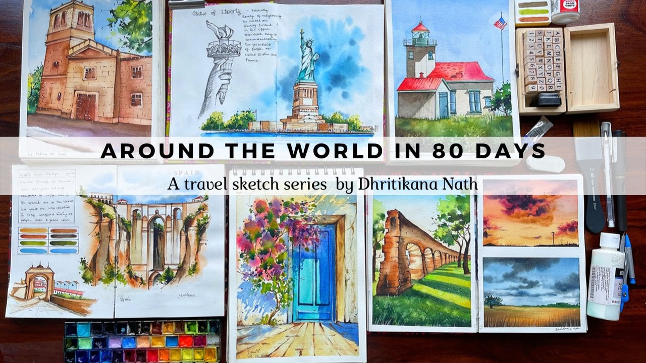
are displayed over there. Over the next seven days, we will be traveling to seven different places
around the world. Each of these mini
painting essence at bite-sized so that it can
fit into your regular show. You. All the lessons are almost of equal
difficulty level. Therefore, you can
choose Kennedy has your day to celebrate
the autumn season hand. They are perfect
to be sent out as gift cards to your
near and dear ones. We will start by discussing
all the materials, colors, pigments,
and its properties. A few basic rules of
perspective and drawing, which will in turn help
us to get our framework correctly for all our current
and future paintings. Let's find that cozy corner of our house where an
oversized sweatshirt, get a cup of coffee, light up a candle,
grab your supplies. And let's start with
our first lesson.
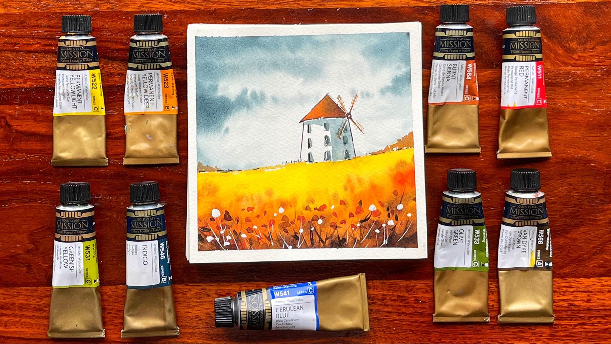
2. Materials Required: Guys, let's discuss everything that we need for
completing the painting. The first is the paper. The paper which you
see is really thin. You can see how it is
as well as you can see backside to know exactly
it is the cold press paper. It is 200 GSM cold press paper from Fabriano artistic
or a 100% cotton. That is what I do like to use for all my
smaller paintings. It is quick, easy to dry off. And that's one of the reasons I have been using this paper, not only fought
this autumn series, but also another class of mine which is around the world and 80 days or travels get series, where you'll get to see these kinds of paintings
only around the one. We have done about eight
paintings on this. The last one is a bonus lesson. We are going ahead
with for really small size paper,
if you absorbed. It, is, I will just show you
exactly what's the number. It's around 12 centimeter, 12.2 that I have taken. This side is again R-square, which is also an output 0.2. You can even go ahead with 12 centimeter if you
want or 13 centimeter, whatever suits you,
it's absolutely fine. They are very small paintings, so it will not make
a lot of difference. I am keeping an acrylic
sheet for myself. Now the second Alex sheet
is very good when I want to actually go ahead and tear
down my paper on this, I'm using mellow tape from my own brand that
is fibrin parcels. So this is a very beautiful deep that can actually
hold the paper very well. It's so washi tape
to the sides of the song sheet that we have. Now, if you are also going
ahead with any kind of a board of your own,
That's also great, but try to use
washi tapes rather than using only the
carpenter washi tapes because these are quite easy to remove as well as they will
never tear off the paper. I'm using a very simple ceramic
palette for my paintings. You can also go ahead with any other ceramic palette
that is available with you. Let's discuss all the pen. I need a black pen for
doing these kinds of maps, for white pen for adding
these kinds of marks. So I'm using a unique pen fine line 0.3 and a uni-ball signal 0.7 are really small scale
that I've kept for myself. Now, this is really easy
to measure and draw lines on a smaller
size sheets like this. That's one of the reasons
I have kept to scale. One is the standard scale
where you get 15 centimeter. And this is another scale where only about four centimeters
is around five centimeters. So that's how we go about it. I'm using my geographic, my graph gear, thousand
Enter and 0.5. So I have been using
this very often in many of my other job painting
strand, it's, it's amazing. I mean, once you start using it, you will get to understand
the best passes. The whole lid goes
inside though. And therefore, you can
practically protect your leads or the graphite whenever you are traveling or whenever you are taking it anywhere with you. A small monograph. Again, eraser, this is one or 0. This really helps me to take off extra maps from smallest pieces, like I have drawn a
single line over here. I can pick it out very easily when these are
smaller paintings, then that really helps. Okay, these are the
three main brushes that we are going to use. That is size two. Then size hate is caught up. And this is the line of one brush from
Princeton, Aqua light. I'm also going to use
this optimal size six. Brush and hit is
beautiful cat down brush. You can use it. For many of your
other paintings. You will see how beautifully he had these kind of
bigger dots onto the painting without doing much that for that I've kept it, but if you do not have this, it's fine to go ahead
with size two brush or size four brush for
creating these kinds of marks. Using Ph Martin's
bleed proof for all the whites that you
see on the painting, the bigger weights that
you see on the painting. I'm keeping only one jar of
water for myself over here. Because once you are
done with one painting, the jar becomes darker
or everything goes dark. And then now you need
to change the water. So precisely there
is no need for two jars of water as we
are not going ahead, but absolute white colors. Or you really do not need to take off the first
supply of water. Given the fact the size of
the paintings are so small, we are doing a delete SM, which means that you
do not need to change. So water again and again, when you are
painting with me and do keep a few tissues
handy for yourself.
3. Color, pigment & properties: Hi guys. So let me discuss all the colors that you need for
completing the painting. The first is my
permanent yellow light. The second is my
permanent yellow deep. Now the permanent yellow light, of course, is from CDC. So there are a lot of colors which are from
series a, B, C, D. And depending on the series, you usually get the
prices of these column. I would like to tell you
even about the pigment, the fastest E14 for a
permanent yellow deep, it is series B, and
this case BY 65 that they have used in
this particular color. So P y means permanent
yellow light. You can say PYY denotes yellow. And then BY 154, again, Y denotes yellow. Now, then we are
going to bond CNR. It is again Series C, and it has a lot of
color combination. If you see it's
PBR, which is 25, and then ASP RPR means
read a 112 and E15 T, which means that it
has even yellow in it. I always say that my Brown has an underlying red in it as
well as a bit of yellow, which makes it look really
beautiful and nice. You have to look at
the color combinations that you say are the
pigment combination, I would say to be
more precise on these tubes that you
get for yourself. The next is my Permanent red. You can use permanent red. This is a pretty easy color
that is available anywhere. And it is again from Series C, it is a PER 112 that
who get then is your permanent Van **** brown
or any dark shade of brown? I'm using the Nike brand new and even makes Qing legal width. You are born CNR
to get this color. It is PBR seven. Again, it is your
single pigment. And this is greenish yellow. Greenish yellow
is from Series C. It has fought lot of pigments. And at PGY1 Fifi, that is yellow, peachy. Thirty-six directors,
you are green. And then p y, that is your pigment,
yellow, again, 65. They have a mix of all
of that put together. Olive green. Olive green is PG
36 BY E15 TPR 112. Surrealism. Surrealism Blue has,
again BB, 15 is 23. This is basically a pure
color shade of blue, made out of Paleocene in blue. Okay, Now this indigo,
indigo, again, is a very beautiful shape
that you get from mom. This Magellan Mission Gold. This is particularly
from the Series B. You can also have from CEC. They have a lot of
their particular ones. Like one particular color in many seeds is
like burnt sienna. You'll get CAN series K, B as well as I think C. So this particular
one burnt sienna, is from Series C, whereas I even had the other ones
here now from CBC, which is not so vibrant
and series C. And depending on the quality of pigments or the
mix that they use, I think the prices also
changes accordingly. So Syriza is cheapest. Series B is a bit higher
compared to series. Cdc is again with higher
compared to Series B. Series D is highest, I think according to the all a, b, c that is available. That's how the whole
of these go together. So this is Pb 29, P B27, PB K7. They even have black in it, that is CBK, you can
see, and this is seven. Over here. What you can always go ahead and check is
the light fastness, how transparent it is. So it shows that it's semi-transparent and
it's non staining. Non, non staining
means you can actually remove the shade from
the paper very easily. Whereas if you have more steaming nest like
this, a bit semi-stable. Now semi steaming
means that you will have the marks on the
people and removing the color will not be
so easy compared to if you have non staining color. So these are a few
properties that you should always check while you
are buying your colors. If it is transparent, it's always great
to use the shape. The white of the paper
will show up and they will practically reflect the color
that you see on the paper. Whereas if it is opaque, now, there are many shades. That's one of the
reasons I just do all of these that we are
using are transparent. But there are a few sheets. This is semi-transparent. Then semi-transparent means that we will not be reflecting to the extent or it will not be seen so much see-through
on the white paper. When we apply it on the paper, there will be some amount of orange color that
will remain on. The white will not
be shown so properly compared to if it is
completely transparent. So these 45 properties, I think it's very important
when you are going ahead and purchasing
the shades. For me. These are the go-to sheets from Magellan mission world
for our fall series. That is the bottom series. We will be painting all of
them within these shapes. Now, if we are going ahead
with any darker shade, you can always make
some amount of blue into your olive
green for a taco. I would say green that you need if you want the
Nike Brown, of course, you can go ahead and always
make some amount of indigo in your Muncie and get shade that is closer to
the one which I'm using. Hence, these kind
of mixing of colors can always be done and you
can get at the best shade.
4. Perspective & Drawing: Hi guys. So before we start
with the class, I would like to introduce to a few concepts on perspective. And let's just go to each
one of them a bit in detail. The first one is
one-point perspective. Go ahead and draw a small block. And I will just place my horizontal horizon
line over here. Here's my horizon line is here. This t is kind of a building
or a cue that I'm making, then all of these points
will move to one single. Therefore, you have to
adjust this line in a way that it needs to 1, which is my vanishing point. And again, you can connect
these lines like this. You can very well
see that we have a cube and we have
our vanishing point. First, you need to mark
your horizon lines. So I am marking my
horizon line over here. And then this is my
vanishing point. And accordingly, I
can draw this q, this is a building
that I want to draw. The next is, if I have o vanishing point
within the scale. Suppose this is my paper and
I need to figure out oh, vanishing point and then
draw buildings accordingly. So let me just define a
horizon line over here. Defining a vanishing
point over here. And hit accordingly. You will have to draw
all the buildings. Supposedly you want to come
up with any burden over here. It would be like this. You have to go. That is, if you were on this side, you can always go ahead
with buildings like this. This is my vanishing
point over here. The court cases,
when we have don't mind perspective where we are going to draw multiple
vanishing points. Now multiple vanishing points as you where to find
one horizon line. And with that horizon line, you will place one or two depending on how many vanishing points
you'll want to place. Since it's a two-dimensional. Therefore, we will work
with two vanishing points. Let's mark our horizon line. And let's monk called
vanishing point. I have building movie here. So this is one way
of going about it. Wanted to like Tesla. Then of course, I can go ahead and draw these lines
from my vanishing point. Hand in case I want
to extend this way, then I can also go ahead and
organize my buildings in a way that it gives me
vanishing point, the spot. So this is
two-dimensional figure. When I get the vanishing point, both of these will converge to one single point that falls
on this horizon line. We're already done with
two basic concepts. That is one-point perspective
and two-point perspective. We have learned
about the horizon line and vanishing point. Let's go ahead and understand
the rule of thirds. This is a golden rule which I have been applying for
many of my paintings, as well as I will
give you an example. Let's go ahead and draw a quick rectangle and divide
it into nine equal halves. Now nine equal houses
that you have to draw three lines and
you will see that the whole paper gets divided
into nine equal labs. Placing your subject at any
of these intersection points, whether it be lower or
whether it be higher, is the best way to go
about the painting. Let me go ahead and give you a quick example from our own
painting of the windmill. If you see, I have placed a
windmill on the right side. And it is in-between this kind of an
intersection with your. Now this is the best way. You can always go ahead
and place your subjects. Because it would be the
safest way to go down and play with your
subjects whenever you are starting up on your
watercolor journey. Towards us practically,
or golden rule that you can follow for
any of your painting. If I show you all the things
that are included with it. It's thought that this painting
has the rule of thirds. Where is the water area? And most of the
attention and most of the focal point that you'll
see lights over here. Hey, according to
the rule of thirds, we have seen all the
buildings on the right side. Again. This is a really
simple painting. And still I can say that according to Rule of
Thirds, if you might, three lines over here, most of the painting lines, fainting lies within this. Again, with unknown
rule of thirds. We have worked it
out in a way that we have placed the complete
padding on the top guide side, as well as the
vanishing point goes to one single point on
this particular row has, these are wine yards and simple binary acids will
converge to one single point, which is called as
the vanishing point. And this vanishing point
is somewhere here. You are. Again, we will have
plateau vanishing point as we have Canada ground that converges to one single
point which goes beyond the line that
you see over here. And accordingly, you can have
multiple vanishing points. Asper this particular building. You can also see that the rule of thirds applies
very well over here. Then most of the work has
been done on the right side. Only this particular painting. I have not followed
completely the rule of thoughts because according
to this painting, I really wanted it took
place in the middle, rather than painting
it on the side. For this particular
painting guys, I want to see only
one single thing that every time you should not go by the time there are a few deviations
which we take. This was one of the
paintings in which I have taken a bit of deviation. And other thing that I want
to always highlight this. Keeping your corners pretty boring for most
of the paintings, the corners are pretty
boring so that the whole of the UP tension, everything as well
as the focus for the painting lies
in-between where I have concentrated by subject and I want people to go ahead
and check that out more compared to other parts of the particular composition. We're on to our
fourth concept now, and it is to break your subject into major
shapes and sizes. If you have a particular
painting and mind, you have to break it
and shapes and sizes for drawing this kind
would take a major shift, which is my square, and then draw a triangle on top of it to get the final sketch. Therefore, I would say there are practically three to four types of shapes and sizes that
is available with you. Whether it be a square, rectangle, your circle, triangle. These are majorly
three to four kinds of shapes and sizes, which I have always seen. If you were painting
on a location or if you were painting
of building corals, you are going ahead and doing any kind of an urban sketching, except the nature part
which is majorly trees, flowers, et cetera,
that you were including in your painting. Rest. You can always go ahead and
break your subject into these major shapes and sizes to get the best of your outcome.
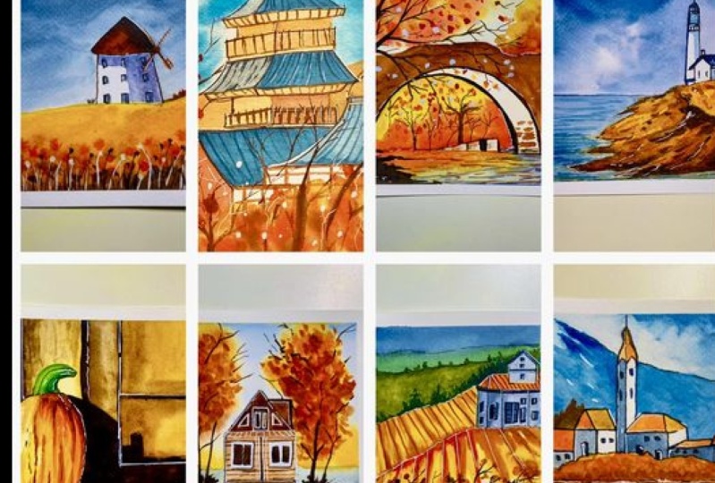
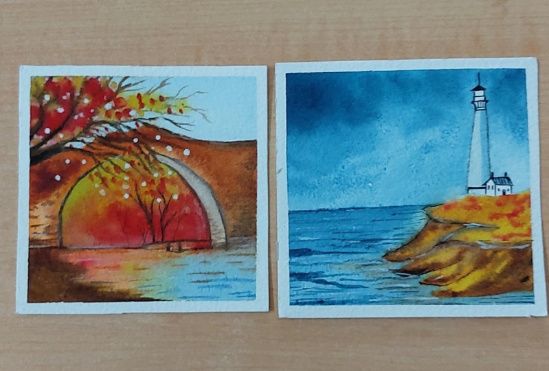
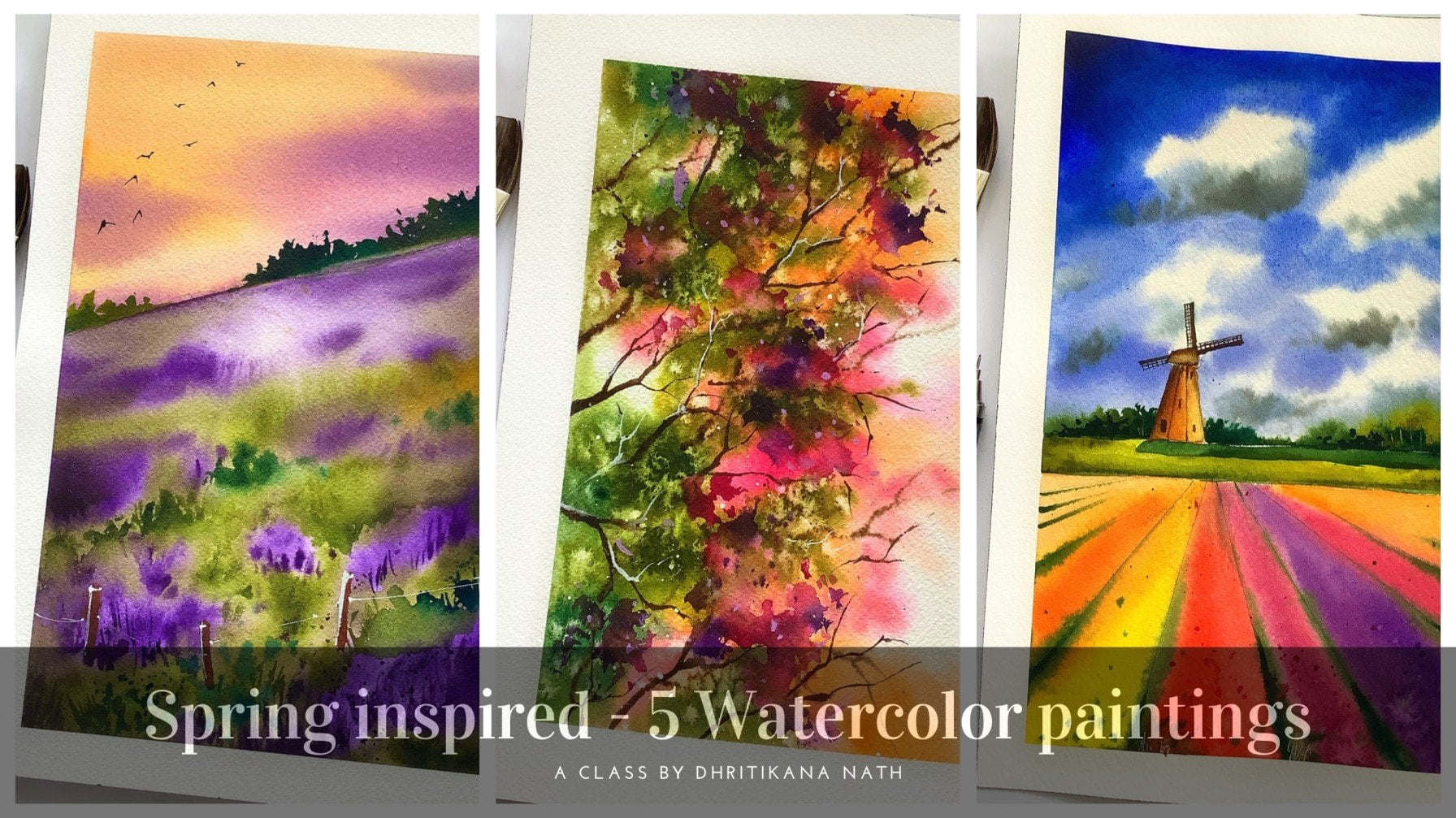
5. Day 1 - WindMill, Holland: I have introduced you to
the golden rule of thirds, which is majorly dividing your paper into
three equal half's. And once you divide your paper into three equal halves
from both the sides, you can always go head
handpiece your subject. Similarly, we are placing the subject towards
the right side. Has, you can absorb
it, is whole windmill. Hence we are dividing it into two major shapes that as a square as well
as our triangle. Whenever you are confused or
whenever you are actually at a particular
location and want to paint a particular subject. Go ahead with this rule of
thirds that can really help you to Ace through on me
any of your paintings. Though, I always
say that this is not the only rule you
can always deviate, but this ruling ever goes wrong. And we can always place if can have concrete outcome
of the painting. Going ahead with three set
of vendors form my windmill. This is a traditional
old when milk, which pie I'm making right now. These three set of windows
are very simple to draw, call absolutely free hand. The whole drawing process
is kept it really simple. Once we aced this painting, we will go ahead with the
castles and Slovenia painting. That we will learn how to add various different shapes
and sizes of the castle, as well as the reflection
of it into the water area. Again, the rule of thirds
is what we would be following in most of
this composition. As you know, a few more graphite
melts and few of the places first going because small circle and then making across which
is a bit slanted. Now, these aren't the
four blade windmills which were there during the older
times compared to the ones that you've
seen nowadays. Now, these windmills are still being used in many
of the places. They have a history to it. Go ahead and start adding
the colors to your sky. Sky will be very
easy and simple. We will be going ahead
with the indigo shade. The sky is kept in
a way that it's not cloudy as well as
it's not completely. There is still some sunshine. That's one of the
reasons I have kept the lighter shade of
indigo for my sky area. There are various integrals which are available
in the market. Some of them are
made out of more of blue compared to black. So you can always
pick and choose the pigments for
your indigo color. As for the brand that you
want to go ahead and choose, don't always go by the
name of the brand. I would request you to exactly cool with the shade that
you want for yourself. If you want more
on the blue side, just check for the pigment that is written on the indigo color. You can always get hershey
that is more on the blue side. If you want more
on the black side, your work have a pigment
which is more on the black side and less
having the blue into it. It's always a good exercise
to choose your colors by going ahead with the shade and the pigments
that is being used. I am using my size
two brush just to extend the clouds a
bit or the sky a bit. Add a bit of drama into it. Though, if you absorb that time, keeping it really
light in terms of the values which I am
using for any of this guy. I will always apply a
lighter value initially. And if I have to go ahead with the taco value, I
would call base. Go ahead with that. In the second goal. If you have committed any
kind of a mistake or if you feel that you have applied
more colors, then go ahead. Use your damp brush, which you use mostly for
your blending corals for other bigger sized brush
that's available with you to pick up the
colors from the paper. Once you have taken
off any extra colors, go ahead and apply a
bit here and there. As I do it with my
size two brush. I think that I am pretty
happy with how this guy has turned out and it's time
to go with the yellow. This is the permanent
yellow light that I'm hiding
for the top area. You can also go ahead with any other yellow that
is available with you. Try to use more transparent
yellow. Over here. As we are going to use the
permanent yellow deep, which is more opaque in nature. Though I am going
ahead with very, very light shade, or
you can say very, very light value what
this color right now, we will be adding the darker
values towards the bottom. And the top area will have
only the light of values. The Brown has caught
some yellow as well as read into
what it is from CDC, as you already know. Hence, the color really makes the whole
painting very vibrant. I am adding a bit
of touch cough, read into the painting as I want this painting to be
more vibrant and beautiful. You can also go ahead with the
small touches of red, etc. And now it's always
great to work towards the top side post and then
come to the bottom side. Because we have applied the
colors from top to bottom. And that would be the area which will become drier faster. Adding the darkest
value right now, which is majorly
the Van **** brown. You can also create a
dark brown on your own. Mixing your indigo
with some amount of your burnt sienna
will give a color that is similar to the
one that I am using. Going with some of the red handle mixed
soft brown, mix off. I didn't round of course, is very pretty though this
has lot of red in it. Can, it has
underlying red in it, which you can always see. Some of you have this
question whether a single pigment color or
many pigment color is good. As per my understanding
of segment, single pigment
color is of course, a better option to
go ahead with has it provides really less muddy
mixes compared to if you are going ahead
with any kind of a shade which has lot
of pigments in it. Because we are unsure
of the kind of mix that we will get when it reacts with
the other colors. There was a small bit of white which I did leave
towards the top area. I did tell you that I am
working simultaneously and I'm not allowing any time for
drying off the paper. Hence, it's great to
leave a small whitespace and while the
bottom area is wet, go ahead and apply the
yellow towards the top. I'm pretty happy with how this whole painting is turning up smaller dots here and there. And then we will add some of our larger dots even
towards the bottom. Again, I was a bit unhappy
with how I have had it though. Correct color, hence sided. Go ahead and remove it
from the left side. Okay. Make sure that you do
not touch the bottom area. Why you add the colors to
the top of the windmill? It is majorly the brown. I'm using a lighter shade of this brown towards the top area. I will blend it with some Van
**** brown. On the right. My shadows are falling
on the right-hand side. The sunshine is from the left. That's how I like
to place my son. Though there are clouds which cry have caught it
to this painting. But that's for hiding more drama to the
painting and create more intense as well as
a beautiful painting. The meanwhile, you were adding these colors to the top
area of the windmill. You will also see that it has for the dried
off completely. Once it has dried up, go to the right
area and just start cutting off the bushes. They are all dried
off and you know, it is at a distance, hence, you do not need to add
much of Fallows into it. Simple Brown can work with. It's just a mix of brown
and Van **** brown, which I am handing
over here in part. Hi, I'm good to save that. You can go with any color of your choice for
this particular part. Very small, easy
addition of bushes. Has I did tell you
that we would be adding some more
jumpy could dots while we complete or while we are going ahead
with the bottom area. It's time now to add those dots and a
lighter shade of brown, which is burnt sienna, as well as the darker
shade of brown, which is my Van **** brown. If you have a mix of Van
**** brown and burnt sienna, makes sure that the intensity
of the color is higher. Or you take. More pigments can do your brush
when you want to end this with a liner brush to add a
few lines from the bottom. These are majorly the crosses, which are also turning brown and yellow as well as orange. Nature changes its shape. And I think that
is a big source of inspiration for all of us
when we want to paint. There are so many times where I've been asked this question, what inspires you, how you are motivated on a regular
basis to paint? The only thing that keeps
me going is nature. With it. I always loved on mowed down periods,
historic places. Like in Holland, we have more
than 1 thousand windmills, over 600 windmills or do
celebrate this national melody. On every second Saturday of me, each and every
year, more than 600 men windmills open their
doors for visitors. It's an opportunity to see the historic windmill that
are no longer maybe operator. There are a few
of them which are still operating part itself. Fantastic. Tourists
visit site as well as it shows so much
about the history, why these windmills
were made, etc. According to the new
structure of buildings and the urban landscape
has changed a lot because of which call these
windmills can not catch the wind as they used to do audio and hence are
not cooperating. I did talk a lot about the
history of these windmills. You can find out more from the websites
as well as you can. All because go ahead and visit
these windmills can drill. We're going with some
white highlights. I have added some
smaller towards pass. Well, as I'm adding some lines with the help of my liner brush, it's time to show the
light and shadows. Light and shadows is something that I always loved
to play with. Going ahead with my darker
area towards the right hand, just using my size seat
has caught up plush. Add this color pod to my Venmo. Fancy using a very light
shade of indigo hand. I have removed call
the paints from my plush and now
blending it towards the bottom area so
that we do not see a difference between the yellow in the code that
I had counting on. Windmill Part. Going with the darkest shade of indigo
and adding it on the Windows. You can always solve that. I am going simultaneously. At some point in time. If I feel that I have added a lot more darker values
compared to what I should have, then I would take it off with the help of my size two brush. As the space is really small, we're going with my
black pen now to add some of the lines. As well as these are majorly
the black highlights, which basically denote the
shape and size of our subject. This really helps me to go
ahead with our hybrid model. My ink and wash. Of course, it's not that time adding
the ink first term though, going with the wash whereas I'm going with the
wash first and then having the cooling in a
few places wherever I feel, it doesn't necessarily hiding somewhat darker value
onto the windows. And then you can observe how
the light and shade works. Had some brown color to your windmill area where you
have these smaller blades. Of course, it's a very, very small size blades
that are adding, hence, it all make sense
to go ahead and use the simple liner brush
for all this area. And I'm going
absolutely free hand. I'm not trying to add
any pen marks anywhere. Just maybe a few once we
are done with the painting. I'm pretty happy with
how it has turned out. We have a very nice
when we're being done. And then adding some
more black highlights in few of the places to
add the final details, finer details of something
which I have always, always loved to
go ahead and add. Because that really changes the look and feel
of your painting. Going with some more
white highlights. Once we are done with this part, this is 0.7 MM signal
uni ball off hand. I have been using it for event, another class of mine, which is fat around
the world and 80 days for travels gets series. If you really want
to learn more, ponder travel sketching,
as well as you want to paint on the location. That's one of the classes which you can go ahead and check out. It has not only got
one single medium, like watercolors, it has way more medium
that is given in, as well as kid talks a
lot about the sketching, the importance of
sketching and drawing, removing a pattern angle and having a final look
at the painting.
6. Day 2 - Castles, Bled, Slovenia: This part as mutually
about painting, castle and black Slovenia. It's one of my own
favorite composition. First, if you try to just see all of the
painting is divided in a way that the
concentration is towards the middle part according
to the rule of thoughts. I hope you have gone through the section of
perspective and drawing. And I have mentioned about
the Golden Rule of Thirds. Be hard following it in
most of our composition. And that's one of the
reasons scientists added that as one of the most important
aspects in perspective. Going ahead and dividing my structure into basic
shapes and sizes. Again, Asper, the understanding of on-location or any kind
of structural drawing, it's important to
break your subject into various shapes and sizes that really will help you to get this sketch
in perfect order. This is a very,
very small sketch. That's one of the reasons
if you start off with that, it will hardly take you
any time to finish it off. And I have tried to
make it even more simpler so that even
if you were to be no, you will be in a position to kneel this
painting altogether. Adding some more
shapes and sizes. I am using my scale for this
drawing of the structure. As I do understand, many of you are new to watercolors and you
would still like to just have that
perfect painting without much of a hassle. So go ahead and start
adding some more lines. Lines are very important and I hope that you keep enjoying adding these lines
as they are really simple and easy to
go ahead and add. As I always say, you might have to
erase it a bit. It's okay. That's one of the reasons you have
kept the eraser. I'm do not make your graphite
months a lot darker. This is something which I have always absorbed than I
have always worked on. Seriously. It takes a while
to get hold of it that never, ever and very dark
provide marks. It would be very
difficult for you to take it off from the paper. And watercolors are transparent, which is one of the reasons
if you add these dark marks, it becomes very tough
for you to take it off. If you paint over it, then you have to
add the black pen, a white pen to go over it. It would not go away. When you are painting with
the help of your watercolors. If it is acrylic or gouache, is very different compared to if you are going ahead
with what colors. Okay. I guess I have
added the mountain that I needed and now I'm going
ahead with my indigo. Indigo has a very little
underlying blue in it. I really liked that
part, you know, when the indigo has
a bit of blue in it. But the Interco, that this one, which crime bruising is
from my art philosophy. Whereas the one that initially
I was using from us, from Magellan, Mission Gold, and add philosophy's pigments
are more on the blue side compared to what we were using
in Magellan Mission Gold. That's the only change
which I have done in this particular structure
compared to what we were using in the last
one. Every time. Whenever I do these changes, It's very important to understand why this
change is happening. Or if you also come across, can you change like
this where you have all the blue for those seem kind
of a color which you have. Just add it to your colors. And you want to understand
why it is happening. Please go through the
pigment structure. What is the, what are the different variety of
pigments that they have used? Or if it's a signal
being men of color, everything, try
to understand it. Then go ahead and
walk around with it. I think some water onto
the mountain and blending. It's time to start
with the yellow. We will start with the
yellow on the bottom part. Cough to Castle and then
just extend it with some permanent yellow deep as well as I would be
adding some brown. So while you are going
towards the top, just had the more brighter
and warmer shades of yellow. And then you are going
towards the bottom area. Go ahead and add the orange or brown that you
have in your mind. Now, if you do not have
this permanent yellow deep, please go ahead and mix some red with your yellow to
get the final column. I'm going ahead with my size
two brush for the brown, as well as adding one or
two drops here and there. This is my way of counting
the depth into the painting. Something which I have
been pretty vocal about adding to your paintings. If you add depth, the way to do is to
go ahead and add some darker values towards the bottom area of these bushes. Or if you want adding
depth to your buildings, you should add
light and shadows. Light and shadows means
some part of your Rome, Berlin would be
enlightened value use the white of your paper, and some part would
be in darker value. You can use indigo to do that. So these are few
important aspects of watercolor that you can always keep in
mind while you paint. Once you are done
with this part, it's a very, very small part. Go ahead and use the bottom part for adding some flesh
and clean water. If even you do not
have that clean water, your water will not
be that bad by now. Hence, you can go
ahead and apply the same water and add
some of your indigo while you are towards the bottom
side of the paper and exact reflection of the bushes you will find on the top part. Just add this yellow
color, your orange color, burnt sienna,
whatever you have for this part so that the exact
reflection can be seen. No, I will not be
adding a lot of reflection of the
building into the water. One of the reasons offices
that there is quite an amount of ripples in the water
and it is moving. Hence, you will not
get a clear reflection like you usually get
in a static water. So that's the difference between a static water as
well as a moving water. One of the reasons of this
painting becoming more simpler compared to if it would
have been a static water, as well as the reflection
would have been accordingly. I'm going ahead and adding some browns towards
the bottom area. Please. Go ahead. In a similar way. You have to also add some
amount of your Van **** brown. I'm using my size two brush
for adding all these details. It's a very simple way of
adding drops and dots here. And why I say this, I have tried to keep a whole
lot this part really simple. It's just add a mix of colors which you need to
know is important. It is to go ahead and
apply some water on the Cloud area and then add the indigo towards
the top right corner. You can keep adding it even
a bit towards the middle. One step top area is dry. Go ahead and start adding these darker values
as you observed me. Now this is my size two
brush which I am using. I have been using this
brush very extensively throughout the whole of
this painting series. As you know, it's a
very small paper. I would not say it's
a very small paper, but it's not as big as you would usually
like to paint though. You can always go ahead and convert the current painting
into optical paper. But I tried to keep it really
small so that you have this feeling of gaming and achieving something
over the day, as well as you are in
a position to even finish it within the time
limit that you have. All of us have caught back
to our normal lives now and it is becoming tougher
to paint on a regular basis. I do understand that many
of you did have this hobby of going ahead and painting on a regular basis when
it was pandemic, but over time, it has changed a lot and still so
many of you have been telling me that
you have the scourge of painting but can't do it because of their daily
routines and the errands, your work pressures,
family, etc. That's the whole land sold. Reason of making these
bite-size lessons, bite-size lessons really help
you to just go ahead, sit, not think much and get a beautiful painting out
on your sketch book. If you are maintaining a
sketchbook or even on. A holiday card if you want
to send out to people, if you want to keep it
for your beautiful walls. So that's how I see it. When I tried to paint something, going ahead and adding
some more brown towards the right side and
yellow towards the top, you will observe the left side. When I did add this bushes
towards the background, there was some amount of
Brown's that I added. By the way, I tried this
painting two times. The first time, what happened is the whole part of this middle
area became too huge ham, That's one of the reason the painting did
not come together. Well, I just tried
to paint it once more and I guess the
real fun was there. The way this
painting turned out, I was not expecting the same. Add some amount of
burnt sienna and orange towards the top
area of the castles. These are some of
the buildings that you see and it is important to add this color for roof
part of these buildings. It's important to
understand how do we create these light and shadows. Now the darker shadows that
you observe is in blue. And this is the indigo color which we did apply
for our mountains. Again, I am currently using my size two brush,
very small area. I do not want to
take a chance now, most of the painting has
already come to life. We are done with the major
parts of the paintings. It's majorly the final details so which we're going
to take some time. So you're not taking a chance as something that I
really like using 200 GSM Fabriano artistically
paper as I did you already. I have been using this
people very often for most of my painting and it
dries off very quickly. You do not need to wait for any time or give it any time
to dry off simultaneously, you can keep working. That's the best part
which I see for using these kind of paper which has lesser GSM compared to papers
which are from hi Jason, adding a darker value even to the roof of this
smaller castle part. The long line. And this is one which stands tall as well as it shows
that this is Blood Slovenia. Okay, adding some
of these windows. Again, going really simple. When I even add these vendors, I do not think much while
I add these vendors, just go ahead with a gut feel. I haven't seen it entirely. Where's the window,
where's the door? Where is everything
going ahead with what I feel it look
gray over here. Some of the part for an
artist is based on intuition. What they think would look
absolutely great on paper. This is something
which I have also can, I have learned over
time that there are parts of an artist which
you need to figure out, which we need to
understand what do apply only to what
extent to apply enough. So it comes with time. And you will also get to understand the smaller
paintings, as I say, is a great way to practice and keep your creative
juices flowing. I think some of my indigo
in darker tonal values. We have already added in
lighter tonal values. And over here in this
particular sketch, CDs, we are going ahead with
a few layers as you absorb. Hence, I am using my lettering technique to go ahead and add this darker value. If you want to learn
more about lettering, if you want to understand how
to paint around the world, I would definitely suggest
you another class of mine, which is around the
world and 80 days. And there you are going to paint API various places across the world with 20
different destinations. You start off your
size eight brush. Now size eight brush
is usually what we will not like to
use for our paintings, but use the tip of your brush to achieve the kind of
work that we are trying to do right
now using my 0.3 m m pen to go ahead and
add these black marks. I really like to add these
highlights to my painting. It's very important to add
these benchmarks which is like in can watch and it really defines the
building in a better way. Keep adding few more places. And then we will go ahead and add the white
marks off signal, white Jelly Roll pen. That is 0.7 m, which I will go ahead and use. The best part. Which pie like to
do over here right now is to start my painting
is one more stamp, and it's just all
few highlights, as well as final details that we need to go ahead
and add the rest. Most of the aspects
seems to be in place. There are some ripples start, you'll really need to
create that troubles. We can do. Now quarrels, you can go ahead and
do it at the end. I'm to add those ripples, simple lines on the right as
well as on the left side. I like to keep my
corners pretty boring. That's one of the
reasons I am going ahead and adding the darker
values on both sides. The hole concentration
and the focus of my painting is
towards the middle part. Now, middle part is the most important aspect over here and the concentration
and attention, the focus, everything
glides over there. Hence, when you are
adding these lines, make sure that they
are simple, straight. That's it we need to understand. And while you go
towards the top, make it a bit more lighter. Or you can say you
have to make it in a way that there
are only few of them compared to while you go towards the bottom
where you have to paint a bit more by
white Ph martin, opaque color for
few of the lines. And then going ahead with the darker values for the
top area of the roof. Now this I am going ahead with
only the sites where there is the shadow compared to the ones which are
in lighter values. Making it a bit more
detail and more precise with the help
of wind chill hit Open. Once you have removed
the tape at an angle, please go ahead and have a
look at your final painting. I'm pretty sure about it. You will fall in love
with it if there are any further details which you
think you have missed out, go ahead and add that as
I am doing it right now, I would really love
to see this in the project section
as well as Can't wait for tomorrow to show you another location where we
are going to paint quantum. Hope to see all of your beautiful paintings
together in the project section. Once we are done with
all these seven days, that is actually one
bonus lesson where we are painting pumpkin on the
barge for the last day.
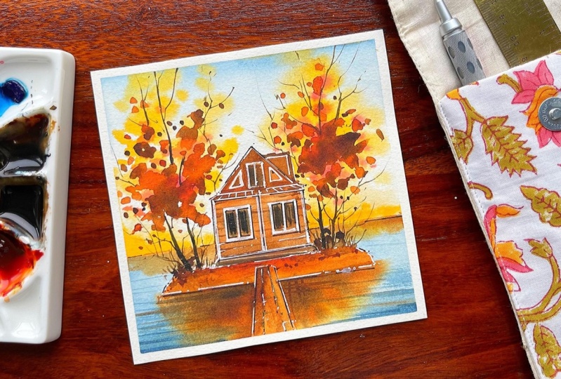
7. Day 3 - The Lonely House in Kyiv,Ukraine: Hi guys. So we are back on our third day and
30 is going to be, or lonely small house
in Kiev, Ukraine. This is one of the
paintings where we are not going to follow
the rule of thirds. As you know, we have
gone ahead and added the structure of the
house in the middle of this off the paper. Usually if you go
by rule of thirds, you do not get to do this. But there is no gravity or fat. And hence, if there
aren't any rules, you should try to
break it and see if the whole painting
or the composition is fallen in place or not. Okay, I guess I have divided
my house in basic shapes. The roof part, I have
decided that it would be in triangle structure and the bottom part in
a square structure. Always, if you are painting
at the location for, if you are even drawing
from a photograph, you should try to see
that you can break in an urban sketching kind
of view or a plain air. Basic shapes and sizes. Now, if your basic shapes
and sizes up fine, you will get the final
structure absolutely correct. You not drawing is
always a framework. As I say, if your
framework is correct, your final painting,
you can always nail it. Okay, let's add some windows towards the left as well
as towards the light. The top part, I did add
two smaller triangles and one bigger window in the middle. I think this is it
that we need to do. And now it's important to show the reflection as
well as to construct that small bridge or the pathway which
connects the line to this small beautiful structure of the house which
we find in cave you. This was one of the
photographs which was there in my mind for
past five to six years. I always wanted to
paint it, but somehow, I was not sure that whether
this painting look, come out well or not. As you know that I was not an urban sketcher or else
even a planar sketcher. From the beginning. It was mostly landscape that I use to make and then post that. I started with plurals. And now the addition
is our urban sketch. All of this put together, It's not very easy to practically understand and
Stoli makeup progress. So I would not say that this
was easy for me initially. It took some time,
but believe me, once you start getting
the structure correct, your final painting is
going to fall in place. I have seen it myself. I have experienced it. And that's one of the
reasons I can see it. So confidently to each
one of you going with the top part of this
time and adding some of my indigo on it. The indigo is bit
bluish in color. It is basically from
Art Philosophy. The indigo color,
as I did not want, the same darker indigo
for the clouds. That's one of the
reasons, or the sky. I just thought that
this indigo would be better compared to the other
one that we were adding. While we go towards the
bottom part of the sky area, I did just add clean water. Right now. I only have clean
water because we have not started
painting anything hand. We will go ahead with these beautiful orange and mix of yellow for getting
our bushes correctly. This is at a distance, and hence you do not need
to practically do a lot. The paper is wet, so just touch your brush and
colors will do its own job. If you are working
with a 300 GSM paper, make sure that it is not really wet and there
are no puddles of water. I'm working with are 200 GSM paper from
Fabriano artistic. One of the reasons that my paper becomes dried off quickly, and I'm pretty happy
with that fact. As I always wanted, this as a small of
fainting structure to warhead and become dry very quickly going with
some of my red and just adding the colors
to the tree area. If you see the paper
is now getting dried off and the colors
are not spreading. To a large extent. That's absolutely fine. If you are using
the 200 GSM paper, you will get something
closer to what I am getting. Okay. I guess we will go
with our burnt sienna. Now. The burnt sienna that I'm using, I have told you about
the pigments of it. If you are also looking for
a similar burnt sienna, you can go ahead with the same color that
I have shown you. In case you are looking
for something else with more of yellow in it
or more of red in it. Whatever you like to
choose from amongst this pigments or amongst the
CNS which are available. Just go ahead and
check the pigments. This is one of the
most important aspects of choosing your color. Never go with the brand name. Always go with the pigments that they have used and
go for artists grade colors are
displayed colors makes a whole lot of
difference to your painting. Even if you are using
lower GSM paper, I always say go for
100% cotton paper. Cotton paper really acts
that glow to your painting. And you know, the colors which you add gets
reflected from the paper. And the paper is not
absorbing a lot of colors. And it gives you a lot more
time to work on the paper compared to if you want not
using a 100% cotton paper. These are a few aspects. If you keep in mind, I think it can really help you through your watercolor
journey even in future. All the paintings that I'm doing right now is pretty easy. So you do not need
to think much. But there will be times where you might be
struggling because of multiple washes or you're trying to paint
something different. During that time. All the steps of using
the 100% cotton paper, using this pigments
that you really want in your color and choose your
colors as per the pigments, as well as going with the artists grade
pigments is something that has really changed
my way of painting. And all the glow, all the beauty that you guys always say is there
in my painting is because of these few set rules that I have been following
for many years now. Time to add the water for the bottom area as well as on
the right and on the left. Now, while you add the indigo, makes sure that
the lighter value of n we go only you are adding. If you see on my ceramic palette there
is a very, very light, a light value of
Nicole that you can see rather than going with
a dark mix, you know, in watercolors, It's
always tough to go back to our lighter values once you have added
the darker values, lifting off is always not available because of the
staining pigments that you have. So I think there again, the properties of pigments become really, really important. Having said all of it, I think going and Layer
Styles and Hamas, that's one of the reasons
I love to tell you to go in layers rather than going with just a
particular color at one go. And then again, picking
up the colors if we need, and this is burnt
sienna and I'm creating the reflections of the
particular area and trees, etc, into the water. I'm going very slow with the
painting, if you observe, it is just some amount
of burnt sienna as well as some amount of Van
**** brown that I am adding to the bottom area then is some amount of
orange for the right side. Sit been sienna,
permanent yellow deep, which is majorly the orange. Kind of appreciate that I
get this when I came around. These are the major sheets
which we have been using. Though. I have kept red, but red is not the color that we are
going to add everywhere. And it is pretty dark, I would say in terms of the
read if you want to add. So user really
dilute shade of red. That would really help you
to add more layers into it. The first layer needs to
be lighter compared to any other layers that you add. Though even there are secondary or third layer
which are also lighter. Or sometimes, you know, people go head with many layers. Lighter, lighter, and
then they go with the darker shade
with 45 players. That is also something which
you can try maybe in future. But right now, let's
just paint our trees. Going with burnt sienna again. Now I leave a few crops are dots of these
colors knowingly, just to create that in few of
the places is burnt sienna and few of the places I am going ahead and adding
this Van **** brown. Okay. The same process of adding the leaves on the left will
be replicated on the right. And that would really
create the depth, as I have told you
for my tree AVL. Keep adding it. And then we will
go ahead and add more colors to the white
areas which are still left. I'm to add some brown lines for the house area as this
is made out of wood. And we really want that
would be seen properly. Go with your liner brush in case you are using a
bigger size paper. Go ahead and use a
bigger size liner brush. Brushes that you use is practically, I
think, replaceable. If you are going with
bigger size paper, you need bigger size brushes. If you are going with
smaller size paper, you need smaller size brushes. The way we are using currently. Adding a few lines, really add that to
the wooden house. I would say add some more
values of this dark brown for the top as well as for the bottom of the triangle
area for the roof. Once we're done with that, we will get back to the
whitespaces that is still left. Adding some burnt sienna. Now, the bottom area. Now I have taken off
all the extra colors. I think this was just too dark. Then I started painting with it, blending with some orange
or permanent yellow deep, whatever is available with you. Once you blend it, you will absorb that. Yes. This looks now
like the houses in an island state and then adding some lines for creating the ripples
into the water. I always say that
when you are going with this kind of
a structure where your all of the leaves or whatever you are
drawing the House leaves, then your foliage, etc, is not seeing exactly the
same way into the water. It's normally sterile water. It's moving water
that you are drawing. If you are drawing
some moving water, you have to make sure that
there are lines that you show. These lines practically
show that there is some of the reports
and the water is moving. Hence, the whole of this
painting comes together. One important aspect
of reflection and how it is
supposed to work for you is something
that I have learned by always seeing the photos. Now, I do have about
two or three classes, watercolor ocean waves 12, as well as there is
watercolor seascape switch. You can always check out. And those do have some of
these in way more detail. As well as, I think if you are someone who loves to
paint urban sketching, go ahead and check out my other class around the
world and 80 days where we are painting AT
beautiful destinations. And that class is quite similar to the one that
we are doing right now. So there are additions of
each and every location. Hence, you will find a lot more details in terms
of how to draw, how to paint. There are monochrome
painting, so you paint, sketch and even draw shade with all of these put
together is there's, that's more elaborative class compared to what we
are doing right now. Going with some white marks
off the pen as you observe. And this white pen, you know, is a savior or else we
had to use masking fluid. And practically, I'm not a person who
would ask you to go ahead with masking fluid during the initial part of your
watercolor journey. It's something that
is a bit advanced and I would ask you to use it maybe once you are
more advanced and this journey and you
understand your brushes, you understand your paper well. So there are paper or
like cellulose paper, it I'm not sure if it can
pull the masking fluid. Well, if you are using
a 100% cotton paper, then only it can now hold the
masking fluid really well. Those are the reasons I don't like to introduce it right now. But an underworld radius
of course has it. It has everything of it. Okay, I guess you can continue working with this white
pen as I am doing. And then we will
go ahead and add the other details which are still remaining for the trees, as well as for this
pathway, water, et cetera. I'm creating some gap
for this pathway. And this one is, again, really, really simple. Go ahead with some darker
values on the right. And then just add some of the lines like this with
the help of your liner brush. I have been using this liner brush so
extensively throughout our whole of the
painting process because they are small paper. And that's one of the
reasons I do not want to take their insurance
going with some brown as well as some Van **** brown mix with burnt sienna so that we can get these darker value
bushes and all. But majorly, we would be adding the trees and the
lines right away. Okay, guys, whenever you
are adding the trees, one thing that I must
tell you is holding your brush at all,
90-degree angle almost. Now the angle of the brush is
very important so that you can just make that exact
line which you need. You have to understand the space right now
is really small. So overall, you should
not face much of an issue while you add these
bark of trees. If you observe closely, I'm going really slow. The bottom area is more wider as we move towards the
female, make it thinner. This addition is way
more easier to do. Just wait for a few seconds and you can really
observe what time adding. As I did tell you, I go just start
perpendicular way with my brush while I
have to add these trees. So it might be a bit
difficult to observe each and every stroke in detail. But you can see that
I am branching it out towards the top area and I'm keeping it one or two of the major bark of the
tree towards the bottom. Towards the top, more
branching happens, but still the whole
painting is small. So there's not as much
as plunging as you would have toward that this
whole painting can take. Okay, I guess that
makes a lot of sense. Now, if you will see the whole painting
is coming together and each and every part is so much more detailed
compared to what it was. We have to still add
some of our black pen. Once we add that black pen, it would be almost done. This is the time when you're
painting has come together and there are only a few details
that you'll need to add, like these, white marks or also the white highlights along with the black highlights. I'm not adding the white and the black
highlights everywhere. The houses more of
white highlights. And there will be
only few spaces where we are going to add
the black highlights. Now, I'm adding a
lot of white and black in terms of the ink
will make it ink and wash. This is practically or hybrid
version of ink and wash, where we are doing
the watercolors initially and just
having these lines or these marks to get the finished work or to get
it more defined, I would say. Hence, I think we
need to be very careful when we are
adding all these lines. Because these lines can
practically make your break, your painting to be
frank at this point, the whole painting look
surreal, I must say, and the static know few
dots here and there. Okay, I guess this is the time. Step back, relax and think that do you really
need to do anything more? Or just leave it over here? Take a final look at it. Can be very proud
of yourself because you have Franklin
need a whole house. You have painted
the autumn season, you have painted trees, pathway, reflection, everything put together
in one single painting. And I'm super proud of
each one of you who have taken the paint to paint
this particular painting. I've gone ahead and mail it. I did enjoy the process
and I would ask each one of you also to enjoy the process of
painting this house. Now, this is something
that I always say if you really want to be there
in a creative field, or you want to enjoy
the creative fields. Just try to enjoy whatever
you see or what can you do? If you start enjoying
whatever you see, that becomes your inspiration. If you start enjoying
whatever you paint, it again becomes a
pathway for you, find your way for the future. Let your paper dry off. I don't think you need to
let your paper dry off as this is 200 GSM and most of the paper to dry
or folder itself. It's just removal of the teeth and having a look at
it had the final goal. I hope you have already
fallen in love with it. I can't wait to show you
tomorrow's painting there we are going to paint beautiful wine
yards in Tuscany, Italy.
8. Day 4 - Wineyard, Tuscany, Italy: Hi guys. Day for Trump
is going to be very interesting today
we are going to use one of the most important
concepts over here, which is basically
the vanishing point. You are going to paint Tuscany, the beautiful vine yards of Tuscany during the
autumn season, they turn so pretty. And I would introduce the
most important concept of balancing point through easy
lines and simple strokes. I think you're
going to enjoy it. So let's start off
with our first part where we are adding
three simple lines. And with those lines, we are going to just
draw a small house. Hall of the concepts that we are doing through this class has either houses in it
or it has some kind of a structure of
urban sketching, oral saw, the
photos are taken or inspired from a
particular place, though there are
no reference photo which you get over here, but I have added the actual painting photos
in the resource section. You can go ahead and
download it for your work. Please follow in a
very simple manner. I'm going ahead and drawing small house as well
as its roof, etc. There is nothing much in terms of difficulty level over here. And simple lines. For the vanishing point. This has multiple
vanishing point, as I say, dimensional structure. You have seen that
always there are multiple vanishing
point which card debt. And hence Some always say that art doesn't
have any gravity. And that's one of the
reasons you can have lots of different kinds of aspects
that you put into it. Now we are trying
to add the graphite much to the wine yard, which are closer to us. Anything that is closer
to us would be broader, whereas the subject that is far away from us will be
smaller in size and shape. Another thing that you need to keep in mind while
you paint this is whatever is far away from us. It will not have as
much detail as you are adding to something
that is closer to you. Okay? I have added a light
wash of indigo into my sky. I am keeping the sky
very dull and simple. I do not want to
actually make it very difficult because the
whole concentration of the painting is going
to be on the wine yard, as well as the small villa or the building that
you are going to paint. First, I have added a very light wash. And through
this particular painting, you will understand that
every time we do not need to use all the whitespaces that
is available on the paper. You can go ahead and even keep some whitespaces empty just the way I have kept right now. This whitespace which
is empty currently, will give you so
much of health in terms of going ahead
and hiding the details. Grape plants which have
already turned brown. You note it's autumn, and autumn is one of the warmest colors
season, I would say. The colors around the
world change completely. Nature has its own way
of giving so much to us. If you see there is so much of inspiration that is
lying in an add-on. And I can go on
talking about nature. But in the meanwhile,
let's just discuss all the colors that we
are applying to the spot. I initially applied the
permanent yellow deep. It is majorly in-between the
color of orange and yellow. I have already told you about the pigments that is
there in this color, as well as now I'm going ahead and adding
the burnt sienna. The burnt sienna is from my
cello Mission Gold Series. C. Anyone who thinks that it is a bit red and yellow,
of course it is. As there is some amount of pigment from the
red family that they have added into this shade of burnt
sienna, which I'm using. I'm using my size two brush. Most of the painting you
will observe is done in size to them. Liner brush. A lot of things as done in this particular small size brush because it's a small paper. As I always say,
smaller people always attracts those smaller
kind of brushes. But I really like the
way it is moving. We do not need to spend a lot of time painting all of these. You can practically prioritize
your activities as well as paved the way for
your creative outlook. Or you can have your
creative juices flowing. The best part about this
particular painting is tuple. Understand that there are two Pavlov three-fifths
which we are doing. One is a bit far away from
us and one is closer to us, the one that is far
away from us their job, you will add more colors compared to the one
which is closer to us. I'm keeping some
space empty over there compared to the one
that you are observing now, I have gone ahead with some amount of
permanent yellow deep. And then now I'm adding some lines with the help
of my burnt sienna. Overall, this painting has
really taught me so much. In terms of perspective. You can understand that the closer the fetal side,
the product they are, whereas the one that
is far away from us has such closer
lines to each other, it becomes so easy
to differentiate it. And this differentiation
is very important when you are working on
concepts like perspective. That's one of the reasons
I have introduced this one in this
particular part. Okay. I guess I'm pretty happy
with how it has turned out. And let's just go ahead and
hide a bit of people's lives. But what's the top?
I am going on top of the wet area which
we did already paint with the help
of our bigger brush. It's time to add more
foliage to the grape fields and to the grape plants
that are already ripe. I go in a very simple
manner by adding some thoughts here and there with the help of
the burnt sienna. And whatever I have
over here on the left, I would be repeating the
same to put the right door. I have always told you to keep
the corners pretty boring. But over here, we
are already breaking the rule as I want the
closer fields to pay more. I would say details. All of you are
observing it closely. That's one of the reason
keeping a detail will pay off Much more help once this part is done and you're pretty happy with the details
that you have added. It's time to go ahead and
just paint some more lines. I just went ahead
with more layers before completely
at one for whole of the painting has the only rule which I follow
is go with your heart. Yes, there are a few
rules which we have to always see in
a painting hand. As per this particular painting, it is done with the
golden rule of thirds. But still, there will be some or the other rule
that I keep breaking. And frankly speaking,
I have been really happy even after
breaking these kinds of roads. Because all these
rules are meant for each and every painting
and most of the paintings, I think that rule can
be applied or except a few paintings where you
can always take a diversion. Adding some more details. This is the liner brush, and that's one of the
reasons you can't see it right away over here. Once we are done with
all the details, it would become way
more easier for you. I hope that you can follow it very closely as the whole
painting is done for your time. And your time really helps you to understand each
and every step. One important requests
that I always do in each of my classes to see
it on a bigger screen. The biggest screen
really gives you so much more opportunity to understand each
and every detail, rather than just
using your mobile or any smaller device for working
this out, has a tutorial. Time to add some colors
on the roof of the house. And we have gone
ahead with a mix-up, our permanent yellow deep, as well as some crown. Then I am going with my indigo. Hi, and adding these lines, I have mixed a bit
of brown in it. Get the shade that you
also have washed my brush. And then going ahead with the color right now
that you are seeing. Once I have washed
my brush again, I will go ahead and add the
color to the right side. As we wash our brush, it becomes so much
more convenient for us to go with
the lighter values. There are some
other, other color that is always
there on our brush. And we can still go ahead and paint with the left
over color in our brush rather than just picking up another pigment or another
color from our row. Going with my yellow, green and then some amount of darker value of green hip can be your dark shades of green like when Nike Green or else you can also
use your indigo, mix it with your
olive green to get a shape that you are
currently observing. On the paper. I can add some more darker
values in some of the areas that you
work on solving. This is always so
important aspect of watercolors to go
ahead and add the colors. Optimal amount of colors
needed to be added. And this optimal
amount of colors, or what I can tell you, the optimal amount
of pigment which you use is very important for
each one of us to know. It's great to go head
width or lighter value initially and then work
with a darker value. This is something which I
have learned over time, that lighter value gives
us we more opportunities than going with a darker value initially and then again
removing the colors. Okay, I guess it's time to paint some beautiful
windows in the house. This gives you the app as
well as it becomes more realistic when you are observing anytime though for house
that you want to paint, going with some indigo
and brown to paint the top mountain area or
the fields area over here. I guess. This is
it that I had to explain how most
of the painting is called The can see it did not take us a lot of time
to paint this part. Only important aspect of watercolor is to
understand where to stop. Yes, that's very, very important
aspect of watercolors. If you know exactly
where to stop, you will be in a position
to make all your paintings. And if you're struggling to understand where
to exactly stop, then you might keep
the whole painting, florals over to a painting, going with the darkest
value of brown and then adding some of the
colors on the roof. Once we have added this
dark value onto our roof, it becomes easier for us
to just have a look at how beautiful and how much depth this whole house
has created for us. You know, every time you do
not need to keep working on something small and create a lot of depth or
anything like that. Even working less can be more
for a particular painting. Just adding a few
lines here and there. I have kept it very simple. Some of the lines are also
not exactly how we want. In few places, we will just go very simply with
some thoughts. This polar brush has
got a very nice step, which is one of
the reasons I have been using this for most of my urban sketching or any of my other plaintiffs
sketching exercises. Adding the darkest value
of green where you mix the cream with more
and lots of indigo. And then these kind of random lines and
smaller dots here and there to make it
look like bushes or trees that are there
far away, please. Adding a few more pushes
in the background, which is actually just above. Or you can say the
house that you see is in the front and those bushes on
in the background. So we are going ahead and
having just straight lines. You know, most of the structure
that you see me adding in this particular painting or
any of my urban sketching is broken into various
shapes and sizes. Either some straight lines or random lines that you
observe me adding it. Or else even for the house, there will be fewer triangles, lines, squares, or rectangles
that I would go head width. To get the final painting. I'm to add some white and
black pen in few of the areas. Wherever you see the
darker values are present. You can always go ahead with the white pen for
the highlights. I always say this
is a hybrid between your ink and wash. That's one of the reasons we
are using firstly, two pens, one is white
and one is black. Otherwise it would
have been only black. And we would have
gone ahead with a wash cloth, watercolors. So on top of it, though, each of these have
something which is very, very interesting to know, like ink and wash. It gives us way
more opportunities into drawing and sketching. Whereas this kind
of hybrid model really leaves us with a lot more opportunities
to experiment, understand our own style, and can apply it on the paper. I would say, I am really happy with how this whole
painting has turned up. I hope that you guys also enjoyed painting
this along with me. I can't wait to see this project
and the project section. And finally, adding
some more details wherever it is necessary to remove the tape at an angle so that you
don't rip off the paper. The paper I've been
using is mellow from the brand by brand parcels. And I only own that brand. All these tapes have never
ever ripped off my paper. Just take so well to the paper, even or 200 GSM paper
or 185 GSM paper, they work absolutely fine. And of course
they're available in various colors,
shapes, and sizes. I would say it is a needle, 1.5 him and which perfectly
sticks to any kind of paper or any kind of sketch
book that you are using. Let's just have a look at our final painting and
be very proud of ourselves. Okay, I will meet you tomorrow
where we are going to paint something even more
interesting amputate. See you in the next
lesson very soon.
9. Day 5 - Bridge of Kledonia, Epirus, Greece: We are back on D5. D5 is something that is very, very interesting and I am so happy to share this
out with you guys. Over here. We learn to paint not
only the reflection, but also abridged from
hedonia increase. What happens in this case
is you will draw an arch. And how to draw an arch
becomes most important. You will make half part of
even the half so-called first, and then go ahead and rotate your paper and the other half. So this way what
happens is you are going step-by-step while
you add this arch, as well as you are more confident while you
work through it. Then next part is
to add the ADR, which is underneath the bridge. Underneath area of the bridge, has to be well sure. That's one of the reasons
we will go ahead and add another part of this arch. Once we are done with
this part of the arch, and you are pretty happy
with how it has turned out. It's important at the other
aspects of the bridge, like going towards the
top area and adding the parts of the bridge models even showing the river which is flowing through the
reverb part is really interesting for me
as there will be lot of reflection of the
whole warm autumn season into the water
area of the river. But keeping in mind that
river is always flowing. Hence, it is important to
note that we will not have any kind of reflection
into the water. It would be more of a
reflection in generic. And we have to add
of your reports. This is something that I have always told and I would
request you guys, if you really want to
learn water reflection, please go ahead and watch
out for my other classes, watercolor, ocean waves 2.2, as well as watercolor
water escapes. Both of these classes
have lot more in detail to deal with
how to paint waves, how to paint river, et cetera. I think it would really help you even in your watercolor journey, because landscape
painting really requires the knowledge
of river, water, etc. That's the place where all of this knowledge will
come to your health. You can seriously
use it for any of your future projects
to I guess I have added most of the
confidence while we were talking through the important
aspect of reflection. There's a small bridge and
on the left-hand side, there will be a few
trees that you can add only the structure of
those three lines right? Now. We'll go over it
with your brush. Linkedin or
framework, isn't any. And now you should go ahead and add some colors on this car. I'm going with a very, very light wash of indigo and
it is just on the sky area. I'm adding it even
on the bottom part, where we need to add
the autumn season where I'm going with a bit of a
light wash of the same indigo. And then I would add the yellow, the Omnimedia NOT as
you observe me doing, as well as the event. I have kept. Interestingly for this particular hole
of the bridge apart, because I just felt
that the bridge looks a bit more dark
compared to we had so much of competent throughout all our work that
we did till now. Hence, I just
wanted to keep more of interesting and warm
colors for this part. So I have added quite some
parts of radio intuit. What I'm mixing, even the same with some amount
of permanent yellow deep. Before I go ahead and added, the colors look so amazing
and so bright and beautiful. It just lifts up my day. When I sat and I painted
each and every day, I felt like this is one of the most beautiful
autumn seasons that I'm also experiencing
through these paintings. I haven't had the opportunity
to visit all these places. But through these photographs, painting painting them from these photographs and painting, along with all of you, has literally made my autumn
season for this year. For the top area of the tree, I will just drop
some piano and on top of it go with my size two, brush and add some
permanent yellow deep as well as some red. It's just on the wet paper. You are adding these drops
of water or drops off pains. Hence, it becomes really easy for roping meant to move along. Water always does it stop? I have been very vocal
about it throughout all my paintings and
throughout all my classes. Just let water do its job. Our job is to just added in a few places and let the
magic happen on its own. Going with some indigo towards the bottom area where we have the river and then mixing
it with some yellow. That can be Gu, best part is it doesn't have
much of blue in it, which is one of the
reasons you are also saying that there is no reaction of yellow and indigo to give me
a green out of it. Whenever you are using more than two pigment
or three pigments, one particular color, make sure you do not get
any muddy mixes. I always try out these colors or the
mixing of this colors on another paper before I
applied the actual painting, orals, the whole
painting were turned muddy and we really
do not want that. After all the hard work, we did not going ahead with
some of our burnt sienna. So burnt sienna
is a color that I am using continuously
throughout all my paintings. Hence, I know that you guys can very well see the lighter, darker, and all shades
of burnt sienna, which we can use
throughout our paintings. One thing that I must tell you, this is the first layer. For my first layer, I keep it very light except
the bottom part where we have added the colors of
water under the bridge. That part is not so I
would say light and shade because I'm not going ahead with any other color in
that particular part. And I will leave it
mostly like that, except a few touches
here and there. Okay. I guess I'm happy with
how this has turned out. Only touching in
a few more places and then taking
off the calories. Sometimes. What happens
as an artist or even as a homemaker has a
working professional, we're a bit delayed back when it comes to even
changing our brushes, you know, after the whole
day when you are so tired, still you want to paint, you have made a
genuine effort to sit, tape down your paper, do the whole of the drawing
and then paint over it. There are times we
just do not want to change our brush or
change the water. Guys. Those are really small, small efforts which had onto a huge beautiful
painting of your own. I haven't been more vocal
about this part earlier, but whenever you just feel
that I do not want to do this, just push yourself a bit more. Change the brush wherever
it is necessarily like using the size toothbrush
or size one brush. Depending on the paper
size you have organelles. Currently I'm using
size eight brush, but if you are more
comfortable with size six, size four brush, use
it to your advantage. All these things. You should go ahead and use it as you have all the resources
available for yourself, then why not use it? You have spend money to
get all these resources. And I feel very strongly
that you must try to paint and try to use the best top the resources
that is available with you. As that is going to really add a lot of difference
to your painting. I am very serious
about this part. So try what I'm saying to you. And frankly, you
would be very happy once you have the final
painting with you, you see how there are different shades of
brown that is appearing. One is the Van ****
brown and another is the other brown,
burnt sienna. Now I have added the darker shade of the
ground towards the top area. This part is more on the
shadow side compared to the other part which is on
the backside of the bridge. That part, as well as the underneath part
is more related. So one of the
reasons of painting this part more darker is that I really like to add
contrast to my painting. This is something
that you must have observed throughout
all these paintings. The windmill had a contrast of white as well as the indigo. That contrast
really helped me to show the light and
shadow in a great way. If you go and observe
the other paintings too, you will find these kind of contrast in each
and every building or in each and every
particular urban scape. Small parts that
we have add non, whether it be house, whether it be any other part, like a windmill, et cetera, everything will have
these contrast except I guess the lonely house near
the key area in Ukraine. So those are one or two things that are always exceptional. And there will be a few
exceptional role going ahead with my Van **** brown. When I keep Brown, I have used very extensively throughout
all these paintings. Frankly, you can see my
permanent yellow deep as well as my burnt sienna and
permanent yellow light. Everything is almost
going to get over it after a while because
these tubes I have used, I don't know for how many years. I think four years from now
or three years completely. So all these pigments have aged over and still
the work so well. Whenever there's a
touch of water to it, it just makes the
painting come to life. Adding these branches which are very thin and I use
my liner brush, you know, these branches
to the whole of the type. Except that the medial part, or you can say the
major structure was ready from the beginning. And we really do not have
much to do in this case, except that there
are few areas which we are just going ahead and
adding the yellow, etc. Now, once this part is done, you will see within the
next five or seven minutes whole of the painting,
we'll come to life. These branches then few drops of your pains of bread
or your yellow. All of that has to come together
to make it more detail. So details really
take a lot of time. And if you do not concentrate
a lot on details, I think there is something
that you are missing out. Details really add a
lot to your painting. It adds that, it
adds that flavor. It adds that beauty to the painting which we
really are looking for. And it makes the painting
complete, though, adding details as
well as the colors or anything that you do in a
painting has to be optimum. Optimum usage of everything
is very, very important. If you can use it
in an optimal way, you will understand
that there is a great outcome which you
are going to get out of it. Okay, I guess few drops
off this buoyancy. And now here and there, once you have added this
few drops of burnt sienna, and then we will
go ahead and add some more burnt sienna on the left as well as
on the right side. I think adding the branches
is really meditative. And I have literally
added a lot of branches. The autumn season is
one of the season where the leaves are no
more there on the trees. If you really want to
show the trees, well, there is lots of branches that you need to
go ahead and add. Now. Yes, if you are
painting pine trees, there might not be a
requirement of carding. These branches.
Are going through all of these small,
small details. But when it is more to
do with a tricky area or three parts to show the
change of your season. It's important to show the
change in the phenomena of a particular tree or off-color particular foliage
that you are painting. Like you will see more
of mushrooms coming in right now and growing. You might want to have
those mushrooms and all those other aspects of this season and you should enjoy the
season Pumpkin, etc. That's one of the reasons I included a pumpkin
for the Halloween. There is so much in and around, but no one usually
paints a pumpkin from the harvest season and places it on a porch or
paints it like that. And I just thought
that this would be a great way to celebrate
this autumn season. Each and every season should be celebrated as per
my understanding, because they have so much
to offer to all of us. Whether it be fruits, whether it be vegetables, whether it be any other kind of whether these
weather changes, the food, fruits, everything
changes along with it. And nature has its
own way to help you. During the summer seasons, there are so many fruits, like mangoes or bananas. Everything that comes in. Summer season really helps us to keep ourselves so energetic. And that's one of
the reasons nature has created its own way
to give it back to us. We should be in a position
to take it and celebrate it. I guess that's it, which I want to say. And let's make some of the
reports now onto the paper. Once you have added the
permanent yellow deep, then go ahead and add
some burnt sienna order, some amount of red. Everything you have painted on the top part needs to come
towards the bottom area. What I mean to say is the whole reflection should be as per the colors
that you also, because the ripples, of course, will not be offered a
separate color or shade. Water doesn't have
any color of its own. That's one of the
reasons you will see either the reflection of the sky or the reflection
of the plants, or reflection of some
other area to fall on it. And you can observe
it accordingly. In case there is lot
of algae in the water, then you will see the
water to be more on the green aside, these small, small aspects of
water, reflection, you can always observe and find orals take help from
the other two classes, which I have mentioned, going with the last
finer details. And I would say at
this point in time, we are practically done
with the painting. There's hardly anything
that is left except maybe some white lines that I'm adding right
now on the paper. Oral saw some amount of dots that we are left
out with urine there. This is it. I'm not going to add anything more or less snow
here is what I'm going to keep it as well as I'm going to stay with
this what I have painted. I'm very happy with it. Frankly, celebrating
this whole season has uplifted my mood to
another level altogether. Using my Ph martin to add a few more white
dots here and there, you can only get this
white dots well, when it is made corner
darker value area. So this you will not get great art scene a great way if you are not planning
on a dark area. The best potters go with a
few here and there. Then. These are basically
the highlights. And have a final look
at your painting. See, I, I'm still not
done with the branches. This obsession of
painting the branches, or this obsession of
going ahead and adding these smaller
last-minute details is something that's
been bitten me. And frankly, if I say I
want to leave it also, it takes a while to
leave that part. Okay. Let's stop and have a
final look at our painting and then go ahead and remove
the tape at an angle. This is something that
I have been saying. Always. Do remove your tip at an angle if the tape
is not coming off, just blow some air
and it has to be from your dryer that would help you or tape to
get peeled off easily. Try to use washi tapes
rather than using only the, the carpenter kind of tapes. See you in the next lesson.
11. Kyoto, Japan: Day seven, Kyoto, Japan. And here we are going to actually understand how
to get a structure. The structure is as per
the rule of thirds. And I have divided a
straight line into four equal halves of around
two centimeter each. Once I have added this line, I will start adding
a structure to it. The structure, of course, uses one-point
perspective, as well as, as per the rule of thirds. We have already seen that the structure is towards
the right-hand side more. This is the main focus
point of the structure, though there will be other
parts which we will add on. Don't go by the time of this particular painting because I just feel that we had
more structure coming in. That's one of the reasons it
just took a bit more time. Everything else
remains really simple. All the techniques that
we have learned earlier will again be used in
this particular painting. We are not going to learn
anything new organ, not going to do
something that is not that we have never used or that we are
doing absolutely. New order is subjective to something that we
are dependent on. All of this put together. Let's just keep adding
all these lines. And once we are happy with how the structure has come together, we will go ahead and start
adding our colors to this guy. The most important aspect of this whole structure is
to draw this cost line. I went absolutely wrong
while I just started it out. I must say, now when
I draw this line, I think most of the
things come together. Okay. I guess the lines
look nice now and I'm extending it to the left exactly as well as to
the right on top of it. You know, that I always divide the structure
into squares, triangles, circles or
anything like that. You know, even though, but are the flowers, anything that I
paint has to go with some kind of a shape and
structure that I have observed. This really helps to add so much more help in terms
of the drawing process. Once you can see something in a particular smaller
or simpler structures, it becomes very easy for you to just put it on the paper and add the painting is one part of it where you can learn a lot of techniques and understand
how to add it. But drawing requires
a lot of practice. That part of the drawing
is something that I would always ask
you guys to focus on. Drawing is a basic
framework which practically paves the way
for your final painting. If you're drawing
comes up, well, your final painting, half of the part of 50 per cent
of it is already done. Whatever you paint from there onwards will go. Very simple. So yeah, I guess that's
what I wanted to say. And let's continue adding
the graphite Vmax. So I think it's about six to seven minutes that
you would take. Just draw this whole part. And once the part is ready, we will start with this guy. Go for this particular sky. I will use two colors. That is selenium, as
well as in nickel. Selenium blue is something
that we haven't used much. But for exceptionally
The last day, I just thought to use this bright beautiful color
from Magellan, Mission Gold. I hope you do fall
in love with it. If you do not have
surrealism blue, go with any other blue that is available with you. Over here. You do not need to think
much when you apply the colors to the sky
because guys never domain. And, or that's not what
we're focusing on. We are majorly focusing
on the structures of the building as well
as the bottom season. Going ahead and adding a few foliage as well as
branches in few of the areas. Now these branches and
foliage practically helps us to explain the autumn
season in a better way. Going ahead and removing the extra five marks from a few abs with the help of this. It is though that I have and
then adding a few lines in a bit darker value for some of the areas
where it is really light. This is the structure for us and the structure needs
to be very defined. So either you can make darker lines orders and go over the older lines with
the help of your scale. Don't make it all
better. Row one. Let us apply some water. It's a cost to clean water because we are just
starting out hand. Go ahead with some of
our Selenium blue. The surrealism blue just
looks so majestic over here. I can't tell you. Once I got introduced
to the surrealism blue, I always wanted to use it
for most of my paintings. But you can also have
the autumn season is a bit about the warm
shades of the nature, but darker values
for the sky, etc. So the reason for using
indigo is that corals, you can also go ahead
with Payne's gray if you do not have indigo, going with some
more lighter values and few of the spaces. And then with my
cat tongue brush to apply the darker values. With the help of my indigo. You can mix indigo or else go ahead with even a darker
value of surrealism, blue, whatever works well
with you go with that for me, it has to be the indigo. Indigo just sets the mood
of the autumn painting. The best way. Mood
is something that I always love to
explore for myself. You know, the better you
get into the mood of the painting and the better
you understand the paints, the better you
understand the people. The warm cup of coffee, the cold evenings, etc. Everything just makes us feel
so much like it's coming. The holiday season is
just around the corner and the harvest season is
there, then the Halloween. And we even have so many other occasions coming
in as we can this year. Yes. I guess we need to start celebrating it now
so that we have next few months to celebrate
the end of this year and go ahead and set our mood for the
next year or together. Mixing some amount of my
ground as well as the yellow. Once I have applied, it is majorly the permanent
yellow deep what I have, I do not have the
exact yellow on my palette for this
particular painting, as I really did not
have much space. So in this part to create the yellows and the
whites is more about the structure that we
have. In this case. The structure really
matters more over here, filling up a few
spaces here and there. And this is the cutoff brush
size stem that I'm using. I have more in love
with this policy. These policies as
such, beautiful, really want to have these
brushes more to Frank. In fact, I have more from the CDS size
four and a size six, but they do not have exactly this kind of a
beautiful, I must say. I think I just overworked
with them a bit more when I was
working with gouache. Not great with gouache. I might say if you
work with watercolors, they keep, you can keep
them safe and better. Watch can actually,
you can go ahead and work with any kind of cheaper brushes compared
to watercolors. I'm going with a bit of a darker value or with
the indigo that I have. And filling up the
whitespaces over here. Once I have filled up the
whitespaces over here, I would go ahead and even start filling up the whitespaces
for the top part of the roof. This is divided
into a few parts, of course, the whole of the
building and some of it. So it's a very simple, some of it is a bit tough. I would not say that
it is really tough. It's just a very
simple structure that we have to go ahead and paint. I hope you are
liking this guy now. This guy has turned up
beautiful in terms of that, there are whites
also within the sky. There are darker values
also in the sky. It looks more likelihood. Okay. I guess it's time
to add the darker part. In the left side there is light. So everything on the left
as on the lighter side, whereas the darker part
is facing to my front. And those would be the areas and more shadows compared to the ones that you've
added on the left. This is a space where you
can go ahead and add the red and mix it with some
brand before you add it. Now, you can have red to
quarrels of bit of yellow. Also when you had this color. All the colors that I use is
from the autumn season only. And we have always used
cassette values or the set colors
that I have always introducing you to maybe one
exception here than there, there might be like the civilian blue which we
are using in this case, rather than using the indigo for the sky rest title thing that we have gone ahead and
changed anything. Okay. Adding a few more
lines here and there. And once we have
added the line side, go just freehand with my brush. I'm so used to this brush
now that I can paint anything and everything under the sun with the
help of this brush, I feel so strongly if it is a smaller space
that fear occupy. Once you are done with
this particular part, we will start focusing
on the foliation next. Now, occupying the whole of the whitespace
is very important. And once you start
adding the foliage, you will get a
better understanding of how your whole
painting is. Tony. We have talked a lot
about the shapes, sizes, and values throughout
all our painting. What is most important is another aspect
which is perspective. Perspective is all
about what you see from the closest value and
what is far away from you. Whatever is far away from you, you do not need to detail much as I have told you earlier, whatever is close to you, you need to detail it more. That's one of the
reasons you will often see that there are
so many individuals tropes that we had to apply for the roof off these
smaller temples. As well as there is so much more that you have to go ahead and add even on the
left side of the house. We will continue doing this
until we are more satisfied. And I guess I am now looking forward to the foliage that we have towards the bottom area. Though there is a good amount of work that is still left on the other parts of the roof
as well as on the pruning. Let's keep working at it and
it's an iterative process. I do not have much to
explain over here. So just follow me. And once you keep
adding these lines, you will see how the whole
painting is coming together. Adding some darker values
of brown for our railing. And this is basically it
looks like a balcony, kind of a structure. Of course. It's not
that we aren't going to exactly do that balcony
kind of structure and all. Just the look and feel should
be something like that. Going ahead with
some more lines for the top area has high
continue doing it. I go very loose while
painting all these lines. Some of the places
I don't miss it. Some of the places I do
market because everything you will not be able to see in such a small
kind of a painting. So having all these paints each and everywhere will
not make all the sense. Handing it in few places
and leaving a few will be more realistic
and will be more, I think, appreciative in a
quick and easy painting. This painting is a bit longer compared to all the
other paintings. It's just that the work
that we're doing over here in terms of detail is higher compared to what we
have done earlier. Now the detailed work actually requires all these individual
strokes to be seen. Now, all these
individual strokes of cost per takes some
good amount of time compared to what we did
in our last few lessons. Though, I am super excited
about my next lesson, which is basically
a bonus lesson, where we're going to learn everything about
light and shadows. In the meantime, many
of you who haven't taken any of my other classes or who are new to watercolors, I would request you to go ahead with for easy watercolor
landscape class or any other classes like
the Polaroid series where you can learn a lot more about watercolors
and the techniques, as well as it is really going to help you even in your
future journeys. And we'll add those darker
and lighter values of the grid as well as
some of the prompt. Now you can either use red, Horace, you can use brown. I would leave that
decision up to you. If you want a more brighter, then you can go
ahead with the red. And if you wanted a
bit lesser darker, you can go ahead with the brown. I really do like to keep
my smaller parts has very loose and because they look more nicer when they
are loose and there are some Few dots here and there. Tom, can you adding
some lines to make it look like
stem and branches, as well as the foliage
looks more original that we keep adding the branches, as I always say, that is really, really meditative and you'll
keep adding these branches and make the word painting
come to life always, always. I think the whole
of the painting now looked so complete to be frank, there are no white
spaces that we have. It's more about adding some
more layers to a few areas. And then we can say that
this painting is detail. Hand, it is close to victim. Let's start adding
the highlights and white and black
to our ping ping. And you will see that this
is going to finish off the painting in a much more
detailed and nicer job. Maybe have been doing it for
all our other paintings too. And so many of you have asked me about the white
Jelly Roll pen. It's from uni ball. If you are having any other band from my unique
ban or data rather pens, posca markers, etc, which
are available in the market. Please go ahead and
use that or else go ahead and use any
of your gouache. And I think that will also
do the work in a good way. I think some lines with
the help of my scale, I have this wild grass gift. Add few more lines here. And then over here, I don't have much to explain
as I have told you earlier, it's more about adding just
a few lines and details. I will come back when we have to really feed off the tape and have a final look
at the painting. And CDC so excited
to now peel off the tape has I know
we are almost at the end of it and
this painting is coming to live in such
a beautiful way that I initially did not considered really painting this fun
as it is not very simple, I would say, as well as
it is not really tough, but keep might be a bit tougher compared to all the other
paintings that we have done. Hence, hydrated, not
want to give it a go, but almost I hadn't
done with the painting. I think it's one of the most amazing things that
we have painted in now. As well as it has so much
of learning and to what compared to the other
paintings which we did, there is much more scale, height added on work like putting your foliage
just in the front of it. And why not keep
the corners boring, which we did not do in
this particular painting. Only the top part where it is more to do
with the sky we have kept this morning as we focused
majorly on our buildings, as well as onto our foliage
status and the foreground. I guess that really leads, quote paves the way for
understanding the fact that we do not need to work on each and every
part of a painting. There are a few parts
which must be left assets. And you should continue
working only on a few parts which you think is important or which you think
is closer to you. I think this is one of the
most important aspects that you should follow in watercolors or any other
paintings that you do. Not to get into the
details on, not to. Blown away with only the details that you see or you want
to add that I'm more sure about is to go
ahead and just work on only a few aspects
and our painting not to continuously work on
everything that I observed. Or I see a photograph or
a painting that I do. I think that's very, very important takeaway
for all of us. And if you follow this in detail for most
of your paintings, I think you would be in a position to Neil,
everything possible. Going with the final white
marks in few places. This is the painting
from Kyoto, Japan. And if you have a friend
staying over there, I guess you should make
an effort and send this beautiful handmade card or the painting to your friends
so that they too can feel the beauty of the
autumn season in Japan. I hope you have
enjoyed this lesson. It is the seventh day
and it is something that I have always looked forward to while I end this whole series. But over time, we have realized that nothing is going to end. We are going to
progress more and more fit another
beautiful painting. And it is the bonus lesson, pumpkin on the porch. One of the most
elaborative, impressive, and beautiful parts that I've
added to this whole series. I will meet you tomorrow
with that particular lesson. We can't end it over here, and I'm so sure about it. Let's wait for tomorrow. And I'm very, very excited to see all of you guys
painting along with me. I'm pleased to upload
the projects in the project gallery so
that I can have a look at it and give my
valuable feedback. Thank you for today
and meet you tomorrow.
12. Bonus Lesson: Autumn is incomplete without having a look at
the harvest season. So why not go ahead
and paint the pumpkin? I am making a basic
shape of a pumpkin hand, putting it on the porch. This is pumpkin on the part, which is one of a very generic activity we
will do during the season. Halloween is also
around the corner, and hence so without
any pumpkins, I don't think the
season can really end. Since we did do a lot. In terms of painting
around the world, I want to specify a few things like whenever you are
painting on the location, you'll need to
really think about a finished drawing because the chances are
that are sketching. And you will make it use just to capture the basic few
and leave it at that. But once you are in your
studio to be frank, you will go ahead and try to
tighten up a lot of things. Like quickly draw a
particular thing and then just start finishing it off with your
pencil a bit more. The quality that you actually add in your
paintings or into the drawing style when
you are in your studio is very different than when you
were actually on a location. So this is one of
the aspects that I want to tell you that
all the lines that you are creating
right now should not be the ones that you have to actually add onto
your final paintings. Now, there are two kinds of artist whom I have
practically absorbed rapidly, I would say three times. One is that who are always painting more in the loose side, whereas there are many who are always typing up the things. And the third one is
more of a mixed kind. Whatever we are trying to do is from the mixed perspective, we are not going to go entirely with each
and every aspect of drawing and then
specifically taking out time and focusing
on the sketching. Then individually go to the shading and then go
to our final painting. That's not the idea of the whole painting session
that we did them now. But we are in a mix of the
loosening and the timing. I hope that you are now slowly getting into
the zone where you can understand that this is more a mixed or a hybrid kind
of a model where we are understanding to loosen up in a few spaces and make it
more titan in a few spaces. Going ahead with some
of my brown and adding it to the left side
of the pumpkin, as well as on the right
side of the pumpkin. It's a very simple process
that I am following over here. Simply go ahead and add
a flat wash. And you can also add a bit more
variegated wash, including some lighter and
darker values of brown, orange, whatever you want
to go ahead and add. I think this is the time
you should experiment, as you have already done
about seven paintings. So if you really want to try out and understand how
the colors behave, how you work it out. You can see that I am performing a variegated
wash where there are two different values that we are adding
in different places. In the same, or particularly one single wash that we have added to our
graph paper right now. They're darker
value of the Brown. I am adding with the help of my size eight brush
from a SCADA. And then going ahead to the top part to add again
a bit of a darker value. I am okay when I am
adding this darker value, as I already know that
the paper is wet, the color will not flow a lot and it would
be really light. So that's one thing which I
always keep in mind when I am adding this darker value
to the first layer itself, which I have had it. It would turn up at least two to three
shades lighter and I do not need to think much
when I add this to my paper. Go make a point that all of these paintings
are on the warm side, which is one of the reasons
if you make it very dark, what will happen is the glue of the
painting will go away. And we really do not
want to take it off from our paintings or from the particular drawing
that you are doing. If you want to keep that intact, the only way to go about
this that tried to have more of the brown and the orange burnt sienna
spaces that we have created. Now, those are the spaces which really add a lot of
glow to your painting. As well as the pumpkin. We'll also add a lot of
glow to the painting side. Many of you have
asked me that how so much of glow is there
and many of my paintings, only single aspect
of all this glow is, I leave a lot of
whitespaces too, as well as lot of
lighter value places, which adds to the glow of
a particular painting. I guess I have shared
the secret with all of you do try to
also do the same, going with some amount
of yellow right? Now, this is permanent
yellow that I am adding. This particularly is permanent yellow light
that I'm adding. You can also go ahead with any other yellow of your choice. You do not frankly need
to use the same yellow. Go ahead with cadmium yellow or if you have scenario yellow, if you have any in yellow, everything is great going with
my permanent yellow deep. And you have seen that how I am keeping some white
spaces over that. One important thing
to keep in mind is the lightest
falling from the left because of which the lighter
values are on the left and the darker values that
we will be adding on would be on the right hand. So once you have to decide what are the whitespaces
that you have to leave. It has to be on this spot where
your sunlight is falling. So the sunlight, if it
falls from the left, you will see that the shadow
will fall on the right. And that's what we're also going to show in this
particular painting. Adding bits and parts
of Brown and going with my lighter value of burnt
sienna in few of the places, I will add some darker value of burnt sienna just
to add that kind of darker shade that we really
want even in our pumpkin. Okay, make some
smaller lines with the help of your size two brush. I am so much in love
with this brush. If you use the tip of the brush, you can get such a beautiful outcome throughout the whole. Cough. The pumpkin. Going with some more, smaller, smaller lines and few of the places and then
blending it a bit wet, clean brush just to make it look more organic and a few spaces, you would have seen that
it has already dried off and I'm working on
their drives space only. I do like to alter my
values to a great extent. And that really creates so much more organic
approach to the painting. It seems like the whole of the painting has come
together that way. Always try to add more and more colors or
changing the values to your, any space that you try to paint. Hello, I am keeping a
few spaces as white. For the top part though, I should have kept
on the left sidebar. I went ahead and just added a few white
spaces in between, going with the darkest value
that is basically my indigo, and adding that color to the
top part of the pumpkin, which is basically the stem. And then making some of
the lightest value of the green onto the bottom area of blending it with
my olive green. Whole of this experience
is something absolutely different and you are practically going to
fall in love with it. Once you are done
with this painting, it is really simple, easy, just that you need to
understand how we are going ahead and adding the colors in a very simple
and easy manner, as well as blending it together. Initially, I added some amount of the light green
or the yellow green, and then going with my
olive green on top of it. Once I've added the olive green, I need to go ahead
and add some of the darkest value onto the left, as well as on the right side. The darkest value
of the brown now, which is basically
your Van **** brown. And then just paint the particular
shapes and sizes in a few areas which would make
it look more like a door, as well as the
wooden pieces that we need to show for this
particular painting. The most lovely part of the painting is to
draw the shadows. And I'm going ahead with my Van **** brown to
draw the shadow part, the top part I'm
covering earlier, you can see the small-scale off the pumpkin is popping
in from the middle, as well as I will
make sure that it falls on the door part
in a clear manner. Keep adding this darker values. So do make sure that you have a bit of a
change in the value. Sometimes you are lowering it down or you're making it lighter with the
help of your water. And sometimes you are keeping a dark every time that
I add the colors. You can frankly also of
me doing it in a way that you will get these
various shades. I guess. That's it, which I wanted to convey to you. And I am going ahead with
some amount of the brown now. The brown is basically
it a way that we can get those dry brush over here towards the top area as well
as towards the bottom area. The top area is majorly the area which
is more in the light. Now when anything is
more in the light, you will have to just
add the lighter value or the dry brush technique in a way that it
doesn't show off a lot. Once that part is done, I am now starting
with my highlights. Highlights are going
to be very simple. Again, over here. Now, the highlights, I would go ahead and add some
amount of brown. Once I have added the brown, we will add some lines to our beautiful wooden
board that is lying dead. Going ahead with my
liner brush to create those thinner and
simple lines that has some more amount of a
higher degree of control, I would say, for me to work
on these particular CDS, this has come really handy. And when it is a smaller paper, you need more control
over your brush. If you have size 0, brush size one brush, where you feel that you
have a better control. Go ahead and use it for
all these paintings. Going with my final grass layer. Once I have added
this glass layer, then you can really see how
the darker and the lighter value or creating so much of light and
shadow in a better way. Why I go and add these grasses, I realize that we cannot continue adding this
process one after another. We need to even know, just think about the darker
spots in a better way. First layer was
really light compared to the other layer that
we have to go ahead and add for our darkest value to make sure that the
corners are boring. As I've told you earlier, that's one of the rule which I always follow in most
of my paintings. Though painting doesn't have
any gravity of its own. And you can always bend the
rules as per your choice. Yes, this is not what we are going to
always, always true. But for many paintings
I do use it. And most of the
paintings you will see that my quarters
are pretty much boring compared to what I tried to show towards the middle part. Continue painting
and continue adding these smaller grasses dots here. And then I would go ahead
and ask you to please upload all these project in the project gallery so that
I can have a look at it. I can give my valuable
feedback to each one of you. Anyone who is working on a
185 GSM to 200 GSM paper, 100% cotton, you can get
the exact kind of field, as well as the colors. The colors sometimes
you may think that they are not as bright
as what you also, the, one of the reasons is
Magellan Mission Gold is for Carlo where you can
get a lot of vibrancy, but all the shades
that you have, even from the other
artist grade paints might not be of same
level of vibrancy. Hence, Don't try to compare
the vibrancy of the colors. Just try to observe how you can continue painting
over here and how you can add a lot of
knowledge your own self. Because all this knowledge is
going to add on and you can practically have a better
watercolor journey. Some of the lines pro black
that I continue adding, and maybe even the
white that I have. These are the highlights which I always love adding
to my painting. And these highlight makeup so much to a
particular painting. If you have like anything about this class do leave
me or feedback. I can't wait to see your inbox
and the feedback section because that not
only really helps me to understand where
this class is lacking, but also the high points
of this particular class, which I can always carry forward even in
the next classes. Font-weight to see
whatever you have created in the project section, as I have told you earlier, as well as continue on this beautiful journey
of watercolors. Every time you do not need
to paint thick, paint small, you can not only
save on the paper, but you can also
see on the fallows, not be de-motivated
and still get out a beautiful painting
once it is done. I think this is one of the very important
aspects that I wanted to highlight through these smaller painting classes, you'll get o huge opportunity to finish off each and every
painting very quickly. And it can get adjusted
within the day that you are trying to work on adding the white lines as
I did tell you earlier, and this is what they had
pulse my Gelly Roll pen. I have been using this
pen for quite some time. And in the darker areas where the whites would
be more visible, I tried to add it there itself. In case you are on Instagram, just tag me as watercolor
illustration later. Whenever you are painting along with me and we're
creating my projects, I would love to share it
back on my stories so that everyone gets to know about your
beautiful creativity. Can't wait to see you all in
the next class where we are going to paint something
different and fantastic, which I have already planned
though I want to keep it a secret before I reveal
it in the next class. So many of you will want to paint another set
of destinations, I think you should and must show and around the world and
80 days car travels, kid sees where we are going around 20 various
destination and painting. For paintings in each
of these destination. Each and every destination is unique and few of the places you are getting to understand perspective
and a better way. And other part we are
working with sketching. In some of the other bugs. We are also working with only the sketching drawing and discussing
their perspective, as well as going through
the beauty of Greece, painting the particular doors or windows or any beautiful
object that you see over there in your
sketchbook and just making your dream
come true kind of series. Once you have already
taken this class, I think it would be quite a cake walk for each one of you to go through all the other
paintings and that series, it has a bigger paintings
and it might be a bit more longer compared to what you have been doing over here. Nevertheless, I know
all of you want to paint on the location or you want to be
an urban sketcher, that child inside
your wants to paint on the location along
with other people, plain air, capturing the mood and atmosphere and everything. And hence, I just thought that that would be the
perfect class to join. And once you are done
with this class, I can't wait to see this
beautiful peel off the tape. Let's have a final look at it. And to clarify yourself
and enjoy that you guys have created
such wonderful paintings.
 Dhritikana Nath, Watercolor Artist and Instructor