Transcripts
1. Introduction: Hello, Skillshare students. I'm back with another
sketchbook class, and this time, I'm
bringing breakfast. Hi, my name is Garima Srivastava. I'm an artist, surface designer, and a Top Teacher
here on Skillshare. If you follow me on Instagram, you will notice
that my sketchbooks are my favorite place
to play and unwind. And today, I invite
you to this space as we paint loose and lively
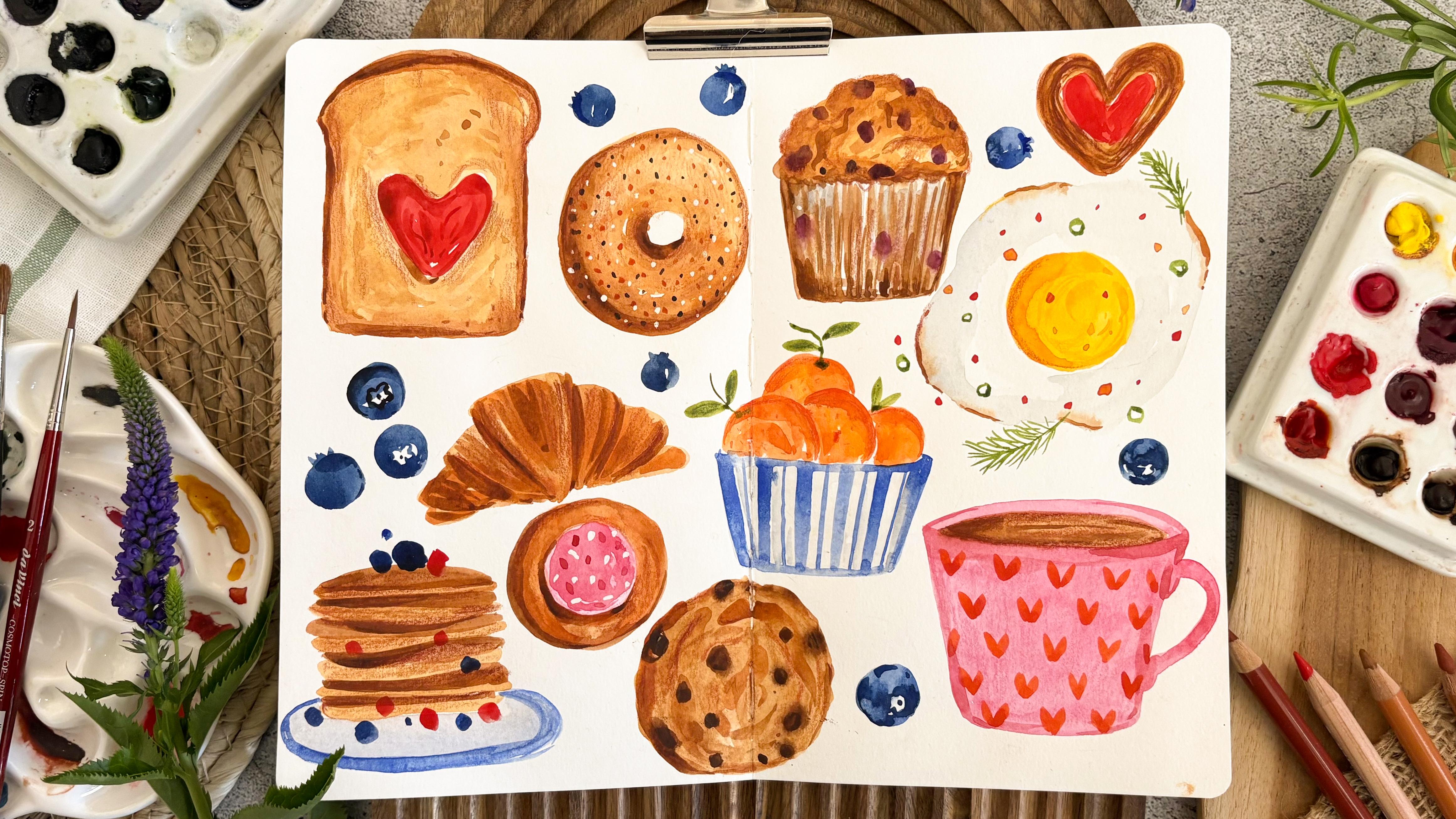
breakfast favorites. Whether you like a sunny side up or a buttery croissant
with your coffee, I've got it all covered. In this engaging class, we'll be working on
a full double page spread simultaneously. We will start with watercolors, and later we will use
some pencil colors to add a bit of playful texture
to our sketchbook page. This class is for anyone
who wants to move past perfection and find joy in the process
of sketchbooking. With this exciting subject, simple color mixes and basic
watercolor techniques, this sketchbook session
will break your fear of a blank page and encourage
you to just start. As a project for this class, whether you decide to paint this entire collection with
me or just a couple of favorites or even something else that you enjoy as breakfast,
the choice is yours. So if these delicious
looking sketches have got you excited, grab your art supplies, and let's go sketchbooking. I'll see you in the class.
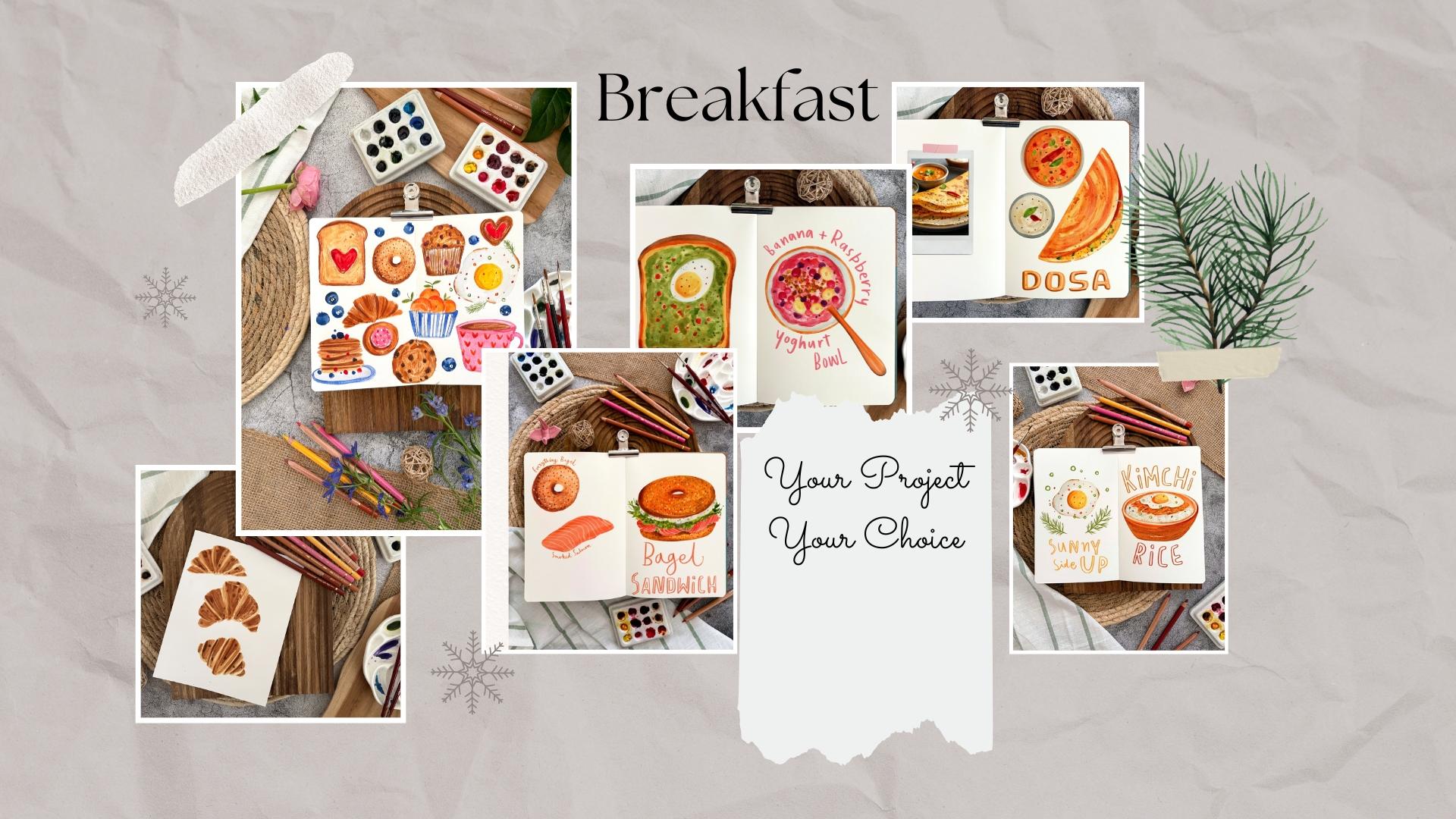
2. Your Project & Resources : Lets talk about your class project. I would love to see what
you create with this class. You can decide to paint with me this entire collection
of baked goods and other sketches that I'll be creating or just pick one
or two of them to paint. What I would equally
love to see is what people eat all around
the world as breakfast. So feel free to create sketches of breakfast that
you grew up eating or mean something
important to you or something you are currently
loving to have as breakfast. So what I would encourage
you to do is go beyond this class and create sketches of breakfast food
that you're enjoying. Would love to see your project, so you can simply
click a photograph of your sketchbook or
your loose sheet of watercolor paper
on which you painted. When you go under this class, you will see a tab called
Projects and Resources where you will see a section on the page called My Project, where you can submit your
project photographs. Feel free to add a few lines about the food you
have illustrated. I would love to read that. One more thing I
would like to add is try to enjoy this process of creating these food sketches without chasing perfection. Try to enjoy creating
rough little shapes, adding layers of color, adding texture, and don't try
to make them look perfect. Class resources like the
list of art supplies, color swat chart, line drawings, and a photograph of the
finished sketchbook page can be downloaded under the projects and resources tab of this class. Now let's have a look
at the next lesson.
3. The Approach: Before we start the class, I want to show you a couple
of different ways in which I fill an entire double page
spread of a sketchbook. The first approach is painting one little thing at a time. On the days when I do not have enough time in hand and I've
got just five to 10 minutes, what I like to do is paint
one little thing, spend 5-10 minutes add the base layer, add some details on
top, and call it done. And then when I have some
more time another day, get back to the
sketchbook page and add maybe one or two more
similar sketches and then slowly fill the
entire sketchbook spread. It is easier on myself, especially on the days
when I'm too busy. I do get to paint
something small each day, and slowly the sketchbook
spread does get filled. But something I've
noticed lately is there are some times when I do not get back to that page and that
page gets abandoned. Times what happens is I do not feel inspired enough to paint that subject again or want to approach a fresh
sketchbook page. So something like
this can happen. I started with a couple of
icon of potted plants, and then I never got back to
it because either I didn't feel like painting it or
just got over the theme. So this can happen that the sketchbook
pages go abandoned. To tackle that, what
I do like to do is commit to finishing
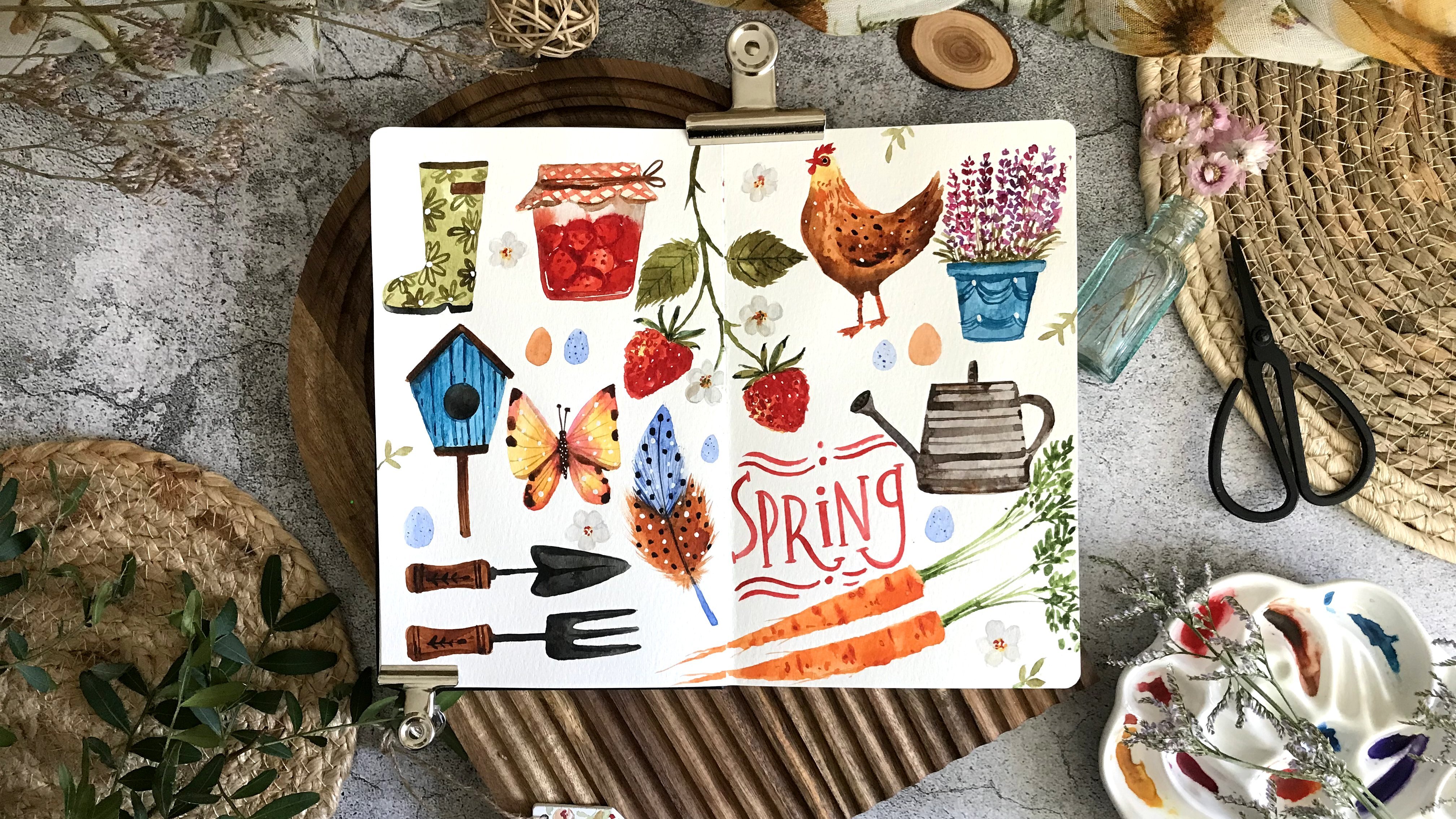
the sketchbook page. And that's my second approach. I already have a theme in mind. For example, here, I had spring and gardening theme
in mind and simply picked little theme prompts
and started adding these sketches by adding the first layer for
a few sketches, moving on to other things
while these are drying, and then simply add
another layer of details. That way, I'm approaching the entire sketchbook
spread in one go, finishing towards the end, adding finishing touches to
all of these icons towards the keeps your sketchbooking
session quite engaging. You're working on different
icons at the same time. This makes sure that
my sketchbook spread will be finished in
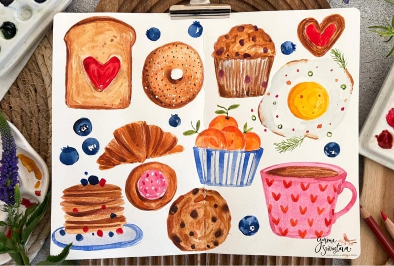
that one sitting. So for this class,
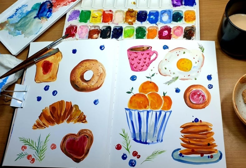
we'll be filling our sketchbook spread with
breakfast food sketches. I often paint food illustration. So for these sketches, I'll be painting them
just out of my memory, but feel free to look online
for reference photographs. You can obviously
look on Google, on Pinterest for nice
breakfast food photographs. But another source
that I often look at is our local
supermarket magazine, which often publishes
nice recipes and comes with nice photographs
that can inspire you. Also, feel free to create a rough pencil sketch if that
makes you more comfortable. I've provided the line
drawing for all of the sketches that we have
painted in this class. For this class, our
very first step is going to be starting with a watercolor wash as the base layer for
all of our sketches. We will roughly decide
how big we want them to be and give them the base
layer color one by one. Once that layer has dried, we will come back again with our second layer of watercolor. What this does is defines those flat washes and gives
them more definition, a better shape, some shadow, and a few details with this
second watercolor layer. You can very well stop at this, but what I do like to
do is add a bit of texture marks with some pencil
colors as my final layer. Before we move on
to the next lesson, what I do want to
tell you is paint these icons based on what
feels comfortable to you. You can watch me paint. You can paint along
the entire sketchbook spread with me if you have time. But if you do not have
enough time or feel more comfortable painting one subject at a time, you can also do that. So feel free to approach, filling up the sketchbook spread based on what's more
comfortable to you.
4. Art Supplies: Let's have a look
at the art supplies I've used in this class. For my sketchbook, I'm using moleskin
watercolor notebook. The paper is 200 GSM in weight. The paper is cold press. It has a bit of
texture on one side, followed by a bit smoother side. It comes with a band, and you can close your
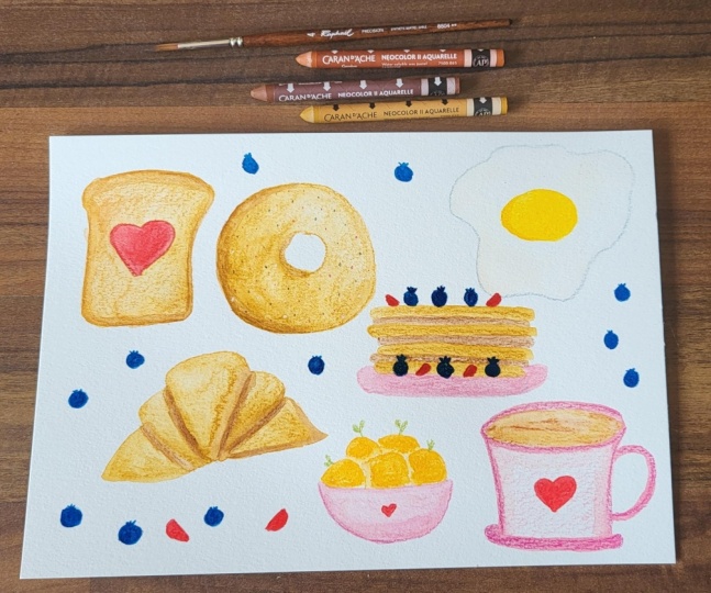
sketchbook like this. But if you do not want to paint these sketches on
watercolor sketchbook, feel free to paint them on loose sheets of watercolor
paper like this. For beginners, I recommend 300 GSM cold press
watercolor paper. It allows you to paint a few watercolor layers
without buckling too much. you can also use a clip like this to keep your
sketchbook pages open. For colors, I like to
use watercolor tubes, which I squeeze out into
this ceramic color palette. I've got some yellows, pinks reds, some
orange and brown here. I've got my blues here, some secondary
colors like purple, green, and a few
neutrals like gray, white and black
out here as well. Before I want to paint, I do like to spray a
little bit of water on top of these
colors and let it sit just maybe 30 seconds or a minute so that they
get nicely activated. So feel free to use whatever
type of watercolor you have. One thing to note is that if you would like a
nice color strength, a bit more vibrant color, try to go for
professional color range of whichever brand of
watercolor you're using. I will provide the entire
list of colors I've used for this class under the
resources of this class. To mix your colors, you're going to need some kind of mixing plate. You can use the plastic
mixing palettes, or you can also use a
white dinner plate. I like to use this
porcelain one, which has got nice
little wells here, some are bigger,
some are smaller. I also like to keep small pieces of
watercolor paper with me, just to try my color mixes. You're going to need some
kitchen paper towel to dry your brushes and
remove excess moisture. A couple of jars of clear water. One of them to mix your fresh color mixes and another one to clean
your dirty brushes. Now, let's look at the
brushes I'll be using today. For color mixing and for
painting large rough areas, I would be using my number
four round natural hair brush. This is Da Vinci Pure Kolenski brush. It has lost its point, but holds good amount of water. So with that, I'm able to paint large areas
quite comfortably, and it also comes handy when I want to mix a large
amount of colour. All of our sketches, we are starting with wet
on dry approach, which means we are painting wet layer of watercolor
on a dry piece of paper. So this is number four, round brush, which
has lost his point. The other brush that I will be using is a number
four synthetic brush. It has got a nice point, and it's a relatively
new brush gives me good amount of control
for any fine lines. Bit broader line if I
push my brush down. And I can also add
finer details with it. This is number four,
pointed round brush. For my second layer of details, what I like to do is use smaller brush like a
number two pointed round. This is Da vinci Cosmotop Spin, and this brush gives me a
little bit of control when I'm adding some details on top of my very first
layer of watercolors. It's got a nice fine point, can create thin lines, smaller details, but also some whiter color areas if I
push the brush belly down. Next brush that I like
to use is this 000 or 3/0 detail brush. With this, I'm able to
add really fine details, and I mostly use it just to add some opaque white details. For that, I like to use this doctor PH Martin
bleed proof white. You can also use acrylic
pen or white wash for this. Like I told you earlier, our approach is going
to be starting with a very initial watercolor wash. Will then add another layer
of watercolor on top of it, giving this initial flat shape a bit more definition,
some more details. And once this dries, we will come back
with a final layer of details with some pencil
color texture marks. I've got a few
different brands here. I've got Faber Castell
Polychromos here. They give nice color and are
quite easy to work with. The other pencils that
I'm really liking these days are Carandache
luminance range. This one is terracotta. They are very soft and quite
light pencils to hold, and I love the
texture they give. The third kind that I
have is from Koh-I-Noor. So I mostly will be using
different kinds of browns, but I've also got some pink, yellow, and some red with me. You can have an entire collection
of watercolor pencils. But what I like to do is keep my selection of
colors a bit smaller. I like to go for
certain greens and certain types of brown
and stick to them. So this is just a
small collection of pencils that we'll
be using today, but feel free to skip this
part if you do not want to add pencil color on
top of your watercolors. But I do like to add them to
give a bit of texture just to scribble in this world of
perfect AI generated art, it's important to show a bit of human touch in your art
in your sketchbooks. As I always tell my students, don't focus too much
on art supplies. Try to get started with
what you already have. It's important to enjoy
this process of creating first before you focus too much on buying
different art supplies. So first start with what
you already have, paint, and then once you
feel comfortable, you can go on and buy all kind of art supplies
that you would like. The entire list of
these art supplies is mentioned under the
resources of this class.
5. The First Layer: Now let's get started. I want to first
paint a toast here. For that, let's mix some colors. I usually like to start with different variations of mixes
created with burnt umber. Got some burnt umber here. To that, I will add a bit of quinacridone gold in one corner, a bit of transparent
orange in another corner. And sometimes I mix
all three of them to create the right
shade that I want. For most of the baked goods, this gives me a nice base. So this is all three of
them mixed together. If you want it a
bit more yellowish, you can add a bit more
of quinacridone gold. For now, I will start with
this mix of burnt umber with a touch of quinacridone gold
and transparent orange. I'm using my number
four round brush. It's a natural hair brush
holds the color nicely, but doesn't have a
good point anymore. You can use your fine brushes, but with this brush, I'm able to quickly lay down the first wash. So we will start here just
rough shape of a toast. I've not drawn the whole toast. I've just marked the
area where I want it to be very roughly, just to decide how big
I want to paint it. I'm leaving a little
bit of center area in the shape of a heart where
we can add some jam. While it is still wet
around the edges, I'll take a little bit of
transparent orange and burnt umber mix and drop
it along the edges. Where it is wet, it will
bleed a little bit. And if it has dried, it will give a bit more
defined edge here. For the crust offer bread. What you can do is you can already paint
the center with red. So I'll pick some Winsor red, add just a touch of
transparent orange to it. I will already paint
the heart for the jam. I've already painted it since most of the
edges had dried. Next, let's create a bagel here. For that, we again
will start with slightly yellowish
mix of this brown. A circular shape, add a slightly bigger one
for the outside of it, and then fill them up and
while it is still wet, take a bit darker mix of a little bit more
of burnt umber and add it a bit closer to
the boundaries of this shape. So you can see how I continuously
mix this variation of three colors and keep
changing based on how I need, you can simply rinse your brush, remove the excess
moisture by running it on a paper towel and soften
any of the harsh edges. It adds a bit more
color variation as well by adding
a bit of water. Let's add a croissant here. For a croissant, I like to start with a triangular shape first. And then smaller
triangles on its side. And while it is still wet, let's add some deeper color where these triangles
are meeting. So I've added one bigger
triangle followed by smaller triangles
on each side. We will come back
to all of this. For now, we're just laying
the very basic layer. Okay. Next, let's add a stack
of pancakes maybe here. I will start with
slightly yellowish mix. So a bit more of quinacridone gold into this burnt umber mix. For pancakes, what I like to do is start with thin lines
of this lighter color, leaving a little bit of
gap in between them. I'm not stacking them straight. Some of them are slightly bent. For now, I will leave
them like this. We'll come back to them to add a bit of darker color to them. Now let's maybe add a
muffin up on top here. That, while I still have this
slightly yellowish color, I will start with the top
of a muffin, a curved top. I'm not making it perfect, rather giving it a bit of
rough shape for a baked top. If you want to paint a
chocolate chip muffin, you can do that. I would like to paint
a blueberry muffin. So for that, I'm
leaving it like this. For the bottom part, we need
a slightly grayish color. Quick way to mix that is combine your burnt
umber and a blue. I'm picking Cobalt blue. Now take good amount of water, and while the top is still
wet with this gray color, you can paint the muffin liner using just the
tip of the brush, I'm painting thin lines I'm not obsessing over making any of these
shapes perfect. Now, I'll pick some
of that brown mix. We have orangish,
yellowish brown, whatever you want to call it. And I will add a little bit to the base while
it is still wet. It gives a nice effect of a muffin liner in which
something has been baked. So thin lines with
that brown color. While we have plenty of sweets, let's not forget
a bit of protein. For that, let's paint a
sunny side up egg here. So for that, I'm picking
my cadmium free yellow. And with that, I will create a round shape
for the egg yolk. You can see I'm not using too much water whenever
I'm painting these shapes because I do want them to dry quickly so that I
can proceed further. And we again need a
bit of grayish color. Or the egg white so you can paint a rough shape
around this egg yolk. I'm trying to avoid
touching the yellow, which might still be a bit wet. If you would like to, add
a bit of crisp edges. You can pick some of that
brown and just add it to some of the edges
of the egg white. Now, maybe let's
add some fruits. So how about a bowl
of fruits here? You can decide to
paint the bowl, any color you would like. I usually start with
a bit of gray mix for my bowl unless I'm inspired
by a particular color. This way, I have the option to add any kind of
design on top of it. Now you can decide whichever
fruit you would like to add. I would like to stick
to this kind of orangish brown theme
and add some oranges. So I'm picking
transparent orange. And for this, I will
probably shift to a bit tighter brush like this number four
synthetic brush. so that I can create a bit more defined
controlled shape. Still not too controlled. I would like a little bit of
looseness in these sketches. So one orange, another
one hiding behind it. Maybe one more here, one on top. And at this point, I'm
going to leave them. I'm not going to touch them. We have a big space here
and some space here. For this, let's not
forget a coffee mug So for that, I'll get back to my fluffy brush with
which I was mixing color. For the coffee cup,
let's add a bit of pink. So I've got two
pretty pinks here. I've got opera rose here. But I've also got
some permanent rose. I think I prefer
permanent rose for this. Have enough mix ready. And with that, I'm going to
first create an oval shape, again, reminding myself not
to try to go for perfection. Simply fill this
shape with color. Let's not forget the handle. For now, we will leave this
wonky little cup here. I would like to add
a little bit of a base to this
stack of pancakes. So I'm picking that gravy
had mixed earlier and just add a bit of colour underneath this stack of
pancake in an oval shape. For the plate underneath it, you can add a touch of
extra blue in it just to give a bit more color instead
of just a bland gray. While we are at the pancake, you can add a bit
darker brown color with transparent orange
and burnt amber mixed together to create
the pancake shapes. So I've got the
lighter edges outside. In between them, you can add darker shapes to give an
impression of pancakes. Now let's fill this little
space here with some cookies. For the first cookie, we will start with, again, a base of that yellowish brown with burnt umber
and quinacridone gold. And we can probably
paint one here. No guesses for this one. It's brown to start with. So it's going to be a
chocolate chip cookie. I'm keeping the
edges quite rough. And while they're still wet, go back in with a
bit thicker mix of burnt umber and drop
it especially at places which are still wet because you want that
melted chocolate look. We will add more
chocolate chips later, but add a few while
the base is still wet. We can also paint another
smaller one here. I'll pick some of that
pink mix and maybe add a frosted cookie shape
though first a pink circle, wait for it to dry. We have a space here. I'm thinking I might add
some kind of pastry. Um, I do like the
ones that have a bit of jam or some kind of
custard filling in there. I often paint them. So I will first start with the same red and
transparent orange mix. And with that, I'll paint, maybe a small heart. Now I will shift to that
bit more controlled brush, the number four
pointed round brush, and I'll pick that
brownish mix we have without worrying too much
about the particular shade. And I'll just go around it
with the tip of my brush, creating these boundaries
around the heart, leaving enough gap
in between them, dropping in a bit more color. Now we will get back to
this little cookie here. We had painted the frosting. With this brown mix
we already have, I'll just quickly
paint around it. I'm adding a little bit
more brown around it. Also closer to the
edges of the pink. For now our base layer is done. In the next stage, let's add another layer of color
and then some texture.
6. Defining the Details I: Now that the base
layer has dried, let's start adding a bit
more color and start defining some of these shapes that are quite rough
at this stage. For this, I will
use my number four pointed round and number
two pointed round brush. They give nice amount of
control for little details. We will start one by one
and add the details. Let's first start
with the toast here. So we can see the crust is
there and also the base. Let's start adding a bit of spots and things just to
give an impression of toast. Will pick in my number
two pointed round, some burnt umber and
transparent orange again, and just go around the
crust a little bit. Just give it a bit
more definition. I'll pick some of that
quinacridone gold and mix it into the brown mix to create
the same original mix. And with that, I'll
just add a few spots of color just to give an
impression of a toast, some texture to it. Just some dots. You can decide how brown
you would like to make the toast based on how
you like your toast. For the jam, I already have the red and
transparent orange there. If you want a bit deeper color, you can pick a bit deeper red, like a permanent alizarin crimson, or you can simply add a
touch of brown to your red. Just go at a couple of places to give an
impression of jam. Next, let's move
on to the bagel. I like to move from
one corner to the other because I'm right handed, so I don't want to smudge
this and save time as well. So let's start with
the bagel, again, that yellowish brown color, giving a bit more
color to the bagel, a bit more burnt umber, especially closer to the edges. While we add this, we can
add some spots of orange. I would like to
add some bagel or mix on top of it with just
the tip of the brush. You can also add a little
bit of black or black if you mix burnt umber
with a touch of indigo, you will get an
almost black colour. With that, let's add
a few spots here. We'll come back with pencil
colors to add more details. But for now, these
little touches already liven up these shapes. Now let's get back to
our croissant here. For that, let's again mix that transparent orange
and burnt umber mix. Still, my number
two pointed round, and I'm going to add some color to where the folds of
croissant meet each other. So this was the bigger triangle, second one, another one
on the side, another one. Ideally, I would have liked
this croissant to be a bit more away from the
cookie, but that's okay. Just adding a bit of
shading with these colors, we can add more texture later. For now, I'm just demarcating
the folds of the croissant. I still have the orangish
brown color in my brush. So I'll just give a bit better shape and some
more color to the pancakes. Pick a bit more brown color, burnt umber, just to add a
bit more shadow at places. We can also add
some fruits on top. So for that, you can pick a blue for the blueberry and picking some
French ultramarine, starting with a few on top here. You can paint them blue or slightly purplish if
you would like to. A few at the base as well. Let's also add some red
for the strawberries. Not really defining them, just adding little
touches here and there, just to give an impression
of some cut fruit. I'll pick some of that
ultramarine blue, and with that, I'll give a little bit of a
boundary to this plate. It looks pretty deformed
right now, but that's okay. It's just a sketchbook. Let's not worry too much
about making things perfect. I will leave it
like this because the more I'm going to touch it, the worse it's going to become. Let's get back to
our cookie here. Let's pick some more
transparent orange and burnt umber mix and give that
cookie a bit more color. It's looking a little faded, a little sad sad little
squished cookie. I'll pick a bit more
burnt umber in my brush. And with that, I'll add a bit more colour
to which half of the cookie this kind of
gives them a bit more shape. I'll also pick that
base pink of permanent rose and just add a little bit
more color on top of that. Pink we had added, can add a bit more deeper colour at places for that frosting. Now, let's get back
to our muffin here. For our muffin, let's first give a bit more
color to the muffin top. Same color make
transparent orange, burned umber and
quinacridone gold in it. I'm not going to go over the whole muffin top
up there because I want the initial
color to be there. While it is still wet, let's make some
permanent rose with a touch of French ultramarine
to create a purple color. And with that, let's
add a few spots especially near the wet
brown I've just added. For the blueberries, if you're painting a
choco chip muffin, you can simply add
a brown color. You can also add a
little bit more blue. I will also add a few
spots on the muffin liner, rinse my brush, remove
excess moisture, and just run along their edges to help them
bleed a little bit, since the base is now dry, so we want the color
to nicely bleed. Let's pick that brown
again and define the shape of this muffin
liner a bit better. Bit more shadow in there. We'll also go back to where
it's meeting the muffin and create kind of a wavy border with
the same brown color. I'll pick some of
that initial gray made out of cobalt blue and some burnt umber and just give a bit
more color up on top. Bit more brown at the base. A bit more textural
marks up on top. Now let's go to this
pastry up on top there with transparent
orange burnt umber mix, and we're just going to
add some thin lines again, just the same way we
added the initial ones. We're just adding
another layer of them. I would like to add a touch of quinacridone gold just to give
it a bit more brighter color. Let's also add some more of red and transparent
orange to the center, just giving it a bit of texture so that it
doesn't look flat. Bit of transparent orange
again with my burn umber. You can see multiple
layers of this brown gives an impression of
layers of the pastry.
7. Defining the Details II: Let's start with the egg. I have got cadmium
free yellow there. To that, I'll add
just a touch of transparent orange and give the egg yolk just
a bit of shape, some shadow in a crescent shape. I'll pick some of that burnt
umber transparent orange mix and go along the edges for
that crispy edge look. If you like your egg to be plain, you can
leave it like this, or you can add little
touches of red or slightly orangish red color for some
marks of some herbs on top. I'm adding some of that red. I also like to add
some green scallion. So for that, I'm
picking some sap green. And with my number
two round brush, I'll just add a
few round shapes. Feel free to leave
your egg plain. I just like to add a
few touches like this. I sometimes also like
to add dill leaves. So you can add
this kind of thin, wispy, leafy shape using
just the tip of my brush. You can also use even smaller
brush like a number zero or something that will help you
create these fine lines. Now we can get back
to the oranges. We will start with
transparent orange and just go along the edges of the oranges just to give them better shape and
a bit more definition, demarcation from each other. You can leave them like this, or you can also decide to
add some leaves to them. So again, picking that
sap green in my brush. And let's add some leaves
to maybe a few of them. Now, let's decide what to
do about this base here. Since I had added a
bit of blue here, we can bring that
blue in here as well. So I'm picking some
of that ultramarine. And with that, you can
decide any kind of pattern, floral patterns,
stripes, horizontal, vertical or polka dots. Anything will look nice. I would say let's do
some vertical stripes. When you're painting
something this fast, sometimes you end up not
liking the choices you made, but I want to tell you
that it's okay to do that. It's okay to come back
and not like something. I'll just rinse my
brush and run it along the top edge and also
the bottom edge. Just to pull some
of that blue out, defining the edges a bit more. Alternatively, you can also pick that gray a little bit and just run it along
the lighter area. Now let's get back
to this cookie here. I'm not going to
do too much to it. I'll just add a little bit of color variation with
our orangish brown mix. Go along some of the edges. You can see how I'm repeatedly
mixing this brown mix. If I had mixed one big puddle of it and kept picking from it, I would have picked
similar kind of color. This way, when I'm
freshly mixing the color, I'm creating different
variations of that brown already because not each
of my mixes are identical. So you get different kinds of brown throughout
this whole spread. So I'm just adding
little wavy marks, a bit more shadow around the
borders of the cookie here. And let's get back with that thick burnt umber mix to give a few more choco
chips to this cookie here. Wherever we had added
the earlier choco chips, they had softened a bit since we had painted them
while the base was wet. I'm just adding a bit more color where the earlier marks were. Now, last but not the
least, our coffee cup. For that, let's first of all, fill some coffee in there. With my same orangish brown mix, I'm going to add
some coffee into this white space bit more darker color
at some places. With the original pink, you can give the coffee mug a bit better shape by
adding some shadows. I like to especially
add some shadows near the cup handles. Now for some pattern, you can either go with polka
dots or any other pattern. I would like to
carry this theme of these hearts that we have up on top and bring them in here. You can paint them
with a darker color or lighter color
with a white later. I would like to use some of this orange and see
how that looks. We can start with just
two brush stroke hearts. One like this,
another like this. One, two, for the second row, painting them slightly shifted. You can see how by adding
some simple details our initial flat washes
are looking quite defined and already
almost ready. Before I move on to adding some texture with pencil colors, I would like to fill some of these spaces and add
some blueberries there. For that, you can either pick an indigo or ultramarine blue. This is French ultramarine.
This is indigo. If both of them don't work, you can even combine
them a bit to get close to blueberries color. Let's add just a
touch of indigo and add it to my French ultramarine. And we will create some
blueberries for blueberries. What I like to do is paint
them a couple of ways. One of them is paint them around shape and then add a
little crown on top. Another one is, I like to
paint first around shape, leaving some white
in the center, go back in with
some darker color. And create a small
rough floral shape with a center inside like this. You can also give them a
bit more shading around. If you would like
to learn how to paint blueberries
and other fruits, you can also check out my class watercolor
fruits and vegetables. For now, let's simply add a few blueberries here and
a few spread all around. We'll start with a round shape, leaving some white
in the center. Let's add another one
here with a crown on top. Let's add one here. Maybe one on top here. So simple round shapes, followed by a little
crown up on top. I'll go back in with that
deeper indigo color to some of them and give that floral
shape I mentioned earlier. Before we move on
to the next lesson, I'll quickly add a few
sprinkle marks with permanent rose for this
glazed cookie here. Now we can get started
with the next lesson.
8. The Human Touch: At this stage, we can
very easily close this sketchbook and call
this sketchbook spread done, but lately, I do
like to add a bit of texture layer on top with
some of these pencil colors. If you're using watercolor
pencils as a texture layer, it doesn't matter in what
sequence you're adding it because you can still add
some more watercolor on top. But these are mostly polychromos or carandache
Luminance pencils. And with them, it will be hard to add watercolor
on top of them. So I've made sure that I'm done with all my
watercolor layers, and now I will add some texture. Don't have a big selection here. I've got a few variations
of browns here. Some are a bit more reddish. I've got some yellow. I've got a few pinks, a few greens, and a few red. I will announce the
color as I'm using them. Let's test them. So this
is polychromos burnt ochre. Lately, I've been liking these luminance pencils
from Carandache, and this is terracotta. This is red chalk from
Koh-i-noor pencils. With some red chalk pencil, I'm just going to add
a few textural marks. I'm not being very
precise or very decisive about how
I want these marks to be a bit of texture on top of my watercolor
layer at a few spots. So again, this is red
chalk from Koh-i-noor pencils. With this same color,
I will go around and add some darker
reddish brown marks. This layer is
completely optional. If you don't like this look, you can skip it because most
of our work is already done. I'm just giving a
bit more texture to some of the
watercolors we had added I will shift to burnt ochre. Just to give some
of these shapes slightly different color. Most of them are baked goods, and a bit of texture suits them. You can see I'm not covering the entire painted area with texture just at a few
spots. A bit of texture. I'll pick some of the deeper
yellow, dark cadmium yellow. Add a bit of texture
to the egg here. This is India red,
polychromos, Faber castell. And with that, I'll add some more lines and curved
shape to the pastry here. Bit more shading to our coffee. I will take a polychromos
pink madder lake. And with that add just a bit of texture to the coffee mug here. I'll pick some of these
luminance pencil in scarlet colour. And with that, just give a little bit of
texture, some dots. To these oranges here. What I would like to do is take a really small brush
like a number zero, pick some of my
bleed proof white. You can also pick
gouache or acrylic color or if you have an
acrylic marker, I would like to add
some white spots for some sesame seeds
to our bagel here. And a few white sprinkles
to this cookie. As some final touches. I'll just add a bit
more darker color to some of these blueberries. I can spend a long time adding more textural details
with pencil colors. But for now, let's call this
sketchbook spread done. I'll bring it a bit closer to
the camera so that you can see some of the marks I've
added with pencil colors. I really hope you
enjoyed painting this entire breakfast
spread with me, and I can't wait to
see what you add to your breakfast spread
in your sketchbook. So please do share your sketchbook projects
here on Skillshare. I would love to see them.
9. Closing Thoughts: And just like that, we've reached the end of our
sketchbook session. I really hope you enjoyed painting some of these
breakfast favorites, and I would love to
see what you painted. So do share your project
here on Skillshare, and if you're sharing them
on Instagram, you can tag. You can use the
discussion tab to ask any question about the
class or the process, and I'll try my best
to answer them. If you enjoyed
sketchbooking with me, please do give this class a Skillshare review to encourage me to create
more such classes. To know about my future classes, you can follow me
here on Skillshare. And finally, I do hope
that you will try to go beyond this class and continue
your sketchbook journey. Thank you for joining me for this class until next
time, stay creative.
 Garima Srivastava, Artist and Illustrator