Transcripts
1. Introduction: Hi, everyone. Welcome to
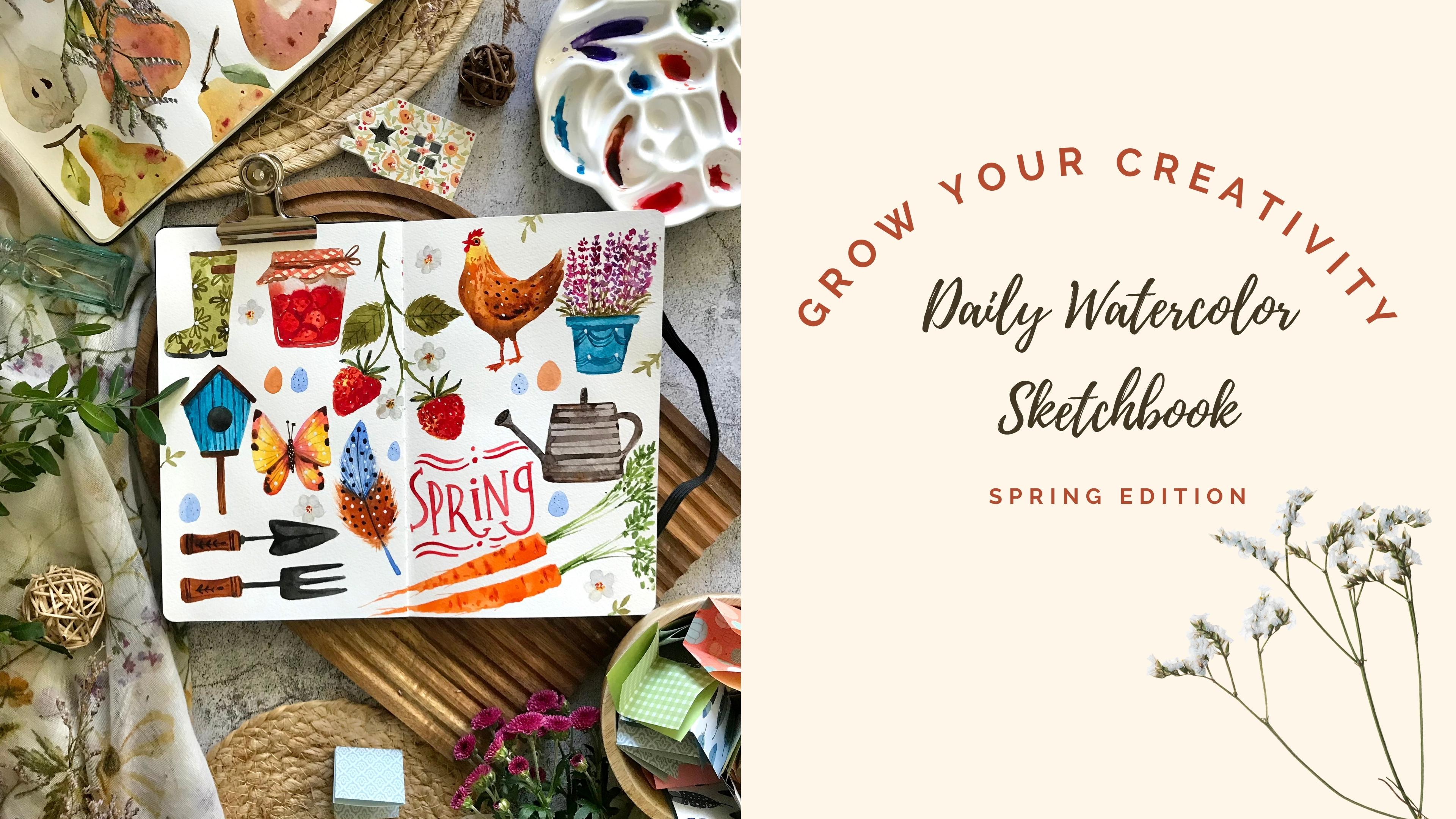
the spring edition of Grow Your creativity,
Daily Watercolor Sketchbook. I'm so excited to share my love of Watercolor
sketching with you. In this class, we'll unlock the
joy of daily art practice, inspired by the beauty of spring and the magic
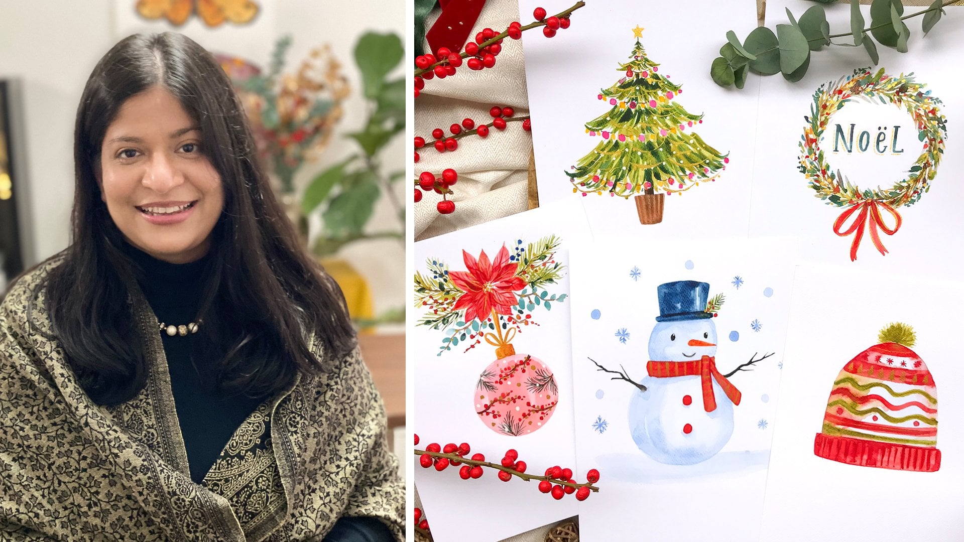
of the garden. My name is Garima Srivastava. I'm an artist, surface designer, and a top teacher
here on skillshare. I love sharing my
creative process with my social media community, and with my Skillshare classes, I've taught thousands
of students my relaxed way of
making beautiful art by focusing on simplifying
the art process in easy, achievable steps. I've been painting since 2011, and I'm a strong advocate of having a daily creative routine. Daily practice is the
secret to artistic growth. It's not about
perfection, rather, it's about showing up
for your creativity. You'll be surprised how
creatively rewarding painting even simple
subjects every day can be. To make this process of creating every single day a little
bit more interesting, you can play some fun
games with art prompts. I've put some of my favorite spring and gardening theme prompts into this little bowl here, and throughout this
class, I'll pick a few prompts to paint an
entire sketchbook spread. You can follow along or come up with your own spring and
gardening theme prompts, a blooming cherry blossom tree, a family of ducks, or a cute chicken.
Inspiration is everywhere. We'll be working in a
watercolor sketchbook. They are perfect for your
daily watercolor practice. It's your safe space
to experiment, track your progress, and
capture inspiration on the go. This is an all level
friendly class where an overview
of art supplies, brushstroke drills,
and a walk through of basic watercolur concepts is included to have watercolur
beginners start right away. I'll show you how to fill an entire sketchbook spread with eye catching motifs
that will paint in very simple steps each
within a few minutes. As a project for this class, you can paint one or
more of the prompts in your sketchbook or even on a loose sheet of watercolor paper. You can follow the
lessons at your own pace. You can paint for a
few minutes every day, trying a couple of prompts or enjoy painting this entire
sketchbook spread with me. I would love to see what
you painted in this class, so do share your project here on Skillshare for all
of us to admire. I hope I've got you
excited about this class. So grab your watercolor
art supplies, and let's go sketchbooking. I'll see you in the class.
2. Your Project & Resources: Welcome to the class. Let's
have a look at what you'll be creating in this class and what resources are
provided for you. I'll be teaching you how
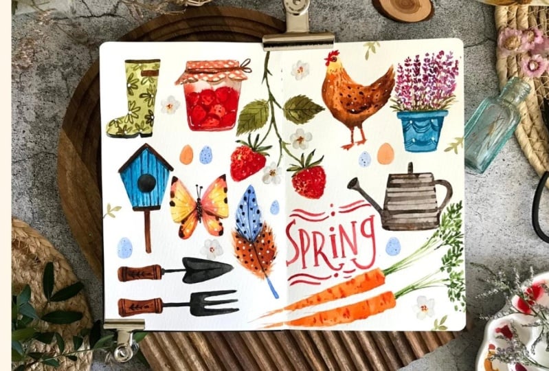
to step by step paint this entire sketchbook
spread with individual spring and
gardening theme prompts. As a project for this class, you can decide to follow along
and paint one or more of the prompts in
your sketchbook or even on a loose
sheet of watercolor paper. Pick one prompt and paint the entire sketchbook
spread with it, painting it once or multiple times or paint multiple
prompts over the page. I'll show you the
basic art supplies and watercolor concepts
that I've used in this class to help
Watercolor beginners. I would love to see what
you paint in this class, so please do share your
sketchbook page or your loose sheet of watercolor
paper on which you painted. Once you're ready to
share your project, simply click a photograph
of your sketchbook page. You can upload it here
on Skillshare under Projects and Resources tab of this class under my project. If you have any questions
during the creative process, you can put it under
the discussion tab and I'll try my best
to answer them. Now, let's have a look at the resources that
I provided for you under the projects and resources section of this class. I provided you with a
month's worth of 30 prompts, which are perfect for the spring and gardening theme
of this class. I've also got a sample
art prompt bingo game for you that you
can print and play to decide on what to paint and a template to print and make your own art
prom bingo card. Provided a line
drawing for all of the motifs that are
painted in this class, along with the
finished photograph of my sketchbook spread
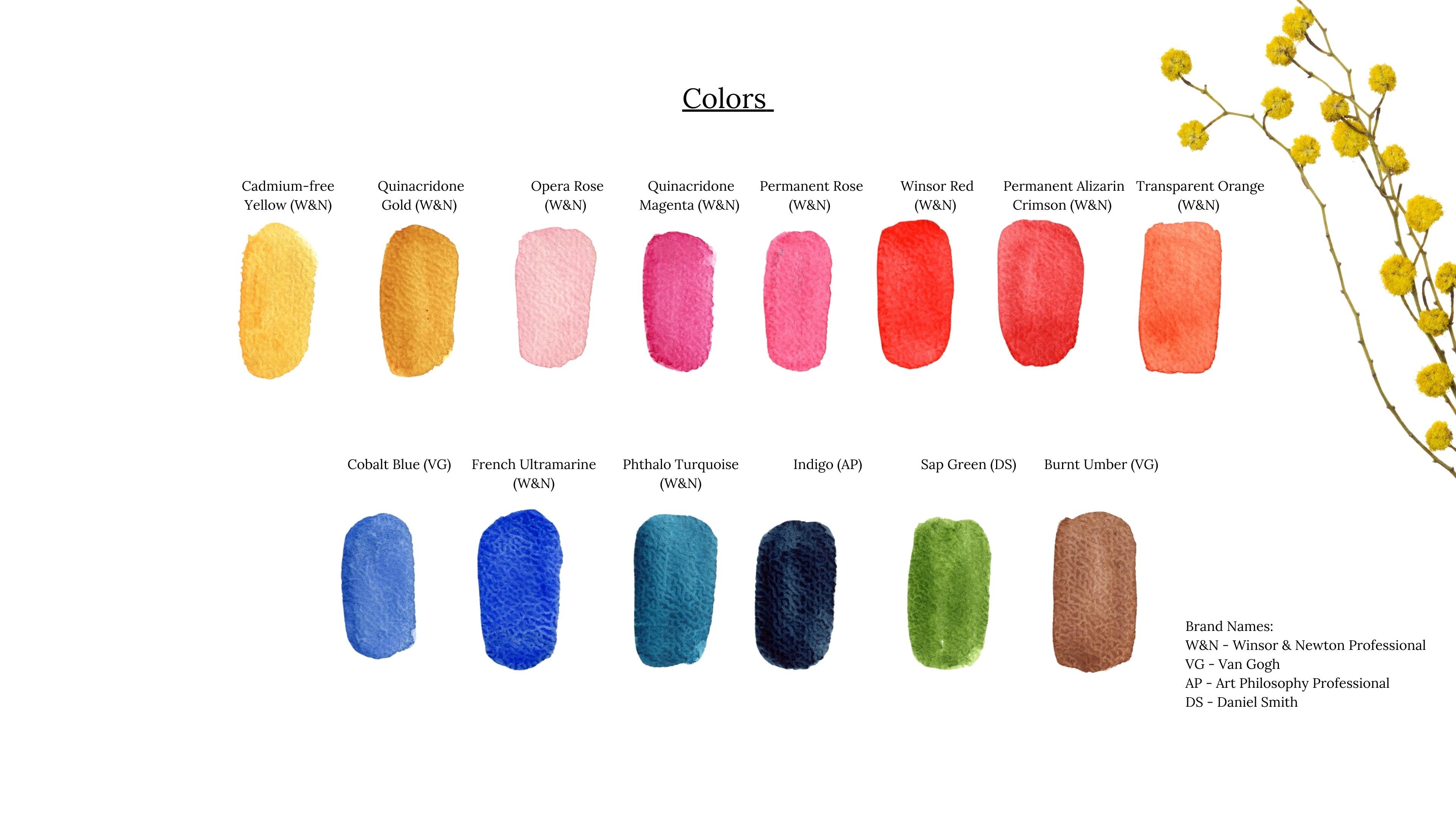
for your reference. Under the resources, you'll find the entire list of art supplies that I've used in this class, including a few watercolor
sketchbook recommendations. You will also find the color
names that I have used, along with their swatches
and brand names. Now, let's get started.
3. Daily Art Practice & Sketchbook: In my personal opinion, one of the most powerful tool of artistic growth is a
consistent daily practice. It's not about creating a
complex masterpiece every time. Rather, it's about showing up for you and your creativity, even if it's just
for a few minutes. Think of it as tending
to your creative garden. A little nurturing every single day yields the most
beautiful blooms. From my own creative experience, I can tell you there's
so much joy that lies in painting sweet and
simple subjects every day. A fun way to find inspiration is to simply look around you. You garden or a local park or even a windowsill herb garden can be a treasure
trove of subjects. You can take a
photograph or jot down quick description of things
that catch your eye. These little
observations can become great starting points for
your watercolor sketches. And now let's talk about
the magic of sketchbook and why is it so important
for daily practice. Firstly, it's your safe space. There's no pressure to
create perfect artwork. It's your place to
play, experiment, make mistakes, which are actually just learning
opportunities. Secondly, a sketchbook is a visual diary of your
creative journey. You can track your progress, see how your style has evolved, and revisit old sketches
for inspiration. It's incredibly rewarding
to flip through a filed sketchbook and
see how far you've come. Finally, sketchbook is portable. You can take it anywhere and capture inspiration
where it strikes. Waiting in line in
the grocery store, you can simply sketch
some of the people around you or one
of your groceries. Enjoying a tea in the garden. You can sketch some of the
flowers or even your teacup. You can paint a single
page placement design or fill an entire
sketchbook spread. You can pick one subject and fill the whole
spread with it, painting it
differently each time, or fill the whole
sketchbook spread with simple subjects
tied around a thing. You've got the
creative freedom to do whatever you want
in your sketchbook. In the next lesson, I'll show you some fun ways
to pick a prompt, to paint in your sketchbook.
4. Art Prompt Games: While you can find plenty of
art inspiration on Internet, social media, it can
very quickly cause procrastination and results
in endless scrolling. To prevent that indecisiveness, you need to commit
to art prompts. You can simply pick a
few everyday themes that you like, seasons, food, travel, and simply write down everything you can
think of related to them. You can commit to one of
these themes for a few days and pick a prompt every day
to paint a new sketchbook. You can bring a bit
of fun and a sense of surprise with some
art prompt games. You can write down
some inspiring prompts on a bingo card like this. Simply close your eyes and
point a finger or roll a dice, and wherever they land,
that's your next art prompt. I've provided a sample
spring theme bingo card and an empty template for you to create your own that
you can download and print under the resources
section of this class. There's another way to add some fun to your
creative routine. Whenever you think of an
inspiration or an art prompt, you can simply write it
down on a piece of paper or a post-it note and collect
them in a neat jar like this. You can also pick
a theme and add all of the prompts related
to that theme into a small bowl like
this and simply pick a prompt or multiples to
paint in your sketchbook. Here's the list of 30 spring and gardening theme
prompts that are provided under the
resources section of this class for
you to play with. I've added some of
these prompts to this little bowl here for us to pick and paint
during this class. So my suggestion is to
add a bit of fun and some freshness from time to time to your sketchbook
creative routine.
5. Art Supplies : Let's have a look at the art
supplies I'm using today. Choosing the right art supplies can be a bit overwhelming, especially when
you're a beginner. So my advice is to
start from a basic set. And then as you go further
along your daily art practice, you can start adding and experimenting with
more art supplies. For sketchbook, I'm using this
sketchbook from Moleskine. They come both in
watercolor paper, but also the ones that are
not watercolor friendly. So this one is a
watercolor notebook. The weight of the
paper is 200 GSM, so it's able to
take a few washes. It's not as heavy as a normal 300 GSM cold
press watercolor paper that we usually
use for beginners, but 200 GSM is good enough to try a few
watercolor techniques. This one is 13 by 21
centimeter in size, and portrait orientation
comes with this band. So the paper has a
little bit of texture. It is cold press feel. Every alternate page spread is slightly smoother to touch, and the next one has a
little bit of texture on it. So on this paper, you are able to try quite a few
watercolor techniques. But if you're a beginner,
you can simply get a 300 GSM cold press
watercolor paper pad from any one of
your hobby stores. These sketchbooks come in
various sizes and orientations. This one is a
portrait orientation. I've got one in landscape
orientation as well. So it's up to you to
decide on which kind of sketchbook orientation you would like for your daily
art practice. You can buy non watercolor
paper sketchbooks. It's just that if the
paper is not heavy enough, it will not take
watercolors that well, and it will buckle, and it won't be that easy to play
with watercolors on it. Now that we have
looked at sketchbooks, let's look at other
art supplies. I'll show you the brushes at the very end so that we can
see what marks they make. For colors, I'm using tube
colors that I've squeezed out into these wells of this
ceramic color palette here. I've got my yellows up here. I've got my pinks, red, some orange and
some burnt umber. In this other one,
I've got my blues, some of my ready to use violets, green, and a few
neutrals s gray, black, and some white. You can also use
pan sets like this. Pan sets like this come with these dry color cakes and
also these mixing trays. In both cases, you're
going to need some kind of spritz bottle to spray over
your colors to activate them. So just spritz
over them and wait just 30 seconds or something
for them to get activated. I will be mixing my colors in this porcelain
color mixing plate. It has got quite a few
different size wells here, so I'm able to create
different mixes here. But you can also use a plastic mixing plate or even
a porcelain dinner plate. For any white details, I use a doctor PH Martin
bleed proof white. You can also use white gouache. It comes in a bottle like this. After a while, it will
eventually dry up a bit, but you can just add a
few spritz of water in it to reactivate the white. For drawing, I'll be using my 2B pencils, and for eraser, you can use any nice
eraser that you like, or you can also use a kneading gum eraser to
pick the excess graphite. You can easily store photographs
of your inspiration on your phone or on a Pinterest board or simply
write them as notes, but I wanted to
add a bit of fun, so we will be picking some of my favorite spring
prompts from a bowl. To collect all your
inspiration ideas, you can use an
origami paper like this or simple post-it notes
like this to add your ideas, and then you can collect
them in a bowl like this or a nice jar like this. Apart from these art supplies, you might also need a paper clip or a small clamp like
this for your sketchbook. You will need a spritz bottle
to activate the colors, a paper towel or an
absorbent cloth to remove excess moisture and two
jars of clear water. One of them to mix
your colors and the other one to wash
your dirty brushes. You will find this entire
list of art supplies and the color names along with the color brands under the
resources of this class.
6. Brushstroke Practice: Now let's have a look at
the brushes that I've used today and a few
alternative options. Before that, I'm going
to quickly activate these colors so that I can demonstrate how
these brushes work. The brush you will
see me use the most today is this pointed
round number three brush. It comes to a really nice point. And with it, I'm able to
make really fine lines. So all you have to do
is hold it comfortably right here and then simply drag your wrist to create straight
lines, some wavy lines. You can also try to vary
the pressure on the brush, start with just the
tip of the brush. When you press it down, the marks get wider and
then you gently lift, they become thin again,
then push again. And thin again, push again. This exercise helps you get
acquainted with your brush. So try to use just the tip
of the brush and also try to use the whole belly of the brush to see what
kind of marks it makes. Based on the size
you're painting, you can vary your brush sizes. I'm using number three because I'm painting relatively small. I don't need to
paint bigger areas. Number three, number
four is ideal for me. You can create petal shapes, leaf shapes with this
For petal shapes, start from the center, push the brush down and release. Let's see it one more time. Start from the center, push the brush down, and gently release
to make it wider, start again, push the brush
down and gently release. So you can with multiple brush
strokes, make wider marks. With a brush like this,
you can also paint bigger areas by filling
them up like this. You're able to paint
all kind of fine, but also thicker marks, little dots or wider
marks like this. So it's quite a versatile brush, and it suits the
size I'm painting. If you're painting even smaller, you will need to go
down in the size. And if you're painting
on a bit bigger paper, you are painting bigger objects, then you can up the
size of your brush. So this is number
three, pointed round. This one is from a
brand called intrend, but you can find similar brushes in any one of the
watercolor brush brands. Similar to pointed number three, I also sometimes use
pointed number four brush. This one is a natural hairbrush, holds a lot of water in it, and this one is a semi
synthetic that you can use. I've used the natural
hair brush in this class because
it holds a lot of water and I'm able to quickly
paint a very wet shape, as you can see, with
just once spread, I'm able to add quite
a bit of water. So if you want to
paint a wet shape or a bit bigger
shape, you can use. This one is from
the brand called Da vinci and it's a
pure Kolinsky brush. But now you can also find synthetic and semi
synthetic brushes that hold good amount of water. With this, you are able
to create thin lines. And if you press the
brush belly down, you can make wider
marks with it. If you paint with just
the tip of the brush, without any pressure, you
can create thin marks. And if you add a bit of
pressure to the brush, your marks will get
wider and bigger. Try experimenting
with your brush, try creating fine lines, try to vary the pressure on your brush from thin
line to thick lines, straight lines, wavy lines. All of these exercises will help you gain confidence
with your brush, and you won't need a lot of
different kinds of brushes. A few of your favorite
brushes in a couple of different sizes are enough
for your daily art practice. For really fine detailing brush, I'm using a synthetic
number 3/0 or 000 brush. It has got a really fine point. And this is from
DaVinci Cosmotop spin. It's a synthetic
brush, and with it, I'm able to create really
fine marks with watercolors, but I'm also able to use
it to add white details, so you can see how thin
of a line it can make. So this is a 000
or 3/0 brush. You can practice similar
kind of mark making exercises to gain confidence with your smaller
detail brush as well. For my lettering, I've used this round number zero Van Gogh
selected filament brush. It's another smaller
detailing brush. You can create fine
lines with it. It also gives me optimum control
to create the lettering. You can create fine marks and
also add details with it. Instead of multiple
detailing brush, you can have one of them that
you're comfortable with. Another brush that
I haven't used today is a flat
number eight brush, but I highly recommend it to have with you because
with this brush, you're able to cover quite
a big area very quickly. This is a flat brush has
got a flat chisel here. And with it, I'm holding
it again comfortably here, and I'm dragging the wrist here, and it makes quite a wide mark. You can make vertical
one like this. If you hold the brush completely perpendicular
to the paper, you can make thinner marks
like this, vertical ones. You can also paint
with just the corner of the brush just like a
round pointed brush will do. So really thin marks. Can also press the brush belly down to
create wider marks. But what I like
about the brushes, you can very quickly cover big shapes and create
really sharp edges. So if you want to paint
something big quite quickly, you can use a flat
brush like this. Another brush that I have
used in this class to assist painting some feathers is this old natural hair brush. It doesn't have a point anymore, and the bristles are quite dry. So what I like to do is if you've painted a
shape like this here, You can use a dry brush like this to simply create
these feathered edges, and it creates this
nice feathered look which comes handy when you're
painting some feathers. You can also dip this
brush directly in the color without adding
too much water and just use this dry
brushing technique to create these strictly marks. Sometimes it's
nice to hold on to your old damaged brushes for
techniques like this and always keep some
kitchen paper towel or any absorbent cloth with you to remove excess moisture
from your brush. Do practice some of
these brushstroke drills to get more confident with
the brushes that you have. All you need is a couple of different sizes of your
favorite kind of brush. So say, for example, I like pointed round brushes. I use a number four
for bigger objects, a number two for
medium sized objects, and triple zero or number zero for really tiny details
if I want to add them. So you need maybe two or three different sizes of your favorite
kind of brushes. Bigger the size of painting, bigger the number of brush, and for smaller details, you will have to reduce
the size of your brush. So these were some
of the brushes that we have used in this class.
7. Watercolor Concepts: Now let's have a look at some of the very basic
watercolor concepts that you will need to get
started with watercolors. Your watercolors can come
in small dry cakes like this that you can keep
in a tin like this, or they can come in tubes like this and you can freshly squeeze out the color or squeeze them out into a small color
palette like this. In each of these cases, you're going to need a spritz
bottle to spray the water and give them just a few
seconds to get activated. The first concept
I will show you is the ratio of water to your color and what
difference it makes. I've got my round pointed
number four brush, and with that, I'm
going to rinse the brush and I'm going to
pick some indigo color. In here. This time, I've not added too
much water in it. The brush was simply
wet and with that, I've added this color here. Now when I'll paint with this color which
barely has any water, you can see how
dark my mark comes. There's barely any water. You will probably not need to paint watercolors like this, but just for your understanding, when you have very little
water in your mix, the marks will come
out like this. Now, let's pick the
similar color like this. Okay. But this time, let's add a few brushfuls
of water to it. I've added one brushfl and
second brushful of water. Now you can see the consistency
of the mix and with that, let's paint the same color. But now that we have added
a bit more water to it, you can see the paper is
showing from underneath. Is transparency has increased. Now I'll use same color again. But this time let's add
a lot of water to it. It's a really watery mix now. So now if I'll paint
with this one, you can see how light
my wash comes out. There's barely any color in it. So as you add more
water to your color, the transparency increases and the color gets
lighter and lighter. So lesser water will give
you darker coverage, and more water will give
you more transparent wash. It's important to understand how to load your brush correctly because if I've not loaded my brush and I simply
pick the color like this, there's not much
moisture in the brush. After a few brush strokes, I will start getting
these dry streaky marks. That means my brush did not
have enough moisture in it. It can be because it's a
different type of brush. Some of the fibers don't
hold enough water. It's important to find a brush
that holds good amount of water so that you don't get
these dry streaky marks. To prevent your brush from
having too much water in it, it's important to load
your brush correctly. So rinse your brush, pick the color, and if I'll
just directly paint with it. Sometimes what happens is your brush has too
much water in it, and with that, if you'll paint, it will create big
puddles like this. To prevent that, what
you can do is pick the color and before you paint, simply touch the bottom
of the brush against a paper towel to remove excess moisture and
then paint with it, and it won't create big
puddles like here or here. Simply check how much
water your brush holds. If it doesn't hold enough water, you probably need a
different kind of brush, but if it holds too much water, then practice removing
excess moisture from your brush before you
start painting with it. Let's have a look
at the watercolo techniques we have used today. There are quite a few different
watercolo techniques. The ones we have used today the most is called wet on dry. What that means is
you're applying wet color on top of a dry paper. You can see how I've painted this shape on a dry
paper with my wet color, and all the edges
are quite sharp. With this technique, you
can very quickly paint something if you want to have
really nice sharp edges. What wet on wet means
is that the paper was wet and then you applied wet color on top of
it. Let's see it here. First let's wet this area I've just used clear
water to wet this area. So now the paper is wet. Now if I will apply wet
color on top of it, let's see what kind
of shape it makes. We applied wet color
on top of a wet paper, we tried to paint
a similar shape, but you can see how fuzzy
it's becoming because the wet color is flowing
on the whole wet surface. So you get these fuzzy edges. So this was simple wet color
on top of a wet paper, but you can also apply another wet color while
this color is wet. So that is also wet
on wet color mixing. So I'm adding some
wet yellow color on top of this wet pink color. These two colors are
now going to interact with each other while the
surface is still wet. All of these marks are going
to become quite fuzzy. So it's a great way to
softly mix two colors. So with wet on dry technique, you get really nice sharp edges. And if you want to
create a softer look, then you can use wet
on wet technique. Let's have a look at some of
the techniques that you can use to add details
to your watercolors. They basically work in
layering the colors. The first one is called glazing. Glazing involves adding
transparent layers of colors on top of each other, either to achieve a darker value or to slightly shift the color. I will show both of them to you. This little pear shape is made out of cadmium free yellow. Now, if I'll use another layer of cadmium
free yellow and with that, I will add a little
shadow area here. So you can see how by adding another layer
of the same color, we were able to achieve
a deeper value. Here, it was lighter, and then when I
added another layer, it became a bit darker. This was the same color. Now, if we add a thin
layer of another color, a thin transparent layer of French ultramarine blue
over this yellow base. You can see how it starts
to look like a green here. So it shifts the
color from yellow to now an optical
mixed green color. So yellow was the base, slightly transparent blue on top gives you a
slight green color. So this is shifting the
colors with glazing. You can use glazing
to add this kind of details on top of
your dried watercolors. But one thing to make
sure for glazing is the base layer should
be completely dry when you're adding another
layer on top and when you're adding this second
layer or third layer, make sure you're very
gently adding it so that you don't disturb the
underlying color layer. Now the second technique to add watercolor details is
similar to glazing, but this time we are not adding very thin transparent layers, but a bit thicker paint to
achieve some deeper details. Here I have a dried green leaf. I'm going to pick
some deeper indigo. You can see it's not
very transparent. With this, I will be able to achieve quite opaque details. You can use watercolors with lesser water in your mix
to create details like this to paint on top of your
underlying watercolor layer. Again, make sure that the
base layer has dried. To add any kind of white
details or metallic details, you need to have the
base layer dried, and then you can use either a bleedproof white, white ink, white gouache, or acrylic gel pens
to create white details. If your bleedproof
white has dried, simply spritz a
bit of water in it. Gets activated again,
and then you can pick your smaller brush
to pick some of this white and add details like this on top of your
underlying watercolor layer. Adding white or metallic
details quickly brings highlights to your work and makes it look quite interesting. Next up, let me show
you how to lift color. You can use this to
create highlights, but you can also
use it to quickly stop colors from bleeding
into each other. For that, I will paint
this little area first. Now if I want to simply
lift color from this area, what I will do is
rinse my brush, remove excess moisture by
patting it against paper towel. Now I'm going to
press this brush against the area where I
want to lift the color. Rinse the brush again,
remove the moisture again, and repeat this method, and it's going to create
this highlight here because it picks the color that was on the surface right here. You can use this method to also prevent colors from
bleeding into each other. Let's paint another block here. If you're in a bit of
hurry and you had to paint another shape
right next to it, but you're worried
that the colors have started to bleed
into each other, what you can do is
Simply rinse your brush, pat it dry, and press it against the area where colors
have started to bleed. This will create a
bit of highlight, but you can manage that later. This way, you're able to stop the colors from bleeding
too much into each other. You have the color
separation intact, and once this dries, then you can go back in and
cover this highlight later. But as an immediate rescue, if you want to stop the colors from bleeding into each other, simply rinse the brush,
remove excess moisture, and lift the moisture from the area where the two
colors are meeting. You can obviously let the colors bleed into each other if you intend to paint loosely and you don't have to worry
about colors bleeding, but if you want to keep
them separated for shape, then it's easy to lift the color like this
and later manage this lighter area by adding
some more color on top. Now let's have a look at the last technique
I want to show you. That is how to
soften up an edge. If I'll just paint
a shape like this, it's going to dry quite sharp. All the edges will remain sharp because we are
painting it wet on dry. But what if I want to
soften up one of the edges. For that, what you
can do is paint the shape rinse your brush. Remove excess moisture and
with this slightly wet brush, run it along the edge. You want to soften up. You might need to repeat
this a couple of times, rinse the brush again, remove the excess moisture and
soften up this edge again. It does spread the color a bit, but you will get a
softened edge here, and here you can see
you had a sharp edge. If you want to create
a softer look, you will need to wet that edge a bit and then soften
up that edge. Once this dries,
you will barely see this little area
here because it has very less amount of
color and watercolors anyhow dry a bit lighter
than when you paint them. This is a great way
to soften up an edge. So these were some of the
watercolor techniques that you will see me
using in this class. You can practice
these techniques in your own time to get more
acquainted with them.
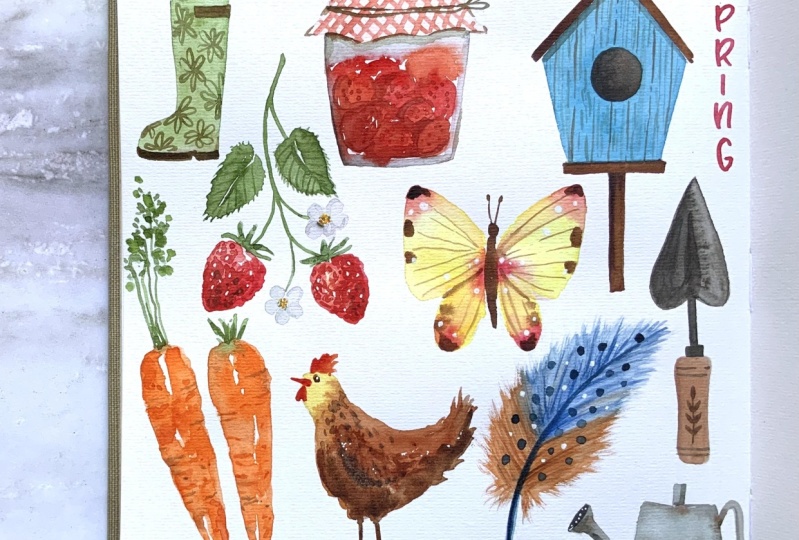
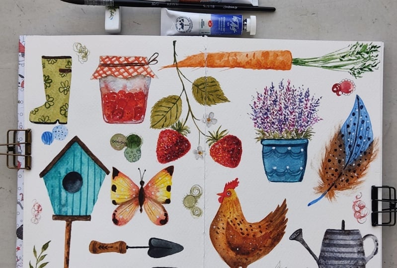
8. Prompts: Rainboot, Jam & Birdhouse: So I've got my
sketchbook ready and a bowl full of lovely
but simple prompts. You can pick one prompt
and paint quite a few of them all over
your sketchbook spread, or do something like what I'm
about to do is pick quite a few of the prompts
and then arrange them over your sketchbook page. So I'm going to start
with three prompts at first so that I can decide
how to arrange them. The first prompt is
a gardening boot. The second prompt is a
jar of fruit preserve. The third prompt
is a bird house. I've got my 2B pencil
here, and with that, I'm very lightly sketching the
shape of a gardening boot. We'll be painting quite
a few different prompts, so I'm not making it too big. Now, let's get started
with the painting. You can look for inspiration
for gardening boots. I'm going to be painting mine with very simple
neutral kind of green. Get our colors ready. I'm going to start
with some Sap Green. And to that, I'm going
to add just a touch of Burnt Umber. That's fine. Since we are not
painting it too big, you can use number
two, or number four, any of the brush
sizes that you like. I've got a number three
here and with that, I'm going to simply paint
the shape of the boot. I've left a little space
here for the strap. We'll be adding a bit darker
color sole at the base. Well, this base layer
is starting to dry. Let's mix the color for
the sole of the boot. For that, I will
simply start with some Burnt Umber and to that, I'm going to add
a bit of Indigo, or you can add any other blue. It will create a near
black color for you. And with this and my
number three round brush, I'm going to add a bit of a base to the boot here with
some Burnt Umber, I will also add the strap here. I'll mix a bit more Burnt
Umber to the green we started with and add a little
darker part up here. Now you can leave it like this or if you want to
paint a pattern on it, you can go ahead and do that. You can add polka dots, stripes, or any other pattern, I would like to add some
loose flowers on it. So for that, I'm mixing again almost the same color with
which we painted the base. So Burnt Umber and Sap Green. But this time I'm not
adding too much water. I'm just loosely going to
add these big flowers. If you want a bit more control, you can pick a smaller brush like this triple zero I have. This is just to
add another layer of some more attention
grabbing details. For now, I'm going to
leave it like this. Now, let's get started with
our jar of fruit preserve. For that, let's
sketch, a little jar. I'm not trying to make
this very symmetrical. We'll start from
the top to paint the cover or the
lid of the jam jar. For that, let's mix
sort of a blush color. I'm going to pick some Cadmium-free
Yellow, and to that, I'm going to add
some of my Opera Rose or any pretty pink just
to create a very light, blush or creamy color. We'll be later adding
a pattern on it, but for now just to
give it a base color. This much color is okay. It's very light
color because we'll be adding some red
checkers later. For now, this is okay. Now it's up to you what kind of fruit preserve you would
like to paint here. I would like to add
some strawberries. So for that, let's
mix our color. Go to start with some Winsor Red, touch of Transparent Orange
and for some darker bits, I'll keep my Permanent Alizarin
Crimson ready as well. I'm roughly mixing my Winsor Red
and Transparent Orange. And with that, I'm going to add a strawberry shape or
small glob shapes. Since it's a fruit preserve, you won't really see all of
them with their full shapes, but you can also do that depending on the state
of the fruit preserve. Now to paint the
glass jar around it, I'm going to pick Cobalt Blue and to that I'll add just
a touch of Burnt Umber. This will give me a
nice bluish gray color. With that, I will paint the jar going around the strawberries. Don't worry if the color bleeds. Also adding this grayish
color up on top here. Well, it's drying,
let's go back. To our strawberries, I'm mixing some of
that Winsor Red along with some darker Permanent
Alizarin Crimson and just giving a bit of border to some of
these fruit shapes, adding a bit more
texture marks on them, like little dots. With that same red
and orange mix, I'm going to add some
checker marks on top of the lid and this
parchment paper. So some diagonal stripes first. Just using the tip of my brush. And now let's go in
the other direction, just loosely adding
these stripes. I'm going to pick some of that slightly gray color
and with that, go around the edges of
this lid a little bit, just to mark some shadows. With some Burnt Umber. In my brush, I'm going to add a string that's
tied around the lid. Let's just add a little bit of shadow underneath
the parchment paper. For now I'm done with this one. Let's move on to our bird house. For that, let's sketch
our bird house. For the bird house, I would like to have
my Phthalo turquoise. So starting with some
simple Phthalo Turquoise color. I've got a little round
hole inside the birdhouse. I'm going to leave that. But since we'll be painting
it with darker color, it won't really matter, so you can paint this whole
birdhouse shape first, and then once it has dried, and then you can add the hole
for the birds to get in. When I'm painting
multiple icons like this, I keep going back to some
of the older ones that have started to dry just to
add little details. So this way you're
working simultaneously on multiple icons throughout
your sketchbook spread. While this one is drying, I'm quickly adding
a bit more shadow to my jar of fruit
preserve here, giving the lid a
bit better shape. While this base is drying, let's mix the color
for the roof of the bird house and also the
pole on which it's standing. So for that, I'm going to pick some Burnt Umber and mix some
Transparent Orange to it. This creates a nice
terracotta or a wood color. With that, I'm going to
first paint the pole, dragging my brush down. I'm trying to paint where the
base blue color has dried. But if you're painting this loosely, don't worry about it. We can also use this color
or the darker almost black, we had mixed using
Burnt Umber with Indigo earlier to paint
the center hole. Also using the wood
color to paint the base for the bird house. With the same Phthalo
Turquoise with which I painted the base for
this bird house, I will add some
wood texture marks, so some vertical plank marks. And with this, our first
three prompts are finished. Now let's pick a
few more prompts.
9. Prompts: Strawberries, Butterfly & Gardening Tools: Now let's pick our second set of prompts. A butterfly or a moth, A twig or a branch of fruit. Gardening tools like shears, gardening forks or trowels. For a branch or twig of fruit, I want to paint a
twig of strawberry. For that, I will sketch it
right here in the middle. That way, it will be spreading
across the two pages. I'll be adding a few leaves, two strawberries, and
a couple of flowers. Now in this space here, I will add a butterfly And for the gardening tools, we can add them here at the bottom where we
have a bit of space. So kind of a trowel here and
a handheld gardening fork. Now we can get started. We'll first paint the butterfly, with that, I'll pick my
Cadmium-free Yellow. You can paint your butterfly, any color that you would like. What I'm trying to think is strawberry is going to be red. I've got a blue here, green here, yellow will flow the colors
nicely around here. I've sketched the shape of
the wings very lightly. You can also paint
simple butterflies like this without sketching. I'm going to start near
the center and push my brush and spread the color
to the bigger wing first. And then to the bottom one. I'm keeping this
center area a bit wet. Now I'm going to
my Permanent Rose, picking some of it and adding it right in the center
here and letting it bleed. Also adding it towards the
bottom of the wing here, and also towards the top here. Letting this color softly bleed, sometimes even nudging the color to spread over the
wings a little bit. Let's do the same
on the other side. So starting with some yellow, I've sketched it pretty lightly, so it's not going to
be very symmetric, but just try to make them almost similar shape
on both sides. So after yellow, a little
bit of Permanent Rose, in the center towards the top
and the bottom of the wing. If you want a bit
more dramatic effect, what you can do is
pick your Burnt Umber. Not too watery, quite thick and add the
butterfly in between already while the
colors are still wet.This will bleed a little bit into the wet pink and
yellow that you have. Add the two antenna. For now, we're going
to leave it like this, let it dry, and then we
will add some more details. In the meantime, we can go ahead and paint
our strawberries. For the strawberries,
I'm starting with my Cadmium-free Yellow first and just adding a bit of yellow to that left
side of the strawberry. Most of it will get covered
eventually with red, but adding a bit of
light initially gives a little difference
in the color and gives your strawberry
a bit better shape. With this yellow, I'm
also adding some dots to the center of the
strawberry flowers that we'll be adding later. Now let's mix the red we
need for the strawberry. So I'm starting with
that same mix with which we painted this jar
of fruit preserves, some Winsor Red and
Transparent Orange. With that, we're going to add the color to
the strawberries here. We will go over the
yellow we have painted, but leaving behind
some lighter areas. I'm trying to leave the edges of the strawberries quite bumpy. While these strawberries dry, let's paint the
leaves and the stem. For that, we had
this earlier mix of Sap Green and Burnt
Umber together. We are going to
use that same mix, add some more Sap Green to it. With that, let's first
add the stem or a stock. Coming close to the strawberry, but not quite touching it
because we'll be adding the green leafy bits above
the strawberries later. Now for the strawberry leaves, what I like to do is paint
for a rounded leaf shape. So like this. Then
while it is still wet, go ahead and pick its edges and pull them out like this to
make them serrated. Let's see it one more time here. While it is still wet, pull them out with the
tip of your round brush. With the same green, we will add some top leafy
bits to our strawberry. Now for the flowers, I'm going to pick
some Cobalt Blue and add it near the Burnt Umber. This will give me
the bluish gray that I need for the petals. The petals are usually
white in color, to show a white on top of white paper using this
bluish gray is a nice way, keeping it quite light. Five petals, our strawberries
have almost dried, so we can add another
layer of some details. So picking some Winsor Red, adding a bit of Permanent
Alizarin Crimson. With that, we can make
small curved marks, little dots, a bit more dense towards the
darker right side, just to give the bumpy texture. Curved marks. Dots. We'll
pick some of the Sap Green, add a bit to the
center of the flowers. With some Sap green
mixed with some Indigo, I'm going to add the thin
veins to the leaves. With this darker color, I'll also add a little
bit of this color to the tip of the green bits
above the strawberries. Also giving them
a bit more color, slight color variation with this darker green
in there as well. Give a bit better shape to some of the petals that
look a little fuse. Bit of red in the center. For now we are done
with the strawberries. Now let's concentrate
on our butterfly again. We'll pick some of that
pink again and with that, let's demarcate the
two set of wings, just a very light pink colour. With some Burnt Umber, let's add some darker spots. We'll start at the base here, try to add them symmetrically. I've added two at the base
here, one on the side, another one on the side, one at the top here, another one here at the top. I'll use some of that Burnt Umber to demarcate the
wings a bit better. With a very light Burnt Umber and just the tip of the brush, I'm going to create these vein
like marks for the wings. You can look for
inspiration on Internet for the particular kind of
butterfly that you like, or the ones that visit your
garden and paint that. This is a very generic
butterfly I've painted here. We'll come back to
this with some white. But for now, let's move on and
paint our gardening tools. I'm going to start
with some Burnt Umber mixed with some
Transparent Orange. For the wooden base, making it slightly
curved in the middle. Now, for the fork
and for the trowel, I'm going to make
some Burnt Umber with some Indigo to create
that near black color. Now, let's paint the fork. We can also add some details to the handle so with some
more pure Burnt Umber, very less water in my brush. I'll add a few stripes here. While our gardening
tools are drying, I'm going to go back
to my strawberries. I've got my bleed
proof white here, and with my zero brush, I'm going to pick some
of that white and just add a few dots to
the strawberries. We will also use this
bleed proof white to add some dots
to our butterfly. Also to the center. I'll pick some of the Burnt
Umber in my zero brush to add a leafy motif to the handles
of these gardening tools. You can see I'm mostly
painting all of this with my number
three round brush. Number three gives me
the right amount of control I need to paint
something small like this. Giving a little bit of shadow to the trowel and to the fork. I'll pick some of the
tal blue and with that, add a bit more color
to the birdhouse. I was starting to
fade a little bit. Add a bit more shadow right underneath the roof
with that blue. We can move ahead and pick
another set of prompts.
10. Prompts: Feather, Chicken & Watering Can: Now let's pick another
set of prompts. Next one is a bird's
feather. Let's pick another. We'll paint a chicken and a watering can.
Let's get started. I'll paint the chicken right
up here for the feather. I have some space here. We can include a feather
here to draw a chicken. I usually start with
a triangular shape, something like this, and then add a round
head up on top here. And kind of follow
this triangular shape to create their body. Add their comb on top, the wattles, the wing, and then their legs. I've shown it to you
here a bit bigger so that you can also draw
your chicken like this. I'll be drawing it here, so it will be quite
small for you. I will add the watering
can right here. Now, let's get started with the painting for the feathers. There is a technique
I follow for years. For that, you're going to need an old damaged brush,
something like this. It's right now quite dry. I haven't touched it with water. You can paint your
feather in any colors. I'm going to paint the top of it slightly bluish in
color and the bottom in this orangish
brown color with a mix of Transparent
Orange and Burnt Umber. I do suggest to mix
your colors right away because we will need
to paint it fast, got the Burnt Umber
here, to that, I'll add some
Transparent Orange. We will start with Cobalt
Blue, starting from top, I'm going to create a curved thin line using
just the tip of the brush. So rest your hand comfortably
and come down like this, make it a bit wider
at the base and pick a fluffier brush that
can hold a bit more water. I've got this natural
hair number four here. With that, I will pick that Cobalt Blue start from the
top and touch your brush, push it down, leave it, go on the other side,
with a thin brush like triple zero or a dry brush, simply pull thin lines out
from the center like this, really thin lines, giving
it a bit of texture, adding thin lines, coming out from the
center for both sides. Now we're going to
pick that Burnt Umber and Transparent Orange mix and add towards the bottom
of the feather like this. While it is still
wet, take that, the dry brush, and simply
pull it like this. The dry brush will pick
thin lines of the color. You can go over the
blue a little bit, giving it that nice fluffy look. Keep them smaller
towards the bottom, pick some more of that color, deposit it in the center. If your older brush
has gotten wet, you can run it
along a paper towel like this to dry it nicely. Now it's again dried
and with that, you can pick a color directly. Dry it again and create dry brush marks like this to
give it a bit more texture. But if you don't have
a brush like that, then you can simply pick
your detail brush and very lightly go back and forth, create these thin marks. We'll wait for
this to dry before we add some more
details to the feather. In the meantime, let's
paint our chicken. For the chicken, I'll
use this similar kind of color combination
of Burnt Umber, Transparent Orange, maybe a
little bit of Quinacridone Gold. I will start with
a little bit of Quinacridone Gold from the top where the head is
supposed to be. Bring the color down. Now shift to my
Transparent Orange and Burnt Umber mix near
the breast of the chicken. Continue this color
over the wings. Pick a bit more Burnt Umber, and then a bit darker
color towards the bottom, and also the back
part of the chicken, keeping the back fluffy
and even the bottom. Also, I'm keeping a bit darker. We'll wait for this to dry before we add any more details. In the meantime, we can paint the base layer for
our watering can. For that, let's use a gray. I'm going to start
with some Cobalt Blue. To that, I will add
some Burnt Umber. It makes a nice bluish gray. Since it's a bit bigger shape, I'll pick my natural
hair number four here, holds good amount of water, and let's paint the shape
of the watering can first. You can see it's a
nice light gray color. With that, I'm quickly painting the base shape of
the watering can. While it is still wet, I'm going to pick my zero brush and with some Burnt
Umber in my brush. I'm going to add a few spots
where the colors are still wet to show a bit of rust, especially where the joints are of various parts
of the watering can. Let that color bleed,
don't worry about it. While all of this dries, we can come back to our feather here and let's add some
darker color dots. For that, let's mix
the Burnt Umber and Indigo together to create that
almost black color again. So Burnt umber and Indigo
Before adding those dots, let me add a little
central line first. I'll pick some of this black itself and with
that very lightly, I'll recreate the central line. Now we can get back
to adding the dots. This time zero brush, just adding slightly
bigger dot shapes to the whole feather here. Now we can get back
to our chicken. For that, let's start
adding the little details. I'm going to pick some Winsor Red. I'm going to add a few
marks for the comb part, the little red but on
top of the head of the chicken and
small red wattles with some Transparent
Orange in my brush. I will add the legs
and the chicken feet. Can also use this orange
to paint the beak. Add some more of that orange
to the Burnt Umber mix, and add some color
around the wing here, add some more color to the
front, soften it a bit. It's up to you what kind of chicken you would
like to paint, a bit more orange
towards the neck, little dots and dashes to give a bit more feather texture. Now we can come back
to our watering can. We'll mix that same gray
with which we painted the base and add a
little bit of shadows. To the handle here. Some darker areas. Let's add a stripy pattern
on it to a combination of some thin stripes and a
white one in between. You can decide to
paint any pattern. So you can make a simple
watering can like this. Quite interesting by adding
little details like this. I'm getting tempted to add a few white dots to the
feather here as well. You can add simply
just the white dots, but I would like to add a
mix of white and black dots. So now I'm just adding
a few white ones. This is just an
imaginary feather, but you can look for inspiration for any particular bird
that you really like. With that near black made out
of Indigo and Burnt Umber, I will carefully add the eye just a round dot and then add a little
bit of red around it. With some of that
Burnt Umber mix, I'll also give a little bit of texture to the chicken
legs, little dashes. With some pure Burnt
Umber, without much water, I'll add some dots
and dashes all over the wings So just
some text remarks. With that near black,
I will also add a few dots on the spraying
part of the watering can. Now we can pick another set of prompts to fill these
remaining areas.
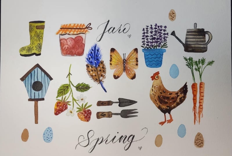
11. Prompts: Lavender Pot & Carrots: Now let's pick our last set
of prompts for this spread. Next prompt is a potted plant or flower and some freshly
picked vegetables. It's up to you what vegetable
you would like to paint, and also what kind of flower
you would like to add. I will only pick
these prompts for now because I want to add
the word "spring" here. I have this space
here and this here. I will paint the potted plant here and the vegetable here. I think a few carrots might
look really nice here. I will quickly
sketch the letters here so that I know how much
space I have for the carrot. We'll be painting a small
pot of lavender here. You can decide to paint
any flower that you like. Let's get started with it. For the pot of lavender, you can pick any one of these colors that you
like for the pot. You can use a
terracotta color like this Transparent Orange
and Burnt Umber, or you can pick any one of these colors to make it
flow throughout the page. I'm thinking of using this
Phthalo Turquoise that we had mixed earlier
for the bird house. With that, I will first paint the rim of the plant pot using my number
three round brush. You can use a flat brush
for something like this. It will be much easier. But this is fine for now. I will let it dry before I
add the lavender strands. In the meantime, we
can go ahead and paint our carrots here, laying flat like this with
their stalks going up. For carrots, we can obviously
start with some orange. But you can also start with some yellow and then add
some orange wet on wet. So it's up to you how
you would like to paint. Now to paint the carrot, I'm going to pick the color, either yellow or
orange. Doesn't matter. And starting from where I
want the carrot to start, lay the color like this flat, and then kind of jiggle
your brush a little bit and lift it slightly
as you're coming down. To give that carrot
uneven edges. I'm extending the carrot
to the other page as well. And while it is still wet, you can drop in some more of that orange in little
dashed marks like this. Let's see it one more time. So either pick your
yellow or your orange, start from where the
top of the carrot is, and wiggle your brush, drag it horizontally like this. And while it is still wet, don't forget to add the
deeper orange color. Add a few spots. You can also use the
tip of your brush to add some more
thinner hairy roots Now for the stem, we can start with a
light Sap Green mix for just the base. So thin lines coming
out near the carrot. Then you can extend them a
bit more for the leafy area. For the leaves, you can
pick Sap Green or Sap Green and Indigo and just add tiny
leaves close to each other. Starting from top,
then two sides, small dashes on each of the
sides close to each other. I'm painting the leaves quite
loosely, as you can see, vary greens to create a little
bit of color variation. Sap Green, sometimes Sap
Green mixed with Indigo. We can now move back
and paint our lavender. So to paint the lavender, I'm picking some Quinacridone Magenta, and I've also got my
French ultramarine ready, but you can also use To turquoise to create that nice
violet or purple colour. So I'm starting
with some magenta, starting from how high I want
it to be little dashes in clusters coming down like this. So clusters of little dashes. Sometimes I'll pick a little bit of that French Ultramarine. So just a few clusters
running vertically. I'll make it quite full. So in between some of
the earlier strands, I'm leaving a little bit
of space near the bottom. To show the leaves. For the leaves and the stem, we can use the same
very initial mix of Burnt Umber and Sap Green. And with the thin
tip of the brush, connect all of these
strands together like this between all
of those clusters, add this green and at the base, add a few thin leafy
shapes, long ones. Close to the bottom and making it quite dense with the leaves. Making it dark at the base. You can go back and add a bit
more magenta or the purple. Make this lavender
pot nice and full. Now, let's add a little
bit more detail to this plant pot with our Phthalo Turquoise with
which we painted it. Let's first demarcate top rim. You can add any pattern
that you would like. I'm using that same
Phthalo Turquoise just to add these loops here. Just to add a few little details to create a simple flower pot, a bit more interesting. Some of the details on
the carrots have faded, with a little bit of
Transparent Orange, I'll just add them once more, just a few dots and dashes. In the next lesson, let's add some colour to this
lettering here and fill up few of these areas either with small flowers or some
eggs to celebrate spring.
12. Lettering & Finishing Touches: Now let's add some color
to our lettering here. For lettering, I'm picking my number zero point
at detail brush. For the lettering,
you can decide to pick any one of the
colors that you have used throughout the pages or painted with black or multiple
colors as well. I will pick this red that we have used for
the strawberries. You can follow your
favorite lettering style. I'm just adding some serif
lettering, but quite loosely. Giving the letters
a bit of a bounce. Take your time with lettering. Don't worry about it. But if you want to add it loosely,
feel free to do that. Now we can fill some
of these spaces with maybe some chicken eggs to celebrate spring
or little flowers. So for the eggs, you can pick this Transparent Orange
and Burnt Umber mix, and this number zero brush, and with that, add
few egg shapes. You can also pick
some Cobalt Blue for some bluish color eggs, for some of the bird eggs. Let's also add a few flowers. For that, we will start with
some yellow for the center. It's a little dots. Let's add one up here. One down here, maybe
one here in between. Now you can decide whether
you want to paint them with pink color petals or with the white petals like
the strawberry ones. I will paint them with
the white petals. For that, you can either pick Cobalt Blue or add
just a touch of Burnt Umber to Cobalt Blue to create that slightly grayish
color for the white petals. Simply add five round
petals next to the center. If the yellow is still wet, it will bleed, but
that's a nice effect. I like to go back in and
redefine the petals with a little bit of border.
It's a gray color. When you paint
them this closely, they tend to get
fused a little bit. With this little bit of
border marking layer, the petals become a
bit more demarcated. Go back in with a
little bit of that red. Add some of that red to
the center in little dots. With my really tiny brush, I'm going to pick some of that Cobol Blue
again and with that, add a few dots to
some of these eggs, giving it a bit of texture for the speckled eggs that
some of the birds have. So using just the tip
of my zero brush, just adding little speckles. Now we are almost done
with our whole spread. You can go around and
see if you would like to add little details
anywhere else, just to give that
little extra bit of love to your sketchbook page. I'm adding some of the white
dots to our chicken here. Adding these white dots binds
it all together nicely. Adding some of it to
the center here of the flowers, be it painted. If you would like
to, you can also add little leafy marks throughout the spread just to fill
up some of these spaces. But you don't need to fill
the whole page with these. Just add them at a few spots. And with this, our
sketchbook spread is ready. I really hope you
enjoyed painting all of these little
spring icons with me, and I can't wait to see what you will paint in
your sketchbook. So please do share it so that we can all appreciate
it together.
13. Conclusion: I really hope you enjoyed painting this entire
sketchbook spread with me. Even if you didn't paint, I sincerely do hope that
I was able to inspire you a bit to give Watercolor
sketchbooking a try. Here is my final
sketchbook spread, and now it's your turn to share a photograph of your
sketchbook page. And remember, process
before perfection. I would love to see
what you created, so do share your project
here on Skillshare. And if you're sharing
your results from this class on Instagram,
you can tag me. You can use the discussion tap
to ask any questions about this class or to interact with me and other students
of this class. I've turned my
sketchbook spread into this pretty art print that you can purchase as a digital
downloadable print. You can print it at home or at a nearby printing service.
Use it as a wall art. If you enjoyed my
teaching style, you can check out some of my
other Skillshare classes and hit that follow button to know when I publish
my next class. Thank you so much for
joining me for this class. And let's paint together
again really soon. Until then, stay creative.
 Garima Srivastava, Artist and Illustrator