Transcripts
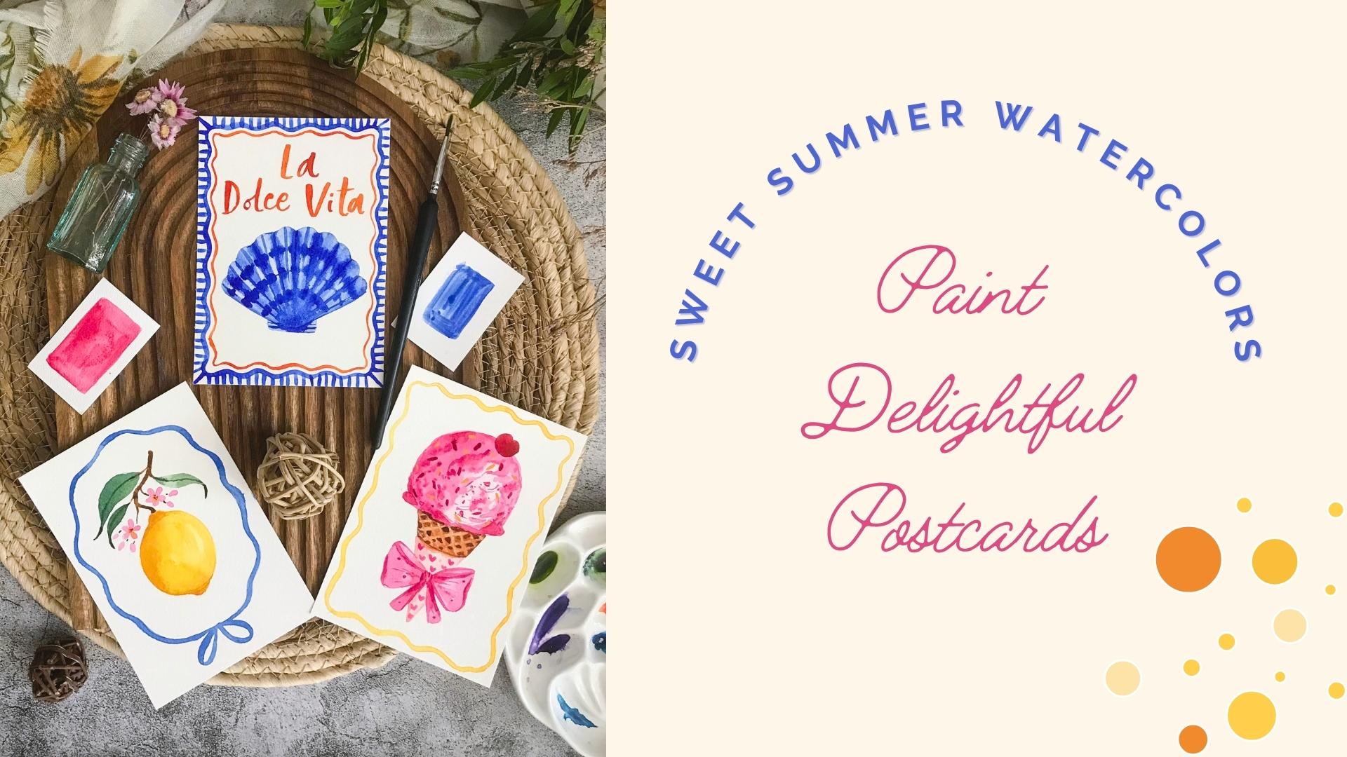
1. About the Class: Capture your summer on
watercolor postcards. With summer break,
we often think we'll have find plenty of time
for our creativity. But with kids off from school, it can become a bit
tricky sometimes. That's why, with this class, I'm bringing you a few short and simple watercolor
postcard projects that can be painted
within ten to 15 minutes. Hi, my name is Garima Srivastava. I'm an artist, surface designer, and a Top Teacher
here on Skillshare, where my classes focus on painting something
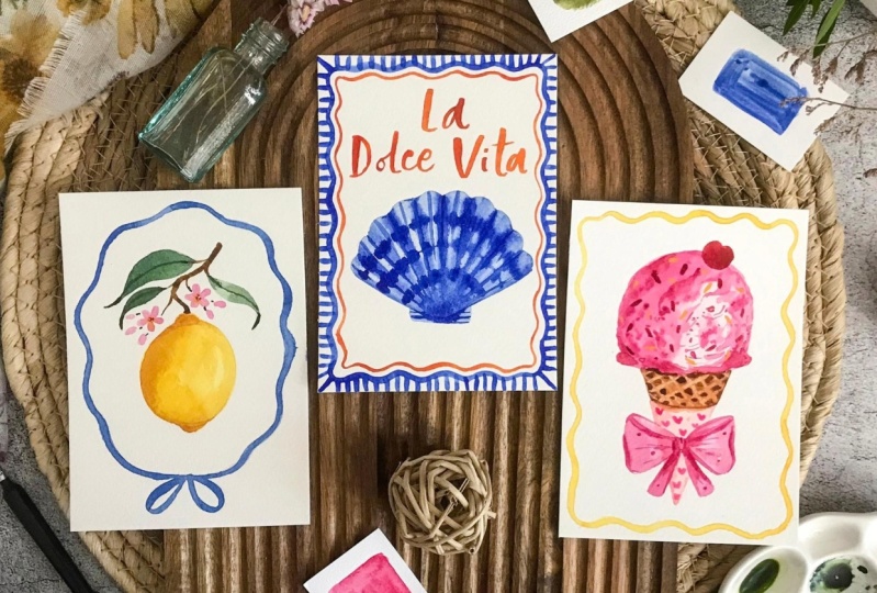
small every single day. In the short class, I'll teach you step by step how to paint three watercolor
postcard projects following a Mediterranean theme. You can paint one or more
of them as a class project. I'll be painting
these projects on these handy watercolor
postcards that you can later frame or even
post to your loved ones. But don't worry,
even if you don't have these watercolor postcards, you can still use
small sheets of watercolor paper to give
these fun subjects a try. This class is best
suited for those of you who have painted a bit
with watercolor before, but the projects are quite approachable, even
for beginners. As a bonus, two more
project options have been included in this
class as timelaps. For more painting ideas, you can check out my book
Watercolor in 10 Minutes a Day, which includes 45 easy to follow charming
watercolor projects. Now, without wasting
too much time, go get your simple
watercolor art supplies, and let's get started.
2. Your Project & Resources: Welcome to this
class. Your project for this class is
to paint one or more of the three
watercolor postcards that I'll be demonstrating
in this class. There are two more
bonus project options available to you as
timelapse videos. For each of these
three main postcards, we will first start with
drawing our sketch and preparing our colors before
painting these fun subject. I've provided a sketch for all
of these projects under the resources of this class
for your drawing reference, along with the list of art
supplies and color swatch chart. Once you're done
painting your project, simply click a photograph of it. And under the "Projects and
Resources" tab of this class, you can find your
"MY Project" button, where you can upload your
project photographs. If you have a question
during the painting process, you can post it under
the discussion tab here, and I'll try my best
to answer them. Now let's have a look at the art supplies I'll be using today.
3. Art Supplies: Let's have a look
at the art supplies I'll be using for this class. For paper, I'll be using this watercolor postcard
block from Fabriano. It has got a nice 300 GSM
cold press watercolor paper. This one is 4"x5"
in size. It's not 100% cotton, so it's a student grade
watercolor paper, but it's still nice
enough to paint on. It's got a very slight
cold press texture. But the best part
is at the back, there is a printed
postcard format, so you can write a
message, the address, and add a postal stamp
here and actually send your hand painted
postcards to your loved ones. This block has
about 20 sheets in there and they're all
glued on one side. You can paint directly on it or detach it and attach to a
separate cardboard block. Or if you're directly
painting on it and want to keep the paper flat, you can use some washi tape
just to glue the side of the paper that is
loose to the rest of the block to stop it
from moving too much. You get similar kind of
watercolor postcards from many other brands as well. This one is one of my favorites. It's from Hahnemuhle and it comes in this beautiful tin box here. And it has got lovely
colour postcards. These postcards come in a
couple of different textures. So this one has got
a nice texture here. And just like the other one, there's also a printed
postcard format at the back. I love this one because
of the tin especially, so that after you're done
painting the postcards, you can also store
them nicely in here or use this tin to
store something else. If you don't want to
use postcard format, you can also simply take a
bigger sheet of watercolor paper. I took an A4 size
sheet of watercolor paper and chopped it down into
four smaller pieces. So this is almost A6 size. This one doesn't have the printed
postcard at the back. You can always make
it by yourself. But this size is especially
handy if you don't want to carry big blocks
of watercolor paper with you if you're
traveling during summer, and just small size pieces
like this are handy. You can also get smaller
watercolor blocks like this. This is 7"x 5" in size. This one has hot press finish, but you can also get
cold press finish. So you'll find this size of Watercolor paper blocks from most of the watercolor
paper brands. So pick whichever one you like. They are handy to carry with you instead of big paper blocks. For watercolors, you
can use tube colors or simply prefer to use
dry cakes of color. Then you can use
tin sets like this. They come in dry cakes like this and have got
mixing plate as well. This comes handy if
you're traveling. You don't have to carry tubes
which can leak sometimes. So this is nice. I've got my
favorite colors in tubes, which I further squeeze out. into this ceramic
color palette here. I've got yellows, pinks, the reds, and then some brown
and orange, some blues, some purple, green, and
finally some neutrals, a little bit of white, gray, and some ready to use black. Good thing about professional
grade watercolors like this is how nice their
strength is in their color. I prefer to use professional
grade watercolors, but there are some student grade watercolor
brands now available, which are quite good in quality. Don't shy away from
trying different brands. In both of these cases, before you start painting, you will need to spray
your colors with water to activate
these colors and let it sit for half a
minute or something and it nicely activates the colors
because once they are dry, it's not very easy to
pick these colors. Now that they're activated, you can use your brush, rinse it nicely
with clean water, and then you can simply
create your mixes. For color mixing, I'll be using these porcelain
color mixing plates. You can use the plastic one or a dinner dish, or if
you're traveling, you can use these
tin mixing plate that come with your
watercolor boxes. Let's have a look at the
brushes I'll be using today. For my color mixing, I use an old No.6
round brush. It was a natural hair brush
holds a lot of water. It has lost his point, but I can still use it
to paint bigger areas. So whenever I need to
quickly paint a big area, I still use this
one just to pick a good amount of color
mix and paint with it. Next brush you'll see me use is No.4,
pointed round brush. This one is from Princeton
Velvet Touch range. It comes to a nice point, has a good snap to it, holds good amount
of color mix in it. A similar brush is pointed
round No.3. It comes to a really nice point. It's one of my favorite brushes. It's slightly losing its point, but I still love
to paint with it. This one is from a smaller
brand called Intrend. But you can find similar
pointed number three brush from other brush brands. The last brush
you'll see me use is this pointed round No.000 or No.3/0 It has got a nice fine point
and it's good for details. You can paint really
fine details, fine lines with it. You'll be needing a pencil
to create your sketches. I always say there
is no shame in drawing your sketches
before you start painting. If you're a little unsure, take your time to draw your sketch before
you start painting. To remove is graphite line, I use a kneading gum eraser that you can press on
your pencil lines, and it picks up excess
graphite and leaves you faint reference
lines while you paint. I've also got a simple eraser. This is my daughter's eraser. With this, once you're done painting and your
painting has dried, you can use a simple
eraser to remove any as pencil lines if
that's what you like. You will need a
spritz bottle with some clear water to spray and
activate your watercolors. You're going to need
some paper towel or any absorbent cloth with you so that once you're
mixing your colors, if you want to remove excess
moisture from your brush, rinse your brush, pat it on the paper towel to
remove excess moisture. This prevents big puddles from falling onto
your paper while you're painting and helps you control the amount of
water in your brush. Also keep some scrapes
of watercolor paper with me just to try out
my color mixes. And since we are painting
with watercolors, you're going to need some water. I've got two jars of
clear water here. One is to wash my dirty brush, and the other one is to pick some clean water to
create my fresh mixes. This prevents your color
mixes from getting muddy. These are the art
supplies I'm using today, but don't feel like you need to use these exact art supplies. Try to paint on whatever
is available to you today. The whole idea is to enjoy painting something small
during this summer. Here's the list of all the
art supplies I've used. Here are the color swatches
and the brand names. You don't need
these exact colors. Try to find something similar from your
own color palette. Now, let's get started.
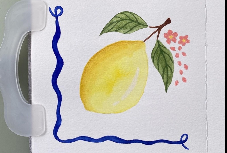
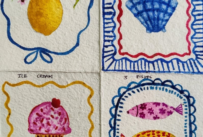
4. A Lemon Twig-Prep: For this first post cut, let's paint a lemon twig. You can paint any
other citrus fruit. I would like to paint a lemon
attached to a twig with some leaves and then a small
frame of ribbon around it. So I've added this sketch
for your reference. I will quickly sketch
my lemon here, starting with an oval shape for the lemon and then two bumps, one on the top, and
another one at the base. Now, I've attached a
twig to the lemon. Let's add a few leaves
for nap on top here. Another one I'll add here with a little portion towards the
end that is slightly bent. Before I add any more leaves, I will also quickly
add the marks for the frame I want to
add just to give me a guidance how big I want the
lemon and the leaves to be. Now we can easily add leaves
without worrying about it. We will also add a few flowers. Usually, the flowers
are white in color. But just to bring a
bit more interest, I might paint the ones here, slightly pink in color
with some flower buds. I'm drawing very lightly, but use the reference
on the screen to draw your lemon twig. Now with my kneading eraser, I'm picking the excess
graphite from my drawing by pressing this eraser gently
on the pencil lines. I had already spritz
a little bit of water over my colors before
I started sketching. You should also do that
for your pan colors. Just a little sprits of water, keeps them nicely activated. For my lemon, I'm going to
pick some Azo Yellow here, you can use Cadmium-free
Yellow or any other lighter, cooler yellows like Winsor
Yellow or Lemon Yellow. While we're painting the lemon, I'm going to add a touch of Quinacridone Gold towards
the left side, just to create a natural
shadow in there. Now for the twig, I'm going to pick
some Burnt Umber. It's a nice brown. You can pick any
other brown that you have or mix your red and green together
to create a brown. And to this, I'm going to add just a touch of Quinacridone Gold. Let's see the colors. So this is Quinacridone
Gold plus Burned Umber. This is Burnt Umber by itself. This is my Azo Yellow. For the flowers, we're going to pick a little bit
of Permanent Rose. Now for the greens, I'm going to start with two puddles of Sap Green
as the base color. To the first puddle, I'm going to add
some Cobalt Blue. So what you can do is start
with any green that you have, add a touch of other
primary colors like blue, yellow or red to change
your base green color. So let's see. This was
my normal Sap Green. Now to that, I have added
a touch of Cobalt Blue. So there's a variation
in the green. And now for this puddle, I'm going to add a
bit of Indigo to my Sap Green for this
really dark green. For the little frame
around our composition, I'm going to simply
pick Cobalt Blue. Now, let's get started.
5. A Lemon Twig-Painting: I'm going to first pick my No.4
Princeton velvet touch pointed round brush. And with that, I'm going
to pick the Azo Yellow, and starting from top, I'm going to paint
the lemon shape. Remember, while I'm painting, I'm going to already
deposit a little bit of Quinacridone Gold
towards the left side. So my paper is dry. Add color to the
bumps here as well. And now, while
everything is still wet, add a touch of Quinacridone Gold to the left side and
also the two bumps. What this will do is
it will naturally make these areas
slightly darker. Just move the color around now, if you want to create
a little highlight towards the right side, rinse your brush, clean
water, rinse your brush, remove excess moisture and gently press it
against the paper. It will lift some color, creating a highlight for you. I'm going to shift to my
number three pointed round. You can shift to a smaller
brush like number two, just to give you a
bit more control for the smaller shapes around. And with the Burnt Umber
and Quinacridone Gold mix, I'm going to add the twig. I'm going to bring it
really close to the lemon, but not touch them, else they will bleed
into each other. Also add little twigs
for the flowers. Let's paint the flowers. I'm going to start with
the pink, five petals. One, two, three, four and five. One, two, three, four and five. Pick that yellow and add that to the center while the
flower is still wet. Let's add a few buds, as well. Now let's start
painting our leaves. I'm going to start with the
Cobol Blue and Sap Green mix. You can turn the page around
to make it more comfortable, start from the top, touch, push, and let go. Touch, push, and gently let go. Don't worry if you need multiple brush stroke
to make the leaf. That means your brush is
slightly smaller than you need now for
this one, as well. Let's connect with the Burnt
Umber. All of these buds. I'll pick a bit of
that Permanent Rose, add little dots in the center of the flowers just to bring
back that attention. Connect the top of the lemon
with the twig as well. Now that this leaf
has slightly dried, I'm going to pick the
darker color and add just a bit on the tip here
to make it look like. The bottom of the leaf
is slightly bent. I want to make this
leaf a bit darker, so I'm going to add the darker
green mix on top of it. With the same dark green, I'm going to use just the tip of the brush and
gently make a vein. You can add additional
leaves at the bottom as well if you would like to make it a bit more fuller composition. While our leaves are drying, I'm going to pick the
Quinacridone Gold and just add a little bit more shadow where the bumps of the lemon
may rest of its body. Rinse my brush, remove
excess moisture, and just gently run
it along the lines we've now added to
soften them a bit. I'll pick the dark green, add it to the tip of the leaves here just to make it look like
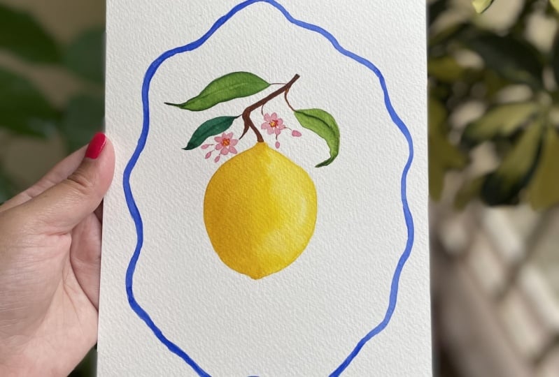
they're slightly bent. Now with the thin line. Now our lemon twig is
pretty much complete. Now let's add the
frame around it. I've got rough guidelines here. I'll just remove excess
graphite from the guidelines. I want to paint a wavy frame around it with the
bow at the base. Now with my round
No.3 brush, I'm going to pick
the Cobalt Blue. I'm adding a bit more water
to it so that it's easy to paint with it,
starting from top. I'm following those oval lines, but giving a slight wave to
the shape of the ribbon. Oops. Got a bit of color
smudge here. Don't worry. These happy accidents happen. Now let's add a bow here. It's looking nice.
Wherever the color of the ribbon has
faded a little bit, you can go back in,
add another layer. Or if you would like
to keep it like this, have some natural color
variation. That's also fine. Once everything has dried, you can take your eraser to remove the pencil lines
that are still visible. And with this,
your postcard with a lemon twig is ready.
6. A Seashell-Prep: For this postcard, I want to paint a scallop sea
shell in the middle, a border around it, and the words "La Dolce Vita"
as well on this postcard. I'll be painting the
scallop seashell, but feel free to
paint any one of your favorite seashell
from your collection. I'm going to first draw the slide border around
the whole postcard, just to give me an
idea how big the space is in the middle so that I can decide how big I want to
paint this scallop seashell. So now I know how big
the space is here. I'm going to add the scallop
seashell slightly closer to the bottom because I want to have enough space
for the letters upon top. So first a shape and then curve on top and then
make the top part, wavy for the seashell. I'm at the base two
sides like this. I'll also lightly write the
words "La Dolce Vita" here. Before we start coloring, I'll pick the excess graphite
with my kneading eraser, pressing it gently
on the pencil lines. For the colors,
I'm going to stick to quite minimal colors. We'll mix some of our
French Ultramarine here. We'll also keep some
Cobalt Blue ready. I will also make some
Transparent Orange. Keep it ready here to
add to the lettering. Now we can start painting.
7. A Seashell-Painting: With my number four
pointed round brush, I'm going to first pick the really watery
Cobalt Blue here, quite a bit of water in it. I'm going to first use this color to paint
the whole shape here. And while it is still wet, I will try to add
some ridges with French Ultramarine along all
these curved lines here. So let's start. You can paint your
Seashell with any one of your favorite
colour combinations. You can paint them with pink
or slightly orangish color. Having your color
mixes ready like this helps you keep
the color consistent. I'm just following my sketch and adding the color
along the lines here. While it is still wet, I'm going to pick
with that same brush, some French Ultramarine
I'm going to start adding the ridges where the pinch of these
curved marks is. Since we are painting
these ridges wet on wet, they will get faded a
bit, but don't worry. We will reinforce them again. This is a great way to add a slight color variation with the colors blending in softly
while they are still wet, can go back in if some of
them have faded too much. We'll be coming back to them. It's okay if the color
pools a bit at the bottom. I've rinsed my brush, remove excess moisture
going to press the brush against this area
to pick some of the color that was bleeding too much to create that lighter area in between these darker ridges. So rinse your brush, move s moisture and press it where you want
to pick the color from. Now, while all of
this is still wet, I'm going to pick a
slightly smaller brush. This is No.3 round. And with that, I'm going to pick the French Ultramarine without
picking too much water. So just quite thick
French Ultramarine. And with that, I plan
to create curved marks. So starting from here, the base is still wet, so it will bleed. But since you don't have too much moisture in your
brush and your color mix, it shouldn't bleed too much. Let's create another one. Another one closer to the base. While all of this is still wet, I'm going to go back in with the French Ultramarine
and recreate those ridges right where the
top scallop edge is pinched. We will also create some
fine ridges starting from the middle part of
this curve top. Not going all the way. We'll be painting
the base with some Cobalt Blue a bit later. But for now, let this dry and we can work on the
border around it. For that, we'll again pick our French Ultramarine
and I'm going to create a slight wavy border
quite close to the edge. No need to make these
borders perfect, rather a bit of
imperfection in it, gives it a nice handmade look
and makes it extra special. Now, what I will do is I will add little vertical
lines coming out from this border towards the
edges going all around Now that the scallop
has almost dried, I'm going to pick some
of that Cobalt Blue. And with that, I'll
add the two sides at the base. One here. Now with some French Ultramarine, I'll add some ridges
down here as well. Now you can take a
short break just to let this border
dry a little bit, else if we will go in to
add color to the letters, all of this might smudge a bit. You can also add a bit
more reinforcement to any one of the ridges
you want to darken, that has softened a little bit. Let's come back to this once
this has dried a little bit. It's been about
two to 3 minutes. This has completely dried. Now I'm going to pick Transparent Orange in my No.3
pointed round brush. You can also use your brush pen just to add some color
to the lettering here. Take your time. And now with the same orange, I'm going to go around this border and create
an almost parallel, similar border with
thin brush strokes. Like I said, it doesn't
have to be perfect. A bit of handmade imperfection
adds to the charm. Once all of this dries, you can erase your pencil lines. And with this, our postcard
with a scallopss is ready.
8. An Ice Cream-Prep: What's the summer
without some ice cream. So for this postcard, let's paint an ice cream
on a cone with a little bow around the cone and continuing
with our tame, we're going to add a little
border along the edges. Again, sketching the
border before I start with the ice cream so that I have an idea how big I
want to draw it. Now first, we'll draw
the cone. We shape. I will add a paper
holder at the base. We'll be painting
a big bow here, so I'll also draw that. Ice cream cone, and
now one big scoop of ice cream can also
add a cherry on top. I will erase the
excess pencil lines. You can use this line drawing as a reference to lightly
draw your ice cream cone. Now, let's mix our colors
for the ice cream scoop, I would like to stick to
pretty pinks that I have. I've got Opera Rose here. I've also got Permanent
Rose for the cone, we will create a mix of Burnt Umber mixed
with Transparent Orange. Let's check the color. This is Burnt Umber, mixed
with Transparent Orange. And this is Burnt
Umber by itself. We'll be painting the base of the paper holder for the cone very lightly with some pink
or slightly blush color. So for that, I'll mix some Opera Rose with a little
touch of Azo yellow. Just very light color. We'll also be needing some
Yellow for the border. So some Azo Yellow here. You can draw the border with
blue if you would like to. Now we can start painting.
9. An Ice Cream-Painting: I'm going to first start with
the base paper holder here, and then we will work
on the ice cream scoop, and then at last, we will paint the
wafer cone here. Now with this very
light blush color which is Opera Rose and
Azo Yellow mixed, I'm going to add just
a thin color layer to the paper holder
for the cone. This will make it easier to draw a bow at the end. You
can leave it like this. Now try to find a
fluffy brush or a brush that holds
good amount of water. You can also pick
your mop brush. And with that, I'm
going to start with some Oprah Rose very light, quite a bit of
water in my brush. I'm not drying the brush. And with that, let's first add some color
to the scoop here. You can see how rough I'm
being around the edges. I'm not trying to
make it perfect. While it is still wet, go in with your
Permanent Rose or any other pink and add some of the color
on one of the sides. I'll shift to a
bit smaller brush, No.3 pointed round. And with that, just give a bit more roughness
to the edges. Some of the areas have dried, but some of them are still wet. Adding a bit of color variation try to add little
wavy marks like this, just to give a bit of
texture to the ice cream. Go in with some thick
Permanent Rose, add that to some
of the wet areas. I'm just continuing to
add some curved marks, little dots on the dry areas, but also on the wet areas. Now we'll wait for this to dry. Now let's work on our bow. For that, we'll start with some Permanent Rose
and with that, I'll draw the center and
two sides of the bow. And to lose ends of the ribbon, I'm not fussing about
making it too perfect. It's a fun little project, so try to enjoy it. Pick some more Permanent Rose or any other pink with a little
less water in your brush. And with that, add
some more marks. Now let's work on the cone. So for that, the
method I use is, I first paint a
layer of the color for the cone and
then rinse my brush, make it a bit dry,
and with that, I pick up some colour to create lighter check marks
on the wafer cone. Let's see how I do it, pick the color which
is Burnt Umber mixed with Transparent Orange and
use it to paint the cone add a bit of burn
timber to the sides, make them a bit darker. Now, wait just a
little bit before you start picking the color up. Another easy way
would be simply paint a base layer and
with a darker color, you can create the
checker marks. But I want to show
you this technique of lifting the color. Rinse your brush, remove
excess moisture and with that, press the brush against
the colored layer. Rinse your brush again. Repeat. You can see how it is creating
these light ridges. Keep doing it, keep creating
these parallel ridges. You can shift to a smaller
brush if that makes it easier. This is my No.000 brush. You can see I've
picked the color up in one of the directions. Now turn it and go perpendicular to the earlier direction and
do the same color picking. This way, you're able to create lighter lines and darker
boxes in the center. While the cone is drying, let's work a bit more on the ice cream scoop
and the bow here. For the ice cream scoop, let's add a bit more
color on this side. Just a little bit more
of that Permanent Rose. You can go back in
on the other side. So I'm picking some
wins red along with some Permanent
Alizarin Crimson to add a little cherry on top slightly towards
one of the sides. Now, with our Permanent Rose, let's add a bit of shadows to the ribbon
that we had painted. It looks quite fused together, going to demarcate
some of the areas, kind of giving it
a bit of border along the edges
just very loosely. With some Opera Rose, let's add a little
heart shape pattern on this paper holder. Little hearts with
two brush strokes using just the tip of the brush, I'm using the No.3
pointed round with the old mix of Burnt Umber
and Transparent Orange. You can go back in and add a bit more color to the
boxes of the wafer cone. Give a bit more color just underneath the
ice cream scoop, giving it a bit of shadow. You can use your opaque white to add little sprinkles on top or use a colour like the one you used for cherry to
add some sprinkles. So let's do that. We will use the Permanent
Alizarin Crimson and Winsor Red mix to
create some sprinkles. I'll also see if I can add a few yellow ones on the lighter areas where
they will show better. This Azo yellow is
quite opaque if you don't use too much water. So it still shows up
on top of the pink. So we're painting it
almost like gouache with some Burnt Umber and a bit of shadow where it meets
the paper holder. While all of this dries, let's add some color to the border here is my
pointed number three. And with that and some yellow, we create a slight wavy
border along the edges here. I'm just going in with
some Permanent Rose, adding a bit more color
to the ice cream scoop, a few more wavy marks. With that Opera Rose Blush mix that we use
for the base layer, just adding a little bit
of colour along the edges. Once this dries, you can
erase the pencil lines. But for now, our little postcard with an ice cream cone is ready.
10. Three Fishes-Bonus Timelapse: [No Speech]
11. A Beach Bag-Bonus Timelapse: [No Speech]
12. Closing Words: I hope you've enjoyed painting these summer postcards and I can't wait to see which
ones you have created. So please make sure to
upload your projects here on Skillshare under the
Projects and Resources tab. If you're sharing them on
Instagram, you can tag me. If you like my teaching style, you can follow me
here on Skillshare to get to know where
I post a new class. Thank you so much for watching
this summer special class, and I wish you a
relaxing summer. Until next time, stay creative!
 Garima Srivastava, Artist and Illustrator