Transcripts
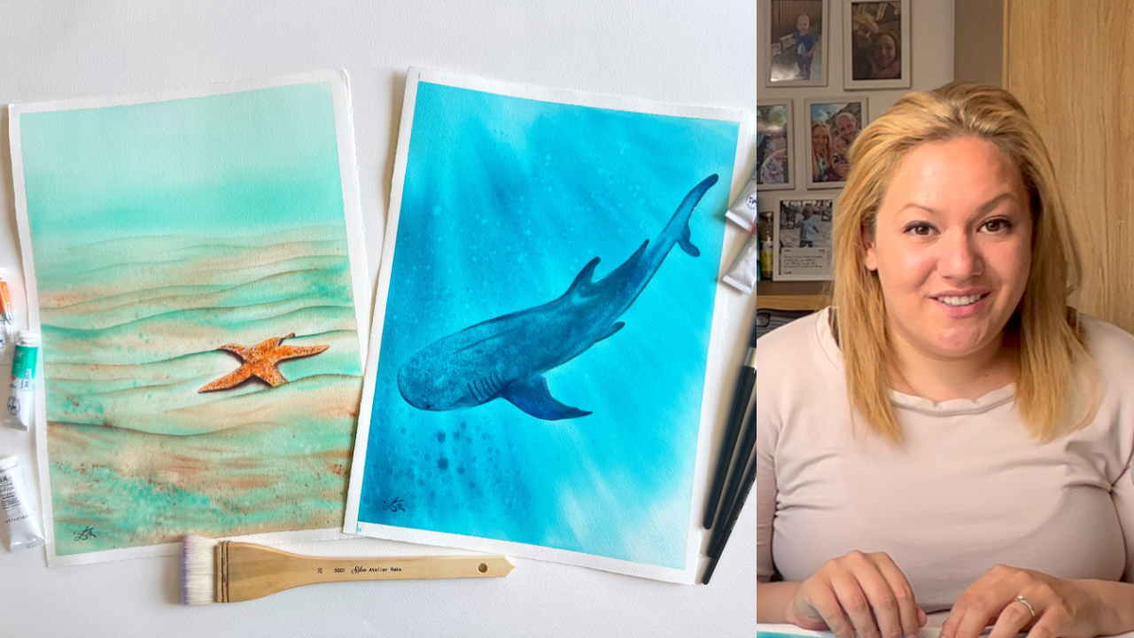
1. Welcome to Class: Welcome to the captivating
world of watercolor. In this exciting
Watercolor class, I invite you to dive deep into the enchanting kingdom of
Watercolour Creatures. Get ready to unleash your
creativity and immerse yourself in the fascinating
beauty of the Sea. Hello friends, my name
is suddenly entity. I invite you to embrace
your imagination and dive deep into the beauty
of the undersea world. I believe painting with watercolors for the
past three years. And I've been constantly
looking for different ways that I can improve my skills
and enjoy watercolors. For the past few months, I've been exploring
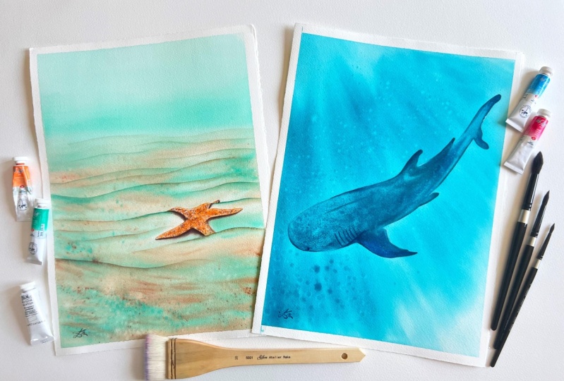
the undersea world, finding different ways to depict their beauty with watercolors. For our first project, I will transport you
to the serine needs of the ocean as we explored the delicate allure
of a Starfish, learning to capture
the essence of this magnificent
creature carefully bring in its vibrant Hughes and intricate details
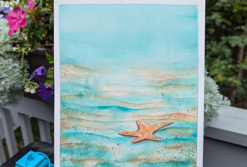
to life on paper. Because we depict the
Starfish gracefully resting on the soft ocean floor. Who discovered the
mesmerizing interplay of light and shadow and the magical translucency
of watercolors. With my guidance, you'll
learn various techniques to create a captivating backdrop
of gentle waves and see, Let's keep blending colors to create a peaceful masterpiece, building upon skills developed
in our first project, we embark on deck
scary Jing journey, think come to the
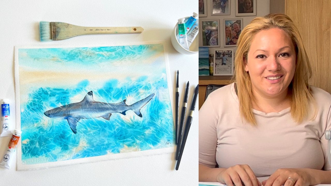
magnificent Whale Shark in our second painting, this extra ordinate
creature provide the main production to explore a wide array of dynamic
watercolor techniques, from the playful splattering
paint and water to the innovative use of sponge and even the tactile
experience of painting, which your fingers move, push the boundaries of
traditional watercolor methods. This project will not only are fine your
technical abilities, but also ignite
your imagination. As you capture the
grace and power. Whale Shark, it's
watery habitat. Throughout this course,
you will receive personalized instruction
and guidance to unleash your
artistic potential, whether you are a beginner
or an intermediate to them. I believe that this class will
immerse you in the world. Creativity, allowing you
to express yourself, unique and mesmerizing
or your ad. So join me on this
artistic adventure and let your creativity flow as
freely as the ocean itself.
2. Class Overview: Welcome to Class, my friend. I'm beyond grateful that
you are here with me. I'll start this
class by mentioning all the materials that we will need to
complete the class, the NLU explore all of the different
watercolor techniques that will work with
throughout the class. Who start with some
basic techniques like wet-on-wet, wet-on-dry, dry-on-wet and dry brushing, which are the absolute necessity
for learning watercolor. Learn how to enhance
your painting and create by lifting and
pulling color down. And then last but not least, will learn how to bring some magic to our painting
with splattering, sponging, and even dipping our own fingers into
the weird thing. This class is created for, For Beginners and
intermediate students who feel that you don't want
to take the techniques, please feel free to skip them and come to join me for
the final projects. Before we paint each project
who have a quick overview of the colors that will use
in the project itself. Remember that you can always
ask me any question that may occur or if you need some help or guidance whilst
your painting, just reach out to me and
I'll be happy to help you. When you have completed
your final projects. Don't forget to take a photo and upload
it to the project in the resources section
of the class for chicken comment on each
of your class projects. Are you ready? I'll see you
in the next lesson where we will discuss all of the materials that we
will need for this class
3. Art Suplies: In this video, have a look at the materials that who
use in this class. First, I'm using
hundred percent cotton, watercolor paper or you Saunders Waterford cold
pressed to come through GSM. I'm the sais other truths for the techniques and
the main projects, it's 11 by 15 inch or 28, bifurcates into my thirst. And half of that size for the
swatch and off the colors. We also need some
masking tape and abort cheap down
the water quality. That creates a
beautiful white border and prevents the
paper from booklet. For Palette, I use, use large led by Magellan
mission with one mixing well, what You can use, whatever
you have available to transfer our drawing seem
to the watercolor paper. I will use mechanical
pencil in a soft eraser. The main brushes that who
needs in our painting around and pulling chip
watercolor brushes are size 48.12, silver black velvet brushes, but you can choose
your favorite ones. Just make sure that they keep nice pointy tip
for Final Details. Need to also solve large brush to apply the water over the
entire background. In the initial wash
of each main project, I will use hake brush size 20, or some people call it hacker, who also use flop
park bristle brush. There isn't
controllable in we can apply finding directions
platters with them. They also are perfect
for lifting paint. Now also use a fan brush
with soft bristles, softening some of the
paint and splatters, but you can use any
conference soft brush. Then we'll play with a
simple dishwashers bunch. Or you can use horse his punch
there super from to use. And they create
amazing fixtures. I know explore their
possibilities, now work different sections. First, I will also
use missed bottled, very wet my paints so
they can soft down. I can pick up a large
amount of pain. But once we will also
use on watercolors, but you can completely octane for either chips
for pan watercolors, or even squeeze some of your
friends in financing you've, in this way, It's
totally up to you. I will also use whitewash. I know that's a multiple artist, doesn't use white and passed
him sheets in your works. But I will show you
their possibilities and I absolutely love them. In this class will
also use some napkins or kitchen roll and
a cotton chiton. It's super important
for me because it have a very high absorbency and
Suan of my essentials. I'm the last but not least, we will also use a
tracing paper to transfer the drawing to the
watercolor before we feed. Don't have any. I'll just show you here, I'm inside here different
techniques that you can use. Transfer your drawing. And I'll see you in the
next lesson where I'll show you how to tape your
paper into the board
4. Taping The Paper: In this lesson,
I'll show you how to keep your paper to the board. I'm forced to roughly
measuring the size of the tape to be a bit larger
than the size of the paper. Just way the people stick
nicely on each side. Then I press firmly in the tape before I
entered the war as well, to ensure that the paint
won't bleed below the tip. Using painter's
tape is essential in order to achieve
straight white borders. And although each artists
have their own preferences, I highly recommend you. I'll see you in the next lesson where we're some analytical
5. Basic Techniques: In this lesson, we'll explore the four main techniques
in watercolor. But before we start with them, it's create two
different mixtures. They'll help us to understand better the lifting technique
in the last lesson. The first mix shirt that
I'm applying to the top of the square is favorable
and failed green. They creep more, just
jerk always color. The second mixture is made the French ultramarine
and burnt sienna. And we will apply of
tick Layer of it, the bottom part of
the same square. I'm also adding a
little bit of water in the middle of them so they
can March little bit. Then I'm preparing unfold
with the car mine, but you can use any of your preferred colors
for this exercise. For any of the formula. It's important
that you are using only the same type of paper for the exercises of
the main projects. That will help you to understand better the behavior
of your own people. When we're exploring the forming techniques
in watercolor, we have to remember
that they refer to the relation between the
brush in the playbook way, the brush is the force
that we speak about. The paper is the second. So in this case, wet-on-wet technique
means that will apply wet paint to the
already wet surface, such as pretty moisten people or still wet layer of paint. When using this technique, we're ensuring that
all day just seen on this layer will retain
their soft edges. The result of using wet-on-wet technique can be up,
become predictable. But with time and extra
practicing of water control, you can learn how to better
control the outcome. When painting in the
wet on wet technique, you can create your
new shapes and seamless blend of color that
you can create amazing, vacant lots to your
paintings with. I highly recommend you to spend some time on each
technique and have found, explore the possibilities, explore what else
you can achieve. I'm really enjoying
the time spent. That will help you
to learn better each of the techniques and
master them over time. To wet-on-dry technique,
where for when we're applying wet paint
into a dry surface, you just could be a dry paper or a layer of paint that
have dried already. The lack of moisture in the
paper where ensure that your paint won't bleed
into other areas. That will allow you to
paint with more detailed. Show more saturated colors. I'm leave hard edges
wet on dry concrete, bolts and detailed can
go to your brushstrokes. I it's usually used details
for your paintings. When you painting wet on dry, you have to keep in mind that you will
routine hard edges. So you can use techniques like softening on
pulling down color, if you would like to
avoid just hard edges. But in theory, the
joy start to have a wet-on-dry and creating
the heart edges. I swarm of its
positives as well. I'm allowed to paint is down. You can still work
on it with wet on the parts that
are already wet. So next one is dry on wet. As that suggests,
that we're using a thick consistency of paint
to a pretty moisten surface. By using this technique will
ensure high control over the placement in the spreading
of the paint on the paper. If you don't want to use
highly pigmented mixture, but instead you some
mixture with more water. You can absorb the
excess moisture from your brush before
you are using it. In this case, I am showing you here that even though
I'm using a soft brush, I can dab the excess paint
on to a B, Patricia. And I already have a better
control over the outcome. Here, you can see that I'm even softening
some of the edges. I'm coloring back. What some of the
Carmine mixture. The promotion paper. And because I removed more and more moisture
from my soft brush, my brushstrokes are even
more distinct and they are not really moving or age
on the surface of the paper. Last but not least, drawn dry, or also known as dry
brush technique, to dry brushing
wherefore when we're using a very thick
paint mixture. And when applied
to a dry surface, the dry brush is dropped across
the surface of the paper. And you're releasing
the pigment, the raised bumps off the paper, which is leaving the valleys
of the paper untouched. It works better with
cold pressed and the rough paper there
are for is the texture, the look created who'll be
even more dramatic and phon
6. Advanced Techniques: Our next technique is
pulling color down, or also known
softening the edges. Issues when we're applying wet paint to dry paper and then using a clean damp brush to pull the color away
from the application. This leaves us with one
part and one soft edge. To ease yourself, I recommend
you to use two brushes, one to apply the color and the second brush to
soften the edges. That will also speed
up the process. Another thing that
I can see about the pulling color down
or softening the edges. You can call it a Jewish, is that you can try softening the edges on both
sides and things like that. In this case, I much rather
use dry on wet technique. Mucosa is more precise
and effect is softer. And it can be better. In this case,
softening the edges, better be used only on one side. The next technique
that uses super firm Ernie's splattering with
hard bristle brush. I recommend you to use a watery consistency of
paint when using the sticky. This will give you
better control of the size and placement
of the splatters. The more water you have
on your paint mixture, the more it will spread
on the width area. Awesome. I highly recommend
you to protect the surface around the area that you're
planning to splatter in. To do that, you can place a tissue paper or
something that you don't really care about around
the desired area. If it's a small place, some Into my non-dominant hand. So because I don't really mind to get us plotter to paint. But you do you love lamp? If you mind it, just cover
the surface around with a tissue paper or already used painting like
the back of it. Something that you don't
really care about. And you will just protect all
of the surface around that. Also, when you're aiming to plot our getters closest
possible to the paper, that will give you a better
control over the splatters. The further you move
from the paper, the less control you have. Also the more saturated pigment
is in the paint mixture, the smaller your spreader
splatters will appear, in the more water you add, your splatters will
be obviously bigger. When using this technique, I always use my finger. As you can see here, I'm just sliding the
bristles of the brush over my finger whilst aiming where exactly I
want the splatters. For that reason. Clean your finger between
each column as they will mix. I am always pay attention. Are you using the
staining colors if you are trying to Wash your hands immediately
to prevent stains. When you're creating splatters
with soft bristle brush, exactly the same
rules will apply. The biggest difference is
that the brushes that have soft bristles move more We will talk. I don't know, that's quite obvious for some. But the biggest the
biggest size of the brush. It will also hold a bigger
amount of paint and water. Also, if you want to leave your splatters to a pure chance, even if you don't
have large brush, you can load it with paint on top over the
handle of the brush, which you've been golf or
other brush from high. And you can enjoy the
magic of watercolor spreading in the most
unpredictable places. Sometimes even on the wolves and the coelom of your own home. Oh, well, it's a proper chance. I wasn't really experimenting when I started painting
with watercolor. And from what I can observe, I'm experimenting more and
more with each year following. And I can see a
massive difference. I really recommend
you try every friend, try splattering from close. I'm aiming to create the
most desirable splatters. You can aim from high and just get totally crazy
with your outcome. I really suggest you just
try out more and have FUN. I think that's the
best advice Stop I could ever receive from someone. And I just wanted to tell
you the exactly same thing. In as you can see, the loss on their role
is to splattering with clean water because it
was an absolute failure. I split it up. So
hopefully you can see how the water is
pushing the pigment away, revealing or more clear
paper underneath. I recommend you to
try for yourself and also try pushing the pigment away what's sold and rice
grains preferably uncooked. I am. That would get you
even more from the results. Have a look which one
your life better. And you can always implemented
to future paintings. If you would like to see some of the results from this technique, you can double-check my
first Skillshare class, practical watercolors. He escapes, learn to compose
your own some of paintings. In, I think that you really
enjoyed that as well. Without anymore ramble, I will
go to the next technique. In here it comes, one of my favorite techniques. And this is the finger
painting technique. And just a quick disclaimer before you use this technique. I know, I know that
the oil pumps in your hands change
the watercolor paper forever once in contact. Awesome. I haven't seen any other artists manipulating
the paint on this way. And I don't know how it
will affect in the loan Chrome us a good
quality paper and paints can stay vibrant in glorious like day one
for hundreds of fierce. And if you keep them in
good condition without set, I find this technique
super form anything yet. And I can that if you try it, you only have lots of PFK-1 and perhaps even
fall in love with it. So let's go before you start
playing around with it. I recommend you to
Wash your hands. Well, I'm just will
ensure that you have less skin OLS on your fingers
for the best results. I find that a
medium thickness of your watercolor mixture
works the best. But of course, try them out, see what you can create. The more you hold your finger, the bigger the mark will
appear on the paper. Also, if you want
to keep the cause clean dishwasher finger
between the different colors. Otherwise, they're
all mixed together, which of course can create
gorgeous mixtures like the purple Creative between this turquoise color.
In the pink one. You can also dip your
fingers into wet paint and make colorful
marks and have FUN. And one more thing to keep in mind when painting
a finished piece. Keep in mind that if you are using this technique
over an animal, it can create the
illusion of a small box. So maybe just don't
go overboard. Let's explore a bit
of sponge painting. Now. This technique
can be super form. I'm Kim, speed up your painting process
like literally 510 times. You can use a standard kitchen
sponge as I am using here. You can also of course, try a sea sponge. Each wavelet broken
into pieces will create different marks on the paper when users punch, press lightly. So you can create
from random sheets. If you press too hard, you can create a
big blob of color. You feel low, just
punch to match. You can squeeze it and
then tap the excess paint, one tissue paper or cotton rag. Also, it's good to keep in mind the four main
watercolor techniques. So in this case, you would like to create
soft and diffused edges. We have to apply the
paint to wet surface. I know we can create
cart marks if we apply the paint on dry paper. For just technique, I
really highly recommend you try using different
shapes of sponge. Try it both on a pretty moisten paper to see all the different soft
edges that you can create. I would really recommend
you to use that without any paint being hovered
the paper underneath, but you can totally
use it as well. For example, I've used the
same technique before. For example, in a
background layer of clouds, I'm waiting for the
clouds to completely dry. Then using the
sponging to create a lovely leafy greens or even trees and bushes
with a sponge. I am here. I'm just
showing you that if you adopt way too much of the, of the paint in one place, it can really look super weird. I need can look very blobby. So give a little bit of space. If you have just dab the excess paint onto tissue
or something like that. And just try all the different
possibilities so you know, the different outcomes
that you can achieve. And here we reach our last but super
important technique when lifting paint from
already tried layer of paint, we can create different effects from pseudo how highlights. Bringing back the
white of the paper. You can gently apply a little
bit of water and let it stay there for few seconds
and wipe only basis paint. This way you can create
the subtle highlights. You can also agentless crop your watercolor paper,
which differ brush, wait for our
shrew-like eradicate, or even mask away
surface around it, Wash it on the same. You can even use a magic sponge. The possibilities are
absolutely limitless. I know that hearing
about washing away the surface of the paper on the sink may sound a little
bit insane in a way, but it works very well with a good-quality
watercolor paper. You can try some
different demos, but you can also just enjoy
me lifting paint here from both the staining colors
that are that your quiz. Blue dot. We treat it by
feel of doing fail green. You can see how the paper is really stained in,
doesn't matter. Mice probative around with
my hard bristle brush. It won't go back to white. Where if I'm trying to lift the watercolor layer that was created from burnt sienna
and French Ultramarine. We can really go into
the white of the paper. That's not the case
with staining colors. And you only wait, I know that you can
go back to white with staining colors is by scratching the surface of the paper
with a sharp mark, which essentially means
that we are just crunching away or in moving completely
the top layer of the paint. In the next lesson, we'll
explore our color palettes
7. Starfish - Colour Palette: In this lesson, we're explore the color subtle used
for the Starfish. I'm the first one is fill
of green or it's PG seven, followed by mint green, which is awesome
pigment green seven. But a smelter little
bit differently. So if you would like to
create the same pastel look, but you don't have
pastel colors. You can make, you can use a mixed fail green
with whitewash. I'll just show you right
here how to look together. Perfectly fine. I am. The more white you
arch to the mixture. The lighter, basically or
pastel color will appear. The next color that
we'll explore. In my work, Starfish painting is pigment yellow for to
to pigment brown 6.7, as well as pigment white. So it's quite complicated. And if you would like
substituted for it, buff titanium is absolutely
wonderful and it's made from only one pigment is pigment wide six column one. So if you would like to
use it in any mixtures, I highly recommend
you to choose a color up half less pigments
mixed into it. And that will create on my soar, on not so dull mixes. The next one is umbo,
is pigment yellow, 43, pigment brown,
pigment black seven. And if you would like, you can create an MBA
with whitewash and that will get you are very
close to both 18, um, and germs as well will
need some burnt sienna, which can be pigment
brown seven, as the first one you
can see swatch here. It can be also pigment the right one-on-one averaging
created a bands of the brand that you are using. In my case, I have them
both in my palette, just because I have
two different brands. The following one is
French ultramarine, which is pigmented 29. I'm mixed together with
burnt sienna concrete. Lovely, lovely colors. The full-on one I'm
swatching here is Carmine, which is per hundred and 71, but you can substitute
it with any core rate, like alizarin crimson
or quin rose. Then we also have a golden deep, which is pigment orange 62. I'm cadmium orange, which is pigment orange 20th
as well. All of them. We can use white goulash, which is pigment W6. And if you would like
to use in whitewash, you can just pretty mask the areas that you would like
to preserve him advanced. Just before you start painting?
8. Transfering The Sketch: Are you ready? Let's jump
to our first main project. In this lesson, mood transfer, our sketch, flower
watercolor paper. You can try. You can
find the traceable in the projects and resources
section of the class, or you can just freehand it. In my case, I'll use
a tracing paper, which you don't have to. Here you can observe some other techniques
that you can use, the transfer your drawing
into the paper as well. And as you can see, before I even start tracing the be form for our
state double check. Is it the shiny sides of the
tracing paper facing down? Or is it the MAC site? It's very important that the
shiny side is facing down. I will watercolor paper because that's the part that
contains graphite. One last thing
before you position your sketch onto the paper
and start tracing it over. Just make sure that you take your time and move
the Sketch around, choose the best possible
placement for your sketch. And then when you
feel comfortable, start tracing it over. Transfer your sketch with light movements and double-check before you remove
the tracing paper. Once you happy, you can
use kneaded eraser to lift off the excess graphite
and get ready for painting
9. Background Wash: Before we start preparing
our color mixes, spring your colors to
reactivate them and apply multiple layers of water
to your watercolor paper. Who do this both before and after the color
preparation of each color. One sure that our
painful give very moist to get moist to the
deepest fibers of it. So we can ensure
that who work on our painting for as
long as it's possible. Once you apply few
layers of all, let's prepare our first mixture. A little bit of white Wash
would fail the green. So we can create
the SF minty color. You can swatch it on a separate
piece of paper to check the intensity in
do you need to Art anymore white or anymore
favor green for the mixture? Keep in mind that you can
add more water if you'd like to make the mixture a
little bit more watery. I feel like to have a car just stop adding any more water. Sometimes it's also
happening that would look at our paint
to wait too much. No worries in case like that. Just let it dry on your palate. Don't forget that watercolor can be reactivated and reuse. Time and time again. I need to look
perfectly fine and it will work on the exact same way. The very first time. Obviously it won't be ducts
thinking preemie if you, if that's the desired result that you would like
if you'd like to work with dry, wet surface. But in our case, we would
like to work wet on wet. So we want to have relatively
buttery consistency. But we want to have some moisture insights with
glide easily on the paper. But it's not spreading
way too much. After adding few more
layers of watercolor paper, we can create a
puddle of sand color. And in this case, I'm using germs color. But you can use buffet
chain, your truth, or any of the other mixtures that we mentioned previously. The tiny bottle that
you can see me use them is just a pure ward off. I'm not dipping my brush
in clean water yet. That way. I'm just
keeping it clean. U4 little bit longer. When you are using
pastel colors, are colors contained White. Otherwise sit. You can
contaminate your water very fast. So that's what I'm
trying to avoid it by using two
different brushes, one for the mint color and another one for
our sandy color. Here, I'm just creating a
swatch of the two colors to check how strong the mixing
of the mixtures of God. And no one wants to double
check off of the mixture. And we're happy with them. The one next to the other. That mean only one thing. It's time to have some FUN. If you filter. Now
it's the moment to add another layer of
water if you'd like to, or if you have any puddles
forming on your paper, you can the extra water
with your hake brush. That will be perfectly fine. Take your time, observe the condition of your
watercolor paper, and when you read,
you can enroll. In my case, I can see that
I have a little bit of water collected on the sides of my paper sham
just dabbing it. Devin, they access
with tissue paper. And then I'm starting with the sand color creed and sweeping motions
from left to right, back and forth and
leave the star. And the top part of our
painting. I'm painted. Once I'm happier with the
placement of my Sunday column, then I can take the
minty color as well in order to create a sense
of distance in our theme. To start with placing the mint color on the upper
third of the painting, ensuring that the upper part
of it who still lighter. So I'm basically just using
their race Jeff paint on my brush and using sweeping
motions left and right. I'm just lighten
the color around. But for me, the most
important part is that the concentrated color is from the bottom part is a Burke dark. You can see I'm just adding
the color on the bottom. Them gently sliding it up. Once happy, I can just start using sweeping left and
right motions with my brush. And I didn't the mean to
color in the image parts Painting or otherwise set the parts that haven't been
painted with our sandy color. Keep adding buffer mixtures with weak free
horizontal brushstrokes. Avoiding to paint
over the Starfish. Just gently paint around it. You can intensify the
color on the foreground. And that will show
us that this part of the painting is
closer to the viewer. So we're basically doing
exactly the opposite of leaving lighter paint on top of our painting
showing distance. Also super important that you would like to
suggest some distance. We have to have more
blue appearing colors. That will suggests
distance as well. The cooler the color that mean is more in the distance and
the warmer and more vibrant, just the color that you
suggesting that is closer to us. Once you're happy
with this resort, that you can start our demand
if I become burnt sienna, our Sunday mixture,
you feel like to suggest even more
vibrancy in our painting. We can use even
pure burnt sienna in to our sweeping motions
in the foreground. Feel free to act as
much as you want, but just make sure
that you are not overpowering all
the sandy color, not covering it completely. You sway, will keep some more. Hughes who keeps some more
interest in our painting. And it will be nice and firm. Once your 50 per
cent happy with it, it's time to get the
star of the show, our hard bristle brush and start to create
the splatters over the foreground and
the mic drowned by awarding the Starfish
and the top minty area. But if it happens to
splatter there by chance, nothing to worry. We can always use our dry hake brush or a fan brush to
soften the splatters, paint and merge them with the background or or
CPS plot or the star. We can use the soft damp
brush to lift it out. Because you can see
in the beginning and come just gliding the bristles of the hard
bristle brush over my finger. And this way, I'm ensuring that I have control
over the placement. Was plotters. Once
happy with huge column. Repeat this tape with all
the following colors. I am. Just have FUN with it. Don't forget to clean
your finger between the red and green mixtures or between the sandy color and
the minty color as well. You can add as many are a
little splatters as you wish. In don't forget that
this plot are so pure smaller if we're
closer to the paper and if we will use
a thicker framing consistency or
inconsistency of paint. And if we would like to have a larger splatter so we can
just add a little bit of water tower mixture
in that way ruling sure that our splattering
will get a little bit bigger. Just have and enjoy
what a comma. And one more thing, you could just feel that now you are lacking brushstrokes. Always feel free to add more. But in each case, focus more on your painting
and how it's coming together. Don't focus on my
painting because each one of them will
look differently. You can add, of
course, some orphans, plotters and clean
water to your painting. But everything is completely
up to your liking. If you like it to be more rich, we can more splatters. If you would like
to be more simple, you can just try to find out which your fan brush
or with a Hake brush, a little bit of the splatters. And when you happy with it, let it completely
dry or you can blow dry it or use a heat gun. Just have FUN. And I'll see
you in the next lesson.
10. Trying of Oranges: Before I start
painting the Starfish, let's try to see how the different Oranges may look with our background colors. First, I'll swatch the
book, the minty color. I'm the sandy color with
tiny little burnt sienna. Have a base for our swatch card. I'm ****, I can add
a little bit of cadmium orange on the left side, trying to fill with
a transparent orange just in the right-hand
side of it. Then just to experiment, even, we can add some
cadmium red light, a little bit of fog
to our main subject to make it stand out
from the background and keep the attention
of the viewer to the main subject or set. Otherwise, it can make our painting a lot more
interesting. The viewer
11. First Layer of the Starfish: In this lesson, we'll
paint the base layer of our Starfish
and to prepare it carefully at the base layer of water to the Starfish that will ensure that the smooth blending of the colors will be seamless. And we can work on
it for a lot longer. Then, once we're happy with
application of the water, we can start applying
transparent orange, which we can just
call simple orange. And we can intensify the color here and here by
adding more paint. I'm remember to also
paint the tiny tip of the Starfish That's
just poke him for the yellow and
after sand dune. Once you're happy with the
placement of the orange, you can graph and the
pelvic bones here. And just place it here and here. Put it down completely randomly. In this way, it will look a
little bit more nitro us. Everything in nature is
not really symmetrical. Now to give it hello,
lovely, natural look. Once happy with the placement
of the brown mixture, then we can continue
with darker, more, deeper brown color. So create that you
just add a touch of ultramarine to
our burnt sienna. So this way we're not
overpowering the burnt sienna and we're just creating
darker brown instead of gray. When I didn't any foreign
color or tried to put them down in
non-uniform mother. Just different tiny
dots here in there. If you feel that you are lacking learned
over the fluorite, you can always go back
to door in short, the button CMO to
the darker mixture. If you feel that it's a
way to overwhelm them, you can always grab
people a little bit of water and that will
push the pigment around. Just feel what your
painting needs. Once you're happy with it, just let it completely dry. And I'll see you in
the following lesson.
12. Sand Waves: Now that our Starfish is dry, Let's make sure that our
large brush is sweet and ready for softening the bottom edge of
our sand dunes, or otherwise said, pulling color them with
our medium brush, we can take over the orange and brown column and apply it with the
light sweeping motion, trying to create a
way the sheep add a little bit of mint color
Towards the Starfish. So the line doesn't
look so boring. Then you can check
your large brush and soften the bottom
edge after sand gems. And now it's time
to do the same for all the remaining jumps
that you want to add. Some of them can be more
distinct on the left side, others on the right side. And even some of them can just appear in the middle
of our painting that who aren't a lot of movement and make it
even more intricate. When agenda lines behind
the Starfish Art, more and more water
to your mixture of paint that will make them
appear in the distance. It will help even more if you manage to make them
feel flow as well. When painting the Jews just in front of the
Starfish tried to add the curvy line on
such a way that we will look like Jonas
touching the Starfish. This way, it will
appear that GMT off the ice fault of the Starfish is hidden by the sand dunes. Also, if you feel that you are lacking any interests
in the foreground, you can always add a
little bit of splattering, which your mint color or
with your sand color, with the burnt
sienna mixed Trump. Just grab your soft brush and up to few more splatters
here and dear. Only if you feel that
you are lacking them. Don't look at my painting
for loop with GRP term. Observe what's happening there. Because no painting
over the same. Even if it's painted by
exactly the same person. When you are ageing, let it dry completely before you continue
to the next lesson.
13. Shadows: In this lesson, we'll add the
shadows below our starfish. In order to do that will create a creamy
mixture of carmine, French ultramarine,
burnt sienna. I'm tiny little bit
of cadmium orange. When I didn't the shadows, It's important to focus on painting them on only one side. So they will look believable. In our case, we will
paint them towards us. Turn sure that we have
created the correct column. We can test it first on a separate piece of paper
and soft and digest. So see how to apply who
answers watered down. We'll load our medium-size
brush with pink enough to paint the shadows but without making it feel and
as it's dripping, to ensure that you didn't
overload your brush. And you can tap the excess of it on a paper tissue or
your cotton rock. Them, use your large soft brush to soften the edges
of your shadows. Will add them under each of the race or a some podium arms. This will make our Starfish
appear three-dimensional. If you feel that the shadows are dark enough at some places, let that site dry and add
another layer on top of it. Repeat the same
action for each of the race and don't
forget to paint. The shadows are always
facing us or towards us. Take her time and make
sure that you won't forget GM of the tiny array
that you're speaking for, the sand waves on the buck. Just make sure that you are just the tiniest little shadow there and that will make
it part of the Starfish. Also feel free. Pool, move your board
in all directions. Make it comfortable
experience for yourself. Painting have to give us pleasure from this
unique experience, not making us feel like
we're at in a competition. You can always move your
board to the donor site. Just make sure it's
comfortable for you and you're having
FUN whilst painting. I'll leave you now
to enjoy the music. Once your painting the shadows, just apply the paint and
soften the edges. That's how
14. Highlights and Dark Spots: In this lesson, we'll
add some highlights, some more Dark Spots
enhance our painting. So first let's clean a little bit of space
on our palette. And then we will squeeze the tiny little bit of
white, Wash your Palette. You can also add few
tiny drops of water, which our brush or
with your list bottle. But don't add too much. As if you look the
mixture too much, it will lose its
opaque qualities and instead of appearing white, it will look more like a dirty spots on top
of your Starfish. To apply the Wash. I'm using my smallest brush. I'm using just the
tip of the brush. As you can see, I'm
applying the paint in one uniform weight. So it will look
more interesting. Some types of starch, facial half random
types of Pattern. But if you prefer to add a certain pattern to the
dots, please feel free. It will be super interesting
for me to see your results. Will also add a little bit of shadowing mixture
here and here. Just try not to overdo
it as it starts to look. Looking very, very, very fast. So first up, your pattern with the white spots and then add
the darker spots as well. Familiar with them. And
it's completely up to you. Would you like to add some
smaller dots are larger ones. Don't forget that nature. Everything is super interesting just because it's all different. So even each array of our starfish will look
different than the others. Some of the dots
will be smaller, some of them will be larger. Some Starfish us will have a certain pattern and
other others like my one. In particular, we'll
look super chaotic. It's totally up to you what you would like to
bring to your Starfish. The most important thing here, just to have and
enjoy the process. This process is super
repetitive and super easy, just because there is not
a particular way that you have to add your white
spots to the Starfish. So just feel free at the
dots, whatever you want. Just enjoy the process
AS wet-on-dry is the easiest technique here
where a lot soften any edges. Just how tiny little details the process could be very
method made it a tiff. If you're just locks
and do it dot by dot. So I will leave you now to enjoy that process allows you
in the next lesson.
15. Sponging & Final Details: Another super FUN trick
that we can use in our painting is using
the sponging technique. This time instead
of transparent, orange will use cadmium orange
as it's a big qualities. So it will be visible
over the other colors. Load your sponge with
the craving mixture. And if you are afraid to affect the color
around the Starfish, you can use a piece
of tissue to cover the surface around it
while she are painting, there are Rabaa sponging. Make sure that you're using gentle tapping motions to
avoid a big blobs of color, exactly like we've
done the exercises. Here. I also, so that I need to increase the
shadows after I spoke, sponging around with
the orange color. So I will once again
apply the dark mixture, mixture and softening
with my brush. Here is also very important
to cultural painting. And to feel, does it
need enhancement, or is it looking good like that? Stockpiled in any
lights and darks? What does you're happy
with your painting? But if you feel that you
cover way too much of your shadows and lights
with orange paint. A few absolutely free to add some more darks and some more highlights
to your starfish. Here I feel that I can
improve the shadows under the Starfish by adding
a little bit more color. I'm softening the
edges and you figure that just makes
sure that you have all of your shadows under the Starfish
with the same tone. So if you add on
one side and you need to adjust the other ones, just make sure to add more
shadows to all the sides, including the little poke can
array from the buck Waves. Once you feel happy
with your painting, then we can take a little bit of the leftover paint
from your palette, or even use a specific color. Let your life to use your signature through our
own finished painting. I know that some artist
name and sign the back of the painting by like to
just sign it in the front. Would you like let me know in the discussions
section of the class. For me, this is one of the cutest parts in my favorite parts of
the painting process. So I'm always taking
my time to make my signature exactly as I
would like to look like. Once you're happy
with your signature, you can remove the tape
of your painting at the mango in that revealed the crisp white frame around it. That was the most suggested
your requests and install. So I hope you enjoy having the crisp white border
around your painting. And I hope you liked
this class projects. So once you finish
your painting, upload it to the Projects and Resources section of the class. So we can all see your
gorgeous painting. And I can give you my
common Paris over it. Thank you for
painting it with me.
16. Whale Shark - Colour Palette: In this class will
have a look at the different colors that we're using for the Whale Shark. The first one is failure
of blue green sheet, which is pigment Glu 15 columns. F3 is a cool blue. So that me and I
crave vibrant greens. If it's used with yellow. The follow-on one
is a fill of green, or also known as very
gym for example. And it's pigment
green seven, or p27. Next one that we will use in
the class is cobalt blue, which is pigment
blue 28, or PB 28. A little bit. Moral panic is cobalt, turquoise light, which is
made from pigment green, five-year or PGA 50. I use a lovely, lovely turquoise color as well. The next color that who
use in the class will be Indian trim blue or P basics. This is very chest pigment
that who use in our painting. The next one will be Carmine, pigment, red hundred
and 70 comb one. Where if you don't have Carmine, you can use any pink
or rather any rate. So you can use Alizarin crimson, you can use quinacridone, red. And each will work
perfectly fine in the last color that who use
in our painting is whitewash, which is pigment wide six or W6
17. Transfering the Sketch Whale Shark: Welcome to the first
lesson of our Whale Shark. Here it will transfer the
sketch to our watercolor paper. I will use transfer paper, but you can use any
methods that you like. Here on the right, you can see some of the most common ways of
transfering the Sketch. Just choose whichever
one fits you better. If you chose this method, first, position your sketch
to the desired position. In general, following the rule
of thirds is best advice. But this time I'll place it more or less in the
middle of our paper. Once you happy Jenkins secure paper with a little bit of
tape so it won't move around. And you can start outlining
the shape of the Whale Shark. We'll watercolor paper. Make sure that you are
not pressing too hard over the transfering paper
as it can stain your paper. Cheek. Her time with just tip. It doesn't really
require much effort, but it's very important. Make sure that you have
transfer then fire outline before you
remove the Sketch. And then you can lighten
it with a kneaded eraser. When outlining, I highly recommend you to start
from one side to now. In my case, I'll start
with the left-hand side. Now for all the outlines up to the tail and then go backwards
on the bottom sites, all of the tiny details. So we can add, once we've finished
the entire outline in front and plant will add the gills openings
in the eye exactly after we finish with the
outline of the Whale Shark. This way we can make
sure that we have transfer the entire sketch and we didn't miss any part of it. Before you remove the
print and transfer paper, keep the paper down one hand
and with the other hand. Lift lift the papers and check. Do you have any missing that
you may want to include? I'm always chicken
multiple times, so before I release it, I'm left the papers. Then we can always lift the excess graphite with
the soft kneaded eraser. And if you have any marks from the transfer
paper to the paper, we can lift them with the
same kneaded eraser as well. Meat means the next lesson where we'll create the background Wash
18. Background Wash: First, apply a generous
amount of water to the entire surface of your
paper multiple times. Cotton paper is
very thirsting to ensure that we have learned time to work
in our first Layer, we have to apply
water multiple times. Have to apply lots
of water without leaving any puddles
sitting on top. So try to distribute, distribute it to create
our first mixture. I'm taking the amount
of failed would fail green with a tiny little
chalk, cobalt blue. Then I'm diluting it
with a little bit of water from my water bottle. Eating chicken medical with of this mixture site creating
a separate puddle. There. I'll add a little bit more cobalt blue and a bit of
cobalt turquoise light. You can add color and
water multiple times until you're happy
with the mixture. You just keep warm eye
on how ficus my mixture. As you can see, my mixtures
on the creamy side. So don't add too much water, just lots and lots of pigment. And keep adjusting until
you're happy with it. Then with a separate brush, make a little put
off engine trim. You can do it now or you can
skip that step until later. It's totally up to your us. We want use deemed in tremble or in the
beginning of the painting. It's nice to have a chair
sitting and waiting. It started with, well, to ensure that we're retaining the
moisture of our paper, Let's add one more
layer of water to it and work it out around so it
goes deeper in the fiber. So if your paper, once you happy with it, who start applying our
second mixture of paint with diagonal strokes towards the left upper corner
of your painting. And then soften the paint
over the entire painting with our large brush or any other large soft
brush that you have. By my case, how will
use the hake brush as it's most comfortable
for me and I'll use it throughout the
entire background Wash. That will not only create a base layer of core of color for our pinching, but also moisten the paper. Once again. Then at another layer of our
second mixture using the same diagonal strokes pointing towards the
upper left corner. That will create an illusion of a light coming through there. When you're using your brush from the top towards the middle, make sure that
you're always wipe the excess paint from your
brush after each brushstroke. So as you can see, I'm wiping the pigment creation some bean and then cleaning my brush straight away on
the cotton Iraq, after every single stroke. Once you are feeling a
little bit happy about it, you can Dark and the rest of the area around the Whale Shark. Don't worry too much if
you paint over it as you can always soften the paint
which are hake brush. Just keep applying
darker and darker tones to your water and
softening them around. Remember to take off
the excess amount of pain from the body
of your Whale Shark. I'm to do that, just
use your damp brush. Make sure to wipe away any excess pigment each time
that you have removed it from your paper
and try not to add anymore water there as dots me create a
cauliflower effect, which may push the pigment, the background away and destroy the smooth flow that we
are trying to achieve. After that, you can keep adding
more concentrated amount of pigment around your Whale
Shark again and again, and don't add any
additional moisture. Don't worry too much if you
cover any of the fence or the tail with paint as you
paint them darker later on. So just concentrate on adding more concentrated
pigment and softening the edges on this is the most important part of
the first background Wash Once you run out of your first, or rather the second
paint mixture, you can start applying
the first one, the more concentrated
darker mixture. So first, we can apply
it to the upper part, basically above our Whale Shark or an below the
Whale Shark as well. And keep softening the edges. Just apply first as much
paint you would like to keep softening the edges
which are hake brush, soft, turn, and then wipe
the excess soft and, and wipe the excess is
exactly the same movement. All the wafer. Really don't forget to wipe the excess after every
single movement. Otherwise, you add some
of the darker mixture. On the left corner
where we're pretending that we have our live
calming through. So we don't really want
darker tones on the corner. This is probably the
most important part of the entire background Wash. Just keep the upper left
corner of painting. One of the lightest
part and also keep our oil Shark lighter. I know keep the bottom
right corner as well. So we have three
sites that will be lighter and a half hour. Gorgeous water in the middle
surrounding our Whale Shark. Makes sure that your darker. All the sites around our Whale Shark on
you can see how many times we're applying in them soft and an applied and
softening the paint. Also super important, yes, if you run out of
your paint mixture, exactly like how will now use concentrated pigment with a
tiny little bit of water. We don't want to introduce any more water to our painting. Here I'm adding field
blur fill of green to create this fixture
quiz mixture. It's predominantly
bloom, but you can see how thick is the mixture. This doesn't flow
in your paper after applying his strokes here
in gear smooth background, which are hake brush and always use directional
brushstrokes. This way you're keeping the GR of the sun ray speaking
for the water. Take your time with this tip. As you can see, only creating
this background Wash. It's taken me out
on 10 min in total. So almost the entire lesson, we're just creating
the diff of our water, softening the edges around. So if I'm taking 10 min, I think that you can
take some time to work on your background
Wash as well. Just make sure that if
you add any extra color, your upper left corner, you take your time to clean it. You can always apply extra paint here and
Gary, fulfill that. You need to add some more. You can see how many layers
of paint I've added them, how many times I have softening the edges every single time. So I'm softening the edges
around the top of the water where the light just
coming through around our Whale Shark and
also around the bottom, who just want to have a
gorgeous smooth force. So I'm gonna recommend
union not first step here, I'm intensifying the
color even more. And after the last softening, I'm washing my brush very well. Then picking up a little
bit of clean water with my medium-size
brush and dab in a little bit of
the excess water from the tip of my brush
on the cotton Iraq, so snot soaking wet. After that, I'm tapping the top of the handle
off my brush with my index finger to create some landlords plotters
above the Whale Shark. Once you feel that you are
at him off splattering, wash your brush very firmly on, you can put it aside. You can soft on some
last minute edges. And if your hands
are not clean yet, give them a quick wash. Because here comes my favorite
part of this painting, who paint with our feet
to do that, pick up, though with a short quiz mixture with the tip of your finger and start tapping small dots of
paint on the Whale Shark. And try to focus the little circles on the
left side of the painting. If you apply them quickly
with little pressure, they will appear small
and concentrated. If you hold your
finger for longer, you create a little
wild circles around your dots to look
like a tiny halos. But to secure those, they are
tried to not overdo them. On this teach. When speaking about
the daughters plot or a little goes a long way and you don't want your
painting too overworked. The background is just
the surrounding of our main subject and it shouldn't take its
attention away. We can also act few little
splatters hearing here with our small size brush using
the same tapping motion. I'm keeping the
moisture freaking out. So we're not creating
giant cauliflower, but instead of finishing off, so we're creating still some splatters coming out
easily from our paintbrush. When you're a fear, happy
with your background, layer to dry completely. And you can even use hairdryer to speed up the drying process. And if you're planning to leave the painting to dry overnight, join me in the next lesson for a quick check before you
leave it to completely dry
19. Quick Tip: If you're a table or desk
gets covered with paint, tried to clean them
immediately after painting the field of
color, so very staining. And if you don't clean
them as soon as possible, it can stay in your
desk permanently. I'm using just clean water
here from my spray bottle. But you can use sanitizer
spray or even alcohol as well. Also clean a little
bit of space on a palette for the
following mixtures.
20. First Layer of the Whale Shark: In this lesson, we'll paint the base layer of
our Whale Shark. So first let's prepare a little puddle of
cobalt turquoise light. Then apply an even coat of order to the inside
of our Whale Shark, making the sure that we're
applying generous amount of water so we can have
longer time to paint. If you feel that some
parts are drying faster, just add some more
water to them. He can't time with
this tells us it's super important that we can apply a soft transition in our first Layer
of the Whale Shark. Want to make sure that not all the entire body of the Whale Shark will
be covered with water, but also all the
fields in the tails. Well, I hope you don't mind, but I will speed up
this part as we were just starting to always Shark. Feel free to pause here. Then you start applying
generous amount of paint over the Whale Shark and don't worry about the
chips of the tail and the fence AS will add
darker mixture stare. First, we are covering
the entire body of the Whale Shark with our
cobalt turquoise light. Once you're happy with it, then you can load
your brush with a chirp is mixture
that we had prepared earlier and start applying it on the bottom
part of the head. Also apply some stripes
of paint onto the back of the sharp fall in the movement
of the spine. Them out. A bit of the same paint
mixture to the tail as well. Add some more
concentrated pigment on the back of the tail. Here we're working
with dry-on-wet and our Shark doesn't
have much water left, so we have to be fast. Just add faint hearing. Dare. I have completely
cover up the top fans as well as the small
bottle of him and chips of the tail with
the same mixture. You can also soften some of
the edges with Dr. dry brush. But be careful not to
introduce any more water tower pinching because that would create cauliflower. Here you can see how I
went over the outline. I'm to clean it. I have first started
only go with a voir so I can
manipulate the paint. Then I'm dabbing the
Bill of the brush onto my kitchen room so I can get the excess moisture
out of my brush. As I felt that only use
in Indian tribe blue, It's quite dark and
to be too harsh. So I'm creating a mixture
from failure blue, phthalo green in Indian shampoo. Then I'm starting to paint the first dorsal fin that is on top of the Whale Shark with
that turquoise dark mixture. And by using exactly
the same mixture will cover the dorsal
fin on the back. I know also add some horizontal strokes around the top of our Whale Shark. I will keep outlining. Usually Keep in mind that the top part of our Whale Shark is darker
than the bottom part. But just feel free to
manipulate it as you wish. Just have FUN and
don't stress too much about the rules because
Syngenta of the day, it's our own painting. So if you would like
to follow the rules, you can totally do that. But I'm just following my black and white
reference photo and also I'm following
my intuition. So in this case, I'll have a darker part on the bottom part of the
body of the Whale Shark. And I'll have a light apart
on top because that part, it will be sunlit
because the rays of sunlight are peeking
through the water. So They're also creating the
illusion that still be one upper part of the body of our Whale Shark
dotted groups justi, a little bit lighter. By using exactly
the same mixture, we are adding some more
definition, the pelvic fin, and we're dragging the color
backwards to the tail, as you can see in our join with other half an hour
failover Whale Shark, because perhaps it's hidden as the Shark is sitting on a site. So you don't really have
to have all the parts of your Whale Shark as long because you can see them
on the reference photo, you can include them otherwise, dots mean the spine is
twisted a little bit. It's on the site. So don't worry about it. Follow your reference photo. I'm totally enjoy
the painting process and have FUN without
worrying about any fan. When applying this
darker mixture, focus on adding the paint to the tips of the
fence and the tail so you can make
them more dramatic appearance on the Whale Shark. And don't worry about the lighter areas thought-out are visible now our Whale Shark, because most probably
they're not visible from the bird's-eye view
that we are looking at our Whale Shark
in our painting. Now, once we're happy with
the chirp race mixture, we can apply a little
bit the filled-in train, the large butter fan, also called picture of him. After that, we can apply it the rest of the
fence and the tail by focusing on the
chips of them. So we can keep that
dramatic appearance dot Wu was creation with
the dark turquoise mixture. Make sure that you are using both the chip of the brush for finer details and to the
edges of your painting. In the belly of the
brush where you would like to add
some more paint. Just try to make a harmonious movement between the chip and the
belly of the brush. And this way you are practicing
using the entirety of your brush that will
really help you with achieving better
results in the future. Not only in that exact. As creation smooth
transitions between the chip and the belly
of your paint can not only make it easier but
faster to paint as well. And you'll gain a lot more
control over your brush. Here as you can see, I'm just softening a little
bit of the paint that I added and it was looking
really, really streaky. And you can also
add a little bit of the cobalt turquoise light and mixing it back with the dark turquoise mixture that we had on the budget
of our Whale Shark. Also, if you want a
softer some edges, you can use a clean damp brush. Just try not to introduce
any additional water. So every single time when
you clean your brush, always make sure that you
dab it on your cotton cloth. And once you're happy with all the areas that are covered, you can create small
splatters with water over the Whale
Shark that will create the illusion of the
dots that appear over their bodies as the water will push away the dark pigment. You can also cover
the surface around the Whale Shark with
kitchen roll and create splatters with cobalt
turquoise light that will create even
more interest in your painting and
create the illusion of even more and more dots
around the Whale Shark. I know you're happier
which are splattering. Just dry your
painting very well. And meet me in the next
lesson where we'll start creating the pattern
over the Whale Shark
21. Enhance the Darks: In this lesson,
observed pattern on our Whale Shark and
enhance some of the Darks if we will
observe the pattern on this Whale Shark that
I have painted earlier, you can see how I had
to painted each of the dots by pinching
filled circles around it. This technique can be really, really beautiful to
die of the viewer, but it's also very
time-consuming. So how can we create the
illusion of thousands of small dots but without
leaving the liver as life. Or with other words said, without painting all the tiny
little circles one-by-one. Before we do that. Before you explore
the different ways, let's enhance the darker
parts where it's needed. So to do that, let's just paint darker paint or show and
then soften the edges. We can repeat that for every single part that
we need to enhance. And we can use either the turquoise
color mixture or we can mix it even
when even true blue, just to make even more popping into bring a little bit more
contrast with the background. So we have a lighter
background and we have our Whale Shark darker. So that's bringing all of the tension for the
viewer to our foreground. Super important for me. It's once again to just keep Walmart on your exact painting. In my case, I need
this enhancement in the front part of the Whale
Shark. Where is the hit? To create a little bit
more contrast in here on the back of the Whale Shark
or on the upper part. Basically I'm
enhancing even more. I didn't some more darker values and softening the
edges once again. But just keep warm eye on what's happening
in your painting. That's the first thing
that you have to do. One of the rules that it took me quite
some time to learn. In fact, in my
painting practice. And I think it's one of
the most important one. You can see that here I'm adding even more Darks on the
second dorsal fin. That's the back dorsal fin. And just keep
softening the edges, which a large soft brush. And just to be more precise, That's why I'm applying
the darker values of the things with my
small round brush. Meet me in the next
lesson to have firm in create the actual pattern
on our Whale Shark
22. Painting the Body Pattern: In this lesson, you'll learn how to create the pattern our Whale Shark first we'll create few wealth of cobalt
turquoise light. And another one with
turquoise color from cobalt with fatal
blue and green. So create the same mixture
that who was using earlier. But will also have a fairly
good puddle where if cobalt turquoise light and also mix some of our turquoise
mixture with the Indian trim. And once you're happy, let your mixture
suicides and we can start painting our first wave. So you can choose for
yourself which way do you prefer to use in
your own painting? I would highly suggest
you to try both, or at least to observe first, to see how both of
the waste work. Then try it on your own as some people like repetitive
actions and they would definitely
enjoy this first wave to learn how to paint
in our first way, Let's take one of the
mixtures and start making tiny circles which
are small round brush. Whilst painting load
your brush from the different wells so you can defer the colors that will create a lot more interest
in your painting. And tried to change the
sizes and the shapes. But I highly recommend you
just to keep cohesiveness. Create few tiny little dots
with one of the mixtures. And who else you have
built tiny little pattern, then you can position
into another column. Just pick up this one
that is sneaks trade. We have a flat palette. That's mean that all
the mixtures around it are touching each other. So if you get some of the paint that is next
to the other one, that means the
mixture, it will be, for example, a little bit lighter or juice a
little bit darker. So we can create a cute little pattern here
and there are varying the size of the circles of pores would bring a lot more
interests for the viewer. But I think that it's even more important to vary the
colors from time-to-time. Don't forget that you can also lighten some of the mixtures by adding tiny little
dots of water to it. Just don't dilute
it way too much. Or we're all worried, half some layers of
paint created there. And obviously, watercolor
is transparent medium. So if you add a
transparent layer, it may even not be visible depending on
the layer below it. So here you can see I'm
getting closer to the H or did basically to the age
of the head a firewall Shark, because it's a little
bit darker there. We got some dark colors. For the same reason. I'll use darker,
truer Chris mixture that will pop out at tiny
little bit of Indian tree blue. And that will Art to
the painting as well. To make our painting
even more interesting, we can add a little bit
of pink red to create a sheet that looks
even closer to purple. And that will bring a
little bit of warmth to our painting and make
it even more interesting. You can use, like in my case, I'm using carmine,
but you can use any pink that you would like. You can, for example, you owe para or a cleaner aid or any pink rate
that you would like, just make sure to keep warm. I am how strong
kissed the color. So in my case, the car mine is not a
very, very strong color. So I can like, I swore up quite a lot my paintbrush in the
paint and I attend national making the mixture very pink is just
lightly tinted. And also, I think it's quite important not
to cover a lot of colors and variations in the area around the eye
of our Whale Shark. Us, we still want to keep the interest in that
part on the eye itself. You can continue like that for hours and hours to
come if you'd like to end up to become a very
detailed painting in, it will be quite
interesting because well, on another hand, you
may decide to also Try a little bit of
sponging as well. The fuel of the sponge painting
is so different part of painting small circles and it killed the super
fan to use as well. If you decide to use
the sponging technique, prepare yourself a
little puddle of paint that you would like to
use on your own painting. You can also test them on
separate piece of paper to ensure that you are happy with the consistency
of the fields. I'm the marks that your
sponge concrete on the paper. It's quite important
here to remember not to press your
sponge to heart. I did can create undesirable effects looking
like a box of color. Instead, the pure sponge
in paint just a little by little and keep building It's gorgeous pattern
for your light can. Keep observing your painting
and seeing what is missing. In my case, I feel that my
painting because Luckin, the circle shapes, so I
will add some more of them. Would get even better
in your painting. Do need some more so-called, feel free to watch them, or do you need to
vary the colors? Just do that. I'll
leave him out to enjoy the music and
paint your heart out. As we're building the hittin
the Body of our Whale Shark. Let's just add the I that was visible on our reference
photo as well. If you can see anymore
your pencil marks, you can always take back your pencil sketch and
follow the guidance to position that I
the correct place and painted in your
dark blue color. In our case, I'll use
an engine trim blue. So that will make it
pop a little bit more. Before we continue, make sure that your paper is
completely dry.
23. Define the Whale Shark: In this lesson, we'll
create the gill slits. They are a series of openings
between the gill arches. So a fish through which water
passes or otherwise said, these are the vertical lines on the site of the head uphill, the fishes and the
sharks with breathing. So to start painting the gill
slits on our Whale Shark, let's create first a
little puddle of creamy, milky consistency of Indian trimmed blue or whichever dark, warm food value half years
throughout the painting. I'm just picking up a
little bit of water from your quiz mixture to make
more workable consistency. But you can also use a little drop of water to
make it workable for you. If your left hand, can you prefer the other
way around which we just watched this part
and paint after that. Otherwise, let's painting
from left to right. We will first apply
a straight line of color following
our pencil sketch, and then soften the edge on the right-hand
side of each gift. Let we will also paint the line below them and soft
and its bottom part. There isn't usually a line
below the gifts of the shocks, but in our case we have it. So for our exact Whale
Shark, we have happened. That mean I would like to
include it so we can paint it. Then you can continue to paint each individual gill slits and soften the edges exactly
on the same way. Usually all the gill
slits over Whale Shark or any other fish
are the same size. But in our case, our Whale Shark is
in perspective. So the gill slits are
in perspective as well. So those one on the
left side will appear a little bit longer
of compare two, there's one on the
right-hand side. When you're painting
each individual gas, let just take your time. You can apply the paint
which are smaller, round brush and soften the edges which are larger
or medium-size brush. You can see that us further I go DOB becomes smaller and you can even make him make them
look a lighter just because they will usually appear
tiny little bit lighter. Following the idea
of perspective, I'll ask totally not me, sorry. The rest of the body of
the Shark is dark as well. So just follow your gut. I'm feel, what feels
right for you. I think is quite important
here to mention that the Whale sharks usually have
only five large gill slits. On the first gill slit, All the spiral, which
C is for breathing. When the Whale sharks are
resting on sea floor, they are also usually directly located after the Shark sigh. But in our case we
have five large ones. So I'm to tiny,
little bit smaller. So in total we have
seven gill slits. Don't ask me why
that's what I was seeing on that reference photo. If you would like to
be more accurate, just focus create on the five
until we perfectly fine. But if you just want to have FUN and follow the tutorial
as I was painting it. You can always make sense. I don't think that Everyone we're looking
at your painting will recognize how many exactly gill slits the shock will have. I think it will be more like
enjoying that your audience, even the tiniest
little intricate details and that will
really be forgotten. Also feel free to enhance
any dark parts that you would like and you feel that they need to be enhanced. Don't forget to soft them. All of their edges. Have FUN. And I'll see you in the next lesson where we'll create some subtle highlights.
24. Add Highlights (Final Details): In this lesson,
we'll create some subtle highlights door painting. And for that we will
use tiny little bit of whitewash with a teeny
tiny little bit of water. As we discussed in our
previous class project, just make sure that you are not audience Week much water Wash. Otherwise it will
lose its opacity, which is basically
towards making it. And that will bring the
highlights to our paintings. So to do that, for a little bit of whitewash to the outer side of the tail of our Whale Shark
and then soft and digest. So in other words, we won't be painting the tail of the Shark,
but just surrounded. The highlights of the
white will contrast with the dark tale and it will
bring some more interested. We can also do the same
around our bottle filled. And if you decide to soft
on the opposite side. Over the ages of
the pictorial fin, we can suggest that the
lightest reflection on the fin, and it's making it to
appear like it's glowing. So think about the
different ways on what exactly you would like
to concentrate on, will do like to add the white
goulash around the films? Or would you like to
add it to the fields itself and make them
looking globally? There are two different things. You can, each either
methods and that would really make your
painting more interesting. All you can, of course, paint on both ways
exactly as I was doing. So I added the white goulash on the outer side of the tail
or in the pelvic fin. And I'm adding it on the inner
side of the pectoral fin. The boat on large fin on
the front close the head. When I was out in the wash. I soft on on the inner part
in exactly the same way. I'm adding the goulash on top of the Whale Shark and that will make it look like it's glowing. So the sun is at afflict him over the Whale Shark
and is making it pop. I'm that could bring a lot
more interest to our painting. In the same time, the light that was
below the fence, I'm the CIO can make
it pop as well. So in this part we're enhancing the highlights and the
Darks of our painting. My case, I'm enhancing
the highlights. We feel that you need some
Darks I've done here. This is your last moment. And you can always add a little subtle highlights to the head of the Whale Shark, exactly like I'm Adam
here in the front. You can either soft on
the inner or outer sides. Now you know the
reasons behind it. And when you feel happy with it, you can use the leftover
dark blue paints or any color of your choice to
sign your finished painting. Just load your brush
whale without making any group in a forth and take
your time with this tape. Don't have to rush this step. Just take your time. Load your brush, which
are favorite color from the painting or any
article that you fancy. And for me, this is one of my favorite steps because
even though the painting, of course, it's super personal, painted on your own. Even though you
following tutorial, the moment you have
us your own supplies, you have your, your own hands. And it is truly yours. It's your creation. So I didn't your signature,
your own signature, creating your mark and
putting your name or little symbol representing
knew exactly as I'm doing is just showing
the word exactly. You have created this painting. And I absolutely love that step. I think it's super-important
for every artist to do it. And be super proud of yourself. Once you're happy with it, then you can take your
time and then remove the masking tape and do that at an angle from the
painting so we can reveal our beautiful white border
came true painting. There's gorgeous projects
with me and I'll see you in the next lesson
for our final thoughts. And don't forget to check the project in
resources section of the class where you can find even more reference pictures. So you can paint on your own
25. Thank You: Congratulations on
completing the class. I hope that you're happy
with journey artworks. I know that Underwater scenarios
are quite challenging, but they are all really
worth the effort. Stepping outside
the comfort zone can help us to gain
more confidence in our own skills and enhance
the results. Are paintings. Give yourself some credit
for completing the class. You absolutely deserve it. And once you read it, don't forget to snap a photo. I look Florida to
the Projects and Resources section of the class. I'm super excited to
see your results. If you decide to share yours results when
Instagram don't forget to tag me at Alice
underscore Art. And I will do more than happy to share your results
are my stories. If you have any
further questions, don't forget to ask me in the
discussion sections class, I would be happy to help you if you need any
further guidance. I'm absolutely there for you until next time. Happy painting
 Ralitsa Arnaudova, Watercolour Artist