Transcripts
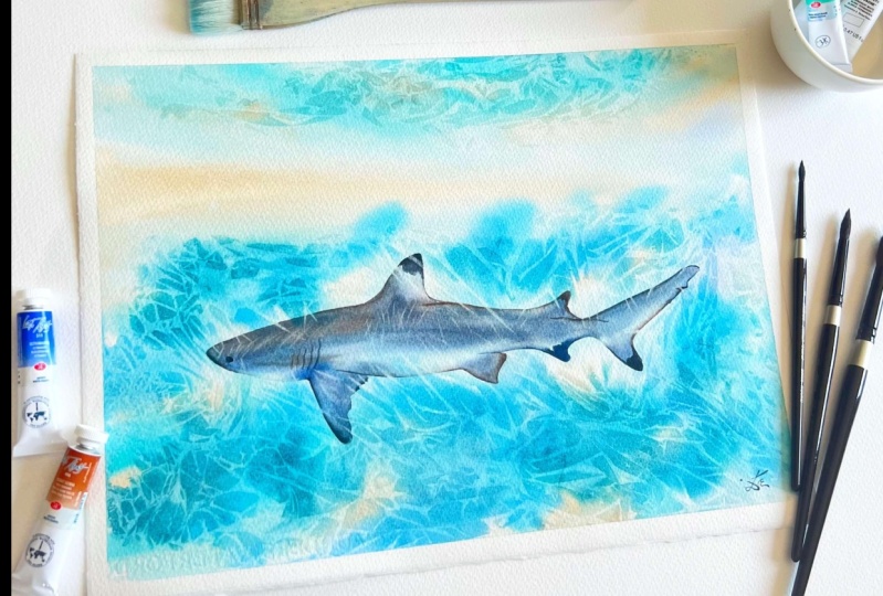
1. Intro to Sunlit Shark : Welcome to this advanced
watercolor class that will take your
skills to new depths. In this captivating course, we'll explore the
mesmerizing beauty of a sunlit shock on the
water. Hello friends. My name is Liza Nova, and I'm a watercolor
artist and a teacher. And I'm inviting you
today to join me on this wonderful journey where
we experience not one, but two of my favorite
techniques that can bring your watercolor skills
to a completely new level. As a watercolor
artist and educator, I like sharing my secrets
with my students as I believe that this can open a whole new world possibilities
for someone else. In this class, our first
focus will be on capturing the eternal glow of a sun lit shark beneath
the ocean surface. From my guidance, you will learn advanced water
color techniques to recreate the interplay
of light and shadow, creating a truly
breathtaking masterpiece. From the shimmering reflections of the shark's leak body to the subtle dance of a sunlight filtering
through the water. You delve into the intricate of this mesmerizing
subject in order to learn that will delve into
the enchanting techniques that will elevate your
water color to new heights. The first technique involves
using clin film to create fascinating textures
and patterns in your watercolor paintings. Discover how to manipulate this versatile
material to achieve unique and captivating effects adding depth and interest
to your artwork. The second technique that we'll explore is the
lifting technique. A remarkable method
that allows you to selectively remove pigment
from your watercolor painting. This skill is invaluable
in creating highlights, adding dimension, and lending an eternal quality
to your artwork. You'll learn the intricate of lifting pigment
and discover how to masterfully incorporate
this technique into your suny
shark masterpiece. This watercolor class
is designed for intermediate
watercolor artists who are eager to push their
artistic boundaries. But if you are a beginner
watercolor artist and you still would like
to learn this technique, I've got to cover
it. No worries. You can jump into my underwater
class where you can learn beginner and intermediate
watercolor techniques that can set you up for success. And then you can join me here so you can seamlessly paint. In this class with me through personalized instructions
and hands on practice, you refine your skills
like never before. Join us on this thrilling
journey as we dive deep into the sunlit sharks and discover the magic of clear film and lifting techniques
in watercolor. Get ready to create captivating masterpieces
that showcase the true brilliance
of watercolor.
2. Welcome To Class: Welcome to this
class, my friend. I'm beyond grateful that
you are here with me. We'll start this
class by mentioning all the materials that
we need in this class. Then we'll explore the
color palette and I'll show you some alternatives
to the colors used in the class in case that you
don't have them or that you would like to try different color combinations as well. I'll show you some
alternatives to my favorite color
combinations that is easily liftable or they are also known as non
staining colors. After that, I'll
show you quickly how to use the techniques that
we'll be using in the class. Then we jump into
our final project. Remember that you can ask me any questions that may
occur whilst painting, or if you ever feel the need
for any help or guidance, just reach out to me and
I'll be happy to help you if you are not feeling inspired by the subject of the shark. But you still would like to try this technique. No worries. I've tried it with other animals before and it's working
perfectly fine. Here you can see this
glorious elephant and how intricate it looks
with this technique. When you have completed
your projects, don't forget to snap
a photo and applaud it to the project and resources
section of the class, or if you decide to
publish it to Instagram. Also you can tag me with
lies on the school out and I would be more than
happy to share your paintings into
my Instagram stories. Also, do feel free
to share any of your experimentations
and what kind of crazy animals you can
create with these techniques. I'm pretty sure that they
will become glorious as well. Are you ready to begin? I'll see in the next
lesson where we'll discuss all the materials that
we'll need in this class.
3. Art Supplies: In this video, we'll
have a look at the materials that we'll
use in this class. First, I'm using 100%
cotton watercolor paper. I use Sanders word
third code press, 300 GSM and the
size other troops. For the techniques and
the main projects. It's 11 by 15 inch or
28 by 38 centimeters. And half of that size for
the swatching of the colors. We also need some masking
tape and a board. The watercolor
paper that creates a beautiful white border and prevents the paper
from buckling. For palette, I use this large palette bymgel
mission with one mixing well. But you can use whatever
you have available to transfer our drawings
into the watercolor paper. I will use mechanical pencil and soft and the main brushes that we'll need in our
painting around point. My preferred brushes are size 48.12 silver black
velvet brushes. But you can choose your favorite
ones just make sure that they keep my pointed
chip for finer details. We will need also
soft large brush to apply the water over the entire background
multiple times. In the initial wash
of each main project, I'll use brush size 20
or some people call. We also use flat
part bristle brush. They're easily
controllable and we can apply finding direction
with platters within. They also are perfect
for lifting paint. I will also use a fan brush with soft bristles for softening some of the painting platters, but you can use any
kind of soft brush. I will also use a
missed bottle to relate my paints so they can soften and I can pick up a large
amount of paint at once. We will also use
panel water colors, but you can completely obtain for either
tubes or panel with colors or even squeeze some
of your tube pins in panting. In this way, it's
totally up to you. I will also use white quash. I know that some
watercolor artists doesn't use white and pastel
sheets in their works. But I will show you
their possibilities and I absolutely love them. In this class, we'll
also use some napkins or kitchen roll and
a cotton che towel. It's super important
for me because you have a very high absorbency
and it's one of my senos. We'll also use some clean film and this is the
start of this class. I'll show you the
stunning effects that you can achieve by using it in your paintings and how
it can elevate your works. I will also use a ceramic
plate for extra mix and space, but you can just
clean your pallet in between the different layers
and that's completely fine. Last but not least,
we'll also use a tracing paper to transfer the drawing to
the watercolor paper. But if you don't have any, I'll just show you
here on the site a few different
techniques that you can use to transfer
your drawing. I ask you in the necklace, I'll show you how to take
your paper into the boat.
4. Colour Palette: In this video, we'll swatch the colors that we use
for our shark painting. The first one that
we'll see is butt. That's pigment white. Six or six. It's a lovely sandy color. It can look super
fun on our painting, but if you don't have it, you can always use dunes, which will be the second
color that I'll watch here. That's made pigment yellow
42, pigment brown six, pigment black seven, and
pigment white six as well. That's a little bit
more complicated. Cold have four different
pigments inside. If I have to recommend you
to choose one of them two, I would really
suggest you to choose this one that has less
pigment inside the mixture. The following one is umbo, which is pigment yellow, 43, pigment brown, seven, pi seven, pigment black, seven. You can see all over around it. I'm just mixing umber with
white wash and that can give us a lot of
different color mixes. Depending on how light we
would like our mixture. We can add more white wash or we can use less white
wash. Of course, we can use Rosena, which is pigment yellow 43. The following one is
cobalt blue which is by 28 pale blue green shade
which is B 15 column three. And this one is a blue. The cobalt blue was warm one. The next pigment that will
watch is pigment green. Palo green which
is pigment green. Seven will also create
a mix of Phil blue and Palo Green's a
gorgeous chercoise color. You can also use
cobourquise light, which is pigment Green 50 or G 50 and Coboerquise on
its own which is 28. But if you don't
have Cobourquise, you can just use that mixture
of El Blue and Phil Green. Just use the colors
that you have available and it will be perfectly
fine. Just have fun.
5. Non Staining Colour Combos: In this lesson, I'll show you two of my favorite color combos. And the range of colors that they can achieve
when mixed together. For our final project, you are completely
free to use any of them or another non
staining color. It's completely up to you. The important is to be
non staining color, so it will be easily liftable. First, here I have
chosen to show you the fun interaction between French ultramarine
and Burn Siena. Burn Siena is a deep
red brown color. Ultramarine blue is warm blue
containing traces of red. In combination, they
create from dark browns and deep blues to
subtle grays and rich, strong, almost black
grays when the looted. This combo is granulating from the strong sedimentary
pigment of the French urine. You can lift them easily
and create even an entire finish painting from
only using this two colors. I've created many of them, and you can just
have a look here, all the different color
combinations that you can achieve from just
mixing the two colors. They're absolutely glorious. I'm using them for
the past three years. With every following year, I'm just falling more and
more in love with them. The second color combo
I would like to show you is between cobalt
blue and red iron oxide. If we use them, we need
to keep in mind that in this case the red color is
a lot richer than the blue. It can easily
overpower the mixture. What that mean, in our case, we'll make sure that if we would like to have the mixture color, we have to use a lot more blue. Just keep control over the red. These two colors create super
fun color when combined, and they can easily achieve
super rustic feel and even some hues between
brown and lavender color. I highly recommend you to try not swatching them
only on this way, but using the second Swatch card that I'll show you in a minute. This way you can really
observe the entire range of colors that you can create
from these two colors. You can do all the Swatch cards either on a separate
piece of paper, as shown here or in
your sketchbook. And see which one do
you like better here. I just wanted to show you
one more way that you can experiment with mixing
the color combinations. The bigger the sheet
of paper it is, the more you can experiment and see the range of colors that you can achieve from the two colors that
you have available. In this case, here
I'm starting with the cobalt blue and
the red iron oxide. And you can see the
little purple speckles, the beautiful colors and giant range of colors
that it can be achieved from only
the first two colors, the deep browns and
dark blues that you can create from frenumrine
and burn Siena. I highly encourage you
to experiment and try. Also, if you have two
different types of burn Siena, try them both with Frente and have a look and see
which one you like better.
6. Excersice 1 - Background: To understand our final project, we can practice quickly on
a small piece of paper. The techniques that we use, first let's transfer
a little part of our, well shark to the small
wood color paper. I've used some leftover paper. You can also use the back of
annual painting for that. The only thing I think it's quite important and
I highly recommend, is to use the exactly same paper that you will use in
your final project that will show you what to expect from it and what you
can do with your paper. Also, as you can see, I'm transferring only the
backside of our shark. I'm not really worrying about any specific detail
because this is just our practice piece and it can be a
little bit quicker. Don't worry. If you would like, you can practice it with me or you can just
watch the video. And then you can jump to our final project where
we painted step by step. Anyway, just for
your information, I'm creating that
little exercise here. I believe that painting with me twice the same
exercise will of course, make your final
painting a lot better, as you have always experienced
the entire feeling. Once you paint your final
project afterwards, it will be a lot
easier, a lot faster. And you'll understand
every single step that we need to do here. You can see I lighten
the sketch also. It might need it, Teresa. I'm applying a little bit of water and I won't
really overweight it as this is just
practice piece, will use some
leftover paint from my palette that we was
using our main project. Don't really worry what will be the outcome of
our practice piece as the whole idea is
that we're just practicing with absolutely
nothing else but practice. Practice, practice. You can use the leftover paint
of your palette from switching the colors
earlier or from mixing some of the
paints you can choose. Which version do
you like better? With French Marine
and Burn Siena or with red iron oxide
and cobalt blue. If you don't have any leftover
paint on your palette, I can just tell you that
I'm using some sand dunes. But tanium ad the lighter base
colors that I first apply. Then I'm using the
Charcos mixture, which is palo blue, fail green, cobalt
blue to the mixture. If you want to make it
a little bit warmer, you can add frenumrine. Highly recommend
to keep it cool. If you just stick colors, that will make it a
little bit nicer. Also, I'm adding some
splatters with water. A little bit more splatters
with white glo with chokes. Once you're happy, just
grab a little bit of clean film and wrap it
around your practice piece. You can manipulate it the very first seconds when you apply the clean film
to practice painting. Once you're happy with all the manipulations that
you do into it, let it just completely
dry before the next step.
7. Excersice 2 - Lifting Technique: Before we start with
the lifting technique, let's create two
puddles of paint. One will be with burnt sienna, and the other one will
be French ultramarine. We'll make a little bit of
gray from them in the middle. If you want it to be warmer, you can always add a
little bit more brown. If you want it color, you can add a little
bit more blue. Just observe how cute is that grain mixture
in the middle? And don't forget that
you can always add a little bit of water
here and there so you can lighten up the
mixture or you can make it stronger if
you add more color to it, then once you're
happy with this, we can start weighting
the body of our shark, in my case, tiny little bit of contaminated water so you can see where exactly I'm
applying the water. Then we can start slowly build the base color of our shark by adding a little bit of brown
and blue here and there. First, take your time, add a little bit of
water because we won't be working for hours and hours
on the body of the shark. One layer of paint of, well, a lot of
water, it's plenty. And then we can pick up, as you can see, a start
with more bluish mixture. We can also add a little bit
of brown here and there. And we'll focus more on the fins and the tail here. I'll add a little bit more
brown to our painting, and this is basically
our upper fin. Okay, let's add some more brown whilst you paint in
the body of the whale shark. I'm recommending you to
use horizontal here. You can see I'm going
back and forth, but because this is
the very first layer of paint that I'm applying. But if you're using
bolder strokes with paint in them, for example. If you observe carefully
what I'm doing as well, you can see that I'm
picking up what are mixtures of the brown and blue. And I'm just exchanging the
color from time to time. I'm putting a
little bit of brown and then switching
back to the blue. And that will create a lot more interest
in our painting than using one flat color
throughout the entire shark. Then try to make some
interest with the dogs, but we can add a lot more
interest exactly on this way. Drop a little bit of brown here. Drop a little bit
more blue there. That will bring our painting
to completely new level. Here we can see
that I'm dropping a little bit of paint to the wrong place because I applied
to the wrong place. Our application wasn't
strong and the colors, Aaron staining,
we can water them down by adding just
pure clean water. And then we can lift it without leaving any
mistakes behind it. But you can do that only
with a non staining colors. That's why we have chosen the non staining colors to be for our foreground and to use our background with
the staining colors. So keep that in mind
whenever you are creating a new painting that would help you to create better paintings in
the future as well, not just to create this
one painting with me. Once that part is dry, you can fix it and
create the bottom part of the shark as well
if you would like to. But for the sake
of this exercise, we'll focus instead on the dry parts if you can see that you already
have some dry parts. You can start lifting the
paint there with a clean, dumb brush by following
the creases that we have created with
our cling film. By doing this, we're creating an amazing visual illusion that we can hardly
paint otherwise. Or it will be rather time consuming and tedious
to negatively paint around every single one of these rays that we have created with the
cling film earlier. When you're lifting the paint, sometimes you can
create marks around the place that you are
trying to lift paint film. If that happen, absolutely
no worries about that. Just soften the
paint with a clean, dumb brush as seen here on
top of the body of the shark. And then wipe it away with your kitchen roll
it works, wounds. Keep following all
the light patches and lifting the paint around
until you get the hang of it. You can repeat that
action as many times as you want until you
feel comfortable. I will leave you now to enjoy the music and I'll meet
you in the next lesson, where we can jump to
our final project and unleash the magic of what, The colour, by creating
our complete painting.
8. Transfer The Sketch: Welcome to the first lesson
of our final project. Here we will
transfer the outline of our shark to the
watercolor paper. I will show you how to
use the tracing paper, but you can use any method
that you would like better. The important thing is that I have to tell you
that the size of my print is and the size
of my paper is 11 by 15 ", or 28 by 38 centimeters, which is a quarter sheet
of watercolor paper, of imperial sheet of
watercolor paper. And it is super important
to keep that in mind. If you're deciding to
have, for example, Fu painting, I recommend you to print your print onto
half sheet of paper. I will applaud to the project and
resources section, two different versions. One of them will be filling
up the entire sheet of paper and the other one
will be filling up just half of the
sheet of paper. Just choose whichever
one you feel better. Like if as usual
printers work on Fu, just choose whichever
one fits you better. First, super important
is to outline your transfer paper and ensure that the shining sign
of the graphite paper is facing down our
watercolor paper. Otherwise, it will go
back to the print, to our print instead of going
to our watercolor paper. Check this twice or
three times if needed. You don't want to do the step twice then when you start
outlining the shock, it's easier to
start from one end. You know what you have
transferred already. Also, when you're
outlining the fence, try to outline the
darker bits as well. That way you won't forget
to come back to draw their little outlines
and take your time with each pencil strokes. And make sure that you are
not pressing too hard. As you can lift only some of the graphite
which are needed raisor, but some of the marks
will still remain there. Try to make confident
strokes with your pencil also for
exactly the same reason. Don't press too hard with
your second dominant hand or with the bottom of your
fist of your dominant hand. For that reason, once you reach the other end of your line and at the eye of the shark
and the gill slits, these are the tiny openings
that the shark used to breathe on the side
of their head, just behind the eye, just before the
large bottom fin. Also, try to gently
out the outline of the colour shark as the
bottom part means brighter. So be very gentle then. As we don't want visible
lines in our painting, you don't have to add it
with your transfer paper. You can just do that
with your pencil by imagining that lines where
exactly there would be. It's not very particular. It's exactly of the shape of our shark that
we're choosing. Before you remove the print
and the transfer paper, keep the papers down with one hand and
with the other one. Lift them to double check. Do you have anything missing that you may
want to include? I'm checking multiple
times as you can see on before I released the paper. After that, I can use my soft needed eraser to
just gently Dp on the paper. I know it's a shaking around, but I'm sorry for that. Just my tripod wasn't very
stable at this moment, but I'm just gently dabbing only on top of my transferred sketch. Once you're happy, join me
for the background wash.
9. Background Wash: Hello my friend. In this lesson will create the background push. To do that, first, we'll
apply generous amount of water multiple times
to our watercolor paper. A cotton paper is very
thirsty and you have to apply it multiple times until the water reaches
the fibers of the paper. Excuse my dirty palette. But I was recording
two classes at once. The first color that
I'm using later on to paint it will be dunes by white is you can also
use both titanium, as we discussed in the color
section of this class. Or any other of the colors that we have explored in
our previous lesson. And make just some random
marks on the paper. Focusing on the
bottom part to create the scan marks to
ease your life. You can also add a few marks over the bottoms or just
the sides of your shark, exactly like I'm doing here. That will help you to create the gorgeous lines that were needed for the
lifting of the paint. Here, I'm just picking
up more Jones column. I will add a horizontal line of the same column for the
upper third of our painting. Of course we can add
few marks on the top as well as we'll create
some fun reflections there. You can enhance this color by adding some more of
it few times over. And after that, when
you're happy we can create a watery mixture of cobalt bloom and make few
marks here and there too. Then we'll use some cobaltquoise light and up pop of
color here and there. That will bring us
even more interest here is the cobalt
turquoise light. But it's totally unnecessary. If you don't have that
color, don't worry. Just use whichever
colors you have. As we discussed in
our practice session, we can always use only the palcoise color that we are creating from
Palo Blue and Phil Green. Of course, we can add a little
bit of cobalt blue even though it's a warmer blue just
to add some more interest. But it's super important to remember not
to interfere with the horizontal line that we
have at it of the June color. That horizontal line we
would like to keep there, that will create a
separation basically in between the top
surface of the water. It will look like
a tiny reflection, like a tiny separating line of our water surface and the bottom of the surface of the water where is basically
sitting our shark. After that, you can mix a
little bit of Fail blue with a little bit of the remaining dumes and add
few marks here and there, and keep putting some more
blues to our painting. Then of course we can
add the fail blue, but be careful as it's super strong color and it can easily overpower
the rest of the colors. If you feel that
you have created very distinct lines on the upper third above
the brown line, you can always
smooth it out with a soft fan brush or even
with your Ag brush, If it's half dried enough, just make sure that
the brushes that the bristles of the brush that you're using are clean and dry. Super important when
you're smudging out. Otherwise, you'll just
blend all the colors and always make sure that you are not introducing any more waters, you're not disturbing
the pigment underneath. Also, keep in mind
that you can add a little bit of the blue
paint over the shark as well. Just try to use water down
paint so the painting becomes more hesent whilst
keeping room for the real colors that
we'll use for it. And you can also, of course, add some flu cherquoise if
you have it on your palette. Or we can premix, palo blue and palo green, which create a gorgeous
cherquise color that I'm using in our painting. We can add a little
bit here and there, even to the top part as well. And then it's time for some
splatters with clean water. Splatters with
white wash as well. If you feel you can always add few splatters with
the Jones color, it's totally up to you and everything is super
optional here. Just enjoy your time here. We have added enough water, but we didn't overload
it with water as we have done in some of the
previous lessons that I have treated
here on the platform. Just have you can see a
white wash here and there. And I'm seeing once again, if you would like add some more water splatters or more splatters
with June's column. Last but not least,
we would like to add our clean film both to the large part below the sand line to the little
bit that is above it. We'll first add one
piece, work it out, create the gorgeous
pattern that will work with after
that for our shark. After that, you can
add the little, tiny bit of clean film to the top part and let
it completely dry. And depending on the climate, that can be from 2 hours
drying time to overnight. Everything really
depends on your climate. Follow your gut, and whilst you feel that your painting
is completely dry, you can join me for
the next lesson.
10. Base Layer Of The Body: Once your painting
is completely it, we can reveal the
gorgeous pattern that we have created
with our clean film. At this stage, you can
check out your outline. If you once again want to try
to erase the pencil marks, just keep in mind that
usually the pencil gets sealed once you
apply the color over it, but you can still erase
tiny little bit of it. Once we're cleaning the
residue from the eraser, use gently some paper tissue and keep your print on a
site in case if you want to refer back to it
whilst you're painting the foreground or the
shark in our painting. I'll keep it here on a site for myself just so I can refer
back to it at any point, and this way we'll know where all the darks and all the
lights of our paintings are. I hope that this moment of time, you already have chosen which of the two color
combinations you use. In my case, I'll choose ultramarine blue
and burn Siena as those classic colors that exists in almost all of
the artists palettes. That's why I'm opting for them. Let's first create
two big pools of them and then we'll meet
them in the middle. If you have paints in chup, I suggest you just squeeze
a little bit of each color. As when you use freshly
squeezed paint, you can pick up
more color at once, and it would save
you lots of time. But pants will do absolutely all the job as long
as they are professional. You can pick up lots
of color at once. There is no need
to worry about it. Just this is what I'm
opting in because I love to use colors in chips. For exactly the same reason. You can pick up lots
and lots of color. I'm here so I can add
tiny little bit of water using my paint brush pie don't really want to
contaminate my water yet. For that reason, I'm using a little bit of water from
my tiny little drop bottle. This way I can decide how water
I would like the mixture. Once you have two
different colors down as you can
see on my palette, I'm trying to create a gradual transition of paint
between the two colors. Rather than creating
two separate pools of paint and then one
between the two colors. This way we can vary the warm, our gray throughout
the painting. By varying the colors
that you're using, you can create even more
interest to your painting. Once you're happy with creating all these tiny little mixes of gray in between the colors, you can wash and clean your
mixing brush very well. Then you can pick up your
large round brush and apply a layer of water to the
entire body of our shark. This time, I won't be
using contaminated water. Well, I hope you can
see where my water is. And in your case, you don't really need
that because you can see the outlines
on your own paper. Just fill up the
outlines of your paper with generous amounts of water
and you keep applying it. You can even repeat
adding some more water to certain parts until you feel like if you feel
that damage quicker, until you feel that your
paper is very nice and moist, we can work on it for
a little bit longer to some of the places that are
quite small and narrow. As the fins and tail, I'm using just the
tip of my brush. Or if it's easier for you, you can always opt in
for a smaller brush and just try to add
water multiple times. It's easier to go over
the lines by mistake, and we don't really
want to do that. If it's more comfortable for you to use a small
brush, you do that. But in general, I highly
recommend you to try to use your larger size
brush because I think it's a very good
skill to try to work faster and by applying
big amounts of water, the outlines of the animals
that you're painting on the foreground or
anything else that you're painting on the foreground
with washed background. Like in this case, it's a very good practice to use just the tip of your brush
if you have tiny little Details to wait, but this is one of the main exercises that I used to practice
loads and loads, and I think it's pain to try
to use my larger size brush. There is another thing
that keep in mind that you want to keep the moisture over the entire shark at all times. If you have to go back and
forth to certain places, like if you spend way too
much time on one thing, you can go back at a little
bit of water, for example, to the body of the shark
or drop a little bit to some of the fins
that you have. Water down area, Don't forget that water will
run where water is. You don't have to worry
that at this point. If you add way too much
water at certain places, it will go overboard. Obviously, don't
create massive polls, but we want our shark
to be well moistened. Once you're happy with your
medium sized round brush, let's first pick up medium tone of gray
from the middle of the two colors and apply
to the upper part of the body following the
lines of our shark. We're trying to create all
of our brush sharks with horizontal mana when we're painting the body of the shark, then we can drop a little bit of former and color
tones here and there. But when you're trying to paint the upper part of the
body and the upper fin, apply the colors only to
the middle of the fin. Try not to add color
to the entire fin, just to the middle part,
up to the middle part. Let's see, Once we reach
the middle of the belling, we can always soften
the edges lightly while shaping it with our clean damp brush that
we have on the site. You can use the same
brushing and keep it clean. Or you can use, for example, another round brush or your large soft brush
and do that in my case, for that I'm using my
large round brush. I think here is quite
important to make sure that you're preserving the bottom third of the
belly of the shark. Light Also keep the lighter
parts of the tail and of the parts of the
head while supplying this first wash. We won't worry so much about the
lifting of the paint, but rather concentrate to create a smooth transition between
the different grays. You can check the process
photos if you would like to our finished painting or of the different stages of
painting for your reference, to bring some more interest to the large bottom front fin, also known as a pectoral fin. We can drop some more blue
and even darken the top of the first of the bottom fin by dropping some more
concentrated color. You can also darken some other parts by adding
some more concentrated color. And place the color
gently on the paper, and don't fuss with it too much. You can always go back
with clean dump brush to reshape it gently or even to lift a little
bit of the water color. But let the water color. Its magic is invaluable
in my opinion. And I think it's super fun to watch it flow around
and do it thing. You can al, lift a little
bit of it if it spreads, To further strengthen
the colors even more by adding some more darker pigment before the paper starts drying. By lifting just
tiny little bit of the colors that we have created
with a soft dumb brush, it can leave us with
lighter values, but at the same time keep the interest underneath so we can keep some of the colors, but we can soften it and make it a little
bit more interesting. Here you can see I'm picking up a little bit warmer colors. I went over the lines by mistake of the outlines that I was creating
with my drawing. You can soften the paint
with the clean weight brush, this time it's weight
by not fully loaded. You can see I'm still dubbing
my brush on the site. You can dub it on your
cotton rack, paper towel. And try not to introduce any
more water to the upper part of your painting or at least
upper part of the fin. After that we which are
clean tissue to do that, press firmly the tissue, it will stop the
water going further. And we can remember
once again that the water will stop
going where water isn't, water flow only where water is. Obviously, it will be exactly the same for our
pigment, of course. Just don't overdo it. You can always go back
once it's completely dry, you can see me adding
some more paint to the fin and then wiping
the pigment once, twice as many times as I
was making that mistake. Instead of doing
that, maybe just let your paper completely dry. After that, you can lift a little bit more of it
with a clean, damp brush. Lift a little bit more paint
from the bottom of the head. That is creating a little
swirl line below the head. Leave lighter values
floating there. Don't worry, we don't want
to lift the entire color. We just want to tiny little
bit of painting soften that will still keep lots of visual interest
to our painting. If you have created
few marks by mistake, like me here and there, you can use your
hard bristle brush to reactivate the
paint and lift it. Then wipe it around
with clean, dry tissue. Just keep in mind
that you try not to disturb places
that are still wet. You can do that only
to places that have already in the drying stage. Basically, try not to
introduce any more water. That it's super important
because we can create some cauliflower effects
that are not really desirable in this
exact moment of time. Keep softening any
other parts and lifting paint here in
there if it's necessary. This will always
help us to create some soft, subtle highlights. In my case, the top fin, the bottom front fin, and the head can enjoy a
little bit of adjustment. I'm just doing that, but keep
one eye on your painting. What is missing? Where
you have to at once, you're feeling happy with it, just let it dry completely. You can use, of course, some
hair dry to help yourself. If not, please let it
dry for a few hours. Before we continue
to the next part, I just want to make sure
that the lair is fully dry before we start
adding any darks.
11. First Lifting: To reactivate the dry paint on your palette you can spread
with your missed bottle. For this part, prepare yourself
with a few kitchen rolls. As in this lesson, we left the high
lights representing the reflection of the sun beams over the skin of our shirt. Make sure that the flat
brush that you'll be using, it's clean and handy. You can transfer
residual pigment to the places that we want
our highlights to be. We don't really want
that for that reason. Make sure it's completely clean. When you're ready, you can
start to lift the paint. You can use your
clean damp brush and scrub the paint following the direction of the pattern that we have created
with our clean film. And it's super important
that we will lift the paint only where
the lighter areas are. Then wipe the part that was manipulated by lifting of
your watercolor paper, and wipe away any excess from your brush on your
tissue paper as well. First we lift the paint, we remove the Xs. And when you feel that unit, you can dip your paint
brush once again, dry it on your cotton rock, even on your paper
tissue once again, whilst lifting up the paint. Keep observing what I'm doing as well as watching
your own paper. I'm going down through my shark about a centimeter or
a quarter of an inch. And I do that for each
individual sunbeam. And make sure to always wipe your excess paint
from your brush so you won't transfer it
back onto the paper. Follow the direction only
of the pattern that was created on your paper from the clean film and you just
cannot go wrong with it. If it happened to bring up a little bit of gray mixture to the background of our shark
just lifted up as well. No need to worry. And that's why we
have chosen to use non tinning and easy
liftable colors. As you can see. Unfortunately, for
this demonstration, I haven't got many beams
created from my clean film. I'm going back and forth adding all the beams
that I can use. If you want to create
even more interest, if you don't have mini beams
exactly like in my sharp, you can lift some
paint here and there, but just follow your gut and when you have enough
interest added to it. Do you need any more or if you have enough on your painting created from the clean
film, just do that. Just follow exactly what
you can see on your paper. You don't want to make a perfect representation
of what I'm doing here. You can see I have some empty
patches that I probably splatter lots of paint or
like white wash or water. I have lots of
patches that I don't have any pattern
created on my shark. But focus on your painting
and just have fun. You can see here I found
another little, some beam. I'm just lifting it. You can keep doing that for each individual Fm all over
the body of your shark. And just keep going down Just about centimeter in some places, even less, have fun with it. Follow the direction of the beam itself and you just cannot
go wrong doing that, keep following exactly
the same motion. First, we disturb the
pigment with our fat brush. We wipe it, lifting and then
drying with our dry tissue. Clean your brush, dry
it on a paper towel, lift some paint, and dry
it with your paper tissue. And just keep doing that
until you lift them all. Once again. Unfortunately for this demonstration I haven't got many sun beams created from the clean fields would
create even more interest. I can imagine some of
the sunbms glowing over the value of the shark left
a little bit of paint there, but you just follow your own gut and follow
your own painting. If you don't have to create more highlights,
just don't do it. Follow your painting. If you feel that you need some more interest, just add it. Left some more paint
here and there, but always follow
your own pinching. That will be the
most important role in the creation of
this final project. You can do exactly the same, not only for the
body of the shark, but you can do that for the fins and for the
tail of our shark. I will create even
some subtle highlights even on the head of the shark, but I will try not to bring so much interest
there as we would like to keep interest
in the head of our shark to the
eye and the giles. You can create some
subtle highlights here and there just
don't throw so many because there
will be other things that we would like to give the
interest to the te itself. Once you're happy with
everything that you have lifted, meet in the next
part where we will create our first starts
in the painting.
12. Defining the Fins: In this lesson,
we'll create some of the first starts
for arrow shark. And to do that let's take a small brush and
a little bit of concentrated dark
gray pigment from our palette and add first
the eye of our shark. Even though we're using
our smallest brush, we can dub the excess of the paint onto our
paper tissue just to make sure that we want slap a big block of
color to our shark. We would like to have
our eye distinct but still quite small and reasonable for the size of our shark. And then you can add, with the same color, a thin line to the bottom front part of the
head of our shark to define a little bit more
of the head and soften the inner side of the line with a
clean, damp brush. After that, we can
add a little bit more of the brownish
gray mixture to the top of the shark and the
beginning of the top fin. And also soften the edges on
the inner side of our shark. As you can see, I'm just taking my time with that action as this is the outer and
inner line of our shark. We would like to be quite precise when I'm
softening dangerous. I'm always using dump to
tie slightly wet brush. The color can pull down gently but it can still have a
lot of definition to it. Then let's create a dark, creamy mixture of blue and brown that looks dark,
almost as black. And applied to the upper
part of the large upper fin, it's on the marks of our reference photo and we
can pull gently the color down to define the
connection between the fin and the
body of our shark. Make sure that you're
using a superfect mixture. You're creating
the spots at once. And you don't have to
repeat yourself once again, but don't worry if you
have to go over it. It's impossible. We would like to keep
some hard edges there. That's why we're using
the wet on dry technique. And you can pull the color down towards the back
of our shark only. Where is the connection between the fin and
the back of the shark? You can soften ages on the
inside if you would like to. It's totally optional. It's not necessary to
pull the color down, It's not necessary to
create that connection as the eyes of the viewer will create that connection
on their own. Anyway, it's totally optional using the same mixture. Let's add a little bit
more definition to the bottom front fin that is connected to the darker spot
on the bottom of the fin. Then soften the
edges on this stage, we don't really want to
worry if we interfere with any of the highlights as
we'll add them back later. Once we finish adding all of the darks that we're
creating on this stage. By softening the edges on
the bottom of the fin, we're creating gradual
transition from the dark color to the soft, cool inside of the
fin of our shark. We should feel that you have to, you can pick up a
little bit more pigment with your brush and drop it to the bottom of the fin to enhance the color a
little bit there. But just keep warm on what's happening in exactly
our painting. I don't worry so much
about the painting that I'm creating then at
exactly the same way, a little line on the bottom
of the belly of your shark. I don't worry if all the lines, not all the lines are
looking connected. When the viewer is
looking in your painting, their brain will connect, all the dots in
the painting will look complete in their mind. Even if some of the
lines are missing, some of the lines soften it. You don't have to drag it to
the second fin on our shark, it will be perfectly fine. The main idea is to add a
little bit of the definition, then we can add a little
bit more definition to the pelvic fin on our shark, which is basically the
second fin that we have. Then we'll add a little
bit more brown than blue. There appear this
will make it appear a little bit more warm and that will create
more interest to it. We can use exactly the
same mixture to add a little bit of a
gradual transition from the bottom of the fin towards the shark
itself by concentrating more color in the fin and
softening the edges afterwards. Now let's switch to a little bit more
bluish dark mixture for the last bottle fin that is
also known as the anal fin. Try to soften the edges on the first initial line
and then you can pick up a little bit more concentrated
bluish dark paint and add the marks on the anal fin because we'll use a tiny bit of water on our
brush on the previous tip. That will give us some heart and some soft edges, the markings. And if you don't
have, you can soften some of the edges if
you would like to, but that's not an option. I just like having some soft and hard edges
here and there. In my opinion, that's bringing a little bit more visual
interest to our painting. And having a nice contrast of hard and soft edges can just make a little bit
of miracles for us. If you feel you can always drop extra paint here and there, feel free to all of your dark mixtures by using exactly the same
mixture and a small brush, we can add few of the small marks on the upper back side
of the pectoral fin. Exactly as you can see
how I'm adding it here. I believe that it's really important between each state to take the time to step aside of your painting and reflect on it. What else could you add without over working
your painting? Always think about
that, what is needed. We don't want to add too much to our painting
and overwork it. We would like to add
some certain stuff. Always take your
time to reflect on your painting and
you cannot go wrong. In our case, we can
see that we can add some more details to the second dorsal fin or
the second upper fin. I feel that we need
some more definition to add to the tail, and I know that some
people call it Caudal fin. But let's be honest, this is a painting
class painting lesson rather than biology one. Let's focus on simplicity. The most important
thing in our cases, just to learn how we can
paint the different elements. Let's add a little
bit more interest by going back to our
warmer paint mixture. We can extend the marks
on the upper body of the shark backwards
towards the tail. First we are pulling
the color towards the back of the shark,
then afterwards, we're pulling the same color by softening the edges towards
the tail of our shark. That will create a little
bit more interest. I think that because
we are using a warmer mixture that will create even more visual
interest to our painting. We started with
our warm mixture, but going towards the tail, keep adding more and
more of the blue paint. We are getting cooler and cooler with our mixture and keep
softening the edges. With every brush, you can once again miss some of the places
and add warmth to others, like the back side of the tail. When you're creating
that last dark mark, you can use warmer hues towards the back and cooler hues to add a little bit more
visual interest when you're getting closer to the anal fin. And create some fun transitions
between the two colors. By usually that flat palette, I can really access so many
different gray mixtures, some of them cooler and some of them because we have a little bit of empty
space there on the tail. We can create even
more visual interest by pulling that warmer
color in the tail. I think that by warming up the tail is making it even
more interesting and fun. Once again, I'm saying when I'm creating this darker spot
on the bottom of the tail, keep one thing in mind, you can always keep one side warmer towards the tail and the other side a
little bit cooler, that is, towards the anal fin. That can create so much
interest in your painting just by simply varying
the hues at this stage. If you feel that you need to add any more darker parts
to your anal fin, you can totally do it now. But just look at what's
happening in your painting. If you also feel that you
need to dark any part that looks a little bit lighter than you
initially plant in, I think this is your moment
of time at your time, darker parts that you feel
that you have to darken. But keep in mind that
we would like to still keep some parts
lighter than others, even though we're trying to
transfer all the dark spots from our reference
photo to our painting. You don't have to make them as dark as light.
They appear there. We still want to
keep some interest, but we can always
omit some details that we feel that
we want to omit. And as you can see here, I'm just adding
some more darks to the front of the head
of our shark and die. And once you're happy with it, just let it rest for a minute.
13. Adding Details: Before we continue,
let's assess what else is missing and what we
can add to our painting. I know we're doing this quite
a few times in this class, but I think this is one of the most important steps that I found that I'm
using all the time. After assessing, I can see
that I would like to add the war mark on the head of the shark below
the gill slit. To do that, let's just
add a little bit of water first and then add
the mark or two. With our brown mixture, we have soft edges and
it looks like a part of our initial wash. Then using exactly the
same war mixture, we can add with weight on dry a little mark on the
upper body of our shark, on the side of the
first dorsal fin. If you have created any unwanted marks
like me for example, you can always correct them with a clean, damp, flat brush. Exactly the same way that
we're lifting paint. We can correct our mistakes. This is the nicest in, I guess about the
Uns staining colors. We can also add a
little bit more of the warm mixture and soften it here and there and
just have fun with it. Then using the same warmer
mixture on our brush will dip the tip of our
brush darker blue mixture. That will give us a blue marks as beginning followed
by brown one. To finish the brush strokes, that line that we can see above. And this is a line that will paint like it's the
line above the Caudal. Il usually that's a
little bit lower. But in our case, that's where I can see the line on
our reference picture. That's where we're
going to add it. Then using a little
bit cooler mixture, we can add a few details to
the tail of course, as well. We'll start with
the medium mixture, medium thick mixture, and we
can always soften the edges, so take your time. You can add some of the warmer
mixture to the tail here, as you can see, and
soften the edges. If you feel that you
have to make it a little bit more thicker or
like more dense, just use less water
on your brush them. Starting with a middle
mixture will paint the gill slits opening in
the middle of the head. We'll keep the
warmer parts towards the head and the cooler one towards the
tail of our shirt. You can always start with warm and soften the edges
on the right hand side. Just take your time and depending on which is
your dominant hand, because not everybody
is right handed, some people are left handed. You can decide to start
from left to right. Some people go from
right to left. In my case, for me, it's a little bit easier to start from the middle, go right. I'll go back and forth
as this way when I'm softening the edges on one side until I
paint the other side, they are already dry as we're not using way too much water. We are not moistening the people for long and is
drying super fast. Let's repeat that again. More brown in the front of the head and we'll have
more bluish mixture. Let's say more bluish of the same gray mixture closer
to the back of our shark. If you feel that you have left way too much water
in certain places, you can always soften
it with your fan brush. Don't worry about that. You always have options
with our brown mixture. Let's add a little
bit more warmth to the two lines that we
have painted earlier. But feel free to skip this step. Your lines feel good. In my case, I want a
little bit more brown, but that's totally unnecessary. If you feel that you
are one, feel fine. Meet me in the next
lesson where we'll bring some of these
highlights back to our shark.
14. Final Details: In this last lesson of our
shark will bring back some of the high lights to our painting and that will
make it even more alive. Let's get our flat brush and bring back the
magic of water color. With a little bit
of lifting here, we will apply exactly the
same technique will lift dry every single one of our
gorgeous highlights that we have covered
with our dark paint. Keep lifting and
drying and you'll see all of the beauty
that we're revealing. After all of these dark hues, life is entering our painting. Be bolt with your lifting. Don't worry if some of
the highlights are on the dark markings of our shark. They will glow the
most as they are creating the highest
contrast of the all. I hope you don't
mind that I have sped up this lesson quite a bit. This is on double speed
of my usual painting, but we exercises the
lifting technique quite a lot in the previous
lessons step by step here, I don't really feel that
it's necessary to watch so much of information or
to add anything else. We already spoke
about it quite a lot. I feel that at this point, you should be pretty
confident with your lifting. Just add some more
highlights here and there. Just where you feel that
you have to add them. Don't feel any pressure. If you're thinking
that you are getting way too overboard,
you can always stop. Don't have to add all of the highlights that you may
think that you have to. If you have way too many
lines in your painting and you feel that that's making it a little
bit overboard. You don't have to lift them all. Just feel free to
follow your gut. Soften all the outer edges. Any paints that you
have transferred there, erase it, gently wipe
the excess pigment. Keep remembering to clean your brush between
every single lifting. You are not darkening the
background of our painting. I think you'll be
perfectly fine with it. Once you're happy with the
look of your painting, grab a little bit of that
dark paint mixture with your small brush and add your
signature to the painting. Take your time with that step. I think it's one of the most important as your
unique and amazing, just like your
gorgeous painting. Even if 100 people paint the sin Claude will have
100 different outcomes. Always sign your paintings because you have
created them with your own hands and that's super unique and it's making your
painting one of a kind. Even if you are
following tutorial, have fun and thank you so much for painting with
me, this gorgeous lesson. When you're ready,
you can take off the tape from your
painting at an angle. Always at an angle away
from the painting, so you won't tear
your new masterpiece. And join me for the last
chip in the next lesson.
15. Bonus Lesson - Straightening the Paper: I think this is one of my favorite tips
from today's lesson. And once you have removed
the tip of your painting, sometimes we may have
double feelings. When you figure out
that the paper, even though it was holded
down to the board with tip still half warp here and there and looks
rather wavy than flat. Here is my pro secret tip. Use a spray or missed bottle, however you want to call it, and miss the back
of your painting. Well, it may curve a bit
at first, but no worries. Put it on the bottom of
your stacked paintings or cover it with few books
and leave it there overnight. In my opinion, it
works miracles. Let me know in the common
section of the class, did you find that chip helpful, and will you use it?
16. Thank You: Stepping outside of our comfort
zones can help us to gain more confidence
in our own skills and enhance the results
of our practice. Give yourself some credit for completing this class.
You really deserve it. And don't forget
to snap a photo of your final project
and applaud it to the project and resources
section of the class. I would be happy to see
your results and I'll check and comment on
each of your artworks. Also, feel free to add any of your experimentation
animals if you would like. And if you decide to
share it on social, don't forget to tag me
with rallies underscore art and I would be happy to share your
results in my stories. Until next time, happy painting and enjoy the
magic of wood color.
 Ralitsa Arnaudova, Watercolour Artist