Transcripts
1. Intro: Happy June to you,
creative friend, and continuing with the
Birth flower series. Today we are going to
learn how to paint stunning striped roses and honeysuckle to celebrate
the June birthday. One of the things
I'm most excited about is we'll be painting
using a live reference. The roses come from my
garden and they make the perfect project for us
to explore this summer. As with all my classes, my hope is to offer you
a comprehensive study, providing the instruction and education necessary to achieving success and leaving you with a sense of anticipation
to keep exploring. I'll be providing
numerous options on how to approach these roses and inviting you to find the style that best suits
your artistic voice. Our early practice
will take us into a few moments looking closely at the roses
we'll be painting, calling out any details that may feel significant
and special. This time will be used
to stir inspiration and help you collect
information about the flowers. Next, armed with our brush, we will move into building our muscle memory by sketching out the
shapes of the roses, honing in on the
general size of petals, the overall shape, and
how the petals ruffle. We'll use a single
color to do this, which will prevent
us from wanting to move ahead and begin
pinning down the details. This exercise is meant to
help you better understand the subject matter and provide confidence when we
paint our main project. After we've explored our
roses in great depth, we'll move into the class
project where we will expand upon our piece by adding the
honeysuckle to the bouquet. This delicate filler flower adds balance and
provides a fragility, benefiting and serving
the painting as a whole. Due to the complex
nature of these roses, I am labeling this an
intermediate class. Ambitious beginners are
always welcome to join in. However, it is recommended
that the material covered in either the tulips or even the floral elements
courses be learned. First, to master the basic
foundation of watercolor. With all that in
mind, let's begin.
2. Supplies: Now let's take a few
moments to discuss the supplies that we will be using to complete this class, beginning with a palette. I always recommend a ceramic, either slid plate or
an official palette, whatever is going to
work best for you, avoiding the plastic
because it will make the watercolors beat up. Next is our Canson, 140
pound cold press paper. Then we are going to be using
a variety of paints today using both Daniel
Smith and Mimeri Blue. From the Daniel
Smith collection, we're going to use
the Undersea green, rich green gold, Hansa
Yellow Deep and Burnt umber. From the Mimere Blue collection, we are going to be
using Rose Lake, and this is permanent red light, and this is Verzino violet. Our brushes are going
to be a variety of Princeton brushes. You know that I love for
you to have duplicates. If you have that on hand,
that would be great. Go ahead and bring those
into your work area. We're going to have a variety
of the Heritage series, velvet Touch, and the umbria. These are the three
brands that I primarily work with or series, I should say, the
brand is Princeton, The series is the velvet touch, the heritage, and the umbria. I'm going to have a size three and then a Size six in
the heritage series, and then I'm going
to have a four and a six from the velvet touch
and those are the filberts. Then from the Umbria, I'm
going to use a size four. You can see that
there's a little bit of discrepancy here because this is a size four and
this is a size force. You have to make sure
that you're looking at the correct series to make sure that you have the correct brush. You're also going to
need a palette or me, a cup of water and some paper towels to
blot off your brushes. Then if you happen to
have a live reference, Definitely go ahead and bring
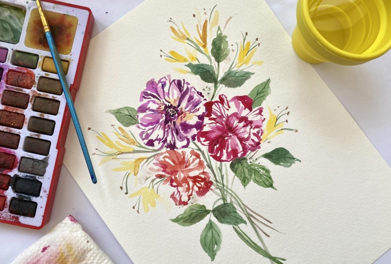
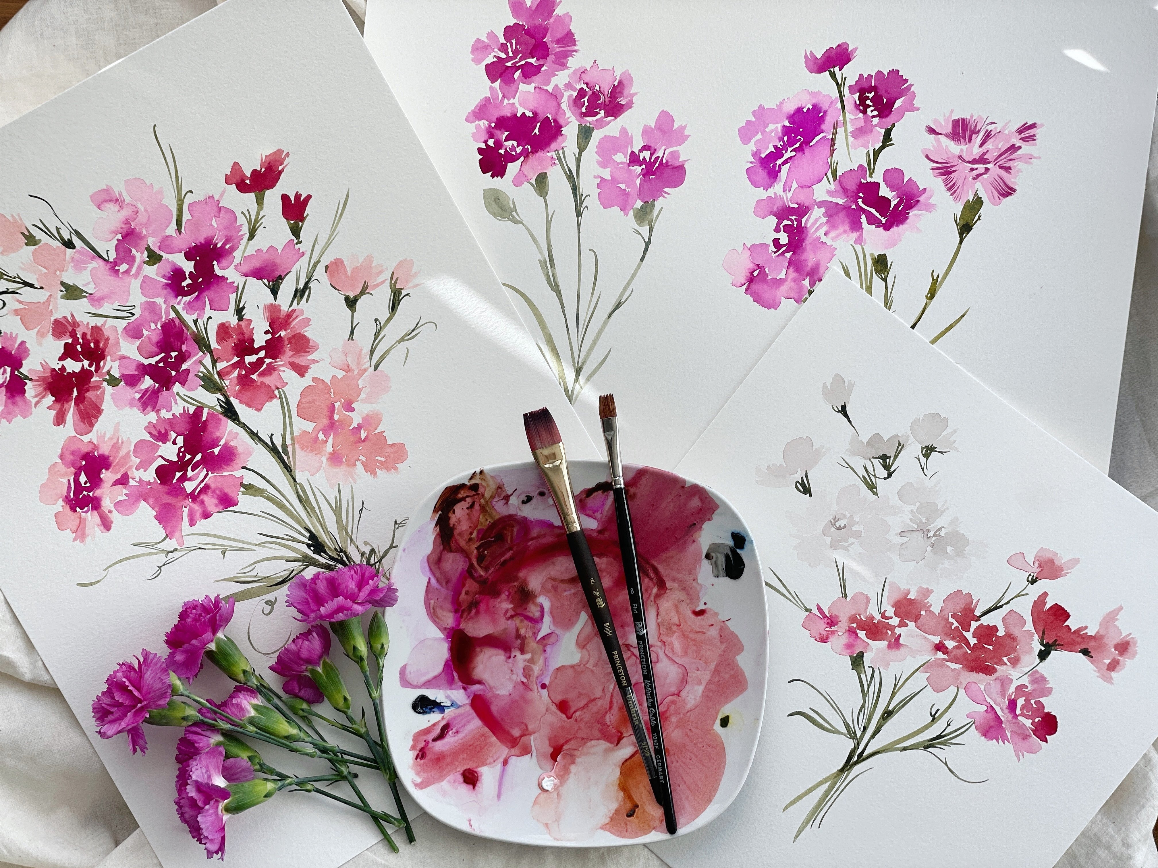
that into your workspace. That is going to be so much fun. Our class is going to feature these beautiful striped roses. I did a little research
to figure out what is the name of these
incredible flowers here, and so many different
names came up including rock and roll
roses, stars and striped. This one, I think was even
called a purple Tiger rose. There was the Neil Diamond rose. Definitely some varying opinions
on what they are called, we're just going to refer to
them as the striped roses. These are from my garden. They are in full bloom right now and I couldn't resist since June is featuring our rose and honeysuckle for the
birth month flower, bringing these in
to create a class. So excited about that. Other than that, grab
yourself a snack, maybe something to drink
and a comfy chair, and let's move into
the next lesson.
3. Observing The Roses: If you've taken
any of my classes, then you will already
know that before I begin to apply paint to paper, one of my favorite things
to do in the best ways to get familiar with the
subject matter is to take a few moments to
observe and just note the significant or
special details about whatever it is that
I'm intending to paint. I've laid out a few
of the roses here. This darling rose here that is, I think the purple Tiger rose, lost a few of its
petals unfortunately, so I'm not going to
be able to paint it as originally intended. However, we were going
to paint it on its side. Um, anyhow. So I don't know. I may tinker around with
this view because this is kind of fun too with the
center of the flower sort of, you know, breaking
out in the middle. Or we may paint it,
you know, from, um, facing in the
left hand direction. We'll see how it goes. We're
going to have a lot of fun. Taking a lot of liberties here. Again, if you've
taken my classes, you'll know that I love
to use a live reference. However, I am primarily
an intuitive painter, which means that again,
I note and observe, but then I put my references
aside and I allow just the artist
within me to rise up and take liberties
along the way. This is not a strictly
botanical class. This is going to be a loose
interpretation in which we are attempting to capture
the essence of the flower. Anyway, let's take a a look at these beautiful petals here. These are just
really extravagant. I just think I look at
nature. I just think, Wow. Wow. If something like this
is capable of growing, then we humans sure have a
lot of potential, don't we? I won't get too deep because
this is an art class, but if I were to be teaching a philosophy class that I probably would go off on a
tangent right about now, just about the beauty of
nature and how it inspires us. I think what I love most about this flower in particular
is the fact that some of the petals were almost a
solid block or hue of color, and then others
are really faint. You can see in this
petal right here, It's almost completely
the yellow and the gray with just a bit of the magenta
streaking through. As I always say in
all of my lessons, arty is going to be
key when we go to implement the details
within the petals. We're really we're going
to aim for some of these solid block
petals and then others that really don't have a
ton of detail in them, or if they do, we're varying the colors that we're using and the
amount of detail. So again, just taking
a moment to just note how there's a beautiful
burst of yellow here, which our Hansa Yellow Deep is really going to
do a great job of just flooding that petal with that initial
burst of yellow, and then we'll be
using a really, really light broth consistency
to set the groundwork and then plugging in a sino violet for that bright pop of magenta. Anyhow, loving these stripes, and then I want
to point out here that it's going to be
especially important, you guys, that when you make a brush stroke
through the petals, that you are aiming that stroke
in the correct direction. That is really going to be
our main emphasis here. The details are going
to be beautiful no matter how you lay them out. But if you can manage to bring your brush strokes completely
through in the right way, leading back to the
center of the petal, it's really going to elevate the rose and allow it to just shine and sing and look very much like
it would in nature. For example, if you were
to take this stroke and then you were to pull
it to the side here, it just wouldn't
look quite right. We want to make
sure that wherever we're loading and
leading that stroke, we're aiming it in the
right direction so that it's centering back to
the base of the flower. So That's that flower. We're going to do a couple of different color combinations, all of which have a
slightly different shape, but they're all
just very roughly, very much like a tool skirt. This one features more of a
very light peach and coral. We can see these
waves of flowers. When we move into
the next segment, where we're going
to just focus on capturing the general
shape of the flower. You'll really get a sense for these petals, how they move, how they unfold and lay out, and how you want to
plant them on paper. Taking a moment to notice the
center of the flower here. If we are to pull
back a little bit, we can see that there is quite a detailed and
complicated center. We have some hot pink
stamen, and then at the end, we have I would say
something around the hue of raw umber, possibly a yellow ochre. We're definitely going
to plug in that detail. Though I will probably avoid the hot pink as beautiful as
it looks within the rose. It's not my favorite to use
for the center of a flower. I tend to find that a brown and a yellow really does bode well, just for the general palette. Of the flower. Anyway, this
one, if we were to pose it, and we really are
going to have to play with the positioning
of the flowers, just because if we were
to lay them all flat, we're going to get a side
view for the most part. I'll be tinkering around to
get some open faced angles, holding them like this in such a way so as to capture
the center of the flower. Then others, such as this one, we will definitely plug in that composition where when
we were creating the bloom, we have roses that are kind
of shooting off to the side, and then others that are sort of cuddled up
against each other, playing with the height of the flowers and playing
with the positioning. You really want to make sure that as you are planning
out your mat piece, and you're going to see
that we're going to do things a little
differently today. Because this is such
a detailed flower to have a class
project at the end, where we're again painting
all of these different roses. It would be a very long class just because we
need time to allow things to dry and just those
intuitive marks take time. You'll see we're
going to lay things out a little differently today, and then at the end, we'll add some details as well. That is the main focus of
the class and the roses. The other thing I want
to just take a moment to point out are these
beautiful rose leaves, being very mindful not to
poke myself because there are quite a few sharp
thorns on these roses. Anyway, the leaves
are so beautiful. I tinkered around
with these yesterday and I love the symmetry. It's just slightly off balance. So we have these leaves that begin here at the stem and
then this one shoots down, and this one is just
a little bit higher, also aiming down and these beautiful ridges on the
edges of the leaves. So we're really going to
play with that as well. And then some beautiful
details through the center. We have a little bit of brown on the edge of the leaves here. Just taking a moment,
give yourself the opportunity to just look
what feels special to you, write down those details off
to the side on a piece of paper so that you can bring that in because
sometimes when we're painting, we lose track of initially what we gravitated towards and what felt the most beautiful. Because I guarantee you that whatever you feel most
attracted to and most excited to paint is going to bring the most
enjoyment to the process, and your overall painting
is going to be benefited. Okay, so anyhow,
that's the leaves. There are some that are
quite a bit darker, which is why we're
going to have a variety of greens today. We're going to have
the rich green gold, which we'll do use in here, and then we have
the undersea green for these darker petals here. Same variety of roses, but just slightly
different leaves. Okay, that's going to conclude just our
noting and observing, if you want to take a
screenshot of anything, please go ahead and do that now. You can keep that
off to the side. And then the next lesson, we're going to go ahead
and just begin to capture the shape of our roses.
4. Sketching the Roses Part I: The color we're going
to be using for this lesson is the
versino violet. We're just going to use one
color right now because, again, if you've
taken my classes, you'll know that I like to
really pare down and simplify the subject matter until we get to the part where
we're building a composition. Using a single color
is really going to allow us to focus
on the shape and the size without feeling
like the need to ruh ah and begin adding those
pressing details that really make
this flower sing. Go ahead and pick up
your number six brush. And wet your paint so that
we're working with somewhere between a broth or a cough
s consistency is great. Again, this is just
for practice purposes, and then I am going to
play with this rose here. So that it's not
completely on its side. I really want to get the
center of this flower. So I'm going to position
it just like this. Kind of angling it a little bit. Love Love and I didn't I should have pointed
this out when we were noting and observing, but I love this chunk
of stem here from which the smaller
stem is emanating. It's just absolutely beautiful, and then we have
this dark stem here. So we're definitely going
to have some fun with the stems when we plug
those in at the end. Holding the rose in such a way, let's go ahead and create
the center of the flower. Push things over
just a little bit, so I have some more
room here to work. Let's begin with the
center of the flower. I'm just going to create something to act as
the center here. Then we know that there is
fun stuff happening in here. I'm just going to lose put
some stamen and there we go. Now, I'm going to work from the center
and build my way out. So we're not going to
use our filbert brush right now to capture
the wave and me, ruffle of the roses. We're just going
to get the shape. So I just want to make sure you're not trying
to ruh ahead and capture the way that the petals are unfolding and
furling and curling up. We're just going to get
the main shape here. We have something like that, coming up here, higher petal, and then coming down, and then I see a petal, a little bit higher, and
then a nice dip here. And coming back to center, this connects right
through here. Then continuing to move along. I see another petal right here. Nice, generous curve there, and then it just ruffles along. Again, we're going to take
lots of liberties here. But this is going to be so
beneficial of just helping you understand how the
flower lays down on paper. Then we have another
petal here with a dip in there and
then comes back. And then we have a petal that
comes out right about here, dips down, and another here. And then I have one
more right about here. Ruffling. And now, I'll continue
working my way this way. This one kind of
comes like that. And we have a
smaller petal here. Nice little ruffle. And then building out from
that, we have one more. And then nice,
generous petal here. And then again,
right about there. And coming out here,
some beautiful ruffling, and then it sort of shoots up here and comes back to there. And then at the very top, we have something that's
kind of like that. Maybe connect it behind there. And then one final. Petal here. Okay. So that is capturing the general shape of this
rose, the way it lays out. And if we were to
plug in the stem, we would do it right about here, and then we have another branch
that sort of shoots there and then this
beautiful stem here, that's just off to the side, and then something like that. And then we would
plug in those leaves. You don't have to do that
stem if you don't want to, but I just like to get the general shape
of how it lays out. Anyhow, very rough scratchings here doesn't really look
like this flower per se. However, it just
starts to give us an idea of what the shape is because when
we look at something, we're like, Oh,
it's a round shape. But then when we plug
it in on paper, we see, it really does have more of an oval feel to it with
some point to your edges. What you can also do
is just try and get the outer shape to get a feel for size because here's what's
going to happen. Your petals are going
to get really big. We're going to be using
the whole paper here, but If you're not careful to make sure that there's some smaller petals
within the center here, very quickly, your rose
is going to get gigantic. So being able to play with size and create something
you can already see. I went a little bit bigger
than what we have here, just because it's fresh and new and it's the first time I'm plugging it in on
paper like this. For the next one, I would aim to do something
just a tiny bit smaller. If I would capturing
just the general shape, I would just do
something like this. And you can see slightly
smaller than that, I may even have to modify
that a little bit, where I go, Okay,
tiny bit smaller. And then I want
something that maybe looks a little bit
more like that. Even though it's a
little bit smaller, we're going to be
fitting these roses together on a piece of paper, so we want to make sure that
if we are doing a big rows, we want to make sure
that's our biggest rows, and then the others
following that, we want to make a
little bit smaller. Building from that framework, we can again in a center here. Again, just noting,
something's happening in there and then begin to
plug in those details. You can see things are a little bit smaller this go around. I'm going to take a few
liberties here as well, just feeling a little confident about how things are laying out. And grabbing that
petal right there. And just moving my way around
as I see lines and ruffles. Okay, we have that
kind of coming there. And then there. And then maybe ruffling there. That's good for this flower. We can get the sense
of the open face with the center being
very prominent and then a stem coming down from the center and
then off to the side. Let's go ahead and put that
rose off to the side and then we're going to paint or sketch
this beauty right here. You can see that the center of this flower is almost
completely covered, and if we were to
put it on its side, then it absolutely would
be completely covered. Let's go ahead and do that now painting this rose on the side. I leave it just like that. And I'm going to fit
it in right here. Let's start here with the base. I see a leaf happening here, and then my stem. Then I'm going to
begin right here at the base plugging in
those petals that I see. We have a lower petal
that sets the framework, and then a paddle shaped petal right here
and then further out, We have one that ruffles and then tucks
behind the flower. That's what we're working
with from the get go. Comes down a little bit more. We can extend that
if we want to. Then we can see behind the stem here a little
bit of petal action. Let's go ahead and
plug in some ruffles. Then we have This petal
shooting out here. Then this one, which is tucked
behind this main petal, so we're going to
plug that one in. Then there's another right
here in the middle of this petal right here that
we're going to focus on. And then continuing to work
our way up and around. We see that this petal
is definitely the petal that extends the furest. We don't want to go
farther than that. We have this one
coming down like so. This is getting
lost behind here, I just looks funky, but it will make sense when we do it with all the
paint and the details. But that is the general shape
of the rows on its side. I definitely recommend
doing this a few times. I would say at least three times for each variety of rows. This is really going
to benefit you. I know that it might seem a little overdone
and you just want to go in and I get impatient to and I just want to paint.
I want to go for it. But every time I do this, it really does make such
a huge difference in the results and just the
success and even like I say, the joy of the process. Then we could add in if we
wanted to do the leaf on here, we have a leaf that's
coming over here. And then we have some
razor edge here. Again, we'll take
some liberties. It's a little leaf pointing up there and coming down
rights like that. All right. Let's go
ahead and do one more, and then we'll wrap
up this segment. I wish I could send you the smell of these
flowers because, Oh my goodness, my friends, it is just decadent. This rose was so sweet
yesterday, it was a bud. This whole thing was completely
closed and there were only two or three petals
that were extending out. I was so excited, I should have just taken
a picture of it. I knew it would open up today, so we won't be able
to do that bud, but it's still the
smallest of the roses and such a fun color, not typically ones
I would gravitate towards because it's
yellow and red, but I just love the shape of it. This will be the next rose
that we pin down on paper. Again, I love how we lost the
petals here in the center. If we wanted to envision
that they were still there, we can pretend like, this one would sit
right about there, blocking a bit of the center. Again, we can definitely
take some liberties. We don't have to have
this exposed center. We can imagine that it's
nestled up like that. I really want you
as the artist to feel liberated to paint
it how you like it. Okay. So if we were, let me just take a
moment to position here. We would say that
something's happening right about here in our center. And then we have
the base the rows. And then we have
this petal that sort of just shoots down. And then we have the other side that comes a little bit lower. And then this one
is layered on top. Sort of ruffles up here. We have this pedal here,
just kind of shooting up. And then we have
one that curves. Another ruffle behind here. Okay and right about there. I'm going to kind
of reshape that, bring that more
generously down here. There we go. Now we have a
better sense the size here, and this is kind of
coming on top here. Don't be afraid to
paint over your lines. This is just you exploring, getting familiar with
things or sitting. And then you can lay
these pages off to the side and use
them as guides and framework as you in the
roses on your main painting. That's right about there.
And then go. Okay. I really like the shape of that. It's looking a little more
open face than on its side. But were I to add details,
it would make more sense. Then this last petal
here is coming on top, and that's what's giving it that illusion of
being on its side. Then we have a stem
that comes out here. There. Then we have this
one that's shooting up. If you wanted to do it like
so, you don't have to. You could just completely take a liberty here and just do
a leaf off to the side. Sometimes that works
better in loose paintings. You can even add the
thorns in if you want to completely up to you. Something like that. Yeah, again, really going to be beneficial and we'd
love for you to have this resource as you move
into the next segment.
5. Sketching The Roses Part II: Now that we've taken some time using our round brush to capture just the general
shape of the rows and how those petals
lay down on the paper. We're going to do the same
thing using our umbria brush. It's the filbert size four. Again, with a beginning
and intermediate class, I'm trying to do my best to ensure that I'm
taking steps so that those who are newer
to filbert brushes don't feel as though the
material is just jumping ahead. We're going to definitely
take a few moments to just show petal structure and and how to move this
brush around so that we can really capture the
shape of the rose. Go ahead, if you
have not already and dip your filbert
brush into the paint, and I'm going to take the
rose and just position it so. This is just the back side of the paper I was
using a moment ago. Don't feel like you have to get a fresh
piece of paper out, just turn over your paper, and you can use the other side. Okay. We're going to use the side of the brush and we're also going to use the
belly of the brush. We're going to vary
in strokes like this. Then we're also going to use some belly strokes like this. Aiming them back
towards the petal if we were to be adding
in those details. Of course, that's not
how the petals are going to necessarily look when we go to add the details
because we're going to be working wet into wet here. But those are essentially the two different postures of the brush that we're going
to be using on its side. Moving it around,
coming down and up and capturing
general petal shape. You're just doing this
up and down motion. Then occasionally, we'll
do some belly strokes, which is the toe of
the brush on its side. Let's do that, but also looking
at our reference flower. We have a petal that's
starting right about here, right in the center,
this one right there. There, that's our
shape. Then we have another puddle that's
coming up and overlapping, but I'm going to start with
that triangular shape here. Using the toe of
the brush to come up and then down and then
building from there. Continuing to work my way out. Again, this is just
capturing the shape. We're not trying to get
every single detail. We may need to do this a few times before you
really get the idea of how those petals lay
and fold and nestle. Roses are very complicated
flowers to paint just like peonies because
they do have so many details, and it takes a while for your
mind to separate everything that's happening and make
it work for the page. Again, it is on its side here, so we want to make
sure that we are not extending too far on this side so as to
lose that shape. We have this petal here, and then we have something
happening there. Then if I were to take my round, the stems right about here. And then just looking at it, I see, definitely
something happening here. You can if you have
a reference flower, you can lay it on top to get
a feel for how it works. Now if I'm turning
it on its side more, we see way more of
this generous flower, but I was moving it like this. It's all going to
depend on if you have a live reference
and if you're moving it around a little bit. P, if your petal ends up
looking more wide and generous, you have something
that's more like this, not two petals, but
one. That is fine. That is not going
to be a problem. If you're not painting
exactly what I'm painting, what you're going
to do is you're just going to work
with what you have, I'm going to give you the
techniques and skills to work with what you
have on your page. Now if we were to continue
working in that flower, let's do a few belly strokes
imagining to strokes, that we have some
details shooting back to the center here. We're just getting
our aiming right. We're going to pull out a
couple petals and do that in a moment. There we have it. Let's go ahead and do one more and then I'm going to take. I'm going to use these
petals as reference, and we're just going to observe
them, capture the shape, and I'm going to show you
how we're going to be doing the two different details
using two different brushes. All right. Pull out
our purple tiger rose. Put a little bit more of the
razino violet on my brush. And let's go ahead and
do the same thing. Imagining that something
is sort of happening here. And then if we want, which is what we're going to be
doing on the paper, we can just fill it in there because we're going
to be layering paint on top of our center. We're going to be
plugging in a little bit of yellow here and allowing that to settle
for a moment and then putting a little bit
of the umber into that, beautiful wet into wet, and then we're going
to allow that to fully dry and add more details. You can take that step now. Then let's go ahead and
build out our flowers. We have the base here, and then we have a
nice generous petal here curves around. And then one that comes
really far down here. And up. Trying to work quickly here, not overthinking it, because we can always just
repaint it again. Again, you're wanting
to just move. Again, you're wanting
to move your brush, so, on its toe and on its
belly, ruffling movements. Okay. That's the
general shape of that. Then if we were to
plug in those details, again, this is going
to be essential. We're going to do it in greater
depth here in a minute. But just taking the
toe of the brush, aiming back some of
those beautiful lines. You can also practice
color blocking. Meaning that some of
the petals here have mo full and complete color, and then others really
just have a few markings. That gives me a good sense of how this flower is
going to lay out, what I'm going to be
looking for as far as the length and the
shape of the petals, and then getting familiar with this brush, how to move it. Let's take a look at a
few of the petals now. We were to start with this one. Now, in our flower, it's not going to lay so
nice and simple for us. It's definitely going to
have a range of motion, but this will give us
an idea of the shape. If we were to be painting
this on our main piece, we would have
something like this. And then we would take the
belly of the brush and begin. Again, very simple here. We're going to
break it down into steps in the next segment. But that'll give
you an idea and you can continue to build the shape
a little bit if you like. Go ahead and do that petal. Okay. And then we have
some pretty details here. And a nice thick block here. Remember, you're
wanting to aim that in the correct direction or it's not going to end up
looking like our petal. You can put the details
wherever you like them, but those main
lines need to look as they're originating
from the proper area. Let's go ahead and do this one. Now, let's use both brushes. Let's use our fit to
capture the shape. We have a nice dip here. And then we have a nice block
of color here and here. And then let's use
our round brush. Actually here, let's plug
in a little bit more here since we have more
color, and then we can You are the artist here. I want you to take lots
of beautiful liberties as to where you want to put your stripes and your
little tiny details. But that will give you
a sense of looking, noting, and observing and where
to plug in those details. Let's do one more. And then use our
round brush here. To add in some of those spots. Then what we're going to do
is when this media is dry, we're going to go over
it with our round brush, adding in those little speckles. We can do it when
it's wet and we will definitely use a little
wet into wet technique, and you can see it makes
some really pretty bleeds. However, it's not a bleedy, blendy flower that we're
working with except for on the edges of the petals. So you will want to wait
until things are dry if you're loving
those opaque details. That way really
does stick when you go to put in the stripes
and the markings. The markings will definitely not stay if you're using
it wet and to wet, but if you will want to do it wet and to wet, this
is how it would look. Let's move back to some of these petals so we
can do the same here. If we were to add in that
next layer of color. If we do it like this. And we can use the
filbert brush to do it. And we can use the
round brush as well. Again, the emphasis is going
to be on making sure that those markings are leading back to where they're
supposed to be. And then we can also use
to soften those edges. Then eventually, what we're
going to be doing is using the paint at a much
thicker consistency, and we're going
to be using it in such a way that it layers
over very opaque like. Carving out a few of
those areas where things are void of color. And then using my round brush to make sure that I'm aiming back in the correct position. And I'm just going to take
a few liberties here. You can see the different ways that you can
approach the flower. You can head straight in with that thicker consistency and layer over almost opaque like. Now, you could also add
quite a bit of color here, and then rinse off your
paint brush almost completely and
blend those colors so that it looks more
watercolor like. Essentially, you're lifting
a little bit of the color as you sweep the brush
through the stroke, and then you can
reload your brush. If you really like that
wet and to wet look. It's really going to be
what you gravitate towards. You can wait until things
are dry and then use your filbert brush
to layer on top for those beautiful
opaque strokes, or what you can do is create a wet media foundation and then rinse off your brush
once you've added that first layer of color
and sweep the color out. You can see if we were to
compare it to this petal, though, is quite a bit lighter. We're going to implement
a ton of variety so that our rose does not feel
lack luster in any way. I'm going to show you several
different approaches. In the next segment, I'm
going to walk you through the whole petal
process so you can see what it looks like
from start to finish, from laying the groundwork to those opaque details at the end.
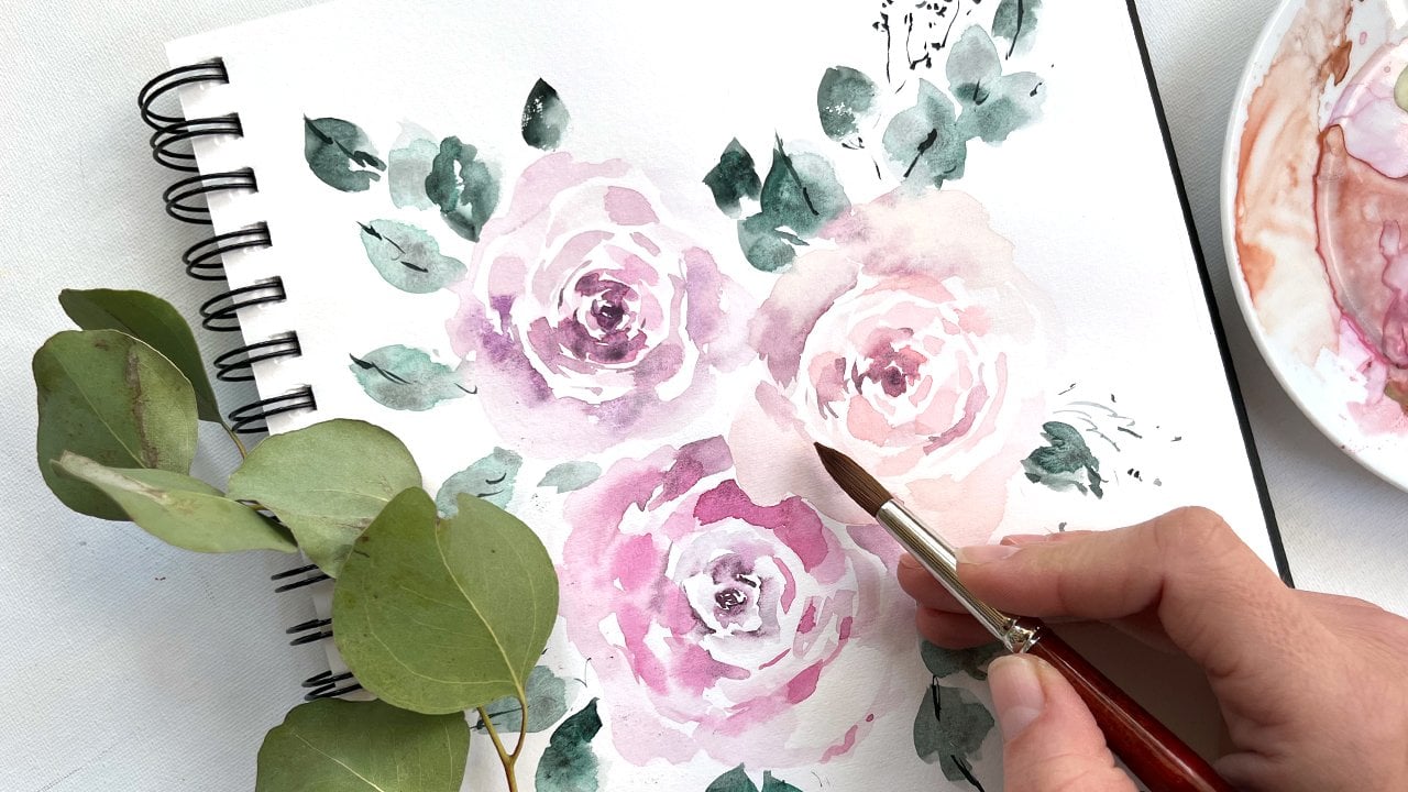
6. Petal Process: At this point,
you're going to want to lay out your palette. I have all of the
colors that we're going to be using
on the palette, starting with the burnt umber, the Virgino violet,
the Hansa Yellow deep, the light red, and
the rose lake. Go ahead and plug into
your Virgino violet. We're going to mix
up the wash that we're going to be using
for the foundation. We're going to put a little bit of the burnt umber
in there as well. This is going to be a very,
very light consistency. I'm going to swatch it
out so that you can see just how light
it's going to be. We really want the base
color for the rose to be light because
essentially, it's white. It's a very very light color with this initial flood of
yellow through the center. Then with a separate brush, go ahead and plug into
your hansa yellow deep, and we're going to decrease the color value there as
well by adding water, creating a broth consistency. We're also going to
put a little bit of the burnt umber in there. The two colors should
look just like this. This should be your yellow, not too dark, this should be your foundational
color for the rose. I'm going to load
up my brush with that yellow mixture and
set it off to the side. And then I'm going to use this mixture to create
the petal here. I'm going to use this
petal as inspiration. Let's go through the
process together here. Rinsing off my brush a bit, using the color
that's already on the page to complete the petal. Now the media is nice and wet. And I can take my other brush and in the yellow right
here at the base wet. And then I can use
my round brush if I really wanted to
pull out that yellow. You may not like it with that intense yellow
in the middle. It looks great on the
road, but sometimes it doesn't translate, but
we're going to try it. Then what you do, right below
where the media is wet, you're going to plug in
that burst of color, and it's just going
to flood right. You can help it along if
you want to by sweeping it. I've chosen a little bit of a muted yellow versus that
intense highlighter yellow. That's my own
personal preference, but a Naples yellow would
work really well right there, and then also a lemon yellow. Those are two other possibilities
that you could use. That sets the foundation. Then if we like that wet and wet look,
what we can do now, is dip into the versino violet, and we're going to increase
the value of the color. Now we're working at a slightly
more opaque consistency, and we can put in some details where
the media is still wet. You don't have to
plug an all in, but this is essentially where we see the darkest
blocks of color, and everything else is
quite a bit lighter. This is the point at
which I would say, leave it and allow it to dry. Then we're going to layer on
top those opaque details. Now, if you really love
that watercolor look, which you could do once more, is dip into the Vazino violet. And add it to the rim
of the petal here, the outside edges and get
more of that gradient. It would be an intense burst of color right here
around the edges, and you could pull that
down through the petal, and then you would have even more of that striking gradient. Now, if you like
the opaque look, this is where I would leave it, and then we're going to wait
till it's dry and then take our brush and create those
stripes and markings. That's what I'm going to do. I'm going to leave that here, I'm going to allow it to dry, and then I will come back and we will add those
details together. My petal is completely dry now. I actually used a hair dryer
to speed up the process. I usually don't recommend that unless it's a very
light wash of color because essentially what
can happen is you can end up blowing the paint
with the hair dryer. But because it was such
a light amount of paint, it actually dried perfectly. Now I'm going to dip
into my asino violet. I'm going to put quite a bit on the brush and
we want to use it almost at its
highest color value. Because we want those
details to be opaque, like a solid block of color. So I'm making sure there's
not too much water on my brush and really
picking up the paint. But I also want to be sure that the paint is evenly
dispersed on the bristles. Otherwise, I'm going
to have dry strokes, and the idea here
is that we have a fluid motion of color. Right about there
should be good. Then if I'm following this
petal for inspiration, I'm going to go ahead and
start here at the center, and I'm going to
pull those strokes back towards the
center of the petal. Using the toe of my brush. You can leave in a little bit of markings if you want or you can just completely color
block that segment. Then I'm going to do
the same thing with my round brush and
I'm going to saturate it with the versino violet so that it's at the
same consistency, and then I can
continue that marking all the way and then do
the same thing over here. Making sure that I'm aiming those strokes back
towards the center. Then I like where that's at. Now I'm going to
use my round brush as a little bit more
of a delicate tip. I won't get such chunky strokes, and I can begin to. You can even rinse off your brush a little bit if you don't want such que dark strokes. I'm going to rinse
it off even a b. Here we go until we
get some lighter mas. And then you can even do
some stripes through it, making sure that you're
coming back to center here. Just alternating brushes to get the right level of detail. You can see that the petal is
not exactly the same shape. That's okay. It's just to get an idea of how it
all works together. You're just taking the
tip of your brush and just fine marks
like this and then making gaps in the petal so
that there's blocks of white. And The amount of detail you want to put in
is completely up to you. Remember that we're going
to have an entire flower. Try not to be so detailed here. You can always add more
details at the end. But I think that the best thing
to do would be to plug in those central key details and then once you have
the flower assembled, then you can come
back and decide how much more you want to do. Let's say in the event, you didn't like this
opaque look right here. What you could do is rinse off your filber brush so that it has basically no
more water on it, and you could lift
out the color. To get more of that
watercolor feel. You're just lifting
out the color and you could do the same
thing with any other areas. Let's say things
just got too dark, you take that brush and you
just lift out the color. This is what I was saying,
you can take the brush, go along the edge, and get
more of that watercolor feel. Now, keep in mind
you will darken the petal because it's
another layer of paint. But it does create a bit
more of that gradient. Then once you've lifted it
out to your preference, you can take a brush and
touch the wet media, and it will create a
gradient of color. That's if you want that wet
into wet look and you don't want those solid
stripes and markings. That's a couple of different
approaches for you. Now that we've gone
through the petal process, we're going to begin
assembling our roses.
7. Purple Tiger Rose Part I: One of the best,
and in my opinion, the most fun ways to build a composition is to
actually use live flowers. This is going to give you a really good feeling and understanding of how it's all
going to lay out on paper. You can get a good idea about scale and size
and positioning. Although the flowers may not lay perfectly I will give you a vision, and
what you can even do, if it's helpful, you can
take a really light pencil and pull up your flower and then mark how big
that flower is. You can just take your
pencil and mark around. Because if this is
your piece of paper, you're wanting to make
sure that things aren't going too far beyond here. For a few different reasons. One, because we're
going to be adding some leaves to bring in some more interest and to add just dimension and
flow to the painting. Then we're also in
our class project, going to be adding
the honeysuckle, which is the second
birth flower. It's quite a simple flower, and we're going to achieve it
with just a couple strokes, so we're really not going
to have a breakdown period of how that works
just because it is quite a simple flower
and we'll be able to understand it with just a
few moments of instruction. Okay. This will give
you a good idea of how in my mind, I'm
mapping things out. I will be taking a
couple of liberties, so please keep that in mind. The flowers starting at the top, we want to make
sure that there is a big height difference and we want to make sure that
things are balanced. This one, I'm going to plug
in a little bit lower. This one right here. Because I want to have
a nice difference in where things are positioned and also the size of things. Initially, I was thinking
that this would be the best rose to have is the biggest one and
it still might be. Although you can see that the way that this
rose is positioned, it looks like the biggest. But you're going to see
that I'm going to take a few liberties along
the way and make a few adjustments
and changes just to benefit my own
painting style, I hope that you'll feel The
ability to do the same. I don't want you, as I
always say in my classes, to feel as though
you have to paint exactly what I'm painting, is just to give you an idea, and then you can play
with the framework within those boundaries. If you want to take a
screenshot so that you have an idea of where things are placed and how you
want to move them, that would be fine, and then you can have
that off to the side. If you're watching
on your computer, you can have that on your phone. And then we're going
to leave this area open for some honeysuckle to come shoot over here and this area down here
for some leaves. I may end up even pulling
leaves off a few of the rows. Uh, the roses and then kind
of doing this sort of thing. And then I'm also going to add more stems than what you see. I had to cut these because they were growing
from a single stem, and so I had to pull
those off individually. So I'm going to put back
in some more stems, and then I'm going to
have these lovely leaves kind of shooting
off to the side. But yeah, this just gives you such a great idea of what
you're working with, and you can map it
out with a pencil, and just feel really confident and at peace as you're
moving forward, not having to worry
if things are too large or if, you know, you're coming up too close
to the side of the paper, which is something we always
want to make sure to avoid. Because if we run up
against the edges, we really lose the breath and the space around the painting. Okay. So I'm to go ahead
and take that off. You put all those to the side. Makes for a lovely work space. I've chosen the purple tiger
to be our focal flower. Rather than being on its side, I am going to paint it in
more of an open face posture. Then this will be also
the main stem from which the other stems
are intertwined with. We're going to start
here with the center. What I'm going to have
you do is pick up your number six round brush and dip into your
yellow mixture, that's the Hansa yellow
deep and the burnt umber, and we're going to
start with the middle. We're just going to
make a few key details so that we know how to
build around this flower. Again, I want to
make sure that I'm not going too high
up on the paper that I'm going to
lose the breath and the movement
around the piece. I'm wanting to place
it right about here and making sure
that I'm leaving room for it to grow because that will be your inclination is
to just keep expanding. We need to remember that the
petals can't be quite as large as how they appear
to us in real life. Beginning here, I'm
just going to make a few markings for our stamen. And then I'm also going to
blend a little bit here so that it's a bit more filled in. And now I'm going to pick up my filer brush
and begin to build. This is the asino violet and the burnt umber at a
really light consistency. If you need to check
that consistency on a separate piece of paper,
go ahead and do that. I'm going to paint
this in an open face w. I'm going to start
here at the top. Using my filbert brush to
sort of ruffle around. Building the flower out. I move that leaf down so that
it's not in my way here. Again, I'm going to
be taking liberties, not going to position every petal the way that
it's seen here. Taking care to leave a
nice space in between. And continuing to build around, twisting things just a bit to
get more of that open face. H I have the general shape now captured on the page, doesn't mean I'm going
to leave it here, but it gives us an idea of the framework and put a little bit of yellow
in through the center. If you like that
more intense color than you can add it
here at the bottom, just like we did when
we were practicing. I see it carried all
the way through here, so I'm going to include that. Now I'm going to put
it off to the side so that I can work intuitively. I'll probably be
twisting the page around a little bit to
get some better angles. H. I saw some petals and tucked behind here
that I'd like to include. I'm just going to sketch
out the shape of those. Now as things are
starting to dry, I can add another
layer of color. Some of the petals
will still be wet, so I'll get a little bit of that wet into wet, which
is just fine. I'm just going to
put in a few of those color blocks
that I see here. Making sure to angle those stripes in the
right direction, I'm going to be using my number six round and my
number four filbert. Just adding in a few of
those details that I see. Taking my time. I'm not
going to rush the details. You can use your
inspiration flower or you can just
move intuitively. We'll be adding this petal last once things are a
little bit more dry, but it is going to be
more open face like this, so we're going to have two
petals coming up and ad. Again, if things dry and you're not loving
how things are dry, you can always rinse off your brush so that
it's completely rid of color and then bring that stroke lifting up the color as
you move through the pal. I use my round brush now. I'm going to put a little
bit more color into this petal down below just because I think
that looks pretty. And then I'm going to guide it and now I can take my round six brush and put in some of those
details while things are wet. Like I said, I
wanted to give you guys multiple ways
to approach it. Lots of variety here. So this area of
the petal is dry. And then down here, we
have the wet media. A few details, taking
some liberties here. This pedal is almost
completely void of details. I'm just going to add a few. I really like that, that contrast between an almost
solid color block here. Making sure I'm
aiming those details back in the correct direction. Okay. Now that things are drying pretty nicely, I am going to load up my number four brush
with the versino violet, and a little bit of the Hanza and create a nice
mixture of color. And plug in those two leaves. E, two petals. Trying
to move ahead. Okay. This petal is
coming up and around. So I'm going to put it
in right about there. And this looks a little bit wet. I'm actually going to take paws and dry that, and then
I'll come right back. While the outer petals are
still continuing to dry, let's go ahead and solidify
our c. We're going to mix up a little bit
of the Hansa yellow deep along with the burnt umber. Just a touch. So that
it looks like this. We're going to begin plugging
in some of that stamen that we see here
in the center with the brown on top of it. You're going to
take the very, very tippy toe of your brush to create some super fine lines
right here in the middle. You can extend those petals, this statement out
into the petal. Then I'm going to
add a little bit. I'm going to dry
this a little bit so that I can make sure that when I plug in the next
layer of color, that it's not bleeding
into my petal here. Continuing to build here, things are a little
drier now and I can plug in some of
those stamen that I see. Okay. Remember,
we're not trying to capture every single statement, just the idea that something's happening there in the center. And now I'm going to dip into my burnt umber and get quite a bit of paint
on the edge of my brush. And begin to in those details I see on
the tip of the statement. Okay. So I'm going to
leave it there for now. I can always add in more later. But that gives me a good start. And now things are
dry enough that I can add the next layer. To do that, we're
actually going to pick up our number six
filbert brush now. We can get a little
bit better control and smaller strokes than with our
four in the umbra series. I'm going to begin plugging
in those details using the ver sino violet at
a cough sp consistency, and then I'm also going to have my number six round brush
in the same consistency. I'm going to capture this stroke right
here in the center. I take my number four brush blot off to extend that petal
just a little bit further. And then I'm going to do the same thing on
the other side. Using my number four brush to blot to lift up a little bit of the color and leaving
that nice open face. I realize that the color is not exactly the
same, that is okay. That's just a liberty
that I'm taking. I like the shape that
I'm working with, and then I'm going to just use my brush to give it a
little bit more body.
8. Purple Tiger Rose Part II : This pedal has quite
a bit of solid color, so I'm going to
implement that here. And begin moving. This
one just a little bit. I'm just going to darken up those areas that I had
initially begun painting. Then I'm going to use
my number six round to just give a little
bit of structure here. That doesn't look
like an open spot, but does in fact look a
petal and then just create a few lines leading up
towards the tip of the petal. You can see, it's
really starting to come along very nicely. Taking my time. Make sure not to overload it with details
that I can't really do. I can darken the
pedal by lifting out a little bit of the color
and kind of start again. But these dark details, I want to be careful about
putting in too early. And then we have this pedal down below has quite a bit of color, so I'm going to sweep that through making sure that I am in the right
direction here. And then I'm going to
use my round brush to plug in some details
in the center here. I'm going to move over
to the other side. There's just a little bit
of detail in this petal. I'm going to sweep through here where I see these markings. Turn my paper just a
little bit so I can get the right angle. H. We have nice varied
leaves or me petals here. We have one that has almost
a complete color block, and then we have
others that have just a little bit of detail in it. I think that really looks nice. The one area that I'm
going to touch up a bit is this outer petal here
and I'm just going to blend that a bit into this bottom petal to create
more of just a water co. B. I'm really satisfied with
that rose and where it's at. It still obviously needs
a stem and some leaves, but we'll begin to
plug those things in as we move along continuing
to build the roses. That will conclude the
purple tiger at this point, and now we will begin the
next rows in the series.
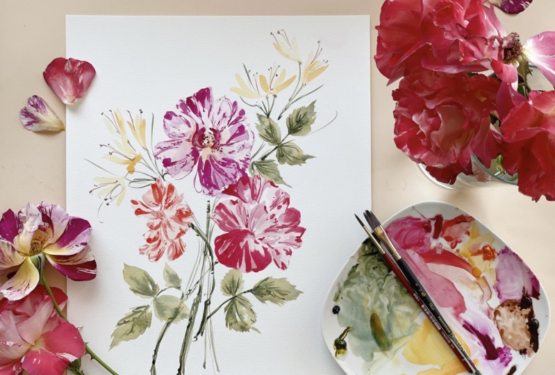
9. Coral Rose: I decided to plug in a
few gestural strokes here and here just to give the petal a little bit
more structure. You can do the same or you
can take different liberties. Moving on to our second flower, we're going to create this
beautiful coral rose. We're going to use
different color and we're going to
mix it up together, and then we're going to
pin it on its side here. We're going to make it
a little bit smaller so that this is our
main focus rows, and then this one will be
nestled against the side here. Then we'll have the other
one facing like that. A little lower here and then
this one right about there, and then that'll give us
room for some honeysuckle. I may even plug it on this side, since we might have end up
having room over there. We'll just see how it
all lays out on paper. For this rose, we are going
to use our rose lake, which is this color right here. Then we're also going to put in a bit of the Hansa yellow. It should be like an orangy coral matches pretty
well with that. Then we're going to decrease the value so that
it's very light. You can blot off your brush
and then create a new pile, something right around there, working with lightest
consistency. Then we're going to put it on its side just
as I showed you, so I'm going to
tinker with that now. I may even layer over this petal here. We'll
see how it goes. The petal I want
to start with is going to be the
center petal here. That'll give me a
nice groundwork. I don't want to put
it too high because then I'm going to end up
at the same level here. I'm going to come down
a little bit lower. Right about here is good and begin plugging
in that shape. Again, we're working smaller, even though that petal
is quite a bit bigger, I need to adjust so that my
petals aren't overly large. I'm going to blot
off a little bit of the paint because it's
still a bit dark. Go, just using kind
of what I have. And then I can continue
building from there. Then I can now begin to
plug in these upper petals. What you can do here
is intentionally leave some white space too so you can just build the
structure of it. Then if you like
that white space, you can just use
the filbert brush to build around it
and leave gaps. This is another
technique for those mas. Just working intuitively here, I have the main
shape plugged in. I am going to overlap here. I'm just going to begin to
play with that concept. Then when I add the opaque details that will cover a little
bit of that flower. I don't want there to be so
much separation that they look as though they were
just planted on the page. I want them to look as they are nestled together
in a bouquet. Then we have this petal
that comes out. Like so. And then this very
generous petal here. This is where the sketching
the shape comes in handy. And I'm going to prince
off the paint and just use what's already
on there to finish that. Again, making
modifications because I don't want the petals
to be so large. And then see another petal
tucked in over here, so I'm going to pull that out. And then one last
puddle right around here to finish it off. Okay. I like how all of
that is laying down. I'm going to just color
that in a little bit. I know where my space is here, so I can when I'm ready, begin to p in those details. I could probably extend
this just a bit. A little bit of color
there. That's okay. We'll do the same thing here, just layer in some
of that color. Then if this isn't too wet, we can continue to
do that around here. Things aren't too
wet, so that works. One of this is just
trial and error and seeing what's and what's not. Let's begin to some
of those details. I'm going to switch to my number four in the velvet touch, so I need to rinse
that off real quick. Excuse me. It's a number
six in the velvet touch. Here I am layering over
that bottom petal. Pulling out a few of those
really pretty speckles I see here along the
perimeter of the pedal. My paper just a little bit. I'm going to pick up my round brush now
to begin putting in a little bit of those toe markings and
some sweeping lines. And here through
the center as well, adding a bit of that
gestural structure. Making sure I am angling
those lines back to center. This pedal is almost completely blocked in color. Okay. Okay. So I like where
everything is sitting. I'm going to allow that
to dry and then we will come back and add that
last layer of detail. I'm going to use
my number six in the velvet touch continuing
to build upon what I have. So I'm going to
darken these areas. Can take your brush
and just move along the perimeter to smooth
out that petal edge. Picking up a little bit
more of the Rose Lake. And now I'm going to take my number four in the Rose lake. And switching brushes again. And again, lots of brushes. So my number six in the round. I'm going to make a
structural line here. Give me something
to work within. This is my number four again. And my number six, adding a few structural
lines again. And then I'm going to
use my number four to layer on top of this rose. Really playing with
the markings here. Another structural line. I'm going to take a
number four brush in the Embry series and just
blend that a little bit. Again, at any point, you
feel like the details are becoming oppressive to
the flower. You can stop. I like to add in quite
a few at the get go, but then also leave room
to continue building, especially because
we're making a bouquet, and we don't need
every single petal on every single f to be the
focus or be the focus petal. But these sure are
showstopper roses. That's what they should have
named them, showstopper. Okay. I like where that's situated and the amount
of detail we have there. We can always add a little
bit more at the end, like I said, so we're
going to pause there, and then we will come back for our third rows and then continue building
our composition.
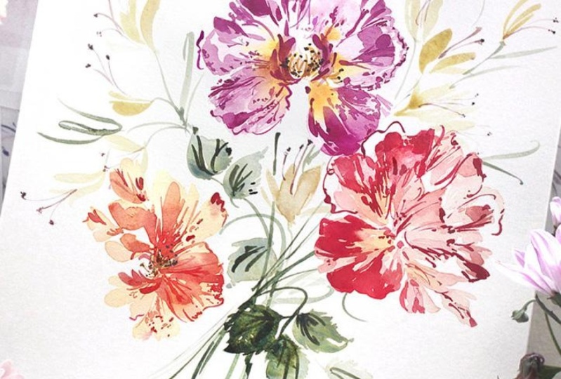
10. Red and Peach Rose: The biggest liberty I'll be taking with this
rose is the size. You can see we have two roses
that are similar in size. This one, I'm really
going to make quite a bit more
petit than as shown just because if I end up
doing it the same size, then we can see that we have
three roses that are all just looking even though they're different colors and
different positionings, they're starting to look
a little bit too similar. And I want to break up that similarity by adding
in the contrast of size. Yes, the leaves
will help us with that as well as the honeysuckle, but I definitely want there to be some differentiation here. If you haven't
already clear away your palette and then
we're going to begin using the permanent red light
and the Hanza yellow deep. That's this color here. And
a little bit of that za. That's a lot a bit of the onza. I'm going to lift that
out. Blot that off. Sometimes it just
sticks to the brush. Plug in a bit more of
that permanent red light until we have something
that's orange. Then I'm going to break
that down even further to create a nice light
version of that using it at its lightest
consistency and lightest value. Start
right out there. And then I'm just
going to continue to build upon that framework. I along hair. Nice and petite. And then I'm going
to add a pedal here so that we really get that sense of
it being on its side. Okay. I don't want to make it
too much bigger than that, or I'm going to lose the
petitnes of the flower. So it's not exactly the same. I'm definitely taking a
whole lot of liberties here, but I'm getting the
general shape down, and I'm leaving a
little bit of gap here to imagine that there's
some stem work happening. Not everything needs to
be up against each other, but you want to give a
sense that these flowers have been assembled in
a bouquet like fashion. Okay. My media is dry. Now
I'm going to take my number six brush in the
velvet touch series into the permanent red light at a nice opaque consistency and begin to plug in those
details where I see them. I'm also going to load up my number six round with
the same consistency. I have that brush ready to go, and I can work with all the
brushes I want to work with. Okay. This petal here
is still a bit damp. I'm going to give
it a moment and begin with some of
the other petals. A little bit darker than I want. I'm going to actually blot
off just a little bit. Fine to have some of
those dark details, but I want one more layer before I head in with the
really dark color. Here we go. Some of you may even want to
stop at that point, which is completely fine. We're going to get a
wet here. It's ok. I put the flower here
for you guys as well. If you want to work
intuitively, that's fine, or if you want to
use this flower to inspire some of
those markings, too. Adding a few structural lines. I turn my paper
just a little bit. Git at an angle here. And now I'm going
to head in with that darkest consistency
at the highest value. So looking at my brush, seeing that the paint
is evenly distributed, and now I can cover some of those markings using my
number six round as well. Mm. Try and stand back if you can and look at it without being so intensely close to
it and take a moment now to see the
composition as a whole. Even though there might be a ton of details within this flower, you may want to invoke
a little bit of subtlety here so that things aren't feeling quite so
intense or overwhelming, or you may just want to go
full and add all the details. It's completely up to you, but
I just as your instructor, just want to invite
you to stand back, take a moment to
look at the piece as a whole and decide what
you want to do next. Making sure that I have things aiming in the right direction so that I can get a sense that the flower is moving like so. If you want to, even
though you cannot see the center of this
flower here because it's hidden behind these petals. If you wanted to just imagine that it's
sitting more like this and p in some more
details right here and I may end up doing that
once I put it all together, that is an option as well. Sometimes I'll do that
because the center of the flower really does give a
whole lot of comprehension. Flowers. Sometimes when
they're just very petal laden, a sense of just understanding
the flower can be lost. We also do that with
structure and posturing. But the center really
does help to just ground the eye and helps move
around the composition. Again, another option
for you, if you like. Just about done
adding details here, just poking at it now. And I like that. You might also even
like just doing the two layers of detail
you can see it ends up being a very
striking contrast to have the light and then
immediately the dark. It doesn't look so much
like that in real life. That would definitely be a pretty distinct artist liberty, but that is fine, if that's
something you want to do. It really does make
for a dramatic effect. I'm going to pause
here, and then we're going to come back and
we're going to add some stems and some
leaves and then we will plug in the honeysuckle in
our final class project.
11. Stems and Leaves: You can see I've pinched off a few of the leaves
and I placed them at an angle where I feel
like it's going to give a really nice sense of flow
and direction to the piece. We're going to imagine
that there's stems coming down the center
here, curving here. This one's going to come right down the center and
this one will have a little bit of motion moving
up and towards the right, and we'll continue with that motion by ping
in a leaf here, leaving a little bit of
room for honeysuckle. And then a nice leaf
coming just short of here, so having different lengths and making sure that
not everything is running up at the exact
same spot on the page. Then having this
stem with the leaves just shooting at a
dissonant angle, providing a little bit of direction or even mis direction. And not having everything
moving in the upper direction, I'd like to have
some leaves that are giving a break to the piece. Then we may add in a few
more details we'll see, but this will be the general
structure and layout. Then we'll also plug in
some honeysuckle up here. We'll probably do it
highest up here and then a little bit of
lower down here just to give that sense of there being a highest
point and a lowest point. If you have not already,
this is a really great time. For you to clean
off your palette and empty out your
water cup and also rinse your brushes
because they will probably be saturated
with pink and red. Then you can come back and put a little bit of the
undersea green and the green gold on
your palette you should still have a little
bit of the burnt umber two. We're going to be mixing
all of that together. We're going to start with
both of these colors. Let's go ahead and pull a little bit of the undersea
green onto the palette, mix in some of the green gold. We're just going
to mix that until we have something that's
similar to what we see here. These are two of my most
favorite colors to use on their own or together. I have a little bit too
much undersea green here. Blotting off. There we go. There we have very nice green. I'm going to break create another pile
decreasing the value. Now there's two different
ways to do the leaves. Actually, there's a variety
of ways to do the leaves. There's two different ways
that I create the leaves. I use my number
four in the umbria to create that
sense of structure. Then sometimes I'll use
the belly of the brush to sweep in those
little spikes that we noted on the edge of the leaf there where
it's like I said, just has a little bit
of a spiked edge to it, or you can use your round
brush and do the same thing, just creating that
base structure and then filling in the
leaf with paint. All right. Just making
sure my piles are ready. Now I am going to move
the way and add in the stems first using
my lighter pile. I'm going to start
with the center stem. Imagining that it's
originating somewhere around here and pull that. Then I'm going to imagine that this stem is
kind of plugged in somewhere around here, we're going to come
out right about there, and I'm going to have my
stems at different lengths. And then this stem is
coming right about here. We're going to have that
one right about there. Then let's begin to build in
a little bit more structure. Okay. So that gives us a nice groundwork. And then we will
be adding details to thicken the stems and then to add some
shadows as well. I'm in to pick up my
number four brush in the umbra series and begin
to plug in some leaves here. I'm creating the
structure first, and then I can use the side of the brush and just come up
in these jagged motions. Just like so. Then I can use my round brush to
create a stem here. I'm going to build out just
a little further here. And then I'm going to continue
doing the same thing. Fill that in and use the toe of the brush
to come against the edge. And then I can take
my number six brush and come in here for a stem. If I want to do a
little wet and wet and continue working. Okay. Adding a bit more of that green and the
coughs are consistency, and I can even add it around
the edges if I want to. Turning my paper. I
get a good angle here. Imagine it sort of
disappearing behind that se. And then We can increase the thickness of
the stem there if we like, add it in a few more details. We can wait till
things are dry and then add a few more
details as well. Just continue to work a
little bit wet and to wet. Now I will begin
p in those leave. I believe it was this one, here. Nice long leaf. Sketching out the
general shape of it, and then using my brush. And then I can take my
number six brush, come back, Then we'll just kind of
imagine that that leaf is disappearing behind the rose. Go adding a little bit of shadow and depth down here
at the bottom. Having fun with the wet and wet. And then I'm going
to begin adding more shadows on the stem, using the cough ser consistency. Using those gestural
markings we so love. To create a nice
thick main stem. I'm going to take my number
six brush and dip it into the burnt umber and add in a touch of brown to
the base of the stem had. Okay? And then I believe
this was the leaf. I can't remember, actually.
I might have been this one. But we're going to
angle it in such a way that it's kind of
coming down here. And bending backwards. So I'm going to kind of
create the stem for that. So that's just like so. Adding a few more shadows
here at the base of the stem. I'm going to cover that stem. Since this would be the top. Being really loose
and gestural here, just sort of indicating
that a stem is happening. I'm going to do the
same thing up here. And we can take the
toe of the brush and create some veins. The veins help to really give the leaf a
sense of structure, although they look beautiful, just using the wet
and to wet as well. Completely up to you how
you want to lay it out. This is my favorite way to
do leaves with the umbria, building the shape and
then using the top, the brush to create those sort of serrated edges of the leaves, especially for rose leaves. This leaf is still a bit wet. But we'll go ahead and plug
in a few details anyway. I can see it's really
starting to come together. I'm going to do the same thing
with my number four brush, and I'm going to work into
green gold a little bit more so that there's
a little bit of color difference
between this set of leaves and the others. I'm going to turn my
paper around so that I can get a really good
sense of direction. I'm going to start here
and work my way back. We built the structure. Now we're taking the toe of the brush and just moving
an up and down motion. Continuing to turn the paper. It's okay that we're overlapping
here. It looks great. I'm going to add a
smaller leaf here. Okay. So we have a really
good range of motion. I'm going to pull you
back so you can see it. So we have a really nice
sense of direction and flow. Things spreading out,
but we're not too close against the
sides of the page. There's still room to add in details while keeping
the breath of the piece. I'm going to go ahead and
lay in a few veins here. You can do the same if you like. All things are wet. I This leaf is already dry, so some of the vans
will look great. Can you just poking at it
now, fixing things up. A lot of what I want to do, I have to wait until
it's completely. I like to move a, stay. Let's put in a few shadows. There we go. That looks
great. Same thing here. Creating a nice sense
of flow and movement. Then down here at the bottom, we can do the same.
Layering on top. Then when we add
the honeysuckle, it's really going
to come together so beautifully because that's going to add that
bit of delicacy, a little fragility
to the bouquet. Right now, it feels very hardy, very robust, just the colors, the shape, the movement. By adding a smaller
filler flower, we're going to add
so just interest and fascination to the piece. I'm going to pause
there, and then I may come back and work a few more
veins into these leaves, but we're going to
start focusing on the honeysuckle in
our class project.
12. Class Project: Honeysuckle Practice: Welcome to the class project. As much as I wish I had some honeysuckle to bring
into the studio with me. Unfortunately, it is not
growing in my area right now, so I am going to have
to resort to using a few inspiration
pictures on the web. I decided that because our
roses are so show stopping, that a bit of delicacy and fragility within the
piece is going to add, like I said, so much
interest and fascination. But I do want to restrain a
bit with the color palette. I've decided that rather than featuring some of the pinks that you might see
out in nature, I'm going to use a really
limited yellow palette. I'm also going to plug in a different color than
originally anticipated. We're actually going to
use it in addition to. We're going to use the Naples yellow that I was mentioning
a little earlier, which will also look
great in your roses if you wanted something just
a little bit lighter. I'll make sure to
mention this in all of the class supplies. You can always check there to be sure what exactly
you're going to need for the class
because sometimes I'm in the moment, and I
decide, you know what? That's just probably going to work a little bit better with the color palette
that we've already built into our
existing composition. The honeysuckle, when done
gesturally is very simple. It has a really
beautiful stamen. Which you can see highlighted
here where we're going to inject a lot of movement within the stroke using our
number three brush here. We haven't used that
yet. We're going to take the tip of the
brush and we're going to create these lovely slender
strokes to create the stamen. Then we're going
to use our number six in the velvet touch, we may even use the four, we'll see how it goes to create
these paddle like petals. You can see that there's
this petal that's curved over and then from there, you usually have two
to three more petals, and then you have these
stamen that are pretty large with the little
balls on the end of them. We're really going
to pare it down. Make it simple. I just
wanted something to fill in the honeysuckle being the June birth
flower was perfect. We're going to practice just
a little bit here together before we plug it
into our main piece. If you have not already, go ahead and get out
a piece of paper. I'm just going to
use the backside of a practice piece here. And if you don't already
have it on your palette, which you won't because it's the first I'm telling you of it. Go ahead and dab a
little bit of the Naples yellow and mix your number
four into the paint here. And then let's
create a pile here. Then let's use the number four, Filbert in the velvet touch. I'm going to rinse
off some of the paint here and dip into
the hansa yellow. Then I'm also going to put a little bit of the as into the. So that it's a bit
more complimentary. The Naples is very sticky, especially if you're using
the Mmeri blue brand, but I do like it because it a
little bit goes a long way. You can see the two
different colors here. We have a cough
syrup consistency and more of a broth
consistency here. Let's go ahead and just put a few practice
strokes on the page. If I were to do that
initial curved over pedal, it would look
something like this. It's curved and then if
I take my number six, we have something
that's like this. I could even do it three petal. You can do a little
wet into wet here, which looks absolutely lovely. It just means that
you need to have your brushes pre loaded
and ready to go. Then from there, we use our number three
brush to dip in two, and I'm not going to use a
white stamen as shown here. I'm going to use a brown. I'm going to dip
into the burnt umber and create some really
beautiful slender strokes here. I put a little bit of
movement into them. Then we can put the balls
on the end if we like. Let's go ahead and do
that a few more times. We have that initial
curved over petal, and then we have these
very paddle like. Color. Like so. That stroke is really just going to be you're
going to inject some movement into it like
that, and then come back. Or if you want to create
more of that paddle, you can just do a
straight and then slender here and shape it. And that really gives
a sense of paddle. Was this is more of an S shape. You're bending the brush, rotating your wrist as
you're making the stroke. I put a little bit more
of the Naples yellow onto my palette. Something
more like that. And when we cluster them, we're going to put them together going in different directions. We might have a honeysuckle
that looks more like this where it's
really spread out. Then we take our
number three brush to put a little bit
of movement back into Or we might have one
that looks like this. Let's say we're facing
in this direction, nice paddle stroke
here and there, and then we have
maybe a smaller here, and then we imagine
that this is the base. And then we can tuck
in some stems here. Just get familiar
with those strokes. It's just your simple
filbert stroke. Maybe practice a few of
those little three where you have a large petal and then you're using
the side of the brush, like so, and then you can
vary that out to the side, out to the side and maybe
in through the middle. Then maybe you're
practicing one here, one here and one here. That would be a honeysuckle
that's facing down. And then we can also
obviously plug in that Hanza we wanted to do like that curved over
petal, where we're shaping it, so, and then using like that, and then we would plug
in the stamen here. Different ways, I would say, We will help if you can take a few moments
to just practice those strokes and just move
through how they lay out. You can see there's
a whole bunch of different varieties here. Here you can get some reference
pictures out and plug in any of honeysuckle
that you like. But we're really going to go
for something that's simple. We're not going to overdo
it here with the details. That'll give you a sense of
just what we're going to do. Now I'm going to pause
here and then we'll regroup with our main piece.
13. Class Project: Once again, these are
the brushes we're going to be using for the petals. This is a number four and
number six in the velvet touch. It's a fill bird, and then
we're also going to add in the heritage round in a
size three for the stamen. Just looking at our piece, everything's nice and dry. We're going to go
ahead and add some honeysuckle right down here, and then we're also going
to plug in a little bit up here to create the highest
peak of the painting. I'm going to begin with
that ruffled over petal, and then plug in a few
of those paddle petals. You can vary with how
many petals you have. You can do two or three. Bunch of different
directions, will be great. And then also vary
in your colors too. Make sure not to go too close to the edge
of the paper here. Apologies, my friends. My camera suddenly shut off. Fortunately, I keep a
very close eye on it. Having had experienced filming 30 to 40 minute segments and come to find out it
was not even recording. I keep a very close
eye on it and was able to catch myself
just a few flowers in, so we didn't miss too much here, but I wanted to just let
you know what happen, didn't want you to think I
jumped ahead without you. Added a few more
of the honeysuckle here on the left hand side, and now I'm going to continue to build up into the right area. Bringing you in just a
little bit closer here. And now let's go ahead
and plug in our petals. And some smaller pedals right
here up towards the right, adding just the right level
of detail filling in. Let's go ahead and
plug in some stems now and then we can
continue to build on what we have after we see how things are laying down
with the added stems. I'm just going to use that
undersea green mixture. I'm going to use my
number six round brush and begin plugging
in those stems. Create a little cap
here at the base, and then I can bring that back through here if you want to connect it all
the way through. I'm also going to add just
a few little gal strokes, some thinner lines to break up the blockiness that we see here within the roses
and the leaves. I'm going to pull those
stems through here. Just to create a little bit
more delicacy down here. And then I'm going to do
the same for these stems, bringing them all the
w to the bottom here. So we have a nice thick little
cluster here at the base. Blot off this little
area here so that it looks as though it's tucked
behind those leaves. And that really does add just a whole lot of
motion and movement. I'm not going to get very
complicated with the leaves, the honeysuckle does
have a generous leaf. I'm going to leave it with
these thin strokes here, just adding a bit of delicacy. You can see by creating
different levels of heights and creating a fuller stem
area down here below, it really does just add a
lot of volume to the piece, but also at the same time, a lot of delicacy
to the piece too. We're going to add this
statement here in just a moment, but I wanted to pull
you back so you could see it at large here with these generous row stems and then the thinner
honeysuckle here. And then you can continue playing with the
honeysuckle if you want to build into this
right hand side here, if you have a lot of room. Just remember that
negative space is part of the composition. You're not trying to fill
every little nook and cranny, but just building in flow and
movement within the piece. I'm going to bring you in closer again and we're
going to dip into that raw me burnt umber with
our number three brush, and complete the painting
by adding the stamen. You don't need a super
intense consistency here. Just a nice broth is great. Again, it's just to
add a little bit of motion into the painting and
a bit of delicacy as well. Okay. Go ahead and move
to the other side. And plugging in those
little ceilings at the top. Do you be sure that
your media is dry before you do this
or it will all start to bleed together. I made quite a mess
of my painting here when I was
splashing in water. So you can see quite
a few markings. They actually show up a lot more intense than
they do in person. I will have to work the paper to alleviate some of that there, but if you've seen my previous classes, you
know my trick for that, I just use a filbert
brush and make sure it's clean and
devoid of all color, and then I begin to agitate the paper using
the filbert brush, lifting off the color
and allowing it to dry. If you made any
mistakes along the way, that is definitely workable. These are not all that dark, but essentially just take a little bit of water
and go over the areas. And as it dries, you
won't be able to see it. Just make sure your
paint brush is, in fact devoid of color. I like to have a separate brush
that I only use for this. I did make sure to rinse
this one very well. But you can see all those
little water marks are gone. And as it dries, you won't
be able to see it one bit. My friends. At this point, I would call the
painting complete. Now, of course, there are always moments where we want to
continue poking at it, and that is all will and good. You will always learn
something through taking a painting all the way
through your curiosity. But I also, as I mentioned, during the class,
take a step back, look at the painting at large and figure out
what needs to be added or what you feel
like you should be adding to help serve
the overall piece. Hope you had a lot of
fun with these roses. They're very complicated
and very intricate. I'm really stretching you
here with this material. I hope that feels
good and right. But if there are any questions, you're always more than happy to leave me a comment
and I will get back to those as
soon as possible. Also appreciate your reviews
if you wouldn't mind taking the time to follow through and just let me know your
thoughts about the class. That would be
absolutely wonderful. Until next time, happy
creating to you.
 Cara Rosalie Olsen, Floral Designer + Watercolor Instructor