Transcripts
1. Introduction: When you're painting
flowers in a loose style, you don't really
need to care much if they will look
realistic or not. All you need to do is capture the essence of the flower,
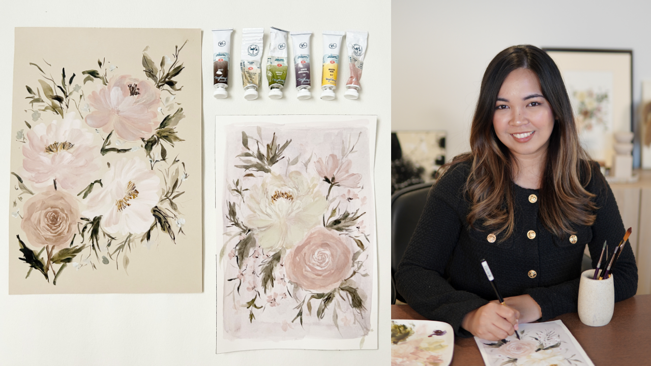
and you're good to go. My name is Jenny Flores. I'm a creative coach, and artist from the Philippines. I love art, and I teach
painting, calligraphy, and creative entrepreneurship
in person, and online. My work as an artist revolves around the
subject of botanicals, bouquets, reads, and different
floral arrangements. In today's class, I'm
going to teach you how to capture the
essence of a flower, by looking at it in
a less complicated, and more approachable way. We're going to
start by analyzing, and dissecting different
types of flowers, such as peonies, roses, cosmos, and wax flowers. Then we will learn how to identify the shape
of each petal, so we can pick the perfect
brush dive for each flower. I will also teach you
how to add depth, and highlights, and finally, how to add details, and embellishments to finish up your painting beautifully. This class is a great place to start if you
want to learn how to translate the overall
image of a certain flower, without the pressure of
creating heavily realistic art. It really doesn't matter if you never pick
up a brush before. Our class is going to
be beginner-friendly, so everyone is
very much welcome. I'm so excited to
paint with you. Now pick up your brush
and let's get started.
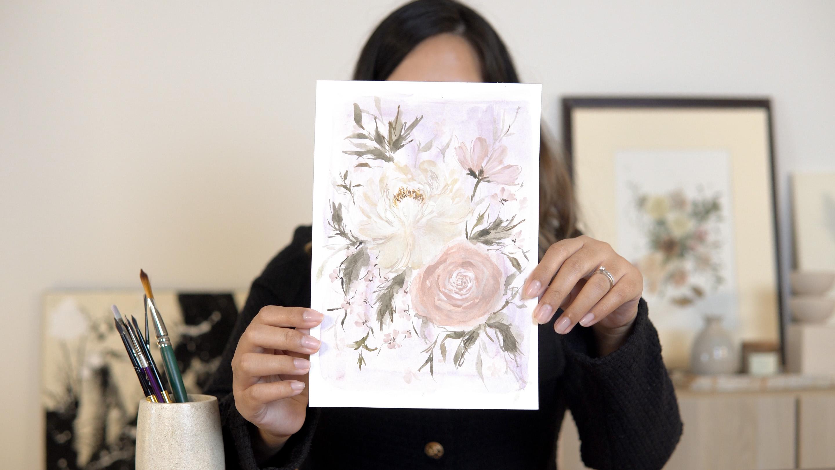
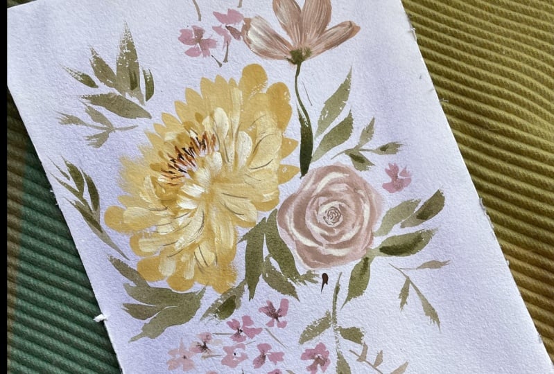
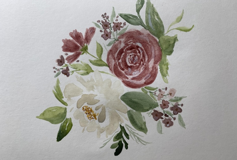
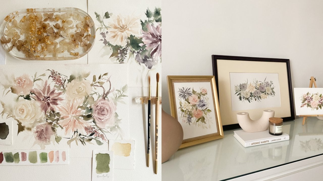
2. Class Project Overview: Today we will be painting this floral composition
consisting of peony, rose, cosmos, and
some wax flowers. We will be basically working on this project all
throughout the class. The painting process
will be divided into sections where
I'll discuss the steps on how to easily
capture the essence of a flower and translate it into a painting
in a loose style. Aside from that, I will
also share some tips and insights that you can use in
your next painting session. By the end of this class, you'll not only
be able to create a beautiful piece of art,
but more importantly, you will also learn
how to look at each floral reference image in a less complicated and
more approachable way. When you're done
with your project, you can upload a photo of your work at the
project section. That way, we can
give feedback on each other's work and support each other on our
creative journeys. I'm looking forward to seeing
your work so let's begin.
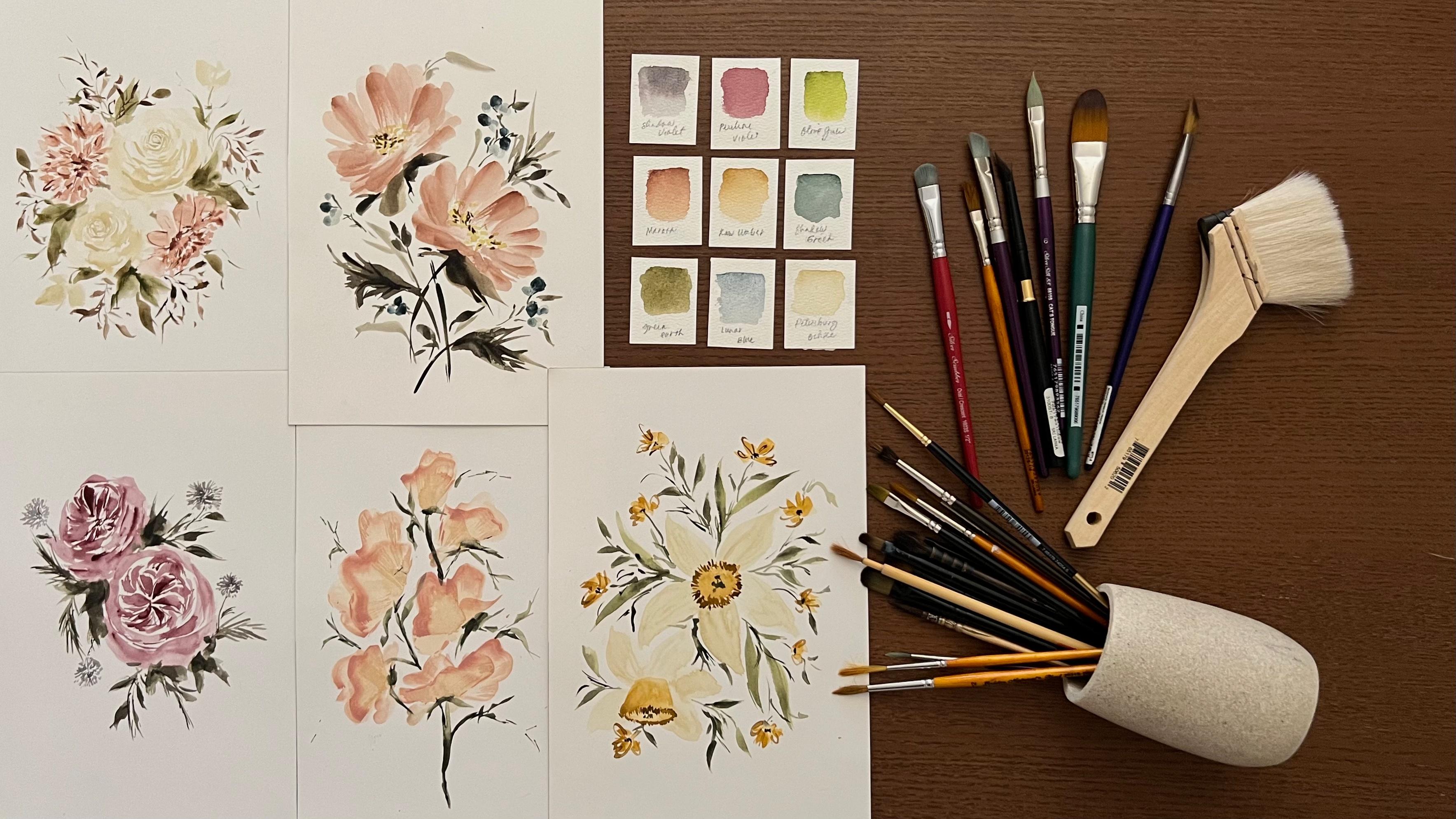
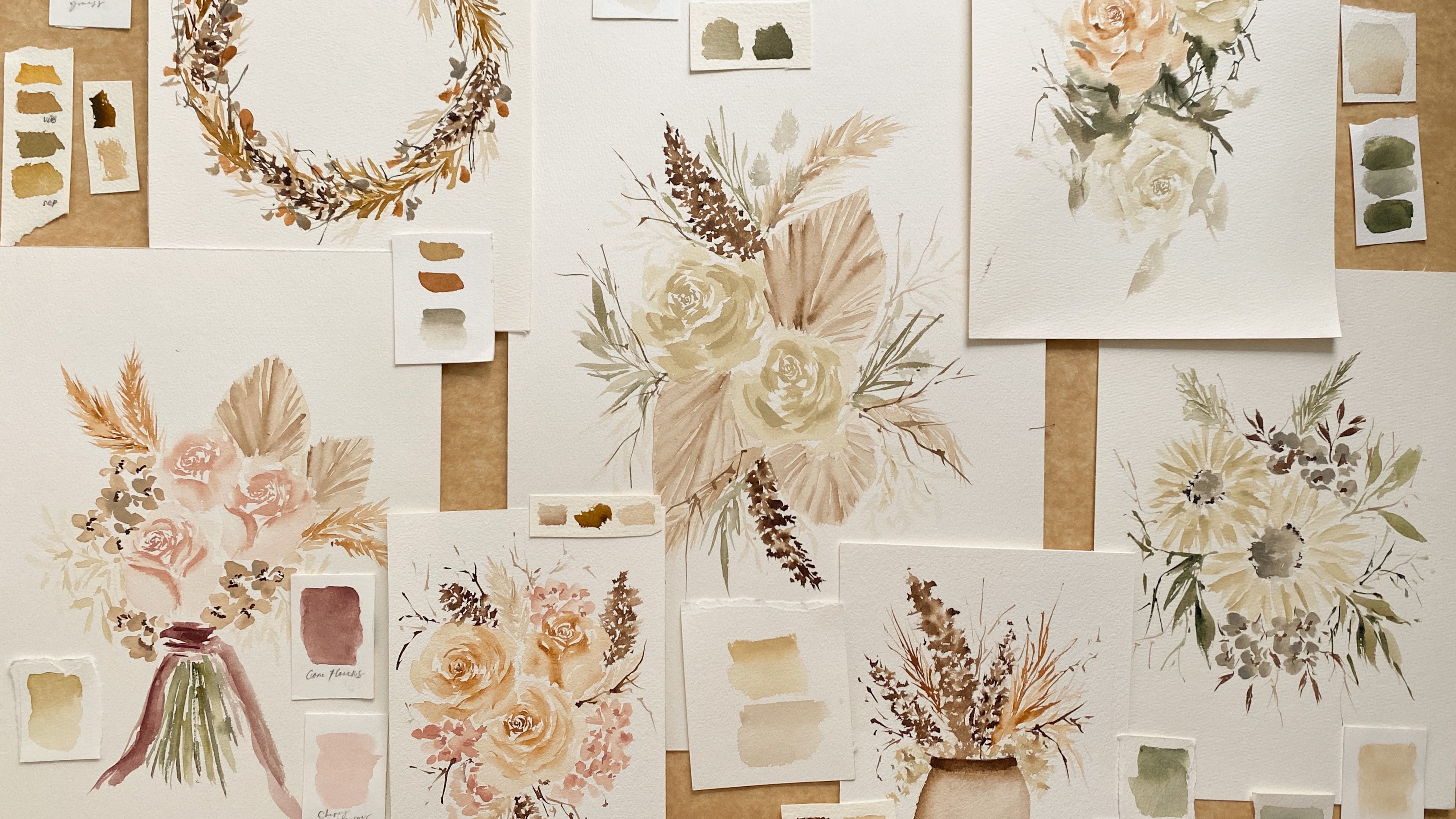
3. Supplies: In this section, I
will walk you through the different supplies that I will be using in this class. Let's begin with colors. We only have one project
for this class, even so, we will still use a couple
of paints to achieve a harmonious flow of
color for our artwork. Before I forget, if
you want to add, there are some
color combinations for the painting
that we will do, feel free to do so. For this class, I'll
specifically use the following colors: Hematite
tint, Petersburg ocher, titanium white, yellow
ocher, raw umber, mocha, undersea green, green earth, Van ****
brown and sepia. I'll be using a couple
of brushes from Silver Brush Limited in various shapes and
sizes for our project. Well, I'll be using different
brushes in this class, you are not required to have all of them to
complete our project. For the brushes, I'll
use silver black velvet round in size 4, 6, 8, silver black velvet
liner brush in size 1. Silver crystal pointed
oval brush in size 3, 4. Silver silk 88 oval
crescent brush in size 3/8, and silver silk 88 monogram
liner brush in size 20/0. For the paper, I'll use
the arches hot press watercolor paper in
size 10 by 7 inches. You can also use cold press
paper or mixed media paper, but the flow of water
may be different. So I will still
encourage you to get a hot press paper
for our project. In painting any medium, it is so important to have some tissue paper
nearby and a couple of water so you can
clean your brush easily when changing colors. Last is a mixing palette. I use a ceramic palette
because it's easier to clean, but the plastic palette will do. Now that you know the
supplies that I'll use, let's go to our next topic.
4. Process Overview: 5 Steps: When I was a beginner, I always used other
artists' painting as my reference photo. I thought that was
the best way to learn because I always felt
overwhelmed when I used actual object or even a
photograph as my reference. As my creative
journey progressed, I learned that it's still best to use actual image because, number 1, you will develop more creativity as
you learn how to combine different
flowers in one artwork. Number 2, you can claim your artwork as your own,
and more importantly, you can always tweak
each detail and insert your own style on
each stroke that you make. I know it's daunting to look at an actual reference photo and translate it
into a painting. But that's the
reason why I'm here. In this topic, I will share with you
the actual process of how to dissect a flower, so you can paint it
in a loose style. This is probably the
most essential part of the class and the
lessons you will learn here can be applied, not only to the selected flowers that we will paint later on, but to all botanical
elements that you want to try to paint next time. To make this lecture
more organized, I divided my process
into five steps. First, analyzing the overall
shape of the flower. Second, identifying the
shape of the petals. Third, adding shadows. Fourth, adding highlights, and fifth, adding
textures and details. Let's start with the first step, analyzing the overall
shape of the flower. Whether it's a rose, a peony, or just a daisy, you'll get easily overwhelmed if you look at the flower as is. Why? Because of layers. Layers make the flower
difficult to paint because it's what makes angles, shadows, and many more. The best way is to look
at it in a flat view. Let's take this
rose, for example. What we have to do is just
get its overall shape. Forgetting all the folds, the curves, what can you see? This. An imperfect shape, somehow circular, but
with a bit of edge. Is that hard to paint? I think not, especially
when you're painting loose, which means you
don't really have to copy exactly
what you're seeing. You just need to get
the general idea of it, which again is a bit
circular with edges. On our next topic, I'll demo and explain this process further. For now, let's go to
our second process, which is identifying the
shape of the petals. This part is very important because it will
be our main guide in identifying the best brush to use for a specific flower. As you notice here, the edges of the
petals are pointy and all the details involving this specific flower have edges. This area here and also here. With that given situation, the best brush to use
is a round brush, since round brushes have pointed tip that can create sharp lines, and at the same time,
it also has big belly that can create soft
body for the petals. What about peonies, let's say? Based on this reference image, since it has round tip petals, the best brush to use
is a filbert brush, because as you can see here, it can really create a stroke
similar to that of a peony. If you're unfamiliar with the different brush
shapes and you want to learn more
about brushes, I have a specific class here on Skillshare that will help
you with this topic. You can find it on
the About page of this class or in my profile. Now off to the next
topic, the shadows. Once we have officially painted
the base of the flower, then we have painted
the petals as well, it is now time to
identify where to place those dark areas and add
depth to our painting. We cannot skip this part unless we wanted our
painting to look flat, which of course we do not. In adding shadows, we do
not need to place them in all the areas just as the
same as our reference image. Just focus on the vital parts. On this rose, we have
the middle part. This particular area,
as you can see here, the shadows are darker and smaller compared to the
rest of the petals. You can also see here that
the shadows are getting wider and lighter as we move toward the outer
part of the flower. When we look at it that way, you realize that adding shadows
become less overwhelming. I'll give you more
examples later on when we paint
the actual flowers. After shadows, we have to
identify the highlights. For the highlights, the best
thing to practice is to place them in areas that
needed to be emphasized. Most of the time I added between shadows or beside a shadow, so that the portion of a petal will be highlighted even more. This painting of my
rose is an example of a painting with
a subtle highlight. Since we are painting
using watercolor, adding highlights can
be done in two ways. First is to leave a
whitespace for that area, and second is to add the concentrated
mixture of white paint. I personally prefer
using the second method, because adding layers
of paint can really take the space intended
for a highlight, and that happens
most of the time, especially when painting
using the loose style. The last part of the process is identifying and adding details. Does the flower have a core? Does it have texture? Or is my painting in need of extra details so my audience
can understand it even more? We need to answer these questions before
we put our brushes down. Remember, we are going
to paint in loose style, so there will be times
when the flower that we paint won't look similar
to our reference image. In that case, we need to
help our audience identify our subject even more by adding
these supporting details. Now, these are the five steps
in capturing the essence of a flower and translating
it into a painting. I'm sure you're very much
excited to try it yourself. Now, let's proceed to our next lesson and
start painting.
5. Analyze & Paint a Peony: Hello and welcome back. I know you've been
itching to pick up your paint brushes
and start painting. Thank you for your patience. Yes, we're finally going to paint now and for this section, we will focus on analyzing
and learning how to paint one of the most
complicated flowers. Well, complicated
for me, a peony. Alright, let's get
those brushes swirling. Before we begin
painting our subject, Let's start painting the
background layer first. For the background,
what we need to do is wet paper first with clean water so that
the flow of color later on will be
easily distributed. You may use any brush for
this part of our project, but a big flat or filbert brush will make your process faster. I also left a bit of space on all the sides of my
paper as my border. All the parts of my paper is wet already and now I'll be
adding the background layer. I'm using hematite dent in a very less concentrated
mixture for this layer. You can use different color for your background
if you want to, but make sure that the color of your
choice will still match the rest of your palette so your artwork will look
balanced and pleasing. I also encourage you to create multiple sets of background, so you can easily switch
to another one once you created a mistake or you
want to start over again. Drying time for the background
layer is a bit long, so it's best to have an extra. I'm done with my
background layer and I will let this layer
completely dry up. While waiting, let's start
analyzing our peony first. We have here a photo of a peony, and I actually picked this
one as my reference because it perfectly captures the beauty and complication of this flower. When we analyze it, we can see that this flower can be divided into three parts. The main flower, the
background petals, and the fallen petals. Generally, the shape
of this flower can be described as a bit messy. As you can see, it has a lot
of things going on here, and at the same time, the main flower is
a bit circular. Then for the background
and the fallen petals, you can see that
they're all curvy. Aside from being curvy, you can also say that the
petals have round tip, especially the big ones. With that given situation, I believe that the
best brush to use is a filbert or pointed oval brush. Alright, now that
we already analyzed our peony and our background
layer is also dry, it's time to actually
paint our flower. I'll use Petersburg ocher for
this one since I wanted to create a soft and creamy
white peony for our project. For different strokes, we will first create the
background petals using a size three port oval brush and a watery mixture
of our color. We will make flat strokes and mimic the shape of
our peony petals. By the way guys, you can check our reference image
from the project and resource section to have a guide where to exactly
place the strokes. Once you're done with
the background layer, you may use sides of
your brush to create smaller strokes for
the body of the peony. As you can see here,
I'm using the side of my brush to create the body. Continue adding
strokes until you have completed the base
layer of our peony. If you find your base layer too light, that's completely normal. We will add more
layers later on as we proceed through the
rest of the process, make it as light as possible. Because later on we
will add more layers. Also guys don't forget
to leave a bit of whitespaces like
what I'm doing here, because we are preserving some areas because
we don't want to create a big blob of
paint on our paper. Just leave some whitespaces. I'm done with my base layer and I hope you're also
doing great there. Let us lay a draft first before we proceed
to the next one. Now that my base
layer is already dry, we are now going to
add our second layer. This time we will use a more
concentrated mixture of color so we can separate
the two layers. For the strokes, we
will actually do the same as our base layer. However, this time we will be focusing more on the
main body of our peony. You may also change into a
smaller filbert brush to create smaller petals for
the body of your peony. If you check our
reference image, a lot of petals and
the inner part of the body are relatively smaller, so it is really best to
use a smaller brush here. Another reminder guys, do not be afraid to
add layers of strokes as long as the layer
behind is completely dry, your stroke will
not create a blob, so just keep on adding. Now let's work on
the pollen petals. For this layer will use the same mixture that we
used on the body awhile ago. As you notice, our base
layer is too light, so we will establish
it and still use the same stroke from
the same big brush. Even though we already
establishing this layer, it is still best not to
just redo the layer rather. Then you set the
petals on top of it to create an effect that the
petals are overlapping. Just like on the
reference photo. Alright, it's time
to add the shadows. As you notice on the
reference image, there's a bunch of
shadows visible between the main body and
the pollen petals. Let's just split that
into painting by using sepia mixed with
our original color, which is Petersburg ocher. I'm dabbing a bit of
the mixture here. As you can see, I'm using a
round brush in size four, and that is because, I wanted to place the shadows in different
shapes and sizes. Using a round brush, I can have more control of my strokes, so I prefer using this one. The shadows I made
are very subtle, and the reason behind that is, when we add highlights
to our petals, all the rest of the
petals will look dark, so we don't really need
to overdo the shadow. Plus you can always
add more later on. It's time to add
some highlights. Using a very concentrated
mixture of titanium white, I'll make big
strokes for the body and the pollen petals
to create highlights. If you think that your
mixture is too strong, you can lift it with a
clean tissue to soften it. Again, check your reference
image as you paint, but you don't really need
to copy everything as is. Add your own creative
touch and be confident in creating
your own strokes. Remember, we do not aim to paint realistic or
unrealistic style here. Just get the essence of the
flower and you're good. I'll be lifting
some whites here to soften it using a
dry tissue paper, drag it and lift the color. As I've mentioned earlier, if you think that your highlights are too
strong, you can lift it. Our peony is almost complete. We will let this
layer dry first, then proceed to another
layer later on. Remember our five steps, we are done with
step one to four. It's time to add the details
which is actually step five. As you see on the
reference image, it contains more small petals than what's seen on my painting. But since I already
added the highlights, I need to use a lighter and
more concentrated mixture of Petersburg ocher for
this layer to be visible. I'll also be adding
some of these here, in between the body
and pollen petals, I also decided to
add another layer of pollen petals to
help my audience understand that this peony has layers of pollen
petals underneath. Again, we are painting
in loose style, so there will be
times that we really need to help the
viewers understand the plot over painting without doing it in an overly
detailed fashion. I'll be adding some here. Very light and
subtle and I'm just mixing the flat strokes
and the side strokes. Another detail to add for our peony is the
core or the center. Although on the
reference image there's only one brown detail in
the middle of the body. I decided to use another
reference photo for this part of the painting and that's another tip that I
want to give you. You don't have to stick to
just one reference image. You can combine two or
even three references that will help you
create a certain flower, especially a complicated one. For the core, I'll
use a liner brush for the base layer and a watery
mixture of yellow ocher. Using the brush creates
soft lines in the middle of the flower and leave a bit of whitespaces to avoid
creating a blob. I'll be adding a bit more here. When your first layer for the core is completely
dry already, we will add another layer. This time, we will
use raw umber, which is a darker tone
for yellow ocher. This part of the core
will be more detailed. I'll use a detail brush, which is a monogram liner
brush in size 20/0. For this part, I'll just create small lines with a bit
of pressure on top. Take it as if you're
creating some commas. Let's add more, but don't
cover the base layer. Just add a lot, but not too much. For the last part of the core, we will add the darkest
detail using sepia. Same thing, just create as
if you're creating commas. But this time I'll leave more spaces because I don't
want to cover it that much. For the second to
the last detail, we will add some freehand lines. This is something
that they add to just give a little extra
interest on our painting. This is part of my
style personally, you can actually skip this part, but I still suggest
that you add it. I mix sepia with
Petersburg ocher, and I'm just creating
random lines on some areas just to add
interest on my painting. This is also part of my extra
shadow and as you notice, it really added a lot
of interest on my art. For the last detail,
I would like to establish some small petals. You can skip this part if your peony looks
complete already. I would add a bit of highlight
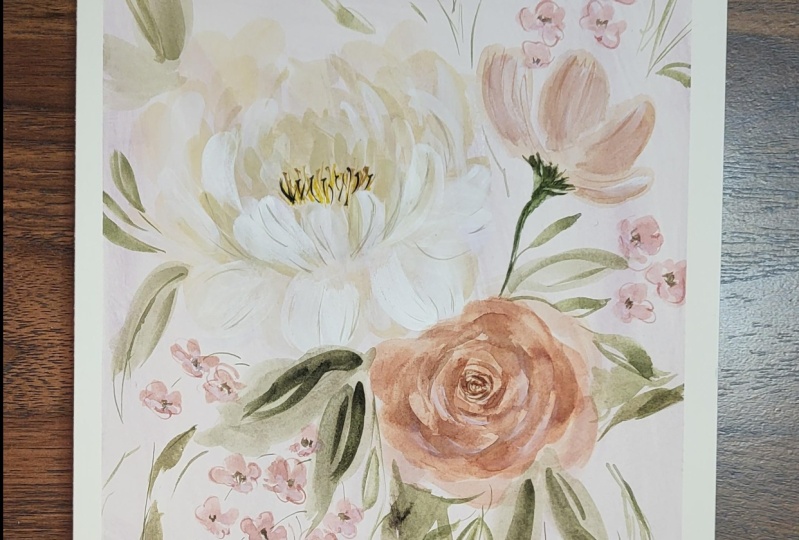
on the background as well, so it would stand out a bit, and we are done with our peony.
6. Analyze & Paint a Rose: We are generally
done with our peony. If you think something is still missing with
your painting, just wait and leave it. Later on when we finally
finish everything, we can go back to it and add extra details to complete it. For now, let's proceed in
painting our second flower, which is a rose. We will place our second flower, which is a rose in this area. For the rose, I decided to use the color Mocha from
Netscape pallete. This is a soft pink
with a hint of peach shade and I
really love it. For the base layer we need to get a milk mixture of a color. Milk mixture means that the
color we will use is watery, yet still pigmented like milk. Let's analyze the
shape of our flower. Looking at the reference image, we can see that
our flower is very detailed with lots
of dark petals. But when we put
those layers aside, we can get this shape which is an imperfect circle with a
bit of edge on some areas. Let's just leave those
information into painting. Let's create a base imperfect
circle with a bit of edge. I'm using a size three
four filbert brush or pointed oval brush here and a very light mixture
of my color Mocha. As you can see, I'm
not really creating a very similar base
with a reference image. I'm just dabbing my
color and creating the general idea of a bit
circular with some edges. I'm done with my base and we have to make sure
that this layer is 100% dry already before we
proceed to the next layer. While waiting, let's start analyzing the shape
of the petals. As I've mentioned on one of our videos where I
discussed this source, this particular flower has a lot of edges and a lot
of dark petals. So it's really important to
use a round brush for this. You can also see that the
petals are getting bigger and wider as they reach
the edge of the flower. Again, round brush is the
perfect choice for this one. Also, since we already
painted the base layer, how we're painting the
petals will be inverted. We will use shadows, reduce the petals out
of the base layer. I know that sounds weird, but let me show it to you. I'm going to use a
small round brush, which is a monogram liner
brush in size 20/0. I'll create small C strokes alternately to mimic
the shadow of the rose. For the color, I mix Mocha with a bit of sepia to
darken my mixture as the inner shadow
of the rose is also darker in our
reference image. Do it slowly and
also makes a bit of random thin lines to add more shadows and
dark petal effect. Now, I'll switch to a
size 4 round brush to create bigger C strokes
for our shadows. This time, I'll also use a bit of a lighter shade of Mocha, since based on our
reference image, the shadows are
getting lighter as we move away from the
center of the rose. I'm also adding the
edge of the shadow with clean water to create
some ombre effect, which is actually
similar to the look of the shadow on the
reference photo. Let's continue adding C strokes till we complete
all the shadows. To make the shadows
more visible, I'll add another layer with a more concentrated
mixture of color. I'm just adding here. I hope your work is
looking good there, guys. If not, just continue. We can resolve all the
issues that you guys are facing later on
when we add details. On this part, I want you to step back and look at your rose. Ask yourself, does it need
more shadow, then add. Did I lose the edges
on my base layer? Then reestablish the edges. On my part, I'm adding
more edges because I can see that I lost some of it when I added the shadow earlier. For the last step, we will be adding highlights. On my rose, I decided
to add highlights on one side of my rows to give more dimension on my painting. Using a very concentrated
mixture of titanium white, I'll add some C strokes
on one side of my rose. As you notice here
in the highlights, I made are very subtle, and I'll dilute it even more with clean water to
soften its look. We are done with our rose. I hope yours is looking good, and don't worry if you
think something is missing, you can add more
details to it later on. For now, and let's proceed
to our next flower.
7. Analyze & Paint a Cosmos Flower: Congratulations on completing
two of our subjects, these two flowers are
quite difficult to paint. So if you had a hard time,
that's completely normal. Now we can start to relax
because our next flower, which is a cosmos, is a bit simple compared to the first two that we have painted. Before we begin painting
our third flower, let's start analyzing it first. Looking at the reference image, you will notice that this
flower is very simple. It's actually one
of those flowers that don't have
much layers on it. When it comes to petals, you can see that they
have around tips, which can be easily achieved, of course, by none other
than filbert brushes. So for our cosmos, I'll use the same color as
arrows, which is mocha, using a filbert brush or
a pointed oval brush, I'll paint the base
layer of our petals. I'm just using the
side of my brush and doing flat strokes
inside strokes here. Make sure that you're
using a light mixture of colors so you can build
more layers later on. While waiting for our
base layer to dry, I'll get a mixture
of green earth and connect this flower
to my other subjects. Since the base of our
cosmos is still wet, there's a chance
that the color will bleed a little and
that's totally fine. Actually, it's even
better because it adds a lot of interests
on our painting. Now that my base is dry already, it's time to add
shadows so fast. That's because cosmos is
such a simple flower. Anyway, I'll get a darker
mixture from mocha and use a size 3/8 of our cosine
brush for the shadows. Based on the reference photo, the shadow and the two
petals on the right are more visible compared to
the shadows on the left. I'll just be adding thinner and Marsh subtle shadows here. Now it's time to add
some highlights. For cosmos, I'll be using a
technique called dry brush. So what is dry brush? Using my pointed oval brush, I remove all the water
from the bristles and get a concentrated mixture
of white titanium. As you notice, there are textures visible in the
strokes that I've created, and that's the beauty
of this technique. So I'll add more highlights on the left side compared
to the right side. Time to add the details, as you can see on the reference, cosmos has this thin
textured lines. And using monogram liner brush, I'm adding the same
texture on my painting. Be cautious on this part and
make sure not to overdo it. For the last details, I decided to add darker tones on my stem to create dimension. Just get a more
concentrated mixture of green earth and add broken lines on the part
connecting the flower, the stem and on the
left side of your stem. Finally, we're done
with our cosmos, actually, we are done with
all our main flowers. The next elements that we
will paint are fillers. So make sure to prepare
your browns and greens because they will surely be used on our next lesson.
8. Adding Fillers: A composition will never look complete without
fillers around it. In this part of our class, we will start adding
leaves to our painting. Leaves may be simple, but they surely add a
huge effect on our art, you'll see it later. Let's begin this lesson. For our leaves, I'll mix different shades of
neutrals and greens. I have green Earth, and the sea green, sepia, and Vandyke brown. I'll just mix them
every now and then, and use different water and
color ratio on every stroke. I want you to do the same. I want you to insert your
own creativity on this area. But of course, you can still use my project as your guide. I'll first add my big leaves to cover a huge amount of area. When doing leaves, I
just play with my brush. I use different sides of it to create different
brushstrokes. Remember, leaves
are just fillers, and they don't need to look realistic to be
acknowledged as leaves. Most of the time they
just need to be green. For the next layer, I'll add some darker
shade of green just to create dimension
on their leaves. It's time to add smaller leaves. Using Size 6 round brush, I'll use the tip of my brush
to create thin lines and then press and lift my brush
to create small leaves. Feel free to add these leaves on areas that you
want to be filled. It can be in between
the big leaves or between two flowers. Also, don't overdo it. We have more fillers to come, so you're not
required to just use small leaves as your fillers. I'll add some more
leaves in this area. We are done with the first
part of our fillers.
9. Analyze & Paint Wax Flowers: Our painting is almost complete. But as you can see, there's still spaces
needed to be filled. This is where we put
our wax flowers. Now let's start painting. If you're not familiar
with wax flowers, this is what they look like. They're little flowers
with dark brown cores. In real-life bouquets, they
always serve as fillers, and today, they'll do the
same for our artwork. Since wax flowers
have rounded petals, the best brush to use are
small filbert brushes like my oval crescent
brush in Size 3/4. In creating their petals, just do flat strokes for
about 3-5 per flower. Yes, you don't need to complete all the petals in every flower. You can create an illusion that they are petals overlapping by removing a petal or two
in some of the flowers. Place a bunch of wax flowers
in areas that needs color. It's time to add the details. Using a concentrated
mixture of Van **** brown, add small lines in the
middle of your wax flowers. Notice that I don't place
the small lines uniformly. I'm creating random
patterns just to make everything look loose. Now, for the next
wax flower detail, I will be adding some outlines. Again, I encourage you not to do these outlines uniformly. Be carefree and let your
hand do the strokes freely. Time to load your brush with titanium white to
add some highlights. Since this is just a filler, I will just add dots of white on some areas of my wax
flower to add interest. No need to add a lot. Just dots of white on
some of your petals. You can actually stop
on this part already, but if you want to add
more fillers, more leaves, and extra details, this is your time to do it. As for my work, I'll be
adding a few more leaves and some more fillers to fill some areas that I
wanted to be filled. You can still refer to the finished painting
as your reference, but I want to encourage you to insert your own
creative strokes and listen to your instinct as you add more details
on your painting. This is actually the part
where you will learn the most.
10. Final Thoughts: Finally, we are done
with the class. Thank you so much for joining me and well done for
finishing the lessons. I hope you learned and
enjoyed as much as I did and I hope you
discover how to capture the essence of
a flower and how to paint it in a less daunting
and more approachable way. Just a reminder. If you think your
work doesn't look the same as mine or you feel like you still need to redo your project, that's
totally fine. It took me years of practice and many mistakes to be
where I'm today. You're so much ahead of me when I started,
so don't give up. Keep on trying and
keep on painting. No matter what, I'm very excited to see the project
that you have created. Please take some photo of it and upload it on the project
section of our class. I would love to give my
personal feedback on your work. If you found this class helpful, I hope you can leave a review
in the review section. Let me know if this class
met your expectation, what you enjoy the most
and what can be improved. This is so valuable
and helpful to me as your instructor so please
don't skip this part. Also, don't forget to follow
me here on Skillshare so you'll get notified about my upcoming classes
and giveaways. You can also follow me
on Instagram to get instant updates about my
latest works and events. Lastly, feel free to
share your project on Instagram and
Instagram stories and tag me @jennyfloresart and Skillshare Instagram
@skillshare. I will surely share your
work with my community. I hope you love this class
and learn something new. Thank you so much for joining, and I'm excited to see
you in the next one. Bye.
 Jenny Flores Art, Top Teacher | Watercolor & Gouache