Transcripts
1. Introduction - Watercolor Portraits for Everyone: One can learn to paint
watercolor portraits with the right approach
and a bit of practice. All you need is four colors, a few court techniques, and a little patience. Hi, I'm Jane-Beata and I'm a watercolor artist
from Slovakia. I've been painting with
watercolor for over 15 years, creating book covers,
illustrations, and exhibiting my work both nationally and
internationally. This year at a prestigious Watercolor festival
in Cordoba Spain. Though I never went
to art I've learned directly from incredible
artists through master classes, and I continue growing
through events, festivals, and countless
hours of painting on my own. I also run my own studio where I regularly teach in person
portrait workshops. To me, portraits are
more than likeness. They're a form of
emotional storytelling. Over time, I've
developed a simplified, intuitive process
that I love sharing, both here on
Skillshare and also on my YouTube channel where
I post videos about watercolor and also
on Instagram where I share my daily art
practice and studio life. This class is
natural continuation of my earlier portrait classes, introduction to
Watercolor portraits and the seven day Monochrome
portrait challenge. If you're just starting out
and want a deeper dive into portrait sketching or want to explore painting
with a single color, those classes are a
great place to begin. In this class, you will
learn how to create vibrant watercolor portraits
from start to finish, using just four colors
and minimal materials. Learn how to sketch with
confidence, fix common mistakes. But if you prefer to
skip the sketching part, I've also included a
downloadable sketch for you. Then we will dive
into Watercolor. You will learn four
key techniques that I use in all my portraits. They're simple, versatile, and we will practice
them together. So you know exactly where
and when to use them. Goal is not for you just
to copy what I paint, but to give you a clear
and practical framework that you can apply to
any reference photo. That way you can begin creating portraits that are
truly your own. The entire class is
filmed in real time, so it feels like we're
painting side by side at a relaxed
encouraging pace. I would also love to see your
project when you're done. You can upload it right here for personal feedback from me, which is one of the best parts of Skillfare creative community. So go ahead and enroll and I can't wait to
see you in class.
2. Class orientation: Hello, welcome and thank
you for joining this class. We will be creating a
Watercolor portrait from start to finish together. And whether this is your
first portrait or your tenth, I'm very happy
that you are here. So before you start
with this class, make sure to check the
projects and resources tab. Download this video, you will find everything
you need there, a downloadable reference photo, a sketch that you can trace if you'd rather skip
the drawing part, a list of all the materials
that we'll use in this class, and a step by step overview
to help guide you through the process smoothly before we jump into painting the full
portrait in this class, we'll first take time to
build a strong foundation. We'll start by learning
how to mix and combine the four colors that
we use in this class. You will see how
flexible and powerful the limited palette can be and how to get
the most out of it. Next, we'll move on to the
sketching of the portrait. I will walk you through my full freehand
sketching process and share important tips for drawing faces and also how
to correct mistakes. And I will tell you why I believe that freehand
sketching is such an empowering
skill to develop even if your drawings
aren't perfect. That said, if you'd rather
skip the drawing part, that's possible because I've included a traceable sketch in the class resources so you can start right from the
painting pace if you wish. We will also have a short
but valuable lesson on the four essential
watercolor techniques that are used in every portrait,
not just this one. I strongly encourage
you to practice these techniques before moving
on to the actual painting. Exercises are very quick
and they will help you feel more confident
and in control. I will also show
you how to set up your watercolor table
in a practical, efficient way so that
you can focus on painting without
distractions or mess. Then finally, we'll
paint the portrait together in real time,
slowly and intentionally. You will paint
right alongside me as if we were working
together in the same room. I will guide you
through what I'm doing. And more importantly, why so that you not
only follow the steps, but also understand
the key principles behind each part of the process. By the end of this class, you will not only have
a finished portrait, but also a repeatable
process you can use in future paintings and the
confidence to approach watercolor portraits with
more clarity and ease. When you are ready,
please take a photo of your finished
painting and upload it down below to the
project's gallery. As for me, it's best way to
stay connected with you. I read and respond to
every single project. I try to write small
feedbacks to your works. If you decide to include
about your experience, going through this
class, that's a big, big plus. Do not be shy. I really want to
see your project. The next lesson
will be an overview of all the materials that we'll be using throughout the entire class.
Let's get to it.
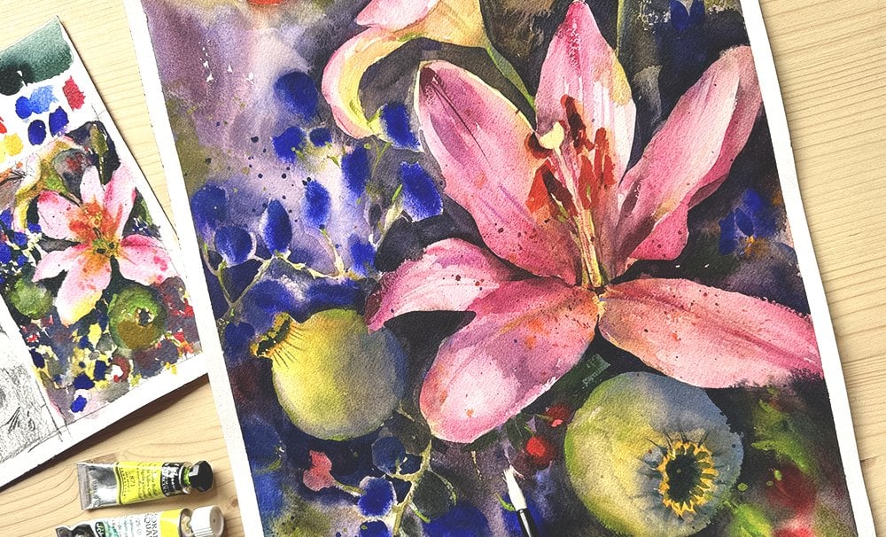
3. Materials: In this lesson, we will go over the materials that you'll
need for the class. Do not worry about having the exact same brands
or tools that I use. Feel free to substitute
with whatever you have on hand or
something similar. My goal is to work with
what's accessible to you, so do not stress about
getting everything perfect. For this class, I will be using windraNwton professional
watercolor paper. It's 100% cotton
and cold pressed. My go to size for
portraits like this is 30 by 40 centimeters
or 12 by 16 ". I like this size because it
gives me enough space to work loosely while still allowing for detail
where I need. Color papers, they can
vary a lot between brands, but as long as you choose
a cold press cadm paper, you'll be in a good spot. It doesn't have to be
the exact same brand, aim for similar quality
and surface texture. Next up, paints. For this class, we will keep it simple
and use only four colors. The first one is
cadmium free orange. I use the Windsor
Newton version because they offer this cadmium free
option which I really like. The second color is cadmium red. Right now I'm using rebrand, but I usually go with
the cadmium free version from Windsor Newton as well. Sometimes my local art store
runs when that happens, I do not hesitate to use
another artist great brand. Most of them use
the same pigment and the quality is
very comparable. The third color is cobbled blue. This one is essential for
shadows, but honestly, it's the color that I run out of the fastest because
I use it so much. And finally, the fourth color is bloodstone genuine
by Daniel Smith. This is a mineral based pigment, which means it has a
beautiful grainy texture. I use it a lot to add
natural texture to my work. If you don't have
the exact color, look for dark, granulating color from any
artist great brand. Even something like paints
gray can work as a substitute. Again, do not stress about
matching every color or brand. Exactly. The key is to choose similar pigments that
behave in a similar way. I will be using three
brushes for this class. The first one is large
flat watercolor brush with natural bristles. I mainly use it for expressive platters and
painting the background, so it doesn't need to
be anything fancy. You can easily substitute it with any large watercolor brush, even a round
something that holds a good amount of water and
lets you work loosely. My main brush and the
most important one is this size seven round
brush from Windsor Newton. It's from their
series seven line. It is made with
natural bristles, and I use it for about
80% of the portrait. If you can find a soft
round watercolor brush in size seven or eight, it can become your
go too as well. It really helps you
get the right feel for watercolor techniques
like blending, layering. Control. The last brush is
for details and refinement. I use a size four
brush from lineal. It is natural bristles also, but this one was not expensive. It has a fine chip and handles
small details very well. I do not need anything
smaller than this for the kind of detailed work that we'll be doing in this class. Sketch, all you really
need is a pencil. No need to overthink it. Everyone has their
favorite type, but I usually use a to be
pencil for the initial sketch. I also like to switch to a mechanical pencil with to be lead when I'm
defining details. It gives me a bit
more precision. As for the erasers, I use a few different kinds
depending on the stage, pencil style eraser from
hinor for refining lines, a ktable eraser for gently
cleaning up the sketch, and a dust free eraser when I need to remove more or do
some heavier corrections. I have been using these
erasers for years. They're all quite gentle
on watercolor paper, which is important to avoid damaging the surface
before painting. You might also want to
have a few scrap pieces of watercolor paper on hand for testing colors
and making swatches. For mixing your paints, you can use any non
absorbent surface. I personally like to use white porcelain plates
because they're simple, affordable and very
easy to clean. You will also need something to help with rinsing your brush, absorbent sponge or
just some tissues or paper towels will work fine. And finally, a hair dryer
can be super helpful if you want to speed things up
and dry your layers faster. It is not required, but
it really comes in handy when you're working in
stages or short on time. Go ahead and gather your materials, and
once you're ready, I will meet you in
the next lesson where we'll learn how to mix our colors and create all the combinations that
we need for the portrait.
4. How to Mix Skin Tones With Limited Palette: Lesson, we will explore how to mix colors to create skin tones, shadow colors, and everything that we need for our portrait. I encourage you to follow
along with a brush in hand and recreate the color
mixes as I demonstrate them. Doing this alongside me will help you get more
confident with mixing. So when it's time to paint
the actual portrait, you will already feel familiar with how
the colors behave. We already talked about the four colors in materials lesson, but let's do a quick recap
before we start mixing. The colors we will use
are cadmium orange, cadmium red, cobbled blue,
and bloodstone genuine. I usually use paints straight
from the tubes and squeeze them out onto white
porcelain plates for mixing. I keep the darkest
color, the blood stone, genuine separate because it
can muddy the mixes pretty quickly if it gets into the
lighter colors too soon. Alright, let's start by learning how to mix a basic skin tone. So when you mix the
orange with the red, and use enough water in the mixture that is where
you get clear skin tone. This is like a basic skin tone. Make sure that you look at your skin tone
when you mix because sometimes your orange prevails and then it looks like this. Other times, when you
get caught up in mixing, your red can prevail and you will end up with
a mixture like this one. Which one is correct?
None of them. You have to check it with
your reference photo. Sometimes you have a skin that
leans towards the orange, sometimes it leans
towards the red and sometimes you need something in between, something neutral. Make sure that you are working with a skin tone that's
closest to what you want. What I do is I take
my reference photo. I always have a bunch
of these papers on the right side of my
table so that I can test the paint and check with
the reference photo. So I just use a swatch and
compare to my reference. The slide is not so strong, but you can use a little bit of the blue to gray your
skin tone slightly. I think if we do that here, but just like very little bit, just like tiny bit of blue. And if we swarch that color, we're going to get closer
to the reference photo. When the skin tone dries, it is going to be
something very different. I'm going to let it dry now so that you can see the change. This is when it's dry and it is super different from
what it was before. And we could this is
more Rugi skin tone. We're working with
limited palette, so we're not going to
get the exact shape, but this skinton I
think could work. At this stage, I would
want to encourage you to observe your
reference photos, especially the subtle
shifts in hue across because that's a great way
to start training your eye, but also let's not overthink it. There's a reason that I chose
to paint this portrait with a limited palette of colors because we all need
to start somewhere. The goal here is not to
mix the perfect skin tone. It's to start noticing the
differences in color and to understand that there is
no one universal skin tone. You can just copy and
paste into every painting. And the lighting in
your reference photo obviously also
plays a huge role. If we go back to our
reference photo, you'll notice it has
very specific lighting, and that influences how we perceive the model's skin tone. So yes, observation
is important. I do encourage you to study
those subtle shifts in color. But don't stress if
your mix does not come out exactly right there's
learning curve here, and the goal isn't perfection. It's about developing your
eye, gaining confidence, and getting a feel for how
color behaves in context. We'll mix color of our
shadows from blue and red. Try mixing the
colors together and swatch the result on a
piece of watercolor paper. The mixture might look a bit strong or dark at
first, but that's okay. You can easily
dilute it with water to create lighter, more
transparent version. We'll actually use both the
lighter diluted version for soft areas and the thicker, more saturated mix for deeper
shadows in the portrait. In mind, this mixture can vary depending on which
color dominates. It might lean more
bluish or reddish, depending on your ratios, and that's totally fine. If you're just starting out, I would recommend
to keep it simple. Mix one shadow color and use
it throughout the portrait. Once you get more comfortable, you can start adjusting your mixes for more
variation and realism. So these are the basic colors that we will use
for the skin tone. This is how you use a limited
palette like this one. Bloodtone genuine, we
don't have to really mix. We're going to use
it for accents, for the lashes, for the hair, maybe for some stylization. So I'll just keep it ready here. If I was to tell you
something about this color, it's a mineral color and
it grains beautifully. In watercolor, we texture a lot. All these three pigments
are very smooth. We have some texture of the
paper, but other than that, this graining texture introduces very interesting element into a watercolor painting and
I really love to use it. There's so many shades of granulating colors
that you can get, but nowadays, I
just use this one. It is darker. If I want some other shade, I'll just mix them up
and the granulation appears that you've
learned how to combine your four colors and mix both skin tones and shadows,
it is time to move on. Join me in the next
lesson where we'll create a sketch for our
Watercolor portrait. I will see you there.
5. How to Sketch a Portrait: In this lesson, we will start
by sketching the portrait. I almost always sketch freehand, even if it means
that the proportions are not 100% perfect. I'm okay with that. Maybe
if you are working on a commissioned portrait or something that needs
to be very accurate, that might be a good
time to explore other methods to get
closer to the reference. But for the purposes
of this class, I would really love us to
draw these ourselves as a way to practice and build confidence in
your drawing skills. However, there is a template in the resources section with
my sketch that you can download and trace if
that helps you save time or if you feel less
confident with drawing. I will be starting
with a two B pencil and later I will switch to mechanical pencil with to be lead just because that's
how I usually work, and that's what I'm
comfortable with. And remember, our
erasers, keep them close. They might come in handy. I actually will not
go too much into portrait anatomy in this lesson as it would make it over long. Drawing is such a wide topic. Like I mentioned, in the
beginning of this class, I've covered more in depth drawing
fundamentals elsewhere. Here, I want to
show you how I drew this specific portrait and how I simplify the
drawing process. You will also get a few
tips on how to sketch on a watercolor paper and how to check your proportions
because those are very, very important for
a portrait drawing. So I usually start by making a few light marks on the paper, one where I want
the chin to begin and one where the
hairline will be. These are important two marks. In this reference, the hairline sits quite close to
the top of her head, so I do not need to leave
much extra space above. These two points basically set the overall height
of the portrait. We do not always have the
luxury of working from a reference that matches the exact size that
we want on paper. That would make
measuring a bit easier. But in most cases, I just eyebllt once I have the line for the
chin and the hairline, I divide the distance into
three roughly equal parts. From this angle, the
face can be broken down into three main
zones, the forehead, which is the first
third of the face, then the area from the eyebrows to the
bottom of the nose, and the final third is from the bottom of the
nose to the chin. I just lightly mark those
divisions on the paper. They help me position
the facial features more accurately without having
to get too technical. Now it's time to
position the nose, since it's the largest
facial feature and a great place to start when building out the
rest of the face, especially in a three
quarters view like this one. The nose becomes
really important. One side will often
appear more as a clear outline or solid line depending on
the light and angle. So I'm going to start by placing that visible edge of
the nose on the page. That will help me anchor the
rest of the features and get a better sense of the proportions and
tilt of the head. I'm going to place the eyebrows
on the second guideline, and then find the
placement for the eyes. A common rule is that the eyes sit in the
middle of the head. So if you measure the
distance from the top of the head to the chin
and find the midpoint, that's actually where
the eyeline will be. I start by sketching the
eyes in a very simple shape, loose outlines with a light line for the upper and lower eyelids. Keeping it simple
like this helps a lot when you're first
constructing the face because it lets you
focus on placement and proportions before getting
caught up in the detail. Now, let's place the mouth. This goes in the bottom
third of the face, and you can divide that
whole lower section into three equal parts. The lowest third
is the chin space. The line for the first
third up is usually where the lips meet between
the upper and lower lip. So these are basic
measurements that you can use to
construct a portrait, even when you don't
have a reference photo. They can help you recognize
common proportions across different faces that do not
always apply perfectly, especially when the
face is at an angle, proportions get slightly
distorted depending on the pose. But for this demo, the reference is fairly straightforward, so we can still use
these guidelines to help place our
features accurately. Once the rough features
are placed on the paper, I start to define the
basic outline of the face. I also try to add a bit of
context like the silhouette of her hair and some simple lines for the clothing if needed. This helps me step
back and see whether the overall proportions of the portrait are at least close. At this stage, I use a kneadable eraser to
gently clean up the sketch. Removes most of the
construction lines and any graphite
smudges on the page. And from here, I refine my lines using a
mechanical pencil, but that is just a
personal habit of mine. You can, of course, absolutely continue with your
regular pencil. I just recommend giving
it a quick sharpen for the step so that your lines
stay clean and precise. The process of refining
your lines is actually quite straightforward and
even a little relaxing. At this point, your proportions
are already in place. So the goal is to go over the rough sketch
lines and replace them with one clean,
confident line. Sometimes I also add a bit
of very subtle shading, but not to start
painting shadows. It's more to mark shadow areas that I notice in the reference. I will use a light touch to
keep track of those spots. This part of the process
might take ten to 15 minutes, but I always suggest doing
rather less than more because we might still need
to adjust the sched later, and it's easier to do that if you haven't overwork it yet. One rule that I like
to follow is to take a break after finishing
the first sketch. I will usually go make a cup of tea or oftentimes I
leave it overnight. Coming back with fresh
eyes almost always helps. I tend to notice small
proportional mistakes that I just could
not see before, and that's so
normal because when we star at something
for too long, we start to adjust to how it looks and stop seeing
it objectively. Let me show you what I noticed after coming back from my break. There is one thing that I like to do to check my proportions, and that is to see the
painting on the ground. At have been doing this
one more often than not. I just throw it on
the ground next to the reference photo and observe. What I'm seeing here, let me show you up close, is that even though my face looks a bit different
than the reference photo, I actually pretty
much like this face. If I did not see the
reference photo, I would want to paint this. But that's just one thing that I think could be improved
and that is this eye. I think on the reference photo, the eye is very close to the root of the nose and
my eye is not as close. I could try and fix that. Always have a break
between when you are first done
sketching and painting. Yeah, I just took 30 minutes and had my lunch and had coffee. Then when I come
back and look at it, that is when I see what
I did not see before. After fixing the eye and adjusting anything else
that caught my attention, I kind of went back
and emphasized a few key lines like the silhouette of the face and some of the flowing
lines of the hair. I also edit subtle
hatching in areas where I noticed stronger shadows
like under the nose or lips. This part of the
process is where I really start to think about
the reference photos. So it's important for me. Taking this time helps me
get familiar with the face. I'm about to paint. When you
skip the drawing process, you're also skipping a lot of the observation and connection
that comes with it, and for me, that's a big part of what makes a
painting successful. That's also why I include sketching in every painting
class that I create for you, it is something that I
care about deeply because I believe that this is such
an empowering skill to learn. Sketching each
portrait freehand, even if it's not perfect
is how you train your eye and ultimately
how you grow as an artist. And now that we've
done just that and have a thoroughly
prepared sketch, it is time to move
on to the next step. Let's go over the
watercolor setup before we start painting. I will see you in
the next lesson.
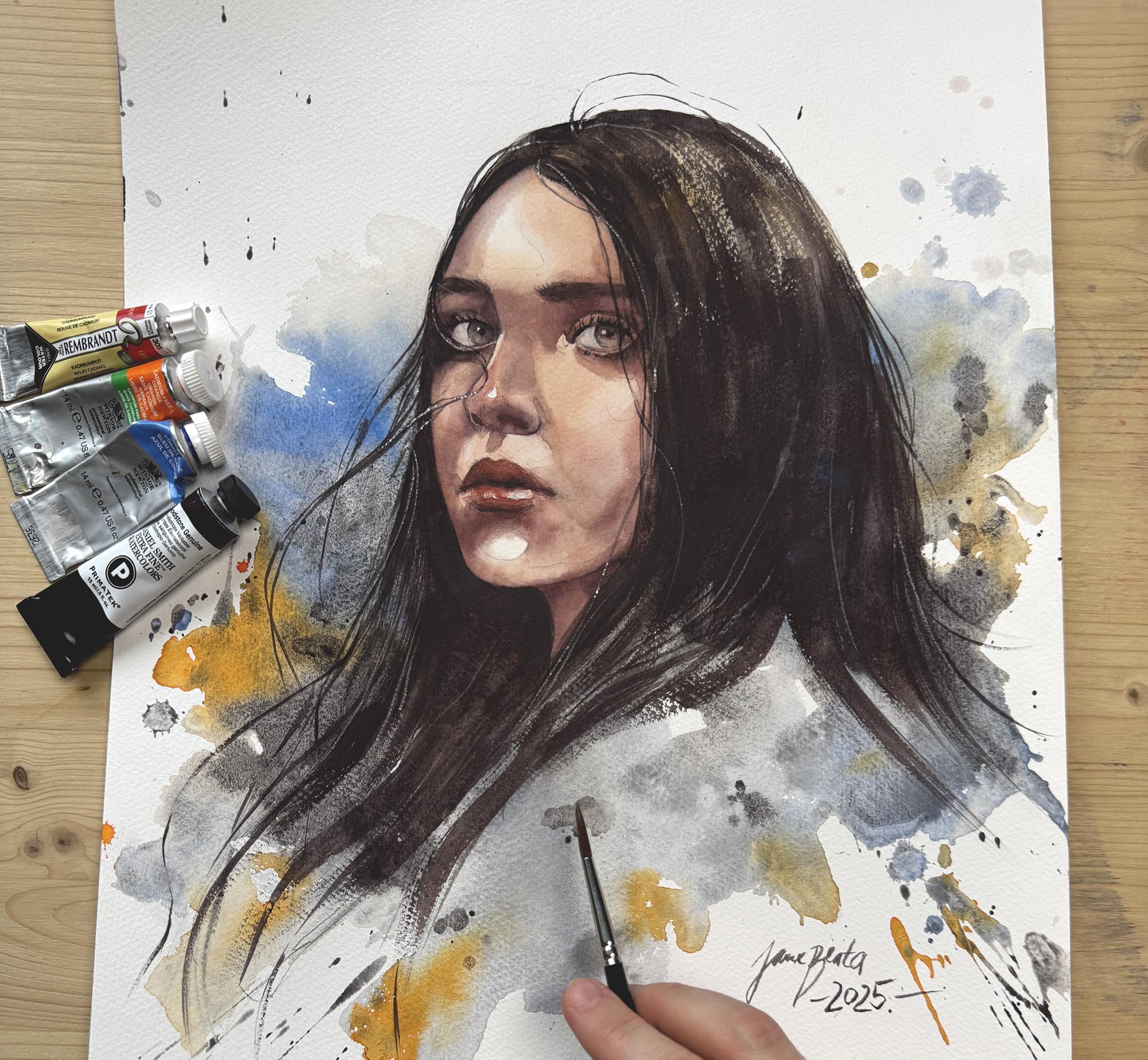
6. How to set up for a painting session: Purpose of this lesson is
to show you how to set up your materials and workspace
for watercolor painting. Because watercolor
tends to dry quickly, especially in lighter washes, it is really important
to have everything ready and within reach
before you begin. That way you won't
have to interrupt your process to
go find supplies. A well organized table setup also helps you avoid splatters, spills, and other
small accidents which can happen easily when working
with water and pigment. So let's go over what
you need and how I like to arrange everything for a smooth painting session. When it comes to painting
setup, important. I need to have this pad in front of me and I need
to create a tilt. For that, I'm using this
just a studio basket, very professional
empty studio basket. Anything you have, basically, it's not too thick, but it allows me to
have a slight tilt. It does not have
to be too steep. This is okay. So that the water can descend towards
the bottom of the page. It helps to connect the
washes, make them cleaner. I'm not going to
change it throughout the entire class, I'm
going to paint like this. Unless I do effects, I will tell you if
I do that and then I will lay it flat for
just a little bit. But mostly there's a tilt. My right hand side, I have two jars of water. One is for dirty water. This one is already dirty from
the testing of the colors. The other one is
with clean water. I make sure that the clean
water is harder to reach, so it's farther away
because I tend to mix them. Then I have two jars
of dirty water. For palette today we have
limited palette of colors, so I'm not going to use
my regular palette so that we only have these
colors here available. These main three colors I
have on one porcelain plate, and then this one
I'm going to be using it separately
on a separate plate, I think, by the time I'm done,
everything is everywhere. Maybe at the beginning
of the painting process, I try to be a bit cleaner, but I'm not a clean painter. The tubes I will
not need because I pushed the paint from
them onto my plates, but just in case that I run out, I will keep them very close by. Usually I tend to run out of
cobbled blue, and this one, since the painting
is pretty dark, we're going to be using
more of this one as well. So I'm going to try
to paint slowly. I will use three brushes. I will try not to use more
than these three brushes. If you want, you
can use a sponge. I have a sponge here. This sponge will be
sitting on my table, and I will get rid of
excess pigment every time that I want to make
a stroke like very often. What I do is I load my
brush with pigment, but before I paint, I release some of the excess
pigment into the sponge. This is how you use the sponge. If you load your brush with too much water and go
straight to your paper, that is where the mess happens. That makes it very hard
to control watercolor. By the way, you do
not need a sponge. I used just tissues
for ten years. The sponge I have
for a few months, it's supposed to
be less wasteful. So that is why I got it. Here is a quick overview of my setup. Keep in mind that
I'm right handed, so most of my tools are placed on the right
side of the table. If you're left handed, you will want to mirror
the setup so that everything stays comfortable
and efficient to you. On the left side, I usually
keep my reference photo and sometimes some notes or
extra inspiration images. That's what I have
space for here. And the right side is a
bit more crowded with all these essential tools
that I use during painting, water jars, test papers, palette brushes, and
the sponge or tissue. Go ahead and set up
your table now in a way that feels comfortable
and easy to work with. In the next lesson, we
will explore some of the basic watercolor
techniques that you'll need for painting this portrait.
I will see you there.
7. 4 Key Watercolor Techniques to Learn : So before we start the actual painting
process in a minute, I first want to go over four key basic
watercolor techniques that you'll need to
paint this portrait. I think it would be
helpful if you did this exercise on a one
sheet of watercolor paper. Try them out just to
get the hang of them before we start applying
paint to the actual portrait. It will make your process so much smoother, so much easier. You will have less
doubt, more confidence. They're frankly, very simple. You will not need more to create a standard watercolor portrait. So let's go over
them one by one. The first technique
will be application of the basic watercolor wash. When you lay down
watercolor paint, that's what we call a wash. It is usually watery,
paint is diluted. There's a specific way
how to do it so that the paint is smooth so that you don't have streaks
on your paper. I think we can mix a basic
skin tone for this exercise. It doesn't have to
be specific color. Just create a pool of watercolor
that is large enough. There needs to be enough color prepared so that you don't
have to mix meat process. Make sure that there are
no chunks of pigments. Like here, you
don't have to worry that the brush will break, you can mix pretty hard. So once that I have my
brush loaded with pigment, this is where I start laying
down the wash like this. Usually, I lay
down my watercolor washes from top to bottom, and if I can help it, then from the left to right, because I'm right handed. So if I lay my wash here, right side and then go left, then I don't have
where to rest my hand. That is one habit that is
good to have when painting. If you're left handed, then you do it the other way. You first paint on
the right side and then move towards left.
I painted this wash. When my watercolor pad is
laying flat on the table, here you can see that
some excess water has accumulated somewhere
here in the middle. That happens because
paper starts reacting to water and it forms these bumps that can lead to streaks and
watercolor blooms. If we wait for this wash to dry, you will see that there is
going to be an irregularity. I'm going to use my hair dryer to speed
things up and dry this. We probably can see it
could have been worse. This particular wash did
not help me make my point, but still you can see some
irregularity in color. This is why we use tilt. When I put my basket here and I paint my
next wash like this, it will be very, very
smooth, more regular. See, this is what happens. You can even go back if you want because when
you have a tilt, then the excess water, it accumulates down here, and then I continue, I descend here when
we reach the bottom, you can easily just
gently get rid of excess watercolor by just tapping your brush and
leave it like this. Now when we dry, we will have a very continuous flat wash. So this one is more continuous,
there's less streaks, there's less unexpected
edges or blooms or effects. Usually, when we
paint a portrait, it is good to have a slight
tilt like I explained before, which helps you to
unify this wash. This does not mean
that we do not want the splatters anywhere. We will learn how
to do splatters, but you just have now a
tool to use whenever you want a smooth wash and then whenever you
want the effects, there's a way how to do it, which I will show you right now. Here, I want to show you how
to do expressive splatters. For this, I do not
have the basket here, and I do not use tilt. Now I want the
watercolor to behave more expressively to
give me some effects, to give me splatters. Usually, I do it with
this large brush. But I will want the
expressive splatters to be in different colors and
not to create a mud. Always, I load my brush and mix properly so that I don't
have chunks in my brush. And then I will splatter. I will even get some
water from the jar, like directly from the jar while there's pigment on
my brush and I splatter, and then I can do this. Like, I can move the paint different directions.
So this is blue. Now I want orange. This is where two jars come
in very handy because I want to use the dirty water
to get rid of excess pigment, and now I rinse the brush
in the clean water jar and then mix that clean
brush with new color. Let's say orange. Orange
gets super dirty very fast. So now I splatter again. I just pull the
brush on the paper, and I even touch the blue
paint with my orange paint, but I do not mix them around. Here, there's some mixture. Of course, they will
mix in some areas, but I would still like to
recognize the orange and the blue in that like
expressive wash. I can now grab a little
bit of this like blood stone genuine
and splat or some more connect connect with the other paints or colors. And. I think this is a very
good color combination that we could use as a
base for our portrait. Essentially, if I was to
recap this technique, it is very spontaneous
technique you can really feel
like you are free, just expressing
yourself on the page. I'm watching a little
bit where it lands, but the main purpose is to lay the colors next to
each other and not just mix everything
together next to each other so that we
can identify the orange, the blue, and that
the color pops. Best thing is when the color touches the
paper for the first time, you can lead the
color if you want. But do not try to repaint
what you splattered. That's probably the best
way to describe this. You also have to get rid
of the excess waters. When you look up close, there's pools of
water here and here. Everywhere where I see them, same technique like we did here. We get rid of all of these
extra pools of water very, very carefully so that I do not push the paint too
much on the paper. And that helps us to dry this faster and prevent more effects. I think after you try this
one exercise, this technique, you will only want to
paint like this because it's so much fun. That's
how it should be. Watercolor works should be balanced between
expressive and controlled. So there's controlled.
Here is expressive. But I will show you two more controlled techniques
that we will use for the other parts of the portrait where
we need more control. I think most of the
water is now out. We move on to the
technique number three. I want to show you
how to smoothen edges for creating shadows
and blending shadows. I will do the third technique
with some shading mixture, so I will mix red and blue like we learned in the
color mixing lesson, but we'll keep them a
little bit more fluid. For the teaching purposes here, you can prepare the
paint like this. For this technique,
you also want to place a basic wash. Let's say that this is a
shadow on the face. You will want to leave
one edge sharp like this, but the other one
we won't blend it. We want to smoothen it out connected with what
we have underneath. For that, we will
need a clean brush. I will clean my brush
with just clean water. The excess water needs to go in your sponge and then
we just clean brush, you brush your paper against this wash and touch
lightly touch. This key technique for shading, but it's also very hard. You will have to
practice it a couple of times to get the hang of it. The key is not to have too
much water on your brush. If you have too much water, if you do not use your
sponge, this is what happens. The excess water can just create a weird looking mistake
basically in your shadows. I'm not saying this does not
happen to me all the time, but during the actual
painting process, I will show you how to
clean up such mistakes. I'm sure there will be plenty. But this is how you smoothen
some of the edges which we definitely will need to it comes to
shading of the face, you will see that some
shadows will have edges that are a
little bit sharper, but most of the edges of the shadows in this specific
reference will be smooth. Like, here is a shadow
and it has a smooth edge. This shadow also
has a smooth edge, so you will have to do
this with watercolor. So let's practice
this one more time. I will lay down the basic wash. This is my shadow. Let's
say I'm painting a shadow. And then clean water
just I rinse my brush. So that I do not
have pigment here, but I also get rid
of the excess. There is a mid level
of water on my breash and then I go against
I lightly touch. Usually, I leave it be like
this. I just let it go. This is a smoothened
edge that blends nicely within the
previous layer. We have the fourth
and final technique, and that is a dry
brush technique. The technique that we use to add some textures to the
hair most of the time, but sometimes to fabric. In this case, it will
be mostly to the hair. Let us use it with
the darkest paint. I will load my brush with it. When you load your brush with paint and try to do a stroke, usually it comes out like this. It is a full stroke, but there's nothing in between, so we want to again, use a sponge to get
rid of some excess and then gently just
go over and over. The texture of the paper will create this nice brush stroke. You can do the same
with thicker pigment. And you need to find that sweet spot when
your brush does this. It gives more texture
to the brush stroke. This is usually what we
need to suggest hair, the eyebrows and sometimes even lashes. You can practice this. I want to practice with a bit more thick pigments so that you can see like that. Some brushes will do this more efficiently
than other brushes, but you still need to use
thicker pigment on your brush, and preferably should be a
soft brush to get this effect. This is what we want. These are the basic four techniques
that we will use. Now give it some time and
practice them for a little bit. And once you are done
practicing these techniques, I will meet you in the next
lesson where we will start painting the first
layer of our portrait. I will see you there. Oh
8. Underpainting (First Layer): In this lesson, we are going to paint the first layer
of our portrait, also known as the underpainting. The purpose of this
layer is to lay down the basic colors of
the entire portrait, a base skin tone, the initial color for the hair, and a loose expressive
background wash. Doing all of this in a
single light pass will make the later stages of
painting much easier and more intuitive.
So let's get started. Now, the first painting step is going to be back to pencil. This is going to be weird,
but just hear me out. Before we put paint to paper, we need to establish
where the highlights are. In watercolor, we do
not have white paint. We sometimes cheat and add
white gouache or white pencil, but mostly we try to just leave out some
of the highlights, some of the white areas. It is sometimes very hard
when you are placing your color to find the highlights and paint
around these highlights. If I'm worried, I will
forget some of these. I will map out some of these
highlights with my pencil, but very, very light. Figure out which areas of the face have the
lightest value, it helps to take a step back and really observe your
reference photo again. In this case, the light is
quite soft and diffused, so we do not have any strong
or dramatic highlights like we might with a
bit harsher lighting. That said, even
with soft lighting, we can still identify areas
that catch the most light. On this reference, I noticed a few subtle highlights
on the nose right here, and other typical
areas that catch light and still do here include
the part of the forehead, the cheeks, the chin, and often the bottom lip, which tends to reflect light. Sometimes you will also see small reflected highlights in the eyes, but in this reference, they are really
not that visible, but I decided to add the subtle highlights
in the eyes anyway, just to give them a bit
more life and energy. I have lightly marked all
of these light areas with my pencil so that I can be mindful of them
while painting. This is the map
that we will use. Now when we premix
the skin tone, we will just avoid all
of these highlights. Now let's mix the skin tone. With clean water, I
will add a little bit of the orange here, a little bit of the red and I will make sure that
this premixed skin tone, that is a large
pool of skin tone. We said we need a bit muted, so I'm going to add a little
bit of cobbled blue into it. We just want to
desaturate with the blue a little bit,
like tiny bit. Again, that's just because of the reference photo
being less saturated. Yeah, normally I
would go with, like, punchy or skin tone, but let's work with reference
at least a little bit. I have skin tone
here. Can we start? Let's start. Do not be stressed. You can paint over the
hair. It doesn't matter. The hair will be dark. So if you cover them, we
can cover them. We will put black
paint on top of it. Anyway. Now your task is
to lay down the watery, make sure it's watery skin tone. You can go through
the ice as well, but do not go where you
put your highlights. Do not go over your highlights. Now, what are we going to do? You have to go through
the eyes because that's not white,
what you see there. We just think that
the eyes are white. The eyeballs, but
that's not quite true. Here on the nose is a
little bit trickier, but we can manage. So before I go to the bottom, make sure that this wash
is very watery because we want to keep it wet for
as long as it's possible. So now I clean my brush, but I get rid of the excess water and I
go over the highlights. I just cover them like this. I connect them with the
rest of the texture. You don't have to connect
these highlights. Maybe this one we can leave
out because it's so tiny. But the rest of the highlights, they need clean water. Here as well, clean
water because otherwise, we will have very hard
edges everywhere. Don't want so many hard edges. So there's one more
highlight here. Again, if you're not
exactly covering the face and if
you're going through the hair like I'm going
here, it doesn't matter. We're going to cover
that. I actually do not like these edges, so I make sure that this is all just a little bit scattered, or I continue the paint with clean water
towards the hair. While it's still wet, we can
go in with a little bit of diluted red color and add
the red color to the nose, maybe a little bit to the cheek. Here may be a little
bit to the lips. You can work it out
just a tiny bit. And here, this part
got slightly covered. So with clean brush, I'm going to pull the color from the page while I
still can like that, and that will lighten this area. If your color covered your
highlight in any area, do this, but do it carefully
before your wash dries. If it's dry, leave it. You can rub the paint slightly and lift some of the
pigment even after your wash is dry but do
not enter with damp brush. It is not great to go into semi dry wash because
that can create blooms. This is okay for the first pass. I forgot this one. I forgot this one. I
would not want to forget because the harta e is not really the style
that we're going for here. I would like to continue for the hair and for
some stylization, but I need the skin to dry. So if it's too hot in your room and the skin is already
dry, you can continue. For me, today is not, and I'm going to grab
a hair dryer and just lightly make sure
that it is dry. So when the skin is dry, I can continue now adding hair. And that's going to be
bloodstone genuine, but for now, we can
leave it, dilute it. And with larger brush, we can just lightly add
some color to the hair. Like that it's too bad that there's not too much
connection with the skin, but it's okay for now. We will add the hair here. This is not about laying
it down in a detailed way. We just want to give it some color so that later
on when we shade the face, it is easier for us to see the values and establish how dark they are
supposed to be. Here, I do not even want to
finish placing the color. But here we're going to
do some stylization. I lay it flat on the table. This is one exception to my
rule to have it tilted up and I will dilute the
blood stone like that. We'll probably do this with the larger brush and do
splatters like that. I do splatters in an angle. This is what I would like to do. I will try to add some color, even though this is
limited color portrait, we can add some color, and I'm adding cobbled bloom
to stylize a little bit. Connect with her hair. This is just freestyle. And one color that we could use to stylize and
offset is the orange. So I grab some
orange on my brush, maybe just incorporate
it in there somehow. Even if stuff like that happens, you can save it very fast
if you have tissues nearby. Is that good? Is that bad? Let's try to just park it into something
nice and abstract. I'm going to add a bit
stronger color here. This is stronger
blood stone genuine, so you can see granulation. Here. Okay. I'm done having fun. Now, important step. This is why we laid
this flat is to remove every excess pool
of the water that you see. The water that we used, its purpose was to create
these splatters and fun stuff. And now the remaining the
excess water needs to go away, and then we take a break, let it dry naturally,
hopefully, preferably. And then we can continue
with shading of the face because that's the
more serious part that we will get a
bit more technical. But this is fun. Try to
just have fun with it. I know that for some beginners that have never tried
painting like this, it could look and
feel very scary. But it also is just so free. I don't know, maybe you're the type that like to go in with a small brush and do
a lot of details, paint for hours, with
a very detailed brush, every single detail,
I like to do a lot of splatters and then just emphasize certain parts
around the focal point, which is the face that creates impactful painting
for a fracture of time. The point is not to only spend a few hours painting
and not few days. That's not the point, but I
think that can be a benefit. Because a lot of
you are very busy, don't have so much time to
paint in this detailed way, even though I admitted
it can be very relaxing to paint in
a very detailed way. We will do that
for a little bit. When we get to the face, that's where I get a bit
obsessed with details as well. I think for a limited
palette of colors, we have nice color there. Maybe I need to
see a bit more of the darker color because
the color looks very black, but it's not with
granulating colors, you can have a hard time. Uh, get in saturation
that you want. They were diluted
and the pigment. The whole point of granulation is broken layer of pigment, so that's why they
don't get so dark. Um, I just want to add a little bit of that. Here. I'm not
worried about that. We can fix that. And actually, some of these hairs
we could paint now just suggest the
direction of the hair. I will leave it now and
we'll go take a break. You go take a break
and when we come back, we can grab hair dryer, finish this with the
hair dryer so that it is completely dry before
we attempt another layer. But I think we have, I would say 80% of our painting done
within the first 30 minutes. How great is that? I think
that's a great advantage. That you're done drying
the first layer, I will meet you in
the next lesson where we will start
painting the shadows of the portrait and
also begin building depth with a slightly
more controlled approach. I cannot wait to show you how to do this, and I
will see you there.
9. Shading (part one): In this lesson, we will learn
how to build a depth in the portrait by carefully
layering shadows. This is often the
part that feels the most intimidating for beginners, but with a focused approach
and by taking your time, there's really nothing
to worry about. I also want to emphasize there's absolutely no need
to get it perfect. If your shadows come out a bit streaky or uneven,
that's completely fine. The most important thing is to practice this
technique a few times. Once that you
understand the process, it becomes much easier and it helps you
avoid overthinking. So let's get started. Now that the first crazy
part is behind us, let's get to shading the face. The face on this portrait
is our focal point, and so we will have to spend a bit more time in this area. Shading is very scary. It doesn't have
to be that scary. We just have to know
what to place where. First thing that I do after the first layer because the
first layer is very messy. There's some splatters all
around. I do not mind them. They're part of my style, but some of them, especially like here on the face or cleaning
up the silhouette is something that I would like to I do it with a smaller
round brush, dampened in clean water. I will just get
rid of the excess and then then you can just gently brush the paper like
this with clean damp brush. When we are done doing that, we can lift this pigment off with a tissue and that
cleans our silhouette. Have to be working on a cuton paper to be
able to do this. A cellulose paper allow
that also to some degree, but you usually pull all
of the pigments away. Just test what your
paper does and then you will get used to
how your paper reacts. That was just minor cleanup. Now we can focus on
the actual shading. I want to explain to you about mid tones and about shadows. Shading is basically what
gives the face depth. Here everything is flat. We already work in two tones. We have the highlight, the light area, and This
is the basic skin tone. We already have two. We did
not paint shadows yet and you already can see
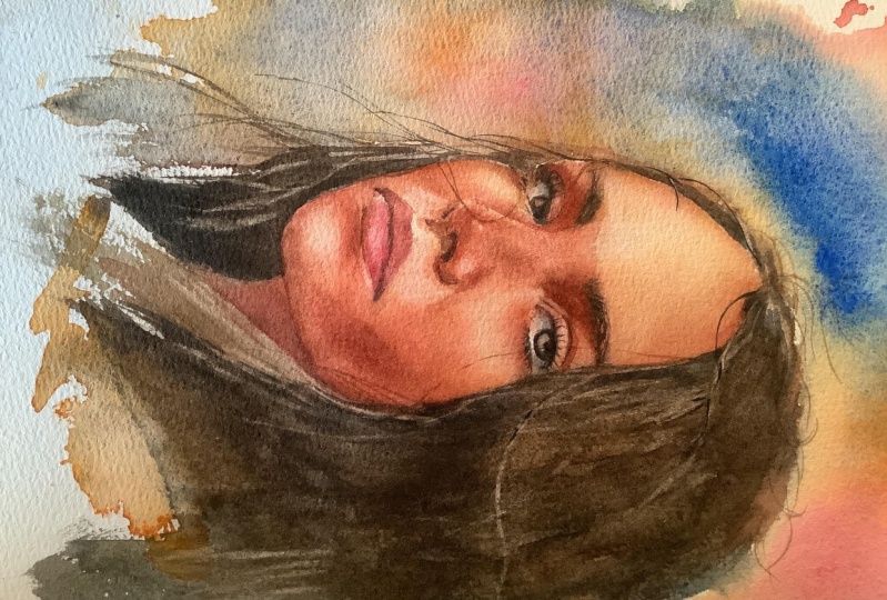
some depth in the skin. But here on the reference photo, however different
it is from mine, you can see much more depth. You can clearly see on that
photo how the face turns towards the light source and
away from it in some areas. So because of the
lights and the darks, you get the idea of what this form looks like
in three D space. What it means for us
is that if we can add some of these darker darks to our watercolor painting, that is what will give
us the illusion of a three D form on a flat paper. This is what we all want to do when we paint realistically. Besides the basic skin tone, we now have to inspect the reference image
and we have to look for areas that are slightly darker than the basic skin tone. I would say the basic skin tone could be this, could be that. There are some areas that
are just lightly darker. You will have to train your
eyes to see these areas. But what I also do
sometimes in Photoshop, you can do it on
your phone actually. You can just increase
contrast of your reference to better see where the lights
and the shadows are. This is the reference photo. I go to contrast and I just pull the
contrast a little bit. I can go as contrast
as I can go. This is not to paint from
necessarily, but you can. This is just to see
because contrast will split your light and
shadow a bit more. Sometimes you don't see
mid tones because of that, but the point is that it is less subtle than on
the actual photo here, you can better see
where the contrast is. Here is the lighter area. But here, you can clearly
see now on this image. While here, it is
a bit more subtle. It is very hard to see that
if you don't edit your photo. This area is what
we call mid tone. This is slightly darker
than the basic skin color, but it's not a shadow area yet. Another example of a mid
tone is here, like here. Another example is the cheeks, cheeks are around form, so that means that they
will have lighter part, and here they will
have a mid tone part. This cheek as well
here is light. This is basic skin tone, and here is midtone. This is mid tone, and
then we have shadow here. You can view the reference
image and try to see which areas are your mid tones, and
then we will paint it. That's one thing that you
need to look for before you go to shed your
portrait, midtone. Other thing is the actual
shadows and what I mean by that is to look for the dark
cast shadows on the face. I do not mean the eyelashes or the brows because these
are naturally dark. But what I mean is
the form of the face, look for areas of where
the actual skin is, but it's not in light, but it's in shadow completely. This area over here, see, this is skin. But it is away from
the light source, so it will appear dark. Here it is even
more prominent in this area below the eyes
as well, a little bit. The entire base of the
nose is covered in shadow because that part is just it
turns away from the light. Another example of shadow is the upper lip and here
below the lower lip. And then we have shadow
here on the neck. This entire area is
pretty much in shadow. It is not that hard
face to shade. So that's why I picked it
for you for this demo. Now that we analyze this, we can start painting. Usually, I first
paint the mitons and then I paint the
shadows just because it is much easier in watercolor
first place in the color that is lighter and then cover it up with color
that's a bit darker. We will paint something
and we will have to check between the painting and
reference photo and tweak. I think this is the
hardest part of the entire process.
We need to practice. We will practice it together. There is no one
person on earth that knows how to do this
without doing it 100 times, but the hundred times
can be 100 fun times. Let's read without stress slowly so that you get used to
this entire process. Every cap from the
color mixing lesson, we are mixing cadmium red here with blue
with cobbled blue. We will mix them. We will mix them together
to create a color. Keep these nearby. They come in extremely heavy. This is too dark
and it's too blue. So I'm going to have
to add more red. This is better, but I
need to add more water. Yeah, that's much
better. Even more water. Something like this
for now to create the meton and I do it with
larger brush and tissues. Tissues are my best friends. Sounds weird, but it's
just with water color, you always have to
have this nearby. Let's add this. I'm
going to add this here. This is where the meton is. And by the way, I'm
going to add this to the parts that are in
shadow as well just because the shadow will need more layers and is going
to be darker anyway. And also here, And then
with cleaned and brush, we're going to just soften
this edge like that. We're going to
just lightly touch this edge to create
a blended effect. As well as here, I'm going to paint a wash, and I'm going to just gently
touch and leave it alone. Do not touch it again,
leave it alone. Where else around this eye. Also, definitely, we have to do like a base for the eyebrows. The eyebrows, they cast shadows, so you have to add
some tone there. Remember we talked about this. We talked about this cheek, they have this shadow. And then clean damp
brush and gently touch and sort of connect
this with the rest. The key is not to have too
much water on your brush. So the tissue or the sponge, I always forget to use the
sponge and use the tissue. I use large brush for now, but then I will switch to
a smaller one later on. Here, and, like, here and here
I lightly touch. We can slowly build
up these layers, we do not have to
do it all at once. Here this is going to be the largest area here. And I do not even stress too much if it's not
perfectly smooth, there will be maps that will
happen like here. It's okay. Well, some will be
covered by the details, some will persist,
but it's okay. Just want you to know that it happens and that it's
part of the process. Here, this one is a bit weird, but this is just how
the face is shaped.
10. Shading (part two): Okay. Here comes a little bit darker
as well as here. When I need darker color here, down here, I have to
mix thicker pigments. I do not add so
much water in it, and then I don't have to do
so many layers because I get intensity of the
tone a bit sooner. This is a little bit weird. Here we should not
have so much paint, so I just clean it
with damp brush. Here is also highlight. Don't need to go there.
I guess, that's fine. Okay, so everything is wet now. I would like to go back to
some areas, but it's wet. I'm worried that I
will make a mess. That's when I can grab this
and just dry it to make sure. When your paper is too
hot after the low dry, then wait until it's cold again. I think our face starts
to take some shape. There are some edges that I
do not like. Like this one. So you can grab the
soft brush with just clean water and you can rub on a higher quality paper. Usually, you would be
able to connect the wash, make it a bit more smooth, get rid of the weird edges. It should be possible. Okay. I think it's time to
switch to a smaller brush, and the shading mixture is
always red and blue together. Balance it out so that it's not too blue or too red,
something in between. Something like this. And I will start shading a
bit darker closer to the ice. So I'm adding those shadows
that we talked about that are slightly bit darker, and I will start here. Adding darker paint like
this one can be very scary, so you just do it slowly. The paint still has
to be bit watery. So even if it's thick like
this and if it's darker, it is still a bit watery and I'm adding them
to the darkest area. So these are the
darkest areas here. And then I go there with clean water on my brush
and I connect this. Since everything is wet, it will dilute naturally
create a gradient. Here. It looks very scary when
it's dark like this, but the portrait
needs some contrast. So just trust me,
it will be fine. I would add a bit more
blue into the mixture, a bit more of the granulating
bloodstone genuine just to create the darkness
for these eyes here. So I will avoid this
area that we set for the highlight and
we'll cover it with paint. We have the sketch
there already. So we're just coloring areas. We'll add maybe a little
bit more darkness here, clean water and rub this. Let's go with a darker color underneath her
eyes a little bit. The eyes, they have this
thickness that they show. Even if you don't see
them on the reference, it's always a good idea to
add this to your portraits. The thickness like the lighter
part here below the eye, makes the eye a bit
more believable. It makes it lighter. I just looks right. So you can do that simply just by leaving this
little part not painted. And then I want to
paint this shadow, not very dark shadow,
but needs to be painted here behind the nose. The nose here is very light. But behind this line, we need to add a little
bit more of the tone. There is a little bit
more of the shadow here, but I'm using more
diluted than here, color. In this area, I'm
adding the shadow and then just gently touching the edge so that it
dilutes and blends. The base of the nose will be slightly trickier
because it's darker. These parts are darker
and I'm using water to. This is not like me
painting the nostrils yet. I just want to paint the
shadow that surrounds them. So it's like this. And it even moves towards
this direction here. C. The nose shadow is always very tricky. Here we have a shadow that
is here on the nose itself. It is not here on the cheek. The shadow is on the nose there. It goes like this. With
cleaned and brush, we will dilute and from
the other side as well. This is why soft bristles on
your brush are important. With a synthetic
brush, you can do, but it's much easier
with the soft bristles. I'm going to add a
bit more red into my shading mixture just
because the tip of the nose, it tends to be a
little bit more red, it's the color of the nose here in this part
that is mostly red. Again, more red because
we are painting lips. Since we're using
limited palette, the lips they won't be so rosy. We would need fourth color, different kind of red for that. But if you want to, you can add if you have
carmine or Alizarin crimson, you want more rouge color, then you can use that. But I think for the purposes
of learning this is fine, just add a bit more red into your shading mixture
and then paint. Mostly the upper lip, but here the lower lip, the bottom of the
lower lip as well. Okay. Shadow continues here. It always looks a bit
weird when it's wet. These parts have already dried, so they have proper color. But the color of
watercolor when it's wet, it is just so strong. But after it dries, it
gets much more subtle. We oftentimes have to go back and actually add more paint. Let's paint this other eye. This is not the final
state of the shadows, but I just want to do a first pass and then add more depth if needed,
refine with details. So we paint everything at
once, if that's possible. We do not perfectly paint one eye and then move
on to the other one. We have to assign
values to everything based on all of the
things that are around, based on the entire
painting context. And here, I'm going
to add more shadow here. This is very dark. This part And here is again, what I told you
with the other eye we have to do here as well. We have to leave out this part, the larger part. We
have to leave it out. This looks very weird,
but you have to go back with damp brush not
overly soaked with water, and we have to just connect
all of these areas. With your brush, you
have to gently rub them, hug them with your brush so that it incorporates
into your painting. Preferably do it before
it dries like this. I'm talking more talking than
usually when I'm painting, I get faster with this, and so it does not
dry so quickly on me. Here, this part needs
some better transition. On a high quality cotton paper, you can add as many
layers as you want. It really helps to
have cotton paper. I don't even know if I would
paint this on a pulp paper, that's very difficult
and the eye, just like on the other side, leave out the highlight. I always when I paint
eyes, no matter how dark, I let the bottom
part of the iris, I let it be lighter. I let it be just transparent. It makes the eye more alive, it makes it look bit glossy
it just makes it shine. A
11. Shading (part 3): By the way, you think
you would have to be very precise with this process, but you don't need to be
roughly in the right ballpark. So you just need to have your values roughly
where they belong. And that means if this is light, this is baskin tone, this is shadow, I can't
have the shadow here. That is what I mean roughly. But you don't have to copy exactly what you
see on the photo. I'm not even I'm
not I would just it would be so boring.
Me to do that. I do not think that most of you would enjoy a
process like that. I'm not even sure if you would enjoy the result
like that because we have photos for that exact
precision if we want it. This is more like an
impression of someone or impression of a portrait that has some level of likeness. So here on the neck, we add very, very dark stuff. This will be dark. I know so many artists
who are much more loose in how they paint than me, and they can still
get to something that from distance
looks like a photo. There is a point when I get so tired of shading
that I just call it done and then go have
coffee and then come back, check what's most bothering me, fix that, and call
it a painting. So even that approach is
completely 100% legit. I want to use a little bit
more like cobbled blue, and I want to do it here because the eye
whites, they're not white. They're far from white. They have some white
maybe here in the middle, but we need to also make sure that it
is perceived as a ball as a round object, and you can use diluted
cobbled blue for that. Maybe with thicker
shading color. So that means red
with blue very thick. I could use now, I could
do the nostrils here. They're a bit darker. Now when we have the base of the nulls shaded,
we can add them. Here we could emphasize that middle part and Yep. Add in some accents, but we'll have to add the hair soon so that we know how
dark we actually need to go. Good. I'm going to dry
this. Have a short break. You take a break too, relieve your eyes
of duty for a bit, and then we come back with
more fresh perspective and check what's wrong
with the piece. Okay. Okay. Once you've had a break and
your painting is fully dry, I will meet you in
the next lesson where we will add details, textures, and some final touches
to the face, hair, and the overall stylization of the portrait. I
will see you there.
12. Painting hair: In this lesson, we
will paint a hair, one of my favorite
parts of the process because it allows us to be a
bit more expressive again. We're getting close to
finishing our portrait, so let us jump in
and start adding those fine layers of character and flow. Let's get started. I would not say that
the face is done yet, but at some point, I can't tell if everything
will work out together. Before we move on
and start tweaking, we need to lay down
the color of the hair. I'm going to be using
the blood stone genuine. The hair, she's got they're dark but not
completely black. So I will add a little
bit of the red. Into it so that it's warmer. We've practiced this
before, but in some parts, we will lay down color
in a regular way. But in some areas, I will dry my brush
and I will use the dry brush marks so that
I can show some texture. And I think because
I just looked at this painting from a
distance that she needs a little bit more of
that hair up here, so I will go a bit higher
than my sketch was. So let's start. I'll just start placing
the the paint here, a little bit more
of the texture. I'll try to do the
drybush if it's possible. But here, maybe we should do
just with the small brush. I'll probably be a bit better. Small brush can do the
dry brush mark as well. You'll just color the
sketch basically here. But something interesting
will start to happen as we lay down this
from time to time, I'm going to add these,
floating hairs with just a tip of my brush
like there here. And everything will just
start to tie together now. I think I hope the
contrast will now work. The contrast of these shadows
will now start to work. Here, up here, there's a
little bit more texture. And here, things will be a
bit more smoother, darker. And here texture again. And a bit of the text more texture will
be up here as well. So even hair, even though this tutorial will not focus
on the hair all that much. But even hair, they have
lighter and darker areas, and we kind of have
to notice them. Her hair is lit from above, so in this area, there will be more
highlights in the hair. I'll try to use a bit more
dry brush in this area. Bit more like leaf
stuff behind and also maybe water down
the paint a little bit. But then here in this area, we'll start to turn away
from the light again. And so will we be darker. We do not have to be
literal about the hair. We can just suggest
some hair strengths don't have to finish all
of the hairs strengths. But I like to add
some floating hairs, you know, to just
make the hairstyle more interesting and more on the photo because she has
a lot of floating hairs. So like, we could do this. Okay. And we're almost
done with the hair. It was just some areas. I want to cover just a bit more. That's and here I want to connect the
color a bit more. Can add some stylization
and splatters. Okay. Now I want to dry
and check everything. W
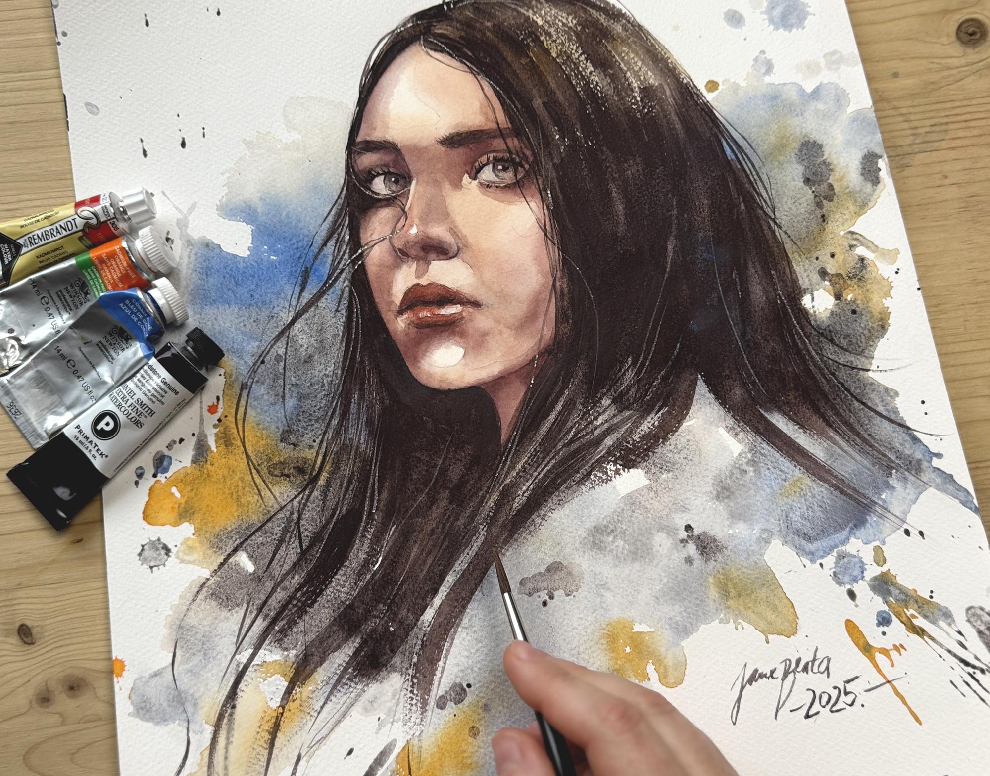
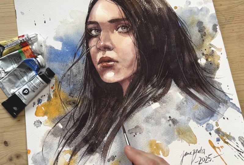
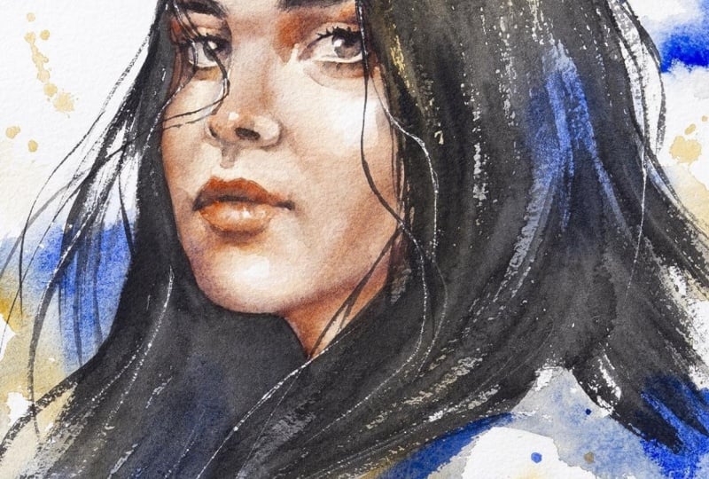
13. Refinements: Well, let me tell you, I do not hate this portrait at all. There's just 100 of tiny little things that
I might want to correct, but also don't have to because from distance, this
looks very solid. But just above the hair, maybe here, I went a little
bit too far with the paint. My go to correction
is always damp brush. Just wrap the pigment lift it, and this is how you just erase watercolor on a
high quality paper. Of course, if you
put too many layers, the damp brush
won't do miracles, but it can just do these
tiny little corrections. I have a couple
of floating hairs that I would love to add, but they're across the face. We'll do that
slightly bit later. You can see how much
it does to a portrait, before the face
was insanely dark. Then we ddt the dark
color of the hair, and the face suddenly
feels more subtle. I would actually even
add some shadows. At first, let me
correct the silhouette. This silhouette needs
to sometimes tweak. And I do that again, with
a damp brush or with just that color that we
mixed for shading the red and the blue and just slightly add and correct the
shape of the silhouette. Tiny bit. And here, again, like for this part, I need to be a bit, even more precise, even
darker here around the neck. So here I'm missing
a subtle shadow. This is a subtle shadow that will make this cheek
stand out a bit more. The tone here and the tone
here is definitely different. It's supposed to be different. So that's what I can fix. I would like to do some
work with just plain red, and then I need some
more red on the lips, not that much red, but just need some more
work with the red on the lips because she just looks like she has face
of just one color. So I will just This is glazing. You can add a thin layer
of red across the mouth. And then when you dry it, it is going to give
it a bit of a pop. And so I will dry enough. There's this shadow over
here on the reference photo here that is almost
the color of the hair, the hair continues
here on the face. And I think without the shadow
being painted on the face, we don't see her likeness. At least that's how I feel. So I'm going to add it here, add that shadow here. And your painting
always consists of a few fundamentals and maybe 20 of these tiny
little tweaks as you notice, but nobody will have to
force you to do these tweaks because when you are so engaged with the painting like here, almost at the final stage of your painting process,
you will want to, especially if you're proud
about your painting, you will want to
tweak it and just give it a bit more attention and push it, push it, push it. So if you don't have time,
you can call it a day. I could do the lashes, the brows, and call it a day. It will be just fine, and you practice, you
learn new things. But if you have some extra time, you want to push it
20 little twigs, tiny little twigs that
will make it more clean, more refined, but
do not overwork. That's what we do
not want to do. I want to tweak the shadow here. Okay. And on the other
side kind of as well here. Now I'm working mostly with
the bloodstone genuine. I kind of connecting these shadows that I've
built with the hair, with the color of the hair. And it is always always
the same technique. The shadow on the nose. So here, and like, here and here, here. And it's just Good. Connect. Here there's a
bit of watercolor bloom. I can rub it, I can add a new shadow if I
don't want it there. It would not be
terrible if I left it either I just want to review. I just want to check
parts of my painting like that painting now when it's
not all that finished yet, it's the eyes are bitraw does
not have the eyebrows yet. Sometimes it looks worse when I add all those little details, but I will leave
that you to judge. You know what my
finished painting looks like because it's on the class cover probably in the reference photos
in the resources. At this stage, I do not know what it's
going to look like, so I don't know if I
will overwork or not, but you can judge, let me know. In the end, even
if I did overwork, I'll learn from it and do
better in the next piece. After finishing these last
shadow tweaks on the face, I will meet you in
the next lesson for the final touches and a
few important details. We're almost there. Let's
finish this portrait together.
14. Final touches: Lesson, we will
finish our portrait by adding a few simple details, and I'll also show you
how to create beautiful, delicate highlights in the
hair without using any paint is a subtle but
really effective way to bring your portrait to life. Let's go. Are we ready
to add the eyebrows? Usually, I add them with the
dry brush technique as well. But sometimes I have to sometimes draw them
as I see them. These brows are more unified. You do not see or perceive the individual hair
strengths. They're darker. We really need to add
that because we do not see her face until
we add the dark browse. We do not see the likeness
until we add the browse. Hopefully, then we will
get some likeness. Here in these parts, I would add and draw some individual
individual brows, maybe. And then I want to add here, supposed to be a bit stronger. There are lashes there, and she has profound lashes painted, so we have to literally
draw them maybe one by one. Or two by two. I just copy
reference for this part. If that doesn't look natural, then with this reference
it's not so hard, you can see
individual eyelashes. I will add the darker
pupil in the eye. And there's some for
the bottom lashes, we definitely have
to do a trick. I will split my brush like
this, split the bristles, and I'll just like I'll
just stamp it like I use it like a textured brush
for the bottom lashes. Those I would not
paint individually. And maybe there's maybe we could also emphasize the
center of the lips. Tiny bit with darker paint, and I always dilute. I always kind of, like, try to smudge the line if I do the line so that it does
not look like drawn, but it needs to be painted. It needs to look
like a painting. We're almost finished. So one last thing is a couple of these floating hair
strings around the face. These ones are like going through even around
the nose, they connect here. Now we can draw
them that has to be the final touch because we did not have the face
details finished yet before, and they can be light,
it can be like this. So. That one looks
weird. If it looks weird on a high quality paper, I'm repeating myself,
but seriously, you can just erase. Good. But there's one
more trick that I want to show you and that
involves the scalpel. To use the scalpel, all
of your paper has to be 100% dry because then
if it's wet or damp, you can ruin the painting
because it can just grab more paint and more of the paper than
you would want to. So with scalpel, we
work on a dry surface. We use scalpel to create some highlights,
especially in the hair. Very little, we do not have to scratch out everything
that we painted. I'm saying it more to myself than to you because I tend
to do that sometimes. And so I just some of these hair strengths that
I want white or lighter, I tend to just literally draw
the hair with the scalpel. And here. Sound is terrible,
absolutely horrible. But the effects
can be very nice. Can I put the reference
photo finally aside? I do not think this was like a portrait of this
person per se. I do not think that the likeness
is there all that much. This part, I'm not
sure if I like, but I will leave it like that. If I did a portrait,
a commission, I would have been more precise. I would like, measure everything
that was not the point. Usually, I abandon
the reference image way sooner than here. But since it was tutorial, we were learning from
the reference photo, so it served us very well. But at this point,
I'm removing it. I like to talk
about this because I don't feel like I have obligation to my
reference photo as much as I have obligation
to my painting. Sometimes I make sure
to not copy everything. At some point, I stop
looking at reference photo. It serves me well when it
comes to applying shadow, something that might be
very hard to imagine. At some point, what's
important is the paintings. Make the painting your own. Think about your painting.
What does it mean? Does it have contrast? Does it look like a person? Is there something
off without me, comparing it to reference photo
and make the adjustments. It does not have
to be that much, but here is what matters. So I'm very happy
with my painting, and I will sign it now. Actually, I have another brush. I do not use it for
actual painting, but it's so hard to sign your
artwork with regular brush, and this one is the brush
that allows me to write. This is Princeton Long
round Aqua Elite. This small ritual of
signing the painting, I'm officially wrapping
up our painting session. Thank you so much for your
time, focus and patience. It means a lot, I can't wait to see your beautiful work
in the project section. Don't be shy about sharing, and I will see you very soon.
15. Final thoughts: And this is it, we've reached
the end of this class. I hope that you can see that the portrait painting can
be manageable and also fun. If you still haven't,
please take a photo of your final painting and upload
it down below the class. There is a projects
and resources section where you can
show us your works, not just to me, but
other students. It helps me to provide
a short feedback, and I really love to stay connected with you even
after you finish the class. If you enjoyed this class, I'd be really grateful if
you wrote a review to help your fellow students discover this class and learn
from it as well. And finally, to stay connected, you can follow me
here on Skillshare. I also share daily works and snippets from the studio on
my Instagram and Facebook, and I also have a YouTube
channel where you can find a lot of content on watercolor portraits
and also drawing. I will see you in
the next class. I'm excited to meet
you again. Bye.
 Jane-Beata Watercolor, Watercolor artist & teacher