Transcripts
1. Introduction: 7 day Watercolor Portrait Challenge: Watercolor lives in a space
between control and chaos, which is perfect for capturing the raw expressive nature of the human face. Hi, I'm Jane. I'm a watercolor
artist from Slovakia. My favorite subject by
far is the human face. Portraits are
endlessly expressive, and painting them
with watercolor is both joy and challenge. Over the years, I've experimented
with many approaches, and one thing has become clear the fastest way to learn
it is to paint a lot. That's exactly what this
class is all about. Through the seven day challenge, you will build momentum and confidence by
painting daily while simplifying your
process and limiting your palette to just
one pigment at a time. We'll start each portrait
with a pencil thumbnail, breaking the reference down
into just three tonal values, light, meat and dark. From there, I'll
guide you through painting with watercolor,
exploring effects, stylization techniques, and different ways to express personality through
a single color. Class is designed
for intermediate artists who are ready to practice their portrait skill in a consistent and creative way. I won't go deep into drawing
fundamentals in this class, but I will include
real time drawing demos and downloadable
sketch if you want to just trace the sketch and jump straight into
painting process. If you are completely
new to portraits, I recommend that you start with my earlier class that covered all the fundamentals of portrait drawing and
painting in great detail. But if you're ready to
challenge yourself, create a beautiful body of work in just one week and unlock a new level in your painting
journey, let's get started.
2. Class orientation: First of all, thank you all
for joining this class. You've made a wonderful decision to challenge
yourself creatively, and I'm genuinely excited
to see what you'll create. Taking on a daily
painting habit, even if it's just for a week, it's no small task. Each portrait demo in
this class can take up to 2 hours depending on how much time you spend
drawing and painting. So please know that it is okay if things feel a bit
challenging at times. You might feel really proud of some of your pieces
and others not so much. That is completely normal. And honestly, it's
even expected. Watercolor is a
beautiful medium, but is also a fickle one. Even experienced artists
repaint their work sometimes. It doesn't mean that
you're failing. It just means that
you are learning. Every portrait, even the ones
that you're not happy with, is still training
your artistic muscle. So if a portrait doesn't work out the way
that you imagine, do not get discouraged. Just move on to the next day. You can always come back and repaint it later once
the challenge is over. Do not judge your progress until you finished
all seven pieces. And of course, if you prefer
to take longer breaks between paintings and complete the challenge at your own pace, that's completely fine, too. The next lesson, I
will walk you through the materials that I'll
be using for this class. So make sure to check that out and prepare your setup
before you begin. After that, you will find seven lessons each for
one day of the challenge. Each lesson includes the full drawing and
painting process, so I recommend working
alongside Ni As you Watch. These videos were filmed
to accompany you as you paint so that it feels
like we are painting together. For every portrait,
we will begin with a quick pencil
thumbnail where we break the reference down
into three tonal values, light, midtones and dark. This step is very simple, but very extremely helpful. It builds clarity and confidence before we
even touch the paint. Then we will move on to the painting using only
one watercolor pigment. You'll see how to stylize your portrait through brushwork, water control, and small
effects unique to watercolor. That said, feel free to stylize your portraits however you like. My results often reflect both intention and the
unpredictability of watercolor, but you are welcome to
try different approach. This is a project based class. So I strongly encourage you to upload your process
in a project gallery. You don't have to wait until you finish all the
seven portraits. You can start your project
with your first painting, and you can continue adding
the paintings as you go. I absolutely love reading about your experiences and how you're feeling throughout
the challenge. I personally respond
to every project, and your reflections help me understand how to
guide you better. Okay, that's everything that you need to know to get started. I will see you in
the next lesson for a quick materials overview, and then we will jump
right into painting.
3. Materials: In this lesson, I
will share a list of all the materials that I've
used throughout the class. Start with watercolor paper. I prefer using caten paper and 300 GSM because
it's more durable, it allows you to experiment
with techniques. It can withstand more water,
more experimentation. So I like to use this brand, professional watercolor
paper by Windsor Newton, but you can use any
caen watercolor paper. The size of my paper is
30.5 by 40.6 centimeters, so it's about a three size. You can use smaller size to be able to finish your
portrait more quickly. But for me, this
size is standard. Besides watercolor paper, I will use it's just
paper for sketching. It is like regular
printing paper. I cut it into smaller
sized pieces, and I will use this to create those five to 10 minutes
portrait thumbnails. Lastly, I use and always have on my table these tiny little
cuts of watercolor paper. This just spare bits of
watercolor paper that I used to test my
paint and show you a bit of the brush strokes before I applied
the brush strokes into the actual portrait. This comes in very handy. You will need some drawing
materials, pencil and eraser. I use black wink. Those are very soft black
pencils for sketching. But for watercolor paper, usually I prefer to
be mechanical pencil. I have three types of erasers.
This is a hard eraser. I use it to get rid of a
pencil mark completely. Then this is a precision eraser. It is eraser in a pencil. You can do tiny little
details with it. And this is kneadable eraser
to lighten the sketch. That is what I most commonly
use on a watercolor paper, and this is sharpener
for your pencil. I have a masking tape here. I only use it to tilt my
watercolor pad a little bit, this is a scalpel and I use it sometimes in just a
couple of portrait bring some light and tiny little white details
back into the painting. Since this is watercolor, you will always need a
jar with clean water, you will need a absorbent
sponge or the paper towel, something to wipe
the excess water. We also need some brushes. The actual brushes
that I paint with are mostly these two is
two round brushes. One is Winsor Newton, the other one is linear. This one was cheaper.
I do not really see much difference
between these brushes. If you prefer to paint with different type of brush
with flat brush, it's okay. You just need one larger size and one for smaller details. Preferably the smaller
one should have a tip. You should have a wider, larger brush to apply
paint to a larger area. So I use this
professional watercolor, synthetic sable brush for that. I have a script brush. This has a sharp tip, and I just prefer to
sign my paints with it, so this is not a
necessary thing. And these two synthetic
chip brushes, I do not actually paint with, but I scrub off some exo
pigment because they're a bit rougher than regular
watercolor brushes. So if I need to correct something or remove,
I'll use this. So if you've got two round
brushes, you're good to go. And then we have the
actual watercolor paint. This is very important
for me to say because this is monochrome
painting challenge, which means you will only need one color for your challenge. Any color that you have is suitable to do the
entire challenge with. Do not feel pressured
to buy anymore paint. Important thing is
that your paint the paint that you choose for this challenge
cannot be something like yellow or orange because
these are way too light. You need something
that can produce a wide range of tonal values, you need to search for something darker like paints
gray, Van **** brown. However, I took the opportunity that we have seven
days and I tried to experiment a
little bit because my studio is filled
with these paint, some of them I
never used before, I wanted to try what
the portrait will look like if I use
this or that paint. So I've chosen Mars
Black, paints gray. This is lunar violet, Zois genuine, Prussian green, deep scarlet and
purlin violet or my seven portraits and I will
introduce each color as we go. I thought it might introduce some more fun into
this challenge, but this is not a
necessity for you. Some of them I hate
and I will never use for creating a
monochromatic portrait again. I will have my reasons which I will mention throughout
the challenge. For mixing my paint,
I use this plates. I prefer to have the plates white so that I
can see the color. By the way, a full list of
all the materials you will find down below in the projects
and resources section, you can download it and check, but this is truly a
low material class. I was hoping that you
could just do the class with minimal amount of materials
that you have at home. I think this is it.
I will see you in the next lesson and we'll
start our first portrait.
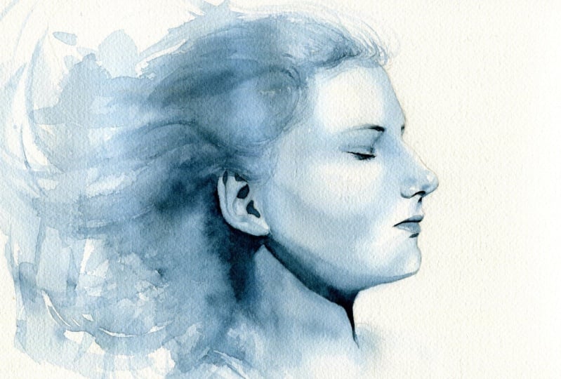
4. Day 1 - Creating a value map (thumbnail): Hello, everyone, and welcome to the first day of our
watercolor portrait challenge. The main idea behind this
class is to learn by doing. So we will be
spending less time on theory and more time
painting in real time, experimenting, observing, and
growing through practice. We are starting right away
with our first portrait, and I've chosen this
beautiful reference photo. It is a profile view which I personally don't
find too challenging. It's a nice, approachable way
to ease into the challenge. Before I start painting
any watercolor portrait, I almost always begin with a quick pencil thumbnail sketch. This is very simple
but powerful step, and I found that it really improves how I understand
and interpret the reference. Think of it as a chance
to observe, simplify, and make a plan before the
paint starts moving around. And I really encourage you
not to skip this step, but also do not overthink it. Keep it quick and loose. This is not about perfection. It's just a map to
guide your painting. Now, I go much deeper into tunnel values in my
previous portrait class. So here I will just
give you a quick recap. To paint this portrait, we first need to
identify the areas of light and areas of shadow. That's all
that we need to do. In between those,
we have mid tones. These three basic groups, light, meat and dark are what we use to build our
entire painting. Technically, there
are many values between pure white
and pure black. But for this class, I want
to show you just three because they are enough to create a strong and
beautiful result. Limiting your values helps
you see more clearly, simplify your decision, and focus on what matters the most. Please follow along and we will create this tiny
little value map from this reference photo together before painting our first
watercolor portrait. First, I'm just going
to follow some lines, try to do very loosely, but sketch this portrait. In a simplified way. So here is going to be here. And here, as you can see, I'm using straight lines
as much as I can. It's going to be
hair, here and here, and it kind of is going
to fall this direction. But the hair is not
our concern right now. It's more about the
proportions of the portrait. This is very simple way how
to sketch a profile view. But now we have to do some lines to map out where the
eyebrows are here. This part I think
is a bit too long, here is going to be our nose. It's going to carve out this line that connects
the nose to the chin. We're going to now
carve inside it. I'm going to find
the entire mouth. Here's going to
be a small indent for this area that's
below the mouth. And as I said, you don't need
to do this 100% precisely. We're going to focus on doing a better sketch later when we
sketch on watercolor paper. I just want to place features. And this part, the e, I'm going to find and try
to place this kind of simple geometric
shape is like here, here, here, here and here. It's like like that to make
it a bit more simple for us. And here we can find
already the rest of the eye rest of the eyebrow. And here is check, check. And the ear a bit better placement than before. Okay. This is my very quick sketch. You can lightly I used a lot of these straight lines to
help me find the features, feel free to either
erase or leave them. Sometimes I leave them.
I just now try to work a bit more clean than what I usually do just for clarity. All right. And now the
most important part. I think the ears just a tiny bit smaller than what
I sketched here. And here is this shadow area. So the neck will
kind of start here. Here are three levels. So now that we have
the outline sketched, the most important thing
is to do tonel values. So first, tunnel value is white, and it's going to be
the white of the paper. These are all the areas
where with watercolor, we will not cover
them with paint. We'll leave them white. So you can map
them out actually. You can do, like,
here's a bit of tone, but this area, for example, very lightly, this
will be white. This will kind of have
some sort of tone. Another area that will
be white is this area here because these
two areas are very close to the light source
that's coming from here, and therefore they
will stay white. There's a bit of a highlight here in this area
around the eye, and then on the nose, this area is quite
light, this one. Then there is area on the nose, two of them actually
here and here. Now, this one is not like that. The nose curves, so the
highlight will be here. And then this area over
here is also going to be quite light as
well as this area. Lightly, you can even sketch some areas that will
stay white on the ear, here, here, and a
little bit here, little bit here if you want to. Everything else will be covered either in mid tone
or in dark value. What I do is after I notice, go over the reference
and I notice which areas will
be totally white. Then I will just lightly use my second value,
which will be mid tone. Is going to be
something like this. And then even with pencil, you can lightly use
your pencil and kind of do some hedging
everywhere else, but the areas that you just kind of assigned the lightest
value, everywhere else, but kind of the areas that you now assigned is
going to be white, you don't go in there,
you can leave them out. But everything else will kind of have this mid tone value. Here, here. Because it's best for us
if we simplify everything. And three values are not a lot. Even the neck will have Everything. Even the hair. I when I sketch, I kind of don't do the mapping
of the hair very much, especially if they're
chaotic like this. Even hair has values,
of course, lightest, mid tones and dark, but it can be very time consuming
to do them with pencil. I'm more or less focused
on the face and the hair. I do a bit more abstract. Now that we have the mid tone value and the
lightest value. Now we find areas that will
have the darkest darks. That will be the value of
the color that's very dark. Sometimes it's
shading like here. The value of this
shadow is very dark. So this is shadow that
we will be adding here. But sometimes it's
just the color of an object or some
part of the portrait, like the eyelashes and eyebrows, which are naturally
a little bit dark. And so it's everything
that you can perceive as very dark or
darker on your reference. There can be a
gradient in between the mid tone and the dark value. You can also suggest that. You can notice that,
you can add that to your reference to your sketch. You can add that to your sketch. Here is dark. Here is a slightly darker hair we do later. Now I do the face. When it comes to the ear, you can clearly see the dark values because
these photos lucky for us, it has very strong light
and so it is easier for us to identify where there is light and
where there's shadow. This is very dark value here. But as we approach this area, the value is very dark here, but a little bit lighter in
here, there's a gradient. I'm going to try to
even notice that and do that in pencil just like I see
it on the reference photo. Here slightly darker. And in between is some sort of transition between the
mid tone and the dark value. And here, just some folds
on the clothes will appear a little bit
darker and the mouth, the upper lip will be darker, and then this area below, the lower lip will be darker. Other things will be more
or less in mid tone. There's just slight
darkness here on this area. And then hair, there are parts of the hair like here
that are slightly bit darker. And then they get light
as they turn away. And here it's just
slightly darker, slightly darker here and around the ear,
they're very dark. So we can just notice that
we don't have to be precise about it, but this is done. This is our sketch. Sometimes I go and just clean the
silhouette a little bit. Don't have to do that, but
you can if you want to. This is my very simple
imperfect mapping of my reference photo. This kind of mapping, I was hoping that we
will do throughout the entire challenge because it helps us a lot. It helps me. Every time that you
paint or draw something, you don't have to figure
everything out on your first try and when
we paint with watercolor, there's a lot of things to pay attention to like
the flow of water, how wet or dry is your paper. And it helps a lot
when you already familiarize yourself with the value structure
of your reference. But I would like to
keep it quick because some of you might
struggle with time. We do a seven day challenge
and every portrait will take a bit longer to paint. If you work on an initial
sketch for 30 minutes, then you might not
have enough time to finish your
portrait that day. If you can, I highly
recommend to do it. I highly recommend to
do it as loose as you just saw me do it
and try to keep this under 10 minutes and more think about what
you're placing here. Then try to make a good drawing. I'm sure that all of you will have so much fun
during this challenge. So after you'll do this,
tiny little thumbnail, or we're going to
sketch the outline of our reference photo for our final portrait on
a watercolor paper, and I highly recommend to do
it with a mechanical pencil, not the black wing that I'm
using for the sketches. This is a very broad tip and
it's very soft graphite, and so that smudges my
watercolor paper too much. After we do that, we can do our quick portrait
painting for today.
5. Day 1 - Portrait sketch: Lesson, we will do a
portrait sketch on a watercolor paper as a base
for our watercolor painting. When I draw, sometimes I place this masking
tape underneath my block because that helps me to see proportions
a little bit better, or you can also draw
standing up that helps. This format of the paper is about 31 to 41 centimeters,
so it's pretty large. It always helps if you don't stand too close or sit too
close to your painting. When mapping out proportion, a little bit of
distance can help. So let's do this.
I'm going to use a very similar process
like this one. Going to make the face slightly larger than
it is on the photo, and I'm not going
for 100% likeness. So yes, let's get started. I will probably
start with mapping out these lines like before. Here, here's going to be
the line for the eyebrows. There's going to be
a line for the nose. And then this line for
the chin and everything, mapping everything very lightly. This is gonna be mouth area. I've been f loose
with this sketch. When I want to find this spot, this line and this line connect, I can sometimes do
a vertical line to find out what it
relates to here. So if I make a line here, no, that's bad. It needs to be here. That also helps me kind of
position the rest of the face. Now I know that this
is a bit too far. So I have to bring this
a little bit closer to the face. This as well. And this should align with this. So it does. Luckily for me. Yes. I'm not really going to
sketch many of these hairs. Here I just map out
how they connect to the head and then I'll just
let this part kind of flow. Not important. This is
my very rough outline. It's truly rough. I have to now clean
it up and I will do that with my needed eraser. I'll try to erase all of these imperfections
and double lines, triple lines, and
kind of go over the sketch one more time to
create a better outline. I think the nose is very wrong. Still, it's not quite how it's supposed to be
so it to reposition. Here. This internals, we can imagine one bone is being over here and then
another one over here. I want to do this and then
just go around this form. Sometimes for cleaning
of the sketch, I might use this precision
eraser to get better lines. A little cleaner lines. All right. I think this is
very close to my final sketch. Did not take that long. I think it's 10 minutes. 10 minutes sketch.
For our first demo, it will be just fine. Now, if you want to
join me for painting, you can prepare all of
your painting supplies. I will also take a
photo of this drawing. Those of you that did not join me for the drawing exercise, they can copy or transfer this drawing to their
watercolor paper directly and just join me
for the painting part. I am excited to paint
this portrait with you. In the next lesson, I will show you what color am I using for today's
monochromatic portrait. And we will start painting it.
6. Day 1 - Watercolor painting (part one): Lesson, we will be painting our first watercolor portrait. My approach is pretty simple. I try to keep it to two layers. My first layer is
very quick and loose. It helps me block in the mid tones and clearly
avoid the lightest areas. The second layer is where I
go in with the darker paint, adding the deepest shadows, details, and more definition. By the way, having a
clear process like this and keeping it to just a
few steps as possible. I can really help when you're trying to build a
consistent painting habit. It removes the
guesswork and lets you focus on just enjoying the painting. So
let's get started. Now that I have my
schedule ready, I want to show you what is my painting setup
for this portrait. I've already showed you my materials at the
start of this class, but the setup is also
very important just to have the right flow so that the process does
not slow down for you. In some stages of the
painting process, you will need to have your block directly flat on the table. But mostly I paint with my masking tape underneath
my watercolor pad, and that is to create
a slight tilt so that the water can flow a little bit towards
the bottom of the page. That is important
for some parts of the portrait because it helps
unify this wash of paint. I have my three brushes here. Since I'm right handed, most of my tools are always on the right hand
side of the table. There's a sponge,
absorbent sponge, my clean paper towels, my jarred clean
waters, also here. And I have a simple
this porcelain palette. This is just played
from Ikea very cheap. I like to mix on porcelain. I want to start very simple with my first portrait
and I'm going to use Paints gray for the first
monochromatic portrait. To complete my setup, I put a little bit of the paint
aside on my palette here. I also have my reference
here usually on the left side so that I don't spill water
on it or something. Besides the reference photo, I also need my a little
sketch and color value map that I created, that's
very important. I usually keep it here
just above my pad so that I can see it properly because even if I did
not have reference, with this little sketch, I could create a very nice painting. We created Chinese sketch
using three values, we're going to do exactly
the same with watercolor. But first wash, because
this is day one, I'm going to help you a little bit and I'm going
to first demonstrate how this is going to work not to the portrait but to a
separate sheet of paper. Calor does not use white
pigment. Usually it does not. You white value is going
to be your clean paper. If you want to help yourself. Just like we mapped here,
you can lightly map here the same areas that we did
for the thumbnail here. You can't really get
rid of the pencil. After you place paint on it, the lines will slightly shop. If it helps you, then do
it and don't care for the tiny little marks that you're going to
create on your paper. Like that, you can map out. And here just so that
you barely can see. On the ear, I think
the highlighted areas are so simple that I'm just going to remember where they are quite simple.
That's my first value. We are not going to put paint
where we have this area. We're just going to paint
clean water in that area. Everywhere else, we're going
to place our middle value. Middle value is what we call mid tone and with watercolor, it is our color paints
green in this case, and it's going to be
watered down like this. So when we replace the mid tone, the color is going to be, you're going to
be using a bit of pigment and more
water like that, and it can be much more watery. It can be watery, I can flow. The third value is going
to be the darkest darks. When you work with darkest darks or just generally
with darker pigment, you are going to be using a bit more pigment
and less water, which means that your paint
is going to be thicker, is no longer going
to be water here. Sometimes we even going to use dry brush technique,
which looks like this. But most of the time when
you apply to the face, it's going to be a
little bit of water, not too much. And pigment. What helps you to control
amount of water on your brush? Usually it's this over here, it's the absorbent sponge. If you paint watery wash, you don't have to care so much. You can just directly
from the palette, take your brush that's filled with paint and
water and painted with it. But when you are doing
these darker tone values, we're going to take
a bit more pigment, less water and before you
apply to paper, almost always, we will dab the sponge
or dab the tissue and then apply to the paper so that we don't have excess
water on our brush. Besides this, this is
the entire technique. We're just going to place the
values here in two layers. So let me walk you through
the process now afterwards, after we paint the
first portrait, I think it will be a bit
more at ease because you already will be
familiar with the process. First, we mapped
out the highlights. Now to this portrait, we're going to apply
the mid tones. I said mid tone is
color plus water, and we don't have to dry our
brush before we can just go straight or
directly to the paper. So let's do this. I'm going to usually start at the
top of the head here, applying to every
part of the face, even here without making
distinctions between parts of the face that are
supposed to be in mid tone, only avoiding the
areas that we marked as these will be the highlights. See, but you have to have a bit more water
on your brush, of course. Like that, here we avoido one, but do not let this dry. We need to do clean water little bit
of this excess water, you have to dab your brush to the paper towel or to the sponge
to get rid of it. Then this part, you have to connect this part and this part with clean
water on your brush. Again, here, if you don't
have to talk like me, it's going to be easier for you because when you
wait for too long, you might get cauliflowers
or the blooms. But this is going to
be spontaneous pot, so we don't have to care
so much about that. Now I continue here. Lots of water on my brush. Here again, there's
this lighter area that is on the chin, so careful like that. We just clean water that I add here, I connect everything. Then we continue here. This area is going to be darker. Be careful about the silhouette. Try not to go too away
from the silhouette. And now help me with the ear. This is going to be all in meton the rest of the ear is going to
just be clean water. I put clean water here. You don't have to
really care about it being bleeding into one another, will be fine here as well. I'm going to do a little bit of stylization for the portrait. I will add these splatters
of paint just to create some flow and we can add almost abstractions
as part of the hair. But for the hair, you can do these dry
brush brush strokes, a couple of them so that
you have some texture here. Most of them will
be truly abstract. Like that. Basically,
we're going to create a mess on our paper. Now, sometimes I grab a smaller brush and I try to add a bit more of
these tiny little hairs, but the brush needs
to be almost dry, not too many strokes just like this tiny floating hairs because she's got them
all around her face. Here connect some of these. All right. Now that we basically have
this layer finished, everywhere where I
see excess water, I will try to take out that water with
my brush with a tip of my brush like this so
that this layer can dry. I even here a little bit here just so that when you
grab the hair dryer, it does not spread more. It should be safe to hair dry. That is the purpose of this
lifting of the excess watch. Okay. That was pretty
easy, wasn't it? This particular layer is nothing to worry about
because it is so abstract. One mistake that you can do
is to put too much pigment. If you put too much pigment, then it becomes very dark and you have to lift some
of it in the next layer. The first layer that
maps that maps out the mid tones needs to be this
fresh, transparent color. We are going to layer
a bit more of paint later after this is
already completely dry. And we're going to
do that in a minute. I'm going to grab
this hair dryer and just dry everything now. I forgot that we can
do one more effect. You can put a bit of excess water into some
of these textures. If they are not completely dry, then this nice effect will form. I don't do it for the face, the face is already dry. I just do it for the hair
and the abstract part. It helps to create
this beautiful flow. I believe this was
not so scary for you. Now the second layer is going to be tiny bit harder because we have to apply the paint
with a bit more control, but luckily not in
too many areas. The areas of mid tone on a face are always a little bit larger than the areas of the dark tone unless you have a specific
very dark lightning situation. But look at this map of tone
values that we created. There's a little bit
of darkness here, a little bit of very
precisely place darkness around the eyes, bit here underneath her nose, then the top lip,
the bottom lip. This is very small
areas we're going to work precisely
with tiny brush and I'm going to
try to not work too much and just show you that to create a
captivating portrait, even a portrait that
looks a bit realistic, you don't need to work a lot. You just have to
think where to add the darkest darks and you don't really need as much detail as you might think
that you would. We're going to work a bit more around the eye and probably most challenging will be
this shadow over here, but even that one, I have a way to do it,
that's a bit easier. Carefully watch. I'll try
to paint very slowly, and we're going to do first these spots
because these are not so hard and then move to the bottom ones that are a bit larger and
slightly bit harder. So I hope that you know exactly what we're
going to do and let's see what this portrait needs to call it
finished, quick study. Let's start. I'm going to actually so
that you can see better, I'm going to do this and
replace it side by side, even though my sketch is
not 100% proportional, but I'm going to
put it side by side so that you can see exactly
what we're painting here. At least for the first
one for the start. I'm going to grab
this tiny brush and we are either going to apply paint that
is dry like this. In that case, you
will grab a brush, you will grab a bit of pigment
and you dry it like that. Either use your sponge or
use your paper towels. I always have one of these tiny little watercolor
papers by my side because I can test what kind of
brush stroke I'm getting from the paint that I already
have loaded on my brush. Or we're going to do
a brush stroke that's a little bit just
a tiny bit wetter. It includes more water. It has more water like that. But in this third layer, it's rarely going to be watery. Usually, it will be
something in between. But for the eyebrows, we will use dry for
the lashes as well, dry brush, and for the
tiny little shadows, we're going to use
a bit more water. First, I'm loading my
brush with pigment. I'm going to grab another one of these pigment with a
bit more water on it. That does not completely
produce a dry brush. I'm going to start applying it because there's a shadow here. From the darkest area, to go towards the lightest area is always the best
that you can do in watercolor because
watercolor can create gradients on its own. Now I get rid of pigment,
just clean water, and I get rid of
excess water and now I go back here and I gently just rub the edge of this new added shadow
that we included here, the edge will spread. You will get a soft
edge here like that. Now I'm going to do
just the same here, a bit more water
and a little bit spread clean water on my brush. Always dab it away because then you can control
a little better if you don't have a ton of
water on your brush and gently rub. See? We got this new area of shadow that's a bit blurred
out. This is what we want. I'm going to do one more
because that is here below the lashes is also one area that is slightly
more spread out. One more area,
slightly bit here, clean water and you just lightly touch the
edge of this shadow. That is done. If you
have a hair dryer, you can do this very quickly. Because if you do
that, you do not risk that when you place the dry
brush stroke on top of it, we are going to paint the eyebrows that
it does not spread. For details, I like to
control it this way. I like to use a bit more
controlled approach with dry brushing
and always paint on a dry surface if it's
possible because that helps you control the end result
and make sharper details. Now I grab a bit of darker
pigment for my brush. But you can see that this
brush is now much drier. It has darker pigment,
but is drier. With this type of stroke, we're going to put
lashes and eyebrows. We have to be a bit careful. I don't want it super dark, but it is slightly darker than the shadow beneath
it here like that. Even here on the other
side is a little bit more. Browse present. Actually, I forgot this
tiny part that is here, we have to put tone
there like that. More brush stroke with dry pigment and I'm
going to do lashes, just emphasize this
because this dark part of the portrait and we
need a bit more focus here. Just do it like
this with a couple of strokes is too much. If you do it like me and
you have too much pigment, you can try to wrap
it a bit with tissue. Then below the lashes, this is one tricky
part of the portrait below this Zoom, painted photo. There is a shadow that
drops on her skin, that cast shadow
from the lashes. I need to use pigment, not dry pigment, but
color like that. See a bit more water, a little bit less than this
because this is the lash and this is
the shadow underneath.
7. Day 1 - Watercolor painting (part two): I think the entire
I area is done. There's just enough
information to communicate what this is all
about. Nothing more to do. I'm now going to show you how to fix tiny little mistakes. Sometimes it works and
sometimes it doesn't. But even if your
first layer dries a bit weird here or here even, this I'm not sure
if we're going to be able to fix, but this we can. You can use brush that just has a bit of clean water on
it and you can rub this, just wet this and gently rub the weird cauliflower edge of this effect sometimes
completely disappears. Sometimes you just rub
this away like that. I can even add a little bit
more pigment this side of the face so that it
shows a bit more volume. Now we can dry. That was the ice, not so hard. Now nose, it's not
going to be hard. For the nose, first,
we're going to do these shadows on the
nose that are a bit more profound than in
the first layer and I'm using watery paint
for this like that. See, a bit more water
not too much water, but enough so that the
brush strokes connect. Here, when you do dry
brush, they don't connect. They leave out the light
texture, but here they connect. Always test the brush stroke first on this spare
sheet of paper, and then we can do the nose. I think the nose usually here has a tiny bit
of shadow and has a tiny bit of shadow here as well. A little bit over here. I just place these shadows, how I see them on
the reference photo, and then I clean the brush. This is just clean water. Don't paint with excess. Just gently with the
tip of your brush, just rub the edge of these
newly placed shadows here. Even if the texture is weird, when you squin
your eyes a little bit and look at the reference, you should clearly
see the values. The values should
be darker here, darker here, darker here. If they are then
everything works. Now with a bit
more dark pigment. But still, we're going to
paint this dark shadow. You cannot use dry brush strokes for this shadow just like here because there's a
shadow, it's connected. We need to have a little bit
of water on our brush still. It needs to connect. The
brush strokes needs to connect and we can now do it. We can do it like this. Now there's a tiny
bit of shadow here. I'm going to add some pigment careful so that
she does not look like she has mustache and we can continue adding more
pigment to the top lip. Again, just notice that we're
not using dry brush stroke, we're connecting
brush strokes and the top part here from the top lip is a
slightly bit lighter, put a bit more water and a bit more pigment is in the
middle here here and here, just a bit more pigment. See? That is all that
we need to paint. So yeah. Now I'm going to paint
these tiny little details of the bottom lip
here here here a tiny bit of tone in this
area of the lower lip. Lower lip has some volume also. It has a bit of tone, but not too much because
it catches a lot of light since it is oriented
towards the sunlight. Then there's a bit
horse shadow is underneath the lower lip here. I'm also going to gently wrap the edge of it
with clean brush. If you paint along with
me slowly like this, you will have success with placing your
pigments, I'm sure. Sometimes we put just a bit
more value very light in the corner of the mouth so that this form is
shown a little better. Here, when it dried, I think it should have
just a bit more tone. This is the face
part of our face, so we pay a bit more
attention to it. Since this is profile,
a bit more attention will also be on the ear, but we don't have to be
so precise like here. By the way, this is painted. I'm not going to
paint anything more. Now I'm going to go
inside this ear. And we're going to figure out the values just
like we did before. First, in this area,
there's going to be shadow. This is by the way, the
insides of the ears. They can be so abstract. It's like you're painting
nothing that makes any sense. You just need to follow these
shapes here is one shape, here is another shape. Here is an oval shape here is
almost like a heart shape. You have to think
in a way that's not this is an ear that I'm
painting, but very abstract. And then you will succeed. In the end, if you
place them correctly, you will have a working
part of the face. I started from placing the darkest values first because that makes
sense to me and it's better for me to then know where I am
and orient myself. These two need to
connect a little bit and here is one more part. You can already see, by the
way that that's an ear. But we're going to grab the
brush with clean water, always dry a little bit, and let's add some
blurred out details. Just a tiny bit,
connect them with the zones that should
be a bit more light, but there's a gradient, mid tone connecting
the lighter parts with the darkest parts here also. This entire part is
a little bit darker. It's covered by
hair so Makes sense that it's a bit darker. Okay. And sometimes watercolor
fades after it dries, I'm even shocked how much it fades and if you feel
like it faded too much, you can add this
darker accents again. Even though this is profile
view and the ear can look like it's the
most important thing because it's so close to us, the viewers, you do not have to actually use that much
darkness in here. It is better if we let the
viewer focus on this part. I'm going to dry this and that's one more
part than this one, will be a bit more complicated. But I will now try to fix this. This part is supposed
to be a bit mid tone, but there's a weird brush stroke that I accidentally put
there and that is dry. Always for bigger parts of the portrait,
grab a bigger brush. I'll see maybe I will make
a big mess. Of all of this. When I want to place
a large shadow that has edges that
are blurred out, it is best if you grab
brush with clean water and first clean and just wet
the entire area around it. Not the details, but this area around it with clean water. Don't let the water
drip too much, add a bit more clean water. Some of that clean
water will help you fix these edges and if it doesn't fix because this
one is unfixable. We will now place a bit of
color inside this wet wash. Here. I want the cheek
bone to stand up a little bit more like that. Just put it there inside
the wet wash and let it be. That should fix the weird
streak on her face. Now, this I dried did
not fix completely, but at least does not really bother me all that much anymore. I will try to do one more
thing and that is with clean brush to bring a little bit of light
back in this area. You can actually
do it if you have good paper that will let go
of your pigment just with a bit of rubbing
with clean water and then drin with paper
towel and then you can you can get a bit more light in
some of the face areas. So now the most difficult
shadow, and that is this one. I just want you
to take a look at the shadow just a little
bit before we paint. So here on this side, since it is cast
shadow on the face, it has hard edge. So the part that we paint here needs to be on dry surface
and it will not spread. This edge will be okay
if we keep it sharp. But this edge on this side is very particular.
That's the hard part. It softens as the face
slowly turns away from the light because this form
shadow and so for this part, usually I put a little bit
of clean water on this side so that we can
connect it a bit more smoothly. So let's do that. I'll just put clean water
here, clean clean water. Not too much water and
not too much water, just a little bit of water. And then we can start painting. Do not forget that this
shadow here is very dark, so we need to grab
a darker pigment, but we don't paint
like dry brush. Okay. So the shadow starts here. And since we pre wet it
this area on the face, you can see immediately how it starts
connecting to the face. Here. Here. Here it connects. And as we paint
this shadow here, careful here about the
silhouette of the face. You can dry your
brush a little bit. And here where we have a little bit lighter
part of the shadow, you can just lift some of
the pigment very gently. Just lift it from the paper. Here. And then here we just clean brush,
we gently rub. Okay. And this part here, we have to kind of
this part I disperse. There's the hair part. I do not want to destroy that little effect that
we had going there. So I just with clean brush, I try to go and do this try to spread this a little bit. Okay. Now, I probably need to dry this so that it
does not spread too much. Believe it or not, but most
of our portrait is now done. You can even leave it
like that if you want. It is a bit abstract,
but the face is done. The rest, what I'm going to do, I'm going to play
around a little bit with darker values
around the face. Do a little bit of dry brush strokes to show
the hair a little bit more. But under no circumstances, do too much detail here
because look at this. This is just fantastic
spread of paint that is spontaneous and helps
your painting much more than whatever you can
do with your tiny brush. So I'm going to do a
couple of additions, little bit of strokes
to define the hair, especially around the face
a little bit, tiny bit. And then here, there's
some folds of the clothes, but none of it will
be very precise. It's just going to be loose. Most of it is going to
be with this brush, and none of it is
actually needed. You can even if you have little
time for this challenge, you can leave the portrait
like this and it's going to be successful
because it's done. So what I'm going to do now to not kill the
portrait but give it a little bit more volume is put a little bit
more paint here so that I show
that the neck kind of turns away from the light. These washes are not controlled. These are very light washes. Here a bit of this
spontaneous dry brush just to define how the
clothing goes here, and here a little bit like that. Sometimes I apply something then it does not look so great, so I use clean water to spread the brush stroke around,
lose it a little. Here, I think we're done. And I wanted to define the
hair just a tiny bit more, even in our sketch, like the thumbnel sketch. We had a little bit of darkness here going on in
this forehead area, so I want to do that to
define it a little bit here. You have to use dry brush for this because the hair has
some texture that we want to at least we want to at least, suggest like that. Sometimes it feels like I'm
destroying the portrait, so not too many additions,
just a little bit. Maybe a bit more of this. When we're done, I
think we're done. Maybe tiny brush and add
just a bit of this here. Okay. Sign the work. And here it is. So here is the
finished portrait. I do not think it took
more than 1 hour, and I'm happy about it. The more you paint, the more expressive your brush strokes can be the more you loosen up, you will see that your paintings do not
need too many details. You know exactly
where to place them. Still, even after
years of painting, I find this little analysis before the painting process
tremendously helpful. In watercolor, you
don't really get exactly three tones or
three tonel values. It's like even if you work
in light, midtone and dark, there's always going to
be these nuanced tones in between that are caused by just water running and these gradients will create
more values than just three. In pencil, it's very three. The result is a
bit more graphic. But I think that's what
makes watercolor very interesting and really useful for this
type of quick work. So tomorrow we're going to paint something else a bit different. I'm going to choose
some fun reference for you and I hope that you will return and continue having fun
throughout this challenge. So join me for the next lesson, tomorrow, during which we will get a concrete
with another reference, do a quick tunnel value
map, and then again, paint our watercolor portrait in a different color, not
paints gray anymore. And I will see you
in the next lesson.
8. Day 2 - Creating a value map (thumbnail): Come to second day of a
watercolor portrait challenge. Let's get started with
our second portrait. Going to draw this portrait
that I've chosen looks scary, but it's not I've
chose a male face because I want some
variety in this challenge. What I like about
this reference is that there's strong contrast
between light and shadow, and there's a lot of
simple geometric shapes that we can explore and
incorporate in our portrait. Like here is almost like a
triangular shape for the head, another almost triangular
shape for the face, and even drop shadow
below the face, it's kind of easier
to reproduce. It's not a perfect
face that would be completely round
and hard to shade. So I think we're going to
have fun with this portrait. I also would like to
in the painting part, incorporate some
of the background and show you some nice effects. So let's first do our thumbnail, have this tiny little
piece of paper here, and I will start
sketching very loosely. I think I'm going to do
just what I mentioned, and that is simple
geometric shapes for everything for the face, and then kind of just adhere the ears in a very,
very simple way. And this is going to be
a shadow. Another ear. Use straight lines
whenever possible. Here is going to be the
nose shape like that. And a drop shadow
will be louder nose. And then a mouth
shape is basically just the middle part that
is a little bit darker. Here is going to be some mass of the facial hair and
facial hair here. And the ice that you can actually block has these simple shapes all over it. The entire shape can
be blocked like this. It looks almost like lassies. And then just carve out the darker shape and this triangular shape
that looks like ice here. Don't focus on details in
this portrait very much. This is not going to be a focus. And There is also some wrinkles on the face, even though this
is not an old guy, there's gonna be some
wrinkles that will we will have the opportunity to explore how to do
that in watercolor. So the heat Now we can be a bit more precise
about the shape of the hat. And there's the drop shadow
below the face here. I can do that. I
sometimes mix up the blocking and then
and the shading, mix it up just because
the earlier blocking and shading of some
shadows like this one, it helps me see the features
a bit more clearly. So here's a shirt. Here's another
part of the shirt. Shirt is not important. We don't have to pay
too much attention. Let's just do it like this. Okay. This very,
very simple outline. Now we're going to focus on the tunnel value.
First is white. What we have to do is kind of
block in the whitest parts. So here is one, here is one
on the nose, this is the one. Here's another one that's
going to be lighter and here. Then we have this lighter part on the forehead,
one, two, three. This is all in shadow. And the bottom lip, I think, will be here will be light part. There is also lighter
part, not a highlight, but lighter part on the head, but we'll put that in mid tone. Now, everything that
is not lightest, we have to put into mid tone. So you kind of just have
to do a bit of tone here. Like that, even the ears. And here, actually, if you want it to be precise because
with watercolor, it's going to be easier to do, but we also have to
block in the background. Just do it with white pencil strokes, something like that. Here is another shadow
that's going to be we have to block this in. Okay. And on the hair, everything that's not
white has to be mid tone, so we have to do everything. Besides what we
marked as lightest, this makes it just
easier for you to think about these tone
values like that. Looks weird, but don't worry. We will add the darkest
darks very quickly. Now, the darkest darks
will definitely be here. This is below the heat. So now we will actually
be able to see the heat. This all will be dark. There will slightly I can't
really say that this will be three values because
there's slightly dark. There's dark and there's
total blackness. I think there will be fourth
value needed at some point. And here on the head. Total darkness will
also be the background, but I'm not sure if I want to if I want to do it all with pencil because it does not
have to be so precise, I like to sometimes just more
focus on the face itself. So here's going
to be the shadow. Eres will be in the shadow. This part will be totally black. This will be very black. This is very black part. Now let's focus on the face. Just below the nose,
there's very dark shadow. This one is very
important for us. And here are slight
tiny spots of shadow around these
nostrils here and here. They kind of shape the nose. Eyes are very dark inside, and here will be the corners of the eyes will be very dark. And here as well. Like that. Now, the facial hair will also have darker parts which are here around the mouth. But this part will
be more in light. So here's going to be a
little bit more light, a little bit more shallow, but here is going
to be just texture. So I think this will be fine. Oh, I forgot. Mid tone, and now these are
the darkest darks. Here, with watercolor, we will put a very dark color
here around the hat. We'll maybe let it a little
bit bleed a little bit, but with pencil, it's very
hard to get it also dark. So this is just an exploration
of the ton values. Here we'll be it will be dark and here they will be incorporated
into the background. But the face is the
most important for us. Think a little bit more about the tone values should be placed on the face because
this is our main focus. Here should be a focal point. I don't think I'm going to leave the shirt completely white. I think more or less it's
going to be in mid tone or we'll do some abstractions
there here also. We'll see. But again, face is
most important. So this is my little sketch. Helps me a lot to figure out where to place
the tunnel value. So now, as I sketched, I was thinking about
it. This goes here. This goes there, and I kind of remember at least a
little bit of it. And then when I'm
painting, I do not have to figure it
out all over again. I kind of explore that and
experience that already. You do your little thumbnail, and now the time is up for our sketch on a
watercolor paper, and we will do that with
mechanical pencil again.
9. Day 2 - Portrait sketch: Son, I will show you how
I sketch this portrait out on watercolor
paper before painting. I'm painting on the
same watercolor pad, but I will do a love
portrait format. Going to place this
masking tape underneath, and hopefully you will
still be able to see what I'm drawing.
Let's start sketching. So I kind of just
want to quickly plan out how I'm going to place
this portrait on a page. So I think like that.
Think like this. If the ears are
here, more or less, then the nose is going to
be a bit lower because we are looking at the
face slightly from above. So that causes the nose to
move a little bit down. So the nose is kind of long. It's a little bit
longer. I like here. Is the faithful hair here? And so here we are
connecting the eyes. I'm still being very
loose with this. I sometimes do these vertical
or horizontal lines just to figure out which part of
the face lines up with what. And this up this part. But how far are they
like that probably? So the eyes are not too down. And here Here's the shadow of the face, and the face is
pretty long as well. So yes, here we have to
do a little bit shorter. Op. Okay. So here's the ear. Okay. Here, there is a
this wrinkle wrinkle, and then there's hair. So here is going to be
the heat the headline. No No here. It's very hard to
do it correctly. The proportions are very important when it
comes to portrait, but if you do sketches and quick sketches like
this for a challenge, we do not have to
be 100% precise. You don't have to
worry about that. You can just do quick sketch, and I will be very
happy if you do your own sketch because that is much better practice
than if you just paint. But of course, it's up to you and even the painting
itself will give you a lot. But if you can also
draw it every day, that you'll see in seven days how much ease you will have at producing this
kind of portrait. I thought it's going to be
a bit easier to sketch, but it's not like it's hard, but it takes a bit more
time because there's more things like head to
line up with everything. I think every time that you have a portrait that has
a bit more features like you have wrinkles
on the face and you have cheek bones and stuff
like that, a bit more visible. This structure of his
nose is very well visible and that helps
you so much to draw this. Here you have triangle, here you have one
visible cheek bone. When you have people
who are too perfect and too round up, there's
nothing really, you have to think a lot about the structure
that's underneath and that's hard to figure out
if you don't see here. It might be a bit more work. But in the end, this kind of portrait is
a bit easier to get right than a flawless magazine photo. If you use that for painting, you might have a hard time. Here is the drop shadow
or cast shadow underneath his face that sort of
reflects a little bit. Hi, like, chin. It ends up I don't know where. And here we have the
here we have the shirt. I think this made him
look a little bit too has had a bit wider
neck that was necessary. I find it very hard to
produce an outline for an image that is
very contrasty and that has a lot more
filled areas of darkness because I can't really see all that very well,
all that well, I mean. We do not really see his hair, so I'll just leave it like this. I think we're very close
to finishing this sketch. Here I can't see. Here,
I barely can see. And there's just a few more of these wrinkles. I
think will be good. Here, there's a darker area. Here is a darker area. Okay, this is our sketch. Maybe I'll just fix this
this one I a little bit. Don't forget, you can download this sketch along
with all the others from the challenge down below in the Projects
and Resources tab. Feel free to use them to trace or double check your own
sketch before painting. I will clean the sketch from excess graphite
that I smudged, go clean my hands because
this always happens to me and we will continue
with painting process. That one might be a bit more fun than the drawing process
as it always is. All right. I'll see you soon. Finish your drawing and I will see you in
the next lesson. I will show you what color we're going to be using
for this portrait. You can use whichever you want, so I'll see you in
the next lesson. It
10. Day 2 - Watercolor painting (part one): In this lesson, I'll
walk you through the entire watercolor painting
process for this portrait. So get your materials ready,
and let's get started. We're going to use a different
color than yesterday. Here's my paints gray, but we are going to
be using Mars Black. I wanted to paint
one monochromatic painting with black paint, but this one is even more interesting because it's
slightly granulating. And so it should give us some extra effects. I don't
know how it's going to look. I've never used it for
a portrait before. So we'll see. I'm going to
first test the color out. Here. When you use it
thick, in a thick mixture, it looks black, like
the wash is homogenous. But when you dilute
it a little bit, it starts to spread and you will see the
granulation effect in a bit and it should be even heavier when
you add more extra water. We're going to use
white paper and not cover it with paint just with clean water for
the first value. Just like yesterday,
we will dilute our paint for painting medtns. So our metons will be a
bit more granulating. Then thicker paint in
a thicker mixture, maybe even larger wash of
nearly pure black paint we're going to use for
some of the background and for the darkest
parts of the face. Now I need to think
how to do this because I want to
include some background, and I think we should
start with that. Just bear with me.
We'll figure this out. I will use one of
my larger brushes, this wash brush for
the background. I will do the painting
in two parts. So I want to first apply
the paint here all over this and just leave
out this part of the face. Everything else will be covered, and then we will return to this part, and we'll finish it. So first, I will start
with clean water. Maybe add a bit more pigment so that you see where
the wetness goes. With this pale color, you can actually cover the head because the head
is not completely clean, like white, and I really want to see where
the paint goes. And here here I'm going
to stop the wash. Here I went a bit too far, but I want to stop the wash at that shadow that we have here. So it'll be like this. Yeah, everything else
will be covered, and you have to keep
this very water. You have to keep this wet so that it does not
dry on us too quickly. Here we cover the ear, very careful around the face, and I will even with
just a bit of pigment, I will even cover this part. Clean watcher, we
can do a little bit of this drips, drops. Mm. It is going to
be a fun portrait. I don't know how
that's going to look, and we have to be a
little bit and go out of our comfort zone and
have to be a bit more curious when doing this
sort of challenge. Maybe it will not
work, but we'll still have great experience. Alright, now I'm going to
grab really dark pigment, like, really, really
dark mars black here. And I'm going to go apply the dark background here into the white wash. You
have to be very careful around around the head because the head we do not
want to cover completely. I want to play around with
the pigment a little bit. And as the water and paint, it starts to dry, then we can go a little
bit closer to the head. We can even do the faults on the head like here
a little bit here. I will really let this bit
more loose, nice and loose. And even bit more of the pigment
here around these parts. And here we want to really, really make this dark It's going to be a bit
tough in this area, but her almost is dry. It's very difficult. We have to add more water if it
starts to dry on us. Yeah, and these parts, I try to do with bit more water, slightly bit more water
here this year as well. I will now do a little bit of splatter
on this background. And with this brush, I will try to add
here just a tiny bit more of the mid tone like that to make it a
bit more round. Hop. Hop. Pure pigment almost
here as well. And here, as well. So everything that's now wet, we can kind of move the
tunnel values around. We can modify a little bit. This was not my intention to do dry brush just
enhance the blackness, and now I have to grab a bit more water and dilute Okay. You can even grab a nail and you can do these little
scratches here because the silhouette the
silhouette here has a little bit more of
the facial hair showing, which are almost white, so you can do just a
tiny bit like that. This is not wet anymore. I'll try to maybe
wet it a little bit. Again, it's not ideal, but is to do it in one go, but that's impossible
because depending on what's the temperature in the room that
you're painting in, here is quite hot and
it dries very quickly. So maybe we can try to put this and this And I kind of just tried
to do these folds, but not a lot of them,
not too much detail, just a couple of these
foldings so that it is at least obvious
that it is a shirt. And here, it's just a
tiny bit of texture. Now we probably have to dry because all of this is done in one go and this part is the thing that we are
going to paint next. This can be very loose. Don't
worry if it doesn't happen exactly like it happened for me here because this is
watercolor effects. So it happens on every paper and every time it's different, so you'll get your
own original piece. But try to do wet
everything, but this part, it needs to be completely dry when you're doing this part. After we dry it hair dryer, then we can focus on
this particular part. So I have to admit
that the moment I placed the values here
to the background, I started to feel very
awkward about the face and I noticed that my schedule was
a bit off in some areas. I tried to lower the eyes just a tiny bit and also I think that the nose that I originally had sketched was a
little bit too wide. Since here is just pencil and it's not being
covered by paint. I did some changes
because I could. That happens. It's very hard sometimes to figure
out the proportions, before you have values placed
because the values change, how you perceive the
proportions so much. That sketching with tone like this can be much more precise than just
sketching with line. At least I personally
find it very hard. If you check your
portrait and if you find mistakes,
even met process, you can still do
that and change it because it's going
to be very hard to change after you
place down the paint. So I did that, I have to admit. I'm going to erase
just a little bit and we will now paint the face. I will now use larger brush to cover everything
but the white areas. You notice the
white areas that we mapped out earlier
is on the cheeks, mostly here, this
part of the nose, and some parts of the forehead, so we will cover everything up, but these parts like this. This is all covered up here, here, here, all covered up. But I will not wait
and cover this with clean water rather sooner than later because the paint
will just keep on drying. So we still have the darks, like the mid tone and the light, but there is the line between them is now a
little bit blurred out. This area, this area, this will be a bit lighter. Here is going to be
lighter area as well. Clean water, clean water. C. This and this all of this is
going to be in the shadow. Here in the shadow as well. This part is just clean water. Here. This is definitely
midtone part. So I get these highlighted areas and I get these areas
that are a bit more dark. Here is definitely a
lot more darkness. But we're going
to add texture of the facial hair
just in a minute.
11. Day 2 - Watercolor painting (part two): So I think we've got
that covered up. And now we will focus on adding a little bit darker
shadows around the ice. Let's start there. So
here is darker paint, but we still need it to be a bit just a little bit
flowy, more flowy. I do not want to add way too
many layers, so that is why. I'll start adding here
because this part of around the ice is very hard to
get proper darkness there, and it's very dark like that. And we should connect
with clean water. Here, bit more darkness. Here a lot more darkness. Go. Same on the other side. Very dark here. Like, truly. This shadow should
be connecting here, I have to add a bit emphasize
the shadow a bit more. With a bit tiny brush, I can lighten this area, but also return with
some of the pigment because I want to fill
in this shadow here. Like that. Okay. I can
do it wet in wet now. On this other side, I also use the shadow
to connect here. This side should be a
bit more like dark. And also, you can get
the smaller brush with a bit more pigment to go inside and add these
shadows that you see here. They will look very dark at
first, but they will spread. Spin with spread. And so we can use this a bit thicker
pigment to sculpt in these parts of the face. Like that, I think that's
going to be sufficient. Okay. Here is just slight
shadows below the eyes. And And these tiny little shadows around the nose, they're truly best to do
if you have slightly wet the surface before
applying here. There is one dark shadow below
the nose that we can add. The guy is starting
to look quite okay, but we did not add his mustache, so he looks like he just shaved, or we will add the
mastage in a bit. Do not worry, I will not forget. And here is another another. He has got this nice structure of the face that I
kind of like to paint. While we still paint stuff that are a bit more dark
with thinner brush, we can do that and
paint this part of the mouth that is going
to be a bit more dark. And here is shadow that's
basically a cast shadow. And here is a cast
shadow as well. We do not use the dry brush technique
here to paint shadows. We use a bit more water, and then we will do
the dry brush on top to create the hair itself. Still, here, I'm adding a
bit more thicker pigment because this place underneath
the nose is very dark. I think that I put two little pigments and then now it looks like
it's very pale. Tiny shadow here below
the lip and the lip, you can define just
with a bit of tone, but not a lot because
in previous portrait, the lower lip gets
a lot of light. Really here should be
a bit of a highlight. And this part also got less
dark than I was hoping for. So I need to go back and fix. We're almost done.
Just the mustache and the eyebrows will be
done in a minute. Maybe these two wrinkles
need to be edited, and there's a little bit of a wrinkle in here that we can actually do with a
bit of dry brush. Then I will show
you one more trick to make this portrait
pop even a bit more. One part that we still have
to add is the facial hair, and I'm going to try to do
this with this kind of brush. We have to be very
careful when adding facial hair because facial hair, especially this
part, imagine it's one object that kind of
turns away from the light. So it will get lighter here, and here is getting
a lot more shadow. So we have to do,
it's a round object that is light at the top and
a bit darker at the bottom. So we'll try to start with
the top lighter part, use a little bit
pigment and make sure that my
brushes. Almost dry. And I will just try to kind of do a little bit
of texture here. Not here, but here. Here. Just a tiny
bit of texture. There. Here. And now with a darker pigment, but same dry brush. So this type of brush stroke, we will do the bottom part of the the darker bottom part
of the mustache here. And I will try to do a little bit of these tiny
individual hairs in between. Yeah, Lighter, again,
it's going to be here. And again, I have to try to do a little bit of this
tanning lighter areas. This can be hard, but
it's also just texture, so it does not have
to be precise. And I think his masterche has these two corners that are like, slightly more dark than
everything else and connects to this kind of dark here
part of the cheek. Hair should not be so hard, so dark. Here also. Okay. Maybe a bit
more shadow here. While this part
catches more light. I do not think that the portrait needs way too much detail. I think this should
be just fine. Probably just have to correct
this shadow over here. This shadow over
here could also be a bit darker just slightly. Now, if you want this portrait
to have a bit more detail, we could do I don't
think this is necessary, but we can play around. Sometimes when I'm cold up and I want to do a bit
more tiny brush, I can do it very
light dry brush. I could try to do the
pattern of the clothes. It's just like this. Here. Here like that. And like that. And even here. But do not think that this is necessary and also you can do this buttons or just
suggestion of the buttons. Did not add that much
to the portrait, but maybe defines this very large negative
space a bit more. Clearly, one more thing, I have this stiff brush,
not for painting. This is synthetic brush
with stiffer bristles. And sometimes when I have a lot of pigment that is covered, something that I want lighter, I use it to scrub off
some of the pigment and return light to
the scene like here. Can scrub it off. And kind of reveal a little
bit more of the slight part. It depends on how realistic
I want this portrait, but we forgot the
brows. The eyebrows. I did not even
miss the eyebrows, but you can do a little bit
of drybush here just to add some texture here as well to make him feel
a bit more rough. For what it's worth, I think this quick portrait
was a lot of fun. Will I keep on adding
details or will I stop? I don't know. Here maybe just one more. Okay. This was quick work. This was 40 minutes of
painting, and look, we are not that far from
photograph all that much. Point here is that you
can work in three values. You can even work quickly and you can just
focus on mapping out the dark mid tone
and light area to achieve look that's 90% close
to your reference photo, especially if you have
a reference photo that's with high contrast that has this kind of value distribution that
you can work with. These are very nice effects. Hopefully, we will get to use them in some other
portrait as well. I like that this
granulation paint, it works with the
character of the portrait. It probably would not work with some young woman depending
on the situation, but definitely works with him
and his facial expression. I liked and enjoyed using the Mars black paint for
this particular portrait. When you pose your project, you can let me know
if this was difficult for you or if this was more fun. Tomorrow, we will do a
whole different portrait in a whole different color. I think you already are starting
to get the hang of this. I will see you in
the next lesson, we'll explore tonal values of yet another reference and
I will see you tomorrow. Bye.
12. Day 3 - Creating a value map (thumbnail): To third day of our Watercolor
portrait challenge. Let's get started with
the third portrait now. I have chosen another
reference for you. This one because I want to
experiment with background, a little bit of layering. I don't think it's too
hard or too difficult, so we will see how that will go. However, this is one of
those pass that is near perfect means it does not show
a lot of structure inside. We will have to do very
smooth gradients here. The shading will be a
bit more difficult, but I'm sure we'll still
have a lot of fun. First things first, I want to create this little sketch
to just map everything out. So we'll probably start with
doing a chin chin area. We'll do another line here and here to map out
where everything is. Here is going to be the hair takes up a lot of
space in this photo, so we have to kind of already account for it early on in
the sketch here and here. This and this and now we can do this is going
to be the hair for the brows. And this is going
to be the line for the nose and the
line for the eyes. So our eyes will kind
of sit here and here, we'll have our nose. It's going to be very soft and mouth, lips. Can now get rid of
these guidelines and try to see if
everything works. Yeah. Basically,
this is the face. Everything else is hair.
So that on that. And here. So we can start mapping out
the highlights and metons. Maybe this will be a
little bit smaller size. Yeah. This part is very round. It's part of the nose, and it will have a bit
more light on this side. Here will be a small
highlight as well. There's gonna be tiny highlight highlighted
area here and here. But everything else,
like this area is a bit more light
and this as well, but everything else is
kind of in mid tone. So here are another highlights. So we can sort of do this. And these parts of the
hair are a bit more light, but these they will need to ton value. This is also light. This will be very
hard to do in pencil. We'll take a bit more time, so I don't think I'll
just map it like this. These parts of the hair are
all in mitum or darker. This will be very
dark. And these parts here will be lighter. Even background
afterwards be dark. I think there's nice
balance between lights and darks going
on in this painting. I'd like to focus on
it on a painting, not just do the face area, but, take it as one painting with
very nice value structure. Here, here and here
will be light. Not even on the chin,
no. There's no light. B here and here. Here
just a little bit. This is going to be very dark. And here we need to add a bit
more dark, a bit more dark. And this is total darkness. Here as well. Here is very
much dark and here as well. Again, it repeats over here. Then here and here
are the shoulders. But right behind them,
there's dark again. Like that. Now on the face, these parts, there's a gradient and
then here on the nose. Below the nose,
there's darkness. See, we have to notice
all of these changes. And then darkest
part of the mouth is usually the mid part like the part that's dividing the
lips and here at the bottom. I kind of gets darker. But then top lip is dark, bottom lip, not so dark, but it has value that's slightly
more than the mid tone, and that is also because
because the light is coming from the front and the face is slightly tilted
away from the light. So this part does not receive as much light
as it usually does. And I already like
this as a painting, I already love this.
It's very interesting. It will be fun to paint,
even though I think I find these positions of the head when it's photographed from the
front, is a bit boring. But if it has a nice black and white or some
nice color going on, then I find it
very fun to paint. So again, we have lights. The lights are here, is here, here and here, a bit here. This is not exactly light, but that zone is not so dark. There's a little bit
of light going on here and here as well
on the bottom lip. And this might be just
slightly lighter. Just a tiny bit. I already love it. Let's paint this. Before we
paint this, oh, I forgot. Mid tone, dark darks. Before we paint this,
we need to sketch it on the watercolor
paper. Let's do it.
13. Day 3 - Portrait sketch: Lesson, I will walk you through
my process of sketching my third portrait onto a
watercolor paper. Let's do it. I'm going to use a tilt here to see my
drawing a bit better. I'm tempted for this one not
to use my mechanical pencil. Use wider pencil, so
I'm going to do it. This not what I usually do, but I feel like when
I was sketching this, it has the head of flow. I don't think the precise
line will do it good. I will try to do
some harsher lines just in spirit of experimenting
for the challenge. We'll see what that looks like. I will try to map it out. I be high here and here. It's actually So just trying to map out everything
very loosely, actually. I'm not sure if that's going to work just like I wanted
about well we'll see. One highlight to
the er highlights. So I roughly sketched
something but I don't like, so I am going to erase
some of the lines now and we'll have to make the portrait
look a bit less crazy. So this is too
large, is too large. I'm here. A very round mouse, but nice one. Here. Verticaline vertical
line should be here. There's a corner of the eye. You're here. So let's continue. Okay. No okay. As is too far. Here I'm just mapping
the flow of hair. How exactly the hair is going
to flow? I do not know yet. I think we're very close. But again, I have my eyes
very high, way too high. This is a common mistake. It's very hard to judge this. Sometimes it helps
to just measure it. If this and this are here, then the same distance will be ester too far too
high, should be here. Which means that
everything is high. Yep, now it makes more sense. So here is corners of the eyes. This and this is the browse. Okay. I'm going to get just a little bit of the mechanical pencil
lines in the end. I'd be a easier to paint
than draw this portrait. Don't like when the skin
is just so flawless. Okay. I'm happy now. Finally. This more
of a naive portrait, but I like very much
this type of style. I even added a little bit
of freckles with pencil even though we're going to paint them as the paint covers them, they won't be so visible, but still we can include them. I think gave the sketch a
little bit more definition. We can also do some hatching around the
darker areas and we can definitely do this to map out the lighter areas that
we want to keep here, here this area and kind of this area I want to
keep a little bit lighter. This area is lighter. What else? Where else? I think that is it. Here I can't forget about this. And we can start painting now. It's a little bit more
messy sketch, but still.
14. Day 3 - Watercolor painting (part one): Lesson will paint our
third portrait together. I will use different
approach than before, just to see what is
possible and get new experience with the
medium. Let's get started. For this portrait, we will
be using different color, and I prepared something
that I have in my collection and it
is shadow violet. Again, it is going to
be granulating color, and it is slightly purplish.
This is what it looks like. When it's dry. I don't
know how that will look. You can use any type of paint that you want and
have at your disposal. You don't even have
to switch your paint. You can do every portrait
with just one darker paint. We are going to be working
wet and wet, I think. I'm going to now wet everything. But the areas that
we said that are going to be white. So you have to go around them. And it would be great if we could use a lot of watery paint. Here, very careful
around the nose. I want to work a bit
more into wet area. There because it
makes it more fun. Uh, but this dries so quickly. So we're going to have to go
around the area like that. Woo. Here. Here again, I leave out the highlight, see what's going to
be nice like that. Here at the bottom, I can kind of leave this paint to be a little
bit more scattered. We will experiment with
different effects. And I will start to add a
bit more dark color here. Dark color here to the
background. Just like before. And a little bit more darkness. I'm kind of following this
map that we applied here and also looking
at my reference to see which areas are very dark. And you can try to test how
it spreads when you apply it. So if it spreads too much, I hesitate to place too
much pigment in there. But as it dries, you can
place more and more pigment. Like here. Here. Here not because it spreads. Now, it's very hard. Now it's very hard to control
how it spreads. So we have to just
wait a little bit. But she has these darker parts of the portrait right here. So I want to kind of add
this before the paint dries. We'll now get the smaller
brush and we'll start applying with a bit
of smaller brush everywhere where I want
a bit darker, like here. Now, because it's been how much, it's been 3 minutes at
least since I wet the page, the new paint, it does
not spread so much. Now, it's great time
to add new paint. It will spread, so you
will get soft edge, but it's not so bad, it will not spread
all that much, so it's better for control. Here. Here, definitely. It only looks like
it's very dark, but it will fade like crazy. Here, where I applied near black pigment, it faded already. And so we truly can
be a little bit more direct with these
choices of pigment. And here I'm going to do a
little bit of these splatters to do some interesting
background effects. Now, as the paint
slowly spreads, I will add minton to the face a bit more
here in this area, this area will be
a bit more wet. You can add a bit more
pigment to the lips. And you have to have a
very tiny brush to be able to apply the darkest pigment now because it
spreads like crazy. I here a bit. And
below the nose, it is still wet. So this is perfect for applying
these diffused shadows. Here as well like that. Drybush is not going to work
for us very well right now. In some areas, we
can already suggest the hair because in some areas it is already dry or drying. You always have to test. Place your pigments
and see what it does. You'll have to add more
pigment. And here. Here around the nose again, apply very little pigment
and also make sure that your brush is just not
filled with water too much. It's just damp. This she's got lips that are actually a lot more a lot less
light than usual. Okay here and here, a bit more. Everything that you apply
into wet paper will be soft. This is what we can use
that to our advantage here. These areas were not
supposed to stay so sharp, so I will use clean water
to kind of cover them up because they are
lighter but not so sharp. And here I think this portrait is
turning out a bit more expressive
than those before. I will start here to add a bit more of the
brush strokes for the hair just to show a
little bit of flow here. And that these are actual hair. Okay. Okay. Now I dry, maybe just a bit of splatter
here into the face. We can get now rid of some of the excess water if
we still have some, but I noticed that here in
this part of the painting, I still have a lot
of floating water. And now I dry and we'll
see where we stand. I've dried everything now
just to be able to see exactly how I manage
to distribute the tone values and
check everything. When you work like
this wet in wet, it can be very hard to control the final effect and how the color leads from
one area to the next. I want to show you one technique how to clean your painting. I use some sort of
synthetic brush, either this one or the flat one. Put it in clean water. You can wrap the painting with this damp brush and use your
tissue to lift the paint. You can create some
additional highlights, lighten some areas like this. Especially with this pigment, this lunar violet
that I'm using, it is very easy to
lift it from the page. So you can lighten something. But you can also create
these tiny little hairs that you want,
highlighted hairs. Just use the damp brush to lift the pigment
off of the page. Maybe here and here we need
some extra highlights. I can also use it to clean
the shape of the face here. Like that. Around mouth, I think we have it quite right. But then we have to
grab our brush and try to finish this painting. I'm going to do it with
this smaller brush. I will add some details. We'll probably still need to
go back in with bigger brush and kind of try to fix this
shading around her cheeks, there should be a
bit more tone here. Maybe we should start
with that, actually. And I will add like that. I will
add some shadow here and we'll add some more shadow on the
other side as well. So add shadow and
with clean brush, lightly touch this edge
so that it dissolves. Yeah, a bit more
on the other side. And I think that it would
be great if we made this bottom part of
her face a little bit darker. I'm here as well. And a little bit here, actually. And the mouth. I'm adding a bit more pigment. And I will now dry this. Thank you.
15. Day 3 - Watercolor painting (part two): All right. Now, with
a very tiny brush, we can now add details. And for a bit more details, I'm going to use dark pigment that does not contain
that much water, and you can even do it with
almost dry brush like this. This is going to be
the brush stroke, definitely for the rows
and for the eyelashes. We have to use almost like pure pigment for these
kind of last touches. The portrait is almost finished. It does not really need all
that much work anymore. But here, since
this is a close up, this is one of the portraits, we rarely actually paint
eye lashes and these tiny, facial details to a portrait because only if it's a close up, you can really see the lashes. Usually, you just see kind of a darker area in the
like around eyes. You think they're supposed
to be lashes, so you paint. But if you look at the
portrait from a bit afar, you don't perceive the detail
from that kind of distance. Can actually take away from your portrait if you
do too much detail. But this is a close up. We see these details very precisely on
the reference photo. And so I draw the lashes like this with just the
tip of my brush. And now the browse the eyebrows, little bit of a dry
brush technique, one side and the er side. And the middle of the mouth, again, I lost the
darkness a little bit. This part I cannot get right. These pigments that
are easy to lift, they're great because you
can correct your painting. But at the same time, when you want to put more paint down, you have a problem because
sometimes they lift way too easily for you to create
successful layers and glaze. So I think this is
problem of shadow violet, but it's really
beautiful pigment. This and this, these
two areas in each eye, we can sort of make
it a bit more dark to emphasize that this part
is round here as well. It should be more dark. Around nose, we could
emphasize a bit more, but it's not all that necessary. We could emphasize a little bit of this darkness below the nose. Other than that, I
don't think that this important area to
spend more time in. And I could do a
bit more freckles with my tiny brush,
do it like this. And I will dry. The rest will be optional
because we've got the face. If you don't have much
time for today's portrait, then you can just
leave it like this. I think it's charming in a way. But I want to do a couple
of things and additions. I want to experiment a bit
more with the background, but I will take no longer than five to 10 minutes to do that so that I don't destroy
and overwork the painting. So first thing that I would
like to add is just a bit of little bit of folds here to
say that this is clothing, that this part is
actually clothes. Maybe we could even, even though on the reference photo,
there's nothing like this. We could add some stripes to help direct the eye of
the viewer somewhere. Here. Here maybe add a bit more shadow to create a natural border between the neck and the shirt, a little bit more probably
the hair around the face. And I will try to add
darker background to better frame because I
really loved the framing, the very simple framing
of this reference, and now this feels a
little bit more chaotic. Maybe maybe this
will not look good. So that's why I'm saying
that this is optional. You have to judge your
own portrait and kind of try to forget about the face and just view
it as a painting. So I really like the contrast between the lights
and the darks. I was trying to find
some good balance, and this feels very orderly while this feels
just so messy to me. So I will try to add and clean the background
a little bit more. And sort of like place a bit of
darker color here. And also, on the other side, And I will now dry and we'll see what that looks like because now the water kind of
reflects reflects the light, so I can't really see if the tonal balance has been achieved. We will
see in a minute. Okay, so this not
quite done yet. I will try to balance some more so that I'm completely
satisfied with what I created. But not every painting
will be successful. You always have paintings
that will not quite work out. It's best to learn from them. This might be one
of them for me. With this painting,
we also need to kind of get back a little
bit of highlights. This highlights it floating hair that we have on the reference
here around her face. So I'm going to use
my scuple for this, and I will just
basically draw with it. You have to try how that
works on different papers. It can be either easier or more difficult to
do these kind of strokes. So if you have too high texture, that might be a bit
more challenging. But anyway, you can try. You'll see how that
works for you. For me, usually, it
works quite okay, and I can create these
tiny little details, some highlights,
emphasize a couple of important parts
of the portrait. The sound can be terrible. Okay. And the
portrait is not done. Sometimes when you
finish a portrait, and you have this wash
of paint that's kind of dark and you want to break it with some
interesting texture. You can use a sprinkler. This is just clean water in it. I kind of like this
one because it has larger drops of water,
quite heavy ones. So I will just use it for this
painting from a bit afar. I don't know if you can see but it produces drops like this. Especially with
pigment like this one, you can utilize
this for texture. Then you let it sit
for a minute or so, and then you just
put the paper towel and lift the excess pigment. And sometimes it leaves behind this very, very
interesting texture. See? It's like here some more. I don't have to
spray everywhere, but in some areas, it really helps to produce this beautiful texture
I like very much. This was today's portrait, and I will see you
in the next lesson tomorrow when we will draw
and paint another one. You have three
portraits on your belt, and you should be feeling a bit more at ease
with the subject. Hopefully, you do. Let me
know how you're feeling. You can post a
project down below with just one portrait or you can add second and third and let me know how your
challenge is progressing. I'd be happy to hear
how you're doing. Looking forward to see
what you've painted. Bye.
16. Day 4 - Creating a value map (thumbnail): So excited to meet you here at the halfway point of our
watercolor portrait challenge. How has it been going
for you so far? I would love to
hear your thoughts. Feel free to share
your experience, your biggest challenge
or anything that you've learned so far when you
pose your project below. Today, we're painting a
really cheerful portrait. It's lighter, more
relaxed process, and a great one to just enjoy the flow. So
let's get started. I definitely wanted to paint this reference as
soon as I saw it. Like this composition.
I like the mood of it, like the character very much. There's facial expression. Before we sketch
it and paint it, we need to create a little
thumbnail in pencil. Just to explore tunnel values, this will be lighter
painting, so less pigment. Last one that we did
yesterday was very pigment, heavy, was very dark. I'm
looking forward to this. Might be less work
than we think. Most of the entire
composition is just a hat. So it takes up a lot of
space in this photo. And I would think that like
here could be the face. And here would be the
glasses, one and two. Here could be the nose, and my schedule
is so very loose. I don't even pay all
that much attention to the proportion. I just want to explore tunnel values just like
what we normally do. Here will be another
part of the glasses. Here is ear, nose, da da, da, There's cheek, one cheek, the other cheek, and the
chin, they're quite visible. Like different
parts of the face. They can be more
easily mapped out. Here will be the mouth. And now the eyes that are quite above and they just love the
expression of these eyes. This will be quite an eye study that will be required of us. And another one here over here, And browse. Something like this. He's going to be a hair area. Here's another hair area, another part of
glass or glasses, here's going to be the head. Now, we could draw these
parts of the head. Here they appear almost straight these lines on this side, they get a bit thinner. Here they kind of turn. We don't have to draw
all of every circle, but just make note
of the direction. And then there is
the like this part of the body and
probably clothes. I like this very quick, but I like the
composition of it. Now let's explore
the ton values. First is the very light part, and there's a lot
of light places. This is light. The
clouds are in light. And this entire
area will be light. There's a lot of light
also here on the chink. Quite a bit here, but since the light is probably
coming from here, this will be a bit smaller zone. Here probably will be a bit
more light visible here. And these eye whites, at least this one
will be lighter. There's a background light also, but we could do it to be in mid tone so that
these areas pop a bit more. So mid tone these areas might be a bit mid tone. This middle area bit darker, but not all that dark. Our darkest darks in this
painting will not be so dark. And the face will be
probably mostly me tone. Besides these areas
that we assigned the lightest value here will also be me tone. Okay. Now let's find those
darker areas on the face. Definitely will be the eyes, the insides of the
eyes and some area here around the eyes
will be a bit darker. Here, these areas
around the eyes, they need to be a
bit darker as well. So here, especially this is the area that is inside
the glass, the glasses. The frame of the glasses
is a bit more dark. And this part of the face, which is basically side, that's a little bit more dark. And then there's
one wrinkle here. Mouth will be darker. Here is another one.
Below the nose, a little bit more dark. And around these glasses, as they sit on the face, they produce shadows around. This entire glass will be
a bit more in darkness. The brows will be
a bit more dark. This entire area falls into
shadow here. A bit more. This can actually be
very similar value. And here just can be a gradient. So I think we're pretty
close, and I Yeah, why not? Probably like this. It will be lighter painting. I'm looking forward to it and we will use another pigment
that we did not use yet. I did not use this pigment. This is very new tube that I got and I wanted to
use it in a painting and it's called Zoste
Zosyte genuine. It's another mineral
color from Diel Smith. It granulates when you dilute. But it can produce
darkest darks. I assume that when it comes to the lifting ability
of this pigment, it's going to be similar to the purple color that I used
yesterday, the lunar violet. But this painting is not
going to be so pigment heavy, so I do not need to produce
such deep and dark tones. Next time I do a
painting like yesterday and I really need to
do deep as darks. I will not choose pigment that can be easily
lifted because I will probably be trying to utilize the layering a bit more
but for lighter painting, the pigments that can be
easily lifted is better. You can correct more and just looks great when you
dilute the pigment. With that, we have to create sketch for the painting first. I'll grab my watercolor
paper and let's start it.
17. Day 4 - Portrait sketch: Lesson, we will draw
together and create a light portrait sketch for
our fourth portrait session. Let's get started. I'm going
to use my mechanical pencil. We'll first start mapping
where to position the face. What I see on the
reference photo is that this side is a little bit
shorter than this side. The face is slightly
a bit off center. But also up here. So I guess it's going to
be somewhere in here. I really like to sketch this even though it
looks so chaotic, but I like to position
everything very loosely. You can erase easily. So I'll probably start
with the glasses here. And I don't know. I like that. I sketch the cheeks and here we will have
to map everything so that the ice will fit
here and they should fit above the glasses. O. And a little bit of
highlight in the eye. And I think the mouth
is a little bit too way too much down. So I want to adjust. We still can adjust
everything here. And the brows and the
browse on this side. Kind of like this
roughly sketched pace. I just I have so
many lines in here. You can see that many
of them are wrong. So I now will go over this
with my mechanical pencil and we'll make the
sketch a little bit more precise if I want to. But I like the imperfect
expressiveness of this pace that I
sketched before. And glasses I find very
hard to paint and sketch. They're so perfect. The shape is so perfect that
I never get it quite right. Let me know how the
glasses went for you. Okay, this will have to do. So the eyebrows, I will
sometimes I will use a bit more lines in areas that normally would still be dark. And the eyes will
be quite round. Okay. Now the head,
but before that, I want to add the body and
the clothes here. Like here. And like that, nothing more
is needed, I don't think. Okay. And the heat. So a little bit of the straight
line a little bit more of a straight line. Here. Okay. And this is our sketch. Even if your sketch with this kind of subject
is imperfect, you feel like it's not 100% up to the reference proportions. I kind of has a character, and if it's not a
person that you know, you can leave it like
that and just paint because I like it like this. I don't know exactly
how that appears. If it is like the reference, we will see once we
cover it with paint, and I will go prepare my painting setup and
we will get started. Join me in the next lesson
for the painting part.
18. Day 4 - Watercolor painting (part one): Alright, let's paint
our fourth portrait. This one took me
about 35 minutes, so it's a bit more chill today. Get your materials
ready, and let's go. So I have my reference
here, my sketch here. If you want, you can start by
mapping out the highlight. I will not do that anymore. I will start directly
with painting. This is the ZoysitGenuine, and I will just create a very light wash and I
will start from the face. Almost entire face
was it was light but had only a few of these insanely light
areas. Here was one. Everything else I kind
of cover in mid tone, including everything, even ice. This part, I do not want
these edges to be too rough, so I cover that
with clean water, and we can continue down here. And careful here because
around this cheek, we also have another light area, another clean water to cover
this up around nose again. And clean water here. This that's too much
pigment. Never mind. This area is mid tone. Here, it's definitely mid tone. Here is another
lighter area here. If I have my sketch here, I don't have to do it with pencil because I remember
where they are supposed to be. Once I map it out,
that helps me a lot. Then here. And this is
more of a mid tone. This is light, but here
we have darker mid tone, I would say, let's
put our paint here. Carefully touch, it doesn't
matter if this is light. It might bleed, but
only on the edge, it will not go too far. Here we connect this
area, clean water. I will get rid of this
excess water so that it does not watercolor bloom here. While this pigment is
a little bit damp, maybe we could go in with
a little bit more pigment and put some more contrast here, maybe around the lips here in these corners,
it's almost dry. I don't know what happens, but today's probably a
bit warmer in my studio. I will cover this area with
a tiny bit of extra pigment. This is not precise. I just, like, block in some of these colors and let it do
whatever it wants to do. Here might be a bit more
and especially this area. Area. These are dark. I don't know what's wrong
with the paper today, but it dries like crazy. Here was very wet
just a minute ago. And now we try to work out
this area with mi tone first. I think this should be
a little bit darker, but try to do wider
brush strokes. Here I want to leave
out some parts of the hair because the hair there, they are lighter. Here again, is very dark. I want to even
leave it like this, a bit more expressive,
less control, and into this, I will
place these strokes. Now, here we have to add
more a bit more color. In this area, we have
darker parts of the head. And here I want to
add darker pigment. On the reference photo here, there should be mid tone, but I want to go a bit darker
to create more contrast. We don't have to go far. We can just frame the head and
leave it like this. And on this side, we have this
part that frames the face. I will use tan brush for
these strokes inside the area that's whiter. Okay. We can now grab this
excess water remove. I think we will have to do a
bit more tone here as well. Just with clean water. This color is reminds
me of olive green. I like this type of
green, and it granulates. It's not unlike olive
green in that regard. Has very nice texture. Here we should a
bit more contrast. Okay. A bit more of the hair. And I want to even add a
dry brush for the eyebrows. A bit more pigment. Dark accents here. I probably do that better
with tiny hair brush. Yeah. I will now dry everything and we'll add
little details in the end. This is basically first
stage that's finished. That was one layer of paint. And now I want to add a bit
more details in the face, kind of try to shape
it a bit more, but I really do not want
to overwork this painting. So what I want to do here is I think the eyes are always the most important
part of the portrait. Here we could work a
little bit more around the eyes than the shape
of the entire face. We need to add some
shading around the face so that it looks
not flat, but a bit round. We have to add some textures for the hairs and we definitely
have to add frame for the glasses and
a little bit of wrinkles and structure to
the face, not too much. I do not think at
this point that I will touch the hat anymore. Let's do it and we'll see what the painting
looks like afterwards.
19. Day 4 - Watercolor painting (part two): So first, the ice,
the most important, I want to pay more
attention to them. I will add really dark
pigment inside here, one and two, and add some
structure to the lens, a bit more darkness. I'm using dry brush for now, but I will get a bit water and just try to water
what I placed there and and try to darken
the iris of the eyes. It needs to be completely round, especially if you have a fazy
expression like this one. They're very round. You can see top and
bottom of them, you will have to pay attention
to this shape so that it's as good and
round as it gets. Because this is our center. All right. Now
when we have that, we can add some volume to
the eye whites, the round. So I will add some pigment
here at the edges. And with clean water,
I will dissolve. So that should give
us some volume. There's a bit more of pigment over here. More details. These faults around eyes, they usually get a bit
more dark as well. And this tiny it's
not even tiny. It's quite large.
Shadow around the eyes. We already added paint there, but as it was wet, it faded a little bit. So we need to add some more also this area of the nose bridge of the nose needs to
be a bit more round, so I'm adding paint here so that it shows
a bit more volume. This part also needs a bit. Here is a fold that's
a little bit darker. Do not overthink
this, add the pigment there like that,
add some pigment. With clean water, smudge the shape a little bit and
you can leave it like that. Below this eye here also gets a little bit more
shadow here as well. And when we dry this,
we can add some lashes, think here, just
some suggestions. And here even the little
tiny ones at the bottom. I'm happy with the ice now. If you want to add
that white detail and make it a little
bit more distinct, we can use the scalpel again. Here, and even just add some more texture here. Good. Eyes are done. Let's move on. We have to shade around
the glass before we add the glass frame so
that it remains sharp. Here, the frame will produce
shadow here and here. When I place the shadow, just with clean
water on my brush, I smudge this edge a
little bit so that I incorporate this new shadow
into what I already painted. And just like that, we can
do it here, bit bit here. The glass is transparent so you will see the shadow
on the face even here. And the nose kind of has a little bit more
shadow. Like that. I will graduate quickly
because then you get these large brush strokes
that look a bit more fresh. So you don't really have to care all that much about this. Here I add more shadow. This is quite an area
with a bit more shadow. Sometimes we maybe we could sometimes try to leave
out the brush stroke and not smooth on the edge that sometimes looks very
interesting and nice as well. Here, this part of the
glasses actually is a bit more in shadows bit
more dark than this one. So we have to add more pigment. And this part needs more shadow below the nose. And I want to use dry brush
kind of for these wrinkles. Here, there's a
bit more of them. Here, just like that. Smudge them a little bit
because they do not have to stay completely straight line. And bit more texture here. I will add some more watercolor here to make the cheek a little bit more round on the
other side as well. Here more. This side
has less light. Okay. Good. We can finally do the glasses. And for this, I like to
use fresh paint very dark. And let's see what
that will look like. One, two, here, here. And here, Okay. And when I have this
dark color on my brush, I will try to do some
of the hairs here. In this area, the hair is or appears a bit more dark
because it's in shadow. But then in light, we will have to do
we will have to do a bit less color and a bit
more lighter hair here. Here as well. Okay. Kind of like the result. This ear, I'd like it
to be a bit more a little bit more dark than the cheek because it's
a bit far behind. This part of the face as well. This is the side. Here
is a bit more shadow. And I will now do this tiny little here. Okay. Just a few more drops,
and we're done. I dry, and I think I'm done. This portrait is now done, and I hope that you enjoyed
today's painting session. I will see you back here
tomorrow for another one. I
20. Day 5 - Creating a value map (thumbnail): Welcome to day five of our
watercolor portrait challenge. We only have three
portraits left to go, and today will be a bit longer and more
challenging portrait. But it's also one of the most beautiful ones that
we will paint together. Personally, I always try to
welcome challenges like this, even when my lazy self kind of wants to avoid starting
a harder piece. I know that without pushing
through moments like this, regardless of the result, there is no real progress. And so with this
thought in mind, let's begin today's practice. Think the main challenge of
this particular reference will be to kind of forget about these details and focus only on the areas that light
and shadow creates, that should help us. But since she is one of
those perfect faces, this might be a bit
more difficult to draw. Just like always, first
I'm going to try to block in the facial features, maybe including the hair. There is this one line. I'm following
straight lines first. Here another one.
Here is another one. And this entire part
is kind of dark, so I'm going to
sketch it like that. Here's the forehead. There's a triangular part. Then here. There is
no nosline mouth. Here will be another
shadow shape. It will be very hard to
sketch in just pure lines, so I start to tone and add a bit more of these
shadows very early on. Here is another part
that is in shadow. Well, the eye, one eye
and the other eye, they're entirely in shadow, so you could just add
this as a shadow area, shadow shape first,
and then you can carve these darker parts
into the shadow shape. That might be easier for you than try to invent the lines. Okay. Yeah. And here we have
another hair part. Here is this darker part
where the hair kind of falls into one area
and the other area. There's this shoulder
part which I don't really want to paint
all that much. Here's probably going to be just abstract part
of the portrait. So this is my first
initial sketch. I took me about 3
minutes to sketch this. And now, what I care about
in these little thumbnails, I want to identify the shadow
shape and the light shape. So when I squint my eyes, this entire part of
her face is in light. It's very strong light. But I cannot include all of these parts as one light part. We have to kind of watch
for the side planes, the side plane of the nose here will be a little
bit more in shadow. Here will be a little
bit more in shadow. Otherwise, the
face will be flat. Here I put a bit of tone, but this entire part more
or less will be light. This part will be light,
here will be light. The rest of it will be in very light mid tone,
but very light. Top of the nose,
here, there is light. And here, this and this
will be the strongest, very strongest also this part. And everything else
is in mid tone. Careful because we have
highlights on the hair as well. So these parts will
be highlighted. This will be area of the hair, parts of the hair that will
have some light in it, even though the hair is dark. Now, everything else
will be in mid tone. And even though the
neck is light here, I'm going to put
mid tone because I want face to stand
out a bit more, very light mid tone, but still mid tone. Now I want to add
the darkest darks. I'm going to start by adding the darkest darks
in this area because here, this part kind of defines
where the forehead ends. So this is dark
part of the hair. Another dark part of the
hair is kind of here. And then here, as
the hair kind of divides into two parts,
it gets very dark. Now, here is mid
tone light, again, mid tone, and we are moving
on to darker part here. So this will be very tricky. But I think it should
work like this. Here I went a little bit too far with the
silhouette of the hair. It's just something
that I want to correct. Here, the darkness of the hair again defines the
silhouette of the face. It's very important for
three quarters view to have this silhouette nice and clean and defined because
it's the focal point. And here again, dark, mid tone, a little
bit of light here, and again, darkness
as it falls down. See how it starts to
shape very nicely. So around the
corner of the nose, we have again here in this area. We have again darkness
there's a lot of darkness. And this area though,
it's in mid tone. The darker parts
will be the iris and the line for the eyelashes here. And here again is a bit of
shadow that is quite dark. So we have to look
at the reference and define these areas. Then quite dark is
again this shadow here. This is cast shadow
from the nose. And it drops down
across the upper lip, a bit of lower lip, and again, underneath
the area of the chin here, a
little bit here. And again, very
dark, it gets here, underneath the chin on the neck. This. Here is going
to be very dark. Here will reveal a bit of reflected light. I
already like this. Even if this part will
stay a bit more vague, I do not even think that I want to do a lot of tones here, we probably just do
something abstract. But let's continue with
the rest of the face. Here there, we have
some darker strands of hair like this and they
cast shadows onto the face. The shadows will be slightly less dark than the hair
itself, but they're there. We can play around with
smaller brush here and do this nice here also. The cast shadows and do this nice pattern made from the shadow that the
hair casts on the face. I think that will make a nice focal point
for our painting. Here again, there's
shadow from the hair. And this area itself
is quite dark. So you barely can see the
eye, but if we wanted to, we can find eres again
that's slightly bit darker, the brows and the eyelashes slightly bit darker
than everything else. So you kind of see the eye, but not really all that much. Here again, in the dark is the nostril and a little
bit of mid tone is present. On this bottom part of the nose. Almost always, you can see that part being a little
bit more in the shadow. Then the mouth, we
just continue to add a little bit more
shadow here until the corner of the mouth.
This is our portrait. If we could paint it
simply like this, we would have a nice portrait even without that many details. It's all about light and shadow. I'm excited to paint
this 11 more time. First value one, two, three, four, five, here. Those are the very
light parts and then again on the
hair, a bit here. Then we have mid tone, which is everywhere else, basically. And then we have
the darkest darks, which will be almost
black in this case. And these are present in a
couple of areas on the hair, especially around the face, the hair gets really dark, like, here and here, and then you have to pay attention
to these drop shadows. And the drop shadows
are like around eyes, here and here, little bit
coming from the hair, then from the nose here. Top lip underneath the bottom
lip here and on the neck. Follow simple structure like this for the painting
process and it will be easy. Let's do a pencil sketch on a watercolor paper using mechanical pencil
not the smudgy one.
21. Day 5 - Portrait sketch: Lesson, we will do a
portrait sketch on a watercolor paper as a base
for our watercolor painting. Let's first map out
the entire portrait. So I'd want the portrait
to be like this, here and here would be the
face, something like this. And I'll start defining the
face from the nose area. Here's gonna be the line for
the nose, this and this. O and the other, these are the areas for
the eyes. So the nose Without these drop shadows, at least at least suggested, I really find it
very hard to draw m. I think the face will be a little bit
more like a bit tighter. I will clean this a little bit. And These corners I sketched with way
too much pencil. I need to clean that
line a little bit. I still don't like this line. It's may be a bit
better like this. Okay. And the nose is a bit
too far, actually. Here. Look. And this one also
a bit too high. So I knew this
will be a bit more difficult to sketch precisely. But Okay, so I need to sketch the hair. Otherwise, I can't rejudge all that well if this
is correct or not. Here is the cast
shadow from the chin. I don't think I can
do any better today. I think if I measure and
check the proportions, more or less, they will
look similar to this. Maybe the chin
scale is a bit too low, corrected 100 times. We'll see what that
looks like when we put down the paint. Here is a little bit
more of this shadow, but I'm not going to do with
pencil just with color, but maybe we could map out. This might be a bit too far. Yeah. We could map out the highlights. So here is very, very, very, very lightly.
Here is the parse. It's going to receive a
lot of light here as well. So a little bit of
highlight here. This part of the
nose is very light. And then here here
we have light. Here we have a lot
of light, actually. Here. And on the chin, most light is in this area. I still think the eyes
are a bit too high. I will still try to
lower the eyes a bit more because when
the sketch is wrong, then you can't really
fix it later on. I feel that we have a
nose that's way too big for this lady and that this entire area of the
eyes is just a little bit lower than what we thought I might not even
sketch the eyes this time. I just will probably try
to sketch with my brush. That means that even this
part is slightly bit. If this is here, then this might be here. Right. I think this
is my final sketch. It's one of the
most messy sketches that I've made during
this challenge. So we'll have to do a
lot with our brush. Even this kind of process is just part of everyday practice. Some days things fall
into place quickly, and other times
nothing seems to work. That's completely normal. I think it's important to
share our struggles as much as our proud results because
this happens to all of us. And so with that in mind, join me in the next lesson where we'll paint this
portrait together.
22. Day 5 - Watercolor painting (part one): Let's paint our fifth
watercolor portrait together. For a painting part, we will use this color that's
called peril and violet is one of the rare reds that can give me darker
tones if I need. This is what the
color looks like. So before we paint,
we have to check the tunnel value map that
we created earlier and see where there is lightest
areas and everything else besides the lightest
highlights that we selected, will be covered with mid tone. Preparing my paints, this
will be the mid tone. Let's do this. So I'll
start with the hair. Maybe give them a little
bit texture here, here, here, definitely, because these are the lighter parts of the hair. And then and then you can
cover these parts with paint. Add in a little
bit more pigment, but I want to just block
in the mid tones here. And here I'm going
to move to the face. I will add a bit more clean
water here in this area. This will be covered with
mid tone, and around nose, we have to start being a
bit more careful because the nose gets a little bit of a little bit
of mid tone here, but there are
highlights on the nose. So we have to be
careful around them. This part can be covered
with clean water. And this side of the face, we paint Dmiton
but very lightly. Here we can add a
bit more pigment. But besides that area, this has to be very light. Just clean water mostly. This part will be bit darker. Actually, I can do these
platters to give it a bit more freestyle effect and continue to this
part of the face. Here there are shadows
that are a bit more dark here as well on
the mouth, definitely. The rest, we will cover
with clean water. Clean watcher has to be. Here I could add a bit more
pigment because that will get difficult to darken
later with just one layer. And it helps me see if
the sketch is at least a bit good or more precise. And this part, I wanted
to do a bit of freestyle. So I use my large
brush, larger brush. We could do this with our
watercolor pad just laying on the table and try to
do a bit more effects. Different splatters, kind of incorporate these
into the painting. And as I do this, here I can suggest some of
the hair strengths. A bit more pigment here. Here I don't go anymore because that's completely dry now. I just want to develop this
part that is still wet. And this is what I'm doing
now is just very intuitive. It's all about experimentation. I don't know if that
will look good. I just want to create
something that does not exactly look like the
hair on the photo. Here, I feel like there's too much too many lines
and brush strokes. But now, it's okay.
And once you get into this stage that you can check this abstraction
and you're okay with it, then we get rid of all
the excess watchers. So with the tip of your brush, gently lift everything,
then you can let it dry. Okay. I'm thinking
of incorporating one more effect because
this is not dry yet. I'm going to try to add a little bit of
these extra drips, but only in some areas. Like that. Now I'm going to let
this dry as it is. And once this is dry, we can continue
adding second layer, just a little bit of detail. This will be fun portrait. This is what the portrait
looks like when it dried. But we have one more difficult
task in front of us, and that is to add some details and add the contrast around the face,
define it a bit more. I don't think it's going to
have to be a long process, but it will have to
be a precise one. Will probably start with adding this hair strength with
the dry brush technique. I have this testing paper. Oh, small watercolor paper
just for testing the paint. I will want to use the
dry brush like this, but maybe with a little
bit darker paint. This is what we did already
with other portraits, but I want to be a bit
more careful here. Here a few more strokes. This way. And at the darkest
darks here as well. Here we have to be very careful. Somewhere, you only have to leave the paper almost
white, do dry brush. Somewhere, you need
to cover a bit with more pigment in the darker area. I have to pay attention to where should I add more
pigment and where I need to let my dry brush just
create some texture. But most of this
portrait is just hair. I just have to map
out the tunnel values just like we did
for this sketch. This is again, very dark part. Here. Maybe with a tinier brush so that I don't have
these brush strokes on repeated look the same. And here I'm covering this
with a bit of clean water to just to add the unity
into these textures. A little bit of not
here. Not there. I could not resist
these pleasures. We'll dry everything
to see how the values look because this paint it
changes a lot when it's wet, looks different, when it's dry, it's much lighter,
a bit more gray. I want to see the proper
contrast as it is. Now we have to do the
most challenging part and that is the ice. Careful here because
since we're going to paint cast shadows and
shadows on the face, no longer we'll be using
dry brush all that much, but we'll be using dark paint
with a bit more water like this so that we can spread it
and cover the area with it. So first tricky
area is this part, so I want to cover
it all with me tone. Paint a little bit of
these cast shadows on the face from the hair
strengths even here. I'm going to be
focusing probably a bit and then as this area is wet, we can go back in
with pure pigment and add these darker parts
it's as simple as this. You can't overwork this. Don't worry about this too much. Just pay attention to the
reference photo should be fine. I should just lay
down the paint as I see that the shadow is
on the reference here, here I see a little
bit of a dry brush. Kind of. Since this
is the eyebrows, the edge will be like
this kind of distorted. Here, it will be below
these hair strength a bit lighter here. And here, it will
wrap around the face. And here we have to just paint these shadows
like we see them. On the reference like that. Here I smudge a little
bit of this edge. It appears a bit softer. Here, this shadow kind of
dissolves a little bit. This shadow is I'm
painting it into a dampened surface so that
it spreads a little bit. And the same is something
that goes in here, and you have to dampen the surface a little
bit to spread. Just with clean water. Now with thicker
pigment, we can go in. I was hoping it will
not be so wet anymore. And we kind of
paint this and add a little bit of this eyebrow.
23. Day 5 - Watercolor painting (part two): This part of the eye here is a little bit
lighter with clean brush, I want to lift some of
the pig Do it like this. Lift it with your brush. This part also lightly
try to lift some of it. Do not overwork. Here on this part, we need to do more of these shadows
from tiny hair strings. You just have to
basically draw them. They might be a bit more
dark here in this area than a little bit more light here. Like that. And I continue I continue
straight to this shadow. Because this is the hardest
part of the portrait. Truly. So here I
continue to paint this, this entire part that
connects to the hair. And we here have to draw these tiny little
shadows of the hair. Now here, I just tried to smudge this part a little
bit to connect everything. And with the darker
paint, again, go back and do these darker parts here and
here, just a little bit. Here is going to be a hair
strength that we will paint later. Here as well. I will try to probably will
have to try to dry this. Here, I don't like
the shadow yet. This shadow kind of
wraps around the face. I try to soften this edge. I'll dry the ice and
then we'll continue adding these dark hair strengths that I have to paint
on top of the shadow. And that is this one and a little bit of
here here and here. So I think this area
is quite finished. Maybe remove some of the
reflected light from here. Now we will paint
around the nose. Here is the shadow
around her nose. Here, it has a sharp edge, but it continues this way. And it continues to the lips, covers basically all of this entire part of the
face. And even here. This is a tricky shadow because it consists
of stiff edges. And some edges that like
here will need softening. This one definitely
needs to be softened. Here also on the nurse. This needs to be a bit more soft and this part softens
as it turns around the chin. Then there is large
shadow underneath the underneath the chin. So here it goes like this. And And here, probably with larger brush
will be better idea, but we have to wet this and let this color bleed into
the face a little bit. Also in this area, we have
to create reflected light. So before the wash dries, you can try to remove some of the pigment just to lighten
this area a little bit. That should be enough. O. While this is wet, I will try to add one
quite soft shadow here, soft and light, but still. And we'll dry. Maybe I
will do one more thing. I will wet this part here. And we'll add some
really smaller shadings. But here, this part
of the nose has some shading. This knot. We'll have to get rid of. Make this a little bit
lighter later if possible. But on the nose,
definitely, yes. This part should
be more in shadow. And nostro, it needs
to be very dark. So for nostro, I'm adding
more pigment into this wash. Here, the mouth will
do a bit later. This already dried, yes. So I have to spread
with clean water again again. And dry. There's just a couple of fixes
in this painting that we have to do with
this stiffer brush, flat brush with
just clean water. I want to rub off
some of the pigment here at the top of the
nose because I feel like accidentally
a bit more pigment go in there that
was supposed to. This part was
supposed to be light. And well, it's not so
light. But this happens. So sometimes you can
rub the pigment off. And if that doesn't happen, then you can maybe here
at a little bit of tone so that this one in
comparison feels a bit lighter. Because this side
part of the nose should have a little
bit more value. And this part of the
nose is very dark. I need to fix the lips because
we did not paint them yet. So the upper lip, it
gets a lot darker. So here should be more
paint, more pigment. And here we just clean water. I create some value, but not so dark in this part. Here is a drop shadow. And that we got. This part is not so light. The lightest part is here. Now I think it's quite okay, but I just want to get some more of this reflected
light here in this area. I'll try to lighten slightly. A little bit lighter. Could fix this forever
or we can say, Okay, this is fine and we can move on because it's a study
or a quick portrait work. But I'm not very happy with the nose because it's like we do not see
this part of the nose. The third part here
should be more in shadow, but there's it is
slightly visible, even though it falls
into this cast shadow. Okay. And here I want to we had a very dark
hair strength there. I want to add some
more because as I was adding the shadow
here on the face, I smudged accidentally
the texture. So I can add a bit of it. One more thing I will try to fix is the corner
of the mouth here. I feel like on the
reference photo, it's a little bit longer, and that makes her
lips a bit more nice. And I think we're done. Did we manage to capture
the values? I think we did. It's not perfect. Quite
like this portrait. This was a real challenge.
It was toughy for me. Let me know how yours went. If you handled this, then you're going to have so much fun
for the next two days. Make sure you don't skip those. Tomorrow, we will paint
a guy for change. I think you will be proud of
what you've created so far, and I will see you tomorrow. In the next lesson, I will introduce another color for
monochromatic portrait. Well again, do a quick
thumbnail sketch and then paint a quick
watercolor portrait.
24. Day 6 - Creating a value map (thumbnail): Today six of our watercolor
painting challenge, we are almost at
the finish line. Let's get started with
today's portrait. You should be able to do this
much quicker than before. Yesterday, the portrait
was really challenging. But today, I think this
will be a bit simple. I included different
types of faces older and younger
with longer hair, shorter hair, both
men and women. So my reference for today
will be this photo. I like it for strong contrast. Yeah, I wanted to include
something different. It's three quarters portrait, so it might not be
the easiest to draw. I want to experiment with
adding a bit of texture. Again, for the facial hair,
the entire hairstyle. I do not have a vision yet
for how to stylize this. I just hope that this portrait
will develop on its own. Let's start with the thumbl, first try to just
block in the shape of this head of his face with
simple straight lines, as many straight
lines as possible. Like always, here
is the hairstyle. And here again is the
part for the eyebrows. This part is for the nose. This again will be
facial hair, here, here, and here, his eyes will be easier to probably draw because they
show a bit more structure. This is the structure of the circles below the eyes that helps us position
them quite a lot. The eyes are closed, so it's not going to be
difficult to paint detail here. There's an under fault here. Very quickly,
something like this. What I like about this photo, partially why I've chosen it is that we can clearly see that the face has this
sight part here. It's like you can
see here and here, the side part of
the face will help us give a bit more
dimension to the face. That this very quick outline. It's probably the face
will be a bit thinner. I always I have a tendency
to do these faces are a little bit more white
and then correct everything. So now I mark, now
we're going to find the lightest
lights for the sketch. There's a lot of
highlights in the hair. The hair is light, but I don't think this will
be the lightest light. We will give it some texture. Again, Abt there's
a lot of light going on in this area,
the forehead area. There's highlight here
and again on the nose, maybe just a bit here. This part is quite
light over here, this part, again,
a bit more light. And this part is light. Here, lightest parts will be this entire part of
the facial hair. Everything else, we can cover in some mid tone gently, entire part. And this as well. When it comes to these hairs, this will be darker part. Here, this part will be darker. Here we have some lights. There's some pops
off a little bit of darker tonal
value in the hair. Here behind the ear is also one part that's
slightly darker. The background is dark,
but I'm not sure if we will do that for the painting his
shirt is very black. Okay. Here again, eyebrows, dark, not very dark, but definitely have mid tones. Darkest darks, one more ten, this is mid tone and
darkest darks should be assigned here in these
areas around the nose. Marking this falls around the eyes underneath
the nose definitely. Here here as well. This is. Again, these areas around eyes, maybe you noticed in
previous portraits, they often contain
the shadow and if you simplify it to the
minimum then you get this sunglass is
almost as a shape like a sunglass that always helps you to define the
face in that area. Here's very dark part that's
underneath the facial hair. I marks the upper lip. Here below the lower lips a little bit of that tone. But then this again,
is quite light. Here is dark, here is dark. That's just the
standard shadow on the neck that you have
that is a bit more dark. This part, the side part of
the face gets a little bit darker just because
marks the side, gives us a bit more
volume in the face. Here we have one more
shadow on the nose. So it might look
something like this. Inside the ear, ear
is a bit lighter, but here we have
very dark shadow. Here we have some darkness and some darkness. I
think that is it. That was 10 minutes of sketching
helps me a great deal. Again, to plan a portrait like
this is absolutely great. I always smudge, then it
does not look so great. At least I know where
the values are, but clean it a little
bit, you have to do that. If you can tell what
the values look like, you don't have to clean it up. When I have it mapped like this, I can move on to create the
sketch on a watercolor paper.
25. Day 6 - Portrait sketch : Sketch our sixth portrait
on a watercolor paper. Now that I drew
this little sketch, it is time to draw
the actual sketch for our watercolor painting. For that, as usual, I will use my mechanical pencil. First, I will start by blocking in simple shapes
just like before. It's just always
more complicated on a watercolor paper just
because well, one. We cannot really use the values. I'm not really sure if the
proportions are 100% okay. Unless I measure everything, but I will not do that
for this challenge, I just want to be freehand and not overcomplicate the process because this is not a
commissioned portrait. Maybe I'll do a class about
that some other time, how to be 100% exact
in these portraits. If you do a commission,
that can be a helpful technique for someone. But not for these
challenges as I said, Oh, quickly, my part, everything it this part. This is quick sketch. This was just a very quick
very quick sketching. And now I have to basically check if I
got proportions correct. I don't think they are correct and never
are the first time. But before I correct, I always use this needed eraser and I'm going to clean the
lines a little bit here. I might even leave
this sketch a little bit more rough than
what I usually do. I enjoyed this. It
was very quick, very bold and it has
more emotional impact, I think than if I'm too
careful. I like that. We'll see how that
turns out here. With this, I was a bit too far. Here, I'm not sure if the mouth is where it's supposed to be. Probably I'll find out by mapping these parts like
this triangular shape, shape, and now the shape
of the facial hair. I think, yes, I was right that
it was a tiny bit too low. Should be like this.
Here a bit more tone, here a bit more tone, and
these are the more windows. The other eye would
go like this, here. Careful about this
part of the head. It needs to have a nice shape here it overlaps with the hair. Here, I think we get
a bit more close to the face. Yes, definitely. I think we're done.
I don't think we need too much more info. Don't really care
about the shirt a lot. We'll soften my sketch a
little bit and we'll figure out which color we will
use for this portrait. I did not decide yet. I decided on a lot of stuff
about this challenge, but the last two
colors, not really.
26. Day 6 - Watercolor painting (part one): This lesson, let's get painting our sixth watercolor portrait. We have the Tamil
sketch here and we have a reference photo and the color that I decided to use
today is Prussian green. I've never painted
monochromatic portrait with this paint before. But it is one of my
favorite greens, I don't know how that will look. It is very rich,
quite dark green. When you dilute though, you will get this
lovely gradient. It contains midgreen
with a bit of turquoise undertones
beautiful and it does not really granulate, so it will be smooth color. Might be interesting. Since
watercolor challenges are about the experimentation, I decided to do one here. Before I start to
apply the mid tone, I have to map out
the highlights. Again, we've got a little
bit of highlight here. We've got a bit
here on the nose, but I will want them soft. This part will be in light. This part here will be in light and this part of
the forehead as well. This is light, but
this is facial hair, so I will not map that out. Also, there's a little bit of highlight here
and here on the ear, which I did not really
include here because I want more contrast
here in this area. When I go over these areas, quickly realize where they are and we can basically
start applying our paint. So starting from the face here, I will apply paint
with a bit of water, but this pigment
will be dissolved, will be very light,
and this mid part will be covered with clean water because that's the light part. And here for the hair, we can do a little bit of texture again,
just like before. Just a tiny bit of texture. The hair is gray, almost white, so not
a lot of pigment. Here we can return a bit
later to add more pigment. Let's continue adding
the wash on the face. Here, this part will
be a bit more dark. Here you have to account
for the highlights. I would just cover that
with clean water and continue towards the
bottom of the page. Here again, there is a mid
tone value here as well. It's really weird to paint
portraits with green. I've never done this before. These areas should be at least
a little bit of mid tone, but here we use clean water because these
are the highlighted parts. And on this other
side of the nose, again, you need a
bit more pigment. And here, clean water. So pigment pigment. Clean water. Lots of clean water. More pigment. This is the side part of the face that
needs a bit more pigment. This part is a little
bit more dark. Me pigment and clean water. But this part in general, needs a little bit more pigment. Here we need clean water. I will try to just
make this area as light as possible
and here as well. Oh. Okay, B here again, pigment, pigment
clean water in here. Pigment, but with texture since here we have some facial hair, so we can add some texture a bit more pigment for the mouth and midtone
is here and here. This part just covered
that with water, a bit more pigment
to the corners, but careful because
the lower lip tends to be a bit more light, rather clean water
than too much pigment. And then here, we just
have to do a little bit of the dry brush to
create some texture. But from the bottom
part, we need a little bit more
pigment to kind of rounded here as well. And here we need a
bit more pigment. Again, these processes, once
you map everything out, they get pretty easy,
pretty straightforward. Here we start adding
more pigment, but you need more water also. And I want to maybe use my brush to be
very expressive here. And thick pigment. Here, just connected
with clean water. So I don't want too much like highlights in this area
to grab attention. And if you have
very thick pigment, then we could do these
darker spots and folds in the clothes here a bit
here and here and here. Just find a little
bit darker parts. And add them if it
feels like it belongs. Sometimes I do this with
paint straight from the tube because it
gets as dark as I need. Watercolor tends
to be very pale. So sometimes we have to fight. If you want strong colour, you can use straight from
the tube if you want. Okay. This dark part, we could have edited that later
in the second step, but I already had
this on my brush, so I did now. I need to now get rid of all the excess
water and then dry. This is basically our first
layer. It was very quick. Think below 10 minutes. If you can keep it quick, at least the first
layer, then you might have a really expressive, nice, not too timid
portrait in the end and everything that requires
a bit more precision in the second layer,
you can take your time. But I like when
portrait or painting, it includes these abstractions
and the splatters. Well, this display, and then a little bit of precision
in your focal point. Right. I will now dry this so that we can
continue with the second layer. The first layer is now dry. Let's move on to a
little bit of detail. I would start probably
with the hair, move on to the ice and the rest, and then I will figure
out if I want to add some background because
it is tempting. With a smaller brush, I'll try to do some dry brush. You know, these strokes, we use them a lot
throughout this week. I'll try to edit here. Small brush is a
little bit harder. Maybe we will try to do
that with a larger brush. Might be a bit more flexible. And here I will try
to add these parts. H And here a bit more. This he is more challenging
than I thought. And here. And all of the darker area
that are around the face, we have to paint there. Okay. Still not happy with the hair and not even with how
the texture turned out. We'll probably have to add
the background so that the white hair does
not scream so much. Though, Okay, now, I have to add here a little bit more
shadow to round this face. And then with clean
watcher on my brush, I have to smudge the edge. Kinda have to add
ocher here as well. And here with more. Okay. I'm thinking of adding a
little bit more pigment here to create this round
shape of the head. Now, we move on to the eye area. I'm going to return here
because it's not quite okay, but we will now
do the area here. I cover this all with pigment, and here there's a little
bit of if possible, a little bit of dry brush
because this should get a little bit darker
here and here. Here as well. And on the other side too here is sort of like the darkness. And then the texture
of the eyebrows, here is the spart. And we have to cover
this up with meton and dark cast shadow
underneath the nose. Maybe it is too light. This paint is tricky. It seems dark, but you really have to add thicker
pigment to stay dark. A very tricky. Almost pure pigment
I'm adding now for the kind of darkness that
I need in these areas. And here I kind of want to smudge a little bit
towards both sides. Smite baby too dark. No. Smudge the wrong
thing. Wrong thing. All right. Something like this. Can I grab a smaller
brush because around ie, we still need some extra work, especially with here where we
have the dark lashes part. I want to do some texture
here to indicate the lashes, and this part is very dark.
27. Day 6 - Watercolor painting (part two): This is just drawing
with small brush, trying to get a little bit
closer to the reference. But it is way easier to paint
and even more fun, I think, portraits that have a bit of expression like this
one and maybe show a little bit more structure with more natural light
I like very much. And with very, very light paint, we need to add some of these
wrinkles on the forehead. Never do them as one line. Do them as a line
that is broken. This was one line
and it looks weird. So weird. And here a bit more volume. And here a bit more volume. And just a few more
spots and like this, imperfections of the skin
that I love to add so much. They show so much
character. Here as well. And I think that I made
him a little bit too high. The forehead is a bit too high. I think we have to do just a couple of these tiny
hairs need to go a bit lower. Hair is a bit too, that was
the lines are too thick. But for this part, I
think it should be okay. And and even, like, here shadow around
this part there. And this this part of the ear that's a bit
too dark or bit darker. Here there are parts
that are darker. This is enough. I don't want anything more about this ear. This just enough. Bit more darkness
around the ear, behind the ear definitely. If possible to add because
this is one of the tightest, darker spots of the painting. We've got stuff to
finish around the eyes, and I think the rest is fine. Around the mouth, I mean, So here is the darker area. And here below the lower lip, we have to shade a bit more. First layer was not
all that sufficient. And here still a little bit of the dry brush. This is too much. I will smatch some of them because they
felt a bit too sharp. And maybe a little bit of darkness and volume
here in this area. Oh, well, I've hidden some
part of the neck that might have stayed a little
bit more light here. So I can bring the light back with rubbing and
lifting of the pigment. But no more than this. And we're almost
done. It's just here. I need a bit more volume. It's like working
with one pigment is way easier than working with color. Here as well. Here as well, because
this is also part of the face that turns
away from the light, so should have a little
bit more volume, little bit more
darkness in this area. I will now dry. We'll see. Well, if you want, we can grab this suple and
bring back some of these highlights to make this mustache bit more
lively and real even here. Here, maybe a bit more. Structure. As well as for the hair. I want to decide whether
I'm going to add background or leave it like this because the painting
is finished. It did not even take
1 hour to paint. And I want to paint a little bit of a background with this brush. So I'm going to make a wash
of paint diluted here. We'll see. So I'll
start lightly here, and I will add this around
the portrait first. And with a tiny brush, I will move the water here. So that I have a clean line. Well, you have to do this while the portrait is still wet. No, the portrait,
while the background. The first washo
background is wet. Here we have to get rid of
the excess so that it does not drip too much. Just to incorporate
it into the hair. And here we will I'm making a bit more payment just to see what it
would look like. And now now I'll take away all of this mess,
the excess watcher. As the wash dries,
I can do this with clean wacher on my fingers
just to give it a little bit of some extra background
effect, and I'll dry. Well, I think it
looks much better with the background
than without it, but have one more
correction to make. And that is when placed in the background on
a separate layer, sometimes you get
these hard edges, sometimes they fit, and
sometimes not so much. And for that, I use
this stiffer brush. It doesn't really matter if it's flat or normal round brush, but with flat one, I can get these highlights if I want to. I could add, I could
wrap the pigment off a little bit here and add
these tiny little hairs. You can do that with very
tiny rambrs as well. He works very nice if you
don't overpaint this layer, if it's just one coat of paint, then the lifting of the
pigment, it works very nicely. And here, sometimes
I want to also rub the edge so that I soften this edge of the
portrait a little bit. Here it created like double
edges which I don't like. So this part of the portrait
can be more seamless. It looks a bit more natural. And here, just a tiny
bit of floating hair. Sometimes I can even rub off some little wrinkles
even on the face. But I do not think that we
need all that much detail. I was just fixing weird
brushstroke here. Okay, we don't need to
be so it. Pick about it. And we can call this done. I will sign the portrait and we'll leave
it alone finally. And guys, we just finished sixth day of our watercolor
portrait challenge. Has it been fun for you? Because for me,
the more I paint, every single day, this portrait, the more as I feel and I feel like starting a new one
immediately after I'm done, I'm kind of getting
curious about different reference photos
and how would I tackle them. So hopefully, it's at least
a bit similar for you. But you'd be I'd be really happy if you
share your experience. You can upload your class
project down below. Even if you only
have one painting, you can upload, tell
me how you're feeling. How's it going for you
and you can always edit your project and add the
remaining paintings later on. Do not forget about that option. And I'll see you
tomorrow. I have yet to figure out what paint
I'm going to use, but tomorrow for
our last painting, we will tackle a weird angle. So we'll take a little
bit distorted portrait, and it's going to be fun. It's going to be difficult, but not so difficult. And it's the last one of this challenge. And I
will see you tomorrow. Bye.
28. Day 7 - Creating a value map (Thumbnail): Welcome to the seven of seven
day Watercolor challenge. And yes, this is our final
portrait for this challenge. So let's get started
on our thumbnail. We have one more
portrait ahead of us. It's going to be a
challenging one because this portrait is phase
in a weird angle, as I call it, it's
tilted upwards. The way we perceive the face, it has a very
different proportion than what phase normally has. I like this kind of challenge. There's a lot of floating hair. Let's try to sketch this and we will see
On the plus side, there is a lot of
contrast in this phase. You can clearly see
the value structure. Here is some lighter
parts of the face. Here is mid tone
and here is dark. So three parts of the face
are quite visible and the floating hair invites us to experiment and stylize a little
bit. I'm looking forward. Not sure if it's going
to be too hard to draw. Let's just try. Like always, I want
to try to sketch this in straight lines
as much as possible. And the face from this angle, it appears much shorter than usual because that's what
the perspective does here. So this bottom third of
the face is very large, larger than how we
usually perceive it, and little lips appear much larger than how
they would normally be, especially the lower lip. Here is a lot of shadow. And even the top lip is quite, it takes a lot of room. This space between
nose and mouth, not a lot of space is there. It's quite small, and
here is nostrils. You will see you will see the nostrils quite
open because that's, again, the angle that we
perceive the nose from. And eyes, they are almost aligned with
the tip of the nose. So here is one. The eyes will be challenging
to draw and paint. And here you get corner and it'll be like this. So here is the chin. Here is the shoulder. This the area for the cheek. We don't see ears very much. Forehead is very short. There is some dark hair here, like mid tones and
floating hair, of course. This is the base. I think this is the base. Without toning and
placing tone values here, we don't really see
if we are correct. Let's try to first find out
where the lightest parts are. They will sort of the
silhouette of the nose. So I think like this
here will be light part. This part is
definitely in light. Forehead, a lot of the
forehead is in light. Then this part is in
light here as well. Lot of light in the bottom in the lower lip, and that's it. I would put the chin in mid tone because it's still hidden
underneath the lip, so we don't really
see all that much. Everything else
will be mid tone. So let's cover this up. H. And now, in all this Mton, we have to find the
darkest values. So start here on the face. Here will be quite
dark this part. Here we'll have quite dark
this part and then browse. Eyes here. And even like the eye whites, you would think they
would be white, but look how dark they are. So what I see is a lot of
darker tones in that area. Here is a bit more dark. And yeah, the forehead should have some me tone here on the edge so that
it kind of turns. Now, the nose here,
this part, this part, And here, this part, the side of the nose gets a
little bit more mid tone. This part of the eye gets
a bit more darkness. Here. Top lip. Bottom lip. And here we get a
lot more dark areas. So we've got light, mid tone, and darks. This case is very orientation, there's not much
precision in it, but I think when I
look at it from above, it more or less maps out what we want to achieve
with this painting. We'll have to be careful because I'm a little bit
afraid that if we don't shade this properly and there's a lot of
changes in the shadow. It's not quite all that precise. Might turn out like
she has weird green on her face or the face will
not quite look natural. So we have to be careful. But I like this
kind of challenge, especially when we
are about to close on our seven day
regular practice. I think something like
this is totally required. I will clean this up a
little bit just a bit. We have to go sketch
on a watercolor paper. I think it must be a fun
portrait in the end.
29. Day 7 - Portrait sketch: Let's sketch our last portrait
on a watercolor paper. I have to admit that I truly
struggled with this demo. It was very hard for me to draw. I don't know if it was
the tiredness or my cold, but I have to admit that
I decided to publish it anyway and not remake the demo
for something a bit nicer, just because I
wanted to give you a reality check because
there will always be days that everything
that you touch will turn out great and
that motivates you. And will always be days when your own art will not live
up to your own standards. And I want to
acknowledge this fact. I just want to
encourage you to be proud of yourself that
you've come this far. Please bear with me as I
painfully sketch this one. You can try to sketch your own, and probably you will produce
a better sketch than I did. Nevertheless, this
all is part of the process and it's
part of my own reality. I regularly throw away at least every fifth
painting that I paint, I think it will
always be like that, and I don't even mind it. It is a very small price to pay for those portraits
that will turn out great because the
felt portrait and felt sketch always
teaches me so much. And so with that, let's
check how this one went. The process will be very
similar to what I've done for the value sketch, but sadly, I cannot
use value here. I kind of like the whole
silhouette of the girl. Here is the nose. Okay. One nostril, the other and very difficult. I will try to clean
the sketch up a bit. This goes actually even lower. Very difficult, more difficult than I thought. It just keeps looking weird. But I think the mouth is the most difficult part, and the rest can kind of
be covered with the hair, but the mouth is really
truly weirdly positioned. Probably this is best I can do, and I'm not even sure if
that's correct or alright. But again, without the tone, value is very hard to judge. So I've probably
got some mistakes. This eye is way too far, forehead still too high, and the chin was too low. Yeah, the ankle is weird. Definitely lies a lot. Okay. A little bit better,
but now I have to. Now the paper is just filled with lines and
I have to clean up. I'm not very happy.
However, I don't know if Pepper could take
any more changes, so I will do it like this, this and we'll see. So this is my final sketch, and I will start
preparing for painting. We'll show you what color we will use for the last
day very shortly. This might be our very
most challenging one.
30. Day 7 - Watercolor painting (part one): In this lesson, we will paint our last portrait in watercolor. I'm so excited.
Let's finish this. For this last painting,
we will use this color. It's called deep scarlet. I was looking for
something like coffee but did not have that
color in my collection, but this is the deep scarlet. Paint, I think it might be an interesting monochromatic
portrait. We'll see. Hopefully we'll not
have trouble getting the strong dark tones
with it. We'll see. So I'm first starting out with
this light wash of paint. I will first apply
here to the hair. Here, also, just add
a bit of texture. And we'll have to do the white for the
forehead and nose. And here is the part of the face that's a little bit more
dark and here as well. And then here we cover it up or connect it
with clean water. Just mapping out according
to our seminal sketch. Nose that will get mid tone, the mouth will definitely get some darkness here on the cheek, just clean water, here
as well, clean water. Bottom lip clean
water, but below it, we have to apply more pigment and here, much more pigment. Between them, could be
clean water to connect. Then a little bit of dry
brush here for the hair. I want to add a little
bit more darker tone in some areas so that
I don't have to do too much darkening in another layer here as well,
while it's still wet. This part and this
part is kind of dark. These parts around the eyes. This part is very dark. Best to apply when
everything is wet here. And we add some
texture and darken as we move towards
the bottom here. Okay. This part of the hair needs to be a bit more light, getting some texture. And this part of the shirt, we have to really go
heavy with pigment. And between these hair strings. Yeah. I kind of want
some dynamic strokes. This part of the
painting is very empty. I'm thinking what
to do with that. I would try to maybe do this. And here, I'm going to take the entire tube and
we'll paint with it the darkest folds of the clothing just because
this pigment is quite light. And if I don't get
clean pigment, then I don't have much chance to get some of this darkness. Here. But mostly I use it
for the clothes, for the skin, it does not
really work all that well. I don't know what it will
look like when it dries. We'll see. Hopefully
it will look nice. This part of the work already belongs to
the second layer, but I just want to do as much as I can,
if that's possible. And here, maybe we could
lift some of this pigment, lift it up here as well. Also, we have to get
rid of the excess. Now, I just grab a
bit of water with my fingers and I try to
do this platter effect, just a tiny bit to
make the painting look a bit more interesting here
in this abstract part. And I will add the
first layer dry. We'll see if we can
make something of this pace in the second layer. So now, first layer is dry and we will continue with
the second layer. This second layer, I'd like
to add some of the Shadows on the face make some areas of this painting sharper
a little bit more. Start with the eyes, move
through the nose to the mouth, and probably finalize some parts of the hair and the
entire composition. Probably would start with adding this shadow
and making it a bit more profound here and here. Actually, on the
other side as well. I'm hearing a little bit more
of a dry brush technique. I'm going to darken
the eyebrows. I have to do this with
almost clear thick pigment because this color
is not that dark. And on this side, the part of the
eye is very dark, almost entire this thickness
of the eyelid is very dark, as well as the insides of
the eye here the iris. Yeah, the iris. And
even eye whites, they are quite dark. I'm not even sure if
I can do this with this pigment. So dark. And here is another shadow. In this part, there's
another shadow. And here we have to blend
with brush that's well, just dampened with clean water, and we blur this
edge a little bit the entire top lip
is quite dark, so I'm using very thick
pigment here to cover it up. Then this lip is rather pale. So if I go there is just to create some texture
of the lower lip, but not much shading. Okay. And then this
part is quite dark. But when I'm painting shadows, I do not want this texture. I want to smudge the
paint a little bit. And here I thought I
might add more shadow. And this chin probably will
need one more as well. Here and here should
get a bit more dark. Okay. I will try to now use hair dryer
because I don't quite see if the
contrast is okay. It is a bit weird. Probably I drew it wrong, but we need to lift
this part a little bit. Okay.
31. Day 7 - Watercolor painting (part two): We'll have to do
something with the eyes. Don't like them for now. Maybe we should do something
about it right now. But for this, I will need, like, a small brush. This is the one
that I have here. Close by, I just
synthetic brush that allows me to draw with
thicker pigment here. I need to add some accents and probably these lashes also. Okay. And I'm not sure, but for this one, I might
need to use white guash or at least a scalpel to increase the lightness and add some
highlights in some areas. For now, I'm just
trying to remove some of the pigment
with thicker brush. Like here and a little bit here. Okay, I see one more problem, and that is with this shadow, it should go like this. Here is a bit too light. I will try to add that
now with bigger brush. I think the face is more or
less we can't do much better. Maybe a shadow here and a
little bit of shadow here, and then we move onto the hair. So here I can actually see how this shadow
could improve things. And I'll just soften
with clean brush. The last thing
that I want to add is adding some contrast
into the hair. So here is a deepened
area that we still don't have much darks in there, so we
need to add those. And there's a couple of
hair strings that I'd like to add just for stylization. I would start here at
the top of the head. Here. These areas are larger and should be a bit more clean since they're very close
to the focal point. Here. And here we must preserve some of the hair
strings that are light, so I'm painting kind
of in between them. Oh And sometimes I just add too much texture, and then I just try to
dissolve it a little bit with clean brush so that it
does not look like pastel. And here still need to add a
little bit of the contrast. Okay. And this floating hair that I'm adding
to the very end, I think they're very
key to this composition because there's a lot of
space in here in this area, and she looks kind of this way. So I wanted the hair to
flow that direction. This one must be
probably too much. I destroyed some of
the nice texture. So now with this couple,
I want to add some of the tiny little
highlights in the eyes. Maybe even like here and on the lips and some of
these floating hairs. I Okay Yes, and I think
we're probably down. But This was a real tough one. I hope that you enjoyed
the entire challenge. Let me know if you
like this portrait. I might have to
even remake it in my own spare time because I'm not 100% satisfied
with this results, but I think it was
fun challenge. Probably second time drawing and painting this one would
turn out a little better. The color was very nice, was much nicer than how I
thought it's going to go. Thank you so much for spending
those seven days with me. I hope you had fun. Let
me know what you learned. I'm eagerly awaiting
your project.
32. Final Thoughts: And the Z you've made it to
the end of this challenge. Congratulations. I hope that
you enjoyed this challenge. I hope that it helped you loosen up and simplify your approach, and maybe even see portraits and watercolor a little
bit differently. If you haven't already,
I'd love if you uploaded your project down
into the project gallery. It is always very inspiring
to see your interpretation, and I do respond
to every project. So if you want to stay in touch and see more of what
I'm working on, you can follow me
here on Skillshare to get updates when I
release a new class. I also post a lot of painting
process and tutorials on YouTube or share my
daily art on Instagram. You can follow me on both
platforms if you want to. And thank you so much for
spending your time with me. I hope this challenge helped you build some of the
creative momentum, and I will see you
in the next class.
 Jane-Beata Watercolor, Watercolor artist & teacher