Transcripts
1. Introduction - 5 Week Portrait Challenge: Hardest skills
become simple when you repeat them with
a clear process. When you stick to a
predictable routine, confidence builds quickly
and things start to click, and that is true whether
you are learning watercolor portraits or
anything else in life. Hi, I'm Jean Veta. I'm a watercolor artist with great passion for
portraits and color. I've been painting with
watercolor for over 15 years, creating book covers,
illustrations, and exhibiting my work both nationally and
internationally. This year at a prestigious Watercolor festival
in Cordoba Spain. Though I never went to art sch I've learned directly from incredible artists
through master classes, and I continue growing
through events, festivals, and countless
hours of painting on my own. I also run my own studio, where I regularly teach in
person portrait workshops. To me, portraits are
more than likeness. They're a form of
emotional storytelling. Over time, I've developed a simplified intuitive process that I love sharing both
here on Skillshare. Also on my YouTube
channel where I post videos about watercolor and also on Instagram where I share my daily art practice
and studio life. In this class, we'll do
what most people skip. Repeat a simple portrait process until it becomes second nature. We'll paint five faces
in five weeks while building a reliable portrait palette that you can mix with. Week includes
reference planning, a loose sketch lesson, a focused color mixing
exercise to help you understand your pigment
and avoid muddy mixes. We'll start with a simple
four color palette, then add one new versatile
color each week until you've built a reliable
eight color palette that you can use long term. After the warm up
and mixing practice, you will follow a
complete paint along portrait demo from first
washes to final details. At the end, you'll not only
have five finished portraits, but also a repeatable
method for sketching mixing and painting faces
with more confidence. The entire class is
filmed in real time, so it feels like we
are painting side by side at a relaxed,
encouraging pace. I recommend this challenge for intermediate students
as it's designed as a continuation of my previous portrait
classes here on Skillshare. You are a beginner,
I suggest you start with taking introduction
to Watercolor portraits, followed by Watercolor
portraits for everyone, where I explain my
full framework for colorful portraits at a
slower, more in depth pace. Once that you've completed
those two classes, you'll be perfectly
prepared to join the five week
challenge and get the most out of weekly
repetition and practice. I would love to
see your project. When you're done, you can
upload it right here for personal feedback from one of the best parts of Skillshare
creative community. So go ahead and enroll. Let's level up in portrait
painting together.
2. Class Orientation: Hi, and thank you so much
for joining the class. Over the next five weeks, we will paint five
Watercolor portraits together step by
step in real time. Whether you are here to build consistency,
improve your technique, or finally feel
confident mixing colors, I'm so happy that you're
joining me for the challenge. Before we start,
make sure to check the projects and resources
tab down below the video. You will find everything
that you need there, a downloadable reference
photo for every week's demo, a sketch that you can download, which gives you the option
to trace and use it if you need to work faster or don't feel confident
sketching it. A materials list
PDF and a step by step overview to help guide you through the
process smoothly. All painting demos in
this class are filmed in real time so that you can
paint the your own pace, I will guide you step by step and not just
through what I'm doing, but also why so that you
understand the logic behind each step and feel confident to
apply it on your own. Just a note, I make mistakes
too and all the time. However, in the lessons, I always reflect and explain
why I thought something worked or didn't pursue deeper understanding of
the creative process. I'm not a big fan of
blindly copying tutorials, but rather big believer in sharing the artist
mindset and teaching how to think as an artist to encourage you to make
creative choices on your own. Before we jump into
the first week's demo, we'll take time to practice key watercolor techniques you will need throughout
the challenge. Each week we'll follow the same four stage process to create a watercolor portrait. We will start by studying the reference and making a
quick watercolor sketch. This helps us preview the painting and
troubleshoot composition or color issues
before we commit. Next, we'll draw
the final sketch on watercolor paper and do a short color mixing drill to warm up and get comfortable
with the palette. We will paint the final piece slowly and step by step from the first watery layers all
the way to the last details. Throughout the challenge,
you will learn how to choose materials that
support your results, use your tools for
specific techniques, spot and correct
drawing mistakes, and even left and correct areas in watercolor when
something goes wrong. You will have a full week
for each portrait so you can practice without rushing and really reflect on the process. I encourage you to stick to a regular drawing and
painting routine. Of course, that you can complete the challenge, at your own pace. If it's in five
days or five weeks, it's completely up to you. But in my experience, leaving
too much time between portraits can break momentum
and slow your progress. When you're ready,
take a photo of your finished painting
and upload it to the project gallery
down below the class. Not only does it help you track the progress and reflect
on what you've learned, but it also helps other students feel inspired and supported, you can upload your project, even during the first week of
the challenge and then edit the project every week and add new photos for each new
demo you completed. As for me, your projects are the best way to stay
connected with you. I personally read and
reply to every project and your feedback helps me make
better classes in the future. If you include few sentences about your experience going through the challenge,
that's a big plus. Upload the project, even if you don't feel like
it's good enough. We all have this
feeling at times and it can be very discouraging. Often just documenting
your progress by adding new photos into it
as you paint new portraits, as an overview
that helps you see your own work with a
bit of a distance. Skillshare members, they're very encouraging to one another. I see so many of them
commenting on projects from their classmates and this makes learning so
much more effective. In the next lesson, we
will take a look at all of the materials that you'll need for this class. See you there.
3. Materials: Lesson, we will go over the materials that we'll
need for this class. Let's start with
watercolor paper. Min paper that I will be using throughout the
class for painting, all of the five
portraits will be Windsor newton professional
watercolor paper. This is a cold press
300 GSM paper. The size that I like
the most is 12 by 16 " or 30 by 40 centimeters, but you can use a
smaller one that might take less time. Usually the smaller versus
slightly larger size doesn't necessarily mean that it's going to take
you less time. But in this size, you can work on details
and you are not too restricted when it
comes to watercolor washes. This is 100% cotton paper. I will also use a
small sketchbook for the tiny sketches that we'll
do before every portrait to warm up and to
basically try to see whether the portrait and the color combination
looks great. So if you don't have a
watercolor sketchbook, like I do, you see
this is very small, messy sketches, then you can use just tiny pieces of watercolor paper that
can also be scrap of works that did not
work out your exercises. But we'll definitely do
sketches in this class, a separate paper for that
would come in handy. Since I mentioned the tiny
bits of watercolor paper, if you took my previous classes, you already know that I
like to keep these at hand because I like to
test the watercolor before I go with my brush loaded with paint
to a main portrait. These always come
in handy when you need to find out whether
your color looks good. If you can keep some of these scraps somewhere
close. We'll also a few of the drawing tools. The main drawing supply I will use is the mechanical pencil. I keep two bits in my
mechanical pencil. I find that those are not too hard and they
are visible enough, but also not too smudgy. I like the pentel
brand because they have very high quality
graphite that lets me work without having to
fight the materials. However, for the sketches, I like to use black wing pencil. That one has even
softer graphite, which makes me really
want to draw more. It feels very inviting to
me for the drawing session. And I like to use it
in my sketchbook. But I did find out that
on a watercolor paper, it keeps smudging a bit more and sometimes
it's harder to erase. So this pencil I have just
for sketching in my sketch maybe for exercises, I do not sketch watercolor
portraits with this one. You do not need two pencils. I'm just explaining
my own process. Usually, I use two.
Then there are erasers. I always use these
three erasers. I've been using that for years. So the first one is needed eraser or kable eraser
by fiber castle. Those are the highest
quality that I found, and I find them very affordable. They last a long time, also, you can find them in
different colors. The color doesn't really matter. This is a very gentle
eraser that helps you smoothen out your sketch and lift some of the
excess graphite so that your sketch on a watercolor
paper doesn't smudge. In sketchbooks, I use it less, but in final
watercolor painting, they come in very handy. This is hard eraser. Dust free is how they
market this eraser, and it is for erasing
lines completely. So this one it
softens the lines, but this one can get rid
of the line while still being gentle enough to
your watercolor paper. I use that rarely, but sometimes I
make a mistake in a watercolor portrait
on the final paper, and then I just try to
correct with this one. And this one is precision
eraser or eraser for details, and that one's from KhirHartmd. I just buy them here in a
local art supply store. This is a very soft
eraser in a pencil. You can find many alternatives online to something like this. Now let's go over the brush. So having all of
these three types at my disposal during the
painting process helps me to create all the kinds
of brush strokes that I need without constricting
myself too much. So the main type that you
need is round brushes, and I do recommend
sable brushes. Synthetic brushes
can help you too. Many of the high quality
synthetic brushes can hold in a water, but they oftentimes fail to release it when
you touch the paper. So the process is not
really all that smooth. My experience with
both kinds is that I tend to use sable brushes because the process is
just so easier with for now. And my
go to brushes are these two round brushes which are Winsor Newton Series seven. Those are finest sable brushes, and they're quite pricey. I will include them
in the materials PDF, but you also can find many alternatives that are
much cheaper to these brushes. You just have to find
brushes that are round, maybe squirrel brushes, any kind of sable
brushes that are round with one larger
and one smaller. And then I have this
pure squirrel brush that has contains
squirrel bristles, and this one can hold a lot of water and I use it
for large washes. This one can also
be replaced by any that can hold a lot of water
and it is a big brush. You can use hake brush
even a flat brush with many bristles that can hold enough water can be used
instead of this one. I definitely do not want
to tell you that you can't paint well without having
highest quality brushes. There are so many alternatives
that I've tested over the years that work
very, very similarly. So while this is something that I have in my studio
and I use regular please find something that works for you that's
similar to what I use and you can find in
your local art supply store. So if I only had
these three brushes, I could do the portrait. But I also like to use
these calligraphy brushes. These are unbranded
calligraphy brushes. I bought in $1 store or
something like that, and they're very cheap. Can hold in a water,
but the bristles are slightly more
textured and sturdy. So I use them for textures
for the hair textures. We will paint beard, I'm sus. That's going to be
helpful for that. All of these textures could be achieved with these
round brushes. Calligraphy brushes make
them just a bit easier. And then there are two brushes that I have that are synthetic. These are Princeton aqua
id, which I quite like. One is round, one
is a flat brush. These synthetic brushes have sturdio bristles and I use
them mostly for correction. If I need to lift some of the
pigment with sable brushes, that's harder to do, but with these synthetic brushes,
that's pretty easy. These I have pretty
much for corrections. The round brush from aqua id I use sometimes
for small details. Paints. These are the
watercolors that we will use. In this class, we will
build a palette together. So I do have a
clean palette here. You do not have to do
it in a way that I do. I just want to
illustrate a building of a palette throughout the course
of this entire challenge. And therefore, I've
chosen to develop this palette from empty to
having eight colors on it. As we proceed throughout
the challenge, we will add more
colors to the palette. So we'll start with four and we will keep
adding as we go. But just to prepare
you for all of the colors that I plan to use
throughout this challenge, this is cadmium yellow medium. It is yellow, orange, permanent red,
permanent carmine, cobble turquoise,
cobbled blue light, French ultramarine, and
blood stone genuine. So apart from
Bloodstone genuine, which is a natural mineral
pigment from Daniel Smith, all of these other pigments
are from SchminkiHa dam Line, and I'm using SchminkiHa
dam paints because the brand was kind enough to send me so many
paints for testing. So I'm trying to
build my palette out of these colors. I prefer art great brand that you choose that you have
available in your location. Previously, I used a lot
of winter renewing paints. Sanaia also is high quality
brand, Daniel Smith, as well. So there are so many brands with very high quality pigments, but it is very important
to choose pigments that are mixed with gum Arabic
and don't have fillers, because if you paint
with watercolors with too many fillers that
will influence how the paint on the paper. That will also influence if
you want to glaze, paint over your previous layers. And that is why I like to
work with limited palettes, because if you have
four colors or five colors or six colors
compared to 36 colors, then your budget
might not allow you to purchase so many paints from the brand that
is high quality. But if you only use
four to eight colors, I think they get
pretty affordable. Brand has beautiful
vibrant pigments. I did my research. Apart from cadmium yellow. These are cadmium pigments, they're supposed to be non toxic and also they're
beautifully vibrant. During the first week
of the challenge, we will start with
four essentials, which is yellow,
orange, permanent red. Then cobbled blue and
blood stone genuine, and we will add the rest
of the colors as we go throughout the entire challenge. So you can prepare those. If you don't have
an empty palette, you can just use
porcelain plates. I do recommend that you mix
on a white surface though. Sometimes for the
darkest pigment, which is blood stone
genuine, in this case, I use a separate bowl for
mixing because this is what I mostly use for backgrounds
and I need more paint. The flat mixing surface
is great for most cases, but for background
sometimes I like to keep the stuff
in a bowl like. Some extra tools that I tend
to use throughout the class. This one is scalpel, just to scratch off
some highlights, maybe some floating hairs. I like to add white detail with scalpel pretty
much all the time. Then you will also need a
tissue or a sponge or both. If I don't want to
waste too many tissues, I just dry them on the
radiator and reuse them. But I also have this sponge that I put in water before painting, then squeeze out the extra
water and that helps me get rid of the excess water from my brush that is super heavy. Year, I've been using
it more than last year, I kind of already
incorporated the sponge into my process and it's helpful
and I use less tissues. But if you don't have a sponge, you don't necessarily have to. I saw some people even use a regular cloth towel for getting rid of the excess paint that you
can maybe wash after. Sometimes in my process, but mainly in sketchbook, I also use the white
colored pencil. From car and dash, this
is luminan pencil. Number 001, this is blank white. It is opaque pencil, if it happens that
in a sketchbook, I lose some light, it
is very easy to get it back and to see what the
sketch would look like. If it had enough light. So this tool comes in handy. I try not to use it very often. Sometimes I use it for experimentation in
the final piece, but very, very little. There's also white
gouache that you can sometimes use in order to add some more highlights
and light into the painting in case that you cover too much
with your paint. Also, there's a spatula
that I have here in the studio for removing some of the paint in case that
I want to scratch off some highlights
while the paint is still wet that I
use very little, but sometimes it comes in handy. And that is it for the material. Next lesson, we will go over the essential
watercolor techniques that we'll use throughout this portrait challenge.
I will see you there.
4. Your Watercolor Toolkit: Essential Techniques to Practice: In this lesson, we will practice a few core watercolor
techniques. Your watercolor tool
kit, essentially, that will help you
paint every portrait in this class. Let's begin. And I will go over essential watercolor techniques that
we'll need throughout this entire class to deal with all kinds of portraits.
They're simple. They can be practiced
beforehand to warm yourself up, and they will
tremendously help you. You won't need
more techniques to learn than these six that
I'm going to show you. So first, basic wash. So, in case that you missed this in my previous
class, first, I want to show you how
to do a basic I want to lay down the color
on the dry paper, but in a way that
doesn't form any blooms, doesn't have imperfections, is just one smooth
wash. For that, you have to til your board. You have to use something small, even something like this. Essentially, when you put some small item here
and till your board, after you paint the wash, the water starts to run
towards the bottom, and that creates a smooth wash. That helps you smoothen
out all of the paint. So I will mix my paint
with water here, and I will try to lay down here. Stroke by stroke slowly, and we are working
on a dry paper, and you have to have enough water on your
brush in order for the paint to become a homogeneous wash. And
here at the bottom, you can get rid of the
excess with your brush. You can just lightly touch the bottom with the
tip of the brush, and it will suck in
the remaining water, and it will stay flat like this. So when you paint
on a dry paper, the edges of your wash
usually stay sharp like this. But if you do not have a tilt, the oftentimes the
excess water can form blooms imperfections and cause your washes to not look
quite like you want. So you can practice this
on a spare piece of paper, just to make sure that when you want a color that looks even, that you know how to go
about this technique. Second will be
expressions and splashes. Is the fun one and not
hard to execute at all. When I do splashes and some
expressions on my paper, I do not use tilts the paper
pad lays flat on my table. So for that, we'll need a
large brush, big brush, maybe even this one
that I showed you during the materials lesson, and you can just grab enormous amount of water on
your brush with some pigment, and then you can
splash it around. If your brush holds
enough water, then it can splash enough water. This is the problem
with synthetic brushes they sometimes hold the water, you can't splash with them. Let's out different brushes
that you have at home so that you can find the one
that creates splashes, easy. Then I will splash
another color, and I connect the other
color with the first one. But while I let the color
touch the previous one, I do not mix them together. They mix by themselves, and I can even add third color, like an orange splider here, but I do not mix them on a page. That's very, very important. And grab a smaller brush with this dark granulating
blood stone paint and add it into the
wash and maybe more of this carmine paint
for the paint to shine. So this is how we do
splatters. Touch lightly. You can touch the
pulls that formed here lightly with your brush and get rid of all
of these excess, but that does not mean that
I'm touching the paper. With the tip of my brush,
I'm just sucking in all of the water like excess water, I can form blooms, so I tend to just get rid
of it and do not mix. Leave it as it is. It will
form a beautiful background. This technique, yes,
you guessed it. We mostly use it for
the backgrounds, and it can create
beautiful vivid portraits. This expression helps
to be more loose with our portraits and makes the entire painting
look more alive. You can't mix the paints. You have to leave them.
It always looks very different when it dries from
when it's wet like here. And also, if you don't
touch it too much, then granulating paints
can open like this. It really shows the
granulating texture. This is a smooth paint. This is a granulating one, and you can see the difference.
Very easy technique. I love to practice
it and I love to incorporate it in almost all
of the portraits that I do. I might do a portrait with a simple background
during this challenge, but most of them will contain something like this with
different colors, of course. So practice this technique. I know it's not always easy. And remember, for this one, no tilt, leave the paper
flat on your table. I'm going to go dry this, and I will show you
technique number three. So for third technique, we will learn how to
do diffused edges. This is the hardest of all of the techniques that we'll do, and it applies mostly
for shading of the face. I think if I ask 99 out of 100 people about which part is hardest when it
comes to portraits, then most will say shading. Shading is very hard
with watercolor. But if you learn the
diffused edges technique, then you can apply your shadows with ease without making a mess, and sometimes you make a mess, but we have to practice it a
little bit for it to work. So let's do that.
Oftentimes, the mix of colors for shading
gets a little thicker. I'm not going to use the
exact shading mixture. I just mix some blue with some red in order to
show you what I mean. When we do the diffused
edge on dry paper, it means that we
apply the shadow, we apply the paint where
the shadow is supposed to be and then just
cleaned up in water. Need to get rid of the excess
wetness from the brush. So it is damp, it's
not soaking wet. No water drips from your brush, and you just go
with the damp brush against the edge and touch
it lightly, like this. See? And this is what
causes diffused edge here. You have to do it quickly.
Otherwise, that edge, once it's dry here, you probably won't be able
to make it smooth like this. But if you do it quickly enough, then the edge looks
beautiful like this. So learning this
technique allows you to place shadows
and then connect the new layer with
the previous me show this one more time,
a little bit differently. So I have a shadow here. I'm
applying new layer here, and I want this edge
to be diffused. You don't have to just
do it with clean water. You can do it with another paint like with a lighter skin tone. You can go against
this edge and touch it lightly and let the two colors mingle and create
a diffused edge. Always, I like to
paint with a tilt, which I don't right
now to be able to control these blooms
a little better. Then here I can just go
with clean water and do another diffused
edge one more time because this is our
space for practicing. This is new wash,
clean my brush, get rid of the excess, and touch the edge lightly, maybe lift some of the excess
and do not touch anymore, let it be like this. You can practice this
technique as much as you want. We will practice in
every single portrait. You don't have to
do it perfectly. I never do it perfectly, but this is something
that we need to do over and over 100 times
for our portrait, start looking fresh and
really so fourth technique that I want to show
you and practice with you is wetting wet technique. And wetting wet technique
is a way to create a diffused edge that's slightly easier but also more
time consuming. And we will practice that in at least one of the
portraits as well. And the way to do it is
to pre wet everything, to pre wet the page or pre wet the portrait or part of the portrait before
you paint the shadow. So we make it wet. Now, the important part is that we can't make
it dripping wet. The paper needs to be glossy, but it can't have dripping water and when
you have this stage, then you can also grab paint. The rule of wetting wet is that since you have
water on your paper, you can't have so much
water on your brush. When I paint, I always
get rid of some excess, and then you can paint, and the edge of your wash, it's automatically
diffused because you placed it in a wet paint. But you also have to
notice one thing. Compared to working wet on dry, this paint is much less visible, much less saturated and
is weaker than here, which is why the wetting
dry technique and created a diffused edge the way we did just a
few minutes ago. Is a little quicker way. If you do this technique for diffusing your edges a
little easier to control, but you have to do more layers. So I will try to
use stronger paint. See the edge diffuses itself, and maybe we'll try to use
even more strong paint here. Always get rid of the excess. By the time this dries, all of these three levels
will be lighter than here. Is definitely a technique
worth exploring. And these two techniques you can compare which
one you like more. I like to use both actually, and it's good to know both because they serve a
different purpose. The technique that
we'll practice next is dry brush technique. This one is very important
for the hair, beards, lashes, eyebrows, all of the things that
have some texture. So dry brush. And I will try to
do dry brush with different brushes so that you know what kind of
result you can get. Is just my regular larger
brush that I use for painting. And with this one, if I split the hairs a little
bit on my palette, maybe even use my tissue
to get rid of the excess, then I can get a decent
dry brush effect. It looks like this. But
with my textured brushes, with the calligraphy
brushes that have less subtle strokes as a result, the dry brush technique might be a bit
prominent. Look at this. Definitely easier to get, but you can achieve
a similar effect. And then I have the same brush, but smaller when I need to paint smaller hairs,
result is the same. This is not a tough technique. Also, for beard,
sometimes you need to do this technique where you split
the hairs on your brush, you get rid of the excess
and you just stamp. Like this. You just stamp with your brush to create
these kind of marks. That's useful for Elahi sometimes for beards,
look at this. It allows you to create
hair that is short. I can even stamp with
the whole body of the brush to create
a weird brush jokes, and you can create all kinds of hairstyles from so you go
have fun, practice this, and our last technique
will be basically a combination of a couple of these that we used previously, and it's going to be a
negative painting technique. So negative painting does not mean that you are
a negative person. You will see in a
moment what it means. But I will need to
layer watercolor. What that means is that all of this that we did here
is just one layer. Means the color touch
the paper for one time. Then it dried. For
negative painting, we need two layers at least. So I will do a basic
wash, for example, like this one, I can
make it colorful so that we have more fun
with the negative painting. I will need to dry now in order to show you what
negative painting means. So this again, is first
layer of watercolor. And then I can draw something
here, like floral shape. And then I grab a slightly darker
paint or it can even be paint that
you painted with. The first layer, doesn't matter because watercolor
is transparent, and so these layers, even if you use the same
color, they will stack. They will look like colored
glass on top of each other. The color will intensify
because they're transparent. I will basically
paint the background around the newly
drawn flour here, and we diffuse the edge here. So you can now see that I
left part of the first layer and covered part of the first layer with the second one that's
slightly darker. I don't have to cover the
entire first layer to do this. I can even use different
colors in the second layer. But now you can see
this double effect of different watercolor layers. This is a technique
that's basically a stylization of a
watercolor portrait or a way to intensify or showcase some parts
of the painting. Usually, I use it
for the background, but you can also use it
for parts of the face. And maybe even in
this challenge, we will try to use
just a few elements in the final portrait that
will lead to stylization. Is a beautiful, very
important technique that we also want to learn and use
in watercolor paintings. So I hope that you
enjoyed all of these techniques and tried
them, experimented with them. Maybe those that feel like
they're very hard for you, maybe try them a couple of times before going to paint
the first portrait. You can even do a
spreadsheet like this every single
day or every week when starting a new
portrait just to warm up. I do that quite often. In the next lesson, we'll begin our week one portrait by creating a loose sketch.
I will see you there.
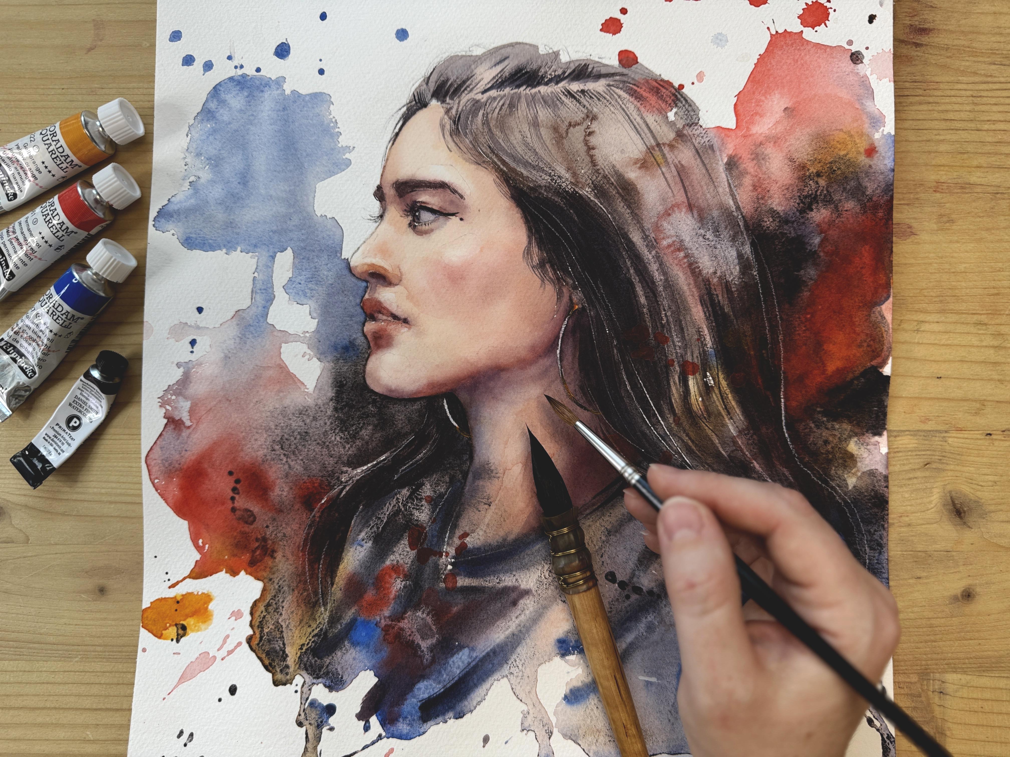
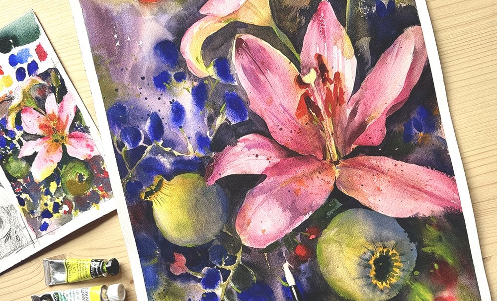
5. (WEEK 1 ) Creating a Watercolor Thumbnail / Sketch: This lesson, we will
create a quick, loose watercolor sketch
from our first reference. Think of it as a warm up and a small thumbnail for
the final painting. This step can be incredibly helpful for spotting composition or color issues before you
commit to the large artwork. Try to keep this sketch
to ten to 30 minutes max. Do not get caught
up in the details and do not worry about
making it pretty. It's job is simply
to help you test ideas and build a little confidence
before the main piece. Practicing this way became a total game changer for
me, so let's jump in. So before we start, I still want to go over the sketchbook
that I have here. This is a saner sketchbook. I like to create small sketches of nearly all of my portraits that are important or if I did
not paint for a long time, but I noticed over time that
creating sketches before I painted a large piece that helps me envision what the
painting will look like, and it will help me to basically get familiar with the subject
that I'm about to paint, and the final portrait
gets so much easier. Since I started to do these
tiny watercolor sketches, I don't throw away as many
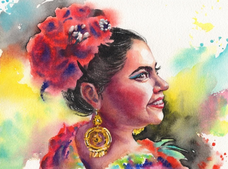
portraits as I did before. For example, this
is a sketch that I created before I
painted this portrait, and the sketch helped me realize that the
color combination that I planned is
not going to work. You can see that the face
is not too successful. It's very ugly
compared to this one, and the model was very pretty, but that's not the
point of the sketch. You can make the
face very quick, very loose. Point is this. Troubleshoot problems
before they arise on a large paper and before you waste your resources
and materials. So after realizing that this color combination
is not great, I opted out for more
vibrant combination, and I think it also
turned out well because I have drawn
the portrait before. Another portrait. And actually, this was the same principle. I did like this looseness, but it was very, very quick. It was maybe 15 minutes sketch, and the color combination made me realize that this is
not what I want for this. Portrait, it does not support
the facial expression. And then I painted the final piece with much more
vivid colored combination, and I like this one more. But without doing the sketch, I cannot realize these problems. I only will realize once I have wasted a
beautiful cotton paper. So nowadays, almost always I do these
tiny little sketches, but I do not make
them look nice. These are very
quick, very loose, but I can already see the point and whether the
painting that I'm trying to envision here is
worth making or what kind changes do I need to make in order for the painting
to work color wise. So we're going to do just
that in this lesson. Here, we will sketch our first portrait
in this challenge, and we will quickly try the color combination and
see if that will work. We'll try to learn
from this sketch. And please, I know you. You will try to work on your
sketchbook for 2 hours, but that's not why we are here. Over the course of
this challenge, I want you to learn
to do this quickly. Just as a notes that you
would take during the class. That's what the sketch is for. Is the first
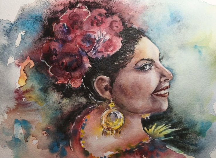
reference photo that I've chosen for this challenge. I knew that the
first portrait that we're going to make
is either going to frustrate us or is
going to support our learning will make us
want to try more portraits, and portraits are very hard. So I've chosen something that I do not think is going
to be dead hard. It is a profile view, and it's a beautiful
will try to sketch this. We'll give you a few
tips on how to do this quickly and then we
will try the colors. Since this is the week
one of our challenge, we will only use four colors and we'll do everything with this limited palette and therefore, we also have to test out
our mixes and if they work. For quickly sketching the
profile view like this, I always want to first maybe use some straight lines to
block in the main shapes. The angle of the jaw,
maybe a little bit. Just use these straight lines to block in some of the
shapes that you see. This is going to be
part of the hair. And here I'm going to use oval. Then there is some straight
lines for the neck. Now we can block in the
line for the eyebrows. That's this one, another one, imagine that the eye
with the eyebrow, they form this one shape. It's like sunglasses on or an eye socket
shape like this one. So do that first and only there, you can do the actual eye, which can have a very triangular shape from the side view. Okay, let's move on to the nose. The nose also from the
profile view can have a very triangular shape
here, here and here. And since her head is slightly lifted, that's
not going to be long. We do not make it too long. Then the mouth, this part
is going to be the hardest. But if you had the
previous class with me, which was about the introduction to portraits that include a whole half of the classes,
just drawing portraits, you know that this
bottom part of the face this part from the end
of the nose to the chin, this part can be split into three parts one, two, and three. Here Summer is going to be that split between the
lower and upper lip. This one is going to
be the upper lip. And this one will be where
the chin kind of turns. You can use these measurements to help you find the mouth. But again, we are
doing this quickly, so we do not try to
do it perfectly, or please do not try to even to focus on
likeness too much. So I'll just blocking
some of the shadows. This is not exactly
hair, but it's fine. She has makeup here, and then the hair I
also try to envision in straight lines first before
maybe doing something else. Here is a cheek bone. Here we can see more light, here maybe a bit more shadow. Then again, here a bit more
light and a lot more shadow in this area before we get
to the ear and the earring. So all of these parts
is covered with hair. And please try to sketch
very, very loosely. I will not take the
kneaded eraser and try to soften my first lines a little bit and clean
up the sketch. And I'll try to soften my
own lines a little bit, make it look a bit more
like her, but again, you can even keep the face not looking so great
at this stage. Okay. And here is just
the rest of this is here. Okay. And with this, I can
move on to the paint because it's just enough for finding out whether the painting
is going to be okay. The sketchbook paper
is a cotton paper, but it's not very high quality. It's very different
from the one that I'm painting final
portraits with. And so it won't even allow me to create such an elaborate
watercolor piece, but that's not the point. So I think we can finally also start building the palette. The first week of our challenge, we will use bloodstone genuine. That's the dark place one here, use it in this palid as well, and I'm going to pour it here. I want to use cobbled blue. I want to use yellow orange that one's going to come
here and permanent red. I tend to use cadmium
red sometimes, but lately, I've been opting out for options without cadmium. So from SchminkiHodam,
the permanent red uses a non toxic non
cadmium pigment that is very similar in
hue to cadmium red. So these four colors
pressed it on my palette and we will try the mixes and we'll try to color this sketch. One more thing. We
have to find out whether the portrait that we are about to paint
has some highlights. I don't see many highlights, but like here on the
notes, there's one. This part tends to
be slightly lighter. You can mark it very gently. Here also here also
might be a lighter part, just so that you
don't cover it up. Here is lighter part. It's
not completely white. So it's not a true highlight, but these parts are lighter. That will help us kind of
preserve some of the lightness. And here, I'm going to
get a little bit of yellow orange and a
little bit of permanred. Mix them together, try
to create a skin tone. Do not forget to add more water. We need a watery
wash. Sketchbooks, I don't use tilts very often. I just block in everything with this one basic
skin tone mixture. We'll work more precisely
on the final piece, but we just go carefully
around these highlights. This one I covered already. Maybe here on the neck, I will add a slight
bit of the dilute it cobbled blue into the skin
tone mixture because here, the skin tone starts
to be a bit cooler and then more of the permanent
red we want to use here, dilute it permanent red. You can add a bit more
here on the nose, on the lips straight into
the wet these highlights, I usually go over them
with clean water. So the area remains
lighter but not completely white and not cut off from the
rest of the face. So the color that we
used is yellow and red so far and just making
notes about the skin tone. I also used a little
bit of cobbled blue. If you add cobbled
blue into this, you will get an undertone that's a bit more gray
that looks like this. Now for the hair, we need some sort of blackish,
brownish color. For browns, usually I mix yellow orange with
a permanent red, a bit more balanced mixture and add a little bit
of the latton genuine. You can get quite
a nice dark color like this brownish color. Maybe her hair could benefit
from adding more blue, so you can add
cobbled blue as well, and that will make the
mixture at more cool. Yes, I think this is very
close to her hair color, and so we can start applying. Even if the previous wash is still wet, you can apply this. We can dilute a little bit more. I just want to see the
color, what it looks like. So this is the base hair color. What else is there? What
other colors are there? There's the jacket
that she's wearing. I would maybe use
the same color but use a bit more blue
into the mixture, and that will give us something
like color like this. I think that's very true
to the reference photo. And here we can use more water. We can splash this
around a little bit, maybe connect the wash with the hair and add in a lot more bloodstone genuine into her hair here where you can
see the darkest part. Just notice little contrasts and put them there very quickly. This is not an
elaborate painting. Now, we have to think about the color combination
for the entire portrait. So I like this color very much. What other color might be
suitable to use with it? It might be red. So
maybe if we use red to create a contrast between the
blue, that might be nice. And I think this
portrait will benefit from having dark
background here. I just testing all of
the colors together. I know that might look scary, getting rid of all
of the excess water, and I will need to add a bit more blood
stone if this is going to work a bit
more of the darkness. We can use that actually for the next layer and do
some negative painting. So, if the face is still wet, then the color will bleed. You can wait, but I don't really make a big deal out
of this in my schedchb. It's too much, then
I try to maybe use my sturdier brushes to get
rid of excess pigment later, but we will probably
be able to cover this with the layer
of shadows very soon. At this stage, might do some
more splatters, actually, of red, but I now want
to dry everything. So to make sure that we
know which colors we use. Orange, permanent
red, cobbled blue, and blood stone
here. Four colors. I do like these effects, and I'm enjoying the
color combination. It's not so poppy, but the red and the blue, they kind of mix together
spontaneously and create these subtle purple
transitions which I enjoy, and the blackstone is adding some texture
and granulation. Might be a good
portrait after all. Let's now move on to the shadows and try to add some to the
face very, very quickly. So the main zones for the shadows will be
here around the eyes, here around the neck, the jaw, some slight shadows,
but very light, medium tone will be here around this highlight
that's on her cheek, bottom of the nose
and below the lip, those are the areas
that we want to do. To create shadows,
even though I will go into more details in the
final painting, don't worry. You can first premix the
basic skin tone here. We'll use the yellow
orange and permanent red, mix them together, add water. Just have a bit of
skin tone set aside to use for shading for connections with
the previous layer, and main mixture for
shading will be red. Mixed with blue. I add
more water and less water, and this is what I try to do my shadings I need a bit
more purple for this. So I apply the shadow
here around the eye. This is not going to be
a nice looking portrait. Don't worry. Then diffuse the edge, the technique that we learned
in the previous lesson, and then connect everything with the skin tone, basically, wherever you have
just a slight turning of the form in your portrait, then you don't have to
use the shading mixture. You can just use another layer of skin tone to connect those. Top of the nose is quite light. We do not need the shading
mixture that's very dark. But then underneath
the nose, we do. We need the stronger
shading mixture. And then the lips as well, here is the strong part,
even stronger, actually. Below the lips, you can use the shading
mixture. Like that. And a little bit
of the skin tone. And now here, I want to use basic skin tone to make the skin quite wet
here in this area, and then want to place this
shadow here in wet and wet. That's what we can do to
make it easier for us. This area is going to
be darker clean water. Okay. That is very,
very basic shading. I also need blood stone
as my darker paint to just suggest the
contrast around her eyes, maybe to here, basically just paint a
little bit of darkness. And maybe use some for the brows as well
for some contrast. And now I want to find out whether the portrait would look good if I placed dark
background in this area. So I have blood stone
genuine here of the blue, and I will try to do the
negative painting, basically, which means that I go over
the silhouette of the face, trying to make it stand out more emphasize
the silhouette. And we will leave
the face dry for now so that we have
this sharp edge around. Here will be darker
shadows of the clothes. On this side, we
need to emphasize a little bit here the
contrast of the hair, and some hairs string hairs. Careful with the strokes in this area because the
hair here is lighter, so we want to do the strokes or more of the brass strokes
where the hair is darker. And then I'd like to do more of that negative painting
here in this area. Basically, this is my
process for the sketch. This is just me throwing a
bunch of paints on the page, seeing if the color works, the face is not well executed is just rough idea of what we are about to
paint a large paper. Maybe the lips need
to be more red, maybe actually in here, I want more red, just to balance this with
the background. Maybe the nose needs more red. Do we want a portrait like this? Would orange help to make it
more vivid? I don't know. Let's find out. I'm going to put a little bit
of orange here. I don't like the combination. I think it's either
orange or red. Nope, I think the red
was all that we needed. I have these luminous,
white pencils. These are color pencils. Sometimes, not always, they're
absolutely not necessary, but sometimes during
the sketching process, I use them just to see if adding more light or preserving more light would help
the portrait out. Since barely can remove from the sketchbook
enough pigment. I just use the color pencil, and that helps me
also better plan what I can preserve when I
paint the final portraits. So definitely the bottom lip needs more light that I
covered too much there. There's some light on
the teeth as well. It is quicker for me
than any other tool. Okay, I will also use
it to draw the earring. But in the final portrait,
we'll do it different. And here is some light on
her jacket, here is as well. Here, just the rim light. Maybe we could use
just a hint of orange along with the red
because now I kind of like it. I'm excited to do this portrait, and this is actually exactly what I wanted
to show you with this lesson is that every time that I create
a sketch like this, it was very quick process, but it's a peak to
the final painting. Sometimes I find
out when I create these sketches that I'm bumped and I do not want to continue. I find out that I'm not inspired by the
reference as much as I thought or the color combination doesn't work. Usually
it's not the reference. Usually it's the colors, and then I find a way
to make them better, and the final portrait survives thanks to that. Sometimes
it's the reference. I find the reference
a good idea, but when I try to draw it, it just does not work for me. I do not connect with reference
that also happens to me, and the sketch helps
me realize that this is not a good reference
for me to paint right now. This process of sketch booking, I think it's going to
be an essential part of your practice as well to
visualize the portrait, and maybe sometimes we will even do two and
switch reference. We'll see. So please do a
sketch like this one quickly. Either on a separate piece of paper or into your sketchbook, I would even love it if
you included your sketch in the project that you will
upload with the final piece. In the next lesson, we
will draw a portrait to the watercolor paper and prepare for our painting process.
I will meet you there.
6. (WEEK 1) Drawing a portrait: Lesson, we will draw
our portrait to watercolor paper.
Let's get started. In this lesson, we will sketch the portrait to a professional
watercolor paper, cut and paper, and we'll start the process of creating
a final piece. So sometimes I'll sketch free hand, don't
measure anything, but other times I use
my pencil to measure parts of the portrait to make sure that I'm a
bit more accurate. If you have the option to print your reference to the same
size of your final piece, then this gets easier
because you can take the exact measurements
and you can transfer them to the
watercolor paper. I will start draw free hand, but I will measure
some of the biggest, largest parts of the
face to make sure that the drawing is at least
a little bit accurate. Usually, I start by mapping where the top
of the head will be. So maybe I want the
top of the head. Here that is
essentially this point. So then the portrait length is about as much as my
pencil slightly a bit more. So here's going to be her chin. Now I have to make sure
that this is where I want that face to be placed, but probably this is okay. So now I maybe just do one
line to represent the face. There's a slight angle to this. So I'll just place a line. This is the top of the head. We'll have to find a
hairline. This is hairline. Between the top of the
head and the hairline, there's a little
bit of distance. So the hairline could be here. Usually there's some volume to the hair on top of the head, so then we have to
incorporate that. But then you can measure
the distance from the hairstyle to the eyebrows at least roughly would probably say that here we
can mark eyebrows. We can measure the distance
from the eyebrows to the bottom of the nose,
approximately here. That does not seem right.
A little bit less. So I'll just do two lines to represent the nose
very, very roughly. And then we can measure from the bottom of the to
the bottom of the face. We already have that marked, so I'm just measuring
to see if the previous measurement
works and it does. If you want, you can
find the midpoint, the middle part of the mouth, and you can measure
from the bottom of the chin to there just to make sure that it is that
you marked it properly. And then I'm going to try to draw a few straight
lines like here, a line here, this angle just to represent
the basic features. This bottom part might be
slightly more complex. One and two, it can
be just a few lines. For now, I'm not looking
to be like 100% precise, just to make the portrait exist. And from here, one more
measurement that could be helpful could be the
width of the face, how wide the face is. I can measure that
and mark here, where the ear will begin, and then we'll just
see where it lines up. So the bottom of the ear, somehow it lines up
with mouth here. Everything else, more or less, I can free hand from
here from this point. I could measure this distance. The eye, it actually looks
like a triangle one line, the other line, and
then this line. So if you draw a
triangle like this, and a few more lines that
you will get the eye. This is all very rough, but it really helps. One tip for you when drawing
on a watercolor paper. Just make sure that you
don't press too much because then the line will
be so difficult to erase. That's not great. Just
make the lines very soft. Try to sketch with
your entire hand, not just with your
fingers or your wrist because then you get better
movement of the lines. And just touch with
the tip of the pencil, just touch the
paper very lightly. Here around the jacket that she's wearing
and the clothes, overall, I do not
care all that much. I'll just try to sketch very
roughly the silhouette. And I think this is just
more or less what we need. There's the makeup the
fold below the eye, And maybe the eyebrows. And here also this other part, we see just a little bit
of the other eye. Okay. I also want to at least
do this so that I can remember that here's a
highlight and this is a check. So this is the first
stage of my sketch. I did not use eraser
by now very much. This is just rough outlines. I make sure that everything
is where I want it to be. So the size of the face,
the position of the face. If you decide later on after
doing some refinements that you want the face to be a little higher then that's
very difficult. But you have to decide
all of these things in this first stage of
the drawing process. But once we have this sketched, we can start refining the lines. I usually start this phase
with the needed eraser. So now I will start
the refining process. I will take the
needed eraser and try to lift some of the pigment. Like I mentioned in the
previous classes as well, the Ned eraser never takes
away all of your lines. It just lightens them. The main point of your
sketch is still visible, and now we have to refine. So we have to commit
to certain lines, make them a bit more prominent, but still we don't press. We just sketch very lightly. So here was the forehead. So I sketched. I noticed that there was a little
bit of a bump here. I will refine this as I
go. I'll sketch the hair. I just look a bit more closely, and I try to also
notice details, the curves, the
angles, a bit more. Before it was very rough, and now it's just the
shape of the nose. I try to be a bit more precise. This precision, you don't have to worry
about it too much. If you can refine
your lines at least a little bit that will
help the final portrait. But do not worry if you
can't observe all of the angles and get
all the curves looking exactly
like on the photo. That is, again, not the
point of this exercise. I'm not entirely sure. If she has a difficult feature, it would be the chin,
from what I noticed. It is also the
angle in which she is captured by the photographer. I'm trying to get it at least slightly similar
to the photograph. Here is where the detailed
eraser comes in handy, but it's not a necessity,
but it really helps. If I want to clean an area like this one, where
I have everything, where I already
have a clean line, but I want to make sure that around it,
there's nothing else. And another difficult
feature could be the mouth. So I might start with the lower lip and just
observe how the lip goes. From what I see,
it goes like this. There is part that shows a
little bit of teeth here. And then here is the upper lip. Sometimes I do add this
tiny hatching is just very soft just to make sure that I remember that
there's shadow there. Shadow is also here underneath. As we draw, we kind of
study the reference. So here also,
underneath the nose, there's a shadow that
we want to capture. I can do hatching. Mechanical pencil
does a good job that the hatching does
not look too strong. And when you place
watercolor over it, usually it work just fine
and covers the entire thing. And now the eye M. I try to just draw what I see the reference,
what I notice. Here underneath the iris and underneath this
part of the eye, you can see the thickness
of the lower lid. But just for a minute here, just for a little little bit, so I try to preserve some
of the white of the paper, and then you can see it again. There's makeup here
and there's lashes. Here is makeup. I think this is also part
of the makeup and then the upper lid here. I think the most difficult
part we've got behind us, there's the part of the ear here just
doesn't show very much. I just slightly measure
this might bit higher. And I want to make sure that this part of the
head is correct. The one here, we can't cut each. It's got quite a lot of hair, so we have to include, I don't have the chin, correct, but I'll fix that after
everything is placed. Chin is not good.
Let's try to fix. It's too prominent, so I think it's S. Now, I always smudge
with my hand, and the Ned eraser
helps me get rid of that so that my
paper is cleaner. This line is not a
sharp line here. Sharper is this silhouette, so I care about that much. More. And then the earring. This could be the final. There's a rule that I have and after every
single drawing, I go for a break, at
least half an hour, but it's best if it's
overnight or an hour or lunch or something because then
after I return to my drawing, I find mistakes that
I was not able to see before and I can correct
them before painting. If I don't find the problems with the drawing and
I start painting, then it's almost you can't fix. Anymore because you
cover them with paint. So I try to notice them. The drawing is usually
the hardest part. And then after you have
the drawing finished, that's where you can enjoy the painting process
and relax a little bit. Or maybe accept shading. So I will delete a
few smudges here, and I will take a break. I will be back in 30 minutes, and then I will show you how
I try to find the mistakes. In the next lesson, I
will show you how to do revisions and how to spot
mistakes in your drawing. I will miss you there.
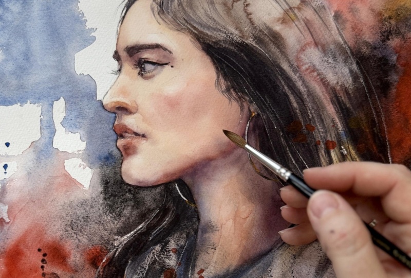
7. How to spot mistakes in your drawing: Lesson, I will show
you my go to methods for spotting and correcting
drawing mistakes, including the ones that
are easy to miss at first. These small issues
can become much harder to fix once
paint is involved, so taking a few extra
minutes to check your sketch is always worth
it. Let's get started. So one of my favorite methods that I've been using
lately to just help me find mistakes in my drawings is throw the drawing on the ground and look at it from above. Well, that helps me gain perspective and seeing
the drawing next to the reference photo from a
distance sometimes helps me see stuff that I
did not on my table. So in this particular drawing, I did not uncover so
far, huge mistakes, but a couple of minor
tweaks, like, for example, here, the hair, should be
closer to the forehead. So here, I'll just mark that the hair needs
to be slightly closer. Some things probably will be
fixed just by adding color, maybe just the angle of the forehead can be
improved very slightly. Other than that,
so far, I did not notice any, huge problems. Maybe she could have a little
bit of like a smile here. So this corner of
the mouth could be maybe improved just very, very slightly moved
a little bit. Yeah, now I like
it a bit better. We just minor tweaks, but looking at a distance
definitely helps me and is one of the
fastest methods. So that's why I do it more often than anything else lately. Another method that I use
sometimes is to take a photo of the drawing with my phone and then take the photo of the
reference with my phone. And then on my phone,
just quickly, sort of, I will have to crop this one
so they are similar in size, and then just flip
in between them. Oh, so now I see. I see this angle is like chin on my drawing
goes just so forward. I notice this now. So maybe that's the thing
that we need to tweak a bit more is not to have the chin go forward so much and just to
tuck it a little bit. I did not see that before, not even with my first
correction method. I and also here, there's I need to go a bit
higher, anything else? And the third method that
you can try is to well, place the drawing upside down or on the side and then compare
all of the distances. Maybe the distance,
whether the eye is not too long too wide,
the eyebrows here. This distance compares slightly
better from this angle. Well, the shape of
the jaw is different, and I can't get it
right for some reason. But the shape of the jaw, I only see now from this angle a little
better than before. And this length,
that could work. And then upside down, I have to think about
the chin because that gets I do erase a lot on a watercolor
paper, and that's fine. The watercolor paper
can handle it, but you can't use eraser that's dusty or that
scratches the paper. It has to be very gentle. Even the hair shape is like
better from this angle. Helps me better seat
from this angle. And the other side It's the dark part of the hair. So these are my
three go to methods. Not always I do it
like sometimes I just don't care for the
likeness as much. I just don't want to
be embarrassed, here, not be able to get at least a little bit
close to the reference. But oftentimes if I do
sketchbook works or quick works, I don't really mind
all that much. Besides measuring the
main proportions, I don't go for likeness, all that much, I just
want to practice. Here we did three evaluations
of the final sketch, and I believe that we got as close to reference as necessary, close enough to create a
decent looking portrait. And so that's great.
We can prepare the drawing for the
final painting. Prepare all of your
painting tools for the actual painting process and make sure that you clean if you are like me and have
the graphite on your hands, I usually go watch that. In the next lesson, we will do a quick color mixing
demo and a recap. I will meet you there.
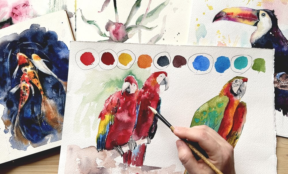
8. (WEEK 1) 4 color palette - Mixing Exercise: In this lesson, we will go
over the four basic colors we'll be using this week
and recap the combinations, practice mixing a little bit, and essentially
prepare the palette for the painting process. Let's get started. I know that we've already used
the four colors in the sketching stage, but we can quickly recap all of the color
combinations that we can get from these four
paints just so that the process of final
painting is smooth, uninterrupted, that you are 100% efficient and prepare
all of the colors beforehand so that you
have easier time during the actual painting process
and we can start mixing. I already put these four
paints into my palette, but since they were sitting
there for some time, I need to now grab a brush
and make sure to wet them, so dampen them with a
little bit of water. You can use water bottle
or sprinkler, if you want. But I just use my brush
and quickly do this. Let them sit in this
tiny bit of water for two or 3 minutes so the
pigment gets more workable. But I also do recommend to
squeeze out a little bit, tiny bit of the fresh paint so that we have the best
consistency for the work, especially the blood stone, which actually I will
squeeze in also here. We will also add water here. So for the skin tone, we use a combination
of the orange. This is yellow orange
and permanent red. We combine them together. Here, I usually create this large pool in the
mixing space of the palate. This is just red, but when
we add a bit of orange, this orange has a huge influence
of the yellow pigment, and therefore, the
mixture gets peachy. It doesn't get all red,
something like this. So this is our basic skin tone. Those are warm colors. We will use them everywhere where the skin tone
is in the light. But then we use cobbled blue. So cobbled blue is cool color, and sometimes we do need
the basic skin tone, which I will grab and
have a bit of it here. Sometimes we need
to cool it down. And in that case, I will grab this mixture and add a tiny bit of the
cobbled blue in it. This may be too much, but
you can see how lid gets. The cobbled blue pushes the skin tone into
the shadow like here. Sometimes we need this in here, for example, or on the neck, some areas of the face
that contain skin tone, but you can clearly see that the skin tone is in the shadow. So this is very important. Then in some areas
like the lips, nose, maybe the cheek bone, they get more red, so you put a bit more red
into the skin tone, make it a little bit
more red like this. You can shift the colors from warm and even redder
towards the cool ones. We will mainly mix these
three colors together. I think it takes about 15
minutes to get used to mixing all of these and adjust the ratios according
to what you need. It's not harder than
that. And for shadows, we will be mixing the
red and the blue. Sometimes we'll mix them and leave the mixture
to be diluted. This gets us some purple, but it's not going to
be all that vivid. Sometimes the red prevails, other times the blue prevails. Like when you add more blue, you get a mixture
that looks like this. So these two colors
together combined, they create some sort of purple, but desaturated, earthy purple that you can
use for the shadow part. And also this mixture can
be used diluted like this, even the one with more
blue can be more diluted. And it's going to
work for shadows, but it can also be used thick, and we will need in some
areas to use thicker mixture. So then I use less
water and more pigment. Which is why oftentimes
it really helps me to push and squeeze fresh
paint out of the tube, especially for the red and blue. So if I create a
thicker mixture here, one part of my palette, it's going to look like
this when it has more red. If you push and add
a bit more blue, then the mixture can look
like this. It's almost black. With thick mixtures, you can create details, darker areas. You can basically use
it for anything around the makeup, lashes, brows, hair, the nostril even this
part of the mouth, you can use it here and you can even use it for
parts of the hair. For the hair, we can
use this mixture and add a bit of blood
stone genuine in it. I did use a little bit
of orange in it as well. So this is going to be
mixture for the hair. Maybe a bit more blood stone, a little bit more blue, and you just mix, you test, and you see what the
final color looks like. Maybe a bit more orange. Yes. For the hair, we will mix all of the four colors and just balance it out. Besides the skin tones, I always think about
the stylization. So which colors do I want
to pop around the portrait? That is why we did the
sketch and we tested it. I kind of like the blue when
it shines a little bit more. I like the pops of red and maybe we'll also incorporate
the pops of orange as well because this final color mixture,
I was enjoying. And now with this warmup, we can finally start painting. In the next lesson,
we'll start painting our watercolor demo
together step by step. I will meet you there. He
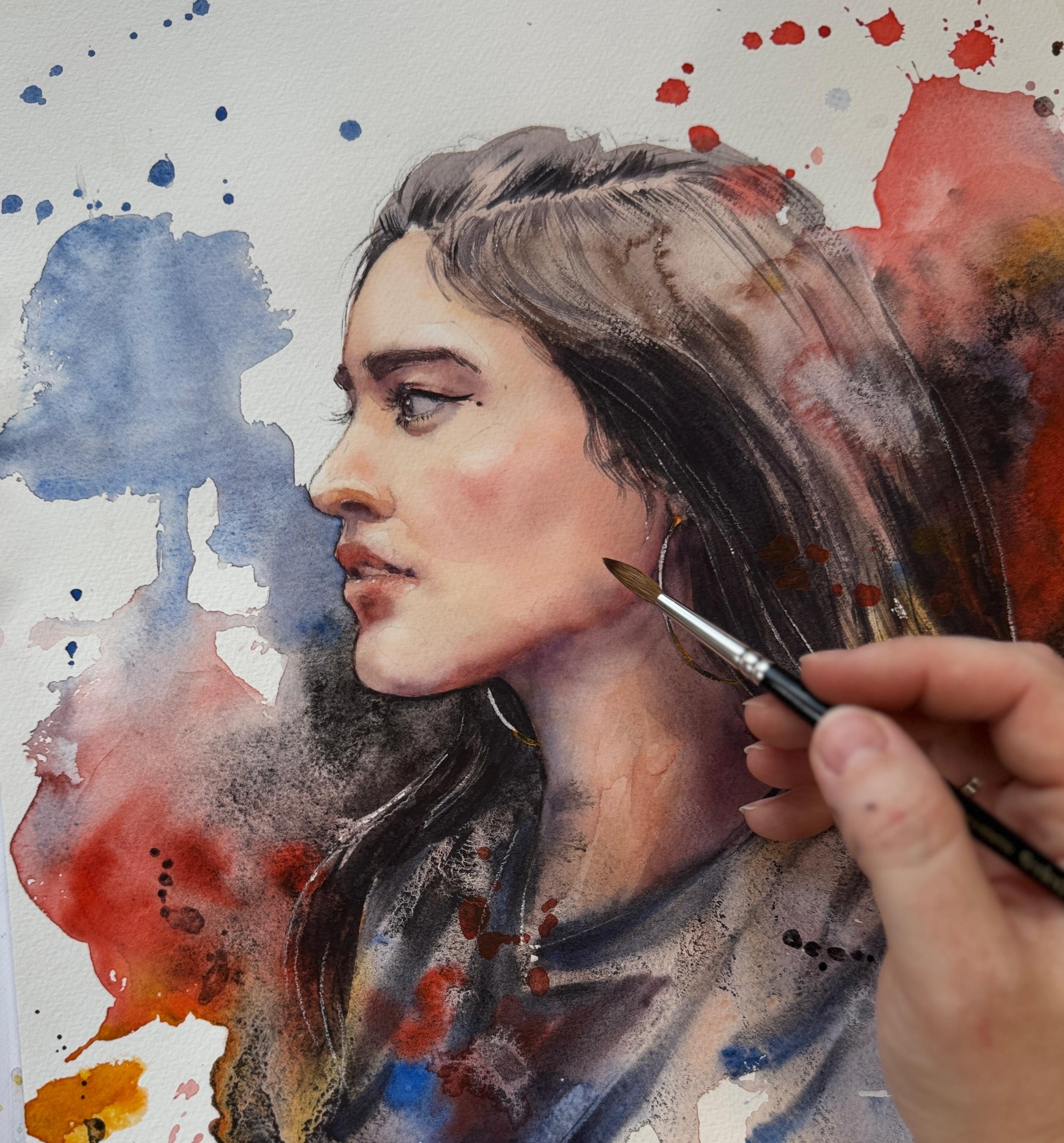
9. (WEEK 1) - First layer & Background: This lesson, we will begin the painting process
by laying in the first skin wash
and we'll also add the expressive background
right from the start. I love working this
way because it helps us establish the main
color values early on, which makes the shading
stage much easier later. I will guide you through
everything step by step, and let's get started. Before we start with
the first layer, I always want to
paint the skin first, and for that, we create a
tilt. I have a basket here. Sometimes I use masking tape, something that's not too tall, but still helps me to hold the paper in a position that allows water to
run down slightly. It is not going to be
sufficient for the background or for the splashes that we will also do during
the first layer. But for the skin painting, it helps to unify the wash, just like I mentioned in the
lesson with the techniques. First layer for me
is always dilute it skin tone placed
and painted over the skin I do try to avoid the highlighted areas or the areas that
should remain light. Just to make sure that
you know where they are, you can grab a
mechanical pencil and very lightly map them out
like we did in the sketch. So here is one area that I can identify in the reference
photo that is very light. Also on the cheek, just very, very lightly, do not make
a map that's very visible. Here on the nose, I guess it's here and also in this area, just so that we
remember not to go there with our brush
during the first layer. Here as well. Actually, we
will go there with the brush. We will not cover that area with paint just
with clean water, and here as well on the chin. This is an area that's supposed to remain
a bit more clean. So when you don't have paint
yet placed on the paper, it can appear a bit harsh
these maps, but do not worry. Usually, we just
cover all of them. I just want to lighten this sketch that I
probably forgot to lighten looks a bit
too harsh to me. And now I no longer want to wait and I just want to get
into the painting process. So the first part is always
the skin tone like we premixed in this previous
exercise that we did. And let's get painting. I will just gently place
the skin tone over areas of the skin except the areas
we just mapped out. And remember to
use enough water. That's very important.
The eye whites, they're not white, so
you can go over them. Just go over this as well. And then clean water
on your brush. You can lightly touch these
areas so that they can blend. We'll also prepare
the Chine brush that I have here
slightly smaller, and we'll go over this part
with clean water here, and we will connect this needs to be always
with more water. Carefully painting around where I can't reach with larger brush. I'll try to do with
the smaller one. You can go around
the teeth as well. But here at the bottom, we have to kind of add the
blue into the skin tone, and we can paint with that
look how different it looks. The entire bottom part
of the face will need a little cooler skin tone. Here, just clean
water to dilute. Don't want sharp edges. And this part will need nectin and I have to admit
that I need to be kind of swift with
placing my first layer, especially if my
room is a little bit warm because that
dries very quickly. Sometimes, if it's
not too dry yet, I can go ahead and use a
little bit of red paint. I guess I could do that because I see a lot more
red in these areas. Maybe a bit more red
in the mouth area as well. And the nose. So for the hair, I'll mix red, yellow. So this is orange. I mix blue in them, and this is the base, maybe at a bit of blood
stone genuine so that you get deeper color a
little bit more of the blue to balance because
the hair appears a lot cooler and we can start by placing at least just
the base layer, I guess. And I want my first
layer always to be watery where I can see the
skin tone kind of peaking. Maybe here add a little bit
more of the blood stone. So I need a bit more. And just because I want
to do the background, I need to dry this part of the skin so that it doesn't
get more blooms than this. It right now, I switched straight
to the background by laying my painting flat, and I will now want
to do splatters. Now, not the reference photo, but my sketch is more important. So just make sure to keep this on your side so that we can use it as
inspiration, basically. And I always start with
colors that are lightest. So maybe in this case,
it would be a bit of the orange bit of red. I might start with the red
and use my largest brush, do these free splatters and I kind of try
to avoid the face. Weapon of the blue. I have to be careful around the face so that
I don't go in it. So I always try to use the tinier brush to get the
background close to the face. And maybe that's enough. And you can't forget about what we did
during the techniques, is that the colors they're
supposed to if you want them brilliant and just each color
to stand out on its own, you can't mix them together. Here I will pour a
little bit more of the black but very careful
about the silhouette. This side of the portrait
is black heavy as well. And the shirt now. I'll try to incorporate
the orange, just like we did
with the sketch, kind of like and now
the important part, get rid of all the excess water, the large puls, suck it
out of the painting. H. Especially here, these drips
and drops this large brush. I can absorb a huge
amount of water, so it really helps me get
rid of these quickly. And now I can level up
the portrait again, let it go down, let
it drip a little. I do not like these shapes here, so I might do just a
little bit of clean water and let it connect like that. Now I just let the
excess run down. Here I collect it, and then I will see what it looks
like from distance. No. So I'll try to do one more effect here somewhere is with
just clean water, sprinkle some tiny bits of
the water in the texture, and we'll see if that helps me achieve some sort of effect. And also, while that portrait
is still wet in this area, I would like to paint
in some of the folds of her clothes. In the clothes. Always, when you screen
your eyes a little bit, you can see parts
that are slightly darker like here is a part
that's darker stroke. I just try to find
this and do a stroke, one stroke each
fold and leave it. But you have to do this
in a wet background. Let's see what I mean. Here I have blood stone genuine with a little bit
of blue cobalt, so that I have this dark
blue mixture here and pretty thick because we are painting
into the wet surface. And I will see if this
will be possible. One stroke, one stroke. Stroke. Another one. There maybe just pure blue. And that's beginning
to look like folds of her clothes.
That's all that we need. We don't need more
elaborate explanation of what she's wearing. That also works for the hair. So some parts of the hair, maybe I could do this
with this brush. That's for textures. Oh, yes, that makes the beautiful
texture already here and try to do
some of these lines. Because in this area, I just want everything to
be slightly blurred out. Maybe we could also do
these strokes with red, why not. Here as well. I can also, sometimes I do this with my
nails, but not today. I have a spatula here
and I'll try to scratch out some of the highlighted
hair while it's still wet. You can even do that for the earring to create a
subtle highlight there. With this, I will
let everything dry. This is the first layer. It's the messiest one. We will have to clean later. But this is just the
process that I enjoy. Watercolor is spontaneous.
All of these effects, I just want to utilize
in my painting. Then in the next layers, we'll have more
opportunity to develop detail and to work with
a bit more precision to create shading and even correct some of these parts
that did not quite work out. But for now, this just looks
what I want it to look like. Here are some beautiful
watercolor abstractions that I don't want to touch. This is the combination
of vivid color, smooth color with granulation. Here, look at this. I don't
even want to touch this. This is what your paint does, and it looks fantastic. So I'd prefer this to be
a part of my painting. Maybe here I'll try to go for a little bit more
of the splatters, a bit more expressive
parts, if possible. And I will just leave it
like this until it's dry, and then we can evaluate and
start working on the face. In the next lesson, we
will paint shadows around the face and add some details
too. I will meet you there.
10. (WEEK 1) - Painting shadows: In this lesson, we will start adding shading to the face and deepen a few darker details
to define the features. This is often the trickiest
part of the process, but do not worry, we
will take it slowly and go step by step
together. Let's go. Now the first layer has dried, and I'm loving how the portrait
is looking at this stage. There's a little bit
of messing here. I would want to clean some
of it, but not right now. What's definitely coming after the first layer is the face. So I'd like to first focus on getting some
shadows into the face, make it look a bit more
in depth, and afterwards, we will do the
entire stylization, see what's missing
on the background. We will tie everything together. We'll grab my basket here again, and let's focus on
shading the face. I will first premix
some mixtures. Here, it's going to be the red and blue together
mixture with blue prevailing, mixture with red prevailing, just like we mixed before. And before I even start
placing new shadows, this always happens to me because the background
is so watery. Sometimes the paint just leaks into the silhouette
of the portrait, and I would like to clean it before we place anything else. Here is also a slight
bloom that happened because I was adding
extra water here. This part was
obviously already dry, and that's why the
bloom happened. But at this point, I'm not
going to do much with it. Maybe I'll just also try
to clean it very slightly inside this zone that was
supposed to be light. Do the cleaning with my
Princeton stroke, aqualy. Usually, it's the flat brush. I'll just dampen
it in clean water, but I make sure that
the water doesn't drip, so I always clean with the
tissue and then gently, very gently rub the
paint off my paper. This technique is just
so helpful for me, but you have to
have proper paper. For this, it does not
work on every paper. Some papers just don't let the pigment out anymore
after it dries, but most of them will
let you do this. That can also be a
pigment problem. Some pigments tend
to stay the paper, and those are also
harder to clean. This was not such a big mistake,
just like it is in here. I'll just rub a little bit, clean up, and we're good to go. First, I'd like to
place large shadows on the face, some shadows, and her face, overall,
is not so pale, so we might have to go in a little bit more
with some color. We want to place
some more paint to create more depth and
shadows over here, like around the eyes, bottom of the nose. Those are the main zones
here, bottom of the mouth, and the most too
difficult zones will be this chin area. In this area. We'll keep in mind that here we will only shade with
the basic skin tone. So I will again, mix the orange with red,
dilute the mixture. Here is the color that
needs to be more intense but not too much cobbled in
that mixture in this area. However, here we will have to work with even darker paint. And for this particular shadow, I would suggest that we
could wet the entire face with clean water and for these large shadows
to work wet in wet, just like we practice during the techniques part.
So let's do that. Now that we went over this, I will place clean water. I will now go around the eye, so I am going over
the highlights, but the eye sort of is dry. Here, I will dampen all of this. So now that you see
that it shines, hopefully you can see this. The face shines. I did
not touch the background. I didn't touch the hair,
and I left out the eye. Sometimes I need to go
over with clean water twice so that the paper
soaks in the water, otherwise, gets the surface
and it is drying so quickly. So sometimes you need
to wait a little bit, then pour more water to make sure that this
is really soaked. Let's start with smaller
brush, placing some paint. I will also premix the basic
skin tone, which I forgot. Okay. So with basic skin tone, I just want to slightly
intensify the color here. I'm adding basic skin tone here. I'll add hints of orange
here on the forehead. Here some shading mixture that already includes
the cobbled blue. And mixture for shading that is slightly darker is going here. Here. Now, if you pre
wet this thoroughly, then you can paint
because it will stay wet for at
least a little bit so that you can really work. In this area, I want
to add a bit more red. And also the basic skin
tone, like we said, here is shadow that we need to intensify
color here basically. That's too much. Since my surface is wet, I can just push the
paint back and forth. And whatever your color
looks like when it's wet, it will be completely
different when it's dry. Usually, it loses a
lot of saturation. So do not worry. I already
am kind of used to working with slightly more
saturated color and just placing more color
than what I think is necessary because
I already notice this shift here I need to add a bit more
blue in this area. Actually, I want to
try adding a bit more of that orange here, just as a reflection
of this orange. So the colors don't have to be necessarily always realistic, but we have to care for
tonal values and therefore, make sure that it is dark
where it needs to be dark, but it doesn't need
to be the same color. I can already see that the face is getting
some more depth. However, in this stage, you have to be careful
about stopping when you feel that the paper
is starting to dry. The moment that you feel
that stop painting, you would do better if you grab the hair dryer and let
everything dry re wet and continue because that
semi dry stage is very easy to mess up and very easy to create blooms when
you work in that one. I happened to me a
couple of times. This bottom part for
me is still quite wet, but here I would not dare to go anymore. Okay. Adding a bit more shadow here on the neck while this area is wet. Here, there's a bit too much
of the blood don't genuine, so too much darkness,
I'll try to paint over with maybe some blue
or different colors. And now I go in with
the thick paint. So very thick blue and thicker red mixed together into the mixture that I
showed you earlier. And I will try to maybe add a little bit of darkness
in these few areas. And a bit more red. Here is going to form bloom. This was dangerously
semi wet area already. So yeah, I guess
there's nothing I can do more because the
paper is semi dry. So everything that I add
now will create bloom. Here, I just want
to lift some of the pigment from the teeth.
We can do that later also. Now I will dry. We'll see the actual color that
is staying here, and then we can
continue wet on dry.
11. (WEEK 1) - Painting shadows PART II: So after this has dried, I quite like this phase. I do not need all
that much more to do. Basic shadows helped a lot. But we also still need to do a little bit more shading here and correct
this area over here. Some of these blooms
like this one, it doesn't really bother me. When I look at the painting from the distance, it
just looks like, Okay, I have the
sufficient info there, so I don't like to scratch
the paper too much. I just do the corrections that I think are absolutely necessary. Maybe one that could be done with the Princeton
Aquilet brush is this one where the color from the mouth bled a little
bit too much outside. So here I can imagine doing a little bit
of the correction, but even that was not so bad. So here I won, but
maybe here I will do just a tiny bit of lifting
of some of the pigment. Like that. I just want to continue working wet on dry now. So with my tinier brush, I already have
shading mixture here. I want to now go over
the eye area here. So I'm adding color. It's not overly thick. And here I'm doing kind
of a background for the eyebrows because
they should not be painted on a completely
white paper or light paper. They need some sort
of shadow underneath. Here just add a bit
thicker pigment. This one will need
a bit more red. So with just the tip of my smaller round
brush, I try to paint. I now will use a tiny bit of
bloodstone genuine because I'm going inside the eye and
her eyes are pretty dark. So here I try to use thicker pigment for that makeup that she has as well
and for the dot. It's probably just
drawn on the face. And the lower part of the iris, I try to do just
with clean water, smudge the existing
pigment so that the eye gets a bit
more light in it. You can even try
to. This something that I don't quite like
the edge I try to make more crisp and very diluted blue for the inside of
this for the eyeball, basically, because
that's not white. I do not perceive this as white. It's more like grayish, a bit cool tone, but definitely not white. And I feel like when
I added this color, then the eye looks
much more alive. Don't forget to add the
shadow below as well. Here we need to add shadow. And then with clean water, go against the edge and soften it like we practice
during the techniques lesson. Here I'm going to lift
some of the pigment to get this a bit more light, but the shadow here should
be a bit more profound. All of these tiny little area, when I need to shade them, I work with smaller brush. Yes. And I smoothen the edges of these added shadows with clean water on my brush. Here there's also a shadow and clean water again and soften. I feel that here is
still not dark enough. So adding the pigment while
this is basically still damp. So there's wet and wet
happening on a small area. And I will want to get
the textured brush. Here, again, I need to do
more shadow on this side. But now I can grab the
smaller textured brush, the calligraphy
brush and try to do the eyebrows because this
part is already dry enough. We can do that by using
the shading mixture but add some blood stone in it so that it is sufficiently dark. Even more blood stone. The shading mixture
plus blood stone, it should be like This is
why the testing papers, they come in super handy. This one can dilute
a little bit. This one could stay a
little bit more crisp. And the lashes, we
can do that with the tiniest round brush with
the tip that we have here. Just draw them in the
makeup needs to be a bit more here like that. Now it's even obvious
that it is a makeup. And here as well.
Just do it softly. Okay. I think that's
enough for the eyes, but we can go slightly below and do the
nose, finish the nose. Not much work there,
but still here, the shadow, I would like to make a bit more
profound and here. It's a bit bluer shadow
underneath the nose that I want to be seen slightly more
intensely than before. And after I paint the
shadow in or draw it in, I just use the damp brush to soften the edge where
it needs to be. Then here tiny bit
of the orange weed, orange with red here. That area, and a bit of
orange and red here as well. This area so that the
shape of the nose, the form can stand
out slightly bit more here in this triangular. Then there's the check here. Where I work in this area where there's quite a lot
of light on the face, I try to just dilute the shading mixtures
so that I don't use too dark paint it will make it very difficult
later to get rid of. Now I can see the cheek, and I will dry this quickly. Probably the most difficult
will be the mouth. Again, I do not want to
go in too much anymore. I just will mix the blue with
red, make thicker mixture, but with red prevailing slightly so that we can
draw in some details. Here, it can be slightly bit darker and here in
this corner, too. And clean water
in this area just because that's where
the light gets more. Bottom lip is more light, but we can use diluted red here to create some
of the textures. You can draw them in literally. And then as the bottom lip
turns away from the light, here, it gets into
shadow a bit more. Clean just have water
now on my brush and I'm softening the edges of
the paint that I just added. Here. Adding again,
some soft shadow. I feel like maybe underneath
the mouth could be slightly darker. And I like the mouth. I do not need more definition. When you look up close to
this what I just created, you will see very blurry edges. You would maybe
even feel like it needs to be corrected
into something sharper. But no, actually, when
you look from a distance, then you can see that this is exactly what we
need a reality, the way our eye perceives, it is slightly distorted. It's not such hard
edge everywhere. We've got enough
hard edges to help the eye focus in this point, but here it doesn't have to be. You just need to place the
values into the correct place. Leave it like this,
it's going to be fine. Let's work slightly more
around the here I'm using mostly just diluted blue
mixed in some orange. Here in this area, I
feel like the blue gets more visible and needed even. And then clean water, just touch it slightly. Just add the shadow like this. Here as well. Me blue, actually more purple and water. And maybe quickly dry so that it doesn't have
time to form blooms. Here, the shadow is
slightly broken up. Maybe I would try to fix
it for just a little bit. Clean watcher. Clean watcher
here. Still broken up. Maybe I will add some
of that red with orange slightly so that we can define the jaw line. I'm not going to
fiddle with this anymore because I'm
going to mess it up. Maybe one more time, just here. Okay. Now that we have the
large shadow and everything, I will try to grab the cleaning
brush with water on it, and I will try to sort of
rub out the earring edge. This edge of this earring, it gets very shiny,
beautiful light. So maybe we could do that without invasive methods
like adding white. Usually that works
nicely just to rub it and it should look fine. Here. Yeah, that's good enough. I feel. One more thing that was bothering me was the area around the ear because here needs
a bit more contrast. We do not have it so defined. That is where I want to
work a little bit more. I'm working with
mixture for shading. Here, just go to add
a bit more contrast. Underneath the
earring as well here. Here. Maybe as one more touch up, I will try to do the eye white again and add one more layer of kind of diluted cobbled
blue here to the corner. Just so that I achieve
a bit more depth. And I just want that to
look like actual bowl. Good. So now I will grab
the textured brush, both of these, the
calligraphy brushes, and let's work some hair. We don't need to do too much, but some of it needs to
be slightly more defined. In the next lesson, we will
finish painting hair and do some adjustments to the background as well.
I will see you there.
12. (WEEK 1) - Painting hair & Final adjustments: Son, we will add depth
and texture to the hair, strengthen contrast
where it's needed, and make a few creative tweaks to the overall color balance. While we never want to overwork
a watercolor painting, a handful of carefully
chosen details can make a huge difference in the final
result. Let's get started. So we will be now
working the hair. I need more blood
stone, actually. Here's the s for the background, but I need more in
my palette as well. Now, hair gets light and dark. Even dark hair has
light and dark. When you screen your eyes
a little bit at reference, then you can clearly see
that this entire area, it does not even
contain hair strengths. You can just see this
shape that's very dark. We want to paint
that in some way. You can see these areas
over here as well. There's almost white
like rim light here. There's a mid tone.
Over here is dark. There can be
identified dark areas. I want to get this
into my painting. But the hair itself, usually they can't compete with the amount of
detail with the face. So we'll just map out
and leave it like that. They're already mapped out. Here is already lighter
area, dark area. Need to make some of
it more profound. Even if I leave the hair like
this, it should be fine. The hair on the top of the
head tends to be lighter. But here just to frame the face, I want to add some parts. This really helps me
to frame it nicely. Then over here, Then here. That was too much. Let's try to do a stroke
that's tinier, like, thinner. When painting this,
always try to find the direction of the
hair and go with it. I. Here is the main
dark hair strength. And there's some that need
to be lighter but still visible here so that they
can nicely frame the face. Here, I want to include
a little more of these abstractions so that the hair doesn't get line
here and line there. And there's also hair here. Here we have to fill this in. There's continuous dark area. I will try to now dry. So I no longer go much
after the reference photo, but I just want to do the
stylization of the portrait, the final one so that I
like the portrait myself, the way that the paint
flows around it. I just want that to be how I
envision it aesthetically. So the reference photo helps
us to get the fact right. But now the stylization
helps me to get my painting to where I
want it to be aesthetically. I'm going to maybe do some light details
with the scalpel, but then I will try
to add some more of the darkness so that the hair and the silhouette pops a bit more. That's the plan for now. But I did forget to add
here that harder detail, this detail of the
earring here and maybe the earring could
be orange slightly that maybe I could add a bit of rougher orange texture
there so that it pops more. This is just very thick
paint for final details. And now the scalpel. Here, just a tiny bit of the
floating hairs. I want to scratch them off. Not a lot, but and maybe
the highlight here. Always such a variable sound. I kind of got used
to it already. But lovely effect. So now only the
final stylization and I just need to figure out the way I want
this portrait to look. I'd just like to add more of the dark textured background, add some areas and do the negative painting
technique that we talked about. So here I don't want to do more. I like these compositions
where there's some room and space and
air above the head. But if I want some of the hair to pop a little
bit more like here, and maybe this shoulder
pop slightly bit more, I do need to add some
dark background here. But I also don't want
to edit everywhere because this color is
beautiful here and here. This is also negative
painting technique makes the chin pop a bit more. I don't want to paint
over this effect. So adding this
hopefully with care. Not too much. And maybe
a bit more of the blue Just to emphasize the
silhouette of the face. Does it make it pop more? Hopefully, it does here
and also sort of here. But this part of the hair, I do want to do the same here. So black background, the
granulating part here, adding contrast here and
maybe here losing some of these colors in order to make the hair pop and
incorporate this into the hair. I like even to use this
ldstone genuine or the granulating color to
get the effect of ink, like the aesthetics of ink brings contrast and
that graphic excitement, I guess, into the
traditional painting. Sometimes I use it straight from the tube so that it's dark, creamy and really rich. Okay. Okay. I will remove
these splatters, like extra water from them. And we'll try to dry and we'll
see what that looks like. Actually, here is a little bit. I don't know. This dark, it isn't 100% dark. It doesn't cover everything. This just an experiment. Let's try to see if that worked. So here after drying, this looked a little
bit overworked. Therefore, I tried to
lift some of the pigment and splatter more red because orange doesn't
really cover anything. It's a transparent pigment, more opaque permanent red
will do a better job. Hopefully, when this dries, it will look less stressed. I mean, this area, and this
red adds it a bit more pop, and it also frames the
painting from both sides. Here is the final piece. I will now sign it. That is this week's portrait
is finally done. This week, it was a
lot of setting up, a lot of exercises,
a lot of practice. Hopefully the next week and
the following weeks will be a bit easier for everybody
and also quicker. That is the real advantage
and real charm of all of the challenges is that the more you are into the challenge, the quicker your process gets, the less it takes you
to set up your table. Everything is a bit more clear. This is what I want
for all of us, myself and you to
have as much fun as possible and to also progress in a way that doesn't
feel like pressure, but it feels like we're
working towards something. You can leave a
painting like this. I am slightly tempted. Do just one stylization, which I like that the
pencils, they can be erased. So maybe just do this with the silhouette and
leave it like this. Emphasize this
highlight slightly. Very little tiny
little bit of pencil. And let's see what it looks
like compared to our sketch. So here is the original
vision that is very rough, and this is the final execution. I like the colors. The portrait, I think went quite well. Hopefully yours as well. For the next four weeks, I would love to
see your projects. You can upload the project into the project and resources
section of this class. You can add the first
painting there and you can go back next week,
edit the project. Below the first photo, you can add more photos. I would absolutely love
to see your sketches as well as your final work
right into your project. What was your experience? How long did it take you? I think the other students
that take the class along with you would love to
see what you also created. And that's just what I
love about Skillshare. And I absolutely
feel like that's a very helpful tool to have at your disposal,
so please use it. Also allows me to
give you feedback, and I will see you in the
next lesson next week, and we will tackle
different portrait. We will add one more color.
It's going to be great. So I will see you in the
next lesson very shortly. With that, our week one
portrait is complete. I'm so excited for
the next four weeks. Each one will be a new phase, new practice, and
another step forward. Come back next
Sunday and we will paint the next portrait
together from sketch to finish. And little by little, this weekly habit adds up in a big way. I will
see you next week.
13. (WEEK 2) - Creating a Watercolor Sketch / Thumbnail: To week two of our five week Watercolor
Portrait Challenge. We will start this week with
a warm up in the sketchbook and we'll create
a quick thumbnail of our second painting. Let's get started.
Welcome everyone in the Week two demo of the five
week Portrait Challenge, reference photo that we are
going to tackle this week, first in our sketchbook and then create a final
drawing and painting. I think it's going to have one advantage and
one disadvantage. The advantage is that we do not have so many details
there, there are glasses. So we'll paint something
a bit more fun, but not too many
tiny little details that you need to
get exactly right. The disadvantage is the
angle of the face which might make the face a bit
more challenging to draw. And there's going to be
lots of light and shadow. This is strong lighting
in the photographs. We don't have to
paint as much to get the effect that's going to
be beautiful and shiny. I'm excited to paint with this one with you. Lots of hair. And we also will introduce one more color into
our palette this week. I would now start in this
lesson with creating a sketch. This is where I
left off last week. Maybe this tiny piece of my sketchbook will be
enough to create a sketch, just a tiny one just to see if this one will work out
and test some colors. For drawing this, again, I will be looking for
lines that are straight. So the top of the head, then here, this
part of the face, I I could draw a straight
line here again, another straight line
here for the draw line. And this line, since
we are looking at the portrait below
from this side, the face is going to be shorter. Normally, the face
would be longer, but since the chin is
lifted towards the camera, this distance is
going to be shorter. And so this one will
appear almost flat here. That will also kind of
put nose in perspective. So the nose will be here
and will be very short. Will appear shorter. Eyes will sit over here. You can also already
put the glasses in Just sketch this lightly, and then here is going
to be the mouth, top lip, bottom lip, corners of the mouth to create
some sort of expression. The expression will
be harder to get. There's the nose and then,
this is really nice. Then there are shadows here. Shape of the shadow
is also important. Then please notice
here the ear earring. There's a bit of a silhouette
of the eye suggested here, but mostly it's the
frame of the glasses. And then there's
going to be the hair. I just very, very lightly
and just to get the hang off that my friend's photo? Here's the shadow
underneath the mouth and then here's another shadow. Lots of shadows
here on the cheek. And then here the hair
will fall like this. The eraser, they'll try to
maybe make it slightly more precise so at least
get some level of being true to the
actual reference. This is incorrect. It's going to be harder to draw. Here it is going to
be shadow earing. This might be even
slightly shorter. But for me, this sketches just what I
need is quite enough. Now we can try to test our colors in order to see
if they will work on a page. There's the glass is
still a little bit weird here. That's fine. Remember the four colors
that we used last week. So we are adding one more
to the original four. We had orange, red, we had blue, and we had the blood
stone genuine, and to these four, we will add a fifth color, and it's going to be
permanent carmine. I'm going to add it here. All of the combinations from last week, they still apply, but
we'll have some new ones. We'll probably go over
the mixing again. So we'll have the
original skin tone from red and orange.
That's going to be here. This portrait will have more
orange shining through, and we will use orange as a
yellow base for the glasses. That's what we are
going to use a lot. We can also use subtle
greens from orange and blue. So orange and blue here. We'll create subtle
greens that we can use for the background
parts of the face. In some areas, the green
will come in handy. And we will have carmine, which is the new color. I'm going to add it here,
and it will be very suitable in a diluted
form for the shirt, as well as mixed. So this is the diluted form. It will give us beautiful
magenta or purple color. And when we add
blue cobalt in it, it will create gorgeous
purples. Look at this. So that will come in handy here. When the purple shard
is in the shadow, it gets a bit more purple has the influence of
the cobbled blue. For the background, we
will use cobalt blue. For darkening, again, we will use the blood
stone genuine, and that's the entire
palette that we will use throughout this second demo. Let me very, very quickly
try to see if this works. So I'm adding very,
very light diluted skin tone first to
almost the entire skin, but some parts of the skin, they need to stay in light. Here as the light
shines on the face. Let's just add a little
bit of the pigment. I'm almost tempted to leave out hard edges around
these light areas. There's going to
be a lot of them. But then we can use
diluted carmine, which I would like to use
for her lips lot here. Some will also go here
to paint her cheek. Here, definitely we
need more clear red. In different areas
what's gonna be cute. Now, the purple, we can
even shade with the purple. We can use the red
and cobbled bloom. To create purple, we can add
a bit more of the magenta. We'll see. Here. I just want to see if this
is going to work. For shading just blue
and red like before, a thicker paint for the
shadows that get a bit darker. Here also this part of the face. This part of the glasses. I'm just quickly
assigning the color. So the inner part
of the glasses, it looks to me like blue
with the blood stone, but also you can
add magenta in it, and that's going
to be this color. It's like, dark, reddish purple. And then let's do
with the orange, let's do the glass frames. Also with a little bit of green. Now, the hair. So for
the hair is going to be something similar to
skin tone, actually. But you can add a
bit more carmine in them and see if this works. They have a pinkish undertone. And I see more orange
in that color as well. And here on this
side of the face, they have a little bit
more purple is what I see. Here, I guess it's supposed
to be white or lighter. This is very light but here Since I have the darker
color on the brush, I just try to go in and create these darker spots in
the hair wherever I see. And we can also go in
and do the pink shirt. Lighter, lighter, that's
going to be a lot of water. The shirt is going to be light. But on the other side is
going to be more purple here. We get the shadows
a bit more red. There's the line and
here's another fold. And now we can go in with the
blue and do the background. So I just wanted strong, beautiful blue for
the background that lets her hair shine,
rich, nice, lovely. A lot of blue will be present on this side
of the portrait. Still, I did not quite
get the cheeks there to be bon. No. Now I will dry. And we'll see. So I do not quite like the blue because I would like
for it to be a bit greener. So maybe if we mix the blue with shiny bit of the orange just to make it and, of
course, dilute it, then that would make the background color a little
bit more like this, which I think would go better
with the carmine color. I would like that more as this combination of
the pure cobalt. Of course, the orange makes
the blue slightly duller, but it would still work.
That would be better. So in the final piece,
I will use this. But maybe just let's add a
few more details to this. You're just a bit more
prominent Shadow. Okay. I will for sure, put a bit
more of the darkness into the background because I like to do the
darker backgrounds, of course, you can do
whatever you like. This is your sketchbook. When you're creating
the sketch, experiment, see what it looks like, see
what would you like to add. The sketchbook gives you room to see what options would work. I don't have to get the
shadows exactly right here. Maybe it's time to use a little bit of this
pencil to see what it would look like if we addit some highlights,
some hair strengths. There's going to be a
lot of these because the hair is floating
against the light. A few of these will reveal a different deeper look on how this final outcome,
what would it look like? There's a tiny bit of light inside the glasses
as well. And here. I find the pencil very
helpful for sketchbook, sometimes even for final work. And it's softer,
it's not so harsh, like when you add too
much white paint. Good. That's gonna be
nightmare to sketch. I think this sketch
is going to be a really fun one
when we go through the initial sketching
process and make it right through the techniques
that I've been showing you in the
previous them as well, then this one can be one of the most fun portraits
in this series. In the next lesson, we
will draw this portrait together on a watercolor
paper. I will meet you there. Ph.
14. (WEEK 2) - Drawing a Portrait: Lesson, we will
draw this portrait slowly and step by step, correcting mistakes as we
go. Let's get started. The drawing of this, I do expect it to be slightly harder, but let's try to see
if that could work. I'm trying to figure
out if I'm okay with the face being the same size, like here, or do I need to
make it slightly larger? I might make it
larger a little bit. I'll sketch very lightly, but I'll try to identify where the top of
the head is again, like before and the bottom. This is very important. So
is going to be the chin, and this is of the head. Basically, this is the hairline, so I need to mark that there's going to be
some hairstyle here. And then I try to
do the center line here to mark where the
center of the face is. Did I make it larger?
I don't know. Not really all that
much. Well, okay, then that helps me
at least measure. So from hairline to where the
glasses are here divided, there's going to be the mark. Now the length of the nose
would be something like this. And the nose, you can also measure the
length of the nose. Here and here, and
then there's mouth. So from bottom of the nose to the bottom of the lips is here. There's going to be
the center line. Maybe let's see what
lines up with what? Again, like before. For now, it's just roughly. Let's map it out.
Now the glasses. Let's try to figure
out. This is the nose. So here and here, there's going to be this edge of the frame of the glass frame. And we can maybe measure the
entire length of the glass. S. And I will try
to make the circle. These glasses, they
can be tricky. I will try to make it nice
and round. Maybe like that. Here on the other side,
there is not much of a distortion between one side of the face and the other,
but there's slight. So when you look at a person from the front and you
draw the central line, usually, one side is just
as wide as the other side. Here it is not completely 50 50. Here is maybe 55 to 45, and that is because we are looking slightly from
this side at the person. Have to keep this in
mind because when I draw the center line to
her lips, for example, then I can notice
that this part of the mouth is slightly longer
than this part of the mouth. Like I said, 55 to 45. It's not a huge difference, but to be correct in drawing
this angle of the face, we have to just notice this. I notice the same when
it comes to the nose. There's slightly more of this
side of the nose like here, and same goes for glasses. There's a little bit
more here than here, even though that
part is covered. Okay, I will also map
the eye that's in here. But only the shape so I
can see this line and this line maybe tiny
bit of the reflection. That's all that I can see.
Okay, the tricky part will be the silhouette
of the face. So I will try to see what straight lines can I find to make this look
at least a bit right. And here. Now, this is too wide. So how wide is the face? And I've picked a
difficult angle straight on Week two, but we will have no more
weird angles, I promise. But this one will be
fun to paint at least once we manage to draw this. I do think the nose is correct, but for now, the
lips might not be. I want to try and correct. So here will be
this cheek. Here. On. She still is not smiling. Why isn't she smiling? I think it has
something to do with these corners that they need to have a specific shape
in order for her to smile. You know, that's very
difficult to get. I want to sketch the rest
of the figure, basically. But before we can do corrections and try to
figure out what's wrong, we have to have everything
placed and positioned. Now, this is too wide. I need to do a bit surging. And I still feel like the
mouth is a little bit too low. Yes, it is low. Is the nose low as well? Yep, it's to go higher. At least I found
something finally. This is too low as well. So again, corrections. Here's one nostril like that. Then here is the shadow. The top lip needs to
be finished here. The length of the entire
lips is the tops. So maybe that's why it
wasn't working out before. This is lining up
with what? With this. Now that at least looks
like the correct angle. Yeah, it looks slightly better. We do the checks here. Just these tiny little
dots in the cheeks. Yeah, she's at
least correct angle now and smiling tiny bit. And here's also
something that lifts. This is the shadow the
shadow actual elites here. It's not correct yet, but we're getting somewhere. Gosh, this is hard. So when you have a difficult
demo to draw like this one, maybe take more breaks just to give your
eyes a little bit of rest and then see if you can identify a little better
where the problem is. That's what I will
have to do soon. And also, this frame
needs to be thinner. Here, maybe not, but the rest is here at the bottom,
it gets thinner. And this one as well. I don't know. I feel like I've jumped from
the phase where I try to just block in everything to straight to the phase
where I refine, to find out whether the
sketch is at least close, what I'm trying to achieve. Yeah, I'm getting
closer, hopefully. This is going to be in shadow, so that kind of makes me see the face a bit
differently when it's all white and then here also. I think my sketch that
we did previously in the sketch was a little
bit had the forehead, it was slightly too large. From this angle, we
just see a lot more of the chin area and less of
the forehead in general. Almost thought I'm
going to give up on this demo. It's
not all that bad. It's gonna be really great looking when we play
around with colors. So I think it's
worth it if we take our time during the
drawing process. So I need to take a
break at this point. I can't see. I just
can't no longer can identify what's
wrong with the drawing. I can still maybe just not. Yep, that was too far. So I'm going to take a break
and then I will throw it on the ground just to be able
to see if that's correct. Where the remaining
mistakes are. I'm just going to
take my time to make the sketch as much
right as I can, because I know that this
extra time that you put in your schedule always reflects on the quality of
the fine painting. So you don't even
have to do the sketch and the final painting
at the same day. I would even recommend to spend a day with your
sketch just sketching the morning correct
in the evening and take another look at it the
next day and then paint. Sometimes it's definitely the
rest throughout the night, it helps me to realize the proportional problems that did not occur to me previously. And here is there's how the This is the
part of the frame. This goes behind the
ear. This is the ear. Break for me. I'm going
to now try to fix this problem that I found
and see if that helps. These are lines
construction lines that were supposed
to be helpful. So I guess that the
glasses will end here. And the frame of the
glass should end here. Now, the precision eraser
comes in super handy. Generally, I don't mind the pencil underneath
the painting, but in areas that were supposed to be clean
and almost white, I do not want too many
unnecessary pencil lines. That should be better. Gosh, I'm terrible at this like technical drawing
where you need to draw something
that's 100% set in stone also comes
for architecture. Just my lines get so
wobbly. All right. Good. So I think that gets
a little better. I'll try to clean up. I smudge the drawing
way too much, and these hairs will have to just do with the brush
because they get messy. There's no need and
no point to draw this exactly like one
hair string at a time. This could be a
bit more precise. This is where the hair will end and hair is going
to be that line. I don't know. You probably
see all my mistakes much better than I
do, but never mind. I think I'm ready to do a
painting and we'll see. Doesn't have to be perfect. When it has to be perfect, it's going to be a
different class. It's going to be a
create a portrait for your mother in law class. But this is not that class. I am ready to go paint, but before that,
let's do a very, very quick color
mixing exercise. In the next lesson, we will do a quick color
mixing exercise and invite a new color into our palette. I
will see you there.
15. (WEEK 2) - 5 color palette - Mixing Exercise: Lesson, we will incorporate
the new color and test mixes for our new
five color palette. Let's get started. Okay. Just to recap, it's better to do this warm up twice
than not remembering what the mixes
look like or being confused with mixes during
the painting process. So in order to really get the
best out of this palette, let's try to mix some colors. So my palette gets
a little bit dirty. So basic colors orange, red, I will herald this for
you every single week. It's good to do this before painting because you
also prepare full of paint for painting
that's going to have minute and then
try the skin tone. This is a good skin tone. I can dilute even
a bit more to get the color that is
slightly lighter. Now we have the new color. We have the permanent
Alizarin crimson. We can actually also incorporate that one
into the skin tone, dilute, look that's going to beautifully match the
skin that she has here. To make the skin tone a little bit more pinkish, make it pop. In this case, it's
going to be lovely. We will also use a lot
of diluted carmine. I will use it for the lips, even for the shirt,
diluted form like this. I think even for the hair, which has this pinkish
kind of shade, a gorgeous mixture that is not really all that present
on the reference photo, but we can use for
stylization is when you mix it with
blood stone genuine. I have this here.
When I mix the two, then I will get really lovely. This granulating purple
mixture, you're gonna love it. I think this is great to have a granulating
paint in your palette, not just smooth pigments because they add so much texture
and you can just create your own granular or
du achromatic combinations by combining pigments that show some granulation like this one, the bloodstone genuine or if you have Mars black
as an alternative, that's going to give you
a similar effect and a smooth color
like carmine here. When they combine,
as the color dries, the pigment falls apart. The smooth pigment stay smooth, but the granular pigment
falls into the wells of the paper and it creates this beautiful
duochromatic effect. That's something that
we could maybe use. They do have the coupled
blue here as well, and you know that the
coupled blue in this form, I did not want to use for the background because I
want to mix it slightly with a little bit of orange and make it look tiny
bit more turquoise. I need to squeeze new
paints to my palette. Shiny bit of this one. With the cobalt. Then it makes
it a bit more turquoise. Dilute it. That's
going to be nice. I would also love to see what it looks like with the blood stone. I'm thinking about the
stylization of the portrait, but main color to stylize
will still be the carmine in contrast with the
cobbled blue greenified. This mess is how you test colors helps me
to figure it out. Anyway, for shadows,
we always use the red combined with
the blue mixed together. This is going to be
for the shadows. The mixture will be diluted
or it can be thick like this. You can also do that, and that same mixture can go
inside these glasses, maybe with some addition of the blood stone to make it
even darker in some areas. As you can see,
this is very close to the color of the
reference photo. Great. Now that we have
tested our colors, make sure that you place
them in your palette. When you have your setup
ready, we can start painting. In the next lesson, we will
begin the painting process. I'm excited and I
will see you there.
16. (WEEK 2) - First Layer & Background: This lesson, we will begin the painting process by applying watercolor to first layer. We will paint both skin and the background while everything is wet, Let's get started. So in this lesson, I
would like to paint the portrait slowly
layer by layer, starting with skin tones. The first thing that we
can do together is to map out all of these areas
that will stay white. There are parts that
will be in shadow. Most of the light parts
we just leave white, but maybe here is one of the highlights that is pretty prominent on the
nose as well here. And then on this side, basically just
this entire thing. I'm not even going to map out because that's
a large portion. And on the chin here, there are small highlights
here on the lips. And with this, we
can start painting. During the previous lesson, I already prepared
the skin tone, mixing slight bit of
permanent carmine into the skin tone to make it more rougi for this
particular portrait. Not every portrait is the same, and so I try to alternate the skin base for every
single portrait that I paint unless I want
to make it super comprehensive and don't want to change colors for some reason. Here is the basket, and we'll create a tilt. And having everything
like this, we can start. We'll start with laying
down the skin tone here around the glasses, and then with clean water, adding clean water here. But it would be great if the skin tone did
not get stuck here. But he way of descending. I'm creating a passage here. It won't measure all
that much here as well, and maybe here as well. Here we can go
through the glasses. Here, the glass frame
is not too dark. We basically can go like this. Here I try to add more carmine for the lip area,
clean water, also. A lot of clean
water in this area. But then this side of the face needs a bit more paint color. Um. Normally I would even try to add cobalt
in the skin tone. But here, everything is so
warm sunshine is on her face, so I don't even see hints
of cool color much. Maybe just very, very slightly. We can mix it in here. And also, I prefer purple
and not clean blue. Let's now dilute the
permanent carmine enough so that we
can paint the shirt. I'm also here using purple mixing cobalt blue
with permanent carmine. I'm here using more carmine
and maybe even a hint of red. This is all just clean water, and maybe let's do some splders Okay. A little bit of hair. Mixing warm colors together. Orange, carmen,
whatever's on my palette, not too much pigment
on the brush, and place the color
where you can see that there's a
little bit of color. There's a lot of hair here
that are almost white. So I'm placing mainly color to the areas here that contain a bit more
color that you can see with your eyes and really
being careful with the pigment because we can lose the
lightness very, very quickly. The brush for some hair strings. I'm trying to
observe as my color here and the paint and
the water as it dries. When it's not too wet, maybe I could go in
with the spatula and remove some of this pigment, but when it's too wet, then it would just be darker. You can use spatula or even your finger to get
some of that highlight. But you can't have
completely white surface. Let's try this. See
it's not working yet. Here, maybe it will. Not
quite, makes it darker. It's okay if you try. This works better with paint that's thicker than
with the first layer. Maybe now it's also time
to grab the smaller brush, and since this is still wet, do some folds of the clothes. Here, maybe I want
to do that shadow. And here, I want to kind of get a little bit of blood
stone with carmine together, the darker one and
do this detail. I don't know why. We
don't have to rush it. Want it maybe smudge parts
of it while it's still wet. It is no longer wet, though. Never mind. You still have
to do the background. I told you it's gonna
be fun to paint. Now, further
background, cobbled and bloom with the hinge
of that orange, just to dull it slightly. And I don't know, experiment. And as part of the background, always is, for me, is blood stone genuine, so I don't want to
use it too much. I want to combine maybe
with a bit of blood stone. No. I just play with colors. No system to my work whatsoever when it
comes to backgrounds. I guess you can't be afraid to mess your painting
because that happens. It's just it might not work. That's why I took the photo
of the sketch in case I need to do it again.
And sometimes I have to. But if it works, then it's beautiful
and it's just like watercolor is supposed to
be spontaneous effects. Okay. Now, I will let this dry, but before it dries completely, I will try to see if I can
wait for a stage where it's semi wet and then sprinkle some clean water
into the wet wash. But I can't do it
too soon. Right now. Then I dry everything,
and, you know, that we can basically
adjust the background even slightly later.
It's gonna be fine. The only thing that I kind of lost is this light over here. So maybe I could try to get
some of the paint out here. But I did want to
connect the background with this wave across her body, so I do not regret that. Okay. So letting this dry and sprinkling just
tiny bits of water. I don't know, 3 minutes. And this you need to
do when it lays flat. Now I will let this dry. In the next lesson,
we will start applying shadows to the
face. I will meet you there.
17. (WEEK 2) - Painting Shadows: Last time, we will do
shading around the face, color the glasses, and do a lot of necessary work on this
portrait. Let's begin. Now, my first layer has dried, and since I left it flat on a table with some excess water lying around here in pools, you can see these beautiful
splatters formed. So when you understand
how the splatters for and you can use
them to your advantage. Make sure that you don't have
them in your flat washes. For example, when
you paint your face, you need to do tilts
to avoid them. But for backgrounds,
they're pretty beautiful. Sometimes I like to do
them on purpose like this. Some of them we might cover
up with a second layer of the background that I
might apply in some areas. But yeah, these
expressive elements are beautiful for
the background. I also noticed this morning, there was a problem that this part of the face
was slightly wider, and so I make an
adjustment moved line slightly closer so
that it's not so wide. The thing with watercolor
and with water in general, when you go over your
sketch with water, even clean water, it
will fixate the sketch. You will no longer be able to erase it or not
erase it completely. Some of it, I can
erase, but not as much. The line will stay
there. However, this is not so difficult to correct. If I was to make the face
wider, that would be a problem. The line would be there. But to make it shorter,
the excess line, we can just cover it up
with some darker paint. So I just wanted to let
you know that this was an adjustment that I
found was a problem, and these kind of
corrections are possible. I'm always trying
to think about what would make this portrait
be more successful. But it's the tiny little things. I think we have to
learn to be observant, but not to torture ourselves for mistakes and take our time,
but not too much time. The perfectionism isn't
really getting most of us anywhere because done is better than
having it perfect. The way I think about
this is I try my best to observe and correct the mistakes
that are obvious to me, but I do not torture myself
for the mistakes that I do not notice and try to focus on finishing the portrait rather than having
it all perfect. That would be the balance
that we are trying to find with all of these
demos that we do. And now I want to start working on the face
just like before, and I don't think the previous
portrait that we did, we worked the largest
facial shadows wet and wet, and that was very
helpful for us because there was a lot of
diffused, large shadows. That would be difficult
to do or wet on dry. However, this portrait is
a different situation. There is some shadows
that I want to apply that will be diffused or
maybe just the skin tone. But most of the
shadows in this face, this one and this one, and also this one, they're not large,
they're small. Most of them have
sharp edges because they are cast shadows
or drop shadows. We'll do better if we
do them wet on dry. I will not pre wet anything, and I will just work wet on dry. So let's start shading the face, and let's actually prepare
the mixture for shading. I will wet my paints
This is kind of dirty. I have to clean up my orange. The orange is
problematic to keep completely fresh and not
dirtied by other paints, but I do not stress
about it all that much. You never can actually
get watercolor being clean because they
mingle. That's the first thing. And the second thing in life, the areas that you are
painting are not clean. Like, the light reflects
from every surface. So she's wearing
this pink shirt. So the pink will be present
here in her skin tone, in her hair, the
pink is everywhere. And also the blue from the background will
project it to the shirt, to the face in some areas, even though you
don't really see it, but it's going to be there. I do not really
get how people try to preserve and keep all of the parts of their palette 100% clean when in real
life, the colors mingle. And if you separate the
areas too much from each other and you only keep
one color in the background, one color in the skin, and the other color
on the shirt, then your painting
is not connected. It feels very artificial. That's what I want to say,
and I will now mix the paint. Just me cleaning the
palette at this point. We want to have
premixed skin tone. I will use it in some
parts of the face, and here I want blue with red to use for
shading blue and red. Let's test if the shading
mixture can work, include a little bit of
red in it for these areas, but more or less that
will work color wise. And here in this area, I already can see that
there's more blue, so the shadow will
be this color. And I think it matches observe your reference before touching the painting with the brush. Observe it, take your time.
Just look at the shadow. Some shadows are much warmer. This shadow looks like
almost completely red to me. This shadow, the drop shadows, they get more cool. You can see more of that
cool color impact in there. But on the edge, look at
this. This edge is red. The other edge is red as well. And here, this shadow
is not a drop shadow. The shadow on the nose form like the nose turning
away from the light, and therefore it
will be more red. And for painting shadows, we will again use tilt
very, very first thing. I want to make sure that this cheek looks
round like a ball. Here it has highlights and
here I will try to insert or paint in a bit more of that skin tone so that it looks like it's
round, basically. I will do that with
the larger brush, and this is light skin
tone, just very diluted. I will apply it here
all the way here. And with clean them brush, we practice this diffusion of
the edges technique before. Will lightly touch
from the bottom part. That is it. That
is how you do it. Don't touch it anymore,
maybe a little bit. And here as well. Adding that color, paint. It will be even here,
more prominent. And then clean them brush
diffusion diffusion. This needs to be clean water. And here as well. I want to do it on the forehead
as well, here and here. This part of the nose containing more skin
tone, essentially. These are not the harsh
drop shadows yet. I forgot to diffuse the edge
on the top of the nose here, clean brush. And
I will dry this. I will work with the
smaller round brush is my number five,
Windsor Newton. And I will mix the
shading mixture, one that's more red
for these shadows. This one here is more red, but then we will add more blue. Best if you have on
your palette pre mixed the bluer version
and the redder versions. Here is the redder one, and here is the one
with more blues. I have a bluer one and we'll start with the redder
one and always have tissue in your other
hand so that you can quickly save
areas if needed. Here's the bluer end,
slightly bluer end, and I am going to hear touch with skin
tone or clear water.
18. (WEEK 2) - Painting Shadows PART II: So now I feel that I need a mixture that's
slightly thicker. And because after
drying it does not have quite the intensity
that I was going for, and I will apply one more
layer very carefully. And only a part of the area that we did
in the previous layer. Hopefully, now when it dries, that it stays the way I need it. Now, let's do this very, very tiny small shadows. And I will also have to diffuse this I see a lot of red in that part. And here. Now, the more difficult shadow
will be here on this side, but you just need to
draw it with your brush. Quite I will use a
thicker mixture also. Like that. Here it needs to be darker
and more blue. Here we'll connect
with more red. I try to connect
it to this area. And clean water or you can use a basic skin tone to
connect this as well. So not every time you have
to have the shading color, go to clean water. Sometimes you can go
through skin tone to water. There's going to be twigs
around the nose, but later. I just want to map out the largest shadows
first. Don't worry. The portrait will look good once we have
everything placed. Like, let's address
the glass area. You can do the shading
mixture, and blue, but I will try to add a little bit of the
blood stone as well for the darker parts for those
that are basically dark cast. Okay. Let's fill this with the color. But here, the rest of this
shape is just mostly red, maybe red with a bit of orange. So should go like this. And here also. Now, while this is wet, quickly mix color
that's more creamy and thick blue with a
bit of red together, but also add a bit
of blood stone so that is really dark
and thick like this. We have to draw them wet in
wet so that they kind of diffuse Thick pigment is just as important to
be used in watercolor at times like the
diluted one like this. I slight bits of red. And now the other glass. That one we have to be careful because we have
floating her there, but I will show you
how to make this, how to solve this dilemma. I want basically to draw part of this glass
maybe thickly. While the paint is still wet, you can use Spetula and
do this to even have some of the floating hairs going through this
part of the glass. I will just draw the hair
suggestion goes like this. I'm missing parts of this red and orange in the
other glass as well, just a little bit just
to balance it out. Now I can dry this
and we can keep on working and do the mouse. We will be using diluted
permanent carmine. Here. I'm trying to find
areas that contain more color and do not fill
areas that look white to me. Like these areas fill and look like they have
most of the color here. This corner, you will have
to mix in some of the blue or purple here as well. Here in this corner
slightly bit. So the rest, you can just use clean water to diffuse
these marks slightly. Leave it like this. Okay. Now the bottom leap here is
almost completely white. But then in this area, again, we have more car mines. Here I see a bit more
red in this area, a bit more clear red. Now I discovered a bit more
clear red here as well, which means I'm using
the permanent red. And towards the
bottom lip, again, you can diffuse the
edge with clean water or with carmine with a
bit of blue again here. But this is an area that
should remain more or less unpainted or just painting with very clear colors so that
the lips are not too strong. They're basically light. And
here again, we have purple. Stronger purple color here. And very dark in this corner. Now, the shadows
around the mouth. Shading mixture more diluted, but there's a shadow here
this one with diffused edges, and there is a shadow here. That runs like this towards basically the
bottom here of the face. But here we need to
diffuse the edge, and you need to work quickly
because it dries very fast. And clear water here. And a little bit
stronger color here. And here, stronger bluer, but return to the
original mixture with more red here
in the middle. See so that we can see
the form a little better. This color is not so strong, while it's wet, I'm trying to add a bit more pigment here, but also see the diffused around the neck here. If we can, not sure if
we will be able to, but we can also try
to No, it's too wet. We'll have to do the removing of the pigment later
probably with scalpel. And the face is
starting to look a bit more three D. I do miss a shadow here on this cheek
that will be a bit more red, a little bit more diffused. Here. This dramatic light, it helps a lot to the
watercolor portrait. If you can, when
you're starting out, paint more reference photos that contain dramatic light
and strong cast shadows. They're easier, but
also you learn so much and you will give
your portraits that form. People avoid it, but
they really are easier. The shadows are
always red and blue, red and blue, look for W's more red and
where's more blue. This is more like
just the touch ups. Where I feel that the
face is too flat, I try to imply the form a
bit more like here again. This is just because watercolor
is transparent and it's very hard to tell how much
it fades when it dries. So I only can tell
once it dries, the pigment that I
placed before was sufficient or if I
need to add some more, but it's not a problem
to add even 20 or ten or three even of
these transparent layers. If you do it with brush that's gentle enough to
ward the color paper. That's another reason why I like sable brushes because
synthetic brushes, they scratch the paper
always a little bit, so you need to do more layers, but they also while
laying the wash, they can lift some of the
previously laid out pigment. That's one reason
why you can't really use these brushes for
cleaning your sketch. Most of the time, they
don't lift anything, but that's the point to layer more color on top of
the previous one. Now want to do a little bit
work around the nostrils. And these details
we could do them later even while I'm on it and have these
mixes on my palette, I try to do everything
I can with them. Okay. A little bit of red here. And just diffuse. I will dry soon, but I forgot. Here is another corner that needs slightly more definition, and there's this drop shadow from this part of the glasses, and it usually is more red here in the middle and more
blue in the corners. That helps to emphasize
how the form is turning. I might do a shading master
class. Maybe not this year. We'll see. In the next lesson, we will finish the
painting process. I will meet you there.
19. (WEEK 2 ) - Painting Hair & Final Adjustments: Lesson, we will conclude the painting process
for week two with adding more details, painting hair, and applying all the remaining adjustments
to this piece. Let's go. Let's continue. I would
like to maybe do the hair. Oh, I forgot about
the ear though. We'll have to do
some shading here. That also, I think is very
suitable for this hair layer. Hair is quite chaotic, but still you can look at the reference photo I kind of squint your eyes a little bit, and then you can
see that here we have very dark
shadow, almost black, reddish black, that is the
same color as we can see here, going towards red and orange. So we'll have to preserve this gradient in a photo.
Then we have it here. We have the dark area here. We have it here, definitely
some of these areas, and then we have mid tone areas. When you see this
particular hair strand going all around the
face, in some areas, it will be nearly white like in other areas where it
falls slightly into shadow, but it's not in shadow
is just a mid tone. This is what it looks
like. Probably we'll mix orange with a bit
of the carmine. And then in other
areas like here, the mid tone can be
almost blue or purple. Here on the top on the hair, you can also see that
here is mid tone, but these areas
will be near light. On the other side,
there's a lot of light, but there's mid tone here in
this area. So mid tone here. We'll use light, mid tone and dark to create
the illusion of form a combination
of this brush and the two brushes for the hair,
the calligraphy brushes. So let's get started. We'll start probably
with the ear. There's a mixing skin tone, and I can give you the
light color first, and then the shading mixture
with red prevailing. That's what I see on
the reference that the shadow appears
redder to me here. And now here the dark
shadow on this side, this will be the moment where we will make the face look a little bit less wide and cover up the second
line that I've had here. And I'm starting with
quite dark pigment and adding more diluted
redder pigment, kind of leaving painting negatively this earring and
adding a bit more cinge. This entire area will be
redder with some orange, maybe with a bit of
carmine even here. And maybe starting to work with the calligraphy
brush would be best. I'll start with larger one, and what I'm mixing here is
just a mixture of orange with the carmine very diluted so
that we get color like this, but less water on the brush
so that we get the texture. And here we have to sort of incorporate that wash we
painted into brush stroke. Oh, yes, and here. Best to do it while this previous
one is still wet. I like to paint the
hair very loosely, like, to make it not
such a big deal, but rather only focus on the most essential brush
strokes here a bit more red on my brush and adding more blue, and the mixture gets thicker and darker as I approach this area. Three and some tone is missing around this part
of the glass frame here. Not too many brush strokes. And there are a few areas here. With more blue in the
mixture, I just paint. These don't even make sense to you because they're
such abstract shapes. I'm just looking for
them when I look at reference and try to just
roughly paint what I see there. Here. You know, I just went over that
shadow lightly to incorporate this darker part into what I had painted there. Down here, the hair
is almost purple. It appears very light. We don't have to
paint everything. I think that if somebody looks
at the portrait right now, I do not have nearly
as many areas as appear here on the
reference, I just have a few. The most important
ones, the darkest ones, the ones that create contrast, and yet there's full
information for the viewer. And sometimes with watercolor, it's best when you stop there. I still don't tend to add
more than is necessary, but I'm learning to
discipline myself. I still feel the need
to work a little bit here and let some of these textures will be great if I mess it up so that I can teach you how not to do it. But essentially, here I felt
the need to add a bit more of this so that this area
is not such in one tone. But other than that,
I don't think we need more than this
in the portrait. I also like to incorporate the background into
the hair slightly. And for that, I will need to add slight bit of the blood stone, and I want to mix it into the carmine and the color
that I used for the hair. And here, for example,
the background has one line here that creates
the silhouette of the hair. I want to break
that one line and just connect it with
the hair strings. So I do have to work a little bit with the
background color. And then I want to use the
method of diffusing the edge to incorporate that ddt paint into the background so
that I don't mess up this. I will have to use softer brush because
my texture brushes, it has quite sturdy bristles
and could mess it up. But for diffused edges, the sable brushes are the best. And I would like to do that
on the aracse as well. I didn't card mine here
with a little bit of blue because previously I had purple there grabbing
smaller textured brush. Okay. Now I'll try to dry
everything so that I can see where we're at
with this portrait. Alright. So this portrait needs just a few touch ups and
we have to leave it. The exact shade of the shadows
is not exactly the same, like on the photograph, but that's not what
we're going for. Do not add layers. Only add more layers if you feel like it's less
than 70% accurate. But I think this is 70 plus
more percent accurate, and I'm not going to touch
it because I will destroy the fresh watercolor like these brush strokes in the hair. Some areas are a little
bit messy. Never mind. We're not learning how to be a world class watercolor
painter right now. We'll get to that later, though. When I figure it out,
I will let you know. We are going to add some finishing touches to make
this portrait presentable. I was thinking about the shirt, but actually, to me, looks so good that I don't need to make
it more realistic. If I did not have
such beautiful bloom, here probably would
add a bit more of these strokes to define
the shirt a bit more, but I will just leave
it like this because the focus of the entire
painting is in the face. I kind of like this. To me, the viewer does not mean to explain that that's a
shirt, that there's a fold. I think that's pretty clear. It is the overall emotion,
what's more important. And what we don't have yet painted is the
frame of the glass. Some small tweaks will to remove some of the pigment and
clean it in some areas. This color what I noticed
and it's bugging me. I'm going to add a little
bit more of the paint here either with a diffused
carmine or diffused red, make this edge so that it
looks around it in this part. And then also maybe here, there's these tiny bits that you can add to define the fabric. It's absolutely
unnecessary to do more. And I noticed a
small shadow here, also something that is the drop shadow that goes from the glasses or from the hair. Here and the glasses. We need to use the orange. You can dilute it and
color the glasses, there's just a few areas
that I see still as white. I'll make them Rugi In
some areas like here, I will add more the carmine. I mean, dilute Rugi color. And here as well. So leave out some of
these highlights. Here, for example, is a
very prominent highlight. And then also with
thicker paint, I just feel like there
are areas that are slightly darker, here and here. Here, there is a shadow. Just look at the frame
on the reference photo, try to map out all of these tonal values
that you see there. Good. Maybe here a
little bit more. Oh, I forgot, and I did
not see that before. She's got eyebrows. They're very light ones, but they're visible here. Another missing shadow that
I just realized is this one underneath the mouth
and diffusing the edge. And I felt like the nostrils need a little
bit more definition. Here, between the nostrils, there should not be black
paint or dark paint, but here we should make
it a bit more dark. Noses are hard, quite difficult
and challenging to shade. Adding a glaze of diluted
carmine here to the cheek. Just in order to
harmonize all of these colors so she's
not so pale in the face. Maybe even here, Tiny And I do miss a little bit of that redness here on the chin. So just glazing on top of
everything that we painted, you can glaze these
thin layers of watercolor until it looks just
about right in here also. So that the neck
appears rounded. Food. We'll now
take the scalpel. We'll try to scratch off some of these highlights,
for example, here. I'm basically drawing
with the scalpel. It's very destructive
for the paper, so I only do it
as a last details and only you have to have
a completely dry paper. Otherwise, it will scratch
out huge chunks of paper, so you need to be
careful with scalpel. Do think that for this
particular portrait, these floating tiny
very light hairs are accurate because
the reference photo has a lot of them,
so Okay, good. I will now sign my painting
with my aqua round brush. This is the synthetic one, and it is helpful for signing because drawing your name with the sable brush or with brushes overall can be
hard to make it right. I feel the need to add some of these just a tiny
bit of splatter. We'll see what that looks like. I will dry, we'll check. And this is the final
portrait for this week. I'm certainly hoping to
see you next week again. For another one, we will incorporate new color
into our palette. Now you're familiar with five. Next, we will be six. Again, I encourage
you to take photos of your sketches of all
of the explorations with color and of
your final portrait from this week and either
upload a new project into the projects and
resources tab underneath this class or update
your existing project. If you've uploaded one project, you have to update and
add more photos into it, and I will see you
next week. Bye. I hope you had fun and learned something new
during this week's demo. I will meet you here next week, and we will paint a
different portrait together. Do not forget to return,
and I will see you. Bye.
20. (WEEK 3) - Creating a Watercolor Sketch / Thumbnail: To Week three of our five week Watercolor
portrait challenge. We will start this
week with a warm up in the sketchbook and we'll create a quick thumbnail
of our third portrait. Let's get started.
Hello, everyone. Welcome to Week three of our five week watercolor
portrait challenge. So we already have these
two wonderful paintings done along with two sketches, and now it's time for the and we are also adding a new
color to our palette. For now, we have five
colors in the palette. So we have yellow
orange, permanent red. Last week we added the
permanent carmine, and then we have the cobbled blue light and blood
stone genuine. That's a quick overview. I hope that you
remember all of these. We are going to have
a mixing drill later. Also, this is the new color
that we will add today. I'm excited for this one, because this one
particular pigment can make your painting
so much brighter, beautiful, just absolutely
fantastic looking. And this is cobbled turquoise. This is a pigment PG 50. I use this SminkyHdam color,
but from the same pigment, many other brands create
the exact same color. So you can find Sanier,
Ivan Rembrandt, and Windsor Newton and
guess even Daniel Smith, they have a color that
looks exactly like this. I am just recapping
all of these colors because while doing
the sketch exercises, we are already going
to be using it. So let's get started. Maybe it's time to even get you acquainted with
today's reference. We already painted two women
during this challenge, so I thought it's nice to switch the subject a little this
is not going to be so hard, not as hard as it looks
like first glance. This is a portrait of this fantastic looking
character guy. We're going to be using
colors, mainly the turquois. Even though the photo is
stylized with blue and yellow, I'm going to be using
yellow and turquoise. This is our opportunity
to practice beard, especially the white beard. I love painting character
portraits like this one, not just beautiful women, and I hope that we can try more faces like this in
the following weeks. I also have to start a new
page in my sketchbook. Hopefully, the rest
of this challenge will still fit in here. So let's start with
the sketching process. A reminder because
some of you haven't been drawing or painting
for another week. We do not want to get
caught up in the details. We just want to do
a quick overview. The face in your sketchbook
does not have to look nice. We are testing colors and somehow getting used to the
subject. Let's get started. I'll start with
some straight lines just blocking in the shape here. He's got some really
great cheek bones. There's a line here. I think the whole forehead
looks somehow like this. And then there is the nose part, then we have the mouth. Cheeks. And this line
is very interesting. And then we have the beard. So one of the easier portraits, I would say is
because half the face is actually covered
by the beard. The beard might be a
bit more volume here, and then the ear. Now, the entire eye, I would sketch as
a trang like this. This is the shape
that I'm seeing here. Here is eyebrows. Very thin ice, but lots of lines
here underneath. Don't have to do all
these lines right now, suggest that there's
something there and there's going to be
some structure in the face, bit of wrinkles, and
here is shoulder. There's a little bit of texture here in the clothes
or maybe a pattern, which is something that I like and would like to include also, if that fits, there
goes my portrait. I think that's about
right. It's good enough for the sketch.
It's super quick today. And I will check the
eyes because it feels like they're supposed
to be a little bit closer to the nose. I will also check here might be lips slightly higher. Here. Good enough for me. I'm
going to take a photo now and we'll test out
all of the colors. I will quickly swatch
them here so that we know what kind of palette
we're using heroes for. So here is going
to be six colors. So before painting, I
need to add a bit of water into these
wells with paint. Don't have to squeeze fresh
paint for skate book. I never do. I only do
that for the final piece, and definitely we'll have to add the new blood stone
because I run out, might not be using
too much of it today. We'll since we have
this new color, it goes in here, we have to add it
onto the palette. This one is best if it's
fresh from the tube. That way, it remains the
more vivid and vibrant. I've used in paintings before. I can live without it, but I'm convinced that
this color could bring to life even the most
messed up piece. Probably it could
make it more vivid. Anyway, I'm going to
count all the colors. So here is orange one, permanent red. Carmine. We are not going to be using too much of it in this painting. I think just for
lips because that's the color here is
slightly bit more rouge. In some areas here,
maybe just to add the pop, but not too much. And then we have the
regular cobbled blue. We have the new
cobbled turquoise. And the blackstone, which is dark granulates
if we let it. Let's mix the skin tone first. Skin tone looks in this photo, a bit more on the yellow side. I'm going to add
more of the yellow. You can map the
highlights if you want. We can make sure that
here in this area, there's not too much
color, just clean water. A in this area over here
needs to be lighter. This one over here,
slightly lighter. Here there's also light. It's not highlight per se, but it's more like a rim light. It is lighter part,
but also gets a little the purple
side or maybe you can even add the turquoise there
to this side here and here. Something reflects from
this side that is blue, but it is light value. So I'm paying attention
to it, essentially. Here is lighter part,
here is lighter part. Definitely here, lighter part, and here is also the rim light. The beard, it gets also sharply
white here in this area. Can't really see or distinguish, but always in these parts
here of the beard and here, it gets more yellow or
maybe even greener. So that's just going to be a little bit more pigment
here than in the middle. And when it comes to hair, this upper part of the
hair also gets lighter. Here it gets light, but here catches a bit more
of the tunnel value. This is a map. It
looks weird now. Probably it helps you cover
everything with paint. The way I do it is usually just add the
skin tone everywhere, except the areas
that I mapped out, and this is just test. Even slightly
stronger skin toon, we don't have to be too
worried because he's got really intense skin color. This is not a pale person. You can be more intense. But then get clean water onto your brush and go over
these highlights. Otherwise, it will
be just too sharp. And then I grab a
little bit of carmine, go over these parts like the
lips, little bit of pure. Red definitely needs to
emphasize that here. I actually see a bit
of carmine on the nose here around this area that's supposed to
be more highlighted. I just see a bit more carmine. Oh, I forgot the ears. The ears, they tend
to be a bit more red, especially when there is so much light going
through them. They're translucent. And so that is better described by adding more
of that permanent red. I want to also use tiny bit of the turquoise here in these
areas like I mentioned. This is going to be
side part of the face, and let's use the yellow, the permanent Yellow
for the head. I want it to shine like this. And let's use the
turquoise here, maybe with a bit of blue. And we'll see what
that looks like here. I want to use it here as well, and a little bit of
that reflected light. Larger brush, a little
bit of the blood stone. Maybe we could let this
sort of bleed around. Let the yellow bleed slightly. And maybe add a bit of
yellow into the background. Just to harmonize the colors. This is the free part of the composition, the
unplanned effects. And we will see. For the hair, you can
mix everything that you have on your palette,
balance the colors. If the mixture is too warm, just add one of these blues. And we can create this type of cool gray that can happen when you mix
basically everything, warms and cools together, and you need to add
water so that it stays more on the
transparent side and you can use
this for the hair. So we will only paint the parts of the hair that are
slightly darker. Here, we have darker parts. Again, I should be using
the textured brush. Here I go he used the hair to just create some sort of
texture in the beard. You can't cover
it up completely, but we still want to paint
this bottom part here. Maybe a bit more worms in
this area because actually, here is a bit of
skin underneath. Here, I need to add a
bit more of the ness. Here is a bit of the shadow. And with the orange, I can create this pattern
on the shirt. This orange mixed
with everything else, so it's not clean color. Here is the eyebrows. Here is the dark
parts of the hair. Just trying to create contrast. Look for darker parts of
the entire composition. I used to just squint
the ice to be able to see this and everything else
we can do once it dries. Hopefully, there's
not going to be too many things left to do, and then we will need
the blue with red mixed so that we can start
applying some of the shadows. And the head, while it's
still sort of damp, the yellow needs to
go slightly more dark so you can mix
in a bit of the red, and then we can add some depth. Like it's going to be darker
here around the edges, and then we can blend it with a bit more of the
clean yellow here. So that we suggest a bit more first sketch,
we're getting summer. I'm going to know
quickly dry this, and we'll see what needs
to be edited in order to see how the colors
should be working. This is now dry. I'm going to try to add a bit more details into the ice because
there are white windows, and there should not be
pretty dark in this area. So that's why I want
to cover that up. There's going to be a few more structure lines,
wrinkles, maybe. I don't like to spend too
much time on these sketches to go into details
waste of time for me. The only thing that I need is to know if the motif has potential to create larger painting from if I need to switch
my color combination. For now, Turquoise did
not turn out so vivid because I covered it
up with other colors. But look, we add
a bit more of it, and I think it
might work better. But also, I need to add
the blood stone too here. But to do more contrast. You don't have to add the
background like I am. This is not according
to the reference, you don't have to use it up. I just have this way of styling portraits that
tends to work for me, so I hold on to
what I normally do. But I think it's
going to be nice and expressive motive
for us to explore. Can really make my textures
look how they will look on the larger paper
because there's just no space for
it on this paper. There's not enough room. The wash will never look the same on the small size
and on the large size, which is why I prefer the A three larger pads for painting. That's my minimum. I don't really like to
add more contrast colors. I like turquoise more with
the carmine, to be honest. When you have carmine and then you have a
turquoise going against, this is such gorgeous
combination. So the yellow with turquoise
is not ideal, but it works. But if you add both, it's not going to be great. Maybe we could add carmine
just as undertone, but there's going to be too
much color if we overdo. I don't think we need
the car necessarily. Need a few more details in
order to see this properly, here, just a few
more brush strokes. Here maybe a few more.
We have the pencil. We can do more lines with
the pencil if you need. There's definitely going to be a little bit more shadow
here, a bit more here. And there's going
to be more here, a little bit more
on the lips and the nooses a catastrophe. Nahair on the cheeks. I want more volume, so I'm adding a wash of paint. Think for sketch.
It's enough for now. Pencil time. And this is again just to show us what we missed. We can this be made
better if this can pop. So I'm just going after all of the highlights,
trying to figure out. Here there's going
to be a bunch of these white lines basically telling a story about the hair. I maybe we should
use masking fluid, but I don't like to do that is unnecessary, in my opinion. What I don't like about masking fluid is that it
prolongs the process. So you can get the highlights in 100 different ways that is
not destructive to paper like masking fluid can has unpredictable results
because you never know how thick the
line is going to be. It's never how you drew it. It looks very
different every time. None of the masters
that I learned from and went to
master class with, none of them use masking fluid. They need to paint on the spot, preserve the spontaneity of
the medium and masking fluid slows them down for
illustration and studio work. I liked it, though, when I
was starting out that helped me to preserve the highlights
a bit more efficiently. So I'm not saying that it's bad, but just telling you
my reasons why I don't think it's a great idea
for me personally. And here we have the those
I need to preserve because that ear somehow are so important to the entire
shape of his head. It did not even notice
before, but they are. And I could leave some of the white spaces here
in between the texture. It's just so crowded, like when I do the final work. This was so helpful.
It's so messy, but helped me to
envision what I want, what I clearly don't
want in this piece. Still puzzled by the colors, whey you just stick to
the turquoise and orange, but I will maybe drop
a bit of carmine to the final one and we'll
see if I like I keep, if I don't like I have
tissues to get rid of it. Anyway, this is the
final palette, one, two, three, four we
have six colors, guys. This is a pretty intense palette
that we're getting into. And besides one, we have
all of the primaries here, the worm and the cool red. We have the worm
and the cool blue. The magenta and the turquoise
are actually primary colors in the printers CMYK model. We have the blood stone, which granulates helps us
with the darkness. And we have the yellow
that's also a bit orange. We are missing lemon yellow
for complete palette. Of all the primaries, lemon yellow is like
the very light, very cool kind of yellow, but I rarely use it
in my paintings. I rarely need
oversaturated greens. I never use them. So
for me, personally, this is the only primary
color that I tend to skip. Most of the time, I just
like the warm yellow, and that's all I need, usually. What do you think? Because this might just be my personal favorite painting
of the entire challenge. Once it's done, if
I don't mess it up, and it's gonna turn out
at least this cool, like the quick sketch did,
I'm going to be very happy. I'm looking forward to this one. In the next lesson, we will draw this amazing portrait together on a watercolor paper.
I will meet you there.
21. (WEEK 3) - Drawing a Portrait: Lesson, we will draw
this portrait step by step. Let's get started. So this portrait
is going to have a little bigger the facial and the head part basically
than the previous ones, is because it's a close up. So I guess I assume this
size should be right. I'm going to mark
the top of the head. Here's going to be the chin, here's going to be the nose. Super quickly mark all of these proportions and
here's the beard. That's the beauty of
having the reference printed at the exact same size. Of course, when
sketching freehand, it's going to look
slightly distorted, but I don't mind like the
sketching the sketchbook, not 100% proportions, but
still had the energy and expressive portraits
are about more than just looking exactly like
the reference for you. But with the rest, we
have to figure out. So I'll just from here, I have to kind of use
freehand sketching as well. This is the eyebrows line. Slightly above it,
there's the ear here. The distance or the
size of the ear might be a bit like this. Here's the noseline and
here's going to be the beard. I tend to draw wide
faces way too wide. So I guess I should measure how wide exactly
the face should be. Approximately this wide. So here I'm just looking for straight lines here. Here is a straight line. This is the point where
the head or the face ends. This is the eyebrows and
I guess somewhere in the middle. I can measure. There's going to be
a triangular nose. The width of the nose should be something like
this here at the bottom. I think not getting the
nose shape here can cause some problems because it's such a dominant feature for him. And here, there's
going to be the I. I'm going to measure again, but the triangle
could go like this. And here, even to here. And now this part This distance here. This ear aligns with this part. So here should be
the end of this ear. But does not align
with the other part. When you draw a straight
line from here to here, you can see that the
ears do not align. This one is lower.
This one is higher. That's just because of the angle from which we are
looking at the face. It is okay to find out they
do not always have to align. Make sure that you check this, see if it does not
align even here, like this part of the nose. Of this weird straight
line coming from this point to here
should come here. But now when I measure the here, yeah, now it's good. So there was a problem. But on the other side, it aligns more like here. So straight lines to check everything with everything here, the nose with the
corner of the eye. Here this part with the
corner of the eye again, Here, we do not see
much of this eye. Here there's the beard. Okay. Weirdly looking portrait, but the main
proportions are there. Now I have to refine. This is just the first part of the drawing process,
a lot of measuring. Now we give him lines that
are a bit more tidied up that are cleaned and maybe try to go
for more likeness, at a bit more details. We'll see how that goes. I'll be a bit more silent
during this process because I have all of the main shapes here
already present, so I do not need to
correct all of that. I just want to figure out the most accurate line and how it's supposed to look like and make it a bit more pretty. If I have two or three lines
here, which is unnecessary, then I use the eraser in a pencil in order
to clean this area. This process looks like
literally cleaning up It's like when
you're making your bed, take the mess,
straighten it out, and then you can
go about your day. I like to start from left
and top and move towards the bottom because I'm a
huge smudger of my pencils. So I tend to have the sketch less messy
when I go this way. It doesn't mean I
won't have to use the kb razor again
because I will. But it's just what works best. That's how I like to paint, too, just because
I'm right handed, so it makes sense to
me to go from top to bottom and always
from left to right. I do not think that we
need too many details. Being a drone on a
watercolor paper before we go and
paint the portrait. Some painters do a
very detailed sketch. I've seen them blocking in
these darker hair parts here and completely making that
obvious in the sketch as well. To me, it's just
a waste of time, and my process just includes only mapping
the rougher parts, rough areas of where
I need to paint, but I just do all of these
darkenings straight with my brush and then makes the
process a bit more quick. Et's do the hardest part, and that's going
to be this area. I already mapped
out some of these, but the dominant part
will be the browse. So I will start with
sketching the browse. Here is going to be darkness. Even in the sketch, do not have to invent lines. And what I mean by
that, you do not have to find the lines of the eye. If you don't see them, you can just mark
this area as dark. That's all that you need to do. You're going to cover it
up with paint anyway. M. Here, just lightly mapping
some of these wrinkles. And then here there's one
this complicated structure. And here, there's some
pores that are showing. So you can include that, but do not press on
the pencil too much. Again, starting here
with the eyebrows and making sure that
we have the eye here. Lots of structure even here. Underneath the ice. Lots of life lived. I just like drawing
these faces that show a bit of structure,
life character. Here maybe also a bit more going from the eyes
towards the forehead, and there's one on
the forehead as well. Just be light with this. Do not just draw a line. I try to rather fill
an area with hatching than draw a line because it does not quite look
like the wrinkles. It's just a suggestion
of the line. Wrinkles can be easy or complex, but they're essentially
not a straight line. Compare one wrinkle to one hair. It's a completely
different type of value. And I think we're
getting somewhere, now. Oh, the nose. Here, there's areas of
shadow and here as well. We're going to have to
use the spatula here. My gosh, I'm
smudging everything. But it's always good to clean up like this because otherwise, that graphite will stay there and will
influence the color. And turquoise is
pretty transparent, especially when
you dilute it with water for larger washes. So I do not want that smudgy,
dark graphite everywhere. Did I get it right? Or is
that a cary catcher? Tell me. Going to have to probably
use our method for checking the proportions and
see what's wrong with it before I commit
to a certain line. Let's use the one with the
phone first, and the other. So I want to try to figure out what is wrong with the
sketch. This is just too wide. So here I need to go and fix
this part of the sketch. Did I measure incorrectly? Well, a little bit.
Here and here, it seems a little
bit out of place. So this and also so therefore, I have to even make the
eye look a bit thinner. I mean, ear, sorry. Okay,
thinking for me is very hard. It. Maybe this might represent the ace
a little better. Like we said we do
not have to fix it because I'm not doing a
commission for this guy. So it's going to be a guy. If I did commission, he would tell me or
his wife would tell me that it is not exactly him. If I'm doing portrait
commissions and I'm not 100% precise, I
have a big problem. I probably don't get paid a lot. But if I just create portraits to learn and have
a hobby like this, which is how I like to think about what I do,
then this is fine. I'm gonna maybe throw it now on the ground and we'll see
if that thing needs a bit more I took some
small break and I threw this thing on the ground just to make sure that
I have everything, not 100%, but at least as close to the
original as possible, but I'm discovering even
here some problems. For example, here, the corner
of the mouth should go a little bit further here than maybe a little
bit here as well. This bottom part
of the nose needs some adjusting and also
this corner of the eye, it goes higher, but it's
supposed to go lower. Those are the few things
that I'm noticing. I'm going to go fix them now, and then we finally
can start painting. Now, I just want to
adjust what I found. This one goes just way too high. Here we have to go lower Oh, and the weird shape
of the nose, as well. I just think that
his nose is a little bit more regular here. And what else did we say? I think I mentioned the
corner of the mouth. Okay, I'm going to take
photo of the sketch. We're done drawing, and finally, we can start playing
around with colors, which is the part that I'm
always looking forward to. With portraits like
this, after you created a sketch and you draw the
portrait in the final size, you have won the bottle at
least 60% of it anyway. The color has
different problems, but this is the biggest
deal at least for me personally to get the
proportions, draw every. Many people will agree with me when they state that drawing is a discipline on its own that we need to
regularly practice. In the next lesson, we will do a quick color
mixing exercise and introduce a special new color into our palette.
I'll see you there.
22. (WEEK 3) - 6 color palette - Mixing Exercise: Lesson, we incorporate
new color and test mixes for our new six color palette.
Let's get started. Now we will go over all of
the colors that we'll use in this demo and we'll
try to mix some of them. We have the five colors here that we used throughout
the previous week, just a quick recap
what they are. And we're going to do
this every single week. I know that you might remember, but some of you had longer time between the demos and
we'll need the recaps. We'll do it quickly,
but we'll do it always. So this is yellow orange. We have permanent red. Now since last week,
we have carmine. This is permanent carmine. Then we have cobalt blue. And we have our dark color
that is also grainy color, granulating, and this is blood
stone genuine. Just one. Now, this week we are
adding new color. We are adding cobble turquoise here as our sixth
color into the palate. So the orange with red
always gives us skin tone. But if you just mix orange with red, what
you get is this. That's not quite what
the skin looks like. You need to add more water. And once that you dilute, there you go.
That's much better. You have to care
for consistency of your paint just as
much as about the hue, so be mindful of
the actual shade. It's going to be more saturated, more intense, and also
a bit more opaque. When you paint with
thick pigment, when you dilute, sometimes
the game completely changes. That's the base
for our skin tone. Now, if we take some of the blue and we mix it
into the skin tone, we get grayer skin tone. So here is the skin
tone with blue. Look at this.
Sometimes we need it. To cool down the skin tone
or something like this. There's a bit more
blue. In this mixture, there's less blue
but still blue. And if you compare these two, there's going to be
a warm skin tone, and there's going
to be a cool one. The side of the face
that is away from the light source will
be cooler skin tone, and this one will be closer
to the light source. But you can also do the
same with the turquoise. You can take the turquoise, mix it into the skin tone. And get the skin tone like this. This is with more
turquoise in it, slightly less turquoise in it. But the thing is the turquoise. I often granulates slightly. It's not the same level of granulation that
the bloodstone has, but it gives you a little
bit of the grainy texture. When you combine
a smooth pigment with a granulate yeah,
would actually mark. So this is the granulating
one and this also granulates. Then colors they will start to split on the paper
like you see here. And so that creates different
story of paint than here. It is a cooler skin tone, but it also shows a
bit more texture. It contains more granulation. So in today's demo, I will cool the skin tone down a little bit more with the
turquoise than with the blue, and the result will
be more texture. We are painting a face that's
not so young and we'll need the structure in any
way that we can get it so that we don't have to
paint everything manually. The structure, the
granulation helps us with but I got to tell
you that other than this, to mix the turquoise
into the skin tones, I do not really mix the turquoise
into any of the colors. And that primarily is because turquoise
is an opaque color. If you purchase this original PG 50 pigment from any brand, then the pigment dies
opaque is thicker, and so it muddies up the mixes. Even here, you can already see that the mixture is
slightly muddier. These are transparent
paint or semi transparent, and so most of them will
not muddy up the mixes. But this when it gets mixed up into my stuff on my palette, then everything looks
a bit more muddy. The way I use this
paint is almost always keep it separate
from other paints so that it's bright and
beautiful like this. Almost always I try to use this color in a way that
shows the saturation of these particular
pigments that you add to paintings
to make them shine as a color that wants to stay on kind of a narcissistic color. But I do mix it into skin
tones to harmonize everything. I can't just have it
on the background on the shirts, on the clothes. That would just
not be harmonious. When I have a specific color and use it in the background
or in my painting, then I need to
incorporate it into other parts in a
way that fits best, but I need to have it present in separate areas
of the painting. So that's why if I work with turquoise, use it
for the background, I try to incorporate
into skinton as well, there's what you
have around you kind of reflects on the thing
that you're painting. So as a way to incorporate, you can mix it into skin toon. Today's mixing exercise
is not much about mixing. It's about learning
to use the color. This is a weird color, but it always livens
your artworks. And with this short
mixing drill, do I need to go through the mixing shadows,
but maybe I will. So always, when we shade, we use red and blue. We don't mix with turquoise,
the shadow color. It's red and blue,
red and blue always. I will do these two here. So you get this mixture, sometimes we need to use
more blue in the mixture, and other times we
need much more red. Like here, so
there's a gradient, but it's always red and
blue, red and blue. This mixture is used in all of the ways
that you can imagine. It's used thick and it's
also used somewhat diluted. At times, you need to dilute, and even the bluer mixture
needs to be diluted sometimes. So look how many shades
it can give you. You really do not need
to do anything else besides use these two colors
for all of the shadows. And I like it because it's a simplified approach that makes you only
think about whether the shadow is warm or cool and not think about
particular colors and how to put them together. So just red and
blue, balance them. Is it more in shadow? Is it more dark? In that case, it's going to be more blue
or is it more in the light? Like, it's shadow that
still has some light in it, and therefore it might
contain a bit more red in areas might
be more diluted. This is the only
two colors that we use for most of
the second layer. And maybe I could say that we
will also need gray because the person that
we're going to paint has some gray hair,
some white hair. There's a lot of gray that
I found in the reference. Grays are not hard to
mix because generally, when you take everything that
you have on your palette, look this and turquoise
and everything. Creates gray, natural gray. This is warm. Then you just have to judge if it's warm or cool. This is not gray yet.
This is like brown. And brown contains a
lot of the warm colors. And so I add turquoise, for example, more blue. And then you get this gray. This is 1 gray. I can
add more blue in it. That's a different type of gray. But look, we have gray.
See? These are the grays. You can dilute a bit more. You can even add blackstone
to create more intense, more like dark gray. And that's how we get gray for this painting. Look, beautiful. When you try all of this combination,
prepare your palette, prepare your watercolor setup, we can start painting our piece. And in the next
lesson, we will begin the painting process.
I'm excited. I will see you there.
23. (WEEK 3) - First Layer & Background: This lesson, we will begin
the painting process. We will again try
to paint both skin and the background in the first
layer. Let's get started. I first need to refill
my palette with a bit of fresh paint just because fresh paint is always
the most vivid, saturated, beautiful
consistency that you can get. And definitely that's worth it. For these larger paintings, I'll start with the skin tones. I'm not going to map
out with pencil. We already did that during
the sketching process. I remember these large areas that need to stay more light so that I will start painting around them and then fill
the area with clean water. For the basic skin tone, we're going to mix like always, the orange with the red. We might use a tiny bit
more pigment than usual. Just because his facial tones are slightly bit more intense. This is a beautiful vivid color. The photograph did a good job. Something like that works. I think that's pretty similar. And because once
I start painting, I won't have time to
explain that much. In areas that are
turning away from the light source like here on
the sides of the portrait, the skinton is slightly greener. I'm going to take this skinton here and add a little
bit of blue in it, or maybe in this case, a
little bit of turquoise, and it will make it
greener like this. A little bit of turquoise works. Look at this, and
this is what we need. In this area, all of the areas that are
away from the light, even here around these areas, and finally on the beard itself, one and two, and then we're
going to add the carmine. We're going to add
the carmine in some areas and pure
red to some areas, especially ears. So
let's get started. We'll premix more of the skin
tone, and we can do this. And clean water and connect. Here as well, and here as well, it doesn't have to be precise. Greener undertone
connect here on the sides and the eyes as
well here on the side too. Now, quite vivid
will be the ear. Here I run out of the
silhouette. I'll just correct. Here again, I will
add more turquoise. Clean water here,
clean water here. Maybe I'll start with clean
water here and we'll add more carmine to get the nose. Clean water on the sides here. The sketch that we created previously that gave
me quite clarity. I could not paint fast like
this and make decisions like I know where everything belongs
because I did the sketch. So I think the sketch is
such an important process. The portraits almost alive here. Here, there needs to be more of the turquoise
undertone here in this area. Even on the sides of these
snows clean water here. Careful in this area
because we are already done with the skin part
and here from this part, we need to transition towards
the texture of the beard. So I'm going to take
turquoise, blood stone, mix them together with
some skin as well, and maybe a bit of
carmine just to get this gray that
we talked about. Something like this. Here I'll just start the
transitioning of this texture so that I don't get the shape of this edge that is too harsh. I just want to transition. Paint sparingly. Don't paint too much. Just paint a bit. Here. It's just a gray, but this is greener gray. So I mixed a little bit of the
turquoise into this paint. H. And I still am missing my smaller
winds re newton brush. The sable one, I'm still missing this part where I
need more skin tone. So here, there's still just so much with a bit of carmine
because that's the mouth area. A little bit of
bloodstoneF the corners, there's darkness there and just the skin tone that I just
want to fill in slightly. And here transitioning
towards the facial hair. Actually, I'm going
to find the spatula. And while this best works
if the paint is still wet, here we can scratch off
some of the highlight it. It's like facial hair. I If it doesn't work, then it's fine and we
will do it scalp later. But if it still works, do it. Now I want to do the
hair in this part. Similar way, bit of turquoise. I just want the turquoise
and the blue to pop. I try to always split
the hair on the palette, just split them like this. And paint with that. I forgot about the
extra red or carmine. I didn't make it while the
washes were still wet. Never mind. We'll do it later. We'll do one more wash later. Sometimes you can't
do this because it might just be
drying very quickly. Sometimes I add a little
bit of the orange for the greens with orange and a bit of turquoise
that gives you greens. In those hair, in certain areas, I see the greener undertones. And with this, I think
we're ready to start experimenting with
all of the rest. Just the yellow here. Let's do the heat. And yellow here,
yellow here and just water between with the yellow, a little bit of darkness
mixed into the yellow. Mostly it's could be a
tiny bit of turquoise. So it gets a little bit greener and we need to
edit here and here. Just to tell about the form, now you can see that the
head has some sort of form where I get to remove
the excess pigment. And with the large brush, I'm going to be now adding
some of the remaining paint. No more tilt. This is going to be the part
where I experiment, throw around some colors. So no more tilt and we'll
see how that works out. Start adding maybe the
blood stone tiny bit here. So now I just have two colors and that little bit of yellow, and I have to decide
what works design wise. I also like these darker
spots for contrast. But now we have to add the
yellow because otherwise, the yellow is not
going to have context. First, I need to slightly get it off. Okay. Now, slightly getting rid of
these pulls so that I can figure out if my composition extract part of this
painting is good or not. If it needs fixing or if I
throw the painting away, it happened to me a couple
of times that I had to start over after this
particular layer. I don't think it's bad, but
here we need more color. I definitely forgot about. Here needs to be the skin tone. And then there's another shirt, which will be greenish
undertones, gray green. So very diluted with water
here and here as well. The whiteness of the
beard would had to compete so that
would not be ideal. I need more darkness, so thicker pigment in this area. And now I can gently
lift this and let the rest run down so that I can get rid
of the excess water. Now I can see the
remaining water drops, which I could not see before
when it was lying down. So Okay. Maybe I'll take just
a few more bits of the turquoise color
and try to create extra fun texture here so that I have these
pops of color. And the same with little bit of the orange. That's it. Now I will leave this to dry. Then we can move from here. In the next lesson,
we will start applying shadows to the
face. I will meet you there.
24. (WEEK 3) - Painting Shadows PART I: Lesson, we will do
shading around the face. This face shows a
lot of structure, so we will try to paint all the skin folds
and tiny wrinkles. Let's begin. First layer
is completely dry now. And look at these
beautiful effects here. I just love how on
Winter Newton paper, we always get these sharp edges, and we get really beautiful
visible transitions. Color I really shines
on this paper. So I'm very happy
with the result. I'm not missing the magenta, which we had in the sketch here. For now at least, we'll see. I would like to do
the hardest part, and that's the
shading of the face. So what I want to
do is to first find the larger parts of the skin
that need some shading. These are the mid tones, and you can find them here
on this tire cheek part, and you have to
imagine some parts of the human face as a sphere that you need to shade and sphere shading is a
little more subtle, so we will need to soften and blend the edge the light part, and here's where we apply
the kinton basically. It might be the skin tone
that's slightly cooled with either turquoise
or cobbled blue. Another part is here, also the mid tone part. There are mid tone parts
here around the eyes, and we also have to
apply mid tone here and here in order to make the
forehead a little bit round. The forehead here
shows some structure. So here is a white zone. So here is the light zone, here's again, some mid tone. Here's again, some light zone. This is the mid tone zone. And on the sides of
the nose as well. And then there's some mid
tone here around the mouth. We won't do the most dark yet, but we'll get to that. The colors that I need to
prepare is the skin tone. So the orange with the red mixed in can prepare a little bit of this color here,
diluted with water. And then here I
prepare blue with red for shading blue with red. It's going to look purple, but with more red, it
will be like this. So the two shades. So I'm preparing
the red with blue, but here is more red, and in this mixture,
there's more blue. And I also want to prepare thicker mixture of red and blue. So I grab red, really, really thick here
and thick blue. Those will be for adding
the darker parts of the shadows with thinner brush. But all the metons that I
just discussed with you, this will be applied
with larger brush. So I'll just keep this here. So let's go. So this part is something
that definitely looks a little bit darker to me, all of this, actually. And then with just clean
water on my brush, I need to kind of
blend the edges. There's not that many harsh
edges in this part yet. So I applied the skin
to on a little bit of that mixture of red
and blue here as here, it gets slightly darker. While this is still wet, we can actually grab
the smaller brush with the thicker mixture of red
and blue that I have here, and we can go in here. This is really thick mixture
of paint on my brush. Here we pre vet this
area where we can paint. Into the wet area, we can even paint the darks. Like this. I try to kind of observe
the reference where I see parts that are more blue
and parts that are more red. It's like darker. When you see darker shadow, it's going to be almost
always more bluer. So here, for example, these parts will be more
blue and here and here. And these parts
more in the light, so you will use the same mixture but with more red ratio in it. And I have to be quick
because this dry super fast got a little bit warmer
here in where my studio is, and Watercolor became
more difficult. It's far from summer,
but it's like a lot of heating going
on inside the building, so I can feel it just
drying very fast. And we got in quite a
lot of information, pretty fast, I think. No. Then it already is dry. I will not touch it anymore. I go work on the other side. I'll need to go back,
but for now, it's fine. So I'll do the same
on the other side. So here we have
the the skin tone that I'm working
with here and here. I get rid of that
mixture of red and blue, but here we need to be
more careful because this eye is in some
areas in the light. And clean water
will have to work fast and clean water
from the other side. And same like here, I get this brush, sick mixture with thinner
brush and I go in a little bit of blue
in the mixture. I want it dark in
this area over here. Maybe I could incorporate turquoise in his eye
just a tiny bit. Kind of there's here there's
a highlight that seems so blue to me that looks blue. To paint the wrinkles, be lose. I feel like they need
to be slightly lighter. So I'm mixing the skin tone with this red and blue mixture. But this is not going to
be overly dark color, but I still want to try
what it does here and here. And I feel the wrinkles here in this part, get literally red. So I'm going to use the
permanent carmine to get this. Here as well, just a
little bit. The pops off. Red. This paper is
incredibly sensitive when you go back in your wash and your wash is already
like semi dry. It creates blooms like crazy. So I try not to work too much. And if I'm unsure, it's always best policy to dry this
and then try again, do the next layer, maybe wet and then work on
one small thing. So I only always work
maybe a few minutes, and then I stop because the
paper becomes reactive. Large areas here around checks. I'll start with skin tone. But the skin tone here, it sort of needs to be mixed with the turquoise
have a skin tone, and I have a turquois so I need to make it a bit more greenish, a little bit more green. This is the color, actually. It was slightly tricky. We already have the hairs
there scratched out. So I'll try to just leave some behind the negative
painting technique, paint around some of
them and here blend. Here, there could be a bit
more of that red in this area. And again, with the
smaller branch, Pure turquoise just to show the reflected light
on his cheek. And here, everything is
a bit more blurred out. I wet this ear. I use clear red
here in this part. And red and blue,
thicker red and blue. Slightly bit more red. And I leave it like that. Maybe a bit more turquoise here. Again, for the reflected
light, the bottom, he's got the turquoise here, it reflects to the
bottom part of here. Now we work on the other
side, the other cheek. Maybe I'll start
with the red here. Clean water. And this mixture of skin tone and turquoise
continues here, over here. Again, we have to just
avoid some parts, leave out some parts to suggest that there's the
reflected light there. It gets a bit greenish, but that's how it's
supposed to look, I guess, and here
just clean water. Just to incorporate it. Now, maybe let's wet this ear. This ear is lighter
than the other one. I have to be a bit more careful, but it still contains
red on this side. Maybe we could even
leave it like this. But perhaps I could do just
a tiny accent here and here. Tiny bit of turquoise. Now, this area below the nose, now I try to use
my small brush and just be a little more
careful around the nose. So below the nose area, the color is a bit trickier. You can still see the skin tone, but the skin tone
is a lot in shadow, so it's going to be a lot of these skin ton with turquoise. This one, the gray one
or the greener one. And here we can probably
apply the color like that, but we have to do it in a
way to leave out some of these parts that are white
because there's the mustache. But I could also
do it like this. I could apply the color, and then while it's wet, I use the spetula like before, but just time it
a little better. And with the shading mixture
red and blue thick again, I need to work these shadows because you get accents here. These need to be darker. Okay. Now, let's
connect to the nose. There's a subtle
shadow on the nose, which is just a shading
mixture, red and blue, but slightly more diluted and
you have to apply it here. It's best if it kind of
connects with this paint if it's still a little bit
wet, then that's best. And here, like this
way goes the shadow. Shadow goes this way.
Clean water? Clean water. Soften this edge. And on the other side as well,
it's not dark shadow. This is very subtle. So I'll try not to mess it up. And on the tip of the nose,
there's redness here. And then here again. I feel like this part
needs more of the shadow. So it is still where
you can add paint here. And here I even removed some of it to create
that reflection. Maybe, actually, I could incorporate some of
the turquoise as well. Is already becoming so reactive, I'm going to have to
maybe fix the nose later. So for now, that part is fine, and maybe let's do the mouth. Again, red and blue,
very, very thick. That creates dark
that just is enough dark for us to paint with
it like if it was black. So here, that mid part of the mouth. Okay. Here, just slight parts of red, bit pops of red is what
I see on the reference, and the upper lip, it looks a bit purplish
to me, slightly purple. That's also just red and blue. Maybe a bit of
carmine to the lips, you can always add
a bit of carmine. Make sure that you dilute
the paint a little bit more, not make it so thick like
the line in the middle. I like the mouse like it is now. You don't have to do much more. Here there's light here in
the top of that lips light. Maybe we could do it when it
dries to get a bit more of that pigment out. Okay. I will dry everything, look
at it a bit from distance, and then we've got a lot of structure in the face
to work out still. But maybe as a next step, I would like to add some hair because I'm missing contrast here that would correspond
with darkness in the eyes. And so I like to work the
entire painting together, not just try to finish one area and
then move to the other, but the areas they communicate. So it's always easier
for you if you try to adjust something here
than something here, something here, and then look at it as one thing, basically. And how all of the
parts fit together. That's very important. I'm
going to dry, and I'll see you
25. (WEEK 3) - Painting Shadows PART II: Now everything is set
and I want to continue. Maybe first, I will
clean up some parts of the sketch with my synthetic
Princeton stroke brush. This one I like for
cleanup the most. I need some paper towels and
clean water on my brush. And here I feel like the paint from the head went a
little bit too far. So I want to rub and then use the tissue to get the
pigment out permanently. Here, maybe a bit too. And here clean up the ear in
this area slightly. Some imperfections, they
don't really matter, but if there's an accent that
I need to make like here, then I will try to clean. So this part of the ear is
supposed to stay lighter. There some of these
parts as well. Okay, now I take the
textured brush and we'll try to mix in some gray. And the way I get gray is just mix everything on my palette to get
something like this. Maybe it is gray for his hair
needs to be a bit bluish. That is what I see on the
reference with maybe a hint of turquoise because that's
already what we paint with. And at times I will need a bit more blood stone
to make it darker. So I'll try here and paint only these parts
of the hair that are darker. You can see them
here, here, here, and a little bit here, here in the middle
there, and on the sides. Here we have to be
a bit more careful. What I want to paint
is the slight shadow that is between the head and this part of the
hair. So let's go. This should not be a hard part. And I started to be
worried that I'm overly, like, doing too many details and just being too precious
about this painting. And that's not what I want it. I actually want it to
be a bit more loose. So I don't know where
this perfection that we have comes from that at some point I don't
even realize that I started to be obsessed
about the photograph. And I just noticed. And when I do that,
then I try to pull myself out of that kind of thinking and only
focus on what's important about the
reference photo, just do what's absolutely necessary in order
to make the point. And usually it's the dark
accents with the light and mid tone roughly at these areas where
it's supposed to be. So here for the beard, we'll do it like this. Now I've bit more just
gray color, not too black. And we'll mix some
greenish mixture that's just orange
with turquoise and try to work something in here. Now I'm diluting a bit. And here just trying to take some paint out because I think I
lost some light here. But I also have
to dilute some of the gray paint and do a bit
more painting in this area, so the hair is not
completely white. It's just only remains
white in certain areas. I think this is good. And I will try to dry. And let's finish the head now, and it's not going
to be a lot of work, but an interesting technique. I'm actually do it
with this brush. I'm going to just take a
little bit of that yellow, and I will pre wet. I'll start with yellow here because there we lost
it a little bit. But I just pre wet this part. The rest is no
yellow, only water. And what I want to get
some of that structure in here, this pattern. And that's going
to be the yellow with a tiny bit of blood stone, something like this, darker. And since we pre wet this, when you start drawing this, draw a pattern like this into the wet background
and it stays there. It will look tiny bit like
what it does on the photo. It shows some structure. Here is already dry. Maybe pre wet some more. And I leave it like this. The head is done. I
would like to fix. Some of this background
would like to add blood stone genuine here because I feel like this part of his face has a bit of
a different shapes. I was bugging me
for a little bit. So I just want to fix. But I still made him
much younger here. And here we lost the shoulder. So by adding a little bit
of the background here, I might get a new silhouette and the shoulder visible again. But it's slow. I need to do that again. So here, just do the shadow. And add a little
bit of shadow here. I'll just do some pattern again. And dry. So this shoulder, I still
feel like I want to do one more layer to try and get
that shoulder more visible, so it was a bit lower before
it was supposed to be. I feel this is what I want here. So just adding the background. Okay. And dry. Now, here on this side, I want to match the
other side with the level of accent here. Doesn't have to go too far. Just the tone, you should
match this other side. Actually, this feels like too
dark. Try to get some out. Yeah, I'm starting to
overfxate on stuff. Good. Still, we want to balance the background
slightly more. It doesn't really go with all of the rest of the portrait, I just I just feel I have to
balance the color. It's only here around the neck. Maybe it will feel slightly better if there's more
of that background, even in this higher part of the portrait and
some more darkness. Yep. More drying Last time I touched the background, I promise, but
there's a way to make this texture a bit nicer and
that involves sprinkler. So I just have the
sprinkler here. I spray from some distance. And you let it sit
for a little bit. Not on the face, though. Face. I want to get rid of it. But then you do this.
You remove the drops. I don't know if you
can see the impact. It creates this texture
in the dry paint sometimes here that kind
of blurs it a little bit. It makes it feel a bit more
natural here like some. Yep. So there's a bit less of the clean areas has
nothing but paint there. Yeah, I like
textures a bit more. Good. Now that we fix that, we need to do something
about his age because still does not feel like we achieve the kind of structure
that this phase has. I'll try to do the eyebrows. We'll try to do some
of the wrinkles, and we'll see what we can do. In the next lesson, we will
finish the painting process. I'll meet you there. Okay.
26. (WEEK 3) - Final Adjustments: This lesson, we will conclude the painting process
for week three, with a few adjustments, painting hair and emphasizing the facial structure. Let's go. I will always have my
skin tone premixed here just in case I need something to connect
with this part. Thought maybe we could
start from the eyes again. Shading mixture, red and blue, red and blue, always,
sometimes more blue, sometimes more red,
depend on what you need, but always these two colors,
nothing too complicated. You don't have to mix
100 shading tones. You only need the
two vary the ratio. So let's start
with this e. Here, there's a bit that
needs more shadow. I'm just basically drawing what I see here on the
reference photo. This one, there's here and here. This all needs to
be a bit more dark. Here's a bit more red. And skin tone blends it all. If we want, actually, we can wet this entire area. So it might be a little
bit easier for us, and then we can use
thicker paint to paint in gently all of these bumps
and wrinkles and everything. We'll see how that
works. You'll need thicker mixture because we already have water on the paper. I can draw it in, and it
will dissolve slightly. Because of these pumps, I try to make it one line and do not interrupt the
line as I'm drawing here, just add more color where I feel like we need
more structure and here maybe add more turquoise where I need the reflected light
looking slightly cooler. And then here the
skin tone again. And on this side, and here. Just drawing in what I
see on the reference. But I do see a lot of red. Sort of been in these parts
present quite a lot here. There's like pops of
red. Here as well. Okay. And for the inner
part of the eye, add blood stone because it was kneaded the darkest
parts of the eye. And for the eyeball, it's again, just some dirt and grease from my palette with a bit of
the cobbled blue here. Do not leave it white. However, this part
underneath the eye, that one needs to stay white. Here, there's
literally reflection. And here and here. And here there's wrinkle. Here there's deep one. And I figure that they
all have this rim around them that's redder
and then just skinton I will dry. Ps to get
some of these pores, but maybe I could
pre wet this thing. Again, just wet it. Soft
brush is needed for this. Otherwise, they would get rid of some of the pigment.
We don't want that. Just want to slightly soften. There's a red here. R here. There's a bit of red here continuing
with the skin tone. Here as well. Some of
it does well here. And here, this part
is just darker. You use the turquoise
to cool this down. I just try again
here on the shoulder to get some of the white
spots, white hairs. Yeah, now it works better. When you have thicker paint, it works a little
better to get this. Maybe I should pre
wet Preet again. Then try again. You have to wait for it not
to be too wet. Aus orange. There's pops of
orange that I see here in this area
and red again here. And then the shading mixture with turquoise cooled
down in this area. Here, we need to get
with a bit more red, we need to get these
wrinkles here and even this. In the eye, we need more gray. A slight bit of color here just to make sure that it's balanced
with the upper part. Well dry and we'll see. So I do not want this
portrait to turn out into something
that's super detailed. I just do a few
more quick fixes, and I think we're going to
be good for today's demo. Here I just want to
remove some of the light. Maybe here just also does not work very well
with the soft brush. Need to do the sturdy
synthetic brush. Here also. In order to make the
nose a bit more plastic, here also quite bit. Or the wrinkles. Also the removal, like the lightening of some parts between
these dark wrinkles, it helps to show the
structure of the face a lot. So for example, we painted
all of the dark lines, but now you have to go
back with synthetic brush and emphasize the
lightness between all of the folds and structure
of the face looks more prominent and looks
more like a photo even here. Now, I like this a bit
more because, like, I feel like that
was the last part that we needed to do in order to really have the
structured eyes. And also, in this
corner of the nose, there needs to be
a bit more shadow here and a bit more here, too. The structured face
are more work because you need to pay
attention and you need to shade all of
these tiny parts. When you have a young person,
you have smooth skin, there's less shading,
but at the same time, this is more fun and
you learn a lot. So we still did not
paint the browse. And for that, I'll just
use my textured brush here and throw some eyebrows
on this and here as well. Maybe slight darkening
inside the eye and I will leave the eye alone here. He they're white hair, but we also need to paint
the shadows underneath them. So we just gray paint, you can do something like this. And we'll later use scalpel to get them a bit more white,
cut some of them out. But there's one more
thing still bugging me, and that's the
wrinkles around here. Besides the nose,
they're supposed to be deeper and darker, and that's what make
him look so young. So I want to go back in there
and try to darken them, no matter how difficult
it might look now. But I feel like without that, it's just not quite what
it's supposed to be. And then some red. But, like, really, really dark. Just red and blue.
The coped here. So now the last thing
to do is to take sople and check out some of
the shiny white details, for example, these hairs here. And I will give the portrait
some extra lightness here. Here super important
in this part. And some to the brows as well. And these reflections. One eye shines slightly more
than the other one here. So I try to make it
pop a bit more Sure. And there's the final portrait. I do hope you enjoyed
this week's demo. It was a little tougher, but I feel like it was not
as hard as it was more work. But let me know how did it go? When you're updating your
projects with the new photo, write a little bit of something
for me and for others, telling us how it went, which parts did you have
the most difficulty with? And I'll be grateful to learn what this kind
of demo does for you. If it teaches you or scares
you, I'd like to know. I personally like challenges, and this is one of
also think that we should be painting
variety of types, faces. Every type shows you
different parts that you need to learn and how to
interpret in your painting. So I personally enjoyed
this very much. Next week, I'll meet you here
again for the fourth one. Please do not miss it. We are going to incorporate
one more color new color, very essential one, this one, and we will paint
darker skin tones. That color will allow us to mix slightly different skin
tones than we these. I'm absolutely excited.
I will meet you there. I can't wait for next
week's portrait. Do not forget to return,
and I will see you there. Oh
27. (WEEK 4) - Creating a Watercolor Sketch / Thumbnail: Welcome to Week four of our five week watercolor
portrait challenge. Just like during our
previous three weeks, we will start with
a warm up sketch that we will quickly color with watercolor and plan our
next painting. Let's go. Today is going to
be a special demo. We will add a color that will allow us to do
darker skin tones. And for this occasion, I have chosen this demo. I think this is such a
beautiful face and I had to do a little editing so that
I can get the face angle that I want and the
hairstyle that I want to show you
because this Afro hair is such a gorgeous thing to paint in watercolor,
especially. I'm really looking
forward to this week. I don't know how that turns out, but hopefully this is going
to be the best. We will. Anyway, what I like
about this face besides the opportunity that
we have here to test the darker skin tones, which are the hardest
in watercolor. We also have quite
dramatic lighting here. So we have a couple of
values in the face. Here is the highlight. The mid tone looks a
bit different than when you're painting
a fair skin. This is basically shadow, but then there are
darker drop shadows and these occlusions that
are almost completely dark. Besides the tongue values, there are new s
to the skin tone. There are more yellower parts, and there are parts
that are more Rugi. Here, we can use the permanent carmine that we already have on our palette, but we also can use more colors to add to this portrait to
stylize a little bit. I don't know what it's
going to look like, but boy, am I excited? Let's get started with
the sketch first. Just map out the proportions Afro is not going
to fit this page, but at least I'm going to try. So I'm just finding these straight lines
as much as possible. This half profile,
almost profile. I like to represent
with just one line here and the other line
here just to start. And then there's line
here and line here. All of this we can map
out pretty quickly. Since this is the sketch or a thumbnail, don't
have to do too much. Then there's the
facial features. Is going to be the
line for the eyebrows. Then there's going
to be line where the nose ends somewhere in here. Oh, these need to
be parallel lines, and then one, two, and three. We will have to divide this
part into thirds to find the midpoint of the mouth and then here this shadow
underneath the bottom lip. One and the other
one just roughly. Yeah, I also like to find
out where the nose ends. Maybe here, there's
this angle of the nose, and then since here is the
midpoint for the mouth, And here, we've got the shadow. Might be a little more
difficult to draw, but we will do our
best, I think. And this eye, you
can try to represent it as basically just a triangle. You don't have to
be super accurate, but use this time when
you are sketching as an opportunity to just study
the angle a little bit. Right. Here is one earring, but really in shadow, and here is another earring. And I will now use the Ned
eraser to clean all this, and the hairstyle is
just I'm not even going to sketch it because
we will only paint it. It's gonna be best when
it's just painted. Yep, these black wing are
awesome for sketching, but they're just
harder to get off of the watercolor
paper, which is fine, especially with a
painting that has so much like all these
darker and deeper values. I don't really plan to do
a lot more of that body. Those are the earrings, I'll just do a playful sketch, maybe here just suggestion of the shoulder with the
clothes and the neckline, maybe that will fit
to the final piece. I'm not sure. What's
important is the face. For the sketch, I
think we're good. But let's map out
the highlights. Oh, here there's a
little deeper skin tone. So the highlight is
here, definitely here. Here underneath the brows and also slightly here on
the entire forehead, when you imagine the
head as a sphere, then the light source
hits this part. There's the bump,
there's another bump. So if it was a smooth sphere, there would be just one
highlight over here. It needs to make sense to
you what you're painting. If you want to do this kind of dramatic light convincing.
Same for the nose. If we were to make the nose, look a little bit simplified. And it probably would look,
well, something like this. And this entire part
would be light, while this part is in shadow, and there's also some
sort of drop shadow. And so here there will be little highlights on
the nose here as well. Bottom lip usually
gets some highlight, and we would get
some here as well, but it's just the
angle of the face, is that the highlight
can't reach here. It's further away from
the light source. Will now remove this. Well, my sketch is
far from accurate. This is just enough
for me to test the colors and see what
it's going to look like. Let's get the
palette out and see what is the new color that
we will use for this week. There we have our fantastic
palette of six colors. Have the orange, the red. We also have the carmine, which is super important. These reds are very
different that will help us get another tone.
This is cobbled blue. Then we have cobbled turquoise. We almost have all
of the primaries, both warm and cool. We have the granulating
bloodstone genuine. That is helping us a lot with the granulation and
with the darks. We do not have to mix all
of these to get the black, but we could do it
if we wanted to. But now today, we are adding special color,
not so special, but actually quite
common color that I think no palette can
really go without. And this is ultramarine blue. In my case, it's
French ultramarine. I think French ultramarine granulate it's more
if you want smooth, just get the regular
ultramarine, and I'm going to pour
it into my palette. We will do deeper mixes with it during the
color mixing exercises, but I'll just already
pour it here, just to show you what
skin tones we can get, not precisely, very roughly. We'll do a more thorough exercise after we
draw everything. But this is a seven
color palette. I hope that by now you already
know how to use many of them that you got used to throughout the
past three portraits. So now let's
incorporate this one, and then we only have one
more to add next week, and you will have a
wonderful palette that's complete that you can use for almost everything,
basically. So quick overview,
we have the orange for more colors here because
they go dry Perma red. And I will not pour cobbled blue because we are kind
of going to substitute. I will pour the blotto. So we still have the orange. Okay, we still have the
red to complete the trio, we will not use cobalt, but we'll use the ultramarine
to get darker skin tones. There's one thing is that
ultramarine and cobalt, they're not that different. They actually are
both warm blues. Mixes with ultramarine
get slightly darker. So you can mix ultramarine. We're going to do this twice, but I don't even mind because you need to get
used to your palette. This is ultramarine, and
we are going to mix it with the orange,
you will get green. This is slightly deeper green
than you got with cobalt, but it's similar hue. You are also going to mix
ultramarine with the red, and you are going to get
deeper tone. Look at this. For basic skin tone, I'm
going to do it here. Is the orange with the red
mixed together, balanced out. Water but slightly
less than before, and a little bit of ultramarine. This is the skin tone that
you are going to get. Something like this,
then you can, of course, balance it with adding
a little bit more of the red always add ultramarine then we get
the darker version, and for blush or for lip part, you can always add
the carmine in it. Actually, carmine
with ultramarine, they will make pretty
intense purple. These purple undertones, I
love to add into the portrait. For now, we'll just
use these mixes, and I will explain the mixes more deeply in the
color mixing part. First, we will going
to use this tone to basically just do
the same like before, only with color that's
slightly more intense. I like to add more red into
the skin tone for the base. And then you have
to paint everything besides the white spots. But again, the white
spots need clean water. More carmine or red
actually when we are approaching nose area here. But bottom part of the nose, I like to do with more yellow. In the sketching
part, it's not going to show that much difference. And when we are approaching
the area with more shadow, like here, you can just add more ultramarine
into the mixture. Here a little bit more carmine. Forehead gets more yellow, more ultramarine and purple when we approach
the bottom part. Here, just clean
carmine, bottom lip. More intense
mixture, less water. Definitely more ultramarine in the mixture here in
all of these areas. Here it gets darker.
Here I want to add a little bit more just
pure ultramarine. You can experiment
with how purple you want those skin tone to look. I like them pretty purple, sometimes even not mixing
in all of the orange, just letting the purple
mixture sort of shine. Basically applying the
rest of the skin tone. Here more clean water because
there's the light part, and we again going in
towards the shadow. Okay. What's interesting is that part where you
paint the hair. So you have to pre
wet everything, and I just want to try it
out here in my sketchbook. You'll have to pre
wet the whole page. I don't mind if this matches, this is just for me. And now we get a little
bit of that blood stone. And where the hair are the
lightest here at the top, it's not going to be so dark, so I will maybe use
a little bit of turquoise to make it more cool, but also less
intense, less black. Maybe we just do a little bit
of that orange, actually. I don't know what I'm mixing.
Just some sort of gray. When there's light,
it's just gray. It's not going to be
black everywhere. Maybe we should mix in some of the warm warmer skin tones, maybe even carmine a
little bit into the hair. With a bit of turquoise. We can even use this brush to do the hairstyle with the brush that has
sturdy bristles. Good. Now I'm going to
add more intensities. I have the blood stone, but I'm going to mix
it with ultramarine so that it gets real dark. And in some areas, this
is going to be important. Like here, So when you apply the paint into the
wet surface and you think, this is too black,
wait a little bit. Usually it just fades
in a couple of minutes, sometimes even seconds,
pretty quickly. Sometimes I just stamp. Here I go in with
pretty dark paint. And you can add a bit more
water and we will do this. I don't know what color.
I'm testing the colors. I like the bluer mixture. I like the warmer
one. I will decide in the end what works best
when I see it painted. That's going to tell
me what looks good. You decide based on
your own experience, which is why we are
doing this challenge. We are here to get
you some experience myself I'll just do
these brush strokes, and I try to figure
out which works best. But then wet and wet always, not into the dry background, but then I also go back with just clean water and I
try to create effects, like I try later
some of the water. Oh, not in the face, hopefully. You can cover the I just let this sit and we'll see
what that creates. Yeah, we'll have to let this dry, and then we can continue. Too bad about the face,
but this is just a sketch. Now, this has dried, so I would like to continue
with another layer. I forgot to include some colors for this earring,
I'd like to do it now. It's best to do all of these colors while
everything is still wet, so I'm going to pre
wet this tiny bit. You can actually use
the turquoise from the previous week just to
give the image some pop. Yep and maybe some red. Not green because that
would mess up my colors, but maybe the ultramarine. And I will use the
blood stone genuine just to create these
divisions as well as in here. Here, I want to do darker
background to define. I don't know how that's
going to work out on the larger paper, but we'll see. I kind of like this
contrast in here, but then has to
happen here as well. We will need color
for the shadows, and so that's red
and ultramarine. You can dilute slightly, and we can just quickly
block in all of these shadows spread
with clean water here. Definitely here. And sort of
here on this part as well. And then bottom
part of the nose, I won't bother with details, but in the final one, we'll do more detailed version. Lips, I want to
work more like with carmine and if I want
to darken the carmine, use the ultramarine
especially for the top lip and below
the bottom lip as well. So shadows in the
face is red with ultramarine and lips is
carmine with ultramarine. The reds are very different. One is warmer, one is cooler, carmine is definitely
turn more purple. Won't use that for the face that needs to stay less purple. But for the lips is fine. Here, maybe just
slight bit of carmine. And here we need more. Here I need a bit more, but just lighter color, and we'll definitely need
a lot more depth here. Here we can negatively paint around this part to
get this earring. Or at least just a
suggestion of it. I'll see how I will handle this. There will be two main
challenges of this demo will be the skin tone to get used to the new mixes for
this darker skin, but also the afro hair. But you're going to love
that, but the result will greatly depend on what type
of paper you can get for it. Now, I will get the calligraphy brush
to do some eyebrows, a suggestion we do not
want to slave over the sketch here a bit
more of this shadow here. We'll dry and we'll
see where we are. I'm already loving it, but let's do some cleanup
and some white pencil stuff. There's my synthetic brush
with just clean water on it, and yep, I lost all
of the highlights. Let's see if the paper lets go. If not, we'll go straight
to the colored pencil. It might want some of
it go. Here as well. And maybe just a tiny bit here. Lips. This worked out
pretty well, pretty fine. The mid part of the I might need the smaller
brush with darker, blood stone on it
to do some details. I want to do too much here because I don't like to waste
too much time on the scale. We've got so much to do, but, like, maybe tiny bits here, just to define the earring
and hear those dark parts between the light parts and also help and taking
some of these out. Please don't add too
many details around this because it might become
a hero of your painting, but this is an accessory. He's the hero of the painting. There's my white pencil. Let's try to add some of
the beautiful highlights just to see what it would
look like with more details, with more precision, since I kind of just threw all of
the colors at the page, hoping for a quick result. No, that's not good. What would work better there
for the reflected light is actually removing pigment
just gently like this. That's good enough for
the reflected light, and then there's some highlight on her ear that we can actually draw this part of the earring
and a little bit of this. Oh, and did forget
about one shadow. Here be knees, the nose, needs to be a little
bit stronger. Obviously, I'm not going to use the white line for
the final piece, but here just tempting. Hopefully, the Afro turns
out a little better, more elaborate, but it
still looks like an Afro. I think we got pretty quickly we got that information across, and that is the foundation of expressive painting
is that you try to do least amount of
brushstrokes and get the information
across to the viewer. So this is what we
did. I'm absolutely excited to paint this
piece. I love painting. Darker skin tones, they're
quite challenging, but also painting afro and different hairstyle that
always challenges me. I just think she's going
to be so beautiful. I'm not quite sure
about one thing. While I know that
this painting is not going to be too colorful. I want to just limit it
to this color palette, having maybe a carmine pop here and there and a
little bit of turquoise, but it's not going to be as
colorful as the previous one. But I have to decide on the final tone that I'm
going to use for the hair. At times I have dark,
like, almost black. At times, I have blue
mingles into purple. So I have to decide so that
it's more maybe uniform. And this is my sketch. We're gonna use seven
colors. Not all of them. Cobbled actually is not gonna be used all that much
in this painting. This is pretty exciting Tamil. In the next lesson, we will draw this challenging
portrait together on a watercolor paper. I
will see you there.
28. (WEEK 4) - Drawing a Portrait: Lesson, we will draw
this portrait step by step. Let's get started. There's my reference photo, and we kind of went over the basics of sketching this already when
we did the sketch. But I will do that again. We will just quickly try
to block the main shapes. We will try to do that
with straight lines. Use as many straight lines as possible while
working on this. So I try to start here, and then I focus on the angle. Like the angle here, then this angle of the forehead. This angle here, this one, I have to decide how big do I want the face to
be this afro here. Maybe I will move it slightly. You need to sketch very
lightly so that it all fits. And then the angle
for this brows. And the same angle will go for the nose and here one and two. Here is going to be the mouth and here we need
kind of the nos. I'm just eyeballing this. I don't want to
measure too precisely. Probably it will need
some corrections, but can do that later. Very rough sketch. Okay. I don't want the face too big because I want to
work in the background. The size that I printed
is about right. I actually quite like
this basic sketch. I just need to make
sure that everything aligns that all of this
will be working out. I just try to do the line like this to see what
lines up with what? So the tip of the
nose should line up with middle part of
the mouth like here. So that's about right. But then here, the chin is supposed to be a bit
less than what I drew. In this part, slightly less. Good. Then maybe the
length of this ire thing. I pretty much fits
the way I eyebald. The worst part will be to
measure the nose actually here and the distance from this part of
the nose to the eye. Yeah, and see if this
eye is positioned well. So here, if I hold this angle, if I put just lines to make sure that
this angle is right, then if I put a line like this, it should go through the iris, basically, and mine doesn't. So that tells me, here's my
iris that the eye is too low. And I need to put the eye
probably somewhere here. This was way too low. And now the brow is too low. I need to increase this. And, yep, I think I
think this is good. I really am tempted to do the portrait a
little bit loose, just not measure so much. But This is the first, very, very rough sketch. Now I will try to refine, and so my needed razor is something that I
really need to use here. These construction lines,
if they're too thick, then I need to go in with the
dust free razor, as well. But just for the
lines that you see are just too thick
and stay there. Here, you can do a bit more of the rougher lines because we are working with the
darker skin tone. You can do more
drawing when you're painting darker skin tones. The drawing will be
covered with paint ultimately because the paint
will be in a deeper tone. Now I feel like maybe the mouth isn't quite where
it needs to be. Here is the tip of the nose. And here's we're
supposed to go here, maybe a little bit like this. And then this one Maybe there's also this shadow
that messes with me, the shadow underneath the nose. Might be some trouble here. And there's the nostril. And then there's shadow here. All of this is in shadow, so I'm going to do some
hatching very light one. You can already just do a little bit of this
framing of the highlight, as well as as here. Here's going to be highlight. The structure of the bottom
lip is really well shown. So I'm trying to also maybe
drop it more in that area. Here, like the bottom eye
is not really that visible. There's just darker tunnel
values that I can see here, here, we can use the hatching. Just map this out real quick. Oh, my chins. Never so great. But also important for
the profile views. The chins in profile views, they tend to do quite
a lot of grief. Good. This eye, you should be always
drawing only what you see. If you don't see something, we only see dark value. We don't see the lines
that are framing the eye, do not draw it, do
not try to invent it, only focus on the areas
of light, medium, and dark and that will save you a lot of trouble
and also a lot of work. You only see that here is just an area of
midtone, just do this. Not everything needs to be
defined by the outline. Underneath the eye is
a similar situation. Here I just see an area of dark, basically, of a shadow. So I just do this. I
don't see the insides of her eye and I don't invent
it. I kind of like it. But she looks very different before we put the
paint in there. Here is the highlight if it helps you not to
put paint in there, you can do that always. It definitely helped me, but sometimes I just I already
know how to paint around, so I don't need to put
the pencil in there, but I know that at the start, it can be really helpful. The hairline is kind
of blurred out, so I won't try to invent that. I will not draw anything that's going to be done with the brush. The ear part, we need to put shadow. There's the earring. The other earring. Like I mentioned,
you can really do the hatching a bit more
than what you normally do. Then here we can do
the darker part. And there's the shoulder. Oh, I smudge a lot. I've been really gentle with the kneed erasor so that it only gets the last layer of graphite and my
lines stay visible. I love these kneadable erasor. They're super helpful. And here I'm just a tad
bit of the neckline. Here's going to be the hair. It's gonna be super fun. Now, I think I'm almost done, but I just want to emphasize
a few of my lines. I think this chop let might be a bit more here,
more intense. Yeah, there's shadow here. And I think we're done. Now I'm going to take a rest
and then I will come back. We'll try to find mistakes with my three methods just to make sure that everything is
where I want it to be, and then we can start
finally painting. I will see you in a
minute. Good morning. I took some rest between
drawing and painting stage. And now, as per usual, I threw my drawing on the ground to compare
with reference. I don't know if I'm
getting better at this, but I can't find any
mistakes except one. And there is this
angle of the jaw. I feel that here it is a
little bit more sharp. This angle and I
made it more soft. That's what I'm
going to correct. Also, I have a huge neck, which needs to be a bit slimmer here because of the shadow. If you don't see tongue
values and only see lines, it is very common to
misinterpret the proportions. But these two things, the angle of the jaw and this neck line are the ones that I'm
going to now correct. I'm going to finish the
drawing process by correcting the two things
that I noticed and that is here, the jaw line. Very slightly, this was not a huge drawing
mistake, per se. And also the neck, which
was a bit larger, I feel. But again, I might be
wrong, but if I'm wrong, then I will just cover this
with the dark background. Good. I think at this stage, we are ready to start painting. But before we move on to
the painting session, we have to do the
color mixing drill. I know that many of you remember
the color combinations, but it is still very useful. We won't spend more than
5 minutes doing that. In the next lesson, we will do a quick color mixing
exercise to get more thoroughly acquainted with our new seventh color, and
so I will see you there.
29. (WEEK 4) - 7 color palette - Mixing Exercise: Lesson, we will
incorporate a new color, and this week's addition is very important for mixing
deeper skin tones, so do not skip this one. Let's take a look at it. I may have to, again, pour some new paint into
these wells. Maybe not this. These ones are pretty filled up. Carmine, I don't pour so often because I
always use it diluted, so I don't need a
huge mass of color. But the blue and
red always I need more fresh paint from
the tube because I need the consistency
to be thicker. So in this case, I will use the ultramarine I think we can
also prepare some coupled, but you don't have to
do too much of it. I just want to compare
some mixes and we'll see what works best with
this reference photo. There's my coupled blue and red always I miss
enough blood stone. Oh, I might need more of this. So we have the orange.
We have the red. And we have carmine. Usually carmine is being
used diluted like this. Lips parts like around
the eyes on the nose, maybe slightly on the cheeks, but most frequent I
just use it like this. Pure form. And then the skin tone, usually we mix with
the orange and red. You can mix them
just like always. Let's first start with the
fair skin tone with a bit of water so that you know that this is the baseline that
we're starting from. And then we need to
add a little bit of ultramarine blue in the
mixture. You add a little bit. You create a swatch
and you observe how the tone turns darker
and also cooler. So base of the skin tone
for dark skin tone is still a little cooler than
for lighter skin tones. Now I add it a little bit
more of the ultramarine blue, and here we can add even more. In my experience
with skin tones, it can't brown like this. You always have to use
more red in the skin tone. It should be more like this. So I try to balance the mixture. So that it is more on the red side because
skin has a lot of veins, so we need to take
that warmth into account and make it
more towards the red. But I can add more
ultramarine and look at this. This turns really, really dark. When you use thicker pigments, still red and blue, you get this kind of color. This might be useful
for shadows as well. Don't really need all that much. This were combination of
three colors just to clarify, here's the ultramarine
that we used. One, two, and three, all of them together are
essentially all of these. All of these skin tones. You can create really
intense purple by using the carmine
with the ultramarine, that gets you crazy purple,
something like this. Now, if we mix it
into the skin tone, that also gets interesting
variants of this. When using carmine,
it gets more purple. But just focus on these three basic colors
for the basic skin tone. I just like to experiment
with this a little bit. For the hair, we will be
using blood stone and then more diluted bloodstone I would like to try blood stone with this purple undertone. I would love that. But I
would like I think that she will look great stylized
with a bit of purple. Okay. We will throw a bit
of turquoise around, too, just for the earrings
for some pop of color. So now I kind of
experiment with what the entire composition of
color is going to look like, but these two colors,
these are gorgeous. Purple and turquoise. I just want to try
to mix red with cobalt I'm not sure
if we need cobalt. Cobalt is lighter,
so I think that we can do everything with
ultramarine instead of cobalt. It gets us the shading
mixture that is just lighter. So I don't think we need it.
It's not that different. It's better if we only
use the ultramarine. So again, to sum this up, we are adding ultramarine
to our palette. Ultramarine is not that
different from cobalt. They only have one thing that's different about
them. This is cobalt. And this is ultramarine. So they have very similar hue if you dilute ultramarine
like this. If you dilute cobalt, they will look very different. You will have a hard time
distinguishing between them because they're
both warmer blue. For example, turquoise is something between
blue and green. So this is cooler. It's under color where you
will find it next to closing up on the yellows
and greens, basically. So that's cooler kind of blue. This is still, I think
in the blue area. But these two, cobalt
and ultramarine, they are warmer kind of blues. The only difference between
them is that pigment wise. The cobalt is going
to be much lighter. And the ultramarine,
when it's thick, it's almost black
like it's very, very thick if you have
high quality color. And the thickness also matters
because with watercolor, we don't always just
use the diluted paint. If we use only diluted, then we would not need
these two colors. On our palette, one
would be enough. I would opt out for ultramarine. But since we use it thick
for fair skin tones, cobalt is the base,
and ultramarine is going to be the base for
the darker skin tones. But you can switch
between the so today, the color mixing
exercise might take you a few more minutes to
get acquainted with this, make sure that you know
how to mix all of these. When mixing dark skin tones, you have to mix the orange with the red and the blue together, but in a way that the
resulting brownish color still looks more
on the red side. Try not to use for skin
tones anything too yellow. With all of this and
the palette prepared, we can move to the next stage which is actually
the painting stage. For today's demo, let's do this. In the next lesson, we will
begin the painting process. This one will be extra
interesting. I will see you there.
30. (WEEK 4) - First Layer & Afro Hair: Lesson, we will begin
the painting process. We will start applying skin
tones, but in this layer, we will also tackle this
challenging hairstyle in a technique that we haven't done before, so let's get started. I'm excited to do
this. Painting part. Finally, something tells me
that there's going to be a lot more work during the first layer when
we try to do the hair, which is going to be a huge
part of this painting, but maybe the painting would at least be finished a bit quicker. See, however, we should, and I think that
for this painting, it's very appropriate if we
prepare a spray but that is like this so that we can do some effects in the
background for the hair, this is going to look fantastic. And also prepare this paper, and I'm even tempted to kind
of shape it like the face. So don't do the same as I
did with the sketch when I sprinkle the watcher here inside the skin tone and then
it got all blurred out. Might not be a bad idea.
That should be enough. Something to cover it later. So let's do the face part. So first, I always prepare
the basic skin tone. So that is red and orange. Then I pour some ultramarine
in it, balance it out. All right. So careful
about the highlights. Let's start over here. I still want to do waters down skin tone to be a
bit more transparent. I have also the purple color prepared here on this
side of the face. There's definitely more of that darker tonal
value and cooler. So here, maybe we just orange, we connect with lighter color. Also, let's not forget
that here is highlight. I covered it up a little bit. Lights. And then here
beneath the ice, there's the blue part
or bluer part again. Definitely only pure
water here to connect. Very careful here around
this area is also more like the basic skin toned with just a hint of the
ultramarine bloom. Here is a little bit
more of the blue, but let's use a thinner brush
for these trickier parts. And And here there's more of red, here's
more redness. Then here's more blue. Definitely here. Lots
more of that redness. Bluer with carmine for the lips. Here to this part,
I can return later, put some water in it. But I need to get to this part. Otherwise, it dries on me. I wouldn't want that. So here a bit more of that
bluer skin tone. Here in this part as well, actually the here too. Here this entire part. We have to be a
bit careful to go around these earrings because they are supposed to stay white. Don't have to be 100% white. It's very bad if we run
out of paint, which I did. So I prepared quite a lot, but it was not enough. It's not ideal. Here is this part I feel pretty purple. And then here is
more warm again. And here is pretty purple
again. Clean water. So That's just the basis. I want to do something
here and also kind of connect this
part in some way. And we need to do
the fresh turquoise, we need to kind of incorporate it while everything is wet. Intuitive, but I like to edit while everything
is still wet. And now the hard part, the really hard part
will be the hair. For the hair, we need to
wet all of this background, clean water, and maybe it's time to do it
without the incline. I always start painting incline, but now it's maybe time to
not have an incline anymore, but make sure that everything that this is all pretty damp. I don't even wait
for the face to dry. Maybe that's risky, but
I just want the hair to be incorporated a little
bit into everything. The hair play into
the face naturally. So this is wet now. I spent some time usually to
pre wetting this surface. We'll see how that goes. And then I'm going to use
the bloodstone genuine, maybe with a little
bit of carmine, just to warm it slightly. And maybe let's start edding it. And you will see what it does. It just will create these
blooms or bleeding effects. We want it lighter at the top, so you can add more water. You can leave out spaces
between the hair. Here, even, and it's
gonna be softer. I'm going to add a bit of
turquoise too just to balance. Maybe the turquoise could be sitting more like
here at the bottom, but I feel like somewhere, since the turquoise is here, it should go somewhere
else in the painting. Let's put the turquoise, the bottom of the hair and carmine with a little bit
of blood stone to the top. So that's carmine
with blood stone. I use dilute it like this, and that's gonna go here
the top of the hair. I know let's paint. This is gonna take some time. You need to pre wet so that it stays wet for at
least a little bit. There's going to be a bit
darker around the face. Can use the drops. Just try to mimic the
texture of the hair. You want to use more
carmine in some areas. As the surface keeps drying, then it keeps on being
more and more reactive. But also the spreading will
not get so far anymore. So you need to be adding
and adding stuff. You have to start where the
hair should be more spread. And then when the spreading is not going to be so profound, you can add somewhere
around the face where the hair is not
supposed to be all that spread and can be
a little bit sharper. Can use larger areas
here at the bottom. I don't even mind that here
it's so watery and splattery. It's going to be
part of the design. Here as well. So what we're going to do now, even especially here at
the top of the head, going to add a bit
a few of these, but then we're going
to use the sprinkler, and that's so important for
this particular effect. And I sprinkle from
a distance to give a little bit of these
gloomy effects. Maybe let it sit like this. So no incline right now. Sometimes these effects
turn out great. Other times, it's not really
working all that much, really have to be connected with the color and
the watcher does. So you need to
observe all the time. He I just want to support the silhouette
with darker paint. I don't want to add too
much in the second layer. What I do in the first layer
is best because it's fresh. And here I'm painting these
bottom parts of the hair. Might not have to
paint so much anymore. I will do an incline again, try to just get rid of all of these large pulls that
I can see right now. In this area, it's
very hard to see the pulls because there's so much granulation and texture going on,
but that's fine. Okay. But I still want to do with clean turquoise to do
more of the effects. Maybe more of this
pure blosson as well. And I think we really
need to drive everything. I'm not sure about this earring
because it's supposed to be more in shadow,
like, hidden away. It maybe we could cover
it up to connect it with everything to make it
slightly different, but at the same time, somewhat connected with all of
what's going on here. Maybe just add some
clean water here. Yep. That I can agree with. Good. Now I have to take a
step back from the painting. Can't see anymore anything, so I will let this dry. In the ext lesson, we
will start applying shadows to the face. I
will meet you there.
31. (WEEK 4) - Painting Shadows, Part I: In this lesson, we will do
shading around the face. We will mostly use the
wetting wet technique that you can remember from week one to make sure that the large shadow shapes
stay evenly placed. Shading dark skin
tones is one of the more challenging parts
of watercolor painting. But in this challenge,
I just wanted us to get some experience with that as
well. So let's get started. Finally, the painting dried and we can start
working on the details. I just love how the
hair turned out. However, there's some work
we need to do over here. In this part, I would like to do some shading of the face. Definitely need to
deepen this part, and I just want the
most important part to be behind me so that I can pay some attention
to the stylization. So let's get started. Here, just for better clarity, I can fold the reference photo. And maybe I could start
by gently here massaging these harsh edges that happened because there was
so many layers of dry, semi dry and different
stages of watercolor. And so there's
maps in the piece. However, it's not a
big deal, really. But on my palette, I want to mix the red
with the ultramarine. Blue and prepare
for some shading. I also want to mix
the ultramarine blue with carmine just
to set this purple aside just in case that we need it for some accents,
maybe perhaps. I also want to set
aside or prepare aside some pure carmine as well. Red and blue over here. Okay. We will do
similar technique that we did during
the first layer, and that means we need
to pre wet everything. We will wet all of the face so that we have better control over
how the shadows are placed, where they're placed,
how it all dissolves. Hopefully that works. Okay. And now with both brushes, I will work a little bit. The skin tone that will
contain less blue, I will need for some
shading here in this part. Just add some to this semi wet
stage and deepen the tone. Maybe I could try to use some turquoise just
here on the edge to do some reflected light here
around the eye as well. Also this part
below the eyebrows, we need to be slightly darker
in areas that are tighter, you can use thicker pigment
and smaller brush like here, for example, so that the
pain doesn't fly everywhere. Sometimes I tend to
reach for cobbled just out of habit. It
is not a big deal. It's just not going to be so dark as when I use ultramarine, And here, I go in
with thick pigment. And I always keep in mind
when working this, like, wet and wet that
everything that I put down now is going to be much
less dark when it dries. It's going to lose
a lot of the light. A lot of the intensity
is going to be lost. I even reached for
some pure blood stone to paint the lashes, and this needs to be
incredibly thick. If you have pigment
on your brush, that's too watery,
it will spread. If that's what's happening
to you right now, then stop rinse your
brush like this. Take thick pigment on
the tip of your brush, and that's how you
work wet and wet. Spreads but only a
little bit here, while this is what we
can work in some of these just to connect the hair. This part is going to
be harder to execute. I would like to
connect this with the hair in a way
that feels a bit natural because the hairline is just not so visible
here. It's blurred out. This brush just to stamp. I'm only trying here
to somehow create a softer transition between
the hair and the forehead. In the meantime,
everywhere else it's dry, so I can't work the
other areas anymore. We can work, I mean,
but we work wet on dry. And so I will have
to blur everything, and that gives me more room
for error as if I pre wet. Solution is to dry
everything then wet again and continue. Sometimes a good
trick is to maybe use the sprinkler again kind
of too big of a droplet, but sometimes it evens
out the textures, and by adding more kind
of texture into the wash, you blur out
everything and it does not no longer seem so sharp. That was too big of a droplet. But now we can watch
everything else in here. Just everything else. And we can start shading. That needs to be much darker than what we
have here right now. Hero is going to be area that's
a little bit more light. You can use your
brush to pull out some of the paint
and here as well, because this is going
to be reflected light. We can even that light can reflect the color of the
earring, for example. So we can add some turquoise. I think that's a good idea here. But then it could
go like this even. And here we would This shadow over here would
be a little bit sharper. Just to get this real dark. I try not to touch this anymore. That's very dangerous. It dries quickly, and it would be very
reactive right now. But I can grab a smaller brush. I lost it somewhere here. And try to work around the
lips and noes wet and dry. That area is also dry, but can start to work
a little bit more. Here. Here, and then just red, diluted red here and just kinton with a little
bit of the yellow base here. Tiny bit more here. A little bit more here. A bit more red. And the top lip definitely has
very dark purple going on. In the dias, I will fill this. I will fill it up. And blue with carmine. Maybe
even with some of the blood stone just
to make it real dark. And to paint some of these
structure of the lips. Now, I want to use this.
32. (WEEK 4) - Painting Shadows, Part II: Now I put everything
flat and this is dry and I like how
the face is turning out. However, I need to focus everything a bit
more towards the face. Here seems so chaotic and messy. This was just the first
layer of shadows. With this, I'm not
going to touch, but I just do a few
adjustments so the face is a bit more framed and I need to get more focused to the face, maybe blur that earring. But I think the main thing
is to clean up the smudge. Here is the line
for the shoulder. And maybe here's another line. I need to put some dark
contrast in this area. I feel like this needs to get
diluted a bit more to lose this edge a little bit so that it's not so visible. I will see what it
looks like if I put here if I kind of paint the shoulder
a little bit more This just a stylist choice,
what I'm doing right now. I'm just trying
to figure out how the composition
could benefit now. I think it could be dark at the bottom and keep it
light like this at the top. I'm a little bit worried
to lose this lightness. So I probably will
not touch the top. However, this bottom part
really needs some framing. It needs more framing around
this neck part as well, so I'm just going to
use blood stone and try to fiddle around
this earring. Like I need clarity around the face a bit more
than I need the earring there, so that's just my
thought process. I need the silver to
be a bit more visible. Now it stands out more. That's the question.
I could try to erase, but I could also try to
do skinton here and just basically for her to have the body up until this point so that it's more obvious
that that's clothes. Another looks a bit
more like skin. No? I think so. We don't have to be too precise. Just wanted to make that
area have a purpose. Now, here I feel like
almost time for hair dry. I would just feel
like these strands of hair would also have
some sort of shadow. H. Time for hair dryer. So we're quite close to
finishing this painting, but unhappy with the
amount of details. So I want to do a little bit
more of the darkness and a few more strokes that define the features in here in
this part of the face. I also want to use the
brush for removing of the pigment to try to get a
little bit more light here. So I am just rubbing
the pigment off with this synthetic brush. Here as well. Only a few more, and then we can a few
more maybe here also. I feel like here we've lost
some light that helped us define the structure
of the face in this area. There I go in with Softer brush because I don't
want to remove so much. I just want to lighten. Yep. Now I will take the small brush
and we'll mix the red and blue together or thick mixture to be able to get the darks, sharp and real intense darks. No. Okay. I'm just defining the
eyebrows tiny bit more. I feel like I need to add
some darkness in this area. This also goes and here is a lost edge where the dark part
mixes with the hair. H Maybe I will use the synthetic pointy brush
to get a crisp line here. But like only for this part. And we need to get the nostrils. It is still blue and red. No. Bad shape, wrong shape. And here when it comes to shadow, I feel like I need to
emphasize here a little bit. Maybe just tiny bit here still. And also here on the forehead, I don't I don't feel like I have enough of the tone value
quite correct here. It's just tiny twigs
that we need to pay attention to and add if you
feel like something's off. It's going to be very
different depending on what your own painting turned out after
the shedding layer. Okay. So maybe the upper
lip needs a bit more of that blue with a
little bit of blood stone. I just want to get slightly
deeper purple here and these few details and
then just connect with clean red that's
left over on my palette. And here we still have
some parts that we need to draw to describe just basically the structure of the lips here. Yeah. Another adjustment
that I have going on, I felt like here was not
quite accurate value, so I needed to add a thin layer, not something too
dark to the neck. In the next lesson,
we will finish the painting process.
I will meet you there. O.
33. (WEEK 4) - Final Adjustments: This final lesson,
we will conclude the painting process for week four and apply
some details, adjust the overall composition, and do some background tweaks. However, you can
do your own style depending on how your painting
turned out at this point. I made a decision to add extra background layers which your painting might not need, so try to consider which
parts of my painting process can be useful for you and which you can skip.
Let's get started. I assume that's a
tattoo on the cheek, but I want to draw this. Okay, one more layer of bloodstone around the silhouette
of the face because I don't feel like
I've quite captured here that I have
enough contrast there. Here from this point. Okay, I've decided
that I want to add the background to
the top as well, just like we did during
the sketching process. So I'm going to do it here, sort of paint the
silhouette of the hair, and then pour clean water Okay. And here, maybe
with clean water, just pull the edge a little bit so that it doesn't
stay all that sharp. And I feel like this could be a nice play of light and shadow. Because I felt like it's not. It looked like not finished. So girl needs to use
some turquoise, as well. And I want to try to let it drip a little
bit, but not from here. So I will first remove
all of the water from this point so that it
doesn't go through the face. But I want some of this
paint would be nice if it drips to test the design. So we'll see. But I have to be careful about
here not dripping. And I love it much more now. There was something
missing and I did not know what it was. Until now. So I really like to utilize
watercolor in this way. Always it feels like you can destroy the portrait when you're trying
something like this. But if you don't touch the face, if you keep it dry, this
is the focal point. Everything that happens in here, all of this flowy paint, it can do whatever it wants. It will most of the time when you don't stress
about it, it looks great. I also feel like successful design does not
have way too many colors. That there's one dominant color, which is the red or the carmine. It shifts from the more warm red here towards the carmine. There are some
undertones of purple, but then there's the turquoise. So it remains simple, and that's why I think that
the design will look nice. I really love how the
background turned out, but it's time to maybe
finish the earrings, and I'm going to have to
check the entire painting to see where to add a few more white details
and will be done. For the earrings, maybe I
will first try to scratch out or lift some of the pigment
with the stiffer aquid brush. This one is the
round with the tip. And here as well. Sometimes I can do pretty crisp details
with the lifting technique. Other times, it just doesn't
work because of the paper, and that's when I
just do the rest with the scalpel. And here and here I want to lift
some of it as well. I I will try to maybe with a bit of a dark
pigment with blood stone. I just want to maybe emphasize
this insights here of this earring in this
way and then connect. I hope this will not turn out as a super detailed piece that
I wouldn't like very much. And here, there's also
some sort of shadow that the ring has around it. I will need to slightly emphasize the surroundings
here as well. Here, this one, I think I'm
just gonna leave like it is kind of blurred out. Maybe this painting is finished. I'm just overthinking it. Okay, I'm going to try to lift one more highlight
here on the shoulder. And I'm now going to try to do some highlights
with this couple. Maybe emphasize these highlights
around the eyes to make it glow a little bit to emphasize the
focal point as well. These highlights, I think
are pretty successful. I don't have to scratch there, but here on the lips, we could add more here in this second
earring, just a little bit, just a tiny bit at the bottom. Here, no, 'cause that one should be like hidden
in the shadows. But then this part
that connects with the ear that I think
could use some highlight. Yep. And maybe even some
parts of the hairs. And definitely here. Well. I think we're done.
This was one of those paintings where you
don't know when to stop. Like, you feel
like it's finished but also not finished,
you could do more. Some areas might feel a little bit messier than you thought, so you go back and
back and back, and this insecurity ultimately destroys the watercolor
painting every time. I'm not going to fiddle with it anymore. I'll just sign it. We will call it done. By the way, sometimes
paintings are like this. Sometimes you are
not entirely sure, but then maybe in time, you can identify what
was the reason why you felt that the piece
is not quite there? Maybe it was a stage that
you no longer can fix, meaning that you worked
too much in certain areas. Once that you identified,
it doesn't matter when. It could be months,
it could be weeks. Then you can repaint it. You can do the entire
piece one more time, but try to do it more
fresh and a little better. So that is my advice, and that's just
something I think all of the painters do that they
see a potential in a piece, but it's not quite
there, so they repaint. I saw some really master
artists repainting their work even three times until they made one that
was finally fresh. And in those repetitions, they gathered the confidence in the brush strokes because they already knew what
they were painting. This is the whole theory
behind why we are even doing the sketch before we
paint the finished piece, but the finished piece
can also be repainted. It's my entire point. I'm going to sign now This
week's portrait is now done, and congratulations to you for sticking with me
up to this point. I'm so very proud of all of you for doing this
challenge alongside me, and I can't wait for next week when we paint our last portrait. It will be a fantastic one, so don't forget to return,
and I will see you there.
34. (WEEK 5) - Creating a Watercolor Sketch / Thumbnail, PART ONE: Welcome to final week of our five week watercolor
portrait challenge. I'm so proud that you
endured up until this point, but we have one last
portrait to tackle. In this lesson, we will
sketch and plan colors together and prepare for one last painting
session with these. Hello, everyone.
Welcome to Week five. Oh, my gosh, this
is the last week. I hope that you are not
sick of portraits yet. But the feeling that
I was going for was confidence and more share
in the hair process. I know that it can get
a little bit tiresome. However, let me know when you submit your new projects
or update your projects. I would love you
to write some of your feelings around the
challenge your experience if you feel like five
portraits every week is just enough or not
enough or too much. For me, personally,
do this quite often, but feel like we should end this week with something
a bit more challenging, something different than what
we've created up until now, and I've chosen this
beautiful reference. I have removed the
background so that we're not distracted
by the other colors and are only free to choose
the stylization that we want. I don't think the challenging
part will be the color. The challenging part will be
the drawing because there's one new element besides color this week and
that's the teeth. The smiles, the expressions, those are always the hardest. Harder smile than
the profile smile. So that's why I've chosen it. In the complexity of this angle and the
facial expression, this is one of the ones
that I find manageable. Hopefully, I will
feel the same when I'm struggling with my
drawing in a few minutes. Yeah, and besides
this, I also have chosen this beautiful
flower to tackle because my next class that I will
publish after the portrait one will be slowly transitioning you
towards floral painting, which later this year, I want to incorporate into the portraits
something that I do in my profession quite often and I find it very rewarding. Today is just a little bit of the taste of the floral
painting as well. We will not do anything that
requires too much detail, but I will just show you
an approach that's very quick on how to capture this very efficiently in watercolor. Also, I manipulated
this reference in order to distinguish the
light and shadow a bit more. I feel that the shadow part
is too much in shadow, so I will try to find balance
between them so that there is some mid tone because the way that this
reference turned out, you only see the highlights
and the shadow part. There is mid tone.
We will try to find a lot of mid
tone when we paint. So today's lesson, this particular
first lesson is all about sketching in
the sketchbook, planning the reference. All of these thoughts
that I have about the reference, they
are theoretical, and they will turn into my actual feelings about this reference when
I start drawing it, sometimes I find out that it
just was not a good idea, but hopefully it's not the case. Let's start drawing. I have my last page
in this sketchbook. So I want to make it count. Maybe I will sketch
on the entire spread. So I want to quickly just
capture there's going to be flower or the floral
piece that needs placing, but there's also the
structure of the entire head, which I find is best if we
simplify something like this. And then there's the
And then the neck here, something like this. Then we have the angle, this angle that we
need to capture, that's the angle
for the eyebrows. Here, the eyebrows and the eye will form a structure,
something like this. We need to simplify
as much as we can. Then there's the nose. The nose is always a triangle, but here, be careful
because it's lifted slightly up here. And this entire part is
kind of lifted as well. Here is the mouth and
there's the chin. There is this beautiful, cheek line that goes with
the expression that she has, and then here we
see the brow and the lashes and
parts of this eye. So just quickly exploring
like this very roughly. I like the makeup as well. Here's the eye and
lips and the teeth. Let's just not draw teeth yet. Let's only draw
the lips for now. Yeah, this looks a
little bit weird, but hopefully I can
get there when I block everything. There's the cheek. The chin is going to be a bit
larger and there's the ear. This is the hair
line here up here. The hair is going
to grow like this. There's the flower here. Very quickly, I need to
now soften and we'll see. So the eye needs to
be slightly smaller. Here, the lashes,
boy, are they long? Very. And here there's a fold. And then here there's a
shadow and the nose itself. Here the shadow continues. Sent here step brows This is going to be very
difficult to sketch. Like a bit more challenging, but we'll do all our tricks
in order to make it work. Hopefully, it will. Don't worry. It has to it's the
last day of the week. So we have to finish
even stronger. I think my sketch is shaping up. There's the earring
of some sort. O there's the inner
part of the ear. This is all going to be
very much in shadow. Look at me smudging everything. Yep, here is going to
be the giant flower. Okay. This is enough for me
when it comes to sketch, I get the expression
is there, I think. But we will need
to spend more time during the sketching process. Do not draw the teeth. My sketchbook, there's not enough room for
elaborate details. This is just enough.
We will tackle that in more detail when we draw
them on a watercolor paper. So here just leave space and just care
about the silhouette. You have this sketched out
at least roughly like this. We will find our palette and we'll kind of swatch all of
those old and new colors.
35. (WEEK 5) - Creating a Watercolor Sketch / Thumbnail, PART TWO: Here's my palette messed up like this from
the previous week. We have first color, which is the yellow orange, we have permanent red. We have permanent carmine. We have our cobble turquoise,
we have ultramarine. So these two, you will
alternate depending on which kind of skin
tone you are painting. For fair types that don't have all that much
pigment in the skin, you are okay to use cobal blue, and for darker skin types, it's best to use ultramarine because your mixes
will be deeper. And then we have the cobol
turquoise for accents, which will not use all
that much in this one. And here is our new color. And for this one,
I need to clean, actually, this dirty
part of the palette. And the new color is
actually one of the primary, so this is cadmium
yellow medium. We can use an addition like this in our
palette because this is yellow that's lighter than what we already have
here, the yellow orange. And in some cases,
for some designs, you will need a pure light and striking yellow
in the painting. I think we'll utilize for
these wonderful parts of the folkwork and I want
to actually use it for stylization for some
parts of the background. So that's why I think
that the yellow is absolutely unnecessary for
me almost all the time, because the yellow orange, it can work in mixes
the way yellow can. But if I want to use
clean striking yellow, then I need that kind of
yellow in my palette. And so I think having this
one as the eighth color is a great I'm going to pour the new yellow there so that they're close
to one another, the orange and the yellow. I do not have the lemon yellow that's even lighter
and more vivid, more saturated than this cadmium yellow on my palette
because I rarely use it. Lemon yellow can produce
striking very saturated greens, but not even landscape
painters need that. Usually they need muted greens. I opt out for cadmium yellow. Medium, this color from Sminki is insanely bright
and just vivid. Even though in long term, I'm going to be substituting this for anything
that I find is the closest to what it looks like that does not have
cadmium pigment in it. When I completely forgot
about bloodstone, this is now the
eight color palette. We will go into more detail
about the color mixing in the lesson that is dedicated to color mixing like
we do every week, so we will keep them close
by for that to come. But now that I have
everything in here, and we can start
Coloring this quickly. So maybe this time, I would like to start with the yellow. And or had so many yellows
in my studio, but this one was
absolutely my favorite. I am just so sorry to let
the cadmium pigments go. They were the brightest, like, the most incredible
colors to work with. If you're not
paranoid like I am, then you can definitely
use them and get beautiful color intensity
with these pigments. So I envision doing
the yellow splatters, but also we will
need to combine this with red because here
is a lot of red. So here I'm using
the permanent red. Maybe we'll need to use a
little bit of carmine as well. But carmine would apply here because even the flour
has light and shadow, so the light is here, and more the shadowy part
gets in this area. So I will mix it with a bit of bloom to emphasize this part. And here with cadmium,
permanent red, you can even add a bit more
water in it so that you get slightly lighter and
warmer here in this part. When it comes to flowers, if this is wet, this red flower, you have to squint your eyes
at reference photo, and this is going to
be very abstract, but you can grab a little bit of the
blood stone mixed with permanent red to
get this kind of dark color that you can
see here in the shadows. Now everywhere where you see that this appear
dark spots appear, you can just mark this spot
with your brush like this. Here. This is going to be very abstract
because these are random. This does not make
any sense because the flower it has
handles all directions. So you only basically paint very abstract
when you paint flowers, which is what's
actually hard about it, but it does not
take a long time. If you can focus on
transferring these values here, roughly, it doesn't
even have to be 100%. Then you're going to get
beautiful flowers soon. Here and here. Like that. And this is a couple
of brush strokes, but we already have some
sort of flour there. But I also want to
replicate the green. I'm going to take a
little bit of the blue, a little bit of the turquoise, maybe a little bit of the
new, beautiful yellow. And then now we have the green. I'm going to darken it
a bit with blood stone, and you can do these green
stems that I see there. I see some of the
green here as well. Then we have these
parts that are lighter. I don't know what
that is. Probably is just buds or some decorations. Maybe. For those, we will use the synthetic brush just
dampened in clean water, and you have to
have tissue there, and you can just try to
remove while this is wet. Maybe that will work
also when it's not wet. So this might be
the only week where we do not start with
the actual phase. I'm going to try the
other synthetic brush, the flat one because
sometimes it helps me to get the pigment
out slightly better. And with this one, I'm going to add more stems, maybe just draw shadow around these and they
are here as well. This is the fastest way, look. Why do we bother? This
breaks even better. And then here, I
also want to use the flat brush to just
maybe remove some pigment around this part of the
roses here to create these petals that turn around
the center of the flower. Yeah, sometimes less is more
gonna leave it like this. Now we can do the actual face. She's not the palest person, but she also does not
have very dark skin. So we can use the orange and some of the red,
clean the red first. Both of them balance
the mixture, add some water in it, and then we can start
by applying here, clean water only in the areas
that get the most light. And then you can use a little
bit of cobalt and mix it in the skin tone to cool down the skin
tone in these areas. There's going to be quick change between light and shadow. Like this. Here is almost white. But then there's carmine
here on the cheek. Almost white. I do not
want to lose this light. Carmine and then shadow. Again, all of this is
basically in shadow. And then we repeat
the red kind of here, repeat the red to do the
pattern on the dress. We repeat the yellow. What else do we have there? We have this blue there. We have to decide if we're
going to use turquoise or maybe work with a mixture
of cobbled and turquoise. Something like this. This is what is true to the
reference photo, but it doesn't also
mean that it's going to be benefiting the
painting the most. No so I might like this, but I can also try doing green. For green, let's just
mix the ultramarine with a little bit of maybe
yellow. Oh, yes. Ultramarine and yellow, and
we will get this green. Maybe we could use
that green instead of the blue here and in the hair as well as here
in order to get some effects. And then I don't want
to forget to add the bloodstone for the hairs. Think I'm going
to want to use it for the background as well here. And we'll see if that works. This part of the face
has a lot of light, so might be great to put
something darker next to it. I need to throw some colors on the page to see what works. But even the
turquoise could work. This first layer is
absolutely crazy. I'm going to remove some of
the wetness and then dry. Then we go and do some more layers and the pencil
and we'll figure it out. Like, what do we want
to do in this painting? Which colors look great together
unless I sit and dried, not wet, then everything is
theoretic until you seat. That's why we do the sketch. Hopefully you
realize that can be very helpful even though
it's some extra work, but I never regret
doing a sketch. What I always
regret is not doing a sketch and going straight
toward the color paper because that can cost me
a lot of papers and a lot of time because large painting is more time than
this quick sketch. Like I said, I'm going
to leave this dry and I will come back to do
a little bit more work. Okay, so this previous
layers dried, and I will continue by trying to shade some of these
parts of the face. So I mix red and blue, permanent red with cobbled blue, and I will try to
apply the shadow. This shadow is going to be quite extensive
here in this part. And here I add just a clean
water to soften this. And then maybe here
around the ear, there's going to be
more of the skin tone. The ear will be
slightly more red, but also less dark
than the shadow. And then there's going to
be the shadow on the back. Here we'll be transitioning
from some color that's coming from the dress,
something like that. And on the other side,
just clean skin tone here. But then with smaller brush, I will have to do some
shading on the nose. Here a little bit more shadow
than there is right now. Just like roughly
to get an idea of what is going to look
like value wise. Here's gonna be even darker. This portrait will definitely fulfill the challenge format. And then there's some dark spots in the ear. Okay. And the teeth part, it can be diluted
greens or blues, but just in this part. Okay, and then very
dark pigment to the eye for the eye
here. And the makeup. Here, the fold
needs to be darker and this eyeballs always
either blue or green. It's just not white. Okay, and then one thing
is the earring here, but I just don't
want to do more than this is enough to
describe the earring. I feel I want to
work a bit more in the background around the
face and around this. Around this flower to use the negative painting
technique in order to cut out some of these parts. I don't know if that's going
to work here because there's dark hair and darkness
on the dress as well. I feel it gives it a
nice contra to the final I don't know if that's
going to be good. I think that the
Turquoise is going to be something I want to
keep there, but not sure. This portrait will
have way more colors than I'm used to for
limited palette. But that was the intention. Another layer probably
needs to dry, still throwing some paint
around just to get an idea. I'm basically thinking
with my brush right now. I'm not being too precious
about the sketch. I just want to harmonize
everything or just put two colors next to
each other to see what they look like,
just experimenting. I want to have tonal values roughly where they
belong here or here. Roughly, not too many details. I will take care of the
face in the final painting. I don't think that the shading of the face will be the problem. Just want to see what
kind of arrangement we need to make in order for the painting to
look interesting. Okay? And then maybe maybe
lips need to be more red. Okay, we're looking
at something. Now I will dry again
and we'll see. So now I want to maybe
lighten some parts, use my sturdy brush
for lifting pigment, and afterwards, we'll
just use pencil, and that's it for the
planning session. Here, maybe I want to try to lift some of these
spots a bit more. I feel the lifting technique
is just so important. It does not work all the time, but But when it works,
it can help you out. Big time with light
that we've forgotten. Here, try to make
this area a bit more clean. Oh, that's nice. And here, maybe just
talk tiny bit so that we have the reflected
light and on the ear, there's going to be some
more of that reflected light here. Here as well. Oh, by the way,
during the drying, I just took a brush with thick turquoise pigment and I realized that she did
not have the makeup on, and I love that about the
photo, so I edited that. But that was just one
stroke of my brush. Now, with white pencil, I'll do everything else. Like, I'll try to look
for these highlights and strong contrast areas that I might have
covered with paint, but the lifting does
not work there anymore. Y y Maybe I'll take a pencil and do some more of these accents here. We'll talk about the teeth in the other drawing parts where we can get a
bit more detail. So when you do the sketch, the smile always needs
to be this one triangle, simplify the shape of the teeth altogether like this
into one triangle. But notice this silhouette here, you have to have that
correct and it will work. Never draw the individual teeth, especially on a small
surface like this one. I just the simplified version that will help you
get them correctly. Avoid teeth, including me, I did avoid them
for so many years. But once that you figure out these tiny little
tips and how to do it in a way that's quick
and simple but mainly simple, then you will never
avoid it again because you will find your
own way to simplify this. So this is a sketch, and I will have to think
about it for a bit because I feel like
it's filled with color, and the color could be cleaner, which means that I feel like
I have too much of it here. We probably will
have to do the reds, so we can't work
without the reds. The reds, one and the other, they need to happen and I need to have the yellow as well. These warm colors are a must, and then the blood
stone is also a must. But so far, the work. The moment I start to mix the greens and the
turquoise and the blues, it gets messy because
too many versions of the cool colors. Ideally, if we use the
entire range of warm colors. We can't use entire
range of cool ones. We have to choose
one cool color, and we have to stick with it. So it's either going to be
turquoise or we will mix a green that will pop or we'll just use cobalt and
let it pop. I don't know. I'm conflicted, but
I think we could use the combination of turquoise and cobalt and mix those two, but only work with that mixture. Cobalt turquoise,
it helps that blue to shine to make it stand out. But it's also a little
bit different shade than we used in
previous two paintings. That's the way to go to only use this combination and
just not use the green. But I think that
I'm leaning towards this solution for
the final piece. Now when we have
everything planned, I think this might be
an interesting piece. It might not be so bad at all. We will apply this huge shadow that's across her whole face. We will do this
wet on wet so that it gets a little easier for you. In the next lesson, we
will draw this portrait on a watercolor paper slowly and step by step. I
will see you there.
36. (WEEK 5) - Drawing a Portrait, PART ONE: Lesson, we will draw our
last watercolor portrait, ensuring that our
proportions are as correct as we can make them doing
our best as always. Keep in mind that
you are leveling up your drawing skills with
every single portrait that you draw by yourself, and the extra effort
that you put into your sketch is
admirable. Let's go. Welcome in the drawing part. Of this wonderful
week five portrait. The only portrait that we will do horizontally,
I don't know why. It's just usually I do the portraits in a
portrait format. Well, this is the
landscape format. I don't think that one looks necessarily
better than the other. It just depends on
the composition. And the reference photo kind of guides us towards this layout. So I'll do it like this. So from time to time,
my mechanical pencil gets messed up, does not work anymore, so
I'll grab another one, but it always has the same led. It's the pentel to be lead 0.5. At first, I will try to just block where I want the
face to be positioned. I want it kind of almost
same size like here, and I want to have it more on this side because here's
going to be the flower. Maybe I will just mark the
angle of the forehead, the angle of the eyebrows,
measure this part. And then here we have the nose. This part, you can also measure
from the top of the eyebrow to the nose to
the bottom of the nose. Here I'm off already.
I like this. Here, this part, I will use my straight lines to see
what lines up with what. So if I have the corner
of the nose here, then it will line up with this where the
eyebrows begin here. The width of the nose. Yeah, more or less. Less, actually, a bit less. And then this part of the
nose, here's the nostraw. I'll just eye bull it for now. Here is going to be
the bottom of the eye. And There we come back later to fix the proportion
and here is another one. Now. Here's the cheek part. Then the entire mouth part is going to look
weird for a bit. You'll have to bear with me. And now from bottom of the nose to the chin,
I will measure. Yep, it's roughly here. We only do the triangle for now. And now what we need
to figure out is the distance from this line, that end of the mask
of the face from here, probably somewhere in here. And then what lines
up with the bottom of the ears like roughly here is going to be
the bottom of the ear. Like estimate how
wide the ear is. Okay, so something like this. We will see if that works. And then there's the flower. This is very rough blocking
of all of these shapes. Actually, the flower
needs to be here. This is the roughest sketch
ever. Extremely rough. Before you refine any details, you need to take a break
and remeasure everything. You can establish
the points yourself. But usually, I try to
look for these landmarks like top of the head to
the top of the eyebrows. The eyebrows are not
in one line here. They're under an angle, but this is the highest point. So usually I measure
this distance. So straight line
and straight line, and these two need to line up. Look, they don't
already see that they don't how easy it is
to make a mistake. I need to be up here with the top of my head
and not lower. Then top of the eyebrow, too, let's say you do
a straight line here, and then you measure
this distance so that you find out whether
that one is okay. And roughly, it
seems to be fine. Then you can measure top of the eyebrow to
the bottom of the nose. So that's different
distance from here to here. This only applies if you
have the reference photo roughly the same as
what you are drawing, but you can still measure
and compare distances, even if the reference photo is on your mobile
phone, for example. You can measure the
distance from here to here and find and
compare a similar one. Like, similar one
will be chin to noes, for example, this is just
what I found very quickly. So you can measure and
compare them on your drawing. And those relationships of
different distances will tell you whether you have some mistakes that you
did not notice before. So that measuring is
extremely useful. You don't have to
do it every time. I don't do measuring every time. I oftentimes eyeball everything, but when I want to get more of the likeness
or do commissions, which I now don't do, but I have done in the past, then everything needs to be
as accurate as possible, and therefore I utilize the measuring technique a
bit more in those cases. You're just going to be shadow. So, yep, measure everything
before you do refining. I'm going to take a break,
leave all of these mess here, take a photo for
you so that I can document the drawing stages because this is a tough drawing, and then we'll come back and fix everything or fix
what we can spot. So I want to continue now. After measuring
everything, I want to start refining
all of the features. So I will grab the needed eraser and I soften my sketch
like I always do. I got quite a lot of
smudge lines on my paper, and now I still did not
get rid of all of them, but I just want refine
those that I find most promising or
truly rightly placed, then we will get rid of all of the unnecessary sketch lines. So here, This pencil will come in handy really
a lot in this one, I just drawing here. Then the nostro then here is going to be
shadow, drop shadow. This I can clean now this space. There is a curve in the
lower part of this nose. Here, I need line
that's very, very soft, almost invisible, only that I can see because there's
huge contrast here. This is very dark.
This is very light. We'll get to the mouth
that one more complex, and I want to talk
about the teeth. But here, I feel we can get some nice curves
here as well. And there is the
reflection in the eye. H. Here there's the thickness
of the lashes, and they're quite noticeable, so we have to draw
them one by one, which is not what I normally
do very frequently. But if the makeup is so
bold, then I have to draw. This is the direction
of the shadow. Here is going to be the
shadow as well and here. And then the lashes. All right. And then here we have the
thickness of the other eye. Here we have the brow and the lashes really stand
out in this area. I'm hoping this is all
not looking weird. Good. I think we can now move
on to the mouth, finally. So I want to talk
about the teeth. The teeth should never, never, ever be drawn one by one, you should always get the
whole silhouette of the teeth, never divide them with a line. And what I mean by that here is one triangle that we need to get and we need to get a
proper shape of that. Let's draw this here and
here, this is one triangle. Imagine the entire face
curving like this. At hand is this bottle. It curves like this. Let me wrap a paper around it so that you
can see it's like this. This is the skin. And so now
imagine that we have lips. We have the part that divides
one lip and the other lip, you have the upper lip and
you have the lower lip. But now the lips
and the teeth also, they're wrapped around
this form, see? So we have to take into account this roundness and also the teeth will kind of
round up on this side, this side is always
wrapping around, and that's important
because of the light. There's going to
be shadow here in this area and lots
of light here. But also because when
you imagine it three D, then it's going to be easier
for you to draw this curve. Now here is that one part
of the mouth and here, here we have the teeth
wrapping around, all of them, wrapping around. Here is a curve, and then
the lower lip is wrapping around the teeth here as
it curves around the face. And here there's a corner, so this is going to be
dark upper lip, lower lip. Upper lip will always be
darker than the lower lip. But it's going to be
something like this. Now that you have this shape, nothing here in between,
you have this shape, then you can start finding the tiny little indent in the lower side
of the teeth line. Imagine this as one
line being kind of slightly interrupted
here at the bottom, and then here, you
don't draw a line, you just find where
it's interrupted. This is one point
that interrupts first and the second tooth here. And then the other one
kind of indents here. And then the other one
and now we're done. This is just one line, and this cannot be too dark. It's just subtle. But the very similar indents are going to come from
the top as well. But, you very lightly
press the pencil. Don't draw them too
harsh, like this. And then another one, see And then another one. This is mostly in shadow
anyway, this entire thing. So there's just one, and there's never do this, never draw the line
across the teeth. That's how you get them
more or less accurate or at least it's not
going to look too weird. But this is going to
be the hardest part of this portrait, hardest part for you to draw. When we fill this with color, it will all come together, but more or less, this all will be in shadow, while this front part will be more in light and
here their accents. And then here's
going to be chin. And lots of all of these lines
that are supposed to help. You need to clean
up like here and here between the eyes
on the forehead, lots of cleanup to get a nice
silhouette here as well. I just want to go over
this a little bit so that But I can be sure that this is okay. The eye looks fine. But I think it looks fine. Okay. So here we have
that part of the face, and then we have the ear. I do not stress about
the ears, usually. Just more or less, if it lines up where it's supposed
to, then it's fine. Usually just let it go and focus on other
parts of the portrait. And then, yes, there's
going to be the earring. And here, the folds of the
this part was more precise. This part will be a
little bit more free. But then we still have to check the sketch if it's correct. We'll see. There's going to be the red flower, no, this is weird. The top of the head
is a bit weird. But here is another part of the hair with maybe
a ribbon here. This can be very sketchy. This can be very rough outline. You don't have to. Maybe
that goes a bit too far, you don't have to
be very precise. You do not need individual flower petals to be drawn there. This is just enough. We will paint everything in very spontaneous way with
very free technique. Okay. I'm a little scared
for this portrait. It has to turn out well
because it's the last one, but it's always
with last portrait, we're exhausted after
five long weeks. Part of us want
to kind of finish the challenge and just
want to be done with it. But the part of me that
cares about this portrait, I find this portrait
beautifully. I hope that I'm not going
to mess it up because I get impatient at the
end of the project. One last cleanup, one last
just checking of my lines. Okay. Never get the chin
right the first time. Always fixing the chin with
every single portrait. We'll see if it's good later
when we place the color, but I feel like this is
as accurate as I can get. With these proportions, I'm not sure about this
part of the neck. I feel the neck should
be a bit shorter. Yep, here. And it. The neck, actually, it can give the face a whole different
expression if it's drawn incorrectly that face can feel I don't
know, startled even. It should be just fine. The other earring
kind of shows in here might not be too important, but maybe we want to include. We'll see. I'm going to take a little break because at
this point, I can't tell. I'm just not sure
about anything. But then I will throw the
painting on the ground, maybe take a photo of the
reference and sketch are, and we will see if there's
anything that I can spot. You probably see the problems
right now, but I can't. So when you look for too
long at your own drawing, then you cannot find your
own mistakes anymore. It makes you blind. I
will see you in five
37. (WEEK 5) - Drawing a Portrait, PART TWO: So I threw my drawing
on the ground and I found one major error, but I think the eye is
a little too small, but maybe that's just
because in pencil, there's not enough contrast and that makeup could
probably be able to fix it. Something about the
upper lip also, it is a little bit too down. I need to lift it slightly, literally give her a face lift. But the main problem
that I found with my drawing is bottom part of the ear I should be
closer to the face. So I try to remeasure that, and this is what I came up with. So I'm going to have to move this part and also move that part of the
earring, as well. I'm going to try
to do this before I paint because that's going to be very hard to fix later. Okay, and I also took a photo quickly on my phone of
my sketch and reference. When I'm quickly
switching between them, I'm noticing that my head is slightly wider
than it should be. So I will try to make
the eye definitely a bit larger and just make the head a bit more
compact this way. Yep. Okay. We'll try
to make sense of this. But please spend time
with your drawings, give it some time,
give it a few more. If you are eager to paint, then at least half an hour. Then go back to
it, try to fix it. And only if you absolutely cannot find any more
mistakes, then you paint. But that extra time is
going to be I promise less and less with every
single portrait that you draw because
that's how you learn. Let's be honest, it
depends on your level of tiredness because when
tired in the evening, I can see less mistakes. And in the morning
with my fresh head, probably I can see more. I can find them easily and the corrections
take less time. So that's also a major factor. Sometimes my level of tiredness also
influences the painting, but mostly it
influences the drawing. I do highly recommend
take your time, do a couple of revisions with your drawing and only
paint when you're sure. Do my revisions now smaller
than it's supposed to be. So that's one problem. The other problem is the ear. This definitely
needs to be moved. But I think this angle is right. This bit needs to be here. And here we need to do
a little bit more like, make the entire
head more compact. Yep, now I like her more, much more. She's very elegant. So I don't want to
do her injustice. I need to move this
one as well, tiny bit. And the forehead here's
just a bit of the hair. Forehead can be very important
feature for a portrait. Oh, yeah, the lip, I need to lift that
upper lip a little bit like that. Y. And drawing facial expressions, I always try to think
about what makes this expression look like that. And in this case, it might be this angle, this
particular point. First of all, it's dark, so we need to make
it slightly darker. And second of all, this
point needs to be sharper. I never know if something
will work unless I try. And then if it doesn't I
have to try to figure out, why not? What is behind it. But I think also here, like this shadow might
also be playing a role. Well, I probably won't be able to make it
better at this point. So I just want to try to paint and we'll see. Okay. Last time. If my
painting doesn't work, then maybe I will just use the sketch again
and color it again. I give up the best I can do. Rest will depend on the colors. I managed to draw something. Let's hope that this portrait
works out. I'm excited. In the next lesson, we will do a quick color mixing
exercise to get acquainted with the last
color on our palette, making sure that we
know how to use it and combine it
with other colors. I will see you there. Okay.
38. (WEEK 5) - 8 color palette - Mixing Exercise: Lesson, we incorporate a
new color and this color ensures that our palette can produce all kinds
of vibrant tones, including bright yellow
and light saturated green, it's an important one. Let's take a look at it. Welcome in the last
color mixing session that we have in this class. Now when we add the last color, which is the cadmium yellow
medium to our palette, we now have an eight
color palette. I do consider this
a full palette. You do not need much more to work with watercolors and
paint almost anything. These combinations of these
colors will give you green, subtle greens, but also
very vivid greens. So let's go over it. This might be the most extensive color mixing
exercise that we will do. I will still try to keep the wrap around courtet so I
will start with skin tones, but then I will give
you suggestions if you want to combine
these colors and paint anything else
because this is a beautiful versatile palette that you can use really for any. Put the tubes aside, I pour new and fresh paint
into the palette. Maybe accept ultramarine
because I will not use this all that much in
this particular demo. I will start with skin tones. This is yellow orange, and this is permanent red. When we mix these two,
we will get what? You know this. Even
in your sleep, you will be able
to tell how to mix skin tone because you've practiced this for
so many weeks. And there you have
your skin tone that's a bit on the yellow side, and here is your
reddish skin tone. You can pour clean
permanent red into skin tone when you're painting accents like skin on the ears, especially on the sun,
like on the light. And you can also use
that for lips, for nose, and then you can use
carmine and dilute the carmine and add it to your skin tone when you
want to paint cheeks. Lips is great to
paint with carmine. So this is your third color actually here,
permanent carmine. And now we've added the
fourth color that's warm, and this is beautiful
yellow cadmium, which is semi opaque because this color can be
vivid even on its own. It's not fully transparent, but you can mix it
into the skin tone, even if you have skin types
that lean towards the yellow a bit more if you want to, but we
will not do that. We will just stick
to yellow orange and permanent red.
That's just good enough. I will use the yellow mainly for the accents on the clothes, for the earring, maybe
and some stylization. So we'll not use that for skin. And then you have the
most important colors from the cool side, this is cobbled blue. Cobbled blue can
be mixed with red. Careful not to mix with
permanent carman but to mix with permanent red to
get the shading mixture, mixture that you can
use for shadows. If you put more blue in it, it will look a bit different. And when the red prevails,
you can see that. Exactly the same way can
be used ultramarine blue, which is naturally
darker than cobbled. With your permanent red, it form also a mixture
that's slightly darker, but will be very
similar to this one. So I use cobbled blue for a lighter skin tone,
fair skin tones, and the ultramarine
for deeper skin tones, which I find very versatile. It gets me to the deeper tones a bit more fast than cobalt. Belt would need more
layers and might be slightly overworked so
I use cobbled for that. Then we have this
beautiful accent color. This is cobbled turquoise. That one, I usually
use it as a pop color. I use it for stylization, for clothing, for my
paintings to pop a bit more. This beautiful pigment,
you could not mix it. It's a primary color. You could not mix it from any
of the blues that you have. It's really good versatile
color to have in your palette. As a recap, you have to keep in mind that it's slightly
opaque so it can muddy up all of the rest of your colors if you
mix too much into it. I just use it as a standalone
pigment. Most of the time. However, if you want
very vivid greens, you can use this one and
the new wonderful yellow and there gives you those combinations give
you this crazy green. So if you want saturated greens, then use cobble turquoise with the new yellow cadmium that
we acquired into the palette. If you want muted greens, you can use the cobalt
or the ultramarine even. You can try to mix
it with the yellow. You will get it's
still quite saturated, but it's slightly more
subtle than here. But I would mix it
with yellow orange to get subtle greens, yellow orange plus cobalt blue. And that gets you muted greens. If you mix the ultramarine
blue with the yellow orange, then you get deeper muted greens like forest green. Look at this. This is even deeper than here. So you get all of these
beautiful greens, which we might not
be using today, but just so you know
that you can use your eight color
palette to create a whole range of
different tunnel values. Then we have one color that's
special. We have color. It's not supposed
to act purely like a black substitute because this is warm black or warm dark. It's called blood stone genuine like you know,
and it granulates. When you have all
of these colors, most of them are smooth. So brands will give
you ultramarine or cobble turquoise that granulate more than mashminki colors, and that's good because that also can make it very versatile. Like to combine the granulation with smooth pigments
in my paintings, and this particular blood stone pigment, I love to use it. You can take it and
mix it even into these greens and then that will give them a little
bit of the granulation. Now you can play around
with your palette, mix all of these combinations, and you will see
what you discover, combining smooth
pigments granulating pigments is so much fun. Oftentimes it give you
beautiful duochrome effect. So eight colors is quite a lot. You do not really need
more than these colors. Regarding color mixing,
I do plan this year to do a whole class just
about color mixing, but also about how to
build your palette if you are all of the kinds of
different watercolor painters. So if you paint portraits, landscapes, animals, et cetera, which pigments you should
always start with and how to reduce some colors and how to add some colors depending
on what you paint. Look for that. But today, I just want to utilize these beautiful colors
in this new painting. I think we went through
all these colors. I just like to combine the
carmine with the blood stone. That's one of my favorite mixes and it gives me this
duochromatic effect, but it's like a volcano
paint. Look at this. It's wonderful. One
thing that I've been thinking about
the sketch that we did two lessons ago. This one, and I've been
rethinking colors, and I think the turquoise
yellow and the bloson is great, but I would like
to substitute in the final piece my
red for carmine. I would like to do
the carmine flower. I feel that the red does not pop that well against
the turquoise. So that's just a theory. I need to see it on the paper. So I'd like to do the car minor with this
beautiful turquoise, because I feel
that these colors, they are best complement. It is better compliment
than red with turquoise. And then I will use yellow for accents because I want
these two really screamed. This is going to be the most
vivid piece that we've done, and then support this with a little bit of
ultramarine blue. So I think this could be
the main color combination. Yep. Some of these might be turning green
directly on the page, but it's going to be great. This is how I want
it. The dominant red will not be permanent red, but I will make the
karma my dominant color, and this is the color combination
that excites me more, what I've been seen here, and hopefully that will work. Do you see the difference
this one to this one? I think she's going to look
great with this color. And with all of this prepared, I now feel warmed up to do
first layer of my paintings. In the next lesson, we will
begin the painting process. This is our very last portrait painting
in this challenge. I'm excited to go through this with you again, and I
will see you there.
39. (WEEK 5) - First Layer, Flower & Background: In this lesson, we will
begin the painting process. By Week five, you are already familiar with what
our process entails. In the first stage,
we usually apply skin tones as well
as the background followed by shadows and details with the final
stylization in the end. However, sometimes we have extra elements in
our painting and we have to think about
what would be the best approach,
what to paint first. So in my demo today, I decided to start with
the flower in her followed by the regular portion of the skin tones and
background washes. So in this lesson, we
will kind of get a peek into how I paint
flowers quickly and effectively a subject
that I would love to incorporate into portraits
in my future classes. Let's go. I'm so excited. At least the first layer
I should get done today. Let's mix some colors
that we will use first. I will need skin tone. I will need deeper base
for a first layer. And that is because this part of the pace is just it
is all in shadow. I will already be using
the shading mixture. And that means the
red with the blue. In this case, it's permanent
red with cobbled blue, and skin tone is just yellow, orange with red, diluted. That's going to be in this area. Here are some highlights that we will not want to
cover with paint, and I will need carmine set aside because I want to
use it for the flour, as well as for the lips, cheeks. Let's do this. We
will need to do the flower wet in wet in
a similar way that we did during the sketching
process and we will not make a big deal out
of a couple of these parts. Maybe we'll actually
start with that. I'll prepare all the colors and we'll focus on this
one to start with. Here's going to be my skin tone. Yellow orange with permanent
red mixed together, diluted. Here's the skinton. I'll rather prepare more than less because I don't want to be mixing
when everything is wet and I'll be in a hurry. Here is the skinton
and here is going to be the mixture of red
and bubbled blue. I will make it a bit
thicker and this might be more of it because
there's going to be such a huge area. Okay. I have these two prepared. This is fine for the skin
to maybe a bit more of that yellow orange and carmine
here, diluted carmine. And a lot of carmine. Good. So I will start by pre wetting this with my
brush, large brush. This part only around
the flour for now. And then when it's wet, we can take carmine. I can mix it up a
little bit here. I mix up a little
bit thicker carmine because this is already wet
and I will start applying it. Look how that spreads. This is going to be we'll just eyeball some of these
floals flower petals. Some parts will be
will be less dark. Here is the flower.
Hopefully you can see. It's okay. If it spreads,
it should spread. That's fine. In this part, we need to start adding a
little bit of that cobbled blue so that it gets slightly more into
shadow like this. This part needs to be cooler. I just mix cobbled blue with that carmine and we can start adding the dark spots like we did during the
sketching process. When you screen
your eyes and you see some dark spots somewhere, you can just add them here. I try to add more
just thick carmine here when I'm in the part that's more on the
sun and a bit more of the blue in my mixture as
I move towards this part. But it's just always needs
to be slightly darker. Here I need a bit more of that blue and all needs to be
done while this is wet. We can also take the
brush, synthetic brush, and we can use the brush with clean water to get out
some of these highlights. Here there's a highlight. You can just lift it
from the page here. There are some highlights. One, two, three,
and then there are these tiny white flowers. When you take them out, you
need to apply the shadow. So that's going to
be a little bit of cobbled blue mixed with a
little bit of bloodstone to create this pale gray, and apply it here in the middle. Okay. These darker accents
here at the bottom. And then we can just
mix a green with turquoise and I guess a
little bit of yellow, but we have to add
blood stone in order to make it darker and thicker. This is my green mixture, and I'll just draw
the stems here. Since this is still kind of wet, you need to draw with
thicker pigment, don't have too much
water on your brush. But also, with this green,
we need to do this. The green parts in
this flower here, but you can be very abstract. You can just add them like
this. Let it breathe. This part is already dry, but never mind. This
is good enough. I don't want to touch this anymore. It's just good enough. I'm not going to
dry this because I will do the skin tone now. For the skin tone, we'll just
do the process like always. So we apply the skin tone
tiny bit of the skin tone. Here a lot more of the
skin tone here like this. And then we apply clean water to connect and don't touch
it anymore here as well. Clean water skin tone. And a little bit darker here. And here the wash
needs to go deeper. It just needs to be darker. But I will want to add
a lot more red here in this part and some
carmine in this part. It looks horrible. It's true ugly stage
straight from the start, right from the beginning. Here a little bit of
that red to the nose. Clean brush and more red here. Like smaller brush I meant. Now, very careful
about the teeth. I want to draw this part with a bit of carmine on my
brush here and here. Just connect with clean water. Almost don't touch
this highlight, but the teeth, this
part needs to be gray. And here gray and here gray, the only highlights are here on the top of these two teeth. Everything else is gray. Like the eye ball is not white. Even the teeth, they're very rarely completely
white, I mean. So we need to connect
everything so that it looks believable
and more realistic. Okay. Here and here,
we can keep this. And here, just clean water. Really clean water here. This is a lighter part. Don't know why I have so
much pigment in here but lifted because that
part of the chin, here, the lower one, it
has reflected light. I should not be having
so much pigment. The pigment will be focused
more around this part here. This part is more in shadow and that I just want
to connect everything. Here I'm going to be using this very expressively
parts of this yellow let me paint the yellow on her dress with a little
bit of orange here. Tiny bits of yellow
here as well. So pattern. Now I want
to maybe do stylization. Not worrying about
skin tone right now. If I don't like the
painting after this layer, then I will have to redo. Carmine, we'll connect. Now finally, the turquoise. We let go of the paint. This might turn out very bad. But also can be lots of fun. It's ridiculous for me to comment this part
because I don't know what I'm doing ever
is just an experiment. And the only thing
that I'm risking is my paper, which
I have plenty of. That's how I need to talk to myself about it because
I would be too stressed. I always convince myself that the worst thing that can happen is that I ruined the paper, and then I have more paper
in the studio to ruin, so it's not a big deal. Okay. Okay, I will collect all
of this crazy water. Now that I have the
large pulls done, I need to get written here to define at least some
parts of this pattern, but we have to do it
with very thick pigment because there's so
much water here. And so I grab a little
bit of this yellow, and I try to go back
with the yellow and just do parts of this pattern
on the dress here as well, just and then the cobble
turquoise like that. You have to have it thick. Pattern. I'll just
draw a pattern, draw a floral shape
here as well. It doesn't have to be exactly
like on the reference, just to say that there
is a pattern somewhere. Adding a bit more
carmine as well. Now, the only thing that's
missing is the blood stone. Maybe we'll leave it
to the other layer, but the bloodstone is
part of the pattern here, that those dark accents
I find very intriguing. So I'll try to add some while it's still wet so
that it runs a little bit. I forgot that inside
this earring, there is a skin tone
in here in this part. Go back in here and
do this pattern again with thick pigment
that's the rule of the wetting wet technique is a very thick pigment to draw
the pattern on the earring. Here are some yellow parts. Now, there's not
much for me to do, but wait for it to dry. And then we'll see what
needs to be refined, but every mess, even a mess
like this can be refined. You can make some
parts a bit more defined with second
layer, third layer. So now I will wait for
all of this mess to dry. Then we'll take a look.
This would be a big deal, but if you don't try to fix it when it's wet,
it's going to be fine. You have to leave them
to dry completely, and then we can gently
massage this part. This dget, we can
actually work with it. But if you try to fix
it while it's wet, it will only make bigger mess. That's one thing I learned about this particular paper that can not go back into semi
dry and semi wet wash. Okay, I'll meet
you here in maybe an hour when all of this is dry. In the next lesson, we will
start applying shadows to the face and deepen everything.
I will meet you there.
40. (WEEK 5) - Painting Shadows, PART ONE: This lesson, we will do
shading around the face. We will use combination
of wetting, wet technique and applying
shadows wet on dry to adjust. We will also incorporate
detail where it's needed. Let's go. So let's continue
with this process. I will now want to deal with the most difficult
thing in this painting, and that's going to be
these shadows in the face, trying to fix the imperfections
as well as painting hair. I guess I did not do
the hair because it was not important and the
layer kept drying on me, so that was the reason
why I skipped it. Hair is black or near
black is very dark, and so you can add
that any later. First of all, I poured
clean water onto my brush, and I will try to rub
this a little bit. Just rub this a little bit. Maybe we don't even
have to try to fix the edge because we
will work wet and wet, so we will wet the
entire face and neck. And then we will place
shadows in that layer. So I guess you can try
rubbing it a little bit. But other than that, we have to wet this entire
part of the face. Try not to wet the
edge of the flour. But the entire face and
the hair needs to be damp. But only stay in the contours
of the face for now, and we will try to tackle
the large shadows. Here, I will wet everything
besides the earring. Nose. Not sure if we will
be quick enough to do the nose in this area also, but maybe we'll see. And I will mix the red and
blue here on the side to get this darker
mixture for shading. And let's try to now add
this into the wet wash. So it should come in here, here also, and here, but it should not be this way. You can try to remove
some of the pigment. This is why when
you pre dampening, some areas, you have to stay within the contours of the
face if that's possible. Here we have to careful
around the neck area. And maybe I will work a little bit here in this
darker part of the ear, but already trying to separate the inside of the
ear and the outside. Now I will mix a
thicker mixture here and get some accents in there. But wetting wet is best. Now, here I want to use
a bit more carmine. I guess these other shadows they will they will need
me to work a bit more precise with thinner
brush here a bit more red, here a bit more red. This area rather not dark. And the rest with small brush. No, I can't return to this area. I have to do the
hair because this dries so quickly today. And I have my
bloodstone genuine, but here we have to kind of be mindful about the
contour of the flower. Here we have to
sort of negatively paint the contour of the flower and maybe grab the
textured brush and much better with the hair. Don't have to be so dark. But here I want the hair kind of at least a little
bit to spread in the wet surface because that
will look more natural. You're slightly darker. Okay. I'm trying to focus, but we can't do too
much before the paper dries and so I will
not try to force it and you know my opinion
about the semi dry stage. I do not want to
completely mess things up, so I would rather take
my hair dryer and dry everything than continue
while the paper is reactive. So now, maybe a little bit of these eyebrows with
the soft brush. Just a tiny bit so that
I can see contours here. And here as well. And I want to fill in
these ice as well, because that will help
us see the tonal values. And a bit more darkness here. I'm working with
blood stone for that. And we should use the
turquoise for the makeup. So thick turquoise
color do this. We have to dry at this stage because I could do a
mess if I touch this. But I think that we've done a good job with
fixing this part. I do not want to work
all that much here. This is turning out to
be my favorite portrait, but let's not mess this up now. I don't think that here
we need too much work. I would show some structure
here because I just was not able to do it in one go because it was drying
out so quickly, so I had to decide, and I
decided to prioritize the hair. But now I feel like one last time I need to wet
this area or dampen it. Then go with a little bit
more dark shading mixture like accents here in this part and here
around the neck to show some structure because
it's not very good. And this layer, if I
wanted to only fill in these tiny parts of
the shadow that could break this huge area
that we need to fill. So I'm going to risk
this one more time, and we'll gently This is what
soft brushes are made for. They can do this very gently. I will pre vet everything
without hopefully destroying the paint
underneath and only wet the face in this area. I'm not going to paint here. I don't want to
have maps anywhere, so that is why. And then I will mix the
thicker mixture from red and blue slightly thicker. We'll make sure that my brush cannot be dripping with paint. Oh, that's maybe too thick. And here I will try my best
to get some structure. Maybe even a bit more
bluer in this area. And blue here. Already dried. Already dried. Here we need to get
shadow as well. We'll do this part separately wet on dry because there's just no way that I can do this because it just
dries so quickly. But that's okay, we have different conditions,
every one of us, depending on where we paint, depending on the
humidity in the air, and we can't
complain about that. We have to work with
what we have every time. So I will try to do my
best with what I have. I will dry this and work
the rest or wet on dry. We were supposed to go with a little bit more red tone
here and not such blue one, that would be better choice
for the ear, I believe. I don't know why I
went with the blue. Here is one still trying to get more depth here. And more blower part. Just more blower part. And here as well. And here as well. Okay. Drying time.
41. (WEEK 5) - Painting Shadows, PART TWO: Clean up this mess, but maybe
it looks a little better, but I now know why working with two layers
only is the best, but you have to train for many
years in order to achieve the depth you need
in that first goal because when you
re wet and rewet, then it just leaves streaks, especially with
darker skin tones. The more pigment there is, the more of a chance of you lifting it with every
second addition. This is fine. It's just how we learn by train again and again. And I like to analyze
my process this way, even though none of
the paintings are perfect and none
is done in one go, then I at least know what to
focus on in the next piece. So right now, I would like to focus on the shading
around the eyes, around the nose, and then
the lips and the teeth, which will be so important right now it looks a bit weird. And we will now work wet on dry. So on dry paper, well not
pre wet anything anymore. And I will use the one mixture that I always use for shading and that's red and
blue, red and blue. But we'll have to
do some more work. Yep, in this area, especially. So here, there's the makeup. I feel that around it, you don't paint through
the turquoise because it will you will doll it down. But we need to add here some
more depth in this corner. And then I want to adapt
here below the eye. As well. And so here I'm using the technique where you place
the pigment to dry paper, and then use clean
water on your brush and sort of try to blend it
with the previous layer. Usually, it works just fine. Like this. Then we also have to take
a little bit of that red and go
inside the eye here. Just make sure that here, you kind of leave out a
little bit of white space or lighter space so
that the eye can pop. That is the thickness of the eyelid that
needs to pop there. And here, it can be more
of the shading mixture, but I'll just use turquoise or blue or some sort of
gray look like it's a ball so that It's usually grayish on the
sides and a little bit more white in the middle and that makes it
look like a ball. Slightly better than before. I will use the shading
mixture with a little bit of the platton genuine just
because she's wearing makeup. So these parts,
they're going to be super contrasty here
and also here we need to sort of
draw a little bit more than usual
because of the makeup. Here and the lashes as well. In this case, I will have to draw individual lashes
with the tiny brush. Okay. And also the
bottom lashes. And here this is, I believe
the eyebrows is good. Okay. I'll continue
with the shadow here. Oh, my gosh, I should have
done that before the lashes. Now I have to be super
careful in this area. Yeah, usually I just leave the lashes to be the
last, but this time, I was a little bit
but not purposefully. If you paint this way, then you can accidentally
smear the detail, which we would not want to do. We want the detail to
be nice and crisp. But there definitely
needs to go shadow. And I will mix more of the
shading mixture. Place here. Oh, my gosh. This is not good
color that was an accident. Something got into my brush
that's not supposed to. Okay. So now I will
for this paint here. And here and here as well. This is what the
shadow looks like, but now we have to
control the edges. So some of the edges
need to stay crisp. But most of these like
over here and even here, we need to dissolve slightly. But then you have to go back in with thicker shading mixture, while this is wet preferably. But as you saw, it
doesn't always work. And here in these
areas where you can see the shadow is a bit more dark and accent here
and around the nostril. And then also here,
I'll try to add this into the wet layer
so that I don't have to. Another layer. Now I'm lifting some of the pigment to reveal
a highlight here. Okay. That more. That shadow needs
to be real dark over here so you can
place the darker, a bit more bluer paint and
then pull outwards with something that's a tiny bit more transparent and redder here. Now, since we're
working wet on dry, I will probably try to dry this just to make sure that
it stays where I put it. Okay, so are you ready
for the difficult part? I hope you are, and
that's the teeth. When it comes to the eye, I might just lightly
correct this part and maybe deepen the
dark part of the eye. Here tiny bit. But
other than that, I don't feel that
it needs much more. But what definitely needs
adjustments is the lips. So I'm preparing
the carmine color here and we'll start with that. Even the red color here, it has some sort of change. It is brighter and lighter
here in this area. So that's where you can
use almost pure red. But it's darker here. I would even mix it with the shading mixture in that area. It would
start with this. See it's real dark. Here. And it's also dark
here at the bottom. But then as it gets
towards the light, it is lighter and the
red really pops there. When this is painted, we need to get the color of these gums and we need
to color that area. And so that could also be usually it's just
leftovers from my palette. It's bits of carmine, bits of the shading mixture, diluted so that you can find
a color similar to this. It's not going to be
very vivid or vibrant, but you can start filling
in these gums in here. With that color like that. Now, the actual teeth
also has shadow. And for that, we'll
need some sort of gray. I have some grays here that
they come from my blues, the blood stone, even, you see. But I feel like on the teeth, it also has some sort
of yellow undertone, so I'm going to mix in a little bit of
yellow, just a tiny bit. Gray is, I would say greenish type of gray,
something like this. And that's good for
this teeth here. So I'm going to color the teeth, but on this side, here are the highlights,
so pay attention to the highlights and do not
color the highlights. Yep, I think something
like that works. And then the lower
lip is the same. Carmine mixed with
a shading mixture, you can darken it tiny bit maybe even with
blood stone here, and we need to get these
accent here in between the teeth here and here. And pure carmine, but
diluted, of course. And on the lower lip, you can draw this pattern
that you can see on the reference photo is that there is some sort of
pattern on the lips. I know this is
tough. We can do it. Okay, I'm going to dry and we will see
what that looks like. I don't think we're bad, if I leave it like
this and continue with the shadows
underneath the lips, that could be fine, but I
still feel that the teeth, especially in this part,
need not a separation, but the accents in between from the bottom side could be a
little bit more visible. And so here and here
just for a contrast. Here. These will
only be those are only more or less
a regular accents. Okay. All right. I'll try to add
the shadow below the mouth, which is, again, red and
blue shading mixture. And that one shadow
starts here in this area. That's the one, the tricky
one that we already tried to get that one
going in this area. And both sides, I need to try to blend with
everything else. But there's one below the mouth, too, and that is a
very important one. It kind of goes to the lower
lip from the side a bit. Just follow the reference,
notice the reference. Here I went a
little bit too far. And I feel like we could
have the skin tone ready, just basic skin tone. And in this area, the more of the
regular skin tone shows than the shading mixture. Okay. I still feel that the
lips are not red enough. One more layer of red is going. Be she's got lipstick so I
need it to pop a bit more. We'll only know this
after drying because reds are so difficult to
get in watercolor. This all is in shadow so Yep. I feel like this is fine. I want to do a bit more
shedding around the ear, and we're not all that
far from finishing this. So here around the ear, I feel like we
need crisper edge. I did not manage to do this very well in wet and wet layer, and I went over this area
twice, but this happens. So one more and one more
here from this side. Also, just to keep this edge
of the ear a bit more crisp. Good. Maybe some parts
of the ear as well, but I want to keep more loose, then this part definitely
needs to be crisper. Cool. As for these earrings, the pattern just does not
have to be too loquid, maybe I'll just
add a bit more of this breaking of this earring. And here, I feel like I want
to just with clean water, remove some of the
pigment here and here. Just remove, lighten Good. Maybe that would be
better to do with the thicker brush
because the pigment went over my lines
in some areas. Here we forgot the earring. Do we want it there?
Maybe not? Don't know. Maybe yes. I want that
to be like yellow, but in the shadow,
something like this. Before we add some details, I forgot this part of the hair. So let's do it. I will
pre wet here tiny bit. And with textured brush, I will first place
the dark hair. So here, here and
a little bit here. That's the part with dark hair. Try to go always when
doing wet and wet I just remind you work with
more thicker pigment. But then the red ribbon. If you want, we can
leave it like this. It's quite comprehensible,
but I could do the accents with
carmine that turn out. Well, pretty quickly. In the next lesson,
we will finish the painting process.
I will meet you there.
42. (WEEK 5) - Final Adjustments & Challenge COMPLETED :): Lesson, we will conclude
the painting process of our final week five portrait. We will apply another
background wash to adjust the stylization
of the portrait, which is completely optional. We will paint difficult details around mouth and teeth and tweak every area that might need it to tie everything
together. Let's start. So I guess some
last adjustments. I'm still thinking
about the background or more of the blood stone
to be in the background, but it's not necessary. Also, I want to
experiment a little bit. Now, I totally risk in
ruining the painting, but I want to experiment because I'm telling
you my reasoning is that this is quite large area and I don't like the texture, how it turned out, and
I can't fix it anymore. I would be reworking the
same area third time, fourth time, and watercolor
paper doesn't like that. But again try to do this
trick where I kind of do some variety in that texture without destroying the
character and the tone, and I will do that
with sprinkler. Maybe this will turn out bad. So I'll just spray.
This a little bit. Wait a bit here in this
part, and we'll do this. Kind of just remove the pigment. Could look like a weird texture, but I really like
what that looks like. Worked more in the hair,
but I actually wanted it in the face a bit more. Where I don't want it, I clean it fast and
where I want it, I live for a bit, and then I will clean it. I didn't work very well here only work in the
hair. That's fine. I can go over the
hair one more time with bloodstone and cover if there's too much
of these spots. But I like this texture.
I like that one. It can be very
useful if you have spots that need a
little variety. Et's rethink the background. I do think that the background could deserve a little bit more, just a tiny bit more of the
bloodstone being involved, and I even want to use it to cut out a little
bit of this flower. I did intend to place it there. I want to here connect this, and here I just want
to cut out the flour. And here the dress, but I need fresh
bloodstone because my diluted bloodstone
is just not the same. Okay. So here I feel like we need more contrast, and I try to care for the
silhouette of the flour. While here, I want to
incorporate it into what exists. Okay. Other side, let's do this
or something similar. So here the texture
goes like this. Here is the dress. And I need to be careful
around the face. So taking my brush that
I can best control, hopefully, and we'll do this. Negative painting
technique, around the face. And here the forehead. But very light in this area. This looks crazy, and you definitely
don't have to do this. You can just leave the
colorful background that we had here previously. I just want to
develop my own way in stylizing this portrait so that it is instantly
known as mine, and I do like darker backgrounds that frame the figure and
the portrait a bit more. So that is why I'm going for
this style, but absolutely, you can do lighter textures, less color, less
craziness overall. And here I will do a
little bit more of the turquoise and we'll
try to connect everything. Now I will dry and we'll
see what that looks like. But before drying, of course, I need to get rid of
this extra water. Now, I've dried everything,
and I must say, even though I have stuff to fix, still, but just a couple. I love this portrait.
Like, it's beautiful. Look at these textures. The face is not ideal. Here
is a little bit messy. I would have to paint
it again in order to try to get this one
be a bit more clean. But overall, I just I
like the atmosphere and I think even the smile
turned out more or less fine. But let's try to clean
some stuff maybe with the synthetic flat
brush that I'm using this aquite here I'd
like to see maybe a bit more of these
hairs, floating hairs. Maybe I'm just going
to try to rub some of these out like that. Yes we will do some
with this couple. But if I can try to
remove some of these. So that here we have silhouette
that is comprehensive. Maybe this part of the ear
could be a bit more shinier. And this one as
well just tiny bit. I try not to lighten too much, but this helps me with showing some structure of the
ear here as well. Because I always feel
that this ear turned out a little bit more
flat than deserved. Then with thin brush and a little bit of
the blood stoned. I want to emphasize
this earring tiny bit more maybe a few more of these
floating hairs here. Now I want to do the
cobble turquois straight from the tube and just
emphasize this makeup. That could stay shiny
even when it dries. And here, Shiny bit lighten
this part of the clothes. Lighten here as well. Maybe lighten here,
tiny bit more. And here is Oh, yes, now I like how
that shows the figure here in this area. Here, too. Just a bit. Those
are tiny details, but they can do a lot
for the portrait. You can feel unimportant. I just want to see whether
that helps or not. And here Good. Maybe. This part of
the flower, too. I'm not going to even
touch the flower because I wanted
it this abstract. I absolutely love it. It's very fresh. Everybody
knows that it's a flower. You don't need to
do details here. Plus, this is the
focal point, not that. One more thing to tidy up is
this part around this cheek. I'd like really this part to shine because that's the smile. And also, I lost the
light on the notes, and I noticed this before, was waiting for the
opportunity to fix this. Here, we want the light to be a little bit
more aggressive and tiny bit here and
a lot in here. Sure. Good. Okay. And the scalpel, a little bit of these
floating hairs, maybe. Here part of the flower. Tiny parts of these earrings. And I don't even
normally be here. There's not going to
be too many things to do with the scalpel
here. Maybe here some. I could maybe scratch out some here the highlights, mainly. There's one here. Yes, I
feel this is accurate, but also maybe bottom lip. And I will the eraser
and I'll try to do this. Because there's the lost edge between the tooth
and the background, it doesn't have to
be pencil there. But I will not fiddle with
this painting anymore. And even if I wanted to, the paper would not
let me anymore. It's been rough on the paper. And so let me sign. Since I used so much water, then the paper literally is
just letting go of the pad. I don't even need to use
knife to get it out. And this is the final
piece for our last week of colorful portraiture in this particular challenge,
I hope you enjoyed. Our last portrait is now done. Doesn't matter if it
turned out perfect or not. Finished is the most
important metric when we are starting to
learn a craft like this. I could not be more proud of those of you that endured
up to this point, and now it's time to
update your project. Oh
 Jane-Beata Watercolor, Watercolor artist & teacher