Transcripts
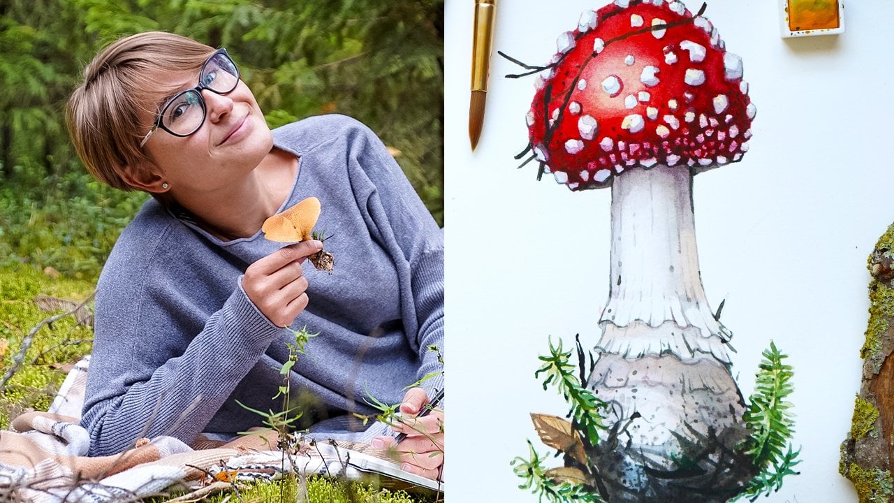
1. Welcome to the Class!: Hi, I'm Anastasia. I'm a watercolor artist, travel sketcher, and creator
of Travel sketching Academy. My signature course for
everyone who wants to capture their travel adventures
or daily life on paper. I paint everything that inspires me from everyday moments, architecture, landscapes, nature, human beings
and portraits. When I visit a place, one of my favorite things is
to see how people live. Getting a sneak peek
into their life, their traditions, what
they wear, how they speak. And one of my favorite places for observing people is markets. I love wandering
the narrow alleys filled with exotic
fruits and vegetables, getting carried away by
the sounds and smells. It's also a great way to observe people without
getting noticed, since vendors are usually busy with customers and just
minding their own business. That's when I take lots of reference pictures while
staying unnoticed. I often get asked, how do you sketch a person? People move, constantly
change positions, and sometimes even walk
away if they feel observed. How do you actually capture
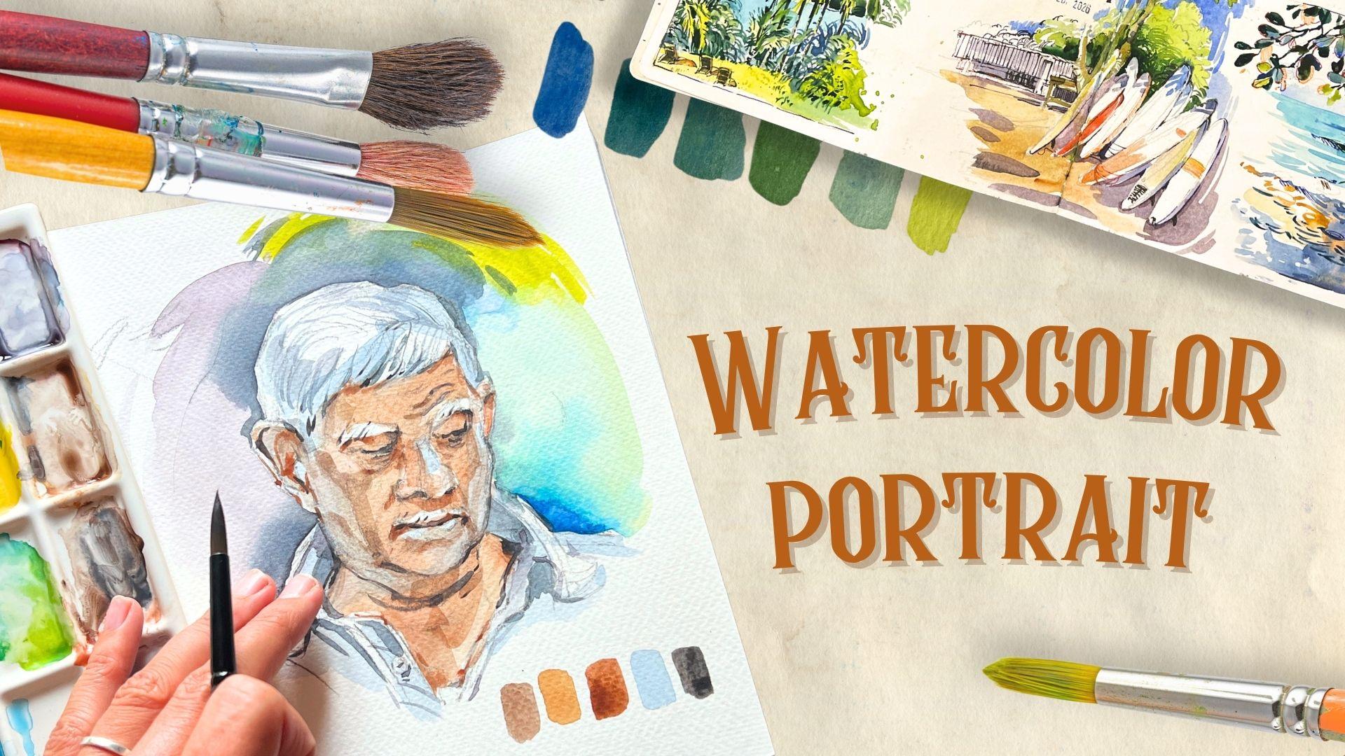
a portrait on paper? That's exactly why I created this intermediate class
to show you how to approach portraits with
confidence and zero overwhelm. Go ahead and tell you about
the method we'll use. We will work from a
reference picture. This is my secret to create realistic and
expressive portraits. In this class, I'll
walk you through every step of the process from
choosing a good reference to creating a pencil
sketch completely from scratch and bringing it
to life using watercolor. You will learn how to
capture the proportions of a human face realistically,
express emotions, mix natural looking skin tones, and add an expressive background that complements
the whole painting. Human beings and portraits
are complex subjects I consider this class to be more suitable to intermediate
and advanced students. That said, if you feel that your current level
is a bit lower, I still recommend coming
and taking a look. With enough ambition, patience, and dedication,
everything is possible. By the end of this
class, you will have a solid understanding of the algorithm behind creating a realistic watercolor portrait. Are you excited to start? I am, so I will see
you inside the class.
2. Art Supplies: Hi, and welcome to
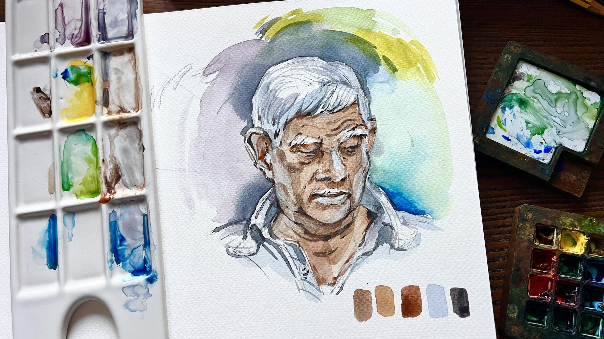
this first lesson of our portrait course. I'm so excited to show you the final painting we will
create in these lessons. So hope you're excited. I'm really excited.
And in this lesson, I'm going to show you
what art supplies we will need to create this
watercolor portrait, and you will see we
really don't need a lot. So let me start with the paper since I
have my paper here, you can use Canson
Excel paper block or Fabriano paper block. Um, I actually use
those one or another. I have my fabriano block here. This is for watercolor.
This is quite important. The thickness of this
paper is 300 grams. You see it's a four format, so it's 21 by 29.7 centimeters. This is a 25% cotton paper, but you can also use
cellulose paper. This is what I have here. I also use a similar block by Canson and it's similar quality, feel free to pick something you have available in your area. As you can see, this
paper has a little bit of texture and it's quite thick, it's perfect for
watercolor painting. Then before we actually
start to paint the portrait, we will need to make a
pencil sketch first. This is why we will
need a pencil. Any brand will work just fine. I will use a B pencil, so it's a soft pencil. You will need an
eraser if you want to sharpen your pencil,
but nothing fancy, just a normal um
pencil sharpener, sorry, not eraser.
Pencil sharpener. We will also need an eraser. I highly recommend you using this kneadable or
kneaded eraser. This is how it looks like
when it's brand new, it goes in this square
format and it's really soft. You can shape it how you want. When you use it, it becomes more
something like this. You see mine is a
little bit dirty and you can shape
it in a roll in a circle and it's a very handy
way of how to gently erase pencil from your paper and
also really nice way of taking off the excess of
pencil before painting. If you don't have
an eatable eraser, feel free to use
your normal eraser. It's just that I find this eraser much better for
watercolor painting again, because it's just
more gentle on paper. Then talking about watercolor, we will need some
watercolors, of course. For watercolors, I use
watercolors in tubes. This is my current set. It's by St. Nodier. It's a French brand, and it goes with this
metallic metal box. You see, I have
other watercolors here from other
brands, by the way, um but yeah, any professional watercolor
brand will work just fine. I often use white Knights, Windsor Newton, Daniel Smith. I have some tubes here. But again, my main set
right now is by Sinier, but any professional or at least student grade watercolor
will work fine. Why Watercolor in tubes
and not in pants? This is my personal preference. You can absolutely use
watercolors in pants. The reason why I use watercolors
in tubes is that I have this travel sketching
palette that I use both in my studio
and while traveling. When you purchase a
palette like this, it comes with empty pans. I need to fill it
with my own colors, which is actually
amazing because I can build my own custom palette. This is just what I use
and the only way of filling those pans with
my colors is to use watercolors from
tubes because I can easily squeeze some color there. But otherwise, the quality of watercolor in tubes or in
pants is really similar. You will need water in any case, feel free to use what you have. This is the reason why
I use watercolor in tubes again because I
use this travel palette. You can see it's really
convenient to travel with. It's really small comparing to my full size set and it's
much more lightweight, it's significantly lighter
than my full studio set. I use this in my studio and
use this during my trips. As for the colors, we really don't need a lot of colors for today's tutorial. We will need some colors
for the skin tones. We will need some colors for
this colorful background. In terms of skin tones, I will name the colors we will be using right now.
But don't worry. I'm also going to be repeating all of this during
the painting process. So if you miss something
now, no problem. Um, and if you don't have
something I will be mentioning, no worries as well because
during the painting process, I'll also name a
few alternatives, and you can always mix something similar from what
you already have. For the skin tones, we will need some browns. For browns, we will need sepia, we will need raw sienna, and we will need burnt sienna. If you don't have those, again, you can mix something similar
using different colors. We will need a blue. I have ultramarine. You can also use cobalt or
any other blue you have. We will need yellow, we will need cadmium
yellow for the background, and we will also
need something red. I will be using carmine. Carmine is a color I used for
the background here. Yeah. Let me name those again, sepia, raw sienna, burn sienna, cobalt or ultramarine
and yellow and carmine. These are six must have
colors and then optionally, you can pick another blue. For example, I have something
like turquoise blue here, or maybe I use the same
cobalt, don't really remember, but anyways, if you have another blue,
that's going to be a bonus. Then if you want to here, I used no black paint at all to paint all
of these details. I mixed two colors to
obtain this purple color. But if you want an even
simpler more easy way to create this color, you can use Panes gray. I don't think I mentioned
this color in the tutorial, but in any case, Panes gray is a really
great color to have in your watercolor
set. Very convenient. Yeah, all we need
today is just six of these must have colors
and the others are optional. Talking about painting, we
need some brushes, of course. I suggest you having
at least two brushes, one big to medium, and one medium to
small to medium. Inside the tutorial, I think my biggest brush was 12 or 14, and the smallest brush
I used was four or six. But if you don't have those
exact numbers, don't worry. You can use, again,
sees what I have here, one big and one small brush. Those are going to be okay
and enough for everything. The important thing
that your brush should be round and have a pointy tip. You see it's a round brush. It's not a flat brush. And it has this
pointy tip. See that? This is the only requirement. I use these synthetic brushes from my own brush set created in collaboration
with craft tamo. But again, any other brand
will work just fine as far as you have this round brush with
a pointy tip of two sizes, one big and one small. Then I spoke about
the palette already, but this is what I
use in my studio, and this is what I'm going
to use for today's demo. It's a porcelain palette. This one is from Zara Home, but I think this
collection is sold out. But you can just use a simple ceramic or
porceonal plate instead. Um, or another option, you can use a lid of
your watercolor set. This is what I also use. This is just for the
sake of showing you all the colors I'm
going to be using. Again, for my travels, I use this palette here, but as you can see, the
size is a little bit small. For studio work, I usually prefer using a full
sized palette. And this is probably it. You will need glass with water. You will need some napkins, paper towels,
napkins, some paper. This is always handy to
have nearby when you paint, and this is basically it. I will see you in the
next video where we will start to create this portrait from scratch. I
will see you there.
3. How to Choose a Reference: Hi, and welcome to this video. I'm Anastasia, and
today I want to show you something that is
really dear to me, which is how to
transform pictures that are maybe not perfect or
complex into simple sketches. For example, I have this picture
here I took at a market, and there's lots of
things going on here. And if I had to sketch
this whole picture, that would be a
little bit confusing, and I don't even like some
of the elements here. But what really captured
my attention in what I was actually
photographing on this picture is this man. So I think he looks really cool. So I really love the expression, and I think this portrait here will make a
beautiful sketch. So what I take out of
a picture like this. So this is my trick.
This is what I see, but this is not what I take. This is not what I will sketch. And this is what I
would actually sketch. So only this part of that
picture, only the portrait. So this will take me much less
time than the whole scene. And then I think it's just
visually more interesting, because this is
exactly what captured my attention on this picture. So let me show you exactly how I go about starting
a quick portrait. So first, I kind of
frame the portrait, exactly how I want it to be so exactly what
I want to take. This is what I want
to take. From here, I'm taking my paper. I'm using Kanson paper. Here, it's watercolor paper. You can use any watercolor
paper you want. And the first thing I do when I start a portrait is I decide
how big it's going to be. So if I don't have
a lot of time, I usually don't
do big portraits. I'm going to make
a small portrait, and this is about the size I
will use for the portrait. So human head has
this oval shape. So this is exactly what I start my sketch with with
a simple oval. Uh, so this tutorial is
probably not for the very, very beginners because human
beings are more complex than nature animals
or still lives. Because, again, proportions
are really important here because with, for example, a mushroom or a plant, if you put something,
like, for example, a branch in the other place
or if you make less gills, then on the picture,
it's not a big deal. But if you place the
eyes incorrectly or if you make a nose too
big, it's going to be funny. So that's why if you're a complete beginner and you will see that it's a
little bit more advanced, you can go and watch my
other tutorials first.
4. Building Structural Guiding Lines: So this is what I
start with. That said. Then next stop, I usually
next step I usually do is I add a middle
line to the face. So in this case, I see that the man is facing is
looking there to the right. So I will add this kind of curved line that will visually allow me to understand
where the man is facing. So this is the line that will help you to place
the middle of the face. So the middle of the nose, of the mouth of the eyes because human
face is symmetrical, so I need to know
where the center is. From there, I'm going to start to outline
the shoulder line. So this is what I
usually like doing, and it allows me to understand, you know, where the neck is going to be, where
the shoulders are. So around here, from there, I can connect it with the head. I see this man has this chin. So I'm going to add
it somewhere here. And then what I usually
like is to give my eyes as much visual references as
possible. What I mean by this? I need some guiding lines
in order to understand the proportions if I'm placing
the proportions correctly. So one of these guiding lines
for me is this the shirt, the backside of the shirt. So I'm going to add it here, and this shirt is going to help me to understand if
everything is correct. So I'm drawing the shirt. Something like this.
So very sketchy. See, it's a sketch, so I'm not
trying to make it perfect. There you go,
something like this. And from here, I can then
define the rest better. For example, now, what I
can do is I can see what is the distance between
the shirt and the ear? It's something like
this. So the ear is going to be about here. Then since ears are symmetrical, I know that both ears
will be on the same line. So I'm going to add
this line here. That is going to help me to understand where the
second ear is going to be. The second ear is a little
bit hidden behind the face. So you see we just see
a little bit of it. But this line is still very
helpful to position that ear. Then I will need to position
other important elements. For example, the
head is too small, right now, I can
definitely see it, so I'm going to make
it slightly bigger. And it's not exactly a circle. I see the top portion
of the head is quite it's almost flat. So I'm going to add
this curved line there. And you see now our head starts to look more like a head,
not something abstract.
5. Mapping Features & Proportions: Now, very important
thing. You see, we are keeping identifying the
main elements of the face. Right now, what usually
really helps me is to understand where the
hair is going to finish. This is going to help me to place the face
features correctly. I see that there is this the hair line ends
somewhere here, then we have the ear. The hair ends somewhere here. And from here, I can
understand where the eyebrows and
the eyes will be. Usually the eyebrows are
about on the same level, a little bit below the ears. You can understand those
things just by observing them. And then I'm placing these lines for placing the eyebrows. Somewhere here. I'm not going to draw you see I'm
not drawing any of these face features
in detail just yet. I'm just placing the guiding lines to show where they are, and then later, I'm going to
draw them in more detail. I'm also going to draw
these kind of lines, the central lines for the eyes. So they're going
to be around here, and then I'm going
to outline the nose. So for the nose, I
usually draw a triangle I add a circle like that will
show the tip of the nose. And for now, that's it. I'm not going to
draw anything else. I'm going to outline the mouth where I think the
mouth is. So somewhere here. See right now, I'm not
giving any details. I'm just trying to figure out where those face features are, where the noses, where the
eyes are, all of that. By the way, for the eyes, I see the eyes are kind of shut. Like we don't just see a
very little bit of the eyes. So with this
horizontal line I've outlined where the eyes
are going to be then what usually helps me a
lot is also to place these circles on
the cheek bones. So this is the middle
of the cheek bone, and it's a really important
element in humans face. So I usually like
to identify them. And from this cheekbone, I can see there's this division between
where the light hits. So the left side of the face is lighter than the right side because the light
comes maybe from here, from the top left corner. So all of this side is
going to be lighter. And usually this
division happens here. So the cheekbone is going to be the separation between
the light and the shadow.
6. Approach to Detailing: Let's identify the chin better. So the chin is also round. We can show it with
an oval for now. And then you see right
now this person doesn't look there's not
much details yet. So right now, what is the
typical thing about this man? So he has this kind of double chin, so
I'm going to do this. And I'm just trying to capture the features
of the neck right now. Then he has a mustache that
I think is really cool. So I'm just outlining
the nose a little bit better and then
for the mustache, I'm going to start
to place it here. He's smiling. I'm outlining this smile
when a person smiles, we have these smile
lines that appear, so I'm going to draw those. And this is usually when I start to check if
the proportions are right, if the person is turning
out like a person. And usually this
is where I try to give some typical
details to this person. For example, I see the
ear was too small, too kind of small, yeah. So I made it bigger, and I'm starting to outline
those details of the ear. Then, I feel like the forehead
is too small right now. So since my eyebrows are here, I don't have enough space for the forehead
and the wrinkles, so I'm going to erase this and move the hair line slightly. So when you create a portrait, it's all about comparison. So you did one thing,
and then you compare. You see, Oh, now the
forehead is too short. I'm going to make
it bigger. So it's not like you did a perfect
eye or a perfect ear, and you're attaching
everything else to it. It's a research. You're kind of switching
from one part to another. So once I have the forehead, then another thing I
also like doing is, I think I need to add
more hair to this man. So more hair. And I like to outline the
right kind of contour, the right outline of the face. So the eyebrow, this is the eye, this is the cheekbone. It's going to be a
little bit bumpy. So naturally, a cheekbone is kind of there's a
bone there, right? So this is exactly
how I'm showing it, and then it's going
to be straight here, and then I have the
the chin and so on. So right now, I can start
outlining the lips, the nose. So see I'm working on
everything at the same time. I'm kind of working
on one element, then switching to another and seeing if they
look good to me. So if I need to erase something, of course, I go and I erase. And at a certain point, I need to make some of the
features really recognizable. So right now, I'm going to add some of this hair here as well. Again, I don't think
there was enough. And the capturing the direction of the hair is also an
important thing to do. So you see, I've kind of created
those strokes like this. It's the same when you draw fur, like fur on the animal. It's kind of the same what
I did here with the hair. There you go. Again, if I want, I
erase and you see, don't use any kind
of single lines. So I use short, small lines to again, to kind of make this research. So I don't take
anything for granted. It's not like I put
one line. This is it. I put one line, but
it doesn't mean that I cannot erase
it or move it. If I see that, it's not
in the right place. So something like this. And
then usually what helps me to really see if I'm going in the right
direction or not, it's placing the eyes. I usually place the
eyes at the end just because you will place them incorrectly if you don't
place everything else before. So before placing the eyes, I add everything else.
7. Capturing Character & Emotion: Then if I want to, if I add
some kind of emotion there, I'm going to add those
little wrinkles. What is really,
really cool about this reference picture is that this man is
really expressive, especially, I like drawing and painting faces that
are not that young. So I feel like painting
an older person is just easier than
painting a young person. This is, again, my opinion, but I think older faces
are really interesting to paint from the artistic point of view because we
have the wrinkles. We have, you know, like, the shape is more interesting, and artistically speaking, there's more material
to work with. So this is why I personally, you know, like to meet these
kind of characters and, um the markets or I like to
notice interesting faces, because I know they will be interesting for
drawing or painting. So to me, personally, like, the standard beauty is not that interesting to draw or paint. So yeah, there you go. This is another eyebrow. You see the switching again
from one thing to another, from one eyebrow to another. And now you see I'm
adding the eyelids, so this is where the eyes
will start to look like eyes. I'm adding some wrinkles
in the eyes as well. Um, so I'm getting more
details to the beard. And probably the eye is too big, so I need to see if I want to make it a
little bit smaller. Also, one more tip I want to give you is that
sometimes you get tired from one element. For example, now, I've got a little bit tired from the eyes. I think I want to switch
to the nose and give some details to the nose
before switching to the eyes. You see, I gave the nose this
more kind of typical shape. Sometimes I even
like to exaggerate the some features, for
example, the nose. There you go, or making
the eyes slightly bigger. There you go,
something like this. Then I see there are also
some wrinkles from the mouth. I'm also going to draw those. I'm outlining some of the
neck a little bit better. And this shirt that goes
behind, something like this. And then, again, I switch
from the face to the shirt. Again, if you got a little
bit tired of the face, you can go there and focus, for example, on clothes. This is what I'm
doing right now.
8. Finalizing Your Pencil Sketch: Now, I've switched to adding
some details to the shirt. So sometimes we really
need to switch off and our eye needs to get some rest because
capturing proportions, capturing all of these
things is quite demanding, so we need to really focus. So our eye needs to rest from
this complicated activity. So sometimes you need to switch to something
easier, for example, a shirt or something else and then get back to the face
with a fresher look. So for example, now, when
I got back to the face, I see that my ear it
is kind of too small, so I'm going to make it longer. So I see it's not
it's not long enough. It's really good when
you switch back and then you see your kind of
mistakes in perfections. Again, it's not about creating something perfect.
Absolutely not. It's just about, you know, trying to capture things better. So I think this is better. And I think I'm getting quite satisfied with
how this is turning out. I think I need to work
a little bit more on this right part of the face and make it just a
little bit kind of whiter. I think this is what's wrong. So I think the face should
be a little bit whideter. And this is why I will
also move the ear. So see I'm always moving things. I'm going to move the ear. Make sure I have enough
space for everything. For example, now I see
that there should be more space between the hair
and the eye, the eyebrow. So see all of these proportions, it's not like they're locked in. It's something that
you will move. And now also I see
that the ear needs to be moved towards the
left side even more. So it's always about comparing
things. There you go. Now, I think it looks better. Some details of the ear. And then the head should
be even bigger, I think. So going to raise this slightly and make sure
the There you go. I think I'm more satisfied
with this kind of shape. All right. Kind of restore
the texture of the hair. This is something
we will also do with watercolor
in my next video. So bear with me. Wait for the Part two to
actually paint this face. Today, we're going to
complete the drawing. And I think we're really
close to getting there. So I'm going to refined some
of those elements like hair, make sure the wrinkles
are in place. Eyelids. Why I also like kable
erasers, that you see, I can shape it in and create a pointy tip and use it to erase those smaller details. This is why I love kable
erasers. Kaded or kable. Just some more details
near the eyes, and then some of this
shadow under the eyes. I think this is also
quite important. All right. So I think we're getting to
a pretty good stage now. Maybe I'm going to
move the chin a little bit lower as well. So you see again, I'm erasing if I want to move something. But you see I'm not just
erasing and starting over. I'm just moving that
line a little bit lower. So it's not that I'm starting
from zero every time. I'm using the line that was
there previously as a base, and I'm kind of moving it. So just slightly changing
the shape of the chin. And I think now it looks better. So I think our man
starts to look good. Okay. And you see I've kind of intentionally made the
nose a little bit bigger because I mentioned I
just love exaggerating some features I like even more. So I'm going to keep it. And then still, it's a sketch. So we're getting to quite
of a detailed drawing here. And everything depends on
how much time you have, but with portraits, I really
don't like to rush myself. And if I'm making a portrait, I'd rather prefer have different several
sessions instead of trying to squeeze
everything in one. So let's say today I only
have like 15 minutes or 20 minutes or 30 minutes,
and I only did this. This is good. I'm going
to continue the next day. So with portraits, I really
like to take my time and without getting obsessed about, you know, the drawing, I just like to enjoy the
process and be satisfied with the pencil drawing
because if I'm not satisfied with the
pencil drawing and I'm starting to paint, and I hope that painting will solve the problems
of the drawing, this is never going to happen. So with painting with
drawing and painting, if something looks confusing
to you on your drawing, it's going to look confusing on your final painting as well. And it can be forgiving
if you're drawing, again, a vegetable or
a plant or a mushroom. Not a big deal, but
if it's a person, all of these mistakes will contribute to the final result and will make it less good. That's why personally,
I like to spend a little bit more time
on my drawings when it, um when it comes to people, when it comes to
sketching people. Okay, so I think
now I really got something that I like. Alright. And I think this is
probably where I will stop with the
drawing phase. If you want to, if your
lines are too bold, you can optionally lift off some of the excess with
your kneadable Eeaser. This is another um another
reason why I like it. See, I my lines are too bold
and I think it's disturbing, I can go there and
take away some of this graphite with
my table eraser without erasing
everything completely. So see I can still see the face, can still see the drawing,
but my lines are less bold. But generally, if I'm sketching, like I still consider
this a sketch, I don't care that lines
show through my painting. So I will stop here.
9. Mixing Skin Tones: So let's dive right in. I'm going to show you my
set, my watercolor set. I use this travel color palette. This is where I store my colors, and in order to fill color
this palette with colors, I use watercolors in tubes. My current set is from Sanier. I really like it. You can use any professional brand you want. In order to fill my
palette with colors, I just need to squeeze some colors from the tube
and it's good to go. So this color I've
squeezed now is sepia. This is one of the main
colors we will be using today on top of some other
earthy kind of brown tones. So we will need raw sienna
and maybe burnt sienna. So before we sketch
the portrait, I would like to do some
swatches and try to find a good match for the
skin tone of this man. So I see the skin of
this man is quite dark, so I definitely want
to capture the color. And I'm going to
usually what I do for skin is that I like to
create three tones. So lights, mid
tones, and shadows. By doing this, I'm allowing myself
basically to have all the colors I need
to paint the skin. And instead of going every
time and mixing a new color, I already know what I will
be adding to the mixes, and if I finish the mix, I
can easily recreate it again. So that said. Let's mix
the lightest mix first. I usually like to start
with lightest mixes first. So I'm just adding some
raw sienna to my palate. This is raw sienna, and it looks quite yellowish. I want to add some
burnt sienna to it. And this will if I need to make the color
lighter, I add some water. And this is probably the color This is one of the colors I'm
going to be using. So this is my light brown color. This is going to be the
lightest tones of the face. Then if I want to
create a darker tone, so mid tone, I'm going to
use the same exact colors. So raw sienna plus
burned sienna. But this time, I will
add more burned sienna, and I will also add
a touch of sepia. So Sepia is a dark brown color. And you see it allowed me to create this darker brown color. And actually,
that's probably it. I'm not going to create
a third color now. I can mix it later because these two colors are
enough to start. And now I'm also going
to show you one trick. This is something I
love using and I feel like it's so effective
for portraits. I like to create
this reflex tone. What is a reflex? It's
a reflected light. We said that the light comes
light from the left side, and I see these kind of blue
reflections on the cheek, on the slower side of
the cheek of the man. And this blue will work super nicely with
these warm browns. This will create a
really nice contrast. It will give our face a much more three D effect and a much more interesting
and alive look. This is something I do
often in my portraits. So for our light blue, I'm just going to
go really simple. I'm going to use some
cobalt or ultramarine, mix it with water, and
that's basically it. I want to make sure
it's not too vibrant, so I don't want it to be
like a crazy blue color, just a light blue. And if I want to make
it even more neutral, I can add just a little touch
of sepia to it and make it, like, a little bit
slightly grayish. So just a little point
of that sepia is enough, and this is the color
I came up with.
10. First Wash & Establishing Light: So in this case, I usually
start with that exact blue. So I'm going to start with the left side of the face because this is where I see those blue reflections. And what I do usually is such a scrab and go
and start to paint. That part right
away, even the ear and even some of
the hair, the hair. I'm just going to leave
some of this white here, and I'm also going to
add this blue there to the right side of the hair. So this blue has two functions. It allows me to put some shadows and to also put this kind of
blue reflection in place. I also see this reflection on the right side of the cheek. I see some of it
here on the nose, on the lips and on the chin. And I will leave the left side of the chain untouched for now. Also going to use
it for the shirt. So I see some of these blue reflections on the
shirt as well. So I'm just going to go there
and add them to the shirt. So see this way, I'm not
only painting the portrait, I'm also starting to
paint these surroundings, and it basically allows me to treat the whole
sketch as a whole, not only as a head with a shirt. So I think it's quite
important. There you go. And you see, just by
adding this one tone, we instantly gave you see kind of a three D
appearance to our portrait. Then without waiting too much, I'm going to switch to
our light brown color, and I will integrate it
with the rest of the face. So what I mean is that I want this light brown to kind
of blend with the blue. So that's why I'm
going there right now. And while the blue is still wet, I'm introducing this new color. You see I'm not caring
that much about the face features now and
painting the face features. What I'm doing, though,
is I'm avoiding the eyebrows because
I see the light. Like the man has gray hair, so the eyebrows are also gray. So they're
significantly lighter, so you see I'm not
painting them on purpose. But I do paint under the eye. I do paint the skin. I just avoid some of the
elements, such as eyebrows. I'm going to paint
this under eye area. Oops, accidentally grab
some of my darker color, but it doesn't really matter. And see here, for example, my blue got already dry, but it's not a big deal.
I'm just going to continue. And if I want this line
to be softer later, I can always go and blend
it a little bit better. But for now, I
don't really care. I'm just going to go and
cover this these parts, this and also the chin. And then I'm going to use
this same color to paint the um the neck and
part of the chest. Something like this. I'm actually quite
happy with how this first step is turning out. I'm going to add some of this
color to the ear as well. See, I've even gave some details to the ear,
even at this point. So I love adding some
details on my way. So I see, for
example, I just added this darker element there. I'm going to add some dark here. So I just feel like when
you start to add lights, midtones and shadows
at the same time, it starts to make your
portrait look three D, and it kind of guides
you during this process. So I will stop here, though, with my lightest brown, and I will switch to
the dark or brown, even though I already
did it in some areas. So for the dark or brown, I'm going to paint this
shadow under the nose. I'm going to paint the eyes, just going there
and I'm making sure the eyelids are lighter though, because
this is what I see. And this area near the
nose is quite dark. I am going to add some shadows there and
under the eye as well. This whole left side of
the nose is also dark, so I'm going to go
there and add it. And just painted gave
the nose a certain, some color, but not
covering it completely. Then I'm going to take the
brown color again and start to outline those shadows in the mouth and some of
those shadows on the neck. And near the hair. So
you see I'm adding the same color in different
parts of my sketch. So this again, allows me
to make the sketch look more united and make
these different parts of the face and the shirt
belong together. This is very important. Um, going to add some of this dark brown he
under the eyebrows. And then we will add even
more shadow near the nose, but later with a
different color. For now, I'm just going
to paint the lips, the mouth opening
that is quite dark. Then I have this shadow near
the chin, I've also painted. And I'm going to outline
just a little bit of this. Actually, I'm going to outline this whole underchin kind
of area with this color. And this part of
the chest as well. By adding this color to several areas of
our painting allows me to really keep it
united and harmonious. I'm going to cover that
right side of the ear and maybe even paint
inside the ear. All right, you see,
I'm just using the same brush for
everything for now. So this, I think is a really nice base
for us to work with. Now, what I'm going to do is I'm just going
to quickly create a new color by using the
same mid tone I was using, just diluting it with water and then adding
some sepia to it. And I'm going to get this
kind of medium brown color. That is a little bit more gray. You see, it's more gray than this previous color we've used. I'm going to use this color to add some darker
details to the face. For example, this
right portion of the face going to use it for the wrinkles. I'm just going to
use it here as well. If I want to correct something, just go with my paper towel and kind of take away the color I want to take away some of this area under the mouth and this
area under the chin. This is not the darkest
color we will use. There you go. I've also added it to the
lower portion of the face. But you see, I'm
still leaving some of that highlight
completely untouched. Some of that blue highlight.
Um, there you go.
11. Creating an Expressive Background: And what I also like to do. So this is just a personal
thing I like doing is to add, like, a background
to this portrait. For this purpose, I'm going
to take my big brush, like the biggest brush I have. A mop brush, and I'm
going to create a color. I'm not sure what kind of
background I want to give. So I see some of these colorful bags or
something on the background. So I think I want to
add kind of a splash of color there
because otherwise, our portrait is just composed
of grays and browns. So I want to give those
this splash of color there. So I'm going to
mix yellow color. I'm going to mix this
kind of a turquoise color by combining blue
and yellow again. So that's kind of a
bright green color. And then I'm going to use
something like pure blue. Those are just the colors
I see on the reference. I think those will give us a really nice kind of contrast. So as a first thing, well, I can go there and
erase those arrows. I've added to demonstrate
you some things. So I'm just going to
erase those a little bit. And then what I will
do is I will take my big brush and
load it with water. So it's completely
loaded with water. And I'm going to
create certain like kind of a color before,
so something purple. So I see that the wall behind
the man is kind of purple. So I'm going to use
some carmine and blue, and I will obtain
this purple color. So this is what I'm
going to use as a base. So I'm going to load my
brush with this color. If you want, you can
also kind of mix it in a separate like in a little thing like this so that you have a
lot of this color in order for you to not
remix it while painting. And then I'm going to start
just to apply this color. You see, with a big brush, it's super, super easy. It's going to be really quick. And I personally love to give some kind of these round
strokes to my sketches. So this is what I'm going
to use to frame my sketch. On the right side, I'm going to use
some of this blue just to make it a little
bit more interesting. And then I'm going to
grab more of this blue, and I'm going to add this blue here because I see there's, like, a blue bag or
something showing through. So I think a touch of
color would be really fun. And then I wanted to add
some yellow and green. I'm washing my brush, drying it, and then just going there
and adding some of this. Green, I want to add some swirl. So things like
this, this is what I love adding to my sketches. You see it kind of
blends with the purple, so I think it looks really nice. And then something
the same with yellow. I'm going to introduce
some yellow there and just make it blend. And again, create a few swirls. So this is what I usually
like doing with my sketches. And you see this? I think I instantly made our
portrait look more alive. I'm going to go here
and make this color, kind of activate
this color again. And maybe add even more water and do something like this. This, I think is enough for me. I think I want to add
something darker here, so I'm going to use that
same purple I've used. But in its darker version, so I'm mixing it again, carmine with water with blue. And I've actually obtained something more blue than purple, but it doesn't really matter. So to me, those backgrounds are I wanted something
expressive there, and I think I definitely got it. So something like this
is looking good to me. I think I'm also going to add
this dark behind the head. I feel like when you
have this dark contrast, because the head, you
see it's white, right? So the man has gray hair. If I want to make
the hand stand out, I usually add
something dark behind. Again, I think maybe some
swirls and things like this. I'm going to use
the same color to underline some of this
outline of the face. For example, the ear, the hair, something like this, just to make it belong
with the background. Um See, it's completely
like I'm changing things, I'm adding more strokes, but there's no one
way of doing it. So usually in these
cases, what I like doing, I like to relax because
if you start to overthink this process of
painting the background, it gets really stressful and you are afraid of making a move. You're afraid of every
single stroke you're doing, and you're afraid it's going
to make portrait look bad. So I went through this, and it's not a really
nice feeling because when you do this out of fear,
nothing good happens. So I just learned that when
I add those backgrounds, I just want to be
completely relaxed and the more relaxed I am,
the better the result is. So you see now I'm adding those details to
the shirt because again, I want all of this
belong together. I don't want to paint the face plus the
background, plus the shirt. I want it all to look
like one portrait. So again, reusing the
same colors across several areas of my portrait
is really important. So this is what I'm doing now. And you see I'm kind
of switching between the body of my brush and the
tip of my brush to do so. And I'm using a huge brush, see, you can also do
these things with a big brush as far as
it has a pointy tip. Now I'm going to
add just some of this dark color to the
hair, but not that much. I think this is actually enough. Um, and to the ear, maybe to this lower
portion of the neck. So right now, what I'm doing is I'm adding the darkest details. I'm now adding the shadows. So the shadows are what will
bring our portrait to life. This is what will allow
it really to stand out. So at this point, I think I'm done
with the background. I think I'm satisfied
with how it turned out.
12. Adding a Unifying Wash: And I'm going to focus
on the portrait again. So I've switched to
a smaller brush. This is number 12 now. This one was like number 20 or something. I don't
know what number is this. But, yeah. Those are from my brush set created in collaboration
with raft Tamo by the way. These sets are
currently sold out, but if you want to
get those brushes, this set contains eight brushes plus so eight brushes in total, two of them are travel brushes. They look like this,
like little bullets. And then when you open them, it becomes a full size brush. There's number ten and
number four inside this set, and this is what I usually
use while traveling. And the other brushes are
perfect for studio work. So just in case you would
like to check those out, and, you know, if you want this set, I suggest you to leave
your email in the box, like subscribe to
the waiting list. There you go. And you will get a notification when the sets
will be available again. So There you go. Just added some shadow to
the backside of the shirt. Again, I want to concentrate most of the highlights
on the foreground. This is a general rule. So you see kind of I'm kind of hiding the highlights that are on the back in
order for us to, like, to not make them
interfere with the foreground. Adding some details
to the shirt. I'm not going to
add a whole lot of details to it, just some. And I'm going to use the
same color for the hair. So for the hair, also, I just want to add a few of these strokes using
a similar movement, kind of a similar
approach that we used here to create the drawing. So kind of these wavy lines. And then I don't
want to add a lot because I see the hair is gray, so I want to preserve
that white of the hair. Again, what we're creating
here is we're adding those details like we're creating these whites
without any white paint. This is a very, really cool
thing about watercolor. So we're using the natural
quality of watercolor. See in watercolor, we
don't use white paint. We use the white of
the paper instead. So by just painting
around the subjects. There you go. Now, I'm using the same dark kind of brown I, What is this, dark gray,
dark purple color. And this is going to be my
darkest tone on the face. So since my face is quite brown, so I have lots of
browns on the face, I think it's going to be
good to add something cool. Like, you see this color
is quite cold, quite cool. So it has this blue undertone. And this color is going to look nice on the face and create nice contrast with
the warm browns. So now I'm working
with the tip of my brush because I'm adding
the details to the face. So obviously, I want to be
a little bit more careful now and just keep
adding these details. So the eye holes, the wrinkles. Some shadow under the nose. This is also quite
important here, the nostrils, the nose hole, and the mouth opening. Some of the color
there is still wet, so I will need to wait a
little bit until I can add those final
details everywhere. But for now, I'm just going
to use that same color to create the outline of the
face a little bit better. And just adding a little
bit more of this dark gray to the hair. Okay. What I think I'm going
to do now is I feel like a lot of the details on the face are kind of
separate from one another. So I want to unite the
face just a little bit and give it an
even darker tone. So I'm going to use
my burnt sienna, I already have on my palette. I diluted it with water
to make it even lighter, and I'm going to go and add
this color to the whole face, except for the blue highlights and I'm gonna add
it everywhere else. And I'm also avoiding
the eyebrows. There you go. Even a little
bit on the highlights. So to kind of calm down
them a little bit. I feel like right now, you see, just by adding this tone there, the face look much more united and those
different elements kind of belong together. I'm also going to add this
tone to the whole under eye. And I really like how
this is turning out. So right now, I need the colors on the face
to get completely dry. And after this, I will be able
to add some final details.
13. Adding Final Details: So let's wait for this color to dry and mix the color
for the final details. It's going to be a mix of sepia. Mix of sepia. So let me free some space here.
Free up some space. So sepia and a little
touch of blue. So it's going to be a dark
kind of brown gray color. And I'm almost ready to
add these final details. So I will see which areas of
my drawing are already dry. So for example, the ear is dry, so I can add those
details to the ear. So this is the darkest
color we're using, and I want to be a
little bit careful with it because it's really dark and I want to make sure it adds
I use it as an accent, not as the main color. This color should really
underline all the work we just did with other colors without taking away and makes the sketch look too
busy or too overworked. I'm also adding this color
here in these shadow areas. And then finally, I'm especially interested in adding this
color near the eyes. So eye holds. I'm going to be a little
bit more careful here again because the eyes are
obviously really important. A little bit under the nose. Not too much, though. I think this was a
little bit too much. And then the mouth opening. H. Near the eyebrows, this is also the
moment where we can add some details
to the eyebrows. Just a little bits. I'm
just adding a few lines, a few strokes to kind
of imitate the beard or the eyebrows,
but not that much. Again, with hair and
such details like this, we don't want to over
add. So this is more. If you want to add more,
you can always add more, but I like to go
gradually and just adding more details here. Now I'm lifting some of the
paint from that left side. Some of this color on the
left side to get back some of this reflex that I think was
a little bit missing there. This is almost it, I think. I'm going to add some of
this dark brown under the chin a little bit
more here where I see some of these wrinkles from the mouth and from the nose. A little bit more under the eye, especially here on the left side because I see it's still light. I'm also going to use
this color to create these wrinkles in the eyes. And add even more of
these darker details here and accentuate
the nose even more. So I'm going to make sure I have these details
on the nose as well. Kind of make the outline of
the nose a little bit better. In some shadow here. Um Just some wrinkles on the nose and some
wrinkles on the forehead. I feel like they're
darker on the right side. I'm going to add them there. I think wrinkles always add lots of charm,
lots of character. I definitely want to add those and now I'm
adjusting the eyebrow. You see, I've kind of lifted
it a little bit because this is exactly how it
is on the picture. So make sure I'm keeping these typical
features of that man. Adding just a little
bit more shadow here. So this is the area where the cheek bone is
quite important. Add extra shadow there. And just going to underline the lip a bit better, a few details on the lip. That's probably it, honestly, so just a few details
here on the neck. And also maybe making this right portion of the
neck a little bit darker. Adding one more detail here. And I think I'm happy
with how this turned out.
14. Final Words: And there you have it. Congratulations. You've created your own watercolor portraits from start to finish. Share your results in the
project section of the class. I would love to see
your creations, and so would the community. If you found this
class valuable, please leave it a review. It will help me so much to
create more content like this. You want to stay in
touch, I'll share my contacts on screen with you. You can find me on Instagram, Facebook and YouTube, if you want to keep
learning from me, check out my other
Skillshare classes, or if you're ready to go deeper, pick a structured learning
program from my website. Thanks for watching and I
will see you next time.
 Natura Illustrata, Anastasiia - Watercolor artist