Transcripts
1. Welcome to the Class!: Thank thank you Hi, everyone. I'm astasia and I'm
a watercolor artist, traveler and nature lover. And in today's class, I want to show you how to paint a beautiful red eyed
frog that is on the cover on my book Capture the Natural
World in Watercolor published by Page
Street Publishing. So I just got this book
today, and I'm so, so, so excited to show you how to paint one of the
tutorials from the book. So inside, you will find
almost 40 tutorials, 39. Tutorials on how to paint
different natural subjects with watercolor with step
by step instructions. And today, I want
to paint together this tree frog with you. Today's class is
going to be perfect for beginners or
intermediates and basically for everyone who loves nature and wants to improve
their watercolor skills. We will need just a
basic supply kit. Actually, we don't need a lot of colors to paint today's frog. So I will be walking you through every single step of the process from how to make a pencil sketch to how
to start coloring it. I'm also going to provide you an alternative way on
how to directly transfer the drawing on your watercolor painting in case you want to skip the drawing part for
speeding up the process, or if you don't feel quite comfortable of sketching
yet, no problem. I will tell you how you can get the drawing directly
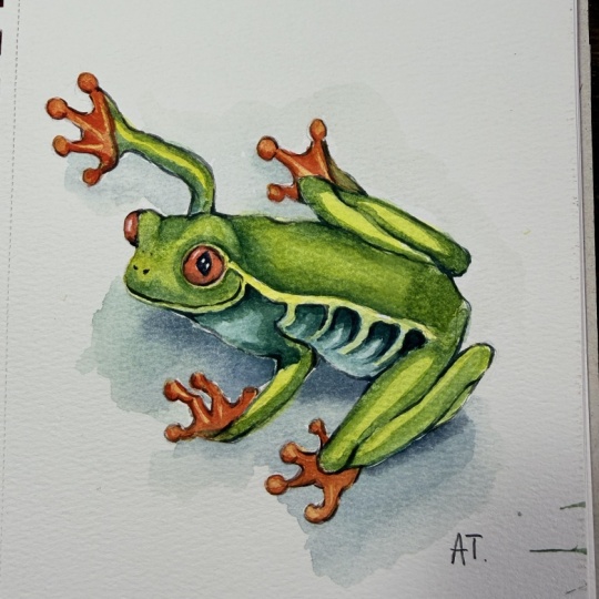
on paper quickly. This illustration was inspired by my trip in Costa
Rica this year, where I had a privilege of
seeing local flora and fauna. And it's just an
incredible country full of nature treasures, and I really want to
share it with you. So, of course, having
a book is amazing. You have all the steps here, all the color mixes, all the process explained
in great detail. But for those of you guys
who are more visual and want to learn with
a video tutorial, this class is perfect
for you and it will be a perfect match for those of you guys who already
got the book. So let's get started.
2. What You'll Learn: Hi, friends. Today,
we're painting this tree frog together
that is actually on the cover of my tutorial book Capture the Natural
World in Watercolor. That features 39
simple tutorials for painting animals,
botanicals, and more. I'm going to open the
page with the tutorial. So that you know
exactly what kind of steps we are going
to be making today. So this tutorial is from the first chapter of the book which is dedicated
to South American. So this book is a
visual trip through seven countries of our
beautiful seven continents of our beautiful planet. And we're starting
with South American. This is a picture of
the final tutorial. So the book is full of these pictures that you
can flip through and quickly choose which tutorials to engage with and which
ones inspire you the most. Personally, this was one of my favorite tutorials
from the book. That's why I'm showing
it to you today. And this is how
everything starts. So we have a material list
and all the steps explained. But for the visual
learners out here, today, I'm going to show you
these exact steps in real time through
a video tutorial. So you're going to see that
this process is going to be simple and smooth
and you will be able to complete this
beautiful frog painting. So I will see you
really soon to show you all the art supplies
that we will be using today.
3. Art Supplies: Let's talk about
the art supplies. So the first one is
a really simple one, and it's a regular
graphite pencil. So you can go from anything
between HB and two B. I think B is a perfect
option because it's not too soft but
not too hard, either. So I'm going to go with this. We will need an eraser. I love using a kneadable eraser that comes in these boxes, usually in this square form, and you can actually
shape it into any shape. I usually create a
little roll out of mine, and I will tell you exactly why in doing the drawing
part of this util. This is all we need for
creating the drawing. Now, when we will
pass to watercolor, of course, we will need colors. So you are free to
pick watercolors in tubes or
watercolors in pants. Let me show you the difference. So watercolor in pants
usually look like this. So these are little pants
filled with colors. I'm going to reveal
a secret, though, that the colors inside
are from tubes. So this is how the tubes
of watercolor look like. I'm going to say upfront that no matter if you purchase
tubes or pants, the quality of the watercolor
is usually quite similar. I'm going to tell
you why I use tubes. So because I use these
travel color palettes, so in the studio work
is not that important. In the studio, you can use just your regular
watercolor set, but I kind of got used to
using those for everything. So travel palette means you can close it and you
see it transformed into this little square so
that you can throw it in your bag and travel
with it easily. It's super lightweight,
and it contains 15 colors. I think 15, yes. And it's more than
enough for traveling. And this is how it looks
like when you open it, it's magnetic, so it kind
of holds in place easily. And then you can also clip it on your sketchbook
with a clip, again, if you want to use
it for travel sketching. But it's also really handy
for studio work as well. So the only thing you need to
know about these palettes, you can order one on Amazon
or any stores like Etsy. It comes empty with
empty pans, usually. So it means you need to fill
them with your own colors, which is actually amazing
because it allows you to create your own color palette
that is going to be unique to your needs with
only the colors you know you will be using. Honestly, I find it amazing. So this is how you feel
your palette really simple. You just take a
watercolor from tubes. I just recently got myself this beautiful
set from Santer. It's a French brand that
contains 12 colors and in tubes. In a studio setup, I sometimes use just the lid of my set if I want some
space for mixing colors. But during my trips, oftentimes I just use this
portion of the palette that is actually the place
for mixing colors. So if you don't feel
comfortable, though, you can just mix your colors
on the lid of your palette. Or get yourself a
separate palette. I'm going to show you
one I have in my studio. I don't travel with
this palette, though, because it's ceramic,
so it's quite fragile. I just use this for
my studio work. But again, you see, the area at your disposal is quite
similar that on this lid. So for traveling,
if you don't mind carrying more stuff and get
it a little bit more heavy, this is probably the most, you know, comfortable version. But if you got used
to the small one, to the small palette,
I oftentimes, again, travel only with
this little guy here. So how do you actually fill
your palettes with colors? So all you need is just
to open the tube and squeeze some color
in the palette, and it's ready to use. So this is probably
it. Today, we are going to use a
limited color palette, so we don't need
a lot of colors. We will need a yellow. You can use lemon yellow
or cadmium yellow, just a basic yellow that you probably already have in your set. This is
what we need today. We also need a green. I use color called green
from white Knights, but it's the same color as
sap green or hookers green, so just a basic green color. We will also need turquoise blue or emerald green for
this belly of the frog. But if you don't have
it, I will show you how you can mix
something similar. And we will need a red color. So for this frog, I would suggest you cadmium red. This is what we will use both for the eyes but
also for the feet. So you see the feet are
orange, but actually, you can obtain orange very easily by just combining
yellow and red. For the rest, we will
need something dark. So I usually don't carry black color in my
watercolor set. And today, I'm going
to show you what you can use instead. So for dark colors, I always recommend
having sepia and indigo. These are my two favorite
dark colors that mix together create
almost black colors. So that's why I'm
revealing you the secret. That's why I necessarily
carry black color with me. Or if you do want to
use ready mixed black, you can use Pains gray instead. It's not a pure black color. It's a much more
interesting subtle color. So pains gray is a great
alternative to black. We will also need, I just
told you about indigo. That's probably it.
You can use cobalt as well for adding some depth
to these blue spots, and I guess that's it. I'm also checking with the
colors in the tutorial book. So this is the exact list. Cadmium yellow, but you can use cadmium lemon
or cadmium yellow, cadmium red, green, cobalt,
blue, or ultramarine, turquoise blue, or emerald
green, carmine and indigo. That's it for the colors. For other art supplies, we will need brushes, of course. So we are painting
with watercolor. So we need brushes that are suitable for
this kind of work. I'm going to use
my brushes from my custom set created in
collaboration with craft Tamo. This is how the set looks like. It contains eight brushes, eight cruelty free brushes. Perfect both for studio work and for your travel adventures, because they feature
two travel brushes. Two travel brushes
mean that the lid the handle of the brush
transforms into the lid. And you see that you can
easily bring this brush with you without being afraid for the bristles of getting
damaged or bended. So this is my favorite
travel companion. There are two sizes
for these brushes, number ten and number six,
and those are universal. Actually, you can paint anything with just these two brushes. But for your convenience, there are, of
course, other sizes. The biggest one is number 14. It's a mop brush. And we also have one
flat brush there, especially handy
for travel sketches of architecture. Or
something similar. And then the other
brushes are all round. So the smallest
one is number two. The biggest one is number 14. I'm going to see what
I'm going to use today probably number 12 and six. But, um Again, don't get too carried away by
the numbers of the brushes, also because if you use
a different brush set, your numbers may be a
little bit different. So that's why I
suggest you having a big medium to small brush. For example, in my
case, it's number six, and then something bigger. So, for example, in my case, that's going to be
number ten or number 12. So you see the
difference. One is, um, smaller or other is bigger. The very important thing is
that the brush should be round synthetic brush
with a pointy tip. So you see the tip of these
brushes is really pointy. Even the big one has
a really pointy tip. So this is really important for painting the small details. For example, you
see this outline on the feet of the
frog on the eyes, on the mouth was created
using the tip of this brush. So you actually don't even need, you know, a whole
lot of brushes. Again, two carefully
selected brushes are enough. As for paper. So actually, paper is probably the most important thing
in watercolor painting, and I'm going to tell you why. So for this tutorial, I used 100% cotton paper. This one is from
brand called Arches. This is my favorite
watercolor paper brand, and this is exactly what I'm
going to be using today. It's a cotton
paper, hot pressed. So hot pressed means
has no texture on it. So it's very smooth, and cotton paper allows
to hold layers. So it allows you
to add depth and saturation to your subjects without the paper
to getting ruined. So it's a perfect paper
for any kind of subjects, especially botanicals
and animals. Arches is my number one
choice in this case. So I think after this, this is really
what I had to say. Of course, we need some water. I just have a glass
with clear water. We may need some napkins
or paper towels. Always have them
nearby when you paint, and this is it. Next, we will pass to actually positioning our subject on the paper and
starting the drawing.
4. A Method to Skip the Drawing Part: Let's start drawing our frog. I wanted to show you
the reference picture we are going to work with first, and we are going to paint
this beautiful red eyed frog, and I will walk you from all
the steps of the process. So from the very basic
scheme to adding some first features of the frog to actually
completing the drawing. But again, today is going to be more clear
because, of course, there are some in between stages that did not get
inside the book. So today, you're going
to be able to see the whole process
from start to finish. But also, I wanted to
mention one important thing. So inside the book, as I
said, there's a QR code. You can click on and download
the transfer drawings. What are transfer drawings? This is basically what it is. So it's a final drawing. That is featured
inside the book. So you see that this is actually the final drawing
of the tutorial. And in case you don't feel comfortable sketching
from scratch or you just want to jump right into the painting phase and kind of skip all the drawing,
you can do so. So let me show you one trick. So after downloading the files, what you can do, you
have two options. You can print out your photo. So the drawing we're talking
about, in this case, it's the frog, printed
on a regular paper, like an A four format. And then you can go to your
window during the daytime, place your printed
drawing on the window, and then place your
paper on top of the drawing and you
will be able to see that the drawing
starts to get visible. You see here I have my lamp on, but if I covered the
light a little bit, you can see that we can see the frog showing
through the paper. If I turn off my lights, let me do that quickly. You see, we instantly see the frog really,
really clearly. So basically, my iPad right
now works like a light box. If you have a light
box, it's even better. So it means you can put your printed drawing
on the light box. So imagine this
is the light box. Put your watercolor paper
on top and then trace it. You, you can see everything
in great detail. So basically, all you need to
do is just to go and draw, so trace what you see on top. On your watercolor
sheet of paper. So if you have an iPad, it kind of works
like a light box. So if you have an iPad, you don't need to
print anything. You can just download the
picture on your iPad, just like I'm doing
right now and just go and trace it
directly on your paper. So I hope these methods
are clear, and again, it's perfect if you want
to trace your drawing quickly and then go and
start painting right away. But I'm also going to show
you the drawing process. So for those of you guys who would like to improve their
drawing skills, I highly, highly recommend not
skipping this step because tracing is an
amazing, kind of, you know, cheating technique that allows you to speed up the process, but it's not allowing you to really enhance
your drawing skills. And drawing is really
important if you want to be able to not only, you know, kind of do
step by step tutorials, but also draw or paint
your own subjects. That's why if you would
like to challenge yourself a little bit and
get better at drawing Um, I will see you really soon
for the drawing process.
5. Starting the Drawing: Let's start to draw our frog. I've positioned my sheet
of paper vertically. This is the paper
orientation I suggest for this frog drawing. My format is slightly
smaller than A four, but I think like this, you can easily get
a good impression of what kind of this size is. So I position it vertically. And I'm ready to draw. I want my subject to be
somewhere in the middle. So what I like doing, actually, in order to know that everything fits inside
my sheet of paper, I love to outline the
area for my drawing. So in this case, I'm
creating this oval, and I know that I
want my frog to be within this oval. This
is really important. From there, we're passing to the step number one
inside my book. So I'm going to show you
this step really quickly, and this is how it looks like. So after outlining the general space on
the sheet of paper, we can start drawing this very basic scheme you see created with this irregular rectangle, and then we can start
outlining the body and the head and then even
the feet of the frog. So you see all the basic lines. The very important
thing about why we start with this and
not directly with this with this more
detailed drawing is that we always go
from basic to detail. So we're not trying
to copy the lines. We're trying to understand
the structure of this frog, how is it made and see the relationship
between different details. So this is exactly how you approach drawing
something from scratch. So let's get right into it. So let's complete
the step number one. I will make these guiding lines just like in the book
that will help me to position the legs
of the frog correctly. So I'm creating this
kind of a rectangle. This, for example, this line represents this movement here. So you see how these two hands kind of what kind of
relationship they have. Same thing here, this line is actually
the line of this leg. So you see, these
lines are not random. I'm kind of trying to understand
how this frog is made. I'm trying to capture
the general movement. For example, one more
thing, I can capture how these two legs are positioned. So
something like this. Again, for now, there
are mistakes probably, but I really don't care. My goal is just to capture it
about right at this point. Also, I can already add
this oval for the body. Don't try to get a perfect
C. I'm doing many lines. They're all quite light, though. So that's why I use my B pencil
because it's quite soft. I don't need to press hard. And you say I'm not trying
to create one perfect line. I'm creating several kind of, you know, okay lines. And then after I can
decide which ones to use, I can also erase with
my Nable eraser. So let's move forward. I'm going to use one more circle for the head of the frog, and then I'm going to start
to outline the lines that will guide me to then draw the hands and the
arms of this frog. For example, this one
corresponds to this. You see, I'm kind of seeing
how much space there are from here to here. So you see I'm kind of
trying to figure out the relationships between
different parts of my frog. So for example, I know that this is not
just straight line. You see there is
this break going on, so that's why I'm drawing this small line first
and then this line. For the hands, I'm not going
to draw any fingers for now. I'm just going to draw
ovals these kind of ovals that already kind of point into the direction of where
the hands are pointing. But you see it's
nothing defined yet. It's just like a
basic general scheme. Same for this leg. So I'm going to draw this
oval for this back foot. And then I can really start
to outline the ankle, for example, see, and so on. So just like this, after the general shapes, I can kind of start to outline
all the other details. I'm going to outline
this back leg as well with this
corresponding oval that is, I think,
somewhere here. And I'm going to give this body of the
frog a central line. So I think it's facing
this direction. You see I kind of trace this line that is in
the center of my frog. And this is actually the
end of step number one. So we have a really,
really basic frog scheme. So this is exactly what we did in step number
one in the tutorial. And again, you don't have
to make it perfectly. Just try to get it about right. And in the next step, we can start defining the details so we can actually
start defining the face and the fingers and all the other elements to make this frog look like a frog.
So I will see you there.
6. Capture the Features and Proportions: Let's pass to the
step number two and start with the head maybe. Right now, we've just outlined the head with
this simple oval. Let's give it some more realism. I would love to outline the line of where
the eyes are placed. Before actually
drawing the eyes, I'm drawing this
line that will then help me to position
my eyes correctly. I'm also going to add the Central line that corresponds
to this imaginary line here that is helping me to outline the direction of
this head and of the mouth. From there, I can
define some things. For example, I can start already to kind of simply outlining
where these eyes might be. So you see they're
positioned on this line, and I'm going to draw
something like this. So this is the actual I, and this is this line here. And there may be still mistakes. So I'm just what I'm doing. I'm not trying to
get it perfect. You see, I'm just
using shorter lines to kind of eyeball
these elements. But again, at this stage, nothing is decided yet. So if I realize
that something is off or something is
not placed correctly, I can always, um move it. So don't be afraid of erasing. And you see, we do
all of these lines on purpose so that there is no kind of stress of
getting it perfect. So I think this is
about correct, then. I think this line here
is a little bit funny. So I'm going to do it like this. And if you want, you can give the
eye the direction. You can also start outlining
this tip of the mouth better and also draw
already the mouth line. You want to if you're
kind of eager, you can already outline
this pupil so that, you know, it starts to look
like a frog a little bit. Same with the nose so that you know that the
proportions are correct. But I think at this point, I need to make sure that the mouth is
positioned correctly. So I think this line here is a bit too close to the
nose. I'm going to erase it. So you see sometimes when I see that something
is really off, I know it's better to erase
it because otherwise, that incorrect line
may distract me. So see if the lines are about
correct, I'm leaving them. If I see that the line
starts to distract me and I see that it's
definitely out of place. In this case, I'm just
going, erasing it, and creating the new line that I think is closer
to the reality. So this is much better
right now, I think. And from here, I think we have a nice understanding of how
this head structure works. And at this point, I
can pass to the legs. So for the legs, again, we're not start to draw
the fingers right away. What I propose you to do instead is to work on the structure. Also, I think this portion
needs to be a little bit smaller because I see
there's this kind of a round area under this leg. You see, I've just outlined it. So right now, I'm not using
just simple lines anymore. I'm giving these
legs some volume. So you see I'm actually giving them thickness,
see, the muscles. One, I'm going to draw the drawing lines
for every single finger, a similar way on how we did
for the legs themselves. So you see with these lines, I now have a more
clear understanding of how to draw the fingers. And then for the fingers,
it's really simple. Again, you just need
to draw these circles. You see this tree frog has really interesting
fingers, like round ones. And I think it's a super
interesting, you know, trait of this reptile and really actually making
it super easy to draw. That's why I'm just
creating these circles, and I will then later
transform them into fingers. So before I actually do so, I will do the exact
same thing for all the other for all the other fingers. And maybe I'm going to
adjust this eye a little bit because I see it's kind of off and it bothers me a little bit. So I'm going to to
adjust it a little bit. So, you see, it's
never carved in stone. You can always go back
and raise things, change things if
you realize that. They're not exactly correct. Also, that's why I love working on different
parts of the frog. So not just going and creating
like a perfect head and nothing else or creating
like a perfect leg. I like switching from one to
another because it allows my eye to rest and then
see the things together, like one frog, not just like
separate elements like head, legs, body, because we're
painting an animal here. So that's why we don't just want one element to look realistic. We want them all to look
realistic together. So that's why you see there
was too much space here. I'm going to reduce this line, so already I'm going to
draw it and give it. Give the structure
a more believable, you see kind of appearance. So now I can give
this arm a thickness. And same as before, I'm going to outline the
direction of the fingers. With these lines and then
finally finish by adding these circles that will
represent the fingers. And this is exactly the same that we will
do with the body. Also with the body,
we can already kind of draw this
line that separates the green part of the body from this belly that is really interesting has this really
interesting texture. So I already kind of added
this line so that, you know, it's clear for me
already at this stage that there is this separation between the body and between
the belly and the back. And then after this, I can finally go and
focus on this back leg. There you go. So see, I'm kind of looking at the reference and trying to capture the form
as accurately as possible. Again, I think this is something that looks quite right to me. And from here, I'm going to
start defining the fingers. I think there's a little
bit less space here between one leg and another
than on my reference. But this is actually
not that important, so I'm not super obsessed with getting
that extra precise, so I think I'm
going to leave it. And I'm going to
pass to defining the main features
of this last leg. And so this is
something like this. I already have the main circle. So right now, I can focus on positioning these, there you go. The brit separate fingers. On my reference
picture, by the way, the interesting
thing is that one of these fingers is kind of bended, but I decided to just
make it straight. So this is what I got. And this corresponds. This is actually even
slightly more detailed than what we have here
in the step number two, but actually really
similar as well. So we've done the basic scheme. We've outlined the main
elements such as fingers, eyes and gave, you know, the head a more
realistic appearance. And in the next step, we will bring it closer
to this finished image. And we'll prepare our
drawing to painting. You may be wondering what we do with all of these
guiding lines, so I will show you
exactly what to do with them in the next step.
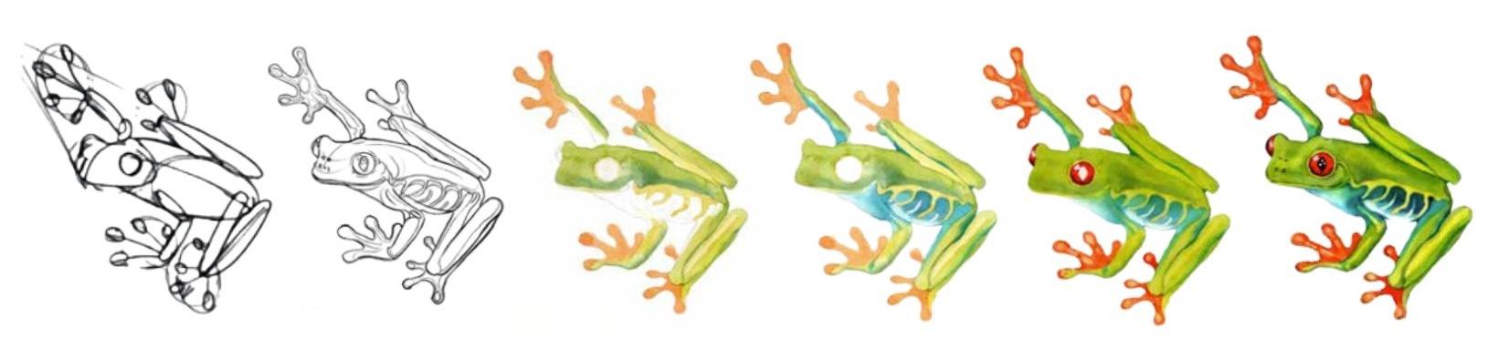
7. Add Final Details to the Drawing: So let's define the features
of the frog even better. So every time I start to
work on the next step, it's kind of also the
opportunity to check on the previous steps if the elements kind of
look right to me, if I want to adjust something. And in my case, I think I would like to make
this eye a little bit lower. So that's why I'm going to
slightly erase the eye. You see, I'm not
erasing it completely. I'm moving the lines and
just moving them lower, not necessarily erasing
everything, see? I think now my eye, this eye looks more in place. And I also think that this
eye right now is too high, so I'm going to do
the same thing here, kind of move it a little bit. And this will make my frog
look a little bit thinner. I think my frog was a
little bit too chubby, a little bit fat. So this kind of I kind of
slimmed the head a little bit, and I think it now looks
more close to my reference. But again, if you want to just leave yours as is no problem. But I think now you
see that you can actually change things a little bit without necessarily
erasing everything. There you go. Also, just
adjusting this eye a little bit. I think this looks
good. So finally, it's time to actually
connect the fingers with each other and make
them look like fingers because right now they're
just like circles. You see very easily
with these lines, I am connecting
them to the hand, and this is basically
the first step. So I'm going to connect them
first. Going to do this. And then it's going
to help me to actually draw the fingers
because you see all I need to do right
now is just to add this thickness that actually is already there in some cases, you see, because I
draw multiple lines. So I just can go and kind of connect these
fingers to the hand. There you go. And I
will do the same thing here. There you go. And again, if the circles, if the fingers are just a little bit smaller or just
a little bit bigger, I don't think it's
such big of a deal. So usually mammals are a little bit less forgiving
for these kind of things, especially if you know that a bird has this very peculiar, kind of the beak and if you make the shape of
the beak different, the bird is not going
to look believable. But I think with reptiles, it's a little bit
more forgiving. As far as your illustration looks believable, you're good. That's why as artists, we just need to make
things believable, not necessarily exactly like
they are in the reality. By believable, I mean, we should recognize
the species and, you know, capture the
main features correctly. But then if something is slightly off and it's
not that important, nobody will probably,
you know, realize it. So there you go. In the meantime, I
started to give these, these hands even more
natural appearance. You see I've made the belly
a little bit more round. I think at this stage, I can already start outlining this interesting pattern
on the belly of this frog. For this, I'm adding these lines because I see the pattern
is composed of lines. Again, you see I'm connecting these lines to this main line, and then I see these smaller lines that go from this lower
portion of the belly, and I think this
is pretty much it. I'm not going to spend
more time on that pattern. I think this is about it. I'm just giving
this back portion of the frog a little bit
more of a pointy appearance. And now I'm going to add
I'm going to make sure that the leg is
long enough because I think it was a
little bit too short. So I actually saw where this
angle of the frog ends, and this allowed me to understand where
the leg should end. So again, remember that we don't treat
elements separately, like the leg separately,
the head separately. We always see what is their relationships with the other elements
because, again, maybe the head is perfect, but if it's too
big for the body, your frog is not going
to look very good, or if it's too small, it's going to look off as well. So proportions are
really, really important. That's why you see, it's like
doing a little research, so we don't just go and
draw the perfect outline. We first define
the main elements, then we define you
know, the more details, we added more elements
such as fingers and so on and so on until we came to this point where we
actually added the pattern, and this is where we can really finish to
work on the frog. So this is step number three. At the end of this step, you will have a finished drawing that you can then
start painting. So in the next lessons, we will actually pass to the painting part
of the tutorial, which is really exciting because this frog is really colorful, super vibrant and is just
going to be a treat to paint, and you will see that you really don't need
a lot of colors to painting even such
vibrant subjects as like tropical frogs. So oftentimes you just need
to know like the must haves, and then you need to
know how to create basically all the
colors from the basics, from the mains that you
already have at your disposal. And you'll see it's
actually quite easy. So this is what I
wanted to show you. So this is the last
step of the process. Actually, this is how it
looks like in the book, and this is almost
exactly what we got here. The only thing you may ask what we do with
these guiding lines. So you can leave them if
they don't bother you. If they do bother you, you can go with your eraser
and just gently erase them. That's why I love kneadable
eraser because it's really gentle and it allows you to create different
shapes out of it. So you can even
make it like thin and go in between the
fingers, for example. So you see you can really decide on what
shape you give it. And the second option that
actually is my favorite. This is also why I
create this roll out of my razor is that
I can roll it like this, and then I can roll it on my sheet of paper, and
you see what it does. It kind of lifts
off the excess of pencil I had on my drawing. So my eraser is kind of dirty, so you see it also
leaves some dirt behind. But if yours is new, you will see that what it does, it actually lifts
some color without leaving any of these
things you see on mine. So this is actually
because my eraser is. Dirty. But again, you see
the lines got much softer. You can also do it
using this method, just kind of slightly going
there and erasing the lines that you don't want or
want to make lighter. And the trick is, you see you're don't erasing
anything completely. You're just erasing this excess. And then if something
needs to be restored, you can then go and
kind of restore the final outline
with a single line. So you see right now
basically what you're doing, you are tracing
your own drawings. So just adding
these final lines. Again, this is all
possible because we made all of this work before. You see, we made
all of these lines. We kind of, again, studied the structure
of this frog. And now I can go and just trace only those lines
that I'm sure in. So you can do it on all
lines or you can just simply decide to go with the lines you already
had at your disposal. So I think I'm going to restore
just some of the lines, not all of them,
because anyways, we are going to work on
the painting right now, and we can define these things during
the painting process. So I'm just going to Make sure that the main
lines are in place. There you go. And I will see
you soon for the painting.
8. Let's Start to Paint!: Let's pass to the
painting process. If you have restored the lines of your
drawing, then perfect. Again, before lifting off some
of the pencil like I did, just make sure your your kable eraser is
clean enough because mine was dirty and created some of this dirt on
my sheet of paper, but I think it's
going to be fine, and I will still be able to show you painting the drawing
process properly. What I'm doing right now is just adding these tiny touches, for example, these
highlights on the eye. So really, really the
final details or, like, for example, outlining
some volume of the fingers. There you go. So you can stop
whenever you feel ready. There you go, outlining this line of the mouth
a little bit better. And this pattern,
just to make sure I, you know, have
these guiding lines during the painting process. And I think we can
now start to paint. So for painting,
I'm going to use my ceramic palette
because it's bigger, so I can easily show you the
colors we will need to mix, and I think I'm
going to place it here so that you can see it. Yes, I think this is perfect. So let's see what kind
of colors we are using. In this step number four, we need to create two
mixes, very simple. So one is just cadmium lemon
or cadmium normal cadmium. So just any yellow color will
work fine. And then mix A. Mix A is composed of cadmium
lemon or cadmium yellow, plus cadmium red plus water, and it will allow you to
create medium orange color. So let's create these two mixes. I'm going to use
my medium brush. So this is number eight. You can use number ten. Number six. This is not that important. I have some water nearby, and I have some napkins
or paper towels. We always need to
have them nearby. And, of course, I have my
palette. There you go. So let me just mix. I'm going to use cadmium
yellow for the first color. I actually had some green in it. That's why it looks a
little bit greenish, but this is not
as big of a deal. And then I can mix
the orange one. So I'm going to use
the same yellow color. So cadmium yellow, plus cadmium red or lemon
yellow, plus cadmium red. But you see that I was easily able to create
this orange color. And this is what
I wanted to say, B you don't need to carry
all the colors with you, especially if you're
traveling because a lot of colors can be actually
created from other colors. Let me explain you why. So I'm going to show you
this scheme real quick. So you see, this is
the color wheel. Actually, this is exactly what I explained in the beginning of the book in the
introduction chapter. When I explain all the
techniques and everything, this is actually
the exact scheme I'm showing you here right now, and it shows what are
the primary colors? What are the secondary
colors and tertiary colors. So primary colors are
yellow, blue and red. So why they're colored primary because we cannot go and mix a yellow out of two
different colors or blue. We cannot go and use two different colors
and obtain a blue. So these are pure colors that create all the spectrum
of all the other colors. For example, what we just did, we mixed yellow with red, and we obtained orange. This is exactly it.
So two primary colors create a secondary
color, so orange. Same here. Yellow with blue, two primary colors will create
a secondary color green, two primary colors blue and red will create a
secondary color purple. This is basically all
you need to know. This is why I never carry
ready mixed oranges, and I never carry
ready mixed purples. Well, purples are a
little bit more tricky. Sometimes you need, like, a
certain type of purple for, like, flowers or different
things like this. But orange is easily mixed. You see, just very simple. For the green, I actually suggest you having a
ready mixed green. That's why in this tutorial, I suggest you having a green. And personally, I just think that the green you
have in the set, the ready mixed
green is slightly brighter than the one you can obtain by mixing
blue and yellow. And then it's just
very convenient having a ready mixed
green because personally, I use green all the time, especially because I paint
a lot of natural subjects, and nature has a
lot of green in it. Our frog is green, so it's just very convenient to have one
already mixed for you. But that said, we now have the two colors we need for this step number four
of the tutorial. So let's start painting. We will start with
the lightest color. In our case, it's yellow. And what I'm going to
do is I'm just going to apply it to some
areas of the legs. For example, I see these areas
of the legs are lighter. This is where the light hits. So I'm going to paint them. I'm also doing the
same thing here. Basically, what I'm doing is I'm looking at the
reference picture. I'm analyzing it,
and I'm seeing what are the lightest
areas on my frog. And I'm just going there and adding my
yellow color there. So, see, I'm not caring
too much of making it super precise right
now because anyways, we're going to add other
colors there later on. So my goal now is just to
place it about correctly. So I also see that this yellow pattern consists
of this yellow color, so I'm just going and
adding yellow color there. Also, I see that I can add it
to the mouth. There you go. See. Here, I just need to
be careful of not going beyond of not going beyond
the surface of the frog. I'm going to put some of
this on this tip of the head and some around the
eye. There you go. And I don't care if it's not perfect because this is exactly what we
need right now. After this, I'm switching
to my orange color, and I'm going to add it to
the orange parts of the frog, so on the hands. And I'm just being a little bit more careful
for this because here, you see, I need to stay within the outline of the fingers. So this
is the only thing. I'm not I don't want
to ruin the outline. For the fingers, I'm being a little bit more cautious,
a little bit more careful. And one more thing to
know if you've just painted with yellow here and
your paint is still wet, you might want to leave
a thin white line, an untouched line between this yellow and this orange
you're painting right now. Why do we need this line? Because it allows us to prevent these two
colors from mixing. In watercolor, color will
go exactly where water is. Water, if you're yellow, watercolor is still wet and you touch it with your
orange watercolor. The orange watercolor will
affect the yellow area, and you will have like
it's all mixed up. So this is what we don't want. We want these two
colors to be separate. And if they're dry, there's no problem because
if the color is dry, it's not going to go anywhere. See, like here, my
yellow was already dry. I painted with
orange right next to it and nothing happened because
yellow was already dry. But if yellow was still wet, I would start to have
this blooming effect, typical to the wet
in wet technique. So to prevent it, again, you can use this trick of adding this thin white line that will basically keep these
two colors from mixing. So this is like a trick for
you on how watercolor works. And right now, you see, I'm finishing covering
the second hand with this orange color. Again, I'm taking my time because I don't want to
go beyond the outline. And for this reason, you say, also switched
to a smaller brush. I'm using number four right now. You can also use number
six, number two. I think number two is a
little bit too small. So I think number four is
actually a perfect size for it. Also number six could work well. But just basically anything
that will allow you to have a little bit more
control over the tip. So thinner brush is more convenient for these kind of this kind of detailed work. So once I have this leg, I'm just going to
add the orange to this last one and this is going to bring me to the end
of this step number four in the book that
consisted of adding this first layer of the lightest color that
we see on our frog. The lightest colors are this yellow and this
initial orange color. And then don't worry if
the colors are not the same as on the final frog yet, but this is
the whole point. We are going to use this
gradual approach that will allow us to gradually
build the shape, the saturation, the realism, without being stressed of needing to do
everything at once. So right now, you need
to leave this layer dry, and I will see you in the next step when we
will start to give our frog a more realistic
color and more saturation.
9. Mixing and Applying Two Types of Green: In this step number five, we are going to mix
two green colors. So right now, while the
other colors are drying, we can use this time
to mix the colors. So we need these two greens. One is called mix A, and it's composed
of cadmium lemon or cadmium yellow,
green plus water. Second one is really similar, but we add a little
bit of blue to it. So let's dive right in. Basically, we need to
create two greens. Um, let's do it. So I already have some yellow on my palette. I'm just
going to add more. And then I'm going to get some
green from white knights. Again, it may be called
sub green in your set. And this is basically it. You see, I've added a
little touch to my yellow. I obtained the green,
and this is actually a perfect green for
me. The second color. So, um, the second green
is a little bit darker. I'm going to use
the same yellow. And then I'm adding some
cobalt to it or ultramarine. It doesn't really matter. Or you can even add indigo. So any blue would
actually work just fine. So I don't have a lot of
blue on this palette. Let me see if I have
some on my other one, and, yes, I do. I have some cobalt here. So I'm just adding it
to my yellow in C, I'm actually creating green. But this green will look
darker and more cold. You see, by mixing
yellow with blue. I'm obtaining this green color, but that looks a
little bit colder. So with this bluish undertone
than this one. See that? These are two kind
of distinct colors, and right now I can switch
to my bigger brush because number four is not enough
for these big areas. Number 12, or I can use number ten is
going to be more suitable. I actually think I'm going
to use number eight. And what we will do is we will start using
our mix number A, so the first mix, and
we will apply it to this whole top
portion of the frog. Actually, I think it
was not too green. I just applied a little touch, and I saw it was
almost identical to my normal, you
know, yellow color. So I just added a little
bit more green to it. There you go, right now, I can start adding this
color to this whole back of my frog and
to these back legs. So you see I'm keeping some
of this yellow untouched, especially on these lightest
details of the frog, and I'm using my big
brush to cover the rest. So again, I'm not touching
the area near the eye. I want it to be um I want it to be more yellow, and I'm adding the green colors to the rest or to the
eyes, for example. There you go. Actually, I'm going to add it to
this whole nose, and I can start adding it to this right side of the hand and to this portion of the hand
as well. There you go. I'm not touching the
orange at this point. I'm trying to be
careful with my orange. And that's it. Right now, I can start
adding the darker color. So while my color is still
wet, this is quite important. We're going to use the wet
and wet technique here. You see, I'm applying some of this green color
to some areas. For example, here
near the transition from the front portion of
the leg to the back portion, near the eye, especially
here near the mouth. I see that there is this kind of slightly
darker area there, so I'm painting it. Here on this right side
of the hand, right here. So basically what I'm
doing now is I'm already painting some of these
shadows on the frog. So you see, instead
of being just flat, we're giving it a more
three D kind of appearance. With just two simple
colors, again, we just used two
different types of green, and then previously, we
had some yellow there. So this is the end of step
number five inside the book, and we need to let this dry. And in the meantime,
we can focus on mixing the colors for that step. So I will see there.
10. Painting the Blue Belly of the Frog: Now let's pass to
step number six. In this step, what we are going to do is
we're going to add this turquoise blue
color to the belly of the frog and to some
portions of the legs. So really excited
about this step. We just need to mix this
really, really simple color. Turquoisblue is basically this aqua kind of looking color. And if you don't have it, you can use something similar. For example, emerald green
or just add some blue, more blue to your green mix. So this is, for
example, emerald green. This also will work nicely. For example, this looks
a little bit too green, and what I can do is I can
mix it with some blue, and I will obtain
the turquoise blue. This is actually almost
identical to turquoise blue. So you see, if you don't have a specific color,
there's no problem. You can actually use something different and obtain
quite of a similar color. So get intimidated by the fact that you don't
have a specific color. Again, your goal
is to make it look believable and, you know,
get it about right. So this color is
different from the green, and this is exactly
what we want to know. So for the rest, if it's
slightly different hue, it's not a big problem. So let's dive right in. I'm going to start to apply this turquoise blue color
on this pattern here, and I don't feel
really comfortable with this eight number brush. I'm going to switch
to a smaller one in my case number four, and I'm going to
continue doing this. And I'm starting from the belly, but you can start from a
different part of the frog. I am just adding
this color here. I'm making sure I'm not
touching the yellow pattern. This is the only thing
I'm concerned here. I want the yellow
pattern to be untouched. And then there's this
interesting thing that once we reach the lower
portion of the belly, there is this lighter color. So there's this white spot. And in order for this transition to be more smooth,
I'm washing my brush, cleaning it with my paper towel, and kind of smoothing that edge. So you see, I'm creating this
smooth transition between the turquoise blue and basically this lighter
lower portion. And if I want to, I can add even more turquoise blue
top on the top side. There you go. And from there, I can continue doing
the same thing here. Actually on the oops, if you made a mistake, by the way, this is
what you can do, go and blot that area with
your paper towel quickly. That's why we always have paper towel nearby while
working with watercolor. It's really convenient,
whether you're doing it on a spot or in your studio. This is, you know, a must have tool for correcting
mistakes and generally, like for cleaning your brush, for taking away the
excessive color or water and so much more. So you see right now, I'm
just painting this portion of the frog with this same color, and I'm going to
do the same thing here as I did here on the belly, just going to dry my brush
with paper towel and smooth that edge for a
more seamless transition. And there you go.
I'm going to do the same thing on this top hand. Again, using the
tip of my brush for not accidentally going
beyond the edge. And you see my other
colors are already dry, so I'm not risking of making them interact
with each other. And basically, what it
allows us to do, you see, we're making this frog look colorful without the colors
mixing with each other. And what it allows us is to have a nice and vibrant color that is not interfered
by other colors. So when colors mixed together, they tend to get more dirty, and we don't want it
because we're painting this tropical frog that is
super vibrant, super colorful. And one of our main
goals here is to preserve this vibrant green
color or this vibrant. Just generally the vibrancy
of color of colors. That's why using
this strategy of painting separate
portions of the frog separately without the
colors mixing together is what allowing us to
maintain this vibrancy. So while I was talking, I actually am actually adding some of this
turquoise blue to these shadow areas of the leg and even somewhere
in between the two legs, you see, um, so I'm kind of starting to
work on the details. And this is also the step, that we can use to add all
of the turquoise elements. I think one more
is missing here, so I think I'm going
to add a touch of this turquoise blue
this back leg, and this is probably
it for this step. So in the next step,
we will start to work on the exciting
part of this frog, which is the eyes,
so the red eyes, and we're going to give even more saturation
to the fingers. So I will see you there.
11. Painting the Eyes and Fingers: Welcome to this step. Here, we will start to
add some red to our frog. And to do so we need to
mix these two new colors. Cadmium red. This
is a simple mix, just cadmium red with water, and then we have a new mix, mix A composed of carmine,
indigo, and water. You will obtain this
burgundy looking color. Let's start with mixing colors. I'm going to move my palette let's start with the simple mix. Cadmium red with water. Cadmium red is a warm red. It's just the simplest
red we have in our sets. So just a basic red. And this is how it looks like. We just need a medium color. So make sure you have enough
water but not too much. So we want this color
to be quite saturated. As for the second color, we use carmine plus indigo. You can also use
cadmium plus indigo, but I think carmine gives
it a slightly better color. So carmine alone, I'm going to show you
how it looks like. It looks a little bit
more like purple, see. So it's a more cold color. So it's colder than this one. You see, it's tending more
towards pink, purple. This one tends more
towards orange. This is how you know that
this is warm, this is cold. And then on top of this,
we're adding some indigo to our to our carmine color, indigo is a dark blue color. Let me try to show you
how it looks like. There you go. This is
how indigo looks like. So it's a deep blue color. Really beautiful. And if you
mix it with your carmine, you're going to obtain this
kind of deep purple color. I think I need more carmine
because now it's too purple. I want it to be more
on the red side. So more carmine. And I think this is what I
was looking for more or less. Yep, maybe a little
more touch of indigo, and that's probably it. And let's start to color. So I prefer starting with the feet. Let's
start with the feet. For the feet, we just need
this carmine mix this cadmium, sorry mix. I'm going to mix it. I'm going to dilute
it with water just a little bit because
my room is really dry and the colors get
dry quite quickly. So I just added some water
to make it more liquid. And you see I'm
adding this color to add some vibrancy
to the fingers. The only thing I'm avoiding are these circular highlights I've created with my pencil
during the drawing step. So see? These highlights
will allow me to show that these
fingers are not flat, but actually have some
dimension to them. So they are round and there's this bumpy little part on them. So by doing this, I am underlying this
fact that these fingers are not just straight. This is what I'm
doing. At this stage, again, I am trying to be
quite careful with my brush. I don't want to go beyond the outlined area of my fingers. I'm working with a small brush.
This one is number four. You can use number two if you want to have
even more control, but for me, number
four works just fine. And you see, I'm
also leaving some of the highlights on
the fingers themselves. So kind of these long lines, and it allows me to create a more visually
interesting look. Also, if I want to make these
transitions more smooth, I can go and wash
my brush clean with the paper towel and kind of smooth that
edge a little bit. So it may be a little bit
tricky on a small surface. So if you are a beginner, skip this step, it may be a
little bit confusing for you. So if you feel like
you're more advanced, then you can go and smooth
the edges if you want to. If you want the
transitions between this light and shadow area
to be even more smooth, But otherwise, I'm going to continue adding this red color. If I need more, just
go and add more color. This is a very simple mix, so just carmine sorry
cadmium red with water, so nothing really fancy. But generally for this tutorial, you saw we used
very simple mixes, so nothing complicated. Actually, we used three colors
at maximum for our mixes, and three colors for
a mix is actually a perfect number of colors, a perfect amount
of colors because if you add more than three, your colors start to look
a bit dirty and then like, it's just allowing
it to create, yes, maybe a little bit more
of color variation, but essentially that
just confuses you and makes these mixes more difficult to reproduce
in the future. And then, again, it makes
your paintings more dirty. So generally, this is one
more tip from me to you. Try to maintain your mixes under three colors maximum
for cleaner, more vibrant colors, and for less confusion in
general, if you want to. To then create more
of this color. While I was talking, I actually almost
finished to give this red color to the fingers. I'm going to finish with
this back leg. There you go. Okay. And we can now pass to
the eye, very exciting part. We were all waiting for it. The very important thing though, I want to warn you
about is that we're not painting the pupil in this step. So make sure you don't
paint the pupil, and I also don't
want us to paint this highlight on
the left of the eye. So in order to not
forget about it, I just outlined it
with my pencil. What we need to do next? I'm going to take some of this same cadmium red. There you go. I'm going to add it to
everything, all the I, except for the pupil
and of the highlight. I just created with my pencil. And you see the tiny highlights are actually inside the pupil, so I'm not mentioning them, but I'm not covering them
either because they're on the black side of the eye, so we don't cover them either. And this is, you know, a moment where you want to get
a little bit more precise. So the eye is the very
important thing of our subject. Generally, animals,
human beings, like, if something is
wrong with the eye, you instantly notice it. That's why be extra
careful during this step. And then same thing
on this eye, also, there's one small highlight I would like to
keep here as well. It's going to be around here. So maintaining these
highlights will allow me to make the eyes look more round
and more three dimensional. And even though this is a very small
adjustment and, like, a tiny spot of white, it's going to make a difference. So I suggest you to do the same. And once this is done, I can then take my purple color, that dark purple
color mix together, and I'm going to add it to the sides of the eye
with my small brush. And you see my color is really
it's kind of concentrated. It's there's more pigment
than water in this color. That's why you see
some of the wet in wet technique gets produced. So my goal here is to make this dark purple to mix
seamlessly with some of this red. So you see, I have some
blooming going on. But because this new color I'm introducing is really dark and because the
previous red color, there's no flood of water, it's still wet, but it's
not super, super wet. You see I'm getting
this blooming, but I can still control it. See? It's not affecting
the whole red area. If you're a beginner,
this may sound a little bit confusing
to you at this stage, but I promise if you start
to practice with watercolor, this all will make
sense really quickly. So basically, we're
talking about the water control here and how much water and
how much pigment using in your mixes depending
on what you want to do. So again, with a little bit of practice,
this will become easy.
12. Adding More Saturation to the Body: In this step, we're going to add some of this
green to the frog, and we will need to use the mix from the
step number five, so the mix five A, which exactly corresponds
to this mix on my palate. Basically, we will need
to use the same mix. If you don't have it, you
can easily mix it again. So all you need to do, I'm going to add
some water to mine, but I think this
is to watery now. So as far as I can recall, it was green plus some cobalt, or you can use any
kind of other green, sorry, other blue you
have at your disposal. You just need to
obtain something like a dark bluish green,
something like this. I think this is good enough. And this step is pretty short. I just need to make sure
I have my napkins nearby, so this might be enough. And all I want to
do is I want to add some additional shadow
to some portions of my frog. Also, I think I'm going to use some of this color here as well. So basically, I just
think I need to add all of this color to
the whole body of my frog. This is what I'm doing
here, adding it there, doing the same with
this back leg. What I'm doing right now is I'm looking at
my finished frog. I'm also looking at my
reference, and basically, I'm trying to repeat and get what I see as
closely as I can. So right now, I'm going to
add this shadow near the eye. And as you can see, it's quite
the edge is quite clear, so I need to smooth
it out a little bit, so it's not that
visible. There you go. Then the cool thing of
watercolor is that if I want to make this frog a
little bit more vibrant, so let's say add like
this extra layer of green or this extra layer
of bright yellow color. I can always do that. So this is something I can do
in the next steps. But for now, I'm just adding, like a combination of
these two colors to create these shadows on the head and make the frog look more
three dimensional. So I'm just adding this color to some of the
areas to make it look better. Also, in this step, I also need to make this
belly appear more united. So what I'm doing, I'm
just grabbing, you know, some of this color I
was using previously. I'm adding it to the belly, so you see I'm uniting it. But once I came close
to the yellow pattern, you see I'm kind of
using the water now, and same with the belly. So I'm not using the color. What I'm doing, I'm
just smoothing out the edge and I'm letting
the color sit on the belly. This is it. Then I'm seeing if I want to add any additional
color, for example, I think I'm going to add the same green color to the legs and to this
portion of the face. Going to add some
of this blue here. You see my frog
instantly looks more united and more realistic. Also, if we want to continue some of the things we
started in the last step, I could add some darker
details to the fingers. For example, I could mix
that burgundy color, and I can add just a little
touch of cadmium red to it, and I can start to add this color to some
areas of the fingers. This is a little bit
too dark, I think, so I just diluted it with
a little bit of color, and you see now
it looks lighter. So every time you think your
color is a bit too strong, you know that you can
easily adjust it, and I'm just going
to start to do this. Just outline some of these
fingers. But don't worry. We can also add these
details in the next step. I'm just going to add
some of it right now. I think we can
stop here for now. And in the next step, we're going to add even more contrast in saturation to the
belly of the frog, so I will see there.
13. Adding Contrast and Details: As a first action in this step, we need to mix a new color. So in the step number nine, we need to create
this dark blue mix, which is composed of indigo, turquoise blue, and water to
obtain a dark blue color. So let's start with
mixing that color. Again, if you don't have
these exact colors, you can just mix
something similar. So as a base, we need indigo. As I said, indigo
is one of my go to choices when it
comes to watercolor, so I absolutely suggest you having indigo
in your toolbox. Let me use this portion
of the palette. And then we can mix
turquoise blue. I'm not sure I have turquoise
blue on my palette now. I think I have emerald green. But as I said, it
doesn't really matter. These two colors will actually
make a good match for me. So I'm just mixing indigo
with turquoise green. Sorry, with emerald green. But it's quite similar to what I'm suggesting
in the book, again. If things are slightly different on your side, it's
not of a big deal. And we need to start
to add this color to some areas of our frog, especially to the belly and
to this pattern on the belly. I'm going to move this sheet and this drawing a
little bit so that you can see everything
I'm doing here. There you go. I think
this is much better. All right. So I'm going
to switch brushes. I'm going to take
a smaller brush. So in my case, it's number four, because now we're going
to work on this pattern, and I want to have a little bit more
precision and control. And you see, I'm
starting with the tip of my brush and with that
freshly mixed color. And I'm adding this color to the top and once
I'm getting lower, I'm going to switch to water. So basically, I'm
going to dilute this color so that
once I come down, I will have a less saturated
version of this color there. So see it's getting
lighter and lighter. And once I come to the belly, I'm just going to
completely switch to water and then just you see kind of smooth
that edge even more. I'm going to work on this
portion of the pattern as well. I'm going to create a
similar effect here as well as near this
portion of the frog. I also see that using
the same color, I can already start
to add some of these darkest
elements of my frog, for example, some of these shadows near the
legs a little bit here. So we're coming towards the end of the tutorial,
and right now, I can really start to add these darkest details that
will make my painting pop. And you see just by adding a
few of these darker touches, I've managed to make the whole frog look more
interesting and realistic. And I still need to add
some face features to it. So contrast is really what allows us to make
the painting pop. This is a life kind of real
life demonstration of it, real time demonstration of it. There you go. So there. And I think at this point, we can This is all we
wanted to do in this step. I'm going to add a few more touches
here and there, and we can still add more in the next steps if we want to. I've just underlined the
head using this color. You see, I never use
a uniform outline. Even if right now
I'm starting to add some of this outline
to my subject, you see I don't use
a solid outline. I love to add irregular outline. I'm especially concentrated
on these blue areas for now. So here. And I think I need to darken
this backside of the leg, even though it's not
part of that step, but I think I need to do it. So I'm just grabbing some of this light green color and
darkening some of the leg. You see, I'm still keeping
some of the highlight, though. So I think this is good. If I need to lift or take away the excess of
this water, I'm just, you know, drying my brush and kind of going there and taking away
the excessive water. And in the next step, we can start to add some of the final details to the
frog, such as the eyes. I'm just going to add a few
of these lines right now, and then we can continue
in the next step.
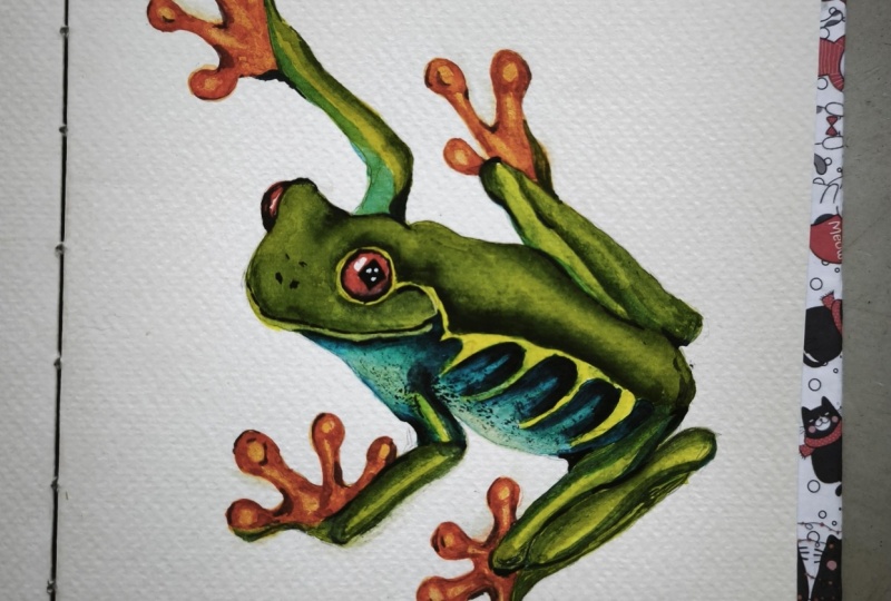
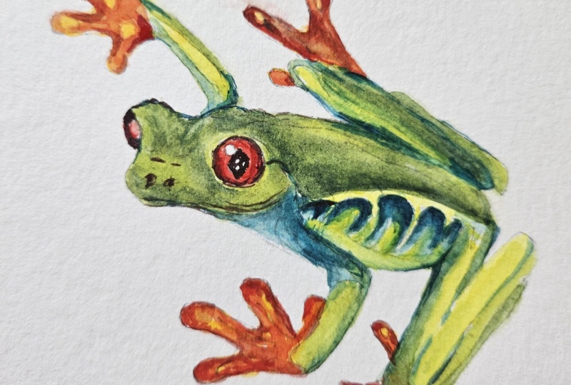
14. Final Touches: So in this step,
we're going to add the final touches to our frog, such as the eye finally, and we're going to add some last touches to the
fingers to the legs as well, and add such details as pupils, the nose hole, and so on. But be but before doing this, I would like to do one thing. So I'm not sure it's part
of that step or not, but this is really something
I feel I need to do. So this is why I wanted to emphasize if
you follow a tutorial, and it does not look the exact same way
as on the picture, or you just feel
that you need to add more color or make your painting more vibrant than just follow your instinct. For example, now I see
that I really need to add some more yellow
to my painting. Like I feel that I need more
saturation on the frog. And this is what
I'm going to do. I'm just going to
cover everything with this cadmium yellow color. I just basically grabbed some cadmium yellow
from my palette, and I'm going to add it to
the whole surface of my frog. This action has two benefits. First of all, you see how
it unites everything. You see how it unites the
whole surface of my frog. This is the first benefit. Then the second benefit, it makes my frog looks more
vibrant, so more colorful. The color looks more juicy. It's a tropical frog.
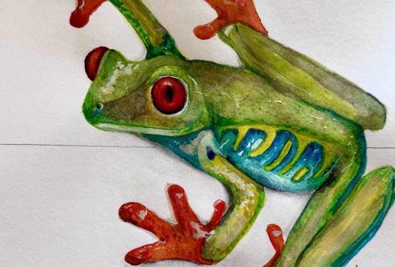
It should be colorful. And I think with this color, it looks much better. Not touching the blue, though, because I think the blue is something that has
a different color. So I've just covered this top surface of M
frog with this color, and then I'm just
smoothing this edge here. And this is the very
important step, I think. You see it looks much
more cohesive and united. So now, very important thing. I need to let this dry
because this is all wet. I need to make sure it gets dry before I add the last
touches to my frog. And I can use this time, first of all, to mix that
color we were talking about. So it's made of
carmine, indigo green. So let me take some
carmine. There you go. Carmine is a cold
red, if you remember. So carmine indigo, our
favorite indigo, so dark blue. There you go. And then
a touch of green. So this combination,
as you can see, creates us this dark,
almost black color. And I think I'm already
going to use it on the eye. So actually, before
I use it on the eye, I need to unite the
surface of the eye. So I will make this highlight a little bit less visible.
Don't need to do anything. I'm just going
there with slightly wet brush, and you see, I am just covering
it a little bit so that the surface gets united
with everything else. And this is the only
thing I will do for now. So before painting the pupil, I need to let this dry, and I'm going to actually
use this time to add some last touches using
my previous color that we've used in the
last step composed of indigo plus turquoise green. I've just quickly
mixed it again. And I would like to add this color to
some areas of my frog. So my room is quite warm, so my previous color is
getting dry or is almost dry. So you see my color is
not going anywhere. There's still some blooming
here in this area, but it's getting
dry quite quickly. So this is why I'm able to
do what I'm doing right now. If your paper is still wet, it's very wet and you see a lot of blooming if you try to do
the same thing I'm doing, I suggest you to stop and
to wait a little bit. So you're not doing
anything wrong. It's just means that
the water takes longer to dry in
your environment. So it's absolutely fine. You see, in my case, again, my paper is almost dry. So I can go and add
these last dark touches on the pattern of my on
the belly of the frog. So this is what I'm doing. I'm going there with this
same dark blue color. Also going to add it to
some of these shadow areas. Right now, it's very
important of not ruining what we've created there during
the whole tutorial. My goal now is just to underline
some of these elements. And I'm doing this with
these tiny lines with the outline itself.
There you go. So something like this, I think it made our
frog look better. At this point, I think
that the eye got dry, so that's the time when we
can start adding the pupil. But before that, let me add just another layer of
cadmium yellow to the feet. I'm not going to re read the step and see if
it sets there or not, but I definitely feel that these feet need
to be more vibrant. This is exactly what I'm doing. I'm taking some of
this cadmium red, and I'm going to paint some of the areas and make sure that the feet the fingers
are nice and saturated. Red color is really important
on this painting and I want to make sure
that the fingers and the eyes of the
frog really stand out. So you see just by adding
this additional layer, I'm increasing the
saturation of the frog, very similar to what
we previously did, what we just did with yellow. There you go. Just a
little bit more here. And I think we're good to go. Also, you see that I'm
kind of a messy painter. So when I paint,
especially when I explain, I'm getting a little
bit carried away and sometimes I have these
splashes on my paper. So what I like doing, again, I'm correcting them
with my paper towel. But if you want to
get extra assure that your background
remains white, you can also protect it
with something around. So put some papers
around so that you can protect it from
accidental splashes, or just try to be a bit more
careful than I am right now. So I think this is good, and we use this time
to get the eye dry. Before adding that pupil, I'm actually going to use this newly freshly mixed
dark color to outline. The nose holes, for example, I'm using a very
thin brush here. Actually, not a very thin brush, but the point of the
tip of my brush. I'm using number four now, but it's just enough. I'm also outlining these
shadows inside the eye, and I'm going to use this
color to outline the mouth. Again, you see, I never
use just a straight line. I'm always breaking the
line even in this case. Finally, these final details the final outline on the back, especially taking care
of these angles here. Right now, I'm going to add these final touches to
the pattern of the belly. I think right now we have
enough contrast there. I can also go and use some of this black color to outline
some of the fingers. Very important thing again, see, I'm not using any solid outline. I'm just Adding some of this
color to the outline. This is personally how
I'm going about it. I don't like to give my subjects a solid outline
because I think it makes them look more flat. But, I think this looks nice. These back fingers. Also very important
thing to know is that in painting in general, what is in front should
be darker in more detail. I'm mainly focusing on the details on the foreground and not as much on the
details on the background. I'm going to add some of
these details there as well. But still, I'm going to make
sure that the majority of them is focused on this
front portion of the frog. Finally, this is the time
when we can add the pupil. I'm grabbing some
of that dark color. Again, if you want
to mix it again, it's composed of carmine,
indigo, and green. This is a nice alternative
to black, by the way. If you want to use
something more simple, you can just go and
grab some paints black. It's going to give
you a similar effect. But even if you don't have it, you know now that you can
easily mix your own black. I'm starting to add this dark color to
that left eye first. And now I can start adding
it to the main eye. Here, the really important
thing is just to avoid those three
tiny highlights because we kept
that pupil white on purpose so that now we can go
and paint it, there you go. It instantly changed
the look of our frog. That now looks much more alive. And as the last step, it's really about
underlining the details. So maybe if I want, I can go and take some
carmine or cadmium red, maybe better cadmium red, and just add some extra
depth to the eye. I'm just painting this area
around the eye with carmine. I'm leaving the
highlight untouched, but I'm just
underlining that color. And this is probably it. I can go and underline. This area just a bit
more, you see right now, you can just basically keep adding layers and
layers if you want to. It all depends on how much time you want to spend on your frog. But honestly, I think our frog is looking quite
realistic, quite detailed. I would just stop here
because the more you and the more risk you have of
overworking your painting, oftentimes, less is more. So I think once you're feeling quite satisfied
with the painting, this may be a good moment for actually letting go
of perfectionism and, um, you know, just
stopping where you are. I think I'm reaching this point. Anyways, I think we've done. All the important
things on this frog. It looks vibrant. It
looks quite realistic. And we did it completely
from scratch. This is the thing I
wanted to show you. So now you know exactly how
not only to paint this frog, but also how to create the drawing for this frog
completely from scratch. We added some last details
to the frog itself, created these little
outlines that really allowed us to
underline the contrast, I'm just adding the
final touches to the eye now since the eye is an important element
of the painting. But again, if you feel
satisfied with your painting, I think at a certain point, you need to find
that perfect moment to start to stop, sorry. So I think for me, this is it. I'm going to leave my brush, and I hope you enjoyed
this tutorial. This is our final
red eyed tree frog.
15. Class Project: This is it. We've painted a beautiful frog together
from my new book, Capture the Natural
World in Watercolor. I'm really hoping that you enjoy this tutorial that you
will paint your own frog. Please share your frog painting inside the project
section of this class. I'm going to be super happy
to have a look at it, and thanks for watching. I will see you in
the next class.
 Natura Illustrata, Anastasiia - Watercolor artist