Transcripts
1. Welcome to the Class!: Have you ever thought about
expressing your love for nature and for the world
around us in a creative way, watercolor isn't amazing
medium to do so, just imagine that
you can transform your favorite subjects into
something truly unique. Like a framed painting, for example, or custom postcards that she can give to
your friends or family. This is exactly what I will be teaching you in
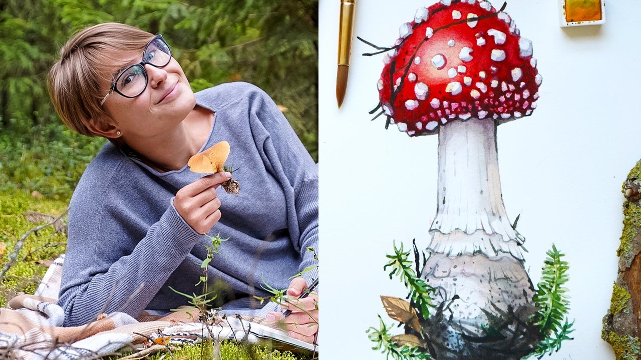
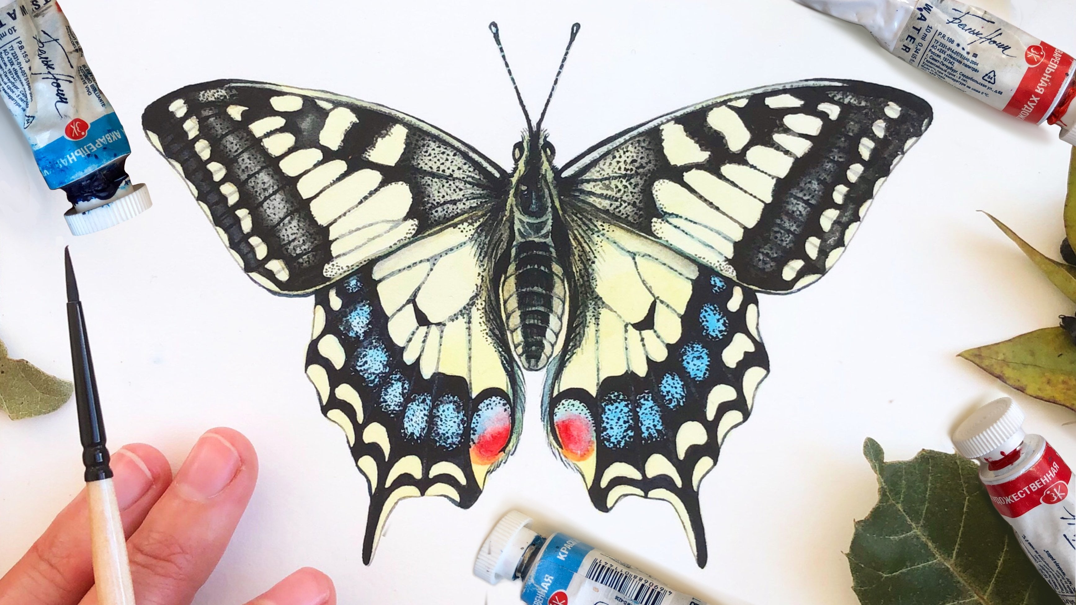
this mini-course. I'm Anastasia, and
I'm an artist, illustrator and pattern
designer inspired by nature. I'm also a founder of
natura Illustrata and educational project focused on promoting nature and creativity. I want you to discover such a versatile medium
as watercolor and show you that drawing
and painting can become a door to so
many things for you, like pattern design,
children's book, illustration, brand
collaboration, and so much more. So if you want to
see how to transform this into this,
let's get started.
2. Art Supplies for Watercolor Painting: Unlike many other art
supplies like oil painting, watercolor is easy
to bring with you. It's not messy and
it's affordable. We will be using only few
colors to be able to create our painting and
you will find them in almost any watercolor set. So now I will show you my favorite art supplies that we will use to create
this painting, as well as these custom
postcard featuring pumpkins. I will be painting
from real subjects. So I have my pumpkins here. Watercolor paper. I usually use 300 g, 100% cotton paper that you
can find in blocks or sheets. I like hot pressed
paper with satin finish and my favorite brand
is Arches pencils. Hb is enough, but
you can also use B, which is soft, or
H, which is hard. Eraser. I'm using cocaine or this
is irregular heart eraser, kneaded eraser, which
is softer that we will be using to lift off
some excessive pencil. This one is by cohort
watercolor paint. You can find it
in pans or tubes. Feel free to choose the form
you like or combine both. It will not affect the
quality of our painting. Brushes. I use round synthetic
brushes with a sharp tip. The brand doesn't really
matter in my opinion, you can use a medium one and a small one, a ceramic palette. I use the one with
different sections, which make it very easy
to me to mix my colors. A jar filled with clear water, I usually use in glass jar, some paper towels that we will be using during the
painting process. Our frame that we
will use for framing, scrapbooking paper or wrapping paper to decorate the
backside of the frame. Scissors, double-sided tape. A ruler, brass leaf
that you can find under this form in sheets or also in this form already
teared in small pieces. Gilding liquid. I use the one by default, but you can use other brands. We will need a hog hair brush or an other hard brush to take off the excess of brass leap
from our lettering. We will also need
a printed copy of your final illustration that you can do once you're
painting is ready. And I will also be using
some lettering for my postcards that I just
printed out on my printer. And that's it.
3. Making the Drawing: If you're eager to
start mixing colors, wait just a second, because to be able
to paint something, we need to draw it first. And I will show you a trick that will help you
to make a sketch, even if you're a
complete beginner. And if you still don't feel comfortable in
sketching your subject, you can download a
free ready-to-transfer drawing as well as a PDF
guide on how to use it. You will find it
below the class. So if you're ready, grab your pencils, and
let's get started. If I don't have enough
time or if I want to just speed up the
sketching process, I usually use this method. I just place the
subject that I want to draw on my sheet of paper. And what I do, I just trace the outline of my
Pumpkin with the pencil. It saves me a lot
of time because I don't need to think
about the general shape. Then I take my subjects
away and I can start to work on the central part that was
not visible while tracing. So what I do First, I just
make the central lines. So this kind of a cross
in the middle that will help to guide
me while sketching. And I'm already outlining the
central part of the stem, then I see that my Pumpkin is divided into
different sections. So this is exactly what
I will do in my drawing. Now. It's time to define the
stem a little bit better. So I'm drawing this
circle in the middle. That means that this
is a base of my stem. After that, I'm outlining the general direction of the stem that goes
to the right side. I'm continuing to work
on the central part. And if I don't like something, I just erase it with my eraser, so don't be afraid of
that more details. And now when the central
part looks good, I will make the general outline of my Pumpkin even harder, and we'll outline the
individual sections better. The very important parts
of our Pumpkin are these orange parts that I've already outlined
and the drawing, as well as these middle lines
where I see this shadow. So this part is
very important too. So now it's time to sketch
the Second Pumpkin. I'm putting it in this position to be
able to see it better. And I'm using the
exact same method. So I'm starting from
the basic shape. I'm just making short strokes and trying to get
the shape right. So I'm already placing the guiding lines on
this Pumpkin as well. I'm already outlining
this edge that divides the orange part of the Pumpkin from the green part
of the Pumpkin. And then I continued to add more details to the
central part of the Pumpkin and where the stem connects with
the Pumpkin itself. Don't forget to put
these little bumps on the Pumpkin because this is a very characteristic aspect
that we want to keep. And then just add some details
where you see it's needed. Your drawing should not be
extremely detailed because we can always add more
details with watercolor. But I wanted to look detailed enough to guide
me wild painting. When the Second
Pumpkin is ready, I can put it aside,
and here we go. The drawing is ready
4. Watercolor Techniques: Now, when you have your drawing, I will show you basic
watercolor techniques that I used to paint all
of my illustrations. The first technique I will show you is the wet-on-wet technique. To produce it, cover
your watercolor sheet of paper with water uniformly. Then load your small
or medium brush with a color and touch your
wet surface with it. As you can see, it
starts to bloom and there are these hairy
edges that appear. Sometimes this technique can
be a bit tricky to control, but it's definitely very useful, especially in the beginning of the painting because
it will allow us to create volume and nice color
transitions very quickly. The other technique
I will show you is the wet-on-dry technique. The right side of my sheet
of paper is completely dry and you can see the
difference between the left side. So you see that the
effect is very different. My watercolor is not blooming, is not going anywhere, and it stays exactly
where I put it. It's very good when
you need to have a crisp edge and more
control over your painting. The next technique
I will show you is to help you to soften the edges created with
the wet on dry technique. It's very helpful if
you don't want to cover all the surface of
your paper with water, but you still want to have soft edges on some
areas of your painting. I've just created
this spot using the wet-on-dry technique and
to be able to soften it, I just dip my brush
into Clearwater, take the excess of water
with my paper towel, and then I smooth out the edge with this circular movement. As you can see, I'm lifting off some paint and making
my edge look softer. The next technique
I will show you is lifting off
painting technique. In some ways, it's quite
similar to the previous one. To be able to produce it, you need to wash your
brush and Clearwater, dry it with your paper towel and then you lift the
layer of watercolor from your paper surface by just pressing steadily
and removing the paint. So as a result, you see the
difference between the area where the painting was lifted
and the rest of the paint. This method is very handy
if you accidentally covered some highlights or
other areas of your painting. The next thing I will show
you is not really technique, but will really
make you understand the possibilities of watercolor. So with only one color, you can actually produce
very different effects. And you can go from a very light color
to a very dark color just by adding more pigment to your brush only
with one color, you can already
create some light and shadow effects and
color graduations. The next technique
I will show you is the dry brush technique. It's very handy when you
need to create textures such as FRD texture or
texture on the leaves, or even to add final
details to your paintings. So it's important
to have more color than water on your
brush when you produce this technique and make the size short strokes
without hesitation, you can also produce dots
using this technique, which is very nice to create different textures
and final touches. Our whole painting process
will be based on washes. A wash is layer of color applied uniformly
to a paper surface. The result of this layer is a uniform surface with no visible brushstrokes
to produce a wash, load your brush with diluted color and start to apply it on your
paper surface. And then just pull the
color lower and lower until you reach the end of the area that you want
to cover with color. So to create a color graduation, just load your brush with
more of the same color, but in It's more
saturated version and just start painting
on top of your area. So now as a result, we have this nice
graduation from saturated red color to
a light pink color. We will be using
this method all time
5. Painting the First Pumpkin: Now, when you're familiar with the basic watercolor techniques, let's paint the First Pumpkin. I'm starting from
mixing my colors. I will be using a few
kinds of yellow color. So I'm using lemon yellow
and cadmium yellow, but you can also
use just one color. I'm using some ocher here, some brown and two
kinds of green color, olive green and a normal green, which can be also
called sap green. I will also use some blue. I use indigo if you don't
have these exact colors, just choose something similar. The first step is covering
the whole surface of my Pumpkin with
yellow color uniformly. I'm starting from the top of my Pumpkin and I'm
trying to be careful and remain within the area of my Pumpkin and not
crossing the edge. I'm adding more cadmium yellow and awkward
to the lower side of the Pumpkin to already create some color transition
and graduation. I want my lower side of
the Pumpkin to be darker. That's why I'm doing
this transition already. I'm mixing some okra
with olive green and darkening the central part of the Pumpkin where
I see the stem, the color mixes very nicely with all the rest because
my paper's still wet. I'm doing the same thing on the lower side
of the Pumpkin. And after that, I'm
ready to dry this layer. I'm doing so because I will
be applying different colors on top and I don't want them to mix with
the previous layer. Now, I want to work with
the wet-on-wet technique. I covered the whole
surface of my Pumpkin except the stem with Lear water. Now, I'm adding
some cadmium yellow to the central part
of my Pumpkin. Then some awkward to
the central part. I'm working with the tip
of my brush and using a very concentrated
color because they don't want it to bloom too much. I then smooth it out the edges just like you see me doing
during the exercise. Then with the same color, I'm outlining the lower
edge of the Pumpkin better. Already started to outline the edges of individual sections Now I'm taking my orange color. I forgot to tell you we
need orange as well. You can also obtain it by
mixing yellow with Fred. I'm trying to imitate
these orange areas exactly the way I see
them on my Pumpkin. I'm painting with
these long strokes and because the surface of my
paper is still quite wet, so I see the colors
spread very nicely and I have these nice
fuzzy looking edges. I want to lift off
some paint from the central part of my
Pumpkin because I want to make it look lighter because that's where the light
is concentrated. So I'm using the lifting of
painting technique here. Then I'm drying this
layer with my hairdryer one more time than I take
my yellow lemon color and apply it uniformly
to the whole surface of my Pumpkin first
on its top side, and then I go lower. On the lower side. I take the orange and I put it where I already put the
first layer of orange, but I think it needed to
be even more saturated. I started to add texture
at this stage as well. So you see me working
with the tip of my brush, making these spots and touches and imitating the texture
that I see on my Pumpkin. As you can see, some strokes
still blue and others don't. This happens because
the surface of my paper is not wet uniformly, so some areas are already dry
and others are still wet. But I liked this effect
because it creates some irregularity and I think it imitates the natural
pattern on my Pumpkin. I dry this layer with
my hairdryer as well. I'm mixing some
brown with accra. So these strokes will outline the shadow that is in-between
of these sections. And we'll make them look
even more three-dimensional. I applied this color
everywhere where I see the edge of each section. The next step is
outlining the shadow in the middle of each of
our individual sections. I do it with a light colors, so it's a mix of
ocher and yellow. I'm making sure
that this color is light enough and that
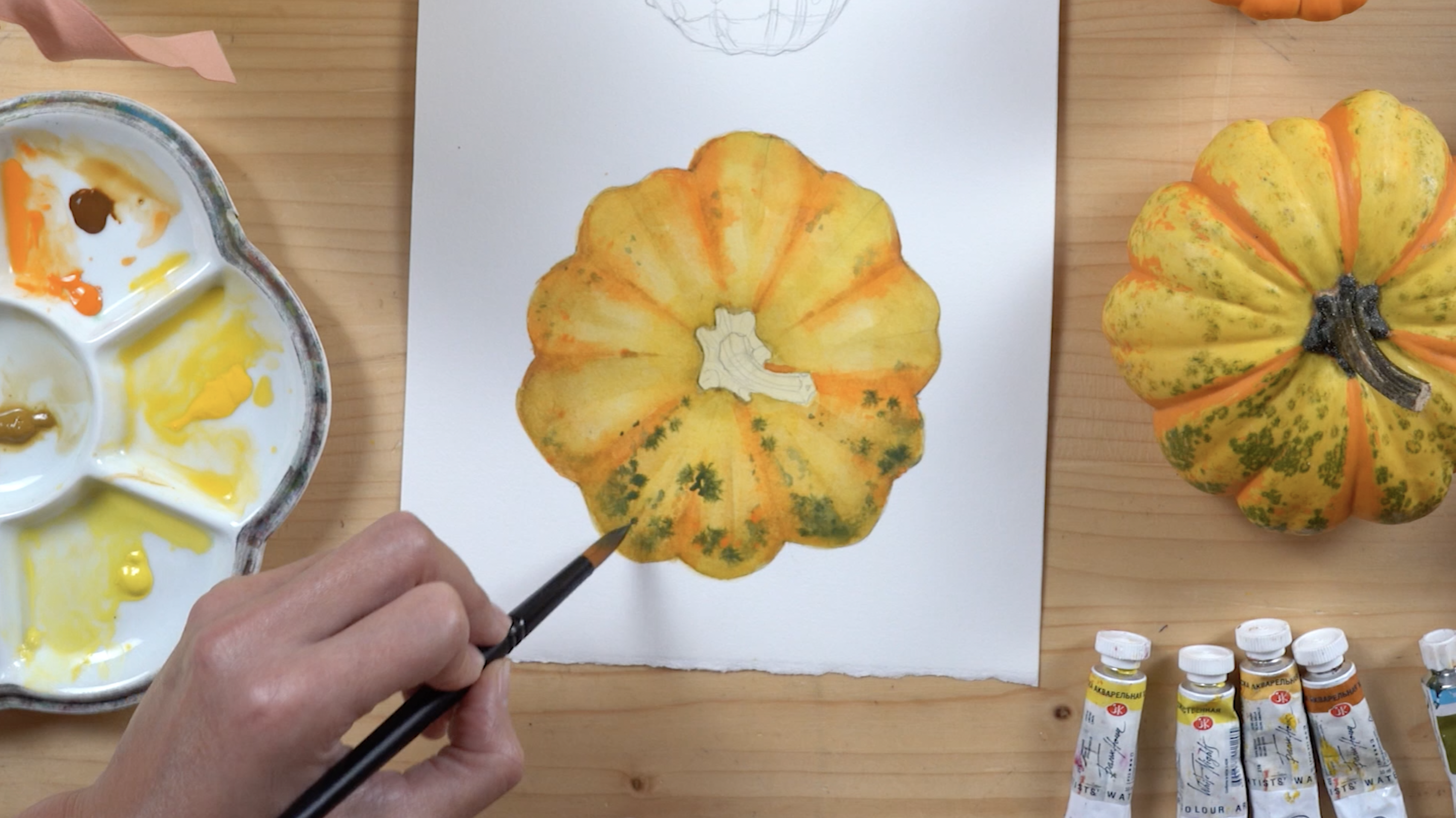
is not disturbing. All the reds that we just did. Next step is adding
some green color. That's when we will start to add the texture we see
on our Pumpkin. I loaded my brush with dark green color mixed
with olive color, and I'm lightly touching the surface of my
Pumpkin that is still wet and I'm imitating the
spot pattern on my Pumpkin I then dry this layer as well. Next step is applying one more wash of yellow
color everywhere, but in the center of my Pumpkin, I'm doing so to unite
everything a little bit and accentuate the light
in the middle even more. I'm adding more of this green texture
with my small brush by creating small brush strokes in spots and lines and
little circles, just trying to imitate the texture that I
see on the Pumpkin. The surface of my paper is wet. That's why you see the
fuzzy edges and it really imitates the
natural texture of my Pumpkin very nicely. The next step is
adding more orange to each section of our Pumpkin. I'm using a very pure color
and a lot of pigment. The next step is
covering the stem. I'm using a mix of okra
and yellow to do so. And then I'm adding more
green in the central part to create this colored
transition and more depth. I then add very dark green
details to the base of my stem where needed and put some details
on the stem itself. I continue to add texture
with the same green color using the tip of my brush to the whole Pumpkin
and to the stem. And then I create
even more volume by accentuating the
central line of the segments even more using a light brown color
and my thin brush. You can also add some texture
to your Pumpkin like you see me doing here with my
brush and green color, it will add even a more
irregular and organic look. Then I accentuate the outline. My Pumpkin, using the
same dark green color and working with very thin lines using the tip of my brush
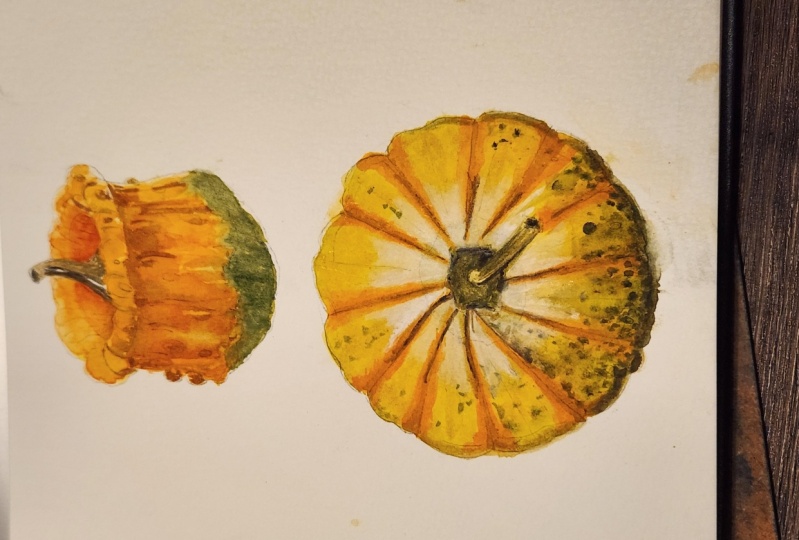
6. Painting the Second Pumpkin: The First Pumpkin is ready, now it's time to
paint the second one. Follow me. I start with the
same method that we use to paint
the First Pumpkin. I start with a very
thin wash and covered the whole surface of my
Pumpkin with yellow color. Then I will make
some green color and add it to the lower
side of the Pumpkin, exactly like on my reference. I'm doing the same thing in the inside part of the Pumpkin. Now it's time to
add some orange. I start from the upper side
of the Pumpkin and then I take an even darker
orange to cover the rest. The Pumpkin, I want
to use some red to, because they want my orange
to be even more saturated. So I mix some red with my previous orange to
obtain a dark orange color. I apply it to the inside
part of my Pumpkin, where I see that this term is
connected with the Pumpkin. Then I mix one more color
by mixing red, brown, and green to create little lines on the whole
surface of my Pumpkin, I add some dark details with the same color here and there to already have more contrast
and difference in values. And that's when I start to accentuate some of the
details of my Pumpkin, like these little
bumps and outline. I then use an even
darker color to make these details more visible. I proceed with painting
the lower side of the Pumpkin by adding
some orange to it, and then adding
the same orange to the whole surface of the
lower part of the Pumpkin. I'm using the same
dark orange color to accentuate the inside
of the Pumpkin as well. I'm lifting off some paint where I think the light is hitting, so I want these
areas to be lighter. I'm adding even more
dark details to the whole Pumpkin by creating
these short strokes. I'm continuing to
work with the tip of my brush and creating
more and more details. I create the texture on the
lower part of my Pumpkin to visually separate the green
part from the orange part, I'm taking care of the
stem of my Pumpkin now, I use a mix of ocher
and brown color Now I'm adding even
more orange color to the central part of my Pumpkin
and shadows where needed. You can add the shadows using the same orange mixed
with some brown. I'm continuing to work
on the lower part of the Pumpkin using my
green color and I'm using the same dark
green color to add even more details
to my Pumpkin. There we go. I'm happy
with the result. I think the Pumpkin are ready, so I will cut them
out of my sheet of paper and I will prepare
them for framing
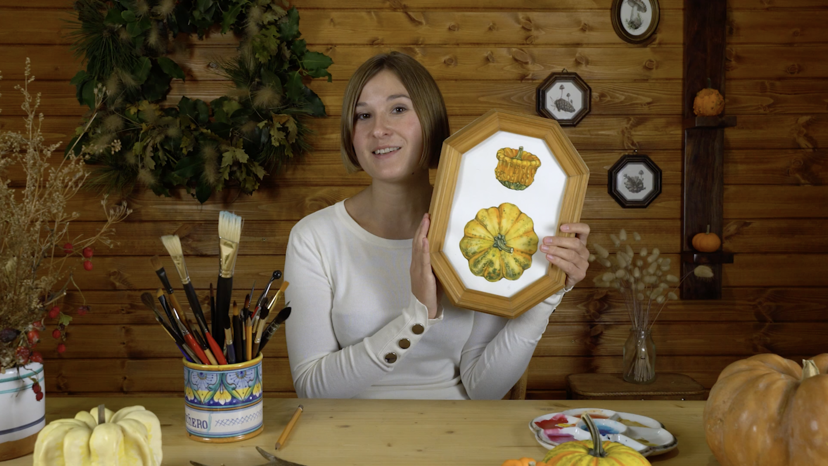
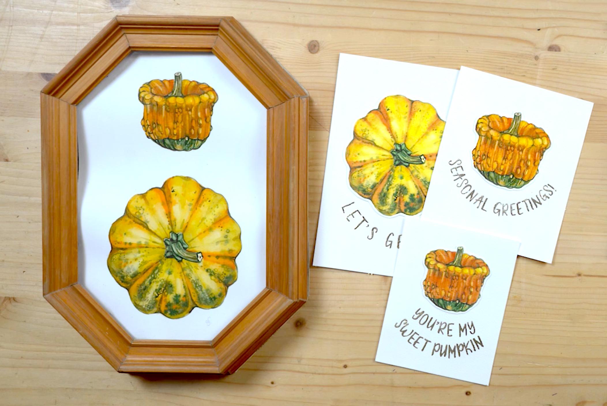
7. Framing: Our painting is ready, so now it's time to frame it in our beautiful vintage frame, I will be using this one
that I found here in Italy, where I live in one of
the local flea markets. And I will also use this beautiful scrapbook paper to decorate the
backside of the frame. I take my frame and First step, I'm putting my painting inside and gently
pressing with my hands. I'm closing it with the
cardboard and I have the back covered that I will now decorate with my
scrapbooking paper. So here's my paper. I really like it. I think
it will make a great fit. So I put the cardboard on the
surface of my paper and I trace the outline of
the cardboard and then I cut it out with scissors, just trying to be careful
and not getting too much. And now the paper is ready. Now I need to stick
it to the cardboard. To do so, I will use
the double-sided tape. I cut small pieces and stick them to the edges of my board. When I'm ready, I peel off the upper surface of
my tape one-by-one. When all of the sticky surface
is free of the top film, I can apply my paper. So I place it on the
cardboard and press with my hand steadily
to make it stick. Next, I'm cutting
the same pieces of double-sided tape and apply them to the
frame itself to be able to stick the
cardboard to it. I peel off the top player
and stick the cardboard to the frame and press
it with my hands. And this is the final result.
8. Making Postcards: Now you have your
unique framed painting that can become an amazing
decoration for your home. It's also a very nice way
of keeping your memories. Similar to photography, but much more personal and
unique when you paint something that you used to hold in your hands during your walks or maybe while
working in your garden. It really creates a
very strong connection with the subject and also helps you remind yourself
of this beautiful moment. Spend in nature. If you also want to share
your love for nature or your memories with
your family or friends. You can make it through creating personalized postcards
just like these, using your own illustrations
and gilding technique. If that sounds exciting,
Let's get started. I made a copy of my
paintings on a thick paper, and I will be using these to cut them out and
make my postcards. So what I'm doing now, I need to apply the
double-sided tape to do so, I look at the backside of my illustrations
through the light and I see where the edges, that's where I will stick
my double-sided tape. I'm following the
outline of my pumpkins. I'm doing it with the
First Pumpkin first. And I'm doing the same
thing with the second one. Then I take the scissors and
cut out the First Pumpkin, making sure I'm leaving at least a few
millimeters on each side. I'm then cutting out the Second Pumpkin
using the same method. And there you go, my pumpkins are ready. Now, I can start looking how they will look
with my lettering. So I can play around
and place them and try different sizes of lettering to see which one will fit best. Now, I cut out the lettering to make them match
each illustration. And I will place them on
the white sheet of paper to see if I'm happy with the
final result, looks good. The next step is to
transfer my lettering on the final sheet of paper that I will be using for my postcards. I will be using my
light box for that. I turned it on and I increase
the intensity of my light. If you don't have a
light box, don't worry. You can use your window during the daytime to
create the same effect. Just place your illustration
on your window, put your white sheet of
paper on top and trace it. Don't rush the
transferring process. We want to make our
letters look nice. And even so my advice is spent a little bit
more time on that, but you will end up
with a better result. Outline the end of my
Postcard with a ruler. And then I'm transferring
the second lettering and outlining the edge of
the second Postcard as well. It's time to cut
out my postcards. I'm doing it with my scissors, just trying to be careful and get a straight
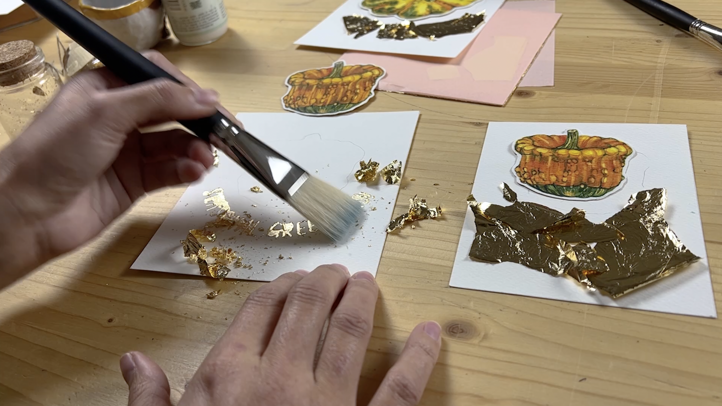
edge. There you go. All three are ready. So now the real magic will
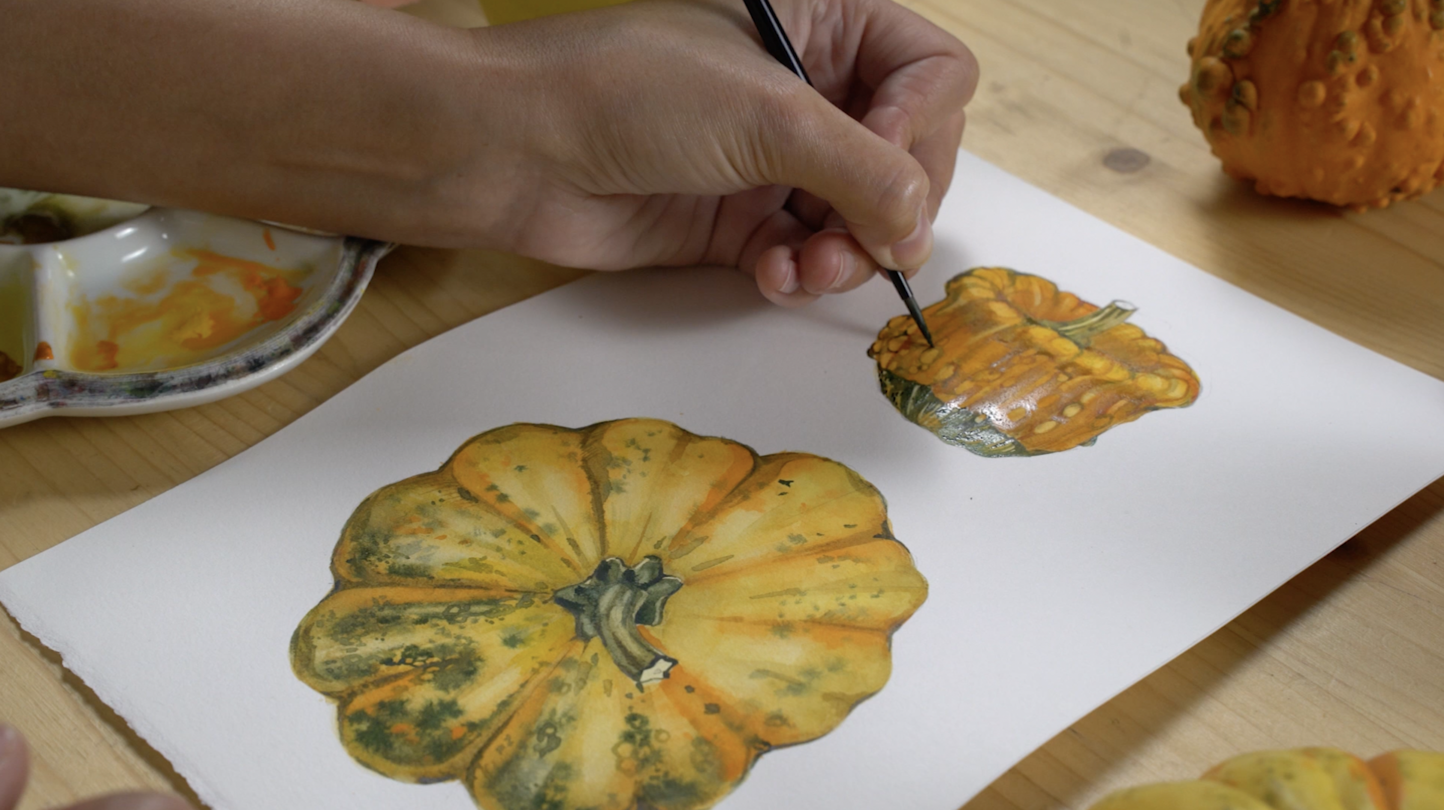
happen because we will start to apply the brass
leaf to our lettering. This will really make
our postcards standout and make them look shiny and
magical and very pretty. I won't be using this
gilding fluid by developed, but feel free to
use other brands. I will apply it with an old brush with a decently
sharp tip brass leaf Using the one in sheets, I will also need a normal
synthetic brush and hard brush to be able to get rid of the excess
of the brass leaf. So the first step,
dip your old brush in the gilding fluid and start to applying it
to the lettering. This process is very important, so trying to be as careful
as you can because the gold leaf will be applied exactly where your
gilding fluid is. So spend the time on this process because it will really make a huge difference. When you're done, leave your
gilding fluid to dry for at least 15 min until it
becomes completely transparent. When this happens, it means you can start to apply
the brass leaf. Don't do it before because otherwise your gilding
liquid will be smudged and you will not be able to apply the
brass leaf nicely. Take the brass leaf and I
usually divide it in pieces. I take them with my
hands and I apply them on my lettering one-by-one. Once it gets stuck
to the letter, I gently rub my
brush against it to make it stick even better
to each of the letters. Applying one more piece, again, pressing with my brush and so on until all the letters are
covered with brass leaf, I'm continuing the process
on other postcards as well. And now it's time to take off
the excess of brass leaf. I'm doing so with
my hug hair brush. And he said that the letters
start to appear already. So this process
might take awhile. So be patient. And if you have troubles taking
off some small pieces of brass leaf from inside part of the letters trying to use this movement, you see me doing. The first Postcard is ready. I will remove the brass leaf from the second one
with the same method. I already love how
it looks so shiny and I think the lettering
turned out perfectly. So now the final part, sticking the illustrations
to the postcards. So I'm peeling off
the upper part of the double-sided tape and sticking my Pumpkin
to the Postcards, pressing them with my
fingers and there you go. This is the final result. I really like how my
postcards are turning out. I love this shiny lettering and the illustration just
looks so nice with it. I think this DIY project is an amazing opportunity to
give something unique to your loved ones or
to even sell it because the final result actually looks
really professional. So here is the final
result of the class, my framed painting and three custom postcards created
using my illustrations. Now you know how to create a realistic Botanical
Painting using watercolors. I hope that you enjoyed this mini-course that
I inspired you to create more and express yourself creatively
through watercolor. I will see you next time.
 Natura Illustrata, Anastasiia - Watercolor artist