Transcripts
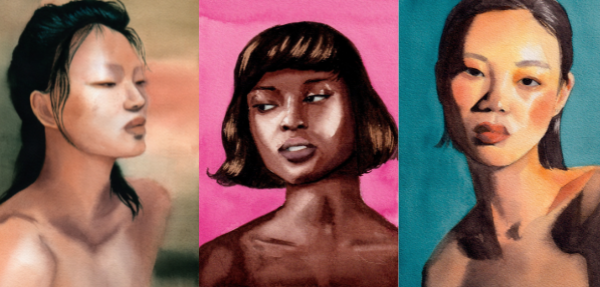
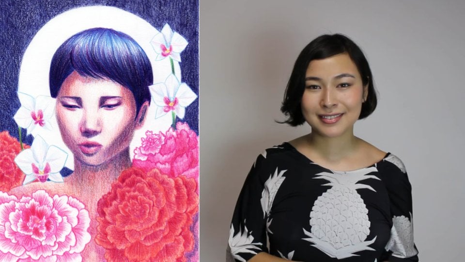
1. Introduction: Hi. My name is Bia Barrett and I'm watercolor artists
specialized in portraits. Have you ever looked at a watercolor portrait
and thought, wow, I really wish I knew
how to paint like that. I wish I had a technique. When you try to
learn on your own, it was just a
frustrating experience. Well, I've gone for that
and that's why in 2019, I started investing
in workshops and classes with some of the
best artists in the world. Now after a couple of
years of practice, I can finally say that this
is my favorite medium. Before, I used a lot of
graphite in my work. But that took a long
time and it didn't have the versatility and fun that
I find with watercolor. Watercolor is also a
much quicker process, the painting's taking about
an hour for me to finish. During this class,
I'll be sharing my entire process from
sketch to final painting, getting valuable advice that
I learned not only from the masters as well as
from my own practice. By the end of these classes, you'll be able to paint a colorful portion based
on the photo reference. Hopefully, you'll also fall
in love with watercolor.
2. Class Project: [MUSIC] Let's talk about
the class project. The class project will
be a self-portrait, and why a self-portrait? Well, they're traditionally
used by artists as a form of study,
but in this course, I'll also go through how to
pick a good reference photo, and it's likely that you have more reference photos of
yourself than anyone else. Also, this course is based on photo references
and observation. You do need to observe the image or the subject
for a long time, and you probably would like
to pick someone who you don't mind staring at it
for long periods of time. Of course, if you do not feel comfortable with painting
and posting a self-portrait, you can pick a different
reference image, just pay attention to the best practices that I'll be sharing along this course. Finally, don't forget to
share your project with us so that I and your curious
can give you feedback. This is a valuable
step of the process, and I can't wait to
see all your projects.
3. Supplies: [MUSIC] Let's go over some
of the supplies you'll be needing
for this class. First, here's a
watercolor paper. For this technique,
the watercolor paper must be 100 percent cotton. Paper that is not labeled
100 percent cotton, usually is made out of
cellulose or a mix of both and that's
just not going to work with this technique
because cellulose slowly disintegrates as you add
more water and more layers. Another important
supply you'll need for this class are your brushes. Here I have three
watercolor brushes. One is 100 percent natural fur, one is synthetic fur, and one is a mix of both. Well, natural fur does
hold a lot of water. It's also a lot softer and you can't really keep a
fine point for long. As for the synthetic, it's more sturdy, but
it holds less water. This is why I opt
for a mix of both, synthetic and natural furs, so I have the best
of both worlds. It holds a lot of water and
it's also quite sturdy, so I can get that very fine
point with round tip brush. This is the optimum brush
because it's not too small, so I can paint large areas, but as it has a round point, I can use that little
point to make a lot of fine details as you'll
see in the demos. Now, moving on to paints, whether you're using
little tablets like these, or if you're using tubes, the most important thing is to invest in professional
grade watercolor. You don't need to
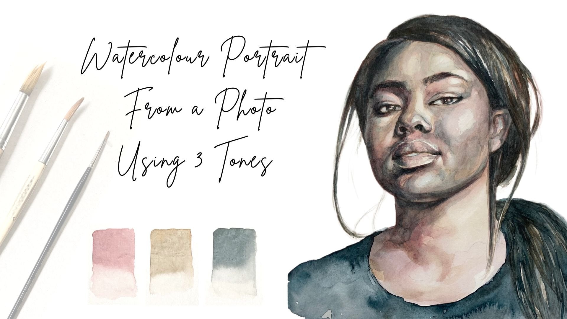
buy a lot of them, in this painting I'll be using only three
colors to show you that you only need the primary colors to paint
a beautiful portrait. This will also help you get more harmony
in your portrait, especially if you're
starting out, because you don't need to think about how the
colors go together. They'll all be coming from
a mix of yellow, blue, and red, and this will give harmony to the overall painting. Of course, you'll
also need water. I like to keep two cups, one for dirty water and
one for clear water. That way, you ensure your
colors are always clean. I also have a palette
for mixing the colors, and if you're not using
all of the paint, you can let it dry and just reactivate when you
needed to use it again. It's also important to have a piece of scrap
paper where you can test the paint that
you are mixing and makes sure the
tones are right. Have an old rag or
paper towels or even a little sponge to soak up the extra moisture and
paint from your brushes. For the drawing portion
makes sure you have a good pencil and
equality eraser. Finally, we have the optional
but very useful extras. A water spray bottle to
activate the paints, and some tape to tape
down your paintings and make sure they don't move around while you're painting. This is optional too, but if you can work on a
surface that's slightly tilted, this will drive the
water downwards and will help dry
the paper faster. [MUSIC]
4. Choose Good Photo References: [MUSIC] The first step in making a watercolor
portrait from a reference photo is actually choosing a good reference photo. To choose a good
reference photo, there's two things
you need to consider. The first one is lighting. You want to pick a picture
that has a lot of contrast, that has a lot of
light and shadow. Clear light source because
those cast shadows to help you gain the trig
dimensionality in your painting. Contrasts creates interests and your painting will
benefit from that. Avoid pictures
that are beauty or commercial because those tend to have very even lighting, and it's very difficult
for you to really have difference of tone and all
the features of the face. The second thing to
consider is distortion. When you're taking a photo depending on the
lens you're using, especially if you're using
a selfie, front lens, and stuff like that or have a distortion of your face where things that are closer
to the lens will look bigger than the
rest of your face. This can really make
your painting look strange or your drawing
look a bit off, and it can really hinder your
portrait drawing skills. I do not recommend for beginners
to use photos that have distortion simply because
you're still training your eye, you're still trying to
understand proportion and the distortion of these lenses really hinders that process. Another silly thing
that also creates distortions are those filters, whether they're
TikTok or Instagram, they really change our faces, they make our noses smaller, they make our eyes bigger. It might seem a
little bit silly, but they again
distort our view of proportions and they can really make your portrait
looked a little bit off. [MUSIC]
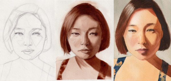
5. Drawing the Portrait: Let's start by
drawing the portrait. For this, you'll need a mechanical pencil
or a regular pencil, whatever is more
comfortable for you, a high-quality
eraser, and a ruler. So the first thing I do is
look at my reference image, and make sure that I center
the image in my paper. Then, I grab a ruler and map out the main proportions
of the face. I don't always do
this, but it helps, especially when
you're starting out drawing to get the
proportions right. So here, I'm just making sure I get the right
vertical proportions. The length of the forehead, the nose, the lips,
where my chin is. Getting these proportions
right, is what will ensure, not only a higher
level of realism, but also capture the likeness, which is super important
in a portrait. Actually, measuring
your reference image and using a ruler is
not always necessary, but it will help a lot, especially if you're
starting to draw portraits, and you need a guide to
help you train your eye. The more you practice, the more your eye
will be refined, and you'll be able
to actually tell, just by looking at the reference and looking at your drawing, what proportions may
be a little bit off. But when you're
just starting out, and especially when
you're putting down the bare bones of the drawing, it really helps out to
have these measurements. Now that I've established
the vertical proportions, I move on to the
horizontal measurements. So what's the length of my chin, my jaw, and so on. Again, this method for me works faster than if I was using the Loomis method for
drawing heads or really any other reference of
proportions that is ready-made, because I'm trying to draw from reference and
not imagination. I'm really trying to focus and get the likeness of the
subject I'm working with. So in this case, it's a self
portrait as we spoke before. It's really important you pick a reference that you actually don't mind staring at for
long periods of time, because that's the
only way you can really map out those proportions
and capture likeness. I find this process very interesting because
with time you'll realize that nobody has a super proportional face or
a super symmetrical face. Everyone has their own
particular quirks and particular characteristics
that form their likeness. So you don't need to worry if
you realized your nose is a little bit crooked
to the right or one eye is higher
than the other. It's just normal,
everyone has that. The more you stare
into your reference, and have it as a guide
for your drawing, the more you will realize
that this is natural. This is also why it's important to pick out a
reference you really like because you will be staring at it for
a very long time. Now that I have the main
proportions laid out, I very lightly look
for the big shapes. So what's the overall
shape of the head? Where roughly the nose, the mouth, and the
eye should be. Again, I have a very light hand. I'm focusing on the big picture, and I try to not detail anything
for as long as possible. Because I want to make sure
that everything is in it's right place before I
really commit to details. This really makes the
drawing process easier because if you don't
overly commit to details, you won't get attached
to that drawing, and in case you need
to erase and start again a single part
or maybe all of it, you won't feel too bad for
the time you invest in. The main advice I
have at this stage, is to focus on the big shapes, the big geometrical shapes, and try to also use geometrical
shapes for the mouth, the eyes, and the nose, and not to overly detail them. One thing that can also be
very useful at this stage, is to see the shadows as actual
geometric shapes as well. If you picked a
high-contrast picture, which you will hopefully after the class about
reference pictures, you will have a lot
of cast shadows, and a lot of definition between the light and
dark parts of the image. So use those shapes. The shadows can really help you define all the
features of the face, and when you map them out, it'll be easier for you to see if the proportions
are correct. If the eyes are in
the right place, if the nose is in the
right place and so on. In the video, you can also see that I'm constantly checking the angles by using the
pencil or using the ruler, and that really helps
get those shadows right, and get every angle
of the face as close as possible to what I'm seeing
in the reference picture. I know laying out the foundations and
making the drawing, might not be as exciting
as painting itself. But truthfully, this is the most important
part of the process. It doesn't matter what
watercolor tricks or skills you have, if you don't have a good
construction underneath, you won't be able to have
a good final result. The quality of your drawing
is the main factor that will influence how good your painting will be
when you finish it. So please, don't rush this face. Take your time. Look
carefully at the reference. Look carefully at your drawing. Make sure those angles and
proportions are correct, and slowly start to
build up your drawing. This way your painting will already start with
great planning. The more you can plan your
painting ahead of time, the more you'll enjoy the
actual painting experience, because you won't be
trying to figure out little details of what you
need to get right or wrong. You can just focus on
the process, the water, and how the different layers of paint are going
to mesh together. I realized some people
might get frustrated with the fact that I don't have a step-by-step way
of drawing an eye, a nose, and mouth. But that's because
I truly believe that when you're
referencing a photo, the best thing you can do is to really look at
your reference, get those angles, the
proportions right, and slowly build up your drawing
from geometrical shapes. That's because
this way you'll be able to draw any
reference image, and not a cookie cutter model of a nose or
a mouth or an eye. One last tip that
you need to follow before you go into
the detailing stage, is to take a pause, go for a walk, have
lunch, talk to someone, and then go back
to your drawing, and you'll suddenly see things that weren't as
clear to you before. Let's go over some little
details and mistakes I caught. First, my mouth isn't
a straight line. It's slightly tilted upwards, crooked upwards to
one of the sides. While looking at the
image and my drawing, I also realized one of the
nostrils looks bigger than the other because of the shadow that is cast to one of the sides. So it also corrected
that in my drawing. I also double-checked every
angle in the drawing to make sure that it looks harmonious and is in line with
my reference picture. At this point, I realized I was really unhappy with the
way the eyes turned out, and I decided to just erase
them and start over again. This is why it's so important to keep your drawing very loose, not do a lot of details because this way we'll have a
lot of more flexibility. Even psychologically, it will be easier to erase and
start over again. I didn't realize it right then. But the reason why I wasn't
happy with this positioning, is that my eyes are not
really symmetrical. One of them is slightly
higher than the other. When I was drawing
with that idea that our eyes are in the
same little line, that really made my
drawing suffer because I wasn't really actually looking at the
reference picture, and noticing that one eye is slightly higher
than the other. Thankfully, I caught that when I was doing
the second drawing. We are making two
drawings for this class because one will be used for
the monochrome painting, and one will be used for the
final colorful painting. It's really important
for you not to get overly attached
to these drawings. After you make the first one, you can start the
new one right away, or you can wait a couple of
days and start the new one. But you'll realize that
the second one will be way easier because you already
know the reference image. You already studied it for
at least half an hour, and now you'll have lot more
ease building or drawing. Only when I'm really satisfied
with the overall image, do I put details in, and here's how the final
first drawing turned out.
6. Watercolor Basics: [MUSIC] Before we start painting, it's important to talk
about how watercolor works. In watercolor when you're trying to achieve lighter tones, you need to put more water into the mixture
and less pigment. Watercolor is a
transparent medium, which also means that if
you have a darker color, you're not able to go over it with a lighter
color and cover it up, which is possible when you're working with
oil, or gouache. That does not work with
watercolor and that's why we usually work
from light to dark. When you want to achieve
lighter colors with watercolor you need
to add a lot of water and just a little bit of pigment and you'll have a
consistency that we call tea. When you add more pigment
and a little bit less water, you have a consistency
we call milk, and you can see that
it's more vibrant. It's a darker tone. [MUSIC] If you go even darker, with a lot of pigment and
just a little bit of water, you have the consistency
that we usually call honey and this is
very easy to control. You can make small details
and fine lines with it and that's how you paint the
darker parts of the image. This difference in tone within the same paint is what we're going to use in our
monochrome painting. Working from light to dark, from more water to less water. [MUSIC] Now, to showcase some of the techniques we'll be
using for portrait painting, let's paint a simple sphere that's receiving
light from the left. First, we start with a very light coat of paint
that's in a tea consistency, so that's a lot of water and just a little
bit of pigment. The paint will only flow
where you've wet the paper. Since we started on a
dry piece of paper, you have full control to where the pigment and the water flows. [MUSIC] To soften transitions
between light and shadow, you can grab a clean brush with just water and wet that
area of the paper. [MUSIC] Then get more pigment in a mixture that's a milk consistency
so more pigment and less water and paint the part of the sphere
that's in shadow. Since the whole
sphere still is wet, you'll have a very
soft transition. [MUSIC] As long as the paper is still wet, you can move the paint around and create the
transition you want. But this only works while
the paper is still wet. [MUSIC] Another technique that's only possible while the
paper is still wet, is to grab a clean dry
brush and absorb a bit of the pigment that's in an area in order to lift that area
and make it lighter. [MUSIC] In order to
paint the cast shadow, which is the darkest
part of this figure, I have a mixture of a lot of pigment and just
a little bit of water. Since the paper
is completely dry when I've put down
this layer of paint, there's a very clear
cut distinction between light and shadow. These are just the
basic techniques you'll be using throughout this class. You can always go back to
more simplified forms and practice these differences
in soft transitions and harder shadows and
also try to experiment and mix different
paints so you can learn the differences between
each consistency.
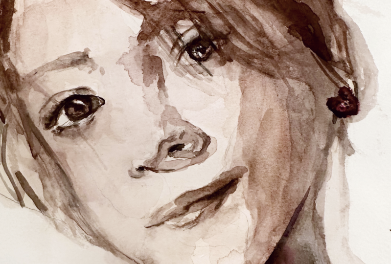
7. Monochrome Painting: Let's make our
monochrome painting. This is a great way
to practice only focusing on values and not
having to worry about hues. I made dozens of these before
I moved down to color. Grab the drawing we made
in the previous lesson and tape it down to
a inclined surface. The inclination will
help the water flow in a single direction and will make the painting
process easier. The steeper the incline, the faster the paper will dry. Here I have a piece of cloth
to dry off my brushes, two cups of water, one for clear water, one for dirty water. The watercolor paints I use, though for this portrait, I'll be using a single
color, burnt sienna. Always choose a dark
pigment like dark brown or dark blue when
you're working in monochrome. I also cleaned up
my palette so you can actually see
me color mixing. I don't usually do this just because watercolor can always be reactivated and
used again and also, I have a piece of
scrap paper where I test out all the
paints I'm using. For this one, as I said before, I'm using burnt sienna
and as you can see, it can achieve very light colors when mixed with a
lot of water and very dark colors when there's almost no water and
it's mostly pigment. Before I start painting, I always like to
soak my brushes for a few seconds into water so that they can become
malleable again. Also notice I use
a different brush, a cheaper one,
totally synthetic, just to mix up the paint
and activate it with water because this movement can really damage the expensive
watercolor brushes. I really recommend you buy
a cheap brush just to mix the paints and so you don't have to worry
about damaging it. Since we're focusing on values, I edited my picture to
be in black and white. You can do this in
various apps by just lowering the saturation
of your reference image. So for our first layer, it's mostly water and just
a little bit of pigment. In watercolor, we often call this layer T because
it's supposed to have the same consistency
of T so you can see it's very liquid and it's
very light in color. Since we don't have any really bright highlights
in the painting, we can confidently cover all of our portrait with
this initial layer. Remember, watercolor
always lightens up as it dries so don't be
afraid to cover it up. If there are any
areas you want to lighten up while the
paint is still wet, you can do so by taking
a relatively dry brush, a clean brush, and
wiping the area because the brush will soak up the paint and that area will
become whiter. Another way you can
lighten up an area is by taking a little
bit of pure water and putting it there because it
will reopen the fibers of the paper and it will move
the ink out of that spot. Please note that both of
these techniques will only work while the
paint hasn't dried yet. After the paint has dried
it is really difficult, if not impossible
for you to rework your watercolor painting
and make lighter marks. You can tell whether the paper
has dried or if it's still wet by how much light
it still reflects. Here in the video,
you can clearly see that especially at the
top of the painting, there's still an area where
there's a lot of reflection so that indicates there's still water in the paper,
it's still wet. Unfortunately, in
this specific case, as the paper did not
really dry there even after the rest of the
painting had already dried, it indicates to me that
this paper was damaged. This sometimes
happens in storage or sometimes happens
in production but these areas don't really soak up the paint and it can be really
difficult to work with. In this particular case, I didn't mind because it is
in an area that's going to be dark and it doesn't have any details so it
won't show up as much. But I'm going to show you
a close-up so you can tell what it looks like
when your paper is damaged. After that first layer
completely dried, I mixed up some more
paint with water, this time to get a darker tone and I'm defining the shadows. However, I later discovered or I realized that this was still
too light for the shadows. Right after I did this layer, I mixed up some more paint
to do the shadows again. The big lesson here is do not be afraid to darken your painting. It is the contrast that will make your portrait interesting. Let's mix some paint. For the lighter layer
as we said previously, you only need a little bit of
pigment and a lot of water. This has the consistency of T and is used in the lightest
parts of the painting. For our second layer, we need a deeper consistency that will give us
a darker color. For this, we need less
water and more pigment. What we're looking for is something with the
consistency of milk. Yes, this is usually
called the milk layer. After adding more pigment, I have the consistency
I was looking for. But I always check
with my piece of scrap paper because remember, watercolor also lightens
up as it dries. It's always nice to test out your color and make sure
that you have what you want. This is the consistency
you're looking for in the second layer, milk. One thing to keep in mind, even during this step of the process is always
look at your reference. Have a very careful
eye and take your time to absorb the information
it gives you. Because although we marked out the shadows in the
drawing portion, it's still important to train your eye to see the
different values. Since we're on the
topic of shadows, in this reference there are places where you want
a softer transition between light and dark and in others you want a harsher line, a harsher more defined
aspect to your shadow. In order to get that
softer transition, what I do is I have a clean brush and with
this clean brush, I pick a little bit
of water and just wet the areas adjacent to
where the shadow will go. The paint will be able to
flow to the wet areas, but it's in a more
controlled way. You'll have a softer transition, but you don't risk losing that light and dark
effect you have going on. Now that the previous layer
has completely dried, we move on into the
smallest details of the painting and
the darkest areas. For the small details, the darkest areas which are like this parting of the lips, the nostrils, the
details of the eyes. We use a lot of pigment and
just a little drop of water, just enough to make it workable and usable
with our paintbrush. The consistency of this
layer is similar to honey. This is the honey layer. As you can see, I'm still using the same exact paintbrush that I was using in all
previous layers. This is why I love a
round-tipped brush. It is so versatile. You can paint large areas
and as you can see here, it can come to a fine point, and with that small point I can do really small detailing like the little nostrils or even
the fine lines of the eyes. After I painted
the darkest darks, I realized my shadows were
still not dark enough. I went back and corrected that by darkening the
shadows once again. Remember, this is
a study of values. It doesn't need to be perfect. You might have to
rework it as I did. The main idea is to
understand how dark or how light the values need to be to convey the depth you
want in your image. This can be tricky to get on the first try for two reasons. One, the watercolor
will always dry lighter than what you put
down on paper when it's wet, so you need to account for that. But it takes a while
for you to get used to it and really be able to measure how dark
you need to go for it to dry the right shade
when you're finished. Another issue is that
value is always relative. When the paper is
white and you're first putting down these layers, it looks dark relative to
the white of the paper. But when you go to
the darkest layers, the darker layers may really
indicate that your mediums, the middle shadow are
just not dark enough. While watercolor does have this general rule that you
should go from light to dark just because there's no undo button and watercolor
is a transparent medium. You can't really go over it with a lighter color
and lighten it up later. I still encourage
you to experiment and even do something
similar to what I did here, which was to go to the darkest
dark and then look at it again and see if
you really need to darken those middle
tones, those shadows. Remember, this is
just a way for you to figure out how you're going
to do your final painting. It doesn't need to be perfect. Now onto the hair. To give off the illusion
of strands of hair, I usually have a very light hand and make all these
movements back and forth. That will help create very
fine lines to taper off and will give the illusion of strands of hair flowing
in the same direction. Now for the highlight part, I have a clean brush with some water and I'm
wetting the paper beforehand so we have a very soft transition
from light to dark. Since the other side of the
hair is mostly in shadow, I don't have to worry that
much about details and I can just cover the whole
area in a darker tone. After I darken that cast shadow, the only thing left
to do is the dress. First, I wet the paper with a lighter and more watery layer, and then I get very concentrated paint and just put a few drops in
and let the paint flow. I thought this would be a
nice effect and will give off the same idea and feeling that the dress pattern does in
the reference picture. Here's the final result. Now that you're done with
the monochrome painting, let's move on to color.
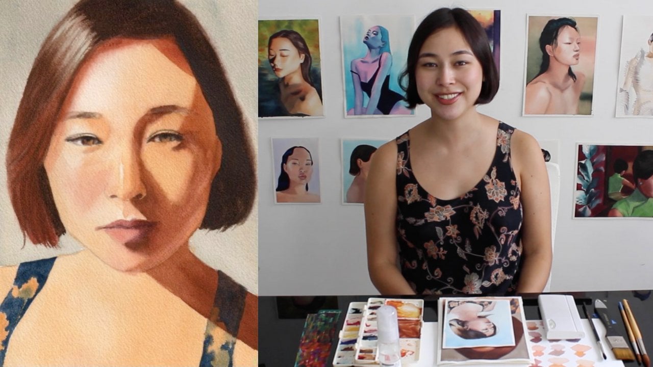
8. Color Mixing: [MUSIC] Before I get into the
colorful painting, I want to talk about how I mix the colors and how I achieve
a variety of skin tones. Keep in mind here I'm just
using the primary colors, so yellow, red, and blue. For most Caucasian and
East Asian skin tones, so lighter skin tones, I generally go and
mix some orange, so a little bit of yellow, a little bit of red and I
just play around with that. When you're diluting it
a lot of water you get really nice skin tones from
different tones of orange. Sometimes I add just a little
bit of blue so I can see different variations of cool
versus hotter skin tones. Some people, they have
this green undertone to their skin and you
can really capture that by adding a little
bit of blue to your mix. When you're looking for
darker shades of skin so if you're painting non-white
people, indigenous people, black people, brown people, basically what you
want to do is add more blue and add a
little bit more red. That will get you some
different variations of brown. Again, you have to really
observe your reference and see if that brown is more
reddish or more bluish. There's also the
variations of light. Always keep in mind that
skin is not uniform. This is not a cartoon. Real people have blemishes and they also have variations of skin tone just based on how much blood those areas
of the face have. If you look at the picture, you can see that my cheeks are a little bit more reddish
than the rest of my face. That's because we generally
have more veins over there. You get more blood, you get more red. A lot of the color variation you will see also
depends upon light. Here I'm also mixing darker paints even though
I'm painting myself. I'm East Asian and white. Because all these shadows
they will be brownish hue, sometimes in a more reddish hue. I really wanted to capture that. For darker skin tones, I really like to
start with a purple, so I mixed a lot of blue and
red and then keep adding just a little bit of
yellow so I can get a more neutral, more brownish hue. But in darker skin tones, purple is a great way to start just like in lighter skin tones, orange can be a great
place to start. Here since this is
a demonstration, I'm mixing a very small amount
because I just want you to see the range you can get from these three tubes of paint. But once I know which colors I actually
need for my portrait, I want to make large quantities so that I
don't worry about running out while I'm painting because it can be very difficult
for you to achieve the same hue once you've run out of a specific mixture and
you need to make more. Always make more of a mixture of paint then you think you need
to finish your portrait. Don't worry about
being wasteful because watercolor will dry on the palette and it can always
be reactivated with water. It doesn't really go bad. You can really mix as much
as you feel comfortable with so that you have
enough for your portrait. If you have leftovers, it's fine you can
use them again. You can mix them with
different paints and get different
tones and hues. It really isn't going to be wasteful and you're
going to be really thankful for it once
you're painting a portrait and you have
enough to complete it, you don't have to worry
and stress about, well, what if I run out
of my main skin tone? What if I run out of
this shadow color? You really have a less
stressful experience if you just mix large
quantities of paint. This is basically what
I'm preparing to do at this stage because I want to
have all my paints ready, or at least the main tones
that I need have to be ready before I start the
actual painting process. That's why I said
at the beginning of this video your painting really
starts with the palette. Just like you're drawing, your initial drawing serves as a map and markings of
where you need to paint. Where is the shadow? Where
is the light? It's a guide. That planning also
happens on your palette. You have to have
the main hues and main colors you're going
to use already mixed. Then when you're getting into
the rhythm of the painting, you don't need to stop
and mix more paint. I really want you
to experiment with these three colors
and see what hues you get and make sure you have all your paints ready
for our next step, which is the colorful painting.
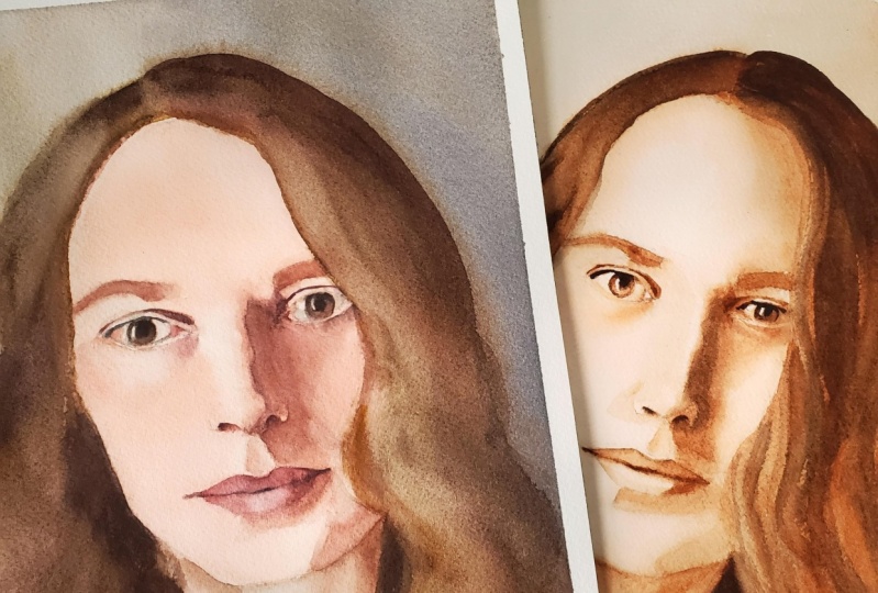
9. Final Painting: [MUSIC] Now let's go into
the final painting. In this video, I did not
include the reference photo, just so you can see clearly what I'm
doing in the palette. The actual painting process
starts with the palette. When you're mixing
up your things, when you're getting the
right tones, the right hues, the more prepared you enter your painting with all
of these paints ready, the easier the process will be. Just like in the
previous painting, we start with a tea layer. It has a lot of water and
just a little bit of pigment. Here already found
one improvement upon the study that we made. One side of the face is
lighter than the other because the light source is coming
from left to right. In order to get this soft
transition and effect, I painted one of the sides with my paint mixture and then
I diluted it a little bit more with water so that there's a very soft transition and a lighter tone on the left side. Even after diluting
some of the paint, there were still areas
that I wanted to be even lighter, like
the highlights. For that I used a
technique that I mentioned in the monochrome
painting, which is, having a clean
relatively dry brush to absorb some of the pavement
and lighten up that area. Now, I wanted to talk a bit about the rhythm
of the painting. You may notice there's a certain speed which
I'm using to work here, which in this case
is pretty fast. Why am I working fast? Well, watercolor is a medium
that dries very quickly. To get soft transitions, you need to work while
the paint is still wet. That will vary according to the climate where
you're painting in. Here I was painting in
the summer in Brazil, it's pretty hot and the
paper dries really fast. If you're in a colder climate or even if it's winter here, I have a little bit
more time to work with, and the rhythm of the
painting changes. But you have to be
aware of it to work with the watercolor
and not against it. Now that we're
working with color, you need to be aware of the slight hue variations you
can see in your reference. Within the same layer
of a tea mixture, you might have an area that's more reddish like
the cheeks here, or an area that's a
little bit more gray. Really paying attention to these slight variations will help bring realism
to your picture. Because instead of having
the skin be all uniform, which is not what
happens in real life, you can really capture all the slight variations
that are caused by how our blood is distributed
in our skin and faces, or slight discoloration that
come with age and so on. [MUSIC] Now that we're
painting the neck, I have to think about
the same thing that I did when I started
painting the face. The light source is coming from the left and one of the sides
is lighter than the other. After having an overall
very diluted wash going through the entire body, I'm grabbing more pigment and having one side be
darker than the other. The transition becomes very soft because all of this
paint is still wet. [MUSIC] After that first layer
is completely dry, I'm just going over
with a very light wash, so a lot of water, just a little bit of pigment, and doing some
color corrections. Basically I'm mixing
different hues. Again, just a lot of water
and a little bit of paint, and I'm just coloring
these areas, so there is that variation we were talking
about with the skin. [MUSIC] Now we move on into
the milk layer. There's more pigment and
less water in this mixture. One thing that I learned
with the monochrome study of this portrait was
that I was just not getting that
shadow dark enough. Here, I really was careful in mixing the paint
so that it is very dark so that I don't
need to be going over this shadow again and again like I did in the
monochrome painting. [MUSIC] Just like in a
monochrome painting, when I want to soften the transition between
light and shadow, I grab a clean brush loaded
with a little bit of water, and I just wet the areas
adjacent to where the paint is. [MUSIC] At this point, I do want to warn you that every painting has "ugly stage". For me, this was it right here. This is a point in
the painting when you start questioning your choices, everything looks a bit off and you start to wonder if it's even worth going
through with it. Let me tell you, do
not give up when you get to this stage,
trust the process. This is only
temporary and it only looks wrong because you
haven't finished it. So keep going and even if you don't really like
the final result, you still have learned
a lot from the process. [MUSIC] In the clip coming up next, there's something I regret
doing to this painting. Basically, when you
have a cast shadow, you may have some reflected
light bouncing back to that shadow and having
an area become lighter. I try to capture that with a wet brush taking away some of the pigment
within that shadow. That can work just fine. But I feel like I
overdid it over here, I overworked the painting. When you overwork the painting, when you go through and
work the paper too much, you get these tricks
and marks that I just don't find
aesthetically pleasing, so please do not
overwork the painting. [MUSIC] Now that the previous
layers have dried, we're moving on into
the honey layer. This is a paint mixture
with a lot of pigment and just a touch of
water. It's very dark. It works for small details and darkest parts
of the painting, such as the eyes, the nostrils and so on. To mix now dark
browns and black, you can use browns and blues, and that will give you a very dark close to black pigment. If you do not, however, own brown paint, just
remember that mixing yellow, red, and blue does get to brown, so you just have to add
more blue to the mixture. [MUSIC] Although as a general
rule we're told to work from light to
dark in watercolor, you can at this point
do other washes with more water and less pigment just to get the
right hues you want. Sometimes to change
the tone of things. That's not an issue. The reason why there's
this general rule is just because once you go
dark with watercolor, you can't really
lighten that area. I showed here a couple of
tricks where you can do that, but these techniques
have their limits. You go from light to
dark just to be safe, just to make sure that the
lighter areas are preserved. But after you paint
the darkest layer, there's nothing
that stops you from going back and correcting or fixing or making
little adjustments to your painting with
lighter washes. [MUSIC] Now that we're mostly
done with the skin, it's time to paint
the background. Here I'm using a very light wash and the background is
lighter than the hair, so that's why I'm
painting it first. I also covered the part
of the hair that will be the highlight because when I looked at the
reference picture, I realized it was a similar
hue to the background, which I saw as this very
light grayish green. I also started painting the hair while the paper was
still slightly wet because I wanted
a soft transition between the hair
and the background. [MUSIC] Since the hair is darker than the rest of the
reference picture, I already started painting
it with a milk mixture. This will also cover up any of the T layer
of the background. [MUSIC] I just wanted to mention a detail that makes a
world of difference, the white of the eyes is
never ever really white. I usually use a tea mixture of a light gray to paint
the shadows on. Painting these shadows
will give your eyes depth and well realism. [MUSIC] Moving on to the right
side of the hair, I'm using this
almost black mixture because this entire
area is in shadow. For that same reason, I'm not worried about
detailing this part, making every single
strand of hair. I don't need to give that
much information here again, because this area is in shadow. What matters the
most at the end, is the impression you get
from the overall painting, and I don't think that
having a lot of detail in really dark shadow areas
adds to that impression. [MUSIC] Now that we're done
with their hair, all that's left is
painting the dress. Here I have a different approach from the monochrome painting. I'm starting from the lightest
colors because I do want that bright orange and the
light green to be preserved. I'm loosely painting
flowers here because that's what the
pattern of my dress was like. But I'm not being overly precise with it because
I want people to focus on the face and not the details or the
patterning of the dress. These are also choices
you have to think about when you're doing a
painting of a portrait. You can choose which areas
you need to detail the most, that will draw the most
attention to them, and which areas could
be kept simpler. [MUSIC] Here's our final painting. I hope you enjoyed this demo.
10. Final Thoughts: [MUSIC] Well, we've reached
the end of our course. I really hope you enjoyed
this whole process and learned a lot about
watercolor portrait painting. I look forward to seeing your projects and
giving you feedback. I also would love to have your
feedback about this class. You can reach out to
me either here on Skillshare or in my
Instagram at biabarrett, and I'll be glad
to hear from you. Until next time.
 Beatriz Barrett, Marketing Specialist and Illustrator