Transcripts
1. Introduction: Hi, my name is Bia Barrett and I am marketing specialist and an illustrator in my spare time. Ever since 2019, my main medium has been watercolor, and I specialize in portraits. But at the start of my journey, I struggled with watercolor exercises, mainly because they were very repetitive. And I would use all my fancy expensive paper and a bunch of just... colorful lines. So I developed this class to teach you the fundamentals of watercolor painting. And by the end, you'll have a beautiful flower pattern as a result.
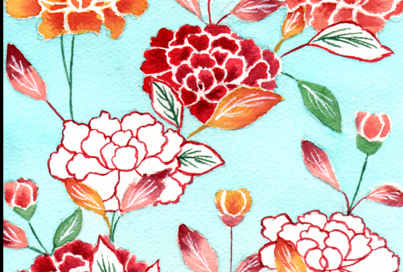
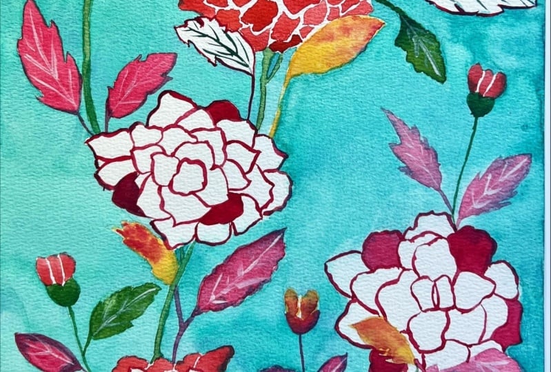
2. Class Project : Now let's talk about the class project. This is a beautiful sketchbook that I bought at the Metropolitan Museum of Art a couple of years ago. On the cover you can see a reproduction of a fabric panel that was painted using a technique known as bingata. Bingata is a traditional dying technique that was created in Okinawa in 14th century Japan. This technique consists in using a variety of stencils to achieve each layer of color. And also a mixture of rice paste preserves some of the white fabric. While looking at this beautiful pattern, I realized that to achieve the same results in paper, you could use watercolor and also you would need to have great water control to achieve this. So in this class you'll be following along step-by-step from the drawing to the final painting, how to make a beautiful flower pattern like this in watercolor. You will learn how to control the water and achieved this result. And these skills can be used for you in various watercolor projects. It doesn't matter if you move on to paint only flowers or landscapes or even portraits. These are the basics packaged in a way that will be fun and we'll give you a beautiful end result. So please follow along each step and leave comments if you have any questions, don't forget to post your final painting in the class project. I look forward to seeing all of your flowers.
3. Tools and Supplies : Alright, so let's go over some of the supplies and tools you'll need for this class. For the drawing portion of this class, you can use any pencil and eraser that you have. I'm using a mechanical pencil, but you can use whatever you feel more comfortable with. As we'll be using watercolors, the main ingredient is water. I recommend you have two recipients, one for the clear water and one for the dirty water. This ensures you will have a nice clean result. No extra pigment will be mixed in with your paint when you're working with it. You will also need some watercolor paper to ensure you have the best experience with this medium. I highly recommend you use paper that's a 100% cotton. A lot of the paper that's marketed as watercolor paper is actually a 100% cellulose, but that doesn't take in water as well. And you have to work faster and with fewer layers for it to work. Here, I'll be using a 100 percent cotton paper from Arches. This is a quite expensive brands and if you don't have access to it, I recommend you use a little bit cheaper paper that's still a 100 percent cotton. A good option is Hahnemuhle Expression line. It's 300 grams. It's a 100% cotton, but it's at a lower price than the Arches option. You can also look for other brands that have the same specifications. Just keep in mind that if you use cellulose paper, your experience is likely to be more frustrating. When you're working with a 100% cotton paper. It takes in water well and gives you more time to work as you're painting. This is especially important if you're a beginner. The more time you have to work with the paint and move it around, the easier it is to paint. As for brushes, I recommend you have at least one rounded point brush. We'll be using a single brush for this entire process. It doesn't matter if it's synthetic or natural or a mix of both. The importance here is the shape. This shape ensures that it can take on a lot of water and help you paint larger areas, while still being able to do a fine point, and letting you do small details. For my portrait paintings, I mainly use this brush for mostly everything. It's a great way to start your watercolor process without breaking the bank. You don't need to go out and buy 20 different shapes. Just make sure you have a paintbrush that is able to paint these larger areas and also come to a fine point. As for the synthetic versus natural debate, synthetic paintbrushes tend to take in less water, but there are more sturdy. You have to adapt and be able to get paint more often. But it's still a good option. If you have a little bit more money to spend, you can use natural paint brushes. But some people are not okay with the fact that they're made out animal fur. They tend to take in a lot more water, but they're also a little bit more fragile. Here, I'm using a mix of paint brush that has both synthetic and natural fur. This ensures it takes on a lot of water and also is a little bit more resistant than if it were a 100% natural fur. Finally, we have to paint. Here. I'll be using a variety of colors. But if you just starting, I recommend you buy at least three colors. One yellow, one magenta, and blue. With these 3 colors, you can mix pretty much all the different colors you'll need to get started in watercolor, no matter what you're going to paint. Asks for the pan versus tube debate. It really doesn't matter as long as you hydrate the pans first. So here I'll be using tubes that I squeezed into pants. You'll also need a pallet where you can mix all your paints and a piece of scrap paper where you can test out each mix. Oh, and don't forget to have a rag or a paper towel where you can clean your paintbrush between colors. This is super important and it will help you have, again, cleaner colors and not have as much dirty water throughout the process. Now, these last two are optional, but can really help you out. Tape, to tape down your watercolor paper. And a working surface that can be slightly tilted upwards so that the paint flows downwards.
4. Drawing the Pattern: But before we get into painting, we do need to draw the flowers onto watercolor paper. If you don't feel comfortable drawing this pattern, which I will be giving you an overview in the next few minutes of this video. You can also grab a template that I'll be leaving in the class project. This way, all you need to do is go over the drawing and trace it onto your watercolor paper. Okay, let's start. First. I figure out what the center is vertically and horizontally. This will give me a better idea of how much space I have to work with on my watercolor paper. Then I'm just laying down the big shapes. It's just simple ovals to figure out where each flower is roughly going to go. Here, a mother concerned with any detail. It's literally just figuring out where I have to draw each flower before I start getting into details. Once I am happy with how everything is positioned, I can move on to drawing the details. I really loved drawing peonies, especially in this style, because you don't really need a lot of skill. It's basically a lot of organic shapes. And as long as you're drawing petals from the inside to the outside, it will roughly look like a flower. So as you can see here, I'm starting from the center of the flower, which is roughly like drawing little circle divided into two petals. And then working my way outwards. When drawing each petal, try to make a circular motion and put some movement into it. It's sort of like drawing different shapes. And you can go back and correct any shape you don't really like. But basically there's no right or wrong way to draw a petal. This is why it's so fun. It's very organic and event, as long as you're respecting that structure of a flower, of all the petals going around the center. It will still read as a peony when we get to the end of it. As you're drawing these flowers, you will notice that not all the petals are the same size. The top petals tend to be a little bit smaller and the bottom petals tend to be a little bit longer and bigger. This gives the idea of perspective. So even though this is a very simple representation of a flower, just these little details with give you a little bit more of depth. And again, perspective in your drawing. So another thing that I want you to keep in mind is that here I'm pressing down with my pencil just because I want my camera to pick up my drawing. I usually would not draw this dark for watercolor. Because watercolor, as I said before, it is transparent. This means that even if you paint over it, the pencil will still be visible. So I do recommend that you go with a lighter hand, like I did when I was drawing the bigger shapes. Because then it will be easier to have a beautiful finished drawing without all these pencil marks on it. As we'll see later on in this course. Once you wet the graphite, you won't be able to erase it. You can only erase parts of the graphite that haven't been in contact with water. As I'm drawing this next flower, you'll see it's the exact same process. I start with a circle at the center, and then I work my way outwards, drawing petals and semi-circles, drawing the leaves. It's a little bit different, like your stuff, basically using an S curve. You just have to come to a point. Instead of making it a circular motion. Let's go over how did you other peony one more time. First, start with the center of the flower, drying roughly a circle divided into two petals. Then draw semi-circles all around those petals. As long as you keep doing this circular motion and drawing organic shapes. At the end, you'll have a representation of a flower that's very simple, but that conveys the idea of a peony. Remember, we're using the original artwork just as a guide. It's a reference to help you and make things easier. But that doesn't mean that you're drawing has to be an exact copy. So don't worry too much. If your flower has more petals or less petals are as occupying a little bit different space. You just need to draw one petal at a time and keep going and repeat the process for each flower.
5. Tea Layer: Now that you have your drawing down, we can start painting. So when working with watercolors, there are two main features we have to keep in mind. The first is that this is a transparent medium. That means that when you put down a layer of watercolor, you can't cover it up by putting more paint. This is very different from other mediums such as squash and oil. And it means that we'll be working from light to dark. Another feature of watercolor is that to achieve a lighter color, need to add more water and not white paint. So the more wire there is enough paint and water mixture, the lighter the color will be. This also affects the density as we'll see along this class. So the first thing that we're going to do is to take down our drawing. This will help us work with the paper because it won't move around as we're painting. And also it will prevent warping. So when we're working with any watercolor paper, as it takes in water, it will tend to war. And if it's not taped down, it can dry in different shapes. So if you have a taped down, the paper will flatten as it dries. Remember, we'll be working from light to dark. So let's start by that blue background. I'm using a turquoise blue. If you don't have to request blue, don't freak out. Any light blue will suffice. And remember, this class is about learning the basics and water control. So the color you use doesn't matter that much. What matters is learning the technique. And watercolor paints a little goes a long way. So I've put just a little drop on my palette. And you'll see that it's more than enough for this painting. As this is the lightest layer in our painting, we'll be using a lot of water and just a little bit of paint. This consistency is known as T and watercolor. So it's basically just sustain. The water, makes the paint very fluid. And it's basically a lot a lot of water and just a little bit of paint to give you that tint. Always mix more than you think you're going to use for your painting. Because MIT painting, it can be very stressful to try and get the same color again. So that's my tip. Especially if you're a beginner, always mix more paint that you think you're going to need. Make sure to have a scrap of paper where you can test out each color as you mix it. This ensures you have the right color that you want. And also will help you see how much of the color will lighten as it dries. So watercolor does have this very interesting property where as it dries, it will become lighter, especially when you're starting out. It can be difficult to predict how much to color, it's going to lighten. So having a test paper is super important. Now that we have the shade of blue that we want and the consistency we want, which is very fluid like T. We can start painting. As you can see, I'm starting to paint on dry paper. When you're painting onto dry paper, you have great control of where the paint goes. As it will only flow to where there's water. This is how you can get very fine details like going over the petals and the leaves without having problems to control the water. Hopefully now you understand why it's best to work with watercolor. In a table that's slightly tilted. This way, the water will tend to go downwards and will actually help you with your painting process. To avoid having streaks, fur marks in my background, I'm always leaving a little bit of water on the edges. As you can see, there's a little beat that forms. This way. I ensure that the paper will stay wet and won't dry out. So there won't be any harsh lines. That gives me more time to work on all the details without the ink drying out on me. How much time you have to work really depends on your working environment. I'm in some Paulo, Brazil in the middle of summer. So it's very hot and it's very dry. I had to work pretty fast. But if you are in a colder climate, you'll likely have a little bit more time to work with. So always take that into account. Another variable that impacts directly on how much time you have to work with is what paper you using. As I said before, a 100 percent cotton paper is the best option, no matter what type of watercolor work do doing. It is a little bit pricier, but it will ensure you have a better experience with watercolor as it will allow you to do a lot more with this medium. Although it had to work a little bit faster due to climate conditions. You can see, I'm not worried about speaking my paper as long as they have those little beads of water helping me make sure that the edges don't dry out. So I'm not entirely sure you can see this, but on the top-left corner there's a little petal that got a little bit of blue in it. What I'm trying to do here is to correct it while the paint is still wet. Again, my clean brush with just a little bit of water and try to wet it a bit. And afterwards, I tried to lift that color up with a dry brush. Sometimes this works. Sometimes it really doesn't. It depends on what pigment you're using because different pigments are easier or harder to lift. And it also depends on how fast you're. So just keep going at your own pace. And remember, as long as you have those little beads of water, you don't have to stress yourself out or move too fast. This is easier if you have less. So keep an eye on. So just progressed as slowly or as we as you feel comfortable with. Let's go back down to realtime because I want to show you those beads again. So the idea is to pull water onto the edges with those little piece of water because that ensures that the edges won't dry out. And that way you'll have a uniform wash of watercolor. This is what you want to be doing throughout the whole painting. This is how you ensure that the paint is uniform and beautiful and has no streaks. This is the technique that you need to master in order to pain washes of watercolor, no matter what the subject is. You may have noticed there on the top left corner that my attempt to lift that paint from off the pedal fails. Head of backfired on me. So you can see that I had a really easy time preserving the white paper because I'm working on dry paper. That means that the paint and the water only flow where I want it to, where I wet the paper. However, when I wet that little pedal on the top-left corner in order to try to lift the pigment. That meant that the ink could flow into the pedal. And that ended up leaving a streak. I didn't really want on this drawing. But that's okay because this is all a learning process and it's actually nice that I can show you that even though I've been painting watercolor for about two years now, nice things still happen. And it's normal to have little accidents happen when you're working with such a fluid medium. Especially when you're in the stage where there's a lot of water and just a little bit of pigment, It's a lot more common to have these little mistakes happen. So on the bottom left corner, you can see there's a little streak in the painting. This is what is called a cauliflower site. It happens where a part of the paper that's a little bit more dried out encounters a part that has a lot more water. The water pushes out the pigment and creates this kind of edge. So this is a very common mistake, especially when you're a beginner. But it's something that you can fix as long as the paper isn't dry. If you still have a little bit of wetness in that paper, you can go over it and kind of correct that streak. And this is what I tried to do here. Alright, so we're pretty much done with this step and we just need to wait for this layer to dry completely before we can move on to the next one.
6. Milk Layer: In the previous lesson, we painted the background with a light blue wash of watercolor. Now we'll be moving on to paint the flowers and colorful leafs. Let's start by painting the yellow flowers. Here. I'll be using Naples yellow. So here's an important characteristic about Naples yellow. This pigment is a little bit more opaque. So although watercolors are generally transparent, some pigments are more opaque than others. This is important to keep in mind because whenever you mix this color with other colors, the mix will also be opaque. Is important to know that this has nothing with the quality of the paint that you're using. Whether a color will be opaque or transparent, really depends upon what minerals are chemicals it is made out of. So each color generally is made from different chemicals and minerals. And some of those are more opaque than others. Now, you may notice that this time around, I'm using less water than when I mix the blue paint. This is because I'm no longer looking for that tea consistency. This paint to water ratio in watercolor is commonly known as milk because you're looking more for the consistency of milk. This means that the color will generally be stronger and also it will be less fluid. So you have a little bit more control when working with it. Now that I tested out my yellow paint and know that it's the right consistency. I can go in and paint the petals. So since this ink is now less fluid, it's easier to control. And they can go in and very solely do the detail work needed for each petal. If you take a look at the reference, you can see that there are little gaps between each petal which create a white line. We're going to do this by preserving the white of the paper. So when you go in and paint each petal, leave a small gap between each of them when they're making contact. That way, you'll have a fine white line, right where your graphite should be. Be careful not to what the graphite. As I said before, you can only erase graphite if you don't let it get wet. Because once it's come into contact with water, you won't be able to use an eraser to lift that up. If you're doing this correctly and leaving that gap right where the graphite is. Then we can go in later with an eraser and just very carefully removed those lines. So you can take your time now and each petal carefully. You're no longer racing against time like we were with the background. Because each petal is very small, it's very unlikely that it will dry out in the middle of the process and leave you with trees. However, you will notice that since this paint mixture has less water, it will dry a lot more quickly than the wash we did for the background. Was more of the key consistency. So I'm leaving this footage of me painting the first flower in real-time. So you can see really how careful I am being during this promise. Not to paint over the graphite lines and being able to preserve the white of the paper is really important so that we can achieve that look that the Bing got the panel has. And this is where the watercolor practice can really become a mindfulness process because you really have to focus on the single task that you're doing. And it can be very repetitive, like these petals. This repetitiveness and focus can bring you almost to a meditative state. And it's one of the things that I most like about painting watercolors. Okay, but of course, since this is a short class, I sped up the rest of the yellow flowers to up to five times the normal speed. This way you can still follow along, but we'll move on to different parts of the painting quicker. So we're back at her master. Matlab. Mathematica. Turkey. Turkey. Turkey. Turkey. Thank you. Next up we'll be painting the pink flowers. Here. I'm using opus pink mix with the rest of the Naples yellow that I haven't used. That's already on my palette. I mix these two colors because I still wanted that kind of opaque feel that the Naples yellow has. And I noticed that the paint has a kind of orange hue to it. As you can see looking to the right, I don't usually clean my palette because watercolor is a type of pigment that can always be reactivated with water. So if you have leftovers from other paintings, you can just spray a little bit of water and that will be good to go again. There's really no reason to clean out the palettes because you don't want to throw out that precious watercolor. I only really cleaned up a little bit because I wanted you guys to have a clear view while I'm painting. So here we're going pretty much for the same consistency that we were going for with the yellow, which is more close to milk. And that will allow you to have great control of the pigments and paint each petal with a lot of detail and maintain that white of the paper whenever one petal gets close to one another. And again, I wanted to leave a part of this process in real time so that you can compare yourself to something that's real and normal and sped up ten times or five times. I think it's very easy for beginners to get discouraged when they see these time lapses from artists. Because time lapses are so quick that they make everything seem very easy. It's not, It's all part of a process. You need to take your time. And while you're painting, you will realize that taking your time is one of the best part of the whole creative process. Because really here is where you have time to slow down and think about what you're doing. Throughout 2020, I was able to build a really strong painting practice, and I strive to paint at least two times a week. Throughout this process, I realized that although I really enjoy seeing the finished piece, the best part of the whole thing is watching the painting take form, going from just a sketch to the finished product. And really there's this turning point in fencing where it's still not finished. But you can see that it's going to get where you wanted to go. And that part is really magical. So although this is a class for beginners, I hope that you can also have that feeling while painting this practice with me. Hi. Hello, world. Thank you. Finally, we'll be using the same process to paint the red flowers. I'm going to use a little bit of Naples yellow again, just so we have a nice color harmony throughout the painting. And I'm mixing it with Alizarin crimson, which is this very deep wine color. Once again, the consistency we're looking for here is that of milk. So we still want the paint to be very fluid, but not too watery. That way we guarantee that it's easier for us to have good control. And once again, it's so important to always have a paper where you can test out the paint before you go onto your painting. Okay. Now. Okay. All right, so we arrive to the last color of this process. I'm using hookers green light. But again, you can use any type of green that you have at hand. And if you don't have a green, which I think can be common, we can just mix some of the blue and the yellow to create a green tint. As the Sermon mixing less paint. Maybe it's more difficult to see, but I'm going again for the same consistency, that of milk, so that we can paint some of these green leaves and stems in the painting. Okay.
7. Honey Layer: All right, So now we're almost done with our painting. All that's left are the fine details. So now we're going to make some Alizarin crimson with just a little bit of water. The consistency we're looking for here is commonly known as honey. So there's going to be a lot of pigment and just enough water to make it fluid because we still want the paintbrush to easily move on the paper. All right, so as you can see, it's a lot dryer, a lot thicker. And this will allow us to do very fine detail with rate control. Also mixing in just a little bit of Naples yellow, so that the color is closer to a red and not this deep wine color that Alizarin gruesome naturally has on itself. So after testing on my paper, you see that I can make a very fine line with this paintbrush because it is a rounded pointed brush. So with this single paintbrush, we were able to paint the background, the petals. And now it's able to make this very fine line. It all depends really on how much water you have to your paint ratio and how you use the brush, whether you're as a pool or if you're just using the little points it makes at the end. So you can practice these lines on your test paper before you feel confident to put them onto your drawing. But basically you'll notice that because this paint mixture is very thick, is more of a consistency of honey, it's fairly easy to make these lines. And although this applies for the entire painting process, I think that here it's particularly important that you have a very light hand. So you don't really have to push your paint brush against the paper. You just have to softly let it make contact with the paper. Have a very light hand, just as if you were using graphite and trying to make a very light sketch. That's kind of the lightness that you have to carry your paintbrush with before. It's easier because the paint is more fluid, so it's easier for it to just make contact with the paper and paint. Now that you have this very dry paint, this very thick paint, you do have to work a little bit more with the paintbrush, but keep in mind, it's still important for you to have that light hand. That's how you will achieve these very fine lines. And again, I'm leaving this footage in real time. So you don't compare yourself to a time-lapse. This is almost the end of the painting and these details are so fine. You really don't want to rush this. And here I just wanted to note that I am painting directly over the graphite and I'm not really concerned about is showing up. Because the pain is so thick and the colors dark enough to cover it. And of course, graphite showing up isn't really a mistake. It could be deliberate. When I'm painting my portraits. I don't really mind if some of the graphite shows through in the final painting, but it's really a stylistic choice that each painter has to make. So you can do whatever you find more aesthetically pleasing. Just know that in general, when you wet the graphite, you won't be able to erase it afterwards. And it may be able to be covered if you're using a thicker layer of watercolor or a darker color like we are here. If you're using the lighter color is if you're using layers that have more water in them, like the layer that we did our demo clear that we did. That graphite could show through. Ciao. Hello, world. Thank you. Hello. So what is culture? Right. Hello. Now, okay, To finish off this step, all that's left to do is the little green details inside the white leafs. So I'm mixing a little bit more of Hooker's green light. And again, I'm looking for the honey consistency where there's a lot of pigment and just enough water to make that pink fluid. And like every other previous mix, I tested it out on my paper before I go on to painting. Now here what we have is a line going along belief, dividing it from the center. And then kind of little v shapes at branch out from that single division and the middle of the leaf? Yes.
8. Flow: Next, we'll be working on the gradients and for the first time, we'll be working on wet paper instead of dry. So first, grab a clean paintbrush and fill it with clear water. Then just what the petals with that clear water. So that it's almost as you're painting, but just wood wire with no ink yet. Be sure not to go over the white of the paper that we reserved in the set before. This is how your flower should look now with just a little bit of water onto each petal that reflect back to you. Really bringing out that wetness of the paper. And just make sure you do only one flower at a time. You can take your time, but just make sure that when you're finished wedding the pedals, that first petal that you went over with, clear water is still wet because next, we're going to grab some of that Alizarin grants him that I already have on my palette and put just a single little drop of that paint onto the base of each petal. So since each petal will still be wet, that ink will naturally flow and basically do a beautiful gradients for us. So as you'll see here, I'm not really doing much of a painting motion. I'm just very lightly tapping my paintbrush onto the base of each petal. And since the pedal is wet, the ink just flows into the water. This is a technique that requires a lot of control. To just paint the petal would be clear water and then do the little drop or dot at the base of it. But you don't really have to worry about once it flows. You don't have control over how that ink is going to disperse throughout the flower. And this is what makes watercolors so unique. So even though we're all working on the same projects, the water flows differently each time. So even if I were to do the same painting again tomorrow or afterwards, it will always be quite unique because the water will flow differently. As you can see, the mixture on my palette is quite thick. Closer to that, a honey consistency that we saw on the last step. That's because the pigment will naturally mix onto the water that's already on the paper. So if we had a very light mix, then the pigment just wouldn't show up. So you want it to be very concentrated. Hi. And now I'm moving on to do the other yellow flowers and leaves. So the most important thing to keep in mind here is to make sure that when you're using the clear water, you don't go over and that white of the paper that we preserved earlier. Because the paint will flow to whatever part of the paper is wet. If you do go over it with pure water, just wait for it to dry completely and then you can try again. Don't try to go in with the paint because then that white of the paper will be gone. Okay, so that's the most important part of this step. Just wet the paper where you want the paint to flow. And once again, I'm leaving this part in real-time now. So you can really get a clear view of the technique. I'm going in with a clear water and just carefully painting over the petals so that I still have that white of the paper. Be dry. And once I'm done with that, I just touch it lightly with some Alizarin grandson, and that pigment will just flow throughout the pedal. I'm always trying to do this at the base of the petal to achieve that effect. That near the center of the flower, the pedal is darker and towards the ends of it, air lighter. You can also see that I chose not to wet the entire flower and then do all the paint because I was worried about it trying to fast. Again. I'm here in San Paulo, Brazil in the middle of summer. So it's very hot and the water dries very quickly. If you are in a colder climate, then maybe you have a bit more time. It really all depends on your conditions. Hello. Then I'm doing the exact same process with the pea flower. For the red flowers and pink leaves, I need the mixture to be just a little bit darker. So I'm mixing my Alizarin crimson, ultramarine blue until I get this deep burgundy color. Once I tested out the color and make sure it's what I want, I can go over and use the same technique to do the gradient on the red flowers and the pink weeks. Ready?
9. Final Details: Now all that's left are the fine details. Grab a small eraser, I'm using the one that comes in the back of my mechanical pencil and just erase those graphite lines that are right on the white of the paper that we preserved throughout this whole process. It should be fairly easy to erase. Tried to be as gentle as possible. We don't want to risk ripping that paper after all our hard work. And for the final details on the leaves, we'll be using some whitewash. So whitewash is a way to have some whites at the end of your painting if you weren't able to preserve that white of the paper. Again, watercolor is a very transparent medium. Gouache is opaque. So I wanted to show you the difference in result that you get from just using white paint over your water color and preserving the white of the paper. To use the wash. You will be diluting it in just a little bit of water and the consistency will be very close to that of the honey mixture in watercolor. So it's a quite thick paint and it will be able to cover up the layers of watercolor.
10. Final Thoughts: So we've reached the end of our course. If you followed along with the step, you probably ended up with something like this. And along the way, you learn how to use water control and different mixes of paint and water proportions. This will allow you to use these techniques further along in your watercolor journey. Whether is to paint landscapes, portraits, or other flower patterns. Hopefully this was a more fun way to learn these basics. And I'm really thankful that you went along on this journey. You can follow me on social media at the buret. And I look forward to seeing all of your projects.
 Beatriz Barrett, Marketing Specialist and Illustrator