Transcripts
1. About this Class.: Hey there Micky, try goes of life. I design. I'm really excited to introduce this new costs to you. It's watercolors, exploring floorlets and loose flowing and abstract way. I've designed this class to show you my approach for when I sit down to pink flowers, my specific style and painting flowers tend to be a little bit more loose, sometimes abstract and forums where we're just painting the impression of a flower and not specifically thinking of a flower in mind. The exercises that I put together will help you open up, that will help you get to know your tools a little bit more and even work with color palettes. I've decided to keep an a few flowers, particularly love, or even colors that weren't my favorite to show you, the best way to explore watercolor painting and fluorophore is to experiment, is to warm up, to be playful, and to have fun with it. It's my goal for you with this class is really to explore looking at fluorophores and even just expressing them in a few short strokes, along with creating a bit of balance as we compose a larger piece of flowers together. I've included a really fun video at the end that shows you how I cut up my paintings are not going to tell you much more about it. So you have to click enroll and join me in the class.
2. Welcome!: Welcome to class. I'm glad you decided to join me. I've structured this class into a short lessons to show you how I approached painting flowers. We're going to look at compositions. How to paint larger on abstract and even flowers that don't necessarily represent a specific flower. But I want you to get to start thinking about different shaped pedals and how to use different tools. I'll be bringing in a Philbrick brush, which is new for me. So I'll even show you how I experiment and explore my tools and my color palettes. Even when I'm not completely comfortable with what I'm painting. Because as you're exploring paintings, watercolor, being able to stretch yourself with different practices will help you understand your skills better, will help you build those skills. And even just explored the ideas without having the stress of meeting to paint something specific for a specific goal. So what we'll do is we'll look at composition of flowers, will pick up a few different types of tools and play around with the color palette as well. And as we explore on flowers and their forms, will put together a few ideas for compositions when painting flowers. So in the end, you'll have some floral paintings that you can enjoy, maybe learned from and then cut up with me at the end too. You have to stay tuned for that lesson. So let's go ahead and get started.
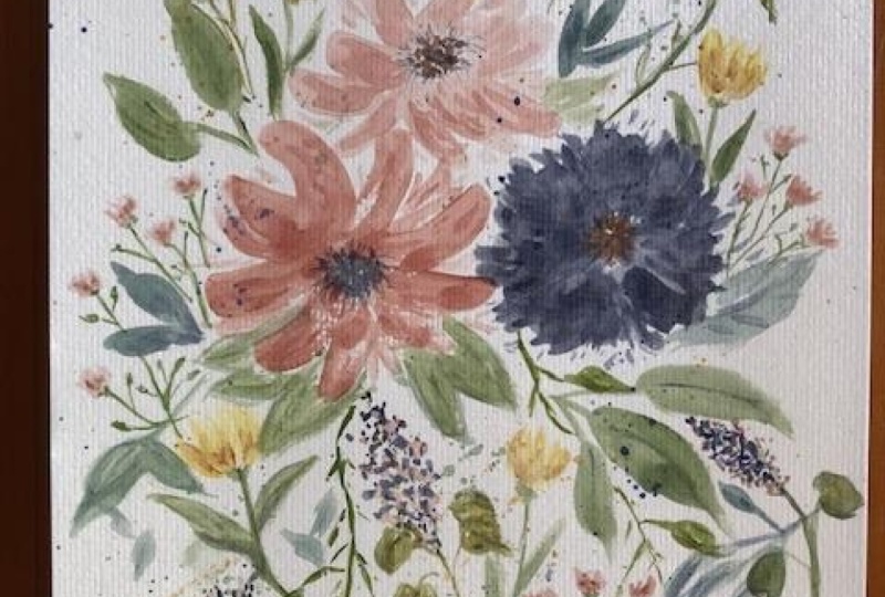
3. Observing Florals: So let's get started looking at some loose floral studies that I've done to get you an idea of what we're looking for when we start to play with their watercolors, brushes and with colors. So again, this is just a really quick study. I was testing out a new brush. Dilbert is a really great brush to use when you want to create some nice rounded petal shapes. This is a new and actually that I picked up. So we're using this during the class to demonstrate. I also use around brushes and various types of round brushes, but we'll get into brushes in a little bit. So just want to get you warmed up to have you imagine what loose, open fluorophores look like. We're not going to copy a specific flower, but maybe just the feeling of the fluorophore. So one that's a little bit more closed. Again, another version of a more budded floral and then something that is quite open. So these are just studies again, to get you warmed up, to get you imagining. We don't want our flowers to be very realistic. However, we can add elements like stamens and things like that. Some leaves and some other very loose, very loose, smaller type Florio's will be great. These ones are still I consider them to be loose and open because they again, you don't have a lot of definition. I use negative space to show the difference between the petals, but again, just very loose and open. We can even paint something like that as we start to get warmed up. So these are just examples of different types of fluorophores. They're very PNAS SQL and some can even resemble roses. I, for whatever you can imagine. And I liked this one because again, you can't really, I think everyone observing it can determine what type of flower it is depending on their experiences. So I like ones again that are a little bit more closed. This feels more abstract, so we just want to be flowy. That's just play with our brushes. And think about what type of flowers we want to paint. I grabbed a few other samples. Let me grab these ones here too. You can also paint flowers that are a bit more structured. So these Florio's actually drew them out first before it painted them. I love to work on a more structured type of flower watercolor. If again, I'm trying to just observe what petal shapes look like. Because what happens is when you do paint something that is a little bit more towards a realistic flour, it helps you to understand the flour and to observe a little bit more so that when you're painting loose, you're able to achieve that. So I would consider this to be a little bit more structured, but we can, we can look at the shape of the pedals and play around with that when we start to paint and a little bit more loose form. So observation, I feel is key when it comes to starting to explore flowers. You want to understand the basic idea of how a flower is structured for can like, you can get really, just really loose and flowy and open. So these again are just studies and they're good for references. This one got a little bit crazy. I think I was actually testing out a new brush. Hopefully this one here when I was working on this, and even colors when I get new watercolor and bring them home, I like to play around with what they look like, wet, dry, and even the compound because each color is pigmented differently. So again, I really loved this abstract form of flowers. Okay, we're going to play in this class and just have fun. Again, this I achieved using my Hilbert, which gives you the opportunity to create some really nice, beautiful petals. Ok, so this should get your juices flowing. I will bring in some of these sketches as examples as we start to paint. But I really want you to loosen up. Have fun with this experience and with painting floras, we can paint some really nice loose open Flowers. Okay, let's talk about our supplies next. See you in the next lesson.
4. Watercolor Supplies: So if you've taken a few of my watercolor classes, you'll know that I have very specific supplies that I like to work with. This is the Canson watercolor Excel. It is cold pressed, a 140 pound watercolor paper. I'd like it because it's inexpensive. And I can, you know, you can see as I was planning the classical, my fingers were wet from my water chars. Let's go ahead and write that up. I like it because the quality of the watercolor paper, and it's quite nice to work with when I'm practicing and I'm doing warm-ups and even for finished pieces sometimes if they're small and don't require a lot of wash or glaze, then I am happy with it. It can buckle if you're using a lot of wet glazing type of watercolor painting, but it's just the Canson exile watercolor paper. I really like that. I have a selection of watercolor paints that I will pull from. And what we'll do in the next lesson is we'll actually start to plan our color palette. It's a really good idea to work with a color palette when you're working on even just practice. Because if you have a structured color palette, you'll be able to understand your colors better. So I do like a variety, Winsor Newton, this is Reeves, It's an old one. I think this is student quality of had this for a while, but I thought I would use it up. Some Daniel Smith watercolor. Of course, our Winsor Newton watercolour and different lines. So there's a professional line and they're caught min is more, it's just a less quality, but they're still really great. So we will pull colors in the next lesson. But I just want you to show that I, I like to work from tubes. I have palettes as well, but I just, I like to work from Tubes, especially when I'm teaching, so we'll use those. And I have a pencil, of course, and unreadable eraser. So we're going to be using that if we require any sketching or make notes. And what I'll be doing is I'll be using a silver brush as well as a round brush To start with. I might, I might pull a few different brushes, maybe a dagger we'll see. But I feel like if you have these two brushes, so let me pull this aside so you can see that better. Hilbert and around, you'll be able to follow along quite easily and enjoy it when we paint loose, open flowers, you want a bigger brush. So again, I might put bigger sizes. We'll see we're going to play and have fun. Okay, so round brush is fine if that's all you have. A Philbrick is great as well. I like to use a ceramic plates. You can see I've got some colors that are leftover and we may pull those in. And I like to have two jars of water handy so that I have a warm and a cool or a latent dark. We'll see how it goes. And then of course, your paper towel. Okay, so go ahead and gather your supplies, and I will see you in the next video as we plan our color palette.
5. Choosing Your Color Palette: So building your color palette is something that's very personal. I believe that you should always work with colors that speak to you that make you happy. So you can absolutely use the colors that I'll be pulling and demonstrating in this class. But I invite you to really just explore a Heller speak to. Because again, you'll love what you're painting. You'll enjoy the process more and hopefully it'll inspire you to paint more. So I'm going to pull a few of the colors that I know I have in this little container of mine. And then we'll start laying them down on the page and start planning out. So I'll show you what colors I tend to always have on hand. Yellow ochre is one of them because for the statement of the flowers that tends to be really nice. And I like to mix a little bit of warm and cool. That's just my style. Of course. Again, invite you to do what you, what speaks to you, Sap Green and olive green. These are two colors that I also tend to pull. Quite often. Payne's gray is definitely something that I used both in watercolor and acrylic. It's just a color that I loved working with, a buff titanium. It is a little bit more on the opaque side. So when I just need to take the edge off of a really cool pinky red color. I tend to use that buffed titanium. And then all the other sort of more traditional, already pink undertones for floras. I really depends on my mood and what I've picked up that might be a new color. I really liked this potters pink. I think I might bring that in for a bit of a muted pinky tone. We can give that a try. And the Quinn high-risk, thus, I don't like to say this, but the Quinta, I'm going to call it the queue read. That's what I tend to call it. The red is a color that I tend to use often. And again, you'll see the difference between warm and cool. I might even bring those out so you can see what they look like. So there are two different ways that you can swatch colors. I'm going to put them in my palate so we can start mixing them together. I do have a little bit of this yellow ochre. Move this to the side, show we are all set up here. Make sure my brush is really nice and wet. So I am going to just reactivate this yellow ochre. So it, you have a nice amount here. And we'll put this down. They will put it here at the top of my little tree here so we don't have any shadows obstructing. So we'll go ahead and just put a nice amount of downs. That way. When you have it down on paper, you'll be able to see what it all looks like together. It's gonna wipe off my brush a little bit. So let's grab some putters pink. And what I tend to do is I'd like to put the colors that I used for my floor rows together and one of the wells. So sometimes I paint using a larger butcher's block. Sometimes they use just a dish. I have plastic pellets really. It depends on what you have handy. I can tell already that this opera rose may be a little bit too bright for the fluorophores that I'm imagining. I like to work and muted colors. So perhaps new like greater tones. I am really just going to see how the colors work together. If you just wanted to use one or a pink or red. For this class, please feel free to go ahead and make sure I pick up just a little bit so I don't want to waste the watercolor. So I'm picking up just a little bit here to remember which colors with think of this in this order. So I can see and what I'll do is you can swatch in a line. I like to sort of bring it all the way around, which is what I'll do. Make sure you wipe off your precious. You don't have any of the first color left on your brush. This is almost like a magenta. It's quite nice. And again, you don't have to swatch this many. All right, just want to see what it looks like together. These two are quite bright and we don't know if I'm feeling those tones. And much to today. I may actually, so this potters pink I find as quite on the brownie side, which may not be too bad. If we mix them, we'll see. So right now when I look at my colors here, I actually quite like this, Q red, and especially with the yellow ochre. So I think I may go with these two colors, so it's yellow ochre and I just want to know my colors. I can just use the acronyms. Yeah. So I can see these are quite bright. I think I'll leave these two out. So I know I'll be using the q red. This is the potters. Potters pink. Pink. Perfect. So now I will use buff titanium because I guess I'd like to take the edge off of colors that are quite, say, on the cool side with a little bit the buffed titanium and I can swatch that later. I am going to put down some Payne's gray. It is strongly pigmented. So put it to the side and the Payne's gray is really great for, again, stamen. I tend to use it took to make the green's a little bit more. Again, Moody had left that tone. And we will use some of the olive greens have got sap green on olive green still that I'm going to swap. And we do have a little bit of yellow ochre. So I don't need to put any of that down. So again, just taking this here a little bit previous state, taking a little bit of the Payne's gray so you don't want to waste the water color. And we put it up here since this is where we're thinking. So again, this is at very light strength. But it'll give you an idea of what the colors look like together. So you can start creating just some harmony already. So when you start to plan your colors that speak to you, you're already creating harmony. As you're painting, you're Flores because we will do some leaves. Of course we have to paint names. Hopefully you've taken a few of my leaf painting crosses to give you an idea of how to paint leaves and the different ways that you can approach them. Perfect. So I do see here that this green is quite light, so that is the sap green, not light but bright. So that I would say is in this family here of brightness, I'm going to go with the olive green. So this is all in green here. And also the Payne's gray, which is right here. So now what we can do is let's just play a little bit with the colors and get warmed up. So this is a really great way to get to know what you have on your palette. And for you to start warming up your hands so you can create some really nice movement and think about flowers as you're starting to work with it. So here what I'll do is I'm actually going to create a really nice pedal. So again, if you've taken any of my watercolor classes, you know, that we want to create a really nice pedal that is not as transparent as this one. This is a strong color, so I wanna go easy. Not as transparent as this one. We're just gonna go ahead and pick up some more watercolor little at a time. I know this color is very pigmented because I've used it before. But hopefully you can see that the pedal here is a little bit more on the creamy sides versus the very liquidy side are going to play around with some techniques to. So let's get to know this color a little bit. If I think about a pedal, maybe I'm going to pull out a few strokes and then let the watercolor pool. So this is what on dry, I'm going to dip my brush, but I won't tip it back into the water color. And I'll do the same thing to see what the differences you can see how really nice and loose and wet bad experiences. I'm going to go ahead and just get most of that color off, but I want you to be able to see as I put down somewhat. And let's go ahead and drop in a little bit more pigment, See how it reacts and how it flows. So my page still is quite wet. Expected to be a little bit more loose, but that's okay. You can always go in and pull out your pedal. So three different petals based on how you're approaching, laying down your watercolor really gives you an idea of how you can play around with some loose Florio's. So when I'm creating a loose fluoride, don't want it to be so structured and tight, meaning I want that watercolor to just flow across my page. So when I went wet, on, dry with a very, I want to say my brush was completely saturated but the paper wasn't. You can see that it's a little bit more structured and tight. Here it began to become a little bit looser. And I really like how this pedaling is starting to dry it. That's what we want. We want the watercolor to be able to dry and behave the way it needs to on the paper. When we're approaching some loose of flowers, this I would have to say is my favorite. So when I'm looking at just how much water there is, I know that I can always go and add a little bit more pigment in areas where I want to maybe to fine the flora a little bit more and I like to do that around the edges specifically. And if I'm imagining this to be the center of the flower, you can go ahead and add a little bit more pigment there, k, which makes it a bit more interesting. So let's use this potters pink. I don't have a lot on here. So what I'm going to do is make sure you can see this here. Go. So I don't have a lot of the potters pink here, so I'm going to just activate that puddle, make sure it's nice and wet. And then lay down the color. So again, if we're thinking about a flower, I'll go ahead and drop my color down and we'll do the same thing. So sometimes when I'm painting floor roles, I will paint a pedal in two strokes, almost like a half circle or three quarters of a circle, and then join it together to create that puddle effect. And I quite like it. I feel like my brush was really wet. I can encourage the watercolor to peddle and flow where I want it to go and any areas where it is very wet and damp. I'll go ahead and just pick up a little bit more water. I sort of just not tapped yet but give it a little shake so that the excess water can fall off my brush. And again, just when it's very wet, see what that looks like. Actually like how it's peddling on the outer edge of the pedal here. So again, just to encourage it, see what happens and what that color and flow looks like. So again, one more time, I'm not even adding anymore pigments to my brush. Let's go ahead and see what this pedal and also color, because that's what we're really working on is what is the color look like? Two. So I'm just going to let that flow. Can draw up to some wet on wet here. Drop a little bit more watercolor to see what that starts to look like. So you can see already we're forming a bit of a flower here. It's not as loose and slowly as maybe we'll get. But I feel like the process will evolve and will be able to start getting more loose. Homer painting our Flowers. Okay, so again, this is a really great way to take a look here, colours, to see what colors that you want to work with. I'm actually really enjoying this. Potters pink feels untraditional and it feels like it doesn't resemble a specific flowers. So that might be a good thing. We can explore colors that aren't traditional in flowers that we see every day so that we can get a feel for them. So in mixing that Potter's pink with a little bit of buff titanium, which will make my color a little bit more opaque. And that's okay because we can always add a little bit more to it. Again, really like muddy tones. So my brush with a little bit try we can add a bit more water to it. And I'm quite, quite liking this potters pink. If I wanted to, I could add a little bit of that to read to our mix and let's see what color we get. Again, making sure that my puddle is quite wet. Just creating petals here. Beautiful. That gives me a nice variation. So what happens is when you're using colors that you're mixing together, your flowers will automatically be complimentary because both of those shades that we mix together will be an each pedal. Okay, hopefully that makes sense. Go ahead and let's do one more just to make sure that this is a color that I'm happy with and we can work with. So just while it's wet, moving the pedal around. And I'm quite liking it. So maybe that's what we'll do. So now that I know basically what colors I'll be using for the class, I just want to make sure that the yellow ochre will still compliment it. If we're using the yellow Booker for the statement, I feel like it is a bit on the warm tone. Not sure. I'll be using the yellow for this statement, but let's see what this Payne's gray looks like. That might be nice. Payne's gray and the yellow ochre will turn it into a nice deep green. So I don't know that I'll use the yellow ochre. Specifically. What I can do is let's pull out a bit of burnt umber. I pulled this out thinking that we may use a little bit of burnt umber. Because I feel like it's more of the moody, moody side. See like the burnt umber might be a bit better for the center. Let's go ahead and even bring it in here. Kinda liking math, it's so unusual to watch. I normally see in flowers in my everyday kind of mix the two together and see what we get. So this is the yellow and the burnt umber. And let's see what that looks like together. Feel like still the yellow ochre is a bit on the warm side. But we'll see, we'll see how it goes. Let's bring in a little bit of this green cell. It can just waking it up, starting my little petal here. And let's see what that green looks like. Because I know I'll be pulling in some leaves. And then if I were to add a little bit our Payne's gray, I feel like that might be a really fun color palette to explore, again, more on the muted side. But I feel like we'll have enough so that we can create some fun depth. So what I'll do is I'll use this palette for the entire class. So when you're working on a colour family, you want to make sure that you have everything handy. I'll have this reference sheet to so that I can swatch as we start to paint. But I may even bring in some of these brighter tones as we go. Who knows? We're just going to play and have some fun with our flowers. Okay, so get your color assorted, get your brushes sorted, and I'll see you in the next video.
6. Florals Using a Filbert Brush: So for our first little warm-up exercise as we explore Florio's and making them loose and flowy. I thought this would be fun to start with. So we're just going to play and use our Hilbert brush and see what kind of shapes and strokes we can make k. So that's our visual reference. Make sure my brushes really nice and wet. Lets use this queue read on its own. Just want to make sure it is a nice, loose, I want lots of water. I want this to be our introduction to just really opening up. What I like about the Philbrick brush is you can turn the brush and really just encourage some beautiful long loose petals here. Don't worry about everything. Joining. Again. We want them to be open. Can even turn my pressure little bit and creating little points in the center. We want everything to be really just open and flowy. And I don't have a flower in mind. Again, I want it to be a little bit maybe abstract. And my impression of a floral and even pop one more in here. And I just let the water be where it needs to be. I grab some of this yellow ochre and while it's still wet, I can add a bit of interest in the center. Moving my brush around when you leave negative space that allows your eye to understand there's a break that their separation and that there is a little bit interests. I loved negative space in any type of loose work because again, it feels like it can be just very impressionistic with the shapes that we're achieving. Its kinda crap some of our queen here and while it's still wet, to encourage it to sit, and maybe I've got a little heavy there. That's okay. We can even make it a leaf. So just pulling using the sides. So Philbrick brush, brush again, it's great because you can use the side as leaves. So again, that kind of room because they went a little bit heavy, but that's okay. Maybe I'll even grab some of this Payne's gray. Let's go ahead and get a nice puddle started. So explore the brushes that you have access to. A Hilbert brush isn't one that I use very often. So I find that I have to warm up a little bit with it. So you can see I created a thicker stem and pages have Lief rather than a stem. That's OK. And I'm just dropping in a little bit of that pains crazy to see what it looks like. I feel like the Q read on its own is quite dark. So I will grab more of the potters, pink, put it to the center. Not quite dark, sorry, it's quite bright. So it wasn't what I originally planned when we started planning out our color palette. So let's go ahead and get a really nice creamy whet pedal here and we will try it again and pay. So when you're warming up Ben, just playing and getting into the flow of painting loose. Florio's just allow that time to use up paper. Use up the paper. And play with the flow. So I'm just in short strokes creating something that is a little structured a little bit differently. And I'm going in with a wetter brush to break up the petals. Cuz I want there to be flow, I want there to be movement. I want the watercolor to dry and an interesting way. And you know that it's a floral because of the shape, because of the color that we used even. Let's bring it into the center there. And instead of going in with the stamen paints gray, I think what I'll do just bring in a very nice, I just used the very tip. And just let my hand flow and well, accent the center a little bit. Just very loose. I want it to flow and have some interest. I'm going to bring that in. And maybe what we'll do is ways to swell here. So I'd like to use the different wells to mix. So I know that I have some Payne's gray mixed in with my green here, adding a little bit more of my water. Pick more Payne's gray, and then we can even bring in some leaves. Feels a bit heavy, but that's okay. Just playing around and warming up here. Maybe you could even have this connect so that it can get a little bit flowing. So I'm looking at the color family. It's interesting this potters Pink, not sharable keeper, or let's add a little bit more Q red to it and see what happens. Who I can see, it's brightened up. Definitely brightened up. Let's do one more. Maybe we'll do one that's a little bit more closed. So the leaves or the, sorry, the petals are closer together. Maybe over here. So just loose and flowy. Can see my brush, it's getting dried. I actually quite like that. So these petals are nice and wet. You can always go back IN courage, the colors to flow a little bit. Just impressions of your stem mixing in that brighter green. See, I don't wipe my brush off very much. Maybe this stem is going to go down a little bit. And maybe at the stem isn't as structured so you can add a bit of water to it. I'm getting a little bit heavy, but that's okay. We'll just plan. And then maybe the pedals or the, the leaves are going to come out a little bit. Play around with it. Get to know your brush. And they don't even have to join. At this point, you can always grab round brush. Maybe we'll bring in a bit more of this mix that we have going on. And just let it flow, flow and see what happens. And remember, if you don't like how the colour is mixing together, I'm just going to get a bit of paper towel here. Go ahead and clean it up a tiny bit. Sram using some clean water. We can even just soften it. Okay. There we go. So that's playing around with our Hilbert brush. And then we can grab our round brush and also see what we can create and create some loose flow. A Flowers.
7. Rose & Peony Practice with a Filbert Brush: So perhaps we want to paint Florio's that are a little bit more open using our Philbrick brush. Go ahead and play around with our pedal here in the center, using this red. Grabbed my potters pink. Again. I don't know if I'm loving the pallet as we're starting to explore it. So I'm going to play around a little bit. Grab our potters pink again, and I think I'll even grab my buff titanium. I do have a little bit here, but I do like the idea of having a large pedal in the Center for flowers, because that is our focal point. So let's just mix it up for a second. Who I like that. I tend to enjoy painting fluorophores that are a little bit on the lighter side and more muted. You'll see what that looks like. Pretty good. So this is a nice liquidity. I've got a nice big amount here for us to play with. But let's look at maybe painting some PNAS and even maybe some rows type flora cells. Just by using the tip of my Hilbert brush, I'll start to lay down some ghettos. And again, this is just a test. We're going to use it as our inspiration on a sheet, even where you have other fluorophores that you've been exploring. So I'm gonna imagine this to be more of a rows where there's multiple petals coming in together. And you can add a bit more water to open it up and play around with it. So I'm getting a little bit on the larger side will stop there. And then pick up some of this brighter green, going to make a nice big pedal. And then add it to our muted pedal here. Just so it's not as breaks. I don't think it'll go with our potters pink. And I can even pull out a leave here and just short strokes. Play around with the shape of it. Again, I don't want it to be too structured. I wanted to be playful, and I don't mind if it actually bleeds into our rows here. And remember with wet on wet and take a bit of that water off, can go ahead and pull out some more of this pink and we can drop it in to create some depth. So again, r, let's just create depth from the center and sometimes have later pedals on the odor edges. But right now I'm just kinda playing with where the water is and you'll be able to see what it looks like dry. So if we wanted to paint something that looks more like a penny, I may even go over this little bit here. Using the same Filburn brush. I can achieve that by just laying and solely in sort of the central areas here. Turning my brush, going over top of this rose as a practice. And I could even bring in some bigger petals here. The outer part of my peony just starting to form it. So we're looking at it from the side upwards. He's me. And in short strokes, bringing in our pedals here. So again, we're just playing around with our brush and looking at the movement. We can create. A little bit messy there. Okay, so that's our Philbrick brush. And the next lesson, I'll grab my round brush and we can play around with different types of flowers that we can paint using our ranch brush. I'll see you in the next video.
8. Painting Using Round Brushes: So for this lesson, what I'm going to do is demonstrate using round brushes to create your loose opened plurals and seeing what kind of shapes we can make for the petals. Because they want the flowers to be a little bit more flowy. I'm going to use a larger round brush, but you can see how much this is tapered. I actually has quite a fine point, whereas this one is a little bit more wider, but it is still a round brush. Okay, I'll demonstrate using the larger one to start. And because it's a larger brush at the barrel is quite big. It does hold a lot of water, so we want to make sure that I have a good amount of color available to me in this pedal, it is going to dry out. I can tell it, I don't have enough color there, but let's go with it. So again, if we wanted to paint something, they find a sample before we go on here. They used a slope for this anyway, but if we wanted some fluorophores that are a bit more open, reduce makes sure we have a lot of water on my brush, allowing our brush to move, making sure it's really wet. 1 third of B at nice amount to water I get, I'm carried away with the amount of water that I have on my brush often. But that's again, just the style and how I paint. And it gives me time to lay down some brush strokes so we can really nice and open. And maybe we'll even do a halfway here. There we go. And then what it does, it allows me to then go back and start to drop in some more pigments here and play around with them. Okay. So and I'm not, and the more water to my brush, I'm just using whatever water was on the brush. So this one is probably a little bit more on the website, but that's okay. We're still warming up. We're still playing. And for the center, where did my yellow ochre go? I think we need another squeeze of it. Like grabbed some yellow ochre. And while it's wet because I do want there to be a flow to too much water. I want it to be concentrated. So the less water, the more concentrated your pigment ids. And because this has a really nice tip, you're able to create some really nice fine lines. So working from the center outwards, just using the very tip of the brush. That looks good. Actually create the statement. Right at this point if you wanted to, again, because we're using a really assign brush, go ahead and paint out some leaves. That when it's nice and light. Pain towns. And they don't even have to all attach. Go ahead and have some pages really wispy, too much water there. And maybe this one is going to go. And the opposite direction, just have it be really loose and it slowly. And then like I said, What you can do since it's wet. And again, this is my style of how I paint. You may paint with pedals that are a bit drier, that's ok. You just won't be able to do the wet on wet as easily. You'll have to layer. I really like how that's looking. Actually sad, a bit more dimension there. So this color for the flowers, not bad. Let's see, well, keep playing with it. So that's again, a really nice opened Flour. If we wanted to create more of a bud, I'm going to have to add more putters, pink because our center petal has started to dry out a little bit. Because I have watercolor here. Let's go ahead and pull some of this upper rows and see what that looks like. Just play. That's the only way that you'll really get to know your colors. Oooo, I like that's almost like a deep room. Kind of the only way that you'll understand what colors you have in your palate is to play, mix them. We don't have a specific objective for this practice warm up other than to understand our brushes, understanding how to paint flowers that are nice and flowy, and understand our color palette type. So again, let's do something that's more of a penny. So nice, open, lush creates the centre ball effect peony. Go ahead and start to build layers of petals. And I don't, I don't even want you to worry too much about it looking exactly like a P90, cuz it could just be a multi petaled flower. Turn the pedal here in a little bit. In the impression of additional pedals really using that whitespace. You put more water to. So as we go out, I want these could even be a rose. I wanted to add in a little bit more of the center there. You can see how easily that turns into a rose. So something like, again, if we look at this one, we looked at these examples, paint a second one. And you know what? I'm going to grab the Arthur round brush, this is a number h, thereby Princeton. I really loved the quality. But snap, I don't have hair's falling out of my impressions. So let's maybe start from the center outwards. And we're just going to pull and create a bit of movement. Nice. So I really like how water color creates variation for you without you really needing to do anything. Just like that. We're just going to pull it out. Pedals up here and start to build out the ball of our Penny. Here on the sides a little bit. Maybe even just water. And we can even pull out a little bit of that puddle there. So chest the impression of petals. And if it feels like it's getting carried away, you can go ahead and stop. To forget our Center. Just using the side, you can draw n. Adding a bit more water so that it blends and pleads in a little bit. Okay. So right on the watercolor again, but that's okay. Just sort of filling out the color and I'll mix a more opaque pedal for sure. Go ahead and add some cream. I love how it pleads in there per hour and leaves can even add a little bit more pigment here. Maybe even bring it in here a little bit. K, Just loose, impressionistic, clean. You can add a little bit more largely here. Play around with it. Just to see how that looks. Okay, a bandwidth around Brush. That one's a little bit more on the drier side like that. And then maybe we can even see what the Payne's gray clay if we were to add touches of when we start to compose a more finished piece, we can play around with the different elements and the different colors that we originally had in our little color study, which I may go back to you actually, and looking at the colors I pulled, you know, I'm kind of there interesting. Nothing that I've worked for worked with before, which is good. And again, when you do these studies and warm-ups, you're, again, you're able to explore colors, your composition, even starting bringing it together, as well as what, what the colors look like together and the styles overthrows two. Ok, so let's go into the next lesson where we will start to build a little bit more composition and flow and building more watercolor puddles to start composing a few more flowers. Okay, I'll see you in the next lesson.
9. How to Paint Supporting Flowers: So for this part of the class, but I want to do is show you how you can paint some supporting flowers. So when you're looking at again, composition, very loosened, flowy. You want there to be a little bit more interest with some smaller tones are small, smaller Flowers story. So I like to do these studies because you get to understand what different types of flowers look like. Maybe ones that you don't have in your area or at your local garden center that you can look at. And this one too. So just some supporting type stems. So when we start to compose our finished piece, you'll be able to bring some interesting elements together. Ok? So what you want to do is have again different variations of washes of color. So maybe we'll start with the Payne's gray. I loved to paint with pains grade. There's just the way that it's milled to. I think it offers a lot of opaque, dense in key color. I'm going to show you what it looks like. If you're not familiar with Payne's gray. So if I wanted to create more of a tight flower has more of a cone-shaped event. So that is Payne's gray on its own. I'm gonna wipe off my brush at a bit of water. So because it is quite opaque, I do have a lot of it still on my brush here and just dabbing and creating different variations of that color. I can even pull out split of a thick stem, can put a bit of a stem, grab a pit of this green. I do have Payne's gray still left on my brush a little bit more. So don't want to break green to go with this Payne's gray. And then when it can even do is just draw in. I'm a little bit of stem and some leaves here. Okay, so Peyton's gray again, is a really great color to work with because it's so deep and dense and opaque that it's beautiful to work with. Hopefully you've taken my leave class, but I just wanted to show you how you can create some interesting accent strokes using your greens and adding in a few more leaves. So we wanted to create some flow. So again, just using my round, round brush and changing the way I'm holding the brush and the direction that it goes will allow for some interesting movement. When you're painting, you're loose plurals. Okay. So again, a more tighter floral. Let's go ahead and do some stems. Mina laid down a few here so that we can play around with maybe some that looked like barriers, again, that are supporting Claros for what we're painting. And let's go ahead and paint using our Booker. Okay, so making sure my pedal is nice and opaque. And what you can even do is just, just tapping. Okay, so it's the impression of smaller flowers and buds. I'm kind of working in a half circle. And you can see it's really nice. No pick. I can rinse off. Do you have quite a bit left on here? Can written as off some of the yellow ochre. And I can add again just, I'm creating some variation with the intensity. Playing. Transparent. And opaque can even have it run. So if I wanted to change that, so then it changes again, the whole feel of that element. When we're painting, I'll loose floral composition and just play around again with how you're holding your brush. And also the amount of wash that you have in your water color. If you wanted to add a little bit more accent to this, you could to add some movement, some leaves around it quite like that actually. Ok, so we have a cone shape and we have some smaller bud type floor rolls. And then we find an example to show you. So here kind of just even very haphazardly, but just in a more intuitive way, allowed my brush to create some strokes. So again, when you're learning your brush and you're playing around with flowers, it doesn't even necessarily, I don't even know what color have on here. We've got a bit of green. Doesn't even need should be a specific flower. So it just, I'm moving my brush in short strokes. Too much green on here. It's kind of a little bit of this and see what it looks like. Probably a brighter yellow. So you can just move very quickly and intuitively. And it looks like a bud on its own very easily. So again, just moving my brush around. Kay, so the impression of a floral that's very loose. It doesn't have to look like anything specific. Go-ahead and maybe bring in a few stems here, some interest. And if you wanted to create depth, you can bring it in and create a little bit more depth here. We can even try that again with this really bright, beautiful upper rows. See what that looks like. It won't go with our color the, here, but that's the cakes were playing. So again, if I wanted to create more of a, but maybe it's a tulip. Just, I put the initial petals down. Let's do it again. Make sure I have lots of colors so you can see that. So put the initial and most work. When I'm thinking of a bud and a rounded shape bringing some C's together and you play around with how much pressure you are applying on your brush. And again, whitespace for me is the magic. It is where your iris and can make it feel like there are multiple petals. So just move it around, move it around to see what it starts to look like. B, two side-by-side stems, not sure which green will go. That is a really bright, bright color. Let's see, let's see what it'll look like. So maybe they're on the same stem. So I'd like to pull out stem is a little bit thinner when I'm kind of drawing them out without realized, without having a plan to see what that looks like. Cayman, paint out a little bit there and then you can always deepen it. Might even add some of this Payne's gray. I'm gonna see what that looks like. An or widen it. Sorry, not T Pinot adding some of that Payne's gray pulling out. So maybe this is a stem of a flower that you've never seen before. Can bring in some leaves here. Can they don't have to go necessarily attached, sorry, can even just bring them in. So when you're playing around with your composition, you're loose Florio's. I want you to just play and have fun. Again, you can always use a photo reference. I tend to sometimes paint using a photo reference. Sometimes not. It really is personal preference. But what you can do is study some flowers, try to paint them so that they are. And so they look like the flower that you are intending. Or just play around again with movement and flows. This piece, for instance, I was probably just a test that I was testing these colors with because they do look new to me. But again, just playing around with what the paint does, how it behaves actually really like this one here. And have it be an intuitive process versus having to look specifically like a flower. Okay, so in the next video, I'm going to show you how to compose a piece. And again, intuitively, let's just paint an entire scene. You will use this one as our, as our inspiration. And I of like this one. Let's do two. Okay, so we'll see you in the next lesson.
10. Floral Composition: Example 1: So what I'm going to do is mix up a little bit more color. For some reason my color palette is not speaking to me as it normally does. I've actually brought in a little bit of turquoise with this potters pink. And just going to mix up a little bit of fact, buff, titanium. Titanium buff. Got an awful lot of paint here. Let's go ahead and see what that looks like. I can, I'm looking at it in comparison to the yellow ochre and I'm going to just play with it. Let's go ahead and get started and see what comes together. So I have quite a bit of paint on my brush, not going to put much water because it's such a big brush, it'll actually absorb a lot of water, some starting from what would be the center of the flower, moving outwards. And I want you to just imagine your brush flowing on its own and creating the shape and the style of the flower most on its own. Like to have the impression that one of the petals coming forward and have that just be really open. And really like that actually really open and just simple. You can always go back over a pedal with a little bit of water. Just to create again from more loose, flowy feel, even add a bit of whitespace member. I talked about white space to give it the impression of a little bit more depth, quite like that. I'm actually going to pick up a little bit of this Payne's gray while it's still wet. And just drop in the center. What would be the statement to add a little bit of depth, again, making sure that we have lots of whitespace that we're leaving. And that's even bring in a little bit of this yellow ochre X. It will mix with the pains grade to kinda look green. And I feel like it's a nice contrast to this more muddy tone that we created with the potters pink. It's just going in and creating some tough, again where the pedals are a little bit wet. Still. Go ahead and play with that a little bit. Okay, so then next, we wanted to create more of an open flower. Make sure my brushes out of the water. I'll grab my other round brush, which is a number eight, the Princeton round. And maybe what I'll do is grab some of this potters pink and mix it in over here so it's a bit brighter. Even take some of this buff titanium, create a flower that's a little bit more open. So compositionally I'm working in a circle making sure that we have even degrees of sizes with our Florio's. It's maybe I'll put it here. That feels good actually. So maybe we're thinking of a peony that we want to build some starting with the base of the penis or the center. And then having the pedals come out a little bit. And I'm not reading my brush every time making sure that a lot of water going from the center outwards. I may reject my brush every second or third time and don't be afraid to turn your page like I am making sure that you can get a really nice open experience here with your fluorophores and even tuck it in. Hi there. And that kind of feels nice. I may go with some water here. And just with a little bit of color left on my brush, build it out a little bit wider. So it's similar in size but a different shape to our flower here. And then again, I'm just going to go in and deepen the center a little bit. And then it can get lighter as it goes out. Ok, so just loose. It can be intuitive. In the next lesson, we'll just get really loose. This is, think of it as a good warm-up. And again, watercolors should be meditative and relaxing in the style. I always call it modern because we really are using traditional methods for water color. But I feel like it's a modern approach to the composition. Can see this is getting a little bit wet and crazy in there. We'll go ahead and address that later. Too much water. There we go. So a bit of that yellow. And then what I'm going to do is take some of this paper towel picture. I just bunch it up a little bit and that's soak up. So this excess water. And because we soaked up the excess water, it's actually taken pigment away. And that's okay. We can go back in and we can bring in a little bit of pigment, so making sure your brush isn't overly wet. And then what I'll do is go into the center of gas just to redefine. So again, this brush, it's soaks up so much water. The barrel is quite dense, very flexible, which is me. I'll even soak up fat. Yellow. I'll take a clean brush. So the yellow ochre. Even just move it around. Someone's interesting, not sure if I'm loving it, but we'll see how it dries. So right now we have two of our three flowers. And again, the color's not sure if I am enjoying what they look like together, but in a wild bunch of flowers or in a grouping of flowers, they don't always, they're not always cool with cool or warm with warm they are contrasting, which can be kinda fun. So let's go ahead and paint our last floral and maybe I'll make it a little bit smaller and as well later. So I'm picking up my number eight brush again. Probably one of my favorite. Just create for nice petals. Maybe this is a five petaled flower. So again, we don't want to imagine a specific flower. You just want to have fun with it. Ok, brown color. I have changed my color that's go back in and added here. So maybe we'll just have a single pedal this way. And more water and just bring out this pedal here. Making sure it can. It's nice and deep. And that's making sure we soak up some of the water. Habit. Just feel really abstract and fun. Try that out too. Ok. So again, a different size, like this needs to come up. There we go. So we have a different size. The color is very similar. Not sure again, of muddling what's happening there, but let's start adding in some supporting elements to make this flow. So I'm going to grab some green. Let's make sure we get that all nice and loose. And that's bringing in a few smaller stems here. So I'm just painting in my stems. And maybe we'll turn our page and I'll put two more. This way. We can paint them at the same time. This is where we'll use our Payne's gray and we can start painting in. Remember the flowers with the simple handy. The smaller flowers that we painted here we got I spotted my desk. Oh, she didn't see my desk. So we'll paint it in something like that next. So again, we're just going to drop. So making sure that our brush is connecting. And we want to create movement. So it's more of a cone shape. Don't want it to get too large. And we want the texture and the opacity to change with these. So the way that I do that is I lay down my initial strokes first. Again, I approach it sometimes a little differently, but then I'll go back and I'll pick up some of the pigment. Sometimes I'll start with a wetter brush, which I can do this side actually. So I have more water on my brush this time versus pigment. And then I'll go in and I'll add a little bit of definitions. Say we want this one to be a bit longer so you don't want them to be identical. So let's go ahead and add a few more here. And then with a bit more concentration of color, we can pop in a few more concentrated spots. And then what happens when that starts to dry? We have a really nice, interesting textured flower to. Let's start bringing in a few leaf elements. I will start here and just trying out a little bit of a stem. Like just sometimes draw out a stem so I can see what direction I want the movement to go. And we'll do the same here. A little bit of a stem. And then I want you to vary the size of your leads to. And then again, you can always go in and just drop drop in a deeper color. And the painting like a so but the pain is grey. So maybe what I'll do this and I'm just dropping in some color there. And maybe we want some leaves that are a little bit more on the greeny tone so that I've matches the brighter shades. And our throws. Right here. I'll add a little bit of green, really 0V and coming out of this flower here. So that there is a bit of movement shaped got away from me. So let's go ahead and adapt. Again. It's just being playful and you can see I'm turning my shoot around so that I can see what shapes there are. Areas that they need to fill in. Kind of working upside-down too, which is kind of neat. And then I'm going to leave my brush on the naked. And in terms of having color, so that I have some really nice Later leaves two, that will dry nicely. So you can see here that this flower tipping down your sheet is a really good idea when I'm teaching, I tend to not because I want to be able to move my piece around. Now that this is a little bit drier than what I may do is go in with a greenie blue and see what that looks like. Here we go. And because I do have a little bit of this yellow ochre going to pick up a tiny bit of it. I don't want it don't want it to be very intense. Dropped, I'm committed. So I'm just going to add a few pops of that yellow ochre color. Maybe in over here. She should. We got up and said, Let's go opposite. And these again will be very settle. And you don't even have to do anything to it. I will add a little bit of green, but I feel like that's good. Looking at the piece now compositionally, I feel like I need some larger leaves just to give it a bit of just a grounded a little bit. But first, what I'm also going to do is draw in these stems a slight bit. And so when you do that, it brings, the stem is closer to the furrows. So it must feel like in here, just little ticks. Even in here we can use a little bit of interest. So I'm just drawing it in and sort of seeing as it goes so I can fill in some nice spacing here. Even right in here. Add a little bit of green. Feels good. Can extend this a little bit. Maybe there is a longer green stem there. I'm looking at this little area here that's starting to drive. And even this feels a little bit I need to get this plurals. Not loving it, but that's okay. That's alright. You won't love every piece and every aspect of it, but we're just being loose and going with it, going with the flow. Just playful. Like that looks good. Sometimes it's good to, to take a step away so that you can observe your piece to see what it looks like. And just adding little moments here and there is a good idea. I might even extend the yellow there. And I must create and took it in here. But that's okay. We'll just wipe it off. And we can even layer in a few here to make it look like a cluster. I quite like that actually, just to fill it in a slight bit. And again, when you're playing around with loose fluorophores, you really can to do whatever feels good. Again, these can just be background filler. It would be nice to put in a few here to add a little bit more interest in depth, quite like that actually. So what I'm going to do is let that dry and see what it looks like dry. And I think what I'll do is even change up. Our color palette is slight bit. There we go, just picking up a little bit because it is getting a little bit heavy. So I think I'll change up our color palette, a sludge that for our next piece. But I'm going to go in and even deepen this here happens since these are still wet. So if you want to intensify, go in and add a little bit of depth and dimension. I don't like to add too much detail to my piece. Just gonna see what I can do here to change up this one. A little bit. That's helpful. So you can add a bit of dimension when it's still wet. By dropping in a bit more of that pigment. We'll see what that looks like dry. Yeah, that feels really good. So we'll go ahead and stop it out there. And I will see you in the next lesson.
11. Floral Composition: Example 2: Okay, so for this next one, I'm kind of looking at a few of my sketches on my desk and want to play around with composition. I want it to be a little bit more free and loose. I'm drawn to this one a little bit more the colors or actually I really like, but I think compositionally, let's play around with something that's a little bit more abstract in form and a little bit loose. Ok, so we're going to use the mean of this one halfway. Going to use this one as our inspiration. I'll have it to the side. And I mixed up some new colors. So I've actually added the queue read back to the mix here and maybe even brought in a few other colors like this flesh tone that I'll be mixing in. And what I'll do is even squeeze out the rest from this tube of the buffed titanium that I can pull. Okay, so let's play around with the color a little bit. So isn't loving what was happening in this last one necessarily. Although it looks pretty good as it's drying as that thing, you never know when it dries. But I do want to a little bit of variation. I think I'll even bring in more of this. I'm paints Great. So just play around. It's when you explore and experiment that you can really figure out what it is that you love. Make sure I've got a nice amount. Color here. Perfect. So I'm going to try to start again with this Hilbert again as a new brush to me. So I feel like it's a challenge and especially with teaching a class. So it's nice to challenge yourself and try something new. So making sure I have a nice wet brush, maybe won't even paint in this direction this time. Let's make it more of a portrait, horizontal. So I'm going to go off center and using the side of my brush lifts and interesting color, I'm going to come up and draw out some of these pedals. And I don't wanna be too controlled. I do have my reference here, maybe a bit longer. But I feel like just go get this and have fun and play it more water so that it loosens up a little bit. And see how that's starting to look interesting. I'm sure I'm digging less brush, but I'm gonna go with that. I'm going to challenge myself to stick to it. So let's mix a little bit of this flesh tone with the queue read because I feel like it just warms it up a little bit. And then that's work a little bit smaller. Just go up here. I've got quite a bit of paint on this brush. This flower is a little bit. Smaller and has a few less pedals, kinda liking that. And then I'm gonna go over here to this buff titanium. Let's see about like that actually. Bringing in yet another smaller flower here. Are water to. Here we go. So really nice abstract form. Let me make another larger one. Turn. But we work this way. That looks good. So similar to the first laurels. And again, I'm going to turn our page. And if there's areas of your merger piece that you love and maybe areas that you don't. I'm going to show you a really cool trick at the end. What I do with some of my pieces to understand what I love about them. So we have 1234. I'm going to paint another smaller one because it almost envision at going up this way. No pinch and other smaller one just right here. And it can go this way and have it be sort of open this way that we come. I is I love the feel of that. Interesting, very interesting. Okay, I'm gonna try to paint a few more flowers with this Hilbert pressure because I feel like it's a nice challenge. And I'm going to use this Payne's gray, but a nice washed up version of it. I am going to just add some interesting elements here and there. And I love that contrasts. I'm just using the side of it. So again, similar to the buds that we painted in that cone shape. Just bringing in a little bit more movements. I feel like we're moving up this way to see what that feels like. And then start bringing in some definition. And to the center. Make sure that he can see is we're going to bring in some definition into the center of our flowers. If you like pins gray might be a good plan for n here. I don't want, so it is quite wet. I don't want the flowers to be too wet. And was want a bit more definition. I want this Peyton's grades to really stand up and sit almost on top of the floor. Oh, so I'm not going to add two to many. Just very slightly until it's more dry. That looks good. So now b, using my round brush and going in t is this, well here we're going to add a bit of the Payne's gray and started to add in some of the leaf elements. I'm not going to add stems. I want this to feel a little bit more abstract. So what I'm going to do is start just building out some leaves here. Maybe we'll add just a bit of a stem. Just the impression of a stem over here. And cheap inherit Philip Hughes. Nice. That feels quite right. So I'm gonna take a little bit like this here, that Payne's gray. And we can start to pull out some leaf shapes and it's even just touching the page to create the idea of a leaf. And if you've taken any of my classes, you know that painting leaves has to be one of my favorite things to do is now I have a concentration of this green up here. So I want to make sure that I really like the look of this flower here. You can see I'm kind of hesitating as I go to make sure that I am like to paint leads and choose, apparently that I am looking at the composition to make sure that it's all flowing and starting to come together, which I feel like it is. You feel like it's a really nice, flowing, easy piece where we can just add some interesting strokes to it to start bringing it all together. Have fun with it. With this style of just intuitive, loose, modern plurals. Like I made him put another little flower here. We can bring in. This. Make sure my precious nice, clean, buff titanium. We can add just the impression of some floor growth as filler food just almost doing to see shapes. Just to have little bit of interest and filling in where it feels like there's a little bit of white space, but I don't want to have to fill it in with leaves. It can even do that with a bit of the pains, great to make sure it's really water down because it can be a strong color. Might even have it coming out this way. And you can always hold it up towards you so you can see what it looks like. And I love that it's concentrated here and flowing up. Because then your eye follows that path too to make sure that we can even go off page a little bit. Coming up this way, maybe even drying or I this way too. And then what happens is as you're painting starts to dry, you really get a better idea of the depth of everything that you're laying down. So these lighter portions tend to be really beautiful chair. So the objective is Philip, as much if your page as you can must feel like I need a few bigger leaves here, which I'm going to turn my page around, make sure you can still see. I feel like here to bring in few more leaves and even change the direction. So I want you to play around with filling your page up and really bringing in a variety of elements. So some larger pieces as well as some smaller. And then you can always go back and create some definitions, stems. And they don't have to attach to anything is just very abstract and playful. I really like I said, love this flower right in here. I like that too. And then in here I feel like add a bit more depth now that it's starting to dry. So I'll grab some of my Payne's gray. Because again, when it dries, it really offers nice texture and offers more depth to feel like these leaves are quite dark. So grab more of our Payne's gray. And maybe it just needs a few more. Like it just needs a former hits of color and I'm ready to say it's done. So sometimes not knowing when to stop is something that we often feel confused about. So not knowing when it's enough. I always say stop before you feel like you've had it too much because you can always go back and add more to it. Pay and make sure that this is the right Greenland I'm imagining So very similar to this one. You can try a bit warmer water on my brush and looking at my piece and just going to hold it up for a second here. And here we can use and a little bit, so I'm kind of matching the intensity there. Let's bring it out here. Slight pit. That feels good, nice and intense, nice and intense. And you just want to move your eye around your piece to make sure that it looks good. It's Justin here. Affiliate means a little bit more depth. Actually going to go over this guy. This guy. Yeah, that feels good. And one more here. And even a little one here. Originally, what's gonna go in there? But I'm glad I did it. And we got maybe just inherit what ad, what looks like a few stems. I go. That's kinda interesting. Again, if you never know when you just open yourself up to the experience of painting, sometimes you never know how it's going to turn out or whether it'll, it'll come together. Because you're opening yourself up to creating just really flowy, loose, modern watercolor Florio's. Okay, so I hope you enjoyed that. Hope he painted along with me and I'm going to in the next lessons sort of bring everything together that we've painted. So you can see how loose and expressive you can really be when you're playing around with your pressures, with the color palette and being open to having an abstract finished floral piece. Okay, I'll see you in the next lesson.
12. A Fun Way to Cut Up Your Art: So for this last little demo that I wanted to show you how you can take pieces of your paintings. And again, if you don't love compositionally everything that we painted together and want to take bits and pieces to really inspire a more flowy, abstract experience with your fluorophore company uses when actually, I'm going to show you how you can get a paper cutter and start to pick out pieces of your painting that maybe that you love. Like I love held this little corner looks, but I don't necessarily love how that floral turned out. So what I do is I tend to find areas that speak to me. So I'm gonna hide this one a little bit. And that I am love how it came together. And I put it through my paper cutter. And I can see right there blocking that off. Make sure you can see that. That that's an area that I really like. So nothing technical thing that hopefully you would have have on-hand other than a paper slicer. Going to take this one. Whiskers. I really like it. I'm going to give myself a bit of space here because I love these fluorophores here. And I'm going to slice it up k. So when we say with those loose fluorophore, they will inspire other compositions. Once you've painted them, if you feel like you don't love what you've painted, who there's even a part on this side, went in km away properly. They will inspire other scenario. They cut this one. I really loved this in there. Let me crop this one in singing silos. And they will inspire other pieces so I can even turn this around. Again. I really loved this one if I wanted to cut off a bit more of the whitespace, Don't be afraid. They're not precious. These, again, are opportunities for us to play. I really loved that. I most wanted to cut it once more right here. Opportunity to play and to see parts of your pieces that you really enjoy and love. And I can, I imagine this event and I framed it in a nice little match, but that will inspire your next piece because I loved the elements of the blue. I love these release soft background pieces. And then a nice Paeony flower. I may even bring in a little bit more green here. I'm going to show you how to do that actually k, so I don't want you to be afraid. I want you to be able to cut up your pieces. If you're not enjoying them. See, even now that I've cut this, these colors together look really nice. Actually don't mind that. And I can explore this colour family a little bit. Okay, so don't be afraid to cut up your pieces. And I almost just like this part here. And have it inspire your next piece, okay, and I'm going to show you what you can do with those in a second. Should we do one more of these things? Is liberating to be able to cut up some of your work. Just looking at what we've painted together. This one's still a little bit wet, but I really did love this corner here. Maybe I'll wait a hold off on that one just because it's still wet. Let me cut this whenever you see an interesting element here. So sometimes it's even how colors to ride together. Who that's kinda color. We shouldn't cut that one. Let's okay. This would have been colon two because one caught my eyes, so I am going for it. So sometimes it's even how colors dry together that make it very interesting that you don't even know how they'll react to one another until they are dry. So let's put them side-by-side. So I really love elements of these two fluorophores. And because I made notes, I didn't write down exactly what a mixed together here, but what you can do is go back and write them down. So I know this was my potters pink. And I added my buff titanium, added my buffed titanium. And then looking at this color here, so that was my cue, red. And I did add a little bit of the flesh tone. So I may have mixed that went off camera and pay and then my greens for sure it is a Sap Green and Payne's gray. So I'm not reading neatly, it's just for my own notes. So I know that this is how I got to these colors. And what you can do is even write it on the back. So this is Potter's pink plus flesh tone. So that way, you know, and very nice enlightenment. So it's not until you cut up your pieces. Sometimes that you can really get a feel for colors that speak to you and elements of how pretty that is. If we were to do this. Mix it up a little bit. K's. So just have fun, loose, modern. Play around with color. Understand your brushes and really get to know different colors that you're working with k. So another idea, instead of framing them, if you want to take these as inspiration, grab a, this is just a sketch book that I had for the year and I just playing around with it where I gather ideas and inspiration. And what you can even do is start to collect your pieces. They would get some tastes, even just washy tape. Let's go and you can put them in a sketchbook. Ok, maybe you have a larger one. Put them in a sketchbook. You can even paint around your sketch book pages and use them in a journal. Even how beautiful that is, you are going to add some color around in the background. So as you're exploring, these fluorophores play around with composition, play around with colors and get shown your brushes, and then have fun with what you do with them afterwards, the sky's the limit. Your creative practice should be your own. Okay, I'll see you in our last video together.
13. Thank You!: Thank you so much for taking this class with me. I really hope you enjoyed it. When you're exploring Florio's. I feel like the more you can paint a specific flower, the better that you'll understand the composition of it, the structure of it. And then you can break it apart and really just make it your own. Even created more abstract type flowers and play around with your color palette. Keep a journal, baby. You want to use a watercolor sketch book, and you can keep track of all of the plurals that you're exploring and even the color palettes that you're playing around with. Don't be afraid to cut up your paintings because you'll find areas and pieces of your painting that speak to you that you'll want to reinterpret and paint again and explore more of. So, thank you again so much for taking this class with me. I wanted to see what you're painting. Please share with me in the student project area, maybe fluorophores that you're exploring. How you've maybe cut up a few of your paintings to really hone in on areas that you love and that you continue to learn and grow with your watercolors. So thank you again for taking this class with me. I hope you continue to practice watercolors and playgrounds and plurals and really enjoy finding a color palette that speaks to you as well as a style that does as well. Thanks again, and I'll see you in our next class.
 Nicki Traikos, Letterer, Watercolorist & Instructor