Transcripts
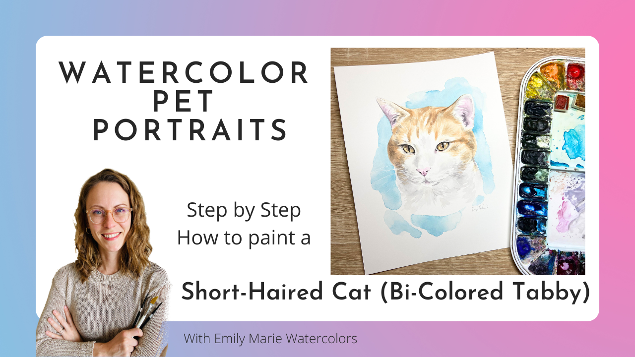
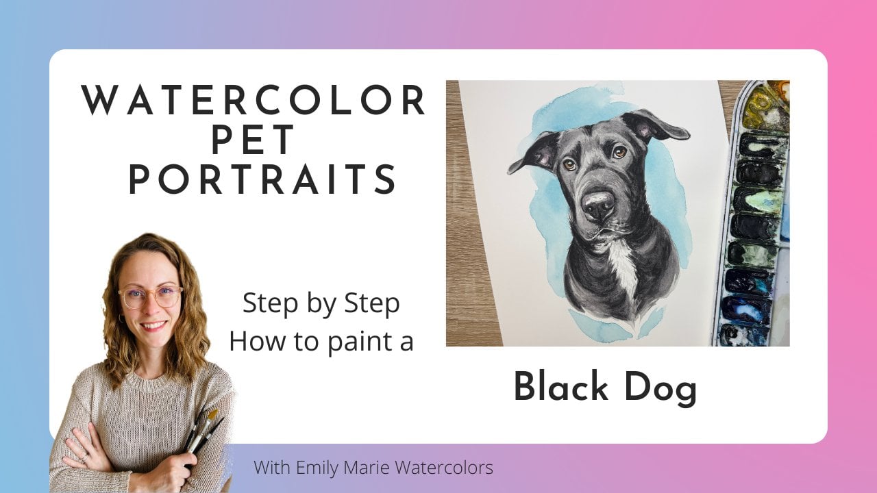
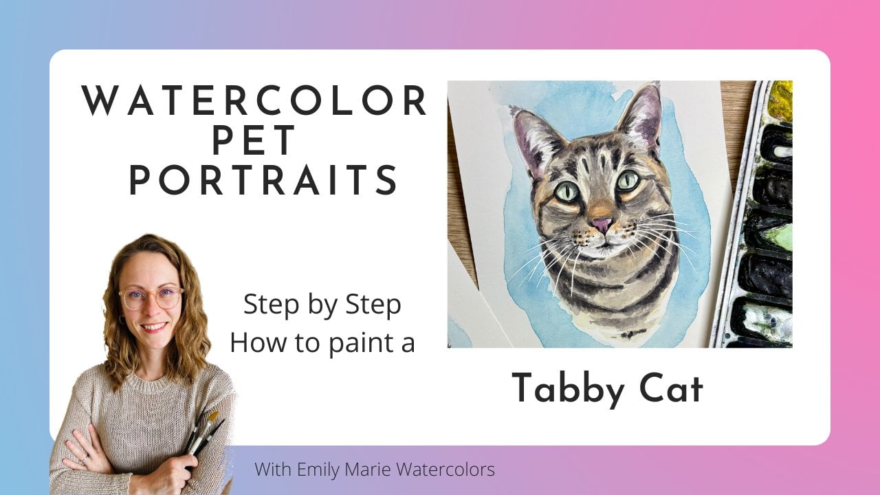
1. Intro to Painting a Short-Haired Cat (Bi-Colored Tabby): In this Skillshare class, you'll learn how to paint pokey, a short haired mixed breed cat. This tutorial is a
great beginning point for those who are looking
to paint cat portraits. I've been painting watercolor cat portraits professionally
for the last three years, and I'm excited to share some of the techniques that I use
to create my portraits. In this step by step tutorial, I'll guide you through all
of the layers that I paint, as well as the different
brushstrokes that I use to make my cat
portraits come to life. Use the template included in this tutorial to paint
the exact same cat, or use the tips and
techniques that I teach in this tutorial to paint
your own tan and white cat. Although black cats,
tortoise shells, and tabbies are beautiful, they are more challenging
to paint with watercolors. This tutorial, highlighting
a light colored cat, is the perfect stepping
stone to gain confidence in painting before you tackle the challenge of a dark
cat with lots of markings. So grab your watercolor paints and paper, and
let's get started.
2. Supplies Needed: Alright, so before we begin, let's talk briefly
about the supplies that you'll need
for this tutorial. The first thing that
we'll talk about is your paper choice. So I will be painting on an eight by ten inch
sheet of paper. I am painting on a hot
pressed sheet of arches. It's hot pressed 300 gram, which is 140 pounds. The brand name is called arches. Hot pressed paper, unlike
cold pressed paper, has a soft texture. There really is no
grain or texture versus a cold pressed paper that does have a little bit of
texture and roughness. Now, if you have
used Arches paper before or you prefer
cold pressed paper, you're more than welcome
to use cold press paper. The only difference
that you'll have to keep in mind during the tutorial is that your paper might take just
a little bit longer to dry. Hot pressed paper Although it's something it's kind
of a divided topic. Some artists love using
hot press, others hate it. It does take less time to dry, so you might find that your paper is drying
a little bit too quickly, or maybe it's a little bit too
glossy as you're painting. Your colors might flow a little bit too
quickly on your paper. And so if you try
hot press paper, you don't like it, feel
free to use cold pressed. I choose hot press paper simply because if I'm using a calligraphy pen for
my masking fluid, or if I'm using a micron pen for any sort of little details
at the end of my portraits, I find that it's a
lot easier to draw on a hot press paper
that's nice and smooth versus a cold press paper
that has some texture. Then let's talk about
our paint brushes. So during this entire tutorial, I'll be using a round size six silver limited
black velvet brush. Sometimes I also will use
a round size four brush, but I don't usually use a
smaller size brush for details. You're more than welcome to
use a smaller size brush. I do find that I prefer to
simply touch my paper towel, release some of
the liquid to get a finer point so that I
don't have to be switching back and forth between detail
brushes and my main brush. O you'll also need a pencil for when you're
sketching out your template. I will be teaching how to mask the highlights of the
eyes as well as the whiskers. I use Windsor and
Newton masking fluid, and I use a calligraphy pen. This calligraphy
pen I originally bought in Mexico while
I was living there, and I did add a link to a
similar calligraphy pen, but you'll notice it's just a
very simple calligraphy pen that opens at the end. I use this for applying
my masking fluid. I know some artists who
will use a glass pen. However, I keep coming back
to the calligraphy pen. For me, it just is a little
easier for me to use. The other option if
you don't want to use a calligraphy pen or if
that's not working for you, you can also find masking fluid that has
a fine tip applicator. This would be also a
little bit easier to apply thin lines
of masking fluid. However, it can bubble up and you still might
not be able to get quite as fine of a line as you can with
your calligraphy pen. The brand of this
particular masking fluid with a fine applicator
tip is Sineie. If you choose not to
use the masking fluid for your whiskers
are your highlights. You also have the
option of using a NOBL signo pen at the end and to draw this
on top of your painting. I like using this UNABL Signo. There are some people
who like Posca pens. I'm not a huge fan of them. I do think the UNABL
can get a really nice, fine point as well. The other option, in case
you don't like Jo pens, you can also use doctor
PH Martin's bleedproof white for those white whiskers at the very end with a very, very fine fine zero or
four times zero brush. The only challenge with
using a brush is that you do need to have a really
smooth brush stroke. I find it's almost easier to have a smooth brush stroke with the calligraphy
pen than it is to paint with bleed proof
white at the very end. But here, these are just
some other options for you. You will, of course,
need a cup of water and a paper
towel or a cloth. Alright, so let's talk
watercolor paints. In this tutorial, I
will be sharing how to paint pokey using mostly
Daniel Smith colors. This is my palette that
I use in my home studio. You can find a PDF of
the color palette that I'm using in the video in
the resources tableau. And you'll find the
names of the colors, a swatch and where it's
used in the video. So I'll be using a raw sienna
light for the majority of the fur that in combination with raw sienna to just get
the right shade of color. And then I'll use a
quinocrdon magenta. That will be for the
pink of the nose, the pink of the ear,
quinocredn burnt orange. That's going to be used for the markings of
our orange tabby. You might need to mix that with piamintteGenuine
or another brown in case your cat has more of a darker orange or
a muted orange. And then shadow violet is
the granulating color that I'll use for the shadows
of the white fur, as well as for some of the
darker shadows as well. Lunar black for
my black details, and then ahaloblue for the
colorful splash behind. You'll notice that there are
substitutions for all of these colors listed along with
the color that I'm using. Lastly, at the end
of the tutorial, there is an option to use
a black micron pen for some details or to fix up some of the highlights
or the blacks of the eyes. The micron pen that
I'm using is black. It is a size 03. However, you can use
size 02, size 01. But the nice thing about
these micron pens is they are waterproof
and they're felt tip, so they're really easy to apply. The last thing I want
to make mention, too, that you'll notice
in the video is that my eight by ten sheet of paper is taped down onto
a painting surface. The surface that I
have for my students, and then I'll also use at
home for smaller sheets of paper is just a piece
of corrugated plastic. This corrugated plastic you can find at most art
and craft stores. It comes in a poster size, and I cut it down to use for either eight by tens
or five by sevens. I will use either a
frog tape or I just recently found a
different watercolor tape called Kiwi Hub is the brand, and this is also a
really great tape for taping around on all
four edges of my paper. This will just
keep my paper from buckling as my paper is
wet and as it's drying. Alright, so the first
step for our painting is to transfer the image onto
your watercolor paper. There is a template
of Pokey included below in the resources
section of this tutorial. You can either place it behind your eight by ten
watercolor paper and use a light box
or a window to trace, or you can use a tracing
app on your phone. I personally use the
app called DaVinci I. This app will allow you to save this template
on your phone. Then pull it up in the app, and using a phone clip, you'll be able to trace
the outline of pokey onto your watercolor paper
without having to print off the template onto a
piece of printer paper. If you'd like a link
to where to find this or if you'd like
a discount link, you can check out my website. I definitely do
suggest that you trace this image onto your
watercolor paper instead of printing it directly onto
your watercolor paper because the whiskers that are
drawn on this template, you'll need to erase after you take the
masking fluid off. So for that reason, I wouldn't print this directly onto your
watercolor paper.
3. The Iris and Pink Nose/Ears: Alright, so after I taped my painting onto a
corrugated plastic board, I'm ready to start painting with my lightest colors first. I like to start with
the irises of the eyes. And so, right now, I'm
mixing water down. It's similar to a rossi
on a light color. So it's like a gamboge, but slightly more
on the tan side. So it's a very warm yellow that's kind of
bordering on brown. That's going to be my base
layer for this cat portrait. So I'm going to paint wet on
dry. This is on dry paper. I am going to paint over
where the black of the pupil is because I can always
paint the black on top, and I don't want to
have to worry about painting around the pupil. So I'll have this first
layer of raw Siana light, and then I'm going to
go in and I'll drop in some more intense opaque colors
directly from my palette. If you don't have a Siena light, you might be able to use a
gamboge or an ochre color, a yellow ochre, make sure that it's on the
warmer side of yellow, not we don't want to cool
yellow for the eyes here. So something that's
leaning more brown. And then make sure it's
watered down enough. This first layer, we
want to keep these eyes fairly nice and transparent,
especially with yellow. If you go too opaque at first, the eyes are going
to look almost fake because they're
gonna look way too dark. So now that I have that
transparent layer, I might go and drop in some more concentrated color
around the eye itself. I'm doing this while that
first layer of color is wet. I should also note
here that just because this left eye is a little bit darker in
my reference photo, I'm actually not going to add any of the shadows
at this point. So I'm trying to keep the
two eyes the same color. From there, I'll grab a little
bit of either raw sienna or some other tan that's slightly less yellow and
a little bit more brown. And I'm not adding that
much water to this color. I'm taking it directly from my palette using whatever
water is left on my brush. And I'm outlining the eye, the iris of the eye. I'm also adding some of that tan color
closest to the pupil. So with this particular cat, it's kind of a two tone color in the eye with this
yellow and brown. However, you might
notice that your cat has a little bit of
yellow and green. And if there's a little bit of green in the eyes, you
would do the same thing. Drop that yellow first, and then using a
concentrated green directly from your palate. Without a lot of water, you would add that green
then to your yellow. Alright, so we'll move on to another light color
in our cat face, and that's going to be the nose and any pinks of the ears. So right now, I'm
mixing an opera pink. That's a Daniel Smith color. It is a fugitive color, meaning that it can
fade with time. So if you're not wanting
a fugitive color, you might think about
using a wateterdwn magenta or mixing your own pink that
isn't quite as fugitive. So here, I've got this
opera pink watered down, and I'm going to do my first
layer of color on the nose. You'll notice at this step that I'm going to dry off my brush, and I'll lift any excess color or wherever that color
has gotten too dark, I'll lift using a dry brush. Alright, so we're going to move on to the pinks of the ears. So you might notice that this particular cat has some pinks on the
inside of the ear, but also there's some
white hairs that are kind of coming out of the ears. In order to paint
those white hairs, we're going to be first painting a strip of pink along the
outer edge of the ear. I am careful to leave a little
bit of that white paper at the very edge because there is a little section of white fur at the very
edge of the ear there. I'm going in and I'm making
sure that this strip of pink is nice and saturated
with pigment. And now I'm gonna pull
some of that liquid. Using my brush inward. And as I pull some sections
of this pink inward, you'll notice that it's creating some white hairs that you can then see
coming out of the ear. So this technique is
called negative painting, where we're painting the
space behind an object. In this case, we're painting the pink behind
those white ears. Now, before it dries, I'm going to clean my brush, and I'll take a dry brush, and I'll lift up any of that section that got
a little bit too dark. So I'm going to keep
the darker pinks towards the center of the ear, but towards the edge of the ear, I might want to lighten up
that pink just a little bit, remembering that I have to lift that pink up
before it dries. Alright, so I'm going
to do this exact same process where I add the little strip of pink color
on the outside of the ear, and then I pull my
strands of pink inward to create those
negative white hairs. It's the same technique. I'm just doing it opposite
in the opposite ear.
4. The First Layer of Fur: So now that I'm done
with the iris color, as well as any of the pinks
in the nose and ears, I'm going to start
on the first layer of color in the fur. So this is going to exclude
any of the white fur. I'm going to wait to do
the white fur until I have one or two layers done of any of the
colored sections. And I'm going to start
with the lightest color that's behind any of the
markings of the cat. So this yellow tan
color that you notice behind the
markings of the cat, that is going to
be my first color, my first layer, and I'm mixing it with quite
a lot of water. I want this first layer to be really nice and transparent. That way, if I make a mistake, it's going to be a
lot easier to lift that color off my paper
with a paper towel. It's also going to help to give the other layers of
color that I add on top. It's going to Make sure that those layers
of color are also seen. So the color that I'm using
is a raw sienna light, and it is a Daniel Smith color. If you're using Windsor
Newton, some other color, I would use some sort of brown yellow or a yellow that's more leaning
towards warm colors, like more of an orange
yellow or a tan yellow, something like a raw sienna
or a cadmium deep yellow, something of that sort. You'll notice as I'm
starting to paint, I am going to keep
any of those sections of white clean from the color. You also notice that I
did start to drop in a little bit of brown in that one section on the cheek,
while it was still wet. I quickly decided that, you know what I don't think
I can continue to do that, where I wet my section, and then I drop
in darker colors. With hot press paper, you run the risk of that
paper drying too fast. And so instead of being able to drop in color while it's wet, sometimes it's preferable to do two different layers of color. So that's what I'm
deciding to do instead. I'm going to do the first
layer of this light yellow. I'll let it dry, and then I'll come back and I'll do
a second layer on top. As I'm painting here, I'm taking a peek at where
the whites of the face are, and I'm trying to
use my brush to negatively paint
into those sections. So if you noticed above the eye, you do have some white areas of fur that are
arcing over the eye, and it's following the same
shape of that eye there. So I'm going to try
to paint negatively to pull some of that yellow
up over and around the eye, to try to leave some
of those white hairs open to the white paper. As I come through
to the forehead, I'm going to use
my brush to pull some negative white hairs
along that forehead area. You'll notice I'm
also adding right away a section of
yellow around the ears. And every so often, I
might go back and re wet some areas there to try
to keep that section wet. When you're working
from reference photos, you're constantly moving
your eyes back and forth. And so anything you can
do to keep that paper wet enough so that you
can really take a time and not have to rush through this first
step, it's beneficial. I noticed a little patch
of white on the forehead that I'm going to try to keep open or the white of the paper. And now I'm coming around
to this right eye. You'll notice I have
big, large strokes. I'm negatively painting
the white hair that's coming up
and around the eye. Alright, when we come around to the lower section of the eye, we can notice that there's
a little bit almost of this tan eyelid
immediately under the eye. And then there's a little
section of white fur. So I'm going to try to keep a small line of white
fur under that eye. I'm using brush strokes that are mimicking the shape of
the eye as they're going underneath there to kind of
negatively paint some of those white hairs that are
coming out of the cheek area. And now I'm going to do
the same to this left eye. I noticed that as I was
painting on this left section, I forgot to do the section of brown that's just
immediately under the eye, so I'm going to add
a little shadow there wherever I see that tan. Alright. And lastly,
I'll take some of this light tan color, and I'm going to paint
just a little bit of the white hairs
coming out of the ear. I'm going to leave
the very tips of those white hairs
free from color, but the section
of the hairs that are inward mostly
in the ear there, I'm gonna paint a
little bit of brown, and then I'll pull
that brown outward, making sure that I don't
cover up all of the white.
5. Pause and Practice: 3 Brushstrokes to Mimic Cat Fur: So before we go into the
second layer of fur, I do want to talk briefly about three different
brush strokes that you might want to
practice before moving along. The first brush stroke is, and I have my pencil out just to kind of help
to show you this. The first brushstroke
that I will be showing is going to be
more of like a hash mark. So it'll be kind of a
straight up and down. So you can imagine I'm
using my pencil here, but you can imagine what it would be like
with my paint brush. And so our hash is going to be just simple straight
up and down line. So I'm dragging my brush down. This would be the
same. I'm starting with a pencil because
it really is. Like, if you were to be making
tally marks with a pencil, I'm gonna be doing that
same brush stroke, and I'll practice it below here. So that'll be kind of my
hashmark tally marks. My second brush stroke is
going to be more of a curve, and it'll be stroking
down and up. So I'm gonna be making kind
of this mark with my brush. So I'm coming down and up instead of just
pulling my brush down. Now, you'll notice that it'll
have a slight curve here, a curve to the curve
like a backward seat. And then the last
brush stroke that you'll maybe want to practice is then the
opposite direction. And so, same thing, we are pushing down and up with our brush strokes instead
of with our tailing where it's just a down stroke. So when we add our brush, I'm going to be using
around size four. You can use your round
size six that you've been using or you can use a smaller brush for
this, too. That's okay. So I will grab some of this quinocradone burnt
orange or something similar. I'm still watering it down because for our
second layer of fur, we still want it
quite watered down. And now, if I'm starting with my talis just like I had
practiced with my pencil, it's just a single stroke down. Now, when I'm painting
my talis with my brush, you might notice that my
talis are quite close. I might have some talies
where there's a little bit of a paper mark shining through
or paper shining through, but most of my tally marks
are going to be connected. And so the only place
that you're gonna see the actual fur or
what would look like the fur is on the base and at the top of these tally marks. This tally mark or hashing technique I use for basically any of the
markings of a tabby cat. So you can imagine that there's a different layer and I
can curve these talies. So it's just the same motion
down down down down down. I can curve them
the opposite way, or I can use this kind of same tally stroke if
I've got a whole blob, and then I'll pull some of
these talies from my blob. Now, my tali my tales are
going to be straight. They're not curved, and you're going to see points at the
top and at the bottom. Moving on to the
second brush stroke that you might
notice me painting. This is going to be
both the down stroke and the upstroke.
So it'll be both. And I do it pretty quickly. So it's sometimes I'll do
it left left to right. Sometimes I'll do it. Where I'm pulling it down,
that's almost easier. So you can practice both ways. So like I said, it goes pretty quickly where I'm downstroke and
upstroke, down and up. There might be a little
bit of space in between. Now, you can rest your
wrist and then keep your hand from resting, or you can try hovering
your whole hand here and having more of the
full movement of your hand. Grab a little bit more color. Like I said, you can try what it would be
like, left to right, or you can turn your paper, and it might be a
little bit easier to pull left and
right and come down. I actually find it's
a lot easier to do this stroke where I'm
pulling my brush downward. Now, this stroke, you can see
it does have a shape to it. So this stroke is
going to be used a lot around the eyes
where you have curves. It's going to be used a
lot around the neck and the chest because that area
of the body is also curved. And I do use this stroke a lot more often in larger surfaces. These little hash marks
are going to be for the tiny details of the
markings of the face. Around, you know, on those
little triangles and on the markings on the face or along the markings on the legs, any of the tabby like markings. But these larger back
and forth strokes might be used more for the shadows on the neck or for larger shadows on the cheek. And then of course,
we have the opposite. So I'll grab a little
bit more water. We can practice that one. So we've got this up and down stroke that it's this curved s, but just the on the
opposite direction. Now, I find that this
opposite direction is a little bit more
challenging for me. Still down and upstroke. Sometimes if you're
practicing this at home, it helps to have a really nice loaded brush full of liquid. And sometimes it helps to
just go as fast as you can. Well, maybe not as
fast as you can, but go a little bit quicker and see what it looks like when
you go a little bit quicker. Now, if going in this C shape left to right is challenging for you, remember, same thing. You can twist your paper. I'm kind of running
out of room here, and then do the same
moon kind of arch shape, left to right,
going up and down. If this is hard for you, remember you can flip your
paper upside down and then do the upper see where you've got kind of the
smile instead of the frown. And then just turn it around. I tend to do this smiley face. So I tend to do this smiley
face brushstroke more often, and I will turn my paper upside down and do an upside down, smiley face instead of
having to paint the frown. So once again, you'll notice these tally marks I'll use in this next video for the
second layer of fur. These comas and
smilees I'll use on the cheek area and
around the eyes. And then you'll also notice these same strokes
in the neck area. So once you feel
like you've taken a little bit of time to
practice on a practice sheet, then you're ready to move on.
6. Second Layer of Fur with Markings: Now we're ready for our
second layer of color. This is where we're going
to start to paint some of the markings that we
see on our cat's face. Now, I'm mixing right now a little bit of burnt
sienna, or specifically, you could use quinacrodon
burn orange, burnt sienna, anything that has a burnt
brown, orangy color. I'm adding it to that
first layer of yellow, and yellow tan, and I'm still mixing it with
quite a bit of water. This is really important
that you still have a transparent second layer. If you get too dark
and opaque for these markings, two
things will happen. One, it'll be hard to lift up using a paper towel if
you make a mistake. And number two, our layers are going to look
way too different. So we want to be able to have these layers blend
seamlessly together, and we can't do that if the
second layer is too opaque. So I'm going to start on
this left side of the face, mainly because I'm right handed. I don't want to drag any
color across my painting. So as I'm painting
these markings, I'm going to use some hashing. So you'll notice that I'm moving my paintbrush
pretty quickly. These hash marks, I'm going
to follow the way that the fur is flowing around the eyes and flowing
around the ears. And I'm using these
little hash marks. Now, you can't see
it on the video, but I am tapping my paper towel. I have my paper towel
in my left hand, and I'm tapping it
if I'm noticing that there's just too much
liquid in these hash marks, and that's going to help me to lighten them up
just a little bit. So wherever I see a
pretty dark hash mark, I might leave a little
bit more liquid, and then I'll tap my paper
towel and release some of that liquid if I want
some lighter lines. At this stage, it's still
really important to not blend. So you can see the
two distinct layers. This second layer is sitting
on top of the first layer. I'm not using water to
blend my hard edges. That's important because if you overblend with the second layer, you're going to have
to create many, many more layers
because you just won't be able to see any
of those markings. The other thing that you'll
end up doing is you'll end up darkening the overall color of your cat because instead of seeing those
individual hairs, you're going to just
see one solid color. Alright, so I've been working on this one little
section upper left. Now, I am going to take some darker of that
burnt sienna color, and I'll just drop
it into some of the sections that I notice
are a little bit darker. I'm being very
careful with this, and I'm only dropping into
sections that are already wet. So this is why I need to work
section by section here. Alright, so I'm
gonna continue to show this section of painting. I'm not going to speed it
up because I do think it's important to see these
individual strokes.
7. White Fur on the Face: Alright, so I'm finished with the first two
layers of the brown. And so before I get into my
darkest browns and my blacks, I do want to start
on the white fur. And so I'm going
to start by adding some gray shadows
to my white fur. I'm using quite a lot of water, and the color I'm using is a Daniel Smith color
called shadow violet. It's a gray that has it's a warmer gray that has some
violets added to the gray, and it is a granulating color. So if you're not a fan of
the pigments separating and being able to see some of those purples and
blues in your grays, you might want to stick
to something more like a Paine's gray or you can use whatever primary colors you have to mix your own gray. Alright, so I'm
going to start by painting some of the shadows that I notice along the
eyes and along the nose. Now, remember that
this shadow violet is watered down enough where
it's just staining the paper. I can always add more of that shadow violet and drop
it in while the paper is wet. But it's going to
be more challenging to lift up the color once
I've stained the paper. So I'll be doing a variety
of using this medium tone. And then, now, as you can see, I'm going to drop in some
darker shadow violet, where I do see some
darker tones there. I'll also use my paper towel
to lift up wherever I see, it's gotten a little
bit too dark. Alright, so along the whiskers, where you notice on the cheeks, you might notice these
little dots that are running along the
length of the cheek. Those little dots are
where the hair follicles of the whiskers are
attaching to the cheek. And so I tend to paint
around one to three of these horizontal lines that are running from the edge of
the cheek into the nose. It's always going to be darker on the outside of the cheek. And as you come in
towards the nose, those dots are going to become a little bit more transparent. You might see that I'm not doing individual
dots at this point. I'm just painting the shadow
of those lines that you see. And then the second layer, I might add a few
more individual dots. Alright, we'll
start on the mouth. So there is a vertical
line connecting the nose to this little
triangular piece of the mouth. So I'm still using
my paints gray here. I'm not going to
be making it quite as dark as it needs
to be just yet. I do want to make sure that it's in the right place first. So start with this triangle, and then I'm going
to pull some little hairs down and out, and then that's going to create a little bit more of
that mouth like texture. M For the right side of
the smile line, instead of pulling
a single line, I'm going to create
these little hash marks, and that's going to show the
texture of that fur right by the smile line without having
it be a single dark line. If you add a single dark
line to your cat portraits, that's when you kind
of run the risk of having more of this
joker like smile. So I'm using these little
diagonal hash marks to create that texture. We'll come back to the
nose and we'll add a little bit of shadows
to where the nose is. So right now, I'm just worried
about placing the shadows. So the shadows are
gonna run along the bottom V of the nose. Most of the shadows, the
most intense shadows are going to be
that V of the nose, and then the upper section of the nose is going to
have a light shadow. There in most cats, there is going to be
this vertical line down the center of the nose. I'm still using my
shadow violet for that. I can always add
another layer of pink at the very
end of my painting, but I want to bring this shadow violet
color into all of the areas where
I'm noticing shadows. And then that's going to
unify my painting because I have that gray under every
section of my painting, not just in the white fur. So, when I paint this
right side of the nostril, I'm still using the
same size brush that I've used throughout
this whole painting. I'm the type of painter
that I don't like to switch to smaller
detail brushes. I just really try to use a less amount of pigment to get that
really fine line. But if you're somebody
who prefers to use a small size zero brush, feel free to switch over to that small size zero as you're painting
these fine details. I'm switching back to my really, really watered down
shadow violet as I paint the shadows
on the cheek here, and then I'm moving into the lighter shadows on this
right side of the face. So we can tell that there's a light spot that's on the
right side of the cat. And that's why these shadows are cast on the left hand side. The shadows on the left
side of the face are slightly darker than the shadows on the right side of the face. And then I'll dry my brush, and I'll use a dry brush
to blend any of those shadow edges that I want to blend seamlessly
into the white fur. The hardest part about
painting white fur is to not go too dark and to not paint
too much of the white paper. So you do really want to edit as you're looking at
your reference photo and really only paint using the shadow violet
where you see the shadows. So I'm trying to leave
still portions of my paper without any
sort of shadows, just because if I paint too
much of that white paper, it might start to
look a little bit too muddy for my cat's face.
8. Adding Shadows to the Rest of the Face using Gray: So now that I've finished with adding some gray to the
white sections of the face, I'm actually going to go back
to where I painted browns, and I am going to add
some shadow gray on top of some of the browns in the
ears and around the eyes. The reason that I like doing this with my pet
portraits is because I've sometimes found
that if I don't bring the gray into the colored
section of the faces, I tend to notice
that the colors and the white fur tend to look
like two separate cats. So by bringing the gray, and this is still the
same amount of water that I used for the white fur. So bringing that very
water down gray and adding some of that
water down gray to the brown section of the fur, I'm really marrying
the brown fur with the white fur and kind of bringing my whole
painting together. Now, it is important to
still leave sections of that brown that's underneath to leave that without
any gray on top. So I'm really looking at my reference photo
as to where are the darkest shadows
and to add some of those grays into those areas. So right now, I'm
working on this cheek, and I'm bringing the gray into the eye socket here so that
it really forces that eye to sit in the head instead um if you don't have shadows
around that eye socket, sometimes it looks like the eye is kind of protruding
out of the head, and by adding those shadows, it's going to help
to push that eyeball inside the eye socket. So as I move up to
working on the ear, I'm going to continue
with the same kind of hatching brush strokes that
I did for the brown fur, and I'll just use gray on top. And I'm once again
looking at where are the darkest shadows
to add the gray. Inside the ear, I'll kind of do this similar technique that I did for the pinks of the ear, where I'll add a little
bit of that gray, and I'll pull some brush
strokes inward and then I'll go along the
inner side of the ear, and I'll pull some
brush strokes outwards. So this is going to just help those white hairs
to kind of give them a little more
of a three D effect and to help them curve
a little bit more. And then, of course,
in the darkest areas, I'll drop in a little bit more
gray while it's still wet. I am going to speed up the
painting of this next section, but just slightly so that you'll still be
able to see exactly where I'm adding some
gray fur strokes.
9. Pause and Practice: Fur Patterns in the Neck: Alright, so before I show you the actual video from
painting the neck of my cat, I would like to practice
painting the neck a little bit. So obviously, as you notice
in the reference photo, you Pokey is not actually
sitting upright. And so I do want
to share with you an image of a white chested
cat that is sitting upright. If you notice around the chest with short haired and
long haired cats, you tend to see more of
a triangular peak that is pointing downward on the
chest of white chested cats. Now you'll notice this for
the chest of any colored cat, but it's a little bit more
prominent when you're looking at white chested cats. So if we were to
want to practice how to paint these
white fur, because, of course, we have
to paint negatively instead of paint the
actual white itself, we have to paint the shadows. So if you are wanting to practice that, we'll
practice it now. I am going to draw
just a little cheek here with the mouth,
the little chin, it's gonna be a very
not a very good drawing here because it's gonna
be really quickly. And then we've got
kind of the side of our neck and from the cheek, kind of the side here. So obviously, this is
not the exact same, but it'll do for now. So when we're thinking about
the shape of our chest, now, there were a
few guidelines. If you used the
template to trace, you might have seen there's,
like, a few little kind of fur things in
the center here. In general, we're going to want our fur to be kind of in
this triangular shape here. So I'm going to kind of draw this little triangle just
to help guide my brush. When you're doing
your final piece, you probably will not
have this triangle there, but it's helpful to have it in your mind to think about
it when you practice. And then on each side
of our triangle, we're going to have
some more dark pigment. I'm still gonna use my
size four round brush. I'll grab some water and
add it to my section here, and I'll grab some gray. So I'm using shadow violet. However, you can
mix your own gray. I do want to have it
fairly transparent. Now, at home, you might want it just slightly more
transparent than this. I'm just going to
have it a little bit darker so that you can
see it on the camera. And then I do want to have
that shadow violet in handy so that I can drop in
where it's a little darker. Alright, so I'm going to
start on either side of the neck just because that's going to be where it's
going to be the darkest. And now I just like I have been doing when I practice and
when I paint the markings, I'll start with a kind of a puddle of color
where it's the darkest. And then from that puddle, I'm going to pull
some strands in. And remember, I'm
using that semi moon. Kind of brush strokes. So I'll come in, and then I'll keep continuing using these
semi moon brush strokes. I'm kind of curving this way. I'll do those semi moon as I get all the way
along that point. And then from that point, so I have this curving this way. Now from that point,
now I'm going to start curving
the opposite way. So I was curving inward. Now I'm going to be starting
to curve outward as I bring my strokes this way. Now, I know it seems
like it goes really, really fast and it kind of does. When I get towards
the bottom here, I might add a little
bit more liquid, and maybe some of these
along the bottom, I might blend out with a little bit of
water before it dries. I might add a few little individual strands
towards the bottom, because this section here
at the bottom can be a little bit lower my sections on the
sides here of my cat. I do want to keep
that definitely a little bit a little
bit higher on the edge. Before this dries, I can always try to drop in a little
bit of darker gray, and then I might
pull a little of that darker gray in a few areas. Now, some here have already
started to dry. That's okay. I can have some
of these that are still wet in some areas where it's starting
to dry a little bit. I'm keeping my paper towel handy so that I can lift up
wherever it went awry. And now I know I kind of
stopped around the chin here, so I'm gonna go back up to
the chin before this dries. And then I'm I'll make sure
that just a little bit darker around the chin area. And then I'll do the same thing. I'll just pull some strokes
from that chin, as well. I might leave some
of that white open depending on how my
reference photo looks. You notice that it is a
little bit lighter, though. So I did add a little bit more water here
towards the chin. I can always kind of add a little bit darker
on this left hand side. I can connect some of these
strands while it's still wet. This is why it's kind
of helpful to practice this on a separate
sheet of paper. And then towards the right here, I know I kind of
stopped because I was noticing that the left here was starting to
dry a little bit. And so now on this
left hand side, you noticed I grab just
a little bit of water. I'm still continuing
with these half strokes. But I want them to be a little
bit lighter on this side. I can go back to these strokes that have started
to dry these edges, and I can kind of rough them out a little bit to soften
those hard edges. But then, of course, along
this edge of my neck, it is going to be a little
bit darker because our neck, we want to keep our neck
a little bit rounded. So I can connect
my strokes here. I can even add a little
bit of that shadow violet. And then I might bring down the shadow violet
just a little bit. Now, if my light source is coming more from this
right hand side, yes, there will be a little bit of a shadow where the
neck rounds out, but it might not be as dark
as on this left hand side. Once again, I'm going to keep this left hand and this right hand side
and the left hand side. I'm going to keep it
a little bit lower. Although I noticed
that I kind of want to even out
the triangle here. I'm going to add a
little bit more water, and then maybe here
I might add a few of these individual strokes or some strokes are
connected, some are not. It's a little bit
more water down. It's still following
this slight moon shape. Remember, our moon is
shaped towards my pencil. Remember, our moon is shaped
this way on this side of our neck and then it straightens out towards the bottom
of the triangle, and now our moon
is kind of shaped the other direction coming
on this side of the neck. So this is kind of the general
where I'm going to add. This is kind of
the general shape. Once these start drying in here, I can go back and I
can add if I want, I can add a few wet on dry. Strands, just a few. I don't want to busy up my painting and have it really busy with
a lot of individual. But I might go back to where the darkest of these sections are and add a few wet on dry. So here I'm adding a few wet on dry on this left hand side. I'm adding a few
strands here that's going to bring your eye towards the center of this triangle. So I added a few
here in the center, a few out to the left. And maybe just a few here
on this right hand side. Now, this paper has dried a lot quicker than a cold press. This is actually the backside
of a hot press paper. So I was able to get
back and do some of these wet on dry a little bit quicker than
you might be able to. Alright, once you've
practiced that once or twice, however many times you
want to practice it, now I think we're ready
for our final piece.
10. Painting the White Neck: Alright, so now it's time
to start painting the neck. So when the client had sent me a few different reference
photos of poky, this particular reference
photo that I chose of pokey lying down is the
one that I like the best, but I knew that I didn't want to have to paint the paw and the side body because I did want it vertically
as an eight by ten. And so I'm going to
make up the neck area. I know that the neck area
is going to be white, and so I'm going to start
with that same shadow violet, that violety gray that I
used in my last layer. And I'll start kind of at
this midline of the cheek. So mid cheek kind
of coming down. And I'm going to try to
keep my brush strokes to be very almost like it's a fountain coming from
the bottom of the chest. So I have almost
like if there were an upside down
fountain coming from the underside of the chin and
it fountains down and out. So right immediately
under the chin is where I have the lowest section. So it's a little
triangular at the chin. Um, I am going to try to
keep some of the paper to shine through here so that it's not completely solid gray. So, I want you to keep
watching as I'm painting. This is I'm painting
this in real time. I'm keeping my brush
strokes really nice and light and quick, but I'm also keeping
my brush nice and wet. And that's gonna help me get these brush strokes to
look very fur like. Alright, so this is always a delicate thing to try to
drop in a darker pigment. So I'm noticing that
the left side of the neck is already starting
to dry a little bit, and before it dries completely, I do want to drop in more
of this shadow violet, particularly around
the bottom of the neck and closest
to the cheeks. Towards the bottom of the chin, I'm just adding some separate
brush strokes so that and I'm doing this wind
this top layer that's underneath layer
is still semi wet. So it's going to blend
in certain areas, and it's not going to
blend in other areas. And that's actually what I want. I I don't want it to be a
complete separate layer. I want some blending to happen
and still some hard edges. And then before it
dries completely, I'm going to clean my
brush, dry it off, and use a dry brush to lift where some of those areas got
just a little bit too dark. And then, lastly, I'll come to the right side of the face, and I do want to
kind of blend in the neck line with the cheek. So I'm just going to
add a little shadow right there under the cheek, but then I'm going to go
up and I'm going to bring that shadow up onto that brown. So now I'm just trying to
blend the head with the neck, so it's not it doesn't
look like it's separate.
11. Layer of Darker Gray: Alright, so my next
step is going to be another layer of just slightly darker gray for the shadows. And here I'm really going
to focus around the eyes, ears, nose and mouth. So I'm using that
same shadow violet, just a little bit more
pigment compared to water. If you want it, you can always use black and just make sure that
it's watered down. I don't like to I
always like to do kind of a second layer of
dark gray instead of black right away just because I do feel like it's
helpful to build up that gray and those shadows in at least two layers before
I add my darkest blacks. But you can always use a watered down black for the second layer. So I'm going to
start with my eyes. And I'm going to outline
the outer edge of the eye. So I'm using a really slow, nice, slow pace for doing
this around the eye. And then now before this
little eyeliner dries, I do want to wet the inner edge. So I'm going to actually start with the lower edge of the eye. So I do want to flip
my painting around. I'm going to clean my brush, tap it on my paper towel
so it's not soaking wet. And I'll use that damp brush. I'll hit the tip of that brush up against that black liner. And all I'm doing
is rubbing back and forth because I want this to be a softer edge on
the inside of the eyeball. So the outer edge of the eye, that's fine to have a hard edge. But this inner edge of this black want to just kind of blend it in with
the eyeball color. I want that line to be
a little bit thinner, a little bit softer
on the inside, but only on the bottom eyelid. That top eyelid, I'm going to keep it still nice and dark. And then I'll start painting
the pupil of the eye. Now this is also
why I like to do a water down gray to
start instead of go directly to a black
because it's a lot easier to lift the water down
gray versus a black. If you go into opaque, it's going to be a lot
harder to lift that pupil. And so I like to have that water down layer just
in case I make a mistake. All right now for the left eye, I'm going to do the
exact same thing. I'll start with this darker gray around the
outside of the eye, and then I'll come back
with a clean damp brush, and I'll just blend
out that lower eyelid. I'll turn my
painting upside down so that I can blend on
the inside of that eye, get a really nice soft edge, and then I'll paint the pupil. Alright, so with some
watered down shadow violet, I'm going to add a few
shadows to the iris. That's the colored
part of the eye. So I notice right
away that there's a little coma like highlight of that yellow in
the lower left hand side, so I'm going to keep that clean. I won't put a shadow
on top of that. But the rest of the eye, I'm just adding a few of these horizontal lines that are kind of radiating
from the pupil. Since the iris is a
little bit more of a subdued brown and not
such a shiny yellow. And then next I'll paint a shadow all along just
underneath the upper eyelid. You don't see this in
every reference photo, but there usually is a bit of a shadow that the
eyelid creates. So it just helps
that pupil to sit that eyeball to sit
in the eye socket. And so that little line of a shadow underneath it really
gives it a three D effect. I'll do the same
to this left eye. So I'm starting with these
radiating lines of shadow. And I am remembering
to still keep this left eye lighter
than the reference photo. The reference photo
shows it much, much darker than
what I want to do. I am going to keep some of the lightest colors
of that iris. I'll continue to do the
shadow immediately under the eyelid and that'll help give this eyeball a nice
three dimensional shape. All right. I'll use some
of this darker gray, this second layer of gray to add a few little
details around the eye. So I'm adding some wet on dry. So this is on dry paper. I'm following the
curves around the eye. So this is just
going to accentuate the dark corners
of my cat's eye. Then I'll also add some
darker fur strokes on that edge of the cheek. Moving on to the
nose and mouth area. For the nose, we'll add some
darker gray in the nostrils, in the corners of the nose, the upper corners of the nose, and in the lowest
point of the nose, that lowest point
of the triangle, along with a little bit
extra darkness along that center line in running
down the center of the nose. The mouth area can be a
little tricky to paint. My reference photo does show a fairly large section
of that mouth, that triangle of the mouth
that I'm painting right now. It shows quite a large
section of that being dark. I always lean on the
more conservative side of the size of that
shadow in the mouth. So I might paint it
slightly smaller. And then if I need to
make it a little bit bigger because it looks a little weird, then
I make it bigger. But smaller is always better, in my opinion to start with. We'll darken up some of
these whisker spots. So the location where the whiskers are
coming into the cheek. Remembering that along
the furthest edge of the cheek on the
outermost edge, that's where the the whiskers are going to be the
darkest where they attach. And then as it comes inwards towards the nose is where
it's going to be lighter. I'll move on then to
the upper left ear. So here I'm just taking
that darker gray, and I'm outlining
the outer edge of this left ear because I notice it is a little bit
darker in the reference photo. And then I'll go
around and I'll add just a few little sections of this second layer of gray where I'm noticing that it's a little darker in
the reference photo. And then before I move on to
the right side of the face, I am noticing that this
second layer of gray in the left eye actually
didn't come out quite as dark as the right eye. So I'm going back
with a little bit of a third layer just to even it out to get that left
eye a little bit darker, a little bit more similar
to the right eye.
12. Color Corrections: Alright, now that I have the shadows the way
that I want them, now I always like to go back and correct
any sort of color. So I'm looking at my brown, and I'm noticing that I do need some sections to be a
little bit brighter. So I'm using a glazing
technique where I water down whatever
orangish brown color. So this is kind of like a quinacradon burnt orange
color, watered down. And I'm glazing it over certain sections where I want that color to be a
little bit more intense. Reason I like doing this after I add the shadows is
because it really helps me to not have my browns get too intense and
dark too quickly. I do find that it
can be really easy to make your browns really, really intense, and
then it doesn't blend in really well with
the rest of the painting. So I always have this
as a last step after all my shadows are added right before I add any
of my black details. At this stage, where
I'm glazing this color, this is where I like
to then add any of these really light brown areas blending in the
head with the neck. So particularly if you
have a cat that has some light brown patches
around the neck area, this is how I would
lay down that color. I would do the shadow first and then add the brown
patches on top, just to kind of get a
really seamless transition between the head and the neck. I'll also go back and I'll
color correct the iris. Now that my shadows
are in the iris, now I can go back
and add a little bit more vibrant and bright
of colors if it's needed, particularly with cats that have light yellow
eyes and bringing in this orange just
around the edge of the iris and closest
to the pupil. Then the last section to think about with color
correcting is the nose. Depending on your first layer and how dark that
first layer got, you might want to
add a second layer of pink to your nose. Now, I'm just adding
a little bit of extra pink at the
base of the nose. I don't need to add
any pink towards the top because I do want
this seamless transition. Then I might take a peek
at the ears and under the eyes and see if I need to add any pinks to those areas.
13. Dark Black Details: The very last step
before I add any sort of colorful splash in
the background of my portrait are
the black details. Now, this is going to
be the darkest layer, and so I'm going to
reserve this only for around the eyes and nose, particularly for poky, because poky is such
a light colored cat. So I'll add a layer
of dark black, still mixing it with water, but just more
concentrated black. And I'll add a little thin
layer of black around the eye. Then I'll also add some black
to the center of the pupil. And lastly, I'll add a little bit of black
to the nostrils. And particularly for poky, that's pretty much where
I'm going to stop. If I had a different colored
cat or say the cat is a little bit darker of a
brown or maybe a tabby cat. Well, then of
course, I might add more black details around the
mouth area or the cheeks. But because Toby is such
a light colored cat, I'm going to reserve my blacks for just the deepest
darkest areas. Y y
14. Optional Colorful Splash: Alright, so our very
last optional step is a colorful splash
in the background. This splash is going to
be painted wet on wet. I'm going to get my
color ready first. So I've got a bunch of
water on my palette. I'm using a To turquoise. And then to theTo turquoise, I do want to dim the
color just a little bit. And so I'll use that
shadow violet that I used for the shadows on my white fur and on
top of the brown fur. I'm going to add just a
little hint of that just to din tone down the brilliance
of that turquoise. I'll get my paintbrush
wet and I'll paint section by section for
this colorful splash. I am going to paint
the water going right up directly
next to the fur. Remember that wherever
the water goes, your colorful pigment
is going to go as well. This splash in the background, I don't need to make
it very circular. I can have this splash
be kind of irregular, but I do want to
cover the whiskers, because remember,
those whiskers are still masked in masking fluid. So as I drop in my pigment, I do need to push the pigment all the way up to the body
of the cat and to the fur. And then I do want to
leave a little bit of a rim of white still
for framing purposes, I don't usually like the color coming all the way to
the edge of the frame. So if you notice I just
lifted a little bit of that hard edge away
using a dry brush, and now I'll go back
and I'll drop in some darker pigment
closest to the body. And then with everything, once I drop in that darker color, then I go back with a dry brush and I'm just going to lift along some of these edges just to have these be a little
bit softer of edges. I want certain sections
to still be a hard edge, so I'm not lifting over
every single section. I just don't want
a fully hard edge around this colorful splash. I'll turn my painting, and I'll continue painting
section by section wet on wet. Now, along the bottom
edge of my painting, I am going to add a
few little blobs just to round out the colorful
splash in the background. Most of the time, it's just to kind of balance the painting, although it's not
really necessary. It's just something
that I like to do to balance the heaviness of the top heaviness of the color to balance it out with some
blobs at the bottom.
15. Final Details: So I let my painting
dry overnight, and now I'm ready to take
the masking fluid off. So I already took the
masking fluid off my whiskers with
a kneaded eraser, and I also took it off of
the highlights of the eyes. Now that that step is complete, now I can always add a few extra details with
a black micron pen. Sometimes you might want to
do a little bit of outlining. Sometimes you might want to add extra dark details where you couldn't get quite black enough. I'm also going to take a peek at where the
highlights are. Sometimes the
highlights come out a little wonky and not
quite as circular, so I might correct them
with a micron pen. I'm not adding any details right now because I just
like how it looks. And that's it. You're
all done painting a bi colored orange
and white cat. If you enjoyed this tutorial, you can find more of my Skillshare videos by
following me as an instructor. I have other pet
portrait tutorials, as well as some
botanical tutorials. Also on my website, Emily
Marie watercolors.com. I do sell watercolor kits that come with everything that
you need to paint at home, including the paint, the brush, and the designs printed
on your watercolor paper. I use Arches
watercolor paper for those watercolor
kids so that you can enjoy your time and
create beautiful artwork.
 Emily Marie Watercolors, Watercolor Artist and Dog Lover