Transcripts
1. Introduction & About Class: Hi, and welcome.
My name is Puja, and I'm a watercolor artist and the author of the book,
Modern Watercolor Workshop. I'm so glad you're here. In this class, we
are going to paint seven relaxing
watercolor patterns, designed to help
you unwind while building confidence with
your watercolor skills. This class is designed
with the intention to be completed as a seven day
daily creative practice. I encourage you to paint one pattern per day
to avoid pressure or overwhelm and to truly enjoy this as a mindful
soothing experience. This class is
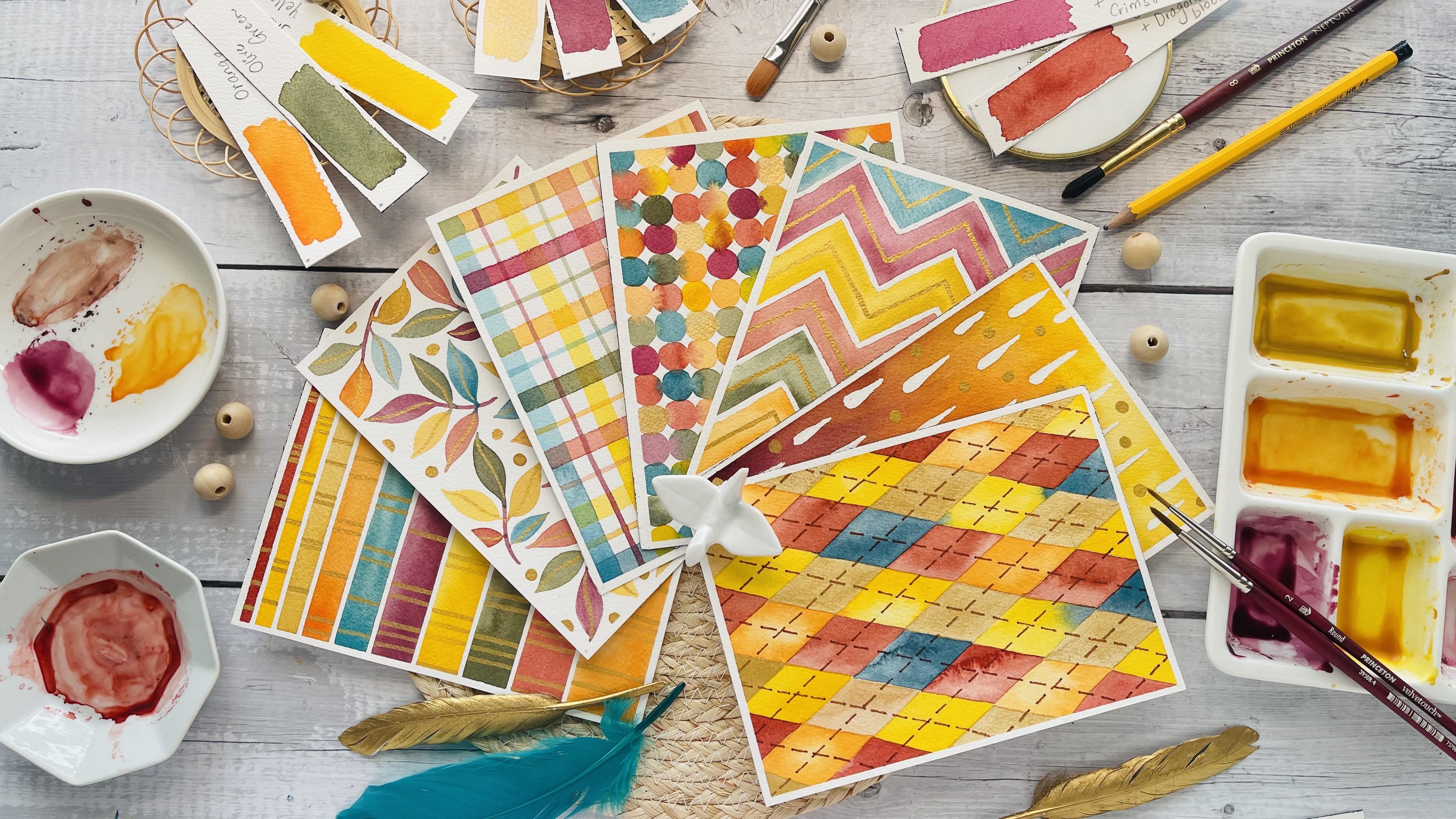
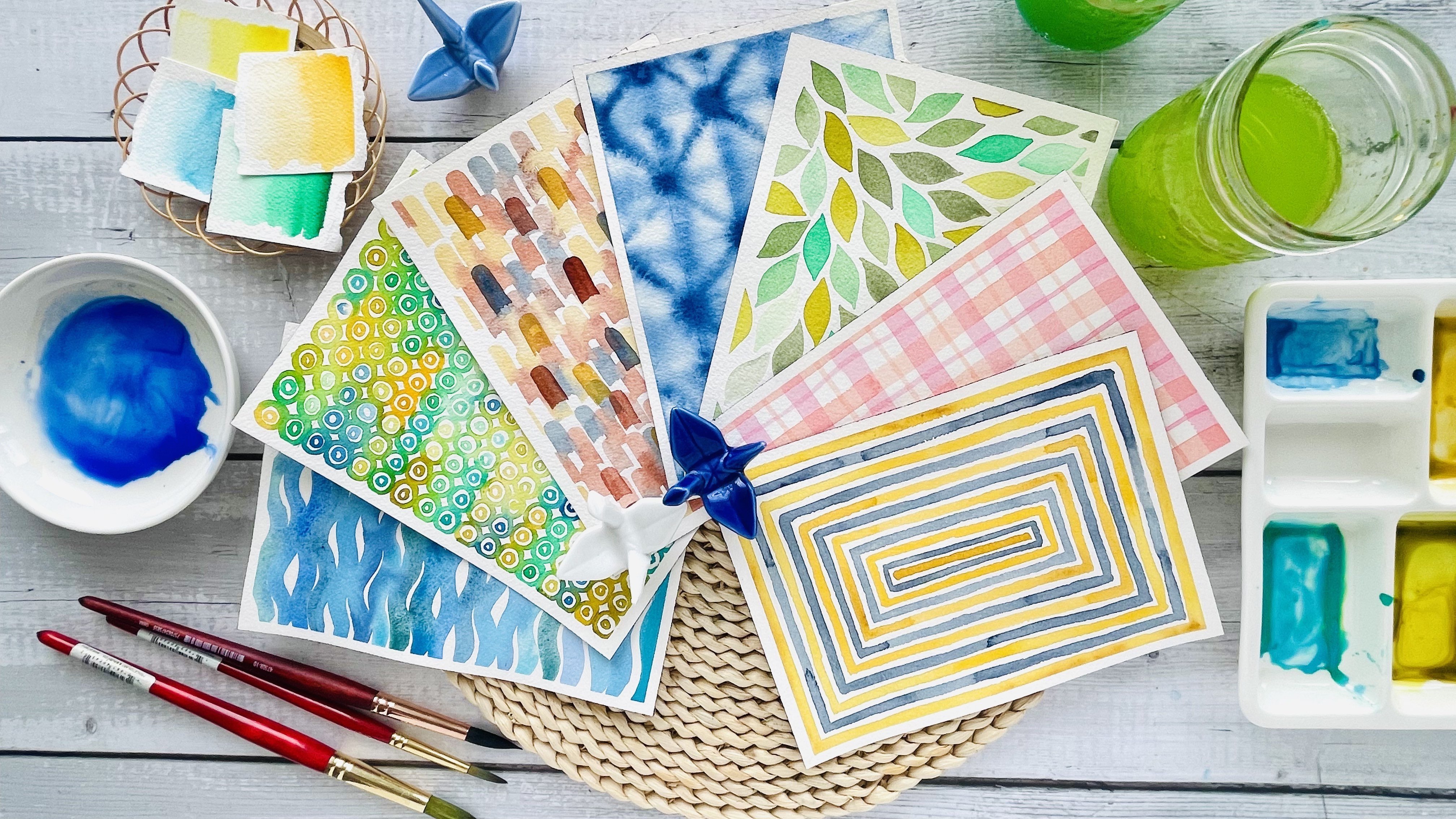
actually a sequel to my watercolor patterns for
calm and creativity class. After the wonderful response
to that first class, I wanted to create
something that feels like a continuation with fresh new patterns and slightly more variety to help you explore watercolor
in a deeper way. Students who are new can jump
straight into this class. But if you would
like, you can also visit the first class
as a starting point. I have shared the link to that class in the
description below. As we paint together
in this class, you will practice
smooth brush control and create clean,
satisfying shapes. You will experiment with
layering and blending of colors for a beautiful,
cohesive color palette. You will learn tips to make your patterns feel
modern and polished, even if you're
just starting out. You will explore the use of metallic gold
watercolor paint to elevate your patterns and
add a touch of elegance. The goal is to keep things
light and relaxing, so you can enjoy the
process and make time for creativity each day. By the end of this class, you will have a collection of seven beautiful
watercolor patterns, perfect for framing, gifting, or simply enjoying as part
of your creative journey. So grab your supplies, and let's dive in.
2. Supplies: Before we dive into painting these relaxing
watercolor patterns, let's take a moment to gather all the supplies
you will need today. For paper, I'll be using seven by ten inch cold pressed watercolor
block by arches. This is 100% cotton paper. I like to cut these
sheets down to five by 7 " for our projects. The smaller size feels
less overwhelming and is perfect for creating these
relaxing daily patterns. For brushes, I'll be using Princeton brand round
brushes in three sizes, size two from the
Neptune series, size four from the
velvet touch series, and size six from the
Aqua Elite Series. These sizes give
me the flexibility to paint larger washes and medium details and refine
smaller areas with ease. But don't worry if you
don't have all three, a size four or six with a good tip is more than
enough for this class. You will also need a pencil, an eraser and a
ruler for sketching simple guidelines and making grids before we begin painting. For Pattern five, six and seven, you will also need
a compass to help draw precise circles
and geometric shapes. For Pattern six, you will
need a hexicon cutout. You can either prepare
it ahead of time or create it when we get
closer to the project. You will also need some masking
tape to secure your paper and get those clean edges
around your patterns. Let's look at the paints now. For this class, I'll be using
a metallic cold watercolor, along with a range of
blue and green shades. I'm using Mamariblue
professional watercolor paints
for this class. In each project, I will share the exact color names I'm using so you can follow along or choose similar shades
from your own palette. Don't worry if you don't
have the exact same colors. Feel free to work
with what you have. These are some of the shades
of blue that I'll be using. I have mentioned all the names in each of the pattern projects. Usually, I squeeze out
paints from the tubes into these plastic
mixing well palettes. For mixing my paints, I'll be using my
ceramic palettes, which are great for blending and holding the
colors as I work. You are also going to need some paper towel to dab
and clean your brushes. And two jars of clean water
for rinsing your brushes, one for the initial rinse, and one for the final clean
rinse to keep colors pure. That's everything you
will need to get started. Before we begin
painting the patterns, I suggest you take a
piece of scrap paper and practice some gentle
strokes to warm up your wrist. This little warm
up helps you feel more relaxed and
confident as you paint. Once you have warmed up, we can jump right into creating these soothing watercolor
patterns together.
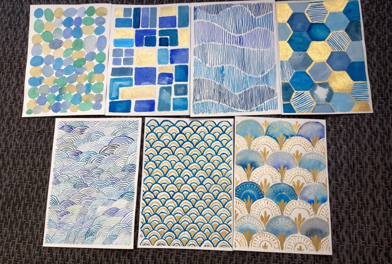
3. Day 1: Sea Glass Serenity: Welcome to day one,
Sea glass Serenity. In this coming project, we will create soft
scattered shapes inspired by pieces of seaglass washed
ashore and softened by time. Let's ease into
the flow of color, one peaceful brush
stroke at a time. I'm working on a five
by seven inch sheet of watercolor paper taped down with masking tape to keep the edges
clean and the paper flat. I have premixed a few cool
toned colors, soft blues, aqua blues and greens to keep things
harmonious and relaxing. In the order of color mixing, here are the exact shade
names cupric green light, turquoise cobalt, hookers green, green gold, ultramarine
blue, and sap green. It is not necessary to have the exact shades
that I'm using, but try to keep the color
palette fresh and bright. You can build this pattern
using three colors, too, but I'm stretching
myself a bit to get a more playful and
brighter looking pattern. We want these shades to
feel translucent and light. So try to avoid using too
much of a darker pigment. If the colors get too heavy, the overall piece can lose that soft airy feel
we are going for. So make sure all of
your paints are watery. A for this pattern, I'm using a size
six round brush, which gives me a nice balance
between control and flow. You can also use a size four
round brush if you like. We will start painting from the top left corner and slowly make our way
down row by row. I'm alternating between
colors as I go, placing the shapes
close to each other to create a nice mix
across the page. You will notice
that I'm switching colors frequently going forward, and I do rinse my brush between each shape to keep the
colors clean and vibrant. I've trimmed that part out of the footage just to keep
the video flowing smoothly, but feel free to take your time and rinse
your brush as needed. Most of the times, I'm letting two shapes touch each
other while still wet, so the colors softly
blend into one another. This is the part of
wet on wet technique, and it creates those
lovely watercolor bleeds that feel organic, almost like two colors are
melting into each other. For this pattern, you do
not need to plan too much. Just allow some
overlap to happen naturally and enjoy
watching the paint flow. Take your time with this part of drawing shapes row by row. I will paint along
with you for a bit in silence so you can settle into the rhythm
and enjoy the process, which I think is the most
important part of this class. As you continue
filling in the page, notice how the shapes
begin to interact, some blending softly,
others staying crisp. It's okay if we have few
overlap or bloom unexpectedly. That's the part of the
magic of watercolor. You can tilt the
page slightly or adjust spacing to keep
things flowing gently. Let this be about rhythm
and not perfection. There's something really
soothing about watching the page fill up bit by bit,
shape by shape. Take your own sweet time and continue to
finish this pattern. D. If your paint starts to dry out, feel free to remix your
colors at any time. And remember to
keep your brush and the paints slightly
moist throughout. This helps prevent dry patches and keeps everything
soft and flowy. This is a pattern you can likely finish in a single sitting, and sometimes that's
all we need a short, quiet moment of color and flow. If you felt a little more calm, a little more centered, or simply happy to have
made something today, then this session was a success. Once you have
filled up the page, let the painting dry completely before
peeling off the tape. That clean white poder
always feels so rewarding. I hope this simple start
helped you ease into the flow, see you in the next pattern.
4. Day 2: Modern Mosaic: Welcome back today, too. Today we are painting
modern mosaic using simple shapes and a refreshing blue and
cold color palette. We are working free hand
today, no pencil sketching, just a brush, some colors, and an open layout of soft
rectangles and squares. I'll be using a size six round brush for
the entire piece. It is versatile enough for both larger blocks
and smaller touches, and it helps keep
things loose and fluid. But before we begin painting, let's talk about the colors. I'm working with a palette of cool calming blues like
turquoise, ocean blue, and ultramarine and pairing them with a touch
of metallic gold for some added warmth and shine. Here are the exact
shade names that I'm mixing onto my palettes
and keeping them ready. I started out with fines blue, which is somewhat similar
to ultramarine blue, but a slightly
more intense blue. Then I'm also using
Prussian blue, primary blue sign,
turquoise bald, and Kobalt blue green. So these are the five blues
that I'm using today. And again, like I
always mentioned, it is not necessary for you to have all of these
different combinations. Having just one or
two blues is enough, and the use of gold color in this class is
completely optional. So instead of gold, if you don't have gold
watercolor paint, you can either use a
contrasting color, such as a yellow Ochre
or chrome yellow or maybe a softer shade of
orange or maybe even a pink. So it's up to you how you
want to add in the contrast, but I chose gold for a
nice luxurious feel, and I'll be repeating somewhat the usage of gold in the
other patterns as well. So this is going to be a
theme throughout the class, and I'm really liking how the gold pairs up
with all the blues. Once your colors are ready, we will begin painting
one block at a time. As you place each shape, vary the sizes and spacing. Let your brush guide you. Some blocks can be tall and narrow while others
can be short and wide. We will be painting all of the blocks with wet
on wet technique. We will apply a nice soft
wash of a shade of blue and then drop in a darker pigment of the same color and allow the colors to
blend by themselves. So we don't really want all
the blocks to look flat, but we are going to make
sure that we bring out this beautiful gradation by making use of the wet
on wet technique. So be sure to spend time on each block and achieve beautiful shading as
you go piece by piece. The key is to stay
intuitive and relaxed. In these early rows, I like to focus on flow
rather than perfection. Think of each shape as a building block
in a quiet rhythm, color, space, pause, and repeat. Alternate between soft
blues and shimmering gold to create a gentle
balance across the piece. Take your time and
rinse your brush often so the colors stay
clean and distinct. There is nothing to be
planned about this piece. All you're going to do is place some rectangles and blocks
and squares the way you want. They could be perpendicular
to the earlier block. They could be parallel
to the earlier block. So just go with what
you feel is right. Blend every block and find
a speed that works for you. Between every few blue blocks, I'm going to paint
one gold block. The key is to paint the gold blocks fewer than the blue ones and keep them far away from each other to maintain
the overall balance. We certainly don't want
the gold to go overboard. To add interest and a
level of complexity, we will add some L
shaped blocks as well. These break up the
repetition and create a more playful
mosaic like layout. Take your time and
rinse your brush often so the colors stay
clean and distinct. As we move further
down the page, step back every few rows to
notice the overall balance. Are your colors
spaced out nicely? Do you want to add a little
more gold in one area? It's okay to adjust as you go, and that's exactly
what I'm doing. This is the beauty of
painting intuitively. You might find yourself settling into a meditative rhythm by now. Just keep moving shape by shape, one small decision at a time. The paper size of five by 7 " works perfectly for
patterns like these. It's not overwhelming
if you're short on time and still offers a
satisfying sense of completion. If you have a busy routine, this format gives you
just enough time to relax and create something
beautiful without pressure. One pattern a day becomes
a lovely, achievable plan, and by the end of the week, you will have a collection of seven calming projects
to look back on. As we near the end, I'm filling in the final
shapes and stepping back to make sure the composition feels
soft and balanced. A few imperfect edges and watercolor blooms only
add to the charm. And that's it. Our modern
mosaic is now complete. Doesn't it feel like a tapestry of tranquil blues
and glimmering gold? If you enjoyed this, don't forget to watch the other
videos in this series, and I'm sure you're going
to have fun painting many more relaxing patterns
with me ahead of this class. Thanks so much for
painting with me today. See you in the next one.
5. Day 3: Waves of Stillness: Welcome to day three.
This project is all about slowing down and finding calm
through quiet repetition. We will create a pattern made
entirely of vertical lines, gently following a flowing
wave shape across the page. It is rhythmic, meditative, and surprisingly rewarding once you settle into the motion. I'm working on a five
by seven inch sheet of watercolor paper taped
down with masking tape. Before we begin painting, I have premixed a few calming
colors in a cool palette. They are the same shades we
used in the day two pattern, so this piece will feel like a natural continuation
in your collection. Once the colors are ready, we will take a moment to draw some gentle wave lines across
the page using a pencil. These soft curves divide
the page into flowing horizontal bands that will
guide our vertical strokes. You don't need to
measure anything or overthink the lines. Just let your hand
move freely to sketch a few gentle waves from one side of the
page to the other. When we paint, we will avoid painting directly over
the pencil lines. Instead, we are leaving a
thin gap around them so they stay visible as soft spaces
between the wave sections. In the end, we will erase
those pencil lines. Before you begin painting, take a pause and slightly
lighten the pencil marks. I'm using a size four round
brush for this pattern. It gives me just the
right amount of control while still keeping the
lines fluid and soft. We will begin painting
from the top of the page, starting with the
first wave band. Use vertical strokes,
paste evenly and let them naturally follow
the shape of the wave. You can choose any one of the premixed shades of blue
to begin with the pattern. There is no particular
order in which we are going to use the
premixed colors. Just go with the flow and choose whatever
feels right to you. Don't worry about making every
line perfectly straight. Organic variation is
part of the charm. Just keep a steady rhythm, letting your hand
relax into the motion. Now, to fill in the next band, we will simply follow
the curves which are on the top and the
bottom of that section and just draw vertical lines in between them without
touching the pencil lines. These colors are light
and somewhat diluted. We want a translucent look, so the finished piece
feels airy and serene. If your colors feel
too heavy or dark, just add more water
to lighten them up. I do really like some
dark streaks in between. Whenever I have to
reload my brush, I get a few lines that
are dark in between, and that is something
that looks really nice when you're drawing
lines in a rhythm. So we do want that light
and dark transition happening between the bands. So don't worry too much if you have to reload
your brush in between. Alternate between the
different shades of blue every few lines or
every new band. This will create a soft shifting gradient
throughout the pattern. Every few strokes, rinse your
brush and reload it with fresh watery paint to keep
the tones clean and distinct. It is also okay to remix your paints if
they start to dry up. Just keep everything moist, both your brush and
your palette to avoid scratchy textures
or dry patches. At all times your
brush should be able to move smoothly on the paper. There's a lovely
meditative rhythm in this process line after
line, wave after wave. If you find yourself zoning out a little bit, that's
actually the goal. This is where the calm sets in. Let's take a quiet moment now to paint
together in silence. Just you, your brush, and the flow of
water and colour. The paper size of five by 7 " works perfectly for
patterns like this. It's not overwhelming, even
if you are short on time. If you're fitting art
into your busy day, this gives you just
enough space to create something beautiful
without pressure. So I highly recommend
always having sheets of smaller sized papers or cut to the size you need
and keep them ready. So whenever you have the
urge to paint something, you can just begin by
starting out small. One pattern a day
is a gentle rhythm, and by the end of the week, you will have a
calming collection of seven watercolor pieces. If you took my previous
Skillshare class, you will remember we painted seven carming
watercolor patterns, each one designed to help you relax and build confidence
with your brush. This class is a
gentle continuation of that journey, like a sequel, where we slowly build
on those skills with slightly more layered
and intuitive patterns. If you're new here, I highly recommend checking out
the previous class before starting this one. It is a great
foundation and help you feel more at ease with the
projects we are exploring now. Y As you move toward the bottom of the page, you may notice your
lines becoming more confident and your wave
shapes slightly shifting. Let that happen naturally. No need for perfection. Once your page is full, step back and take it all
in the subtle curves, the layered colors,
the quiet repetition. This is the beauty of
intuitive pattern making. Let your painting dry
completely before peeling off the tape and
erasing the pencil lines. That crisp white border always
adds a finishing touch. And if you felt a sense
of flow, presence, or even just enjoyed the act of slowing
down with your brush, then this painting has
served its quiet purpose. Thanks so much for
painting with me. I will see you in
the next pattern.
6. Day 4: Coastal Currents: Welcome to Day four. This
pattern is inspired by the soft interlacing motion
of waves and ocean currents. We are building a piece full of sweeping arcs and curved lines that flow over one another like ripples
weaving through the sea. My colors today are from the same cool palette
as before, blue greens, turquoise and ocean blues, but feel free to
tweak your shades slightly if you're in
the mood for variation. For this piece, I'm using a five by seven sheet
of watercolor paper taped down with masking tape
and a size four round brush. It's the same brush we have
used in the previous sessions versatile and easy to control
for curves and fine lines. Before we begin painting, there is no need to sketch
anything on the paper. We work free hand, letting each line flow naturally
from the wrist. We are starting from
the top left corner of the page and working
our way downward, one flowing section at a time. Let the curves gently rise and fall as you move
across the page. We are working in sections
that almost stack or layer into each other like
overlapping water paths. Each new section of curved lines follows the natural angle of the one before it with a subtle change in direction to keep the visual
movement going. Each section also gets
its own shade of blue, which helps build a soft shifting gradient
across the page. The key here is spacing. Leave consistent gaps between the lines to let the white
of the paper breathe. This negative space adds so much clarity and lightness
to the final piece. I'm starting with
one color and using it to complete an entire
section of curve lines. Then I switch to a
new shade of blue for the next section to create
soft shifts in tone, almost like the sea changing
color as it gets deeper. Make sure your brush
isn't too dry. We want each line to glide
smoothly across the page. You can always test
your stroke on a scrap piece of paper before
returning to your piece. It's completely
okay if your lines are not perfectly
parallel or identical. That subtle wobble or unevenness gives it the hand painted
character we are after. Think of it as your
personal tide mark. You might notice your wrist
loosening up as you go. That is part of what makes
this pattern so enjoyable. Your hand gets into a gentle rhythm like
sketching waves in the sand. As we move through the
middle of the page, let the curves shift
direction a little more. This builds a woven effect, almost like one current crossing another or waves meeting and
folding into each other. You can even overlap
the ends of some arcs slightly to give the illusion
of depth and dimension. It makes the pattern more dynamic while still
keeping that calm energy. Between sections, I always
take a short pause, not just to change colors, but to check the balance
of movement on the page. Ask yourself, does it
feel like it's flowing? Is there a nice contrast between
light and dark sections? As you continue, let's
take a quiet moment now and continue painting
a few sections in silence, letting the rhythm of
curved lines take over. If you need to remix your
paints during this time, feel free to do so. A light fluid consistency is what we are aiming for
throughout this piece. The beauty of
coastal currents is that it encourages
freedom within structure. Each band of lines is similar, but you're always
making tiny decisions about curve, tilt and spacing. It keeps you gently engaged. This pattern may look
intricate at first glance, but once you're in it, it's really all about
repetition and flow. And that's where the
relaxation truly begins. As we reach the final section, I like to slightly
taper the arcs so the movement settles naturally toward the bottom of the page. It gives the piece a
gentle conclusion, almost like waves coming
down after a storm. Once your painting is dry, carefully peel off the masking tape to
reveal your border. That clean edge really helps highlight the intricacy
of your curves. I hope this session brought you a sense of creative focus. Whether you felt fully immersed or simply enjoyed the
steady motion of the lines, you have created something calm and deeply rewarding today. Thanks for painting
along with me. I will see you in
the next pattern. Oh
7. Day 5: Golden Seigaiha: Welcome back. Today
we are painting golden Sigaiha a pattern inspired by iconic
Japanese wave motif that symbolizes peace, resilience, and good fortune. We will build this design
slowly and intentionally, beginning with a light
pencil grid and painting a simple row of arches that repeat across the page
like ripples in water. Using a ruler and
a sharp pencil, let's start by marking horizontal lines spaced
half an inch apart, starting from the top and moving all the way
down the paper. This gives us 14 rows. Now, turn the paper and
draw vertical lines spaced half an inch apart again across the
width of the page. You should now have a full grid made up of half inch squares. Lightly erase the pencil
marks because we are going to paint our pattern
on top of the pencil lines. This is going to be
a two toned pattern. We are going to
use metallic gold and a shade of blue
of your choice. I'm using fines blue, which is similar to
ultramarine blue. And to paint this pattern, I'm going to use my
size two round brush, which has got a beautiful point. Now, each ark spans
1 " in width, which means you will paint
across two arches and squares, and the height of the
arc is half an inch, fitting exactly within one row. Starting at the top row, use your size two
round brush and one of your premixed blue paints
to draw a smooth curve, beginning at the left
edge of 1 " section, peeking gently at the center
and ending at the far side, just like a soft
shallow rainbow. Repeat this across
the entire top row, keeping your hand relaxed and your arches as even as possible. Now, for the second row, we will paint each new arc centered between
two arcs above it. This creates the signature interlocking rhythm
of the SigiaPattern. The beauty of this pattern
lies in its repetition, so thoroughly enjoy
this repetitive process and get into the flow of
painting the pattern. Slowly and steadily continue this process row by row gradually building
the pattern downward. The grid will help
guide the spacing and placement so everything
stays consistent. This pattern is all
about consistency. Once you have completed the full page of
overlapping blue arcs, we will add a
subtle highlight by painting inner arcs
using metallic gold. Start by mixing your gold paint to a smooth fluid consistency, not too thick, so
it glides easily. Using the same round to brush, paint a thin gold arc inside
each of the blue arcs, following its curve closely, but leaving a little
space from the edges. These gold axons should sit
gently within the blue forms, adding a shimmer of elegance without overpowering
the pattern. Think of them as little
moments of quiet light. There's no need to
be overly precise. Just keep the motion
fluid and the lines soft. Let each stroke feel like a quiet echo of the
larger arc around it. The next step is pretty
straightforward. We now go back to the
blue paint and draw even smaller arcs to fit
within the gold arcs. I'm going to continue
using the same brush, and very softly, I'm going to
add the smaller blue arcs. The pattern is slowly
looking intricate and dense, while the other patterns had a certain level of
abstract theme to them. This is a perfectly
repeating pattern. Symmetry is the
essence of this one. And now we come to
the final step, which is going back
to the gold paint. I'm going to fill up the
center portion of the arcs, the gap below two adjacent arcs with a flat gold fan shape. This last touch instantly
lifts the mood of the pattern and makes
it look luxurious, yet elegant and minimalistic. When done, the pattern may
look complex to paint, but the secret of this
pattern lies in the grid. If your grid is in place, you will be able to
paint this pattern in no time and without
any pressure. So I highly suggest you
spend the time in getting your grid right and getting
the pencil lines perfect, so it becomes extremely
easy to paint the pattern. And that's it. We are
done with the pattern. Wait for everything to dry before you peel
the masking tape. This is one of my favorite
patterns in this series, and I absolutely love the way in which the gold paint
shines and glimmers. I can keep doing
this for hours and see how the gold paint
dances with the light. Now, you can also turn
your pattern upside down, and it would still
look beautiful. So you can hold it
the way you want. I hope you had a
good time painting this symmetric repeating
pattern with me today. Thank you for joining me, and I will see you
in the next part.
8. Day 6: Shoreline Honeycomb: Welcome to day six, where we will paint
shoreline honeycomb, a striking pattern inspired by the geometric beauty of honeycombs and the soothing
colors of the sea. This design balances structure
and fluidity as we combine soft watercolor textures with metallic gold accents to
create a modern mosaic effect. To begin, we will
prepare the layout using a small hexagon
cutout as our guide. The radius of this hexagon can be anywhere 1-2 centimeters, depending on your preference. Make sure the hexagon is neither too small nor too
big for the page. I used a compass to
draw the hexagon and then cut it out carefully
with a paper cutter. You can place the hexagon
either horizontally on one of its sides or vertically
on one of its corners, whichever orientation you
prefer for your layout. Start by placing the hexagon
cut out in the center of the page and lightly trace
around it with a pencil. From there, draw hexagons
next to each other, working outwards
in all directions. Place them randomly
so the pattern feels more organic than rigid. Continue tracing
until the page is filled with
interlocking hexagons. Don't worry if a few
edges aren't perfect. This adds charm to
the finished piece. Once the layout is ready, let's mix sour colors. We will use the same
coaming blue tones from earlier patterns and pair them with metallic gold
for a touch of luxury. Keep your blue shades
light and translucent, reminiscent of sunlight water. The metallic gold will bring in warmth and
elevate the design. For this piece, I
will use my size four round brush for
filling in the hexagons and switch to a size
two round brush for outlining and drawing
the stripes later. Begin by filling any hexagon in the top left corner of the page with one of the
premixed blue shades. Work outward and
downward from there, alternating blue
tones as you go. I'm going to use wet on
wet techniques for most of the hexagons to get a
beautiful gradient of color, and I'm going to use a flat
wash for a few others. There is no set rule on how you begin painting
the hexagons. Just choose random hexagons
and start filling them in. This pattern is quite detailed and you are going to take some
time to finish this. So don't be in a rush when
you sit down to paint. Tell yourself that today you're going to
spend that time to finish this pattern and not going to rush
into the process. Add gold hexagons
every few spaces, scattering them thoughtfully to avoid overpowering the blues. The key is to keep the gold
axons sparing and balanced. As you can see, I took
my own sweet time to paint the scattered
hexagons in gold, and now I'm going to go back to fill in some blue hexagons. It's all about balance, and you will have to try
this mix and match strategy and switch between
shades of blue and gold as the whole pattern
starts coming together. The Now that we have painted enough hexagons
that are blue and gold, we can switch to painting some patterned hexagons
that have stripes on them. And to do that, I'm going
to now switch to my size two round brush and fill up some hexagons with
stripe patterns. The stripes can
either be horizontal, vertical, diagonal, or slanting. So take your size two round
brush and start drawing stripes on some of the hexagons that are between
two solid hexagons. Again, there is no specific
way or plan to do this. Just randomly
choose the hexagons and start adding
stripes to them. Adding some striped
hexagons creates subtle variation and
visual interest. As you paint, remember to rinse your brush often and
keep your paints moist. This helps prevent dry lines and ensures smooth
and even strokes. Take your time and enjoy the meditative flow of
working hexagon by hexagon. I finished painting quite a
few patterns using stripes. I then took a step back to see how balanced
my overall pattern was looking and decided to
add a few blue hexagons. You will have to switch between striped and colored
hexagons till your pattern strikes
that right balance. So keep at it and continue
to paint with me. Once you have filled
in all the hexagons, wait for everything to
dry and then use the size two round brush and gold metallic paint to outline
a few select hexagons. This subtle outlining will highlight them and
give the pattern extra depth and a polished
mosaic like finish. Step back occasionally to check the balance of
your composition, making sure the blues and the golds are
evenly distributed. A when you have finished, let the painting dry
completely before gently peeling off the tape to reveal
the crisp and clean edges. Take a moment to admire
your shoreline honeycomb. It's like a patchwork of
sea glass and golden light, both structured
and free flowing. Completing such a
detailed pattern is a wonderful achievement. I hope this session brought you focus and a sense of
calm as you painted. Up next is our final day
seven pattern where we will bring together
everything we have practiced into one
beautiful project.
9. Day 7: Radiant Fans: Welcome to Day seven for our
final pattern radiant fans. We will combine
structured geometry with delicate gold
details to create an art deco inspired design that feels both
luxurious and calming. We will begin by building
the grid that will guide our fans using a
pencil and ruler, mark half inch markings along
the width of the paper. Make these markings both
on the top and the bottom, so it'll be easy for you to
join the vertical lines. Mark 1 " intervals along
the height of your paper on both the sides and then connect these markings to draw a neat grid across
the entire sheet. Take your time to keep
the lines light and precise as they will guide the placement of
our semicircles. With the grid ready,
take a compass, set to 1 " radius and begin drawing
semicircles across the wids. Place the compass point on each horizontal grid line
where it intersects with the vertical lines and carefully sweep your pencil
to create an even arc. Continue drawing semicircles
row by row, but this time, place them alternately so
that the semicircles on the next row fit neatly
between the ones above, forming an elegant
overlapping fan shape. This alternating
placement is what creates the signature fan like
structure for our pattern. Once all the fan
shapes are drawn, gently erase the grid lines with a needed eraser
or a soft eraser, leaving only the
fan shapes visible. This ensures the grid does
not show through when we begin painting with
translucent watercolor layers. We are using the same
shades of blue as the previous patterns and
a size six round brush to start filling in
the fan shapes with smooth gradient washes to
show beautiful shading. As you begin painting, paint every alternate row of fan shapes in soft
blends of blue shades, keeping the gradients aligned to create harmonious flow
across the pattern. Leave the other rows
blank for now to enhance the contrast and give the design its
layered, airy feeling. I'm going to use wet on wet technique to paint
all of these fan shapes. I'm going to start out
with a layer of water and then start dropping
in the darker pigment towards the pointed tip
of the fan and then slowly spread the color out
using a clean, moist brush. Feel free to alternate between the shades of blue
as you go along. So all the shades are scattered across the
page beautifully. Now, wait for everything to dry. Once you're done painting all the fans in the
alternate rows, switch to a size two
round brush and use metallic gold paint to add in fine details
in the white fans. These are the rows that
we left blank earlier. Now, you can choose to paint any kind of design
on these fans, but I'm going to keep the
design uniform throughout and paint the exact same
pattern on each one of those. Another idea is to paint a different design on every
fan. You can have stripes. You can have polka dots or any other design which
you want to try out, so feel free to do so. But I want this pattern to have somewhat a repeating feel to it, and that's why I'm going to
stick to the same design. Adding the goal details is the most time consuming
part of this pattern, and this last
project will require the most patience and
focus out of all seven. It's slightly more advanced and feels like the final
challenge in this series. But I really hope you will take your time with it
and give it a try. The result is so
rewarding and it's a beautiful way to end this
seven day pattern journey. To give the illusion
that the pattern continues beyond the
edges of the page, we will also paint
the top section where the fans are
partially cut off. This little detail
makes the design feel seamless and gives it the look of an endless
repeating pattern. O. To complete the pattern, we will repeat the
same delicate gold detailing on the rows
of blue fans as well. This final step ties
the entire design together and adds a
harmonious, elegant finish. Once you have finished, let the painting dry
completely before carefully peeling off the masking
tape to reveal smooth, neat borders around your work. Take a moment to
admire your painting. Isn't it absolutely beautiful? This pattern truly feels
worth every bit of effort, and I especially love
how the gold details catch the light and bring
the whole design to life. It's such a stunning way
to wrap up this series. Thank you so much for
painting with me today.
10. Conclusion: Thank you so much for painting along with me in the class. I hope you enjoyed creating these relaxing
watercolor patterns as much as I love
sharing them with you. Before you go, I would
love to hear from you. Head over to the
discussions section and let me know which of
the seven patterns was your favorite to paint. If you enjoyed this class, please take a moment
to leave a review. It really helps me understand what you would like to
learn in the future and if you would like to see more classes in this
relaxing pattern style. Don't forget to share
your beautiful work in the projects and resources
section of the class. I would love to
see your patterns and celebrate your
progress with you. If you haven't already, you can also check
out the first class in this relaxing pattern series. I have shared the link to this class in the class
description below. And if you're looking
for more step by step inspiration, my book, Modern Watercolor Workshop, has 21 modern and playful patterns that you can explore
at your own pace. Thank you again for being here, and I can't wait to
see what you create.
 Pooja Kenjale-Umrani, Author of MODERN WATERCOLOR WORKSHOP