Transcripts
1. Introduction 7 Day Relaxing Autumn Patterns: Hi, I'm Puja from by the
Lakeside Art Studio. I'm a watercolor artist and the author of modern
Watercolor Workshop. Welcome to my seven day
watercolor pattern series. This is the third
class in the series, and it's all about cozy fall inspired
watercolor patterns. We will explore seven warm
and comforting designs, each one celebrating the rich, golden tones and textures
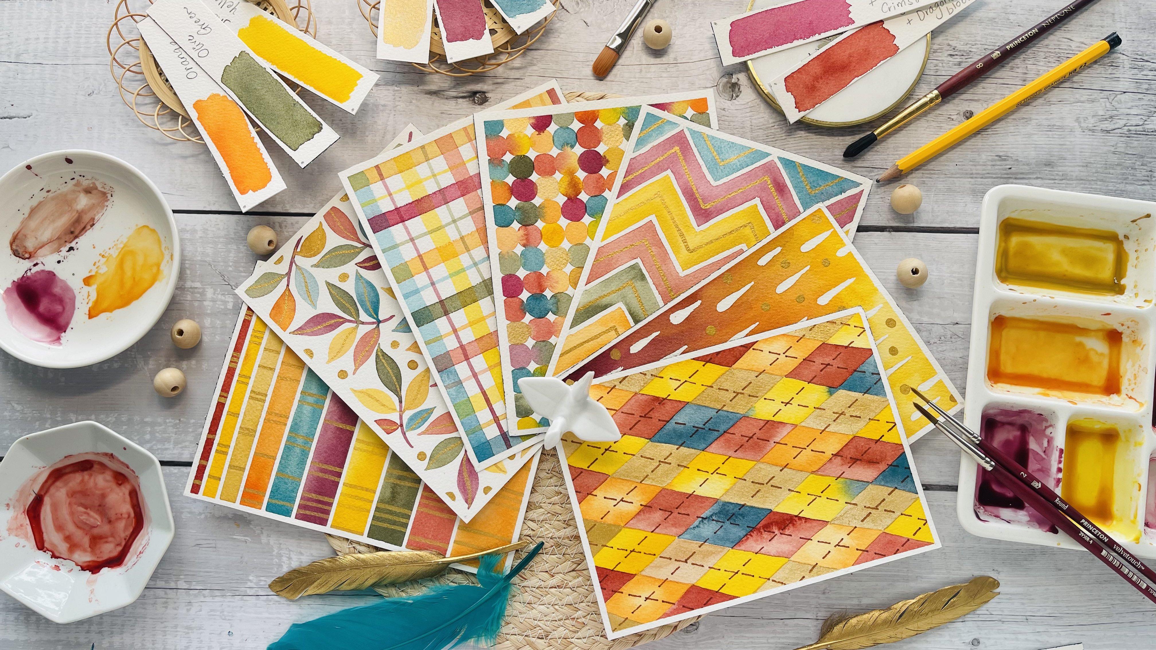
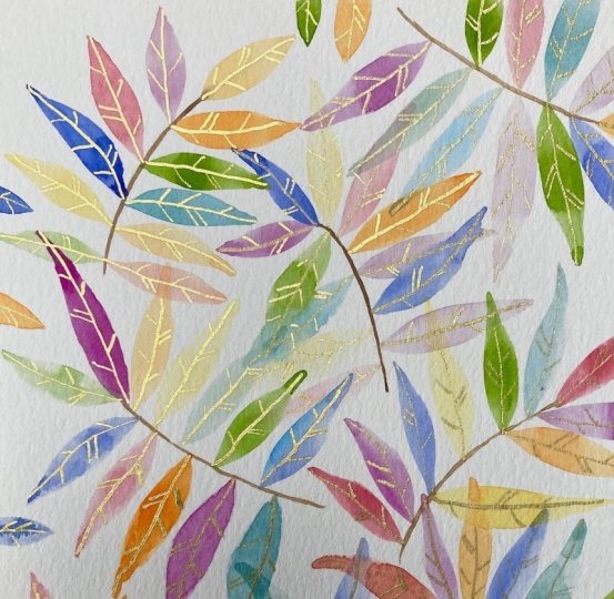
of the autumn season. Here's a peek at all the seven patterns
featured in the class, a harmonious mix of leafy
motives, plaid textures, abstract shapes
and soft gradients that together capture
the beauty of fall. This class, like the
others in the series is designed to be simple,
relaxing, and approachable. It's intended for you to paint one pattern a day so
you can build a calm, creative rhythm without
feeling overwhelmed. If you have joined my
earlier two classes, you will know that each one includes seven unique
pattern ideas, small achievable
projects to help you unwind while learning new
watercolor techniques. And if you're new here, I highly recommend
checking those out, too. They have been loved by
hundreds of students so far, and you won't want to miss the beautiful relaxing projects
shared in those classes. Students also love uploading
their paintings under the projects and resources
section of each class where I personally provide detailed feedback
to help them refine their watercolor skills and grow in confidence
with every project. The goal of this
series is to help you find stillness and
calm through painting. We will paint slowly
and mindfully, focusing on color,
rhythm and flow. These projects are
meant to give you a gentle break from the
business of everyday life, helping you finding joy in
simple brush strokes and the quiet pleasure of creating something
beautiful with your hands. By the end of this class, you will feel more confident with your watercolor techniques from brush control and blending to creating
depth and contrast. Most importantly, you will
feel refreshed, relaxed, and inspired to
continue painting regularly as a way to nurture creativity
and peace of mind. So take a deep breath,
grab your brushes, and let's begin our
cozy fall watercolor journey together. See
you in the class.
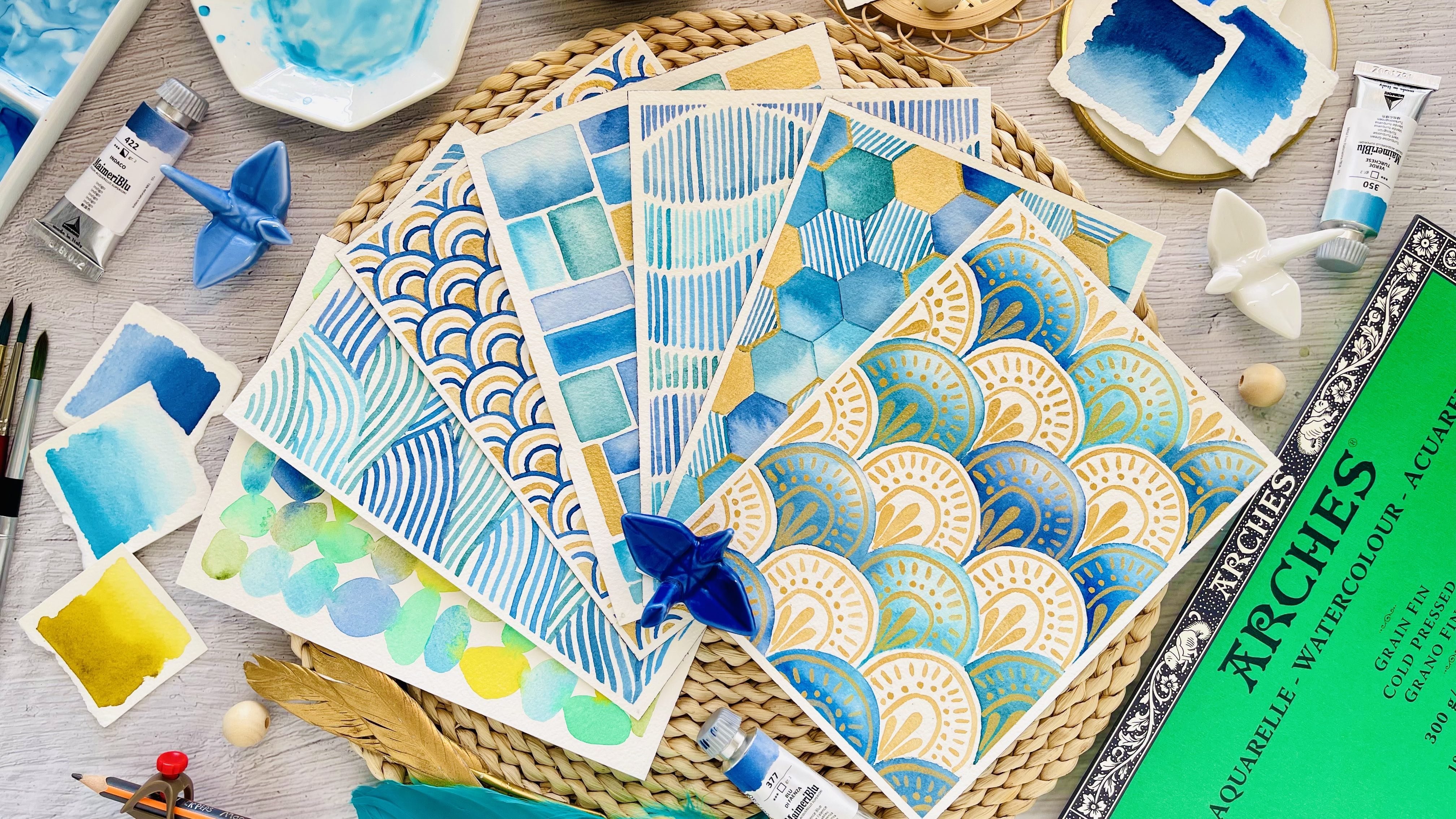
2. Supplies: Before we dive into our
cozy fall patterns, let's prepare our workspace with a few essential supplies. Setting up mindfully makes the painting process much more
enjoyable and stress free. First, you will need
watercolor paints. Any good professional brand will give you beautiful
vibrant results. I'm using my Mari blue
watercolors here. You will see me
swatching a few of the shades that we will be working with
throughout the class, including a touch of gold watercolor for
some subtle shimmer. If you don't have
gold watercolor, you can also use a gold acrylic marker
for a similar effect. We will be mixing our
own unique color palette for the seven patterns
in this class, so you don't need to have
the exact same colors. Just gather a range of warm fall tones and
a few cool accents. I will walk you through
this process in the next video where we will prepare the complete
palette together. For paper, I recommend
arches cold pressed, watercolor paper cut to
the size five by 7 ". It's the perfect size for
these small pattern projects, easy to handle and
just write for creating a full collection
by the end of the week. Now let's look at the brushes. I'll be using a round
size four brush for most of the
projects in this class. If you don't have a size four, a size six round
brush works well too. We will also be using a
size ten Filbert brush, or you can use a half inch flat brush if
that's what you have on hand. For broader washes, keep a
medium to large brush nearby, something like a size eight. And finally, a small round
brush in size one or two will be perfect for painting all the
delicate cold details. You will also need masking fluid for a couple of projects. I'm using one by
Windsor and Newton. When applying masking fluid, always use an inexpensive brush. One you don't mind sacrificing since it can easily
damage your good brushes. You will also need
two masking tapes, one thick and one thin. We will use these to tape
down the paper edges neatly and to mask off certain areas in a
few of the patterns. Next, keep a few basic
sketching tools handy, a pencil, an eraser,
and a scale. We will use these to
draw light grid lines or simple shapes before
painting some of the patterns. Up next, a ceramic palette
for mixing your paints. If you are using a
ceramic dinner plate that does not have
separate wells, just make sure the paints
don't run into each other. It helps keep your colours clean and vibrant
while you work. And finally, some
paper towel to clean your brushes and two cups of
clean water to rinse them.
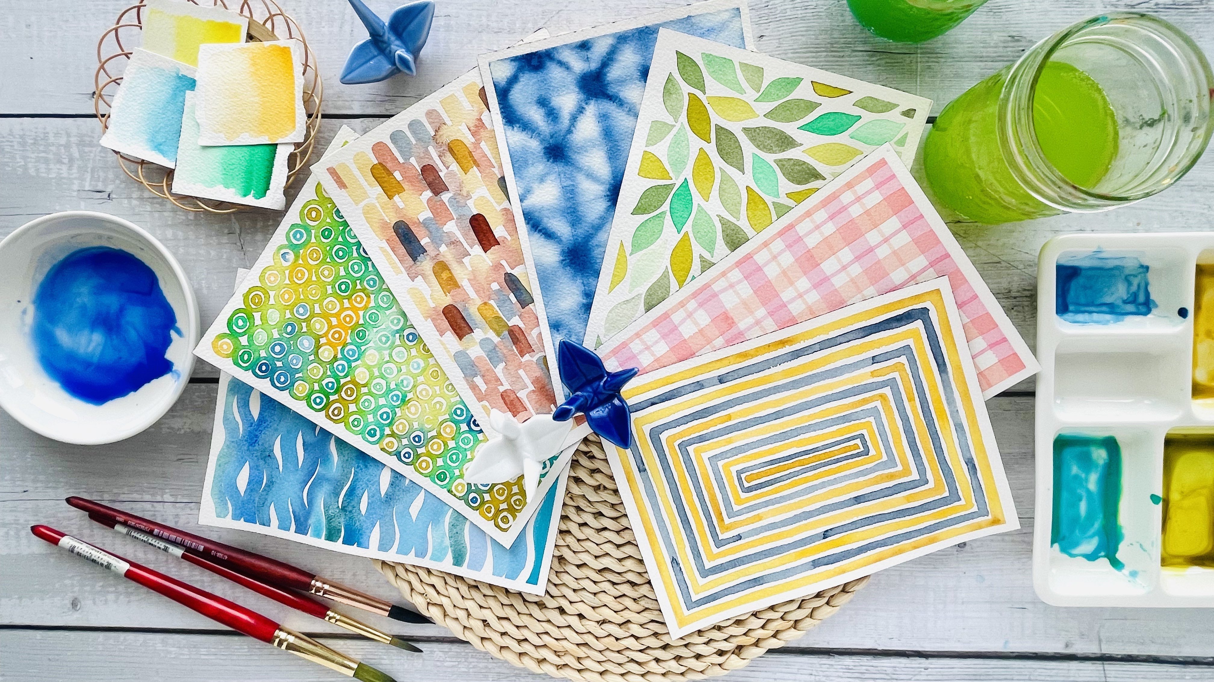
3. Autumn Palette Color Mixing: Before we begin painting, let's take a few minutes to prepare our color
palette for this class. These are the warm,
comforting fall shades we will be using throughout
all seven projects, a mix of early golden
and jewel tones that capture the
beauty of the season. Let's start with yellow
Ochre, a gentle, muted yellow that brings a soft natural warmth
to our patterns. Next is orange, bright, cheerful and full of energy. I think it's going to add
a beautiful pop of color. Then we will mix crimson with dragon's blood
to create a rich, warm red that feels like
turning maple leaves. Moving to the cooler side, we have turquoise to which
I'm adding a hint of gray in order to get
that smoky teal blue, followed by a soft
early olive green. Both of these colors are perfect for balancing
out the warmer tones. Next comes magenta, a vibrant, rosy hue that adds a
touch of brightness. And then finally, we
have boda, a deep, elegant wine red that brings
depth to the palette. Now, it's not necessary that you use both of these colors. I think throughout the class, I'm going to use either of
these colors interchangeably, but I'm still mixing these
two shades so that you can have something in
your palette that matches either of these colors. We will also be
using Indian yellow, a glowing golden tone that ties everything
together beautifully. And finally, a touch of gold metallic watercolor to add a hint of shimmer and
that festive autumn glow. As you mix your colors, take your time to
adjust the consistency, load your brush with
paint as needed, and add just enough
water to keep the paint fluid and
creamy at all times. I recommend preparing all
your colors in advance so you can paint smoothly and enjoy the process
without interruption. Once your pallet is ready, we will move on to
our first pattern.
4. Day 1 Autumn Stripes With Gold Bands: Welcome to day one of our fall
watercolor pattern series. This one's called
radiant autumn bands. It's the perfect way to
begin our painting journey, calm, structured, and
beautifully luminous. If you want, you can tape down the edges of
your paper as well. This helps keep it stretched and prevents any warping
as you paint. It's totally optional,
but it gives a clean, professional finish at the end. Now, let's start by
preparing our sections. Using thin masking tape, I'm dividing the sheet into gradually increasing
bands with the one on top being the thinnest and each section below
getting slightly broader. You can adjust the
spacing as you like, even random or gradually
changing like mine. This kind of variation adds
rhythm and visual interest, and it's always a lovely way
to play with proportion. Just make sure the tape
is pressed down firmly along the edges so no
color seeps underneath. Feel free to take your time and adjust the tape as you need. As seen earlier, I have
premixed all the colors ahead of time and kept them
ready to begin painting. Here I'm using a size
eight round brush. Make sure to have nice, easily flowing paints mixed onto your palette for a smooth and enjoyable
painting experience. I'm continuing with our
fall inspired palette, warm, glowing hues of gold, burnt orange and deep red, balanced with earthy greens and a touch of
teal for contrast. To create soft transitions, start with a wet brush and let the pigment move naturally. If you would like stronger
saturation or little texture, use less water and build up the pigment while the surface
is still slightly damp. Don't worry about achieving
perfectly even washes. Watercolors little
variations and blooms are what
makes it feel alive. Now I'm painting each
colored band one by one, moving slowly from
top to bottom. You can also start with lighter shades on
the top and deepen the tones as you go down or simply follow what
feels right in the moment. I like to alternate between warm and cool hues to keep the pattern balanced
and interesting. If you notice any harsh
edges between sections, gently soften them with a clean damp brush that helps
create smooth transitions. Remember to rinse your
brush between colors, to keep them fresh and
avoid muddy mixes. I really like the contrast of this burgundy color sitting
right next to the teal blue. This stage is really about enjoying the meditative
flow of color, letting the brush
glide and watching the pigments settle
beautifully on paper. Take your own sweet
time when you're coloring each
section one by one. A this pattern is all about simplicity and having that experience of laying down the paint one by one
and simply watch how the colors look when you place
them next to each other. There's absolutely no
complicated method involved or there is no detailed process on how this pattern
is to be made. But the intention of this
very first pattern is to allow you to mix your paints and just enjoy your brush
gliding on the paper. That's all it is
for this pattern, and I really want you to experience this as you mix your paints as you dip
your brush in the water, as you load your
brush with the paint, so enjoy the flow and be proud of yourself
for the fact that you were able to take that time
out today and get your palettes out and simply mix paint and start painting. So that is the
intention of day one. This is the last band that I am painting with a
nice orangey yellow. And I'm still using my
size eight round brush. Now, once all your colored
bands are complete, let your paper dry fully
before the next step. This drying time is important. If the paint is still damp, the gold details might spread
instead of staying crisp. And now comes my favorite part, adding the shimmering
gold axons. I'm using a round
number two brush with a fine tip and a metallic
gold watercolor, but you can also use gold
gouache or even a gold gel pen. Paint thin vertical
lines in each section, placing them in a
randomized order. Some can be close together, others more spaced apart. Let it feel organic
and intuitive. You can also play
with line thickness or length to add subtle variety. Your brush starts to dry out, simply lower it again
with your gold mix. Metallic paints tend
to settle quickly, so giving them a
gentle stir before each dip helps keep the
beautiful shimmer even. Make sure your gold lines
are bold enough so they glimmer beautifully against the matte watercolor background. As the width of each colored section increases or decreases, depending on how you have
sectioned your paper, let the length of your
gold bands flow naturally. That variation adds rhythm and visual movement to
the overall pattern. Once you have finished
adding the gold details, give the piece a few extra
minutes to dry completely. Metallic panes can
take longer to set, and letting them dry
fully ensures that gorgeous reflective shine stays crisp and smooth for
the final reveal. So wait for a few moments
and let everything dry. Once everything has dried, carefully peel off
your masking tape that moment of reveal. When you see those
clean white lines appear between the colors, it is so satisfying. It instantly starts giving your pattern a polished,
modern finish. This project is all about slowing down and
enjoying the process. Each color, each brush stroke, and each gold line adds its own energy
to the final piece. The mix of mate, watercolor, and shimmering
metallics captures that warm autumn light
perfectly calm, glowing and full of
gentle contrast. So take your time, enjoy
the rhythm of painting, and watch as your radiant
autumn bands come together.
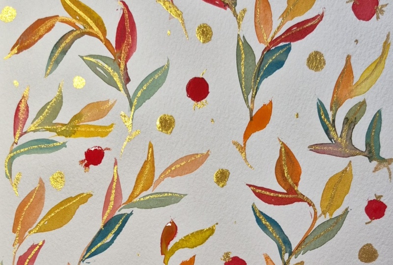
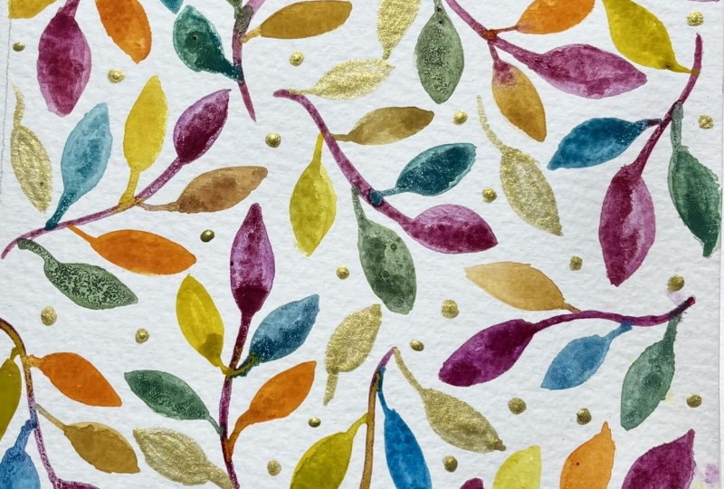
5. Day 2 Tossed Autumn Leaves: In this project, we will create a light and airy
pattern inspired by fallen autumn leaves painted in a free
scattered style. We are using the same warm
fall palette as before, but this time we will apply differently to bring
each leaf to life. The combination of soft
colour transitions and shimmering gold details makes this design feel
lively yet soothing, a perfect blend of
structure and spontaneity. You can tape down your paper
along the edges if you like. It helps keep the
sheet stretched flat and gives you a clean
border once you're done. Step is completely optional, so feel free to skip it if you prefer a more relaxed
natural edge. We will be painting
directly on the paper today without any
pencil sketching. I find that painting free hand gives the leaves a
loose organic flow. But if sketching helps you
feel more comfortable, you can lightly mark
your layout as a guide. Like I mentioned before, I'm using the same fall palette that we used in the
previous pattern, some warm golds, burnt orange, burgundy, olive green, and a
touch of teal for contrast. Having your colors pre mixed
and ready makes it easier to move fluidly between shades without interrupting
your painting rhythm. Try to vary the colors
across your page. Placing warm and cool
tones next to each other, helps each leaf stand
out beautifully. Keep your paints
creamy and smooth, not too watery for an
even vibrant coverage. We will be painting
one stem at a time, adding leaves to it before
moving on to the next cluster. I'm painting the
stems as well as the leaves using a
round size four brush. It gives just the right
balance of control and flow. Let each stem curve gently across the paper in
natural flowing lines. Once a stem is painted, continue using the
same brush to add simple almond shaped
leaves along its length, varying their direction and size to keep them lively
and organic. Y. As you paint leaves, hold your brush slightly
perpendicular to the surface of the paper and smoothly glide your brush as it
comes to a fine tip, and then lift it gently. Add another stroke
right next to the first one to fill
the leaf shape in You can mix up your
colors as you go, alternating between
warm and cool tones for contrast and balance. When one stem with its
leaves feels complete, move on to the next one, placing it in a new direction to maintain a sense of
rhythm and spontaneity. You can even create soft
colour transitions within a leaf by blending two shades while the
paint is still wet. If at all, two clusters meet, vary the leaf colors
where they touch. That little bit of contrast keeps the design
visually interesting. Feel free to turn your paper
or block around to get that comfortable and
optimal wrist angle as you paint each
stem and leaves. This makes a lot of difference
in the way you paint, and you will realize
that your hand flows better when you paint
in a certain direction. Explore what works best for you. Keep your wrist relaxed and enjoy this slow
meditative process. One stem and one set
of leaves at a time. Once you're done painting and
reach the end of the page, wait for everything to dry before you proceed
to the next step. Okay, so now that
the leaves are dry, it's time for the gold axons. Start by adding small
dots across your piece. These will act as subtle highlights and give
your design a gentle sparkle. Then using a small round
brush with a fine dip, add delicate veins
or outlines to a few selected leaves or
maybe just all of them. This selective shimmer
keeps the piece elegant and adds a subtle glow
when light hits the gold. If your brush starts to dry out, load it again with
the gold mix so the lines stay bold and opaque. A These rich gold axons will glimmer beautifully over the matt watercolor surface. Once done, wait for the
gold dots and the veins to dry completely before removing your tape or handling the paper. H. Take a step back and look at your piece. If you see any uneven
areas or open spaces, add a few smaller leaves or
dots to balance the design. Once everything is dry, carefully peel off the tape
for a crisp, clean edge. You will notice how beautifully the matte watercolor contrasts
with the metallic shimmer. That's what makes this pattern feel both elegant and alive. This tossed autumn leaves pattern captures the
feeling of fall in motion. Leaves swirling
gently in the wind, each one unique yet part
of a graceful whole. It's such a rewarding project, relaxing, colorful
and full of light. I hope you enjoyed
painting with me today. Join me in the next lesson
where we will explore another relaxing
watercolor pattern inspired by the cozy
beauty of fall.
6. Day 3 Autumn Plaid: Let's begin our day three
autumn plaid pattern, a cozy, woven inspired design that instantly brings to
mind fall scarves, blankets and all
things warm and snug. Before we begin painting, I want to quickly show the brushes I'll be
using for this project. I'll mainly work with a
size ten filbert brush for the broad thick stripes and a size four round brush
for finer thinner lines. I will also show an option of using a half inch flat brush. It's great for
covering larger areas, so feel free to choose whichever feels more
comfortable for you. Using the same fall palette that we have been using so far, we will start with the first layer of thick
horizontal stripes. Load your brush with
rich fluid paint and glide it evenly across the paper from one
edge to the other. Keep your brush
pressure steady so each stripe feels confident
and full of pigment. You can always go back to add a little bit more pigment to get a nice gradient wash. Now, leave a bit of white
space between the lines. This will help the
plaid pattern breathe. Again, using the
same color logic that we discussed in
the previous pattern, try and place contrasting
colors next to each other. So I started out with
a beautiful teal, and then I'm placing an Indian
yellow right after that, and then I'm going
for this rusty, burnt orange red color, which looks really
nice next to yellow. So have a strategy or a
plan to place your colors to get a beautifully
laid out pattern. Right after the burnt orange, I'm going in for
the same green that we have been using in
the first two patterns. It's a nice, rich
shade of olive green that complements the fall color palette
really beautifully. So I place that right
after the reddish orange. And then I'm going in for a brighter orange that
we have been using. I think it looks really nice next to the contrasting
green color. So place your colors in a way that the pattern
looks evenly distributed. And then I'm going in for a beautiful Burgundy
maroon stripe. I think this is one
of my favorite colors in this fall palette
that we have curetd. And then I'm ending
the horizontal stripes with a yellow ochre stripe. Once you have finished all
the horizontal stripes, set your paper aside
and let it dry completely before moving
on to the next step. Next, we will add
our vertical stripes using the same brush
and similar spacing. I'm going to rotate my
block just so that I get a comfortable
angle to paint. I'm starting out with
the same teal color. I As you place the vertical stripes, you will immediately
start seeing that classic plait structure take shape where the lines intersect. Now, if you want, you
can also experiment by slightly changing the
color for the vertical set, perhaps alternating between
warmer and cooler tones to bring out that fall feel, but I'm just going to go the way I did for
the horizontal stripes, feel free to follow along. Make sure to wash your brush between colors so that you
get nice bright colours. Again, let this set of stripes dry completely
before proceeding further. Now that our base
plaid is ready, we will bring in the thin
horizontal accent lines using the size four round brush. These delicate strokes add
definition and texture, giving the design more
rhythm and intricacy. Keep your hand light
and your lines fluid. As always, if needed, rotate your paper for
smoother wrist movement. A if your hand feels shaky while
drawing thin lines, it's okay to take
that small break, lift your hand, and then
continue painting again. That's exactly how I am
painting these thin airy lines. But if you have a steady hand, you can just paint the
entire line in one go. But I feel comfortable
when I lift my hand and take a pause
and then continue again. So explore what
feels comfortable to you and understand your
style of painting. Okay. The last step is adding thin vertical lines
with the same round brush, intersecting the previous axons to complete the plaid grid. These finer lines tie
the whole composition together and add that
refined woven look. As the paint dries, you will notice how the
overlapping tones softly blend in some areas and
stay bold in others, creating a beautiful variation. All right. Once everything
is completely dry, gently peel off your masking
tape for clean borders. Step back and enjoy your
finished piece, a warm, structured and
timeless autumn plaid pattern that feels perfectly
cozy for the season.
7. Day 4 Autumn Confetti: Let's begin day four with a joyful and colorful pattern called autumn confetti, a fun, free flowing design that
captures the cheerful spirit of falling leaves and the golden
glow of autumn afternoons. Before we start painting, let's prepare our base grid. Using a pencil, make small 1 centimeter markings along all four sides
of your paper, top, bottom, left and right. Then connect those markings with straight lines to
form a light grid. Keep your pencil strokes
soft and delicate. Just enough to serve as a
gentle guide for your brush. If you would like,
you can also tape your paper on all sides
with masking tape. This step is optional, but it keeps your
paper flat and gives the final painting a
crisp, clean border. Now, let's start painting. Using your size
four round brush, begin filling each
grid square with a round organic circle of
any color of your choice. We will be using the
same warm fall palette that we have been working
with rich yellows, warm oranges, deep reds, and a burgundy, with a touch
of teal and olive green. Don't worry about making
each one perfectly shaped. Let them be loose and natural. Allow the edges of
your circles to touch slightly so the colors can
softly blend into one another. This gentle merging creates a
lovely seamless transition, almost like colors gently drifting and overlapping
in a breeze. Now, because we are using
the same color palette, these familiar shades will
help your painting feel cohesive with the rest of the series while still standing
beautifully on its own. I'm intentionally
starting out with the second row as the first row is a bit cut off because of the tape and the
spacing on the top. So I'm beginning
with the second row. But eventually towards
the end of the pattern, I'm going to come back to the very top row and fill
up that white space. As you paint, remember to add a few gold circles in every row. Place them intentionally
so they feel balanced and well spaced
across the composition. These little touches of shimmer bring the whole
pattern, come to life. Now, I totally forgot to add that gold circle in the second
row that we just painted. But here I am from
the third row onward, I'm going to add one gold
circle in every row. Now, it's up to you how many gold shimmering
circles you want. So feel free to make
those tiny tweaks on your own and make this
composition your own. Here are a few small
tips as you go along. Load your brush as needed with enough water
to make the paint fluid. You don't want dry, scratchy patches or a puddle of water sitting in one place. If you notice two wet
circles blending too much, give the area a few moments to dry before painting nearby. You can also use a
tissue to gently lift off excess water or
paint if needed. If you notice paint dripping
from the tip of your brush, simply glide it along the rim of your water cup to remove the excess before
touching the paper. And if some circles overlap
slightly, embrace it, The soft transitions often turn into the most beautiful
moments in the piece. Continue painting
at your own pace, following a rhythm
that feels relaxing. You can move row by row, column by column or
paint in small clusters. I prefer to work
from top to bottom, so my hand doesn't smudge
any wet paint as I go. As you fill in these circles, notice how the colors
interact on the page. Some blend gently at the edges while others
remain bold and distinct. This contrast creates
the lively rhythm that gives autumn
confetti its charm. Take a moment to watch
the pigments settle. Sometimes they pull slightly, creating a subtle
gradient within a circle. These little surprises
add texture and depth. Notice the balance of
warm and muted tones. Moving from one
shade to another, you can create a soft
flow across the grid, guiding the eye naturally. And remember, don't rush. Painting each circle
slowly allows you to enjoy the meditative
quality of the process. This pattern is less
about precision and more about
celebrating color, rhythm, and the simple joy of seeing a pattern
come to life. Take as much time as you need. Once the grid is filled up with circles, wait for everything
to dry completely before carefully peeling
off the masking tape. As you peel the tape, take a moment to admire how
vibrant and lovely your piece looks like a soft confetti of fall colours
scattered in the breeze. This pattern is a
gentle reminder that even simple brush strokes can create something
truly uplifting. When you are ready, we
will move on to day five, where we will explore
another cozy fall inspired design this time with a more structured rhythm
and gentle flowing lines. I'll see you in the next part.
8. Day 5 Autumn Chevron Part 1: Before we begin painting
our day five pattern, let's start by creating a clean 1 " pencil
grid as our base. Begin by taping the paper along all four edges using
a masking tape. Again, this is
completely optional. This will keep your sheet
stretched flat while you work and also leave a
nice clean border once the tape is removed later. You will need a ruler, a sharp pencil, and an eraser. Keep your pencil
lines light so they are easy to erase or
paint over later. Turn your paper slightly
if it helps and make 1 " marks along the left
and right sides first. Now connect the marks on the left edge to those
on the right edge, creating horizontal
lines across the page. You will see the first layer
of your grid take shape. Now, again, using a ruler, make small 1 " marks across
the top edge of your paper, and then do the same thing
along the bottom edge, making sure the marks
line up vertically. Use your ruler to connect
the top and bottom marks, forming straight, light vertical lines from top to bottom. Take your time and
keep your hand steady. The key is to keep
these lines even and consistent. And that's it. Your 1 " pencil grid is ready. Now that our 1 "
pencil grid is ready, we will add the masking lines to create the Chevron pattern. The masking fluid
acts as a barrier. It covers certain parts of the paper so that
when we paint later, those areas will remain
clean and white. That's the basic principle
of how masking fluid works. Move slowly and enjoy
this careful step. It sets up the whole design. We need masking fluid and a small inexpensive
synthetic round brush. We will be dipping the brush directly into the bottle
of masking fluid. If you prefer, you can
pour a small amount into a separate dish to make it easier to control the
amount on your brush. Now, before you
touch your painting, test the masking fluid on a scrap piece of paper
using the same brush. This helps you get a feel for the line weight and
how the fluid flows. If the line looks too thick, gently wipe a little off the brush on a paper
towel and try again. If you're dipping
directly into the bottle, load your brush lightly. A small bead of fluid at the tip gives the
cleanest lines. If you have poured the
masking fluid into a dish, lightly dip your
brush and wipe s on the rim to avoid
blobs or drips. Aim for smooth
controlled strokes. Okay, now that we have all the tips about
masking fluid in place, let's actually start
painting the lines. Follow the grid to place
each zigzag line precisely. Paint each Chevron segment in confident continuous strokes
rather than just dabbing. If the brush starts to drag
or the masking looks uneven, stop and reload your brush. Steady strokes give
the nicest edges. Work row by row so you can stay organized and maintain
even spacing. Set the piece aside flat and allow the masking fluid
to dry completely. Dry time varies usually
15 to 20 minutes, but if in doubt, wait longer. Using a hair dryer
is possible on a very low cool setting
from a distance. But avoid heat
that's too strong. Once the masking
fluid is fully dry, gently erase the
pencil grid lines that are visible around
the masked areas. This will keep those
lines from showing through once we start laying
down watercolor paints. Be careful not to rub over the masked portions that
can lift the masking fluid. Keep your touch light and
work slowly for best results. Also, masking fluid can quickly ruin your brushes if left
to dry in the bristles. Rinse your inexpensive
brush right away in water, gently work soap through
the bristles if needed, and lay it flat to dry. Scan all your chevrons to
make sure the masked lines are continuous and that you're happy with the
spacing and shape. If you see a break
or a thin spot, you can carefully touch it up now with a tiny bit
more masking fluid. Just let that touch up dry
fully before proceeding. That's it. The Chevron
masking is set and protected. Once the masking fluid is fully dry, your
brush is cleaned, we will move on to painting
the watercolor washes, knowing those crisp
white zig zags will stay bright and
sharp in the end. Now I'm using my size
eight round brush, which holds a good amount
of water and pigment, perfect for creating smooth
washes with gentle gradients. I'm laying down a layer of clean water before I
drop in the pigment. We will be painting
one row at a time, starting from the top and
working our way down. This helps prevent
smudging and keeps each section clean as
the previous one dries. Using the same fall
inspired color palette, warm gold, burnt orange, burgundy, olive green, and teal. But the fun part is
arranging them in a way that feels balanced
and visually interesting. Here's a simple color logic
that works beautifully. Try to alternate
warm and cool tones. For example, a teal
section next to a burnt orange or a burgundy
one could work really well. Avoid placing two similar
hues side by side. This contrast is what keeps the design lively and rhythmic. For instance, I would
not place yellow ochre next to an orange or indian
yellow next to an orange. In this case, I would use either of these shades and instead place a burgundy red or green next to an orange
or yellow ochre. Think of the colors
cascading down like a flow of autumn hues
shifting in the breeze. For each section, start by loading your brush with a
generous amount of paint. Place the color
along one edge of the chevron and gently
pull it across, letting the pigment
naturally fade to a lighter tone as you move
toward the other edge. This creates a lovely
gradient effect that adds depth and variation. You can also drop in a
slightly stronger pigment near the top or corner while
the paint is still wet. This gives that natural
watercolor bloom and movement that makes
each section unique. As you move to the next row, rinse your brush
thoroughly so the colors stay clean and don't
mix unintentionally. Keep your brush strokes
smooth and confident. Avoid overworking an area. Just let the watercolor
flow and settle on its own. If you find one section
drying too quickly, tilt your papers slightly
to encourage the paint to move or re wet a small
edge to blend softly. That's also a reason why
I'm using wet on wet and laying down a layer of clean water before I
drop in the pigment. So try painting both ways and find out what
works best for you. Work slowly,
enjoying the rhythm, one Chevron row at a time, watching your pattern
come alive with warm and cool tones
dancing together. Once you finish the last row, let the entire piece dry completely before moving
to the next step, which is adding
the gold details. In the next video, we will add some gold details to
embellish the pattern and then remove the masking fluid and masking tape to
reveal the final pattern.
9. Day 5 Autumn Chevron Part 2: Now that our watercolor Chevron pattern is
completely dry, let's add some metallic
details to make it shine. Start by lightly drawing pencil guidelines through the
center of each painted row. These will mark where your
golds at lines will go. Having these guides
in place makes it much easier to paint neat, even lines later on. Next, using a size
two round brush, paint over those
pencil lines with metallic gold
watercolor or gouache. These delicate zigzags instantly
add a touch of elegance, turning a simple Chevron pattern into something
ornate and refined, almost like an embroidered
handwoven textile. Take your time and keep your brush strokes
confident yet controlled. Make sure your gold
paint is thick so that it looks crisp
and shiny in the end. Once the gold paint
has fully dried, we will carefully remove
the masking fluid to reveal the crisp white
zigzags beneath. You can use the tip of
a pen's plastic lid to gently lift the
masking fluid. It helps make that first
scratch to start the peel. Then you can continue removing
it with your fingers. Just make sure everything is completely dry before doing so. Once you peel off
the masking fluid, peel off the masking
tape finally slowly at an angle to avoid
tearing the paper edges. And there you have it a beautifully finished
Chevron pattern. The combination of soft
watercolor washes, shimmering gold details, and clean white lines makes this piece look polished
and sophisticated. A lovely balance of structure
and fluid watercolor charm. I hope you like today's pattern, and I can't wait to paint
the next one with you. H
10. Day 6 Autumn Drizzle : It's day six, and today we are painting our autumn
drizzle pattern, a calm and minimal
design that feels like a quiet fall evening
when there's a soft drizzle in the air and everything glows under the
warmth of fall colored trees. We will begin this
pattern by sketching some teardrop shapes
across the page. Don't worry about
being perfect here. The beauty lies in
small variations. Some teardrops can be short, others tall or slightly curved. It all adds character and
movement to the final piece. Keep them well spaced apart, leaving white gaps in between and draw these teardrop shapes
across the entire page. I'm keeping mine slightly vertical and not
thick and broad. So it's up to you what kind of teardrop shape you
want to sketch. So just take your time
and sketch all of them. Once you're happy
with the layout, take a soft eraser and gently
lighten your pencil marks. We want the lines to guide us but not show through
the paint later. Now, we will mask these
teardrops using masking fluid. I'm using a small inexpensive
brush for this step, something you don't
mind dedicating to masking fluid work, as it can be tough
on good brushes. Carefully cover each teardrop following your pencil outlines. Now this takes a
bit of patience, but it's worth the effort. The crisp white
shapes we will get at the end really make
this piece shine. Once all the shapes are masked, let the masking fluid dry completely before moving
on to the painting stage. And now for the painting part, we will create a
smooth gradient wash using deep warm tones
from our fall palette. I'm using Indian yellow, yellow ochre, orange,
and a rich burgundy red. Start from the top
with Indian yellow, and as you move downward, introduce yellow ochre
around the middle section. Also try and use a big size
round brush for this pattern. I'm using a size eight
round brush here. Load your brush with
plenty of color and water, so you'll be able to
create nice big washes, which you can easily spread with your big size round brush. Blend gently where
the two colors meet to get a soft transition, and then continue
with orange below that and finish with deep
burgundy tone at the bottom. I'm using a bit of yellow
ochre after the Indian yellow, like I mentioned before, and I'm allowing it to blend
into my Indian yellow. And then right beneath that, I'm introducing the orange color and allowing it to blend
naturally into the yellow ochre. If you really want the colors
to blend into each other, slightly tilt your paper, so the color will naturally flow in the direction
of the tilt. Also work quickly while
the surface is still wet, blending the edges softly so
there are no harsh lines. I really like how the burgundy
color is seeping into the orange and creating a very natural transition
between the two colors. So enjoy that flow of colors. Don't overwork too much. Once the gradient looks
balanced and smooth, let everything dry completely. I'm just adding a deeper
shade of burgundy here. Blend everything softly. I'm just seeing a harsh
streak at the top, so I'm just going in with a moist brush and
blending it in. So as long as the paint is wet, you'll be able to
make the changes or blend out everything evenly, making it tiny bit darker again. And in my case, the burgundy at the bottom looked a bit
lighter after drying. So I went back in with another gentle layer of
burgundy to deepen that tone, and I reblended the
transitions once again. When you're blending the colors, make sure your brush
is moist at all times. A When your gradient wash is fully dry, take a small round
brush and start adding scattered gold
dots across the page, filling the spaces
between the teardrops. These subtle metallic
touches bring warmth and a little sparkle
to the overall design. A After all the gold dots are done, let the piece dry one last time. Then slowly peel off the masking fluid from
the teardrop shapes. You can use your fingertips
or the back of a pen cap to gently rub or scratch the edges of the masking
fluid to lift it off. Once all the masking is removed, carefully peel off the
masking tape along the sides to reveal those
clean, crisp borders. And there you have it, our
autumn drizzle pattern glowing with warm fall hues
and shimmering gold accents. It's simple yet elegant, capturing the calm rhythm
of a gentle fall rain. I hope you enjoyed painting
this pattern with me.
11. Day 7 Autumn Argyle: Let's begin our final pattern of the series, the Autumn Argyle, a cozy sweater inspired
design that beautifully ties together all the warm tones
we have explored this week. Before we start painting, we will first create
the pencil grid for our Argyle pattern. I began by marking
half inch intervals along the top and bottom
edges of my paper. And 1 " intervals along
the right and left sides. Then I joined all the lines from top to bottom and
from left to right, forming a neat grid. Next, I connected the
intersecting points diagonally to create a series of vertical diamond shapes
across the entire page. This will form the foundation
of our argyle pattern. I then taped down the paper on all four sides to
prepare it for painting. Now, once the paper was in place and the diamond
structure was formed, I gently erased the
base grid lines, leaving only the diamond
outlines visible. This gives us a
clean guide to work with and keeps the pattern
looking neat and balanced. Okay, so now that our paper is taped down and the
diamond grid is ready, we will begin painting, working column by column to keep things neat
and consistent. With the help of my
round four brush, I'm going to paint
all of the diamonds. For the first column, I'm alternating between
Indian yellow and orange, painting one diamond in yellow
and the next in orange. I like to soften the edges
slightly where needed, keeping the colors bright, but with a natural
hand painted feel. Keep it slow and
steady and try to maintain the diamond
shape at all times. You can either
paint the diamonds using a nice plain wash, or you can also do some gradient shading
the way I'm doing. It's all up to you
how you want to hand paint each
diamond one by one. It is okay if the
two diamonds meet at the corners and the colors
blend into each other. That's only going to give your pattern a very
natural and organic feel. In all the seven patterns, I think this is the most
time consuming pattern and also a slightly
bit more advanced, but I intentionally kept it at the end because I'm
sure that by now, you are used to this whole
pattern painting style, and you don't mind giving that extra time that
this pattern demands, only to reveal a very
beautiful design in the end. So even if you can't
finish this pattern in one go or in one sitting,
come back to it. Painted in parts or
painted as a set. Next, we will move to
the second column where the colors alternate between
teal blue and Indian yellow. The coolness of teal contrasts beautifully with the warmth
of the yellows and oranges, giving that cozy autumn balance. We will continue this
rhythm across the page, pairing colors in an
alternating sequence so that every adjacent column feels
cohesive and slightly varied. Don't worry about making
every diamond look identical. Small shifts in tone
or brush texture will only add to the warmth and handmade character
of this pattern. Once you have painted
all the columns, let everything dry completely before moving on
to the next step. Now that the first set
of columns has dried, we will move on to
the remaining ones. For these, we will alternate between burgundy red and gold, a pairing that instantly brings a rich festive warmth
to the overall pattern. If you start the first of these columns with Burgundy red, begin the next one
with gold and keep alternating the sequence as
you move across the page. This creates a
beautiful rhythm of deep matt tones and
shimmering highlights, making the argy look
layered and dimensional. Continue filling in all
the remaining diamonds until the entire
page is complete. You will notice how the mix of mate and metallic
finishes transforms this simple grid into something
elegant and eye catching, almost like a woven
autumn fabric. Once all the paint has been applied and all the
columns are done, let everything dry completely before we do the final step, which is to add the classic
argyle stitching on top of this to give it a beautiful texture and elevating your pattern
to the next level. After everything is dry, we will draw some
pencil lines to guide us to make the final
dashed line texture. Draw soft diagonal lines cutting through all of the
diamonds in the center. Try and use a scale in
order to get precise lines. If you feel confused, carefully observe
the way I'm placing my ruler and drawing the lines. You will have to go about in two directions in order
to make these lines. Here's a closer look at how the final grid
lines should look. Once the pencil lines
look good to go, use a simple brown
colored marker or a fine tip round brush and some brown paint to paint
over the dashed lines. As you start making
these dashes, the argyle pattern instantly
starts coming together. Once you're done with
the dashed lines, erase all the pencil lines to
get a clean, polished look. Carefully peel off
the masking tape to take a look at
the finished piece. When I finished this pattern, I instantly loved how
this came through. The metallic gold diamonds, the warm yellows and oranges
radiate perfect autumn mood. This does feel like the
OG autumn pattern that you must paint to mark
the onset of the season. I hope you enjoyed painting
this pattern with me today.
12. Final Word: Thank you so much for painting along with me in the class. I hope you enjoyed creating these relaxing
watercolor patterns as much as I love
sharing them with you. Before you go, I would
love to hear from you. Head over to the
discussions section and let me know which of
the seven patterns was your favorite to paint. If you enjoyed this class, please take a moment
to leave a review. It really helps me understand what you would like to
learn in the future and if you would like to see more classes in this
relaxing pattern style. Don't forget to share
your beautiful work in the projects and resources
section of the class. I would love to
see your patterns and celebrate your
progress with you. If you haven't already, I highly recommend checking out the first two
classes in this series. You will find the links in the
description section below. And if you're looking
for more step by step inspiration, my book, Modern Watercolor Workshop, has 21 modern and playful patterns that you can explore
at your own pace. Thank you again for being here, and I can't wait to
see what you create.
 Pooja Kenjale-Umrani, Author of MODERN WATERCOLOR WORKSHOP