Transcripts
1. Introduction: If you could create stunning
botanical paintings with rich textures and beautiful linework using techniques most watercolor
artists have never tried. I'm Casey Saccomanno. I'm a fashion print textile
designer, watercolor artist, and muralist with over
18 years experience in the fashion industry, and 15 years of experience using watercolor as my main
medium of choice. Over the last
decade, I've been on a personal mission after
spending the majority of my career designing for fashion brands with their
own specific styles. And masking fluid
techniques have been one of the most exciting
discoveries along the way. This class, I'll
teach you how to use masking fluid, salt, and beautiful metallic paints to create expressive textures and negative space linework
in your botanical paintings. I'll guide you through finding your own inspiration in nature, building a color palette
through hands on experimentation with a few color mixing tips along the way. And then you're going
to use that palette as a guide while you paint your own beautiful
botanical piece. This class will give
you the tools and techniques to expand
your creativity. And by the end of the class, you'll be able to
approach the blank page with a little bit
more confidence, intention, and your
own unique style. This class is for all levels, beginners, hobbyists,
and professionals alike. You don't need any prior
watercolor experience. All you need is a curiosity and a willingness to experiment
with this magical medium. I am convinced that even
advanced watercolor artists will find some takeaways from this class that
they can apply to their painting practice. What
will you need for class? A full supply list will be
provided in the resources tab. One essential that
you will absolutely need is masking fluid
and applicator tool. I will show you some of
my favorites and walk you through how to use them
in upcoming lesson. Throughout the class,
I'll walk you through my creative process of
gathering inspiration, creating a color palette, working with masking fluid, and then painting a
botanical artwork from start to finish. Your class project will be to
find botanical inspiration, create a color palette
using that inspiration, experiment with masking fluid, and then create your own
unique watercolor painting. I will be reviewing every single project that is uploaded, and I'm so excited to
see what you create. Let's get started. I'll see
you in the next lesson.
2. Project Overview: Welcome to Lesson two,
your project overview. Your project for this
class will be to create three things a botanical
inspiration collage, an experimental color palette, and a finished botanical
painting using masking fluid and top applied techniques
that I will demonstrate in the
following lessons. This project is practice, how as artists, we
can find inspiration, experiment with color, and then translate those tools into
a final beautiful artwork. And the best part is that
this process is repeatable. Once you've learned
it, you can use it again and again with any source of inspiration to keep working on fresh watercolor artwork. I've used these masking
and salt techniques for all kinds of
themed artworks. For example, this is
my mystic shell piece. It has a more organized layout, but uses the same masking and salt techniques
that we're going to learn in this class to bring texture and depth
to the background. So here are your project steps. Step one, you're going
to find inspiration. This can be a single photo, a collage of images, or any visual that shows
your starting point. Step two, you're going to
explore your color palette. You're going to fill a page with experimental mark making. You can also start
to play around with the masking
fluid at this stage. You can play around with
how different colors react next to each
other, adding salt, adding additional
paint on top of lighter colors to bring a lot of value to your color palette. This is your time to experiment. Step three, you're going
to study your results. Once your color palette is dry, peel off the masking fluid, study the linework,
the textures, the color combinations that you absolutely love from
your color palette. This will guide you in
your final painting. In step four, you're going to create your botanical painting. Using the masking
fluid techniques that were demonstrated
in this class, you're going to
paint your finished botanical composition and then add any top applied finishes
like metallic if you desire. And just a reminder to make
sure your masking fluid is completely dry before you
add watercolor paint on top. And then once you apply
your watercolor paint, make sure the watercolor
paint is completely dry before you start to
peel off the masking fluid. So step five, you're going
to upload your project. Upload your inspiration page, your color palette page, and your final botanical
painting to the project portal. And now it's time
to get started. If you need a jumping off point, I included a Pintres
board full of some of my favorite floral and
color combinations to spark your inspiration. You'll find that link in the class resources.
So let's jump in. Can't wait to see you
in the next lesson, which is Lesson three,
supplies overview.
3. Supplies Overview: In lesson three,
we will be going over the supplies you
will need for class, including paper,
brushes, palettes, paint, and some
additional items. In the next class, Lesson four, we will be doing
a deeper dive on the types of masking
fluid. Let's get started. So for paper types, you just want to
make sure whatever watercolor paper you
are working with, it is 140 pound or heavier. We're going to be working with a lot of water in this class. So you just don't want when
you are applying your paint for the paper to warp or curl while you're
working with it. I get all my paper cobrasq
because it has a nice tooth and texture that I love how the paint
looks when it dries. So first up is this
five by seven option to the 500 series cold
press by Strathmore. And this is great for
small little paintings, and it will also be great to work on your color
palette exploration. And the second type of
paper that you will need is a slightly larger surface
for your botanical painting. This is a great option. Strathmore, 400
series, 140 pound. I love this 12 by 12 size. It's just really nice to work in a perfect square for
painting botanicals. And then if you want something a little bit more vertical, this nine by 12 is a great size. And this is also 140 pound. I love this arches paper. It is a little bit pricier
than the Strathmore. This will work perfectly fine. I love working
with arches when I am really putting
a lot of time into a painting that I'm going
to sell at a market or I'm working on a commission
piece that's really special. Next, we're going to go
over brushes and palettes. So for brushes, I
love to have a zero, a smaller round brush on hand, and then either a two or
three and a five or six round for adding details. And then you also
want larger brush. So this is a three quarter flat, and then this is a 1 " flat. And these are great
for when we are dropping in color in very
wet areas on your page. So you just want a
range of brushes. I typically go for synthetic
watercolor brushes. I love the Princeton
Heritage series, which these are from. But anything will
work for this class. Just some of my
recommendations will be on the supply sheet that's attached if you're in the market for investing in
some new brushes. So for palettes, I love working with a ceramic
palette like this. You can have your paint on it, easily wash it off, reuse it. If you don't have
a ceramic palette this is a great option as well. It is a disposable palette. So it has this coated surface, so you just can mix
and apply your colors. And when you're done
with it, you can just dispose of the top sheet. And then you want a
canister hold some water. Next, we're going to talk
about watercolor paints. If you already have a
watercolor pan set or tubes that you
like to use or you want to use for your project,
that's perfectly fine. I'm just going to
introduce you to a few of my favorite options if you're in the market to invest a new set. So this first one, it will be
linked in the supply sheet. I got this one off Amazon. It has a long name,
so just reference it in the supply sheet if you want to purchase
it, but it's great. It comes with all these
different colors. Out of the three of these, this is the most reasonably priced. This is the St. Petersburg
White Knights 36 pan set. This one comes with all
these different colors. I used this one
for so many years. I feel like I've had
this for ten years at this point. It's a great set. I love how the paint
flows on the paper. This is the most expensive. This is an investment.
It's the Holbein, 36 half pan set. So it comes with
all these colors. I absolutely love
this palette so much that after you
use up a color, you can order a replacement, and there are just some colors I have replaced, like
numerous times. I sometimes work
with some tubes. So these are also hobn tubes, but a lot of different
brands make tubes. It's a great option if you just want a color
on hand that you don't really feel like
mixing from basic colors. This is indigo, shadow
green, burnt sienna, and this is a really beautiful
granulating watercolor, which I can demonstrate a little bit later in the
painting lesson. But this is J Rose gray, and these granulating
watercolors are just very interesting
to work with. Next, we're going to go over
some optional supplies. Nice to have a pencil
and an eraser. There will be an option to sketch out your botanical before you apply masking fluid if you just want
a reference line. So this will be a great
option to have on hand. Second is a spray
bottle for water. This is just a
great option to add additional water to
your page or dilute a color on your palette and spraying the color when
it's on your web page, it can create some really
interesting textures. Some salt. So you can
get coarse, fine. All different textures of salt are really fun to
experiment with. They create different textures when you apply
them on wet paint. So I recommend at least
one type of salt, but if you have a
few in your kitchen, it'll be great to
experiment and see the difference between the
different size grains. Our tape is optional. I like to apply it to the
edge of my paintings. This is a quarter inch wide, and just to show an example of a painting
I did this week, look at this crisp edge. It's really satisfying to pull the tape off once
the painting is dry. For final touches, I absolutely love adding metallic to
my watercolor paintings. This is a paint that I use
on almost every painting. It is the iridescent
copper, light, golden brand, and it just adds this really
beautiful shimmer. Then if you want something
a little bit more subtle, this aqua bronze, rich, pale gold, it is more
of a powder form. So I just put the powder in here and then just add
a little bit of water. And this also adds
a really beautiful, subtle shimmer to your painting. And then I love having some
inspiration books on hand. This one is something that
I use almost every day, the flower color guy, and it just has some
really beautiful photos. So when I don't have fresh
flowers to reference, this is a great starting point to start my botanical paintings. So next up, we will be doing a deep dive on masking fluid.
4. Masking Fluid Deep Dive: In Lesson four, we will be doing a deep dive on masking fluid. We will be reviewing the types, applicators and some
tips and tricks when applying it to your
page. Let's get started. You will be applying
wet masking fluid to white watercolor paper. Anywhere the fluid is
applied will remain white once the watercolor
paint is applied on top. Let the masking fluid
completely dry. Apply watercolor paint on top
of the dry masking fluid. Once the watercolor
paint is completely dry, peel off the masking fluid and a look at the crisp
white linework. So here are some
different options of masking fluids that you can use for your project
in this class. First, there is the type
that has the applicator tip, and this is really
nice because you can easily squeeze and draw. It is a little hard to control line quality or get a really
organic edge with this, but it is probably the easiest to use if
you're a beginner. So this is a brand name one, and then this is a generic one
that I ordered off Amazon. Both will be linked
in the supply sheet. So another option is to get loose liquid in
bottles like this. My biggest call out
when working with masking fluid is just make sure it's either blue or this, like, light yellow color,
when you get the white, it's just a little harder to
see against the white paper. And the masking fluid
is really going to define what your composition and what your final
painting looks like. So it's really important.
For you to be able to see the composition and where
you're placing these lines. So with these two loose ones, you have a few different options for applying them on the paper. You can use a brush,
but you want to make sure that you use an old brush that you
don't care about. As much as I try to
protect my brushes from masking fluid and rinse them
while I'm working with them, they're still going to get
a little bit ruined and masking fluid gets caught
in the base right here, and it kind of causes the
brussels to flare out. But basic concept is that you dip this in
the masking fluid, apply it on your page. Then rinse it with
water and repeat. My new favorite tool is
to use a wooden stick. This is a thin pointed edge. You can see that I
recently used it for a masking fluid
project here. If you don't have a stick like
this, you can literally go outside and find different sized sticks and
experiment with them. The third applicator
option is a pipe. These are disposable.
So the concept is that you can pull up as much
masking fluid as you need, and then use it to draw
onto your painting. And then when you're
done with it, you can just throw
it out because sometimes these nozzles will get clogged after a few uses. But with this, you don't
have to worry about that. To remove the masking
fluid after it's draw, you can either use your fingers to pull the masking fluid up. You can use a
really firm eraser, or this is called a
glue runner eraser. It's basically a
very rough rubber. And when you rub it
across the edge, it just pulls the
masking fluid up. The best part is removing the masking fluid and seeing what your
artwork looks like. So let's get into the next class of finding inspiration so we can
get our project started.
5. Finding Inspiration: Welcome to Lesson five
finding inspiration. Let's get into it. Inspiration can come from
absolutely anywhere, whether it's walk in the park, flowers that you find
at a farmers market, recent travels that you
made around the world, or even just a flower that
is growing in your yard. In this lesson, the goal will be to find two things
for the class. One, a color palette that
excites you, and second, a plant or flower that
you'd love to use as your painting subject for
your botanical painting. Let's talk about color
palette inspiration. When it comes to color, I'm
personally drawn to earthy, muted shades, like soft greens, dusty pinks, warm neutrals, the kinds of colors
you would see in a faded photograph or
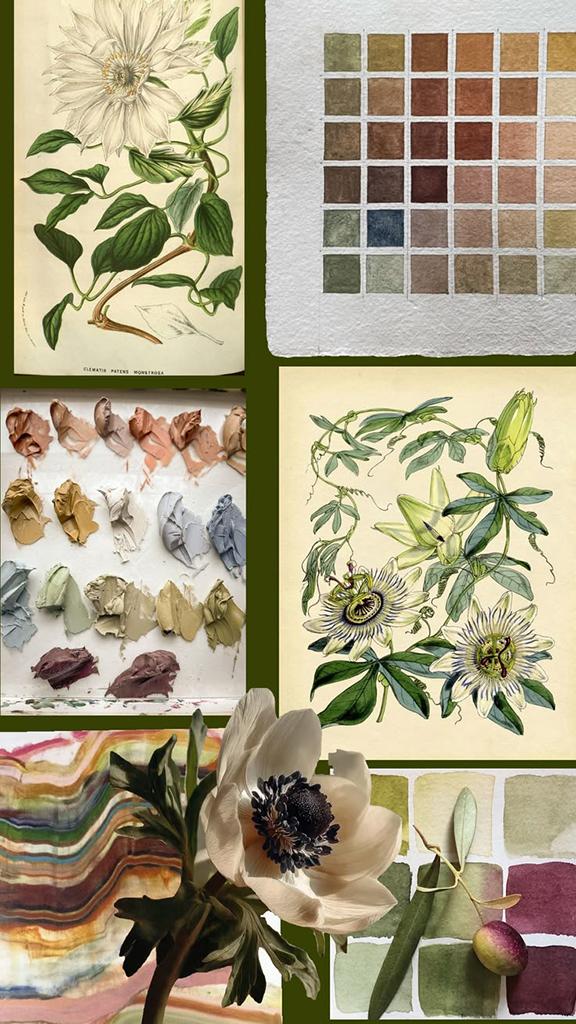
maybe a pressed flower. This collage is a great
example of the kind of color and content inspiration
I like to pull from. Even with a lot of variety, notice how all these colors feel like they belong together. That's exactly what
we're looking for. If you're not sure
where to start for your inspiration board, I pulled together a Pintras
board full of some of my favorite color
combinations and favorite florals to use
as a jumping off point. You can find this in the
link in the class resources. I've broken it out
into a few sections, color palette inspiration
and botanical inspiration. Feel free to use it as a jumping off point to create
your own inspiration board, full of photos, color swatches or anything
that catches your eye. Action step for this
class is to take a few minutes to pull your
own inspiration together. It doesn't need to
be super polished. It could be a single photo. It could be a
collection of photos or a similar collage
to what I created. Just look for a color
palette that excites you and a plant or
flower that you're drawn to that you
feel like would make an interesting composition for when we start painting
the botanicals. Once you've got your
inspiration pulled together, we're ready to move on
to the next lesson where we'll play around with
color palette exploration.
6. Color Palette Exploration: Welcome to Lesson six,
Color Palette Exploration. In this class, we're going to
be reviewing color mixing, adding textures,
and color analysis for what color we
want to include in our final painting.
Let's get started. Feel free to experiment with the masking fluid for your
color palette exploration. So what you'll do
is you'll apply the masking fluid first
on your color palette, let it dry completely, and then start to
experiment with the colors. I added a few colors to my ceramic palette
here a fortiana. Jose gray. And this is one of the
granulating colors that I will show how it looks
once it's on the page. Yellow okra, potters pink. Mixing a dusty pink like this, I use this pink a
lot in my work, and mixing it is a
little difficult. So I like the tube of that. Shadow green, which is also
in the holbnd palette. This is the deep shadow green. This is the hazy yellow. Looking at my botanical
inspiration collage, I have some different shades of green and lime and
lilac and wine colors. And starting out, you just want to have some water on your page. I am working here on one
of the five by seven, 140 pound Strathmore
watercolor sheets. It's nice to have a paper
towel on hand, too, to control the amount of water because you'll see
the more water, the more freely each
color is gonna flow, let's start out with
this Jose gray. This potter thing is just really muted and beautiful. Now, this yellow ogra
little bright for me. Got to mix in some of the
burnt sienna. Drop that down. When you're working on
your color palette, you can experiment with
mark making, as well. You don't have to
place your color cause consistently through
the whole page, you can just drop in some color. I know I really
like burnt sienna. As it is. So I'm gonna
drop some of that in. And the burnt sienna is really similar in this
whole bind palette as well. It's one of the
colors that I use. I'm gonna go back
in and just add a little bit of a deeper value here just
to experiment like that. Already, you can see how
this granulating color, it almost separates into
two different colors. So there's almost
this, like, beautiful lilac mixed in with this, like, deeper eggplant purple. Just go a little bit of
indigo to see how that plays with eggplant purple. I want a little bit brighter
shade to mix in with this, like, deeper olive color. To me, that's looking
a little bright, but I can mix a little bit, a muddier olive in. And as the color is
drying and there's a little bit less water
on the top of your page, you can drop in some more
color and see how it reacts. This is just experimenting. My favorite, the shadow green just contrasts so beautifully
with the Gilton UTI colors. Now, I want a little bit of
less warm neutral color. So one color I like to mix up is There's this Colblt blue that's on the Holbein palette. It's also on the same
Petersburg palate. Then I mix that with a
little bit of burn sienna. I just trust my eye because
you're never going to get this same amount of each color that you pull
up from your brush. That got a little
muddy over there. So over here, I had some burnt sienna
and I just added a little bit of the muddy color. This is a great exercise to practice how much water
you want to use as well. I don't think I
stated it before, but I'm using a five round, but you can also use an even larger four inch
flat filbert brush. You just want something
bigger, nothing too small while you're
dropping in your color. So before this dries, we want to add some salt. It's not wet. You can take your spray bottle and add a
little bit of water on top. You just want to make sure
that the salt crystals have some water and paint absorbed in them so that
it can create the texture. Now I'm just going to go in
and carefully just drop in a little bit more
color on top of the areas where the
salt flakes are. I do find that when the
salt flakes are applied, they do absorb some
of the pigment. So even though it looks
pretty dark while it's wet, it will read a lot lighter. What I'm noticing here
is that the sienna is mixing pretty aggressively
with migraines. So just remove some of the water and reapplied
some of the green here. Now, we're just going
to let this dry and see how it looks now that
my color palette is dry. I would like to take a look and see just analyze what I like
about it, what I don't, and it will just give me
more confidence to know exactly how I'm going to place my colors going into the
larger botanical painting. On your color palette, you did play around with
some masking fluid. Now is a great time to peel off the masking fluid
and take a look at your line quality,
see what you like. Which method you like
the best that you want to apply to your
larger botanical painting. I didn't apply any masking
fluid to my color palette, so we're just going to be looking at it for
color and texture. I absolutely love
what happened with the fine grain salt here in
the sage dark green color. And the medium green crystals look really nice on the sienna. I love this organic
texture. Sea salt crystals. They did make this eggplant
color, much, much darker. And I think I put
too many there. The fun thing about watercolor and adding things
on top of it is that it never really does the same thing two
times in a row. So you kind of just have
to be along for the ride and enjoy the organic
nature of the medium. I think for the
botanical painting, I am going to still use some
of the larger crystals. I'm just going to play
around with putting them in this lighter
sienna color, and I think that
would create a little bit more of an interesting
texture and less harsh. I am happy with how the
color palette looks. It feels very earthy. I think the painting
with these colors is going to be very moody floral, and I do think it aligns
with my inspiration. The next step is going
to be taking what I like from this color
palette and applying it to the botanical painting. So in the next class,
we're going to be diving into the larger botanical
painting by prepping the paper, by laying out the masking fluid and deciding what
our composition is going to look like before we apply the watercolor paint. Let's get started. Good.
7. Paper Prep & Masking Fluid Application: Welcome to Lesson seven,
masking fluid application. In this class, we will
review taping paper edges, sketching out your design, and applying the masking fluid. Let's get started. Step one
will be taping your edges. I use quarter inch y
tape and I line up my tape perfectly with each
side of my paper edge, and then I make sure I press
firmly on the tape to make sure it's sealed and no watercolor is going to
leak in when I'm painting. For my painting, I am
going to be working with 140 pound 12512 paper. The next step is composition. We are going to be
doing a pencil sketch, applying the masking fluid, and then revising
the new linework after the masking fluid dries. Considering composition while
you are sketching is so important because
it will dictate how the viewer's eye will flow
across your painting. Have your inspiration
board handy to closely reference while
you are sketching. Make sure to use a light
line when you are sketching. In this demo, I am using
HB graphite pencil. Here I'm providing a
few composition ideas. Flowing filled page. This is a layout that
is dense but still has connecting objects to create
a flow throughout your page, a simple centered
composition or the third, an exploded large scale, which works best if
you want to zoom in on your floral inspiration. This composition can be extremely dynamic and
pull the viewer in. I have opted to go with the
flowing filled page option. Since my pencil lines are
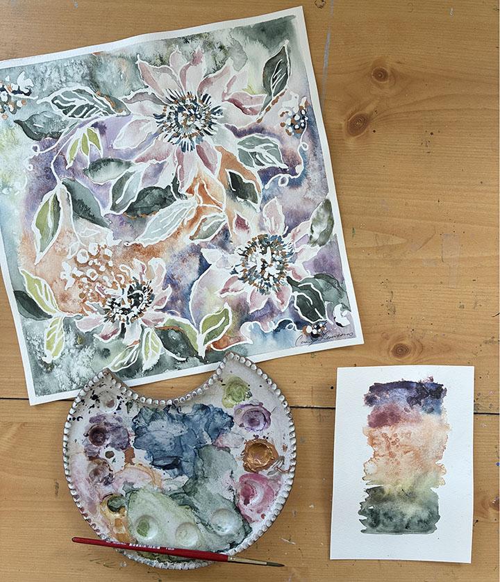
so light, I did this quick, sketchy overlay to show you the overall composition that I am planning for my painting. You can see with the filled
flowing page composition, I use the vines and the berries to pull your
eye around and connect the clematis flower and passion fruit flower that are pulled from my
inspiration page. While you are sketching
your composition, frequently reference
your inspiration board. With mine on the top left, I absolutely love
this lomatis flower. I am personally drawn to them. They grow in my garden every single year at the
beginning of summer. The passion flower that is in the middle right of
my inspiration board, tied really nicely back
to the clematis flower. And then at the lower right, I absolutely love
this little ry sprig, and I figured it would
be a good way to incorporate some different
shapes within my painting. So I'm going to
incorporate those with some flowing vines to
connect everything together. Once you have your
design sketched out with pencil on the paper, now it's step three.'s
time for masking fluid. You can see in my demo,
the first example, I am applying blue masking fluid using the built in
applicator tip. Second, I am using the wooden doll that I dip
into the blue masking fluid. You can see the lines from the doll are a little
bit thinner, sketchier. They have a little bit
of a more organic nature than the built in applicator
tip. Quick call out. If you make a mistake
with your masking fluid, just let it completely dry
before you start to remove it. There are going to
be a few lines I want to get rid of
in my painting, so I will demo this at
the end of the class. Here, lastly, I'm using the yellow masking fluid and
applying it with a pipe. You can see here the
linework ranges from thin to thick and creates a really
sketchy, varied line quality. I suggest if you
have the tools to do so to experiment with
these different types of masking fluid and just remember while you are
applying it anywhere the masking fluid is placed, this portion of your painting
is going to remain white. So now that I have
completed putting the finishing touches on my
masking fluid composition, I am allowing the masking
fluid to completely dry, and now I'm removing
any pencil lines because any pencil lines
that are painted over with watercolor
are impossible to remove once the paint is
applied on top of them. And also, there's a few areas
of masking fluid that were a little bobby or lines that overlapped over my flowers
that didn't make sense. So I am removing those using either a basic eraser
or the rubber eraser. So now it's time to
get your watercolors out because next
is Lesson eight. Painting demo part one, applying watercolor. Let's go.
8. Painting Part 1: Welcome to Lesson eight
painting demo Part one. Applying the watercolor.
Let's get started. I like to take my time
while I'm dropping the watercolors in during
this portion of the process. I had to speed up
these videos so you could see my process in a
reasonable amount of time. I'm going to walk you
through my process, some tips and tricks as I paint. I will mostly be using a size five round brush
to drop in my colors, and later I will be using a smaller brush to
add in some details. I am starting out using my larger three quarter
inch flat brush. I am dropping in water without paint within
the flower petals, where I want to start by
placing some dusty pink. This is called the
wet on wet method, which means you are
dropping wet paint onto paper that is already wet, giving it a flowy
organic appearance, and the edges won't
be harsh and it will kind of just blend in wherever the water is
already on the page. For the sake of
time, I already had my watercolor paints
positioned on my palette and I
will be planning to refill the palette throughout
the video as needed. I suggest you also get your colors organized
and ready to go. It just makes the painting
process a lot smoother. So next, I am
blocking in some sage green leaves to fill some of
the open space on the page, as well as adding a deeper green in the centers of
some of the flowers. I like to work in sections throughout the page so the water has a chance to dry while I paint other areas of the page. This helps avoid all the colors blending together and
looking muddy or messy. You can practice by dropping your paint into a
wet shape and then painting a shape on dry paper with pigment
already on your brush, and you can compare
the two methods. For this style of painting, I do prefer the
wet on wet method. But throughout the
painting process, there will be times that I apply wet pigment onto dry
areas of the paper, especially in areas
that I want to give a little bit more definition
to after they dry. Through the painting process, you will see me adding
some salt to wet areas. You can add salt throughout
your painting process because salt only works if you are applying it to wet pigment. So if you wait too long
for certain areas, the salt will not
have any effect. And I specifically love how
the salt looks on the green, darker green colors,
and the rust colors. Next, I'm starting to fill
the background with rust, eggplant and some
sage green shades. I never have much of a plan
with this type of painting, and I just like to trust my eye as I'm adding the
color to the page. So I just start in the
center of the page, usually, and just
kind of work my way out how the
water is flowing. You'll see me just
jump around a lot. I was painting the
background, then I wanted to paint more leaves. So it's a little
bit of working on composition and color
all at the same time. Feel free to work
throughout your page, whatever makes sense to you and feels right
in your process. Just the one call out I have is it is good to jump around to different areas of wet and dry just to give that wet
paint a chance to dry, some of the water to absorb, just so all your colors don't
get all mixed up and muddy. So here you'll see me grabbing some of the purple
from my palette, and this is just a
royal purple shade. And I'm realizing I
just wanted the Ja rose gray shade to just be a little bit more
pigmented in some areas, so I am adding some purple. If there is ever an area of
your page that has collected a little too much water and
starts pulling or warping, just take a clean,
dry paper towel and just use a corner of it to soak up a little
bit of the water. This tends to happen
when you're working with the Strathmore
paper a little bit more often than
the Arches paper. The Arches paper, to be honest, has gotten me
really spoiled with the way that it absorbs
water and works. It's a big difference
from the Strathmoe, but the price is also
a big difference. So that's why in this lesson, I am doing this painting example
on the Strathmore paper. As I was looking at my palette, I realized that a lot of
the sage shaded green. I wanted to make sure
that there is some depth and dimension within the
cooler green colors. So I am pulling a little bit
of this chartreuse color in, but you'll see I'll
drop in some of the deeper sage
with it so it will have those hits of poppy color
without being too bright. And just to remind you again, when you're working
on your painting, you want to make sure
that you're referencing your inspiration page and
also your color palette, so you can see here, I have
my color palette positioned right to the left of my painting so that I can reference it, see where I want
to add the salt, see what colors I want to
add next to each other. So it's a great tool to have to just give you confidence
while you're painting. So now I really like the green color I have on the upper right
of my composition. So I was just adding some
of that green to balance it down at the bottom left hand
side of my composition. And also, now I'm going
to be starting adding a little bit of this
touch of indigo. I almost forgot
about that color, but I do remember I
added a little bit of it next to the eggplant
in my color palette, and I did like it to give it
a little bit of dimension since there is so much eggplant
purple in this painting. So now that my flower
petals are completely dry, they dried a really light color. So I'm just going
in and adding up a little bit of
dimension on the edges, specifically the edges right next to the masking
fluid to just make sure that we get credit for
those lines that are really going to make the flowers pop out in the final painting. So I'm adding some of the medium coarse salt crystals here and using the spray bottle just to make sure that
they're fully saturated. But then the paint,
just to bring some more texture to the
edges of my painting. So you'll notice
that I keep jumping around to different
parts of the painting. When you first apply
the watercolor paint, the wet paint reads
a little darker. And then as it dries,
it lightens up. And then I see different areas that I want to add
more dimension to. So I just really like to
jump all over the page. I absolutely love
this indigo shade and what it does next
to the eggplant. So I'm gonna add a
little bit more of that. Also, if you recall, when I was working
on my color palette, I wanted a little bit
of a saddle brown, neutral brown that wasn't
as warm as the sienna. So I just mix that
here by mixing some blue and the sienna together
and dropping that in, which is a lighter neutral that blends nicely
with the sienna. Here I'm adding some of the
larger salt crystals to see how that looks and what that does against the sienna paint. The larger mouldin salt crystals looked way too dark when
applied to the eggplant, so I'm definitely avoiding
that in this painting. As I'm placing all my
colors on the page, I'm realizing that this
painting is a little bit more saturated and colorful than my typical painting style. I think that is a good thing in the sense that you're able to see the colors blending on the camera, a
little bit easier, but it's just interesting
how sometimes we get so set in our ways with
color palettes that we use, and we sometimes go to
what is most comfortable. But I kind of like that this palette is a little
bit brighter, moodier. Than what I usually work with. And the fact that I'm realizing
while I'm working that this color palette is a little punchier and brighter
than I usually work with. It's a good reminder
that sometimes it really helps to find
a strong inspiration, image, collage, starting point, and a color palette that you are drawn to and then
making a painting from there and following that creative process
can help you create something a little bit different than is the norm in
your creative practice. So we're in the
final stretch here. All of my paper is mostly
covered with watercolor paint. I'm going in, adding some
deeper shades of the green, making sure there isn't too
much water on the edge. We are going to let this dry. Then in the next class, we're going to take a
look to see if there are any final painting touches
that need to be added, and we're going to per
masking fluid and tape away and add some metallic touches. See you in the next lesson.
9. Painting Part 2: Welcome to Lesson nine
Painting demo part two, healing and finishing touches. Kept away for about 45 minutes. There was a lot of
water on this painting. A lot of the water
has now dried. It's not completely
dry, but that's okay. I am able to see what
colors lightened up, and I just want
to make sure that the painting has enough
depth and dimension. I am noticing the
fine grain salt here and here created an
absolutely beautiful texture that I'm really excited about. There's some salt and water
still drying over here. Overall, I'm just looking to
add in some deeper shades. So I have some clean water because my water got pretty
dirty while I was painting. Now, I just want to go
in and add some details, specifically to the
center of the flowers and just some of the
leaves to make sure that they have enough dimension. Another call out is just any
area near the masking fluid. You just want to make
sure there's enough paint and pigment there so that there is a lot of contrast when we
pull the masking fluid up. I'm just going to
for a few minutes, work on adding some details, and then next we're
going to be taking our masking fluid off once the paint has
completely dried. I added some dimension. I added some different
levels of color. I made sure a lot of my empty blank spots
were all filled up. I added just some dimension to the berries I have
here and mostly in the center of the flowers so that when the masking
fluid comes off, the white really pops
against these darker colors. I know with my creative
practice when I'm painting, it's really hard for me to
know when to stop painting because it's very easy to
overwork watercolor paintings. And with this kind of technique, it's a little hard
to know exactly what it's going to look like until the masking fluid comes off. Just part of trusting the
process, I would say. I am going to stop painting, let this completely dry, and then we're going to
come back and remove the masking fluid and
see how it looks. Okay, so my painting
is now completely dry, so it's time for the best part. We're going to
peel off the tape. Overall, this tape is pretty gentle if you get the
brand that I suggest, but you just want to be just careful when you're pulling it off just to make sure you don't
rip the watercolor paper. So now I'm going to
use the rubber eraser to remove all the masking fluid. I do have to say as
someone who has used my fingers or a regular eraser for so many years to
remove masking fluid. This, I think it's $2, this rubber eraser, I
got it so much easier. Your masking fluid kind of
just collects on the edge, and you can just
just pull it off. Mm Okay, so all my masking
fluid has been removed. And overall, I am very happy with how the
painting turned out. It has a lot of different
textures throughout. And in the center
of the flowers, going back in and adding some of that dark green really
makes them pop. So next, we're going to
add some metallic touches. You could either do the
rich pale gold powder or the idscent copper or any other metallic
that you have on hand. H so now our masking fluid
is completely removed, and I decided for the metallic, I'm going to use the
iridescent copper, light, fine, old and acrylic to just add a little bit of shine
on top of my painting. I have one call out specifically if you're working
with Strathmore paper. The amount of water
that we put on the paper did cause my
painting to warp a little bit. This is completely normal. The solution for that is to
just take your spray bottle and spray the back so that the whole thing
is pretty damp. And I just make sure I'd like push the water all
the way to the edges. Take some paper towels, put them on top
of your painting, and then place a heavy box, something flat on top of your painting for about
eight to 12 hours. I'll usually do this
before I go to bed, and then in the morning,
I'll take the painting out, and it really does
the trick of getting it nice and flat the way the paper was before
you painted on it. So with that said, let's jump into some
metallic painting. So you can put your paint
on a palette, honestly. A lot of times I just find it's easier to just work
directly from the tube. And for this metallic
acrylic paint, I'm just using an old brush. This is a size one or two round. The acrylic tends to
ruin watercolor brushes, so just be mindful of that. So I usually just use
small little dots to accent where I
want my metallic. Even though you can place the
metallic however you want, I do recommend using
a smaller brush, so two round or smaller,
I would suggest. I'm just going to highlight
a few of these leaves. Similar tale I paint
with watercolor. When I do metallic, I like to jump around the page
and just make sure I get a nice balanced
aunt throughout. So let me try to hold this up
so you can see the shimmer. It see it just adds a
really nice subtle shine. Then I'm just going to add my signature down
at the bottom here. So once your watercolor
painting is complete, you've removed any
masking fluid and applied any metallic touches
that you desire on top. I would suggest downloading the free version of
the Genius Scan app. This app allows you to easily
scan in your artwork to share and upload your project if you don't have
a scanner at home. So at this point, we are finally wrapping up
this watercolor class. So we only have one
more lesson left, and it's Lesson ten the
conclusion. See you there.
10. Conclusion: Welcome to Lesson ten. Conclusion. So final takeaways. I appreciate you
for embarking on this experimental bohemian
watercolor journey with me. Congratulations on
completing the class. You've learned the
inspiration process I typically follow for
botanical artwork, how to explore technique, color, and how to bring it all
together on a larger page. I hope you're wrapping up
the class with a piece of artwork that you want to
scan in, gift or frame. If there's one thing I hope
you take from this class, it's that watercolor is a medium that gently asks us to
relinquish control. And when we do, that is
when the magic happens. Possibilities from
there are truly endless and completely unique to
your creative vision. I have more classes
in the works, and I can't wait to
share them with you. Make sure you're
following along so you're the first to
know when they drop. Please post your projects
in the project gallery, and I will be reviewing
all of the projects, and I am here to give feedback. If you enjoyed this class, leaving a review truly
means the world and helps me continue creating content for this wonderful community. Follow me on Skillshare
and Instagram. At KC Sakamano. I'd love to stay connected
and see what you create next. Thank you so much,
happy painting. See you in my next class.
 Casey Saccomanno, Freelance Print & Textile Designer