Transcripts
1. Introduction to the Class: Hi, friends. Thanks
for joining the class. My name is Shiba.
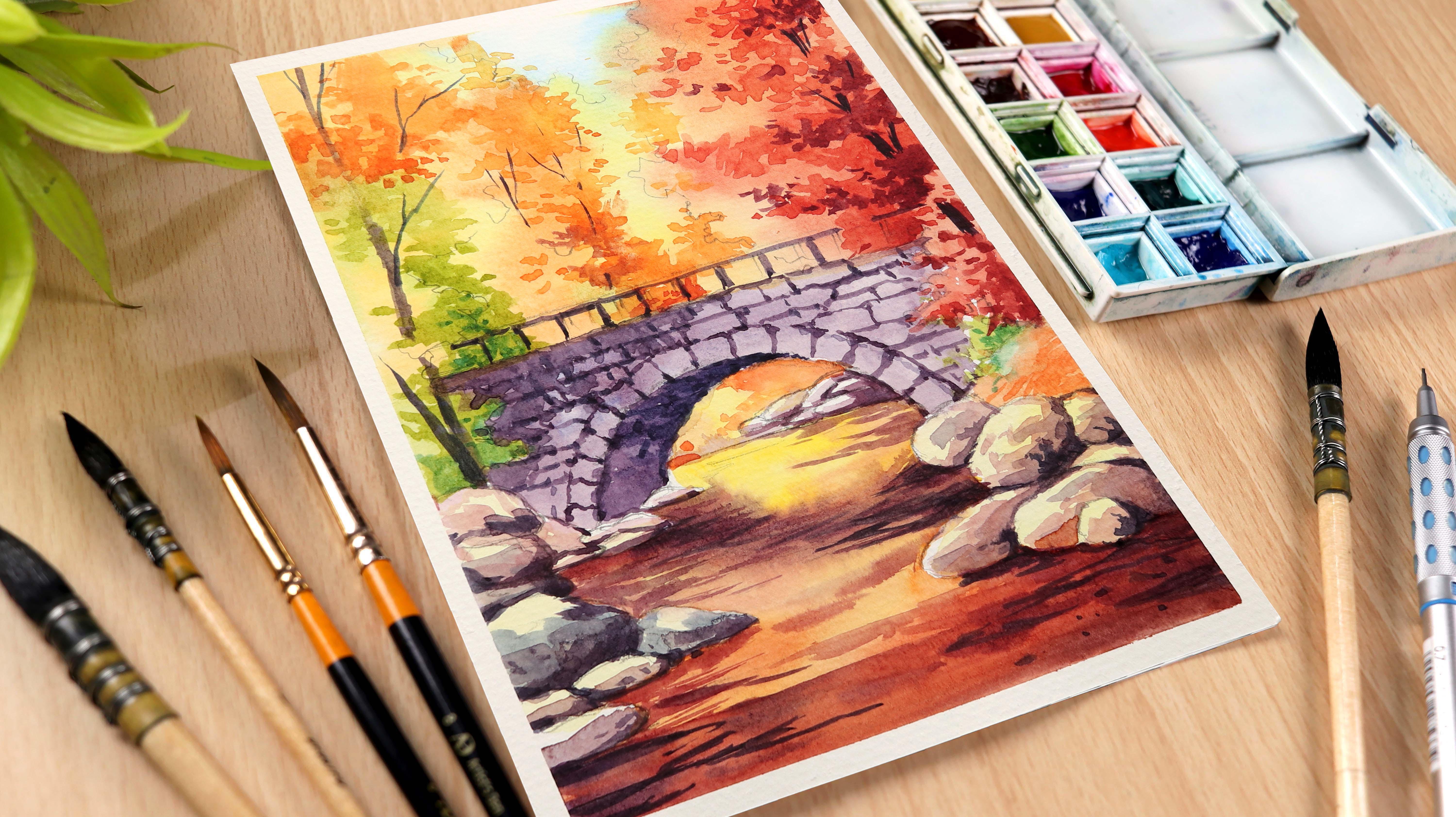
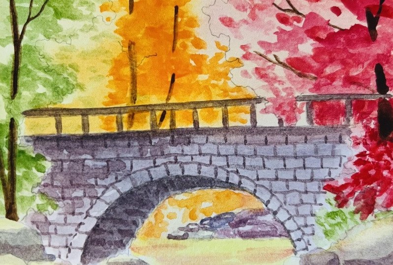
I am an artist, instructor, and a YouTuber. In today's painting class, I will paint a
beautiful autumn trees and bridge landscape
using watercolors. I love to do
watercolor paintings, mostly the old rural areas, landscapes, seascapes, birds
and animals, and much more. I try to keep my painting more vibrant and
full of rich colors, which you will find today in my watercolor painting class. I'm very excited to share all those steps that
help me in making this beautiful painting
and walking you through my materials so that you can
even try and follow along. Without wasting time,
let's get started.
2. Materials Required for the Painting: Hello, everyone. Welcome back. In this part, I will
discuss the materials that I will be using for
my watercolor painting. Starting with the paper,
the paper which I'm using is from Fabriano Artistico
Watercolor paper, 300 GSM cold pressed. I'm using this cold press
paper because it creates beautiful bouquet effect in your painting and it
does not dry out soon, giving us more time to
work on the details. This comes in 15 sheets
of an A five size. The colors which
I'm using is from Windsor and Newton Cotman
student grade watercolors. These colors are very
good for anyone who wants to start their
beautiful art journey. Now the names of the colors on my palette are displayed on
the screen as you can see. Here I have replaced
the white color with the cobalt turquoise from white Knights because I don't
use white in my painting. For the brushes, I'm using three mob brushes of size zero, two and four, as you can see. Now, these brushes are
good to apply paint for a longer period of time as
it holds a lot of water. I'm also using these three synthetic
brushes out of which, two are the round brushes
with number six and eight and one is a lineup brush number
two for the sharp lines. Now, these brushes
are sufficient to make a painting of
an A five size. If you don't have
a similar brush, you can use any brush you have. It's just that you must be comfortable while
doing the painting. For drawing this
sketch, I'm using a mechanical pencil
with lead 0.7. If you don't have a
mechanical pencil, then you can use an
gB pencil as well. This is the needed eraser
that I will be using to remove unwanted pencil
marks when required. Now the best thing
about this eraser is that it can be molded into the required shape as per the area you want to
erase on the paper. Now, this is a half
inch masking tape that I will be using to tape down my paper so that it holds my paper firm
throughout the painting. Here I'm using a
jar of water and a small tub of water so that
I can use them separately, one to clean the brush and the other one as
a mixing medium. This is a hair dryer that
I will be using to dry my painting once I lay down the paint layers on the paper. I'm also using a cotton
clue to dry my brush and to reduce any extra
paint on the brush. If you find your brush
has a lot of paint, you can wipe it off by gently
making it run on the cloth. Friends, we have
completed discussing the materials that I will
be using for this painting. Now let's move on to the
next part where we will be starting with the sketch
and I see you there.
3. Drawing the Basic Sketch: Hello, everyone. Welcome to the first part of this
painting session. In this part, we will
draw the basic sketch. Let's start with applying
the masking tape. This is a half inch masking
tape, as you can see. I'm applying this masking tape on all the four
edges of the paper. Here I'm using a half
inch masking tape. If you want, you can also
use 1 " masking tape. While applying the masking tape, I'm trying to keep half of it, stick to the paper, and the other half
stick to the board. I usually use masking
tape in most of my paintings as it gives clean edges at the
end of the painting. We have completed applying
the masking tape. Now let's press it
firmly so that it sticks well before we
start with the painting. For sketching, I'm using a mechanical pencil with lead 0.7. This is from the brand pentel. It is not important to have a mechanical pencil
for this sketch. You can use any normal
pencil you have. Here I'm making the outline of the rustic Mountain bridge. I have drawn an
inclined line to mark the perspective and then drawing the curve to draw the
passage under the bridge. I'm using a needed eraser to clean any unwanted pencil lines. Now, this inclined line is depicting the top of the bridge. Let's make it dark. I'm also adding
some curved lines to add rough texture
to the bridge. Now I'm adding a second line to add volume to the curve
under the bridge. You can see how bridge is now looking like a three D object. Now it's time to add the
adjoining land surface. For this, I'm starting with drawing the rocks
close to the bridge. Let's draw some more
rocks and stones. You can see I'm drawing these
rocks close to each other to show the land surface on
which the bridge is standing. While sketching the rocks, I'm also changing
their shape so that they look more natural
and realistic. Let's quickly add some
more rocks on the left. Now while adding the
rocks on the left, we will try to maintain
the perspective. We will make them
a little smaller, which are away and the bigger
ones will be close to us. Now let's draw the rocks and stones which are at the
distance, as you can see. It's time to add
the land surface on the left under the bridge. Now, let's add some
smaller rocks and stones. Now it's time to add
the bigger ones. You can see I'm
using the mixture of smaller and bigger stones to make the painting
look more natural. Let's quickly add some
more rocks and stones. It's time to draw the reflection of the bridge in
the flowing water. Here I'm adding
some pencil marks just to mark the
area of reflection. Let's add a sloping line
to draw the land surface. Once it is done, we will draw the tree
line on the right. This tree line will
help us as a guide at the time of painting
it with watercolor. Now, let's draw some
tree lines on the left. While drawing these lines, try to draw them a little irregular so that it
looks more natural. It's time to add
some more trees. Now it's time to add
fencing to the bridge. For this, I'm starting by drawing a horizontal
straight line first. Let's add some vertical lines to draw the support
to the fencing. You can see I'm adding two lines to add the volume to the fence. Now let's interconnect them with the second horizontal line. Now I'm adding a
few more details to the tree lines
as you can see. Friends, we have completed
drawing the sketch. If you want to have a more
clear view of the sketch, you can just download
the sketch PDF, which is attached in the
project and resource section and I see you in the next part.
4. Painting the Trees at The Background: Hello, friends, welcome back. In this part, we will paint
the trees in the background. First, we will
cover the trees at the back and then we will
paint the ones on the sides. Now, let's apply water
to make the paper damp and the brush which I'm using is a
mob brush number two. I'm applying water only to
the trees at the background, leaving the bridge underneath. It is important to apply two
to three layers of water so that the paper becomes damp helping the
paint to flow well. Now the technique which I'm using is a wet on wet technique, and it is used to add blurry bouquet effect
in your painting. Now let's start by applying
turquoise blue to the sky, and here I'm using
mob brush number two. I am applying a very light wash of cobalt turquoise,
as you can see. Now let's mix lemon yellow
with cadmium yellow. Here I'm using a very light wash of colors as a base color. Now I'm increasing the
amount of cadmium yellow. At this stage, it's
important to apply the base color without thinking
much on the detail part. We will add details once we complete adding
the base color. Now let's apply
some more mixture of lemon yellow mixed
with cadmium yellow. Now let's add some
cadmium red to cadmium yellow for the leaves as we see in the autumn season. You can see I'm
applying this paint when the paper is still wet. I'm applying this paint on the selective ideas where I want the leaves to
look more dark. Now I'm applying a
very light wash of cadmium yellow mixed
with cadmium red. Let's apply a wash of crimson red mixed
with cadmium yellow. I'm applying this
mixture on the left to draw dark colour leaves
and the shadows. Now let's add a mixture of crimson red mixed
with cadmium red. Now these dark tones of colors are adding
depth to the painting. For these dark
autumn tree leaves, I'm using the mixture of cadmium red mixed
with crimson red. With each layer of color, I'm increasing the amount of color pigments to make
the mixture saturated. It's time to paint the
trees on the right. For this, I'm using
the same mixture. Let's add a few
more brushed rooks to add some details
to the tree leaves. The paper is still wet. Let's quickly apply orange
and reds on the left. Oh For this, I will be using
a mob brush number zero. Now I'm adding some
green tree leaves. For this, I'm using a wash of sap green and adding
it to the wet surface. Now, this brush is
a smaller number, so it carries less
amount of paint helping the paint
not to spread fast. On the left, I'm adding
some light wash of sap green to add base color
for the green leaves. Now let's add some sap
green on the right to add some base color for
the green colour leaves. Most of the time I use
the tape of the brush as it helps me to
add smaller details. Now, let's mix some base
color for the background. Here I'm mixing lemon
yellow with cadmium yellow. I'm also adding a light wash of cadmium red mixed
with crimson red. As this is the first layer, I'm not paying much
attention to the details. Now, let's add details to the stones and rocks
at the distance. For this, I'm using
the mixture of crimson red mixed
with intense blue, also known as halo blue. Here I'm diluting
the mixture to make it light for the
first wash of color. I'm adding this
paint at the base of the rocks to show the shadows. Let's quickly add this color
to other rocks and stones. Friends, this is all
about for this part. In the next part, we will
be adding details to the flowing water
stream and I see there.
5. Painting the Water Stream: Hello, everyone. Welcome back. In this part, we will paint a beautiful flowing
water stream. Before we start our painting, let's clean our brush. Here I'm using a mob
brush number zero. Before we start
with the painting, let's wet the paper
using a damp brush. You can see I'm using a
small brush so that I can apply the paint only
at the required areas. Here I've applied a
good amount of water so that the paper remains wet
for a longer period of time. Now let's apply the paint. Here I'm using cadmium yellow
mixed with lemon yellow. Now let's quickly apply this mixture to
the required area. I'm adding a little
bit of cadmium red to the mixture to make it
look orange in color. Here I'm applying this
paint to the areas which are close to us
because the subject which are close to
us tends to look more sharper and saturated
with a lot of contrast. Now I'm adding some shadows
using the same paint. Most of the time I use
the tip of the brush so that the paint flows
well as required. Now let's mix cadmium
red with crimson red. I'm applying this paint to the darker areas to create
shadows and reflections. I'm still using the
same mob brush number two to pull some
horizontal strokes. Now let's apply some
more mixture of crimson red mixed
with cadmium red. You can see this
mixture is looking dark because the amount of
crimson red is more. Let's add some thalo blue, also known as intense blue to the crimson red to make the
mixture look more dark. Now I'm adding some
horizontal strokes to paint the water
waves close to us. Friends, we have
completed with this part. Now let's move to the next
part where we will be painting the bridge
and the rocks. Um,
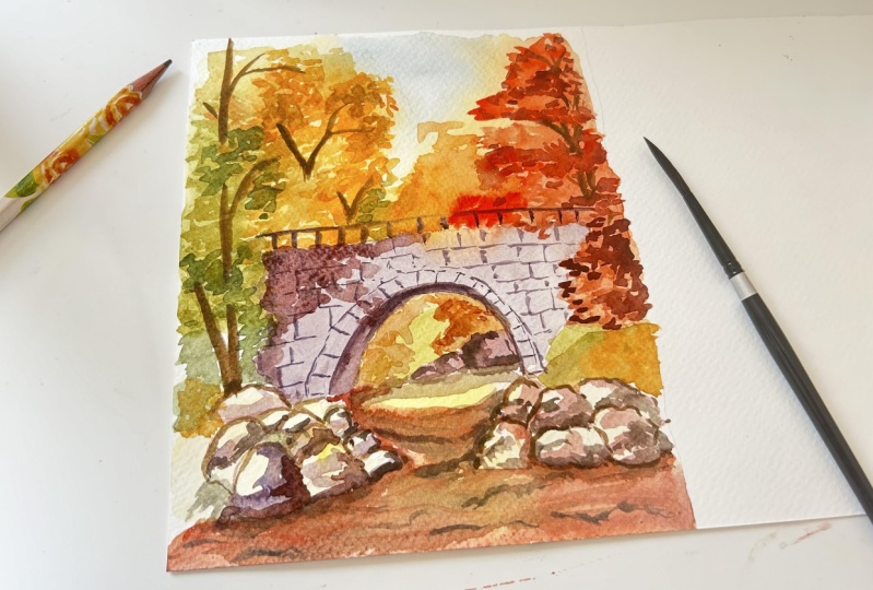
6. Painting Bridge and Rocks: Hello friends. Welcome back. In this part, we
will be painting the bridge and the rocks. Let's start with
the bridge first. For this, I will be starting
with the mob brush number zero and applying some water
to make the paper wet. I'm applying the water
thoroughly so that my paint flows well once I
start with the painting. Let's quickly mix some ultramarine
blue with crimson red. Now this mixture
looks like purple. Also keep in mind
that this mixture is quite dilute with less
amount of pigments. Now I'm increasing some crimson red to make
the mixture look red so that we can add
variation to the painting. I'm applying this mixture
using the tip of the brush, and the brush which I'm using
is a mob brush number zero. Once you are done with
this, we will apply some more paint to the area where we want the bridge
to look more dark. For this, let's pick some more paint and apply it
to the area as you can see. Now these dark patches
would give our painting a natural feel just like the old rustic bridge
would look like. I'm adding this to paint the shadows formed
by the leaves. Now let's add a
few more drops of paint to add some
texture to the bridge. Friends, we have completed painting the first
layer of the bridge. Now let's start with the
painting of the rocks. I have cleaned my brush and now I'm applying water
to wet the area, to apply first wash of paint. As this is the first layer, I will apply a very light
wash of lemon yellow. But before that, let's wet the paper to all the
areas covering the rocks. Here I'm taking some
lemon yellow and adding some water
to make it dilute. As the overall painting is based on the autumn
scenery, therefore, adding a light wash
of lemon yellow to the stones and rocks would actually bind the
painting together, giving the rocks
that warm reflection reflecting from the
yellow and orange leaves. Frince we are done with this, now let's move on to
the next part where we will be adding details
to the trees behind.
7. Adding Details to the Trees: Hello, everyone. Welcome back. In this part, I will be painting the trees in the background. Before we start the painting, let's clean the palette. For this, I will be
using a dam brush. Now, let's start the painting. Here I'm taking a little
bit of cadmium red and then mixing it with lemon yellow
to get a light orange. Now to apply the
paint, I'm using a mob brush number zero
as this is a thin brush. It will help us adding
smaller leaves and branches. For painting the leaves, I'm using a very simple technique, just adding small drops
of paint and then interconnecting them to
form a bunch of leaves. As we move forward,
we will apply and add variation to the
leaves by adding different color
tones to the reds. Now I'm painting some
dark orange leaves by adding a little bit more
cadmium red to the mixture. Some of the portions,
I'm just adding a block of paint to cover that
area in dark color, not adding much details to it. Let's add a few more dots
to paint the tree leaves. I'm using the tip
of the brush to add the paint to
the tree leaves. Now, let's draw
some more leaves. For this, I'm taking a very
light mixture of cadmium red. Instead of drawing each leaf, I have applied a patch of paint, then adding few dots of
paint to add leaves. Now, these dark
patches of paint also helps the paint to
get its shadows area. Now, let's add some green
leaves using sap green. Here I'm adding some sap green
to the dilute cadmium red. The intensity of cadmium
red is not enough. This is the reason the
paint is still green. But adding sap green
to cadmium red gives sap green that filter which is required and helps sap green to bind
well with the painting. Let's add some sap
green directly. I try to add few drops of paint and then interconnect
them to form tree leaves. For painting these tree leaves, I'm using am brush number zero. I'm covering a large
part with green to show this area is in shadow. Let's add a few
more dots of paint. I'm starting with more
darker tone of leaves. Before we start, let's
clean our brush. Now let's mix some
cadmium red with crimson red to get
a dark red colour. While applying the paints, I'm trying to apply
patch of paint first and then applying
drops of paint. I'm continuing this method to be in the rest of the leaves. So while painting
these three leaves, try to paint them in variation
for some of the potion, try to add less of water. So this will help to create some darker
and saturated leaves. Whereas for some of the potion, you can mix a lot of water to create some less
vibrant layers of paint. So this help the painting to look more natural and realistic. I'm still using the mixture of crimson red mixed with
cadmium red, as you can see. Let's mix some more
mixture of these colors. While painting the tree leaves, try to paint them
narrow at the edges to show smaller
leaves and branches. Now I'm blocking the area using the mixture of crimson
red and cadmium red. Let's add some shadows by painting the
dark colour leaves. Now, let's add some dark colour leaves to
paint the shadows. You can see this mixture
is quite dark and saturated with less
amount of water in it. Now, let's add a few
more dark tones. I'm still using the small brush to paint these tree leaves. If you want, you can use a
narrow round brush as well. Now, let's clean the brush. Now it's time to paint
the rocks and stones. For this, I'm taking
the mixture of crimson red and adding
intense blue to it. But before that, let's
apply paint to the rocks. Here I'm using a Be
stone of cadmium red. Now, let's mix some crimson
red and thalo blue, also known as intense blue. Here I'm using a crimson red more to keep the mixture
on the red side. Now, this light wash
of crimson red and halo blue adds shadows to
these rocks and stones. While adding this color tone, try to be a little irregular to add a sense of realisticness
to the painting. As the overall painting is
towards red, therefore, adding crimson red to the
shadows of the rocks, help them to bind well
with the painting. I'm also adding lines
with this mixture of paint to separate them
as individual rocks. Let's quickly add these shadows to the other rocks as well. I'm using the same
mixture of paint to draw the shadows of
the rocks on the left. This is a second layer of color separating the light and
the shadows on the rocks. This is a mixture of
crimson red and halo blue, also known as intense blue. For this rock, I'm
adding a wash of halo blue to make
them even more dark. This also helps in adding darker tones to the shadows
which is close to us. Once we are done with
this, we will add some crimson red to add warmth
to the rocks and stones. Now I'm painting
these small stones with a mixture of crimson
red and halo blue. Friends, I hope you
have enjoyed this part. Now let's move on to the
next part where I will add shadows and reflection
to the water stream.
8. Adding Details to the Water Stream: Hello friends. Welcome back. In this part, we
will be painting the shadows and reflections
of the water stream. Let's start with the paints. For painting this water stream, I'm using a mob
brush number zero. As you can see, I'm starting by applying a very light wash of cadmium red at the background to draw the shadows
of the trees. While applying the paints, I'm using the tip of the brush. Now I'm picking up
some extra paints using the tip of the brush. Now let's supply a layer
of water before we start adding the reflection
of the bridge to make the paper wet. Here I'm taking some cadmium red and then mixing it
with crimson red, and also adding a little
bit of ultramarine blue. You can see this
mixture is little dark and also has a tint
of purple in it, which helps in
adding darker tones. While adding the
shadows of the bridge, we will try to add a
little curved shadows so as to match the
curve of the bridge. Here I'm adding some
more crimson red and ultramarine blue to make the mixture even more
dark and saturated. We are almost done with adding
the shadows to the bridge. Now let's add shadows to the
rocks and stones nearby. It's time to add an
additional layer of darkness by using the mixture of crimson red mixed
with thalo blue. I'm using horizontal
brush strokes to add colors to the
reflection of the bridge. At the base of the bridge, I'm making the mixture
even more dark. Now let's add reflection
to the water waves. For this, I'm using
the same mixture of crimson red mixed
with thalo blue. Here I'm applying water to
make the mixture dilute so that it covers large part of the stream at the foreground. Now I'm adding some
horizontal brush strokes to paint the flowing
water waves. Let's take some
ultramarine blue. Now I'm mixing some crimson red with ultramarine blue to add dark shadows and reflections of the rocks in the
flowing water stream. You can see I'm adding some
small horizontal strokes to draw water waves
of the stream. Here I'm increasing
the saturation as well as the
darkness of the paint by adding more of
the ultramarine blue to make the mixture
even more dark. This is the third layer of
paint where we will apply dark tones to add final layer
of depth in the painting. As the paper is about to dry, adding this layer of paint helps in getting hard edges
and reflections. Here I'm using the tip of
the mob brush number zero, which helps in adding
some sharp lines. Let's add a few more strokes of paint to draw
the reflections. Bladding this paint,
try not to be that precise because
in real world, water does not flow in order, so they create their own way and they have their
own behavior. Let's add shadows to
the stones which are at the distance far
away at the background. Now, let's add a few
more paint strokes before we end up
with this session. In the next part,
we will be painting the bridge in detail
and I see you there.
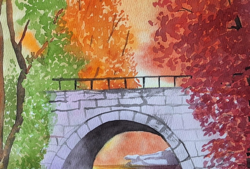
9. Working on the Details of the Bridge: Hello, everyone. Welcome back. In this part, we will add
details to the bridge. I'm starting my painting
using around brush number E, which is a synthetic brush. Here I'm taking some
ultramarine blue and then mixing it
with crimson red. Now, this time, the saturation as well as the color
pigment will be more. I'm starting by adding the
shadows under the bridge. Now this area is getting
less of the sunlight. Therefore, we'll
make it dark using the mixture of crimson red
mixed with ultramarine blue. You can see that though we
are adding the shadows, this layer is not that dark. It is quite transparent, but the amount of color pigment is more than the previous layer. Now let's make it more
dark by adding more of the ultramarine blue
in the mixture of crimson red and
ultramarine blue. The curve under the bridge
where it becomes more narrow, I have added the darkest
tone of paint to show that this area is getting less of
the sunlight and reflection. Now let's paint the fence
of the bridge using the mixture of ultramarine
blue mixed with crimson red. Here I'm using the same
round brush number eight to draw the
fence of the bridge. Now let's add some
vertical lines using the same mixture of
ultramarine blue mixed with crimson red. Now, let's add natural arches and joints between the rocks of the bridge using
the same mixture of ultramarine blue
mixed with crimson red. To paint these gaps, I'm using the same round
brush number eight, which is a synthetic brush. I'm starting by painting
the curve over the tunnel. Now I'm making the mixture even more dark by adding
intense blue, also known as halo blue to the mixture of crimson
red and ultramarine blue. Here I've started my painting by drawing the broken lines, as you can see, so as
to confirm the shape. Once the shape is confirmed, we will interconnect
those lines. Now the area between the
curve of the tunnel and the curve of the
arches increases as it comes towards right to show that the area which is close to us seems to look wider and bigger. Now let's add lines and gaps
to separate these rocks. Always use the tip
of the brush to create these sharp
lines and edges. Let's quickly complete this. Now we will paint the rocks which have been
placed horizontally. For this, we will add lines in horizontal directions,
as you can see. At the same time,
we will be adding some vertical strokes to separate these rocks
from each other. To paint all these
arches and gaps, I'm using the mixture
of three colors. That is crimson red, mixed with ultramarine blue
and intense blue. To make my painting
look more natural, I am bringing some variation between the gaps of
these horizontal lines. This will give an
effect of natural man made rock bridges that
we see in nature. Let's quickly add some
more horizontal lines. Here I'm interconnecting
all these lines by adding small brush strokes so that they come together to create harmony. Now, let's add some vertical
strokes of this paint. Friends, we have almost
completed this part. Now let's add few
more brush strokes before we end up
with this session. I'm adding a second
layer of dark tone under the bridge using the mixture of crimson red and intense blue. I'm also adding some horizontal lines to draw the arches of the rocks under the bridge
using the same paint. So friends, this is all
about for this part. In the next part, we will
be painting the shadows of the tree leaves
and I see you there.
10. Adding Shadows to the Tree Leaves: Hello friends. Welcome back. In this part, we will add
shadows to the tree leaves. Here I'm taking some crimson red and will add intense blue to it, also known as halo blue. I'm using a round brush number six to draw some smaller leaves. Here I'm using some pigments of crimson red to make
the mixture more red. To draw the leaves, I'm
using the same technique, adding paint dots and then
interconnecting them. Let's quickly add some
more tree leaves. I'm keeping these
tree leaves dark in color to show that they are
away from the sunlight, getting less of the light. We will not overdo the brush
work using this color. We will keep the
paints fresh with a combination of
light and dark tones. Let's mix some more crimson
red and intense blue. You can see I have kept this
mixture dark and saturated, adding less of the
water while mixing it. Most of the time
I use the tip of the brush to draw
these smaller leaves. Now let's take some crimson red and add intense blue to it. Here I'm taking intense blue
more to make the mixture dark so that I can use it
to paint the tree trunks. To get the dark mixture
is by adding burn sienna, that is brown to
the intense blue if you don't want
to use crimson red. Now let's add some
branches using the mixture of crimson red
mixed with intense blue. Let's clean the brush before we move to other paint pigments. Now I'm adding some oranges
and red tones to the leaves. I'm using the wash
of crimson red, that is already there
on the palette. Let's add some more tree
trunks and branches. You can see I'm using
the same brush to paint these branches by putting
less pressure on the brush. Now let's add the tree
trunk on the left using the same dark mixture of crimson red mixed
with intense blue. O. You can see I'm adding these tree trunks
by keeping a gap in between, leaving the portion unpainted. When we keep a gap, while
painting the trunks, this actually give us effect of real tree where the trunks is visible only when it is not obstructed by
the tree leaves. I'm removing this portion of the tree trunk to
show the gap in them. For this, I'm using some water. Now let's mix crimson red and intense blue to paint some
tree trunks and branches. By increasing or decreasing
the pressure on the brush, we can bring variation in the thickness of the
branches and trunks. Now let's add some
thin branches. We will paint these
branches wider at the base close to the trunk
and as it moves away, we will paint them thinner. Friends, this is all
about for this part. In the next part, we will add shadows to the rocks
and I see there.
11. Working on the Shadows of the Rocks and Stones: Hi, everyone. Welcome back. In this part, we will work on the shadows of the
rocks and stones. Let's mix some crimson
red with intense blue, also known as thalo blue. Let's apply this
paint in between the rocks to separate
them from each other. I'm applying this paint to show broken and uneven
surfaces on the rock. Now, the brush which I'm using is a round brush number six. This is a synthetic brush. Now, let's apply some paint to separate these
rocks from each other. The mixture which
I'm using is of crimson red mixed
with intense blue. While adding the shadows, don't be that precise as this will help the painting
to look more natural. Now let's apply this mixture. I'm also adding a
little bit of water to make the edges of the paint
soft, as you can see. Let's continue the same color to draw the edges
between the rocks. While adding these thin lines, try to use a smaller
number brush as this will help you to add fine
and sharp strokes of paint. Now let's quickly
draw some more lines. At some of the areas, you
can also add wider strokes of paint to show large part
of the rocks is in shadow. Now here I'm using this
paint to draw details like dark scars and
marks on the rocks. It's time to add some more lines to draw these separating lines. I'm adding some more
minute dots and lines to paint the marks on
the rocks, as you can see. I'm adding dark
strokes of paint and making it white to add
volume to the rocks. Now let's apply some paint
at the base of the rock. Friends, this is all
about for this part. In the next part, we will add some final details
and I see you there.
12. Adding Final Details: Hi, friends. Welcome
back. In this part, we will work on
the final details. Let's start by applying
light wash of cadmium red. Here I'm using a round
brush number six. Now, let's paint some
light colour leaves. For this, I'm applying the
mixture of lemon yellow, mixed with cadmium
yellow and cadmium red. Now, take some mixture of
lemon yellow, and cadmium red. Once we are done, we
will clean the brush. It's time to add
some more shadows to the small rocks using the
same round brush number six. Here I'm using the mixture of crimson red mixed
with intense blue. Now I'm painting the lines in between them to separate
each rock from the other. Let's quickly add
some more shadows. Now I'm also adding a little
bit more intense blue. Here I'm using the
tip of the brush, as you can see, to paint
these sharp lines. Let's clean the brush and apply light wash of lemon yellow
mixed with cadmium red. Now I'm mixing some sap
green with viridian green. Here I'm using
small dot technique to paint these small leaves. Let's take some more
viridian green. I'm adding these dark leaves to add contrast to the painting. Now, let's clean
the brush and take some mixture of crimson red
mixed with intense blue. A. Now let's add another layer
of shadows to the rocks. I'm adding this layer
to make the shadow area towards pink color because of the reflection
from the leaves. If you want, you can also
add a touch of light blue. But as the surrounding is
towards the red colour, I'm adding a very light wash of cadmium red to paint
shadows on the rocks. Now I'm mixing some crimson
red and intense blue. I'm using this mixture to paint the water waves and to
make them even more dark. Here I'm using the mix of sharp and wide lines,
as you can see. Now, let's add shadows and reflections of the
rocks in the water. It's time to add some
sharp thin lines to draw the water ripples. This tone is quite dark as the amount of pigment
and saturation is more. You can see this mixture
is towards blue as the amount of intense blue
is more in the mixture. Let's add some more
water ripples. To paint the sharp lines, I'm using a thin brush, as you can see, and also I'm
using the tip of the brush. To make the painting
interesting, don't try to overdo
the brush work. Here I'm adding the reflection
of the bridge in detail, reducing the speed of my brush to create some accurate
lines as required. Now I'm adding some
dark shadows in between the rocks using the mixture of crimson red mixed
with intense blue. Let's add a few more details before we end up
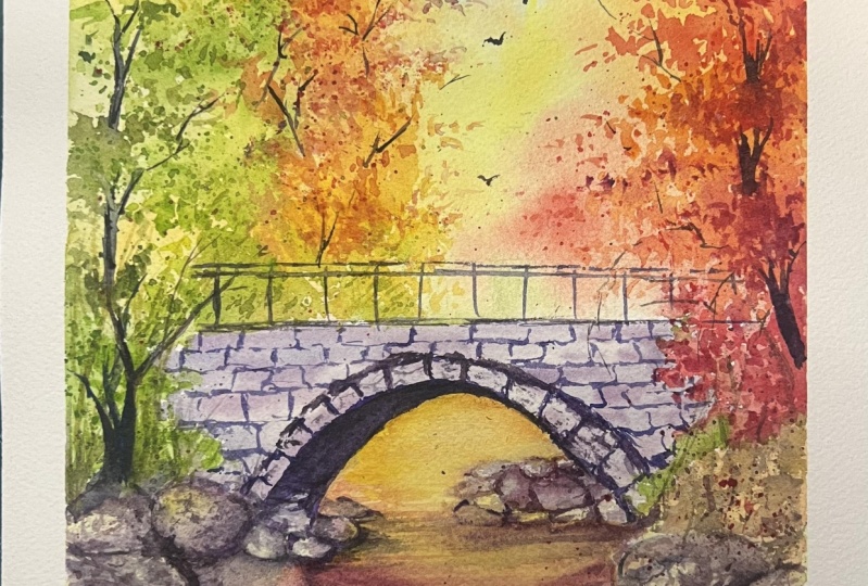
with this session. So friends, I hope you
have enjoyed this session. In the next part, I will share my final thoughts
and I see you there.
13. Adding Details and Sharing Final Thoughts: Hello, everyone. Welcome to the last session of
this painting class. Let's remove the masking
tape to reveal our painting. Here I'm pulling
the masking tape outward to avoid any
damage to the painting. Now the painting is
ready to be framed, but before that, let's
apply the last details. Here I'm taking the
wash of crimson red and intense blue to add shadows to the bridge
formed by the tree leaves. I'm applying this layer as a thin wash of paint,
as you can see. I'm adding these shadows
in the form of tree leaves to make my painting look more natural and realistic. Let's quickly add some
more shadows using the same paint before we
end up with this session. Friends, I hope you have
enjoyed this painting class. If you have any queries, feel free to ask me in
the discussion tab. Also, don't forget to share your paintings in
the project section. I will try my best to go through each of your artworks and try to comment so that it helps you to understand
the subject well. I will soon come up
with another painting till then take care
and stay blessed.
 Shiba Basan, Art influencer and Content Creator