Transcripts
1. Introduction: Hello, everyone, and welcome
to the painting class. My name is Shiba. I'm an artist, YouTuber, and a
passionate watercolorist. In today's session,
we will be creating a windmill landscape
using watercolor and ink. We will explore techniques
for layering colors, adding shadows, and using pen details to make the
painting lively and realistic. In this painting
class, I will share all the materials you will need to paint this
beautiful landscape. I will go through the various
watercolor paints, brushes, and tools required,
and also explain in detail each step that I
demonstrate on the screen. I love creating
watercolor paintings, especially of old rural areas, seascapes, landscapes, birds
and animals, and much more. This class is designed so
that the bigness can try it and still end up creating a beautiful
painting like this. By following the simple
steps I demonstrated, you will be able to achieve
a satisfying result, even if you are
first time working with watercolor and ink. I'm very happy that you've
chosen to join this class. Now let's quickly jump onto our next part and take a look at the materials you
will need to create this beautiful watercolor
and ink painting.
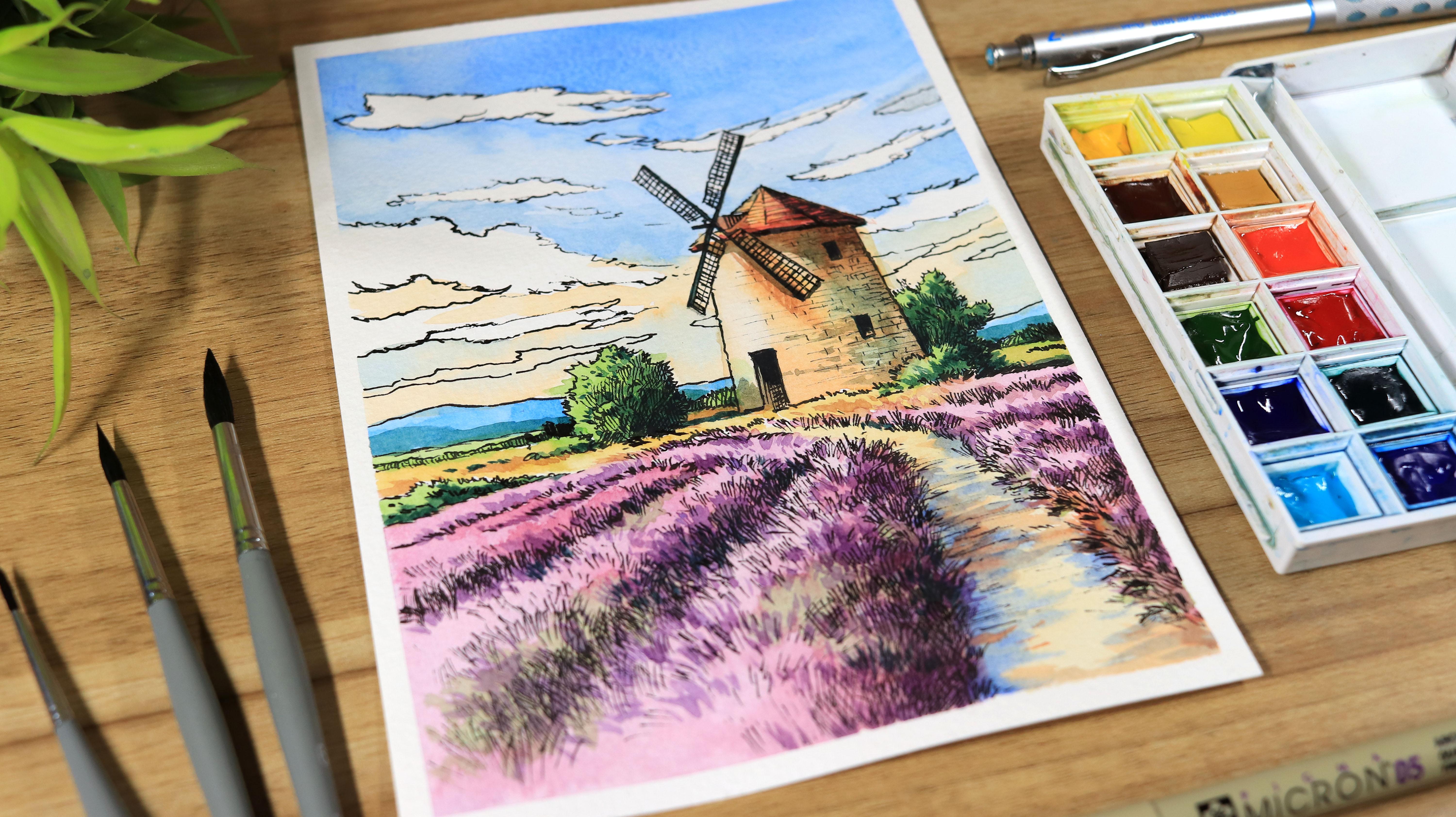
2. Materials Required for the Painting: Hello, everyone,
and welcome back. In this part, we will go over the materials that you will
need to create this painting. I will quickly walk you
through each one so that you get everything
ready before we start. Let's start with the paper. I'm using a paper
from a brand canson. Now the size is A five, and it is 300 GSM cooled
pressed watercolor paper. Now, this type of paper
works really well for the watercolor
painting because it can hold the water nicely. And this cool pressed
texture helps the paint to spread
beautifully on the surface. You can see that the paper
has a little bit of texture which really helps
the watercolor to settle nicely on the surface, and it creates
beautiful effects. Let's start with the brushes. Now, these are the
brushes that I will be using for this painting. Most of them are round
brushes in different sizes, and all of these are
simple brushes from a local brand named Schneier. You can use any
brushes you have. You don't need to have
the same brushes. Here I have two sets, one with smaller brushes and other with slightly bigger ones. Now all of them are synthetic
brushes with soft bristles, which works really well
with watercolor painting. For drawing this
sketch, I will be using a mechanical pencil
with 0.7 lead. Now, this one is from
the brand pentel, but you can use any
pencil you have. I use this because
I don't want to sharpen it again and again
during the painting session, which makes the process a
little more convenient. To remove any unwanted
pencil marks, I will be using needed eraser. Now, this eraser
is very flexible and gently lifts pencil lines
without damaging the paper. For the watercolors,
I will be using a Windsor and Newton
watercolor set. Now, it contains 12 shades. The name of the shades are displayed on the
screen as you can see. I have removed white paint from the set and replaced it with a cobalt turquoise
because I usually don't use white in my
watercolor paintings. Now, these watercolors
are very big no friendly and are also
quite easy to find. So they are great
choice if you're just starting with watercolors. To tape down the paper, I will be using a half
inch masking tape. It helps keep the paper in
place while painting and also gives a clean border around the artwork once we
remove it at the end. To clean the brushes and
rinse them while painting, I will be using a tub of water. Now this helps keep the brush
clean during the process. This is a hair dryer to speed up the drying process
of the painting. Now this helps the
layer to dry faster so that we move to the next step without
waiting too long. To clean the brushes and
remove any extra paint, I will be using a cotton towel. Now, it's very handy
and helps keep the brushes in good
condition while painting. Hee I'm using a
Shakurablack marker, which is a micron
pen with a NIP 05. Now, I will be using this pen to add the ink details
in the painting. So, friends, these
are the materials that I will be using
for the painting. Now let's move on to the next
part where we will begin the painting by starting with a basic sketch, and
I see you there.
3. Drawing the Basic Sketch: Hello, everyone,
and welcome back. Now, let's begin by
applying masking tip on all the four
corners of the paper. Now, this will help keep
the paper in place and also give a neat border
around the painting. As I mentioned earlier, I am using a half inch
masking tip for this. Now, it works nicely
to secure the paper and creates a clean border
around the painting. As we applying the masking
tape along the edges, make sure to gently press
it down around the corners, so it sticks well
with the paper. Now, this will help prevent
any paint from seeping underneath and also keeps
the border nice and clean. Now let's start with the sketch. For drawing the sketch,
I will be using a mechanical pencil
before I begin, I'm just making a few
light guideline marks. These small lines help me understand the placement of
the different objects in the painting and also make it easier for me to plan
the overall composition. You can see that I've already drawn a straight
horizontal line. Now I'm adding two
vertical lines. Now these are just simple
guidelines to help me indicate the placement of the windmill in the composition. I have added a small dome shape at the top of the windmill. I'm also making the
windmill a little wider by extending the lines
slightly on both sides. Now, the small adjustment help define the overall
shape of the windmill. Whenever there is too many
unwanted pencil lines, I'm using a needed eraser
to gently remove them. Now, it helps lift the
extra pencil marks without leaving any
dust on the paper. Now that we have a basic
structure for the windmill, now let's add a few trees
around the composition. Now, this will
help us understand the overall layout before
we start with the pen work. As you can see, I'm
also adding the trees. At this stage, I'm not
focusing on the fine details, but I'm simply blocking
out the general shapes to indicate where the trees
will be in the composition. Now, this will help us plan the overall structure
of the painting. Now let's add a small base where the wings of the windmill
connects to the main structure. Now, this little details
helps define the form of the windmill and make the
sketch look more complete. Now, let's add a small door and a few windows
to the windmill. Now, these simple details will help give the structure
more character. Now, let's draw the four
wings of the windmill. First, I'm adding a few
straight guidelines. These line will help us mark
the placement of the wings. Once the guidelines are ready, we can build the structure. You can see that the
two wings closer to us, they appear slightly
bigger than the other two. Now, this is because I'm
following the perspective here. Objects which are closer to us, they will appear larger and the ones which are farther away, we will make them
smaller in size. Now, let's draw a line to add the distant mountain
in the background. Now, this will help create some depth in the overall
painting composition. For this part, I'm using a small light pencil lines to
sketch out the basic shape. Now we will slowly build the entire ground area working across the
scene step by step. Notice these tiny guidelines. Now this will help us map out the surface without making
the drawing feel heavy. You can see how I'm adding
these small straight lines, moving them gently
towards the composition. Now all of these lines have
been drawn in perspective, and as they move
farther away from us, they gradually becomes
narrower and closer together. Now, this helm guide the viewers eyes deeper into the sea, and it's also simple
way to suggest a distance while keeping the
drawing light and natural. As you may have remembered
earlier that we have drawn a few straight lines to suggest the blades
of the windmill. Now, let's make them a little
more defined for this. I'm adding a second set of lines to shape the
wings more clearly. Now, this helps and gives
a better impression. While drawing the
blades of the windmill, I'm making them slightly wider towards the
side closer to us. And as the blade
moves further away, I'm gently making them
a little narrower. Now, this helps create a
sense of perspective showing how distant changes
the way things appear. So friends with this, we
complete the first part. Now let's move on to
the next where we will start making these lines
permanent using a pen marker, and I see you there. So
4. Ink Sketching with a Pen Marker: Hello, everyone,
and welcome back. Now we're going to start drawing the basic sketch
using a pen marker. For this step, I'm using
a micron Shakura pen, and the size I'm
using here is 05. This pen will help us
make the lines clean, clear, and permanent as we
begin defining the drawing. So here I'm starting with
the top of the windmill. You can see that I'm going
over the lines two to three times in place where I want the lines to
appear a little bolder. Now, this helps strengthen
the structure and makes certain parts stand out more clearly in the drawing. Now, let's draw the
part where the blades of the windmill connects
to the main body. Here I'm starting by making the central point where
all the blades meet. Then I'm gently shaping the area so that it clearly
holds the blades together. I'm also trying to keep the lines neat and
control, as you can see. As you can see that I've
also created a wider lines. I'm going over the strokes
two to three times. Now, this helps make the lines appear a little thicker
and more defined. If you prefer, you can also use a thin nip pen marker to achieve the same bold
effect in a single stroke. Now, let's quickly draw the
blades of the windmill. Now keep the lines clean and simple as you shape each blade. Now, once the blades
are finished, we will move on to
drawing the windows and the door to add some more
character to the structure. You saw that earlier we sketched the structure lightly
with a pencil. At that stage, I didn't
add too many details. That's because many of the lines can be drawn directly
with the pen. Mm if you prefer, you can first draw the entire
structure carefully with a pencil and then go over
it with a pen marker. But personally, I find
it more comfortable to add some of the details
directly with the pen. You can see how I've added a tree around the windmill
on the right side. Now, this helps balance the composition and adds a
natural element to the scene. I've also made the outer edges
of the trees a little more defined so that the structure of the foliage looks
cleaner and more solid. Keeping these lines light but confident helps the trees feel
natural in the landscape. But now let's add some more greenery and a few additional trees
to the composition. Now place them naturally
around the scene so that they complement with the
windmill and the landscape. Use soft gentle strokes to
suggest leaves and foliage, keeping the overall look
relaxed and harmonious. You can see how these
small print strokes are gradually changing the
overall feel of the painting. Now each tiny lines
add texture, depth, and movement, bringing more life and character
to the scene. Even simple subtle strokes
can make a big difference. Now let's draw the
mountains in the distance. This will help create
depth and make the landscape feel
more expensive. Now, let's draw the section
of the grass on the ground. Here I'm wearing the
sheep and the size of it to make the grass
look more natural. Now, this variation adds
texture and life to the ground, making the scene feel
more organic and lively. While drawing the grasses, try to follow the
particular sheaps as I'm showing on the screen. Now, this helps the grass feel intentional and consistent
with the overall composition. Mm. I'm drawing some long
grasses in the foreground, making them taller
and more prominent that helps make them
feel closer to us. At the same time,
the smaller grasses in the distance will
appear farther away, creating a sense of
depth and making the scene feel more
three dimensional. You can see that while
drawing these grasses, I'm not keeping the
sheps consistent. Instead, I'm wearing
their lens, angles, and curves to make them look
more natural and lively. Now, this irregularity helps the grasses feel more organic, just like it would be
in a real landscape. Most of the details I'm adding here are being
done with the pen. Even for the shadows, I'm using pen lines to create
depth and darkness. By layering these
strokes carefully, we can give the drawing
more volume and make the forms feel solid
and three dimensional. Now I'm making the
grasses a little bit bigger to add a sense
of depth to the scene. As we move towards
the foreground, we can make them a little
wider and more prominent. Now, this contrast between
the foreground and background will help us
create more realistic effect. While drawing the
grass, feel free to relax and enjoy the process. Add your own personal
touches and style, letting your strokes reflect
your feel for the scene. Now, this makes a
painting uniquely yours and brings more life and
character to the landscape. Also, when using the pen, you can use an ink pen as well. It's not necessary to use the
exact same pen I'm using. Just make sure to
check that the ink doesn't bleed when you
apply watercolor later. Now, this way, your
lines will stay crisp and your paintings will
remain clean and vibrant. You can see that in some areas, I've added multiple lines
to make them darker. This is not only to
emphasize those sections, but also to create a sense
of shadow in the painting. By layering the lines carefully, we can add depth and dimension, making the scene feel more
realistic and lively. You can see that
I'm also curving the grasses as it
moves away from us. Now, this creates a subtle path leading the viewers eyes
towards the windmill. By guiding the
lines in this way, we add movement and direction
to the composition, making it feel more dynamic. Now, let's add some greenery along the sides of this path. Use soft varied strokes to suggest small plants and bushes. Now, this will help
frame the path naturally and add more life
and depth to the landscape. You can create
these darker lines to suggest shadows,
as you can see. Now by layering these
strokes carefully, we add depth and
contrast to the scene. Now, this helps the
object feel more three dimensional and
gives the painting a richer and more
realistic look. Now, let's add some details to the blades of the windmill. For this, I'm using
some gentle lines to show texture and dimension. Here I'm paying attention
to the direction of the strokes so that the
blades feel more natural. Now, these small details
bring the windmill to life and make the structure
more engaging in the scene. Now, let's add tile effect
to the roof of the windmill, which has a cone shape. Here I'm drawing some small, slightly curved lines following
the slope of the roof. Now, this pattern
adds texture and details making the roof
looks more realistic. It's time to add a brick effect to the walls of the windmill. Here I'm starting with
a horizontal stroke, then dividing them with shorter vertical lines to
suggest individual bricks. Now, this create a
texture and details making the structure look
more solid and realistic. I'm also keeping the lines
light and consistent so that the brick pattern blends naturally with the
rest of the drawing. While doing this, don't worry
about being too consistent. Now, at some places, you can
leave the lines uneven or incomplete so that the pattern
doesn't look too rigid. Now, these subtle
variations keep the wall looking natural and also
adds a more organic, lively feel to the painting. Et's add shadows to the trees
using some pen strokes. By layering short gentle lines, we can suggest depth and
volume in the foliage. Now it's time to add
details to the other tree. Here I'm adding shadows to
the right side of the tree. This shows that the light is
coming from the left side, creating contrast and
depth in the painting. Now, there aren't any
specific pen lines here. I'm using a variety of pen shapes to create
these shadows. I'm mixing short,
long curved and angle strokes help the shadows feel
more natural and textured. Now, these variations
give the tree and the scene overall a
lively and organic look. Now I'm adding some darker lines to define the shadows
more clearly. Now, these deep strokes
help create contrast, making the forms stand out and
give the scene more depth. Now by layering the
darker lines carefully, we can make the shadows
feel more natural. Now I'm adding some
lighter pen strokes to create thin,
delicate grasses. Now, these fine lines
add texture and details, making the grassy areas look
more natural and lively. By wearing the thickness
and direction, we can give the ground
a sense of depth. Now, let's fill the empty areas with more bushes and grasses. Now, use soft varied strokes to suggest different
shapes and textures. Now, let's quickly
add some more lines using this Shakura
micron pen oh five. Now, this additional strokes
will help define details, enhance textures, and bring
more depth to the drawing. Now we will slowly
move forward with the finer details using
the same micron pen. We will add some smaller
strokes and subtle touches. These delicate
details help bring a sense of realism without
overwhelming the drawing. You can see that
with a single pen, you can create a variety
of shapes and lines. It's all about controlling
the pressure you apply, now the lighter
strokes for thin, delicate lines, and
some firmer pressure for darker and bolder marks. So our basic structure
is almost ready. We will start focusing on the finer details
like adding shadows, texture and subtle touches. These finishing details help bring depth and
make the form more realistic and give
the entire scene a polished and lively feel. Here I have added a
quite darker line to indicate an intense shadow. Now, the stronger
strokes create contrast, making the area stand out and
give the scene more depth. Now, let's add the aces that connects the
blades to the windmill. The overall structure
is complete. Now let's move on to the sky. We will start by drawing
the clouds using soft flowing shapes to
keep them light and airy. While drawing the clouds, try to keep their shapes
and structure random. Now vary the size, curves, and edges so that they
look natural and organic. Here I'm sketching
some smaller clouds. Now, these tiny shapes
add variety and depth to the sky making it
feel more dynamic and natural. It's time to add a few more
clouds to complete the sky. Here I'm placing them very thoughtfully wearing their sizes and shapes so that the sky
feels full and natural. For now, the clouds in
the sky looks good. Now let's move on to and add
some details to the ground. I'm working on the shadows and gradually making them
darker with the pen lines. It's time to use
some needed eraser to remove the unwanted
pencil lines. Before using a needed eraser, make sure all your pen
lines are completely dry this prevents smudging
and keeps your drawing clean. It's time to work on the
details to make certain areas more prominent and defined before we move on to
applying watercolors. Now, this step helps trend the composition and adds
depth and contrast. Here I'm checking
the sketch to see if any area need extra darkness. And wherever
necessary, I'm adding a few more pen lines to enhance contrast and define the fonts. Now, this careful
adjustment help bring the balance and make the
drawing ready for watercolor. Now, let's add some
horizontal lines to define the pathway, keeping the lines gentle and slightly varied so
that the path feels natural and guides the viewers eyes through the scene
towards the windmill. Let's add a few more
straight lines to suggest some more
texture to the grass. For the entire sketch, I've used a cross hatching technique. Now by layering
intersecting lines, we can create texture, depth, and shading, as you can see. Now that we have almost
finished the ground, let's add some texture to the cone shaped roof
of the windmill. Here I'm adding
shadows under the roof using darker layered pin
strokes to suggest depth, showing where the roof
blocks the light. So, friends, I hope you've
understood the process so far. With just a few more details, we will wrap up this part. In the next part, we will start with watercolors
and I see you there.
5. Laying down the First Wash of Watercolor: Hello, everyone,
and welcome back. In this part, we will begin
working with watercolors. Now let's start with a
round brush number eight. Now, this brush is
great for covering medium areas while still allowing good control
over the strokes. Here I'm taking a
mixture of intense blue and ultramarine
blue for the clouds. For this step, I'm using
wet and wet technique. This means that the paint is applied directly
onto the dry paper, which helps the shape of the clouds stay more
controlled and defined. While applying the blue mixture, I'm carefully leaving the cloud areas
untouched and white. Now, this helps the
cloud stand out and appears bright
against the sky. By preserving the
white of the paper, the clouds naturally pop
and feels light and airy. Now I'm making the blue mixture
a little more diluted so that the color becomes lighter
as we move down the sky. This gradual change in tone helps create a
smooth transition, making the sky feel
softer and more natural. You can see how I'm
living certain areas completely white where I
want the clouds to appear. By preserving the
white of the paper, the clouds stay bright and soft, creating a natural contrast
against the blue of the sky. Now, let's quickly add an
orange tone to the sky. For this, I'm taking cadmium red and mixing
it with cadmium yellow. This creates a warm orange sheet that we can gently
apply to the sky. Oh also while applying
the orange shade, I'm still keeping the cloud
areas white at this time. I'm using a little
clean water to gently merge the
orange with the blue. This helps create a smooth transition between
the two colors, making the sky looks
soft and natural. Now let's add a little more of the blue mixture to make
the sky more saturated. Apply it gently in
selected areas, especially where you want
the colors to feel deeper. This will enhance
the contrast in the sky and makes the
cloud stand out even more. You can see that with
each change in color, I am washing the
brush in between. Now this helps keep
the color clean and fresh and prevents them
from becoming muddy. Taking these small steps makes a big difference in maintaining the clarity of the watercolor. Now I'm switching to around
brush number six and I'm taking a mixture of cadmium
red and cadmium yellow. We will use this
warm colour to paint the rooftop of the
windmill carefully filling the cone shaped area while keeping the edges
neat and controlled. Since this is a pen and
watercolor drawing, I am keeping the
colors fairly diluted. This will allow the pen lines
to remain visible so that the details and
texture we created earlier will still stand
out through the paint. To add the shadows, I've added a little bit
of crimson red, and then I've applied it on the right side of the roof
to create a gentle shadow. Now I've added some cadmium
red to the mixture, which gives the color
a warm yellowish tone. Before applying it to the
wall of the windmill, let's first wet the
surface with clean water. Here I'm using a wet on
wet technique so that the color spreads softly and blends naturally
on the paper. I've also added a
touch of cadmium red to the mixture to make
it look more orange. Then I have gently applied this color to the surface
of the windmill walls. Now, this warm tone helps
the structure stand out while still keeping
the wash soft and natural. Now, let's add
some burnt sienna, which is brown and cadmium
red to the mixture. We will use this slide
dark tone to paint the shadows on the right
side of the windmill. Applying this color
carefully will help create depth and give the structure a more three dimensional look. Now, let's add a small touch of cobalt turquoise
to the mixture. This will introduce a subtle
blue tone into the color. And it also helps cool down
the mixture slightly and creates a more natural
variation in the shadows. You can see how we have created a lighter area on the
left side of the wall. To make this session
even lighter, I'm using a damp brush to
gently lift some of the colors. This technique helps
remove excess pigment, allowing the surface to appear brighter and gives the
wall a natural highlight. To paint the mountains
in the distance, I'm using a very light
wash of intense blue, also known as halo blue. Keeping the wash
light and soft helps the mountain appear
farther away, which adds depth and
atmosphere to the landscape. Now, let's paint the trees, but before that, let's clean the palette using a dam brush. To add a warm yellowish
tone to the sap green, I'm mixing a little
bit of cadmium yellow, and to deepen the tone slightly, I'm also adding a touch of
intense blue to the mixture. Now, this combination gives us a rich natural green that works nicely for
painting the trees. Since this is the first tone, let's quickly apply it across
the overall tree area. Here I'm using a light even wash to cover the
foliage shapes. This first layer will
act as a base color and later we can add darker tones
to build depth and details. Now, let's take some
cadmium red and cadmium yellow for
the ground area. Mixing these two colors will
give us a warm earthy tone. We will apply this
wash gently across the ground to establish the
base color for the landscape. Here I'm spreading the color to all the areas where
it is needed. I will also apply
the same mixture to the path leading
towards the windmill. Now, this helps create a
consistent be stone across the ground and ties
the different parts of the landscape together. Now let's take some
ultramarine blue. We will apply it along
the path to suggest the shadows forming due
to the grass around it. Use a light touch while
applying the colors so that the shadows blend softly with the base tone
of the ground. Now, let's clean the brush, then take a little cadmium red and apply
it along the path. This will add a warmer tone to the ground and create a
gentle variation in color, making the pathway look
more natural and lively. It's time to add few more
shadows using cadmium red. Here I'm applying it gently in selected areas to deepen
the tones on the ground. You can see how each brush
strokes makes a difference and helps adding warm variation and more depth to the pathway. It's time to clean the brush. Then we will apply a light wash of green tone using a sap green. Spread this gently over the grassy areas to build the
base color of the ground. Now we will start
painting the foreground. Before applying the colors, let's first wet the
surface with clean water. Here I will be using a
wet on wet technique. For the colors, I'm taking
some crimson red and ultramarine blue and also mixing them together to
create a deeper tone. We will apply this as a first
layer for the foreground, allowing the colors to spread softly over
the wet surface. Now, let's wet the section
with a clean water first. Preparing the surface this way will help the paint
spread smoothly. And once the rea is evenly wet, we will begin
applying the colors. You can see that
this layer is quite diluted and less saturated and keeping the first wash light helps us build the
colors gradually. Later, we can add a
deeper tone to increase contrast and create more
depth in the foreground. We have covered the
foreground with a light wash using the mixture of crimson red and
ultramarine blue. Now this soft base layer sets the tone for
the foreground. Now let's add a little
more crimson red. Here I'm applying it gently over the selected areas to enrich the colors
of the foreground. Now, this will add
warm and variation to the wash while still keeping
the layers soft and natural. Here I'm applying the shadows on the right side since the light is coming
from the left side. Displacement helps
create depth and makes the elements in the scene
look more three dimensional. You can see that I'm applying it only in the selected areas to create stronger sense of saturation with
this crimson tone. Now I'm adding a little
bit of green wash. This helps plants to retain
their natural color. And by mixing these green
tones with the existing wash, we create a more balanced and natural look
in the foreground. Let's add a few more
touches of green before we wrap up this
session of the class. In the next session, we
will continue by adding some more details and refining the painting
and I see you there.
6. Applying the Second Watercolor Wash: Hello, everyone,
and welcome back. In this part, we will refine the watercolor painting further. Now we will begin working on the second layer
of the watercolor. Let's quickly take
some burnt sienna and mix it with intense blue. We will apply this
mixture at the base of the roof to create
a soft shadow. Now this darker tone will
help separate the roof from the wall and also add
depth to the structure. You can see that I've also used the same paint mixture to draw and define the blades
of the windmill. I'm also using a
little clean water to help spread the colors. Now, this allow me
to soften the edges and gently push the
shadows outward, making them appear
lighter and more natural. Using water this
way helps create a smooth transition between
the darker and lighter areas. Now, let's add some
details like bricks of the walls using the
same paint mixture. This is more like working
on the texture of the wall, and each small step makes
the painting come to life. Now I'm adding the
shadows of the trees onto the wall of the windmill
using the light mixture. Now, let's take some crimson red to draw the shadows of the roof. Here I'm applying it
gently just below the roof edge so that it creates a soft
shadow on the walls. Using the same paint, I'm now drawing the small scales and tiles on the rooftop. Now, applying these
strokes gently following the curves on
the cone shaped roof. It's time to prepare the colors for the shadows of the trees. For this, I'm taking radiant
green and intense blue, and I'm also adding a little bit of burnsiena to the mixture. This combination creates a deeper and more
natural green tune that works well for
painting the tree shadows. Here I'm applying this color
to the trees in the areas where it is receiving the shadows from the
walls of the windmill. You can see that
I've left some of the areas untouched to
represent the light. By preserving these
lighter sections, we create natural contrast. Here I'm using a
small round brush because I'm working
on finer details. Now with this brush,
I can carefully add small leaf
shapes to the tree. Now, this smaller tip gives
better control helping create delicate details with a more natural look
for the foliage. Here I'm adding
some smaller leaf using just the tip of the brush. Now with light gentle touches, I am placing tiny strokes
to suggest leaf shapes. Now let's add some more contrast using the mixture
of viridiant green, intense blue and burn sienna. I'm applying it in
the darker areas of the foliage to
strengthen the shadows. Now let's work on
the foreground. First, let's clean
the palette to prepare fresh colors
for this section. Now I'm taking some crimson
red and ultramarine blue and mixing it in 50 50 ratio. Now this mixture is kept dilute but thicker than
the previous layer, it will apply smoothly
as a light wash. I'm applying this color
to the darker areas of the foreground where it
receives less sunlight. Now this helps establish shadows and create
a sense of depth. Now we are focusing on adding smaller details like individual
blades of the grass. Using fine control strokes, we can suggest texture and
movement in the foreground. You can see that the impact is subtle because the
mixture is quite dilute, but we will build up
the layers gradually and the colors will
become more noticeable. This part is a bit time
consuming, as you can see, but these small careful details really enhance the painting. Here we are following
similar steps, as you can see to refine the
painting, layering colors, adding shadows and enhancing details gradually
helps bring depth, texture and vibrancy
to the artwork. I'm also adding
individual strokes of paint to depict the
blades of the grass. By placing these fine
lines carefully, we can create texture and
movement in the foreground. Now let's add a bit of darkness to paint the shadows
in the foreground. Now apply the darker tones carefully in areas that
receive less sunlight. While painting the grass, I'm also following the
natural flow of the blades, and by aligning the strokes
with the way the grass grows, we add realism and
movement to the scene. At the edges where the grass curves or changes directions, we will make the strokes darker. Now, this creates natural
shadows and depth, emphasizing the shape
and flow of the grass. Another important
point to remember, as we paint elements
closer to us, we should make them
darker and more defined. This will help create
a sense of depth, making the foreground stand out. It is important to maintain
harmony in the painting, keeping the colors
balanced and consistent ensures that no single
element feels out of place. The already placed pen
lines in the shadows will guide your brush on where
to apply the darker tones. Now, they act as a
roadmap helping you enhance depth and texture without losing the
structure of the drawing. We can play and
experiment as much as we want because it's all
about the details, and there is no limit on
how far we can take them, so enjoy the process. For the smaller details, I use just the tip of the brush
to create the fine lines. Now, this allow precise control, helping me add delicate textures like grass blades and leaves. Now let's apply some
more details using the mixture of crimson
red and ultramarine blue. Now, these subtle
touches help enhance shadows and add depth
to the foreground. In a pen and watercolor piece, it's good idea to keep
some pen lines visible. Now, this helps
preserve the structure, highlights the details
and add texture. For now, the details look good. Now we can move on to work on the other areas like
adding subtle touches, refining shadows, and enhancing the textures wherever needed. Now let's take some
burnt sienna and intense blue to paint the
wooden blades of the windmill. This mixture creates
a natural muted tone that works well for the woods. To make the mixture darker, I have also added
intense blue and reduce the amount of burnt
sienna, which is brown. This deepens the tone, allowing the wooden blades to
show stronger shadows. It's important to use a thin round brush when
painting fine lines like this. Another small tip
gives precise control allowing you to define details such as edges of the blade. Now I'm taking some
cadmium red and mixing it with green
on the palette. We will use this mixture
to paint the box where the windmill blades
connect to the body. Here I'm adding some shadows
to define the roof tiles. Use a slight darker
tone along the edges and curves to suggest
depth and texture. I'm taking a little bit of cadmium red and mixing it with
the green on the palette. We will use this mixture to paint the shadow
areas on the ground. I am applying this mission now to paint the shadows,
as you can see. By carefully placing it
in the darker areas, we enhance the depth and
dimension of the ground. Here I'm using a
small round brush to paint the finer
details precisely. Now, this allows me to add subtle touches like
tiny blades of grasses, small shadows or
delicate textures. Let's apply this now to paint the shadows at the
base of the rooftop. Use a small round brush carefully following
the curve of the roof. I'm taking some viridiant
green and intense blue and then mixing them together. We will use this mixture to paint the mountains
in the distance. Now keep this wash light. I'm also using a
small round brush to work on the finer details. Now, this allow precise control for adding subtle textures. It's time to mix
some crimson red and ultramarine blue to create a
deeper tone for the shadows. We will apply this carefully to the areas that need
more contrast. I have kept this
mixture a bit more saturated than before to
create some darker shadows. Now, this strong
tone helps define the forms more clearly and
adds depth to the scene. I've started with
the foreground, making it darker than the
other areas in the distance. Now, this helps create a
sense of depth so that the closer elements
appear more prominent. These smaller strokes
add fine details helping to define the individual
blades of grasses carefully. By placing these lines, we can create texture and
movement in the foreground. I'm carefully following the pen lines to
add these details. The existing lines guide the brush and helps
to place shadows, textures and
highlights accurately. Here I'm applying
a bit more mixture to create some
additional darkness. Now, this deepens the shadows
and enhance the contrast. While applying the colors, I'm also keeping in mind the
basic shapes of the grasses. Now, this ensures that each stroke follows
the natural flow. Now, let's
interconnect the lines following the basic
pattern of the grasses. By linking the
strokes naturally, we create a sense of
flow and cohesion. Can apply the colors
more solidly in the areas where you want it
to become completely dark. This helps create a stronger
shadows and add contrast, just like the way
I'm doing here. Now, let's take intense
blue, sap green, and a touch of burn sienna, which is brown to paint the
darker shadows of the trees. Now, this mixture creates
a deep natural tone that works well for
the shadowed foliage. You can see that the
mixture is quite dark, which is perfect for the
deepest shadows of the trees. Using this tone helps
define the form. Now, let's apply
this mixture behind the walls to paint the
darker shadows of the trees. Place it carefully in
the areas blocked from the light so the shadows fall naturally on the
ground and the wall. Now, let's take some
ultramarine blue and apply it along the path
to paint the shadows. Focus on areas where the
light is blocked by the grass so that the shadows blend naturally with the base
color of the ground. Oh For the fine details, I'm using around
brush number zero. Now let's take some intense blue and mix it with burnt sienna. We will use this mixture to add some subtle shadows and
textures in small areas. I'm also using this mixture for the darker
shadows on the trees, as you can see, applying
it carefully in the deeper areas helps
define the foliage. Now let's make the
wooden blades of the windmill darker using some dark mixture of intense
blue and bon sienna. Here I'm applying it
carefully along the length of the blades to enhance
the shadow and texture. Here I'm using the same mixture to paint the shadows
on the roof tiles. Applying it along
the edges and curves of the tiles helps
define their shape. Let's apply the
same paint to draw the windows and roofs
of the windmill. The doors are completely
dark here since they don't have any window
glasses or reflected light. So painting them fully
dark will create contrast with the lighter
walls and surroundings. Now, let's add some minor
details to the trees around using these
small detail brushes. We can also paint some
subtle leaves and delicate shadows
using this brush. It's time to add some
details to the foreground. For this, I'm using
the same dark mixture. We will apply it to
define the shadows, individual blades of grass and some textures in the ground. While applying the
brushstrokes now, I'm focusing only on the areas that need
the final darkness. Now, this helps build contrast gradually so that the shadows look natural and well placed, and the painting retain its depth without over
darkening other areas. In this area, I haven't
added many details because I want the focus to naturally guide the viewers
towards the windmill. Keeping some
sections simpler and softer helps the main subject stand out while still maintaining the balance and
harmony in the painting. So, friends, this is all
about for this part. In the next part,
we'll focus on adding the final details and share my final thoughts,
and I see you there.
7. Final Details and Thoughts: Hello, everyone,
and welcome back to the final session of
this painting class. Now we will be adding some
final details to the painting. For the details here, I'm using the micron pen 05,
as you can see. I'm now adding some details to the windmill fan blades
using some fine strokes. I'm also trying to define
some wooden texture, edges, and subtle
shadows, as you can see. For most of the part, I'm using a straight horizontal lines to add texture to the
windmill blades. Now, these lines help suggest the greens of the
wood and give a sense of structure and also makes the blade look more
realistic and detailed. For the lines that look faded due to the watercolor layers, I'm actually running the pen to make them a little more dark. Now, this will
restore and define the details and ensure
the structure stays clear and also keeps the texture of the windmill
blades crisp and visible. Now, let's add some more
bleds of grasses and bushes in the foreground to make it look more
detailed and lively. Here I'm using some
fine control strokes to suggest texture and movement, which will help the foreground feel richer and more realistic. At this point, I feel that to make the painting
look more like an illustration that we
usually see in the books, I will actually underline the clouds with the pen to
make them pop a little. Now, this will add
definition and contrast helping the
clouds stand out against the sky while keeping the overall look playful
and illustrative. Here I'm keeping the
shape of the clouds random and following
the previous marks. Now, this approach
makes the cloud look more interesting
and natural, adding a sense of movement
and life to the sky. Also, while applying
the pen marks, it's important to go slow and steady because once
the line is met, it's much harder to erase. It's very important
while using the pen to choose one with a permanent
ink so that it doesn't bleed. Even though we are at
the final session of the painting after most of
the layers are applied, using a permanent ink
ensures that the lines tase crisp and the
details remain sharp. Let's quickly add a few more
clouds using the pen marker. Try to keep the
strokes light and art following the natural shapes that we have already
established. Now, this will add interest and depth and also add a sense
of movement to the sky, making the illustration feel
more natural and lively. While drawing the clouds
close to the horizon, we will make them flatter
and smaller than the others. This will help maintain a sense
of perspective and making the sky appear vast and
giving a depth to the scene. Now the variation in
size and shape keeps the cloud naturally and
visually interesting. So, friends, we have almost
done with the painting. Now let's carefully remove the masking tape and reveal
our finished artwork. This final step shows
the clean edges, framing the painting beautifully and giving it a polished look. While pulling the masking tape, make sure to pull it
outward at a low angle. Now, this will prevent the
paper from tearing or lifting, leaving clean, crisp edges
around your painting. So friends, I hope you enjoyed
this painting session. If you have any
questions or doubts, feel free to ask me in
the discussion tab, and don't forget to share your paintings in
the project section. I would love to
see your artwork. Also, it's always inspiring
to see everyone's creation. I will see you in the next
class with a new topic, tell them take care and stay
blessed and keep painting.
 Shiba Basan, Art influencer and Content Creator