Transcripts
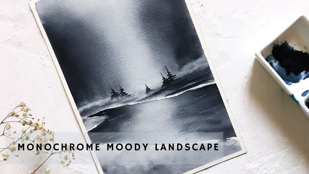
1. Welcome to My Class!: Your characters need a place
to live, a real place you can jump into and be a part of. Hi, I'm Madalina, an artist and
illustrator based in Italy. I've been painting with
watercolors for 5 years now and although I love the delicacy and
transparency of this medium I found it difficult
at first to create the illusion of depth
in my illustrations. Learning about the
negative space and the negative painting
technique enabled me to create appealing illustrations that seem to jut
out from the page. In this class, you'll
learn how to use this technique and apply
it to every kind of art, botanical, abstract, realistic
illustration and so on. I'm really excited to share all this knowledge
with you and to guide you with step-by-step instructions. To easily follow the lessons, I recommend you to know the
basic watercolor techniques, such as wet-on-wet
and wet-on-dry. Starting from the
understanding of the negative space
and the overlapping, you'll learn how to add depth
to your drawings and how to apply this
knowledge to watercolors. You'll be able to create a color palette,
set to the mood of an illustration and give a feeling of depth
to your backgrounds through the negative
watercolor technique. You'll be impressed by how much this technique will improve
your illustrations. So see you in
the first lesson!
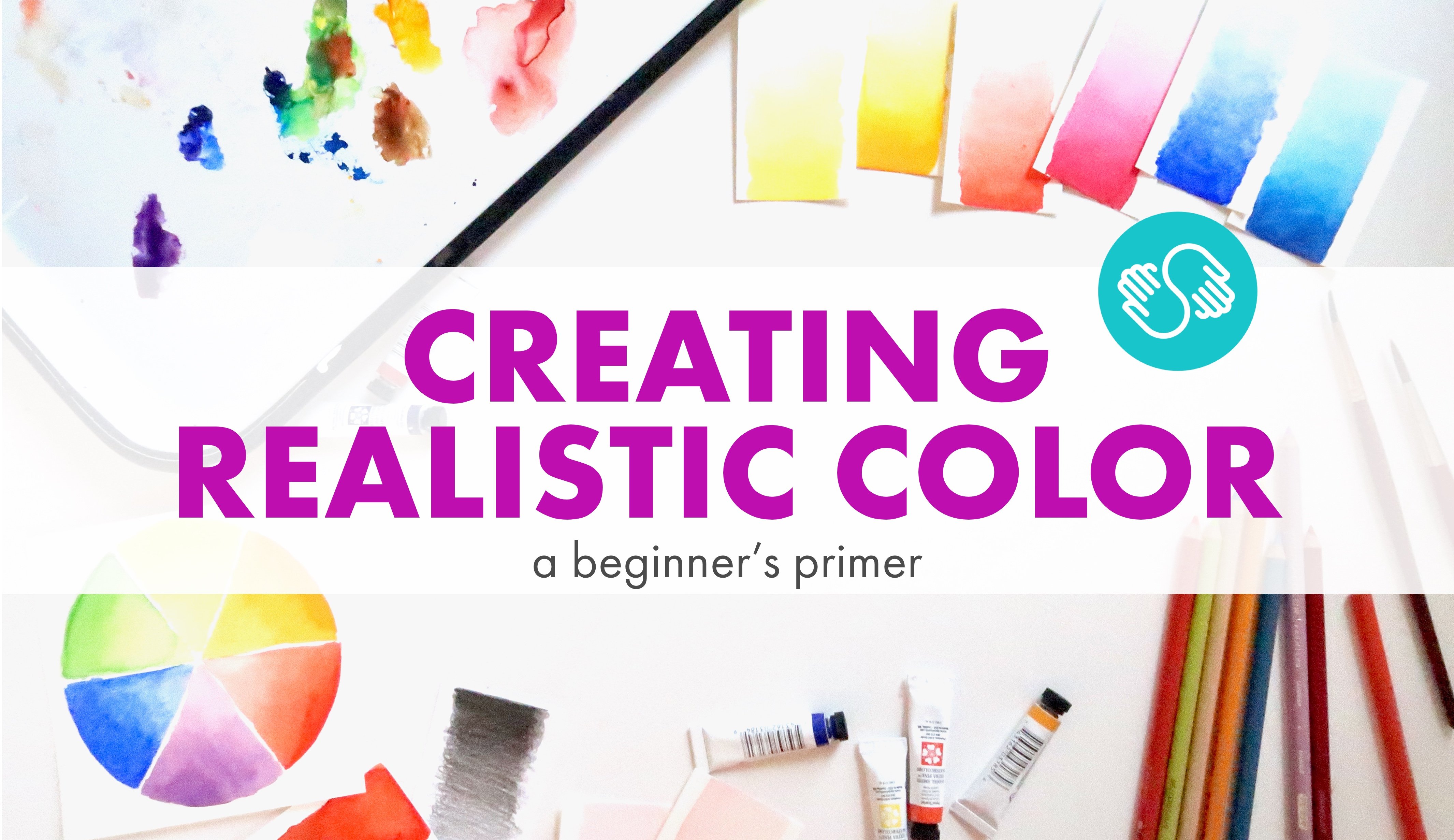
2. Materials: For this class, you will
obviously need watercolors. In the next lessons, I'll show you which colors
I use specifically. Then you'll need some
watercolor paper. And I highly recommend using the 100% cotton one for
this particular technique. As for the brushes, you will need a large one
to wet the whole paper. And then I suggest you
to have 3 more: a thin one for details
like a number two or one, a medium ones such as
number five or four and the bigger one that can hold a lot of water and paint. You'll also need some
paper tape to fix the sheet to the table
or to another support. For the drawing and
other small details we're going to use a
standard gray pencil, then a white and
a dark blue one. And in the end, a white pen, or alternatively
some white gouache.
3. The Negative Space: The negative space is the
space surrounding a subject. It's usually empty and
lacking in details. The positive space instead
is the subject itself. Negative and positive
spaces can help set the mood of an
illustration if used wisely. For example, a dominant
negative space can suggest mystery, but also fragility
and spirituality. At the same time,
the subject being so small may appear
weak and threatened. A dominant positive
space instead gives a sense of
power and confidence. The subject now appears strong and in control
of the situation. Equal negative and
positive space is like the Yin and Yang symbol. The feeling that we get from
it is stasis and stability. Now that you've learned that the negative space is as
important as the subject you're going to
look at your images in a new and abstract way.
4. Overlapping: Now we're going to
use the concept of negative space to create
depth in a drawing. The subject in this drawing
are two pieces of paper. If you draw them separately and place at the same distance, the drawing will appear flat
and you'll not be able to tell which paper is closest
or farthest from the viewer. The secret to
create the illusion of depth is overlapping. Draw again the pieces of paper. But this time make sure you put one paper in
front of another. This means that the
first paper will cover two or more sides of the
second paper and so on. Now, you can distinguish
which is the first, the second, and the third
object in your drawing. In order to accentuate
the illusion of depth, add a clear shadow on the second paper and a darker
shadow to the third one, since it's farther
from the viewer. We're going to apply
this technique to watercolors in the next lesson. In the end, I want
you to observe the negative space in
these two drawings. The negative space of the
first drawing appears uninteresting and
boring since it has homogeneous and
symmetrical shapes. While the negative space
of the second one is more interesting and appealing since it has more dynamic shapes. Therefore, the concept
of negative space and overlapping are
strongly connected when it comes to create
depth and appeal in your illustrations.
Now let's paint!
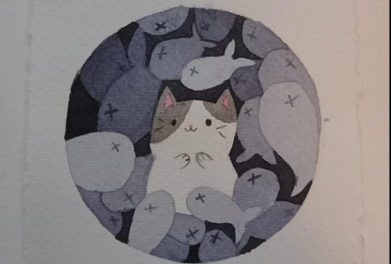
5. Negative Painting Exercise: Here we go again with a bunch of paper sheets. I want you to draw this
simple subject so that you can focus on the technique
rather than the drawing. I'll also let you the template
in the resources below. The first step before
starting to paint is to distinguish which papers are on the top and which
are on the bottom. I'm going to mark all
the papers with numbers. Number 1 for the
sheets on top of all. Number 2 for those
covered by the first one's. Number 3 for
the sheets covered by the first and
the second ones. And number 4 on the
papers below all the others. The negative painting
technique is about painting the negative
space around the subject. We're going to paint
as many layers of color as subjects
in the drawing. For the first layer of color, our subject of interest are
the first sheets of paper. We just have to paint all
the space around them. Since the space is quite big, It's better to paint
wet on wet. So first we wet the paper, paying attention to not touching the first sheets. Then, we apply the color. Make sure you use a very diluted color
for the first layer. At this stage, the result has to be very light and transparent. For the second layer of
color guess what?! We're going to paint all around the second sheets of paper. You can choose to paint
wet on dry as I do, or wet on wet as I did before. It's up to you. At this stage, you should use a darker and less diluted color than before. So the result will be more
intense but still transparent so you can see the
drawing underneath. Now, you know the drill. We're going to paint around
the number 3 papers and we're going to use a
darker color than before. The color is darker and more opaque as we move away
from the foreground both because we are adding
layers upon layers of color and because we are actually using a darker
color each time. Now we paint the last layer of color around the
last sheets of paper. We use the darkest
color of our palette. Since you have to paint many layers of color
for this technique, I suggest you to use a 300 GSM cotton paper and fix it to a hard support
with some paper tape. In the next lesson, I'll tell you more about
how I choose colors and mix them to get a smooth transition
from layer to layer.
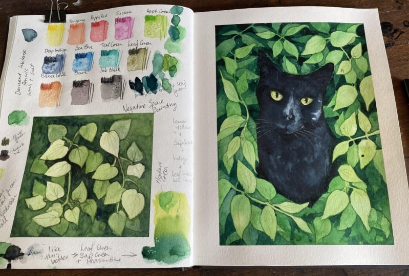
6. A Bit of Color Theory: I haven't used four
different colors to paint the four layers in
the previous exercise and I'll explain you why. I made this little
drawing to show you what the final result
would have been. If I used different
colors for each layer. As you can see, the
transitions are not so smooth since each color has
its own degree of warmth. So what's the secret to finding the right colors for
the negative technique? The secret is to know a bit of color theory or to simply
use a color wheel like this. In the color wheel,
you can easily find the complementaries
of a given color. In our case, the
complementaries of ochre yellow are blues, violet,
blues and violets. You may be wondering why you need to find the
complementaries? Now I'll show you why. Let's take some yellow
ochre and a violet blue. Now, add a little bit of
violet into the yellow. You're going to obtain
a darker yellow. If you add again a little bit of violet to the previous shade, you will obtain even a
more darker yellow. This happens because
complementary colors have the ability to cancel one another out when mixed together. The secret is to add
just little bits of the complementary, into the
yellow in this case, so you'll obtain a beautiful
range of muted yellows. This is why you
don't need a lot of colors to paint with
the negative technique.
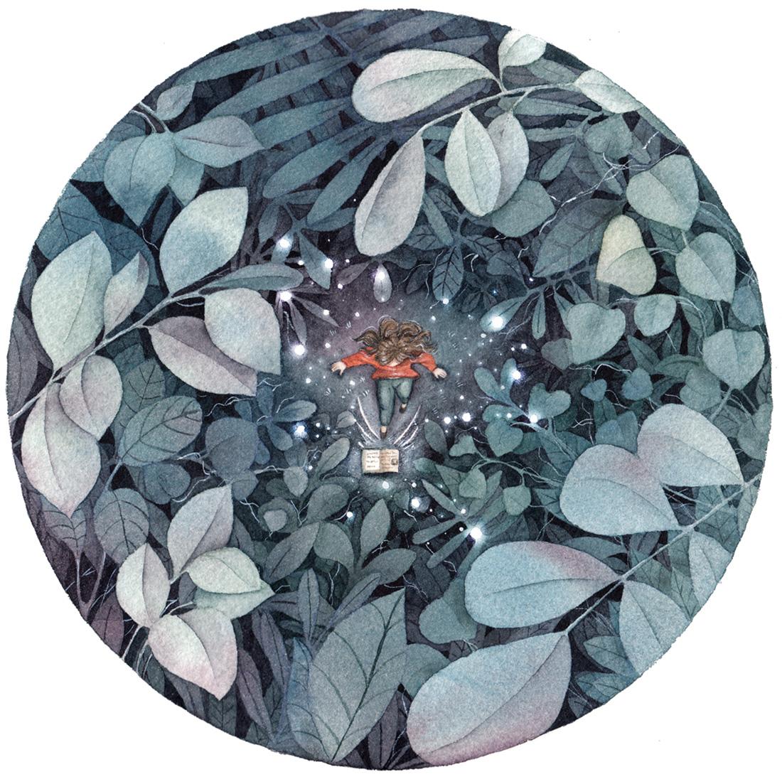
7. Final Project: the Sketch: For the final illustration, we're going to apply all the concepts we've learned
in the previous lessons. During the sketching process, think about the mood
of the illustration. I decided I wanted
the atmosphere to be magical and mysterious. So I've chosen a
dominant negative space around the main subject. As regarding the leaves
surrounding the little fairy, apply the concept
of overlapping. You can also draw
larger leaves in the foreground and
smaller leaves for the more distant planes. This will accentuate
the feeling of depth. Now that our drawing
is finished, we can add numbers to the leaves as we did in
the previous exercise. You may be a little scared
to see all those leaves. Let me give you a tip that will help you to draw them easily. First, draw all the leaves in the foreground and mark
them with number 1, then draw all the leaves behind the first ones and mark them
with number 2 and so on until you've drawn
4 planes of leaves. I'll leave you this drawing in the
resources of this class.
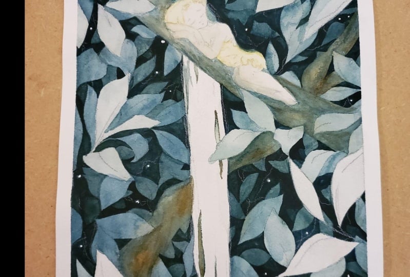
8. Final Project: Layer 1: After you transfer the
drawing to the cotton paper, either using a light
pad or another method, go over the leaves with
a colored pencil. This will help you to see them even under multiple
layers of color. I suggest you to use a dark green or dark blue
colored pencil rather than a black one. These are the colors
that we're going to use for this illustration: a dark blue, a yellow, a dark warm red, a light blue and a violet red. The carmine red and cobalt
blue shades are for the fairy, while the first three colors
are for the background. You can also use other shades, but I suggest you to stay in the same range of colors if you want to obtain the same
night atmosphere as mine. In the previous exercise, we didn't paint
the first papers, but in this case, it would not be
likely to leave the first leaves just white. This is why we're going to apply the first layer of color on everything except the fairy. We will paint the fairy at the end of the
negative painting. Wet the paper and then
apply a very diluted color. I created this green by adding a little bit of
yellow to the indigo. Mix the colors before
wetting the paper to prevent it from drying
out before painting. In some points, I add more
indigo and in others, I also add pure burnt sienna
to highlight the trunks. Let it dry or dry it with a hairdryer before proceeding
with the second layer.
9. Final Project: Layer 2: This time we paint
around the first leaves. And to do it easily, we divide the background
into three parts delimited by the
hair and the trunks. Wet the first part and then apply the same green as before, but this time less diluted. I use a thick brush
with a fine tip so I can work on both details
and larger areas. We do not apply
the color evenly, so there will be lighter
points here and there. Again, add some brush
strokes of burnt sienna. Use this color not
only for the trunks, but also to create
contrast with the greens. As you may notice, I stopped at the trunk where
the fairy sleeps. And before proceeding with the
second part, I let it dry. Repeat this process on the second and the third
part of the illustration. First wet the paper, then apply some
green and indigo and some burnt sienna for contrast. If you feel like painting
the whole space at once without having to
divide the process into three steps, then do it. I prefer to divide the
space whenever possible, so I don't have to worry
of the color drying on one side of the paper while
I paint on the other side, if you know what I mean.
10. Final Project: Layer 3: After the paper has dried, we can paint around the leaves number 2. We have to use
a darker color than before. And to do it, just make a mixture of more
indigo and less yellow. Also don't forget
to add here and there some burnt
sienna for contrast. Try to dilute the
color enough so you can still be able to see
the pencil underneath. Let's say that you need
to use less water as you get closer to the last
layer of the illustration. And now we are around
half of the way.
11. Final Project: Layer 4: Let's paint now around
the leaves number 3! We'll have to use a
darker color than before. And to do that, just
add a little bit of burnt sienna to
the previous shade. You can still see the
leaves number 4, this meaning that the color is
not very dense and there is still a good amount
of water in the mixture. If you can still see
the pencil underneath, is a good thing.
You're on track!
12. Final Project: Layer 5: For the last layer, we're going to use a very
dark and dense color. So we mix indigo
and burnt sienna and we add just a
little bit of water. The color will be very opaque, but since it's the last layer of our negative painting,
it doesn't matter. Since the space around the
fourth leaves is very small, use a fine brush. After finishing
painting this layer, we can clearly see the depth created between the first
and the last leaves. This is the magic of the
negative painting technique! In the next lessons, we will see some tricks that can enhance even more
the illustration.
13. Fill in the Gaps: At this stage, you can accentuate even more
the illusion of depth by creating another
layer of small leaves. Use a mixture of
indigo and burnt sienna and add a very
little amount of water. Then imagine some leaves in the empty spaces and
paint around them. You don't need a pencil to draw the leaves because you
wouldn't see the strokes. Instead, you can
use the brush to draw the shapes
and paint around. Obviously this
layer is optional, but I bet you'll enjoy
fill in the gaps!
14. Last Details: If you feel that some leaves
need a bit more color, and this could be the
case of the first ones that have been painted
with a very diluted color, then add a bit of
green in some points and blend it with
a clean wet brush. Adding too much color
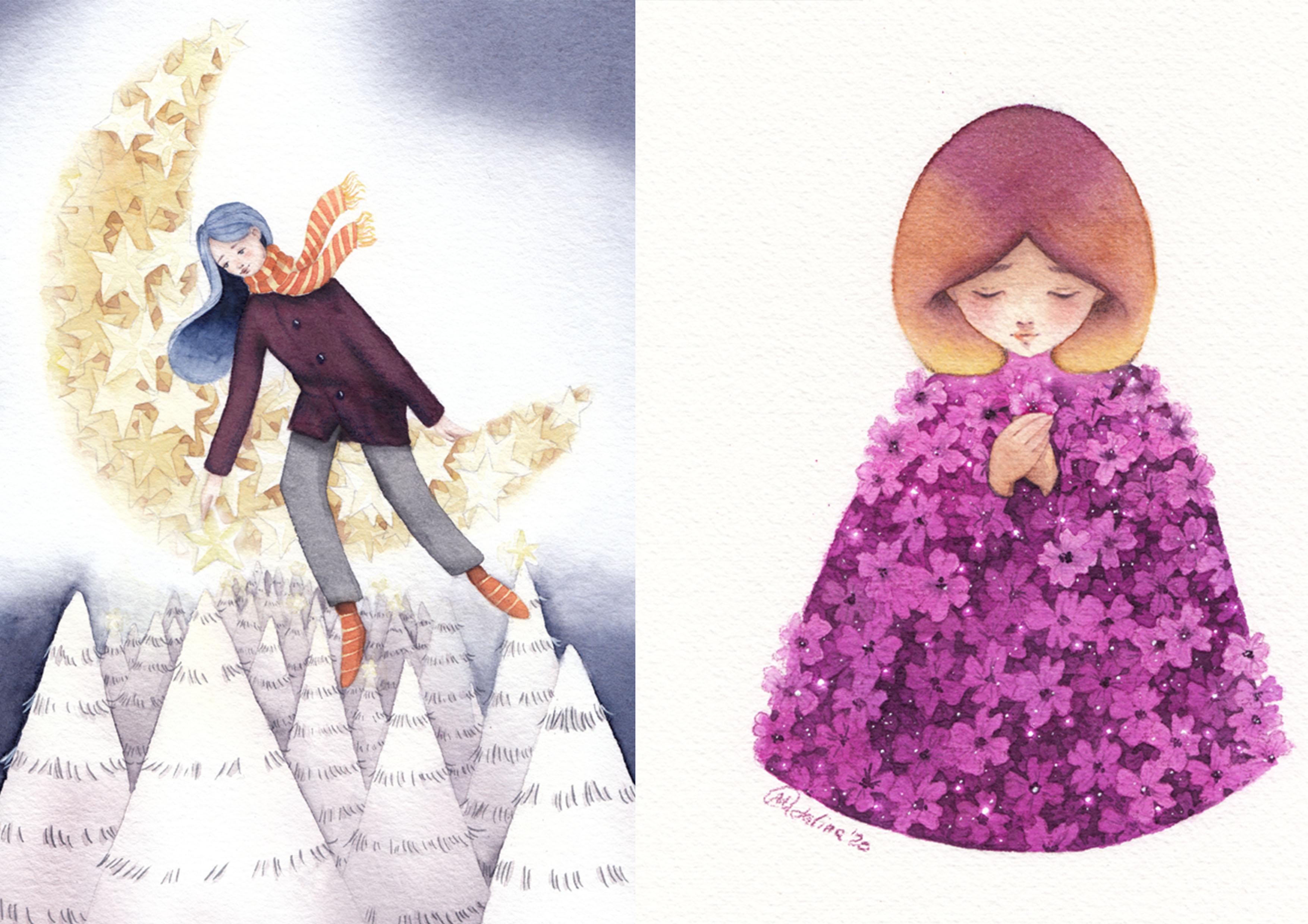
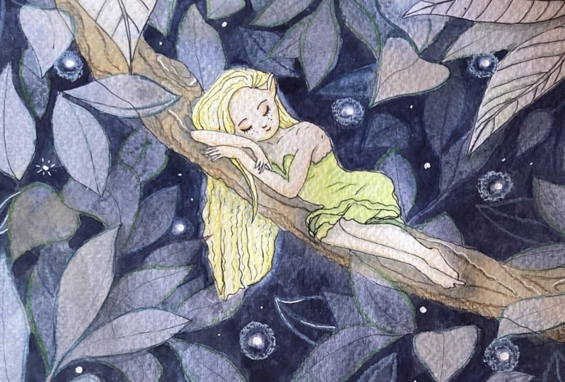
may affect the depth. So be careful with that. Now I quickly paint the little fairy and I'll
not delve into this process, since it's not the
focus of our class. You can paint your
subject as you like, also using other techniques, such as colored pencils. The important thing is to add a little blue
to the shadows, since the surrounding
environment is all dark blue. Let's add some more magic
to this background. I have a great tip for
creating small vibrant lights. First, lift up the color
with a clean, wet brush, I recommend using
a synthetic brush since it has a harder tip, then just dab it with
a piece of paper. Repeat this process
a couple of times since you get the
effect, you like. Make some of these
spots randomly, but always in the darker
parts of the background otherwise you won't be able
to obtain a nice contrast. Also, be careful not to
create too many lights as it can cause confusion
and too many distractions. After this process,
take a white pen or some white gouache and add small points in the middle
of the lighter spots. You're going to get really
nice, vibrant light! This step is optional. You can use a white
pencil to draw some filaments among the leaves. This will accentuate the depth and the different
planes even more. Here is the final result! We worked a lot on the
background and depth, but we finally put our
character in a real place. Now it's time to sum up the most important
steps of this process.
15. Final Thoughts: Here we are at the
end of this class. Thank you for embarking
on this journey with me, and congratulations for
completing the lessons. The most important thing
I want you to take from this class is to see things
from another perspective, the negative space
perspective, in particular. I can't stress enough how
important negative space and overlapping are to create depth and make
backgrounds pop-out. Also pay attention to
the color choice and color combinations to obtain a smooth transition
through the layers. I hope you followed along and applied all
these concepts to your work and if so upload it
to the project gallery I'd be very happy to see it
and give you my feedback. If you want to know more
about me and my art, you can follow me on
Instagram or YouTube. Thank you again for watching and see you in the next class! Bye! :)
 Madalina Buzenchi, Artist & Illustrator