Transcripts
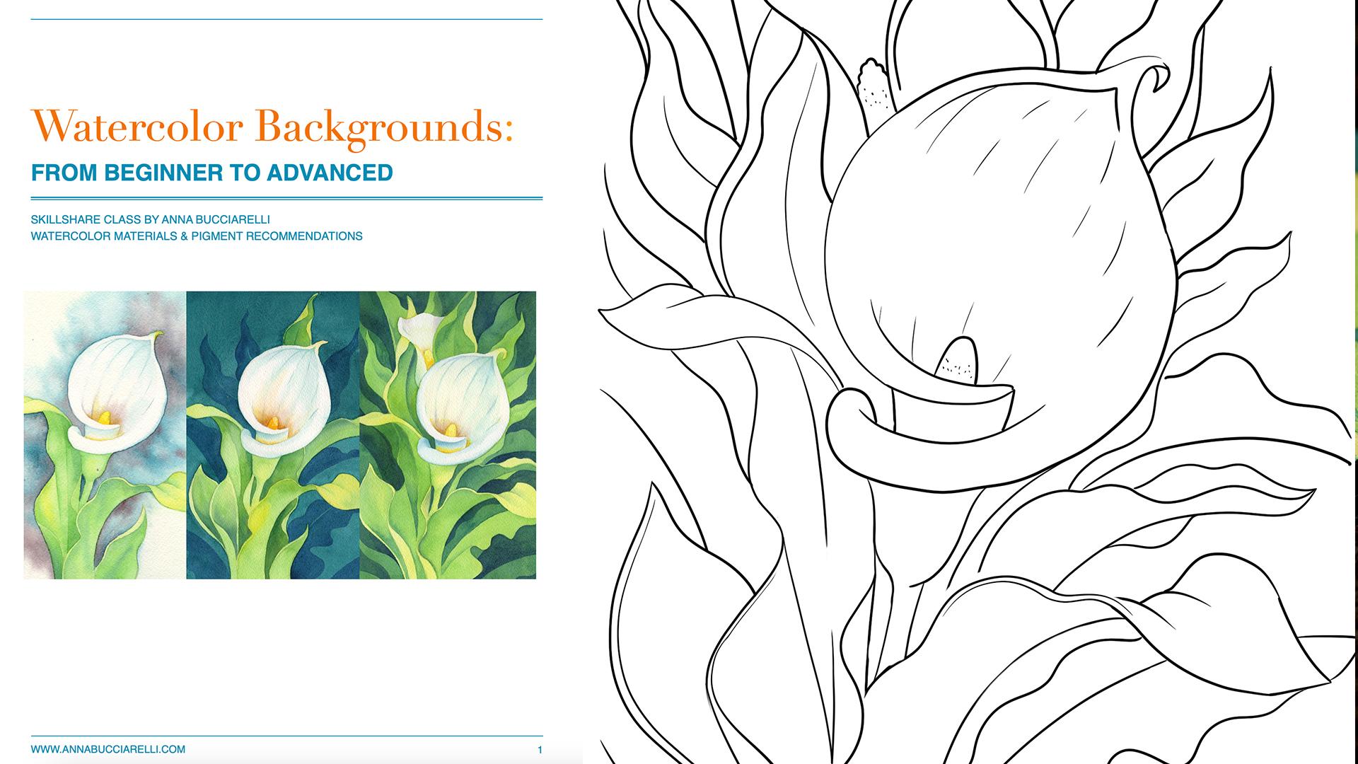
1. Introduction: I get it. Watercolor
backgrounds can be very tricky, but what if I told you
that we have options? Lots of them from a very simple beginner-friendly
abstract look that works practically
on any subject. The trickier but no less
beautiful flat wash that will give you
full coverage and beautiful depth with
just one color to my all-time favorite
negative painting technique, my most requested
style that I already introduced you to in
the previous class, where we used it to paint
beautiful greenery. Many of you asked for a background example because it is a complete game-changer, especially if you're
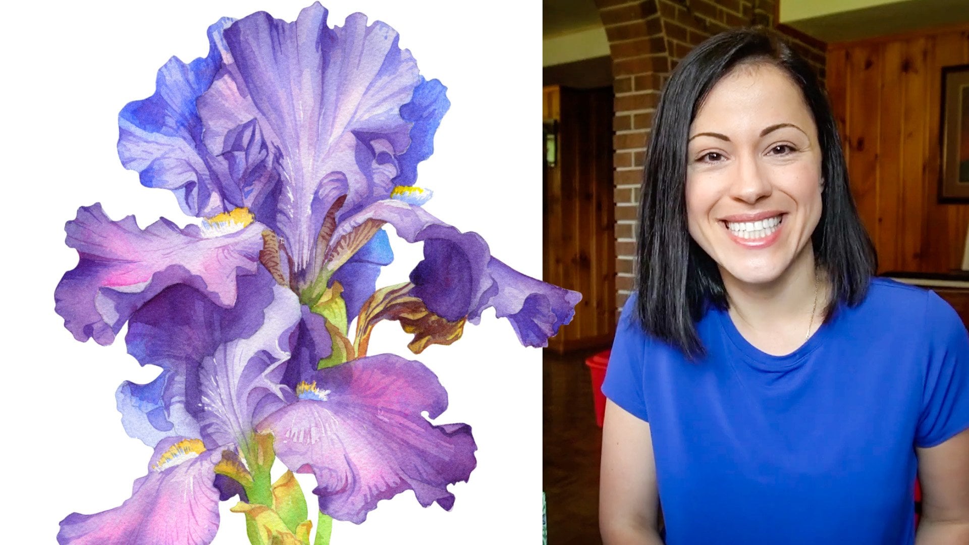
into botanical art. My name is Anna Bucciarelli. I'm a professional illustrator, designer of Canadian money. I teach watercolor here on Skillshare and
also on YouTube. In this class, I will show
you three methods for creating watercolor backgrounds in real-time step-by-step, using a simple
palette that you can adjust to your own style. As always, I will share
a ton of tips for creating smooth visually
stunning backgrounds. We'll talk a little
bit about some of the common challenges
that you might encounter and how to fix them, so your watercolor background
really enhances your work. As part of this class, you're getting access
to a full list of materials and reference images. Of course, as a bonus, you will learn how to paint
these beautiful color lilies. For your class project, you can focus on learning just one watercolor technique at a time or tackle all three. By the end of this class, you will have a
beautiful painting, or maybe three, and a whole new set of skills that you can
apply to any subject of your choice to enhance your watercolor work with a beautiful
background technique. I look forward to
seeing you in class
2. Supplies & Color Palette: Welcome to the class. Before we get started, let's talk about our
watercolor supplies. I will show you the
tools and pigments I use to create all
three backgrounds. You will find a summary
of my products along with some alternatives
I tried and tested in the resources
section of this class. But keep in mind that
you don't need to use the same brushes or
even the same colors. The focus of this
class is practicing specific watercolor
techniques that will be useful in
your future practice. You have a ton of
options to play with depending on your style, your budget, and availability of different brands
in your region. The only thing I would stress is the quality of your paper. In general, it is very
important to work on cotton paper when it comes
to watercolor medium. But especially when
you're planning to use background techniques
that require a lot of water and
a lot of layering. Cotton paper will
absorb lots of water, allowing you to create
gorgeous effects. But student grade paper, or even 50% cotton paper
will buckle and warp. The effects will simply
not be the same. I will be using
100% cotton Arches paper in cold pressed finish, which dries a bit slower
compared to hot pressed, allowing me lots
of flexibility for wet on wet washes
and multiple layers. The weight of my
paper is 140 pounds, but if you can splurge
on 300 pound weight, it will be even better. I will be using masking
tape around my artwork. This will ensure that the
edges are smooth and the paint doesn't ruin the
underlying clean sheets of paper in my block. We will also need a hard
pencil to create outlines. Try to find 2H, or even 3H pencil, these letter number codes indicate how hard
your graffiti is. Anything higher
than 2H is ideal, anything lower might
be a little bit too soft and leave some
smudges on your paper. You want to avoid that. In terms of the brushes, we will need at least one
flat brush for wetting the larger areas and
at least one round brush with a pointy
tip for smooth edges, I will actually use two
round brushes to give me some flexibility when it
comes to those tricky, smaller segments where I want a super accurate silhouette. Finally, we will need
two jars of water. Always keep one clean. You need a pallete to premix
your background colors, and you may notice I'm
occasionally using a glove. This is totally
optional of course, but it helps me protect
my paper from smudges. Now, let's talk about
our color palette. At first, I will explain which colors I used
on the color lily. Then we'll talk about the background and
discuss a little bit of color theory and
which pigments and hues work best for
background layering. For the lily flowers, we will need one yellow pigment. It doesn't really matter which brand or hue
you decide to use. Just pick your favorite yellow. These are small
segments we will cover. Towards the end, you can add some definition on the stamens using a more saturated orange. Once again, just go with
your favorite orange, the one that you have on hand. For the white petals, we will need two colors. Even though on the
petals they're white, we still need to
create a sense of form by painting very light shadows. In order to simplify
the process, I'm going to use the
same pigments here as I will in the first
version of the background. First, we need a light
blue or greenish blue and my favorite is aqua green from
Winsor and Newton. You can use phthalo blue or any greenish blue
of your choice. When I was doing a study
of these color lilies, I used all sorts of
different colors. It's all very light, so matching the color
doesn't matter as much. Just again, use what
you have on hand. If you have a light blue, it will work just fine. Second, we will need a
warmer brownish violet hue. I decided to use perylene
violet from Daniel Smith. It's a rich,
transparent pigment, works super well
for subtle shadows. Once again, I will apply
it in the background in a much more saturated
form later on. You can use any
violet or brown hue, I've listed some alternatives
in the class handout. We will need a warm green
color for the leaves. My go-to here is Hooker's green. It's the same green
that I will use in the third case study
and something to give the leaves a little
bit of that sunny glow. You can either recycle
the yellow color from the flower stamens or go for something more vibrant
with a hint of green. I decided to use green
gold from Daniel Smith. For the second and third
background case studies, we will need a deeper, darker blue for our
background elements. I decided to go with
indanthrone blue. Again, you have lots of
different choices and alternatives that I've
listed in the class handout. The reason why
blue is so helpful for backgrounds has to
do with color theory. All colors on this
side of the spectrum closer to blue tend to
appear further away. They are ideal for background elements as
well as the shadows. You will see me use
these different hues, like indanthrone and aqua green to help us
create a sense of atmosphere and depth in these different
case studies that I will take you through
in the class. In the next lesson, I will give you a
high-level overview of each technique and the key steps so you know what to expect, and then we can dive in
3. Process Overview: Welcome back. In this
introductory lesson, I will provide an overview
of the key steps for each background technique
that we will cover in class. The whole class is
roughly three hours long and each case study
will take about an hour. You will see my every
brush stroke and I will be talking about my process and
giving you lots of tips. It's important to first go over the general steps so you
know exactly what to expect. You can also refer to this
section as well as you start thinking
about incorporating various techniques
into your own work. I will start every case study by painting the
color lily flower. Then depending on the technique, I will show you the leaves
and the background. We will finish each case study by adding finishing touches to accentuate the leaves and
the flower so you can have a complete painting
for your class project, but feel free to focus on the background techniques alone
as this class is designed to give you lots of tools and necessary knowledge for
your own compositions. The first case study is the most beginner-friendly
background technique that uses so-called
wet-into-wet wash, meaning we will cover the
surface of our paper with clear water and then add
some color onto wet paper. You can use just one pigment or a variation of pigments I will
be using two just for fun. I will be giving you lots
of tips on how to make this process better and how
to enhance your results. I will also show you some
extra effects that you can introduce while painting using this background technique. It's all down in one layer. There are no mistakes, so I encourage you to have fun and experiment as
much as you like. The second key
study is a bit more controlled and it uses
wet-on-dry technique. Our goal will be
to create a solid, smooth coverage on
our background. I will start by putting down
the first layer of color, giving you lots of tips
for creating an even wash. This is probably the most
common traditional way of creating a background. You can follow with
one more layer, which is optional,
but it's always helpful for more even effect. It's a bit more opaque. I will be using one color only, but you can always
experiment by adding more. In the final and third layer, I will add some
additional details, some organic elements
using the darkest color. This will bring the
whole composition closer to a more
decorative look, which I quite enjoy, but you may not. Either way, I want to show
you the entire range of applications and techniques that you can use to
create more depth. You can follow along all
the way through if you like or move on to
case study number 3. In this version, I will be using negative
painting technique, which is my absolute
favorite for backgrounds. It's trickier to master
because it requires a different way of
thinking about shapes but it's so worth it because
it will give you a ton of flexibility when it comes
to watercolor painting. I have an entire class
on this technique that you can find on my
Skillshare channel. There are a few videos
on my YouTube channel. In this case study, I will show you how to apply it to background painting
specifically. We will start with a
solid background layer around the flower. Very similar at this stage to the second case
study, flat wash. But then we have three more layers of
color that we will apply, getting progressively
darker with our pigments. Painting around the leaf shapes, first around the
lightest sections, then around the larger
foreground leaves. Then finally one more time around the background, greenery. Every time we apply
a layer of color, we will need to have our underlying layers
dry out completely, so all our edges are crisp and you will
see how the shapes of the leaves emerge from
the background as we paint in the negative
space around them. This is the essence of
negative painting technique, adding color around the objects, revealing the
shapes, and it adds a fantastic sense of
depth and atmosphere. I absolutely adore
this technique. I'm very excited to
share it all with you. Let's get into it. In the next lesson, we will get started with
the first case study
4. Lily #1: Flower: Welcome to the first case study. Before we get started
on the background, let's put down the first
layer of color on the flower. I'm going to get started by just painting the stem in with
a solid layer of yellow. All I'm going to do in this
very quick lesson is paint the main background
areas of color on the flower and I'm going
to do this two more times. For each case study you will see my process and
the colors I use. The next thing I'm
going to do while my yellow is drying out, is prepare the white petal by wetting my paper
with clear water. We want to add some very subtle shadows to
show depth and dimension. In order for our shadows
to be very smooth, we want to use the wet
into wet technique, meaning we're going to
be applying our colors very lightly onto
the wet surface. It might be difficult
to see exactly where I'm putting
down my clear water, so I'm going to help
you in two ways. First, I saved a
quick snapshot where I've highlighted the area
that I'm focusing on. It's mainly in the
center of the petal. I'm leaving the front fold and the second larger
fold without any water. I'm going to lift my paper
block slightly so you can hopefully see the light reflecting against
the wet surface. Notice too, that my paper
is not dripping with water, it's just wet enough for me to start adding a
little bit of color. The colors I'm going to use
are exactly the same as the ones I'm going to use
for the background coverage, but here I'm going to
apply them very lightly. You can see on the right-hand
side in my palette, well, my mixture of aqua green
and water is very watery. I'm going to drop a little
bit of that greenish blue on top of my
wet area and maybe drag my brush a few times
following the natural direction of the petal veins
because there's a little bit of
shadow there as well. Another thing I'm
going to do is add just a tiny hint of a shadow under the petal fold and I'm going to blend it
with clear water. While my paper is still wet, I want to add a warmer
shadow around the stamen. I'm going to use
perylene violet, once again it's the same pigment I'm going to apply on the
background just for continuity. There's so many different hues that you can use in this case. When I was doing a
study for this class, I've painted several color
lilies and I've used different shades of
brownish violet, so don't fuss too much about matching my pigments
specifically. Use something similar
or you can even use a mixture of brown and
violet if you want. Once again, I'm going
to drag my color out to identify a few petal folds
just with the tip of my brush, creating these
subtle thin shadows. You can use your damp brush to soften the edges
if you feel like your shadow is
churning out way too harsh or maybe there're a couple of edges
that you don't like. Just clean your brush, tap it on tissue
paper and drag it along the edge of
the main shadow. The last thing I'm
going to do is add a subtle shadow effect using that same aqua green
all around the front fold. I'm just going to
paint the silhouette with the tip of my brush
and then once again, with a clean, damp brush, soften the edges of that shadow leaving a nice
highlight in the center. That's it. For the first
layer of color on the petal, you can add a tiny bit of your green or yellow on the tip. Blend the edge once again
with a clean, damp brush. In the next lesson, I will show you how to put down the first layer of
color on the leaf.
5. Lily #1: Leaves: Welcome back. In this lesson, I will show you how to paint the leaves on the color lily
and then in the next lesson, we will finally look at the first case study
for the background. So I'm going to start
with this front leaf. The tip is facing
all the way up, so it's receiving a
lot of sunshine and I'm going to apply my
greenish yellow there. Then move down using
hookers green. Cover the rest of the leaf and maybe add a little
bit of that same hooker's green on those grooves on top of the leaf
and on the tip. Wet into wet, very subtle. If you want to
simplify this process, you can just cover the entire surface with
your favorite green color. This extra greenish yellow hue is helping us create a
little bit of volume and dimension because we're using color theory to help us create
a more realistic effect. I'm going to mention it
very briefly here as it also relates to our choice
of the background color. So remember when we talked about our color choices
for the background, we discussed how colors
on the blue side of the spectrum always look
like they're further away, or colors that are
on the opposite side of the spectrum closer
to your yellows and reds always look like
they're closer to us and like they're more
illuminated by the light. So that's why I'm introducing this yellow color
here to help me add a little bit more dimension on the green leaves and
you don't have to use the exact same shade. Any yellow or a
mixture of green and yellow will help you create
a very similar effect. I'm going to finish by working on the background
leaf, once again, applying my warmer greenish
yellow on the tip, the side that's facing
towards the light. Then switching to my
Hooker's green as I move down and closer to
the stem and the lily. You can use slightly
more saturated green here because
that leaf is in the background and
it's probably getting a little bit of a shadow
from the lily flower. Moving down, notice again
we have a fold that's probably getting a little bit
more of a sunlight effect. I'm going to use my green gold and finish this section
with Hooker's green. The last thing I'm going
to on do in this lesson is cover the stem and the
beginning of the flower. Again, using my Hooker's
green very lightly, and maybe on that portion of this section
that's closer to us, that's getting a
little bit more light. I'm going to add a little
bit more of my green gold. That's it for this first
background section. In the next lesson, we will go through the
background technique in detail, and in the final lesson
for this case study, I will add another layer, just a few quick accents on
the flower and the leaves to add a little
bit more dimension so you can look forward
to that as well.
6. Lily #1: Background: Welcome back. Let's make sure that our flower and the leaves, the first two layers that we've painted are completely dry, so we can start working on
the first background study. I'm going to be using aqua
green from Winsor and Newton, the same color I've used for the shadow and
the lily pedal. Just for some visual interest, I'm going to introduce
the secondary color, once again, the same one
as I've used on the lily. A combination of
two will give us a nice atmospheric look
behind the flower. Just like I've mentioned in the materials section
of this class, feel free to improvise. You can use any color
combination you like, so don't be stuck if you
don't have the same pigments. One of the more fun options that you can explore is
granulating colors. They're going to give
you lots of texture. In general, leaning towards
blues and greens will give you more depth
because those colors typically look like
they're further away. They are more appropriate
for shadows and backgrounds, so you can improvise
as much as you want. Our goal in this case
study is to create a very abstract blend of
colors in the background, indicating just a
bit of depth to help create a more atmospheric
effect around the flower. The first thing
we're going to do is pre-wet our paper
with clear water. There are a couple of tips that I'm going to
give you here to make this process more successful
so you can create a much more smooth
background towards the end. This applies to
the more abstract, simple version of the
background that we're going to do in this section of the class, and also to the next example
that I'm going to take you through that will
include more of a smooth flat wash coverage. In the first phase of
the background work, I only plan on putting color down in the top area
of the painting, but just in case it's spills
over down at the bottom, I don't want any hard edges, and so I'm going to pre-wet this area in the
bottom corner as well, just in case there
are any particles of paint that might rush down, I want that transition and that flow of color
to be very smooth. Be mindful of any areas
that are connected to the area that you plan on working and putting
the color on. I'm going to lift my paper
block a little bit so you can see what my paper
looks like right now. Not dripping with
water but quite wet. My next quick tip is on the type of brushes
that I recommend. For this first, initial stage, I use the larger brush. It's a lot faster and
more smooth to work with a larger flat brush
as you're working on a larger areas and
covering the edges. As you get closer to your foreground elements where precision is more important, you can switch to a
smaller round brush. For example in this area between
the leaf and the petals, it's particularly important to have a precise tip
on your brush so you don't cover any
areas that you don't want to have a
background color on. Now as I'm waiting for my paper
to absorb all that water, I'm going to make
a light mixture using my first background
color, my aqua green. Then using my smaller brush, my round brush,
I'm going to start adding that color
around the lily. My tip here is to try and create a wave of color that extends beyond the
edges of the page, like an imaginary diagonal. One of the things
that you will see, and I've done this
as a beginner, is a lot of people add
background color just around their subject and it looks a little bit unnatural, like a frame around
your subject. You can create a much
more dynamic background, much more natural
effect if you extend your background color beyond the area that's immediately
next to your subject. In this case, I'm going to
create a wave that starts in the bottom left corner and extends all the way
out to the top-right. I'm roughly going to be dropping my color in this
area right here, avoiding the top-left corner
and bottom-right corner. Notice that it also follows the natural curve
of the lily pedal. There's a lot of movement, not just depth that I'm trying to create by adding this color. But take your time, experiment and see how
far your paint spreads. This process is rather
unpredictable and we're really taking advantage of the natural
properties of watercolor. Every time you create
these effects, they look slightly different, but that's the beauty
of this process. There are no mistakes. There's just experimentation and following the natural
properties of the medium. You can see there areas
that are a bit lighter, some are a bit darker depending on how much pigment I've added. If by any chance you
see the edges of your paper are drying out and
the paper stops spreading, just grab a little
bit of clear water. This is why we need
that second jar, and add a little bit of
moisture in that area. Because we've pre-wet the paper, it will reactivate all that
initial water that's already absorbed into the
cotton paper and your paint will
continue spreading. I slow down significantly
as I move to those areas, those intricate sections in between the leaves
and the petals, working just with
the tip of my brush. A little bit more controlled. In those areas that
are out in the open where I want my
paint to spread freely, I'm simply dropping
the pigment in. Try not to move it too much
once it's already there. At this stage, I'm quite
happy with the overall shape. As I mentioned, I'm trying to create this wave of color that extends up and towards
the corner of the page. Now I can add my
secondary color. This is entirely optional. I just wanted to
show you that you're not limited to just one pigment. It's always interesting
to add other pigments, complimentary colors, darker
colors, your favorite colors. I'm simply playing around. I went with my violet
and other option would be purple or maybe
a deeper blue. It's really up to you. For as long as
your paper is wet, you can continue adding
additional colors. Another interesting effect
that I wanted to show you, completely optional,
but very fun to do, it's called watercolor blooms. Sometimes these occur by
accident when we maybe drop some water onto the wet paint or add
a watery mixture, but here I'm going to do
this on purpose because I quite like the
effect it creates. You can see with the
tip of my brush, I'm simply dropping clear water onto a surface that's damped. Quite a bit of time has passed. It's not dripping with water. The paint is sinking in. When I add my clear
water to damp surface, it pushes the particles of paint out creating these
so-called blooms. To me, they look like
shimmering light. Like I said, it's
entirely optional, but just something that you
can add for some texture and visual interests that
I wanted to show it to you because I think
it's a lot of fun. I'm running out of
time for this section. I'm going to continue right into the next lesson and finish off my background
using the same technique.
7. Lily #1: Background {cont.}: Welcome back. I'm
picking up right where I left off in
the previous lesson. Moving down to the next section where we need to put a
little bit of color. So once again, if you imagine
this background color as a gentle wave that
starts in the bottom left corner and moves towards
the top right corner, we need to add just
a little bit of our blue and violet in this area right here
in between the leaves. But just like I did before, I've pre-wet the entire corners. So in case a little bit of this color spills over
into the whitespace, I want that transition
to be very smooth. And I'm going to start
with my aqua green. Once I'm happy with
that coverage, I'm going to drop a little
bit of my perylene violet. As I move closer to the leaves, to my main subject, I'm not afraid to go a
little bit more saturated. I might add a little bit of aqua green on the other
side of the leaf, which is for some continuity. Not too much, but once again, you can play around with
this as much as you like. Don't worry about the exact
placement of my brush. It's more of a general approach that I want you to see so you can apply it
in your own work. Since my paper is
still dry up on top, I might add a little
bit of that perylene violet closer to the lily. I'm happy with how everything
turned out at this stage. Before I move to the
bottom left corner, I'm just going to paint this
section on the other side of the lily bud and I'm going to try to match the value
on the other side. So I want it to be
just as dark as what I have on the
right-hand side and I'm just going to put
solid coverage there. Let's take one final look
at how the background is turning out and maybe add a few drops of
water just for fun. Once again, I'm
improvising here. This is a really loose
approach to backgrounds. I want you to feel
free to take advantage of the natural properties
of watercolor, play around with granulation, play around with
blooming effects, and really have fun. The more you do this, the more you will
get used to it and discover lots of beautiful
unexpected effects. Now we can safely move
to the left hand side. This one is very
straightforward. It's a self-contained
section that I can pre-wet very easily
with my flat brush, making sure that my corners
and my edges are all wet. Then start putting down my colors starting
with aqua green. Once again, I'm keeping in
mind that overall logic of a color wave extending
from the corner and out. I'm following this
shape very loosely, but I'm trying to put more color in this area
closer to the leaf, just so that there is the natural progression on
a diagonal behind the lily. Depending on how
wet your paper is, how fast it's drying, you can put more or less color, see how fast it spreads. If your paper is very wet, it's going to spread
a lot faster. If it's drying out quickly, it's not going to go as far. I want to maybe add a
little bit more saturation, drop a little bit more color and I'm trying to drag it out, again, following the
natural direction that I've established for my background color
waves on a diagonal. I'm going to finish
this process off by adding my secondary color. You can see I'm going
to lift my paper block. You can see how wet my paper is. As I'm lifting yet, it also
helps the color spread, so the particles of paint are moving in that direction
down and on an angle. You can help create additional
sense of movement by lifting your page and
watching your paint spread, helping it move in the
direction that you want. One thing I want to mention
here and this might happen, especially if
you've put a lot of water on your paper
and it's totally okay, but you can have this effect of paint gathering at the
bottom around the edges. Don't be afraid to just
lifted off with tissue paper. Very gently, just press it in the area where you want
to lift the paint. In the next background example, you will see me lifting even dry streaks of paint
where I made a mistake. You can always just
lift watercolor this way to fix any potential errors. In the last minute
of this lesson, I'm going to leave
a few drops of clear water just to add a
little bit of visual interests. Once again, entirely optional. I find it beautiful,
you may not. It's entirely up to you
whether you want to incorporate this effect
into your backgrounds. I just wanted to show
you what's possible. In the next lesson, the final one for
this case study, we will add finishing touches on the flower and the leaves.
8. Lily #1: Finishing Touches: Welcome back. In
this final lesson for the first case study, I'm going to show you how to add finishing touches on the
color lily and the leaves. We're going to be using
wet on dry method so adding color to dry paper, accentuating shadows and maybe boosting our color
in certain areas. You're going to see me do
this for every case study using exactly the same
method and the same colors. Starting with the color lily, I'm going to apply a
little bit of my orange. I'm using Hansa Yellow
Deep specifically behind the stamen and also a little bit on the
stem in itself. Just pressing my
brush a little bit, creating a tiny bit of texture on that beautiful
yellow element. I'm going to add a
little bit of that same yellow at the bottom, in the shadow area there, there's a little bit of glow. You can blend the color out with a clean, damp brush as
far as you feel like. In this version, I'm not going
to drag my brush too far, just a tiny bit to help that
orangey color fade into the white background of the lily and maybe
on the tip as well, just to add some continuity. The next thing I'm going to
do is use my aqua green. The same background
color that I used for the shadows and behind the
lily and just very gently, very lightly mark up
the veins up on top. Don't use fully saturated color, the lily is still white, so just like light to medium value and then
using a clean damp brush, I'm going to help that color
fade into the background. What I do is I just clean
my brush in clear water, in my clean jar, tap it on tissue
paper to get rid of excess moisture and then
just blend my color out, and to finish the
top of the petal, I'm going to add a little bit of extra color around the edges. Creating a sharper silhouette. Maybe a little bit
of a shadow as the petal curves and disappears
into the background. If you put too much color, the line is too thick. You can once again use your damp brush to
blend that shadow into the background and that's more than enough for a
white petal like this. What we can do next is work
on the leaves and once again, I'm going to be
working wet on dry, simply accentuating the shadows, making certain areas
a little bit darker. If you followed any of
my previous tutorials, you know that this is the
last step where typically I look at the overall
balance of values, meaning lights and darks, and see if I can bring
certain areas closer, maybe add a little bit of depth. Notice that I'm working with
my Hooker's Green simply putting it on those areas that I want to make a
little bit darker, make them look like they're
more in the shadow, so I'm adding a little bit of contrast and try not to create hard edges. Once again, I'm blending
these shadows into the background color
using a damp brush. For example this element of the lily bud I
really want to add a little bit more shadow
around the edges to bring the central area
closer to the front. I'm creating a highlight in
essences so I'm accentuating a highlight by adding
a little bit of shadow around it and blending
it with clear water. I'm going to continue
moving down. Adding additional shadows on this large leaf and
the background. Still using that
same Hooker's Green, you can bring in a little
bit of aqua green if you want to make it
look even darker. Accentuate the shadows
even further since, remember, as I mentioned before, according to color theory, pigments that are closer to blue on the spectrum
will look further away, so they're very appropriate for the shadows and depending
on how much contrast and how much color variation
you enjoy in your work you can introduce lots of
blues into your green. They look natural and they
help you create nice shadows and a better sense of depth and every time I put in
my shadow color, I blend it with clear water, helping it disappear
into the background. All these color transitions are very natural, very smooth. A very quick tip here,
completely optional, but it would be very helpful and will add
that extra bit of realism to your work for your
second layer on the leaves, try to leave the edges
without any colors. Notice I left a tiny strip indicating that the leaf
has a bit of dimension. It's not flat and so when
you paint each side, paint them separately, leave a little bit of a
strip in-between. It will give you that
extra bit of realism, even in the most
simple color blend, I'm going to add a little bit of my aqua green at the bottom. Just like I said, we can to accentuate that
shadow even further and then move on to the front
leaf and once again, notice that I'm going to leave the edge without any color. I'm going to gently follow
the curve of the leaf. You can see how that edge
will start glowing right away because we're adding
darker color around it. Once I'm done with adding
a layer of Hooker's Green, I'm going to add
my aqua green so the deeper shadow will
help me even more, create a little bit more depth
and visual interest there. I'm going to try and
add a little bit of extra shadow on the
leaf veins up on top. Very gently. I'm not going to
fully saturated color here. Medium value at most. Blending it with a
clean, damp brush. Maybe a little bit of color on the edge just to make it
more crisp and I'm going to finish this painting by
adding another layer on the last leaf once again leaving the edge
without any color. Using Hooker's Green at first, and then even darker, more blue pigment
immediately under the fold. In the shadow area
and then maybe in-between the two
halves of the leaf. The last thing I'm going
to do is accentuate the shadow next to the
flower, even further. Blend it with a
clean, damp brush and that's it for the
first case study. I hope you enjoyed
this quick exercise. In the next section, I'm going to show you
a more complex way of painting backgrounds using
a flat wash technique.
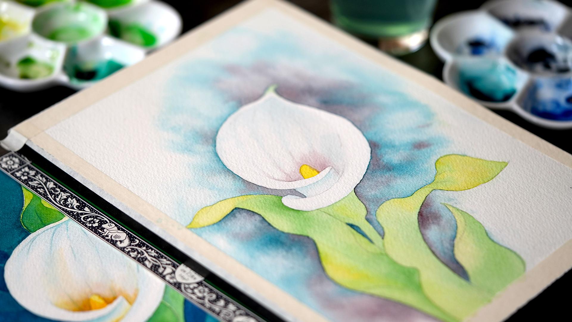
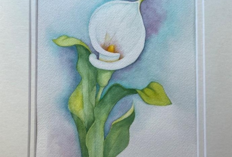
9. Lily #2: Flower: Welcome to the second
background case study. In this version, we're going to create a flat wash
behind the lily. But first, just like I did in the first version
and just like I will in the third version, I'm going to show you how I
painted the flower itself. If you've already seen this
in the first case study, feel free to skip to
the next section. Just like I did before, I'm going to start by putting
a little bit of yellow on the stamen and the
tip of the flower. Then I'm going to pre-wet the surface of the lily petal
before I paint the shadows. As I mentioned in the
first case study, there is an outline
with that area that I'm going to pre-wet
marked up so that you can use
it as a reference because it's hard to see
clear-water in the video. But just to show
you that we're not bound to one specific method, I'm going to add
an extra element and it's going to make it more interesting for me because
I'm doing it three times. In addition to the top
part of the petal, I'm also going to wet the area in-between
the petal folds. Add a little bit of
my yellow in there. In the first version, I showed you the step
towards the end, but you can always
mix and match. It's a little bit like
cooking, you can improvise. Now I'm going to follow the same steps as I did
in the first case study. I'm going to wet the
petal almost entirely, leaving just a few highlights and just to show you how wet my paper is and where
I put my water, I'm going to lift
my paper block. You can see there are a
couple of areas where I've missed that I need to add
a little bit more water. But generally, it's
the middle section, everything behind the stamen. I left the front side of the petal folds without
any water so that they remain bright white and they will serve as the brightest
highlights on our flower. Then just like I did before, I'm going to use my aqua
green, very light mixture. If you look at the value scale, I'm working with
the lightest values because the petal is white. We're just adding a
little bit of a shadow. I'm going to focus
on the top part, so the tip of the lily, dragging my brush out along those natural folds that you
see in the reference photo. Because we cover the paper
with clear water first, these lines are going to be
very soft, very natural. If by chance you've created a hard edge
that you don't like, an area that you want to soften, make it disappear
into the background, simply clean your brush, tap it on tissue paper and
drag it along that edge so your paint can spread and disappear into
the white-space. I'm going to finish working
with the section by adding my secondary shadow
color behind the stamen. Still working with wet surface. I'm going to drag
my brush out again following those
natural petal folds. The next thing I'm
going to do is add a shadow under the fold, so a little bit darker than
what I've used before. Just a step or two darker, more saturated and then
I'm going to gently blend it into the background
using a clean damp brush. All we have left for the white lily petal
is the front fold. As you will see, I'm going to do this three
times in this class. We want to add a little
bit of aqua green around the perimeter and then leave the space in the middle without any color so there's a
little bit of a highlight. The way you can do
this is start with clear water like I'm doing here, leaving just a tiny strip in the middle and then follow
with your aqua green. You can start with your
aqua green and then blend it into the background
with clear water. Either way works as long as you put your color
down around the edges, around the perimeter
of this section. Then use your clean
damp brush to let that color disappear
into the background. Before we work on the
leaves and the background, I'm going to add some
definition around the edges, still using the same aqua green, still very, very lightly using
just the tip of my brush. Then blending that
color very gently with the damp brush so I'm not
creating any harsh dark lines. This is a very light element, so I want to keep all my
strokes very soft and natural. Now that everything is dry, it looks a little bit too
light for me up on top, so I'm going to add a
little bit more color in the corner there, just accentuating that shadow. That's it for the flower petal. In the next lesson, I'm going to show
you how I painted the leaves and then we're
going to do the background.
10. Lily #2: Leaves: Welcome back. In this lesson, I will show you how to put down the first layer of color
on our green leaves. I'm going to be working
with two green pigments. You can stick to just one if you want to
simplify the palate. One will be my main green, my Hooker's green and another
one called green gold, which is essentially a
golden yellow color, which I will be adding on
those areas that are facing towards the sun,
facing the light. You can use any yellow
of your choice. It will simply add a little
bit of dimension before we do all the intricate shadow
work in the second layer. I'm working with my
main round brush, working very slowly
section by section. Our goal in this
step is to create some very light
background coverage that will give us a good idea
of where our values, meaning our lights and darks, will land when we
add the background. It's entirely up to you how
you structure this process. You can paint the background first and add all your elements, like flower and the leaves or whatever it is that you're
painting towards the end. But I find that having just the background
color on my subject is extremely helpful
because it allows me to judge how dark or how
light I need to go. Oftentimes, I don't know which colors I'm going to
use for the background until I put down this first layer of color
on my main subject. We can always plan and
imagine things in our heads. But sometimes the best ideas
come during the process of creating something and so that's why I structure my
workflow this way. I usually put down the main background
layer on my subject first and then move forward
with my background colors. We're almost done with
this process and you can see for the top of the leaf, the one that's facing all
the way towards the sun. I'm going to switch almost
entirely to my green gold. Adding just a little bit
of Hooker's green on the tip and around those veins. Once again, a more yellow, warmer color will give
us a better sense of dimension and show
that that part of the leaf is
illuminated by the sun. The last thing I'm going to
add is the smaller leaves, just the tip of the leaf that's visible
behind the flower. It will help us break up
the background segments a little bit and I'm going
to use my Hooker's green, adding just a little bit of
green gold around the edges. Let's make sure this
layer is completely dry before we move on
to the next lesson, where we're going to put down our first layer of color
on the background.
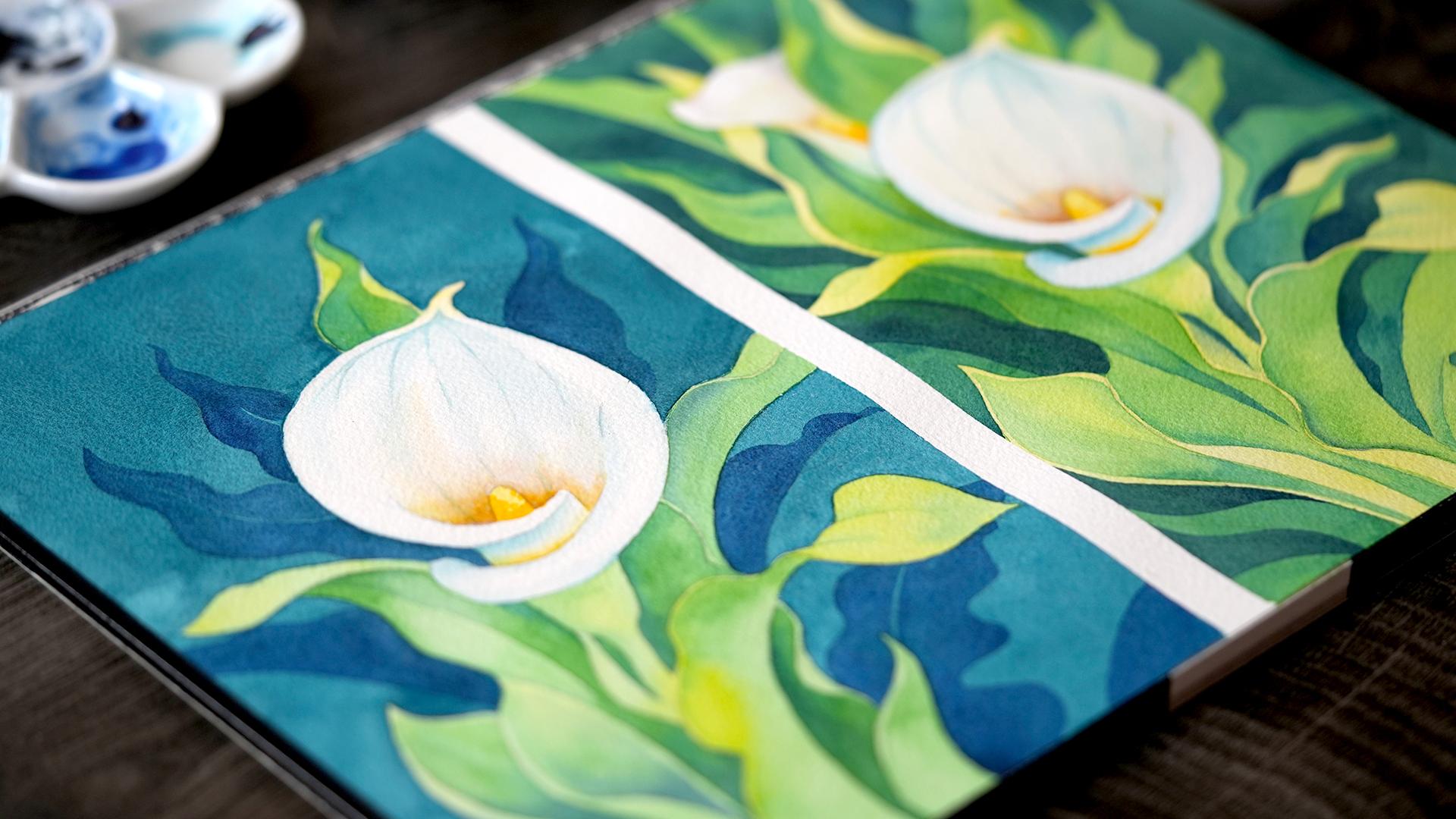
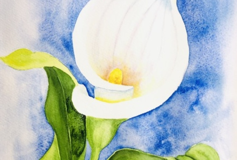
11. Lily #2: Background Layer #1: Welcome back. Our lily and
our leaves are finished. We're ready to start
working on the background, and I've picked this
aqua green pigment from Winsor & Newton, one of my favorites
for background work. It is very subtle and natural. It has a little bit of blue, which will help
the overall look, because as I mentioned before, blues always look like
they're further away. But it's not too intense, and a subtle green undertone will help tie
everything together visually and keep our palette consistent with the
greenery up at the front. As I explained in the overview
section of this class, our goal for this
case study is to create a flat wash of color. Before we put down the colors, we need to pre-wet the
surface of the paper, working in sections around the lily flower and the leaves. I will start by focusing on this discrete section up on top. Just in case any of my colors spills over
into the next one, I will pre-wet that one as well, so there are no
hard edges between every discrete section
we're working on. That's tip number one. My second tip for this
part of our work is to focus on wedding the edges
of your paper first, because we want our
background color to move freely and
blend all the way, reaching towards the edges, creating a more realistic
atmospheric effect. Now that the edges are wet, I'm going to switch to
my smaller round brush, the one that has more
of a precise tip, and continue
pre-wetting the paper. But this time, as you can see, I'm moving a lot slower, because I really want to
make sure that I don't cover any of the areas on the
flower or the leaves. The ones that are
not going to be covered by our background color. Occasionally, I'm
switching back and just re-wetting those larger areas, making sure that they stay
nice and wet all the way through until we're ready to add some color
to the background. I'm making sure also to
bring that water down to the small section that's connected to the one
we're going to work on. Now I'm pretty happy
with my coverage, and it's time to
make the mixture. You can make it ahead
of time if you want. But always make sure you
have enough to paint with to cover all the areas that you're planning to
cover ahead of time, so you don't have to
make this mixture while you're halfway
through a section, because it might dry out and leave some edges that
are not desired. You can see I've added a
little bit of extra pigment, and I'm going to
mix it thoroughly, so there are no clumps. Before I start painting,
another quick tip, lift your paper or your board up a little
bit, not too much. I just put a tiny
box underneath. Maybe 35 degrees to assist
your paint with spreading. Because gravity is
our best friend, it's going to pull those
particles of paint down very slowly if you
don't lift it up too much. It's going to create a
much more even coverage. Notice my workflow. The sequence is the opposite from the way we wet the paper. We're actually starting
from those areas that are closer to our subject. By doing so, our paint is spreading out towards
the wet areas. Now you can see why we started
by pre-wetting the edges. This allows us a lot more time to cover the larger
areas without creating any
unnecessary streaks or without having any
small sections dry out. You can see I'm putting
down the paint. My mixture is quite even. It's simply spreading
out towards the edges. You can switch, again, to a larger brush as you move closer now to
your larger areas. Your coverage will be so
much smoother this way if you start from the center and move out towards the edges. Notice the particles of paint
are slowly moving down. But I'm not putting too
much water on my paper. So I have a chance
to control the way my background color is spreading by directing it with
the tip of my brush. Paying very close attention
to those smaller areas like in-between the petals where the background is disappearing
behind the flower. I'm going to add a
little bit more color up on top while my paper is still completely wet and I'm not going to
touch it anymore. Clean up the edges, and then carry my greenish blue all the way down to
the next section. Another quick tip, you can gently lift and rotate your paper or
your sketchbook to prevent the pain
from gathering at the bottom if you were
lifting it beforehand, just allowing it to
spread evenly all around. Now let's continue to the smaller area that was connected to the larger
area we started with. It was already quite wet. All we're doing right now
is just moving all the way down very gently and
now I'm just going to lay my paper block flat. I'm working with a
much smaller area, so I don't need that
extra help from gravity. I can just control the
process gently with my brush. We still have to
work quite fast, but not as fast as
before when we were working on this larger area, making sure that
everything was covered. Here, we have the luxury of
slowing down a little bit. The smaller the area, the slower we can work, making sure that all the
edges are nice and smooth, and I'm only working with
my small round brush here. We have two more sections left. I'm going to start
with a smaller one in the center on the right. I have more than enough of my mixture left for
this part of the work. Once again here, I
don't need to rush, I can just follow along
the curves of the leaves, slowly creating a
very even coverage, much easier now, and making sure that I get all the way to the edge
where my tape starts. Don't be afraid to
paint over the tape. Masking tape will
protect the paper, and it will give you
that nice sharp edge. I'm moving down to the last section, the
bottom-right corner. I'm going to switch
to a larger brush, just because I have a little
bit more room here and I want again to have
very even coverage. Here I have enough room to
use my flat in the center. Then, again, around the
edges and smaller details, I'm going to use
the round brush. One thing I'm going to note
is a tiny smudge that I left on the white color
lily when I was working. Just a little accident, these happen and don't be
discouraged, don't be afraid. It's really easy to fix. I'm going to show this to you in just a few minutes
in the next chapter. What we need to do
first before we fix it, before we lift the paint, is make sure that
it's completely dry. I'm going to show you that
trick in just a few minutes. The last thing I'm going to
do before this portion of the exercise is done is
just clean up the edges. My tip here is be very
careful and only do this if your paper
is still quite wet. If it's not, adding
additional paint, additional watery mixture
might create some ugly blooms. So be very careful with
this additional step. You can see on the left already, there's a little bit
of a bloom forming. The reason for that is
because when we add more water to an area
that's drying out, the water is pushing the
particles of paint out, and so these blooms are unfortunate accidents
that happen occasionally when we
paint backgrounds. Be very careful about adding additional strokes on the
area that you just painted. Try to avoid it, unless it's
absolutely necessary. That's it for this
portion of our exercise. Let's make sure the surface is completely dry before
we continue working, and I will see you
in the next lesson.
12. Lily #2: Background Layer #2: Welcome back. I'm returning
to my color lily, after an entire day
worth of drying time. I would say that at least
three hours would be necessary if you're painting
a full background like this. You can speed up the
drying process by using a hairdryer on a
very low heat setting. But I prefer to always leave
it to dry on my table, giving it a little
bit of extra time. As you can see, we have a nice, relatively smooth greenish blue background behind our flower. You can do two things
at this stage. Either proceed to the
finishing touches on the flower and the leaves, or add another layer, which is usually my preference. Adding another layer of color helps us
achieve two things. Number 1, it will smooth out any potential
irregularities, any small accidents like
the bloom that I've mentioned in the previous lesson that formed on the
left-hand side. Because I've added
a little bit of my background mixture
all the way towards the end or any streaks that
may have formed potentially, I have a few up on top. The second thing
it allows us to do is to create a much darker, striking look, especially if our subject is white or light. Because I like this
high contrast style, I often go in with
another layer of color, like I'm doing here. This time around, we don't need to
pre wet the paper. We can simply make another
mixture and cover the areas that are already light
blue with the same color. Or if you want to experiment, you can add additional
colors here. I think purple would look nice. You can create some really beautiful wet-into-wet
transitions. The underlying layer is
helping us by creating a very smooth light
background that will mask any potential accidents
or irregularities. The second layer takes
a lot less time, giving you a much more
striking high contrast result, just like I did in
the first layer. I'm working with two brushes, my flat for larger areas and my round with
a pointy tip when I'm when I'm moving closer to the details like those smaller areas in-between
the flower and leaf. The top section is done. Now I'm going to zoom in, work on smaller sections. Still using the same mixture, this time my mixture is
a little bit less even, a little bit darker. I have to be very mindful about leaving potentially clumps
of paint or streaks. As you can see here, there's some smaller
streaks forming. But I'm going to try
to smooth it out. As I mentioned before, this first underlying
layer of color is really acting as a
protective surface. There's a lot more
room for error. We can always fix
our mistakes a lot easier because we're not painting directly
on white paper. It's a little bit
less stressful. This little section,
I think I've put a little bit too much
pigment, but again, it's not as critical
in the second layer, it's going to dry
out with just maybe a bit of a dark spot here. I'm going to zoom out. Once again, I have
two sections left. You can see that at this point our surface
is drying out a lot faster because we
didn't pre wet the paper. You can already see
up on top more or less what the final
background will look like. It's not perfect. There are still some areas where there's a little bit
of a difference in value, meaning light and dark. But it's a lot more striking. The smaller areas
like the one I'm painting now will be
a lot more smooth. In the next lesson, I will show you how to add additional elements in
the background to mask any potential
irregularities and add some more additional
visual interest using even darker color. For the last
section, once again, I'm going to switch
to a larger brush, larger flat to cover
the area very quickly. Much quicker than if I was
working with my round brush. then finish everything
with my round moving slowly around the
silhouette of the leaves. I'm much happier with this
look with this second layer. Again, because I
like high contrast, doesn't mean that you
have to paint this way, but high contrast is my style. I like how this color frames
the leaves and the flower. In the next lesson, we will add some
finishing touches and definition on the
flower and the leaves
13. Lily #2: Leaves Layer #2: We're done with
our background for now and we're going to work on perfecting our
flower in the center. Follow along if
you're interested in this section or
you can skip to the next one where
I'm going to add some additional details
to our background. I'm only working with one pigment here,
my Hooker's Green. You can use any green
of your choice. I like this vibrant color because it has a lot
of yellow undertones, and it really stands out against our bluish-green
background. What I'm going to do is just work on different
sections of the leaves, adding these darker shapes
with my smaller round brush. If you want, you can add
that same background color, that bluish-green, or maybe you used phthalo blue,
whichever one, as long as it has a little
bit of a blue undertone, wet-into-wet into your green just to add even
more definition, but I don't want to
over-complicate this step. We can stick to one color only. You can follow along. As you will see, I will pick one
section at a time, adding a little bit
of green color, making sure it's just a few steps darker than my
background, green. If you look at the value scale, it's going to be somewhere
around the medium value, so not fully saturated. Occasionally like in
this larger section, I'm going to really focus on adding this color
in the shadow area, the one that's facing
away from the light, and then blending
it with clear water towards the areas that are
more lit up by the sun. In this section, my shadows
would be immediately under the folded leaf and right
next to the flower. The rest, I'm just going
to clean my brush, tap it on tissue paper
and then blend with that clean brush out so that I have a very
smooth transition. I'm going to carry
my color down, definitely, the area
that's more in the shadow. I'm using lots of my
Hooker's Green there. Then right next to the
flower bud, as I mentioned, you can add a little bit of your bluish-green just to
accentuate the shadow. A little bit of
color theory here. Pigments that have
blue undertones will always appear further away or
like they're in the shadow. That's just a property of blue when you consider all
the colors on the spectrum. Adding a bluish-green just
pushes that area further away, adding a more definitive
shadow wherever you add it. I'm going to clean up
the edges and then add another small section right
next to the flower stem. Once again, adding
a little bit of my bluish-aqua green and
wet-into-wet in the last step. Then just to keep that symmetry, I'm going to continue
on the other side, starting with aqua
green and then switching to my Hooker's Green. Once again, you can
stick to one color, but adding that aqua
green just adds a little bit more
depth and definition, especially on those larger
slices where we can play with light and shadow and color temperature
a little bit more. Now, I'm going to work on
the other side of this leaf. Another slice, very
beautiful, curvy silhouette. You can take a look at step-by-step photos to see exactly what I'm
working towards. Don't worry even if you
lost your pencil marks, you can still find them by
looking at the references. Another slice. Once again, I've painted using
Hooker's Green and then added a
little bit of my bluish-aqua green
towards the end while my paper was still wet. Another leaf on the
left-hand side. I'm going to paint the
area inside the leaf, leaving those curved
edges without any color. This way, the lighter, the green around
the edge will have even more contrast against
our bluish-green background. Now switching to the right, the back of this leaf, I'm going to paint with a
very light Hooker's Green. Cover everything, maybe
leaving just a tiny strip of paper without any color around the edge of
the leaf because, of course, the leaf is
not completely flat, it has a little
bit of dimension. Just to show how thick it is, try to leave a little
bit of a dry strip there and then add a little bit of
aqua-green wet-into-wet. We're almost done
with this section, the back of this leaf, I've added quite a bit of
warm yellow just to push it forward visually when I was
painting the first layer. Now what we need to do is just
add a little bit of green. Once again, here we see
the edge of the leaf, so I'm painting
carefully around it to show that the leaf has
a little bit of dimension. In the upper side, the front of the leaf
that's facing the sun, we don't need to add a
lot of color at all. We want to keep it super light, so I'm just going to paint
two lines using very light, very watery version of
my Hooker's Green and then blend those
lines with a clean, damp brush, softening
those shapes, making them disappear
into the background. We're almost done. Now you can see how much more depth and dimension we've added
with just one layer. I'm going to finish the left
side of this larger leaf, maybe add a little bit
of color up on top here, and of course, add
a little bit of definition to the
flower bud itself. All I want to do it's just a
hint of depth and dimension. I'm going to put a
little bit of my green under the petal where the shadow would naturally fall and then blend it with a clean, damp brush, making that color
fade into the background. Last leaf at the bottom, a little bit of green, and then blended down
with clear water. This step is done. In the next lesson, I will add a few very
simple details to further highlight the flower and add some visual interest to
our blue-green background
14. Lily #2: Background Layer #3: Welcome back. In this step, we will add additional layer
of background elements. This is a very simple, entirely optional but
very helpful step that I use in a lot of my paintings
that feature flowers. I'm talking about
the extra greenery, and you will find the
look I'm going towards, I'm working towards in
your reference photos. This will help us in two ways. First, by masking any
potential irregularities in our flat wash because we will be covering the background
with extra leaves. Second, it's going to help
us create even more depth because I will be painting
using in the throne blue, a few steps darker
than our background so almost going to a
fully saturated look, taking advantage
of the fact that darker blue colors
on the spectrum always look like
they're further away. I have a few very
faint pencil outlines of the color lily leaves that I've mapped
out in the background. They're barely visible, but
you can always refer to the step-by-step
photos if you want to follow the same design. I'm going to simply
cover each shape with a slightly
darker blue color. Once again, the concept of
color theory is at play here, because we're using
the blue color, the shapes that we're
painting look like they're really far away
and in the shadow. Because blue always appears like it's further
away than the shadow, and using this
blue is helping us frame the warm greens and
yellows in the center. This is probably the
least stressful part of the process because
all we need to do is just create an
even smooth coverage but on much smaller shapes. We already have two
underlying layers of color, so any irregularities, any differences in values
that might occur are masked by these two
underlying layers of aqua green underneath. I'm going to try to follow
my pencil marks and maybe leave just a
very thin white strip of paper in the
center of the leaf marking up that main vein
that splits the two halves. Just enough
definition to suggest a realistic shape and I'm not going to add any
more detail than that. Generally, when we paint, the more details we add, the closer something appears in terms of the
visual hierarchy. As we move further away, less detail is preferred. It actually reinforces
the sense of depth. I'm not too fast about
adding a lot of details, a lot of shadows here. It's just going to be one
continuous block of color for every leaf that I
create with my pencil. You can of course, improvise as much as you want. I've simply follow
the natural shape of the color lily leaf here. But you can add all sorts
of organic elements. You can look into
other leaf shapes. Maybe you'll find more intricate, more
interesting designs. It doesn't have to
be a color lily. All we're doing is just creating one additional layer that separates the flower
from the background. Just another element in the visual hierarchy that we're trying to recreate on paper. On the left-hand side, I'm going to add two leaves. Once again, just the tips. Very simple, solid coverage, a few steps darker than the
background, and of course, having that extra blue
helps us differentiate the leaves that are closer to us from the ones that
are further away. I'm going to try and paint around the central vein
just so that we add a little bit of
realistic touch to an otherwise very
decorative looking detail. If you are adding additional elements may be
other leaves and branches, my advice to you is to position them from the center and out. If you have a central element, it will help frame it better. Notice the direction
of my leaves. They're following the
natural direction of the main flower. As if this is a bouquet or
maybe one cluster of flowers, they're moving out from the
center towards the edges. This helps me create a more cohesive composition,
much more stable, much more balanced
than if I were to put these leaves randomly pointing in
different directions. So far, all the extra color lily leaves that I've painted, I've been focusing on the tips. I have a few more
spots and the stem, I think I'm going to
make them actually move out and reach
all the way towards the edge of the composition implying that there's a lot
more background behind. That's another way of adding your background
elements if you want to create a sense of more space
behind your main subject. You can see this one
I'm going to make it go all the way towards the edge on the left and imply that the tip is just
following further, we can't see it. Then here on the left-hand side, I'm going to use
the same principle. Making the leaf reach
all the way to the edge, halfway through,
implying that there is a whole other section
that we're not seeing. The last one I'm going to
add on the right-hand side. Maybe just covering that corner. That's it for the final
step on our background. The only thing we have left is some finishing touches
on the flower, which are entirely optional. But at this stage, I feel like
my background is complete.
15. Lily #2: Finishing Touches: Welcome back. In this lesson, I will be adding some
final finishing accents on the flower and the leaves
and fixing my mistakes, like the blue smudge on the white petal that I
promised to show you before. Follow along if you
enjoy a more detailed, more contrasted style or meet me in the next lesson
where I will show you a completely different
way of painting backgrounds using the so-called negative
painting technique. You can see already
the beginnings of this different version of the flower in the
right hand side. But for now, I'm just going
to focus on this flower on the left that we've been working on for almost an hour. The main thing I want to do
is accentuate the shadows. Once again, this is completely
optional but I like adding more contrast to my work. This will give us
an opportunity to define some of these
areas further. I'm going to be using the same Indanthrone blue that I used on the background greenery. This will help me create some
continuity in my palette, tying together the background leaves that are all the way in the shadow and some of the stronger shadows on
the foreground greenery. My technique here
is very simple. I apply a little bit of my blue color in
the shadow areas, so typically that part of the leaf that's
either covered by another leaf or is facing away from the light
like I'm doing here. I'm using medium value, if you consider the value scale. Once I put down enough
color for the shadow, I blended with the background
using a clean, damp brush, spreading that blue color out, making it disappear into our background green that's
a little bit warmer. If you look at the final photo, you will see the areas that I
focused on primarily again, the ones that are
covered by other leaves or are facing away
from the light. I think that's more than enough
in terms of the accents, I don't want to make
it look too dark. The last thing I'm going
to show you is how I fixed that smudge
on the white petal. I'm going to grab my flat brush, make sure it's completely clean, so no residual color left. I'm going to tap it on tissue paper to make
sure that it's damp, not dripping with water, and then gently rub it
over the blue smudge, lifting the paint
with every stroke. This might take a
minute or two depending on how dark the smudge
is but eventually, it will come off, maybe leaving a little
bit of a faint outline. After every stroke,
I clean my brush one more time so I'm not
spreading that blue around. Again, tap it on tissue paper, and continue lifting until
you're happy with the result. Now that my white
petal is white again, I can add a few finishing
touches on the flower. I'm going to work with two
colors only, so my orange, specifically I'm using
Hansa Yellow Deep and a little bit of aqua green, which I will add on
the petal veins. The first thing I'm
going to do is just add my Hansa Yellow Deep all around the main stamen and the shadow, making sure I don't cover the white petal
fold at the front, the one that's facing us. Then using my flat brush, spread that color out and up, making sure it disappears
into the background. I'm going to use that
same Hansa Yellow Deep in between the folds, very gently not a
lot is needed here. Once again, I'm
going to blend it with a clean damp brush. That's it for my Hansa Yellow. You can use any transparent
yellow or orange here. Now, just a few final
strokes using aqua green. I'm going to reinforce the
shadows on the petals and add a few very light thin strokes up on top to indicate the veins. The small grooves that are
visible on the color lily. That's it for the second lily. I will see you in
the next lesson where we will start working on a completely
different background using negative
painting technique
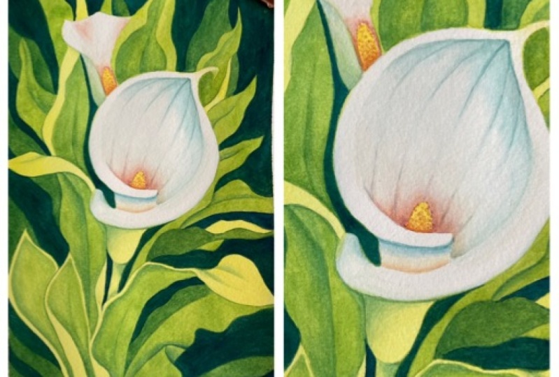
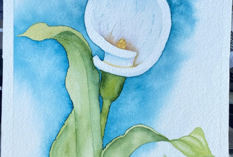
16. Lily #3: Flower : Welcome back. In this
portion of the class, I'm going to show you the third, my favorite background technique called negative painting. But before we start, let's put down the
first layer of color on the color lily petals. I'm not going to go
into too much detail because we've done
it twice already. The process will be
exactly the same. The only difference is we have an extra lily bud
in the background. I'm going to start by painting the stamens with my warm
yellow, both lilies, and also add a little
bit of that same yellow on the tip
of the petal may be helping it spread and fade into the background using
a clean damp brush. I'm going to put that same yellow at the bottom
on the back of the petal and blend it into
the background there as well. The next thing I'm going to do, just like we did in
the first two versions and you can see one of them is drawing on the
left-hand side. I'm going to cover the lily
petal with clear water. Make sure that you have a
second jar of pure clean water. You can use that to prep your background and leave a couple of spots
without any color. I'm going to lift my
paper again and show you the exact area I covered. Leaving the petal folds and the tip of the lily
completely dry. Those areas will remain
bright white and look like they have the
strongest highlight. My paper is not
dripping with water, it's just wet enough
to start adding a little bit of a shadow using
your bluish green color. I'm using aqua-green, which is the same
color I'm going to use for all three backgrounds. Here I'm using it very lightly, focusing on the tip of the lily. Focusing on the top corner just under the
yellow tip and maybe adding a few lines wet on
wet along those petal veins. If your paint is
spreading too fast, creating a sharp edge
that you don't like. Simply clean your brush, tap it on tissue paper and
drag it along those edges, making them a lot
smoother this way. Making them fade
into the background. Right before we're done
with this section, let's add a little bit
of our brownish shadow. I'm using perylene violet
once again behind the stamen, making sure we
don't put any color on the petal fold that's
facing us and then you can drag that color
out using the tip of your brush again along
those petal veins. Very subtle. Don't go
to full saturation. Just a little bit
of color is enough. You can see on the
left-hand side, the look I'm working towards and a few more
finishing touches, starting with a shadow
under the pedal for that, I'm going to apply
using aqua green. Then you can blend it
with a clean damp brush. If it makes us a
little bit with the yellow, that's totally fine. It's just a very subtle warm
and cool shadow transition and then the last thing we're
going to do is just add a little bit of shadow
on the front fold. Here you can pre wet the surface again with
clear water this time, make sure that your brush doesn't have any residual color, and then you can add a
little bit of your shadow, aqua green, along the edge. Maybe even on both
sides if you want. As I mentioned in the beginning, every time you follow
these techniques, it turns out slightly different. So don't worry if it's coming
out lighter or darker, you can recreate the exact
same effect every time. Just the general logic, the general steps is what matters and I'm going to
wrap this up by putting a very thin outline along
the edge and we can move on to painting the
background layer using negative
painting technique
17. Lily #3: Background Layer #1: So for this first step, our goal is to cover
everything with a very light first layer
of color and the technique and the key principles and tips that I'm
going to mention are exactly the same as the
ones we've applied when we painted the flat wash on
the color lily before, so the one that you
see on the left. I'm going to start in exactly the same way using a
flat brush and clear water, I'm going to wet the paper
starting from the edges. So I want to eventually have
my paint spread out towards the edges because it does ensure a much more smooth coverage. So let's prewet the
paper this way but this time we're covering
everything so it's a lot easier. The only area I would prefer to leave without any
color in addition to the main lily is the second lily that I've
added in the background. The other tip I mentioned in the previous background
was premixing your paint, so mixing it with
water ahead of time. So you have enough paint with similar consistency to last you through the entire section. So you can see on
the right-hand side, I have a fairly large amount
that I can dip my brush into and I can start
applying my paint gradually, eventually switching
to a smaller brush. Now that the edges
are sufficiently wet, we can switch to our color mixture and here
I'm using my green gold. You can use a yellow
or mixing a little bit of green into your yellow if you don't have
the specific shade. Don't worry about matching
the colors exactly, it's more of the technique and the overall effect that matters. So you can see I'm
using once again, my flat brush, working
around the entire area. The only thing I'm
going to leave without any color is
that secondary bud, the rest will be
covered completely. Once I'm done taking care
of the larger surface, I'm going to switch to
my smaller brush to make sure that I can give very good, very detailed coverage around
the edges of the flower so I don't accidentally paint
over any white petals. But these are the final strokes that we need to put down
and you can see I'm really able to get into
all the tiny details with the tip of my
brush, on each side. This is the third time I'm painting this lily
and so I know that the most tricky part will be
in-between the petal folds, on the left-hand side. As you paint other things, flowers, birds, whatever
is your subject matter, you'll always find these smaller trickier
areas where you need to really slow down and take care of the details
with the tip of your brush. So just allow yourself
some time and using your flat brush on
a larger surface at first really makes it easier
because you know that the main areas are already covered and you can focus
on the smaller details. I'm actually going to spread this yellowish green
or greenish yellow over the folded pedal
of the other lily, since it will be in the
shadow and for now, we're done working
on the background, let's make sure it's completely
dry and I will see you in the next lesson where we will continue using negative
painting technique. Final tip for this
part of our work is to use gravity to help the
color spread more evenly. So I'm just going to lift
my block a little bit and let this first background
layer dry out while my block is positioned maybe at a 35 degree angle to let those colors spread
down very gently.
18. Lily #3: Background Layer #2: Welcome back. Our first layer
of color is completely dry. I gave it a couple of
hours and now we're ready to put down the second
layer of color, and just like we did before, we're working with
the entire surface, so everything, but
the white flowers in the center and using
negative painting technique, so painting around the objects rather than on the objects. We're going to paint
around some of the lightest parts in
our composition and you can take a look at the step-by-step photos to
see what I'm working towards. Using Hooker's green or whichever
is your favorite green, my favorite for this type of background is Hooker's
green at this stage because it's the color that
I want to be left on the green leaves all
the way towards the end. Right now we're covering
the green leaves and also the background layer which we will continue adding color to, but right now at this stage, Hooker's green medium value, I would say light to medium, so quite watery, not
fully saturated. I'm going to go around
the composition covering everything except
the lightest areas, so for example I
have a couple of folded leaves where the
edges I want to leave light, so I want to preserve this first background
layer on those areas. Everything else I'm
going to slowly cover with my green mixture. I'm working left to right to avoid smudges and
so far I've covered the top-left corner and I
stopped at that natural border, the curvy edge of
the leaf that I want to preserve as
being the lightest, so I left to dry and now
I'm going to switch to a larger flood brush because I'm going to be covering
a lot of surface, big strokes and I'm going to continue working on
the top right corner, slowly moving down and
again I'm going to be leaving certain areas without
the second layer of color. I'm going to be leaving
them quite light, so just that first layer of green gold and notice that overall because we're working with transparent
watercolors, my green gold is
shining through, so you still get a little
bit of that golden glow visible through the green layer that we're putting
down right now. I'm slowly moving down
and switching once again to my smaller round brush
that has a more precise tip, so I can get into smaller areas and I recommend having
both brushes on hand, so you can pick and choose which one you're most
comfortable with. Once again, flood
brush will give you instant smooth coverage, but it's a little bit
trickier when you move to closer areas that require a
little bit more financing, so you may want to switch
back and forth between the two brushes or use one
whichever method you prefer. The top part is covered. I'm slowly moving down. You can see in the second
section of this work, I left just a tiny bit, the top of the leaf visible without any color and
now I'm moving down. What I want to do on this
larger leaf that's closer to us is leave two things
without any color, so leave two things bright gold. One is just the top of the leaf, the part that's turned towards
the light and you can see on the left in the second
color lily version, it's also quite bright. It's facing towards the sun, so I went to leave it very, very light and also
just the edge of the leaf because I want to show that the leaf
has some dimension, so maybe just like a millimeter or less as much as you can get, leave it without any color. In the final stage of
this work this layer, I'm going to work
on the bottom left. First, let's add a little bit of green on the inside
of this top leaf, closer to the lily again leaving the edges without any color. I'm really slowing down as I get in that area in
between the petals, making sure that I cover everything and my
edges are very smooth. Now to make it a little
bit easier for me to work on the bottom
left-hand side, I'm actually going
to turn my canvas around and feel free to rotate it in the way
that works best for you, so you don't create any smudges. Here I decided to turn it
all the way around and continue with my Hooker's green just gently
covering everything, leaving just some of the
parts blank for now. We're almost done. I just have
the corner that I need to finish and note how I'm going to leave the larger
leaf without any green. We're going to do
some definition work on that area later on. Right now it looks flat, but this is all in the
name of preparation. We're establishing a
really nice contrast between lights and darks. I'm going to cover
the corner with green and then add a
little bit of color inside the leaf starting maybe with a much more
watered-down version of Hooker's green up on top, painting very carefully between the two edges that I
want to leave light and then carrying that
color down making it much darker as I
move down towards the shadow area and then we have a few nice folds
in that area that will give us a good start before we move on to the next layer. Let's make sure we leave this
to dry completely and move on to the next layer of color using negative
painting technique
19. Lily #3: Background Layer #3: Welcome back. We've put down two layers of color on
our background so far, and we don't have a lot
of definition just yet. Simply the beginning
of the leaf shapes in this third layer of color using negative
painting technique, we will finally arrive at a much more realistic
look and feel. The nice thing is
that this third layer is quite straightforward in terms of the colors
we're going to use. Simply go for your
favorite greenish blue. I'm going to use aqua green, which is a very
mild greenish blue. There are lots of
alternative versions that I've mentioned in the chapter where we talked about
the color palette but the main thing that you
will note is that A, we're going to be painting
around the main leaf shapes. Only focusing on the background painting around the leaf shapes, which is the essence of
negative painting technique, and you will see them
emerge from the background. The silhouettes will
look bright green. In some cases, like the one I'm painting
next to right now, they will have very
light, warm yellow edges. But this is the stage where these leaf shapes will finally emerge from
the background. Notice an interesting thing, because we have two layers
of warm yellowish green. Even though we're working with what's typically
considered a blue color, so this aqua green is very frequently used
for water scenes, painting the ocean, here because it's transparent, it's coming out looking a lot
warmer and a lot greener. Because the first two
layers are shining through. I recommend not going
to full saturation. Keep this third
layer quite light. If you consider the value scale, we're working with
a medium value. You can see the difference
between the way aqua green is coming out right now on top of the green-yellow, and the way it looks
on the left where we used it as a standalone
color for the background. A lot warmer, a lot closer to the color scheme of
the color lily leaves. A little bit different
than pure aqua green, because of this transparency. You can see the overall
effect is coming out looking a lot more matte now because we're putting down the
third layer of color. There's one more optional
background layer that I'm going to put down in this
section, but not yet. For now, let's just
focus on using this one color on
the background, and maybe in some
cases where we have very large warm green areas and some of the larger leaves, we can also create a
little bit of definition. On this leaf here, I'm going to put that aqua green around the shadow areas, so right up on top and
next to the lilies, and blend it with
clean damp brush, clear water, and
those other areas where the leaf is getting
a little bit of sunshine. Very similar to the definition layer
technique I showed you on the leaves in the previous two versions
of the color lily, but this time we're doing it at the same time as we're doing the background
negative painting. Putting down this
bluish color everywhere that we would consider a
background or a shadow. I'm going to continue moving
with my small round brush, taking care of the
sections up on top, in between the leaves, and then moving slowly down. Once again, we have another large leaf here that may use a little
bit of a shadow. I'm going to put my
shadow aqua green along this beautiful curvy
silhouette on the left and then blend it with clear
water all the way down. Let's continue
moving to the right. I'm still working with
a smaller round brush. You can switch to a larger
brush in certain areas. But here I decided
to just stick to my round brush with a
pointy tip because I want to make sure I don't
accidentally cover any of the leaves or edges that I don't want to cover with
my background color. I'm painting around these
elongated leaf shapes with the tip of my brush
and then just filling in the rest
of the background. Moving very gently, I'm not pressing
my brush too much, because I don't want to lift
the color layers underneath. Recall, in the first two
versions of the color lily, I gave you a tip about
helping your paint spread. A tip that will help you create a more smooth coverage when
you're covering larger areas. Here when I have a larger
area to work with, I'm going to lift my paper block a little bit, not too much, just to help my paint
flow down very gently. Gravity is our best
friend when it comes to creating
smooth color washes, and so that's where
at this stage, it helps to have my paper block positioned
on an angle a little bit. I will move it back down, lay it flat when I'm done
with this larger area. For now, I'm just
covering everything with my color mixture being
mindful of the edges, not covering the leaf edges
that I don't want to cover, but when I move all the
way to the paper edge, I want to drag my brush out to make sure there
are no dry spots. Now, the left-hand side and the top of the painting is done. I took a little break, so you can see it dried out, and now it looks a
little bit lighter as watercolors always do
when the water dries out, everything looks a
few shades lighter. This is just something
to keep in mind. Now I'm going to lay
my block flat and continue working on
this layer of color. Starting with those
smaller areas next to the color
lily, moving very, very slowly, there's
no need to rush, especially when you're
working on a smaller area. When I'm done with
those sections, I'm going to move on to
the back of this leaf. What I want to do here
is maybe just put some color around the edge and then blend with clear water. We'll see if this makes
sense or maybe I should just cover the whole thing and
then add definition later on. Let's just try this now, see what it looks like when
it's a little bit more dry. For now, I'm going to
move down and paint another section
of the background in between the two wavy leaves. You can see as soon as I'm
done with this section, this front leaf will emerge. The overall silhouette will
become much more obvious. Now that I see where I'm heading towards in terms of this
third layer, I think, just as I suspected, this may not work with the background leaf
having that bluish color. I need to extend it over. Continue with my aqua
green all the way down. We'll add more definition in
the fourth background layer. For now, I'm just going
to cover everything and finish this section by painting
the bottom right corner, moving carefully
around the silhouette of the leaf with the
tip of my brush. You may see there
are a couple of pencil marks indicating
additional leaves. Those will emerge later on when I add another
layer of blue. For now, this section is done. Let's make sure it's completely dry before we add more color. Before I show you the final, the fourth background layer, I'm going to spend
a few minutes in the next lesson adding the
definition on the leaves
20. Lily #3: Leaves: Welcome back. We've put down three layers of color
all over our color, lily background and the leaves. So what we have at this stage is a very nice
definition already, where we see where
the leaves are, where some of the highlighted
parts are in those leaves. We have a nice greenish
blue background. There's one more layer of background color that
I'm going to put down. You can see in the
step-by-step photos where I'm going to land all
the way towards the end. But even at this stage, it's already taking shape. What I want to do
in the next five, six minutes is just add a
little bit of definition, a little bit of light and
shadow on the leaves. The pigment I'm going
to work with is that same aqua green, but I'm going to
be working just on the surface of the
leaves at this point. Painting the shadow
areas with aqua green and then blending those shadows
with a clean damp brush. As you can see
here, for example, I've painted a shadow along the edge and then
blended it with a damp brush so that
my shadow color just disappears into the
background green. Very similar. Next leaf, this
one is quite open. We see a lot of it on the top. But at the bottom
where it disappears behind other leaves, I'm going to put a little
bit of aqua green. You can use a different
shade of green or even blue. You can play around with
different hues here. Just for simplicity sake, I'm applying the
same aqua green so that the overall effect
is very cohesive. I'm not using a very big
variation in color, although, if you follow my work on
YouTube or Instagram, you know that I usually bring in all different shades into my greenery to create
a better variety. You can see some
of these methods including mixing in
reds and yellows into my green in the previous Skillshare
class that was dedicated to negative painting technique as it applies
specifically to greenery. You would get a
lot more variation of technique there,
different scenarios. Here, I'm simply showing
you how to add very simple, straightforward
definition on the leaves using a very simple blend. Here, I put down a little bit of color in the
center of the leaf where the vein
splits the leaf in two sections and then
blend with clear water. Similarly, on the top
part of this leaf, the one that's facing
towards the light, we have actually two veins that split the leaf into
three sections. I'm going to put a little bit
of my light aqua green in those veins and then
blend with clear water. A few more details that I
think I want to capture. The center vein that splits this larger leaf up on
top and two halves. Again, I'm just going
to put the color along the vein and then blend
with clear water. Same thing on this leaf, maybe a little bit
more intense shadow, so a little bit darker color. Because there's more
of a shadow there, I feel like it
would be covered by the petals and be maybe
a step or two darker. Similarly, again, I'm going
to reinforce the shadow between the petals right there
in that very tricky spot. We also want to add
a little bit of definition on the green bud. So once again,
following the logic of light that's falling
from the top down, I'm gong to put a
little bit of green on the left and under the petal, then blending it with
a clean damp brush so that it smoothly disappears
into the background. Another small vein up on
top here, very lightly. Let's do one final assessment to see if there's
anything else that may require shadow
before we move on to the final stage and add another layer of color
on the background, this area right here behind
the bud and that's it. At this stage, we can
move straight into the next lesson because
our background should be sufficiently dry and
we're going to be working on the areas around the leaves. I will see you in
the next lesson.
21. Lily #3: Background Layer #4: Welcome back. We've
reached the final stage of our work using negative
painting technique. We've created quite a nice
background for our color lily. There's opportunity
to add one more layer using negative painting
technique creating a little bit more
depth and contrast. For this stage, I'm going to use my darkest most blue pigment that I've picked
for our palette. It's the same one as you see on the left-hand side that I've
used on the darker leaves. It's called indanthrone blue. You can use any blue
of your choice. I like indanthrone
because it's not quite as dark as indigo, which would be
almost like black, but it's a little
bit darker than say, phthalo blue, which
is not to say that other blues won't work. Once again, don't focus too
much on matching the color. It's more the general approach, the technique that
I want to show you. That's what matters.
As you can see, and I will show you
side-by-side photos and you can find all of them
in class resources. The step-by-step photos, you can see what I'm
going to do is add another layer using
this darker blue, and for the most part, I'm going to cover everything. All the background areas
behind the green leaves. But in some cases, I can still add a few new leaf shapes by
painting around them. You can see here, I've added one up on top, just a tiny section visible, and I'm just wrapping up, creating yet another
shape in the background. These new leaf shapes
are going to look a lot darker than the leaves that we have
in the foreground, so as opposed to what you
see on the left-hand side, we're in the final stage. I've added the darkest leaves. Here, we're using
opposite logic, we're making the
background the darkest. The last set of our background leaves is still a little bit
lighter than the background, although it is darker than
the foreground leaves. Just a little bit of
variation and there's a lot of freedom in
this last stage, which is why I absolutely love negative painting
technique because it's almost like you don't
need pencil marks. You can make these final sets
of leaves, this greenery. You can make them up as you go. Or you can use your
pencil marks as a guide. I'm improvising in some areas, just following the natural
logic of my composition. Everything is organized
from the center out, and so I want this last
set of leaf shapes to also appear as if they're coming from the center and
towards the edges. I'm going to make some of them fully visible and
some of them I'm painting as if they're coming outside the boundaries
of my painting. I'm done with the
left-hand side. Before I move on to
the right-hand side, I'm just going to
reinforce some of the shadows because now that I'm putting down my darkest blue
color on the background, I feel like I can bring in that same color inside my
foreground leaves as well, just reinforcing
some of the shadows. That's why, as I said
in the beginning, it's always very
helpful to paint your foreground and your
background in stages, so you can go
step-by-step and judge the values or your lights
and darks and your palette, your variety of colors, and adjust it as you go. As you add more in
the background, you can start adjusting
the foreground as well, keeping your overall
palette cohesive and your balance of values
should also be cohesive. If you have extra shadows
in the background, you can always bring
a little bit of that high contrast
into the foreground. It's going to make the overall
effect that much better. This was just this tiny detail. I'm going to continue now with my negative painting
technique on the background. Still using the same color, I'm going to move left
to right and then down, for the most part, painting just over background, flat areas around the
foreground leaves, and in some cases, I'm going to create entirely new shapes by
painting around them, by leaving them dry. You can see right here, I've added a whole new
leaf behind the flower. Now I'm just continue adding
a little bit of my color. One tip here is try to minimize the number of times
you put your brush down over previously painted
areas because eventually it might lead to lifting of the paint on your
background layer. We're working on
nice cotton paper. This shouldn't happen the
first couple of times. But if you continue
rubbing your brush, especially if you're not gentle, there might be scenarios
where the bottom layer gets lifted so that color gets reactivated and
starts coming off. Try to be precise
with your strokes, but also very light and gentle so that you don't rub that underlying
layer too much. At first, 1, 2, 3 layers of color, we want them to stay put, and all we're doing
is just gently painting one more
layer up on top. I'm not super happy with the
way this area turned out. I think there's too much of a sharp outline
that unfortunately I created by putting
too much of my saturated blue around the leaf. But I'm going to try
to resist coming back and reactivating the color there for that specific reason, I don't want to rub
my paper too much. Let's just see how it
looks like when it's dry and whether or not
I need to come back. In this area right here, I'm going to switch to a
smaller brush and focus on really capturing
those beautiful edges in-between the leaves, so I need a more precise tip. Similarly, here, lots of
very beautiful wavy shapes. You can slow down as
much as you need to. We're working on small areas. Let's make sure that
in this final step, we create not just a
darker background, but also very nice,
crisp silhouette, beautiful edges for our
foreground greenery. No need to rush. Take your time in
this final stage, and you can see now on
the left-hand side, my last layer of background
color is almost dry, and it's looking a
little bit lighter than it did when
we first started. The top layer of blue is completely absorbed
and we still get a little bit of that green gold and green
color shining through. I'm quite happy with the
way this turned out. I'm going to finish off by painting another
section in-between this lighter green
leaf and maybe creating one more
shape at the bottom. To make this corner a little
bit more interesting, fill it up with a little
bit of additional detail. Our work here is done. This was our last layer of color using negative
painting technique. Let's let it dry and add some finishing touches
inside the lily flowers.
22. Lily #3: Finishing Touches : Now that our background
is finished, we can add some finishing
touches just like I did on the other two
color lily flowers. I'm simply going to add a little bit more vibrant color and accentuate some
of the details. As you've seen me do before, right behind the main
stamen I'm going to add a little bit of my Hansa, yellow deep, my orangey color. Then blend that color out with a clean, damp brush to make it disappear into
the background. Let's repeat the same
process on the main flower. Notice just like I did in all
the previous versions I'm spreading a little bit of that orangey color
over the stamen. Just leaving a few dots to
add some texture and shadow. If you want, just as an option, you can even draw
up a little bit of that same perylene violet to make the shadow a
little bit darker. Then grab your clean damp brush and spread that color out, following along the natural
direction of the petal veins. I'm going to clean up the edges, maybe even pull out a few lines. My paper is still wet. Add a little bit of that same darker violet
shadow on the top flower. Now we can move on to the other
details that are visible. A little bit of the shadow
at the bottom, warm glow. I'm going to mark it up
using Hansa Yellow Deep and then blend it into the
background with clear water. Here I see a little
bit of an edge where I've blended
the yellow up. I'm just going to
clean it up further. The next thing I
want to do is on this top bud I want to add a little bit of my perylene
violet into the grooves. It's a wavy pedal. It has a little bit of a shadow. I'm just going to put
some light color there, continue cleaning up the
edges just to make sure that I don't have any harsh
edges on that shadow. Let's see what
else we have left. In the final stage, what I want to add
is just a little bit of shadow under the petal fold. Just like I did on
the one on the left, you can see I'm putting
my greenish blue and then blending it with
a clean damp brush. Similarly on the petal fold, just like I did
before, very gently, a little bit of color in
the main shadow area, helping it spread and fade
with a clean, damp brush. Then maybe add that same
color along the edge. A very subtle detail, but it's going to help create
a little bit of volume, capture the curvature
off the petal, and a little bit of shadow as it disappears into the background. A little bit more of that
same shadow color on the tip. Blending it out
with clear water. Before we do the final step, which is just a few lines, a few shadows marking up
the veins of the petal. Note, again, they're
not exactly straight. They're following the
natural logic of this petal. A little bit more
visible up on top, and then again at the bottom, right next to the stamen. That's it for the
finishing touches. The third and final version of the color lily is complete.
23. Final Thoughts: A few final thoughts as we
are wrapping up this class, we worked through three different backgrounds
in three hours. I hope this process
gave you lots of good tools and techniques that you can apply
in your own work. I'd love to see your result. You can post your work in the projects section
of this class. Don't forget that you can
apply these techniques using any color palette
on any subject. For example, if you painted
another flower and try the negative painting
technique on the greenery or maybe you painted a portrait
and used a blue wash, do share those results as well. I think it would be
super useful and inspiring for me and
for others to see. If you enjoyed this class, don't forget to leave a review
and let me know what you like and didn't like about
the format and the content. This really helps me as a
teacher to come up with new ideas and enhance the
quality of my classes. Subscribe, of course, if you found this
class of value, I have lots more
coming up this year. Thank you for
watching and painting with me. I will see you soon.