Transcripts
1. Introduction to Watercolor Mood Boards: Rethink Your Process: It's not always easy to sort out what you should be creating, keep on track with your
projects, and stay inspired. Hi, I'm Chris, a former fashion retail
management professional, turned full-time
freelance artist and designer living
in the desert. I teach courses, classes, and I have a
watercolor membership that takes students deeper. I love art and design, and I've been teaching
creative classes on Skillshare since 2016. My specialty is
demystifying processes into more simple terms
and helping students gain confidence in
their own work, which I've done for
thousands over the years. In this class, I'm going to
show you a process that's invaluable to artists and
designers around the globe. It has been a wonderful
asset to me and I think it could help
you get inspired, move past some creative block and keep your projects moving. That is with mood boards. This tool is an art
form in and of itself. That's why I believe it's so helpful to book illustrators,
surface designers, brand designers, and
artists looking to build a collection
plus so many more. Mood boards are used
to help clients visualize the project you
have in mind for them. Art directors use a version of this called briefs
sent to their artists, setting the tone for
upcoming client work. But it's also an amazing way for you to gain clarity
by your own projects. If you've taken some
of my other classes, you might remember my
Procreate mood boards class, where I show you how
to easily create a mood board using the
Procreate app on the iPad. Today I'm going to show you the advantages of creating
mood boards and show you how I would build one
step-by-step with watercolors. We'll start with a
theme, color palette, and some subject
matter then we'll add some custom watercolor
stickers and do some fun cut-and-paste collaging
to polish it off. I've even created a workbook
for you to help you keep on track during
the entire process. This class is for beginner to intermediate students who want to get their projects
better organized, looking to break creative block, or just looking for a
fun watercolor project. You can win a Skillshare
badge just for watching this class. Ready
to get started?
2. Your Project: [MUSIC] Your project
in this class will be to watch the class videos, follow along with me
on my project or get creative on your own for
your own Moodboard theme. Then choose a layout, cut out your elements, sketch, paint, and detail
your very own project. I'll be with you every step of the way to guide
you to the finish. Learning how to do this
project will give you an entirely new skill set and interesting ways to
look at your own work. Seeing your art with
fresh eyes can be incredibly helpful in
finding inspiration, breaking creative block,
and spurring new ideas. I really hope you plan
to share your project. I grew exponentially when I first started showing my work. It was magical to
have feedback and comments and it helped me grow so much faster than I imagined. If you've never done
it before here's how to upload your
project on Skillshare. First you'll go to
the Projects and Resources tab under
the class videos, then click the green
Create Project button. From there you'll want to upload your cover image
for your project. Choose a file then click Submit. From here if you want to replace your image just click
the button below, find an image and below
you can make it larger or smaller with the slider or you can drag it
side-to-side to position it. When you're happy
just click Submit. Now your project needs a title. It can be funny, descriptive, or whatever you like. Below is your personal
project field, click Image to add image files, then position your
cursor underneath the image to add descriptions. I'm adding a series of images to show my entire
process for this project. You can do it any way you like. Below you can also
add a video or links. When you're done just click
the green Publish button. Once it's published
you can go below the videos and see your project
on the right-hand side. When you click on it you can see that all your images
are uploaded. On the right is where people can comment and like your project. I comment on every project, so I can't wait to see
you in this space. You can also find upload
instructions in your workbook or on the Projects and Resources page under
the class videos. When you upload your
project you can win another Skillshare
badge, which is fun. I can't wait to see what
you create. [MUSIC]
3. Tools and Materials: Now I'll go over the
simple tools and materials you'll need to
complete your project. They will actually be very similar to the tools we used in my other class called abstract watercolor
planner and journal. I'd like to go over paper first. I just got this Canson, 140 pounds, 300 gram
watercolor paper. This is hot press, so it has the texture
which I love. Cold press is also
available where you can just have a smooth surface. This will be from my background, so it's nice and large. But you can also
consider a paper that is a different type of
paper and just add your elements to that if you're not going
to be painting it. I'm going to be
painting one so it's important that I use
watercolor paper. Then for my smaller paintings, I'm going to use this paper, which is also 300 pound. This is by Strathmore, this is by Canson. I mix papers a lot. I like to experiment
with different ones and I love this for quick small paintings because
of the size and so forth. I think that will be fun. I'm also going to be using
a pencil and eraser. I have 2B and HB and either one of them will work I just
have to keep my lines light. I have a polymer eraser which doesn't leave marks on
my paper when I erase, which is invaluable
to me because I don't want that showing
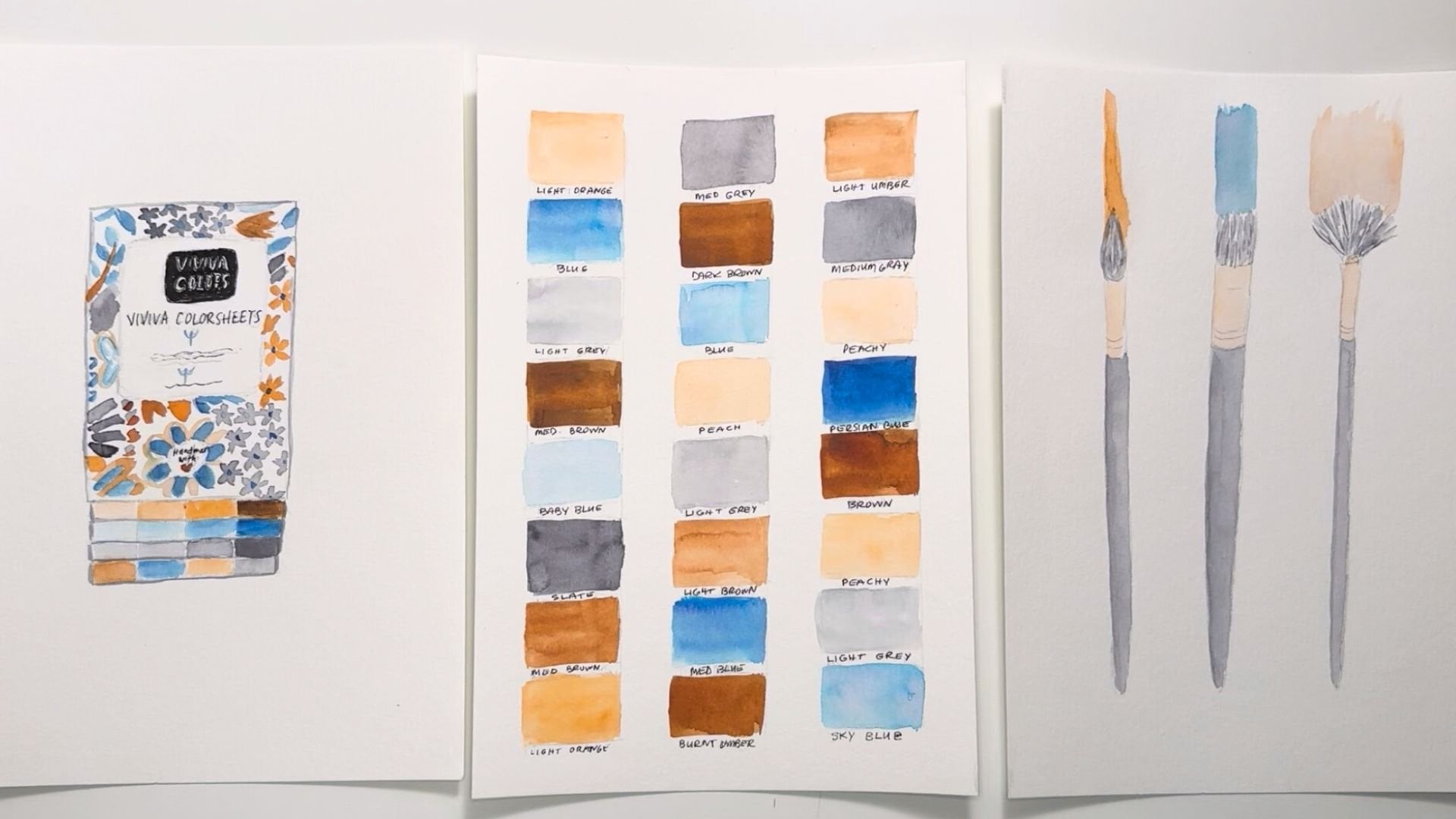
through my painting. A gum eraser will work as well. For paintbrush, all
you really need is one round brush technically. Round brush covers so
many strokes that, that is the only basic brush
you have to really have. You can have a different
kind of brush too it's just a round brush
is so versatile. This is a medium-size, technically is size 7, but internationally
they're not standardized. I think this is about an inch long if you want to
compare it that way. A ruler for when I
cut these pages up, I want to keep them
nice and straight. But you don't have to,
you can just wing it, which is one of my favorite
things to do honestly. Besides that I'm going
to need scissors to cut up my pieces with. You're going to need water. I love to use the
double jar system because my paint brushes get pretty dirty and
it stops me from having to get up any
sooner than I have to, so it keeps me painting
for quite awhile. If I have a really dirty
brush I can save one of these waters for the
really dirty rinses and then save one for
the clear rinses. Or you can just use this
as a second option. I'm definitely going
to need something to sop up water with, so my paper towels and you'll see how this
is one I've used before, so I've really use
these over and over again until
I can't anymore. Just to save on resources, especially paper and I'm
really trying to use my rags more and more so that I
use less and less of this, so I have that. Now, as far as options
to add to this, I'm going to probably be using a flat brush
because I have quite a big surface
here to paint, and so the bigger the
brush, the better. I'm going to be using a larger flat brush and I'm
probably going to be using a smaller round
brush for detail. I'm not sure yet. I also have this fan brush that is great for making marks, but you can get
creative with that. I also have a micron pen if I want to outline some
of my paintings, this is awesome to have. Then I have these
beautiful pilot pens. I love these pens. The ink is very nice
and saturated colors. I have like 25 colors. I love these for adding detail, or maybe I'll make my
lettering with this. I haven't decided yet, but I know that I do
love to use these. I also have this brush pen set. This is watercolor
brush pens by Arteza. I have 48 beautiful colors, they work so well. That's like a little brush
on the end of each marker, if you will, but the marker
contains watercolor paints. It's pretty genius. If you haven't used these, oh my gosh, I love them. I'm also going to be using
a little small test pad. This is just sketch paper, but you can see I have marked it all over the place and it's
just great for test painting. Like if I want to just
show you how this works, this one's a little bit dry, but most of my colors are really good and if I get water
to this, it will spread. It has that watercolor effect, but it's great for lettering, so this is another
option for me. Now as far as adhering your
elements to your background, I'm probably just going
to be using tape because tape lets the paper pop out a little bit and I love
that three-dimensional look. But you can also
use a glue stick. I have this glue, you just do this and
the glue sticks to it. I guess it's called a
glue roll adhesive. Looks like it's by adhesives. But you can find these at the art supply stores or
any other glue you have. You can use Elmer's
or whatever you have there that's going to keep your elements secure
to your background. As far as watercolor paints go, you can use anything you have or paint anything
that you like using. I'm going to be using
my Viviva color sheets. This is the original set, and I really like the basic colors in here that
I can mix and make my own. But you can see all
the basic colors. You can see this is all
pretty basic and simple. Use what you like if you have things that you like working with that are a
little different than this, please feel free
to throw them in. You'll find a full
list of materials in the projects and
resources section under the class videos and
also in your workbook. Now that we have our tools
and materials together, let's work on the theme
and subject matter.
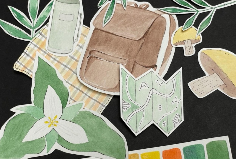
4. Theme and Subject Matter: [MUSIC] Let's start by
picking a moodboard theme. You can choose just
about anything for your theme like florals, art supplies, books, and so on. Choose something that
you like because you'll have way more fun with
this project if you do. I get super inspired
on Pinterest. All I have to do is
search one word and I get so many visual examples and the ideas can just
grow from there. If you have a favorite
search engine, this is a great way
to get inspired. Since I live in the desert, I'm going to use that as
my theme for this project. Next, I'll make a list of what subject matters will
work for my theme. There's a worksheet for
you in the workbook so you can jot down all your ideas. Write down as many
things as you can think of so you have plenty
to choose from, then circle the ones
you will be using and use the brain dump area
below for any thoughts, ideas, thumbnail
sketches, and so on. Keep in mind that you don't
actually have to have any other thing besides
the color palette itself. Before I had my brand colors, I wanted to challenge myself to create different
color palettes each month for my Instagram feed just to see what it
would look like. It was a really fun project
that I learned a lot from. You can visually see
it's quite lovely, and something that
you can do for your own social networking. Essentially, moodboards are used professionally to convey ideas, but you can create them
for visual play as well. I've constructed
beautiful mood boards in the past just by having a color palette and
all different types of art. For the purpose of
this class, however, I'm going to use the desert as my theme to show you
how I can create cohesive elements that bring this project
together in the end. I've decided on a succulent, a hummingbird since they're
plentiful out here, mountains since we're
surrounded by them, a sun, and some cactus. [MUSIC]
5. Color Palette: [MUSIC] Now that you
know your theme, you can choose your colors. You might even want to let your theme inspire your colors. For example, for
my desert theme, I'm using sky blue, neutral browns, and a soft blue-green perfect
for painting cactus. If your chosen theme doesn't have an obvious color palette, then just go to the
next best thing, which is your favorite colors. This can go a long way to making a project
extra meaningful. I've provided you with a link in the workbook to my color
palettes Pinterest board. It's chock full of color
combinations that are gorgeous. At this point, I have over 700 pins in here
that you can choose from. This is a gorgeous
color palette and any two of these combinations
would look amazing together. But there's lots and lots more. These roses with the green and
the gold, that's stunning. There's lots and lots
and lots of options. You can do your own
search here as well or on your favorite browser to find any color combinations
that you need. I just particularly
like the search engine because it's really beautiful, and it's a wonderful feast
for my creative eyes. By using the color wheel, you can pick a color
and look directly across it to find its
complementary color, and this will never fail you. That will always be a good
combination of colors. You can also choose the colors that are right beside another. Those are called analogous
color combinations. That's another
beautiful combination. They're really just
versions of one another. If you like fashion, you can always look at an outfit that you like that these two colors are
amazing together, they're a form of
complementary colors. If you like paintings, you
can look at paintings. Maybe you want to
choose some colors from a favorite
painting that you have. Maybe you have a favorite color or maybe you have
some colors in mind. I hope this inspired
you either way. I look forward to see what colors you choose
for your project. [MUSIC]
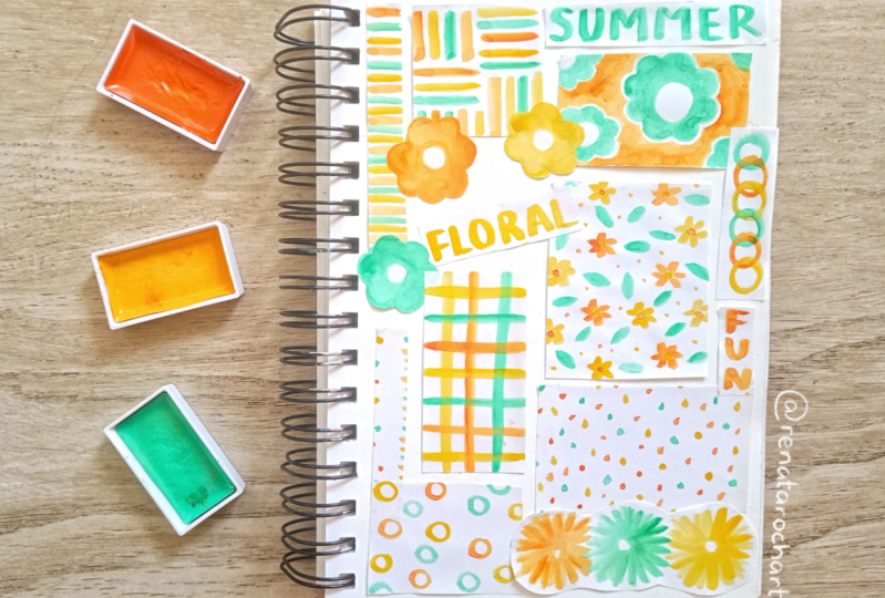
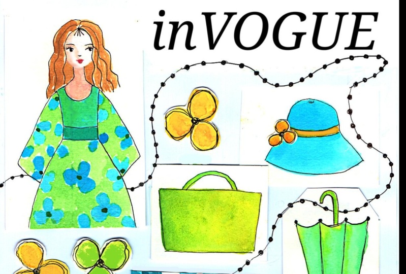
6. Mood Board Layouts: [MUSIC] If you're not
familiar with mood boards, it helps to see some examples. I have an entire Pinterest
board, of course, actually two, that I have devoted entirely to mood boards. One is for mood
boards themselves and the other is for
mood board formats. I've shared the link to these in the projects and
resources section, and of course, in the workbook. To clarify by layout, I mean, composition, there are so many different ways you
can compose your mood board. To understand how to create a
layout for your mood board, you're first going to need
to know the anatomy of one. Generally, every mood
board has a title, then come the visuals. I'm going to be including three main visuals to tell
my story of the desert, plus probably some
other little elements. I've almost always seen a color
palette included as well. At times there can be some additional elements to
embellish the mood board. Sometimes there are squiggles
are lines or textures. We'll be doing this
in the form of watercolor stickers and maybe even some painted
stroke overlays. You can keep it
simple and clean or you can lay your elements
for a more visual impact. You can choose to
have fewer elements or more elements on
your mood board. You can choose to have
just a few colors, or you can choose to have more. Just keep in mind that
the more colors you have, the more difficult
the project becomes. However, if you do need
more colors represented, that is completely possible. In this class, I'm going
to be keeping it simple. Just 3-4 colors
because I want to concentrate on the concepts
that I'm teaching you. None of these concepts is correct or better
than the other. It will really just depend on your style and what you like. Even if you don't know your
style yet, you do have one, and sticking to
what lights you up will get you closer
to discovering it. I highly encourage you
to lean into this. I want your project to be
something that ignites you and inspires more ideas
and/or projects. I would love it for it
to be something you want to hang on your wall
or keep in your studio. Keep it handy somewhere, so you know that you can turn to this technique
anytime you need it. After looking at a
bunch of layouts, I used my little
test pad here to cut some little test pieces and I've decided on a
layout much like this. What this looks like is or
what this represents is a portrait painting here, a square one here and
maybe a small portrait, smaller one here, maybe
much smaller than this. This will be the title
up here and these are the color palette colors,
probably in circles. But you can do these in
squares or different, we'll talk about that as we go. Then I might add some
additional elements or stickers maybe in
here, maybe over here. Once I have everything in place, I'm going to have a better
idea of where I can maybe use some extra elements to add some visual interests. These are the papers
I'll be cutting for my smaller pieces and my
color palette pieces. We'll see about the title. I don't know if I'll
paint that directly onto the background or create
another sheet for that. I've been thinking
about doing it right on the
background, we'll see. But that gives you an idea. This is something
you can do to sort and move your pieces
around once you've decided what your main piece is, that's the biggest, or if
you want them all the same, you want them in a row. This really helps to visualize your project
before you start, so there's just a
little less error and having to go
back and redo stuff. Hope that helped. [MUSIC]
7. Creating Your Layout: Now that I know what layout I'll be using for my moodboard, I'm going to decide
on the sizes of my elements and
cut out my paper. I'll set the pieces
on backgrounds, so they're all ready to go. I'm really just looking at
the size of my background, and visually
estimating what size each of my elements need to be. Keeping my mini model
close by for reference. I'm adjusting as I go to
allow for pieces that are too big or not shaped well to
fit and cut them down. Take your time on this step until you're happy
with your sizes. Then I'll see you in the next
lesson to start sketching.
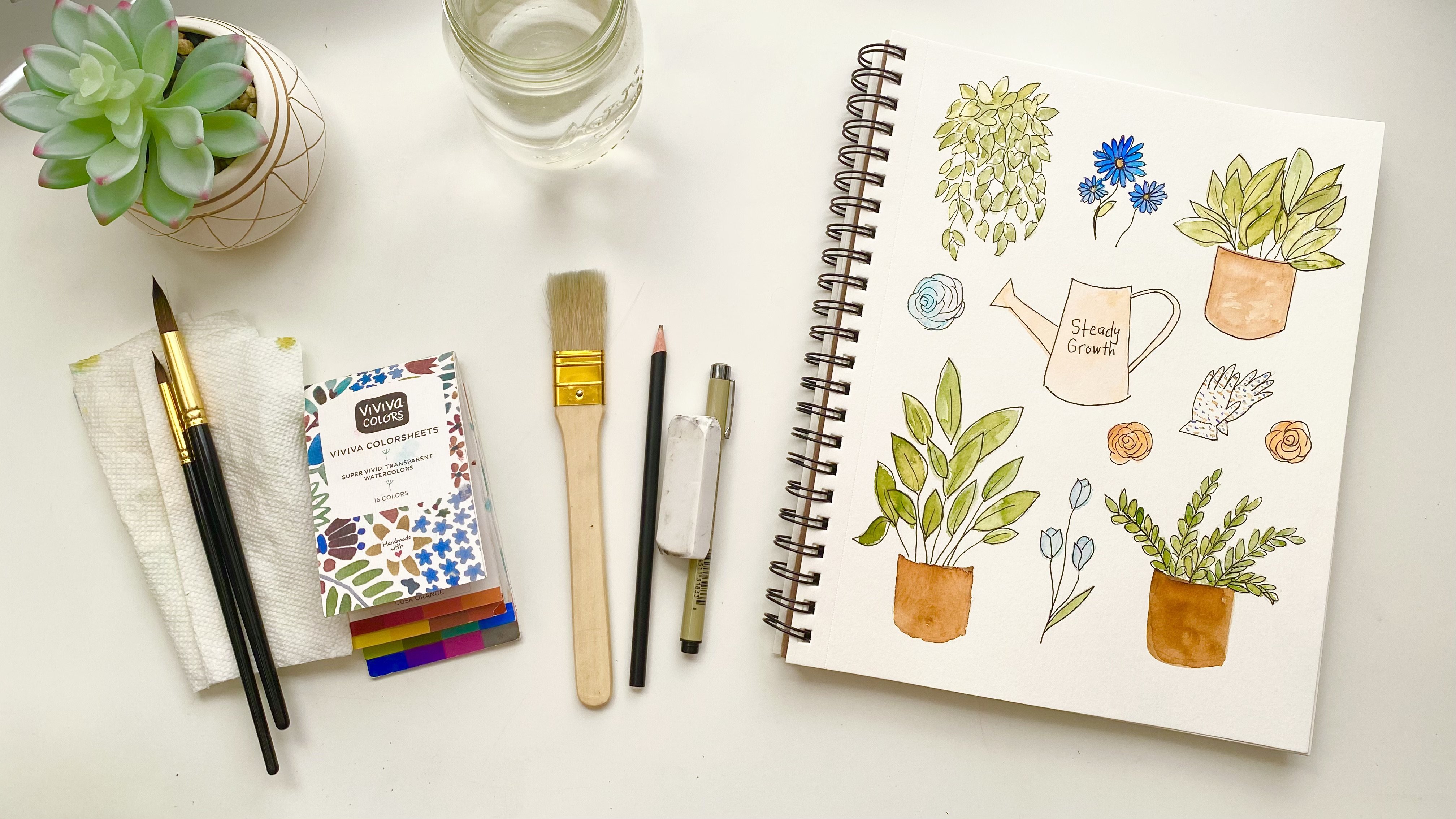
8. Watercolor Stickers and Additional Elements: [MUSIC] Since watercolor
stickers isn't actually a thing, I thought it would
elaborate a bit on this. If you've taken my abstract watercolor planner
and journal class, you might have already seen my process for creating
watercolor stickers. This is simply the
process of making little miniature
watercolor paintings on tiny watercolor paper and then cutting and sticking them
wherever you want them to go. Super simple, I know. But it is so much fun. They take a bit more time
and attention to create. But in the end, they are
so worth it because they add such a fun touch of
whimsy to any project. I'm going to make
watercolor stickers that go with my desert theme. Maybe some cactus or sand. Will you be adding watercolor
stickers to your project? There are also
different elements you can include on
your mood board. Elements I mostly see
are images, paintings, and lettering, but
you can also add graphics like
squiggles or shapes. You can even add a
colored background depending on the design. For the purpose of this project, there is a choice of painting types that you
can create as well. For example, you can do
an abstract painting, a line art painting, a full painting, or a
painting with no background. You can outline with black ink
or leave it the way it is. Maybe there are some
other options you could think of when
you get creative. I've made a list
of some of these for you in the workbook
in the meantime. You can go through
them and decide which ones you want to
use for your project. Stop the video if you need
to choose your elements, and then we can go
on to the next step in the process. [MUSIC]
9. Sketching: [MUSIC] I'm going to get all of these elements sketched out onto various sizes
of watercolor paper. This will help me to
visually organize my project so that when
I get my paints out, I'll know exactly
what I'm doing. Now that I have all of my
papers cut out and I have a little extra in case I want to do something fun with that, I am going to start sketching. I'm going to go ahead
and start with this one, which I can't wait
to get my hands on. This one's going to be
my hummingbirds sketch. I have an image I'm
working off of, but I want to reverse it. I'm going to go
ahead and start with the beak and the head. I want it to be centered
on this square, so I may have to do
this a couple of times. I don't know. I'm not being
too precious with this. I just want this to be quick and even maybe
a little rough. I don't know, we'll see. I'm just following the shape
and then we have the wings. Hopefully I left
enough room for that. It goes down in a triangle. Then this one comes out from
behind his head like this. That not bad. I think I might be able
to work with that. Its little feet here. I don't want to
get too detailed. This is just going
to be filled in. Maybe I'm actually going
to make this bigger. I want it to take up
a lot of this page, a lot of the space rather. Maybe I'm going to make this way bigger so it gets much more visually interesting
with that wing all the way to the end, and this wing a
little further out. I'm just going to erase all the pencil
lines I don't want. I'm going to lighten
them because I don't particularly want them to show once I've painted. Sometimes when you
paint over it, you can't get your pencil
lines off anymore. So that's something
to think about. I have my trusty
[NOISE] and this is a little brush I got from my garage and I'm just going to sweep the eraser
dust off with it. One handy tip. That's a much better
use of this space. I am just going to refine the shape of his head
just a little bit more. With that is pretty done good. Again, I don't want to get
too detailed with this and get crazy with all of this, getting too finicky
with all of this. I'm going to leave his feet off. I think that's a nice
fill in of the space. It's even up and down and
it's even side-to-side. I'm going to go
onto the next item, which is going to
be my succulent. I want it in one of these
tall portrait shaped papers. Again, very quick, you can see the shapes are
just so simple on this one, and this is exactly what I'm
going for in this project: simple, clean, quick. Definitely you can do make
this project more complicated. But because I want to focus on the concepts of
building a mood board, I want to keep the rest of this very simple and that's great. So that will be another
simple painting. I think I'm going to make
this one a line painting, so I'm just going to do the outlines and I'm going
to go ahead and just lighten this a little bit more so the pencil marks don't show
through my paint too much. It might fill in the
container. I don't know. When I get to that
painting stage, I think I'll have more clarity. That's one thing that
you could think about so you don't get bogged
down in the details. It's just keep going. If you're not sure about
something, just keep going. A lot of times the
answer will just reveal itself as you go forward. Now this next one I want to, I didn't think about
doing this horizontal. Again, as you're going along, you might get new inspiration and that's been happening to me. You can see my layout
has slightly changed from the last time
I talked about it. That's okay, just
allow your piece to evolve with you and as
you're creating it, it's really extra fun that
way because it's almost like the art is in
collaboration with you. It's just feel so much more
of a hamburger connection. I'm going to turn
this one to the side and slightly move my other
pieces around a little bit. I can even overlap. I don't know yet. But I think I'd like to do a mountain and I'm just going to wing this one from memory and a sun because
that's what we look at out here in the desert. This is the view we get every sunset [LAUGHTER]
and even sunrise. So I wanted to include that. Maybe this is a little bit big. This one I might make a
full painting because, again, it would be so simple. I'm just going to fill in the
mountains, fill in the sun, and maybe do a
sky. I'm not sure. I think I'm going to
keep this a sunset, so I'll keep golden tones, which will be great
for the colors I've chosen from my color palette. I love circles, but you
don't have to do circles. You can do squares, or blocks, or just brushstrokes. But I'm going to go ahead
and go with circles and I'm just going to quickly because see, I'm
not even measuring. I'm just drawing
some circles down. I'll just keep my colors
generally inside this, but we'll see how they turn out. For my stickers, I have decided to do a couple
of cactus and a lizard. There's a lot of
little tiny lizards out here and they
stay out of your way. I hope you're not
creeped out by reptiles. I generally don't love reptiles, but the lizards are adorable. They just stay out of your way and just do their thing and
they eat a lot of bugs, which is really nice. [LAUGHTER] They do
a good job out here of maintaining their
end of things. I wanted to show that, and I'm just going
to modify this a little bit to show
that tail curving around since I don't
have a lot of space, it makes it more
interesting anyway. Its little arms, I'm not going to get too fussy with the fingers part of it. I think I like the one
on the left better, so I'm going to redo this one, make this a little chunkier. Then these back legs
going the same way. Just, again, not
getting too detailed. I'm not doing it
just like the image because I don't want
to get that detailed. I'm just going to do a quick
version. That's great. Again, I'm going to
lighten this up a bit, although I have an idea for
this and I think I might keep this dark pencil line for now because I might
just do this in ink. We'll see how we do. Then for this one I want
to do a barrel cactus, so they're super tall. We don't have barrel cactus
in the Mojave Desert, but we have them
nearby in Arizona, and they're super cool. I just love this as
a desert staple. They have these
seeming lines going down where the needles are. Then on this one, I think I'm going to
do in our Gabi cactus, which is very similar to this, but it's its own thing coming
right out of the ground. [NOISE] I don't have to
get too fussy with it, but I want one more
maybe right here. Again, I'll keep this one. Keep these pencil lines dark. I'll just show the
ground going like this. Oh, I like that. Maybe I'll show the
ground in this one too so these match a little bit. Again, I got ideas
as I went forward, and that worked very well. This could be a cute layout. Now the last thing
is my lettering. It might take me a couple
of times to get this right. Again, this is not even straight as cactus, but you know what? It's organic. I love the quickness of this and I'm
just going to go with it. I might have to do this a
couple of times as I said, because I don't know what the space I am going to have
to spread these way out. [NOISE] I've chosen a block letter just to keep it really clean. It goes with the
color, the simple clean vibe I'm going with. That's so much better. I could just ink that in and
put it there or paint it. I haven't decided
on that at all. I think I'll just leave these to the side and just see if
anything comes up I want to add, but I'm really happy
with this layout. I think this will work very
well as an end project. Let's get onto the
painting. [MUSIC]
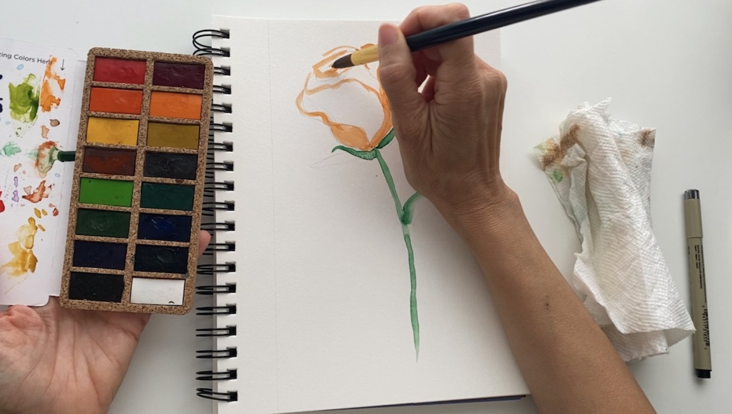
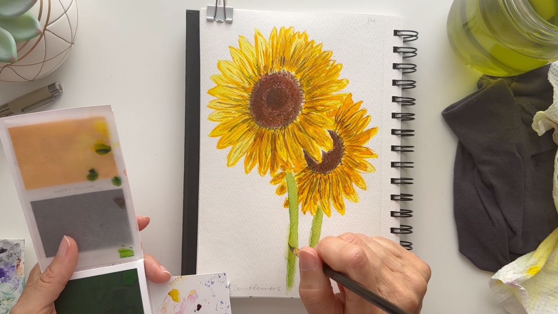
10. Painting the Background: [MUSIC] Now that I have
all my sketching done, it is time to paint. [LAUGHTER]
This is the fun part. I'm going to start by actually
painting my background, which is something you don't
always see in a moodboard, but I've decided I
really want the color to really shine on this project. I'm going to take all of my
little moodboard elements and I'm going to put them aside, and I probably should
tape this down, but I'm going to be moving
things around a lot. I'm going to just let this dry a little curly and
I can always put it under a book or something heavy so that it
can flatten out. I want it to have some texture and bumpiness anyway
because again, this is a very gritty project that is not supposed
to be perfect. I'm going to go ahead
and get my blue going. This is a Persian blue in my
original Vivido paint set. I'm going to get my
brush fairly wet. My colors dry pretty fast
out here in the desert, so I have to move quickly. If I get a little paint on
my table, that's all right. I can wash it off. Instead of actually
doing a wet on wet, which would be the
easiest thing, I'm going to just apply my paint as light as I
can and just keep it moving that way because I think it will buckle a
little bit less that way than if I wet the
whole thing in advance. I wouldn't even make it down
half this page and it would be dry already because
it's so dry out here. I'm just going to
keep this going. It's working. I was going
to put some clouds in here. I don't know if I'm
going to do that now because I don't think you'll see them for all
the elements anyway, and it would be a shame
to have them under here and not be able
to see them because my elements are big
compared to this size, so I'm going to
let the clouds go. Again, one of those
split-second decisions that you can make on the fly. [MUSIC] I could use a bigger brush, but the bigger brush that I have is not for watercolor and I have a moodbrush
that's bigger, but it puts so much
water on the paper that I don't think in this
case that will be in my favor. I am going to leave all
these crazy variations in color and texture in here because
I think that'll add to the visual interest here. Maybe I'll even leave some
white spaces. We'll see. I'm liking these
up-and-down strokes as opposed to the side-by-side. I think it makes it feel
taller and more elegant. [MUSIC] Again,
there are no rules. We're just playing and
we're just being intuitive. That just makes it so much more relaxing and approachable. [MUSIC] I think I will fill in the white spots. I don't think I like
them that much. I think that's going to take away from the
white backgrounds that I'm hoping to have
in my element paintings. [MUSIC] I got a little brown in there which
I wasn't planning on. I think I'll just wet
that and just gently dab it with my paper towel because there won't be probably
any elements as far over, so I want to make sure
that's not visible. Now I'll just put a
little more blue over that. That should do it. [MUSIC] Fun. Almost there. Just going to try and
get some of these edges. Cool. I'll let this dry and we'll go ahead and start on the other elements. [MUSIC]
11. Painting the Main Elements: [MUSIC] I'm going to start by
painting my backdrop paper. This is definitely not required. In fact, most foods boards
are on white backgrounds, but this time I wanted
to do something a bit different to showcase the
watercolor paints a bit more. So I'm going to be painting
my background blue and I plan to leave some spaces
at the top for clouds. That's a pretty sophisticated
move for a backdrop. But again, I wanted
to do something a little more artsy
for this one. I've cleaned up my surfaces. You can see all the blue is gone and I'm ready to paint some of these other paintings. Let me get my brush
out of my water. I'm going to continue
using this brush. The round brush is
generally my favorite. When I have larger areas, I do love to use this. It's just very fast. So I am going to be
using primarily browns, a light green, and a lighter version
of my browns. Let's go ahead and
jump into some brown. I'm going to keep
this here in front of me and we've done the
background with this one. So I'm going to be focusing on these other colors and maybe
a darker brown in this, just to add some
interest here and there. So yes, I'm going to go
ahead and start with some brown and I want to keep it light like a terracotta almost, which will be perfect for a plant pot and I'm going to go ahead and
fill this plant pot in. I'm going to put
more paint in here, with the intention of
letting it dry really rough. I don't want too much. I want a lot of character on this because my elements
are going to be simple. So I want the paint
to be the star. [MUSIC] I'm going to
let that dry before I paint the rest of the plant. I'm going to go ahead to this mountain because
I'm going to use this same brown
for the mountains. So I'm going to fill my brush. This is the burnt umber, if you're wondering
what color this is in the Viviva palette. So if you have this paint set and it's the burnt umber color, which has a lot of red in it. It's perfect for this color
palette that I've created. [MUSIC] As you can see I didn't even really think about how these mountains
were going to look. I just dove in, I just did some jaggedy lines. I didn't worry about the perfection of it or how
it was supposed to look. I'm just playing and
it just makes it less intimidating and I can
just feel like I'm just having fun and
relaxing into this. So I hope that's what you'll
do with your project too, is just allow yourself
to play and experiment. Of course, if you want
to add more detail, you are certainly
welcome to do that. But I don't want it to keep you from completing your project. That's the main
thing. Great. So this is a little darker than the
rest, but that's all right. I think that'll be interesting. I might want a little bit
more brown right here where, I may have stuck my finger there or drop some
water. So that's great. It's not perfectly
up to the edge, but that's all
right too [MUSIC], I think that this hummingbird should also be the same color. I didn't even think about
that in the beginning. Or I guess I could make it blue. The hummingbirds are
actually brown out here, but that doesn't mean I
can't change its color. Or could be
interesting is to add a combination of
brown and green. That could be really fun. So, yeah, the hummingbirds
are brown out here to blend into the desert colors. We don't get too many super
colorful ones out here, which is sad, but it totally makes sense. They have to blend with their
environment to stay safe. It's part of their protection. Although hummingbirds
are pretty aggressive, I don't think they
need much protecting. [LAUGHTER] They are the god
of war for certain tribes, I think in South
America, I don't know. If someone knows,
please correct me. South America or Africa. I think I've definitely heard that in a lot of
tribal communities that the hummingbird is
actually the god of war. It's not a tame little creature, but they're super friendly. They'll come up and
see what you're doing and they're just really cool. I love them so much. I'm going to try to keep my darker stroke
around his head. Even though it's going
to be all one color, it will look like it's
got a little shadow up here and I might just blend that into
the rest of the body so it's not too different. I don't want to look odd. I definitely want
more character. It's a little too even for me. So I'm going to add
some water and blend this and let some of these, they're called
watercolor blooms, form where you see the
round, hard edges. I just absolutely love that. It's the only paint
medium that does it and I want to rock it for sure, make sure that it's
doing its thing. I'm going to leave this one
wing alone because then it'll stand out as in the background because it
doesn't have any texture on it. Add a little more water here. You can see the texture
starting to form. I love that. [MUSIC] [LAUGHTER]
12. Painting Additional Elements: [MUSIC] Now, I'm going
to do my color palette. I'm going to go ahead
and put my brown in first and I'll try to
stay within these circles. But, again, I'm not going to
get too precious with it, I'm just going to
drop it and go. Maybe just a little bit
more to show some of the dark portions of that brown. Let's do the lighter version of this with some burnt sienna. I didn't mean to put
it there though. I wanted to put it over one, so it doesn't look too
perfect on this palette. This is great. The pencil lines will show a little bit,
but that's all right. Oops, I'm doing it again. Have you ever done that before, you didn't mean to do something and then you
do it more than once? It's interesting. [LAUGHTER]
I'll just put it that way. Great. I guess it wanted
to go on that second one, but I visually think this
will be more interesting. Then I'm going to do the blue, so we'll have warm,
warm, cool, cool. [MUSIC] It's gotten a little
bit out of round. Let me just dab that a
little, and that's perfect. Then the very last one is
going to be the green. I'm going to use my Viridian. [MUSIC] Now, we're
back to green. I need to add some more blue. It's like that with
mixing colors sometimes, it doesn't always work the first time, you just
have to play with it. Let's see what I've got.
I need my test pad. That's not bad if
I keep it light. I'm going to go
ahead and put what's left in my brush down here. That's pretty darn close, I like it a lot. Watercolor will always
dry lighter anyway. I'm going to leave this, will be a nice rich color
without being too bold. I love the mutedness
of it, beautiful. We've got our color
palette and stickers. This will be on a
blue background. At least these two will
have a white background. I think I'm going to paint
this one all the way through, and then these, I think
should be orange. I'm going to paint them
this burnt sienna, which is the lighter brown. [MUSIC] Sweet. Now, we'll add the second
layer of paint to all of this. I'm going to use my green to go ahead and start
painting in these leaves. This is way darker
than what I wanted, but what I'm going to do
is just keep spreading it around the plant like that. I don't even have to get any more paint on my
brush because there's so much paint on this
painting already, I'm just going to use that as my palette and just
spread it around. Great. Looking good. I eliminated this smaller leaf or maybe I will outline it. I don't know what I'm
doing with this yet, but I think I want
it a bit taller, so I'm going to get just a
little bit more water and just spread this paint
out just a little more, make this a little thicker. I think this one in the
middle can be the tallest, just like that and maybe one more tall one
here, and the rest are fine. [MUSIC] That's done. Now, I'm going to add the
burnt sienna to the sky. [NOISE] I really didn't want the mountain to
start dissolving, but it's what's happening. I'm just going to brush that downward and use this
to paint over here. [MUSIC] I think what
I'm going to do with the sun is just add a
little pop of muted yellow. I have a yellow ocher that could be really
perfect for that. But I will let this dry first. Even though it's not
in my color palette, you're allowed to cheat, [LAUGHTER] it's called
artistic license. You can do anything
you want with your design if you want to
add a pop of something. I put this yellow will blend
in beautifully. [MUSIC]
13. Painting for the Finish: [MUSIC] I was going to add a little green to my
hummingbird. Let's do that. Now this green is
really saturated, so I have to water it down, but I think I'll do it
right on his belly. You know what? What if I
did it all the way through? I love that idea. Just dabs and dots
here and there. Fun. Give it a whole
different personality. It'll pick up the green in the color palette
and in the succulent, which I hadn't even allowed for. That is cool. I'm going to leave this
back wing once again, just the way it is so
it really stands out. Fun. I love that. It adds a design to it
that wasn't there before, maybe a little
more on this wing. Stabs and dots and I'll
just let that dry. I love that so much. Now, I think I'll add some of
this green to my stickers, which I really wasn't
planning on doing. But I think I'm going
to do it anyway. I probably could use a
detail brush for this, but I want a roll. I'm going to keep it going. Just keep these a little bit
away from one another so I don't blend them all, they don't fade all
into each other. Just using the very tip of my brush gives me
so much control. [MUSIC] I have my sun to paint. Now that this is dry, I'm
going to add some yellow. I'm going to do my
yellow ocher so it doesn't get too
bright or anything. It's still got that
brownish look to it. That is perfect. [MUSIC] I don't want to add just a little bit
of fill in here and here. That's looking pretty darn good. Great. I know this got a little messed up there,
but that's okay. I can just finish it off at the end when
that yellow is dry. I love this, I love
this, these are drying. This is fantastic. We are getting there. Now the last thing, move these out of my
way a little bit, is going to be my lettering. For this, I think
I will definitely add that background orange, so the burnt sienna. Just keep it light. I want to keep it light
because I want these to pop and I want
this more quiet. It's going to be the
longest, widest element, so it's going to have plenty of real estate and it'll
be noticed plenty. It doesn't have to
be super colorful. That's great. I'm just
going to let that dry. Add some little extra strokes. Super. I don't know
if you noticed, but I made this a
little skinnier. Again, you can change
things as you go. Maybe I need to add
a little more color up here. That's better. This is going to buckle,
but I'm just going to keep it down while
it's drying or I can just let it dry and then I will have all
my elements painted. I'll see you in the next
lesson to detail them. [MUSIC]
14. Ink Details: [MUSIC] Everything is dry now. I'm loving how it looks and
I'm just going to go through and I'm going to add some
detail with my black Micron. I wasn't sure if I
was going to do this, but I think black will give
it a nice finished look and bring some of
these details out. With my Micron pen I'm
just going to carefully, oh, this one's not very good. I usually use a 0.8
and this is 0.5, it's too skinny for me. Let me go to this
one which is an 08. This is an 005, super skinny. Not really working
for this project. I need something a
lot more visible. I have cut this a little skinnier and my letters
have moved down, so I'm going to just
adjust them as I go. As neatly as I can, I'm not a great letter. I don't consider myself
a letter at all, but organic lettering in your handwriting will
go so far to feel so authentic that I'm
pushing myself to do more and more lettering
all the time and I'm fine having more fun with it as I go. It's quite a revelation. I encourage you to dive in if
you're not comfortable with lettering and just
do it. That works. I want to maybe put some circles around my
color palette, colors. I'm not measuring or
doing anything fancy, I'm just even letting some of the colors go
outside the lines. It's still going to give it a much more finished
look. Just like that. Maybe that's my answer to this scraggly looking mountain
because I can finish it off with an outline
that could work. I won't have to
repaint anything. That will come off later
and the sun too, I think. I think I'll just go
around this hummingbird. I wasn't sure if
I was going to do any of this but I really liked that finished feel, and so I'm just going to go over every
single one of these. [MUSIC] I'm just going to make some dots for the
texture on this barrel cactus. [MUSIC] I was going to fill them in with
black but I think it's just going to be too much black. This might be a
good time for me to come back and do
some adjustments. For example, I think I'd
like to bring my pinks back. With this little detail brush, let me get my water. This is a great time
to just go over what you've done and make sure
you're happy with it. I want to definitely add a few things with
some burnt umber. I think I'd like to make
this lizard burnt umber. Burnt umber. Very close to the color that
they actually are. They're a little more
sandy but that's okay. [MUSIC] I'm going to
add a little bit of burnt umber to the
ground on both of these. Just a light layer. [MUSIC] Cool. I'm really happy with those. Now, I have all
my elements done, adjusted where I want them and we can start assembling
our moodboard. [MUSIC]
15. Mood Board Assembly: [MUSIC] Now it's time to
take everything we've done so far and put it all together. Using my composition type, I'll place all my
elements around the backdrop until I'm
happy with the layout. You can see I have my
background all dry. I love all this texture
on here from the paint, and you can see it's
dried a little curly. It's got up on the edges a
little bit, but that's okay, I can force it back down, and when I'm all done, put it under something
really heavy. But in the meantime I can
work with what I have. First of all, I know this
is going to go at the top. I'm going to go
ahead and refer to my original little plan here, my strategy, and then see
what I want to change. I love this succulent over here. Let's see how are we
going to do these pieces? I want to keep them
around the same distance from the edge. I know I want my
colors down here, and then I've got my stickers. I am going to arrange
them like this, and the lizard will be
crawling over both of these. I'm just going to play
with it a little bit. Maybe I'll do it this way. They're not that even, so I have these two together and this
one a little separate. Do I like that? Let me play with some
other arrangements. I could do this, bring this up, bring this over, and then give these more space. Wow, I like that way more. Cool. You definitely
want to revisit, even though you have a plan, now that it's painted, you might want to
just go over it and see what you want
to change about it. I love that these
two are at an angle, and then this color palette goes in a little bit
of a windy circles. This is a stuff that
really brings life to your composition is when you have things that are a
little bit asymmetrical. Again, having them in a row, there's no problem
with that at all. I just really love playing
with the composition, putting these together and
then these ones separate. Surprises the eye. It's expecting it
to be in a row. I like to tweak it and give it a little bit
of a surprise there. I like where all these
pieces are sitting and I'm actually
going to use my tape to adhere these because I want the freedom to be able to move them around
later if I want to. I am going to just take a
moment and put tape behind like an a row and put it
behind all my elements. This gives me a chance to
stand back and make sure I'm happy with where
they all are as well. At some point I might
want to glue them just because this isn't going to stay very well if it's curling and there's only a little
piece of tape on there. Definitely want
to tilt that out. Again in here in the desert, it's so dry that
glue can drive very, very fast too, so it's tricky [MUSIC]. There we are. I've
finished mood board. I really like how this came out. I love the colors. I love how everything's
interacting. It's like the hummingbirds
flying through the desert, flying over to the succulent. You have the lizard over here
with its little plants that it lives in and
our color palette. It tells the story of what
it's like to live out here and the things I see
every day and experience. I really hope you
enjoy that and I cannot wait to see
your project [MUSIC]
16. Let's Recap: [MUSIC] That was a lot. Let's do a quick recap. Gather all the supplies you need to complete this project. Feel free to be creative
with your art supplies. Pick a theme for
your mood board. Choose something that you
like because you'll have way more fun with this
project if you do. Choose a color
palette that will be carried throughout your project. Your color palette can even
be your theme if you want. Choose your mood board layout. Now sketch out all
your paintings and watercolor stickers,
AKA, elements. Paint all your elements for the mood board and let them dry. Then stand back and make
sure you don't want to make any changes before
moving to the next step. Because now it's time to put
it all together and assemble the mood board using your
chosen layer as a guide. Keep in mind that
nothing is set in stone. You can still shift and
rearrange your elements until you're happy with
the total composition. That's it. Congrats on learning how to create a mood
board of your very own. If you haven't already, it's time to create a project and upload it to Skillshare.
17. Thank You!: [MUSIC] I want to send
you a huge sincere thank you for watching
all the class lessons. I am so excited to share this process with you
because I know it holds a potential that most artists are not
even tapping into yet. Moodboards are already being
used by professionals, but can be such an
incredibly helpful tool to you as well. Why not dive in and
see all the benefits? Now it's your turn
to choose a theme, find your color
palette and create your very own
watercolor moodboard, or you can follow along
with me on my project. Either way you'll be
practicing new skills and techniques that are designed to take your work to another level. My hope is that you've learned something new about
how to perceive your own work and
how to approach projects with more strategy
in mind in the future. Before you go I'd love to
ask you if you can go to the Reviews tab under the class videos and leave
me a review for this class. This helps others find the class plus it helps me to
improve classes, which is really important
to me as I want to keep bringing you a
quality experience. Yes, you can earn your
Skillshare badge for that too. [LAUGHTER] Also, don't forget
to upload your projects in the Projects and Resources
tab, if you don't know how, I've shared step-by-step
instructions in video number 2 called Your Project and
also in the workbook. I cannot wait to see
what you create. See you next time [MUSIC]
 Chris V, Artist, Designer, Maker