Transcripts
1. Intro to Watercolor and Ink: From Small Illustrations to Beautiful Themed Artwork: Many think that
artwork needs to be complicated or sophisticated
in order to be great. But that's not the case at all. In fact, some of the most beautiful
work that I've seen is the simplest, riced, most imperfect
workout there. Your simple imperfect
illustrations may not look that
exciting to you, but they might look
absolutely lovely to someone else. This concept reduces
creative block, and can get you moving and inspired when you
might be stalling out. Hi, I'm Chris, former Retail Management
Professional turned full-time Freelance Artist and Designer living in the desert. I love art and design
and I've been teaching creative classes on
Skillshare since 2016. My specialty is demystifying processes that look hard and helping students
gain confidence, which I've done
for thousands now. If you've watched any
of my other classes, you'll know that drawing in
watercolors are my favorite. I'm so excited to have you back in the studio
for another project. In this class, I'm going
to show you how to start with theme, strategize
the placement, colors, sketch, and finish with some paint and outlining
to polish it all up. We'll be keeping
illustrations small and simple using ordinary
subject matters. I'll be doing a botanical theme. But if you're more
experienced feel free to jump in with any
other theme you like. What I love most about
this process is that it's perfect for everyday art or projects with
a special theme. Also it can be used for so many different applications
like sticker sheets, posters, prints, greeting cards, surface pattern design
like wallpaper, wrapping paper, fabric,
package design, and the list goes on. This class is for beginner
to intermediate artists who have at least some
drawing experience and love watercolors. Especially if you're
looking for a fun and efficient way to spice
up your artwork. Who can take this class? If you're a painter, a surface pattern designer, or a graphic designer, a crafter, a ceramicist, or any other type of creative, looking to maximize your process of
trying something new, you'll get something
out of this class. Why learn this? You'll walk away with a new
appreciation of how ordinary objects can
become beautiful works of art when they're
grouped in smaller form. Fashion and home decor
magazine editors use this process called Editorials to show off the latest styles and
accessories of the season. That's why this is the perfect way for you
to showcase your art, to share on social media, and your portfolio as
gifts or anything else. I cannot wait to show
you this process, so you could do it for your own projects and
level up your skills. Are you ready to go from
simple illustrations, too beautiful artwork? Let's get started.
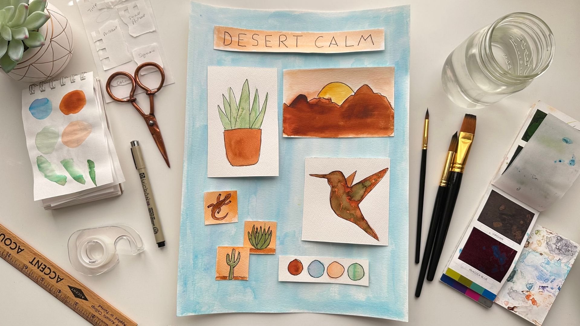
2. Your Project: [MUSIC] Your project in this
class will be to come up with a theme or
follow along with my botanical theme and create a full page of small
simple illustrations. I'll show you how
I use a sketch pad to strategize the placement
of my small illustrations, then I'll take you
along with me as I make my final sketches on
watercolor paper. Next, we'll paint an outline now with archival ink
for a finished look. I'll take you through
my entire process from start to finish so you know exactly how to do this for all your
future projects. Finally, I would love for you to upload your project
into the class in Project Resources tab under
the class videos. Here's how. First you'll go to
the Projects and Resources tab under
the class videos. Then click the green
"Create Project" button. From there you'll want to upload your cover image
for your project. Choose a file, then
click "Submit". From here, if you want
to replace your image, just click the button
below, find an image. Below you can make it larger
or smaller with the slider, or you can drag it side
to side to position it. When you're happy,
just click "Submit". Now your project needs a title. It can be funny, descriptive, or whatever you like. Below is your personal
project field. Click "Image" to
add image files. Then position your
cursor underneath the image to add descriptions. I'm adding a series of images to show my entire
process for this project. You can do it any way you like. Below you can also
add a video or links. When you're done, just click
the green "Publish" button. Once it's published,
you can go below the videos and see your project
on the right-hand side. When you click on
it, you can see that all your images
have uploaded. On the right is where people can comment and like your project. I comment on every project, so I can't wait to see
you in this space. One of my favorite things to see is what other
artists are creating. I cannot wait to see your project if you'd like to share it with
me and the class. I never grew so quickly as when I started
sharing my work. I know you'll benefit from
completing this step. It can seem scary at first, but the more you share, the easier it gets, I promise. Artists connect so deeply when bonding over each other's art. So this will also help you
build connections and gain confidence as well as learning new techniques from
others. [MUSIC]
3. Tools and Materials: [MUSIC] I just want to talk a minute about what
I'm going to be using for this class.
Again, very basic. If you've taken my
classes before, you'll know I like
to keep it super simple because I can
just dive right into the process and really enjoy
myself with the art itself. First of all, I'm
going to be using an HB pencil for sketching. It keeps it light just so I don't have to worry
about my lines getting really dark and unerasable and then I've got a gum eraser. It's actually a polymer eraser, but it doesn't leave black
marks on my paper that can damage the paper and ruin
the way my art looks. That is one. Gum erasers
are another option. Here's just a paint
brush from my garage. I can brush off the
eraser dust quickly, easily and not have
to worry about getting oils from my
hands on my paper. As for paper, I am using a Canson 140 pound cold
press watercolor paper. This paper is good quality, it's not super expensive, and it has a tear sheet. Just so if I really want to take this out and frame
it or hang it, I can do that, but it still has that
sketch book convenience, where I can flip through
and see all my art easily. This is nine by 12, so it's a nice work area, but you can work on
smaller paper if you like. I often work on, is this five by seven? I think it might be. This is a Strathmore cold press
[NOISE] watercolor paper. It's also 140 pound and yes, it's five and a half
by eight and a half. That's this size, but I do a lot of quick paintings on this size, but you can choose
whatever size you like. This project is going
to be your project, so go ahead and choose
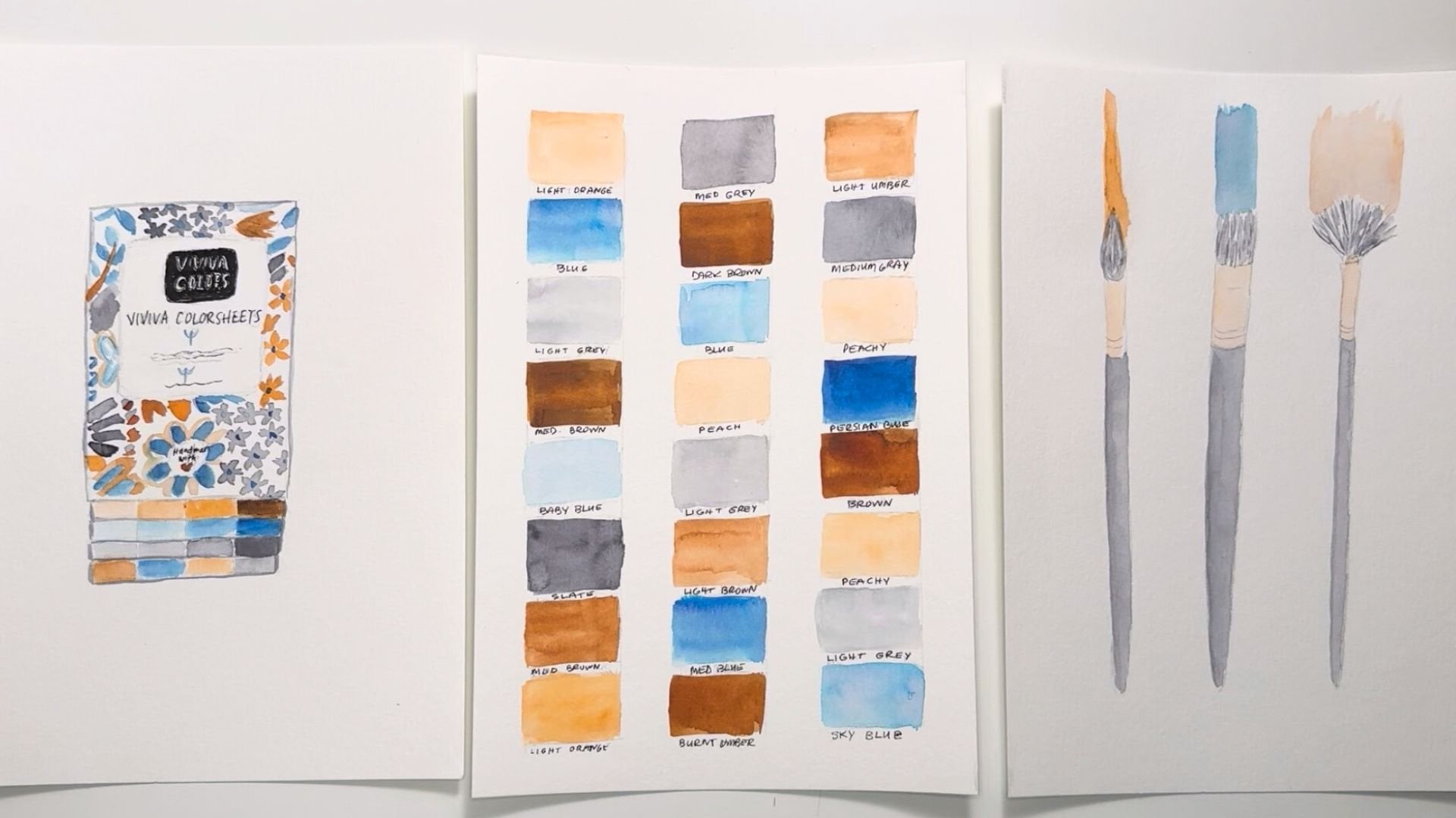
what you like to use. For brushes I've
got a large round, well, this is actually
a medium round brush. It's a Size 7 and
this one is a Size 3. If you don't have a
small round brush, you can definitely substitute
with a basic detail brush. But we're going to be
painting small items, so I know I'm going to
need something to get into some little bit of detail. For paints, I'm using my Viviva Colors color sheets,
they're super convenient. But other than
their convenience, aside from going out and
painting when I'm out and about, I love to use this
in my studio because the colors are so vibrant
and it's just easy to use. It's easy to hold in my hand. It has its own
flip-out color palette that I can clean and
use for next time or continue to use
these colors and it has 16 colors that last as
long as a regular half pan. I've been using this
for a year and I'm still not even close to
using all this paint up, but when I do, like
this one's getting close and it's starting
to separate a little bit. I can buy a replacement
for any color I run out of and so it's just super convenient and easy to use and I use it for a lot of projects. That's the paints I'll be using. I've got two jars of water because I get really
intense with my color a lot and if one jar
gets too saturated, I have a second one or if one jar starts
getting really dirty, I can rough clean my brush
in one and then final clean it in another to
make sure it's really free of color before I
move on to the next. Then of course, paper towels
or rags if you prefer. I use a combination of both and so I'm trying to be a little kinder to the environment as
much as possible. But sometimes I need to see
my color on a white piece of paper towel and if I don't
want to paint it all up, I want to use it for
sopping up or whatnot, I have this little
tiny sketchpad. It's literally
just sketch paper, it's also a Strathmore
sketch sheet. This one is three and a half by five inches, so
it's pretty tiny. But I can just do some
test painting on here to test my colors against
a white background. I use this quite a lot. It's a nice handy tool. I'm also going to be using a basic sketch book to capture some thumbnails
and do some strategizing. I'm also going to be
using a Size 08 micron to outline my illustrations. I do like the look of an outlined illustration
with black. It really makes it pop, but you could also use colored pencils or
markers if you prefer. That is all we're
going to be using. Let's get started
with our project. [MUSIC]
4. Getting Inspired: [MUSIC] If you'd like to try coming up with your own theme, maybe you'd like a little
help getting inspired, Here are some thoughts for you. If you love nature, perhaps a floral
theme could be fun or a forest theme as
I mentioned before. There's also ocean
themes, bird themes, desert themes so a lot
to draw from there. If you're active,
you could choose hiking, dancing,
cycling, tennis. Obviously, there are so
many more options here. Then make a list
of all the things that have to do with that
topic that you've chosen. I like to think of themes
in terms of a storybook. If you envisioned your theme, what things might be shown
in the book illustrations? For example, if
you're a yoga lover, you could sketch out a
yoga mat, some blocks, a yoga outfit, someone
doing yoga positions, a water bottle and a towel. If you choose an ocean theme, you could do a series of small illustrated
ocean creatures like starfish, jellyfish, a clam, an octopus, fish and there are so
many other examples. You could even draw
some bubbles going upward to help tell that story. If you love sports, perhaps you can include a uniform shirt, a ball, a sport shoe, and even a trophy. Take your list of items
that you've put together, and choose a half a dozen
things you'd like to include. We're not going for
12 or 15 items, 6-8 is perfect because we want to keep this project
simple and easy. If you get stuck, rely on your favorite
search engine. It's a great source to
get loads of ideas. Even if you'll be
following along with me on the botanical
project, for now, I've created a worksheet in the PDF download section
under the video titles so that you'll be able
to more easily choose themes for future
projects going forward. [MUSIC]
5. Color Palette: [MUSIC] Choosing colors for your project isn't always easy. This is another
common reason for creative block
because you probably think you need to be
a color theory pro in order to choose great colors. But there are some hacks
and methods that can get you moving and
feeling confident again, for example, already done
for you color palettes. I've shared a link to my Pinterest board
called Color Palettes, where I have hundreds of
combinations that are stunning and work well together. There is no shame in using color palettes
that have already been created because when you use them, you
learn from them. Osmosis is a wonderful teacher and this is a great
way to apply that. You can also simply choose
colors that you like already. The color palette
I'm using today is very close to my
brand color palette. I just love using
those colors because they feel familiar and help
tell my personal story. Lean into the colors you like. Use variations of them too, to easily expand your
options with little effort. Also, think about the
theme you've chosen. If it's different than mine. Is there something
about the theme that makes you think of
certain colors? For example, if it's a
forest theme maybe dark green sky blue along
with some deep browns and soft yellows
or an '80s theme where you might have some
bright pops of bold color. Maybe you're taking on a
holiday theme of some type, and there are some colors
associated with that holiday, which actually simplifies
the process a lot. Using one of these
methods to choose your colors should
make this easier. However, if you're
still struggling, please message me in
the discussions tab and we can figure
this out together. For the project like this, I wait until the
sketch is done because [NOISE] I can really see the colors come
alive on the page. I can more easily decide
what I'm doing with that. I really feel like I'm
really loving this. All of the color
it's like a green, but it's got some brown in it, so it's a softer green. I really liked that for these. I'm not like a
bright green girl. I know some of you
already love it, but it doesn't really
work with my style. I tend to like muted colors. I think I'm going to go with
terracotta on these pods. I thought it would
stay with the white, but I think a gray. But I think terracotta is really speaking
to you right now. I'm going to go with
this burnt sienna. Let's see what the
burnt umber looks like. Yeah, I think I prefer
this burnt umber, so I'm not going to go
with the burnt sienna, I think I like this one. It's more terracotta-looking. What other colors
can I pull in here? I really liked the
idea of a blue. Let me see what this
Persian blue looks like. That's pretty cool. I like that. I think some of the flowers
could be this color for the gloves I
think I'm going to dot them like I'm going
to make them a pattern. I think that would
be really cool. As for the watering can, maybe like a light
peach could be fun. For this to accent
the terracotta, but not mimic it too much. Let's see how I'm
going to do that. I think that this burnt sienna, I can take a more
watered-down version of it and work with that. Let's color that
down really lightly. I think that will be
beautiful. I love that. A version of this
but much lighter. What else do we have here? I'm going to go ahead and maybe make all the flowers blue. There will be green here. We'll have a balanced
blue going around here. Actually, maybe I'll combine blue with this peach for
some of the flowers. That can be really pretty. I'll have to figure that out. I don't want too much color on one side and not
enough on the other. Blue is going to look
maybe a tiny bit heavier, but I'm going to keep it light. Let's see and maybe some
orange centers on these. You can see how you can start
visualizing all of this. I have the color of my pots, I have the color of my flowers. I know I'm going
to make a pattern like a little
implied pattern with these gardening gloves
because most of them I've seen have little flowers on them at least
on women's ones. Then I know what
green I'm using, and I know my pots are
going to be terracotta. [MUSIC]
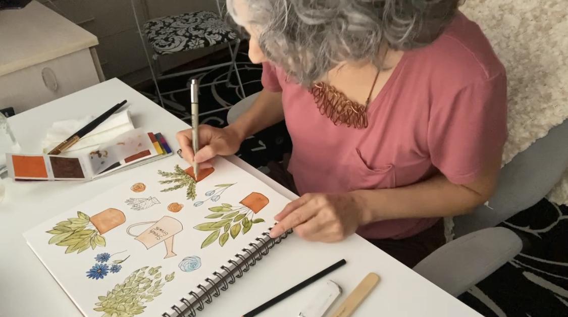
6. Strategy Sketch: I'm just going to
open up my sketchbook and think about this theme. This is going to be a
theme about plants, very basic houseplants, but I don't just want house
plants in this composition. I'm going to add a watering can and maybe some
gardening gloves. I have to figure out where
all this stuff goes, plus each plant might be a different size depending
on how I work it. My plant reference, I'm going to go ahead and draw
my plants first and what I'm imagining
is my plants on the side and then my
garden accessories, if you will, in the center, but we'll just see how it goes. I think that will be a
little more balanced look. I'm going to go ahead and draw my first potted plant
and I think I'm going to start at the bottom just because I know
I need to fill that space up and I
don't want it to be awkward if I start at the top. I'm going to go ahead and go in just about three-quarters
of an inch. This is not final, this is just a thumbnail
sketch just to get an idea, but I'm still trying
to be thoughtful and try to picture how I
want it to look in the end. I think if I draw some
plants out of here, this pot is going to be
too close to the edge. Right away, I've already figured out something that will
help me going forward. That's how it goes,
it's trial and error. I'm going to take it in
another half an inch, I think that's a safe
distance and draw a pot and then I'm going
to draw the stems. I'm just going to quickly criss-cross these stems in here, some, and I don't
want it too tall. I probably won't make it as
tall as the actual image, but I'm going to
go ahead and use this column once stirrup
plant or is this a palm, I'm really not good. I don't grow plants though
even though I love them, so I don't know the names of
them like many of you might. If anyone knows the
name of this plant, I'm going to go ahead
and ask you to put it in the discussions or let me know in some other way if we follow each other on
Instagram, you can DM me. But I'm really curious
about the names of these. I'm just mimicking the shapes of these leaves as best I can
without getting too crazy, perfect, but this is
going to be a great, almost like a template for
what we're going to be doing. But I don't want get too
detailed because again, these are just thumbnails. I do want to know how far this
is going to be spread out, and I think I just
need a little bit more down here, that's nice. It's not exact on both sides, but there's enough
volume on both sides, it looks nice and balanced. I'm going to start
out with another one. These other two plants in this composition are going
to be a lot shorter, so they're not going
to be as tall as this, so I can allow for
a lot more space. Maybe the gloves
could look good here, potentially, I'm just
going to draw an oval. This is where the
thumbnail part comes in. I wanted to initially
sketch this to get an idea of how much
space I needed for this. But now that I have a feel what everything is
going to look like compared to this plant, I can now just draw some blogs. I think I want an item
here and let's see. I could even do an item, just to fill the space, that goes horizontally,
potentially like the gloves. I think I might like
the watering can hear, so I'm just going
to make a note. It's very easy to
forget this stuff once you get into the
details of your project. I'm going to go
ahead and do that, I'm going to
tentatively put gloves here and then I'm going to put another pot here about
the same size as that one. I'm going to put a little quote in here. Because this is going
to be the plainest of these elements. I'm pretty happy with that, I think I might want to move
this down a bit and make these leaves a little bit more full than they actually are in the image and that
will be a fun reference. But I've got a good start. These are very similar size
and so I'm going to have more space to maybe add some more accessories
or more plants. Again, this gives me a great test runs for
my final project. It probably would
have helped if I had a sketch book that
was the same size, just because we are
trying to fill the space. But again, I've learned
enough here that I can take this and
keep on going.
7. Final Sketch 1: [MUSIC] Since I know I want my watering
can in the center, I'm going to go ahead and sketch that out a little larger. And that's another
solution is to maybe make these
just a taste larger, so that they fill the
paper a little bit more without changing my
composition too much. I'm still in the
sketching phase and I can change any of this. I don't like that
line right there, it's a little too angular. Great. I don't consider
myself a letter. I move very slowly
when I am sort of writing a quote or whatnot, but I really enjoy them. I'm stretching myself to
improve in that area. I definitely highly
recommend trying new things, stretching yourself in
areas that you don't feel super qualified and just to improve and get some new
skills on your belt. Great. You know what
could be really interesting to add if
I have extra spaces, maybe a flower or two, that can be really fun. [NOISE] Next, I'm going
to do my hanging plant. I'm going to go ahead
and just sketch out. Even though I can't
see much of the pot, I'm going to go ahead and
sketch it out so that my plant looks good in
relationship to it, and I can always erase
whatever I don't want. [MUSIC] Now I'm going to go ahead and sketch out. Again using my
sketch as a guide, I can go ahead and
create the pot. It's going to be a little
larger than what I have in my initial sketch. Then I'm going to start
fanning out these leaves. [MUSIC] Great, that's looking good. I have this space in
here to think about. Then I'm going to start with
my larger plant down here, because I think it's
going to take up most of this space here. You might have noticed I
took out one more leaf here just to give me a little
more space up at the top. I might even end up moving
this down a little bit. Maybe I will just move
this down just to give it a little more space
up at the top and bring some of this
down a little bit more. This is what you want to
be doing at this stage, is adjusting and making sure that you're happy
with your composition. I'm going to go ahead and make
sure I'm not too close to the bottom and not too
close to the edge either, like I did before. We learned that lesson.
[NOISE] [MUSIC]
8. Final Sketch 2: [MUSIC] Then you can just
start filling in with leaves. You don't really
have to add more stems necessarily
unless you want to, and I think I want to
put one here, small one. I'm pretty happy with that, but I think I want
it a little taller. I'm just going to add
a stem right here and put some taller
leaves over here. You can also put partial
leaves like this. I can allude to a leaf, and that's nice and full. I'm pretty happy with that, and I'm going to move
on to the next plant. [MUSIC] I'm going to start
drawing my leaves, and I can kind of keep them a
continuous thread like this. It saves a lot of time
that looks really cute. You can also get really creative with this and make
these plants your own. You can change the colors. You can change the shapes. You can invent your own
plant if you want to. This can get pretty fun, as fun as you'd like
it to and honestly, I think that's all
I'm going to do. I'm just going to keep
this one really simple. I didn't do any of these
exactly like the image, but it's working for
me and I like it. Now, I think I'm going to add a gardening glove here
and maybe one here. I also have the option of
[NOISE] adding some flowers, like I said here and here. In fact, I think
I might do that. I'm going to go ahead and
just draw the gloves stacked. Even though on this
image I sourced, these are really messy and
they're next to each other. I'm not going to
sketch them that way. I'm just going to draw a cute Daisy-shaped flower here and that really
nicely fills in the space. Maybe I'll have it with a
little baby flower next to it, just to give it a
little personality. Now, even though I'm
doing my final sketch, any of this can
still be changed. If I don't like this, I can do something different. [MUSIC] I'm really happy with this. It's cute. It's fun. There's a nice distance
in between everything, and it seems to be
flowing pretty well. There is a little bit
of extra space here. I could do a spiral shape, and this could even be a peony to be anything
you want it to be, but it's a pretty flower, and maybe do one over here. I can make them different sizes, different colors in the end, and a smaller one may be here, and that's really great. I really liked that. It just kind of filled
in some of these spaces, and move on to the next step which will
be painting. [MUSIC]
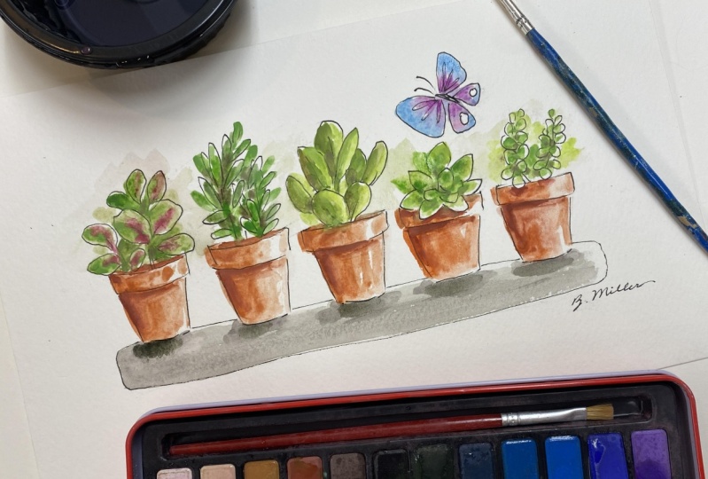
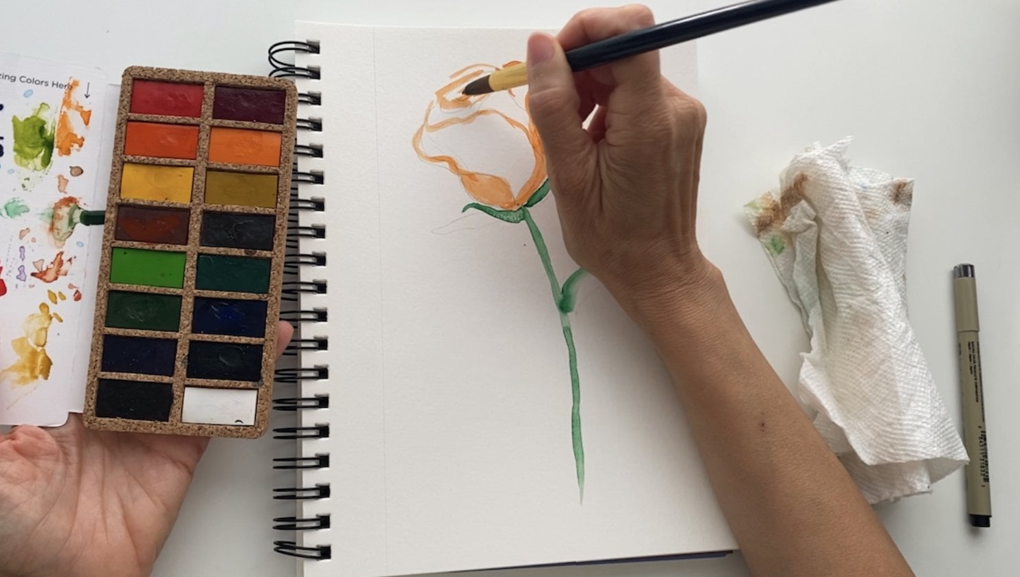
9. Painting 1: I'm going to go ahead and start painting and I'm going to
go ahead and start with my green on this
plant here because I can let it dry and I won't
get my arm in my wet paint. That's something you can
strategize with your projects, is to know that if
you're wet here, your arm might be landing on that if you
need to get over here. I'm going to start here and just to be sure I have
the right color. Yeah, that's great so I'm going to go ahead
and just start. These leaves are small. I'm going to go ahead and
use this medium brush because I can get through
them pretty quickly and the tip is nice and pointy so I can just buzz through
these pretty fast. I'm going to make
some some lighter, some darker because that's
how leaves are and I can start just moving pretty
quickly through here. You can see I'm moving
pretty quickly. This does not have
to be perfect. In fact, the less perfect it is, the more I think I'm
going to like it. That's just my style though. I love loose, free-style painting that leaves
a lot of room for the imagination to play
and put the pieces together and that's one of the reasons I love
watercolors so much. It's so good at
implying shapes and textures without having to
tell every little detail. I'm going to go back and paint over some of these that got so light I can barely
tell they're green, especially on this one side and I can even not paint
the whole leaf through, just paint the center
of it or the side. You can see I'm
filling in spaces too. Now up here while this is still
a little wet, I'm just going to go ahead
and spread my brush around, just to fill in this
spot where I know that there are so many leaves that there are leaves
behind other leaves, and they're just going to
be implied at this point. Great. Great start to that. I need to get a little
water on my brush because it's getting really dry. This one is going
to be a lot easier, but we're going to
do it in layers. I'm going to do this
front layer first. I'm loving this
soft olive green. I think it's really pretty and it's definitely working
for my color palette. I am going to fill
some spaces in here because we know
that plant is so full. I got a speck of viridian green. Now viridian green
has a lot of blue in it and that's not
the look I'm going for, so I'm just going to
go ahead and see if I can pick that up a little bit. There's some water. It's okay to mess up. You can just fix it
and if you can't, you can just keep going
and then start a project afterward and see if you
can give it another try.
10. Painting 2: We're going to switch
colors and do my blue here and with one stroke. Wow, that's super dark. I forgot to test that
first, but you know what? That's okay. It can be dark. I didn't plan on it being dark, but I think I'm fine with it. It's going to be really pretty I'm staying away from
the center because I would like that to be
more orangey or peachy. One thing I can do
to thin this out is not put more paint in my brush, but bring this very
dark blue puddle, let it saturate the rest
of the flower and then it instantly and naturally
thins out the paint. There's another little
bonus tip for you. Maybe since these
leaves are so light, maybe some dark blue is
exactly what we need here. This one's a little more
blobby, but that's okay. We'll let it be blobby. I think I'll do this in blue also, but I'll make it much lighter. I'm going to use my palette. That's a lot of paint,
way more than I wanted. I'm going to go ahead
and thin that out. I have one blue rose over here. I'm just going to fill
that whole thing in. I'm going to go ahead and paint this, my super light sienna color
so that it can start drawing. I'm going to move to
my smaller brush. Let me rinse this one first so that paint doesn't dry on it. Always good to think about your brush care as you're going so you develop good habits. I'm going to go in these
corners a little bit better. I don't really care if
this paint is super even. In fact, the more
uneven this dries, the cuter it's going to be. I really embrace the
imperfections as you'll know about
me if you've been following me for
any length of time. I think I'm going to
go ahead and take just some pretty dark blue and I'm going to make
some dots inside these gloves. Try and keep them
as small as I can. I'm going to be adding
maybe some orange to this, and that's how it'll be cute. It'll be an orange
polka-dotted theme here or orange and blue. I think what I'd like to do, I thought I was going to add some terracotta in here just
to show that there's a pot, but I don't think I'm
going to need to. I think this plant stands alone. I'm going to go ahead
though and paint these other pots with
this burnt umber. That's really dark. I'm going to dilute that by just adding
water and no more paint. That should be plenty
for the entire pot. You're going to just
keep pulling paint down from this corner to fill the rest of this space.
11. Painting 3: Awesome. Well, let that dry. I'm going to go ahead and paint these orange and I
want them pretty dark. We're using a similar color between this is the same color, this and the terracotta, but we're going to add
variation in the intensity. That's almost like using a
different color completely. The beauty is that it's
going match and be cohesive and pick up these other colors even though there are a
different version of them. This is dry now, so I'm going to
go ahead and drop my color in the center of these. I don't want to touch my blue too much because
I don't want to activate that paint
with this water. I'm just going to carefully
keep my brush in the center, and you can see I've
activated a little blue, but it's not going to
interfere too much. I'm going to let that go
and move to a smaller brush that can just be a
little more detailed. That pulls a little orange
right up to the top. This I don't think
is blue enough, so I'm going to go
ahead and add just to smidge more of blue here. Want it to be good
and noticeable. I am ready to paint the
rest of my greenery because these are dried
almost completely. Now this one turned out more yellow
than I really wanted, so I'm just going to
pick some of that up and hit it with a
little darker color, so it drives the
way I'd like it to. Again, some of these
I'm only partially painting just to make sure they have some color variation. It came out a little dark, so I'm going to pull from it and start painting these
leaves over here. While I'm passing by, I'm just going to paint this as well. The rest of these lines
I think I'll be inking, so I'm going to leave those
completely undone for now. I think I'd like to switch to
my smaller brush for this. Now I'm going to go back through and
just darken some of these, the second layer, and
I'm going to maybe fill in here a little
bit here and there, down here at the bottom. I have one more little leaf to paint right here. I have some orange dots
to make over there. I'm going to try and stay where the blue did not touch the page so it looks like a nicely spread-out
polka dot design. Here we go. This painting is done now. We ended up with blue
in all four sites here. Even though they're
not the same intensity or even amount, they still help
balance the page. The green is nicely balanced and we have some orange
that's nicely balanced. Even though there's none
up here, it's okay, there's plenty here to
keep the eye moving and this is forcing your eye up. It's almost like there's orange
in this direction anyway. I think we're good. We are ready to start inking.
12. Inking: Now that the painting
is all done, let's do some outlining. I really like a black archival
pen because it really balances the color and it
grounds the whole illustration. I am not being too
precious with this. You can see there
is some gap here and I went too far down here, but I'm not worried about that, I am just having some fun. The last step here is to just erase
any unwanted pencil. I'm really happy with this. It's so cute, I can turn it into a sticker sheet or a poster, or even a greeting card, anything that I
would like it to be, I can isolate these elements and turn into a surface
pattern design. There's so much I can
do with something like this and I can't wait to see what
you come up with.
13. Let's Recap: We have talked about a lot of steps in this class so
let's do a quick recap. First, get your tools
and materials together. I'm using some basic watercolor
and sketching supplies. Next, you'll want to look for some inspiration if
you don't already know what you'll be using as your theme for your
small illustrations. Then you'll want to
pick a color palette of about five or six
colors maximum. Fewer is fine, but more
could get a bit complicated. We're going for a
simple project, so the fewer colors, the better. The next step is
to make a list of all the elements you'll
be using in your project. Get a sketch pad out and
strategize the placement of all your elements on the
page until you have clarity. You can fill any empty spaces
with smaller elements. Next, sketch out your final draft on
your watercolor paper. Think about how you'll place your colors throughout
your sketch. If it helps, you
can make notes on your strategy sketch where your colors will go
on the final project. Now, it's time to paint. Using your strategy
sketch as a guide, paint your elements, keeping your colors balanced
throughout your composition. This makes it extra
pleasing to the eye. Unless it's time to ink an
outline on each illustration, you don't have to
ink every detail, but giving your illustrations
an outline will bring them to life and make
them pop off the page. I hope you enjoyed this
project as much as I did and I can't wait to
see what you create.
14. Conclusion: I am so happy that you came and spent some time
with me in the studio today. I am truly honored that you did, and I hope that you learned some things that you can
take with you and use over and over again to improve your projects in the future
and do some new fun things. I really hope you
take all the skills we learned in this
class and practice them to make beautiful
art that you can use in so many applications. If you enjoyed this
process and love fashion, I have another class that
I think you'll love called Fashion Illustration-Watercolor
Fashion Sets, which uses much of
these same principles that apply to fashion. In the meantime, I
really hope you create a project because it's the most effective way
you can learn and grow. When you do, please share your project in the
project gallery for feedback and to inspire
others taking this class. You'd be surprised at how much other students will benefit
from seeing your work. If you need help in
uploading your project, you can refer back to
the "My Project" video, which is the second video in this class, for
detailed instructions. I would love it if you left me a review of this class so I can keep improving on how I
deliver this content to you. To be notified of
future classes, just give me a follow
here on Skillshare. You can find me on social
media @OctopusConnection. For more watercolor learning, you can find me at Octopusconnection.com
where I have a watercolor membership
and courses. Thanks again, and bye for now.
 Chris V, Artist, Designer, Maker