Transcripts
1. Intro: Hi, This is terrible on park a block stop Com Thank you very much. We'll get into his video to Tora calls on watercolor mixing now, in this cause, I will teach you and show you the different types off Tuesday that you need to use with watercolor. Then that will show you how you can choose your own colors based on the pigment information on those watercolor tubes. Then we'll move on to some watercolor exercises, college hearts, and I'll show you how you can mix colors that you won. And finally, with all those knowledge we are going to use that to color sketch always is, and things that I talk about, they will be spread out into many lessons so that you can follow along easily. Some of these are content are actually available on my YouTube channel, but they are in bits and pieces, so this video to Tora cause has more information, and it is in more detail, and it is more structured. If you have any questions rather cause you free to ask me or even me. So let's get started
2. Types of Watercolor: hi. In this lesson, I'm going to show you the colors that we are going to use, draw the cause and also talk about the different types of water color watercolor tubes versus what a collar pans. This is the set that I will be using in this cost. This is the sad made by Daniel Smith, and it's the watercolor essential set I like to set because there are six tubes off primary colors and it's a very versatile set. Let me show you why. So it is outta six colors in the set. There are six primary colors. Primary colors. Art occurs that you can use to mix all other colors. For example, we have two yellows here to Ritz and to lose. If you want to mix a green calorie can use yellow and blue if you want to, makes an orange and use yellow and rape Anyone who makes purple. You can use blue, so just six types of colors. You can use them to mix all other colors. Now what colors they are available in tubes like this. This is five ml. There are also available in larger troops burden. You have to buy them separately for Daniel Smith. Sometimes they sell them in sets. Sometimes they are so separately. So this is 15 ml, which has more capacity, and you you really need those really big tubes. I think they are also available in larger trips like this, but usually for me personally, I buy watercolors and trips like this. These are all 15 ML tubes now. In addition to tubes like there's the watercolor is also available in pans and pen sets. This particular pen set is made by Cramer Pigments Show you show you what's inside. Now. These are plastic pens. We've solid watercolor kicks, the formula or sometimes can be a bit different. Competitive Teoh two pins. But generally speaking this off formula, this formulas so that watercolor can become hot. And the vantage off this is This is much more portable than tubes like this. Now that this advantage is to mix a watch mixture, sometimes you have to spend a bit more time because thes hot and pens, they are a bit difficult to dissolve. At times. I really depends on the colors and also the brand, but generally speaking to makes a large wash, you have to spend some time to dissolve them. But for what kind of tips like this, because when you squeeze them out, they are semi moist at a bit of water. You can mix them up, and you can create a large mall washed very, very quickly. So that's the advantage off this, versus just so depending on your needs, you might prefer one over to the out of personally for me. I prefer to use pen sets like this because they are much more portable and because I paint outdoors a lot. So it is particular satis made by Cramer Pigments. Descent costs us $80 you get 14 blue pens. I think it's quite worth the money. Let's take a look at my personal set. This is our This is not your Embrun, by the way. This is a run brun box, but inside are actually Daniel. Steve paints. These are half pence, and I used this. Tubes squeezed the two pins into the half penn to create my own customized up. Hello. So these are mixture of Daniel Smith pains and winds, and you didn't paint. This box is a bit smaller compared to this box, so this is why I pretty birdies box even more possible now, even though I recommend Dennis me if you can try out a lot of friends as well, I'm just gonna talk about some other brands that are quite nice. If you want to buy a book set, then per helps, I would recommend Cramer Pittman's or this sh mink, Florida mackerel. Now this box set is quite similar to my customized box set and comes a trawl half pans with the watercolor brush. But this is much more expensive because, uh, what color equality is quite good for beginners. I do not recommend that you get so many colors. Just start with. Just start with. Six will do. Now. I'm going to teach you how to read the labels to find out more information about the paint . That's insight. Let's take a look at this. For example, this is the name off the color new gum bush. Different brands Me used different off similarly names for the same color, So this one is new Gun Bausch and is made by Dennis Me. Here, it say's Ottis. Great. Now what color they are different greets the cheaper ones out of student quality Peens. But this is the more expensive art, his quality pain. So these are his grip. The difference between students and artists is for student great pains. The use more binder and Pickman and for art is great. They use more Pickman than binder. Now the color actually comes from the pigment and binder is actually their thing That hose the pigment to get it so far. What color? They used his binder called gun ribbit. So this is the vehicle also known Astor Binder. Is this gun Arabic solution? So for all you painting, they would use different binders While Cala pans souls, they use different binders for past house and out of different binders. So this is what makes watercolor watercolor that binder and pigment. And here is easier pigment Colin P Y 97 p. Y 110 So the P stands for pigment and why stands for yellow And this is the number could for this particular color, which is actually a mixture of two colors, we have 97 +110 Now, some of these formulas they can change with time. So this is a relative. The new formula by Daniel Smith let me show you the same color that I bought about two years ago. This is also new gun Bush, and let's look at the Pickman could Here you can see that uses P. Why 15 treat. So these two colors the have the same name? Burton. They used different pigments. So yes, so even within a brand. Sometimes when they change the formula, they can use different pigments, but routine the same name. And lastly, there's this thing here called Siri's. Um, there are different. Siri's like serious 12 tree for this, actually, IHS sort off related to pricing off the color. So for serious one that would be cheap for serious, for there will be more expensive because some Pittman's they are actually meat from very precious gems To some pigments are made from chemicals, so does would be cheaper. But those that are from James doing dues are will be much more expensive. Let's take a look at the other colors that we have. This is a pyro scholar. Let's take a look at the Pickman that it's used. This is PR 25 flights. His is creen a cried on Rose, and this is PV. One night v stands Fall violet. This is French Ultra Marine. This is P B 29 serious, too, and this is Hansa Yellow Light. This is P Y tree and is this halo boo green sheet is his PB 15 colon three Serious one. When you're choosing your own colors, it is best to choose colors that are made with single pigments because the color has one characteristic any. If you are using a color like, for example, this new formula for new gun boss retires to colors. Now each of this color may have their own characteristic, and when mixed with other colors, there will be a bit more variables. And sometimes the color may not come out the way you want it, or because there are so many cause. It's like the more colors mixed the madia. The colors will look so single. Pinkman colors are the best when it comes to mixing water. The last thing I want to talk about is careful what color After each painting session, you should always put the cap back on tightly so that opinion site doesn't dry out. If he does dry out, then it's going to be inconvenient to get a peanut because there's no where to get it out, other than cutting that you so always remember that put the cap back on tightly for me. I have a lot off tube, so I was put the cap on tightly. In addition to that, I have and at height, container like this, and also I put some moisture is Auburn backs into, uh, box so as to keep them properly tight at height. So do you doing tryout. If you have 10 sets like deuce, you can leave them out in the sun. But make sure you cover the box because I'm what color pigments they are. There are different grades off light. Fastness, like Fastness is means how durable they are, how resistant they are to fading when in contact with sunlight. So some colors when they have very lousy like fast ratings, their colors will fit very quickly. The reason for covering the box like this is to prevent a son from getting onto two colors for tubes. I want to prevent them from drying out for pence. I want to dry them because here in Singapore, where I live, the climate is very humid is very wet, and if the water color pens, they remain wet for a long period of time. Sometimes they can grow mo, and it's going to destroy. The color is very difficult to remove them, so I usually take various very special care to make sure that my pen sets are always trying . I was dry them out in the sun with the box closed with a little bit off gap to allow the moisture to escape. So those are the basic information regarding water column pigment and also the different types off water calorie. You have any questions? Feel free to email me.
3. Watercolor Brushes: Hi. Welcome back in this lesson. I'm going to talk about a different types off watercolor brushes, show you what they can do and also give you recommendations on which, what kind of brush to get the most common types off watercolor brushes used for painting on the round Russia's It is a round brush is on the left and the flat brushes other than brushes. You need a cup of water and preferably have two cups of water on. The reason for that is because you can use one cop for cleaning abroad and yet a cop for getting clean water. There's, by the way, is the feeble Castell. Click and go cop. I like this car because you can actually press it down to make it more compact and put it in your back very easily. And second advantage is CDs curves Here. You can use debt to put your water column, brush your on. They do not run off the table. So let me just pour some water into this car and moved them to decide first on. Let's talk about the Rome brushes and brushes. The brush is they get their names from the shape off the bristle. So this is a round brush now the hairs there, middle of different types off material. For example, This on the right side, is that brush. This is meant off golden nylon. This is actually synthetic brush and this is also syntactic even do it looks like natural hair. This white bristles definitely synthetic synthetic. Now on the left side. Here, this is a sable brush. The hair is made off this animal called stable and is this natural hair this ISS square brush? This is also natural hair on is to ah, sable brush as well. The main difference between sable hair natural hair versus synthetic hair is natural hat. They tend to hold more water. So what that means is you can paint longer with Russia's like this. You don't have to keep on reloading the paint or water. But we've synthetic brushes like this. You have to keep on reloading the water because they don't hold a lot of water and other differences. The durability off the brushes. Natural hair brushes tend to last a bit longer compared to synthetic brushes, and if you take good care off your watercolor brushes, they can last for several years. The downside is natural. Head Russia's like to screw a barrage on the sable brush. They are more expensive compared to synthetic brushes when you compare brushes off the same size, sometimes significantly more expensive. So even though synthetic brushes, they are last year. Oh, but they are actually more affordable to replace personally. For me, I prefer to use natural have Russia's because they hold more water. I mean, they are more expensive, but I take good care of them. It is more economical in the long run, other than the different shapes off the hair and also the durability and not a differences . Some of this brush is they can come in portable versions or collapsible version. Take fuck some bold is synthetic brush. Now, this is a collapsible brush, so I can actually pull off the body here and then put this body here to cover the brush. And this is very portable. You can put it into your pencil case, but this is a bit lache. This rosemary brush. The company is called Rosemary. This is a sable rush. This is also collapse bow. And as you can see the size off this brush is so much smaller now. Ah, brush that is this small. You can actually put debt into her potable water color box. So this is how I usually transport my Russia's. I would just collect stem and then put them in to the water column box like this. It's really very convenient. So rosemary, they make rushes that are small enough to fit into water column boxes boxes. The same goes with DaVinci Russia's that being cheap. Russia's to come. I mean all these brushes to come in different sizes. This is a size two, so you can see this does not have a lot of hair, and also this is a bit small as well. This can't fit into the box. However, there are collapsible brushes that are too big, despite example will not be able to feed into that watercolor box. So most of these brushes they have mood and body on. They are considered shot handle. Shot handle means this Woodham body here is a bit shorter. The long handles. They can be this long up to this long, so it's a bit inconvenient to bring out doors. I personally prefer shot handled brushes and not a type off brush that is quite common nowadays is dues. What have brushed now? The water brush is a portable brush. We've are in Butte. What? Ah, reservoir. Where you can put water into the body. So this is how you do it? No different. What kind of brush? I mean, what a brushes aren't have different fielding mechanism, but for this one, you just screw it. Put it under the tap. You can put water in sight and then you can close it up. Just dis uses synthetic bristles, Some of these water brushes they have on natural hair as well. But for the ones that I have test that they are not dead terrible, because off the manufacturing process, the quality is just not good. So usually for watercolor brushes what a brushes like this synthetic bristle eyes better. And when you press it like there's the water will flow down. So you don't have to bring cups off water like this. So this is really very convenient. No, I'm going to talk about brush. Size is the most common brush size that I use Is the size sixth I usually paint in a sketchbook. Darius, around a five size to a four size, so I find that size six is a very nice I'm brushed to use size sixes disk. There's a size six, and this is a size two size, too, and smaller Russia's. They are good for detour for size. Six, I think, is a good general purpose. Are size for painting. This is size 10. This is X Skuta, by the way, on different brush manufacturers. They have different types of sizes. For example, a size 10 from Escada may not be the same size as the rosemary or da Vinci, so taking up debt is is a size 10 and this is a size 10 s. Well, let's see if they are the same size quite similar. But this is a sable sable brush. When brushes dry, sometimes they tend to like doomsday, move outwards. But when you went there, let me let this brush this sable brushes. They are capable off retaining a sharp point, so you just have to let them and take a look at this. Now it's no you has a sharp point, and when you are drying the brush, try to dry them horizontally so that the water doesn't flow back if you put it brushes up right like this, that what I will flow into the photo row this metal prices for Oh, and it will take a bit longer to draw and made damaged glue that is inside holding the brush hairs together. So try to dry. Brush is either horizontally like this with hair pointing down so that water can throw down with the help of gravity. Now that I've talked about a different types of watercolor brushes, let me show you the strokes that they can create. I'm going to start with this wet Russia where brushes are usually used for covering large areas. So if you want to paint wet on wet, this is a technique where artists would read the paper first so they can actually just read the paper and then apply what color. So let me just demonstrate that to you. For you. I'm going to lay down wash like this, so we have a large brush. Light is it's so easy to read the surface off the paper. If you are going to use a small piece off, I mean a small brush. It's gonna take a long time So this is how I'm gonna wet the surface and for wet on wet technics. Usually artist would just dip the brush into the pain and then just paint over elected so that the colic and spread and notice that the pen sizes that I'm using to date this up through Penn Sizes. I'm using this specific size because this brush is actually one inch. I won't be able to feed this brush into 1/2 pans like this. I have somehow friends here. I won't be able to fit them like this. So depending on the taps off pans on the tubes that you have, you might want to choose the appropriate brush. So this is how the brush looks like. And this is synthetic brush doesn't hold a lot of water. So I'm going to dip on my brush into you more water and try to pick up more paint so you can use this brush for wetting the paper first. Before painting Oregon. Just paint with this brush directly onto the paper with paint. And is this the type of strokes are you can get? You can use the each off the brush to create things, strokes like this or you can twist it around to get interesting strokes. It really takes a bit off practice. But usually when I'm using flat brushes, I use them to Kabul large areas. So let me give a bit more some more water and painted. So this is for one to flu fall, creating large areas off much washes. Now let me move on to another brush. This is a synthetic brushes about This is made by ex Skoda. This is also one inch now some brush hair and they meet specially do whole water such as the case What is a Skoda Prasetyo brush status? The name off this particular brand brush. Now this brush hair can hold much more water. So let me just dip into the paint the water here and pick up some maybe some blue color here and just painted down like this so this brush can actually go a few more times before it requires Are you to reload it again? I do not use a lot off pinned. That's why this washed appears to be quite diluted. So, um, is off that brushes Let's move on to and not a brushed squeal brush school brushes the whole lot of what as well, and they are generally used to cover big areas just like the flat wash. But because the square brush is has around tip round, brush it, it can go into tighter areas, so it's slightly better to use when you need Teoh. Draw details. You need to go into small ears, and they come in different sizes as well. So this is the square brush. I just did it into my cup of water to pick up the paint on. It's really very generous with, uh, fool. So does this square brush. Now let's move on to sable brushes. Stable as a natural hair brush, this is enough. Sky Apollo Troccoli East Sable brush, Usually out there in up stores they sell Ritz Able are Kalinsky stable. The performance is quite close. One thing nice about disable. Usti can keep shot points very well, so they are good for very detail work. So this is Kolinsky Sable. You can get different types of troop, depending on the pressure you put down with the brush Soviet. You put down a brush like disease. You get thick stroke if you use it on the side. You can get even taker strokes and this brush it goes a lot of water. And if you do quick strokes like there's gonna get Tapert strokes like this, which can be good if you want to draw things like grass trees. Village. So this is the sable hair brush. That's a round brush. No, let's take a look at this synthetic brush. This is also a round brush, but with synthetic brush, they doing a whole s much water. So I'm going to dip it into this cup of water on, pick up some pink here from this pen and try to do the same thing. A sable brush. Now, in terms off those strokes, I can get first in low strokes compared to the sable brush. But aside, reach this area here, you can see that the paint is starting to run out because this brush this entitled brush, it doesn't hold much water. So synthetic brushes like this they're quite good. If you want to create dry brush effect so you can create that you think very easily. And I was so the tip is a bit steep for so if we want to do DT work. Sometimes it might be easier to use a synthetic brush of, ah, a sable brush, but bull brushes they can between the ship's quite well, especially for stable. When you apply them on to the paper, the brush charity will go back to the ship. They were just I'm respected the ship and lastly, only show you the water brush. This is dry. To use it, you have to wet brush half us. So I'm gonna press a bit to let the water flow down. Okay. All right. So you see some cholera is coming out from the brush it. Now, this is the downside of using watercolor brushes. What? The brushes like this because you need to clean the brush tip first. And if you have no access to tops off water like this, you have to clean them. Perhaps he was in red to show which I'm going to do right now. So usually when I bring what a brushes like there's outdoors at work, Also bring with me are tissue people towel. So they compress. Let the water flow down, and to wear the brush so they can clean it, try to clean it as properly assess possible and let's see. All right now it's relative clear. And if I want to pick up collars, I can just dip it into a pen like this on to pick up the color and start using them. So it is. It is very confusing, but inconvenient part is the part where you need to actually clean resource when you're mixing colors is a bit challenging as well, because I'm sometimes when you put brush like this makes it onto another color. Brush comes dirty and you need to clean it before you use the next color, so it can be a bit inconvenient compared to using normal brushes where you have a cup of water. So which brush should you get? Well, if you can get one brush, I recommend you get a round brush. Maybe you can get a size six test of brush that I use frequently. Depending on your budget, you can. I too get disabled. Brush all it does synthetic brush if you have more budget and get a sable brush. If not, you can just get a synthetic brush. Or you can look for brushes that have mixed hair them is they makes natural hair with synthetic hair. Those brushes are quite affordable, and the retains some of the characteristics off a good sable brush. The most commonly seen brands would be Escada da Vinci, Rosemary Rafael. Personally, For me, there is not much difference between all these brands because if they use the same hair, they are going to perform rather similar. So just go with whatever Brandon is easy for you to buy. That's fall for this lesson. Now, in the next lesson, I'm going to talk about paper.
4. Watercolor Paper: Hi. In this lesson, I'm going to talk about watercolor paper. I'm going to talk about a different types of watercolor paper and that characteristics the people of that you should get. And it was so the paper that you will want to avoid what color paper is also an important component when it comes to using watercolor. There are many different brands off watercolor paper out there, but they are usually just treat hypes off What a color up surface. So the first height will be the one that is most commonly used. That's the cold press finish. So cool price been usually have dis textures, extra surface. I'm no suri of my camera can capture this I mean zoom in closer for you It seems that my camera is not ableto pick up the texture of this paper. But anyway, let me show you an example off a sketch that I have painted on Cool press paper. This is my Qadi paper sketch book. So you can I don't buy the paper in Pat's like this or in sketchbook form like this on here . I think the texture here is easier to see. So what I want to show you is is a recur. So that's so. This is the type of texture them talking about on here as well. So because the paper as textures on pot off the paper is a bit lower, the hay V pigments they will go into the lower areas off the paper and they will collect there. And that's why you can see patterns. Textures like this now different paper have different types, all pattern texture. So this one is, to me, looks quite random. There are some that are quite obvious, such as his paper that is, meat by Henson. You can see it is, ah, line running across for obvious patterns like this. I don't think they are desirable. They do not look good and they distract viewer when the viewer is looking at your art work , so I will try to avoid Are picking and buying Watercolor paper were very obvious green texture, but this is also cold press. You can see the texture on the paper itself, even though it's not a very nice texture for painting. This is a sketchbook that I made with hot pressed paper, hot press well there, even though I mentioned that there's texture. Dairy is actually not so much off a texture because the paper is president by those Ah, hot steam roller to make the surveys let and smooth now the difference between hot price and cold presses. Because the paper surface is smoother, there's no obvious green pattern. Um, Peens. We've granulated ing characteristics. The pins will react a bit more randomly. For example, in this our sky area here, where are used our car marine. So the regulation is spreads out rather randomly and can repeat, be a bit unpredictable but with water collar. That unpredictability, I think, sometimes can look rather lovely. So, which is the case for beginners? I recommend cold press paper because it's easier to work on something that has texture on. I think that any effect sometimes it looks a bit nicer. Compact, too hot press, press. I feel that small for a lot Street even work for more stylized look, perhaps you could go for hot press, but for general purpose paper, I recommend cold press. One other thing to note about paper is the paperweight and also the material that's used to make the paper take. For example, Diz is what I call a pact that is made by this company called fluid. Is it? By in just is a square format pat. So you can either buy paper and square format in horizontal landscape format. Or in this this is, I think, a tree by to racial my by 12 injures. So they come in different sizes and he come in different paperweight as well. Here it say's 300 G s m trended GSM USTA. Wait All day is paper and treasure. Jessamy is considered pick. There are water. How the paper. Yet when he uses 200 Yes, and paper sold those tina paper, they are more likely to back over and use water on it. I prefer using watercolor on trend just on paper and you can see that this eyes cool press against these on a select texture on it. Now, some of these watercolor pets the bound on the sites such as In this case, there is glue here on blue up here. But there's no glue here, so you can tear off the pages easily now. They put blue here and here because they want to prevent a paper from buckling when you use watercolor. This is a nice feature. The other thing I want to talk about is the material that is used to make the paper. Generally speaking, there are two types of people that is cellos, base and people that is with cotton. Now, cotton paper is much more durable compared to sell of those paper. So if there is no mention on the type off materialize used, you just you can just assume that it is selling those based wood based paper and wood based paper. They are not as durable. So if you are going to use multiple washes on the last durable paper, some of the people fiber might actually come off. But we caught him paper more durable. Just think about it in the line like a Zeevi are drawing on. Maybe a cotton T shirt, for example. You can actually wash that T shirt many times. And that T shirt we were not wear out. You can still read a T shirt. I think that is the sort off durability you can get with cotton paper, but called on paper is more expensive. But, um, if you are serious about using watercolor than I recommend you get caught on paper. But for beginners I recommend just getting Nama seven lose based paper. Now that I have talked about about the material, I'm going to recommend some paper. This is Mitt by Dale around it is this hot pressed paper. Oh, here, See? Take a look at this. 100% Sell knows. So that means this paper is not that durable. Does this hot press on? Is the people personally, I do not like this particular paper pat from deal around. I feel that is a bit, uh, not that doable. The one that I would recommend if you can get her hands on it. It's the D'Leh wrongly, uh, quite fine paper. This is tree 100 GSM. Does this cold press on? This is also wood based paper. What I like about this is just a NYSE cool press texture. And because it's true 100 GSM, it is quite thick, and the paper is white. It doesn't dowel down the colors. Some laws you wanna call it Peter? When you use paint on the paper surface, the colors become more muted on That's because of the paper itself. So for this particular brand, if you are a student, you can use this paper. It's white enough. And it doesn't affect what color debt much when it comes to affecting vibrance. The other thing to note is all this acid free. It's important to get acid free paper as it free. Is the manufacturing process so dismissed? A. Do not use acid on the paper. Um, acid free paper. They do not become yellow over time. So the integrity off the paper is not affected. And also it is more durable in the sense that they do not attract things like more. Sometimes when you are people grows yellow. It can be because off the age of the paper. Or it can be because off the more so acid free paper, it prevents those two things. Um, no debt as it free only applies to the paper itself. Many of these past they actually have. These are cut bought. Behind this cotton bought is not acid free. So try to finish using up the paper before they're cut buttons yellow. If not, uh, yellowing is going to affect the paper in sight. And lastly, you can also buy what kind of sketchbooks. Um, I'm not going to recommend any watercolor sketch book right now because there are just too many. I've I recommend you get what kind of pets like this so they can tear off practice. You can wasn't by them in packs like this. These are loose sheets. This is made by the company called Be Paper. This is six by nine inches and issues is 100% cotton paper because it's caught on. I think it's a bit expensive. The last thing I want to talk about. ISS. What if you paint on paper? There's no watercolor. So take, for example, this is a spiral sketchbook. There's no mention, uh, anywhere that this is, what, a college paper. So I would say this is cartridge paper now. The difference between cartridge paper and what a colored paper is, what kind of paper their surfaces are treated to handle what color? What I mean by that is when you apply watercolor on what I call the paper. The watercolor can stay on the paper for a while. You can you delete it, run it, still read. You can let the colors blend together very nicely now for cartridge paper like this, even though it shows you that you can handle some wet, meet him. The problem. The issue with cartridge paper is when you use watercolor on it. The services not treated the paper is going to is up the water on. You cannot use a lot of techniques with this paper. What is going on is ah pian, and it will usually the cars with the bit for that. There are people that and he will dow down the color. So that's the difference between cartridge paper on watercolor paper. So I'm used proper paper for what color purposes. If you have AH, limited budget, I would recommend you put some of those budget more. Twist the site off getting good watercolor paper because paper is really quite important. You can save some money by not getting too many colors. You can save some money by getting a cheaper synthetic brush, but when it comes to paper because the paper affects how the colors look, Wendy I dry. It's better to get better paper, and he doesn't mean that you have to get caught on paper. You can Guindos seller knows bees paper that works well with what color, so that's awful. This lesson. In the next lesson, we are going to mix some pain
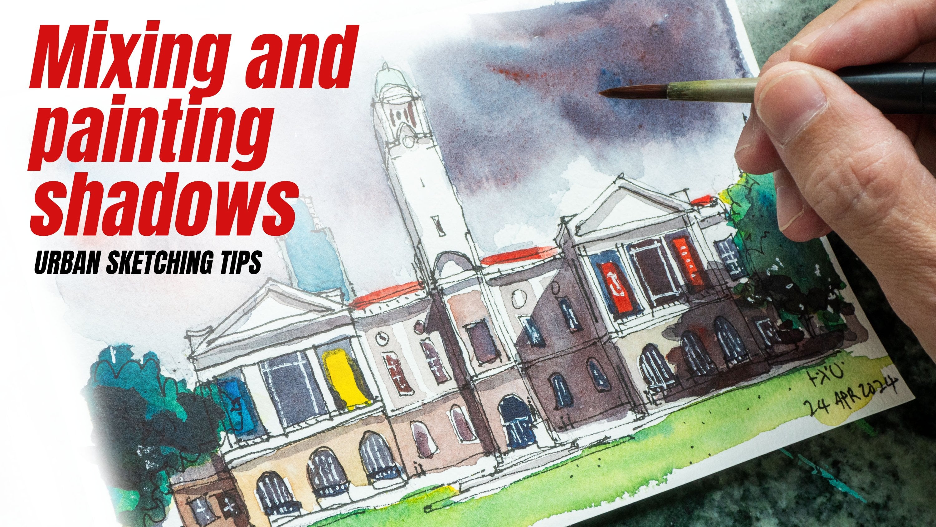
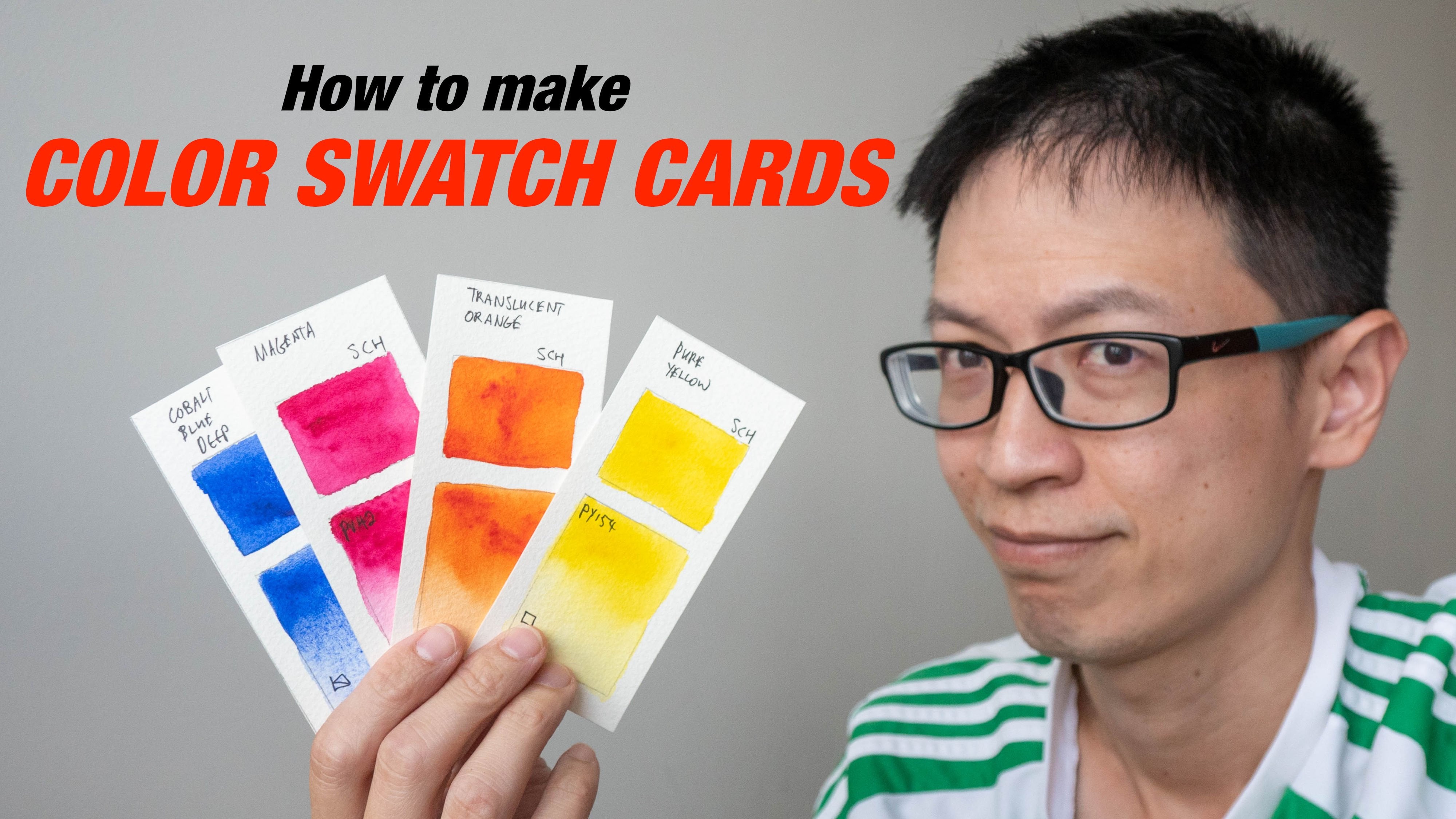
5. Making a Color Chart: Hi. Welcome back in this lesson. I'm good to talk about color charts. How you through there and I'm going to teach you how you can create one for yourself. Column Mixing charts are very helpful because they can let you see at a glance the different types of Colin mixtures you can achieve from the pins that you have. So now I'm going to show you the different colors, shots that I have created over the years for the different watercolor sets that I have bought. This is the pay be Oh, what a color set off 12 colors. So the colors here are not very intense when compared to let's see this particular set. This is from Cramer Pigments. There are 14 colors, and at a glance, when I look at this and compare it to the pay vo, the colors here are more intense. Not just that. The colors are the are more granite leading. So if you want a very textural look, Creamer Pittman's is a very good friend to get. So this is another advantage off color charts. So if you have created different college has over the years, it can comparative with different watercolors sets, and this is mission goal. The colors are very intense. These are actually two pins. This is Let me see. This is Daniel Smith, 15 colors. This is a set that Jean Blondel has recommended on her block. So I bought some extra colors to add to my collection of Daniel Smith colors. And this is the type of colors that you can achieve because you're the variety is huge, but you don't need so much colors to get to be able to mix all the colors detriment. Actually, I think a good selection off trial colors is more than sufficient. This is Winston Newton Cotman, cause I was quite right, but business a student brand. So we have some student brand water calendars. You do need to use more pins in order to get the same intensity compared to out his great watercolors. This is white nights, and this is half completed chart because while I was painting, I accidentally meet some mistakes. So when pending colored shot, careful not to make any mistakes because what color is very difficult to correct and when you're painting colored shot, especially if you're using a lot of colors. If you make a mystic, then the color chart may not look perfect. So that's why while I'm painting this halfway, I'm in a mystic. I decided to just redo this with a new color chat, so be careful when you are creating shots. Disease que are also known as car more colors. Colors are not as strong as I expected, even though they are from two pains. But these are actually colors that are right. And then I apply water on it so the two pins will be more intense. This is San Alia from fronts because I was very reach, very bribery. So all these are different cultures. When you're creating color charts, it's good to have the names on this site so that you can know what color they are because memory, you know, serve you that well, if we are looking at a culture of one year from now, so having the names and also the Pickman Daddy's used in the collar, that is very helpful. So I have debt. Here s well, these are the tools that are required for this lesson. The six tubes off water color. What color palette. These are the pains that I've left over from the previous lesson. A pen or pencil. A ruler. This is to help you draw the Greek and of cause watercolor paper. A brush two cups of water, one is to clean the brush, and one is to give you access to clean water. Before you mix the color chat, you have to know how many colors you are using, so I'm using six colors. To date, that means my college shot. We'll have seven rules and seven columns. I'll take a look at this example. Do's set has nine color sold, their 90 colors at the top and my colors at this site. There's one extra box here because of the way to chart works. You need that extra box here so that you can mix the colors throughout the rows and columns easily. So here we makes yellow with orange, and we get this mixture. Here we mix yellow and great. We can this mixture, so it goes on and on until you feel the whole. All right, so we're six colors. I need seven columns, so I'm going to measure the shorter's. We fear first. This is 21 cm. Sold. 21 CN is divided by seven will be about three cm. But I cannot use tree cm because it would go all the way to the beach. So I'm gonna use something that it's smaller. I'm going to just use two cm's for each box. So to see em switch box, I need seven rules. That would be 14 c. M. So now I'm just going to draw a line here to represent 14 c n trying to keep it horizontal parallel to the beach. So, dears will be 14 c. M. And they moved us to the site. And here it will be 14 C. M. S. Well, now, as I draw here, I want to put a dot at 40 cm mark because I'm not sure whether or not this distance is 14 c . M. And now I really draw the horrors on the line here 2 40 cm with this dot as reference. So I would go all the way up to 14 c m, which does not coincide with the dot that I put down just now because it's actually much further away. And then I will close up this box and we have a box studies 14 CN by 14 cm's. Now I can go in and divide up the box into the to centimeters squares. So I'm just gonna put a dot here dot here like this. Now that I have added ordered dots on the lines, I can now connect dots. Let's start vertical e my share too. Draw properly. I think it might be easier to draw the lines from this night to do site so that you move away from the well being. If you're using a panic shirt that Japan has waterproof ink, if you're using a pencil, it's all right because pencil is what proof? All right, the grid has been completed While waiting for the ink to dry. I'm going to write down their names off the colors and the pigment is used to create colors at the site. Off this chart. Leave the space around the top left box empty. I'm going to start by writing it here at the second box at the second room. So this is Hansa Yellow Light and Pickman could for this is P y tree. Next is new gun Bush. I'm arranging the colors from yellow to red to blue. If I have earth tone colors, then have tone colors will come up there to do. Sometimes I like to mix of tone colors after two rate. So it really depends on, um, how you like to arrange your own chart. So for me, I try to arrange it According to the color wheel, this is new gum Bush. As I move around a collar will, the color gets warmer, so the color that it's warmer than you gum Bosch will be a one rate. So the one rate I have here is Pyros College, so he gets warmer. Danny gets cooler because it goes to its the crew sites. So the next color is cruel. This is Queen Rose. Then we move on Teoh Crew Blue Kubel crew blue is a payload do. Now that we have, there's color chart. Let's go ahead and paint the colors in. Now Try to put the colors on your palate in the same order as you have written them down so that it iss last confusing. So I'm going to start with Hans. I You're right. I mean, wet my brush and depth. Some of the paint here that is on my pellet. So I'm going to try and feel this box with onside yellow light. You might not want to use too much water because this is a riotous mom box, so try to feel the color within the lines on not over. Let them and do it for all the other colors before your speech to the next color. McShay. Wash or brush properly and then used a clean water from the other cop to step onto the color. This is to make sure that you always get the most accurate representation off the colors that you are using. If you feel that the colors are tools you can always depth onto the paint again, the colors may be too late because you used too much water, so try not to use too much water Now. If you do not keep the color within the box, then if the colors they overlap on to each other, then you're going to see some of the colors blend together, such as the case here. So here are some off The new gun boss has went into pirates color. If you want to minimize contamination, then you have to be a bit more careful as you can imagine. If you have more colors, this is going to take a lot more time. So now I'm going to move to the next step to mix the colors. I'm going to start with Hansa Yellow First Hansa Yellow will be mixed with five other colors, So this is the five colors that I will mix and create. So before I start, I really know that I'm gonna mix five colors. So let me wash my brush first, clean it properly and pick up some Hansa yellow good mix. Five. Pardo's off one's are yellow because later on, I will makes five different colors. I find it. This is easier. So just a second bottle. You don't have to mix a lot off paint because Box is actually quite small. All right, now that I have the five Prado's, I'm going to mix the colors so the 1st 1 will be mixed with new Gun Bosch. So let me down a bit on new Gun Bush and mix it in two. Is he right here and then painted? Don't. If you feel like the color is not strong enough, you can go in and at additional paint. I think this is good enough. So does this whole. The mixture will look like when you mix Hansa Yellow light with gun bush. Now, in this box here, guys diagonally across, you might want player in the same color off. You might want to add water to make it lighter so they can see the different types all tonal values you can achieve with the mixture. So in this case, I'm not going to add water. I'm just going to go in through strength. But that is another option that you can do. So next up, I'm gonna move to mixing Hansa Yellow light with pyros color. I'm gonna clean my brush first and get access to clean water. Make sure I try to dry my brush and then pick up some off the pyro. Scholar, This is a rather strong color, so you can add it slowly. So every time you finish mixing color just washed the brush and then pickups and clean water dry brush and then pick up the new paint to attitude are color. Now that I have mixed Hansa yellow light with all the other colors, I'm going to move on next to the next color which is new gun bush. And with new gun bush, I need to mix it with four other colors. So I need for mixing wells and I'm only love with to clean well, so I'm going to clean up my palette here to give me clean wells. Now I'm going to repeat what I have done for cancer yellow. So I will use new gun bushier to create for puddles here and basically repeated process for all the other colors onto I feel up the watercolor shot. Now that the color chart is completed, we can see the variety of colors we can get from just six starting colors. Now, if I want to mix bright origin, and I will need one rate and a warm yellow so disgraced me bright orange. If I want a bright green, that would be a blue and yellow, so a bright green is probably this'll one. This is halo blue and onside yellow light. So if I wanted bright purple than he would be, how trauma Marine and a cool rate, which is Queen rose. So this is very easy to see what types of colors you can create, just from six colors Now, if you want an even larger number off mixtures, well, just at more primary colors to your set. So now, currently we have two sets off primary colors. We have two yellows to rates and to lose if you want even more colors than but helps at and not a yellow to have tree yellows, tree rates and dream news. You can explore individual color mixtures in greater detail by changing the amount off paint or water that you use. For example, if you want a yellow green, then perhaps you can add more yellowed and blue. Or, if you want a doctor, green Dan, you can add more blue dan yellow. Now let me show you Ah color Swatch book that I keep that I used to do these colors studies . So take, for example, here I'm trying to mix a little green with pyro crimson, so if I just use pale green with with some water, I get a very bright, intense color. But if I add even more water, you can see some of the colors. They are quite feet quite dull as I Atmore relate to it as I add more pyro crimson to it. you can see how the color changes so it mutual eyes is the green color on here. I use a lot more agree, and for this watch is here I add it more and more water to get the feet color so you can do a lot of different colors. You can get a lot of different color mixtures just by varying their mouth painted. You use order, amount water that you use. Here's another example. Here we have transparent pyre orange and feel boot transparent power orange is actually a warm, rich color. And here I tried to die Newt debt color by adding water to create a greedy. So this is how the color can transition for all. Mom. Dark color to a very faint color. Same thing for two? No. As I add more brew to the rate you can see here becomes turns brown, it becomes docker docker. Mom blew. It comes doctor and more bluish. Onto it comes blue like this. Another thing to note is, if you mix the colors on the paper, you don't next time to clean can get variations with being the kind of swatch itself. For example, if you don't make the colors to cleanly see here you can still see the blue and reach you in True in one single Swatch. That's all for this lesson. If you have any questions, feel free to contact me. Are will be happy to answer enquiries. See you in the next lesson by
6. Mixing Greens, Grays and Blacks: Hi. Welcome back in this lesson. I'm going to teach you how to use the complementary color scheme to mix different variations off green grays and black. And using that concept, I'm going to show you how you can use it to create your own variations in ships off colors that you want. For example, if you want to mix an orange color but you do not want a bright orange, you want a dull orange. Well, in this lesson, I'm going to show you how Let's take a look at the colored shot that we have created in the early a lesson. So it makes green. We need to use yellow and blue. And from this college hot, we have four types of greed in real life, however, there are many more types of green. And for particular, green Carla, there can be different values as well, like light green to a dark green. So this lesson I'm going to teach you some concepts to help you mixed greens and using the same concept. You can use that to create different variations of orange and different relations off purple. So why do you need our discount variation? That's take a look at some photos. I did a Google image search, and these are some photos off trees that I found. That's comparatives tree. And this tree. No, by comparing this to I feel that and also can see that this tree has more yellow to it on this tree has more blue to it. So this is bluish green, and this is more yellowish a green on. When I scroll down, I see a tree that is quite duck, and reason for this is because that lack sauce is behind a tree. So from the front and looks like a duck, it's almost black. But actually this is a very dark shit off green. And as I moved down to get out of trees, I know is that, hey, even for the same type of leaves, there are different ships as well, different values like the loos that are in the sun. They will be brighter, competitive views that are underneath that do not receive the sun like Saudi's out of shadow areas. So we can see that there are a lot of different types off green, different shapes off green on different values just by looking at nature These are studio same six colors from the earlier lesson, and I still have my two cups off water. One is for Washington brush and one is for clean water. So I mean, just put them here by this site and let's start with our bright yellow green first to mix the yellow green, we have to use a cruel yellow. So let's pick up some of these yellow here and put it down here. I'm gonna mix enough of it so that can split it into two different mixing wells. Later, you'll see the reason why Iverson, that's pick up some Segall blue. So once I had a little blue to the yellow start to see the green is denying his brilliance . Stop starting to form. And this is the yellow green that I'm talking about. And I'm going to split this green into, uh, different. Well, I made put some here perhaps at in a bit more all right now with green and is well, I'm going to at some off the cool read to it. I'm just gonna add a tiny bit too it slowly and see what kind of green I can get. So with a tiny bit off crew it the collar dolls down. We get a slightly doc agree. So let's add a bit more. The more rich you add to the green, the doctor it will become and the more muted you will become. So here's Swatch. Here it's almost a dirty green. It's quite dark, so you can actually use this technique. It is color Mixing tanning to get shadow areas is they are just adding black to the green again at a rate to the green rate is the complimentary color off green. So that's why you can get this dock ship, this neutralized machine. So I decided different ships off green. I can get just by adding the cool right now. Let me wash my brush and with the same green, Let's try and at a warm written out in ST. So let me pick up some tiny bit off route and put it into this wash here on Let's see what color I can get. So it's also a bit muted. Let me a bit more right to it. Hopes. I think I added too much rich, so I need to pick up some more yellow and a little blue Tala mixing is about experimentation. So you need to experiment a lot, make a lot of mystics. And after a while you will learn, Um, what color you can get just by looking into Colorado's will by mixing So just ISS do so let me add a tiny bit of rate again. So just now I had too much written, so I'm just gonna add a tiny bit by bit. So you see, there are some slight differences between this green and his green here and here. Almost poachers black. But there is still some hint of green inside this particular wash. With only four colors, we can get so many different sheets of green and you can get even more greens just by adding more water or using last water. So because that I've usar this school yellow Kubu warm writ and cool read. Now let's try the one yellow and one blue. Now I'm going to mix ah, one green. So I would do that with New Gun Bosch and French Ultra Marine. I'm gonna use a bit more water so they can split this mixture into two later on. I mean, used more paint aan ultra Marine, So I always start by using the lighter color first and then mixing the doctor colors. If I use ultra Marine first before mixing with orange, I'm going to make this orange dirty. He had a bit more blue to it. I think this is the mixture that one, So that's paint this watch. It is a nice warm green and let's compare it to earlier green. So this green is probably better for trees or vegetation. They are groaning, dry, drier, climate on. This is green that is better for crazy and cooler climate. Tropical green. So let's split this into to mixing wells and at cool right first to this. But like it's slightly. I had a bit off Cory to it and see how the color changes comes a bit warmer. Come becomes a bit more that's more drawn to it on. That's a bit more right to it. So now it turns it's more redish on. It appears to be more brownish as well, and now it's definitely more ground. Harris deals some slight hint off, bring to it, but it's almost lost, and here it's broke. So if you want to make some brown color this ISS mixture you can use. Use a warm version off orange and one boot to give you broke. Because, bro, it's one color. So then you watch my brush did and use the mixture and mix it with a warm rich. So now I have one yellow, one blue and one red that see what we can get, ones that had ended bit off rich. You can see that tens, bro very quickly. On more right at more brownish is going to become onto to you. It's switches over to be read. And of course, if you want to get back, uh, the green, dry green look, you can actually at more blue to it. And this is actually a neutral tone, a very nice, neutral sort of a rage. So these are just some of the greens that you can mix. We've blues. This waas mixed with the one version off yellow and blue, and this was mixed with the cool version off yellow blue. You can makes even more greens with one blue and cool yellow off the crew blue with yellow so we can get a lot of different variations. And why do you at rit to green. Well, if you look at the color wheel, if you at the red to green and actually neutralizes the green. Now this colors that are on opposite off the color wheel opposite section on the color wheel. They are called complementary colors, and if you add them together, the real neutralize each other so rich will neutralize green to make this more dull. And green will neutralize writ to make this real Montel. So if you want to neutralize orange, you can at blue. If you want to neutralize the yellow, you can add purple. So, for example, if you want to pain a green tree, for example, and you want to paint the shadow area, you can add to it to make it neutralize on. Make it a bit doctor. So that's how you get a shadow area. So the Colorado is very helpful. Now let's take a look at the color chat again. So with the concept off using complementary colors, you can get different variations off other colors. For example, if you want to get different variations off orange, you just have to add the complementary color, which is blue to it, and you will get some sort of pro. And if you want purple, you want to propose to be more neutralized. You can just add a complementary color, which is yellow, and you get some sort off neutralized to neutralize purple purple that is twisted Greece site. So using the color wheel using complementary colors is a very nice, really to Dow down colors, causing nature. You seldom see colors as bright, as clean as this. And now let's make some greeters with six colors, toe mix, grays or black unit to use three primary colors yellow, green and blue. You have to mix destry primary colors and get some sort of gray and black. Now the important thing to note is day might not mix in equal proportion. That means you might use more blue and more rate and last yellow. So that's usually the case. So I'm going to start out with, um, yellow and rate first. So I'm gonna picked this yellow and makes it with a warm writ on, see what we can get. So here we have a very bright and does this sort of like a orange? So to neutralize his color commuter allies orange. We need to use. Remember the color wheel to neutralize orange. We need to use blue. So I'm gonna at sound due to it his case. Then try ultra Marine. So once that out primary, you see the REIT stocks to dow down very quickly and it becomes very dull. Very dark. Are not going to teach you how to mix grease and black to mix, agrees, and black Unit three primary colors Unique makes a yellow writ and blue together. Now the important thing to note is you do not need to use equal amount off the color. So usually you need to use more blue last ray and even less yellow. But which rouge you use or which read which yellow will give you a black or a great one? Well, for me, I used this trick, which is to mix to Cruz and one warm all to warms and one crew. So if I mix to cruise like a cruel yellow and a coup brew, then I will need a warm Oh, if I used to warm colors like a warm yellow and a warm rich, Then I will want to use a blue. So let me show you that in practice. So I'm gonna pick up some yellow office. Let me add a bit more water I'm gonna use to cruise on 11 So the two crews I'm gonna use will be this cruel yellow on a cool rich. So once I had a crew turns into a color like this and then a warm blue. So the one blue here would be French Ultra Marine. That's put down his swatch first. So this is a rod uphill color, more like greenish color. So I need perhaps to add in more right on a more blue mixing grease. Really? ISS, um, replies even more experimentation. So let me at more warm to it, I see what I can get. So it starts to turn reach, which is what I like. I hope so. Remote that on if I had a big yellow to it, there's a tiny bit of your loan. Let's see what I can get. I think I need to add even more blue remembered portion. You need more beauty, and now I have a very nice, great hole that is slightly purplish, but this is a tone that I like. So this is to Cruz and one warm. And now let's switch to using to warms and one coupe, so to warms and one cool. Let's see what we have. So for the two warms, I will be using new gum bars and it's one written on them. Cool will be years crew blue. So let's put some new gun bush So new gun bosh mix with this one, right? So to give me this right orange. So let's see, what we have here is is a bright orange, very bright and now I can use a Kubu. Remember, you need to use more blue. My thing is a bit too much so perhaps some rich. Remember to neutralize the green. I need to at Rit. So in this case, greatest out warm right on. You can see here the color is very, very dark. It's almost black, but there is still some way off green inside. So to get more to remove the green, I need to add more Richard because the color is so that is very difficult to see the actual color that's inside. Now I have more rate, so I need more into it. So to get more green gonna use new Gun Bosch. Just a touch of new gun wash to it on. It's like it more right to it. So you can see it's all about trial and error, and I get a very nice shit off black. So if I won black, I would use fatal. So that would be one Kubu 21 colors. And to get graze, you just add more water to your make share. That's awful. This lesson. If you have any questions, feel free to contact me. Remember, color mixing is about practice. Tron era. The more you practice, the more you will live. So I hope this has been helpful. See you in the next lesson.
7. Choosing Colors for Your Palette: Hi. Welcome back. So far, we have only been using the six colors from this set. In the future, you may want to buy more colors, and there are so many out there there's to choose from. So in this lesson, I'm going to show you how to choose colors that work well with existing colors that are reading your palate. This is the Daniel smear set that we have been using so far. There are only primary colors, so if you want to make secondary colors, you have toe makes them using these primary colors. But if you actually use a lot of secondary colors, then you might actually be more convenient to have secondary colors included in your palate . For example, if you use a lot of green instead of mixing greens using yellow and blue, you can include a green your palate if you mix a lot of skin tones than you might want to into the color that is convenient for mixing skin tones. So now let me show you the Daniel Smith set that I used in my pellet. I have to a sets off primary colors as well. I have two yellows to Greece and to lose the colors at the bottom rule. They are convenient colors. This are premixed colors that come up from the two. So I have to greens. One yellow occurred. I have been sienna. This is another primary color transport empire await. This is sort of like generate, which is great. Later I'm going to show that to you. So a convenient color is actually a pretty mixed color. That would be green is a very good example. Yellow curry is also a nice example. Burnt sienna is also nice. But how do you know which convenient color to add to your parents? For example, how do you know rich green to add to your existing pallet? Well, let me show. You know, the method that I used to choose convenient colors are secondary colors. Is this the convenient color? Must be a color that I can get by mixing existing colors that I have. So how do I know which green to add? For example, let's take a look at this green here. This is a little green. This is a very bright green green that you don't see in nature on as you mix it with other colors. So in order to get this green, I would probably makes lemon yellow with the little blue. So let's see if I can get this screen. So this is lemon yellow. Now let me at some feel blue and see if I can create a same shade of green, a little green. They are quite close, but not exactly the same. Now. The reason why you will want to have these two cars watches. The same is if you choose a green. For example, this is sacrilege if you choose a greedy that you cannot mix. We have existing colors like, but I say you have lemon yellow. And if you choose these green to put in your palate and dhoni to primary colors that you have this yellow and this blue when you mix the green, this green is not going to work well with discreet, because these two are from different color temperature, different shapes, and they just look off place when pleased with one another, side by sight. So in this case, I would say this mixture off lemon, yellow and teal blue. It's quite close to fail greens or feel green would be a color that I can add to my palette . So that's why I have a big green and dispatch Now, how do you know the green to at if you cannot paint swatches first? Well, he has the thing. You can look at the Pickman coat off lemon yellow and pale blue. He will be something like P. Why a certain number Plaza P B and s of the number. So we just have to go to the watercolor manufacturer's website on Look for Green that contains that contains those two Pickman coat on. If it has that, then that would be safe color to that. If not, then you probably have to get the color by try and error, creating colors watchers to see which is the green going to. Now let's move on to Sabri. Sabrina is another color that I like. So this is Seth Green. So you know that a paint sap green, I would probably use the lemon yellow on French ultra Marine because I see some yellow in this. So let's see if I can get the same shape. The same color offset green using lemon yellow on ultra marine. So this is quite close. Not exactly the same, but quite close. This means that if I were to blend just two colors together, they would blend quite well, and he would not look out of place. But if I were to blend using this with this favourably, it's going to look a bit here and see how great it is when placed side by side. My disk. So that's how you can choose secondary colors. Let me show you some other colors that I like to include. I like to include yellow ocher yellow, curious, a nice color that you can actually use straight from the pen, because this color is sort off. Doubt down is not as bright as lemon yellow. Let me yellow is very difficult to find in nature. Yellow curry is actually are colored at the old masters. Use a lot, so even right now, I think it's ah right, a popular and very convenient color. To have I used is a lot to mix skin tones. So yellow Kerr and let me mix some right to it on. Did you see how the colors blend and what kind of tunes I can get? If it is to read, then you just have to be more yellow occur and you can get very nice sheets off us in tone . Just keep experimenting until you get the right ship on. This is KRI hna cried on great and I'm using so the actual color We only come out after the PDS try But let me show you. Yeah, Loker with another. This is crema cried on the gent are you can produce skin tones as well was that I think I preferred a skin tone with queen cried on all warm break color is more vibrant. So after news is dry the flash to and will look quite similar to actually because my has some genital there are some ring to it but you don't have to actually try and mimic the exact colors that you see because we are not trying to be We're not creating realism. Painting writers creating an interpretation using column mixing if you really want to achieve realism than the specific color choices that you uh use is very important. But it is just any interpretation. If you're just using colors while sketching purposes, then it's not that important. You have a color that I have that is here is this This is sort of like genuine some people on the like pins, gray and pin Story is included in a lot of different pat. It sets. So this is how it looks like now on its born it's quite flat. Let me try and mix this same shit using French Ultra Marie on but Sienna. Now Ben Sienna is a very nice color. Very convenient college you can use to add to any other color just to doubt down. I mean some colors when you use it, it's too bright. He doesn't look natural. You can add a tiny bit off, been seeing onto them on that will down down collar to make it more natural. So this is buncha this is our primary. So let me try and prove a colored down on Khadem site by site, so they are quite close. These two colors, they are quite close. So so that generated would be Qala guys appropriate India's particular palate because I can actually mix this color from French all primary and sienna. Convenient colors are great because they can help you save a lot of time. If you painted a lot of green Dan. You definitely will save a lot of time if you include some greens in it, but trying on to use them straight from the pan like deers. Even if you use the green from the pen, make sure at some avocados years to give it some variations. For example, this is straight from the pan. It looks a bit that, but if you were to actually use this sort of like and be it all Bernstein, you're not to do it. Then there is more visual interest because now I can see two colors in this shit here in this area here on its more appealing that way. Rather than using the color straight from the pen, which she is going to be, I slept. If you want to make your palate even more versus all, you can add more primary colors. Right now, I have to assess a primary colors, so there are six colors. If I add and not a sad yellow, red and blue, I would have a total of nine primary colors and nine primary colors. The column mixtures that you can get will be more competitive. What can makes from six colors. However, we've more colors is gonna be a bit more challenging to get color harmony, right? And one tip on getting color Harmony is basically Calame is so that the colors work well together to get Qala Hominy. Very easy tip is to not used to. Many colors use a limited palette, so my recommendation would be to use three primary colors, maybe too convenient colors, so that would be a total of five colors. Do not go more than five colors. Do not use more than five colors because it's going to be very challenging to get all the colors to work together. So that is my general tip, too. Getting and achieving color harmony Now that what color has dry, let's take a closer look. This is fatal green. This is a low blue with lemon yellow. They are quite close, even though there's not exactly the same. But if I would have used them side by side, they will not look out of place from each other. So that is the me and cried here for including colors in your palette. They must not look out of police with the charter on a visit Sap green. This is also sap green. This is French ultra marine, mixed with lemon yellow so they are quite close. And when I blend them together, they blend seamlessly. So sap green is a nice color to include. If you have lemon yellow on French, Ultra Marie are really in your palate. This is yeah, Loker on mixed with clinic Right on. Right. And this is yellow color mixed with cream. Kredell magenta. If I were to place this color side by side to discolor, it's going to look a bit rear. So in my painting I will just stick to one. If I use magenta, then I will stick to Magenta. I would not use Queen cried on rate. If I use this, I will not use a gentle and this is the skin turned that I'm talking about. Has a nice, bland off rate yellow. I mean I can mix this collar using new gum bosh rate and perhaps a blue. But it is so much more convenient to use yellow color because it's foster the results. They look very nice. This is so delight. Genuine noughties, that granulated texture. This is French ultra marine with burnt sienna. And this is some sort off French, all from Marina, been sienna as well. So depending on how much paint you use, they can look very different on here. It's very granule eating, but here not so much. So for your homework, you can go check out a pigment called for the tubes that you have and go online and look for secondary colors. That secondary color must contain at least one color from one of these tubes you have a color may not be as important as long as it contains one color from this. For example, this is Hansa Yellow Light with a pigment could off P Y tree if you choose a green has P Y tree, plus some other blue. That green is going to work well with this pencil yellow because that green waas mixed with Gonzalo. That may be a lot to take in, so let me summarize all information into three points. The first point ISS, the convening color that you choose to include in your palate. It must be a color that you can get by mixing existing colors that you're really half. The second point is, if you want to make your palate versatile, include as many primary colors as you can and the third point ISS to achieve color harmony . Do not use too many colors. Use a limited palate. My suggestion is to use up to five colors, but no more than that. I have many artists, friends who recommend using only tree colors. Three primary colors with three primary colors. You can makes any color that you can imagine, but I find at a five color limited palate is marvelous. Start because sometimes, for example, if you use a lot of green, you can have yellow, red and blue and green because you like to paint green a lot. That will help you save a lot of time. And usually I will included legacies as well, because it's white, useful color. I'd have been CNR young worker anyway. Different art is We all have different preferences, different college choices that they like. So the colors that I like may not be the colors that you like, so you do have to experiment and see what colors you prefer. So that's all for this lesson. See you in the next one by
8. Watercolour Mixing - Colour Wheel: Hi. Welcome back in this lesson and we do teach you how to use primary colors to mix all other colors that you need, and we're going to create a color will like this. I will be talking about concepts to let you understand why some colors when makes the give you bright colors and why some of the colors. When makes the If you dull colors, those will be covered in this lesson. Before I begin, I want to talk a bit more about primary colors. Primary colors are colors that you can use to mix all other colors. Primary colors are yellow and blue. For example, if you want to makes orange, you can do so with yellow and rate. If you want Makes purple, you can use blue and written. You wanna make some green. You can use yellow and blue. There's this thing called the calla temperature bias that affects all colleges, So this is the bias that's going to affect the resulting intensity off the mixture. So if you want to use if you want to create bright colors, then you have to start out with a correct color with the correct color temperature bias and the colors are down. Wouldn't be using. Today are the six colors from the Daniel Smooth What color social set. So the six colors are Hansa Yellow Light Nuke Ambush, Pyrrhus Qala, Karina Kreider, Rose Taylor Blue French Outre Marine. If you are not using this particular set, it's not a problem, because in this particular lesson, I will be referring to the colors as cool. Yellow, warm yellow Cooray, one rate coup blue and warm blue. If you're using other brands, you just have to look for a color that is close to a cool yellow colored as close to a warm yellow color that is closed to warm. Yellow will be quite close to orange color and holidays called close to ah, one great will be a bright rate, and a cool is readers that may look like magenta or has a violent team to it. And a Kubu will normally look like a sky blue and French Ultra Marine. One do usually has a rather deep, solid color deep blue shit, so it doesn't matter if you're not using the same colors that I'm using, but if you want to follow along exactly again, it's good to use the same colors. Now I'm going to teach you a concept to help you understand color mixtures and color vibrancy. So this is a very simple color wheel. We have a primary colors here, yellow, red on blue. And when we makes the primary colors, we get secondary colors. That would be green orange on purple. Now, as I moved his yellow to the laughs out of color wheel, we tend to have a bit more blue to it, so it becomes green. But right here in this area here, there is actually a cool yellow. And on the right side, as we add a bit more rich, we actually have a warm yellow. So, for example, we have Hansa yellow light, which will be on the left side, and new gun Bush wish will be on the right side. Now. There are a lot of out of pins that you can use to represent warm yellow or cool yellow, which is why, which is the reason why you don't need to use the specific colors that I'm using today, as long as you're using a color that is closed to the color will. If you're using a warm rate. For example, you just have to choose a color that looks like a one rate. Ah, cool, right. You just have to choose a color that looks like a cool. Now, in order to mix bright colors, you have to use colors that are clues to each harder. For example, if I want to, you makes a bright green. I need to use a cool yellow, which is on the laps out here, and a cool blue, which is not too What's the yellow site here? So that will give me a bright green. Now I'm going to show you a very simple formula to use. But a way to content in this section is also available for free on my YouTube channel. I want to repeat that cure because I feel that's quite important. If you can understand this, then you will be able to understand why some colors, when they mixed it, come right. And some colors when they make, they cannot achieve that level off brightness. I'm gonna start with yellow first, so I'm yellow. We have a cool yellow and warm yellow, the crew yellow, as you can see in the kind of well earlier. Um, it goes to what's the left site. So it has some blue added to it. So I'm going to at some Bluetooth is yellow too. Represent his color as a cool yellow. Now, if I want to create a green color, I want you knew which green How How would I makes a bright green color? I know that yellow plus blue We'll give me green but which blue? So now I'm going Teoh show you to lose here this is These are two blue colors and one is a cool blue and one is a wonder Just now on the color wheel See that cool blue has some yellow added to it And I'm going to put some yellow here and, uh, one blue has some right to it. So I'm gonna put that here. So when we add is cool yellow to is Kubu way at this yellow to is one Do we will see what color we can get. So let's see, we will get something like this a yellow on because that's blue we have blue and here we have another do here and here we have yellow so we have yellow, blue, blue yellow, so the mixture only has two colors yellow and blue. And this is going to give us a bright green color. If we makes this coop Yahoo with this warm blue, let's see what we can get again Yellow we have do you and just do here and there's some great Now we can't get green, We've yellow and do But with the addition of the rate, this is going to double down the green color and as a result, we are not going to get the brightest green with bizarre mixture. So we we will not be able to get a bright green. We've a cool yellow on a one. How about if we use a warm yellow, for example? So this is a yellow want me a little? Let me at some rich to it because on the color wheel tends to move to the right side with some with some added to it. Now I'm gonna use the to lose here again So we have one blue that iss a cool new one Buddhas for the cool blue We at some yellow to it one blue, some rate to it And now I'm going to at this colors again and see the resulting mixture for this color at the top. We have yellow. We have great way. Have some do. And lastly, we have yellow here. Um so from what I can see here, this is not going to be a bright green color as well, because there are three primary colors mixed together. And when you make street primary colors together, usually you're neutralized color mixture and make the colors are dollar. Make it more past are like So we're not going to get the bright green here as well. And lastly, for this we have yellow. We have a rate we have new and we have rate again on this ISS, probably the worst mixture to get a green color because, well, green is a compliment off. Great color on because there is a rich, warm color biased of great here. We actually have two sheets of rain. This is going to neutralize the green by quite a bit. So in terms off, down green, if you want to get a degree, this is the mixture that is going to keep you dowel green color and is this of course is not going to give you the bright green, um, issue and not a quick example on getting a warm, bright orange. So this is the color wheel again. So if I want to get a warm, bright orange, I want to use colors that are closer to the orange color to begin with. So that would be warm yellow and a warm read in terms of warm yellow. We have a yellow that has a slight, great warm bias to it. So that's yellow. We have some written by us to it, and we need a warm right, so that would be a rich. We've yellow bias to it, so it's just and where we add this to together we have yellow rate rate and yellow, and this is what's going to give us dead right orange. So this is how it works. And now we're going Teoh, start painting with one color to see audience interaction in this section, we are going to paint a color wheel. Let me show you the materials that I'm gonna use. I have a plastic pellet with me. You will also need a warrant so they can mix your pins on it. You can either be a plastic pallet apostle in plate on may be Just mix it in your water color box set using debt. Then we have the primary colors. Warm and cool Rusian off each primary color yellow and blue. You need watercolor paper and you need two cups of water. One is for cleaning the brush and one it's what access to clean water. And lastly, you can use a pencil because pencil is what approved. I'm using a Sharpie marker here because I want to show you the black lines that can be captured with the camera. So we ducked further. Do I'm going to draw? Suck off us is not gonna be a perfect circle is just gonna be a very quick circle. I'm going to draw a tree lies down to divide a sickle into a pie And on 11 right side off each line. I'm gonna put warm and cool colors, so let me squeeze up some more colors onto my palate first. This is a cool yellow. Remember Teoh Cap it tightly so that pin doesn't dry out. This is warm yellow. You can see that the warm yellow it almost looks like an orange color. That's because there is some slight reid added to it, which contributes to our warm bias. This is pyro Scholar. This is a warm grit to it. This is a warm rip. Sorry. And this is Queen cried on, Rose, this is a cool color. I put cool colors on the left side and a warm colors on the right side. This is French ultra Marine, which is the warm color on fellow blue, which is a cool blue. I mean, what is that? My plastic pellet iss a bit dirty. That's because some of these colors, they're actually quite staining. What that means is they because I'm in the manufacturing process on those pigments. They are actually manufacturing such read that are so small that they can actually go into the plastic. That's why it's so difficult to wash them up. So know that I have the six colors I'm going to use my, um, what I call a brush to lay down a primary colors for us on the color wheel. I'm gonna start with the lighters color first. I'm gonna start with yellow because yellow is the color that is usually the easiest to make dirty. It is very difficult to get a clean yellow, so I'm gonna start from yellow first. I mean, lay that down here. Groups. So this is cool yellow. I'm putting it on the left side of the color wheel, just lying here. And, you know, I'm gonna wash my brush, and I'm gonna pick up the gun. Bosh, which is warm? Um, one yellow. Just tap it a bit. Here on laid down like this, Andi washed up brush again and lay down this one rate. So one great would come here, watch my brush again and lead owned crew read Kuria it. It's It's a very bright rate was like a gent. Our ruse color. So every time I lay down color I wanted to watch my brush on pick up the clean collar. This ISS ultra Marine Ultra Marine is a one color. So it built here and we have state of blue. All right, so now that we have on a primary colors laid out, it's very easy to see where you can get right color mixtures. So if we want to get a bright orange stand, we will mix the two colors that are close together on the color wheel, which will be It is warm yellow on his warm. Really? Somebody pick up some out the warm yellow earlier on again. I start with the lighter color first, and I will add a bit of to it just a tiny bit because really is a very strong color. I want to add it a bit slowly and then I just going to put down colors here. So, um, there's do some space here. If you want this tertiary color, you can add a bit more orange to it. Make sure you, um I had a bit more orange or if you wanted to be more British, you can have a bit more. I'm just gonna use it straight from its place. Here. Be a bit more rate. So we have to bright orange here way. Have some sheets down closer to the primary colors. Tissue cards. All right, so that's trying. Makes a bright green bright green from the color wheel. We can see that we need are right cool yellow and a bright crew Cool blue. So just now I have some lemon here, so just and I'm going to add some blue to it this blue is very strong, so but at just a tiny beauty you see, just a tiny bit can give you a very bright green at a bit more I'm going to lay down is colored here first So this is a yellow green on just every Here let me just add a bit more blue to it This will be my bright green Perhaps a bit more water And here I'm gonna have a being more blue to it to get my blue Really dark blue green All right, so this is, um bright green dot can get if you want to get a yellow green and just use a bit more yellow tutus. I think I probably added too much blue here, So it appears to be much darker. Maybe. Let me try that again. So at a bit more yellow, too, his party and makes it cleanly on there. So this is actually the green. I'm trying to get all right, something like this. And lastly, to mix a bright purple, we are going to use a cool rate and one blue so cool rate will be queen cried on Rose. I mean, Jews at debt here and a one blue that will be ultra Marine. So you can see it is hurry, right purple It is dark shit off break here on. If I wanted to be a more Rick, I can add a bit more writ to it. Put it here on If I wanted to be cooler, I'll just at more blue to it. And we have, ah, even darker shade of purple here that's wash my brush and take a look at this color wheel. So we have six primary colors you can use them to. Makes a huge variety off other colors on. We've been knowledge off the color will. You can use that to have vantage to mix bright colors, But what happens if you want to mix a darker shade off the same color? Perhaps you want to make a mix a darker shade of orange adoption off green. Well, I'm gonna cover that in later lessons, so that's the on off this lesson. If you have any questions, feel free to email me. If not, go ahead on practice, creating your own color wheel
9. Watercolour Mixing - Painting Demo: Hi, Veron. This is the last lesson and we're going to use all that we have learned so far to color some sketches. These are two sketches that I'm going to cover in this lesson. So these are just some fruits. You can find any image online, just draw it on practice color mixing doing be to call out with the accuracy of the drawing . Because this is a column mixing cost, the focus should be on color mixing. So for this particular sketch actually found our image online, let me show it to you. So this is the reference hodo Bananas are some apples GV, orange, strawberry, some Cherries on grips. So this is yellow. This is green. On green is a mixture of yellow and blue. We have great for apples. We see some yellow and down on this kiwi fruit. I'm not exactly sure what color It looks like a brown color and this is orange Cherries. They are very read on this strawberry There some green leaves on it. Ondas grapes. They are green and some of the groups like the shadow area. So later on, I will need to make some of these pots a bit doctor on the same applies to the banana, especially the bananas that out back and also the pot where curves away from the light. So these are some of the things do take note off when drawing. Basically, just see what that dominant collar is and trying mix to what's that dominant color. So I will be mixing toe. It's yellow. I'll be mixing towards Green LP mixing toe. It's this great with a land off yellow, so let's get started. I'm still using the Six colors from the Daniel Smith set, so I have some more paint to appellate so that run up and let's get started. I usually start by painting the lighter colors first, so I start with, uh, banana and this year so they can see this so them at some water here. I'm not going to be very careful about keeping the colors with the ship. I'm just gonna go quite loosely, hopes. I think I accidentally at some orange, but doesn't matter as long as the dominant color is Der. It's all right, so I have to make sure that it's do looks like yellow, and now it's turning orange, which is not what I want, so make sure I have a little and later on after this is dry applied and Exley off wash to add in the shadow, too, so I usually start by. Using the lighter colors on yellow is a good color to start with, because later on, if you use yellow again, you want to use yellow for mixing, like for somebody for mixed with green, you may actually dirty the yellow. It is very difficult to keep yellow clean, so that's why I tend to use yellow first. And there is Stopford Derris Well, which is also yellow color. So far, I have not done in law mixing. I'm just using the color almost straight from the pen, perhaps a bit off orange here and there just to give you some visual interest. But that's that's all there is. As I mentioned earlier, there are some yellow in the apple, so I'm going to at some yellow to the Apple. Joe's attitude, please, is where they are going to appear. Roughly. This is not a realistic sketch, so I don't to be really careful, Andi thing. Maybe something yellow. Florida Orange s well, and now I'm going to mix green. So the grips they are green color this Paris and green. Some parts of this fruit is green as well. Onda leaves what a strawberry are agreed so to mix green. I'm going to use yellow on blue. So this green he is Looks to me like a yellow green and it's sort of a warm green. So I'm gonna use the yellow with French out trauma. Let me add a bit more water so that run out so that I don't have to go back and mix it on. This is ultra Marine. So this is the queen that I'm looking at. It's a very nice yellow green. So let me keep that fresh on. Used a mixture here. All right. So now I can try and Ecologists for the groups that are more yellow, I would need to add a bit more young. Basically just depth two yellow paint, dera and painted on. If this is still where chances are, the college are going to lend over. So if you want to keep the shop ages, make sure that paint is dry on. For this paradigm on your website, use some yellow and I'm gonna use some? No, I'm actually mixing the colors on the paper itself, but it and using the pattern so you can do that as well. Sometimes it's a bit more exciting if you blend the colors on paper. Using the palate on the use for the strawberries are going to be green as well. Maybe a bit more yellow now for areas that requires I'm color blending unique to plan it. Fuck some bold is foot here is actually a bland off green to rate. So I still have some green here as I used a green here. I'm going to at Rit over here, so I need to think I hit first. So now I'm going to use my green on this side here on dissolve some rate here. Just let it blow over. It is if the blending is not a smooth, you can go in and at some green to it just to help it, then better. And if there is too much water, you can't have a tissue to just his up his lead a color, which is what I'm going to do right now. I'm just going to dry my brush because it's too wet and I'm going to pick up some of these colored here because there is too much water. I think there's kiwi. Fruit is around the same color, so I'm going to use the green under from earlier. If you mix green and great, sometimes they are going to turn brown. But sometimes they're going to turn, So it really depends on which green and radio. All right, so I think I'm pretty much done with agree. So let me just take a look at overall scene and see which areas I should continue coloring with this car. What color is, uh, about concentration? So you do need to have concentration. So usually I would just go over the scene one by one, just to make sure that colored everything. Because if not, I would have to go back on, makes the colors again, and it's not going to look like the college that makes the first time. All right, so I'm gonna move on Teoh, using orange for this orange on, buddy used new gum. Bush helps a little bit off. Great. Just a tiny bit off. And the reason for this really is because there are some chairs year that sherry will reflect the light onto the orange. So just a tiny bit. And now I can at the last collar, which is great. So I usually leave written and blue to the last because right and blue, they are very strong colors. So let me use this rate. I think there's a great might be a bit too strong, so let me mix it with some off the neutralizing color, which is green. So I need some yellow our some blue. So now, instead of just bright right now, I have something that is a bit doctor. If you use the rich street from to Japan, you can look a bit unnatural because that really is too strong. But if you want to make it more natural, you just have to add a tiny bit off its complement color just a tiny bit we'll do for Apple . This is going to be a quite fun, because it's actually a soft blend off yellow and great, more predominantly written. But it's a soft blend, so just know. I've used a yellow and the yellow as a really right, so I want it makes a bit more yellow again because is soft, blend off yellow and red. Some planning is needed. So this out of tree apples that I want to paint I'm gonna put down some yellow again just to make it wet on usedto here to get some variation or just pushed our colors and round for this apple. Same thing. I was just pushed Rick color on. Looks like I have to much water here because I have too much water. I'm going to dry my brush gain on pick up the excess water on for this apple here. This apple is very rate, so I will want to use a bit more. Pittman. We don't a lot of mixing, so because there really is so strong it is three covers the yellow dot painted earlier on. And if I still want to show that yellow, I can do so by picking up some yellow here on this Legia's charging it into Pete just a tiny bit. Not too much. If not, you are going to disturb the washes every day there, so while still ready, can double some additional colors just to get that variation. And now I want to color some off there putts that I missed out on. That would be the stems off this foods. You mix it up with some Great. They're not exactly green, more like brownish color. So when I mix read on green, I get some brownish color, which is quite close to the color that I want. This is the first wash, and it's almost dry. So now it's time to add in the shadows to give, uh, elements more ship on form. I'm going to start with bananas and the starfruit. Now, the dominant color is yellow. So the shadows, they must have some yellow s well, but, uh, docker shit. A dollar shade of yellow. So I'm going to use the yellow here. Now, don't get that shadowed hood. I would add, Read on, do just a tiny bit of rape and just a tiny little blue. You may want to test it on some scrap piece of paper before you add it in. So I'm going to put my some of the yo here. I'm gonna add a tiny bit up here just a tiny bit and a tiny bit. So I think this is a tone that I'm looking for. So now I can use it to paint, but not before. I think I need it to be much darker. So I'm gonna use more paint. More yellow, more rate on. All right, So this is the color down looking for I'm not gonna mix it to cleaning. I still wander into Joe colors. So I'm gonna go through the back here on just spot here on this. But if it's too strong, you can at some water to it. We dry it a bit on at some water, commit. I think I'm going to be a bit more spontaneous rather than took half board to keep me in the lines. Sometimes there is beauty in spontaneous on for this staffer Akira this ISS shit. And now I want to add a shadow. Your is for grips on perhaps the pair. So the dominant color is green on to achieve that green I was using this one's are yellow early on were French Altimari. So I want to get that mixture again now because the shadow is Doctor. I would need to use a bit more, Pete. So this is just a more saturated version off that green. I want a doctor version so I will. I'm going to add some great to it. There's a tiny bit and watched a color change. If it becomes too, I'm we have to add a bit more blue to it just to make it doctor. So it takes a while to find at Koller that you want. I think this might be it. So let me try again. I think I added a bit too much blue. So I'm going to try this and a bit more water because I'm starting to lose the vibrancy off that green. All right, so for power here something majors that's some color to it. And now for the shadows off the apple, that would be great, the dominant color. So I have a dominant color first at some yellow, some blue to it. By the way, if you know what he is so far I have only used four colors Hansa yellow, A new gun bushes for the orange When he used his war Marie on When you use French out family. So I'm sticking Teoh Very limited palate advised not to use a little blue. It's my look off place, so I want to do that. So for the shadows off grapes and just at it like this. No, it is that it's a bit darkness, like it's quite Mahdi. So try and mix using a different rate state. So now I'm going to mix this rate, going to try. They love you now, warm rate and a crew blue is going to give me something that is quite dark. So this is going to be quite dark. So this Waas ultra Marine, which I feel that starting to turn muddy. So now I'm using sale a blue. It looks like it's almost seen. I try not to use too many colors for mixing, so just now I use a tiny bit off a little blue. I don't want to use so much. If not, it's very difficult to achieve color harmony. And now, for the last stitch. I'm good, too. Add in the shadows that are on the table, so I would love to have a purple shadow because purple is the complement off yellow on. There are a lot off yellow in this particular scene, so I wanted purple. I want a vibrant purple, so to get a vibrant purple, I would need to use French ultra Marine on There's are cool rate, So let's start with that French ultra Marine on some cool So cities nice shade of purple metastases on a scrap of paper. So this is a nice poeple. When I put them side by sight, it should look nice, but I don't want to be so strong, I wonder. Doll it down a bit because if it's so strong, if every color is strong, is going to every color would be trying to grab your attention so you don't want that, so I would just want to shadowed play as a second reactor. So in order to neutralize the purple, I will add a compliment. Watch my brush first. The compliment off purple is yellow if you look at the color wheel. So at some yellow to it March dollar, I think this is the color that I want. You can leave. Some probably don't makes it completely, because it's nice to have some variation, so I'm just gonna put some of the collars here. I can't actually overlap onto someone fruits as well. If it's too much again, just clean off some of their water from my brush. And if it's too flat. You can just at some color introduced. I'm coming back into the wash when it's still wet, like you get introduced on off their primary back into the wash. His will make the shadow a bit more interesting for this site. Have this. I want to make the shadow a bit more interesting, so I have a bit off all family to drop it into the shadow. So this is the complete that sketch with coloring. So just to recap, when I look at our scene like days, I will pick up the dominant color first and using the dominant color, I will pick the color to use. So in this case, the banana. They look like a bright yellow, so I will use a bright yellow the Orient. She looks orange. That's why I used the new gun bush. The rate they look bright red, a bit warm. That's why I used one rates and for grips here they look yellow green, so for yellow green, our definitely yellow on. To get this sort of shit, I would need to use French Ultraman Marine if I would have used fail Buddha Green will be too cool, so it was a little bit unnatural, definitely not a type of green that I'm looking for. So that's how I would approach painting something like this. When French ultra Marine dries, it usually leaves behind a nice, granulated texture like this. Look at the column. Blend here off yellow and great certainly makes this much more interesting compared to this orange, for example, which is like flat are inch wash. So if you have some cultures in that big shape that blends together, it's going to look more interesting. Compact Teoh colors like this Where it's let This was also drawn from reference photo and the reference photo Wosz in black and white. So this is the reference photo. It's in black and white. There's no calorie information. So how do I actually I know what colors to use for a skin tone Eye Word makes a colored at is close to skin tone, obviously, but for the arrests off the clothes, the hair, the colors, they are not that important. The most important thing to note when coloring is to keep to a limited palette. If you use too many colors, it's very difficult to achieve Qala harmony. I'm gonna make skin tone first, so I'm going to use new gum. Bush Skin tone is quite light, so I'm going to use a lot of water. Use New Gun Bosh. I'm going to use some of this warm rate. So now it's the look. It looks like it's very rich. I'm going to use a tiny beat off French from Marine and let's tacit on some scrap piece of paper to see by get the color. So this is the color down looking for, which is quite nice, so I'm just going to paint it straight away. I'm not being very careful. If it's too dark, you can at some water to it. You want to change the color, remember to at a tiny bit off color, doing that too much. If you have too much of you too, you're gonna wash and rate is going to turn brow. It's going to turn Marty, and I'm going to color the court, the court, our life, too. I would love to use French, our primary on and I dont have been sienna, so I do have to mix a larger washed with this Pupo. Just cool right to get a purple and then perhaps at some yellow Teoh neutralize it. So I stayed off, adding yellow Later on I'm gonna at yellow now I was wonder dirty todo nature Put some here so use ultra Marina this cool, right? So let me use this first aan ultra marine so it turns it almost turns green so I need to have some more Kool on. After that, I can just apply this. It is best not to mix the cars completely. If not, they will turn into is really marsh Nizer To be able to see the colors blend together on the paper Notice that there is a hand here that I forgot to color with skin tone earlier. So I do make mistakes sometimes. I mean, this is not really mystic, but usually it's best to spot all the years that you need to color and colonic ones and stuff going back because it is very difficult to get the same color here to match the color here and for this lady are per helps. I'll make quite a bit more purplish, So I'm gonna use this Washington. I'm going to add some French Altimari I'm gonna use mauled is So this is quite dark too. And finally for the hair, I think I, like discover for the hair. So yeah, what is I'm going to use a bit more blue. I can actually let the hair color blend into Doc. Step shoes were Dr Corday Trees Murray. So I leave some highlights in the hair when you use the same color for her here. I'm not exactly sure what hair qualities on die has. But having purple color her it's might not actually be purple. So I think that's done. And now this cash appears to be very dark. So when everything is, Doc, uh, you need a lighter parts. The brighter parts, they will stand out in this case right now, on the bright parts would be his pot here on his part here on this spot here because they extend out, by contrast, not is Yellow appears to be quite doll as well, so he doesn't really stand up. So for that guy on the right side, I'm going to really use yellow. We don't much mixing some yellow straight from the tube on perhaps some new gum bush. So I think it is stands out. No This is the first wash for a second Washington, adding shadowed horns. So for the shadow tones, again, we'll use some yellow from earlier on. I will continue to mix. Using the French are from Marine on a cool rate mixture, this time with a bit law out from Marine. Um, because that in the shadow years so this other to complete that sketches, they look very different. The colors here they are much more vibrant, more attractive. Here. It's doll. It's Doc Small Contras. Here. There is not a lot all right, lights on dark shadows. Here we have a lot of dark tones, so different styles painted using the same six colors. So even with six colors, it's very versatile. So that's the an off this lesson just to recap some color mixing tips to get vibrant colors , I recommend you pick out the dominant color and then at in other primary colors to dot it down. But the reason for that is because in nature we seldom see colors that are so bright, so vibrant, also clean, so adding out of primary colors to dial it down a bit. It will make your colors look more natural now the second tip ISS to limit the colors that you use for color mixing is will help you achieve color harmony much easier. And that is when mixing colors like deers tryto. Try not to mix them completely on the palate. Let some color mixing occur on the paper. Let the colors blend together. When you have colors blending together, they look more interesting compared to you. Mixing the colors are completely on a pallet and then applying colors on Do the sketch. It's going to look a bit that so be more experimental, be more daring. Adventurers let colors mixed on paper but retain the dominant color, and that's awful. This costs. I hope you have enjoyed it on. Learn something. If you have any questions, feel free to contact me true gumbo, or you can just email me directly. And if you want to send me your sketches to let me have a look, I would be happy to see them as well. So thank you very much for getting this costs. I hope it's helpful to you. See you in the future. Have fun sketching. I
 Teoh Yi Chie, Sketcher, watercolour lover