Transcripts
1. Introduction: Hello and welcome to this course on creating color swatch Qazi using watercolor. My name is Joe and I have been using watercolors since 2009, mostly for urban sketching and for journaling. Now in this video, I'm going to show you why swatch cuts like this are useful and how you can create them foil self. By the way, this is just one of the many videos I have on what a color. If you want to learn more about watercolor, like how your sketch and paint with this wonderful medium. To check out my other courses. Oh, and don't forget to live does cause a review so that other students can it's fine. I'll read on on this causes any good. All right. Let's get started.
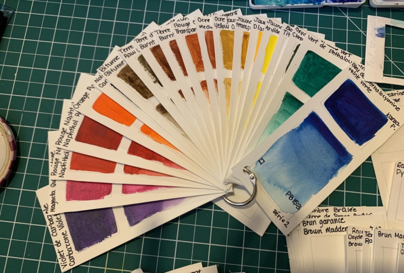
2. 1 Uses for Colour Swatch Cards: In this lesson, I want to show you some of my watercolor color swatches and show you how useful they can be. Now I use to create color swatches in sketchbooks like this. It's actually quite nice to see all the colors, swatches presented like this. But it's actually quite limiting because you are limited by the number of pages into sketch book. And it's actually not that easy when it comes to comparing against different colors and different brands. So here you can see this color swatches created for specific holler sets. And here I have color swatches for the primary colors are yellow. And towards the end here I actually have to draw the swatches, the boxes here much smaller because I was running out of space. Because again, limited number of pages in this sketch book. So that's when I decided to create color swatches like this. I use colors swatch cuts to compare against different colors. And since they are in hot format like this, it's really easy to compare the colors side-by-side. And it was, so this is to help me keep track of the colors that I have used to keep track of the colors that I like and dislike. So for some of the causes that I don't like, me actually write down some notes behind a cause to remind me why I don't like that particular color. So that in the future you've forgotten about their color and I'm thinking of buying that color again, I can actually refer to does swatch cut and see why I don't like that particular color. Now there are too many colors out there, so it can be difficult to remember the colors that you have used. So it's great and it's very useful to keep a collection of colors that you have used it cut format like this. And since they are in cut format, you can keep adding new cuts. You don't have to be restricted or limited by the number of pages you have in a sketch book. Let's see what's on my color swatch cut. So I have the name of the color, the name of the brand. In this case, this is Daniel Smith. I have to light fast rating and on different companies will use different system to read the light fast quality and Dennis maybe uses a scale of one to three. So light foster two out of three is considered on average to good. Lfo 1 will be the bass, threefold be the worst. Shanker uses a five-star system. So here I have the characteristic of this color. It's semi-transparent, low staining and non granulating. And that's the pigment used to create this color. And I have this box here with a flat wash. And here at the bottom I have this great data wash where the color fits into the white of the paper. This is actually one of my oldest swatch caused because recently I found out that writing the letters here, it can be a bit ambiguous because as t, which is supposed to be semi-transparent, can also mean that it's name. So I actually switched over to using symbols in state. This symbols are ships are more universal, so forth. Square it represents how transparent paint all pigment is. And for the triangle a represents how staining paint pigment is. So in this case we have a square that is not filled. So that means this color is transparent. And here you see that little stroke across this grad admins, this color is semi-transparent or semi-opaque. And for the triangle here you see it's Hopfield. That means it's Sammy's staining or medium sustaining. And here it's filled all the way. So that means this color is highly staining. Staining colors as the name suggests, pigments debt stain the paper. So when you apply what a color onto the paper and when the paint is dry, it's going to be very difficult or impossible to lift the paint all to remove the paint by scrubbing. That's because in addition to having the paint on the paper, some of the pigments actually go into the paper, making it really difficult to lift those pigments or painting of staining colors are great for layering or glazing techniques. Ideally, if you want to paint with layers, the first layer should be our staining paint. Because when your app subsequent layers, you don't want to firstly are to be reactivated. And here I have the light fast reading here I've written the four-stars, but it's actually clear it who write four out of five over the years I have improved a way I write the information on there so that the information is easier to understand without any ambiguity. So in this course, you will learn how to write those information without making the same mistakes that have hit previously. Color swatch cards are useful for comparing against different colors. So that's comparison colors now. So on the left I have Hansa Yellow Light made by Daniel Smith. On the right, we have lemon yellow made by Schenker. And these two colors actually use the same pigment, PY three. So when you choose to buy colors, always look at the pigment rather than just rely on the name of deontology because different brands will use different names for the paint. And another thing to note is if you really want to know how light fast or how resistant the paint is to fading. You have to do the light fast test yourself rather than just rely on the light fossil reading provided by the manufacturer. So that's shoemakers lemon yellow. And this is Daniel Smith's lemon yellow, which uses the pigment at PY 175. If we take a look at thinkers PY 175, you can see that it's named chromium yellow hue, lemon, Nico AZO yellow is a very popular yellow for mixing. And Daniel Smith's version uses the pigment PY 150 for SSH mean curve, they call it transparent yellow as take a look at three versions of quinacridone gold. So this is from Daniel Smith and this is for a mushrooming curve. This is from Winsor and Newton. Now looking at it kinda swatches like this at a glance. If there is no label, it would be very difficult for me to tell which. Is from which brand? Now the other way to compare colors is to actually use the paint to actually paint something painting or a sketch. Because if you compare colors, swatches like this side-by-side, this is the so-called ideal comparison. But sometimes you really want to see how the colors performed when you actually use them to create art. Alright, so for Daniel Smith's Quinacridone go, it's made with two pigments, p 048 and PY 150. Speaker uses a different formula. This is PY 150 mpr 1, 0, 1, and shrink our alcohols color, quinacridone gold hue. Now hugest means that the color is a variation or using a different formula compared to the original color. So the original Cranach random goal is actually using the payment P 049, which has since been this continuum. So this is the new formula. And we've shown Pinker calling their color quinacridone go here. This is actually a more accurate name and formula for all Winsor Newton is PY 150 PR to 0 six NPV 19. So this is a mix of three pigments. These two are a mix of two pigments, but they look pretty similar. Let's take a look at new gum Bosch from Dana Smith and Winsor Newton. So Daniel Smith's version uses PY and 1907 MP EY 11 zeros and new gamboge from Winsor and Newton uses the pigment PYY 53, which is actually the original pigment that Daniel Smith uses. But that pigment has been discontinuous. So this is the new formula. And if you take a look at two colors side-by-side can tell that they are very obviously different. This is more orange or more warm competitive. This which is more yellow. But compared with xm Pinker's version, which is also using the pigment PY 153. You can see each linkers version looks very similar to Daniel Smith's version. And even though these two colors are using the same pigment, they don't look like. So early on I mentioned that you should choose painted based on the pigment that is used. In addition to that, you should also look at their color swatches. It's best to look at colors swatches painted by artists. I'll all from reviews that you can find online, rather than just relying only on the color swatches provided by the companies. These six colors are created from the pigment PR 1, 0, 1. So even if there is just one pigment, you can't actually create. So 40 different colors out of that single pigment. And the reason why it can create different colors is because sometimes the pigments, they are heated to produce different colors. So for example, with PBR seven pigment that is used very commonly to create burnt sienna. You can heated to produce a different color. So burnt sienna is probably the heated version, and raw sienna is the raw version. And all this seven colors meet with their same pigment, PBR seven. By the way, Daniel's moves burnt sienna uses PBR seven, whereas when send Newton's Burnt Sienna uses that pigment, PR 0100 01. But because there are so many different variations, or PR 1, 0, 1, it's kinda difficult to tell which is the real version that Winsor Newton is using. It's probably this. Daniel's means transparent red oxide. These are all yellow ocher or different versions of yellow ocher. And looking at the names, sometimes you can tell where the pigment is from. So this one, Italian deep worker is probably for Italy. And French ocher, probably from France, Burgundy, yellow ocher. I'm not sure where that plays is, but young, six different colors just from one single pigment. So sometimes it can be confusing to choose a specific color that you want. Now that I have all these colors, torches, how do I actually store them? First of all, I will arrange the colors according to the order of the color wheel. So I have yellow to orange to the one reads to the coup rates. Purple, violets are blue, green and the colors here. Then I will group them according to different brands in this case, or this from Daniel Smith. I will create this cut here that I'm going to use as a separator. So I have this separator for Daniel Smith, a separate the linker. Another one, fall Winsor and Newton. And I just on this in my crawler here out a color swatch cuts grouped according to different brands in my drawer. Now I would actually recommend you get an ad high Box2D stormed is cuts to protect a constant gains humidity. As you can see, color swatch cuts are very useful. In the next lesson, I'm going to show you the tools and supplies you need to create the swatch cards yourself.
3. 2 Tools for Creating Colour Swatch Cards: This other tools we'll need to create the color swatch cuts. Obviously, we will need water color. We need three cups of water to fall, Washington brushes and one for clean water. If you can have two watercolor brushes, wonderful painting, and one for clean water, that you will use to paint a wet surface of the watercolor paper. Ten knife for cutting. This template. Sees this for cutting or the swatch cuts later on. Pencil for drawing the boxes and pen for writing the names and characteristics of the pigment. And we need a ruler, preferably long ruler, one that is longer compared to the watercolor pet that you are using. So this particular one is 45 centimeters, much wider or longer compared to this watercolor pet for watercolor paper, if you have the budget, I recommend you get a 100 percent cotton watercolor paper because it will make it easier for you to paint. Radiations like this to have the color fade from intensity to the white of the paper. If you're just going to be painting flat washes, you can actually go with non cotton watercolor paper or cellulose water color paper. And is brand that I'm using. This is Fabriano artistic goal. Regardless of which brand you get, do get the same brand so that you can use the same paper when you are painting color swatches in the future, what I call up paper can come in different colors like this one is off white all little bit primi, this one is bright white. So if you paint on different papers and compare obviously to Kazakhstan to look different, personally, I prefer to use bright white paper so that the colors appear to be more accurate. The brain I'm using here is Fabriano artistic goal. There are many different brands out there. The good ones are Fabriano, archers flew it, and Legion paper. And cylinders and Wallenda are just too many manufacturers for what our paper out there. Anyway, regardless of what you buy, just make sure you buy the same paper in the future to create color swatches so that you can have some consistency. And for Fabriano artistic or there are two versions, the traditional white and bright white. Personally for me I prefer traditional white and a paperweight is 300 GSM. The dimensions nine by 12 inches. This is actually a good size that can allow you to create 12 cuts. Now you can go with smaller watercolor paper pads, but it's more economical to buy a big sheet of paper or B-C, what I call a booklet this and cut dow into smaller cuts rather than by a small watercolor pad on this this county maybe produced, it costs. So you have to replace all read by his each time you want to create more cuts. And I by 12 inch watercolor block like this with 20 sheets of paper, I can let you create 240 cuts, solid. That's a lot of colors and a lot of cuts. And the last thing you will need is a cutting bought. I'm going to use this almost used up what are called Pet here. I'm going to use the back of the watercolor pet to cut this template later on.
4. 3 Creating the Swatch Cards: Let's create our swatch cuts now, the first thing to do is to measure the paper. We should not rely on the dimensions listed on the packaging. We need to measure the paper to find out the exact dimensions. So this is 12 inches exactly. And this should be nine inches, but it's not it's actually slightly shorter than night inches. Now, does piece of paper. Money by 12 inches can create 12 cuts like this. So to create shelf cuts, we need to divide it into half and then divide it into six parts. So since this is 12 inches on the long side, we can divide that into six parts very easily. Each pot we'll be just two inches. I'll be using a mechanical pencil. Who create them markings. So flush your ruler to the side of the paper and create aid or mocking at two inches, four inches, 68 and 10. So I have mapped out five pencil markings there at the bottom. I'm gonna do the same at a top. So now you just have to draw a line through the markings to create aid, the six pots. And now we're going to create two markings at the 4.5 inch mark here on the shortest side. So remember it's not exactly nine inches, so it's not going to be exactly flaw and a half inches. It's going to be slightly less than that. I've just placed mocking there on the paper. Slightly less than 4.5 inches. And now I can divide Is paper into half. So now we have our trough cuts. Now we need to create this template so that we can use this template to place it onto your cuts and use a pencil to draw the boxes so that we can have boxes to paint into. So to create this template, I'm going to Macau two centimeters from the top. Make sure to flush against the age of the paper. So that's two centimeters. I can draw a line across like this. And I want to have maybe three centimeters down. So 1, 2, 3 here, and 123 here. So I can draw another line across. Have maybe half a centimeter full of this. So half a centimeter or maybe more. If you want that part to be thicker, maybe I can have it at six millimeter. The thicker this pot is, the easier it is for you to cut her later on. So all let's make it six millimeter. And at the bottom here, this part, we are going to have it at six millimeter as well. From the site here, we are also going to measure six millimeter. And your six millimeter. So now we can draw one line like this and do the same thing for this age as well. Six millimeter here. And six. We need to make sure we have enough space at a top to write down the name of the colors and brand or company. So this is what we have so far. And now I'm going to place this on a cutting board to cut out these two areas. And I'm going to use this ruler here to help me cut. I'm going to place the ruler here to approve artists of pot so that when I cut, I have something to push against. And when you're cutting makes sure to be very calf rule so as not to cut your own fingers. Definitely take your time to do this. How was actually thinking of cutting like this with a ruler on the right side, but my finger is here, so make sure to find some way to cut safely. So I'm placing the ruler here so that when I'm cutting my finger is actually a way from the bleed. Take your time to cut. This paper is quite thick. So you need to actually push now, quite hot to get the pen knife through the paper, we need to cut here and stop here. Cut here, here, and here, so that we can pull out this area here. Cuz be careful when you are cutting. Now if you mess up this template that you are cutting, doesn't matter. Just create a template on the right side. I've already cut all the four sites, so that's try and push this out. Now, I'll sit in areas asked, Do you not cut property? So I have to actually go in and cut those areas. Let's try again, see if I can push out, okay, and it comes out very nicely. Now when you pull out this piece, make sure not to ban does template. This pot is due and not cut. Well. So let me just try and different is few times and pull this out. When pressed this paper here to pull this out. And now you can repeat the same process to cut out this bottom part here. It is very important for the paper and a ruler to not look while you're cutting. Otherwise there can be some misalignment or you can cut somewhere else x dental loop. So now that we have this template, we can just cut it out with a C That's very easily. You may want to create it and not a template because this is made of paper. It can be quite fragile if you accidentally bent it somehow, is not going to be that easy to use anymore. So even he wanted to create light, maybe two templates here, I'm just going to show you one. Just cut along the line. Again, cut slowly and take your time. So now we have this template that we can place onto the other boxes to draw our toolboxes. When you are drawing the boxes and make sure that our template doesn't move. So I'm going to use my finger to press that template and draw those boxes. They're so used a template to fill up the whole page. Do not cut out all of this. In the next lesson, I'm going to show you how to paint the color swatches.
5. 4 Painting the Swatches: In this lesson, I'm going to teach you how to paint the house swatches. And I have some new watercolor tubes I've bought recently. This one's almost used up, but I have not created any swatch cut for this yet. Now I do recommend you create color swatches whenever you buy a new color so that you don't get to create the swatches. Here. I have my cup of clean water. I have two cups here for washing the brushes. I'm going to have this brush just fall picking up clean water that I can paint onto the paper to wet the surface. And if possible, try to use a flat brush instead of a round brush. Although you can use a round brush because a flat brush will allow you to paint boxes like this more easily compared to a round brush. It would be great if you can have your paper at an angle, you can put this on an easel. I have it on a tablet stand. Or you can maybe put some thick books behind your watercolor pad just to prop it up just so that it can flow a dao to make it easier for you to paint and those gradations later on, before we paint, Let's find out what information we can write down on a swatch cut. So that's the name of this color that I'm going to paint, Indian yellow from Winsor and Newton. It has permanence a, that's the light fast rating. Aaa is the best and light fast is pretty good. And on the back here we can see the pigment information PII or 62 and PY 13, 9. And this square box here means this color is transparent. There is no information regarding whether this paint is a granulating color or a staining color. If the information you want is not on the watercolor cube, you will have to go to the manufacturer's website to find those inflammation. So let's take a look at Indian yellow. So we see here that it's not a staining and it's not granulating as T means it's staining and g means it's granulating. So in this case here it's neither staining all granulating. It's transparent. There's onto strong here. This is the ASTM light foster eating, but Winsor and Newton, they have their own light foss rating. So this is a and most permanent will be Aa. That's right Done name of the color here, Indian yellow. Make sure to use a pen with waterproof ink. So this is Winsor and Newton use waterproof ink because later on we will be painting over the ink. And his pen that I'm using. This is the unique boss, you know, Zhao stick with waterproof ink. This md square will mean the color is transparent and is Empty. Triangle will mean that it's not a staining color because it's empty. And put a light fast breathing. I'm going to put here l, f, a. And here on the right side I'm going to write the pigment information. So this is going to be p 062 and p y 139. Before you paint, make sure you have some tissue just in case. All right, so that's paint, Indian yellow. Make sure you are using a clean brush. I'm going to push some paid out of the tube and paint it here. Let me add more paint to make this color as intense as possible. So if you use a flat brush like this, it's really easy to paint in a rectangular box like this. For the bottom part, I need to have the color to paint fit into it, a white of the paper. So to do that, I'm going to wet the paper sub face so that when I painted the color, the paint will move on its own downwards. Make sure to cover the whole area with water. Pick a little bit of paint, just a little bit, and paint over the area here. If the color is too light, you can add more paint at the top, starting at the top. So just paint all the way down here. If you want to make this lighter, you can actually pick up some of the excess water at the bottom here t, basically just read up the color. Once you have painted this, don't go over and paint a GIN, you are going to mess up this area here. If there is too much water at the bottom, you can use this tissue to pick up the excess paint. So this is the first color swatch on this piece of paper. Usually what I will do is to fill up the whole piece of paper before I cut out all the swatches to make into cuts. If you find out you use too much pain, for example, like this. Just wash off your excess paint. Make sure your brush is clean. Now, pick up the excess water at the bottom teeth fit the color here. So basically, if you have too much paint here, you have to remove the excess paint from your brush. You may have to mess up a few swatches before your swatches. Good. Don't worry. It's all part of the practice. The more you paint it, the better you will get. When you wet the surface here, makes sure to use enough water, but not too much water, until the water actually flows of the page. When you have enough water on the SF phase, you can see the colors that paid. We'll move on its own. If you are using non cotton watercolor paper, sometimes it can be very difficult for the paint to move on its own. So here I'm going to help the paint move by using my brush to push the paint around. But first I need to clean this brush first. Clean it once. And is a cup of water. You can see this is quite dirty and clean it again into second cup so that this brush is now significantly cleaner. And pick up the excess water and clean water here at the bottom, pick up some water here and apply at the middle section here just to push the paint down. If you see excess water at the bottom. If you see excess water collect at the bottom, tried to dry them, used a tissue to dry them. See, this is blue. I'm going to use a clean part of the paper to pick up the excess paint and switch to the clean pot. It can't pick up the excess paint here. And here. If you don't pick up the excess water, this is what's going to happen. The water will actually go up again. So this effect obviously is not going to look as nice as compared to this. When your brush is clean, you can actually just pick the pinch off from the tube. This is the last swatch. It's definitely very satisfying to see or there's beautiful colors on one pitch. While looking for the pigment information on wizard, you'd his website, I found out that they don't have any info on quinacridone, violet and cobalt green deep on their colored shot or colored brochure. Maybe it's because these two are new color's added after the colored shot opera osha was published. So in this case, I wasn't able to find out whether or not these two colors are staining on, not a staining. Anyway, you can actually look at the pigment used by brands or auto manufacturers to get an idea of whether or not those to ask staining. So for now I'm just going to leave them as they are. You can have caused has whether or not the colors are stealing. By doing Golan test, if you don't have waterproof ink, you can actually just use pencils, do a write the names and all the info. All right, so it looks like the color swatches have dry, so now I'm going to cut out the cuts. I'm going to cut it like this half and then cut like this. So earlier I mentioned it's good to paint the colors swatch for each new color you fly. But after painting the color swatches, I think it's actually more productive to pick on a color swatches During just one single session. If you have a color swatch painting session, you don't have to prepare the water separately each time. So that could actually see a lot of time. It's better to paint on a larger sheet of paper. Because if you cut out cuts and paint later on on, the paper will buckle a bit more compared to painting on a larger sheet of paper. This Winsor orange is not dry yet. Make sure the paint, the switches are dry before you cut. Otherwise, when you stack, like there's it's going to make other costs 30 if you mess up your color swatches or York hearts, for example, you wrote the wrong name or you just don't like how your color swatches look. Do N'T control them away. You can actually turn those cuts into templates that you can reuse. So these are the beautiful colors, swatch cuts, I Algiers make Nivea one to find morgue hollers to swatch. You can consider buying colored dot cuts from manufacturers. There are many companies that make a dot cuts like this. So you can just watch out the colors using all these thoughts of what a color paint you don't have to buy like what a colored tubes to swatch to cut it. We need to find out later that you don't actually like that 200 what to call you just bought. Another way to get more colors to Sochi is to exchange colors, weave your friends.
6. Goodbye: Thank you for joining me in this course. I hope it's helpful and informative. And this is just the tip of the iceberg. There is actually a lot to learn about colors, pigments, and watercolor. So I hope you can go on and explore. Those are wonderful medium. I really loved what color again is. Thanks for watching. Thanks for listening. See you guys in the next course.
 Teoh Yi Chie, Sketcher, watercolour lover