Transcripts
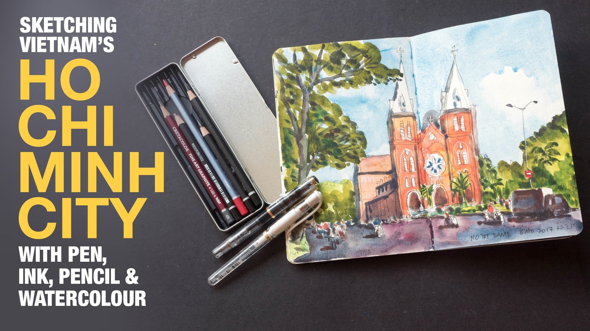
1. Introduction: Hello. Excuse share students. This is too for this. Set off to Toral's. We were re sketching some urban scenes off Bangkok with help off some reference photos. That's me. Show you the sketches will be drawing to get her. But before that, let me talk about the tools and supplies unit. So you need a pen with what A proof Inc you need, What, a color and watercolor paper, that's all. So this is the first sketch. This is a pen and ink sketch just for warming up. And this is the second sketch disease off Chinatown in Bangkok. So to go off this to Toral's is basically to get you to draw from observation as much as possible. I prefer to drawing location, but sometimes I do work with photos as well. So all these sketches are going to be very loose. Very sketchy. Goal released. Here. Have fun while you're sketching and we will be painting with a limited kala palate. Just Teoh make color. Mixing a bit easier for between us is to Taurel iss for me Penis and lastly, we will sketch this the Grand Palace off Thailand, using a limited color palette as well this actually some of my favorite sketches. So after you're done with your projects, you can look them on skew share to share of me, and I can give you some pointers. All right, let's start drawing.
2. Sketching Bangkok Busy Street: Hi, everyone. Welcome to today's to Tarell, where I will be drawing this city scene from Bangkok. So this is a reference photo that I have taken last week while I was in Bangkok traveling. What caught my attention? Waas disputing here this yellow building with the red and white 10 teach light thing extending from the top off the windows. So this was quite interesting. And this is a very busy scene with lots of power lines and activity going on. So I'm going to try to attempt to draw this and show you how I would approach a scene like this. Is that drunk tools that I will be using to date kopek Multi liner. This is brown color. There's users Pickman Inc. It's what a proven coping proof. I will not be using any water color. So two days to Tara will just be a pennant ink sketch. So the different pens here they have different line weaves. This is 0.50 point Juan 0.3 and this is 0.5. This scene has a foreground me to grow and background. So for the fall ground, which is disputing here, the vehicles and this three here I will use a 0.5 pen to draw this foreground. And for the middle ground, which is this yellow beauty, I will use a 0.3 line to draw that and for background, which concedes off this light, rebuking the tall, utter beauty and background and also the trees here how we use a 0.1 pen for the power lines which are very thin. How we used a 0.5 Before we start drawing, let's find a vanishing point. So this is actually a one point perspective seen. I'm going to use the diagonal lines to find a vanishing point. So I'm using this line here. Andi is reeling here that points upwards and also the lines on the ground. So I think the finishing point is somewhere around here in this area here and this point is also in line with my I level. So my eye level is somewhere here because I was standing when taking this photo. My eye level is slightly above all this cost all these vehicles, which is why I'm able to see all the roofs are artists, vehicles. So this is the vanishing point and this is going to help us draw on the diagonal lines later on, as they tell me. And what's going to go into the scene I want to include is rate sign about here and his re sign boys attached to the beauty here. So I will include part off the beauty here as well as is traffic light a lamp post the tree will be in. So this is basically the scene that I'm going to draw. This is the page that I have. I need to make sure that the top of this sign bought must go in the page. And also, the tree here must go in the pitch. So the top of this line bought is actually around the size off the height off the tree without the tree trunk and the bottom of this sign bought it almost starts right at the top of the three year. So this is gonna be the slain bought. This is gonna be a tree, and this is gonna be the tree trunk. So I'm going to use my 0.5 pen to draw other important proportions. Do not would be where this line is This is the line on the left side of the yellow beauty. This line is exactly between the tree here and a sign about here. So later went drawing. We need to pay attention to where the yellow beauty will start. But right now I'm going to start by drawing the tree and a sign. But so this is a 0.5 line. My scotch is going to be quite loose when a sketch D is very quickly. All right, so this is my treat. You can add in some additional details. There's to give it more texture, but this is done. So remember the height off the sign bought here. It's about the same height. Soul. You must draw that in relation to the size of this tree here. So it's gonna be something like this. There is this perfect like that overlaps onto the sign. But so I need to leave some space for that and there are reduced now remembered. Ah, vanishing point is some right here you can put a little dot or cross to get that. The reason for the vanishing point is because all the diagonal eyes they will go to the Fasching point and this side, but he has some thickness to it. So it portraits backwards and might have produced backwards. It's gonna go to the vanishing point, so I'm going to give it a little think must like this. And now let's draw or other elements in the foreground. I'm going to start with the power pole here, which goes like this and goes all the way down to the bottom here. It's going to end right here at a trunk here, so I know what it's gonna end so I can draw very quickly all the way down like this. Now there is, ah, reeling Henry Linger, which she is going to point toe. What's the finishing point? Because I have the vanishing point. I do not need to measure the angle off the reeling. I just need to know where it starts is going to start here, right at this tree trunk. Here, at this point here, I'm using the tree trunk as a measurement to, and it's going to end somewhere around here. So if I draw a diagonal line like this from the vanishing point, it's going to end somewhere around here like this. So it's very easy to draw angles like this. When you know that Vanishing point and the bottom off all these polls here again, they will actually go to words the vanishing point. So you need to end them at the right position, something like this. Sometimes they may want to use pencil to draw before he drove the pen, But that's up to you on the other side of the route. There are also rulings and all those buildings and wrote yourself go to the finishing point . As I'm measuring from the left to the right, I noticed that this poll actually should extend a bit further down so that when I draw, I wrote like this When you start the root right here just below this sign about here, this will put a little dot there. Casita. I am constantly trying to measure the angle to get the right angle. So it's gonna be like this. This is the walking pavement on this ist, uh, walking people in raised above the road on that's droid and, uh, railings. All right. And now that's draw out of big ships like this little smaller sign bought below. This I bought There is a them pose hearer. Let's go down like this Onda structure here is like this can use the finishing point goes up like this ex truths a bit from the beauty comes down, goes behind his power cable line goes all the way down on don't two days part here which is the top off the shop on the top of the shop, using the vanishing point again. This line is like so this line here is not horizontal. It's gonna be something like that. And now the challenging part is to draw the cost. When drawing on location, the cars will be moving. So it's gonna be a challenge, a huge challenge to draw moving vehicles. But since we are drawing from reference photo, we can take this opportunity to practice drawing cost. When you draw a lot of cars, you can draw on occasion, even when the cause I'm moving. You have that muscle memory. You have the image of the car in your mind because off all the practice you will be able to draw the car very easily. Even if they are moving. So the positions off the car will be important. Make sure that they are plays properly in the scene. So this is the halfway line off the yellow beauty. There is a white car here, so the white car will start. From here. We don't. I'm just trying to get a shape off the car when you're drawing cars or basically anything you should take into account measurement the placements off objects like, where is this window going? Where's this light going in relation to the car? Is it below that? We know. Besides, we know to the site off the door. How far is it away from the site? Off the doll photos is going to help you draw more realistic car. So this is car number one on car number two is here. It's much smaller because it's put away. Now. The cars should pay attention to toe perspective off the vanishing point as well. Best drawed a taxi to this site. Bottom of the Texas is going to stop somewhere around here, right Gonna be here, Go up like this. The taxi is smaller competitors career because it's but a week in the perspective. So to know the right size to draw the Texan, you have to use basically this mean car here. So this is the taxi on. There is one truck here. The truck. It's like this. Remember to use the vanishing point to get the angles right. All right. All these cars are in the foreground. So I'm using this zero point line to draw them for the cause of further back. I'm going to use a 0.3. I shall suits Teoh zero point 3 10 because all these cars, they are overlapping the building behind I was with the roots go into a draw using this first because behind they are much smaller as well because they are much further behind. No. At this point, I realized that some of the leaves, they overlap the cars so they don't have to switch to does your 15 again to draw some of the leaves overlapping cost. Or you may choose not to draw the overlapping leaves. You can just use long is like this too. Suggest that there are cars going into the bedroom. All right, thing I have thrown all the cars except for this one. All right. No, I'm using the 0.5 again. I want to fill in all the details here and also the details. On the left side, there is also another power pole that comes all the way up here goes all the way down like this comes off this. There is lamb pose that goes a birth sleep. There are two Paul pools as well. Now, using technical pens, it's best to draw of technical pens holding down vertically have used them to the site. Sometimes that you come, you know, come out because the tip is not in contact with the paper. I have added some people here, even though there were none in my photo. Now the head of all these people, they should be on the eye level if they're further where you should draw the body smaller, and laying off the lakes should also be smaller. If they are closer in the foreground, can draw them bigger. But the hit should always be on eye level. Now it is. We'll give the scene some additional details and making more life because they are people. So there's other shops. I'm not I'm not copying the exact configuration or the exact thing that I'm seeing. I'm just using very quick doodled lines. I have completed drawing the foreground elements. So I'm going into the middle ground using the zero point three. The top of this yellow building is going to start somewhere here, right in the middle of this sign bought. So it's going to stop here. Remember, the last site off the yellow beating is going to be between the tree here and this Sybil here. So it's gonna be here. And since this building's going into perspective like this is going to turn me, just draw the line here first. Just to show you where the heart is on the line is is going to turn at the half way point somewhere. All here, This is the halfway point between disputing this yellow building the age of the yellow beating on the age of the L. A meeting here and when it turns, it should point to the vanishing point. So it's gonna be something like this. There are several extrusion Z. This is one of it. This is and not a one on. Let me just draw this angle here for us. The bidding goes in a bit and goes down like this on. That's going, Teoh be almost horizontal. Here is going to hopes. I think I drew it at an angle like this, but it doesn't really matter. So it's going to stop right here because there are some power lines, power cables in front. So I want to draw that in. So when you have overlapping elements, it gives more on that to your drawing. So this extrusion here we'll go to the back here as a traffic light here. So with the structure off, the beauty was drawn. You can draw all the little details very easily. There's a satellite dish, some water tanks up here and there is and not a beauty behind this yellow beauty which I'm going to draw with Lena Line. But I'm going to finish drawing this first. There are one here on a tree, balconies. His balcony is over here. So does another balcony Here, here and here. That's a big sign here and here. The roof here is a bit different. Compact Tiu, the one at the bottom. So drawing it in on a balcony. So we have the balcony? No, the balcony actually extra outfront abusing. So you need to give it some extrusion. No, it is my balconies they are not very straight. The lines are not very street. It doesn't really matter. No, this line here this angle is wrong because it should point to the vanishing point. So it looks weird. All two diagonal lines. I should point to the vanishing point. If not, it's going to look really. And I can draw that little cover the full grown and meet a girl drawn. So now I can draw the background. This is a 0.1. So remember this building here that I told you about this behind the yellow building? It's going, Teoh be like this drawing with 0.1 line on his line here will go into the finishing point. Something like this and I'm going to draw the power lines. No, the pollen is here. It's not totally vertical. So is a bit too took to this site on this site. IHS, this is a 0.5 pendant I'm using because the Pol allies here they are close there in, uh, flow ground. I want to draw them with a thicker line. All right. I think this is good enough now to switch to 0.3. His will go down like this. This, like this? No. There are a lot of lines here. I'm going to use a mixture off 0.5 on zero point three. Because all of these lines, they are actually in, uh, full grown, and it's very messy here. Very, very messy. Crisscross lines, you increase, cross the lines and paralyze. Here I will be using the ver thin line 0.5 because well, if I use everything lines, the picket lines, they're going to get your attention. But then lines they are softer. So do you. Do not have as much contrast. They will not take attention away from me in structure. - You may also want to, at some shadows, to the cars if you want to, you can do that. Some off the power lines here they are actually quite like they are a bit thicker than usual, and also because there are so many off them. So some of them combined together to produce a thick align. I want to have some variation variety in terms off thin and thick lines here. All right, So this is the completed sketch. At this point, if you want to add water colors. You can do so if you are beginning. I would suggest you start by practising your tunes. The music can start by applying a watercolor wash. Just by using one color, you can use French, ultra Marine and burnt Sienna. They will create a very nice great hole so he can create a great home for all the years that are in the shadows for the Ducati areas. You just at an additional layer on top after the first layer has dried. And for the really dark areas, those areas that are close to black, you can use a very concentrated makes off French, our primary and burnt sienna to add in a little earlier. So here's a closer look at the sketch for years where you want additional contracts. You can actually go in and at take a lines just to bring out the extra contrast if you want to. All right, let's recap the main lesson points. So in order to draw the mean subject that I wanted to draw, which is this beauty, I need to make sure that I have enough space and to do that I drew The element is at the boundary first which are the sign what and tree? Because I know that this building is actually between the sign bought here and treat here. So once I have these two elements on the page, I know that I will have enough space to draw into beauty here and also the cars into full ground. The next point is, for one point perspective seem like he's trying to find a vanishing point first because it is going to help you to draw quicker later on. So the point is here and all these beauties that are paralleled to one another, they are going to share the same vanishing point. However, for buildings that are not parallel, for example, in disputing it. If it would, he wrote it slightly. Then it's going to have a different vanishing point. The recognize the diagonal lines here they are going to have a different finishing point, but if they are actually parallel to each other, then they are going to share the same finishing point. And with this vanishing point, you can draw in obvious diagonal lines very easily. Even we don't observing them from what you see in real life. The last point is when choosing a composition. Try to choose one where there are overlapping elements so you can get a sense off that. And here see these cars. They are overlapping other cars, this trees overlapping on Paul lines. Volunteer, overlapping the beauty. So you get that sense off that I want to create an additional sense off that when using pens, you can use pens that have different lion thickness. So we've different line. Think knows you have that sense of that best well for elements in the foreground. Used thicker lines for elements in the background because they are further, we'd you're gonna be smaller used in our lines. So that's awful. Today's to Tarell. If you have any questions, let me know in the command section. Thanks for watching. See you in the next video by
3. Sketching Bangkok Chinatown: Hi, everyone. Welcome to another. Drawing to Taro for today's video are will be drawing this scene. This is a photograph that I have taken in Chinatown, Bangkok in Thailand a few weeks ago while I was there on holiday. I do not have time to sketch this. That's why I took a reference photo off it. And I like this scene because there is a lot off activities going on the cars with zooming pause, the people they were going on with the business on the street and science the They're quite striking for me, so I'm going to draw this. This is a bit complicated. I'm going to try to simply fight his particular scene and try to get my pen and ink watercolor sketch done in one hour or 1.5 hour. This is the sketchbook down using. To date. The paper is Bob Brown, your studio paper with 25% cotton so he can handle watercolor quite well, but it's not too big. This is the sketch book that I have used to create all the turtles that you might have watched earlier. Before I start, let me talk a little bit about the Tenneco. Expect off. This photograph on this photo was taken with a wide angle land. So there there's some distortion. I'm sorry about that noise made by some bird site. I'm not sure one, but it is. Anyway, for the white angle lens, there is going to be distortion, especially around areas that are closer to the frame. So all these areas here, they are going to be a bit distorted. Here is here they are not soldiers started. What I mean by that is take a look at this line, for example, lines that are closer to the center of the frame. They are gonna be much shorter, not just because they are further away, but because of the distortion and lines that are closer to the frame. They are going to be stretched out Now. If you take a photo off a group of people, people who are standing near the age off the frame, your faces are going to be distorted. So this is something to take off when you are drawing from reference photo as much as possible. I do recommend you draw from observation because when you draw from observation and then compare that to a photograph. You can spot little details like this. Like, what's the difference between going from real life and drink from photo? So that's one difference. All right, So full this scene. I'm going to start by drawing again the longest line. And that would be actually these power cables here on is stand here. Then I will work my way across to the vehicles in front. I'm drawing the vehicles in front because they are in front and beauties are behind. I want that overlapping effect and then move on to the beauties behind. I would draw the sign, but first followed by the beauty. So when growing, that's how I usually think I draw the foreground elements first before the background elements. All right, let's get started. So the power cable is going Teoh, around here, this is the standard for cable. So sometimes I use my finger to measure debt has become all the way down here and go up here. So this is this point here is half off at this point there. So that's what I usually think about when I am drawing. I think about the positions often lines, so I always think about things like, Where is this in relation to the other lines? And now I can draw the cable. I mean, the stand that goes all the way down there is this table here. This person is actually squatting down. No drawing people. You have to draw them very quickly because sometimes they just moved off and it happens a lot of time. So this is just a very quick sketch, not very detailed, very simplified version. So when you're drawing very quickly, you do not have time to think that Oh, this is actually a person riding a motorbike. Your credit thing in terms off the shapes like this line is going down in this angle. What is this angle and things like that Israel make your drawing more accurate. Now, this area here, a two motorbike, it's a bit dark because mine camera dynamic range is not that good. So later on, when I'm painting, I'm just gonna paint all these areas in black even though there should be details. And this is another difference between drawing from observation and drawing from real life . Yeah, I will be able to see more details compared to the camera you will be able to see details in the shadow areas very clearly cause cameras they are not good at capturing details in shadows. Okay, there are some signs there are some signs here. I'm going to draw those signs. I'm using this sign here. Teoh, help me gauge to size off this smaller sign about step are just be site The thing. I messed up some of the sizes, as mentioned in many on my Utah rose. If you want to be really accurate, just draw a bit slower. Just pay more attention to the proportion and things like that, basically drawing slower well, may be a bit more careful and think, Really think about proportion. All right, let's move on to drawing that tech seat. This texi is just right in front. It's a very big taxi, so maybe I want to draw it a bit carefully because it's big. Department demands more details. When you try and measure and see how the lines wolf, this line will move up. This site mirror the front of the texi. His it's a unique extends a bit out to the front because you have to draw from observation . If you are drawing from real life. I mean, if I'm drawing a car, I would probably extend the front off this car. How much further to the left side compared to the centimeter? But as I'm looking at a reference photo, this part very actually just extends are very slightly on this angle. Here it is a bit steep, and his wheel it stops right here, right below this window. Here at this point, so just pulls up, come down, it goes down, not a bottom up the taxi again. It's very difficult for me to see from the photographs because it's very dark in the shadow area, but you've got drawing from realize it's not going to be a problem at all, because it's your eyes will be able to see quite clearly all the details, even in the shadow areas. All right, that's it. There is a truck here. What was the same height as a bus? All right, because I'm drawing from a reference photo. This is really relatively easier to draw. Growing from real life you have. Thio was say you only brought a truck like this. Tried Teoh, Get that image into your mind before the Trump moves off. All try and draw. When the vehicles are stuck in traffic, that will be a good time to draw you tings here they are difficult to draw because there are a lot of details, so I just I don't want to draw those details. I just want to draw that. Maybe the bigger ships that catches my eye. So after I have this big shape, let me count the number off smaller rectangles inside. There are six. So I'm going Teoh, um invited if ideas into six. The halfway point around here. So this would be Juan to three, 45 six. Something like that on disputing is going to be cropped off because there is not in our space defeat the top off this building, which is not, um, Porton. If you really want to fit this building in, then you should take into account how how tall this building is in the first place. When this case, it doesn't really matter to me. So I just brought this for the windows, going to divide this beauty into your few sections, so that can draw the smaller sections easily. So in this case, the taxi, the top of the Hexi would be somewhere here. Miura goes up across. This is a lot. That thing on top Texi, It comes down here. The will the back of the wheel will be in front. Off the baby on the left side of this site mirror. So something like this I just wrote a real in This lying here goes down a bit slightly. This is where the other wheel will start. Is this the back off texi? This is not that accurate because I did not draw carefully. How do I know that this is not accurate? Now, when I look at this wheel here, for example, this will is actually in the middle off the taxi, in the sense that this will proportion here should be equal to this portion here. So just be in the center. So actually this area here should extend a bit further out. So that's how I know that I have gone, uh, with some You don't get the proportion. Correct? Not a fan behind decided. We knows what is particular shop? Yes, Young. Just just drawing very casually. My fountain 10 actually ran out of ink, so I had to go and we feel it. No, these When I travel, I just bring along my disposable pen, The uni balls No, Joe stick Because I don't have to bring along a bottle of ink. I do not have to brief you on it is so much more continued. And I would bring, like, up to disposable all tree disposable pens just for backup purposes. Now, sometimes when you are drawing lines at this with me, when I'm drawing lines, all these lines are there Just to give me an idea pleases where I should color So places where I have drawn the line I know that I'm going t put a different color. Sorry about the noise that's of our irritating. But you know, there are a lot off. I'm not sure what all this are, but this are very tiny metal cables I used to attach to the science. So I'm using the other site off the phone and pen to get those thin lines. So this is the completed sketch, so I can see the style is very sketchy. Vory lose details sometimes are more details. Sometimes it's really very loose. First simple fight. And now I'm going to color this sketch so colors that I'm going to use to dio some of the new because that I bought a few days ago. This is Monty Amita Metros, Nina in danger in blue organic milion, they green yellow shit. All these are made by dental Smith. Watercolors are getting the milion. This color is not totally like fast. But since I'm sketching in a sketchbook, the colors feeding the problem with colors feeding is not going to be a problem because the sketchbook is closed most of the time. If you're fooling my to Tarell and you want to use the exact same colors that I'm using, actually, there is no need to. If you want to follow a bit closer, you can use a one yellow warm rate on one new, and this is actually a cool cream, but you do not have to use exactly the same colors. But have you used the same colors? Then you are going to get the same mixtures, but that is actually not important. The most important thing is to use a limited palate and just play around with the primary colors. Play around with how you can mix primary colors so I have release grease about some colors onto my palate, and I'm going to use them. Right now. I'm going to start by coloring or the yellow objects in the scene, so I'm going to use this inner as it is straight from the to. The nice thing about Sienna is the colors are really muted, slightly so it's not that glaring catching. Just use it straight from the to No. Four colors that are a bit stronger, like lemon yellow. They are really vibrant. They are really bright. You seldom see those colors like that that bright in real life, so you have to dollar down slightly. Now it is taxi here. This is a suitable subject to paint with lemon yellow because yellow is very bright, but in this case I only have sienna. So that's the yellow are use so sometimes is good to use a limited palette you are restricted to using. We'll need to colors that you have. You do not have to buy so many colors. Therefore, it is guy here. I'm using Sienna. I just need to add a little bit off rate to get skin toe. Want some variation? I can just step in some additional colors to the wash hopes. Too much rate. So be careful when you're adding strong colors like red or blue, Anything that is tail. Oh, be very careful when adding, Because they are, they have very strong tinting strength. What I mean by that is you just need to use a tiny bit off Pickman from a fatal color, and you can drastically change the color off the mixture. And that's what's happening now. So this are getting the 1,000,000. This is very likely to have a very high tinting strength, which is why I added a bit of a 1,000,000 know this area here. It becomes really rate. And now I can't go on at a rate I want to add a bit off CNN s. Well, so that is radius. Not that glaring. So as as I add a little bit off, Bluetooth is rich. The colors it becomes a bit dirty here depth some rate colors here and there. And now I'm going to at some greens to the scene. So for the green, I'm using fatal green yellow sheet. I wonder at some sienna to that green to make it a bit last glaring because people green yellow shit. It's quite bright. Now. I'm going to use in dental allude to make some off the sky area. Now if you watch other tutorial videos from outer out hiss, sometimes they would start by mixing the sky first, and they would do every quick wash up the sky. Sometimes I do that first. Sometimes I do that later on because I want to. You see the colors that I have and determine how light I want to paint the sky. Usually this guy is quite light, so this mixture is makes from three colors. So this this power cable and a stand here is going to be very dark later on. But some of the areas the have this shadow like tool should have, like value to it. And I can use this to paint all the shadow areas. Just you get all the shadow eras dark and later on, when I paint in the blacks for the black areas, it's going to look a bit nicer with contrast. So this shadowed who actually softens up, uh, shadow areas because if you use black and white, the contrast is too strong. So you should always have some meat torn values like this. Some of the pig hasn't hasn't right yet, so that's why the cholera is moving around. I just want to paint very quickly, so I he would just let color flow. Try to mix the colors on the paper rather than mixed them completely in the palate. If you mix them on the paper, it's going to look a bit more likely because you can still see the individual colors that used to create a mixture. But if you mix it on paper, I mean, if you makes it completely on, the pellet is going to be a bit Mahdi, and that might not be a color that you want. I have waited for the sketch to dry, so now I can at in a really dark shadow areas. I'm gonna use dental boo fought that. So this area here it's almost black. I need to mix it with a bit off read to get Doc let color, - and now I'm going to use this wash. This is permanent White Wash. I'm going to pains on the white into the scene, especially to write the words on this signs and also the markings on the road. So let's start by coloring this I know it. Is that the back window off this taxi? It's much brighter compared to the road. So I want to at some wash to it. Sometimes having a tube of white can be quite convenient, especially when you want to paint over large areas like this area. It will be a bit difficult to pinto over with Does white gel pens. I just noticed that this should be green as well. So you see it is green. It's too bright. So I need to dull it. Don't with a slight read but this is too. So let me just try and redo this again this time mixed the green properly. So this is the green at that? I'm using little green. This green is very bright so I want to add a bit off Ritt two It Justin Dalit del I think there should be fine. All right. This is the completed sketch. I must say that I really enjoy painting this. It waas really fun now The difference between me pending this at whom and painting on location I think if I paint on location days, maybe a bit messy year. So right now I'm drawing this at home. It's really much more comfortable. So let's take a closer look at the sketch this I bought here that is behind this to stands . Your color is the same as that cloud, so it's not easy to difference you this Teoh clout. So I might want to add an additional washes to make this a bit docker so that there is a slight difference between this and the cops, some off the areas that are a bit bright, I might actually want I might want to dr them a bit like, for example, with this evil here. This is a bit too bright, so let me just add a very light wash over and be here a swell. The white wash works really well. On what color It's very well pick. So the contrast between white and rich it's really strong. It's really nice. This is the area where are admitted. Mystic. This building is supposed to be yellow, but I had a too much rich to it. So now it becomes a real beauty on what I want to see is it doesn't have to be accurate. You don't have to follow the color of the beauty. Exactly, because this is this is hot is just how you interpret it. When you make a mystic, sometimes you can correct it. Sometimes you can just go with the flow. There is no right or wrong ways to handle a mystic. And after you've finished the sketch, you can look back at your mistake and see whether or not you have chosen the wrong way. Toe. Fix that. Or maybe you have made the right decision and you just learn from, um, every piece off work that you create. So this is the completed sketch, painted with a very limited palate off four colors. I have to include this green color because if I makes green from the Sienna and this blue is going to be a very dull green, I will not be able to get a green that is going to look like this. So that's why having this green, it's very helpful. So that's the end After days to Tarell, I hope you have enjoyed it. I hope this is helpful. If you have any questions, let me know in the comments section or just contact me. Thanks for watching See you in the next video by
4. Sketching Bangkok Golden Buddha Temple Pt1: Hey, everyone, welcome to another To Toro in today's to Taro. I'm going to show you how to draw angles, how to measure them correctly and draw them accurately. So this is actually foretold that I have taken in Bangkok, Thailand, a few weeks ago. This is a photograph off a temple there and the temples there. They have rules that have a lot off extension. So it is not just one simple roof like that. It has many extensions out from the front and also from the laughs and also the rules. They are at different angles, so it can be quite challenging to draw something like this. Even for roof like this, this is quite complicated. So today I'm going to teach you how to measure angles. Consider this roof here. This is not exactly horizontal, because the line actually goes to the lab site to a vanishing point on a live site and his line here it goes down to a vanishing point on the right side, and you can see your this angle. It's quite steep and goes on, wake up. This is going this direction. There's this line here that goes destruction here, here and you're and there are a lot of different sections here, so this is gonna be very challenging, but I'm going to show you sort of how you can simplify drawing this. Don't be too caught up with the detail. You should pay attention to the bigger shapes. First, for two days, sketch. I'll be using my Perricone M 200 phone and Pan. This is a watercolor sketch book with Far Browning Will studio watercolor paper that's 25% cotton paper. And later on in the second half, off the to Tora, I will be coloring the sketch with there's color palette. So before I start, I'm going to measure the proportion off the temple to make sure that I can fit everything onto this picture so assured of reference photo again. So I'm going to see where the largest part is going to be. So I'll take measuring from the bottom off this roof to the bottom off building here. So this is going to be one unit and the top off the roof. It's going to be another unit. So we have one unit here, one unit here, and there's this little extension. This is not on the ground. There are some steps here. This extension will be probably 1/4 off this unit and I want to draw the Korean. So maybe this will be half. This would be one unit, one unit. So when I draw later on, I have to pay attention and remember the proportion correctly. If you feel that it's a bit difficult to draw straight with ink, you can use the pencil and do some layout first. So I'm going t probably put this. I'm good. I'm going to use my hand here. Would put one unit here on one unit here on one unit here. So this is one unit one unit on this is going to be half unit. The other thing to note ISS, this actually takes up quite a large area, so I want to measure that as well. So, having a measure from this site here, I'm going to use my pencil and put my Tom here. Measure this point here to this corner off the war Here, it starts to turn. So this is one unit. This is an on a unit. This is maybe 1/4 unit. So when I draw later on, I'm going. Teoh, put this here. So this is one unit. This is another unit. This is sort of 1/4 unit. I just put a little dot there at all those places. So this is going to help me locate order important points later. And now we can start drawing. So how I usually measure angles is using this method. I would use my pen or pencil, locked my elbows and put his pencil away from me to measure the angle on disk aids. His line here is, too. That's likely this and I'm going to use their help off the clock face. So, you know, in a clock there is travel clock three across six and nine o'clock. So this is almost going Teoh three o'clock. But this if you look at the minute hand, this is probably a 40 minutes or 30 minutes and his angle here, If I measure it like this, if you look at the minute hand, it's going to be something like this is 45. So this ISS for a six, this is probably 47 and from what I can see, this angle, it's steeper than this angle. So this is very likely going to be 47 minutes. And this is the 14 minute. So that is one way. The other way is to choose again. You have the measure that is get one on go, right. I always choose the longest line first. That is get one angle. Right? So in this case, I'm gonna get this ankle like this. Does this 40 minutes. And later on, when I draw this angle, I'm going to use positions on the roof here to get this point here. So his language up. This is the point that I want to get and we re draw vertical line down here is going to intersect this line here at Maybe you want that place. So when I'm draw this line first, I would draw this line first and then at 1/3 off the point here, I'm gonna move my pen up here and then draw this line down. I'm going to demonstrate that later on, just show you my part. Process first and this point here. You see that if I draw vertical line down here in this section here, it's much shorter. So later on, when I draw, I'm going. Tiu have a mental image off this point here. We're gonna extend it all the way up here and then draw with the pen down like this, and then I could connect it. All right, so enough talking. Let's draw. I'm going to draw from decide to this site, or I can also draw from this side. Does this site. But I have to make sure that angle it's not horizontal. So something like this and there's this little extrusion to the bottom. So it's like this. So remember earlier on, I say that I'm using this point here to extend all the way up. I don't move, too. How far up and just connected. I just connected. And this point here, it's If I draw it down, it's going to be somewhere on here. So again, I'm just going to you do it like this. So I have two points already. I can just connect. You're it is like this. And as I look at the roof, I can see some extension again. It goes up vertically, first likely and just draw that in, and we have this first roof here now for the first roof. It's the point is somewhere around here again. If I look at this line that I have drawn, I'm gonna use this point. So this is the middle point off that triangle. So it's gonna come, though, like this. Thank you, and and go up like this. Come down like this. There are some decorations there. You might want to do that. It's not important at this point Now, the other roof, the one that's just right behind this one. The middle point. It's if I look at if I look at this line here, this line here, the middle point is actually very close. Very, very close to you. Somewhere on here, So again draw up. And when it comes, don't you? The bottom off the triangle there is actually out outside off this point here. So when you draw that, make sure it goes outside. So it something like this. So that's outside. So as I'm drawing, I'm always using those points as measurements like this point here from this triangle. It's actually directly above this point here, so I can draw something like this and it just goes down. It was like that. And this line here there's an angle s well but because you have drawn does you can sort of use, uh, that, uh, measuring to like this and we have the roof. It is the general shit all round the first two triangles. And next one, we're going to draw the roof behind his second triangle. So, Mr Khan triangle there's this angle here that goes to goes downwards. And when it goes down, what is going to stop just above here? So it's going to be like this. There's this little white pot here, and the second roof will go up now the second roof is actually shotted. And this is our first route by way. This is actually more tapered, so it's going to start here, and I have to make sure that it's lower than this US. I can try and go here, So I'm going to and here and I'm going to move my way down again. I'm going to start off prime, find where ends is gonna end somewhere wrong here. So they just moved on this on desist A roof. This is vertical pod. A little extension. Okay, so we have one to three. If if you find out there is really a lot off did. He was like too much did use. Then do not draw all the extension. First, draw the big triangles. Most like this 11 to three. Don't draw the details first, because sometimes we can get a bit confusing. When you draw too much details, you forget where you are. And now I can draw the this roof that goes all the way to the back. It's going to end at this point here. There's at this level here, so I think it's about here again. I'm using some measuring technics. So this will come from here. I look at the photo I see Read that line Starts is going to start from here is going to end somewhere around here when I compare it horizontally. So I can Roy all the way down like this. And this angle aerial after it goes like this is gonna turn like this, and this angle is going to go down all the way to where this point is, So it's going to be somewhere around here, control like this. Actually, it's not If I look at a photo, I think it's somewhere like this. So I drew something wrongly so it's actually like this. So this goes to show that you do need to measure the lines correctly to draw accurate, but after you have measured everything, it's really very easy later on. All right, so after this part, I can just connect. Use Andi. Let's see where I am now. I get I'm getting a bit lost. Actually, there's just here on, okay? The roof comes down here and goes Don't like this. So this is that little angle that IHS steeper than this that I mentioned earlier. And this part of the roof that extends out actually comes up from the center of this point on this roof here. So this will go all the way. The angle of this roof, this part here it's the same Angeles dis. So I can just followed angle of that and move myself all the way to this pot. It's going to be below on the middle point here and there is is this triangle actually continues all the way down from here to here like this, like this. And from this point here connects to this point on Despots here connects here on here, on here. So this really as you can see is a very difficult moved to draw on. His part would go out like this on this angle is the same as this angle. And this angle, when it goes down, comes down here on this part here will go down. Teoh, despite here. And there's another roof here. Andi is well come down here and now we are on the right side of this room. This roof this point your will go down. This like this Ondas we'll go down like this. I think my angle is a bit too steep, so it's actually more like this. So the more you draw, the more you will be able Teoh Saris like this, you will be able to recognize angles are correctly. So this is actually about pot experience pot measuring and more comfortable. You are at measuring batter and more accurate, you will be in the future. You will be able to draw a bit, Foster. So I think this is the general ship off the roof. I cannot add in the little details, like additional lines for the extensions and maybe some additional lines for the decorations and things like that. All right, the roof section is almost completed and straight away, I can tell that there are some problematic areas. The most obvious one to me would be. This area here is part of the roof just is too big compared to the reference photo that I have. So let's compare and see here this part here it's really small, but here it's really big. And the reason why I drew this wrongly is because I lost concentration for a while. Angle is actually almost correct. It's almost 45 degrees. But this line here, this is shorter, so I should have ended it somewhere around here like this, and a triangle and back should go up like this in state off further back here. But other than that, I think it's all right. The thing is, when you move this triangle forward like this, you also have to move all the other elements forward as well, because on placement it's relative to other elements in the sketch. Always remember that whatever you draw, it's always in relation to other elements in the sketch. That's why I am always comparing where this point ISS relating to other points readies lying is in relation to other points. And the second problematic area is this part here. If you take a look at here, it's really very complicated. So here I think I lost some concentration as well. And not a point is, uh, this line here, This is not horizontal, but here in my sketch, I drew it as if it's horrors on those old That is also wrong. No, some of the problems. When I while I was drawing it, I did not notice that. But when I look at it, I can tell that those are actually mystics. Now, when you are drawing, they are drawing a particular line and straight away. After you draw that line, you have that moment where you think Oh gosh, this is wrong. That's actually a good thing because you are able to now recognize that what you're drawing is actually wrong. That means you can start off measured angles or see the subject in front of you in proportion. That's why when you draw something wrong, you can tell immediately that there's something off. But if we are drawing something and you do not have, those are moments, I was Oh my gosh, moments then you do stuhn it to practice some. So, for example, here I lost concentration. I don't realize that I made a mistake on to I look at a sketch right now. And now, with the main structure done, I can go in and draw in little details like the little details on the roofs. This is to give the sketch a bit more detail. I shall just be used. Um, I'm not going to redraw that part. I'm just going to live it as this. Sometimes if you re draw, you might actually make it worse. So I'm just going to live it as it this. There are some decorations inside us. Well, some hot. I'm using the other side of my phone and pen to draw to because I don't want that lines to be that thick. It was asked. Think is going to take a really attention off the mean structure. The roof structure is done and now I can move on to drawing mean beauty bought over the beauty. There's there's little roof here that goes all the way from here to here and his line. It's almost horizontal. So I'm going to draw this time. I'm going to draw it horizontally and come down like this. But this line here it tips don't slightly so I need to draw it tilted down. So it is line here off. The beauty will continue behind. I am going to fast forward is part here because today my focus is on the roof just to show you the roof after you finished drawing the roof, I think the what is our little details here in front in the foreground, Audis are actually pretty straight for it. The most challenging part for drawing this off this particular has sickness, Really? The his roof structure here for the background. I'm going to use again, uh, out of sight off my phone impediment to draw because I do not want the background to stand out background shares. Supporting character Supporting Elements Inc is not fooling very well when I draw with the phone and pen like this. So sometimes it may be actually better to bring two pence one for Thika loans and one for Tina lines. In my case here, I like to just bring one pen because I don't like to bring so many items out. - So this is the completed sketch is starting to common life. I want to explain Ah, some parts. So this part here this part here is actually larger compared to what the temple is in real life. Because I drew this part wrongly is not just that I drew the angle wrongly the length off this is also wrong. That's why because of this, the error is extended to other areas of the sketch. So sometimes when you make mistakes that mistake me affect other areas of the sketch. That's because when you take proportions, compassion is always in relation to another part. And if one part off the proportion is wrong is going to affect other theories as well. So this is one area here, but I'm just going to leave that the other area is this part here. This is definitely something as a big really, because there's part here is a bit difficult to imagine what that structure is like. The line should actually be like this. Yeah, detection looking right. And here you see, I drew the corner off this beauty all the way down, and then you realize, Oh, there is actually a tent in France. So now this line overlaps the tent, but again, this is a sketch. So really doesn't matter when it comes to sketching or learning to sketch. I think the most important thing is to enjoy the process off sketching as you're drawing, really spend that time to really study the subject that you're drawing. Try to remember the moment, experience off what it is like to be drawing on location, and that really is what attracted me. Teoh drawing on location because off the memory is that are captured on the pitch. So mystics like this is all part off the learning process. Don't get too hung up on them. And when you look at a sketch like there's when you see your own mystics, you would just remind you not to repeat that mystic. So all this mystics, they are just very good blending spirits. Let me show you, and not a sketch that I have actually created from the scene reference photo. But instead of black ink, I used colored things, and here the roof structure is actually more accurate. So you can see here that this part here that I through wrongly here I drew it correctly year because I think I probably paid a bit more attention to drawing here and also his line here, that as horizontal, which should not be I drew. It is at an angle here on Let's see what else? Oh, this area here, which is too big and here at so much smaller. So even for the same sketch, when I drew it on separate occasions, they stew, they may look the same. I mean, the star is looks like my style, but drawing the proportions. It's a bit different, that's all for the Pennant Inc section. Ford is particular sketch. In the next video, I'm going to be applying watercolor over the loans, so see you in the next few Thanks for watching die.
5. Sketching Bangkok Golden Buddha Temple Pt2: Hey, everyone, welcome to the second part. Off this tutorial, I'll be using watercolors to color this sketch and this out of four colors that I will be using. Today we have Monty Aminata Natural Sienna organic for 1,000,000 dentro blue and fail. So let me show you the color swatch just at his four colors Cream eight. So this is the color wheel that I have created from this three primary colors. This ist Asiana. This is organic for 1,000,000 on this is dentro blue. No, if you want to full along by using the same colors, then you have to get the exact same colors. But it is actually not necessary to get exactly the same colors as long as you have warm yellow that is somewhat like orange or a sienna. If you have a one raid, you have one blue. Or maybe you have French Ultra Marine. You can steal Fuller long. As for the green Well, how do shows a green? No, for example, here I have sienna mixed with in central blue greens that I get They are really Calvary Date. That's why I included a Theo Green, which is very bright. So if you have a color. If you have a secondary college is very date, then you might want to add a to off color that is very vibrant. So let's say if you're purple is really very dull. Very date. You can add a purple tip off purple so decided four colors are switched out. You can see the green. This is really bright. And when I makes little green with organic vermillion, I get this cream, which is pretty nice, and I'm going to use that green to collar trees later on. The brush and I'm using is the enough sky up Kaletra sable brush. You can use any sable brush brand doesn't matter. Sable. It's pretty much quality brush regardless of the brand you get. And now I'm going to mix this color. I'm going to be using a this color for the sky. It's very nice. I just have to mix the three primary colors together, just at them bit by bit to one another. Hopes. I think that's a bit too much. This is definitely too much, So usually blue is a very strong color, and if you want to add blue, just edit very lightning so I just want to get this this color going. All right? I think this is the color that I have, and I'm going to put my pellet to the site first. And I'm going to switch to using this squirrel brush. Seems at home I have access to all my brushes, even outdoors that would just used sable brush to create dismal wash. So this ISS washed. I want to use some wet on wet technics today, so I'm going to create dismal wash over the sky first and just add a bit more water. This time it works best on cotton. What kind of paper? Because the cotton will czar, uh, water and hold it for a while while you play in the wash. So now that I have the paper wet, I can just very lightly Depp in some of the colors. You can see that this is almost purple. I'm gonna get depth in some genter. I mean something. Dental blue, creative blues. Guys, this looks like this almost going to marine set off rainy sky. If you do not pick up the water, some of the paint me actually flow down later on on effect the painting. So I want to do that for right now with the wash earlier I can wash is a dress here as well . His areas are supposed to be great. Horns just create a very quick wash. I'm not sure if you can hear uH, thunder that's going on. Roll on Recording is going to rain. I'm actually painting at home. If I'm actually painting outdoors, I will work even quicker because there's no way for me to predict when it's exactly going to rain. So I try to paint a bit faster when on all doors. Not a good thing about painting outdoors is the paint they will drive very quickly, since its under the sun. And because the pain can drive very quickly, you can pain a bit faster. Okay, I'm back for the plans here. I'll be using a little green mixed with a little bit off a 1,000,000 used. They will green like this onto the pitch. You can see that this is really a natural, but I would add a bit off again in a 1,000,000 to basically just dial it down. I think it's best to mix it on. A pallet stayed off, doing what I'm doing right now, which is to have it mixed on paper. It's a bit difficult to control. I need more green. So if I had a bit too much read, like what I have done here, it's it looks is going to look, it's not going to look like what I wanted to. Okay, so I think I'm done with green. And now I want to use Vienna. Very light wash off. So, you know, for the roof images Sienna is a color, Dad. You can actually just use street from the tube. So I'm just going t create a very light in Washington. Perhaps I want a little bit off rate to give you some invigoration. So once I under really can see that this is the radius overpowering. So let me just so I'm just going to color order here. Is that supposed to be so here? I'm painting the rest The roof. We've, um this sienna, and you can see us some of the areas. They have a bit of read because I want that some variety in debt yellow. So when you have some variety in the young, only makes it looks Look a bit makes them washing look a bit more interesting. So this is a dark a doctor Wash off Sienna. I'm going to use a lot of water now to paint misleader wars off this temple. That's what I'm doing right now. And C on moving my brush just to cover the war is a very light wash. Competitive Sienna off the roof. There are some I'm not sure. What is it called? Barry? Kate saw something is all white in colors, so I'm not going to leave them. I'm going to leave them as white. Okay, I'm quite happy with is a yellow wash on, uh, war. I'm going to continue the yellow wash. Ford is building right in the background. Okay. I think that a wrist is yellow rubbish mean here. It's actually bright yellow, but since I do not have a bright yellow are well use, we have to use enough of that. So I think some parts off the roof, it's almost dry. And now I can mix a bright orange. I'm going to be using this sienna with for a 1,000,000. Just a mixed right orange. Can you hear, uh, rain heating my window? This is actually more rid and order. So I need more Sienna. I think this is a nice color and trying cover order there is that are supposed to be orange . The barricade here is supposed to be rich. So I'm going to use Vermillion on Here's the tip off my brush to create the barricade. I think that's order rate terrorist in this scene. Now, since I'm using rate, I'm going to add a bit off dental blue to create the color off this vehicle here, which is supposed to be some purple like color. So I'm just going to create this whole waters purple and leader on when it's dry. I'm going to add a shadow leader to meet the doctor. Here is Doctor as a person here and here. All right, for background here I'm going, Teoh. His dead body is I mean for all these people here. I'm just going to dep audience people with this color, all right for the darker areas here, which is is our part. I'm using a very concentrated wash off in central blue. So this is in central do in a concentrated form. The bottom off the vehicle is supposed to be closed a black. His part here is supposed to be green. Some parts off the hot here, it's it has some yellow in it. The bottom off. This this is not as dark. I need to make Shadows are in the shadow of this. This structure here much, Doctor. So right now I'm going to wait for this to dry before I apply another earlier, off color for the shadow area here. I'm going to mix three primary colors together. So I have something like this. I think this looks all right. I can use this. Washed. He washed the bottom side off the hopes bottom side off this roof here to create that shadow. You know, some of these structures they are, doctor. So I want to use Vienna to make them doctor. Mr. Revere is also in Sienna color in the background. But partner has believe it is actually in shadows over. Let me make it a bit darker. All right. Florida shadows off the steps. I'm just gonna paint over like this very quickly. The lines are actually supposed to be thinner. The shadow lines actually supposed to be on for this car windows. I'm gonna make it a bit darker, so I'm just basically touching up different parts off depending that I have according to color. I think this is it, right? I think this is it. Oh, no, no. Yet they is part here. There is supposed to be some blew out of in the photo The blue is actually like a sky blue cyan blue But since I only have in dental blue this isn't only blue that I can use You use it like this and I forgot to color this pot This should be Docker Shadow. Let me mixed primary three primary colors to get her again to get that Dr Shit here. Okay, I was the one paint to bottom off even some extra shadow. Think despite your just paint is has a ship and lastly I'm going. Teoh, take some four million Teoh draw this cycle. This is actually a sign. A sign board. All right, so I think this is almost done. We just for some roots stare for the finishing touch. I'm going to use some white wash to paint over some of the colors for the parts that are supposed to be white, but I accidentally painted them over with a car. So it's part here is supporting white wide Urus. Well, so this is how the sketch looks like when colored the steps. Syria, they are drawn, a bid reared. I think I probably should have paid more attention to getting the proportion right to drawing them in more detail that perhaps I can maybe salvage something here by adding some lines. My share of it it works, actually, probably did not work. All right, um, let's take a closer look. So instead, off Sigh in which I do not have I using dental blue for the blue color on this is the shadow area, which I mixed with the three primary colors. So this is how the roof looks like. I really like this orange that is mixed away. If Sienna and the 1,000,000 This is really nice, because the hall will paint that washes and really contrast very strongly against the orange roof. I should have left that pot in white winner when I was painting, but I've thought about it, so I painted over. So now I have to paint over with a white wash. I think it's their works. Some of the details I forgot to drew in would be here. I'm going to draw in some of the details now just to give you some extraordinary tale, Not a thing when drawing over watercolor is the line black against the color is going to be a bit stronger than color over the black. What I mean is when you're drawing and you apply watercolor ovary, the watercolor start off lens with the incline us below it. But when the watercolors dry and you go and draw over it, the black is going to look a bit glaring, by contrast, because there's no water color applied over. So which is the case here? Okay, so that's through some details here as well. Thing here, it's pretty. All right, let's move down to the car. So this is the car is a vory wonky car, adroit in a very wonky manner. So just, uh, trees. So remember, earlier I use a little green and I make stay with some volcanic off a median, even though there is no great in the actual reference, would hope it doesn't really matter, because you do need to add that rate to make the green bid Docker And sometimes when you see variation like these again, it's more interesting than if that washing like whose? For little details like this, you may require a smaller brush, but in this case, I basically just used this brush. I just need to be a bit more careful on the sable. Brush as capable are keeping a very sharp tips so you can create all these details. You just have to be a bit more careful not to press down too hot. So this is the shadow. Under the structure, mixed is a shadow with three primary colors again. So this is how the Golden Buddha at Hampel in Bangkok, Thailand, looks like And I'm going to write down the name of this temple. So that's all for the second part off this to Tora. Um, I hope you have enjoyed this. If you have any questions, feel free to ask me. Just contact me by email. Thanks for watching. See you in the next video by
6. Sketching Bangkok Grand Palace Pt1: Hi, everyone. Welcome to another watercolor sketching to Tora. Today I'm going to sketch this. This is the Grand Palace off Bangkok. So I was there on a holiday a few weeks ago on took this reference photo. This is the scene that I actually wanted to sketch on location. But because the weather was so hot and humid, I would probably die off dehydration if I stand there on draw. So I had to move off to our more shaded location. But this is the scene that I want to draw. And the reason for that is because I can see the two sites off disputing. I can see it is site war here and the front section off this beauty. Usually when I draw buildings, I liked to be able to see the site war and the front or the site one back basically to see two sets of debuting. So that building will appear more dimensional. If you're just looking straight on to the beauty ing, looking straight into the front of the building is going to appear a bit latte. So it's not going to give your sketch that sense of dynamism. So here I think it does the job for me and also the angles you can see. They are not horizontal to touch. So again give some sort off dynamism to it. The other thing I like about this portal is there are a lot off lapping elements. So the crowd off people in front, they overlapped trees in the middle ground. And then we have the beauty ings in the background, and this beauty is also much further in the background. So when we have overlapping elements again, it provides that sense of depth mix. Your seeing looks a bit more time dimensional. Let me show you the sketch that I actually drew. So I drew this from the front off beauty. Maybe our standing a bit tow us the right side. So I consumed this site war here and see the shadow here is here. But this was drawn mostly facing the beauty from the front. So it's not that I would say dynamic, but there are a lot off people over that being the background amino ground so does provide . It sends up that my duties with pencil so the lines day are not a strong compared to Pennant Inc lack lines. And then I apply what color over it depend that I'm using today is a pelican M 200 found in pen and using a phone and pen for this particular sketch. It's going to be quite helpful to date, because for the elements in the foreground, I'm going to be drawing with the fountain pen anomaly. But for elements in the background, are will be turning the fun and pen back like this to draw the tip upside down so that I can get the thinner lines for objects that are for the way in the background. All right, let's start by drawing the elements in the foreground furs, and that would be the people in front. I'm going to draw the largest person here, And that would be this guy here, and his guy takes up about half off the whole scene. Tim. Self height. So when I'm drawing, pay attention to the language that I use. When I tried to determine the position off the subjects, for example, this person is half off whole scene, so his hat is going to start around here, and the top off this scene will be It is this thing here. This element here that goes all the way up and this will be the top off the beauty. So this is half on. This will be half. So when I get this to in, I will be able to feed off other elements in to pitch. So sometimes I find it helpful to just place my finger here just to get a sense off spacing and distance. So that's draw this person here first, not his head. It's about as high as tall as his neck. Tous next stops here, goals up, turned slightly to the right and goes up trying to look at the reference photo as much as possible when drawings that I can get angles. Right. Okay, so we have something like this. This is not totally accurate because I see that a neck actually to in this direction. So my sketches not that accurate. It doesn't matter as long as it looks like a person. It's good enough now for the next person. This is ah person who is standing in the middle ground carrying an umbrella. Are this person is foot away so wish he or she is going to be smaller and umbrella that he or she is carrying it somewhere, owned this evil here somewhere around a neck here and the feet off that person will end around here. So the inbred eyes here ends around here at shoulder here. So maybe I'll draw from department up. This goes up is Dan for the umbrella as one big shape, then comes down like this. I just don't like this comes tall again on paying attention to reference photo as much as possible. There is a back here on the back on Let's Go on to draw and Knicks Person debts also carry an umbrella. So the next person, the feet, actually comes all the way here. That umbrella will start here seeing height ST's umbrella here appears like this. Sometimes it's actually easier to just draw very quickly. Just get the sheep there, make sure that a proportion is right. DeSisto hand on, desist a ship off the body. This person is was carrying him back. No drawing from reference photo, and there's drugs on people. Drawing people from the reference photo is very, um, easy in the stands that they do not move. But if you're drawing from real life, you really do have to draw being foster, even if it's not accurate. It doesn't really matter because you're trying to capture the Essenes off the scene. And when people look at our sketch, they know that you're drawing it very far, so they will discount the fact that you, uh, not going to be accurate, So it doesn't really matter. So there are a lot of people here. There is going to start off Boss. Forward is pot, But the general principles that I used to draw is is the scene. Make sure that you get the top correct and the bottom correct. A top of the hit starts here on the bottom starts here, and when you're drawing mixture that you can fit everything from the top to the bottom, just get a sense off the size so that when you draw it, you don't draw too big. Now there's is tourists that IHS wearing a scarf over the hit. If I draw that tourism death scarf here, it's going to look a bid, really, because that ship is not a ship that can be easily recognized when drawn. So instead of drawing that scarf, that huge scarf, I'm just going to draw and other tourists rather than that tourism discuss. So that's the good thing about drawing. You can just draw anything that you like. No. When you're drawing people, you want to replace people. One important thing to take note off ISS in order to get the size of right humans find the eye level. So high level of all these people are going to be in this area here and this area here. Now this person is an AB section because thes guy here is much taller. That's why he is much higher but high level for all these people here. They are actually around the same year. So when you're drawing and the other person that you want to add in, but it's not actually in front off what you see, you just have to make sure that you're drawing it in such a way that the eye level is around this area. So there's a quick tip for you in case you want to ask people to your C. But ah, you I don't have any reference. So this is what I have so far, I think I I'm going to stop here on move on to drawing trees in the middle ground. So some of the trees they are here, I'm going to turn my phone and pen upside. Don't know, because I do wonder lines in the background to stand out so much to know the placement off all this trees. It's all over interesting ships. They are almost brown, so I'm just going to draw them this. Try to draw as accurately as possible. Teoh. What I see, actually, for the trees, it doesn't matter if they are not debt accurate or not in the correct position. Because, unlike people this trees, if someone who has never seen these trees before, they are not going to be able to recognize the ship off the trees. So it doesn't really matter. But for people use, do you have to draw them in the right shape because when people look at our schedule, you know that it's person, it should be in the shape off a person. But for trees, it doesn't really matter if you don't get that exact accuracy a loose for this particular sketch. So I have very quickly drawn the people and media growl, and now I'm going to move on to the beauty. I'm going to start from the left side to the right. I'm going to turn my fountain pen around again and draw this site. So remember earlier we took this person as one unit. So the building is this tall on a the age off debuting starts your in your head when you put a line down a vertical line and is building moves down slightly to the right site and goes down like this all the way down and his pot here, there are actually Steve some trees. And this part here is almost horizontal. This line here, it's almost hard to. And for this site, I need to make sure that this point here is lower than this point here. If you're not sure, you can spend a bit more time to go and measure that positioning. But I'm just trying to eyeball it right now. When I look at it, I usually try to use these points as important positioning points. So this point here ISS hired at this point here at this point here is higher than this point here. They moved down to this pot here. No, this distance here It's about less than half off this. This will be one unit. This would be half off this or maybe 1/3 off this on this angled as a triangle here and it goes all the way up Kiss. I'm still like this. I can see a bit off The extension into debuting is another try and go behind. Andi, this is I'm not sure what the structure is called. And there's another one here. Goes down like this does. If you're unsure, try and use your pen to measure so you can get angle. Correct. And the tallest point is somewhere around here is actually quite closed to this point here , me drawing to make it thicker. And then it comes down like this on this part here will come down this It has a slight curve to it. Curves like this on a This is some sort off corn ship. So when you are standing on the ground looking upwards, usually for corn ships are cylindrical ships, lines, naval curve like this in this direction. All right, so we have this fuzz butin here, this first structure on the beauty. Now that I have this, I can move on to drawing the this section here with a lot of big windows. Now the point here there is one point here that's going to and at the top off the hat. So I'm going to droid like this. So he's been end here. I had a top hat goes up my business and gold goes up like this and this lying will come down like this. All right, So what is particular tree here? I drew it a bit too tall, but it doesn't really matter, because it it's, um is not that accurate. But it's not that important. And now I can draw the structure. This is the corner off this structure here. This line will go up slightly on this line, would come down slightly. There's a roof here. This goes up and down and up. I don't Now, if you are unsure, I'm actually drawing the smaller parts rather than the larger pots. If you are unsure, you should draw the larger part spurs. Now this beauty is really intricate, has a lot of details. If you want to, you can really draw very detailed. But I just want Teoh for this detour. I just want you want you to sort of get a sense of how I draw the ships. How, actually measure the ships? So it doesn't really matter even if I do get all the details in. So this is the second structure here. That's on top of this beauty. The top, actually. Somewhere around here, which is Lord and is because off perspective someone You draw this first and then come down like this. And now I can move on Teoh this section here. So this roof is part here. It extends all the way to this part here comes down this as the easiest spot here goes behind his. There's Peter here and continues here. So you won debt Continuation on this section here is smaller than this section here. How do you know how small you just compared his pot here. Tubas, Cledus areas here. Make sure you don't draw them as you should. Make sure that this is be good and this slightly but not too big. It is too big Proportion is off. So when you're drawing, always be comparing what you're drawing with elements that are close by. And for this last tall shut that thing here it's going to be here. So I'm gonna draw this. This no Ive you really feel intimidated when drawing elements like there's because there are so many details. Or maybe this scene is too complicated. Then, um, for practice purposes, just select. Just zoom into our specific area on draw that specific section just fall practice purposes . The goals are sometimes can be quite intimidating to look at a scene. Dennis, this big, so busy on you are wondering if you can complete the drawing. Um, if you're not sure, Dan, you can practice at home. Just focus on a specific part just to get the angles right. Okay? And now moving on to the last structure. All right, What is part? I definitely drew trees a bit too high, so that's that. It's a mistake is definitely a mystic here, But if you do not tell the person who is looking our sketch, they are not going to know. So there's another shop thing here, all right, I think the main structure is almost done. Now I can add in little details like windows. He's my long is not really ST wobbles. Slightly neatness, quite quite fun. There are seven win news for big Windows. I try to count them, but for smaller windows, such as those in skyscrapers, there's no point counting counting them. Because when people look at our schedule, I'm not going to tell the windows. There are smaller windows here. Load bigger windows. Now this smaller windows, they are aligned just that rectory belief. So you need to use this. We knew here as, ah, positioning to to how you position the windows that odd directly beneath. And if you feel like you do not want to draw so many windows again, just draw trees to block articles. Windows. This is a technique that I use quite Boston to use the trees to block off the window so that you do not have to draw them. And when drawing this section here, here lies the bandage off, drawing from reference photo. If your camera lenses not white not to capture everything like mine isn't that right? A modest part will be in the photograph on. Since there's no reference, it's a bit difficult to draw. This is almost done. I'm just putting in sound finishing touches. So this is the completed pennant ink sketch before I At what color? Before moving on to the next section, I'm going to scan this image so that you can have a look. I'm going to upload the fall somewhere so they can access the fallen. Have a closer look at this sketch.
7. Sketching Bangkok Grand Palace Pt2: for the second part. Off this to Taro, I will be adding, What a color over the pennant Incan lines. Before I do that, let me show you the colors that I'm using. Today There's water. Colors are from Daniel's me of brand. I will be using new gun, Bush asked A primary. Yellow is his credo cried on rate. This is French ultra Marine, and I added a green. I'll be using a sap green. Actually, I wanted to use a fellow green, but this color looks a bit off compared to this three colors. And this is the color wheel that I have created. So with Gambar. Sh When I had a bit off queen read, I get a nice orange, uh, redish orange and is is queen rate when at some French ultra Marina have is beautiful purple. Oh, violent. I'm not sure if you can see clearly, but the ultra Marine does not mix completely with the KRI. Hna cried on so you can see some traces off outright Marine. Even within these wash itself, and that is really interesting, it's really nice to see that kind off color that separation that makes out what color really beauty food. This is We have more French Ultra Marine on this is ultra Marine. You can see some regulation. This is ultra Marine. We have some new gun bush again. You can see that the Ultra Marine does not makes completely with new gun, but I can see traces of outdoor marine, but I'm not able to see new gun boss here, But I can see a new gun bushier some traces of new gun bush and ultra Marine. This three primary colors are not able to mix a bright green. I wanted to use fatal green, but little green is actually not a color that I can mix from this three color. So when I choose a green, I want to make sure that that green has some Pickman that is coming from one off this color and in this case at green one off the contributing color for sap green is actually French Ultra Marine. If you add yellow to French ultramarine can actually sort of get this kind of green. But do not at new gun watch because this is not This is not this green. This is a brighter So this is what I want. I do not want the Dow green and for the Great Horns, I mixed the three primary colors together just to play around with the different agree on neutralized. Who is that I can get? So these are what I can get and this color here, this is almost black. This what's mixed with this three primary colors? Together, I used more ultra Marine, a bit off rate and a bit off new gun bush. So most of this is actually contributed by ultra Marine. The proportion off black usually is not equal proportion off primary colors you have to use usually more blue on last rate on last yellow. Now that we know the colors that we have in the mixtures that are possible, we can use that to paint this sketch. I'm going to read the sky first with this school brush because I want to paint, uh, lodgers area first class. So I'm going to wet the paper so that the colors later can just spread out and bloom beautifully. I'm just wetting their Skype and not this structure here. Make sure that I do not wet the beauty. If you're working in a very dry climate. This is probably going to dry quite fast. So you may have to read the paper a few times, all to work very fast before it dries. And in order to do this kind off, wetting off the paper is does that you use Colton paper because they are going to be more durable. So right now, I am going to at some ultra Marine to the sky. Just do that, uh, colors, land. You can see how the colors are moving down very nicely, and I'm going to add some new gun bush some red. And now I'm going to mix the neutralize toward So for the neutralised who? And I'm just gonna add it somewhere around here, this is a bit too rich. So perhaps more ultra Marine. See the clubs, They are so dark. It's like it's going to green. Okay, so I think this is pretty much done. Maybe this is a bit too dark, so I want to pick up the excess water with my tissue. Just try and pick up the water. Here you can. Also used is to create clots like areas where you want close to be whiter again. Jizz going and dab Try to do this before the before it drives. Because once it dries, you can. It's a bit difficult to pick up the pin. And now I'm going to leave the sky alone and let it dry properly. And I'm going to move on to Calorie and, uh, foreground elements, which would be the people in front. I'm going to start with the clean colors. So this person here is wearing bright orange court. I'm gonna depth this orange somewhere a swell, you dare. And now I'm going to use, uh, great wash that I've created here to Washington. Some off the clothes. This is too much water when you use too much water. When this dries later on is going to have that back Ron effect. So I'm going to pick up the water right now. Now, this is a neutralized Tony. If you wanted to move to West a blue collar, you just add a bit more blue. Like what I'm doing right now I have a beating on blue here. I wanted blue too Moved here, See the colors blending together and makes this a bit dirty. If you are the sort off artists, all pain. Terrible, nice things to be meat. Danu probably would take a bit more time to finish this particular sketch because you have to read for the paint to dry and things like drawing accurately drunk slowly is going. Teoh, take a wall for the umbrellas. I'm going to using ultra Marine. Mostly just step it here. And terror. Surely there should be more ultra Marine on Queen cried on. Great, because most of these people are wearing black. They are actually morning. The taIking So many of these people, Thai citizens. They came from out of pots off the country just to come here to Peter Last respects to the late taIking Let me show you my palate. Usually I will create a wash off yellow blue on rate in this case here and when I want to mix a neutralized on our jazz quickly use my brush. Just pick up some of the paint on Mexico here on pick ups on up in here and makes it here. Or maybe I'll just pickups on up in here. Mixing here on some here just dab a bit. Just at the color is a bit by bit so that the colors day shift too much. So here I have a neutralized tone, and that's how I go into at colors again. This part is too much water. This brush that I'm using is, uh, Sky a poli tre. What a column. Brush it. Use this able hassle. It really holds a lot off water. Okay, now I'm going to mix the skin tones for all these people. I'm gonna wash my brush first. Sometimes I paint the skin. Tones were sometimes I pain big areas first. So for a skin tour, now will be using new Gun Bosh clinic right on rate and a tiny bit off blue skin. Tones are quite challenging to mix, especially if you do not have convenient colors. So let's see if I can get this color correct when he drives is going to dry lighter so hopefully the colors will turn out well. And now let's paint the yellow parts of the beauty ing. So let's take a look at the color wheel that we have just now. So the yellow part I'm going to be using new gum bush as it is. Maybe mix it with a bit mall water so that it's not that strong and just step it on to the parts. Were the yellows on needed when painting on location? When I use so much water, it's all right because it drives quite quickly. But now I'm painting at home, so he doesn't drive that quickly. So I have to be a bit more careful when, uh, choosing how much water to use. And now I'm going to use sap green to colored, uh, trees. Except green is a very nice, convenient green. So let me just step here in there. Hopefully all this are really dry. If not, the colors are going to run into. Are there areas? If you want to make the green a bit docker, per helps. The shadow areas are doctor. You can just at ultra Marine. If you want some parts of the green to be a bit darker, you can just at ultra Marine to the mix, which I'm doing right now. I'm adding some ultra marine to concede this area. Commas, docker very quickly. I'm just adding it to the bottom part off doors, no green areas that are in the shadow and London to paint the orange rooftops. This is new Gun Bosch way of Queen cried on rate. I'm going to add some blue to the windows. I think this is the shadow areas off the beauty in front, just going to dab it just to cover up those areas. You can see the greenest do not dry yet, so there's a lot of blending going on. I'm going to wait for this sketch to dry before I add in additional shadowed Hoon's on some of the areas. I want them to be really dark. So I want to mix this black to creates on this cigarette to give them the extra contrast. And now I can paint some off the shadowed ITU's. I have mixed ultra Marine with Queen Rate and a bit up new gun Bush for what is colors. It's a very cloudy afternoon, and his son is actually directly birth. So is casting light like this So the shadow areas actually on the body, the shoulder areas are going to be, uh, lit. So I just have to at shadow areas to the site of the body, there are known strong shadows almost off this are actually just Ambien shadows, and now I'm going to mix the black, - and I'm going to add a bit of water just to make the mix a little lighter so they can add in the shadowed ones on the ground. Two at the shadow here is for the golden or yellow section. You just have to mix ultra Marine with couldn't quite on rate basically use a complementary color and then step over shadowed years lays over it so that the color will look a birthday yellow to provide that neutralized tour. So this is the completed watercolor sketch. Let me zoom in closer to let you take a look at the details. One thing I really like about ultra Marine ISS. The regulation. This is really pretty, so this is mixed with the three primary colors. But with more Queen Read and Ultra Marine and the white areas, they are lifted off with tissue. So this is the golden structure on business. The shadow area mixed with Queen rate and ultra marine but helps this is a bit too dark soul. Maybe I could have a light and slightly I think it still works here. Queen, read with your gum Bosch for the roof. All these are just Sepp green depth on two different areas for the doctor areas. The, um they were added with French Ultra Marie So French aquamarine is really quite Doc on its own. If you add it to set green, you can get the shadow here. It's very quickly, very conveniently. So all these other people standing in front models actually just neutralized who? When I want to achieve a color toe, words yellow. I just at more yellow to the neutralised. Hold on. When I want to shift it to rate, I just add more Redo. It all blew just more blue for the doctor areas where I really want it to be close to black color. In this case, I mixed it with new gun bars, Queen Read and French Ultra Marine. Now this particular combination of colors is actually able to get me to a very dark black. Not all primary colors were makes to ah, dark black like this, but in this case in DOS and it looks quite nice. So that's all for the two Taurel today. If you have any questions, feel free to ask me in the comments section below. I'm going to scan this in high resolution so that you can check out the details in greater detail. The link will be in the video description below. Thanks for watching. See you in the next video by
 Teoh Yi Chie, Sketcher, watercolour lover