Transcripts
1. Intro: Welcome to this course on
understanding and using shadows more effectively
in your sketches. Now, this is a
beginner's course, but you do need to have some
knowledge of drawing and sketching on
location in order to get the best out of this course. You can think of this
course as a complement to other urban sketching
courses that I have already created. In this course,
I'm going to show you how important shadows are and how they can make your sketches look
more beautiful. How to think about tunnel
values and contrast, how to mix shadows
with watercolor, the colors that are
used to mix shadows. For the last few lessons, we will take a walk around
Singapore River and look at the different buildings
and how they look under different light and
shadow conditions. There are several hands on tutorials included
in this course, which you can follow
along very easily by downloading the reference
photos provided. After you've gone
through the tutorials, I recommend you submit
your projects online so that I can have a
look and give you some ideas on how to improve. And don't be afraid of making
mistakes because the more mistakes you make the
faster you will learn. And I have a favor to ask you before we head over
to the first lesson. If you find the lessons useful, do leave this course
and review so that you can help other students
discover the course. All right, let's head
over to the first lesson.
2. Tools and Supplies: Take a quick look at the tools we'll need for this course. We will be creating pen ink
and watercolor sketches. We need watercolor supplies. We need watercolor paper. You can either use hot press or cold press watercolor paper, and it will be good if you have 100% cotton watercolor paper because it's easier to create wet and wet techniques on them. Obviously, you need
watercolor paint. Shown on the screen
right now are some of the suggested colors that I
recommend for this course. You don't actually
need that many colors. In this course we'll focus on using a limited color palette, so that usually means we
are using one yellow, one red, and one blue, it would be good if you have two sets of primary
colors because that will give you the
additional versatility to mix colors. For drawing, I'm using a pen
with waterproof black ink, and this is a pencil for
creating drafting lines, and this is a white gel
pen, nivo signal um153. This is for creating
highlights or adding details. I have two watercolor brushes, and these are actually pocket
brushes that I use outdoor, so I can keep them very
easily in my back. The small brush is used
for painting details and small areas and the
bigger brush is used for covering larger areas. In case you're interested
to know the brand, This brush is made by Da Vinci, and there are many companies
that make pocket brushes. The two others that I know
of are Rosemary and Escoda. And there are two cups of water here for washing the brushes. And this is tissue for drying the brushes
or removing paint. One additional tool you might want to add is this water Mr., so I can use this to
make my paint wet. And because this can hold
a good amount of water, I can also pour out some of
the water into this well here so that I can wash
my brush with the water. When I'm outdoors, I do
not bring the cups out. I use this instead.
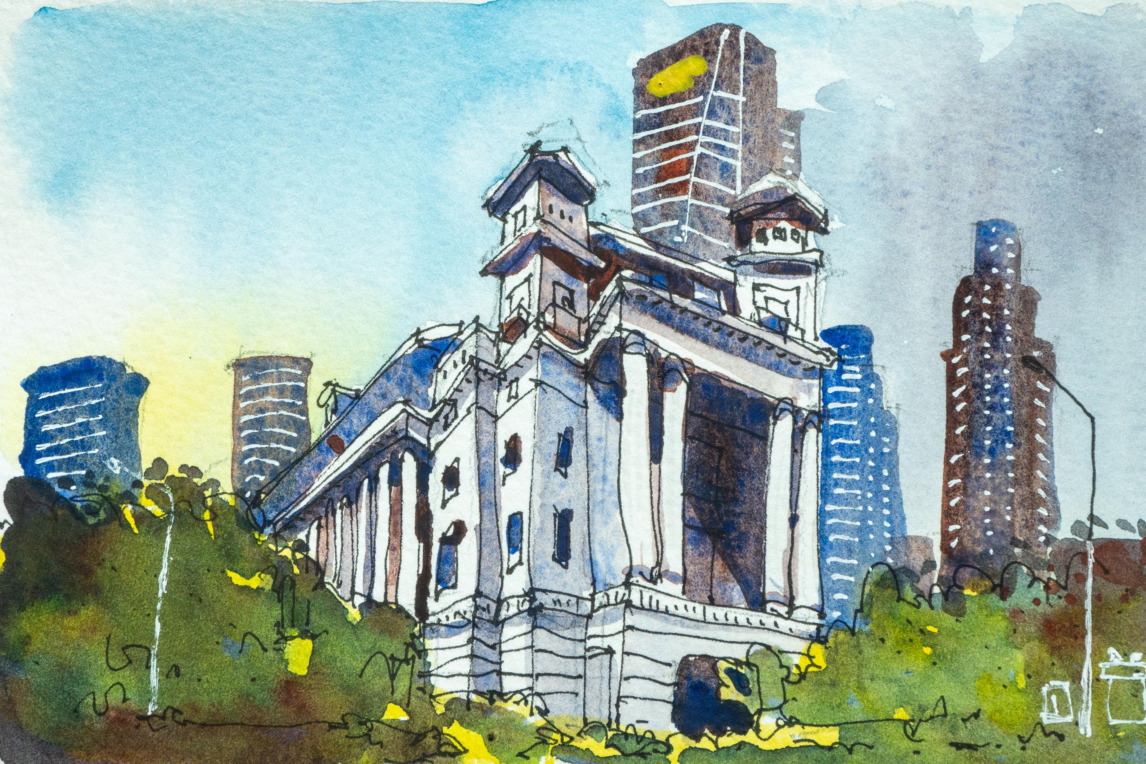
3. Effect of Shadows: This lesson, I want
to show you how you can make your
sketches look more lively and interesting just by adding shadows and why you
should consider framing your sketch or your composition based
on how shadows look. Let's look at the line
art for this exercise. So I have drawn a building
six times and later, I will paint the
shadows differently for each building to let
you see the difference. This building is
essentially just a cube. If you draw the
building or the cube like this without any shadows, it's going to look
like the building is floating in space. By adding shadows
to the building, it will make the building
look grounded instantly. This building has three floors. There are pillars at each
corner and on the ground floor, there are some shops. We have two rows
of windows here, two rows of windows here, and the two windows
have an awning above, there is this rooftop area If you want to follow
along with this lesson, you can draw the
same building a few times and paint with me. Let's start with
the first building where the light source is
coming from the right. I've just tested
some shadow mixes that I have created on
this scrap piece of paper and listed by the side of the screen are some mixes
that you can try out, or you can just dilute black ink or black paint for
this exercise. For this first
drawing or building, the light source is
coming from the right. The cast shadow will be
here cast by this wall, and there will be some
shadows here as well. And this side of the
building will be in shape because it's
not facing the light and this will be the shape of the shadow and the cast
shadow on the ground. Now, the shadow should also
follow the perspective. In this case, this is sort
of an isometric perspective. So the shadow here on the ground will be parallel
to this diagonal lines. I have drawn the drawing
with waterproof black ink. So if you want to
draw with ink make suure your ink is
waterproof when dry so that you can paint
watercolor on top. Okay. So there is a pillar here. And there is shadow
here as well. And this pillar will
cast some shadow. And since these are the
shops on the ground floor, there will be some shadows
here as well because they are not they are blocked
by the top here, so they can't see the light. The first sketch is done. Let's move on to the
second sketch where the light source is
coming from the back. Same thing, because the side
walls here are blocked, so that's how the
shadows will look and these two walls are
not facing the light, so they will be in shade. Oops too much red. This mix that I'm
using is Azo yellow, tra quinit scarlet
and thalo blue. Now, when you're
painting shadows, try to make sure to paint the shadow as one
continuous shape. By that, I mean, don't
wait for the paint to dry. Make sure the paint is still wet and continue painting so that your shadows will
not have edges done. For this building, the light
is coming from the left. This part here will be in shape. And notice there
are awnings here. So the awnings will
cast shadow as well. Let me just paint the
shadow beneath the awning. Make sure your shadows are dark enough so that you
can see the contrast, you can actually
see the shadows. And this side of the building is facing away from the light. So this will be in
shade and make sure to paint the shadow as
one continuous shape. When the wash is still
wet, continue painting. Don't wait for the wash to dry. De for this building, the light source is
coming from the front. So these two walls are
facing the light source, which means you
don't have to paint shadows for these two walls. But the awning is still
going to cast some shadows. So we need to paint shadows beneath the, you
know, the awning. There should be some
hint of shadow here. Caused by the two walls
behind these two parts here. And we need to paint the shadows here as well on
the ground floor. Okay. Okay, I think
this is done. And for this last building, the sun is directly on top. So there will be no shadows here because the sun
is directly on top. But the sun will hit the awning. So you have to paint the
shadows for the awning, and the shadows will be quite long because the
sun is directly on top. And this awning will be
in shade as well because the shadow from
the awning on top will cast directly
onto the shadow, sorry onto the awning,
just directly below. And this or these
two awnings will cast shadows to the bottom here. This part here will
be in shed as well. Let's look at the
painted examples. At a glance, I can see the sketches painted with
shadows look more interesting compared to just a
black and white line drawing because now
there is more contrast. In addition to the details such as the windows, the awning, the pillars, there
is now the shadow. Now with the shadows, there are more areas of
contrast which catches our IM, we also get more information
regarding the building. This building also looks more dimensional and grounded because it is on the ground since
the shadow is on the ground. We also know where the light
source is coming from. It's coming from the
right side because the cast shadows
are on the left. If we think of the timing, it's probably the morning or the evening because the cast
shadows are quite long. If this building was drawn in the afternoon with the
sun directly on top, the cast shadows will
not be that long. And thanks to the shadows, we also can get a
better sense of the form of the physical
form of this building. Next, we have the light
source coming from the back, and this is usually the type
of shadow shapes that I will avoid drawing because highlight of this
sketch is the building, but the two walls that
faces viewer in shadows. Everything is in shadow. You can't really
see the details. The areas of contrast
would be this part here because there is light
and shadow and ages here, where there is light and shadow. Whereas if you compare
this with this, you can see light versus shadow, light versus shadow,
light versus shadow. You can get a better
sense of the form of this building due to
the shadow shapes. But for this, well, you can tell the form of these two walls because of
how the shadows is cast. For these two walls, you can get a sense of
the form of the walls, simply because of
the angle shadows. But for this, this is
just one big shape, so it's difficult to tell
the form of this two walls. For this building, the
light source is coming from the left side because
the cast shadows are on the right side. Again, we have one wall that is lit by light and one
wall that is in shadow, and we also have the
awnings that cast shadow. For this particular sketch, there are more
areas of contrast. We have the contrast here, here, here, here, and here. The shadow shapes for
the last two buildings are not that different. For this building,
the light source is coming from the front, and for this building,
the light source is coming from the top
of the building. For this building, I actually need to pin
the shadow here. I accidentally left
out the shadow here, because the light source
is coming from the front, this pillar will cast
a shadow behind. Depending on how high
the light source is, you may or may not be able to see the cast shadows created by the two walls behind
these two areas. For this building,
the light source is from the top directly above, which is why the shadows
cast by the awning. Is top down because the
shadow is top down, it's going to cover
this whole area of the building versus this where the cast shadows are actually at an angle
cast by the awning here. Also on the ground floor, you can see the corridor here. This front area here just
in front of the shops. This whole area is in shade. Whereas for this building, the front area here
is lit by light. These buildings were
drawn from imagination. Because of that, I can control
where the light source is coming from and where
the shadows will go. Now if you are
sketching on location, if you're out urban sketching, your control over how or where the light is coming from
is going to be limited. For example, if you want to sketch or paint buildings
with long shadows, you should not be
out painting in the afternoon from maybe 11:00
to 12:00 P.M. Of course, that will depend
on which country you are in Here in Singapore, if we go out and paint
from 11:00 to 2:00 P.M. The shadows will look like this the shadows will
not look as nice. For me, when I'm out sketching, I prefer to sketch and
paint in the morning or in the evening where I can
see longer cast shadows. If I'm out sketching on
location and I happen to see a building like this where the light source is coming
from this direction, and I happen to
be standing here, that will mean I'm looking at the shadow side of the building. These two walls
will be in shape. The building is going
to look something like this because I'm on location, I can choose to walk
and I will choose to walk to someplace else
to sketch this building, so that I can see one
side of the wall. One side of the
building that's in light and one side of the
building that is in shadow. Whenever I'm sketching outdoors, I always think of contrasts. I'm always looking
for contrasts. When I look at shadows, I think about how the shadows can show off the physical
form of the building. And I from where I'm standing, the shadows cannot show off the physical form
of the building, I will move to a
different spot just to frame the building and check the composition and
check the shadow shapes. Some buildings will
look better in the morning and some
buildings will look better in the evening due to just how
the building was designed. For example, for this building, the sun will rise from the east, so the sun will hit the building from this
direction in the morning. In the morning,
this side is lit by light and this side
will be in shadow. Now, during evening time,
the sun will be setting, so the sun will be here and
the light will be here. Because the light is here, The awnings can cast shadow. So this building is going
to look slightly better during evening time
compared to in the morning. Just simply because there are more shadow shapes that give you more information regarding how the form of this
building looks. All the things that
I've mentioned so far in this lesson
will become part of your subconscious as you gain more experience
with painting. In the next lesson, I want to show you how you
can control shadow shapes.
4. How to Control Shadows: To painting shadows,
there are some things you can control and some
things you cannot control. One example of a thing you
cannot control is weather. If you're out sketching
and it's cloudy, then unfortunately, you may not get any beautiful shadows. However, if it's sunny, then you will see shadows and
I highly recommend you take a reference photo first just
in case the weather changes, at least, you can
still work on painting the shadows with the help
of a reference photo. So the things that you can control are the time that
you go out for sketching. So if you want to
paint long shadows, you should sketch and
paint in the morning or in the evening where
the shadows are long. Do not go out in
the afternoon where the sun is directly overhead. Another thing you can
control is the perspective. So you can actually
control the horizon. To see how much shadow
you want in your scene. And you can also walk around certain places just to choose your composition to show more or less of the shadows
that you want to see. Let's look at these
three buildings, which were drawn with
different perspective and see how shadows will be affected
by the perspective. For the first building, the horizon is here. It's high it's on
the second floor, and the horizon usually
coincides with our eye level. In this case, the
eye level is here. We are probably
drawing this building from another building
on the second floor. We can see the diagonal lines converge to the
vanishing point here. For the second building, now we are standing
on the ground. We are now at the ground level. The horizon is lower. It's here, and the horizon
coincides with our eye level. This horizon intersects
with the heat, the eye of this person
standing here and goes across, and this is the finishing
point for this building, and this is where the
diagram lines will converge. For the last building, the horizon is now much lower, so close to the ground
it's almost on the ground. This is the vanishing point and the diagonal lines will
converge to the vishing point. This is not a very
realistic scene or building because if we
have the horizon here, it would mean that
we are actually lying down on the ground
while drawing this. Are the same buildings
from the earlier lesson, as you can see how the
buildings will be affected by perspective and how the shadows look will also be
affected by perspective. Depending on where you are, you may be able to
change the perspective. For example, if you want to
draw something like this, you will need to
draw the building from a higher elevation. If you are drawing a
building like this, it probably means you are
standing and drawing. If you want to draw a
perspective like this, it means you are probably seated very low or just
for exaggeration, you're lying down on the ground. Let's pin the shadow for the first building and see
how the shadows differ. I'm going to have
the light source coming from the right side, the shadow will follow the finishing point,
this diagonal line. Will follow this diagonal line. And this pilar will
be casting shadow. When you're painting
on location, you just, you know, follow what you see. Again, these
buildings were drawn from imagination so that I can show you the
examples more clearly. Same thing, this shadow
cast shadow here will follow the vanishing point on the left and the right side. Since the eye level or the horizon is
lower, when we look up, we can actually see the
ceiling for the ground floor. Okay. And lastly, we have this very exaggerated
perspective as if we are painting from the ground, like we are lying
down on the ground. Same thing, the shadow should follow the vanishing
point as well. In this case, because we
are so low on the ground, we can barely see
the cast shadow. Let's look at the
similarities and differences between
these three sketches. At a glance, you can
clearly see that the side of this
building is in shape. For the first building, where the horizon is high, where the eye level is high, it means we are at
a higher elevation looking down and because we
are high up looking down, we can see more of the ground, so we can see more shadow here. For the second building, our eye level is now lower and because our
eye level is now lower, we see less of the ground because we are
now closer to the ground. And for the last example, our eye level is
well, on the ground, because our eye
is on the ground, we can barely see the shadow
cast by this building, which is on the ground. What this means is, if you want to see more shadows, you should go to the higher elevation to sketch whatever you want
to sketch and that way, you can see more
of the ground and see more of the shadows. And if you want to
see less shadows, just move the horizon lower, move your eye level lower. Instead of standing
and sketching, you should sit down on a
small portable tool or sit down on the ground to
move your eye level lower. That way you can
compress the shadows. The shadows for this three
buildings look accurate. However, they also
look different thanks to the different
perspective used. You can choose the
perspective to use. You can change where
the horizon is, you can choose to change
where the eye level is, and that will affect
the perspective and how the shadows will
look Another way to control the shadow
shape is to walk around and see how the
perspective changes. Here I have drawn three
similar buildings again. This time, I have
kept the horizon at the same level for
this three buildings. The horizon is between the
ceiling here and the ground. For this example, let's assume this side with the signboard is the front of the building. Here you can see
the two sides of the building is almost
similar in proportion. This is maybe 50%, and this is also 50%. Let's say the light source
is coming from the right the left side of the
building will be in shade, and this is how
it's going to look. I'm going to paint
this really quickly. The signboard will also cast a shadow on the ground as well. To see less of the shadow
for this building, what I can do is walk to
the front of the building. When you are at the
front of the building, you will see more of the
front and less of the side, and because of that,
the shadow shape for the side here
will be compressed. Now the shadow portion takes up less area compared to
the areas lit by light. For this building,
there is light coming through this
open area here, which is why you
see this areas lit. Let's say now you want to see more of the side
of the building. Now we walk from the front of the building to the side of the building and this
is what we will see. If we do so, The shadow shape
will be much larger compared to the side
that is lit by light. Usually, I will try to avoid having the
building look this way where most of the
building is in shape because when everything
is in shape, you can't really see the details because everything is hiding in the shadow and we need to paint the signboard
here by the side. Let's compare the three examples and see what are
the differences. For the first example, we have 50% area for the shadow and 50% for
the area lit by light. This is almost symmetrical
and this is not really interesting
because it's symmetrical. Usually, I will try to avoid drawing something that
looks too symmetrical. This is good because we have a smaller proportion for the shadow area and a larger
proportion for the lit area. But this is not ideal as well. The front of this
building is quite simple. There isn't much detail. It's just two rows of windows
and this little signboard. The side is actually more
interesting because there are more window panes and there is the awning above the windows. Interesting side of
this building is actually in the shape. Here we have the owning, we have the window panes
with more details, and this side looks
more interesting, but unfortunately,
it's in the shape. If I'm sketching this
building outdoors, I will make a note, maybe to come back to sketch this building at a
different time so that this side can be in the light and the other
side can be in the shape. So the two ways to control
shadow ships is to change the perspective and can do so by changing where
the horizon line is. But to be able to change
where the horizon line is, it means you may have
to sketch on staircase, sketch from higher elevation, sketch from somewhere tall. But sometimes you
cannot go taller and hence you have to use the second way to
change perspective. Just walk around the
building just to see how the shadow and the
lead areas change. When you're sketching and
painting on location, you can change the perspective
to a certain limit, and you should use that
to your advantage.
5. How to Mix Shadows: In this lesson, I'm going
to show you some of my favorite mixes for shadows. Now, you don't have to use the exact colors that
I'm using in this lesson because there are so many colors or paint choices out there. It is impossible for you to
use the same colors as I use. But what's more important
is you should understand certain concepts when it
comes to choosing colors, when it comes to mixing colors. And the most
important concept or the easiest concept
when it comes to mixing shadows is to use a
limited color palette. Use the same color palette
that you have used to create your sketch and use those primary colors to mix shadows and
those shadows will look harmonious to
the existing colors that you have used. This is my watercolor palette
with just six colors. By the way, this
watercolor palette is called the micro
portable painter. The colors I have
are Azo yellow, which is a bright
vibrant yellow. Good alternatives to
this would be Hansa yellow medium or
nickel Azo yellow. This is yellow color, and this is traquinit scarlet, which is a warm rate. You can also use any
scarlet or pyro rate. This is To blue. This is a cool blue. This is cobalt blue deep. Most people use ultramarine
or French ultramarine. Personally, I prefer
cobalt blue deep, this is transparent oxide. A good alternative to this
would be burnt sienna. Shown on the screen right now
are the alternative colors that you can use if you
want to follow along with this exercise
a bit more closely. Before we start mixing, I want to give you
this first tip. Try not to mix your colors
completely in the mixing well. Try to have some of the
mixes happen on paper because if you mix the colors completely
in the mixing well, The mix is not going to look that interesting
because it's just going to be a single
color compared to having the paint
mix on the paper, you can see the two colors that I used to create that mix, and that will make your
wash look more interesting. I shall damo that
for you to see. I'm going to show you one of my favorite mixes for mixing
black and that's using blue, which is this color. Next color is tra quint scarlet. This is a bit dirty because
the paint is dirty. You can use pyro red or
pyro scarlet as well. As mentioned earlier, I'm
going to try and have the colors mixed on paper. I'm putting some
water on the paper. We already have the scarlet. Let's add some blue to it. If it's too blue,
just add more red. You can do this in the
mixing well as well, but as you can see if you
mix this on the paper, it's more interesting
because you can see the colors that are used
to create that mix. This is one color that I used to shadows and also
the really dark area. Now, when the wash is still wet, you can charge in some color, either blue or red to shift the shadow tone or
a shadow color. Now, if you want to mix black
black, just use more pin. This is a lot of blue, and this is a lot
of traqin scarlet. You can see the
resulting mix is almost, and this is great
for painting Black. This mix is not exactly black, but it looks black enough. It's not black like this black. When it comes to painting, everything is relative,
everything is subjective. You don't really have to mix a pure black for that
mix to appear black. This looks black just by placing this color beside
white or other colors. Reference purposes, you may want to write down the name of the colors that were
used to create the mix. In this case, I have written down blue with a
warm red instead of intra Quinte Colt
because you can create this mix
with any warm red. To have your shadows
look harmonious together with other colors that you have already used in your sketch. All you have to do is to use the same colors that you have already used to mix the shadows. For example, let's say
I'm painting a sketch with this yellow Asoyellow Traqunit scarlet and blue. To mix the shadows
for that sketch, I will mix the shadows
with these three colors. Let me show you how it's done. I'm going to add some yellow to the water that I already
have in this pan, and I'm going to add some blue. When we have yellow and blue, we get green to
neutralize the green, we will add Just make
this less green. And you can test this on
a scrap piece of paper. Let's test it here. If it's too red, you will have to add more
blue and yellow if needed. Because this is to red, I'm going to add a
little bit more blue to this and test it again. Now this color is not yellow. It's not red or blue. This can be used
to paint shadows. Once you have your mixtures
painted on the paper. And when the wash is
still wet, again, you can choose to
charge in some color. So here I have added some red. And now you can see
it's more reddish. This is what happens
when I add more yellow. Because the wash is still wet, the colors will blend. I want to add more blue
here and it turns green. To neutralize the green, I add more red. If this looks brown, I add more blue. When you use a limited
color palette for mixing, it's pretty
straightforward. You just play around
with the proportion for the paint and you will be
able to get your shadows. This looks more blue. Let me
add a bit more red to it. Now you can see we have
a neutralized color. Even with a limited
color palette, in this case, with
three primary colors. You can create a good
variety of mixes, and all these colors can
be used to create shadows. Shadows are not always gray. Sometimes there are
colors within shadows. If you look at the shadows here, you can see a hint
of blue whereas this whole area here
is just flat color. For this, there
is a hint of red, and there is some gradation and some watercolor marks that makes this wash look
more interesting. For this, I don't
see any color shift, so it's just this
very flat color. It's not as interesting compared to the earlier two examples. It is very important to choose transparent colors for
mixing shadows because what you really want is to have your line art and existing colors to show
through the shadows. If you use opaque colors
for mixing shadows, the opaque color will
cover your line art and existing colors and the
shadows will not look good. Another popular mix for shadows is ultramarine
with burnt sienna. Now for this palette, I do not have ultramarine
and burnt sienna, so I'm using cobalt blue deep
and transparent red oxide. Now, ultramarine is a warm
blue and burnt sienna is an Earth color, it's blue with Earth. Kobo blue dip is
also a warm blue, and transparent red oxide
is also an earth color. This will work as well. Kobo blue deep has more intense granulation
compared to ultramarine, but it's not as vibrant
compared to ultramarine. Ultramarine is also a
more affordable color compared to Cobalt blue dip, which is more expensive. This is transparent red oxide, let's put some water on the paper and have
more cobot blue dip. Okay. You can also mix
this in the mixing well. It's just easier for me to show you the actual
color on paper. Let's add some transparent
red oxide hoops. Can you see how the color
pushes the cobol deep away. Different paint will have
different characteristics. All this looks more brown. I may have to add more blue. Notice the intense granulation. You have to figure out
what is the proportion of blue and earth color yourself. This is again to brown. I have to add some blue to it. Now, I don't really see the co body obviously or the transparent rate
side very obviously. Now that this is
dry, you can see the granulation
is quite obvious. With this mix, you can create some pretty eye
catching shadows. Here are two buildings
painted with different mixes. The blue and traqit
scarlet do not granulate. The resulting mixture
does not granulate. This is the mix from Cbo blue tip with
transparent red oxide. Both colors granulate
and because of that, the resulting mix
also granulates, in this case, quite
dramatically. Which mix to use really comes down to
personal preference and sometimes the colors
that you use to mix shadows will be determined by the existing primary colors
that you have already used. Another mix that I like is the yellow occur mix with Coup. This is yellow curve. It's a bit dirty because
my pen again is dirty. This is what we get when
we mix the two colors. Yellow curve can be considered
an earth color as well, and again, cob
blue deep is blue. When we have blue together
with earth color, they will neutralize each other. This looks nice. These are the possible
color mixes for shadows that I can create from
this limited palette of just six colors. Another important
thing to note is there will be certain
color combination or mixes that will not give you or cannot create
that really dark color. For example, with ultramarine
and burnt sienna, or in this case, C blue
with the earth color. It is not possible for me to mix a color that
is close to black. So if you want to mix
a really dark value, you have to use
the correct color. In this case, you need to
use high tinting colors, colors that are very
strong to start with. The blue and scarlet are
incredibly high tinting colors. By high tinting, I mean, you just need to use a
little bit of paint and you can achieve really
high intensity. Those are high tinting
colors of paint, and you can use high
tinting colors to mix really dark values or
really vibrant colors. To sum up this lesson. To create shadows
that look harmonious to other colors that
you have already used. Just use the existing
primary colors that you use to create the
sketch or the painting. Second tip, it is very important to know which color
combination creates black because black is the only color that will
give you the most contrast. You find that your sketches
or your paintings, they are lacking contrasts, it's probably due to the
lack of a really dark value. The tip for you is try to figure out which
primary colors work well together because not primary colors work
well together. For example, some primary
colors are opaque and you shouldn't use them for mixing and when you want
to mix shadows, you should always use
transparent colors for mixing.
6. Understanding Tonal Values: This lesson, I'm going to
show you how to create contrast light and shadows
using tonal values. To paint shadows effectively, you need to understand this
concept called tonal values, total values is basically just how light or
dark something is. Tonal values is the thing, the concept that
creates contrast Contrast is the most
important thing when it comes to creating art. For example, if we look at this piece of
watercolor paper, it's just white, there is no tonal value because
it's just white. Now, if I use black ink to
draw something on the paper, there is now an
additional tonal value. There is now black
and there is now white because there are
now two tonal values, there is contrast,
and we can see the lines because
there is contrast. Now, if I am to draw a
square using this pencil, Um, I'm also adding total
value on the paper. However, this pencil line, you can see, it's
not that darker. So the contrast
between the pencil and the paper is not that obvious. So you can vary how much contrast you can create just by using
a certain technique. In this case, I can press down harder to make the line darker. And now, I have
two tonal values. I have this lighter value
and this darker value. Now let's use watercolor
to create tonal values. If we are creating a
black and white sketch, just by adding one sheet here, this can actually
represent shadow. For this exercise,
I want you to draw four squares and
paint across three of the squares like this
because we want to create three additional tonal values. Make sure the paint
is dry before you paint the second wash and paint it over the
third and fourth box. Now, if the second wash
does not look dark enough, you should add more paint. The point here is
You should create noticeable contrast between
the different boxes. I've just added more paint to
make this darker because I feel like when this dress
going to dry lighter, so I need to make this darker. Now that this has dried, let me paint the last box. This is just a four value scale. For the last box, I have added a bit more
paint to make this noticeably darker compared
to the third box. If this is not dark enough, you will have to add more paint. This is a four value skill. You can create a five, six, seven, eight, nine, ten value skill and keep
using the same process to make each box or
each value darker. For this four value skill, we have white a
slightly darker sheet, but it's still quite dark. I can actually make this even lighter to create a
five value scale. But this is what we have here. The next value
should be noticeably darker compared to
the previous value. If this is not darker
after drawing, you will have to pin this
to make it even darker. Now, for this fourth box here, you can see that this
value doesn't seem to be significantly darker
compared to the third box. For this, I really need
to add more paint to make this much darker so that this can
appear almost black. Okay. Okay, so we will need to wait for
this to dry again. This is now dry and this looks
darker compared to this, and this is darker
compared to this, which is darker
compared to this. So when you're painting values, I use the overlay or
the glazing method, which is easier because when
you overlay a second layer, you will definitely make
the second layer darker. Whereas if you try to mix each value separately
without overlaying, it's very difficult for you
to mix the correct value. Now, let's use the color
scale to paint this sketch. I have already
applied one value. If you are using a very limited
value scale for painting, you can just use
white and black, or in this case, this is
white and a dark gray. But if you want to
add more details, you can add an additional value. In this case, I'm going
to add the value here. To create a contrast between the darker windows and the
white side of the wall. I want to make the windows
here darker as well, so I'm going to paint this overlay basically overlay another layer on top of this. I'm going to do so here as
well for the second row. One important thing
to note when painting shadows is if possible, you may want to use
staining colors for the first wash. Staining colors are colors that you cannot lift. For example, the
blue is staining. If you have the
blue on the paper, you will not be able to
lift or remove that color. If you use colors
that do not stain, sometimes when painting
a second layer, you may actually reactivate
the first layer. What I'm doing here
is just adding an additional layer just
to create more value. Now we have white a mid
value and a darker value. You can see this
person standing here. This person can be seen
because there is contrast because this person is in lighter value against
darker value. Now, in reality in
the real world, this person is probably
going to be in shape, so this person is going to
be quite difficult to see. But when it comes to
sketching, again, you can use your
artistic license in this case to make certain
things stand out. If I want to make this
person stand out, this is what I would do. I will make the person pin
the person in lighter value. To contrast against
the darker value. The second wash has. So I feel like I need to
add an additional value. I need to add black to create that extra contrast because
right now we only have white. We only have the med values. So I've just created this
very dark mix of the blue and tra queen scarlet just to
make certain areas darker. Usually for the ground floor
shops that are in shape, they can be quite dark. I can also use this to
paint the bottom side of the awning. Here as well. With this white colored pencil. I can use it to create
some highlights to create the illusion of lights
in this building. This doesn't work that
well against water color. Sometimes I use
my white gel pen. Sometimes I use colored pencils. Sometimes the white gel pen will create too much contrast. This is where the
colored pencil, the white color pencil
is more subtle. This is just a very simple
sketch to show you how you can use tonal values to
create light and shadows. For the next exercise, let's look at this
fun optical illusion with tonal values and shadows. Make a guess is square
a darker than square B. This is a really fun illusion that basically tells us that
our brains can trick us. If you look at squared B, which is beside a
darker squared, you know that this is a
lighter square obviously. This darker square is
beside a lighter square, so this is obviously lighter. These two squares are
supposed to be lighter, are they of the same value? And if these two
squares are darker, of the same value. Believe it or not, square A and square B are of the same value. I can show you y. This is my drawing and the photo reference
is by the side. Let's paint the
black squares first. We will also need to paint the shadow side of the cylinder. So right now there are only
two values white and gray. This is square B, and this is square A. It is difficult for
me to see whether the green cylinder has the same total value
as the gray box, so I'm just going to leave
the green cylinder as it is. So now that
everything has dried, let's paint the shadow, which there obviously is. So when we paint the shadow, This is the cast shadow. Notice I'm overlaying
the gray box. This side is also, in shade, let's paint over this. I can see some value difference between the white box
here and the cylinder. So the cylinder is
probably darker. So now that this is dry, we can see that
square a indeed has the same total value
as squared b because square A was painted
with one layer of wash and square B was also painted with one layer of wash. It's actually the darker
squares that are under the shadow that are
darker compared to the white squares
under the shadow. What's the point here? Well,
tonal values is relative, light and dark is relative. This box only appears
to be darker and that's because it's placed
beside a box that is lighter. Box B appears to be lighter, only because it's placed
beside a box that is darker. Even though in reality, these two boxes have
the same value, which means if you want to
make something lighter, you can make that lighter, or you can make the
surrounding darker. For example, if you want to
make this box B lighter, you can increase the contrast by making this box darker
because this is watercolor. Once we paint over this, we cannot remove this
unless we scrub it out. The only way to
make this lighter by comparison is to
make this darker. Let me show you another example. When it comes to painting, tonal values, painting
light and shadow, what do you really
want to do is to capture the contrast accurately. And if you can
capture the contrast accurately, your sketch, your painting, even though
it's in black and white, can look really realistic. So let's see what we have here. We have some plastic pans
on top of black cut board. You know that white plastic pans are lighter compared
to black cut board. This side here is hit
by light, it's white. I'm going to put a zero there. If I compare this
side to the top, they have the same value, so it's going to be a zero here. Now for this side
which is in shape, this is obviously darker compared to the
top and this side. This will be one value
darker than these two sides. So whenever I'm painting,
I'm always comparing. Is this lighter or
is this darker? If I compare this to
this cast shadow here, obviously, this is going
to be darker than this. This is one value darker, and the black cut board
here is lit by light, and you can see that this
is lighter than this. This is also value one. This is value one, and
this is value one. These two areas actually
have the same value. Even though your
brain knows that black should be
darker than white. So when you're painting
something like this, all you have to do is
paint all the areas that are not white
with one wash, and that will mean
this whole black area, including the shaded side. All this will be one
wash, one layer. And for the darker areas, just paint an additional layer. How about this?
This is zero again. This is one value darker than this side is obviously
darker than this, this is two, and this is three. We know that this
black cut board is darker than this. Is this a two? Yes, it is because it
should be darker than this, and this should be lighter
than this as well. This actually works
zero, one, two, three. And for this, we only have 012. How many values to use in
your sketch or painting is subjective and really depends on whatever you are
drawing or painting. The only tip that I have for
you when it comes to judging values is to always
compare the values. Is this lighter or
is this darker? If it's darker, then you
should make it darker. Total values is
really important, and having your tonal values look right can make your
artworks look terrific, even if it's just a
black and white sketch without any colors. One of the most common
mistakes that beginners make, including me is painting
the shadows to light, which is to say that The
value difference between the shadow and your
highlighted areas is not that noticeable. So what you need to do is to
paint your shadows darker. But how dark should you
paint your shadows? That, again, is
something relative. All you have to do is to paint your shadows noticeably darker compared to whatever
is below the shadows.
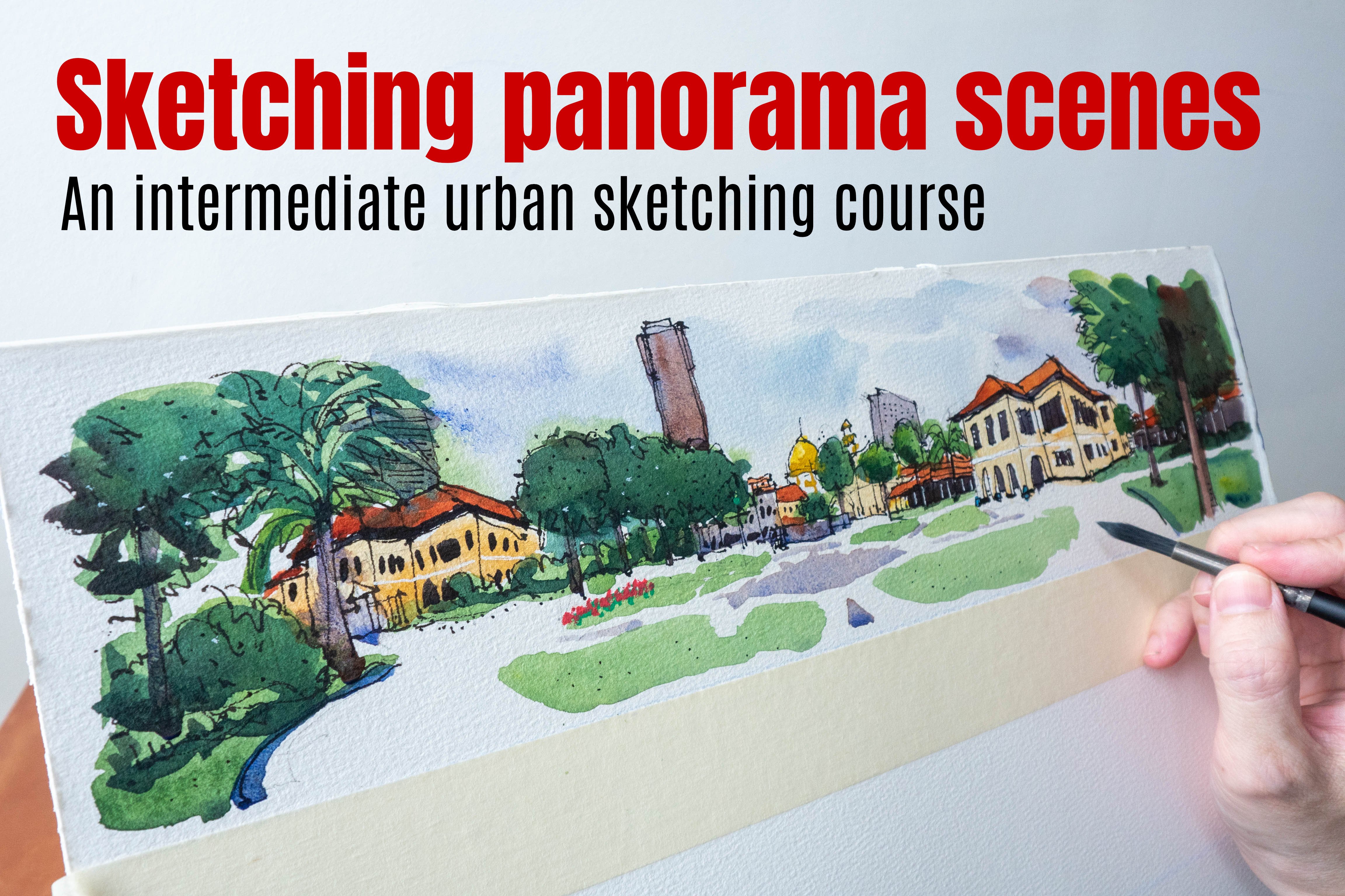
7. Looking for Things to Draw: This lesson, we are
going to walk along Singapore River and look at
the different buildings and see how they look under different light and
shadow conditions. It's 9:00 A.M. In
the morning right now and light is beautiful. It's a sunny day today or
at least at this time, but weather can
change very quickly. I always highly
recommend you take a reference photo
first before you start sketching in case lighting condition changes or
the weather changes. For example, I know for a
fact it's going to rain very heavily later on because I actually read the
weather report. So let's take a closer look at the shop houses by the river. The sunlight is hitting the shop houses from the
front and the shadows that I can see are all small
areas of localized shadows. For example, we can see shadows under the shelter
for these restaurants here. So these are the little
pockets of black. And we have shadows for the balconies, for
the shop houses. So those are the little
areas that you have to paint or make very black
when you are sketching. And this reflection
here is also very dark. So these are the areas of
contrast that you will have to remember
and get them right. This is considered a high
contrast scene because we have the brightest white
and the darkest dark. And thanks to the sun, everything is well lit, so all the colors
are very vibrant. But the shadows are not
that obvious because well, the sun is hitting
the buildings on the front and also on the side. So the shadows, most of the shadows are actually
behind the buildings. But still, this is a really beautiful scene
to sketch and paint. It's just that the shadows
are not that obvious, even though there are
shadows in this scene. Let's look at this
museum across the river. And this is the Asian
civilization Museum. So there are some really
beautiful shadows right now. You can see the angled shadows. So when I see angled shadows, I just left hand because
they are so dynamic. And this scene has
lots of contrasts. We have the shadow side, side lit by light, shadow, light, shadow, light, shadow. So we get this
repeating pattern. And you can see for the
buildings in the background, there is this hotel which is lit by light from
the right side, and most of the
hotel is in shape. We have that tower,
which is lit by again, the light from the right side
and this side of the tower, the clock tower is in shape and we have other
buildings as well, which are also lit by
the sun on the right, and with the shadow
side on the left. But this is not, I would
say a perfect scene to sketch because we are actually looking at the
shadow side of the building. So there is a lot of shadows. There is a lot of
beautiful details hidden in the shadows. If I see a scene like this, I may want to walk
around the museum, to see if I can hide the shadows by changing the perspective
or composition. Also, when I'm sketching
a scene like this, I have to sketch very fast. Right. Now, the shadows are at an angle because it's still
quite early in the morning. But 1 hour later, the shadow will be steeper. So half an hour ago, the shadow was like this is
at about 45 degrees covering half of the wall and half of the wall here is
actually in shape. So now the shadow
is actually moving inwards as the sun is going up. And once again, it
will be good to take a reference photo
first before we start sketching and I can see the storm clouds
coming in and already. So let's maybe walk to the front of the museum and
see what we can see. Let's look at this
scene first before we head over to the other
side of the river. So this is the bridge
in front of the museum, and this is not the
best composition because there is actually
another bridge behind. So if we want to draw
or sketch this bridge, we need to move to
a better location so that we don't have bridge one overlapping bridge
two behind that overlaps the buildings behind because right now it's quite confusing. It's very difficult to
see the two bridges. Anyway, this is a
back lit scene. So all the buildings
are back lit. We are looking at the shadow
side of the building, so there is no light and
shadow for the buildings. If you look at this hotel, the Fullerton Hotel
on the right side, you don't see any
light and shadow because this is the shadow side. For this scene, it is possible to balance the light and shadow. So for the light areas, we have the sky and
for the shadow areas, we have well, the
back lit buildings. And for the back lit building, we don't really
see high contrast. I mean, there are some
areas which are lighter, but this whole area is in shade, it's in the shadow, so
it doesn't look good. All the details will be
hidden in the shadows. We will go behind the fluent hotel leader to take a look at the side that
is lit by the light, and you will see
how different and how more beautiful building
is from the other side. This is the hotel up front
and this is the shadow side. So the best time to
paint this hotel is not in the morning
but in the evening where the light is hitting this side of the
building of this hotel. This is the bridge in front
of the museum we saw earlier. And this bridge is lit by
the sun from this side, so we can see some cast
shadows on the ground. This is the view from my
standing position and we can see the shadow details
created by the support. And we can see this
big shadow shape here and we can see
the light here. And there are repeating patterns of light
and shadows, again, we have light shadow light
and darker areas here, we have the trees which
are dark and museum, which is lit by
light that is right. So when I see repeating light and
shadow details or shapes, instantly, I know that this
is a very sketchable scene. And also notice the
shadows cast by the people walking
across the bridge. The shadow is long right now
because it's still quite early in the morning
and when you paint those shadows for the
people who are walking, it makes them feel grounded. There are some
really good contrast here as well for the background. We can see this part
here, the bridge. This is white against the
trees which are dark, so there is really
beautiful contrast there in the background. And if we zooming closer, like what we are
looking at right now, we can see the shapes
created by the shadow. So we can see all the
enclosed lead area. Those are interesting shapes. So right now I'm in front of the museum and sunlight is
coming from the right side, so there are cast shadows
on the left side. This is a beautiful building
to sketch and paint. This is a high
contrast scene because we have most of the
building lit by light, and we have the
really dark areas. Now, in this view, the areas are going to look really dark, darker than what I can
see with my eyes due to the limited dynamic
range of my camera. But in real life, it's
actually dark gray. It's not black. So the shadow sites
are now hidden on the left side because
we are not there. We are not standing
there to look at the building from that view. You know what? Let's go over
to that area, that spot. Let me talk a bit
about perspective first before I talk
about and shadow. Now, if you are sketching this building from
a reference photo, the vertical lines
for the buildings, as you can see are
tilted inwards, and that's due to
camera distortion. In real life, obviously, the vertical lines for the
building are vertical. Okay. So now we have some
really beautiful light and shadow and we can see the repeating pattern of
light and shadow kin. We have the dark areas here created by the
trees in the background. We have light shadow,
light shadow light, and we have the dark trees here and we have this
enclosed lit area here. So there is a lot of repeating
pattern, which is nice, and we can see details from the front of the building
because that's lit by light, and we can see the
shadow areas This is just a wonderfully
beautiful scene and a building to sketch. Now, this is in the morning. So the angles for the shadows, as you can see the angle
almost 45 degrees, and this angle is
almost similar to the angle here after
a perspective line, but it's not the same
angle, by the way. Now, in the afternoon, the shadows here will be gone and the shadows
here will be gone. So this whole area
will be lit by light. So that's how light
lighting conditions can change very quickly. Earlier when I was standing
in front of the building, the whole building
was lit by light, and now I'm standing at the
corner of the building, some parts of the building
are lit by light and some parts are in shadow,
which is what I want. I don't want everything
to be in light. I don't want everything
to be in shadow. I want areas of light, shadow, light and shadow. That's what I'm always looking for when I am
sketching outdoors. Notice right now I am
standing in shade. But as I move out into the sun, you can see some cast shadow. Yeah. So there is there is just
more detail when you can see light and shadow versus everything in shadow or
everything in light. This is Victoria theater
and right now it's cloudy, so the cast shadow
is not that obvious. Now later when the
sun comes out, there will be very
obvious triangular shadow here created by this
part of the building, which is actually
patrolling forward. But without the sun and
without the shadows, it's not easy to know that these two parts of the building are actually
patrolling forward. So we'll have to wait
for the sun to come out. And there is this clock tower. And we can see this side
of the clock tower, that little sit there, which is away from the sin, so that's the shadow side. Now, when the sun comes out this building and
this scene will again have repeating patterns
of light and shadow. But we will have to Okay. And as expected, the rain
clouds are coming in. Correct. The sun is coming out from
behind the clouds and now we can see the
angle shadow here. But it's not the darkest shadow because there is
actually a lot of reflected light
from this building, the white walls, and also reflected light from the ground that's reflecting outlets. Which is why this shadow
side is not that. Now, on the left side, you can see this is darker, and that's because
there are trees that blocking the
reflected light. Here's a closer look at the
angle cast shadow here. So without the shadow, it is going to be
more difficult to know or see at a glance that this part of the building
is actually protruding. Here's a view of
Victoria theater from the side side as in, we can see the front and sites. We don't just see the front. From this view and
with this perspective, we can get a good sense of the form of the
building because we can see the front and the
side of this building. Even without shadows, we can get an idea of the
form of the building. But if there are shadows, then the form will be even more obvious and right now
it's cloudy again, so we don't see that
angle shadow here. So when the sun comes out later, if it comes out again, we should see this
area here much darker. And there will be cast
shadow here as well and also here as well the shadow
side of the building. Right now without
shadows, as you can see, the tonal values
is not that white. I mean, there is contrast, yes, there is the light areas versus the gray areas versus the
darker grays and the blacks. But we just don't really
get that extra level of contrast when there are
actually cast shadows. Right. The sun is
now out and yes, we can see the area
here. This is darker. But as mentioned earlier, this is still not that dark due to so much
reflected light from the ground from the ground here and also from the walls
here onto the wall here. But at least we can still see the cast shadows
quite obviously. So when we paint, you can
choose to make the shadows darker or you can
paint as what you see. Right now, I'm on the side of the hotel that
is lit by light. This is the same
hotel at the start of this lesson where it's totally back lit
from the other side. Now this building is lit
by sunlight from the left. Once again, we can see repeating patterns of light and shadow. We have the darker
trees in front. We have this whole side here, which is lit by
light, and we have the shadow side and we
have the cast shadows. Now, this side that is not receiving light is darker
compared to this side. But this side here, this
wall here is not as dark compared to the side
that is under shadow. Those are the tonal values
you must understand for this scene and also notice the cast shadows
are at an angle. And there are cut shadows here as well and the
angle this one is nice because the angle is
different from the angles here. And there are also cast
shadows just below the ledge that goes
all the way across, and we have some ct shadows here as well and here as well. There is a tall
skyscraper behind, so I'm not sure if it
looks good from this view. So I may want to walk around
the building to see if I can see other compositions
or other views. Here's another view I can
consider and I have moved the building away from this area here so that shapes for the skyscraper behind and
the hotel more recognizable. Right now it's cloudy again, so we don't really see
noticeable cast shadows. But for the areas here
you can see still darker. It's just that without
the cast shadows, we don't really see
the angle shadows, which look so beautiful. Without shadows, I mean, you can still clearly see the
structure of the building. Thanks to the perspective
in this case, and also thanks
to the late side. But The form of
the building will look more obvious with
shadows to help you. Let me show you this sketch
that I sketched two days ago. I drew this sketch really quickly because the rain clods were coming in my direction. So I probably completed
the line art in 30 to 45 minutes and I painted this at some other
location from memory. Now, on hindsight, I
probably should have used a reference photo so that I can get the shadow shapes right. So when painting shadows, your shadows must
behave consistently. For example, earlier on, you saw that angle shadow here. Yeah. I did not know that angle, so I painted the
shadows like this. And this is not really accurate. And there are four columns here which are all
lit by the light. In fact, they are
fully lit by light. So there should not be any
shadows on the column itself. And notice I have three out
of four columns in light and this fourth column is
not in light. This is wrong. So this four column
should be fully in light, and of course, I got the
angle angle shadows wrong. And I should have painted the cast shadow underneath
the ledge more clearly. I mean, it's there,
but it's not clear. But at least I got the tonal
values more or less correct. So the side as lit by light is lighter compared to the side
that is not lit by light. And for the shadow
side of the building, the side that is under the shadow under the cast
shadow will be darker. So at least I managed to get to values more
or less accurate. Those are the four columns
I was talking about, right now, it's cloudy, so we don't see cast shadows, but we still see the side, which is lit by light very
obviously and the shadow side. I will want to wait
for the cast shadow to appear because I
want to show you this area between
these two columns. So when there is cast shadow, the shadow will be
this triangular shape, and this side here will be the light shape, which
is also a triangle. So between these two columns, you will see the
shadow side here and and the lit side here. Right now it's cloudy,
so we can't see that. Okay. But when you can see that, it's going to look interesting. It looks like I will
not be able to show you the light and shadow between those two columns because
it's getting more and more cloudy and it looks
like it's going to rain. So I'm going to end
this lesson now and run for shelter
or hit for lunch.
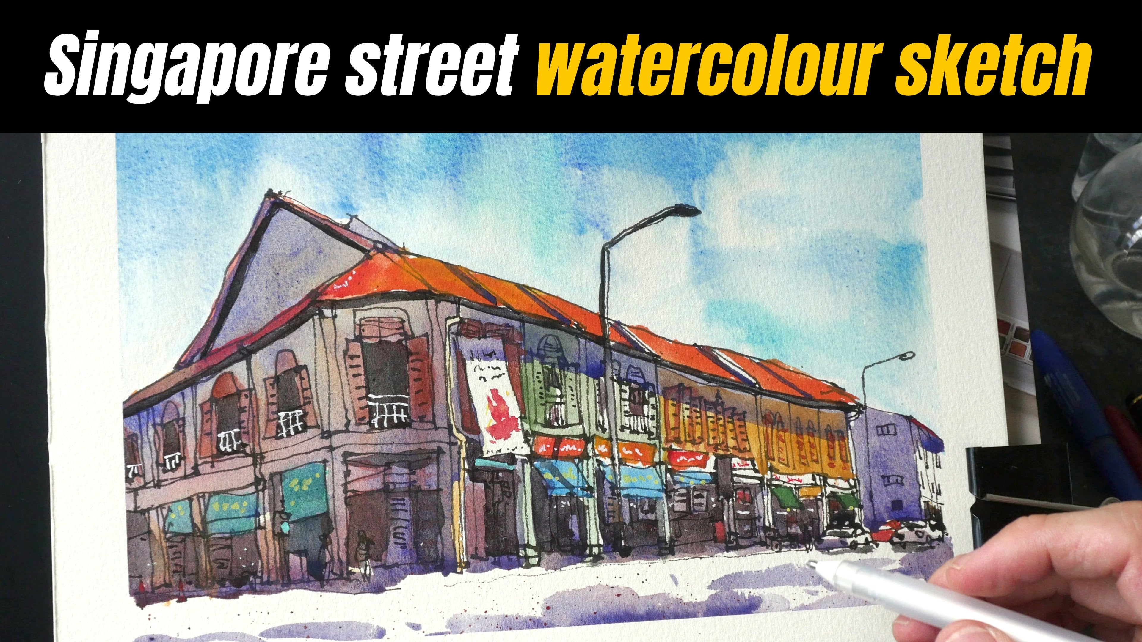
8. Sketching Victoria Theatre (pt 1): Welcome back. In this lesson, we're going to have some
painting exercises. We're going to paint
the shadows for some of the buildings that we saw
in the earlier lesson. Now to follow along, you
just have to download the reference photos provided. Now, do note that there
will be camera distortion in the photos because
of the camera lens. More specifically, the
vertical lines for some of the buildings
are going to look tuted which is why I prefer
to sketch or paint on location because the scene
will look more real. However, when it
comes to teaching, it's just easier to teach
with a reference photo and also the shadows will
not disappear suddenly. Start with something easy
for the first sketch. We will sketch and paint
Victoria theater from the front. As mentioned in the
previous lesson, the cast shadows are not that dark because the scene
is really bright. When we're painting the shadows, we can decide whether to make
the shadows darker or not. Let's start by creating the
line art with pen and ink. Now this lesson is the focus of this lesson
is not on drawing. So if you want to
learn how to draw, you can check out
my other causes. But generally speaking, and
drawing complicated scenes, I like to use the pencil to mark out the composition first. And during this stage, I may identify certain
mistakes which I can avoid when I'm inking
the drawing later on. So for this particular gauge, the most important thing
is to make sure you can feed the building
in the page. Okay. Now, when you are practicing or when
you're following along, you don't actually need to
make discussion that detail because the purpose really is to learn how to paint shadows. You can actually just draw a very simplified version of this. If you make any mistakes, well, just along that way. We have a triangle here. We have a side of
the building here. Yeah. This This photo actually does not have
much camera distortion because we are because
I took this photo from quite a far distance away looking straight at the building almost straight at the building. We can see the side of the wall here here and also the
side of the wall here. So make sure you get that in. Now, when you're on location, if you want to show more of the form of the building,
you can just walk, you know, to the left or
the right side so they can see the front and the
side of the building. And now I'm happy
with the composition. So I'm going to just
ink the sketch. I am drawing pretty quickly. And notice I did not erase I did not even erase
the pencil lines. Okay. So once you have
the pencil lines down, just draw over the pencil lines, draw the big shapes first, then divide the big shape into smaller shapes and
smaller shapes. This is how you can
add more detailed ops. I the columns here
should be thinner. This column here is too thick, unfortunately. That's
a mistake there. But don't worry about
all the inaccuracies because that is not a
focus of this lesson. The focus really is on
how you can paint shadows and how you can make your
sketch look more beautiful, more impactful with shadows. Notice, I'm drawing the
tree over the building here and I can still see this part of the
building behind a tree. Okay. That is okay. We have some tree branches here. Yeah. Okay. Okay. So
don't be too caught up, I'll say with drawing
all the details. We have some windows here. The line is a bit curvy. Make sure the windows are aligned vertically
below the big windows. This is my completed ink sketch, which was drawn really
quickly and loosely. I really didn't add much
details to the sketch. For example, I did not
add the window frames and all the little
details on the walls. Maybe we can add them later. So now we can paint this.
9. 7B Painting Victoria Theatre 1080PSketching Victoria Theatre (pt 2): To make the color
mixing process easy, we will stick with a
limited color palette. In this case, I'll
be using Azo yellow, which is a mid yellow. Tra quin scarlet, warm red, yellow blue, a cool blue. Let me wet paint first. Let's paint the sky first because the sky takes up a
huge proportion of the sea, because it's a big area, I'm using a big brush. There are rain clouds. What I want to do
is to wet the sky. Make sure you do not use wet water to paint over
the building because the building is many parts of the building is actually
white. Bright white. We want to make sure the white
areas will remain white. Be very careful when you are
applying water over the sky. Make sure the
building is not wet. Otherwise, when you
paint the clouds, the pin will blend
into the building, which should not happen. I'm tilting the paper at
an angle to see what are the wet parts and where are the wet parts and where
are the dry parts. Okay. I'm wetting the paper
because I want to use wet on wet techniques. Now, for the sky for that gray, we are going to use that gray to pin the shadows
later on as well. Now, this particular
section of the tutorial or exercise can be difficult
to follow if you are using watercolor
paper that is, well, of lesser
quality because wet on wet technique is kind of difficult on lousy
quality watercolor paper. Okay. So for the sky, we're going to mix
blue with warm red. Okay. So once you
have the color, just add it onto the sky. Now, if there is too much water, have tissue by the
side so that they can drain off some
of the water, right? So paint across. Just try to paint
the cloud pattern. You will notice the color
will start to move down. Certain areas will be dry, for example, the bottom
part here will be dry. What we want to do is
to dry the bottom part here and not have to
pin go down too much. I'm trying to pick up the
excess water at the bottom to try and make sure this
bottom part is lighter. If you cannot do that, you can use tissue and dry like this. Just dry like this.
This looks all right. Maybe we need certain
areas darker, so let's add a bit
more paint to the sky. Just to make the clouds
make them darker. Okay, so make sure you do
not paint over the building. The building has to be white. This building here actually
can be I can actually just paint over this because
it's in the background. So it should not
call for attention. The highlight is actually
it's actually the theater. Okay, I think the
sky looks good. Using the same wash. So far we have used To
blue and traqu scarlet. Maybe we want to
add some yellow. Just to paint the grass. When you are painting, try to paint a shape like have the pint connect
together so that your paint work will not
look patchy like this. So when the paint is still wet, just continue to paint. So the grass is well, green. I'm painting yellow because
I want to, you know, add some green or blue later. The tree is also green. So I can add yellow to the
tree and later add blue, and we will get green. Now I want to put slight
slight amount of th blue. Just a little bit of the
blue into the wet wash. Okay. Let's paint really quickly here. The trees are much darker. Later on, you will
probably need to add red, which is why using a
limited color palette is really easy when it
comes to mixing colors. You use yellow and blue. In this case, yellow and
blue, you get green. If you want to make this darker, just add red to the mix. Okay. Okay. We have some
leaves that overlap, you know, the building. Okay. This looks good enough.
Let's wash our brush. Next, we will go on to paint
the gray of the building. I just saw that
there are actually banners on the tall windows. So let's paint the
banners. We have yellow. I just wash my brush,
and now we have. There is a red here as well. Lastly, we have the blue. This is still wet. If I paint over this
area right now, the blue will actually
just blend with the green. I believe I've used
too much blue. It should be light blue, if you look at the
reference photo. For the next color, we will mix warm gray and
prepare a bit more water here. I have Azo yellow, so I'm
going to add some to it. This actually looks
pretty good already. It looks a bit more orange, we're going to put a bit
of blue, a little bit. If you put too much, it's
going to turn green. Make sure you don't
put that much. I'm going to put a
bit more red here. Okay. So let's see what we have to use this color to
paint the bottom here. Okay. This doesn't
look that neutralized. So I'm going to try and mix a neutralized warm
gray if I can. Perhaps I need
more blue and red. This is a new mix.
This is red and blue. As you are painting the second
or the ground floor units, make sure you do not paint
over the white areas. And notice the color blend here. The color that you use
is actually not that important as in not that
important relatively speaking. You can spend a
lot of time to mix the color to get
that perfect gray, but in this case,
I'm fine with this. I just want to make the bottom darker compared to the top. I want to use this color to paint the design here as well. There is a white column
between the colors. I did not want to use
black to draw the lines. Now I'm using the color
to suggest the shape. Okay. And don't be too I mean, if you can't get the accuracy, don't be I won't
be that concerned because literally, you will see. So just have this. You know what? I while
the watch is still wet, I can actually plan some of some of the orange that
I mixed earlier here. Yeah. The most important thing
really here is to make sure the top part is white and the bottom part or the
colored areas are darker. As I painted over this area, I noticed that this
tree here is casting a shadow onto the building. Okay. So we will need to pin
that cast shadow here. Okay. For the top here,
that's painted green. For green, it's easy, it's just yellow and blue. When this is dry, this
will be lighter later on. I believe I use too much water. So this is going to take
a bit quite long to dry. Let me just take up
some of the water. And this building here
in the background, this is more blue, so this is a bit too much. When it's still wet, you can add some to the warm
rate to neutralize blue. This looks all right. Next,
we'll mix the shadows. So far for the gray, I'm using thing blue. As you can see, it's
blue here with one red. These two colors
are really strong, you just have to tap or da your paint brush slightly onto the paint and you will
get a lot of paint. Now we will paint the shadows. I'm going to have a
very light line here. And a thicker line here
to represent the shadow. Now, this looks quite pale, so I will want to add
more paint to make this darker because when
this dries later on, it's going to dry much lighter. There is this pion here. The protrusion will cast
this shadow beneath. Okay. Does this look dark enough? I think it looks dark enough. This area here, the left
side of the building, this will be sorry, this part here will be in shade because the light source is coming from the right side. You may also want to paint the
windows now just to remind you to make them later on. For the tall windows here, I'm going to leave
it white first. Later, I'm going to mix a really dark black
to mix the pin ds. There is protrusion
here as well. So the protrusion is
casting the shadow oops. This is too light. Yeah.
Casting the shadow down here. Now, if you feel like the
shadow is too boring, you can add some additional red or blue to shift the shadow. Now, it may not be obvious here, but there is actually
a cast shadow. There is this ct shadow created
by this side of the wall, which is a very small side
of the wall is too dark. Against the wall in front. This is again too dark. Let me just wash my brush
slightly to make this lighter. And this whole part here, I'm going to paint it with the same wash because this is
the site that is in shape. We have some shadows
here and here, there should be some color here. I had forgotten to paint, so the color is this color. Later on, when I mix same
color to paint this area, that color will not be the same. Okay. Okay. So now we can
paint over the sorry, the cast shadow over the
wall here at an angle. So the shadow will end here. So when you know where the shadow ends and
where it starts, you just connect the
lines like this. This is the easy way. And this is again, this mix is thalo blue with red. And I just added some red. This side of the
wall is in shadow, pin over that side. As we move over again, we need to make sure our
shadows are consistent. That means all the hears that should have
shadows have shadows. This part here and we need to pin the c
shadows from the tree. Let's just pin that. Okay. When the wash is still wet, I just charge in some red here just to make that shadow
shape more interesting. Okay. Okay. So this whole bottom
area should be darker. Okay. So let's see where else
we can paint the shadows. I think that's pretty much it. We covered most of the shadows. So after painting the shadows, you can see the sketch
is coming to life. Let's add some more
shadows here here as well. I want to make this part darker because now
it looks lighter, it looks like the cloud. And if you look at the
cloud from the photo, the value of the
how dark the cloud is is quite similar to how
dark the side wall here is. If certain areas are
not dark enough, you have to go in and
make the colors darker. I just realized that
there is the roof here. Let me just add some red here. Make sure the sky is
dry before you do this. Otherwise, the red
will blend into the sky some red here as well. This is consistent. As in, you can see
this red roof go across the top and behind
all the structure here. Right now, we have the white
of the paper and we have one layer of wash
from the color and speaking of the color
should probably really mix this color up
is the home color. Okay. Yeah. So try and look at your sketch from a
far to see which are the areas that you
left out so they can pin them first because when
you try to mix the color, the same color here
and apply it here, the second time you
mix that color, it's not going to look the same as the first time you did. Okay. We have the
white of the paper. We have one layer of paint, and this cut shadow
is the second layer. From a far or at a glance, I can see just light
value and meat values. Next, we will need to
add the darker values. In this case, blacks. For the blacks, it's
really easy just mix it with lots of
fallow blue and red. T test mix on the
mixing well first, and I'm going to test it here. This looks dark enough. Okay. I'm going to make certain
parts of the tree darker. I'm going to paint this
area, make it black. This looks dark enough. It's not a perfect black, but it's dark enough to give us the impression
that this is black. Again, when you paint all this, make sure the adjacent colors. The colors beside are d. I'm going to paint here as well, make this black
enough, more black. Okay. So I painting all the
colors are well, relative. If it looks a bit blue, just add more red, and
if it looks more red, just add more blue. Okay. Um, we have some
black here as well. Oops. It looks small red now. So I need to add more blue. Okay. You see this problem here. This is still wet. So when I painted the blue, the blue actually blend
into the wet areas. So make sure when you're trying to paint
like sharp edges, make sure the adjacent
colors are dry. Otherwise, that will happen. And don't forget the
little detail at the top. Now, you can paint this with
paint or you can actually just draw this with Okay. B Ink.
10. 7C Painting Victoria Theatre 1080PSketching Victoria Theatre (pt 3): Let's look at what
we have so far. I noticed the clouds here. You can see the rough edges. The color did not blend smoothly because I dried the area here, so the color stopped. There. I I guess it
looks all right. For the shadows, I don't
think they are dark enough. I mean, if you look
carefully, yes, there are shadows, but they
don't look dark enough, so I will probably want to go in with another layer just to
make the shadows more obvious. While waiting for certain
parts of the sketch to dry, I can use this white pen
to add some details. This is the error of the
mistake that I made earlier. Is now mostly dry. Now I want to add some some blue here to make this building
a bit more blue, and that is a bit too much or
is it looks all right now. Let's add additional
layer of cost shadow. I'm going to mix thy blue
with warm rate again. Let's test it here where
this should be darker. Okay. Can you see that? Once I
added the estra layer, it looks darker.
This looks darker. It looks okay. And now let's make
this pot here darker. Okay. As you paint over the ct shadow, just make sure you don't extend beyond the ct shadow
that was already painted. Now, it's going to look
like it's too dark, but later on when it dries, it's going to dry lighter
like this area here. Make sure you do not paint over the front of the building. Notice now it's much darker. Now painting shadows can be
quite scary at times because, uh, it looks dark, but later on, when it dress is
going to dry lighter. So how much paint to use will
come down to experience. So how much paint to use really will come
down to experience. Okay. We have to cut shadow here from the tree to the side
of the building. The underside of the tree
will be very dark as well, so I can maybe make the
bottom side darker. Now, if you have pin the shadows much darker in the first place, you don't need to pin
it a second time. Let's make this darker as well. Let's make certain areas darker accidentally covered
over the white line. I think it should be fine. This part here should have a shadow as well
because remember, shadows have to be consistent. So all the bottom part
here are in shadow, so this part here will have
to be in shadow as well. The sketch is almost done, and now I want to
make the clouds darker so that the building
can appear brighter. And also the clouds look very boring because it's
just one flat color. So I'm going to wash my brush
and put some water again. Make sure you do not
go over the building. Now, depending on the
paint you use for the sky. When you apply water
the second time, you may scrub off some
of the initial color. You may lift some of
the initial color. But since we are using the
blue and quint scarlet, which are colors that
will tint the paper. As in the colors will
go into the paper, they are not going to
lift from the paper. That is too much red. Now the sky looks really moody. The paper I'm using is 300 GSM, so it should be able to hold a lot of water
without much buckling. Notice, as I make the sky, now the building appears
brighter, relatively speaking. I think this looks great now. So I'm removing
the excess water. Now, when the wash is still wet, certain areas, you
may want to make it. When the wash is still
wet, you can do so. For example, let's say I
want to make this area. I just put a bit more pin here. Okay. Or here and here. Okay. So we will wait for this to dry and see
how it looks later. Meanwhile, I'm going to
keep the paper tilted at an angle so that water can
flow in this direction. Let's add some finishing. I'm going to add to
suggest texture. Yeah. And I'm going to add maybe a
few people in the background because right now the
scene is without people. I'm going to put maybe a person here and maybe
another person here. How I draw people in
the background is just this line and
a little dot above. Now there is actually
a statue here. Maybe I should draw the
statue here as well, but it's not that obvious, which is okay because this is
very far in the background. I can maybe add more people here Let's look at
the completed sketch. After painting the watercolor, the pencil lines
earlier are almost gone because they are
covered by the watercolor. I notice a white spot here. This is inconsistent because
the whole sky should be covered with clouds. Let me just try and remove that. Now it looks consistent. Yeah. So earlier on when I
was talking about the values, there was only the white
and also the met values. So now after you add
the darker values. So now we have wide met values
and really dark values. So now there is extra contrast. Usually, when you sketch, don't doesn't look good. It's usually due to
the lack of contrast. Having the right amount of
contrasts is very important. Now you can see the clouds they are looking just way
more interesting because of the soft
color blending within the areas and it's no
longer looking flat. It also looks quite dramatic. We can see gradation, we can see the colors that
we use to mix the clouds. Even though there is
no red in the photo, it doesn't really
matter because, um, when we're painting, we will not be able to replicate a photo and we are not
trying to replicate a photo. So that's the fun thing about, uh, painting or creating art. You have your artistic
license to do whatever you feel like doing. Okay. So, when the building is set beside the darker clots, you can see the contrast,
this is really good contrast, um, bright versus dark. So for this scene, there are
areas of bright versus dark, bright, dark, bright, dark, bright, dark and dark
and bright here. Oh, I just realize one line that I should draw here
just to make this dark. Now, when you draw above
water color with ink, line is going to look darker. And also the black is not
going to look as nice compared to the black that
is under the water color. But in this case, it looks,
um, all right, because, um, we have all the details
hidden in the shadows. Earlier, while I
was painting this, I was wondering if the sketch is going to turn out all right. And, um, Yeah. It turned out all
right, thankfully. But even if your sketch does
not turn out all right, you can look at your mistakes
and see why you made that mistake and see how you can improve with more practice. All right. This is the
sketch of Victorio there. Remember to write the name of
the place and also the date
11. Sketching a Museum (pt 1): For the second exercise, we will sketch and paint the
Asian civilization Museum. I have taken two reference
photos and this is the one with the very
obvious cast shadows. For this photo, the
camera lens distortion is quite obvious because we
can see the vertical lines, they are tilting in if I'm
drawing this on location, the vertical lines are
actually vertical. So for my sketch, I will draw the
vertical lines as vertical instead of the diagonal
lines that you see here. The cast shadow here
is very obvious. You can see this
very angle shadow. There is very obviously the
lit area and the darker area, and this area here is
also lit by light. The sunlight is coming
from the right side. So again, we have the light
light pattern, which is nice. Now, for this second photo, you can see, it's
becoming cloudy. The contrast is not there. Everything looks flat. We have the physical
form of the building because we are actually at
the corner of the building, so we can see the
front and the side of the front side front. So we can see the physical
form due to the perspective, but when we have cast shadows, you can see the
form more clearly. For this particular scene, I probably should have
taken other photos from the front so
that I can see more of the front and
less of the shadows. So when walking on location, this is how you can
control the shadow shapes, if you want to see no shadows, you just walk to the other
corner of the building so that you don't
see the shadows on the back of the building. But usually when sketching, um, I'll try to include
some shadows because, um, the arch grade for creating extra contrast
and portraying form. For this building, the
Asian civilization Museum. I'm going to draw with the help of the reference photo
and I'm also going to use my knowledge of perspective
to make the lines vertical. By the way, if you want to
learn more about perspective, you can check out the
perspective cost that I have. I placed a cross here, this is the vanishing
point and this is where the diagonal
lines will converge. Once again, I'm using
a pencil just to mark out the composition first. Okay. It is possible
to draw this from observation without
any drafting lines. I just have to be
well, more careful. For this diagonal line here, I'm going to again use
this ****** point to help me this point here from what I can see is actually quite close
to this point. Yeah. I'm going to
put down like this. There is another
vishing point somewhere here, it should be there. So notice what what I have here is the general
shape of the building. And now that I have
the general shape, I can divide the
ground floor from the second or third
floor and just keep dividing until I have
more and more details. There is a tree
here some windows. Okay. Believe it or not, the structure of the
buildings already complete. As mentioned earlier, if
you make any mistakes here, that's great mistakes that are made with pencil
will not be permanent, so you can correct them later
on when you ink the sketch. Okay. Once again, later on, when I pin over the ink lines, the pencils will not
be that obvious. So I don't have to be I don't have to erase
the pencil lines now. So let's just very quickly
sketch out this building. So once the structure is there, your sketch can still sketchy, like really sketchy and
the building will still be recognizable even if it
doesn't have any details. Let me sketch is really quickly. Now, the style that
I have here is, I would just call it pen
and ink watercolor style. Style can also be affected
by how fast you draw. If you are someone who
likes to sketch fast, your style will look
very different compared to someone who
sketches more slowly, and hence more carefully. There is a slope
here it seems for maybe handicapped people
to go into the museum. Okay. So when drawing, I just make sure you pay
attention to the perspective because perspective is
important when it comes to creating the illusion of a
properly standing building. And notice my vertical lines
are perfectly vertical. So I'm using my perspective knowledge to help me draw this. It is possible to draw
everything from observation, draw the perspective
perfectly from observation, but you can draw more accurately and faster if you know the
knowledge of perspective. So perspective is
actually pretty helpful. Knowing perspective
is really helpful. Okay. Okay. So the structure of the building is done and now I just have
to add details. So this sketch is
almost complete. Now, when drawing windows, make sure the windows
are aligned vertically. So this window must be directly
beneath this window and this arch must be directly
beneath this window. There are some banners
in front. Yeah. So this was drawn very
quickly and loosely.
12. Sketching a Museum (pt 2): Colors we'll use for this
exercise are yellow ochre, rocuind scarlet and
cobalt blue deep. Now, yellow co is
quite a common color. If you do not have andro
quindcart you can use pyrod pyrosc ermlion And if you do not have
cobalt blue deep, you can use French
ultramarine or ultramarine or even dentro blue. Let's start by painting the sky. I'm going to have some blue here and some gray clouds here. So for the blue, I'm using cobalt blue deep actually accidentally
depth some blue over there, but it's fine. Let me try and
draw the shape for the clouds and just
have this blue here. Okay. Now, I'm going to wash my
brush and wet this area. Make sure you do not
wet the building. Yeah. Just wet this area where
the gray clouds will be. For the gray clouds, since I'm using a
limited color palette, so let's try yellow cur
with a little bit of blue. So let's paint this
area with that mix and see too much water. If it's too green, you can add a slide a bit of red to it. So you can see now the color
nice mix of three colors. Okay, too much water. I'm going to I've just dried my brush to pick up
the excess water. Okay. Maybe here as well. We have some clouds. Okay. Just make sure you do not
paint over the building. This part of it's time so far. Next, we will paint the
yellow of the walls. For the yellow of the wall, since we only have yellow occur, that's the well color we use, and you can create
slight variation just by adding more water to
dilute that yellow occur, or you can make the
color more intense by using more paint. Or you can add a bit of red
like what I've done so here, just to create more variation with that wash, more
color variation. So when the wash is still
wet here, for example, you can add in some
red ops too much, if it's too much red, just dry your brush or use tissue to pick up the
excess red. Okay. Yeah. So the scarlet
is really strong. The color is very intense. So once you add a
little bit of scarlet, the color will
shift immediately. Okay. So if it's too red just add more yellow for the bottom
of the building, it's actually very
neutralized warm color. I'm going to use
yellow c mixed with a little bit of coo blue, and also add more water
so that I can create this very diluted almost
warm wash that you see here. And try not to mix the colors to completely in your mixing well so that the wash can
look more interesting. We will also need to use that
color to paint the pillars because the pilars are
not totally white. In this scene, it
seems like there and the only thing that's
white is the other clouds. So we will keep
the clouds white. I just realize I
accidentally painted over this banner here, which should be white.
It's not a pilar. For the trees, it's
very dark green. If we mix the dark green
with yellow and yellow blue, this is what we will get Okay. It's I would say
a very dry dirty green. Yeah. It's not the
green, dark green. That's the limitation here. Now, if you really want to
paint the cool dark green, you can use blue. You will probably get a
better color if you use ultra mering here I'm
using cobo blue deep. I think it looks okay. We will see how this looks
when it dries later on. I'll use that paint
here as well. Yeah. This is
definitely not green. Yellow occur is an earth yellow. So when you mix an
earth color with blue, you usually get a grayish color, which is what I have here. So if you want to
have a vibrant green, you need a sorry, a cool yellow. So if I want to paint the
grass here yellow will, let me just cheat a bit
and use Azo yellow. Okay. I'm going to use Azo yellow
here as well with cold blue. Okay, this green looks more like a yellow green. Looks nice. Now, that this is dry. I can anticipate some
problems later on. With these three colors
that I have yellow curve, traquina scarlet and
cobalt blue teeth. It is very difficult
for me to mix black or color that is
really dark like this. The darkest I can get is this, later on, I may not
be able to create extra contrast due to this
limited color palette. But that's the thing with
limited color palette. Okay. So now this is dry. I'm going to paint the shadows. For the shadows, I'm going
to test out two mixes here. The first mix is
with yellow occur again with coal blue dip. So I'm using a lot
of paint here. This is how it looks. The other option is
to use cobalt blue deep with tra quint scarlet
hopes to too much red. This is much better.
We can use this purple or we can add more blue to
make it look like this. Let's see what will happen if I let's add in some
of the red here. No, that's too much,
unfortunately. Now, this color actually looks
pretty good. I'm not sure. I mean, I'm not sure if it will look great over the
existing wash. But let's try. For the shadows, I will
be using a lot of water. I'm going to paint
the ground first. We, this actually
looks pretty good. This is just yellow cur
without mixing any color. So I'm going to mix this. I'm going to have this yellow
ocher mix with cobal blue. So you can mix it with
ultramarine if you want to. So I am using a lot of paint
right now to mix that gray. And we will cover this now. Remember to create
the angle first. This is not that dark
because later on when this dries it's going to
drive much lighter, we need to add a lot more paint. This side of the
building is in shade. Now, I will want to tilt the paper slightly so that the paint can flow
down in this direction. Okay. As looks actually
pretty good right now. Hopefully, we'll dry better. So we need to paint a
shadow here as well. Once again, let me just
mix a bit more blue here. Now, there will be certain
color mixes that you prefer certain color mixes for shadows that
will not look good. Again, with experience
and with more practice, you will be able to find out
the colors that you like and those those mixes that
just do not work. I have a lot of blue here and this shadow is coming
down at an angle as well. See this diagonal line here. This diagonal line should
be behind the tree. To remove the diagonal line, I will have to paint the tree. Let's look at the tonal
values that we have so far. We have the white of the paper. We have mostly met values, but we don't have that
or the extra contrast. Now you can see in this area, we have very obvious
dark versus light, but it's not black. Okay. It's not
something like this. So with this limited color
palette of yellow cur, scarlet and cobo blue tip, it is impossible for
me to mix black. So to get that extra contrast, I'm going to have to add
an additional color. So I'm going to have to add Ty blue to this
limited color palette, so that I can mix black with
Ty blue and the scarlet. But first, I will want to paint the cast shadows on the
ground because I missed that. Earlier on, I actually painted this whole shape as
a single wet wash. So now I need to add that
extra cast shadow here. For the cast shadow, I'm just going to paint it
with the same mix earlier, yellow c with cold blue dip. And make sure you
follow the shape. As you gain more experience, you will know what's your favorite color
mixes for shadows. If I layer multiple times
to make the paint darker, I can I can. But there you layer, there you will lose the
vibrancy of the colors beneath. For example, I lay one
layer of shadow here and the color the
fibrin color here, you can see it's almost lost. So the more layers you add, the more the color will be lost, which is what I do not want. I can see very dark shadows
behind this banner here, but I cannot mix the black well with the limited color palette. Now, I'm going to use the blue and add the scolt
to get the black. Okay. Let me test maybe
test it here here first. This looks dark enough. This definitely looks very dark. Once I add this immediately, there is extra contrast
in the sketch. After adding this shadow, this really dark shadow
behind the banner, you can see the banner floats
in front of the building. The darkest areas will be the shaded areas the shelter that do not receive any light. So this would be the
really dark areas. Where you can see this plant
here, but it's in shape. Now, it's a really
dark green, but here, I'm just going to paint
black just to save time. And for the trees here, I'm going to paint this black. Once you add the extra contrast, you can see it really
brings the sketch to life. And that's what
shadows do as well. Once you add shadows, which will create
extra contrasts, your sketch will come to life. Now, I try to paint
with one shape. You notice my technique
here is to d here. It may sometimes
work, it may not. If you keep dabbing, the work
is going to appear patchy, but here it's dark, so we won't be able to
see the patchiness. But here when it's
not that dark, I can see it can
be quite patchy. One thing I notice
from the photo is these two trees are
actually lit by light. There is actually a shadow side. For the shadow side, I'm
going to pin this side. And this area that
is under the shadow, it's going to be
darker here as well. Let's have the tree trunk black, and the side of this
tree just darker. We need to add shadows
here underneath the ledge. Now, depending on
the paper you use, you may or may not be
able to layer or add more layers because the paper
is already at the limit. So for example, if I
add more layers here, it doesn't seem to work anymore. So you have to understand the quality of the paper
that you have as well. There are some red
colored banners in front, so let me just add the red oops. I need to dry the brush to make the pint thicker so that
it appears to be more red. I can add some designs for
the for the posters here. The long banner here. The look and feel of this sketch is quite different from the
first sketch because the tonal values here or the contrast here is
more limited compared to this sketch due to the paint or colors that we use
to mix the colors here. So it is not possible to mix
bla bla with cobalt blue. A warm red and an earth yellow. If you want a really strong
contrast or dark color, you have to go with high
tinting colors such as scarlet, few blue. In Dentrm blue is black as well, so that's a good color. Anyway, before you paint, always test out the mixture on some scrap piece of paper first. I think that contributes to the different look and
feel is granulation. Coba blue tip granulates
quite obviously, so you can see a lot of texture. This paper is hot press paper, and this is how granulation
looks on hot press paper. This is Cob blue tip, mixed with yellow cur. And you can see a lot of granulation here in
the darker area. This area is a lot of yellow color and coba blue
deep and on the left side, we added some thing blue to
make it slightly darker, but it's not that obvious. Here it's a bit more obvious. So here you can see it's noticeably darker
and I like this because the shadow is hitting
the trees, so it's darker. Here you can see
the granulation. It's quite obvious. Some people may prefer
granulation, some may not. And we will compare the
shadow that we had earlier. This was painted with
Ty blue and scarlet. They blue does not granulate. And hence the mixture
does not granulate. For the green, we use
They blue as well, so the green does not granulate. The clouds also do not granulate compared
to the clouds here. So the look and feel
is very different depending on the color
choices you use. Sketching on location,
the way to control shadow shape is usually
to just walk around. The other way to control shadow shape will
depend on whether we have access to sketch
at a higher elevation, maybe sketch from
a second floor, third floor or just
somewhere higher. Because if we cannot go up a building to sketch and
look down to sketch, um, we can only control the shadow shapes
by walking around. So how much shadow
on the ground, can we can control a bit, we can control that slightly. We can stand and sketch or sit down on the portable do
and sketch and that way, we can control how much
shadow we see on the ground.
13. Sketching Fullerton Hotel: In this lesson, we will sketch
and paint Fullerton Hotel. I'm going to just keep the sketching section and
go straight to painting. This building is very
challenging total because while there
are so many parts, if you want to follow
on with this tutor, I highly recommend you you know, I create some drafting lines first like what I've done here. But I mean, when you are
drawing this building, don't be too caught up
with getting the accuracy, don't be too caught
up with the details because what we
really want to do here is to have fun with painting the shadows,
creating color mixes. So even if you building I mean, your building should
look more or less like the the photo in
terms of the shape. But don't be too disappointed if you cannot
get the perspective right. Because even right
now when I'm drawing, I'm just drawing very loosely without any specific
focus on the perspective. When drawing, one
thing that you should at least get right
is get the spacing between the columns right because we want to paint the
shadow between the columns, so we need that little
area there to paint. This line behind the
columns is very important because this will make the column look like they are in front of the wall behind. I did not draw the skyscrapers
in the background, but I did mark them
out with pencils, so that I can pin them later. If I draw them with ink, they will also get the same
attention as the building. Without the ink lines, now the focus is on the hotel. The colors I'm using for
this sketch are Azo yellow, raconte soltthyo
blue, Cobo blue deep, and transparent red oxide. If you do not have cobo blue deep and transparent red side, the alternatives would be French ultramarine
and burnt sienna. Now, transparent red oxide
is pretty dark color, so I like to use these
two colors to mix red. For the sky, I'm going
to wet the paper again. I can cover the sky
scrapers because those buildings
are blue as well. Yeah, so I'm going to have
maybe blue blend tubed white. This building here. The
skyscraper here is also in blue, so let's just paint that. Make sure again, you do not
paint over the main building. Now, the blue is a
really intense color, so don't use too much the blue. Okay. So the paper is
starting to buckle, so I'm actually trying to
press the paper down slightly. Let's just have a bit of thy
blue, just a little bit. Yeah, a little bit
and have it go across the top here so that the
color can move down. Okay. Okay, I realized that there
are some clouds here, so I'm just going to let
the colors move down like this and fix my mistake here. So this area here
will be just clouds. For the clouds, I'm going
to use blue scarlet. So that's the mix that we
have been using so far. Dark clouds here. Yeah. Just let the colors flow and dry your brush to pick up the excess colors
here at the bottom, or you can use this to just
pick up the excess water. For the trees, what
I like to do usually is to use yellow first. Now, well, I just
realized that this part here at the top is still wet. So if I notice what
happened there. So if I paint the yellow onto
the blue sky, which is wet, the color is going to spread up, which does not look good
as you can probably tell. Yeah. So be careful. The thing is when
you're working fast, sometimes things like
this will happen. Not that particular because the fun thing really is
about watercolor is. Sometimes you need to
let accidents happen and see whether sometimes
those accidents can be happy accidents, but sometimes they are not. In this case, it
doesn't really matter. This is almost dry and there
is some weird effect here. So earlier on when
I painted the sky, I left out this area here
that I did not color. So I went in to
paint this again, and there was extra water which pushed out
of the paint here. So when you're painting, try to do everything
with one wash because when you go in
to paint a second layer, you may disturb the first wash when the first
wash is still wet. That applies to painting
shadows as well. So when you paint the shadows, make sure you do it right
the first time because when you miss of certain areas
and you add more shadows, you may disturb the
first wash. Okay. So now that this
part here is dry, I may want to add red to the blue or red to the green to
make this area darker. Just to make the
trees here darker. This is Azo yellow with
the blue with red. Notice, there is some red here. When the wash is
wet, you can charge in some extra blue or extra red just to make your colors
look more interesting. For the building,
I'm thinking of using cobot blue deep and
transparent red oxide. This is what we get with cob blue deep and
transparent red oxide. Even though the
building is off white. I'm going to keep the areas lit by light or by the
sun to be white. So let's paint the shadows. I'm going to boop. Wow, that is very blue. So if it's very blue,
when it's still wet, you can add more
transparent oxide to quickly neutralize the color. So I want to paint
between the columns. Okay. When you are painting, make sure you get
the shapes right. See this area. I actually drew the
lines too close, so there is no gap between
those two columns. Yeah. That's the thing when
you are sketching so fast. Okay. So this area here, there is actually an
angle shadow here. So paint ops, too much paint. You know what? Let
me just remove some of the excess
water from the brush. So this part here
is under the shade. Oh. Yeah, so let
me just put that. There is an angle
shadow that goes behind the loops that goes
behind the columns, so we will want to
paint that later on. Okay, this building
has a lot of shadows, so let's just paint
as much as we can. There are there is the well, the shadows between the columns, so paint those areas
between the column oops, accidentally painted one column. If you want to be precise, you will have to
paint more slowly. I am also going to use
this blue to paint the skyscrapers in
the background. This looks nice. This
looks really nice. For this one, let's
have blue with a bit more transparent
rate oxide that looks nice as well. We have another building here. To brown right now
it is to brown, it should be blue or gray. Those skyscrapers are
usually blue or gray. Okay. Make sure the roof there is this
triangular roof here. Make sure you get that shape that triangular shape to
be white to remain white. More buildings in
the background. So by not using ink to the
buildings in the background, they will not be as
they will not grab the attention compared
to the hotel. So for the buildings
in the background, I just need to, you
know, pin the shapes, later on, some details for the windows to
suggest the windows. Okay, so let's see what we have. We have one side of the wall
which is not casting shadow, but yeah, this side here, this side is actually, this is the lighter side. And this as well, this should
go all the way down here. This is black. This part here. This little area here
behind the pillar is gray. I notice there are certain
areas which are lit by light. So let's leave a
little area there. There's this triangular
roof that some shadow, some windows here, here. This is still. So
if we paint now, the color is going to spread. There's a balcony
here here here. This part for this
part here at the top, we need to wait for
the paint to dry. But we can paint
this side first. So this is in shade. This balcony here, the
left side of the balcony. This is white. And this side here, it's darker. Yeah. And we have actually a lot
of cost shadow here as well. So far so good. Now we'll just need to wait
for the pin to dry before we add the darker shadows and also add some details
to the skyscrapers. Now, that this is dry, we need to make
certain areas darker. So we have the light
value or no value. We have one wash here and we
have the darker value here, but we don't have black. Now, this area here looks black, so there is really strong
contrast here, but, uh, we need to add more contrast to certain areas such
as this area here, which should be darker. This area here, Okay. Yeah. So this
sketch can actually be completed really quickly. Okay. Here's the fun
thing about this area. There is this angle shadow. So this triangular part
is actually the ceiling. So what I need to do
is actually I need to make the angle
shadow more obvious. So let's paint it like this. Make this darker and
have it like this and paint another layer here to make the angle
shadow more obvious. Make sure the wash here is dry. Otherwise, you are going to
disturb the initial wash. Okay. Okay. The bottom here has to
be much darker as well. I'm going to charge
in some extra blue so that it's darker. For the windows, let's just quickly just paint something
over just to make it. The area just
beneath the roof or the columns here,
that's really dark. And I may want to know. I'm going to keep this
roof here with this color. And I'm going to paint
this area here with a light wash because
accidentally left that out. Let me just make this
slightly darker. This part here you know what? It looks a bit inconsistent because you know
that this side of the wall is actually
facing away from the side. Now this side of the wall is interior also facing
away from the side. But if we look at the photo, we can see that it's actually lighter compared to this wall. So what I want to do here really is wait for
this wash here to dry first before we paint a
very light wash here. So while waiting for
other areas to dry, we can once again
add some details and I want to add a lamp post here. This pen is not
working very well. I just switched to a new pen, but this is the same model. It's the same. It doesn't roll very
well on this paper. Okay. Anyway, it sort of works. For the skyscraper, I'm going to draw horizontal lines
across to suggest windows. Even though there are
no horizontal lines for the skyscraper
in the background. So I'm just going
to have windows on this side and not
on the other side. Just create some variation. And for this same thing, I'm going to draw lines. This building is
actually curved, so I'm going to have
the white lines curved. Okay. This looks nice. This
looks really nice. And we have this building
here at the top. I'm going to use that line to draw the form of the building. I think I drew it wrongly. Anyway, let's continue. Let's now the pen
rolls more nicely. Maybe I need to tit the pen
a bit more, that's why. So Ts really nice with
the extra detail. This looks all right. So far, we have another building here. And now I'm adding some dots in addition to the
horizontal lines to create some variation. There is a yellow sign up there. I'm going to use thick yellow
paint to paint on this. I hope when it
strikes still yellow. There is a red flag here, so I want to use red paint
to paint the red flag there I can also
use the red paint to maybe add some details
at certain areas. Maybe there are some flowers here sort of just to
balance out the red. So we have red here, and we also have red on the right side. And if we look very closely the transparent
red oxide here, there is also some red here. So, uh, we get this balance. And for yellow, we also
have some balance. We have yellow at the top,
yellow at the bottom. Now, I'm just going to paint this here with a
very light wash. It looks a bit weird. So let me just take up the color and just use a bit more blue because
it should be more blue. Okay, it looks all right. This this also needs
to be painted over. Do we need to add some
details to the columns? Let's. Let's add a few. This is not very obvious. Okay. That is not good. So let's just leave
the columns wide. This sketch is almost
complete certain areas stand out for the wrong reasons. For example, this area here, this looks too wide. There should definitely
be some detail here, so there is actually
a window there. There could be a window there. I'm actually not too sure. So maybe let's
draw window there, and we can draw
window here as well. It's quite difficult
for me to see what's up. What's up there? I see little details. There are some electric boxes. Okay. This penny is starting
to act up again. Okay. There is a lamp poles which is actually pointing
to the right side, but it's going to look
really weird if I draw this lamps pointing
to the right side. I'm going to have the lamp
poles point in instead. I draw the bottom part here with white and switch over to drawing the top part here with black and it goes maybe
into the building here. I should have left
the white areas here with white paper instead of
drawing it with white lines. Now it looks weird. I just realized
that I should make the column slightly darker. Okay, that's too dark. That's not good. Just make it slightly
darker because I can see some cast shadows there. I think it looks fine. This is the completed sketch, and I am actually quite
pleased with this. There is a good variety
of total values here. We have, we have met
values, darker met values, and we have a very lax something
that's close to black. There is a good variety.
Again, there is a pattern of light versus
dark versus light and dark. That is really nice.
14. Comparing the 3 Sketches: These are the three pen and
ink watercolor sketches. If you if you sketch a
building from the front, you really have to rely on the shadows to bring out
the form of the building. Because if you just draw
this with, let's say, ink without any colors, the drawing is going
to look quite flat because you're drawing
from the front. With the shadows, you can tell which areas actually protrude
forward towards you. With the shadows, you know that triangular top here
protrudes forward, which is why the top
here is casting shadow, and this area here protrudes forward because this
area is casting shadow onto this side wall and
this area protrudes forward because we can see
this shadow area here. For this second sketch, the physical form
of the building is recognizable due to
the perspective. So even if I don't
add any colors, I will know what form this is. It's a squarish or
rectangular block, and there are trees overlapping in front of the
building, trees behind. So this perspective
is quite dynamic, and when you add colors
and shadows on top, it's going to look even better. However, I don't actually like this particular color palette because of the lack of contrast. Lastly, we have this sketch where there is good tonal
values, good contrast. The colors are
vibrant and we have a nice contrasty shadow shapes. When we compare
these two scenes, we can we place more emphasis on the shadow shape here
and less emphasis here. If we want to see more
of the shadows here, we can actually walk to the other side so that
we can see the side, which is still lit by light and also the shadow side
of the building. It really depends on which view or what kind of story
you want to tell.
15. End 1080P: We have come to the
end of the course and I hope you have
enjoyed the course. Don't forget to submit your projects so that I
can have a look at them, and also don't forget
to leave this course a review to help other
students discover the course. Before you go, I have
one last tip for you and that is to experiment. Experiment with
different color mixes because you will not know which color combination
will work best for shadows. For example, can you use
red to paint shadows? Can you pint shadows
with green or purple? And you will be
surprised that you can use any color to paint shadows. You just have to
experiment to see under which circumstances under
which circumstances would, those colors work for shadows. All right. Thanks for
watching and following along, see you guys in the
next course. Bye.
 Teoh Yi Chie, Sketcher, watercolour lover