Transcripts
1. Intro: Hi, and welcome to this
beginner friendly class. Where together,
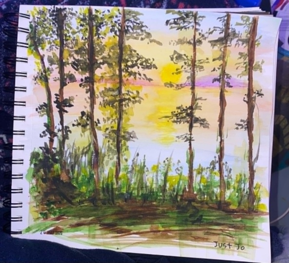
we're going to paint this peaceful lakeside scene
at sunset in watercolor. My name is Avraham, and
I'm a professional artist. I've been in classes
online since 2016. This class is all about enjoying the process of painting
in watercolor, where mistakes are just
part of the charm. And while I think you will come away with a lovely
final painting, it isn't about perfection. It's about the joy of moving
color across the page. We're going to move through the entire process step by step, and I explain techniques
at every stage, as well as my thought
processes so you can gain valuable insights into how
to get the results you want. As we progress along
in the painting, we'll cover how
to create dreamy, soft transitions in a
sunset sky, color mixing, and how to mix both
vibrant warm tones and deep shadows with confidence
and contrast in detail, where we'll be
practicing making crisp, sharp strokes to bring
our foliage to life. Whether you're picking
up a brush for the first time or just want a low pressure project to unwind with, this
class is for you. So grab your paints, find a comfortable spot,
and let's start painting.
2. Materials: So to begin, let's discuss what we need equipment wise
to start painting. First thing we're going
to need are some brushes. So I have here a
eight round brush, **** Blick brush I got a
while back, and it's nice. When it's wet, it
comes to a nice point, but you can also flatten it out to get some
different effects, and then have a
much smaller 0.4, also a round brush for
some more finer details. For the paints, I
have here a set of Daniel Smith
essential watercolors. These are the six colors here. There's, as I labeled them even, hansa yellow light, new gamboge, aqui and Rose, pearl scarlet, alo blue, and French
ultra Morlan. From these three primary colors, there's three primary
colors, and each one is warm and cool. This is the cool
yellow, warm, yellow, cool, red, warm, red, cool blue, warm blue. So from the three
primary colors, you can essentially every color in the color
wheel and going from the cool to the mixing between a cool and a warm gives you a little bit extra flexibility
in what the results are. We'll probably experiment
with that as we go along. To the right, I have these colors here that
I may or may not use. We have this violet, a burnt
sienna, and Payne's gray. Paine's gray is if
you need to get some really dark
colors, dark values. I'm probably just be mixing
again the primaries in a way strong enough
to get dark forcene. But if I need it, we'll
bring it in there. As you can see in the
mixing palette here, I used this side for my cools and the right
side more for my worms. I try to keep them
like that just so I keep things organized. But you can use any
colors you want. As I said, from the
three primary colors, you can make anything. But if you have
greens you like to use that are already
premade or you see here, there's a brown, right,
this burnt sienna, because if it's
hard for you to mix a certain color or you like that certain shade
that's giving you, so just use, start with that. So these are my color palette. For the paper, I have this
nice little tin that I got, with these postcards,
watercolor postcard paper. And I thought it was really
cool. Oh, look at that. So we'll be using
postcard paper. These postcard size
watercolor paper. It's 300 GSM, 300 grams. And that's good for it. It's recommended for watercolor. Because it helps the water absorbs into the paper and
stays wet a little bit longer, you can get some
different effects. Besides that, we
also have mixing these waters for mixing wetting
our brushes and whatnot. I have two, as you can see here. My workhorse water is this
smaller one over here, and that's where I will
mix most of the time. But I want to be absolutely
sure that I have clean water or clean brush, then I'll take the brush and put it into this one afterwards to get
absolutely clean. And the only thing that
I think we need is a towel of some sort
to dry off our brush, between the different colors. A lot of watercolor is obviously controlling the
wetness of the brush, the paper, things like that. So having someplace to absorb your water
is very important. And one last thing I
forgot to mention is that I have the paper not
flat on the table, but actually on an
inclined surface. This is a 1 " binder that
I got many years ago, and you can see it's
about it's 1 " tall. So I just put the paper on this incline that
helps when there's water, there's a lot of water, it
helps the water flow and bead. And we can help continue
painting that way because sometimes if
it dries up and edges, then you get these little
harsher transition points. And if it's beading like this, you can it helps control where your active line
is in your watercolor. So with that said,
let's begin painting.
3. Painting the Lake and Sky: Looking at our photo,
we want to approach this in a way that
makes the most sense. And obviously, in watercolor, we go from light to
dark because you can't lay in dark
areas so easily. So because of that, we're going to start with
our background, which is this lovely sunset. And then after that, we can
go out and do the foreground. So I'm going to take
my larger brush, and I'm going to just wet
the area because I want to be a I want to be more
of a smooth transition. If it's dry paper, then the transitions are
harsher, and if it's wet, then they are um smoother.
They blend more together. So I'm just putting
water on my paper here for about the height I see that I'd like the sunset
or sky area to be it doesn't have
to be so precise. And I'm going to
actually increase the size of the sky because
the very foreground, which is a lot of just, I guess, dead twigs isn't so
inspiring to me. So I'm just going to go a
little bit further down on the page around here, and we'll see, uh
and draw like that. Okay, so let's get our colors. To make the start with
the lightest color first, which is the yellowy colors. So I'm going to take a
little bit the new gamboge. I'm going to dry my brush
because it still very wet here. Take a little new gamboge, place over here in the palette and a touch of pearl scarlet. To warm it up because
I see it's not exactly it's a
warm yellow, okay? And since there's a lot of
water on the brush right now, it should be very, it should
be a very light color. It won't be very intense. So I'm figuring out where
I have to pick out where my sky is,
the horizon line. So let's pay over here, I have to estimate
again because of the I'm not doing exactly
like I see in the photo. So I have like this,
I see a little gap where this and it comes over here and it
goes onto that side. I'm leaving a space
in the middle also for where I see the
sunlight is going to be. Okay, so I have like this, and it goes all the
way to the edge. And I see also the yellow goes through the trees a bit as well. So this is going to
be our yellow area. I'm pressing down
more the brush. It's a very light,
and as it dries, it'll actually dry lighter. Okay, so here's what you
have for the yellow. Mm hmm. Next, I'm going to go
with the pinker color. I don't need to really
wash off my brush. I'm just going to damp
it a little bit and add in a bit more of
the pearl scarlet. Put a side here, see
what it's looking like. Now that I have the red, I'm going to mix it a bit
more on my brush and I see here it's getting to about the color
that I'm looking for. While this is all still wet, I'm going to start
to add that in. I'm going over here. I
think the underside of where the sun is going to
be pull it off the side. Put some red on top. Something like this. And then I'm just gonna add
a little bit more water to my brush to make it a
little even less red and add in a few subtle areas of red over here as well in
the reflections of the water. Okay, very subtle, very nice. Here it's drying
up a little bit. I want to smooth that
out. Okay? I see a little bit of red in
the top, too. Okay. So now, Um So from here, I'm going to move
in to the blues. So here I'm gonna wash off
my brush a little bit. Dry. And for the blues, I'm going to be picking
palo blue because it's a very nice, um, greeny blue. And make sure it's very watery because it's a very
intense color. And basically more watery brush even rather err on the side of caution and having too
much water than too little. So from here, I'm going to just start down here and see
what this is looking like. It's a nice, okay. And more water. But
these together? It's a lighter blue as it
gets closer to the horizon. That's my horizon
line right there, and the blue doesn't
go. Actually, wait. I need the white to serve
a little bit of where the sun makes this little
light coming straight down. So make sure I leave
that over here. It's so light that's
almost negligible, but I just want to
leave that in there. The wettest part of the paper is the highlights, so
keep that going. Okay, so I have, like this snail and but more blue for the sky. You see how little paint
is left in my palette. So I could pick up
a little bit more here and water it down a bit. And now just go and
throw some on here. I like this texture.
My leave it like that. It's use to clouds and want it. Because it's a cold
pressed paper, it has more of this
texture to it, and so you get these
nice cool effects that you wouldn't get
with a hot press paper, which is why I prefer this one, but you can use whatever
type of paper you like. Okay, so now we have here
the next part I want to put in the purple part, right? That's the most intense
part of our sky. And we might come back
with another pass as well. But I don't have
purple on my palette. How do you make
purple, blue and red? So we're going to take
the pearl, scarlet. And I'm going to do
French ultramarine blue, and that will make
a nice purple. If I went with the thalo blue, because without getting
into too many details, it wouldn't be as
vibrant purple. It would be more muted purple. So using these gives me more a nicer purple for what
I'm trying to achieve here. Okay, so looking, I'm trying to remember where the sun is. It has that gap, and over here, this line, so
drawing my horizon. Like this. It goes
all the way to here. And then I'm gonna pull
it up a little bit. I might want to do this again,
make it slightly darker, but we're gonna start with a lighter one like
this and come across I keep my horizon
straight. Like that. And then over here, I can't really see what's
happening behind the trees, so we're just gonna do
something like this. And then what I
want to do is blur. It's a nice it's not so sharp
on top here or something. So water, dabbing off
my brush a little bit. And then I'm just
going to gently water to where
these points meet. If I just put water on and if I cleaned off
my brush by adding the water but didn't dab it off, there'd be a lot of
water on the brush. And then when I come and
touch it to the paper, there'd be more of a chance
of getting what are known as these back runs or cauliflowers. So if you like cauliflowers,
that's a way to get them. But if you don't
want cauliflowers, so it's good to try
to match the level of wetness that's on your paper. Okay, so we have the sprite now, and I think I'll do a little
bit more just a touch at the bottom to highlight where the horizon
line is the darkest. So I'm just going to mix up
a little bit more of purple. You can see that it's a much
thicker consistency now. It's not as liquid,
and because of that, it will not move as
much on the paper, and it should be a lot darker. Okay, not so much darker, but it's dark enough
for me. Okay. Like that. And we'll let that a lot of times it's nice to just let
watercolor do its own thing. So I could go and
blend this out, but we'll just let
the wetness of the paper do what needs to do. Okay. So here we
have our background, and so now we're ready to go into the foreground
part of our painting.
4. Painting the Trees and Foreground: So for the foreground, we want to have lots of
greens and darker colors. And so they will go very well over what we have here already. So to do that, we're going
to mix up some greens. Green is gonna be a mixture
of yellow and blue. So to do that, let's
get yellow and blue. I'm going to take,
again, the new Gambage the warmer yellow, and mix it with the blue, the pale blue, salo blue. And we have this nice green, which matches the top
part of our foliage. So I'm just going to
lay all that in here. A nice area of green. Like this. No coming down here. I just tossing some greens. Okay, I see also it comes
down a little bit like this. We have some areas here on the edges, a
little bit over here. There's a little yellowy pinky
flowers or something here, so we'll leave space for that. And like this. Okay, so we now have our
lightest area of green. So if you're here,
I'm going to go and this side a little
bit, too, I see. Here we're going to layer. So we're gonna get a
little more of our green. Maybe I'll change the
consistency a little bit. I'll just add a little more of a little more of the blue
and yellow and mix it in. So it'll give a slight
touch difference. And what I want to do is then sort of dab a little bit
here and there like this, and I'll sort of hint to
the idea of flowers or the leaves as being yeah. So we'll do that for
now. What I want to do is wait for the water
to dry a little bit more, and then we can get a little
bit more distinct color. So, well, that's so to do that, let's go and move
to the foreground a little bit and get
something really dark. So for really dark, I'm seeing this as it's like almost it's almost
a really dark purple. So to get our purple, we're going to mix
like we did before, perhaps scarlet,
French ultramarine. I'm going to go very,
very dark here, very dark meaning
thick with less water. So now, when I paint, it will be quite dark. And we can start
with from the top. So I see here we have
a number of trees. We're gonna start on
the left and move to the right because as
being right handed, I don't want to
smudge or whatever it well, it's toll drying. So we're just going
to come and just start come straight
down here like this, and it curves a little bit. The only thing I
want to try to make sure is that it
gets a little bit, um thicker as it moves down. But basically following what
I see in the picture here. So, uh, you know, sometimes people draw trees that are thick at the top
and thin at the bottom, and that's not really reality. So, let's just try to keep it more to what reality is here. Okay, so we have one
tree comes down to here. I pick up a little more, make more my purple here. And we do it again with
this next tree trunk. It's about this far apart. And it's a thicker
one, isn't it? Slightly. Even if it
weren't good to make variations because nature is not so symmetrical in that
sense, typically. So we have some thicker
trunks and some thinner ones, and it makes things
look more natural. But fortunately, our
reference picture is doing that
thinking work for us, so we just have to
follow what we see here. Can't as come together.
So over here. You can see at the
bottom, it's not as intense a purple or
dark color as on top, and that's because this paper
is still a little bit wet, so it's mixing and
diluting what's on top, which is okay. It's fine. It's It's part of the
joy of watercolors. You get to mix these
things together. Okay, and just see here by
drawing around the shapes, define where some leaves are in a negative
space. Very cool. We'll do more of
that. Okay, getting a little bit more of our purple. This one almost
looks brown to me. Anyway, it's perfect
for what we need. Okay, so now we
have our thickest tree trunk on this side, which is about steps over
here, it looks like. Cuts in and then back out. Okay. And that connects all the way to the bottom here,
which connects to this part. Might need to add some more
green areas over here. Okay. And you see here it's actually wider on
top than bottom. No, no, so I'm going to go and just wide off
the bottom here, make sure it looks, at least, you know, as wide as
that. There. Funny. And this part right
here is way too narrow, so it's It's just ticking that also again for so it
looks more realistic. There we are. Okay. It's
white on different sides. And, uh, great. Okay. Now we're going to
go for a very thin one. You see here if I hold
a brush like this, it's flat on the side
how thin that is, right? So that's because I'm
pressing down like this and make it
very thin brush. And I'm going to draw in that
style to make it very thin. That's the hope,
at least, right? So let's see how this goes. Here. So I'm just drawing in the
thickness of the brush. I see it's not as
pigmented as I'd like, but I'll just finish this
off and then we'll come back and do it another pass. Okay, I see also that
in my drawing these are way too much to the right. Like I've already hit the
center of the picture, and in the actual reference, this one is far to the
right far on the left side. So we might have to just
play with the trees. How many, you know,
remove a tree. We'll see. Purple again here. Okay. And this one
gets thicker now here. I will keep it pretty thin. And see at the bottom, actually, I'll leave an open space
here because I see that the green leaves
cross over it, so we'll try to leave
space for that. And Okay. One more pass here. If you ever want to
make something darker, so you just have to
go over it again. Ideally, when it's
dry, if it's too wet, then you'll then, you'll just
be moving the paint around. Sometimes, uh, here. So I'm leaving a bigger gap there to make it more obvious. My intention. Okay, now we're up to the trees on the
right on the right side. And let's go with this
another thin tree. And I'm gonna put it here.
It goes pretty straight. The nice things
about when you're painting nature scenes
is that even if you're a little bit imprecise and
not exactly a photo likeness, people aren't going to say, Hey, that doesn't look like the tree. I mean, you have to you could
be really off, you know. But, for the most part,
you have a lot of leeway and flexibility and forgiveness when it comes
to painting nature scenes. Okay, so this is going
to be this trunk. I'll do it one more time here. It's not exactly dry yet, but it's fine to go
over another pass right now to darken it. Okay. I know a
little more water, a little more paint. Now we're getting to
our biggest trees. More purple. There we are. I'd rather be more blue than red is what I'm trying to get
to. Okay, here we go. So now we have these two that
are very close together. And because of my
thing over here, what I'm going to I think
I'm going to do is just do the really thick one and
leave off the other one. So let's do that. It comes like this. It's
heavy thick like this. I've reloaded my brush
with lots of paint. I'm just following the contours
I see here best I can. Los a little bit wider. And coming back in here. This little more paint here
comes all the way down the bottom of the
photo to around here. You think we'd get another
one in here? We could try it. Trade game went in. Be a little tight and
have to watch out. I don't smear
anything. Okay. Okay. Using my finger, my pinky here to keep my hand off the paper and off the surface. So hopefully everything
will be without problems. Alright, I'm
seriously impressed. I wasn't sure I'd be
able to add in this guy, but it looks like
we were successful. All the trees are now
happily represented. So what I'm going to do
right now is link up. Or just add in how they
all connect at the bottom. For that, I'm going to
get a little bit more of my purple color. This great. And now just put it in. Now, this bar on the
part of the paper, we never put water on,
right? So it's very dry. So you can see how
the strokes are very, they don't blend
together at all, unlike what we did
at the top, right? How that was all
blending. This is gonna be very, um, rough, and it works
perfectly for, like, the highlights of sunlight on the different branches
and all that type of stuff. Just, you know, angle your brush differently
back and forth. Get some more of my color here. And this whole
area hint to this, there's a type of
branch it looks like it's running through
the whole thing as a very light area. So try to leave that sort light. Again, it's more
impressionistic in a sense. I'm not trying to match.
It makes no difference. Honestly, if I get all the
branches in or whatever, those are happening
in this foreground. It's more just, you know, impressionistic of saying, Okay, we have lots of dirt and
textures and stuff like that. Least that's what
my approach is. If you'd like to
do it differently, you are totally welcome to. I would love to see how
it comes out, in fact. So hopefully, you'll share it in the projects and resources
section that we can all enjoy each other's
interpretations of this scene. Okay, so now that I've
gone through and go here, what I want to do is continue
to blend it all together. So we have this tree
here comes down. Very nice it comes into here. And then we're going
to be a second pass of different darks and lights, you know, different shadows
and things like that. And here is where
it gets really fun because you can just let loose. We've already set down
all the major areas of this painting here, and we can start to
really have fun. So I'm adding in a little
extra dark purply dark here to show texture of
the bark and whatnot. Alright, let me have.
We'll come back with these little branches in a moment, but
that's where I was. Just floating around here, okay. And then here I got a fill in this area
here 'cause it's really, for the most part,
just all dark. There's only a few areas
that show up light. I do want to connect a
little bit more here. So here, it was more dark
on this side, right? And it comes on to like
this here as well. So I want to do it
also right now is sort of cut into
this green area that I left to sort of hint to, like, the different
shape of leaves, right? So before we just had a
big blobby green area, and now it's going to be cutaways that hopefully
will look like, you know, impressions of leaves. And again, since it's dry, we get these very, um, crisp lines, which I think
helps sell that impression. So I'm loving it. I think it's really come out
very nicely. You know, good. So this is the foreground area. Now I want to do is move
into this middle ground of green and add in the
texture like we did before. So let's go and do that now.
5. Finishing up: So after cleaning off my brush very well because going from these dark brown and
purple colors into a light green is definitely not going to be
won't work so well, so you can see how, you know, murky this color this
first mixing is going. So I'm going from
now from there, mix up some more greens and for that we're going to use the other
side of our palette here, and I'm going to take
new gamboge and a blue. I'm going to dry off my brush just at the barrel a little bit. That helps take some water out without losing the
pigment that I picked up. I'm sure I'm doing it on
this side, but whatever. Because it's more yellowy. Fine. So I'm going to go and add it and even though
it is very yellow, and the green, you'll
see that it's gonna show up more as a layering effect. You can't make
watercolor lighter by adding more pigment to it.
It's just gonna get darker. So as you see, what's gonna
happen is I'm going to put on and gonna be much darker. Even if it was my first layer, it would be a little
bit lighter, but now it's going on top
of the other one. So I'm just throwing down this, uh, leafy type of texture. Quick taps with the brush, back and forth. Some green. Okay, what we have
to do, though, also is go up into our um, the lake water area
because as you see, these little trees
and an branches, whatnot, you know, they're not confined just to this
area. They go up. So we're going to
do that right now. Okay? So I like this. I'll get a little bit more of my alo blue, put it in here. Okay. And now, this
actually what I want to do is make it a little bit darker because even
though against the other grass and whatnot, greenery, it's pretty light. But here, it gets pretty dark. So let me go and let me
move it to this side. Here, just pick up my
green, I guess, whatever. And here, add in a little
bit more of the blue. And this will make
it much darker. So now we're going to put
in some very fine marks. And for this, it might even be worth switching to the brush. So maybe I'll do that
in a moment after I do a few things with
what's over here. Like, for example, the leaves. So these Well, okay, let's do this. This brush, okay? We're going to go and take it a little bit and pick up some of the color here and
do some very fine. It's a little bit wet here, so I want to dry off the brush, and maybe I'll do that is just by picking
up more pigment. And it'll be a little bit richer and it'll be more precise here, so they can see,
this is much better. So I want to maybe draw the
stem of how it's going to be looping around like this and another one like that, right? And these come in here and I'll fix all that later, right? So I have also a
line coming here. Back and forth. So what
I think I want to do also is that they're
not so much green. I mean, they are green, but against the background,
they're darker. So I'm going to add in a little
bit of this red, in fact, and that is going to create a
like a rich almost a brown. Yellow and green makes brown. So if I want to make
it a darker green, that would be a way to do it by adding a little bit of the red to make it
almost like a brown effect. Okay, so now that
I've remix that, let's see how this looks,
how dark this is getting. Yeah. So here you can see
on this side how beautiful. I mean, hope it's
beautiful. I'm enjoying it. Uh, some tree
branches like this. And here, again, trying to make match the style of
distribution of leaves. So it looks somewhat realistic or like what I'm seeing
in the picture, at least. Yeah, something like
that. That's looking Those are looking very nice. And to see if I can continue
that style because these are all the same type
of I'm all thick. The same type of tree
thing here, right? Like this. I like
here back and forth. Again, this is where the fun part of
watercoloring comes in, I think, once you've
already had, like, the basic laid in your
groundwork of what you need to draw and now you
can sort of play around with these elements. I'm seeing here that I
really like how I did the stem or those leaves without actually
drawing in the stem, and that might have
been a better technique than here where you
actually see the stem. But that said, in this
part of the picture, they really are the
stem is much thicker. And you can see it
more. So, um, yeah. So what is what it is. Okay, draw blobby
things in here, right? Great. And a few more blobs. Look at that. That's
really looking nice. It's such a pleasure when you're seeing your picture
start to come together. Many times, when
you're painting, there is something
called the ugly stage where you're in the
middle and things like, Oh, how's it working
out? I don't know. Uh, it's something they say, as everyone says, trust the
process and keep going. There have been so
many times that, like, I've been drawing or painting, and I'm like, Ah, this
is not working out. And I say, Well, keep going anyway, because
that's what they say. And thank God, for
the most part, I've had, of course, a
few failures anyway. They just can't be
saved. But you'll be surprised how often you
are able to just keep going. And like, when you're in the
middle of doing something, you're like, Oh, my gosh,
this brushstroke was bad. That brush you're
looking at the at a microscopic level
of every time you put your I brushed the paper and
saying how it went, right? But later on, when you take
a step back and come back to it later or another
person looking at it, they don't see all
those details. You know, they're just seeing the whole picture as a whole. And so as a whole,
it looks nice. Okay, maybe this one stroke isn't so good or whatever it is. But like people,
artist, me, whatever, sort of tend to blow it out of proportion at the time
because they're like, that's what they're in. That's what they're
doing at the moment. So like, Oh, my gosh, did I put down this one or that one? Like, right
there? Oh, my gosh. Ah, right? Don't worry
about. It's fine. Okay. So here, what I'm trying to do I need to mix a little more color. But I'm trying to do is make the petals a little bit more, um, brigger because this
is a It mixing up anymore. Let's go to get the green.
Okay, let's get some green. That's going to
darken it up, right? So again, this is
if you have your own green pre mixed, you can
go through this process. But at the same time,
by doing it like this, you also get infinite variations because every time
you mix it up, it's a little bit
different and that also mirrors the
reality because, you know, it's a little
bit different everything. So as I was saying, though, what I'm trying to
do right now is press slightly harder with my brush to make a little bit bigger leaves because that's what's
happening over here. These are bigger leaves because they're part of the tree and not those other things down there. Okay, this so we have a
few things here and there. What I want to do to protect the side
of the paper here, I'm just gonna cover this up. I mean, it's dry and everything, but we'll do I just
don't want to get my oils from my hand or
anything, doing stuff. So we're just gonna paint these. And here, this smaller brush, this four is great for these little uh tree
leaves and whatnot. So if you're here,
if you're there, And these actually, I
think, are even darker, based on what that looked
like, so let's see. Yeah, so that's even darker. I'm gonna put a few
of those dark leaves inside where the
lighter ones are, as well, maybe, like,
the sun hits the leaves, it's a little bit different and so some are darker
and some are lighter. I'm just gonna pretend that's
what's happening over here. And here is branch. A branch isn't the same color. We'll have to deal with
that later, maybe. So over here, in the
original picture, there's a lot of
foliage over here, and I'm not like, my sun area is over here, and the foliage is
slightly different. So I just have to
make sure that I, you know, don't
lose my sun area. As I look, we'd
like to go back and try to make it more pronounced. Right now, the light
page is just a big blur, and in our reference photo,
it's more of a circle. So I want to see if I
can do that, as well. So it looks more like an
obvious sun in the sky. Okay. Yeah, there's a whole
bunch going over here leaves a few are here too. Okay, dabbing on. That's looking pretty
good. Pretty good. Okay, so now I just think
we need a few more. I'm making some more
water here on my brush, and we'll darken it by
adding more pigment. Great. And now, it's over here. Let me do. I'm okay. So over here, we have
a few on the top. Like this. And here are a few. That side of here. I'm just sort of trying
to match how I see it going alterning sometimes on this side, sometimes
on that side. Nice. Okay, and then a few
more things over here. This one, because the proximity of these
are going to overlap more than in the source
reference photo, so it's to adjust
as best as I can. And then the space between
these two is also not, you know, a few things
here and there, whatever. I see there's
another small brands over here, but we are
not putting that in. Wow. This is really
coming along. Okay, so I think
next we're going to do some final
finishing touches, and then we'll call this done.
6. Class Assignment & Thank you!: And Thank you so much for
taking this class with me, and I hope you had a fun,
relaxing time painting this peaceful lakeside
sunset scene in watercolor. I'd love to see what you made. So please remember to upload your work to the project
and resources section, where I'll be happy
to give it some love. If you enjoyed the class, I'd really appreciate
if you left a review. It will also enable my class
to reach more students. And if you post your
work on social media, I'd love it if you could
also tag me on Instagram. Lastly, please follow
me here on Skillshare, notified of future
class releases and other exciting
announcements. Thank you again so much
for taking this course, and I can't wait to
see what you create.
 Avraham Nacher, Artist & Photographer