Transcripts
1. Welcome: Hi. Hi and welcome to
this Skillshare class. My name is Avraham, and
I'm a professional artist. Together, we're going
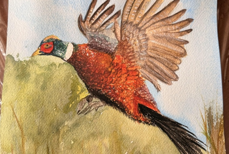
to learn today how to paint this pheasant
in watercolor. I'm gonna guide you
step by step from the initial pencil sketch all the way to the
finished piece. Along the way, I'm
going to share tips and tricks of
how you can use your brushes and watercolors to get the best effects
from your equipment. In my particular approach, we don't need a lot
of extensive colors and equipment to create
beautiful results. We'll have a few brushes
and a few primary colors, and from that, we'll
have everything we need to create a
beautiful picture. This class is designed for
people who are already a little bit familiar with
watercolor techniques, particularly people who
already familiar with how to mix colors and how to lay the colors on the paper based on how wet the paper is. So if you ready get
started, have a fun, relaxing experience as you
paint this pheasant with me, I look forward to seeing
you in the next lesson.
2. Materials: So for materials that
we used in this class, we have a bunch of brushes. These are the ones
I'm planning to use. I've got this eight
round from **** Blick, a number three
Diano brush that's, like, with that's
a squirrel here. Is a nice spring to it. And this is my
beginning workhorse, this Siami art brush number six. I got this on Alley Express. It's, you know, not
really expensive, but it works really well, holds a lot of water, and we can cover a lot
of area with it. So this is the brushes I
like to start off with. This is the brushes I
like to start off with, and then for more details, we'll move these other brushes. Besides the brushes, we have our paints, our
watercolor paints. So, for the most part,
I'm going to use the Daniel Smith
essential Watercolor set, which you can see
in my palette here. Have them conveniently labeled just so I know what they are. But we have hansa
yellow light over here, new Gambage anaquinose
Par scarlet, Tyloblue and French ultramarine. Most I like to focus on having
just the primary colors. We have a cool and
a warm of each, so let's have their
step in the palette. We have cool warm yellows, cool warm of red, and cool warm of blue. That way, just I can keep
track of where they are. It's easier remember.
And in my mixing area, I like to mix the cools on the left side and the
worms on the right. It's not a hard and fast rule. More or less that's
what happens. I also have this paint's gray. You can see on the far
right, this laquelle brand, which helps get some darker darks if I
need it really quickly. Besides that, I
have tried I have this burnt sienna also from
Daniel Smith over here, which I've used a little bit. I find mixing browns a
little bit harder for me. So this is a little shortcut, which maybe newer, maybe not. And then I recently
got this lavender, which is in my pet, and I've never actually used it. It could be good for throwing in some highlights and whatnot. So we'll see what
happens in the course of the painting. Right. Besides that, we have mixing. I have two different waters. I have a main cup for
washing the brushes, and then if I want to be clear
extra sure that's clear, so I have the second one that stays hopefully
more or less clear, and I know the brush
is really clean. I also have a little
spray bottle which we'll use most likely just to activate the paints
at the beginning. And as far as, for the paper, which
is very critical, up until now, I've
been going through this pad I got here,
this jumbo pad. It's had 50 sheets in it,
and it was, you know, 140 pounds or 300 grams, which is a very good recommend
weight for watercolor, but as you can see,
I finished it. So this is actually one of the first pads I went
through completely. You know, it's like you
have these sketchbooks and you get part of
the way through. So this was a very big
accomplishment for me that I actually
finished the whole thing. I was like, Wow. So because of that, I decided so I could see some of the artwork that
I've done with it. You know, what I decided after that sort of
treat myself is I've heard many good things
about the arches paper. So I went and I
bought two arches. I have here. This is
the cold pressed. And then we have
the rough grain, which is extra grainy or
extra texture on the paper. So I think we're going to
I'm going to try doing. This one. Is is brand new. I've never even opened it yet. So I figured it'd be
something to try here. Okay. So I don't know exactly
how it's going to react, but since I've heard such
good things about it, I'm sure it will be just fine. Okay. So here, this
is also, as I said, 140 grams pounds or
300 grams weight. And so the advantage of
that's nice and thick. Well, I can feel that paper. It sounds amazing, even. So we're using this. And aside from that, also, I have where I just
put it over here, we have some masking tape, artist masking
tape on the edges. And that lets you get
this nice little, uh, this nice little
border like this. So it looks like it's a
frame within the frame. It's a nice effect. And, um, this I have here, like, a large board. It's just the back
of a larger piece of cardboard, which
I have at an angle. And then this is to
put a slight incline. It's how big is this? A 1 " binder, you can see here, and this 1 " binder. That's basically 1 "
high off the ground, and it lets the water run in a direction that way you have this bead sometimes
that you can work with. That way, the water isn't
just pooling on your paper. So those are the
basic materials. Oh, and I do have a
pencil and eraser just to do some preliminary
sketching of our photo. So that's what I'm using. And you don't have to get
exactly this material. I think the most important
thing is you have a large brush for getting a lot of
details down initially, and then maybe a smaller one for more fine details later on. And for your colors, I do think it's
recommended to work with just a limited palette
like this because there's a cohesiveness between the picture if all of the colors are from
the same source. And further ado, we'll start we'll do a quick
sketch of our painting.
3. Initial Sketch: So let's first put a little
border on our paper. So I'm taking this
tape. I'm going to just measure out
enough for each side. I'm going to put it on. Try to keep a little
bit an equal edge, so it looks straight what
the tape is covering up. That'll make the frame look
straight and organized. Okay, this one here. What makes artist tape a
little bit different from regular tape is that it's
not as sticky, I guess. I can come off the paper later cleaner at the end
without tearing your paper. Though I have used regular masking tape like
this, and it's worked fine. Basically, it's a wider, so I'll just take it and then cut down the middle
to have two halves. But I figured I try
real masking tape. Though, honestly, I haven't
really found much difference. I mean, the regular masking tape hasn't caused any
problem to my paper. Alright, so here. And one more. Like. All right. And there we are. So now we have our frame,
everything's set to go. Next is to draw in a really rough sketch of
where things are going to be. Even though initially, I had
thought that we're going to doing the picture
in a portrait, I think in the end after
looking at doing some at the overall space here that it would bear to do
it in a landscape format. So we're going to do
that, and I'm going to arrange the pheasant
on this paper, sketching it out to make sure we have enough room
for everything. So first, I put the
head over here. It's gonna be a little bit low because I want to have room for all that wingspan. So I have the head
about this size. And then the neck comes out to around here before it
starts to go up like that. Again, I'm drawing this a little bit darker than I normally would a rough
sketch just so that the camera can pick it up so
you can see what I'm doing. So here, and then the body goes a little
bit higher, I think, and then angles down
like this. Around here. Let's see if the
head starts there. The bottom of the body looks
like it's around here. So I have to make sure
you have that angle. So this and just looking for the lines and angles and direction of the
lines of the body, like if this head is over here, so this curve looks
to be around here. See the head is here,
comes out to there. Like that this part here. Make sure I mark off where the whitest air of
the paper is going to be that we don't want
to draw there or paint there at all. This comes in. H Okay. Here. Alright, so I feel
like I'm taking a lot longer on the preliminary
sketch than I would like to. Um, but I do think it's
important that you get a good foundation of what
your painting is going to be 'cause this is where you're going to build
everything on top of it. If you're not looking
for something as realistic or true to form, so then you definitely don't have to spend
as much time on this. M Okay. You hear that? I think the bottom I have
is fairly accurate now. And here, it's a
little bit narrower. Like that. Okay. So after all that, I think the body of our
pheasant is looking like this. And now we draw in our feathers. So if this is here, it looks like you have some
feathers going like that. Coming out to here, and
then they come in a little we're like that. And then we have another
wing that's over here. And this feather is a long its own over there
and comes out like that. Well, okay. That
took a long time. So now, uh, just
I want to draw in the angles of some
of these feathers. We have a few like this. Alright? Like that. And then these
feathers coming here. Okay. And then the
last thing is, I want to just mark out where this wing the arm, I guess, is. I'm not sure the anatomy
correctly called, but there's this part
of the bird where it's the arm part where it
connects to the feathers. I was over here. See it
coming out like that, right? And it's got a few something like this, this area over here. Okay. Excellent. We have
a few strings like that. And, uh get the
beak at the front. And you'll mark off
also where this that very bright red
vibrant area is over here. And his eye is going to be
something like this, huh? That little bluey
thing underneath it. Okay, so there we are. We have our beginning sketch, our groundwork, and from
here, we can start to paint.
4. Background Colors: I'm just going to take
my spray bottle and activate these colors,
the primary colors. I don't plan to use the
other ones so much. If we do a lot, I can make
with a little water on them, but we're good damping my brush. And I did forget to mention
that it's good to also have paper to dry your brush. So I'm going to start off with just throwing some color in the whole area to get the
paper, get the color going. What I see here is I have blues
on top, the very vibrant, like, amber color here in the feathers and then
some greens the bottom here. So I'm going to start off with I think I'm going
to take blue, okay, and do some just a very base
gentle wash for the sky. So I'm gonna take this alo blue, which is quite strong, okay? So when sal Blue, you put a little bit of water
on it and activates crazy. So just go very
gentle with that. With watercolor,
it's always easier to add more color after. You know, you can build
up. So right now, I'm just going to do
a gentle wash here. Um, leaving the area around
the pheasants wings and body. And I like, always sort of testing my color on
the mixing tray, I can see how much water
how intense it is. Okay. And here see
how strong it is. I'm gonna add a lot more water. Okay? So some blue
here from the top, more just for some
variation like that. Okay. So this is a really
straight blue. I could take a little bit of the French ultramarine and just add in a little
different see, break that up a little bit,
so it's all the same color. I do like having complex
colors, in a sense. Like, use the color
straight out of the tube is not I'm not
such a big fan of that. Okay. The sky is a little bit of an exception, but even there, you see how I'm changing
things up here. And, uh, okay. And I'm just going around here. I want to make a smooth
transition at this point here. Um, let's take some of
the blue inside also, where we know we're gonna
have a bunch of the feathers. We can see the sky
through there. So I want to bring
that through. Okay? We can Touch it up later. Okay, so that's gonna this area. And now, um, we can add in a
little bit of yellow. So we're gonna do
the new gum Baje with what's in here already. And I'll make a
nice green color, which we can then blend in with what we already
have at the bottom. This dry brush is a little cool because it leaves a little white specks in here, which could be sort of like
the highlights of some of the the um light against
these branches or whatever. Hello. Get the hair off there. And I do want to get a
little bit more blue. So let me just clean my brush. Make sure it's without any as little green
as possible, right? Pick up a little more
blue here and do the underside and
blend it together. Okay. And over here, it's
a little more yellow. So we're going to I think
try to brush again, get somewhere the new gumbage
and put that in here. And from there, it can
segue nicely into the body.
5. Painting the Body: I'm gonna first move gumbage here and take a
bit of our barrel scarlet. Ton it down just a touch. More pl scarlet and more gumbage Okay. So here, it's
coming in like this. Smooth out the edges there. And from here, it's going
to be a lot darker. So we'll put in
more pearl scarlet. Over here, too. So I'm mixing it with a new gumbose
because I want a gumboge. I want more of like
an orange color. I want so much red. So I'm
mixing the two together, and then you steak over there. Okay. And then we can put it in like this
and the underside. So I'm building up
in stages here. So I So I wanted to blend in the
transitions between the different colors were here. In this whole area, I'll
just sort of coloring. I'll fun now because it's gonna be dark, like, really dark. So I don't want to
be a hard transition between where these lights
and darks area are. I just want to like that. And now we'll let that
dry a little bit. And while that's drying, we're
gonna go for very strong, just pure par scarlet and do that around the face over here. So what I like about this brush is even
though it's so huge, it has a very nice point, and you can get
details like this. So it's very multipurpose. I'm looking where the
middle part of the eye is. I'm saying that this
red goes a little bit like where that yellow part is it goes a little bit below. Is the eye, there's a line leading from the bottom of the red to
the bottom of the eye, and then we have this
circle that comes out like this underneath it. Get a little bit more
red on my brush. This comes around, like here, That's a very that's, like, the brightest red area
we have over there. Okay, so from that, I'm
going to definitely take some red off of my brush right now because
I don't it's so intense. But I do want to get this brown. So I'm going to try to get it. I'm going to do another
layer here to build up the feathers, this color here. I'm gonna try doing it with the primary colors.
You'll see how it works. If not, I can always take on some burnt sienna, I suppose. So I'm gonna go with
the lighter color because it's always easier to darken in watercolor,
not lighten. So add a lot of our new gumboge. And then from there,
I'm going to add in a little bit of pro scarlet, and then just a small touch, really small touch of
this feral blue Sal blue. Here. Trying to build a
nice brown or amber color. So also by mixing over here, I can see what I'm getting
and then apply it. It's important to remember
that whatever color you're adding will be sort of glazed over the color
you have underneath it. So like here, I have to
remember that I already have like this color, this
yellowy color here. And that's going to affect
what happens after. So I'm just making a little bit more of a red area towards red. And so the first layer
that we put down, you can leave those as gaps, and those will almost be like the highlights of the feathers
where they hit the light. But I can't say we'll be done even just with the second pass. You might even do a
third pass after this. And this is, like, the dark area where I see the
bottom of that limb. It's definitely not
dark enough yet, but we'll pose a first
pass for this area. And here, I'm gonna try and move the brush in the
direction of the feathers. I want to just lighten
up a little bit, and the easiest way to lighten it is by adding some water. So now we get to this
part of the pheasant, and you'll see that it's a lighter it's lighter, but still, you know, an extra layer of it's a little darker than what we
have is our base layer, but it's not as dark
as the area over here. So I'm just want to
lighten this up. And instead of doing
that by adding a little water to
the brush, okay? We can also make a combine
that over here like this. Okay. And what's
happening over here, I can go and darken it again. So I'm gonna go back to par
scarlet and a little bit more of Dale blue and new
Baboge. Okay, over here. Now, this area is not
necessarily so dry yet. So what I'm gonna do whatever
I do over here is going to end up being blending in a lot. Okay. Just working up
different areas and always managing the wetness
of the page, right? This color also, if I mix
it with mo more blue, will neutralize it out a
little bit. Let's see. What I'm trying to do
is get to the feathers. I think it's a good color for
the feathers at this point. So I can start
throwing those in too. Trying to carefully just look at the directions each of these
feathers are going, right? Because they have
a certain angle feathering out from the body. No intended. Whatever. Uh, yeah. I'm sort of losing the running
out of color on my brush. So I'll just get a few
more put more here. I have to make sure
I leave that space where the lowest feather is and make room for the for
the sky that's underneath. Okay? Now, from here, that's
looking pretty good. Um, what I want to do
from here is actually, let's go fill in the
really bright bright beak. So from that, I see that that yellow is actually
more the Hansa yellow. It's it's a very it's a cool yellow versus
the rest of the bird. Which is a more warm yellow, but it's a dirty yellow. So I'm gonna take
the hansa yellow and mix it with what I have
over here a little bit, which will dirty it
down a little bit. And this part of
the bird, the red that we did before
is already dry. So now I can just
put this on here, and fill that in. So here, and also the
top of the bird's head, we have this area here, which there's gonna be
a blue that we have to put in afterward, right? But there's this
yellow a dirty yellow, some green a little
bit looks like. So we're gonna add
that in as well. So let's try and make more brownish. Here. Okay. Let's have that we
can take this also. Let's go darken this up. So now we're gonna
do another layer of dark getting
really dark here. So this is a much thicker subs before the paint was very runny, and now we're making
it much more, um, like, a milky consistency. So I'm gonna throw that in here. And since the paper
is pretty dry, it's it's staying
where I'm putting it. I have to say, I'm very pleased with this
brown that's coming out. It's a very rich brown and
looks very, very good. It's not as dark yet as
what we need to get to in this photo in our painting,
but it's a good start. It's just built up
layer after layer. And you see how I'm moving
the brush in this arc. These little arcs here. And that's 'cause
that's how I see them the way the feathers
interact with each other, almost like scales or something. Here's a top again where it
gets darker. Need to here. Okay. Mm mm. It's just a matter of I'm just identifying shadow
areas and light areas. That's really all I'm doing
on at this stage here.
6. Painting the Head: What I want to do
now is I want to let this area dry just a
little bit and maybe focus on the very vibrant
blue area of the head. So for that, let's go
switch to a smaller brush. I think that guys
been doing okay, but let's switch to this sky, which is our number
three squirrel brush. And for this, we're gonna start
filling in the whole area with the Dal blue. Okay. I'm going to go here. And that blue right now, that's beautiful for what
I want for the underside. Like the lightest
area over here. So make sure I get that
area here like that. Okay. And now the rest of it, we're gonna do with
a much darker blue, get both these blues together. Okay. And here I want a
more creamy consistency. So I'm gonna really
try to get rid of, you know, not use as
much water right now. Okay. Seems to me almost it turned a little bit even
green over here. So we'll see even adding a
little bit of that, maybe. In the meantime,
though, let's go here. Switching to only
French ultramarine for much deeper blue. And this part under the beak. Alright. It's like that. I like that. Okay. And now I want to wear down my
brush a little bit. Go back to Sala Blue. Coming in here. Okay. And then a little bit
darker area on top here. Not dark enough, so go right
to the pan. Get that in. That's nice and dark.
Cuts in down here, I see. It's like a little triangle
or something over there. Like that. That little area right where all the
interesting intricacies are happening around
the top of the beak, I'm very happy how
that crypt turned out. Okay. Now, this area, actually, I do
want to try dry up a little bit I see it's a little bit on the
later side right there. Okay. So I'm going to a new layer and I'm going to add a
little bit of yellow. In this case, I'm gonna
go with the new gambog yellow to make it
just a touch green. Because, as I said, I see something a little bit
green happening over here. Over here, too.
Okay. I'm probably gonna wait till it
dries a little bit and then go over with a
little bit of blue. But for now, I'm looking
how that's looking. Oh, one more blue
that I need to put in here is underneath his eye. And that's going to be
just wash out my brush. I want to green of it on it. Um, we'll start
with the Tala blue, I see there's a little
bit here that's pretty bright like that. And then the rest of it is or we'll say French
ultramarine darker. I don't know, we'll see
how that turns out. I'm realizing what I should do probably is the
yellow first, though, because I don't want the blue to bleed into the
yellow afterwards. Let's go to our last
brush. Get that wet. Okay. And first, well,
it's just water. I'm gonna pull out this fill in the air. It's
not actually white. It's just a very
light blue, okay? And now here we
have this yellow. We're gonna go hunt of yellow. Very white, very strong
yellow, and put that in here. I just like dabbing. It's like Oh. I'm going directly from the
from the pan onto the paper. Okay. And when that dries, then we can go add
in the eyeball. So, but since I have
a little yellow here, I'm gonna go add in more
over here on the beak part. A? Get something here.
Okay. And, uh, I try to do something
with the that's good. A little bit of green
that we got there. And, um try to make
a brown again. Like that we have these individual
hairs. These strands. So it's nice to have a
contrast between, like, areas that are detailed
and not so detailed. So this area is definitely
the detailed area. Whereas beaks that's
like his face is, you know, the focus
or one of the focus. I mean, I think the wings, feathers are really beautiful, but people usually focus on
faces, human faces, at least. I don't know about bird faces, but we're going
to add that into. That's a little bit
too much. I think. Alright, well, it is
what it is, right? Okay. Good. So back to this brush, which we were using our blues. Really gorgeous. Really enjoying the color thinking over here. Okay. And just to
fill in this area. Like that. Okay, it's a
little bit brownish, is it? The
7. Painting the Body Feathers: So now let's go back and finish off our feather
area over here. So this is still nice and
brown. That's very dry. So now if I paint in here, it should be should get some
nice very dry to touch. Maybe even darker, but I'll
be maybe another pass. Slowly adding until I get a dark consistency
that I'm looking for. I definitely want to make
it very, very dark around, I don't call it this
neck area because that will accentuate just how bright the just how bright the white
part of the paper is. Now we're getting really dark. And this is probably the some of darkness that I want to
add in for the feathers. Alright. So it's a good starting
area for that. Probably do another
layer as well. You see this, how dark
it looks over here. But over here, it
doesn't look as dark because it's around an area
that's very dark already. That the importance of contrast
between lights and darks. I really brings it out. Here, this is the area I've
been trying to show where the feathers are on
top of the bird. This is very key
for defining areas, you know, of the anatomy. And slowly, slowly, it
will start to take shape. Like, before, it wasn't looking so three D and things like that. But I think now we're
starting to get the idea of how this is looking. I'm going to warm
this up a little bit. I'm adding in more of
the pi scarlet and newcombagT get a little
bit warmer area. It's one of my most used colors, 'cause it takes a lot to get
things to get the color. And, um, so I go through that pretty quickly. Okay. So for me, this is more or less how I
want the body to look, the main part of the body that we've been working on so far. Now I want to, um, work on the other the
top part of the body. How about that? So now, over here, I'm gonna add in a little bit
more of these colors here. It looks a little more, you know, warmer red
over in this area. So I'm doing that. Down here. And then this areas
for sure red. So like that. And now I want to do another
pass of much darker, for the lower part of
the body, so we're gonna mix that bar brown again. So from here, we're gonna
go around one more time. Okay. At this point, it's looking like I probably want
to add in some of our pains gray because I just can't get as dark
as I'd like it to be. It's a very rich brown,
which is beautiful. But these shadows
really are more black. So, let's just make sure I have all the rich
browns that I want, and then we'll go add
in a little bit of the pain's gray for this area. Okay. Hands grads. So I blended in a little bit, with the brown I had already. I don't want to do,
you know, as I said, try more of a complex colors, and I don't want
strain on brown. Strain paint's gray. It's,
can be a little too intense. So I'm mixing a whole
bunch of things. You know, our colors I perhaps to wait a
little bit for this to, um, dry up to get even
a stronger color. But for now, let's just, uh, I'm doing this this pass. I do it again. Another one. I'm really loving how it's
a dry brush over here. It's looking very cool to me. Just don't want to
overdo it, right? Otherwise, the effect
looks contrived. But right now, it's
I'm liking it very much what I'm seeing
so far of it. Okay.
8. Painting the Eye and Wings: Alright, at this point, let us do the eye and
the wings a little bit. So what I want to do
is start with an eye, getting my smallest brush here and we're going to
go for this one, I think, with Paine's gray. Get nice and loaded up
here. Just check it out. It's pretty dark.
And here we go. Hope for a nice eye. It's scary, right? Alright. Mm. Okay. That is our eye. I'm not doing anything
more than that. Okay. And now, um, the wings, there's an area of the wings over here
that I see is has this, like, bluish feel to it. I'm wondering if you're
trying it out with that, um lavender that we haven't
I've never actually used. Uh So let's go like this. Let's first try to get a
little bit more details. For the feathers and
then go from there. So it's a pickup. We have some nice brown
area for feathers that we've already been using. Just uh try to paint what
I see here, I guess. I guess it's feather
markings of pheasants. You know, it's got these defect that makes it more color
here, but whatever, we'll see it has a comes
up like this, and then So it depends how detailed and accurate you want
to make your paintings. Right now I'm having fun doing something that's fairly
realistic, I hope. But as the artist, you can
interpret it however you want. You can get some more brown. Let's make some more brown here. Get a bit of the
pain's grey as well. A I think these little lines,
how they show this, uh, is very, I guess, telltale or Like if you found a pheasant
feather on the floor, you would know that it's
a pheasant based on how these little lines
are on the feathers. So I'm trying to preserve that when I'm drawing them
or painting them in here. This here it's I see this these little
rays almost coming out. Somehow they hit the feathers in these these fan patterns. Something something like this. Watered down my
brush a little bit, so it's a little less
intense color. I know. Well, I'm gonna fill
in this area here with that lighter that lighter
brown that I've been using. It's like a greeny
color, actually. But that way, it's like, we have the where the
edge of the feather is, I see it almost a line. And then after that, it, uh, has a softer color. So that's why that's why I'm
dampening my brush to make it less, um, less intense. Okay. Like that. I know. I think even lighter
and just go over here and fill on the feathers a little bit.
There's no white area. The only white area is right
on the neck of the bird. So trying not to have any
other white areas on the page. Over here. Let's take
let's try this with our be a little bit daring, I have to say, I've never, ever used this color before. So let's take some
lavender, mix in here, and we're gonna throw it in a very dry brush
fashion over here. Okay. Picking up some more
of the lavender color. I'm actually saying I
am really loving it. The effect is really cool. It's a little bit
down here, too. Don't get carried over this. Okay. And a lot more up here. I think what I want to do
is let it dry a little bit, and then I can add in
a little bit more. But in the meantime,
I do want to fill in. I want to wash that part
off the brush very well. Well, I see a big
difference between my painting and the source right now is there's a lot of gaps over here, so I
want to fill that in. You know, so fill
on this like this. And, uh, Okay. I think we do even a little
bit darker on the bird wings. So I'm gonna put a little
more paints gray and mix it with red and yellow,
Lucombage and scarlet. And then I'm going
to add in here I see again, just trying
to do what I see here, and I see a little bit of this, uh It's a little darker
sometimes in here. So I just be true to
that and fill that in. Okay. I'm going for the final
touches, I suppose, of these really dark areas where it really
needs to be darker. Mm hmm. Uh, the feathers come out in this pattern. So try to do that
a little bit more. Damp down my brush
just a little bit so the colors aren't so intense, but I do want to try to
capture again more of these lines that come out. These parallel lines
on the feathers. And they only go for the
first half the top ones. After that, I don't see them
at all down at the bottom. Okay. So now that
we've got, I think, our bird pheasant mostly done, and it's putting in
a little bit more of the background to make him pop.
9. Background, Part 2: Let's go back to B Brush. Well, look how dark this is. I don't know if
you can see this. This is how dark the main water is versus
the secondary one. Looks like that. So, uh, definitely have different roles. Okay, let's see how good
that is. Nice. Okay. And Alright, so let's
go back and try to, um, define everything
much better. So we're gonna go and
another pass on the sky. I'm making my brush
of ice and wet wet. And we're gonna go and I'm in between the feathers now. All right. So I'm trying to
not have too many. I like the dry brush
effect over here, but it's a little bit distracting because
it's so many, like, speckles, so I'm trying
to smooth them out, only preserve just
a few of them. Um, come all the way to
the edge of the paper. I'll have that nice, frame
effect when we're done. And now let's switch
into a nicer green. So we're gonna add in more
of the new gumbage and mix it in with the pale
blue that we have already. T blue, sorry. And actually, I want to put in a little
bit of peril scolet. My brush is really
wet, so I'm gonna just dry the bottom
half of the barrel, and that keeps the color in without without
making it is wet. So these lines here. So before, remember, we had a little bit of
white on the page. But, now that we're adding in more color,
you can barely see that. Okay. So this area
is more green. I have it coming up to the area, the body of the pheasant. Good. From this area here, is a lot more yellowy. The grasses are drier. So we'll see what we
do with all that. Um, first, I want
to get more green. So just the green yellow and blue makes a very strong green, but to add in a little of red weakens it makes it a
little bit more woody color. So you'll see here see
it that red really um, it gives it a darker it darkens
it a bit, which is nice. Though, in this case, I don't want to
distract from our bird, so I'm going to take
another brush with water it down and blur that out. It shouldn't be shouldn't
be taking away too many, too much attention. Okay. And the last thing is to try and get some browns over here or we'll see light yellow. I don't want to, um, again, compete with what's
going on on that bird. So it's gonna be an orange, I suppose. This dirty color here. I wanna wait on the
side of the paper until it dries a little more. You can see how
it's blending in a little bit too much because of the paper so damp right there. N. So we have some grasses or
something in the background. Throw loads of in here. H. I do think that the um, talons, I don't know, whatever the feet part is getting
a little bit lost here. So I'm going to just
darken that up again. And we're going to do with, um, a brown that is, um, helped out with Pain's gray. So we'll see. Try that in. We're here with our small brush. Okay. And, um, I guess, also, while I'm here, we can maybe I don't if more things
over here. Mm hmm. Just a pattern of light and dark on the back
side of the bird, where the sun is hitting it,
making this scaly effect. At least that's what
it looks like to me a little bit. Oh.
10. Finishing Touches: As the picture dries, the
colors lighten up a little bit. So because of that, I do
want to go through and re darken a few areas.
Let's start over here. We have the birds that blue area that was
such a gorgeous color. It's still gorgeous, but I
think it could be deepened. So we're going to
get a little blue, and I'm mix it with a little bit of French
ultramarine touch of newcombugT that greeny
color a little bit. Like this here and come around the bottom again. Be
very careful here. Add a little word to my brush to lighten it up a little bit. The effect, so it
won't be as intense on this part. Come around again. Okay. Something like that. Okay, then let's go back for another pass of the lavender. Okay. I like this a little bit, and then we have in this area a few areas which also
a little bit lighter. Okay, like that. I suppose and maybe you want also darken the
wings again, the feathers. Try to get that slate green brown color
that we had before. Mm. See, even this was, even though it was pains
gray and it was really dark, it's lightened up a lot. So putting another pass to add a little bit
more dark areas. And a small brush,
as you can see. Alright, so, you know, looking at the source picture
and comparing it to what I see on my painting or my painting compared
to the source picture. Either way, making, you know, frequently frequently
referring to, what I think I should be what my painting should look like if I'm trying to
make it realistic. And it is looking like and then making small adjustments
to fill that gap. H here. So fun areas over here. In this area even this was
like the darkest area around, and it's still lightened up
too much, in my opinion. So, um putting it back in. Little gaps here
where the feathers are like grasses again. Alright. So, uh, the only
thing I think that really, if you noticed this over here, it could have been I think
the original sketch, the painting the sky doesn't
go all the way down to it, so we don't really want to
change too much over here, but I'll come with a little bit more color for the sky and see what we can do. You know, I don't
want green. Do I? Let's go clean out
the brush here. So it's just blue. Try it off. Get
the blue in here. See if that will help
out a little bit. And, uh, it's a little bit
shadow at the bottom here. It's not perfectly white. And blow over here. One thing that I'm
seeing that I'd like to do is the bottom of
the neck does curl in. So let me see if I
can make that happen. It does curl in a
little bit like this. And add it a little bit
darker here. There. Okay. That. There we are. And now at this point, we're
just sort of adding just getting a little do details
that are way too small. So I think now we can
consider this done. I'm going to take off the
artist's masking tape, and then we'll see how it looks. I'm pulling off the
side like this. And you just have to remember the order that you put the masking tape on, right? And if you remember, I
put it on portrait style, so it's a little bit backwards. From reverse from how I put on, but this is how I did it. This side. And the last one here, And there we are. Well, I think that's really
looking very successful.
11. Thank You: Thank you so much for joining me in this Skillshare class. Where together, we
learned how to paint this pheasant using watercolor. I really hope it was an
enjoyable experience as you painted along and saw your
pheasant come to life. I'd love to see what you did, so please remember
to share it in the projects and
resources section, where it could be an inspiration for other people
taking the class, where I'll be sure
to give it a like, as well as some constructive,
encouraging feedback. Thank you again so
much for joining me. I look forward to seeing you
another Skillshare class.
 Avraham Nacher, Artist & Photographer