Transcripts
1. ABOUT THE CLASS: I a pinch of salt brings out the true essence of flavors into your food. Similarly, textures
in watercolors, especially in landscape, bring out the true essence
of colors and create an atmosphere that makes them appear more natural and vibrant. Creating textures is an
essential element of painting. Many artists use different
ways to achieve these results, including using
different materials, different techniques or by
using granultin colors. Watercolor is often
a collaboration between the artist
and the medium. And the true magic
of watercolor lies in its ability to
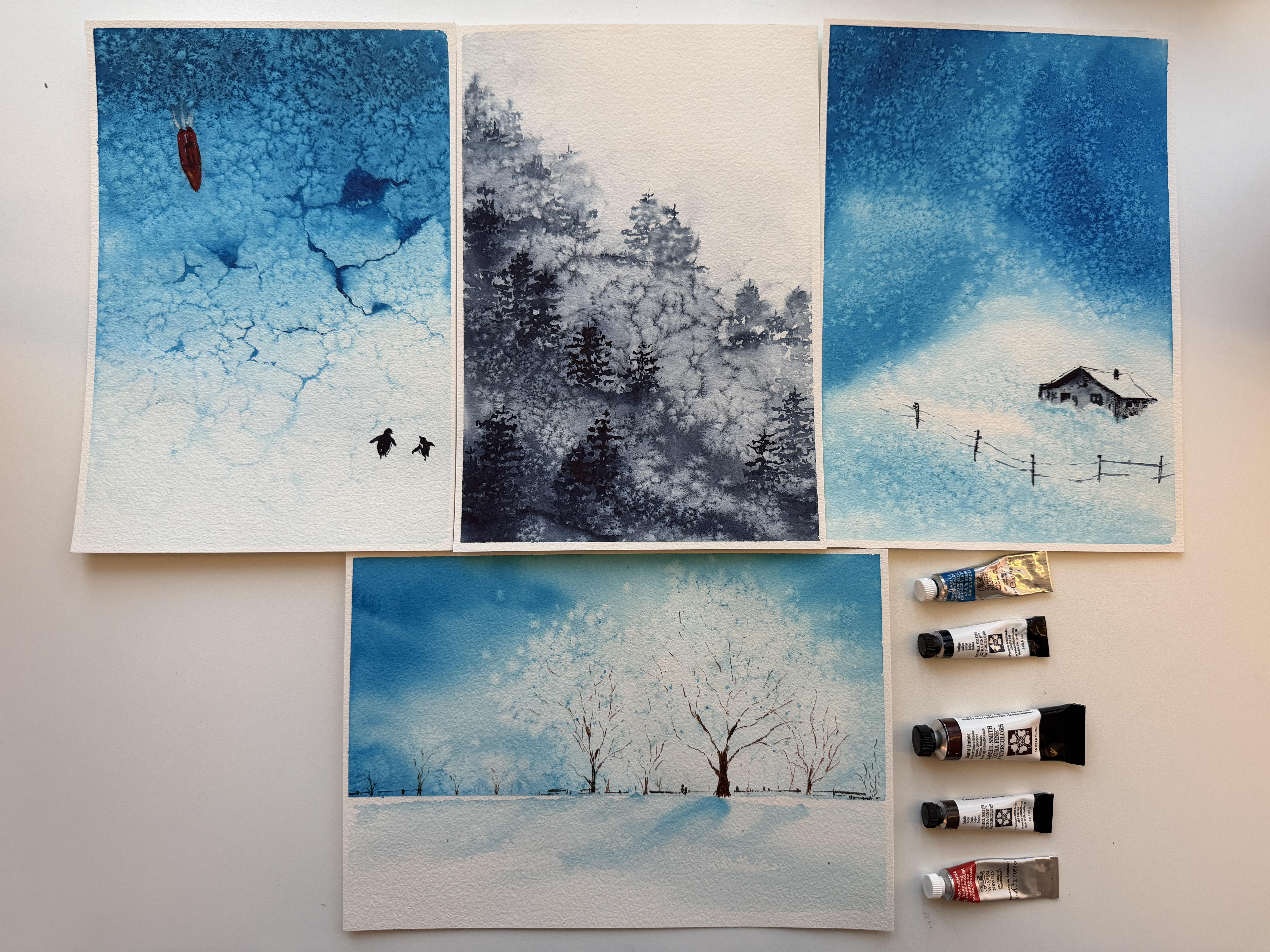
create the unexpected. This class is all about that. Hello. My name is Tite Mitel, a watercolor artist
and an art educator. I take my inspiration
from nature, whether it's flowers,
animals, or landscape. And one of my favorite ways to add character and interest to any of my artworks is by
adding texture using salt. I love how this simple
ingredient found in every home can transform a flat wash
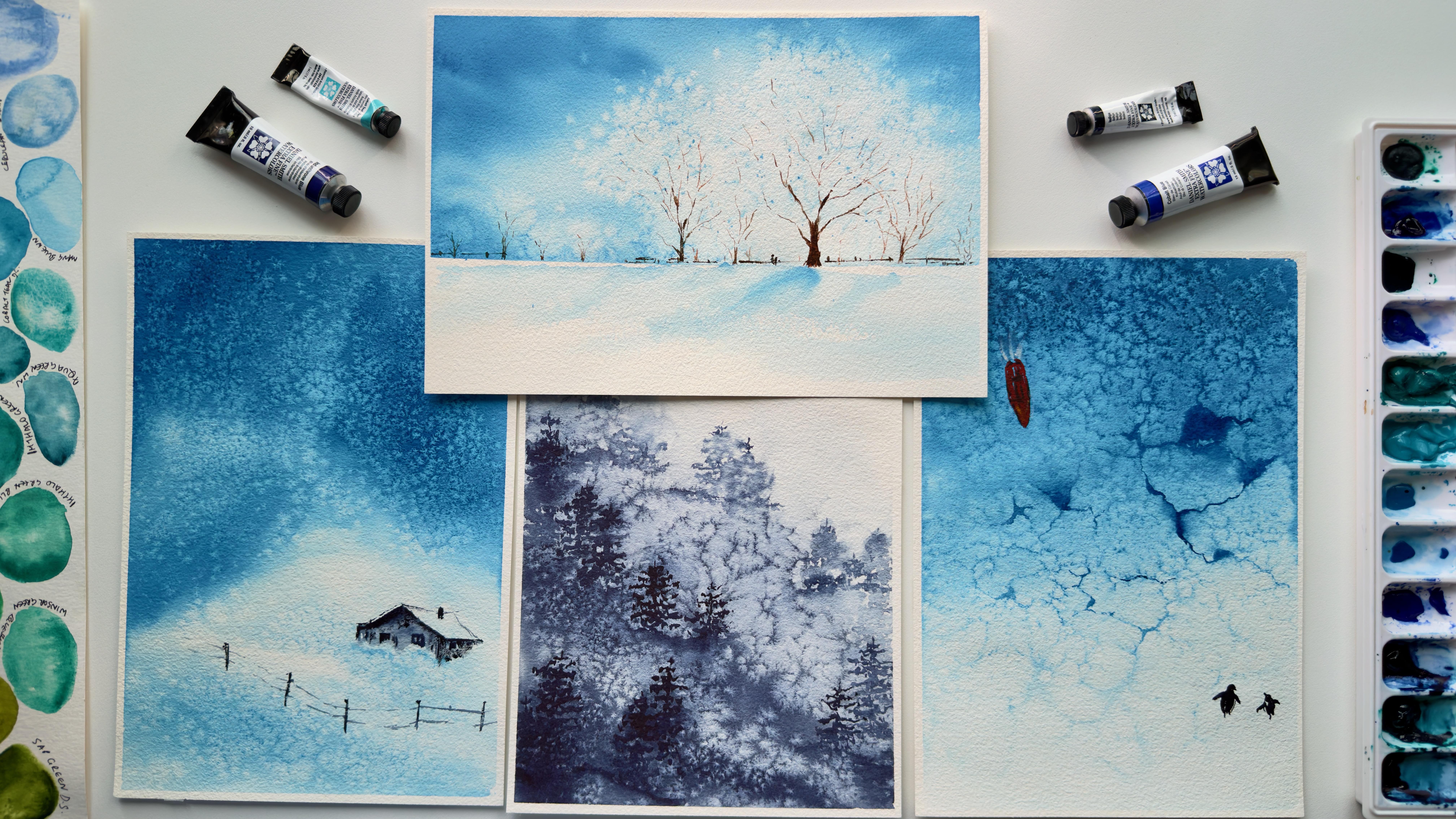
into something full of depth, movement, and visual interest. Today, in this class,
we will learn about this most playful
way of creativity. Using salt, we will create
the sparkling snow effects, the roughness of the
weathered surfaces, softness of the distant foliage, and simple texture effects, which will add unique
touch to our paintings. When sprinkled onto a
damp watercolor wash, salt absorbs water and pigment, creating beautiful
organic patterns that are impossible
to replicate by hand. By embracing these natural
reactions and happy accidents, we will create textures
that bring life, atmosphere, and a sense of
wonder into our artwork. Grab your watercolors and let's get ready to
add some spice. I mean, salt to our paintings.
See you in the class.
2. MATERIALS & SUPPLIES: Welcome to the class.
Let's have a look at the materials we will be
using for our projects. The most important one is paper. While using salt to create
textures with watercolors, the choice of paper makes
a lot of difference. The paper should
be cold pressed, 100% cotton with a
very light texture. Heavily textured paper will
not give desired results. I'll use this 100%
cotton paper by Pa hung for both the exercise
and main projects. This paper has a little texture which is perfect
for our technique, and I'll tape it down on
a flat board so as to keep it from buckling
using masking tape. Other supplies we will need
are a pencil for sketching, elastic eraser, and artists
create watercolors. We will work with a very
limited palette for this class. The colors I'll be using
are hello blue and indigo. So these two will
be our main colors to paint the projects. Next is Bonsiena, sepia, and bon tumble two
jars of water. One mixing palette and brushes. I'll use one flat soft
brush for big washes, one round soft brush, and one fine tip
synthetic brush. For brushes, please feel free to use whichever
you are comfortable. All we need is one for big wash and one fine tip for
painting the fine details. And paper towels or tissue. I always keep paper towels handy to wipe my brush
and extra color. And one of the most important
ingredient is salt. This is a normal table salt,
but a little coarse one. Sometimes table salt can be
really very fine ground, which will not create
similar effects. The one I'll be using is
a coarser table salt. I also suggest not to use rock salt or any
other salt as they tend to dissolve easily in water and can sometimes get
stuck to the paper too. Also, the effects
are not as good as with table salt. That's it. So grab your materials and
get ready for the class. I'll see you there. And
3. PRACTICE EXERCISE: Before jumping straight
to the projects, it is very important to understand how the
salt technique works. Salt when sprinkled on a
damp surface absorbs water, and when we add salt
to a watercolor wash, it absorbs pigment too.
That's why plumes. Now plums can vary in shape and size because of three
factors mainly, such as the choice of paper
if it is smooth or textured. The level of wetness of the wash and concentration
of the pigment, that is dilute or concentrated. In this exercise,
we will work with different concentrations
of pigment and level of wetness to
understand how salt reacts with them on
our paper of choice. One thing I would
like to mention here that this exercise
is very important, as throughout our
learning process, this will be our first
step for all the projects. As our main colors to paint our initial wash will be
thalo blue and indigo, so we will use them to understand how they work
together with salt. Salt here, I'm using
a coarse table salt. So for the first wash, I'll use thalo blue, both in a milky ratio
and a watery mix, and I'll apply my color on a previously wet paper where there is lots of water
for salt to absorb, a smooth even wash. And sprinkle some salt on
both of them together. Now, for the next wash, I'll use the same
consistencies of the color, but this time, I'll add
my wash on a dry surface, and hence less water to absorb. First, a milky consistency, darker even wash, evenly wet, but not too much water. Then taking a very
little color for the second very light
and diluted wash. And then we'll add salt
together on both of them. Now for third exercise,
I'll use indigo. First one on a dry paper, a milky dark wash. And then a watery, very light wash, using lots of water and
very little pigment. And adding salt to both of them. Okay. Now for the fourth exercise, we will see how the timing
will affect the results. For this, I'll wait a couple of minutes before
adding salt to my wash. So here are the two even wash using thalo
blue as our pigment. And both the consistencies are similar using a watery
consistency of the pigment. And let's wait, say until
the wash loses its shine. So while we are waiting,
one thing I would like to mention here is
that this video is completely in real time and not edited so as to give you
an idea about the timings. Okay, so the shine
looks good now. Let's add salt to them. And let's wait for the results. Now look at these as it's long, we have painted them
and they are almost dry now so we can see the
blooms emerging nicely. Okay, so this is the
status after 5 minutes. These are still little wet while these all
have dried already. I will wait for this one to dry and then we
will remove salt. Okay, let's see the results. As we can see, the dilution does affect the
size of the blooms. With more water and less
pigment, we get bigger blooms. And when we use more pigment, we get much smaller blooms as the pigment particles
are heavier to move as compared to water for
both indigo and halo bloom. Why here, as we
delayed adding salt, we can hardly see any texture as the paper has
already started to dry. So the timing and
consistency of the color are very important factors
to keep in mind. But
4. LAYERING EXERCISE: Apart from coarseness of salt and dilution
of the pigment, now let's quickly see how the effects can differ
on different paper. To understand the
effects of paper, let me show you one more example using the same
pigments indigo and Toblue on a lex textured but 100% cotton
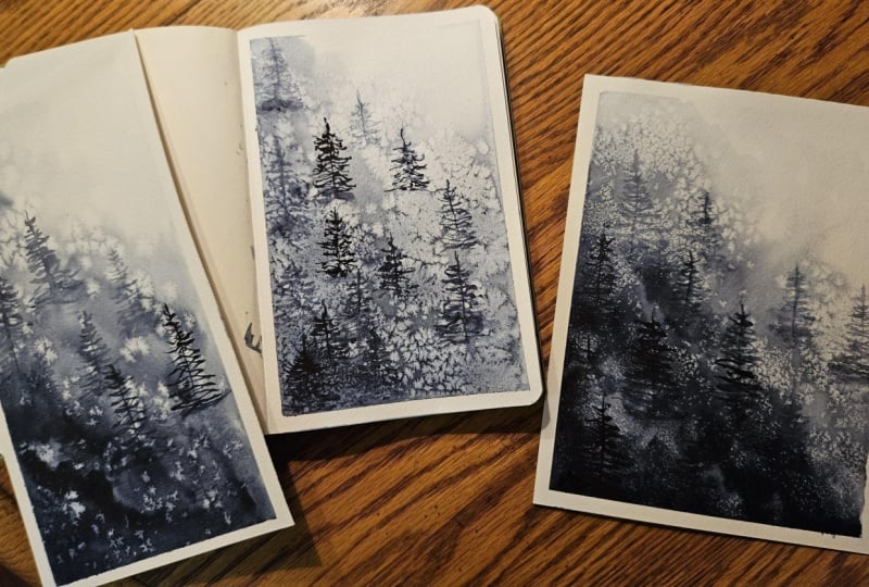
paper in my journal. Yes, this is a place where
I love to experiment. So here, for the first example, I'm applying a milky
mix of indigo on a dry paper, even smooth wash and then add salt, why our color is still wet. Similarly, a very dilute
mix of thalo blue. And some salt. Let's
wait for the results. So while we are waiting, let's work on one more example. Let's see how to use
salt in layering. For this, I will apply a simple, smooth wash of theloblue and we'll wait until
it's fully dry. Then we will work in
layers and we'll apply wash of our second pigment
indigo on top of it. Now, it's too dark. Okay, that's good. Meanwhile, watch how these washes on the top
are changing slowly. Wow, look at these results. Okay, so now as our
light wash is fully dry, I layer it with two
consistencies of indigo, one watery and one milky using a softer brush and
dilute mix of indigo. Not pressing too hard as I don't want to lift
the previous layer. And let's add salt. Similarly, taking a thicker
consistency of indigo. Applying evenly. And then salt. Et's wait for them to dry. Okay, here, it's
not fully dry yet, but we are getting some
beautiful textures, as we can see. Now the paper is fully
dry and I have removed the salt and look at
these beautiful blooms. I love how we can see thalo
blue from underneath, though the size of the blooms is smaller in thicker
consistency of the color. So the effects can vary from
pigment to pigment too. Let me show you some example. Here I have experimented
with a variety of different pigments and using similar consistency of colors, and each pigment
behaves differently. So the choice of pigment is a major factor while
working with salt. Also, sold technique doesn't
work well with granularity as both are good for creating texture and hence they
interfere with each other. So I'll suggest practice with your pigments
on the paper you are using before diving into the process. I'll see
you in the class.
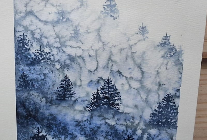
5. MISTY PINES : FIRST WASH: Welcome to our first project. The best way to practice any
technique and to understand any concept of watercolors is by working with
a single pigment. Monochrome studies are one of the most valuable
exercises in watercolor. By working with just
a single color, we remove all the distractions
of choosing palette and hence can focus on what truly brings a
painting to life, the color value, light
and shadows, and texture. So for our first project, we will keep it simple and work with a single color,
which is indigo. As we have seen in our
previous classes also, indigo is a very dark, deep blackish blue color, which in its pure form, almost looks like black. It can create a wide
range of tonal values, right from the
lightest to almost black when it is used
in its full strength, where the lightest tone is
transparent and luminous, which turns nearly opaque
in heavier ratios. No wonder why indigo is the most common pigment to be used for monochromatic
paintings. Here I'm preparing two
dilutions of indigo, one, a darker milky mix, and one diluted watery mix. As indigo is a
very dark pigment, so I'll suggest please test your mixes on a scrap
paper before starting. And without any further delay, let's start wetting our paper. So for a smoother
application of color, we will work on a wet paper, but this time just with
a gentle quick wrap. And without waiting, I
will start adding color, beginning with the milky
mix and the left corner of the paper as our paper is wet, so the color will flow nicely. Yo, please notice
my brush movements, small longitudinal
zigzag strokes so as to imitate the
trees on the hill. M. Keeping a variation in the tone and dilution
of the color. So our aim here is
to create a gradient from dark to lightwh starting
from the bottom left, gradually decreasing the
dilution from milky to watery to the lightest value and working our way all
the way to the top. And nearly a clean brush on the top part, blending
everything, smoothening. So as to imitate a distance. Okay. That looks good. Tilting my pot a little bit, so the colour flows
towards the bottom. Et's wait a few seconds. Let the color settle. Okay, let's add salt now, being careful to
drop everywhere, but not to drop any lamb
or too much at one place. Carefully spreading
everywhere. Not too much. Okay, I think that's enough. And we will be a few seconds. Patience is the key here. So once you are
done adding salt, don't touch anything or try to correct or move
or add any color. As the reaction of salt and
water has already begun, as you can see here, and if we'll fiddle with it now, then we will not achieve
the desired results. So this is the status after
5 minutes to the clock. And as we can see some
beautiful effects are blooming in and I'm sure
it will turn out great. The paper is still
wet right now. Let's wait until it's fully dry. Okay, so the paper
is fully dry now, and as we can see such
a courteous outcome, now it's time to remove salt, and I will do it by rubbing
it with my fingers. But I don't want the
salt all over my table, so I'll take it to a sink
and we'll be back shortly.
6. MISTY PINES : PAINTING PINES: Okay, so our paper
is fully dry now. We have removed the salt, and now it's time
to paint the pines. For this, I'll use a thin
tip synthetic brush. As synthetic brushes
hold less water, and we get precise
details with a thin tip. So I will start working with the lowest dilution of
our pigment and we will add some lightest further trees on the top layer,
starting from here. Here our aim is to
find the shapes in the texture and then give
them the tree shapes. A little rub with water, just a touch, not
completely wet. Like this, we will achieve both hard and soft
edges of our pines, and they will appear distant working with a tip
of brush all the way and with lowest dilution, finding shapes in the textures and blending trees
into the background. And some shadows on the base. That's good. Let's move there. Again, a gentle
rub with a brush. As this will be a distant part. So I want to keep everything
soft and light there. Working with the lowest dilution and tip of my brush all the way. Finding the shapes in the
texture, taking advantage. And some shadows, textures
on the base and melting everything in the
background. That's good. Let's move to the
mid tones for now. Notice how I'm beginning from the lighter areas and ending the base of the
trees in the darker areas. I blending everything in the background with
a very dilute mix. In one here. Okay. Let's add a few lighter ones
here. A gentle rub. Please notice my brush
is not wet enough. It's damp, as we don't
want our color to run. One more to give
it some company. I want to add a few details here on these before moving
to the darker ones. Okay, for now, this looks good. Let's start adding
darker color. And
7. MISTY PINES : FINISHING PINES: Okay, so now it's time to add the darkest tones to our
painting and bring some depth. As then only we will understand
what else we need to add. So starting from the bottom and working with
the milky mix with a darker tone of indigo. Notice how I'm finding the space between the textures
to add darker lines. Going all the way down, working with the milky
makes of indigo, and a thin tip brush and then melting everything
into the background. Okay, one more here, away from the blooms
where there is dark area. And again, softening
everything into the background
with a damp brush. Okay, let me take out
some fresh creamy indigo. One here. Working with the darker mat. So you need not to copy about the positioning
of the pines. Try to find spaces. Just keep the perspective
and values in the mind. Your texture may have
come out differently. Just take advantage
of the texture, find the spaces where you
can create the trees. Wow, I'm really so excited to
see your projects already, how you will achieve
different effects and how your artworks
will turn out. Really? Okay, I want
to add one here. I blending in the
texture of the hill. Okay. That looks good. I feel I should add a few here. It will help bring in balance. This is dry. Let's add
some more dark tones here. It does look like a hill slope. H one hill. And softening. Yeah, that's better. I feel I should add a few here. A few details here and there. What is? To give them a definition. Okay, that looks pretty good. I think it's time
to say it's done. Hope you enjoy it. Okay, it's time to remove the masking tape and
see the final result. Isn't this amazing? Working with salt can create
unexpected results. Each one can be a
totally unique piece. Keeping it simple,
creating texture, and not going into
too many details is the best part, isn't it? I'll see you in the next lesson.
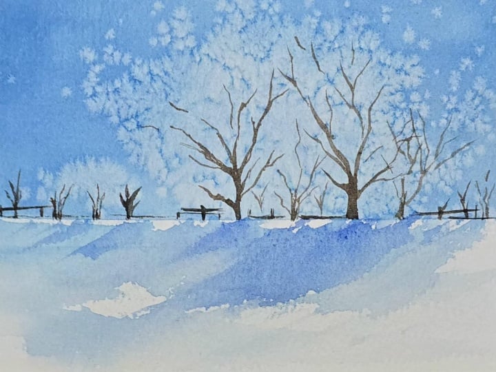
8. SNOWY SCAPE : FIRST LAYER: Hello upon. Welcome to our second project. For this project, we will
paint a beautiful snowscape. We will divide our paper
using the rule of thirds, and in the top part,
we will create some snowy tree
effects using salt. Let me show you an example. So this is what our
painting will look like. For our first layer, mainly working with a single
pigment theblue, we will create some soft sky and then transition it into
the blue of the trees. Then we'll add salt to create blooms like we practiced
for the exercises. So here I'm preparing two concentrations of
thalo blue, one watery, fully diluted and
transparent mix, and the second is a
milky concentration. Next, I'll divide the paper
using masking tape so as to get a clean straight line as
we are going to use salt, so I don't want the color to
bleed into the lower part of our landscape as this will be snow and hence we have
to keep the paper white. Making sure my tape is straight. Okay, we are good to go. Next, using a soft flat brush, I'll start fitting
the top part of our paper above
the masking tape. Quickly and gently,
not pressing too hard. We don't want to
scratch our paper. All the way until
the masking tape. Okay, and straightaway,
using the same brush, I'll start adding some color, beginning with a watery mix of tho blue and working
from left to right. As our future trees are on
the right side of the paper, so keeping the right
side much lighter. Blending the colors
smoothly into the water. So for this one, I'll
suggest you should first watch my process and then
proceed with the project, so you will understand the whole process and we'll be ready for what's coming next. So here for the first ph, I have created some zones using the same
dilution of pigment. The sky on the top is darkest. The area just above the
ground will be our mid tone, and the trees will be
the lightest of all. Now further darkening
the sky a little bit. And a little bit on the ground, not touching the
trees at all for now. Cleaning my brush and
retutting with some water. And some very,
very light colour, a touch before adding salt, nearly a clean brush just to make sure the paper is
wet before we add salt. And a little more
darker milky color just on the edges to
create more contrast. Okay, that looks good. Waiting a couple of seconds. And now it's time to add salt. So unlike the first one, here we'll add salt only in the areas where we
want to create trees, beginning with the
middle part of our main trees,
carefully dropping salt. I don't want it to
spill in my blue. Okay, that's good. And moving near to
the ground area to create some distant small trees. And a few random spots which will mimic the small
bushes here and there, a little more here and
there in the tree area. This is the process where you
can't control anything and you have to let go of the
perfection and precision. Just carefully keep adding salt. Same like we add
salt in our food, neither too much nor too little, just the perfect amount. Maybe a little more here
on these small ones. I think this is okay. Yes, that's done. And now we wait. Patience. Watercolors
always reward patience. And we can see them
already appearing. This is the status after exactly 5 minutes, as we can see so many
tiny blooms emerging. I'm so happy with this result. My paper is still wet. That means the
effects will enhance. Let's try this completely
and I'll see you there. Now my paper is fully
dry and as before, I'll take it to the basin
to remove the salt. See you in the next lesson.
9. SNOWY SCAPE : PAINTING TREES: Welcome back. So now
my paper is dry. I have removed the salt, and I'm very happy
with the outcome here. Let's prepare to
paint the trees. So to paint the trees, we will work on a dry paper, and we are going to use some warm earthy colors
like bun sienna, burn tamber, and sepia
for the darker tones. I'm preparing a milky mix of my colors here on the palette, and I'll mix them
variably to create a variation of the
colors for my trees. This way, we will bring contrast and depth to our landscape. Okay, let's remove the
masking tape first, as I don't want any
blue on it to get activated and bleed
into our browns. And now using a thin
tip synthetic brush, I'll start with the darkest tone and with the furthest
tree trunks. And very carefully, working according to
our texture achieved. I'm now creating
some trees here, some small broken thin lines, just a suggestion,
not too detailed. Taking advantage of the
blooms that we have created. So as to suggest
some distant trees, creating branches and dabbing them a little with the tissue so that the color doesn't
appear too harsh. Carefully working according to the texture and some
horizontal lines as there are some place
to sit, some benches. Okay. That looks good. Moving to the second
bigger tree now. I So thicker lines in the bottom. And thinner as we move up constantly creating a variety of tones, switching between my colors. Creating very thin branches. You can use any brush
for this liner brush. Any thin tip brush will be
good to create these branches. Just some broken
lines on the top. Not taking too much water. Let's add one small
tree here also between two big trees as the
distance is a little more. Yes, that looks good. Let's move to our main tree. Starting with the lighter
part sienna here. Switching to sepia. Here I'll work a little
bit in detail so as to highlight the tree
and bring it forward, as this is our main element. Similarly, creating branches, being mindful of the
shape of the tree, finding the gaps in the texture. And thin branches on the top. Yes, that's good. And one next to it, a lighter and smaller
to push it back. Okay, I think it's good. Let's paint the foreground
in the next lesson.
10. SNOWY SCAPE : PAINTING FOREGROUND: Okay, let's mix a
touch of indigo to sepia to create the fence and the final
detailed suggestions. And nearly with a dry
brush and pure pigment, I'll create some
broken line effects. So suggestions of
fence or some things. Also, one more tree here. As this looks a
little bit empty. And adapt with the
tissue to lighten it up. Okay. That looks good. I want to add a
few spatters here on our main tree
because why not? It will create some more
interesting effects. And using a very light tone, a watery makes of thalo blue and a thin tape brush,
I'll gently tap. Yes, that's good. Let's soften them
a little bit, too. Okay. Let's add a few more details before moving to our foreground. Just some suggestions. They can be some people
or just something else. Adding darker tones increases the contrast and
helps creating depth, and it brings life
to our painting. Okay. That looks good. Now it's time to paint the snow and shadows
in the foreground. For this, I'll roughly
wet the paper. And using the same brush
and diluted thalo blue, I'll just make one, two, and three and cleaning my brush and a gentle
wash. That's all. And that's it. This way, it appears like snowy texture, some shadows and some whiteness. Et's create some
shadows for the trees, melting wet color
into wet paper. That's good. Now the picture looks complete. And if we just wait
for a few seconds, we can add salt here
on this area also. Yes. Okay. Until we are waiting
for the salt to do its thing, let's add some really fine
branches to our trees. For this, I'll be using
this very thin tip brush. And using some browns, I'll create some
super fine branches. And some and some very
thin tree trunks. Just some suggestion. Yes, that's good. And I want to enhance
this shadow a little bit. Yes. That's it. Let's try this. So this is how it turned out. Let's remove the masking tape. So this is it isn't
this beautiful? I love these trees very much. It reminds me of a park in
Saporo, Japan we visited. I loved it very much.
Hope you enjoyed it too. See you in the next lesson.
11. FROZEN ARCTIC : APPLYING FIRST WASH: Welcome back. Let's move to our third project. We will create an Arctic
inspired drone view. For this, first, we will create a gradient wash from top to bottom while working wet on wet, and then we will
create different elements of our painting. The pigment we are going to
use for this is theloblue. Here I'm mixing it into
two concentrations, one darker milky mix, and one very dilute mix, nearly cleaning my
brush with water. What is a gradient wash? It is a little variation
of wet in wet technique, where we will begin
painting from the top and slowly come down
without lifting our brush. This gradually
decreases the intensity of the color as we
work our way down, and hence we achieve a
gradient of the color. And to achieve that,
I'm keeping my board at a little angle by placing
this tape roll under it. And we'll start with
wetting our paper this time nicely as we want the
color to flow smoothly. Using a soft brush, and not pressing too hard. Nice and shiny. A quick
check with a shine. It should be even.
Yes, that's good. And a final gentle rub. Okay, all set to go. So we'll work from top
to bottom for this, keeping the top darker and
letting the color flow down. And once we are halfway
through the paper, we'll slowly start
introducing more water. More dark milky
color on the top. Adding some more and gently
pulling the color down, cleaning my brush fully, and now gently pulling the color all the
way to the bottom. This way, we will
let the colour flow naturally and we'll create a smooth gradient
from top to bottom, making sure the paper doesn't
dry out in the middle, as we have to use salt later. Adding more hello
blue on the top. Adding a touch of indigo
just on the top part, as this should be the
darkest color mixing some more creamy indigo to a hello blue and creating a dense pigmented
background here. Just smoothing the wash. And as the colours settle down, I'll start adding salt, this time beginning from the bottom and all
the way to the top. So as we have seen
in the exercises, the more diluted the color is the bigger blooms
we will achieve. And as we increase the
concentration of pigment to water, the blooms become smaller. Because pigment being
heavier than water, the salt cannot
displace it that much, and hence blooms
remain concentrated. This way, here we will
achieve a variety of textures which will make our painting more
interesting and natural. Smaller blooms on the top and
bigger ones on the bottom. A little more on the top. Always be careful while
spreading the salt. No lambs, not too
much, not too little. Okay. That looks good. And now, patience. Lots of patience. As we can see, the blooms have
already started emerging. Let's come back after 5 minutes. So this is the result
after five more minutes. I loving how the blooms are
growing all over the paper. Your results may
vary and could be very different and not as even. It's completely normal
and no need to worry. We'll create our final painting with the results we achieved. These exercises are not
for creating perfection. Just let go of the pressure, have fun, find the textures and create something
that's truly unique. As we have seen in our exercise, the effects can be different. They can vary according
to your dilution, according to your timing. Salt technique being
totally unpredictable. It's completely okay. Okay, so this is it after
it's dry and look at all those tiny blooms and the bigger ones
here in the bottom. As usual, I'll dust
my salt in a basin, and then we will paint the
details in the next lesson.
12. FROZEN ARCTIC : PAINTING THE ARCTIC: Okay, so now begins
the exciting part. We will now create
the icebergs or the massive chunks of ice
that are breaking off from the mainland to create these large floating chunks of ice that are also
called growlers. All we have to do
is find the lines along the texture and
make them work for you. The color we are going to
use is the same thalo blue and beginning from the middle
and using a thin tip brush, I'll find the creeks
into the texture we have got darken them to imitate the ocean underneath and make them look like the ice floating on the
top of the ocean. Something like this,
going along the lines. Giving them shapes of the icebergs and melting the color in the
background where needed. Isn't this the fun part? I'm changing the dilution
of the color where needed and darkening
a little bit. Using various delusions of the same color and
a variety of sizes, different directions,
different lines. Okay, let me turn my board. As this way, I work more comfortably going
with the texture. So this is the thing I was talking about in the
previous lesson. At this stage, it doesn't matter how our first
layer looks like. This is the stage where we can make changes according
to our requirements, and every piece could have
a unique look and feel. Going along the texture and darkening them or softening
them wherever needed. Creating thin and thick lines. Please notice I don't
have a fixed pattern. I'm working randomly, going
according to the texture, keeping a variation, and
not working everywhere. Building the cracks.
That looks good. Keeping lines thin
in the white part. And not creating perfect shapes. Okay, I want to work here. So please bear with me. I'll keep turning my paper. Okay. And as we are moving from snow towards water to
the darker part, the cracks will become bigger
in size and much cheaper. So the color will
be darker here. Okay. That looks good. A little more softening. Okay, that's good. Let's add a boat here before
moving further.
13. FROZEN ARCTIC : ADDING BOAT: Okay, so for now,
this looks good. Let's set our main element, the boat here before
moving forward. So to paint port here on
the top of a dark color, we have to choose an
opaque and bright color. Like red, for example, you can use cadmium
red or pyrolered. I'm using Pyrole red from
Daniel Smith for this. There should be opaque. So it will shine brightly
over the blue water. And with a thin tip
synthetic brush, I'll start with a boat giving some shape,
some simple structure. No fine details, the suggestion going with
a creamy mix of pyrolred As this is kind of a drone view, so everything should feel
smaller and not detailed. One more layer of red
to keep it brighter. And some small suggestions
for the details on the boat. We can use indigo for this. Just a few lines and some random marks to
create some textures. Yes, that looks good. Okay, I want the top tack
to shine a little bit. So just softening with some
lighter color like yellow. Again, the opaque one. Yes, that's good. And a little trail
behind with our blue. Once it will dry, we'll
add white to it. O
14. FROZEN ARCTIC : FINAL DETAILS: Mm. Let's make some small
arctic animals here. So using indigo or Pains
gray or neutral tin, whichever darker
color you prefer. Let's add some
blackish suggestions. As some arctic animals, they can be anything
like walrus, or seals or penguins. No, they can't be
penguins, right? As penguins are native to
southern hemisphere only, they don't exist in the Arctic, but this is our artwork. We can make penguins. And one more here. And some little feet. Okay, that's good. Just correcting the
shape a little bit. Okay, that's good.
Okay, what is? Now, I'll use some white cash to create the frothy
trail off the boat. Just some thicker colour. Let me turn my paper. This way, it's always easier. Okay, that's better. And a little bit under the boat. Just some suggestion. Okay, what I want to add a few more
details here and there. As this area looks
a little empty, some small cracks, just with
a dilute mix, not too dark. And one here, Just be careful. Don't create any pattern.
It should be random. And some softening. Yes, that's better. Okay, I'll darken this
one a little bit more. And I think it's done. What do you think
about this one? Let's remove the tape. Wow, I really love this
effect in the snow. The colors, they look
so natural here, right? I'll be so excited
to see your works. Do tell me about your feelings when you post your projects. See you in the next lesson.
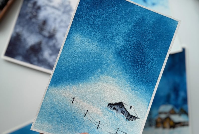
15. COTTAGE ON THE HILL : FIRST WASH: Welcome back. Let's move to
our final project where we are going to paint a serene
small cottage on the hill. For this, like the
previous project, we will use two
dilutions of hello blue, one milky, and one theltstne. Let me just clear the palette. So as thalo blue is a very
strong staining color, and a little touch of
color would be good to go. The process will be the same. First, we will wet our
paper with clear water, and then we will
create a gradient as we did in our third project. But unlike that one, here the gradient will
not be a smooth one. However, we will
create a hilltop like shape here in the lower
third of our paper. Let's begin with
wetting the paper. Nice and shiny. Taking my time. We want our paper
to be evenly wet. No pools of water. And right away, I'll start with the milky mix and from the
top part of our paper. By now, you are already familiar with the process
and the pigments. So to achieve good
results with the salt, timing is really very important. Here we have to work
really quickly and efficiently enough to keep
our paper wet all the time, because if the paper dries out, then there will not
be any effects. Going even darker in the top part and moving to the middle with
a medium tone of color. A little more dark tone
here on this side. Yes, that's good. Notice how I'm just dropping the color and letting it blend, not guiding it all the way. And nearly with a clean brush, I'm softening the edges. Okay, let's move to this part. As it is a hill, so we
will keep our strokes a little slanted so as to
imitate the terrain, it should not feel
like a flat ground, keeping some whites and
using the lightest value of our color blending softly. A little more here
in the bottom. Yes, that's better. And blending smoothly. I want that cornet to
be darker as to give a feel of tar and distant,
maybe some forest. Just dropping the
color a little more. Okay. That looks good. And now it's time to add salt, beginning with the
lightest part as we need little
bigger blooms here. As in the darkest part, there is more pigment
and less water, so we will achieve smaller blooms like we had
done in our previous project. Spreading evenly Okay, a little bit more. Okay, I think that's good. Let's come back after 5 minutes. So this is the status
after 5 minutes. I really like these effects. This will become our path. Let's try this completely. Okay, here it is fully dry and it does look like
how I expected it to be. And as usual, I'll
dust my salt in a basin and then we'll paint the details
in the next lesson.
16. COTTAGE ON THE HILL : PAINTING COTTAGE: Okay, we are at the final
stages of our final project. Let's start adding the details, beginning with creating
a little cottage. For this, I'll take some fresh
indigo and we'll use it in various dilutions from
the lightest watery to pure pigment for
the darkest parts. Let's begin with a sketch. I would like to keep
it in the lower third and a little
away from the center. Keeping in mind the
rule of thirds. A slopy roof. And some walls. I'll not sketch the details near the ground as they are
all covered in the snow. Just some suggestions. And this is the back part. Okay? Lightening my sketch
a little bit. I don't want pencil lines
to shine through the color. And starting right away with the lowest dilution
of the color. Creating a slope and shadows. Keeping the color very
diluted for the first layer. And gradually adding
the cur tones to create the shadow areas. Working with my thin tip brush. For painting details,
synthetic brushes are always a good option as they
absorb very little water, and we can control the
pigment to some extent. And here will be the wall and softening with a damp
clean brush on the bottom. Keeping the roof white so as
to suggest snow on the top. Giving some outline
very lightly. Okay. Switching between the
tones of the color, trying to create the
darkest shadows. So the lightest part
will shine through. Building contrast and nearly sketching the details with
a thin tip of my brush. That's good. Working very carefully
with the thin lines. A little suggestion on the side. There is some cabin, maybe. And the silhouette of snow. As the cottage is
hidden behind the snow and adjusting some shadows in the snow using my thalo
blue in the diluted form. Okay, it's dry now. I can start adding the details. So suggestions of the windows on here. And doors I'm not trying to make them perfect as they are hidden
behind and very far. So just some
suggestions, some lines. And a little chimney
because why not? Yes. Okay, that looks good.
17. COTTAGE ON THE HILL : ADDING FENCE: Let's add a fence here
to suggest the path. So dark wood posts, not so perfect in the
shape and no details. Keeping a variation in
shape and direction. I'm not making them similar. So they appear
natural and far away. Okay. And some rails. Let me try. I can
do it in first go. Yes. Thin broken lines
to mimic the wires. Okay. That's good. Let's at one light one here
with some lost eedges. And some final details in the cottage, darkening
some shadows. And some texture with
dry brush technique. We don't want neat
and clean walls. Okay, this edge looks
a little smaller. Yes. That's better. And let's bring it
a little forward. A very light wash
in the background. Wetting the paper. Okay, that's it. I don't want to ruin the roof. Okay, so here is
our final piece. Hope you enjoyed painting along. Isn't this courteous? Let's remove the masking
tape one final time. So we learn how to
create beautiful art. We don't need 1
million supplies. Good art can also
be created with a minimal palette
and some creativity. So play with your colors,
learn their powers, and understand how to use them to create beautiful
artworks with them. Let's wrap up everything in the next lesson.
I'll see you there.
18. LET'S WRAP UP: Well, that was fun, isn't it? Let's have a recap
of what we learned. So throughout our journey, we applied various
wash with a pigment, played with the salt, and
created some beautiful pieces. Salt can create unexpected
textures and effects, which we have to think
about how we can improvise. No two pieces will ever
look identical watching the results carefully,
finding the shapes, reading the textures
to desired results, and then choosing
which color to use for creating contrast is
the most challenging, yet the most satisfying
part of the process. Now I will be waiting to see your beautiful works and
experiments with salt. Please feel free to use any other pigment that you
have for this project. Just keep in mind, whichever
pigment you choose, first try it on a scrap piece of paper to understand how
it reacts with salt. As some pigments are
heavier or granulating, both of which will
not work well with the salt technique,
so choose wisely. Do tell me about your
experiences when you upload your projects
in the project section. If you have any doubts,
please feel free to reach out and ask your questions in the
discussion section below. If you are sharing
your art on Instagram, don't forget to tag me. I'll be happy to share
them in my stories. And lastly, don't forget to give a feedback about the class. I'll be happy to hear from you, and this will also help
us in our future project. Hope to see you soon until then, take care and keep painting.
 Deepti Mittal, Watercolor Artist