Transcripts
1. ABOUT THE CLASS: Whenever I look at the ocean, I always wonder how endlessly it stretched
beyond the horizon, beyond where the eye can follow. Beneath this vastness lies
a deep breathing universe that is home to some of the most magnificent
creatures on earth. Sea creatures such as
strong and powerful sharks, intelligent and
graceful dolphins and white wing stingray drifting through the water
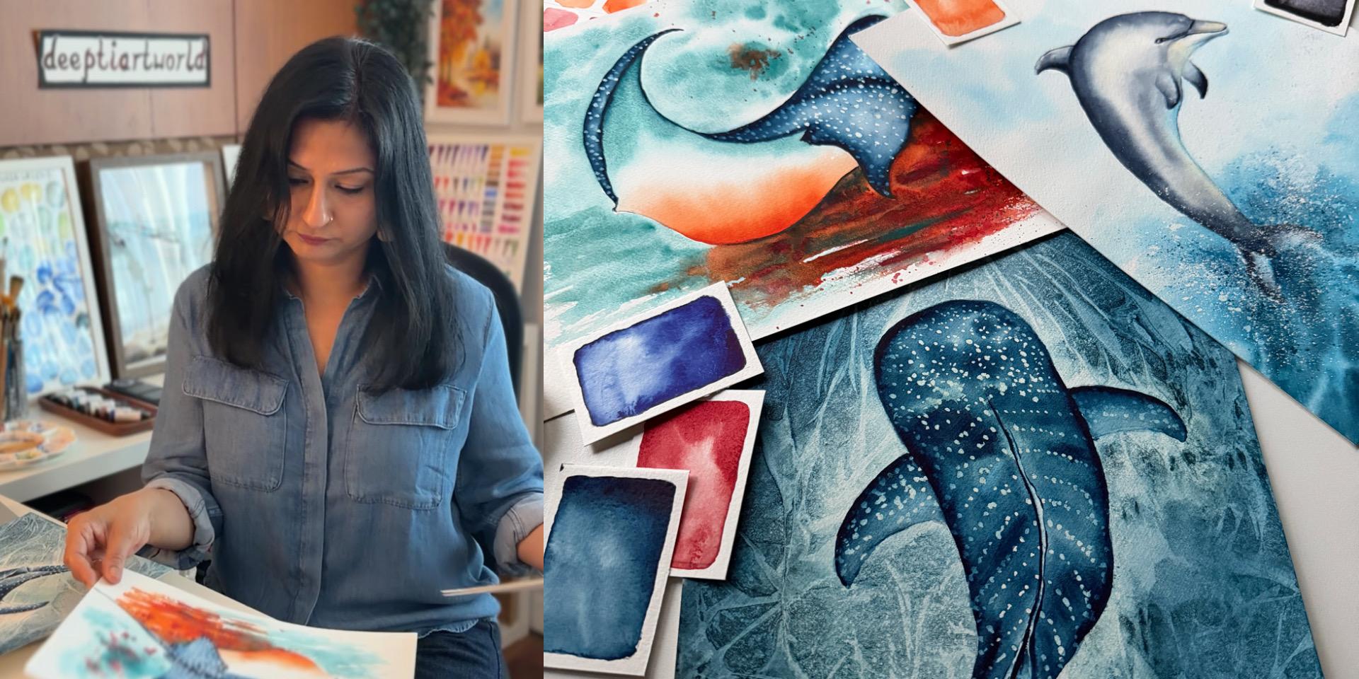
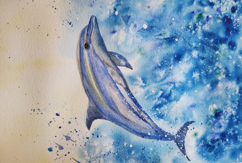
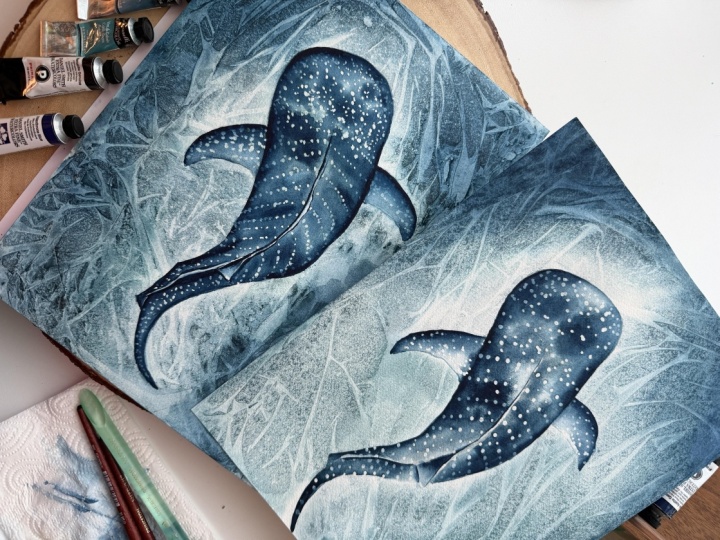
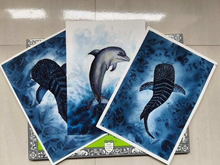
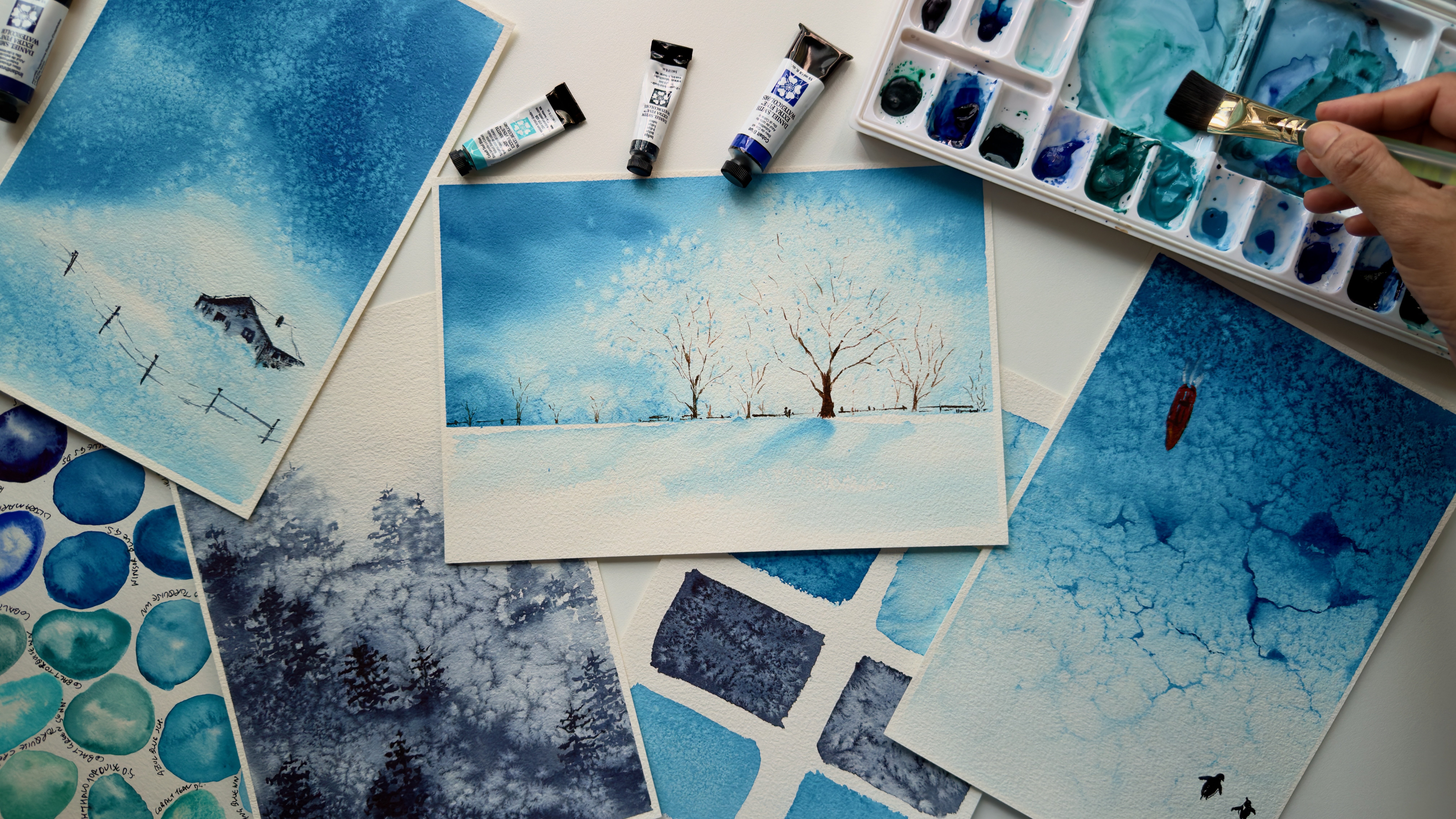
like living kites. This class is all about painting these giants of the ocean. Hello. My name is D Mittal a watercolor artist
and an ocean lover. Painting animals has always been a big part of my
artistic journey, whether it's realistic wildlife, expressive birds,
marine creatures, of colorful sketchbooks filled with the flora and
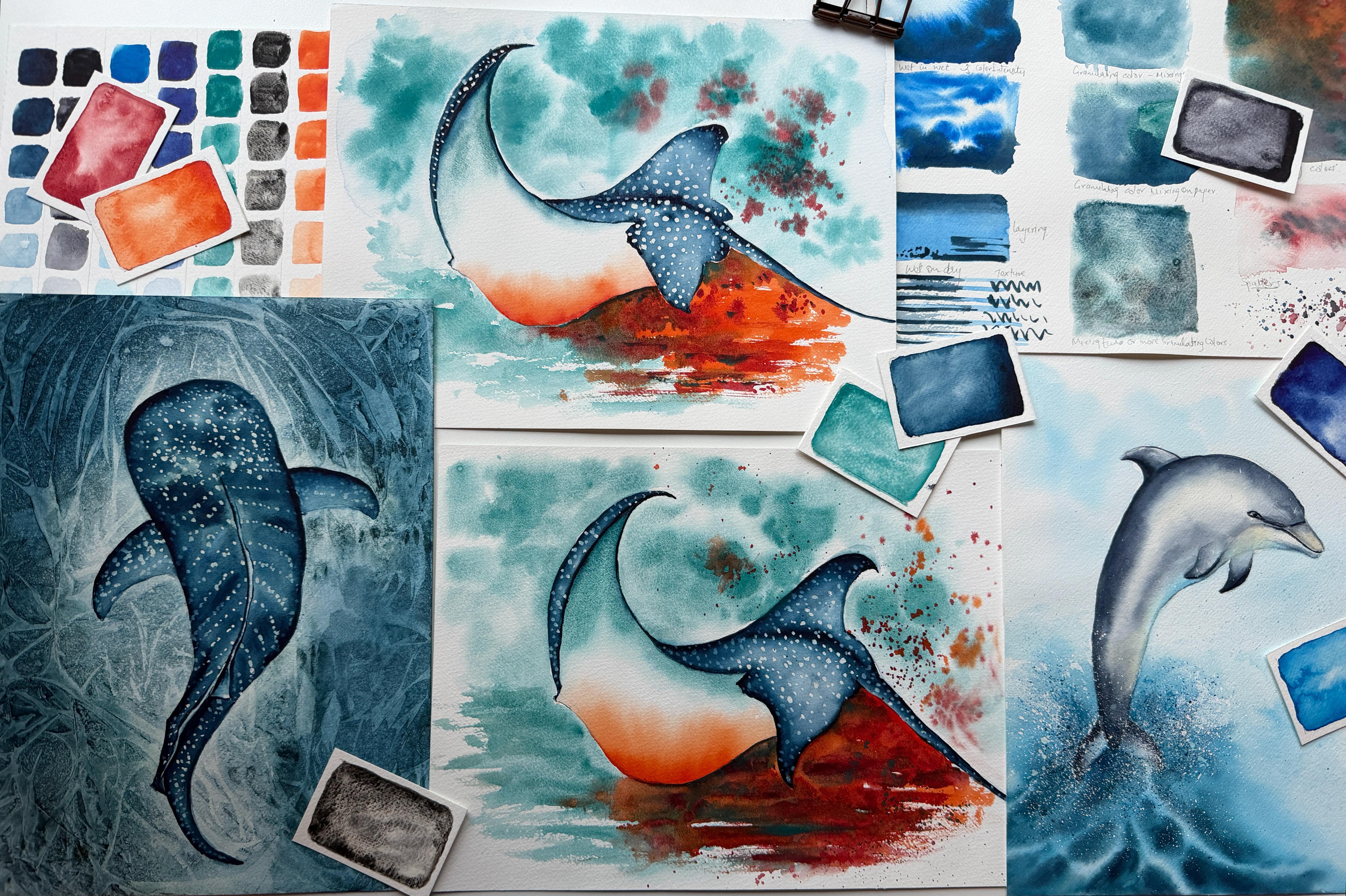
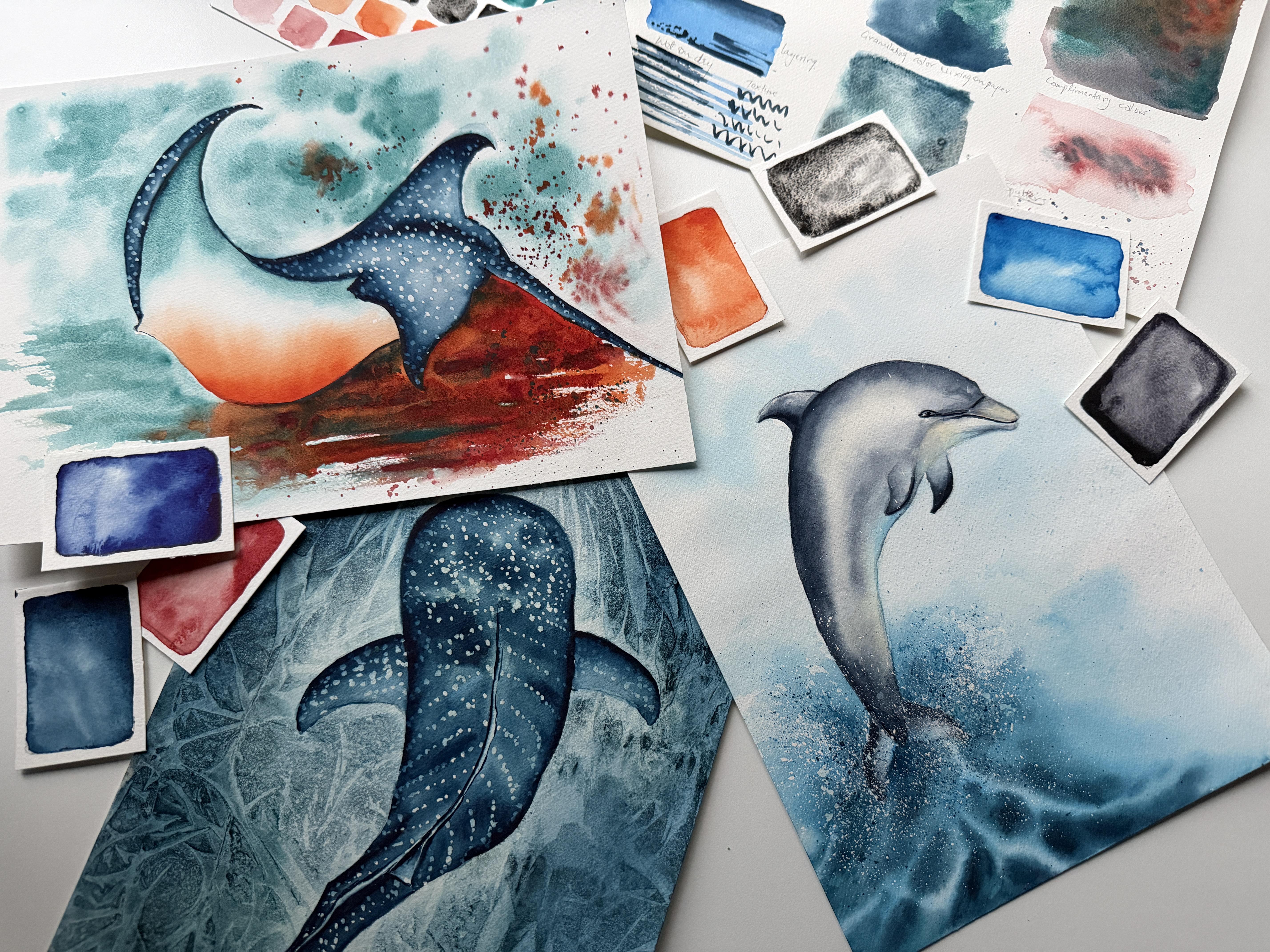
fauna of the blue. In this class, we will paint these three ocean creatures against beautiful
abstract backgrounds. Through these three projects, we will explore different
properties of watercolors and learn how to use them
effectively in our paintings. For our first project, we will work with
analogous colors, and you will learn how
using different values of the same color can create beautiful contrast and
dimension in our work. You will also discover how
the wet on wet technique creates soft edges and how
layering helps build depth. In our second project,
we will explore why different pigments behave
in certain ways and how we can use these unique
watercolor properties to our advantage to create a
variety of beautiful effects. For our third project,
we will dive into the fascinating world of
complimentary colors and learn how to use them to create striking contrast that make our paintings stand
out beautifully. Throughout this class, we will work with a limited palette and we also explore some
alternative color options. I will guide you through all
the materials you will need, along with the techniques used
to create these artworks. By the end of this class, you will have completed
three courteous ocean inspired paintings
with your own hands. You will also gain a
deeper understanding about how collars behave
in different environments and how various
watercolor techniques and approaches can be used to
achieve the desired results. I'm so excited to invite you into this beautiful
world of blue. Let's dive into it together
with our watercolors, create some magic, and bring these magnificent ocean
creatures to life on paper. I can't wait to see
you in the class.
2. MATERIALS & SUPPLIES: I'm so glad you have
decided to join the class. Let's have a look
at the materials. For this class, we will need most important
is, of course, paper. Today, I'm using Windsor
and Newton Cold Press 100% cotton watercolor
paper size 21 by 31. You can use any good
quality watercolor paper for this, whichever you like. Just keep it in mind, it
should be 100% cotton and minimum 140 pounds thick
with a little texture. Sometimes using a
cheap quality paper can be very frustrating, as you might have
your technique right, but if the paper is not able to handle a good
amount of water, then we will not get
similar results. Today, I'm using a block, so I don't need to
stretch my paper. In case you are
using loose sheets, I will suggest to tape down
your paper to a board nicely. For these projects, we will
be using not a lot of colors. Let's discuss one by one. First and the most
important one is indigo. Indigo is a very dark
tone blue color, which in its full concentration
looks almost like black, and it is named as Indigo
itself by mostly all brands. However, they can
vary in their tones, which we will discuss later. The one I will be using is
this one from Sennelier, which is a very deep,
bluish black tone. The second most important color
is cobalt green or cobalt Turquoise or thturquois as named differently by
different brands. So it's always good to go
by the pigment number. It is PB 36. Next is Idanthrinblue, which
is pigment number PB 60. Again, a very dark
blue royal pigment. So in case you are using an indigo which is
blackish in tone, you will need to mix this
beautiful blue pigment to it to get the desired color. Next one is Windsor blue or
Hello blue, pigment PB 15. Transparent orange or
any bright orange. If you don't have orange, you can make usual yellow and pink to make your own orange. Next one is Aasarin
crimson and black. So not just any black. It should be a granulating one. There are many options to
choose from like Mars black, by Windsor, lunar black or hemotypeGenuine
Bar tanielSmith. You can choose any. And
lastly, pains gray. So we will discuss more about
colors, their properties, and their alternatives later in the next lesson.
Next is brushes. We will use various brushes like a soft flat brush
to wet our paper, some soft round
synthetic brushes, which have good water
holding capacity. I'll be using size eight for
painting our main subjects, some fine tip brush
for the details, and one old thin tip brush
to apply masking fluid. Masking fluid, any good
quality masking fluid is okay. Also, for some fine application, we can use this type of masking fluid applicators
color mixing palette. Any plastic or ceramic
mixing palette will work. Just make sure it is clean
or we will get muddy colors. To jars of water, one for cleaning our brush, and one for clean water
for mixing colors. So paper towels, a
pencil for sketching. Elastic eraser,
some masking tape. In case you are
using loose sheet, you will need to tape it
down on some board so that the paper doesn't buckle as we will be working
with lots of water, some scrap paper
to test our colors and some loose sheets to
practice the techniques. Also, we will be
using cling film or saran wrap for
one of our projects. We will discuss more
about the colors and their properties
in the section, understanding pigments
and their properties. So grab your materials, and let's start working
on our projects.
3. UNDERSTANDING PIGMENTS & THEIR PROPERTIES : The most important
way to learn about watercolors is to
understand our colors, identifying our pigments, exploring why different pigments
behave in certain ways. What are their
specific properties and how to achieve
certain outcomes when using different
watercolor techniques makes it easier to
understand them and hence, easier to learn and work with. Mainly, the colors
are divided into different categories based
on their properties. For example,
transparent or opaque colors depending on the ability to pass the light through them. Staining or non staining, depending on how
permanent the pigment is and the extent to which we
can lift or erase the color. Granulating or non
granulating colors depending on how heavy the
pigment particles are. Some pigments are made of very
small particle which give us smooth washes when we
paint, hence non granulating. However, some pigment
particles are heavier and hence they separate and settle in the texture
of the paper. They create various patterns and are called
granulating pigments. To understand this more, we will now explore our
limited palette one by one. Where we will see each
pigment in detail, explore the
alternatives for some, and then experiment with them based on these three criterias. Tonal contrast, that
is how light and dark the pigment can go when used
in different dilutions, how they spread when
we work wet and wet and any special
properties of the color, like if they are
granulating or not. First and one of the most
important pigment is indigo. Indigo is a very dark, deep blackish blue color, which in its pure form
almost looks like plaque. When we look at the pigments, it normally has a blue
pigment mixed with a black though the ratio of blue to black can vary depending on the brand and hence little variations in the
tone of the color. Let's explore the possibilities of what this pigment
is capable of. Indigo can create a wide
range of tonal values, right from the
lightest to almost black when it is used
in its pul strength, where the lightest tone is
transparent and luminous, which turns nearly opaque
in heavier ratios. No wonder why indigo is the most common pigment to be used for monochromatic
paintings, and it is one of
my favorites, too. While working wet and
wet with this pigment, it spreads nicely and can create a wide variety of tones
while flowing with water, perfect for creating
effects and depth in water bodies like
oceans and lakes. This is a non
granulating pigment, and hence can give
smooth washes, not too staining,
and hence can be lifted to some extent,
as we can see. We will be using indigo in
our all three projects, as this is a very important
pigment for our projects, and hence, I will suggest you should consider
using it like that. Next is Pains gray, which is more of a
platish gray color and almost has a
pinkish undertone. Though this is also a mix
of blue pigment with black, but it leans towards
gray and is known by the name Pains gray itself
by most of the brands. Let's see how this pigment
behaves on our three criteria. Pains gray can also create a
wide variety of tonal values ranging from the
lightest where it behaves fully transparent
to the darkest. However, unlike indigo,
some pains gray have a very slight purplish anatone which gives kind of a glow
in the lightest value, where it behaves transparently. However, this property of
pigment doesn't affect much in the darkest value
where it is nearly opaqu. L Indigo, this color also
spreads nicely and gives a variety of tones when
we use it in wet and wet. The one I'm using is a non granulating color and
hence smoother application, while there are some
different brands where pains gray can be a
granulating color. So be careful which
one are you using as we will be using a non granulating one for our project. These special
properties of creating a ton of tonal values
of Pinscrey and indigo make them everyone's favorite pigments for
the monochrome studies, Windsor blue or hal blue. As named differently
by different brands, this one is a very beautiful
bright blue color, which is known as the most common pigment
among the artists. A fully transparent single
pigment staining color, which when mixed with
water remains brighter, even in its lowest dilution. Carrying pigment number PB 15, it is an absolute non
granulating pure pigment, perfect to paint water
and sometimes the sky. It flows and spreads nicely
while working wet and wet, stays very bright, even
in its lowest dilution, and a very dominant pigment. And hence, we should use it very carefully as because of
its staining properties, it cannot be
lightened or lifted. We will be using thaloblue
for one of our projects. However, because of its
staining properties, I will suggest you to
work on this pigment to understand its dilutions before moving to the main project. Next is Ianthn blue. Now, this is a very deep
blue color which is very well known
as pigment PB 60. Again, also a single
pigment color, which if you haven't tried yet, then you are absolutely
missing something. A very beautiful deep pigment, when used for color mixing, creates beautiful blacks with browns and purples and
is fully transparent. Okay, as we are not
mixing blacks here, so we will not discuss this, let's have a look
at the properties of this deep blue color. When used on wet surface,
it flows instantly, spreads beautifully, and hence we have to be very
careful with this one. This is an absolutely
non granulating pigment which gives smooth washes. A dark pigment and hence can
create a variety of values. Still, the lightest values
are fully transparent, which can be dark enough
in higher concentrations. That's why to create
the background for our second project, we will mix this beautiful blue with our other two pigments, which are granulating and which I'm going to discuss next. So the first one is cobalt
torquoise or cobalt green, containing pigment PB 36. This one is a beautiful
torquoise color, which has a greenish
blue undertone. Again, a single pigment color. Let's have a look at the
superpowers of this pigment. Not a variation in
the tonal values. This pigment is quite light yet strong due to its opacity. Flows instantly, and hence
a little goes a long way. Tone almost stays similar
throughout the wash, granulates beautifully, and hence works best
with lots of water, for example, while
working wet and wet. Granulation adds to texture, and hence helps create
a variety of patterns. As granulating colors works
best with lots of water, and hence, as we increase the
consistency of the color, it loses its granulation. Because of its property, this pigment will
be our star pigment for painting whale shark. Cobalt turquoise are
also known as cobalt green and works best
with lots of water. And the second one
is hematite genuine, a very heavy granulating
pigment by Daniel Smith. This black super
granulating color will help us in creating textures
for our second project. As I have mentioned before, any black color which
granulates will do the work. Some alternatives are like
lunar black and Mrs black. As we know, granulating colors
works best with lots of water and hence not a good
choice for creating values. In fact, if we increase
their concentration, we even lose their special
property to granulate. It's heavy particles
sediments in the texture of paper and hence need lots
of water to work with. And it's always good
to work on with a textured paper to
maximize their results. I will refer to this
color as black in our future conversations
so as not to create any confusion about
which black we are using. Okay, so enough of
blues and blacks, let's bring some
contrast and discuss the last two pigments which we will use for one
of our projects. First is transparent orange, as the name suggests, is a very beautiful, bright, transparent pigment, which
gives smooth washes. This is also a single
pigment orange color by Windsor and Newton. Let's have a look at the properties of this
beautiful pigment. A transparent, somewhat
staining pigment, which gives very smooth washes. If we look at the
intensity of the color, it is very light in
the lowest dilution, but very bright and vibrant
in the darkest value. Doesn't spread too much, and hence we can achieve a consistent and
controlled effect, absolutely non granulating
and hence smooth application. And the last, but a very
strong bright red color is laserin crimson, fully transparent, non staining, normally a mix of red
and yellow pigments. Let's talk about the
properties of this color. Can create some variations
in the tonal value when used in the lightest
or the darkest dilution. Make smooth washes
in low dilutions, and when mixed with
certain colors, give bright beautiful
color mixes. Spreads instantly
and beautifully when it comes in contact with water and
hence a good option to create certain effects. Absolutely non granulating. That's all for the colors. Hope you will also play and
experiment with your pigments to understand them better before moving to
the main projects. Your certain pigments can behave differently depending on
the brand you are using, and that's completely okay. The main idea is
to understand how they work and what we
can achieve with them. See you in next lesson.
4. TECHNIQUES & EXERCISES : Now we understand our
pigments and it's time to practice some
techniques and try some color mixing exercises
that we are going to use for these projects to understand
better and make it easier. Let's divide our
projects into two parts, the background and
the main subject. So to paint our projects, the first and the most
important technique we are going to use is wet in wet, which we will use to paint both the backgrounds
and our main subjects. For wet in wet, as
the name suggests, we wet our paper first, and then we apply
wet color to it. However, both the flow of the
color and the intensity of pigment depends on the dilution of the pigment.
Let's have a look. Here, my paper is wet. And for the first example, I'm using a little diluted color like water or milk ratio. That means less pigment
and more water. So what happens? We get beautiful light tone. The color spreads nicely, gives soft edges and
smooth transitions, and hence, everything
feels smoother. For the second example, let's see what happens when we use fully saturated pigment
that is cream ratio on wet paper. See
the difference. The color doesn't flow much, gives soft edges though, and the intensity of
the pigment remains high and hence creates
beautiful contrast. This way, changing the water to color ratio affects
the end result. For more softer washes, we use more diluted color, and for achieving more contrast, we use heavier
ratios of the color. Let's try another variation of this technique where we add more intense color to our previously
painted lighter color when it is still wet. This way, we can
increase the intensity of the color and create
beautiful contrast. This practice is
perfect for creating backgrounds and
enhancing the contrast. Et's take one more example. To increase the intensity of this blue feather and to
create certain effects, let's add another darker color. For example, indigo to it. Can you see this way by adding different pigments
when our color is still wet, we can create more
contrast and depth. This technique we
will use to create the background color for our first project, which is dolphin. Let's enhance the color
of this second one also. This way, when the
color is still wet, we can darken the tone, increase the contrast, and can control our
color to some extent. Next is wet on dry in
which we apply our color directly on the paper or previously painted layer,
which has dried off. This gives us smooth washes, uniform color and texture. This technique is
mostly used for adding the details or some
textures and effects. So other examples of
wet on dry techniques are like some fine
brush movements, making a variety of brush marks, both thick and thin. Or we can use it for
dry brushing to create some textures or to create some more darker tones. This way, practicing
these techniques will help you to understand your pigments and
brush movements and hence improving
overall techniques. Also one more little variation of this technique
is called layering, where we can add
another layer of transparent color to our
previously dried color. Let's try this here
as our color is dry and adding one more layer of color creates depth and we can blend and
smoothen our edges. This way, painting in layers can help us to enhance colors to create depth and vibrancy and we can get much
controlled results. For example, to paint
our main subjects, we will use these techniques
along with wet in wet. Now, let's practice some mixing
with granulating colors. Let's see how mixing
granulating colors can create some visual interest
to our backgrounds. Here I have tested
a few examples with granulating colors, which we can use to paint
our second project. As we know, we can mix
colors in two ways. One on the palette and second on the paper while
painting wet in wet. Let's try both examples
with granulating colors. Here I'm taking some cobalt and see what happens
when we mix it with some darker
color like indigo. When mixed in palette, the color spreads uniformly, creates texture, but the tone of color stays neutral
throughout the wash. However, to create some
more visual effects, let's try mixing it on paper. Let's wet the paper first. Here's our cobalt green, which is a beautiful
granulating color, and we can see it spreads
and creates texture. Now, let's add some dark color. Let's see what happens
when I mix it with dark tone non granulating
indigo on taper. As you can see, this way, mixing granulating colors
with non granulating ones can help us create a variety
of shades and textures, which creates a visual
interest for our background. And we can enhance and darken
the color at some places. Let's take one more example. For example, some indigo, some cobalt color and black. So let's see what happens
when we mix them on paper, all wet in wet. A quick rub with water. Here is our bolt and some indigo to darken
the tone at some places. Here I'm adding black,
the granulating one. And some more we can even add more water to enhance the
texture and effects. So by mixing two or more
granulating colors, we can increase the
granulation and enhance the intensity
of the texture. This method we will use for painting the
background of our shah Now let's try mixing some
complimentary colors, the colors that are
on opposite ends of the color wheel
like blue and orange. For this exercise, let's use
cobalt, indigo, and orange. As usual, we will begin
with wetting the paper. Let's start with our cobalt. So more thicker consistency. And while it's still wet, let's add indigo on one end to create
some mutual intrast. And let's see how adding complementary color
brightens up our background. When we add orange color
to it and let them blend we can even enhance the contrast by using heavier ratios
of the color Okay. This way, we can create
some beautiful transitions from blues to gray
to brown and orange. And we can even incorporate
some more dark colors. For example, let's
try lazine crimson. Beautiful contrast. And we can even
make it look more interesting when we add
some thicker colors. Some more cobalt. Did you see? So we will be using
these combinations for our third background. And even some spatters. Which is our last exercise. However, spatters can
create various types of effects depending on
the wetness of our paper. For example, when we add
spatters on wet paper like this, the color spreads all over
and give beautiful effects, and we can use different colors to achieve different results. However, the results depend on many factors like
thickness of brush, wetness or dryness of the paper, and the tapping movements. For example, if we spatter on
a dry paper, the spatters, they will stay local
and the color will not spread for more details on these techniques
and to practice more, I will suggest you check the technique sections
from my class. Let's paint seasons
in watercolor, where I have explained
this all in much detail. That's it with the techniques. Okay, all set. Let's move to our main projects now. See you in the class.
5. DOLPHIN - THE SKETCH: Let's quickly put together a sketch for this
beautiful creature. This is a very simple sketch, and you can either draw along with the reference
or if you want, you can download it from
the project section. It's your choice. I just love to draw
my sketches by hand, as a good sketch is always a
foundation for a good art. So this is the basic shape, a simple streamlined body. You will be the
mouth, the eye area. You will be offense. Okay, let's refine the shape. The tail A little bigger belly. And the dorsal fin. No Aye. You will be our beak. A little bit more round. Okay, that's good. I want the tail a little
bit more lower. Yes, that's better. Okay, so here is
our simple sketch. That's it with the sketch.
6. DOLPHIN - APPLYYING MASKING : As our dolphin is
jumping out of water, so we will create a
splash around this area. For this, we will apply some masking fluid using
a stiff thicker brush. You can use any toothbrush also, and we'll make some spray movements like this
using our finger. So there should be a
variation of sprays, though we don't want big blobs of masking fluid on our paper, so I prefer to test once on a scrap paper before using
it on my original project. Okay, we are good to go. Now, imagine how splash works. There should be a
little bigger drops. So closer ones near the dolphin, and some finer ones
as we move away. Some on this side. And some finer ones. Okay. By the time our
masking fluid is drying, let's have a look at the colors we will use for this project. First one is Tlloblue
from the lightest value, which we will use in dolphin, which is like water like ratio and to the
darkest dilution, which we will use for
painting our water. Then paints gray
from the lightest to its darkest cream like ratio. Pain scrap we will use for
painting dolphin only. Another colors are indigo, which we will use to
darken the blue of water. And also, I have decided to
use a little bit of Naples yellow for warm tones in the face and body
of the dolphin. Okay, then, let's
begin our project.
7. PAINTING DOLPHIN : H let's begin with wetting our paper. As I mentioned before, our projects are
divided into two parts, the background, and
the main subject. So to begin with, we will wet the body of
our dolphin first, nice and shiny, taking our time. As to achieve softness
and smoother blends, wet paper is a must. For the initial layer, we will work wet and wet, and then later on, we will add the details
on a dry surface. I'm not worried
about the tail area right now as it will be darker, so we can work on it later on. Oh softly and generously. Okay. So for the
lightest highlights, I will be using
some naples yellow. Naples yellow will also help us to balance the colours and bring some warmth as mostly our color palette
consists of cold colors. Also, I will be using this
small separate palette for pains gray as I don't want
my colours to get muddy. Let's start putting
some colors right away, beginning with the
lightest parts around the eye over the beak area. A little bit around
the neck area, the belly, wherever we can think the light falls and the
lightest areas like belly. Letting it blend and switching to the blue using a water like ratio with the
lowest value of color. As the belly area is the
lightest part of dolphin's body, and as it is facing
the water surface, so putting some blues
here as a reflection of the water and letting it
blend with the yellow. H some more around the belly. As we know watercolor always dry lighter than
how they look when they are wet and letting
it blend with the yellow. As you know, dolphins
skin is a shiny, bright grayish color, and it reflects colors of
its surroundings. But as we are not
working realistically, so without going into
too many details, we will try to make
it look like that. Soft, smooth, mirror
like surface. Okay, let's start
working with gray. Working all wet in wet, using a diluted color tie ratio. And blending everything,
starting from the tail area. Going a little darker in color, but still keeping
milk like ratio, building depth, slowly layer by layer, and softening everything. Carefully working around
the eye. And the beak. A little more darker. Carefully keeping away from the light areas as I
don't want to lose them. The side of the belly. And softening every time
I'm putting new color. Okay, it's still wet. Let's add some darker colors
on the flippers, too. Please keep in mind, I'm still working with milk like ratio as going heavier on ratio will
make our paper dry faster, and I don't want that right now. And blend, blend blend more. Let's enhance some
colours here also. As my paper is still wet. And softening everything. Let's add some darker tones on the inner part
of the flippers. Oh, that's dry, but it's okay. Let's smoothen it a little
bit with a damp brush. And some more ducks
on the tail area. I'm trying to build more depth as my paper is still wet here. Please keep in mind, I'm
now working with only Pains gray and a milky mix. A little more on the flippers. And it's almost dry. Let's try it fully, and then we will
come back to it.
8. DOLPHIN - PAINTING DETAILS: Welcome back. As our paper
is fully dry by now, let's start building
layers and details for our dolphin, starting
with the fin. Lighter and shiny on the top, and darker on the bottom part
as because of the shadow. And softening. Let's darken the back
a little bit more. Oh Again, a milky mix of paints gray. And then blend. Okay. That looks good. A little more. Here, please notice using
two brushes will be a good choice as I am using one round
synthetic brush for adding color and a softer round
brush for softening. Slowly darkening the darker
areas around the edges of the flippers and blending. On this one, too? Please keep in mind, I'm using a soft temp brush for softening. Okay, that's good. Let's add details around
the eyes and face. Working with a thick, creamy consistency of the color now. Slowly and carefully adding the details and
softening where needed. Building shadows and depth. A little darker tones
on the beak area. In blending. Similarly on the lower lip. The idea is to enhance the shadows so our
highlights become prominent. A slight suggestion of the blow hole and blending
it into the background. That's good. Let's darken the eye carefully
with a fine tip brush. Okay.
9. DOLPHIN - DETAILS PART 2: Let's work on the tail
now, wetting the area. I will start with a
creamy mix of pain scray here as I don't want
it to spread too much. And softening with a
milky mix of thalo blue, something like shiny skin, the inner surface of the tail. So while working wet in bed, we always get soft blends. Similarly on this one. Husband. A little paints gray. In the hello blue. Okay, that's good. Oh. I'm now shaping the lower end
of the body a little bit. Let's work on the
dorsal fin a bit. I want to enhance the shadows
here a bit more carefully. And blending everything
that's better. So this is the advantage
or you can say disadvantage while working
with a single colour. All we can do to
enhance the contrast is increase the values and
enhance the shadows. That looks more natural. Shaping the belly area
a little bit more. I love this part of the process slowly working on the details, noticing what's to improve here, and then wedding a little bit
more depth here and there. This stage helps
build up the piece. Slowly and carefully. Okay. Now I have switched to a fine tip brush for real fine lines and details, darkening the darker
areas and to enhance the shadows darkening
the color of eye. The shadows. Okay. What else? Let's add a little
bit more, blue. And a little bit
yellow. On the beak. And a little shadow. Okay, that's good.
10. DOLPHIN - FINISHING DETAILS : A little bit yellow
here on the neck area. Okay. That looks better. I want to reshape the
dorsal fin once more. A little broader on the bottom. Using a creamy mix
of paints gray. Fully opaque. Yes, that's better.
Now the shadows, they look more enhanced. And as usual, softening and a little bit darker here. And we're done. Let's paint water in the next
lesson. See you there.
11. DOLPHIN - PAINTING WATER : Okay, let's begin
the second part of our project and create
a beautiful background. To begin the process, we will first wet the
whole white area, carefully working
around the dolphin, as we don't want
any color to bleed or lift or any strong
blue color in there. Using a flat brush, I will gently start
wetting my paper, keeping our dolphin dry, carefully working around it. Gently, taking my time
for good 2 minutes, as we will work all wet in wet, so it's good to take
time to wet the paper. This way, we get ample time to cover the whole background, and paper doesn't dry too fast. Although it depends on the weather conditions
at your place. So as I live here in a tropical climate and it's
summertime here right now, my paper will dry faster, so I'll have to work
really very fast. Being careful near the edges. A quick rub. Okay, that's good.
And right away, I will start with the lowest
dilution of Windsor blue. And I'll start
putting some color in the sky area as the sky will be the lightest part of our
background and we don't want any details there
some suggestions. Please notice I'm not
touching the edges here, just keeping my
brush near to them, and as our paper is wet, so the color will
flow naturally. Be careful about the dilution as windsor blue or thal blue is a very strong pigment and hence can look patchy if
not diluted properly. Very gently and carefully
working around the dolphin. So lighter colors on the top. Some softening there. Okay, that's good for the sky. Let's begin with the water. Slightly increasing the dilution as the final water
will be much darker. Notice my brush movements
where for the sky, I was making small
round petchy movements, and now for water, I'm making slightly longer brush strokes while giving them
some direction. As our dolphin is
jumping out of water, so the water movement will be towards the surface
from all directions. Always remember watercolor
always dry lighter than how they look like when they
are wet, keeping in mind. Going a little darker
now using a milk like ratio and enhancing
my water direction. I'm not going to a
creamy mix right now as it will dry our
paper very quickly. Keeping my strokes,
longitudinal, working on the
shape of the water. Some splash like strokes there. Enhancing the color. Okay, I think the blue
looks good enough. Let's start putting
some darker tones, mixing indigo now using
the same milk like ratio. Keeping the direction
of my strokes. Small longitudinal
brush strokes. As our paper is wet, so I'm slightly touching
the surface of the paper. Slowly increasing the
ratio of indigo to blue, moving to a darker side keeping my strokes in check in terms of direction
and length. Using the darker color on the bottom and the light
tone on the top parts. Slowly increasing the
concentration of the color keeping the tone of the colour lighter near the masking area. Let's add some more blue here
as my paper is still wet. Okay, that's better. The shape looks good. So more lighter tones. Okay, now I'm using
a creamy mix of pure indigo and enhancing the
color in the darker areas, keeping my strokes in
place and shorter. It softening some of the hard edges
with a damp brush. The paper is already dry there. Okay, that looks good. Let's go full concentration
and add the darkest color. Now I'm using a pure indigo in its full strength and only
to darken the color further. I'm not touching the light parts now as my paper is
drying too fast, and I don't want any hard edges. Gently enhancing the color
wherever I am feeling, the paper is still
okay to touch. Okay. I think that looks good. Let's add some spatters. Using a stiff brush
same like before, as here we want
very fine spatters just to mimic the splash. Using winsor blue. Let me take some fresh colour. Okay, that's good. Similarly on this side. As the paper is still
wet at some places, so these patters will
melt into the background. Okay, I want to darken the bottom part of water
a little bit more. What else? There are a few gaps. That's better. Okay. You the paper is still wet. Let me add some darker tones. Okay, I think it
looks beautiful, and let's not touch it
again and call it done. Let's try this completely before removing the masking
in the next lesson.
12. DOLPHIN - REMOVING MASKING & FINISHING: Welcome to the final
part of first project. As our paper is
fully dry by now, we will remove the masking and we'll see how the
splash turned out. Carefully using my finger, I'll remove the masking. Not pressing too hard, or we can smudge our color
as it's a very dark color. Okay, let's clean everything
with a soft brush. Okay. That looks good. Let's add a few spatters. For this, I will cover my
ski and the fish or dolphin. And using a small
fine tip brush and a milky mix of colour,
I'll add spatters. Oh using indigo or blue. And sometimes a mix of both. Carefully, I don't
want big blobs here. Just small fine spatters. So with blue on the top part. Gently tapping the brush. Not too much water. He Okay, let's see how it looks. Wow. Learning how to
create contrast by using a few colors and
different values was a really
interesting exercise. I love painting this one. Hope you enjoyed it, too. Let's get ready for
our next project.
13. SHARK - THE SKETCH: Welcome to our second project. Let's begin with a sketch. Looking at our reference, the whale shark have quite a
simple structure which you can either draw along or can download from
the project section. It's your choice. So here's a sleek,
torpedo like body, a broad head or snout
and mouth in the front. Wavy body with a
large upper tail fin and some patterns on the top, for which we will use
masking later on. So as we know, the
whale sharks are known for their
distinct pattern spots, mixed with faint stripes
here the belly area. Let me tell you some fun facts. Do you know, like
human fingerprints, every whale shark have a
completely unique marking, which marine biologists
use to understand them. Coming back to our sketch, I'm using a B lead pencil here as our shark is going
to be darker in color, so I'm not worried
about the lines here. One thing I would like
to tell you guys, whenever you sketch
for watercolors, always use HB or a B or a two B pencil and never etch
or two tch or four etch. The etch here stands for
the hardness of the lead, and with a hard pencil, though it will appear lighter, you will always
get pencil marks, and it will ruin your paper. Ideally, for landscapes, we should use a TV or
more dark ones, as they are softer, and while painting
with watercolors, they mostly get
dissolved in water. However, for some
delicate colors like flowers or lighter
birds, we can use HB. So here are the
wings on both sides. Let me refine one
or two lines here. Now, it's better. The
sketch looks good. Let's begin with
a painting part.
14. SHARK - THE BACKGROUND: Before starting with a painting, I always remove the
extra pencil marks and lighten my sketch by
using an elastic eraser. The colors which I'm going to use to paint this project are hematite genuine or any
granulating black, cobalt tren. Indigo, which I have taken out in this small
palette separately. As we have discussed
earlier, also, some indigo leans towards
black and some towards blue. For example, Indigo by Daniel Smith has a
black undertone. While Indigo by sanela which I'm using
leans towards blue. In case your indigo
has a black undertone, then you have to mix a little
bit of Ianthn blue to it. Let me explain the
process a little bit. To paint our shark, we will begin with the
background this time. First, we will wet
our paper fully, including the sharp, and then we will start
putting colors. We will create texture using
sun wrap for the background. Then we will mask
our lighter parts. That is the spots on the
sharp using masking fluid. And finally, we will
give shape to our sharp. As I mentioned earlier, take your time to wet the paper like good
one to 2 minutes. This helps with the smoother
replication of the color. And right away, I'll start
putting some colors, starting with a watery mix of cobalt torquis and we will cover the entire surface with a similar consistency of cobalt. Please notice I'm not worrying about the direction
of the strokes right now and moving my soft bristle flat
brush quickly and gently. My aim right now is to put the color everywhere
and keep my paper wet. Okay, our base color is done. Now I will work for granulation, going a little heavier in the consistency,
using same colour, keeping a little away from my shark and right away mixing my black to
add more granulation. Always keep in mind granulating colors works best with water, so I'm mixing ample amount
of water to my color. And And I will start darkening the
water area using indigo, pure indigo, starting right from the top and working downwards, keeping dark color away from the shark and letting the color
and water do their thing. As my paper is wet, the colors will blend
in by themselves. Similarly, on this side, the idea is to create a
gradient from light to dark, working from the center
towards the edges. Don't worry about
the brush strokes, color blending, or smoothness. Just have fun and
keep the paper wet. Keeping away from the shark. Going darker near the edges. Okay, that looks perfect. Now it's time to cover our
paper with Kling wrap. So I have a piece
of Kling wrap here, and I'll cover my entire paper making these type
of tingly textures. So while putting the wrap, if by chance you mess up, which is very likely because
of its sticky nature, don't worry and don't
pick it up again. Just cover however much area you can and then get another
piece to cover the rest. Effect will be similar. However, picking it
up and then trying to fixing again can ruin
the colour gradient. Make sure to make
as many folds as possible with your
gentle hand movements. Okay. That looks good. Let's leave it to dry
completely for two, 3 hours or preferably overnight.
15. SHARK - APPLYING MASKING: So after applying Kling wrap, I left my paper overnight, and I did put some weight on it so that the paper dries flat. Let's see our results. Removing Kling wrap carefully. Wow, look at the texture. Hm, I'm very happy with
the texture achieved here. This side, not that perfect as my paper buuckled a little
bit, but it's okay. Now it's time to put
masking on our shark. As the pattern should
be neat and tiny dots, so you can use a
pointed tool like this if you are not
comfortable using a brush. Now, this part here
is very important, as how we create
the pattern will make all the difference
for the final result. So take your time, be
patient, and don't rush. I will start with the
main fin on the top, carefully covering
the top highlight of the entire fin with a very
thin line of masking fluid. If your masking fluid
is thick or lumpy, then please mix a drop
or two of water in it. Going all the way down, covering the whole fin. Mm. After the fin, I'll
start with the head. As we can see in the
reference picture, the spots on the top part of
the head are quite smaller, closer and have
no fixed pattern. They become a little bigger but still scattered
further down. And as we move further
near the wings, the pattern appears,
keeping in mind the basics. Please notice as I
continue your wings, I have started making
some lines with the dots, and I'm working together on
both sides, moving outwards. This way, it will help
us get an even pattern. Always working from
inside towards outwards. Moving all the way down,
making the pattern. And then again scattered and
smaller you the tail area. All the way down. Similarly, on the wings. Random size and cheap. What else? Let's put some random
spots here and there to keep everything
looking natural. Okay, that looks good. Let's dry it before
painting our shot. Oh
16. PAINTING SHARK: Our must include hesit and
using only one color indigo, we will now be
working on our sharp. The background colors that
we already put here on the sharp in our first player will
work as the lighter areas. And using indigo, we just bring in shadows
and Tarke tones. Beginning with wetting
the surface of the shark, carefully using a
soft round brush. Working within the
lines of our sketch. Okay, that's shiny. And with a creamy mix of indigo, I'll start putting on
some colors. No colors. Actually, we are
using a single color. Please notice I'm not
going full strength yet. Let's first establish
our lights. Then we can further
enhance the darker areas. Notice how I'm not rubbing my
brush all over the surface, but just touching my
creamy consistency color on the paper surface, which being wet, the color
is flowing naturally, and we get these gradients. Going back to the top. As color already settled here, now I will define
the shape and go a little darker with
a heavy cream ratio. As now there is less water, so the color will
not spread much. This way, we will keep
going back to the areas we already painted to enhance our
color before they dry out. Making similar movements
with the brush. Just touching lightly. And keeping the shape in mind. Okay. That's good. Let's move forward before the paper dries. As there is masking, we can work in sections. So it's an advantage
for us. Hmm. Working on left side first. And darkening the
edges right away. Going back where
we painted last. Keeping the edges darker. My color is still wet there. Okay, as we move down
near the tail area, I'm keeping my color
in full consistency. Here, the body of shark
is usually darker. It's a small area,
and all we have to do is darken the edges
to keep the shape. Darkening the shadows
under the fin. Okay. Moving to the wings. Oh, my paper is dry
here. No worries. Let me just paint, and then I will then I will pull the color
using a tap brush. And pull the colour
towards the lower edge. That's okay. Darkening
the upper edge. Similarly on the second one. And cleaning my brush
and pull to the edge. A little lifting.
Okay, that's better. And Okay, now as all of our areas
are covered with color, it's time to enhance the color wherever needed and make
the shape corrections. I want to come in
here one more time. That's better. The tail area looks good. This area looks lighter to me. Let me add some more color here. Yes, that's better.
Rn some here. My paper is still wet here. Okay, that's good. Let's try it completely before
removing masking fluid.
17. SHARK - REMOVING MASKING : As my paper is fully dry now, I will remove the masking
fluid using my finger. Being careful about
not rubbing too hard, or we can smudge the color. As indigo is a very dark color. Let me clean it up
with a soft brush. Okay, this looks good. Now we will work on the shadows and using a milky
mix of same indigo, we will tone down our
white spots which are in the shadow areas as they
are in the shadow area, so they will not
appear so bright, and it will help us giving
our shark more definition. Starting with the
head part, working on a dry paper this time, we will put some
color on the edges, and then using a
clean damp brush, I'll soften the color and
blend it into the main part. This side is in
shallow and darker, so we will adjust
the color here too. A little bit on this side. Going over the edge. And softening into
the main body. Darkening here a little bit, as this is a fold here. Not to forget the tail. That's good. Under the upper fin and correcting the shape. So this is a time when
we can correct things. And on wings, too, only on the upper side. Yes, that looks good. I want this one a
little bit more dark. Okay, that's good. Let's come back one more time
and paint the details. M.
18. SHARK - FINAL DETAILS: Welcome to the final section
of our second project. To paint the top fin, I have now switched
to a thin tip brush. You can use a size four or
size two and using indigo, I'll now start with
creating the base of the fin using a creamy
color mix on a dry surface. Working all the way down. And cleaning my brush and a gentle rope with a
damp brush to soften it. Collecting the
shape where needed. And giving a gentle rub
with soft temp brush to smoothen everything so that the whites don't look too
harsh. Similarly here, Similarly, working on
the top edge of the fin. Carefully going over the line. All the way down. Okay. I want to darken
this side a little bit as it's in the shadow. That's better. What else? Let's enhance the
tail a little bit. And a little on this edge. This is not dark enough. I need more creamy color here. Let me take some from the tube. Yes, that's better. Maybe a little bit here. Here's some final touches. And a little here. Okay, that's a good indicator. I think it's time
to say it's done. Hope you enjoyed painting along. See you in our final project.
19. STINGRAY THE SKETCH: Uh Welcome to our final project, which is wide wing stingray. Let's quickly put together
a sketch for this. Not going into too many
structural details, we will just work on the main areas for which
we will begin with a moon shaped wing
and the wing fold. He just a suggestion
of mouth or the snout and a big belly here
will be our tail. And the second wing. Let's make this wing
a little more wavy. And both joining on the
back near the tail area. Okay, that's good. Let's refine this a
little more curvy belly. Yes, that's better. Let me tell you something
interesting about stingray. Do you know, sting rays, they don't have any
bones in their body. Instead, they're
made of cartilage. That's why super flexible body, very easy to draw and
super fun to paint. No complications. Just
try and make pins as heavy as possible and keep track of the
dimensions. That's it. And a long tail. A little more curve. Yes, that's better. That's dark on the wings. And the pelvic fin. Okay. Okay. That's good. Let's start putting some colors.
20. STINGRAY - FIRST LAYER WING: Welcome to the class.
Let me walk you through the process before we
begin for this project, we will first start
with painting a very light wash of
indigo on the wings, which will be our base
color for the spots. For the second step, we
will apply masking for white spots before working
on the body of the stingray. And then finally, we will add the background using
complimentary colors. The colors which
I'll be using for this project are indigo, cobalt turquoise, transparent
orange and lazarin crimson. Okay, then let's
begin with the wings. So using a very
watery mix of indigo, I'll start putting some
colors on the back, the wings area, and the tail, working on a dry
paper this time. This will become the lightest
value of our painting, which will be the
color of white spots. As indigo is a very strong
color, I'll suggest, please be careful
with the dilution, or it will become difficult to differentiate between spots
and the color later on. Carefully working in the lines. And using a uniform water makes. Mm. Very quickly as my color is still wet, I will enhance the color of the tail as this
area will be darker eventually and the shadow area. For this, I'm using
the same concentration of indigo, the watery mix. I have not changed the
ratio of my color. Similarly, this
fold of the wing, And be careful with
the wet color. Okay. That's it. Now let's try this completely before
putting masking fluid.
21. STINGRAY - APPLYING MASKING: Okay, our first wash
is completely dry now, so I will apply
masking fluid all over this area using a
thin tip pool brush. Similarly, as we
did for our shark. The only difference
will be for the shark, there was a pattern
that we had to follow. However, for stingray,
it's completely random. Applying tiny spots a
little closer to each other and keeping their
position random all along, covering the whole wing. Moving to the back area, keeping in mind about the
variation of size two, so they don't look too uniform. Some people just don't
like applying masking before and would use
white cash on the top, though there is no
harm in that, too, but for me, masking works for some textures like these spots, as I don't like to
use white cash or any other opaque medium
with my watercolors. And with adding
whites on the top, we also lose transparency. All the way. Moving to the second wing now. Random position and random size. Let's add some more pig
ones in random places. On the tail, all the way down. In the middle of
the wing fold too. Okay, let's try this before
we move to the second layer.
22. STINGRAY - PAINTING THE WHITES: Okay, by the time our
masking is drying, we can work on the white
parts, the pale area. To paint the whites, we will use two colors cobalt turquoise
and transparent orange. Cobalt turquoise
or also known as cobalt green is
pigment number PB 36, and as we have seen, is a very beautiful
granulating color. We will be using a milky
consistency of both colors. Activating my colors. Let me take out some
fresh indigo also. So for the process, we will first wet the paper, only the area we want
to put color on, keeping in lines,
taking our time, as the color will spread
out nicely on a wet paper, and we will achieve soft edges. Taking my time. Carefully around the edges. Okay, that's good. Let's start putting some colors. Using a size eight round brush, carefully starting
with the edges and letting the color
flow on its own. Look at that. As the top part of the wing will be in shadow, so we are using cool
color for this. Oh. Using a milky mix.Topping some
more on the edges. Carefully giving shape. Yes. Going all the
way until the mouth. Blending a little bit. Okay. That's good. Now I'm mixing a little bit
of indigo to our cobalt, like 50 50, and right away, I'll drop some darker tone to the top edges to darken
the top part of the wing. Let's quickly move
here before our paper dries a quick rub with water, carefully not
touching the color. And I'll start
adding orange along the bottom edge and
letting the color flow. As the belly will reflect the reflection of the ocean bed, so the warm color. That's why we are
using orange color as it's both warm and
complimentary to our plues. Smoothing out with
a damp soft brush. And pulling all the
way to the edge. A Okay, that's good. And darkening the lower edge, dropping some more orange. That's it. We're done
with the white area. Let's paint our wings
in the next lesson.
23. STINGRAY - WING PAINTING SHADOWS: Okay, our masking is right, and so does the white area. Let's begin with
wetting the wing. Going carefully, I
don't want to activate the surrounding colors and dropping some juicy
indigo only on the edges and letting
it blend with water. All the way to the bottom. And to the top. Switching to a thinner
synthetic crush now. Now, it has started
taking a shape. Okay. That looks good.
Softening the edge. And carefully going
in between the lines. Giving shape to the snout. Just a suggestion with a thin tape brush.
Yes, that's good. And going even darker
with the color, giving shape to the outlines. I softening a bit. Okay, that's good.
Let's wet the back. A gentle ripe with
a damp soft brush. We don't want to
disturb the masking. Carefully working
around the veins. All the way to the tail. Okay. And dropping some juicy
colour right away. All wet in wet. Keeping in mind
the darker areas. Carefully giving the shape and some blending
in the middle with a soft tempush similarly, working on the front wing. Here I'm working in parts as we can divide the
wings with the tail, and it's always easier. Giving shape and blend. This way, I'm working on in
layers and building shadows. Darkening the back
the middle area. Moving all the way to the tail as it is the
darkest part of all. All the way till the end. Adding some color and
blending with a soft tempush. Here I'm using two brushes. Yes, that looks more natural. Carefully giving shape. Okay. Let's add some more darks on the wing as our
color is still wet, so it will blend smoothly. I'm going slow and building
the color step by step, rather than going all in advce as this way we get more
depth and natural effects. Adding color in the
shadow areas and then blending and smoothening
with a damp brush. Building lights and shadows. Yes, that looks good. Oh That's almost dry. A gentle rub. And a little darker
near the tail area. Carefully working on
the edge of the wing, keeping the shape,
heading some dark tones, and then blending
and softening it. Okay. All the way to the bottom. A little darker here
at the tail area. As indigo is a
very strong color, so we are going step by step. Yes. That looks natural. And a little more
shadow on the back. In blending. Okay.
That looks good.
24. STING RAY - DEFINING WINGS: Okay. Now it's time to go and do the final touches
on our stingray. I have decided to add a little wing fold
here on this one, as it will give it
more natural look. Wetting the little area right away and dropping some
milky mix of cobalt, as this is the white area. Yes, that looks better.
Now, one more time. Let's define the darker
edges of the wings using a creamy mix of pure
indigo and a fine tip brush. Only working on the darkest areas, correcting the shapes,
and darkening the edges. A little more shadow here. Yes, that's better. It looks more defined now. What else? Let's add a
little bit in the tail area. I'm using now a creamy mix
straight from the tune. And the shape of the tail. Okay. A bit here on the wing. A little more dark
on the top part. Some more definition
in the snout. Okay, the swing here, it doesn't look that smooth. Yes. Now it looks more natural. Let's balance this one also. Okay, that looks great. Let's try this and remove
the masking in next lesson.
25. STINGRAY - REMOVING MASKING: Okay. As our color
is dry by now, so using my finger very
quickly and gently, I'll remove the masking fluid. Being careful not
to smdch the color. Let's clean this. Wow,
that looks good, isn't it? The white spots are
shining beautifully. Let's soften the ones. Those are in the shade a little bit in a similar
way as we did in the shark. Using a very watery mix of indigo and a very
soft round brush. We don't want to lift the previous lab and cleaning my brush and gently pull the colour
with some water It's a little bit
of masking, okay? Similarly, on this side. I gen pulling the
color with damp brush. And some in the back area. Wherever we have darker shadows, we will tone down
the whiteness of the spots as they
are in shadow two. A little bit on this one, just to define the shape. I now it looks more round. Okay, then let's move
to the background now.
26. STINGRAY - THE BACKGROUND: Welcome to the final part
of our final project, and it's time to add a
background where we will complete the piece by creating contrast with
complimentary colors. As we know,
complimentary colors are colors which are on the opposite sides of the color wheel. For example, red and green, yellow and violet
and blue and orange. As for this project, we are already using
torquoise and orange. Along with them, we will use lyserin Crimson to create some darker tones
at some places. As we have already practiced
in the technique section. I will suggest please visit the exercise once more if
you wish to freshen up. Taking out my pigments in
advance and activating them. Okay, so you know the drill by now to paint our background, we have to wet the paper first carefully around the
corners of the stingray. We don't want to activate the previous color using
my soft flat brush. I've started wetting the
paper, but this time, we will wet only the top half of the paper where we will work wet and wet and
we'll create soft edges. So wetting the paper, nice
and shiny, just halfway. So for the lower half, we will work on a dry paper using dry brushing somewhere and then dropping darker colors when our previous
color is still wet. And this way, we will
create hard edges in the lower part and
hence more contrast. This way, working with
lost and found edges, we will create our background. Taking some milky mix of
cobalt to begin with. And using a round soft brush, I'm dropping my
color right away. The color is spreading
nicely as the vapor is wet. Going closer to the
edges really carefully. Now, working quickly on a wet paper so as to
achieve soft edges. So lost edges in the top part
to imitate the distance. Similarly on this side. And something near the edge. And my paper is wet
until here, this point. Adding more creamier cobalt, creamy ratio this time, just dropping the color and rest letting the water
and colour do their thing. As we know, the
colour always dries lighter than how it
looks when it is wet. Now, as our paper is dry
from here onwards, first, I'll be using a milky mix
of colour to water ratio, creating the softer blend. M And now going dry brushing around the
bottom to create texture. Dropping some more milky
mix here and there, so as to create the
illusion of water. Yes, that's good. And until now, only working with the torquois Okay, that's good. O.
27. STINGRAY - FINISHING BACKGROUND: Okay, while our
color is still wet, let's start adding contrast,
working with orange. And I'll add in the bottom
part of the stingray, as this is the shadow part, so it will be the darkest. And blending in Kobalt turquoise right away while my
color is still wet. See how beautiful dark
color it creates. Similarly, in this back part, solid darker tones in the top And as we go down, I'm
creating dry brush effects. Now taking a much
creamy mix of cobalt, I'm dropping some
more dark tones as I don't want my color
to spread too much, so a heavier consistency
of the color. Let's start dropping
ilzarin crimson also. As my izarin crimson
is a pushy color, it will make space for itself. Going totally abstract. And alternating with
a creamy mix of cobalt to create darker shadows. Dropping here and
there, not everywhere. Let's add some
spatters too. Why not? And some with orange. Okay. That looks good. Two. Okay, that looks good. Let's add some contrast here before the
paper dries totally. Adding some spatters
with orange and red. Oh, I like this effect. Some heart and
some softer plums. Dropping some more
color directly. Similarly here. Oh, the
paper here is already dry. Going back to our bottom part. Let's add some Tarkastns
here to build shadows. Using a creamy color. Okay, I want a few more
dry brush strokes here. And a little softening here. This blend looks too harsh. The Okay, that's good. What else? Okay,
that looks good. And as our color is not so
wet now, it's almost damp. So let's add the final touch, some creamy turquoise
directly into the damp areas. This way, due to
thicker consistency, the color will not spread much, and it will create some
sharp, darker contrasts. And spatters And I will say it's done. This was indeed an
interesting journey. I hope you had fun painting these three projects
along with me. Now, this is how it
looks after drying. Look at all those
granulations of cobalt and these contrast. Isn't this beautiful? Let's wrap up things
in the final lesson.
28. LET'S CONCLUDE: I'm so glad we finished
this class together. Hope you enjoyed
painting these projects. So let's have a recap
of what we learn. Learning watercolor
takes practice, and no two people can
make exact same painting. It all depends on
so many factors. The choice of paper, the timing, your mood that day, and even
the weather conditions. Even after years of experience, my two pieces don't look
like two exact copies. Results can vary depending
on your mood also. Some days I want to
work more loosely, while some days I love
to go into the details. For example, these
two pieces are done on two different papers
on two different days. I love the background
of this one more, but the colors and the details of the shark in the other one. Similarly, background
here turned out so soft, but here my papers
started drying too fast, and I love how we
got mixed effects, some softness and some
more defined effects. So I will say, be kind to
yourself, practice more. Don't compare your work, and just try to be better
than your own self. To share your projects
in the project section. I always love to see
how you approach different aspects and
how your art turned out. Don't forget to
review the class. It helps me get better
ideas for the future. Follow me on Skillshare
so you will get notified about the latest
updates and new classes. And lastly, do follow
me on Instagram. And if you are sharing
your art there, don't forget to tag
me until next time, take care and keep painting.
 Deepti Mittal, Watercolor Artist