Transcripts
1. Intro: Welcome to the enchanting world of watercolor tree painting. Are you ready to unleash
your inner artist and bring the beauty of
nature to life on paper? In this captivating course, you'll embark on a
wondrous journey through the art of painting,
trees and watercolor. Whether you're a budding artist or a season creative spirit. This course is
designed to inspire and guide you every
step of the way. Prepare to be amazed
as we dive into an array of ten delightful
video tutorials. Each showcasing easy to
follow techniques for capturing the essence of
trees and all their splendor. From the graceful
sway of the branches to the lush foliage
dancing in the breeze. You'll learn how to
breathe life into your tree paintings with confidence and flare.
But that's not all. As a special treat, will unravel the secrets of the masters as we
explore how they use these similar techniques to create timeless
landscape paintings. Grab your watercolor
palette and let's embark on this marvelous
artistic expedition together.
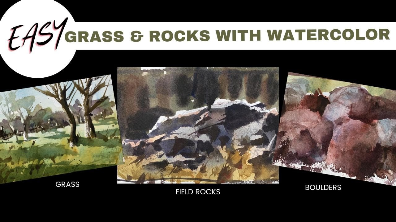
2. Painting Simple Trees: In this section we're going to go over just some elements. Rocks, grass, those things I
think give people problems. And if you paint landscapes, you're going to come into situations where
you have to have some tricks up your sleeves that if there's a
certain type of tree, there's a certain type of rock, maybe there's a grass field and not quite sure
how to handle it, that's what this section is for. Hopefully give you some
ideas on how you can do it. Now, for the record, I'm not a photo
realistic painter. I think that work may be
impressive to look at. I dabbled in it early
on in my career, but it just got to the point quickly that I
didn't enjoy painting anymore. It was almost a chore just to have to go in the
studio and like, oh my gosh, I have to sit
down and figure this out. Got turned on to some
more impressionistic, expressive style
of watercolor art and just art in general. And that's what I gravitated to, and that was enjoyable. Okay. I guess I say that
because a lot of what I do is it gets the point across and I'm going to show and demonstrate why that
is in this lesson. Then it leaves a little bit of room for the viewer to
use their imagination. You're not painting every
single leaf where there's just nothing left for the
viewer to try to interpret, because everything
is there for you. Anyway, when we start getting into these trees in
different situations, I'm going to use
the approach that works for me in the things
that feel good for me. Then it's up to you to make sense of it and to do it in a way that
appeals to you. I may do it on a
scale, let's say, of one to ten, ten being really, really loose and abstract,
one being tighter. I may be in the seven or
eight range to some of you, Maybe you're in the ten, maybe you're in
the two or three. You can go in here and get
as much detail as you want. For me, again, I'll get the idea across and then
I get on down the road. That's my attitude for trees. I think it's important, really, all shapes and objects and symbols that we paint and you have to realize
everything we do, and art is a symbol, it's a lie. All we're doing is trying
to trick the viewer into seeing a certain scene
that we're trying to paint. A subject that we're
trying to paint. And hopefully leave a
little bit of room for their imagination and
their brains to explore. I can't really paint a tree on the two dimensional
piece of paper. I can paint a symbol of a tree. In grade school, we learned
to do this lollipop, and that was our tree. And that doesn't really cut
the mustard as we get older, because we know trees aren't really shaped
like a lollipop. They have a lot more interesting
edge quality to them. And that's really
what you want to do. You want to create
an edge quality, A shape that has the
symbol of a tree. That's what it's all about.
Okay, Crack into it here. Color isn't going
to matter here. It's really about the
shape, the edge quality, and the overall idea of just painting the
shape of a tree. Let's just start with some
of this red orange here. Maybe I'll add a little bit
of this turquoise to it. I'm just messing around here. Just stick in my brush. In some of these colors, I'll just keep mixing
until I find something I like maybe this cherry
red here works. Okay, for starters. Okay. Now, the paint
consistency is thick, so I'm going to start
a little bit thinner. Okay. So now we've
got that watery feel. Now I don't want to go
right to the paper with a completely loaded brush like this because it
might be too much. So I'm going to
just dab that off, get a little bit here, and then do this
technique that's called. Scumbling when we scumble. What we're not doing
is holding it with this tripod grip and using
the tip of the brush. What we're doing
is I like to use this overhand grip
and then come down. I'm going to slide this over just a little bit before
I can get my brush over here where your brush is
almost level with the paper. The bristles just about level. You will have to go
with a little bit of an angle to get the
bristles to contact, but we're using this
side of the brush. All you want to do is just make the organic shapes
and don't, again, avoid doing lollipop
circle because, you know, trees don't
really have that shape. Maybe something like
that. For starters, we can go in with a
little more here and add a few darker notes. Trees had these little sky
holes, they call them, where we can see through
some of the holes here. For starters, I think
that works pretty good. Now if you wanted to, you could go in with maybe
a little more sienna. A little more crimson.
A little more red. I'll just make a thicker color. There's the finger test, dab off a little bit of that because I know
there's a lot. I can dot some of that in there and that's going to
blend because the pain is wet. Again, very simple technique. You can do this with
hot press paper where it's smooth to, you're not going
to get quite the texture that this one has. But you can get a similar effect because
really it's about manipulating the side of the brush and doing
this sort of thing. Okay? Now I can take and switch my grip and then do just a
trunk, something simple here. Maybe we'll do this
double trunk like that. And then a little
simple shadow or something underneath.
Let's do that again. A little bit of water, just to thin out some of
this right here, I'll remove the excess water. Now, load the brush. I know it's not
like crazy loaded. What I'll do is just drag tip of the brush just
along the paper there. You see it's not
a straight line. I went in these little
segments and did that. Now I can again use
this scumbling idea of just dragging the side of
the brush across the paper. Now, nothing that's
too symmetrical. Okay, We don't need,
we don't want to look like a fish skeleton
or anything like that. Trees tend to be a
little bit more organic. Then again, we can get
some darker notes in here. Trees tend to have a little more darker
notes towards the bottom. Then again, we can put a
little shadow on that as well. That's those evergreen
cedar type of trees. Then for the last one, I'll just put a
little water on this. I'm not really going to
use a scumbling technique, I'm just going to do a dead tree or maybe it's wintertime, and there we can just
see the main trunk. Now the technique, if I barely drag this
across the paper, that's like taking
your finger and barely touching your
skin, almost tickles. Then I can press
harder like that. If I start out with this tickle and then press harder
and harder and harder, we get this dynamic stroke that starts thin and
then it gets thick. That's what I want to do
here. I want something. That's going to start thin or thick. You
can do the opposite. So we can start like this, then end with this light note by just lifting the
brush off the paper. We're just basically
manipulating the pressure we're
using into the surface. Now, it may be more comfortable for
you to flip your paper upside down, for example, here. And then as I reach up and here, I'll lift that brush and then
I can come back in here and join again something like that. Maybe we have a little
bit lighter branch like that you can
get accustomed to. And I'll just do a
little shadow there just to match what we have. I can even drop a little bit darker since the shadow
is going this way. I can even do shadows
on the right hand side. That's something to
think about also, that was flipping the paper. You can try starting light and
then getting down in here, then again heavy and
then barely touching the paper and getting that
tickle feeling again. We can do that. Then we can come in
here while it's wet. Add a few, a little
shadow there, form shadow, we're
good over here. Using that scumbling
technique here is using the pressure of
the brush onto the surface. Any brush can be used this way. Doesn't matter if we
have a sword brush, Motler, Quill, small
pointed round, and even a synthetic brush. Now, there are other
techniques we can do. Let's say, for example, I
want to explore this idea. Well, if I have a
flat brush like this, I can get some paint on it. Let me get a little
bit more because it's fairly weak here. Let me gray that
out a little bit. I can do segments. I can take this brush and
press down a little bit, and go up and then
break away from it, and then go in a
different angle. We get this different look. We're going to explore brushes
and this sort of idea. But we can do that too to create a slightly
different approach. That's where we want to go now. Okay, what we want to do is take these ideas now let's explore how different
brushes respond, using the scumbling, and
then maybe using pressure as a sensitivity to it to create
some interesting trees. We can get in here in
these sky holes too, and put some branches, maybe a little branch coming out the side there happens
that thing again, all we're trying to do,
going back full circle now, is give the
impression of things. We're not trying to spell
out every single needle, we're not trying to
paint every single leaf. Even though the color is a red, you may not see this in nature. It still gives you the
impression of what it is without actually having
to try to color match. That's all we're going to do as we move forward
is paint symbols, things that look like trees. Some trees are more specific
than others, and so on.
3. Trees with Alternative Brushes: Okay, I primarily worked
with my pointed round, going to switch to my sword. This is my small, since I have a small
space to work with, it only makes sense that I use a small brush as opposed
to something like this. We're going to do
a lot more trees, but I want to pound this
home a little bit more. We'll switch colors maybe and do just put some blue into these. Red finger test tells you
that's pretty thick paint. I can come right to the side here and just put a
little bit of water. I've got some thick
paint over here. I've got some thin paint. Again, if I didn't mention
this before, I apologize. But this is dry paper. Unlike when we were
working on the skies, when I pre wet everything, we're not doing that right now. This is working
onto a dry surface. Here. Again, side of the brush. I can use this tip, this side, I can use this side, I can use this side. You get my point. It
doesn't really matter. The point is to really
explore your brushes. You saw where I use this one. But we can use this one
to do the same thing, and I'm sure we
will in this class, Just like I can use my motel
and my Quill if I wanted to, but for now again, we just do this thing and
have fun with it, okay? Remember to leave some
little holes in there. If you get these little marks that you didn't mean
to, That's okay. Nature is going to
throw all types of crazy stuff at you and
when it goes to trees. But one thing I want you
to avoid is this symmetry, which is what I have going on. Now, if I did a circle around or took a line and went
around all these edges, it almost make a perfect circle. We don't want that, things aren't really that
perfect in nature. We also have some symmetry, where we have a middle one and we have this, and
then we have that. There's quite a few
issues with this, but one stroke can
change all of that and just make sure that those things don't
exist in your painting. Now, I can just take the point. Remember the pressure thing? A little bit of pressure.
A lot of pressure. I can always use the
pressure of the brush to create thin and thick
branch quality. Okay, we can always do that. We'll do a little
shadow this way. Maybe that's one there. Let's take the same brush, and I'm sorry, go with a
little bit of thicker paint. Now, this tree that has this canopy tends to be a little bit darker
underneath that canopy. Down below here, you'll
get darker values. We can do some dots in there, but the key is to remember, we're only worried about
the outside shape, not about what's really
going on in the middle. We're not here trying to
paint individual leaves. At least I'm not now,
again, scumbling again. I can use this one
however I want to use it. I'll pull down these
branches again. Stay nice and loose with it. People don't try to control
every single thing. Let your brush do
some work for you. Imperfection is really a
beautiful thing in art, I think. So long as you can back
up from your subject, it holds together, That's fine. I think anyone looking at this, if this had a ground plane, a little blue sky or whatever, I think people would be
able to associate this. Identify this as a tree. Clean my brush off, I'll go with the
debtor trees there. I'll press down and then lift to get thin and thick. We can pull some smaller
branches in there. I can go a little bit
thicker there at the base. If I want, I can go high. You may find that you
enjoy starting up here, as opposed to starting
down below and pressing harder as you go down. You may enjoy flipping
it upside down. You may find your trees are a little more gnarly or
interesting shapes or whatever. If you do that, the key
is to experiment now, as opposed to waiting
until you're painting a finished landscape and
you're sweating it out, like, how am I going to do this? You find your freedom now. Explore different brushes,
different size brushes. You have a range
of possibilities. We're not putting ourselves in a corner or giving
ourselves only one option, we actually have a few. That's the idea that
you want to do at this stage is just explore
just this type of tree. Remember the things I
talked to you a little bit about the shapes pressure
into the surface. Don't try to make them perfect. You're just worried
about the outside shape. We're not worried
about the interior of the tree at this point.
4. Trees with Bristle Brushes: In this lesson, we're going to explore some
alternative brushes. These are bristle brushes
suited for acrylic. This is hog's hair,
really stiff, bristles. These are synthetic. Two fairly stiff, again, suited for acrylics. Maybe oils, maybe not quite
stiff enough for oils. But you can see compared to, let's say, a water color, they're just a lot
harder, a lot firmer. I'll refer to these as bristle brushes if you have
some of these. These are great for adding even grass and foliage
and things like that. You can work a lot
of magic with these. I'm not going to do
every single one. You can even use a
toothbrush if you want. But again, I'm just going
to do a couple of these. I'll let say this one and then maybe this one because they're very different
from each other. Let's get started here. I'm not worried about color, as a matter of fact, I'll
just do this on a gray scale. If I mix all of this
up on my palette here, I'll probably have
exactly what I need. It's a good way to clean
your palette off too. We'll just work
with the same idea, the scumbling technique, leaving a few sky
holes in there, making sure we get this nice organic abstract
shape, something like that. I'll put a little bit more
neutral tint into this. Maybe a touch of red and blue, just a little bit thicker and hit a few dots in
here, something like that. Now I'll do one more
similar to that, again just dragging those tips side of the brush
along that paper, just coming up with
a nice shape there. Again, just making sure I
don't end up with anything that's too symmetrical Now, just putting a few dots in
there, that's a great shape. By the time I take a small round here and we get a trunk going, I'll do that one more time. Again, we'll do this
double trunk like that. Those make great
alternatives for trees. I'll now switch to
my smaller brush. Look at this one.
This one is awesome. If I were painting on a
little bit larger scale, maybe can have some
fun with that. You can see the side of that, it's just very irregular. You can even rough
it up a little bit, then go to town here. Make sure you move
your elbow around. Get some flexibility in here. Work this way, don't just
keep it in one position. Move it around a little
bit and really get a nice organic shape
happening again. A nice thick trunk,
maybe on this one. A few more there just
to finish it off. I'll start with these little
thin strokes in here. Little wispy twigs,
then maybe a short, squatty trunk on that. You can even do
some splattering. When you splatter,
don't come back. What you don't want to
do is boom on the back. If you go down and up, the paint is going
to go everywhere. In your face, on the floor. You name it. But if
you load your brush and just go down, you get that. Now that had too much on it, so try to limit how
much you have on it, but it just makes some nice, more abstract, less
predictable stuff I can add. We can take your towel and do this blot and
remove a little bit, just like we did
with the clouds. Don't do it too much. Just a little bit. Come back in, do a few dots,
you're good to go. I can remove a little bit. There, we get a nice
transparent look to it. Just feather it out if you want. Again, you can learn by just exploring with these brushes and seeing what they
come up with for you.
5. Pine Trees: And I know we just did
this one type of tree. But don't stop there. I'd encourage you to do
different types of trees, so we can just the
tip here and press down and get our
stalk like this, going in different directions. Then I can do this scumbling technique
to put in the rest of it. Okay, so again, I
can start down here. Again, sort of don't try
to control it too much. The whole idea is you
don't want to control it. And then that way you get a lose depiction and something that is
less predictable can get it slightly darker,
slightly thicker here. We can do little
touch here and there, especially towards
the bottom like that. Again, we've got a nice
tree there I'll go to. This would be more
for a tree like this, it wouldn't be suited to do
these cedar looking trees, but maybe something like this would again getting
our trunk down and then just the tip there to do the rest of it. I'll travel more again, starting at the
bottom this time. And I really wanted
to try this one. I'll see what I can
do out of this. Maybe what I will
do is use my rigger here to put in a little, a trunk and then this
a little bit fuzzy. You see the edge quality is a little bit than
the other ones, but I think with a
little bit of practice, a little bit of
getting used to there, that might be a lot
of fun to work with. For trees, you get the idea. Obviously, like I
mentioned before, I'm not going to do every
single brush again. The key here is that we're
not focusing on the interior, we're just focusing
on this shape. Because this is the
shape that tells people that they're
looking at a tree. Okay, that outside edge right
there is all people need to see how you get there. It's up to you, but I highly recommend you try some bristle
brushes at some point. Again, we can wet
this a little bit. Is drying up really fast. And here I got my lights on, obviously my film lights, and it's just crazy
hot in Virginia today. But then we can get
some thicker paint, get in here and do in a
few dark shadows in here. And really bring even trees like this to life and give
them an interesting look. And they would work great for watercolor
painting. All right.
6. Trees with Color: Okay, we're going to
crack forward here. We're going to still
focus on trees, but now we're going
to infuse some color, like a layering color. So thinking about working
light to dark, of course, we're going to build
upon some of those same tree painting techniques
we've talked about, like scumbling, using
alternative brushes and all that fun stuff. And then I'm going to
share some other tips with you that you may enjoy. Again, you don't have to
stick to just one brush. I've got some other ones here. This is a number two mop brush, squirrel mop, really small. So if I were painting
a small tree, I could easily use that. I got my large sword.
Get the drill there. But I think for
this one I'm going to use my pointed around. This is cheap right here, but it's great. It's
a golden natural. I think I showed you
this in the materials. That's what I'm
going to go with. What I'll do is mix
up a yellow here. That's going to be
a glowing yellow. All right? I think
even before I do it, I'll give our light source here, indicate that coming
from this side. Now just because I want some yellow in this for the foliage, I don't want to be
intense saturated yellow. I wanted to still be
gray down a little bit. I'm not really into
highly intense colors. What I can do is take a
little bit of this ochre, maybe even touch a
little red in it. I'll go a little bit
of this yellow, pale, some water, and I'll then it out a little bit, not quite enough. Maybe maybe something like that. We see how that responds
to the finger test, that's just not as intense
with something like this. That would just be a little
bit too loud for me. I'll get all that moisture off. Then again, use this technique. You can scumble like this too. If you're comfortable,
more comfortable holding your brush with this standard grip, you
can scumble like that. But just remember, it's
good to get down in here. Just use the side of that
brush so we get all of this lovely artifact
and spontaneous. Spontaneous. But
it's unpredictable. Which part of the brush is going to get that
texture of the paper. Maybe unpredictable is the
way to think about that. That's good for our first layer. We got something like this. Again, I'll just
abbreviate here. We used some yellow, pale CYP. I use some yellow ochre
and a touch of Cad red. I think that'll give you a good reminder now
while it's wet, we want to go ahead and
move into the next layer. I can either use some sullan
or some cobalt turquoise. I'm going to go with a little
bit of turquoise here. As you may have guessed, that's going to push
it towards a green. Now, if you get too
green, too fast, you can come over here and mix
up a little bit of orange. Maybe you can see that's
really close to our ochre. Anyway, then you can take
some of these turquoise, a little bit of blue
will go in between them. I've got 123 puddles there. Let's get a happy medium there where it still has a little
bit of this yellow in it, but it's not quite
as intense as this, so it's a little more earthy. Now what I can do is take that, let me get some of that
moisture off my brush. And these will be a
little bit thicker here. I'm going to go a little
bit thicker with the paint. I want this to be a warm green, leaning towards the yellow side. You can see that
swatch there now. Again, scumbling and just touching that into a few places. Maybe there's a tip of that in here and of
course leave some of this yellow as well as you go, we got that effect
happening there. Again, two layers. This is basically
the same mixture but just adding a little bit. Yellow, ochre, and
a little bit of that cad red with
the yellow pale, getting that more of a
earthy green in there. Now what we can do again, is keep working with this. Now I can take some of
these cobalts in there. Now what that cobalt going to do is going to cool
it off a little bit. I'm going a little
bit thicker now. As I do this, I'm not
really going back to the water and adding a
lot more water to it. The finger test tells you
that's getting thicker. I'll clean my brush. We'll get our little
swatch down here. I think I'm even going
to go a little bit, a little more on the
cool side there. I'm just adding some cobalt blue and then a little bit of cerulean again to cool
that off a little bit. I'll load the brush
up really good. Then I'll come down in
here to the shadow area, which is really underneath
over here again, away from the light source. I'll just touch some of
that in there like that. Now you've got a more
sophisticated tree. We can finish that off with
my little rigger here. I can just use the same color if I wanted to, but
just for giggles, I'm going to go with a bit of this neutral tint down here. A little bit of my burnt sienna. I got a fly on my
table here for that. I'll put a little
bit of water in it. Just so you can see it again, I've put too much and now
it's running all in there. Burnt sena with that neutral tint,
something like that. I'll start fairly pale again. What I can do is go with
this heavier stroke, a little bit thicker down here. Now I'll go up a little
ways, then what I'll do, trees have these little
joints where they go up and they switch angles
just subtly there, especially for that main trunk. Then maybe once they get to a certain point,
they'll shoot off. That's what you want to do. What you don't want to do is paint a stiff telephone pole. Now I can touch a little
bit of color into that, just indicating
that light source. I'll take some of these
darker values in here. And while it's wet, let it touch that
side of the tree and it's going to bleed into it and do some heavy
lifting for you all. Now, I'm going to do this
again when I'm finished, but we can take this intersection here where it goes up and then
switches angles. Let's say there's typically S where you'll have
a new section. Think about like a 30
degree angle there. From this to this, it's about a 30 degree
angle that goes up and maybe it switches again
to about a 30 degree angle. And then maybe we have
a 30 degree angle there and that maybe
just goes off. We have all of these angles where you're going about
20 from here to here, you can go 2020 and so on. And that's a good rule of
thumb sometimes to use. Again, I'm going to do
one in just a second that we're going to go over
this a little bit more. Maybe again, we've got
this other trunk that's right beside it that helps
support some of that weight. Again, I can do that. Same idea of a 20 degree angle. We can get up here where
some of these holes are. Draw a few, we get a few the
sticking out there as well. Maybe something like that. Then a shadow there to
anchor it to the ground. I'll just put a little
bit of color in it. I'll just take a little
bit of this turquoise. Just cool it off and we'll
exaggerate it to this side. Again, a very simple tree done with the same
techniques we've used, but this time we're just
exploring color a little bit. Okay, this was a neutral
tent with some burnt sienna. You can even come back in here with a little bit
of these yellows, turquoise, and maybe even add
a little something there. That's good. Now what I was alluding to here, and this is just something
you can practice on your own. I'm going to use a little
bit of umber this time. A little bit of sienna, maybe even a little bit
of turquoise there. Get this brownish color. You can do this with any color. Let's say for example, you, you had some dead
trees in your scene. Let's say that tree can come up then it has like
a joint to it. That joint maybe
goes off about 20% this way, maybe this way. Then it goes up and then
it goes off this way. Then maybe it comes back. I can go in here and just really paint these 20 degree angles like this all
the way up the tree. Obviously as we go
up a little bit, things will get skinnier
and skinnier as we go. But that's just all
using that same angle. Just some angles are moving in one direction and other
angles are moving in another. Just something to keep
in mind as you paint. And I'll just cool that
shadow off a little bit here. Again, simple. Simple is where we're
going with this, building upon those ideas
we've already talked about. Let's do another tree below it. Here I'll switch to my, maybe I'll switch
to my small mop. Again, this is a
really small mop. If I compared it to the one I normally use, that's
what we're doing with. I'll paint both of
these with my quills. Let's do a different
type of tree here. I will start with
some of these browns. Um, neutral tint,
umberiena, fairly thick. I'm going to start
with this trunk idea. When I put my trunk in again, I can think about
those sections, it comes down, maybe
switches again. And they're not all of
the same size like that. Now, instead of just
using a gray or whatever, I'm going to come in
here and start with my cerulean and cobalt turquoise. I'll add plenty of
yellow ochre to that. A little bit of yellow as well. I'll get a little bit
of this clean water in here that's pretty thick. I want to start fairly thin, then also fairly light in value. I want to make sure
I get this effect. But these trees don't
have this bright foliage. They typically are
a little bit earth more in the realm of this. Again, using the
scumbling technique, just taking that
side of the brush, which I will go like
this and away I go into getting this
effect with the paper. If you find yourself getting in a pattern where it's small, big, just switch it up and make sure we
have some variety. Now I'll go to this
thicker paint here and maybe even add a little
touch of this blue, maybe a little touch of
sienna and red up here. And then drag some
of this into it. Then maybe that's a little
bit to to brown right away. I'm going to get it more
of these darker greens. We can just touch some of
those darker values into it. Again, I'll pretend
my light source is coming over from there. Maybe the tops of greens are
getting light and the other, and the right hand side
is getting more shade. In general, then I can go with maybe even neutral tint
now mixed with these blues. Maybe a touch of this turquoise. I really have
something that's cool. I used these for the initial
wash, then I went darker. I think I even had probably
a little more yellow on the ocher side to this,
something like that. And then we got into these. Then lastly, I'll go with
these smoky blue grays here. A little bit of cobalt blue, cobalt turquoise to this. That's too gray. Then I can just take
a little bit of this yellow ochre and push that in towards a yellow green. Now I've got something
that's dark, it's in that green family. We can just drop a
little bit of that again into the tree. I'll clean my brush. I'll get a little blue cool
in this and do our shadow. All right. So as you
can see, just again, using those same
techniques to do it, but now that was just
exploring brushes. Now I will go with
my needle brush. This was, I'll put it down here. Number two. That was a really
small squirrel quill. This was my number
ten pointing around. This was a number six rigger. Now let's go with my
three eighths needle. I can just use what's here is fine for this demonstration. I'm going to do a, I'm just going to
focus on the stalk. Sometimes you just had this tree again that doesn't
have any leaves. We want to get this look to
it instead of just one value. All the way through
what we can do. Actually I think I
will clean this. I want to stick to something
a little more colorful. Okay. Again, I'm painting
on dry paper Here, unlike the skies, I'm
not starting with any pre wet paper. Things are going
to be a little bit tighter and when
you put them on, but then whenever we work
into inside our shape, things are going
to bleed and blend a little bit because
we're working wet into wet with this one. Let's say we start with
these reds for giggles. And I'll put a
little bit of our, my, I should say yellow
ochre into that. Maybe a little more of
yellow and yellow ochre. This tree is going to be
a little more vibrant, but then we're going
to knock it back. Once we get into it, I'm going
to start fairly weak here. Do again these sections, maybe going up and then, and then back this way and
then up again like this. I can even bring that
down a little bit more so we get another
section in there. Again, it's not a straight line. Okay. We've got, okay. Now, again, that's just using that combination of Cad, red, yellow, pale, and
then yellow ochre. Now I will drop into
that. Okay, So I'm going. To take the same
brush while it's wet. If you want to remove
some of this, you can. I will. Let's say now we want to
make this a little bit darker so I can take
some of my sienna touch, a crimson here and maybe even
a little bit of my umber. What I can do now is
just my brush and pop in some of those colors
that's taking the same color. Flies still around,
dag on it and adding some burnt sienna and umber. Then I can do another round. Maybe even make this
even more colorful here by taking some of this cobalt blue with the
crimson lizard, crimson. Now maybe to knock back
just a little bit, I can do a little
bit of this sienna. Now we can go a little bit darker in some of this as well. Maybe again, we've got our
light source doing this. We want to show that light. Then of course, we can do our shadow running
off like that. So again, that's using
a little bit of Sienna. I think I have room to do this. That's everything
that was there with some cobalt blue and then we used some Alizarin crimson with the colors that were there. And we get nice glowing tree. You can see just by introducing
color here into this, using the wet and wet technique, you can really start to have fun creating some amazing trees. Now I can take some
of these values. Again, there's our 20 degrees, maybe it comes out, goes
off this way, that way. There's another notch in
here we get here off of. Again, you can do
this all day long. Maybe we have a
smaller twig there. I can change the color a little bit and maybe even
push that more towards this blue in there. If you really enjoy those colorful paintings,
you can do that. All right, so you get the point. You have a lot of fun with that. And really do some
interesting landscapes. If there was a winter landscape
or something like that, these techniques would come
in real handy to work with. And think about that
20 degree angle, that happens 30 degree angle. If I've been saying 20, it's about a 30 degree angle. Okay, So if this is our 45, that's in the middle, that's roughly good enough in there. If you just did know
nothing but that, think about a right angle. If that's the right
angle, you're like splitting the
difference like that, maybe it's coming up and
off about like that. Again, you'll see
leaves a branch that may even go out in
more of an angle. I'm just giving you something to build upon and something
to think about. Then it's up to you
to run with that. But anyway, I'll do it
for this one next lesson. We'll again build upon all
of these techniques and keep learning other ideas
we can do to paint trees.
7. Winter Trees: All right, we're going to
do some winter trees here. Again, when it comes to brushes, I recommend you try these techniques with
all of your brushes. There is no sense in just using
one when you've got a lot of variety and options to go with if you have
different brushes. But I'll use a couple of
different ones in this one. In the first I'm going to use my small sword again if you're
curious about the size. This is a quarter inch
with winter trees. They're not always leavelessy. Don't drop all their
leaves all the time. Sometimes trees will hold on
to a certain number of them. This is the effect we're
after all my palettes. A little bit of a lizard,
crimson, a little bit of umber. You could even put a little
bit of blue into this. I would recommend keeping
it a light brown, a cooler color, something that isn't going to
be too saturated. And again, this finger test
tells you it's very weak. Now, some scumbling again
to get these shapes, and I'll do a couple of
them here with this brush. Something like that. And then
I'll switch brushes here. Just silver. We stay organized. This is my four inch for giggles. Go with the larger squirrel. I'll flirt with
color a little bit. Now maybe I'll go with
the brownish green, ochre, Turquoise, maybe a touch
of burnt sienna in there. But again, keeping it gray brownish because
you're not going to get a tremendous
amount of leaves, that's probably
too strong leaves. These are again, just
leaves that are holding on a little bit different sizes. Just make sure I'll make these a little
bit bigger like that. Just a very organic shape there. Just watch out for
repeating patterns. Symmetry. I can get
back in here with just a damp brush here and just even lift some of this if I wanted to,
but not too much. At this stage, I've allowed
everything to dry 100% Again, a very light wash water. If you want to go back into it and just drop a
little bit of water, soften it up a little
bit more, that's fine. You want to avoid anything
that's too dark in value, so keep it again very light in value because
these leaves aren't dense. They're just some scraggler
leaves that are holding on and the new leaves are going to push
them out come spring. Now for the big finish here, I'll take a little bit
of a neutral tint, a little bit of umber, maybe
a little burnt sienna, and clean my brush
and then mix that up. The reason I let this dry
is because typically, as I alluded to earlier, the leaves aren't dense. Because of that, you're going to see the skeleton of the tree. You're not going to see too much overlapping and
things of that nature. And hopefully it'll make
a little more sense once I get into it here. A little bit of blue
into this as well. Again, finger test tells you
is thicker than what I had, but not crazy thick here. I can just start
with my trunk again, don't do a straight line, make it crooked, and get
those little notches going. Now notice as I draw the structure that we're
seeing a lot of it, okay? It's not hiding behind
the leaves, okay. We're again making
that impression of dead leaves and they're
not again that visible. Then I'll do that again. I
can start up here if I want, member of that 30
degree angle thing. Pressure, light, heavy pressure, and then pulling away as we get. Further away from
a notch or joint. Okay. So now I can do a
little shadow under that one. You get that feeling, the impression of a dead tree. Now if for some
reason, or I'm sorry, not a dead tree, but dead
leaves and a dormant tree. Now, if you wanted to make
this even more subtle, you could take it
and a few places, but not too much. Because again, we don't want that limb structure to
hide behind too much. But if it gets too
dark in a few places, you can do this dabbing thing. I can switch colors. Now let's see, I think I use this brush,
so I'll use it again. I'll just take same colors here, take a little bit
of ochre into it. Maybe we'll make this
more of a golden brown. The nice thing about these
quills is you get the points. I'll just do my best
to use that point. Again, look at the structure, I'll do this one a double. We're not getting
that telephone pole. Look, I'm thinking about
those 30 degree angles, but without getting too anal about it,
something like that. Again, a little shadow
and we're good to go. Play around, play around
with your brushes. Play around with
different sizes. You can blot a little bit. Again, don't blot too much where it completely removes it. Maybe this one a little bit
wider here at the base. And then we get this
structure here. Something like that.
Okay. And then again, I will get a little
shadow there. Again, winter trees, you can
apply the foliage with this. I've got other brushes, I can try bristle brushes. All those things are
perfectly fine to give a shot here scale. If you wanted to do
some larger scale, like half a page or even a whole page,
it's good to do that. It's good to fall in here
and do some smaller ones. Now, I mentioned this earlier
that allow these leaves to dry 100% The reason why is
I'm going to do another one, and this would be maybe
a bad example here. Let's say these are my leaves. I didn't let it dry, I'm going to work
right into this. I'll go ahead and
do my trunk now. Watch as those branches
go into the leaves here. They disappear. They bleed out. What that's going to do is give the impression that the
leaves are more dense. Then the structure, the skeleton of all of these limbs and stuff. They fade away. Then it looks like a spring tree and the
leaves are just coming out. That's why I recommend
doing this in two layers. Foliage, let it dry, come back, add over it. If you feel the tree structure, the branches are too dense, you can just dab it a
little bit and that will lift a little bit, but still put them in
front of the foliage. Okay, some tips there on
painting winter trees. Obviously you can flirt with
color to cool more brown. I can go bluish gray and so on. So you can take the idea and run with it and see again
what you come up with. Okay?
8. Birch Trees with Negative Space: All right. I'm going to do a negative space birch
tree painting for you. This is two lessons in one. We're going to do another
technique, you can paint trees. Then we're going to do that
negative space technique that we've talked about. In case you didn't see it, you fast forward to this lesson. A positive space tree would be, maybe just painting the
actual tree itself like this, just doing the trunk
now like that. A negative space is
different because we're only going to focus on
the space around it. To do it, what I
want to do is sketch out a couple of trees
here to begin with. So maybe something like this. And then maybe we'll do a
little branch coming off there. What I'll do is I'll
paint around that. I'll use these browns. I'll go with some siennas. You can use any color. I'll even put in a
little bit of blue and crimson pushing this
towards a violet. Maybe lots of water to begin, so you can see very soupy. What I'll do now is
go to the edge of the tree on both sides, but I won't actually paint the tree so it's doing
just the background there. I'll do that here. Since
I have a blind spot, I'm going to flip
the paper like this. I can't really see through
the brush that edge. So what I'll do, flip the paper now I can clean it up like so. All right, for the first
layer, that's all we need. I'll take a hair dryer to
this and then we'll do the next one drop to the touch. I'll do maybe one back
in here like this, maybe it curves out. And then maybe one here, and then another one in
there thing that'll work. I'll mix up some more paint.
A little bit of water. Same colors, crimson,
blue, sienna. So still pretty watery, but more color
than I had before. I want to bump this
one over a little bit. I'm just going to do that. That'll leave room
for another layer. I'll just do something like this and I can go to this one. And then that one sort of
sneaks behind our first one. Then we've got this
one here again, I'll go right up to the edge and then have to flip
it to do this one. Obviously, you can explore
whatever brushes you see fit. We'll go a little
bit skinnier too, so I can sneak in a
little bit there. All right. You can already start
to see the depth happening with these
being a little bit, those getting
pushed back because they're in the
forest a little bit, they're not getting
the same sunlight. Now, I want to do
the same thing. I'll dry it and we'll
do one more layer. All right? You know the drill. I'll put more back in here, then let's do another
one back in here. I think that'll be
enough, just more paint. It doesn't really
need to be a lot darker because with each layer, it's going to get darker
just because you're layering one more over
top of the next one. But I'm going to go a
little bit thicker, maybe a little more brown, a little more blue on
this one, less red. And away I go, this tree, obviously a little
bit deeper in the woods. Maybe I'll put one
more back in here. Maybe super skinny and maybe
it gets lost right in here. And then we've got
a little one here. Again, that one's really
shoved back there. Now what I can do is
just feather this. I don't need to go to the edge
because what I want to do is add a more paint, brown blue touch of water. Make this a little
bit darker towards the middle here and maybe just a touch there. All right? So really adding that deep rich color right in there, you can really see that negative space painting
there going on. What I can do now is soften some of these edges and add a
little bit of detail to these trees just to make
them look like birch trees. Maybe in here, I'll
do a different color just because they're
closer to us. But let's say I take a
little bit of yellow, a little bit of blue
off to the side here. Maybe get more of this
Cerulean and ultra. It's not too bad. Maybe I will put a little bit
of that in there. Maybe even a touch
of yellow there just to give it that
feeling of green. Yeah, a green, gray. I can even take a warm
it up a little bit with, let me see. That's probably too much. I want to get that back to a green. A work so I can take
this really weak though. Actually, I've got the wrong
brush for the job here. I'm going to go with
my pointed round, make sure it's clean. I'll just go on the
left hand side here. This is still a little wet. You'll get a little bit of
bleeding in there like that. Maybe I'll push it more to
a blue for the next one. Just for variety's sake, I'll touch that blue
into here just to tie it in something like that. Maybe this one's got
a little bit too, but I'm not going to
put as much detail in the ones that are getting
farther away from us. Not as much. I
really want to now, while that's I can
work wet into wet. I'll switch to my
small rigger here. Just go with a little more blue ultra something like that, maybe a touch of that
brown fairly thick. We can that texture that birch trees have
don't do too much. You can always add more but
it's hard to take it away. Yeah, we can put a little
bit on the limb to here. Soften that up a little
bit with some detail. Take a little shot of blue in
there to. So there you go. And maybe I'll just suggest just some dots
and different things. I want a couple of these just so they don't look too naked. All right, so we'll just a
little bit of technique there and a little paint, right? Little water, some layers. Able to do a really
cool little painting here of some trees
using negative space. This technique of
negative space, huge, It's going to make a
big impact in your art, not just trees and
landscapes or whatever. If you really start to harness the power
of negative space, you're going to find
so many ways to do it. It really gives your paintings a very rich professional look. I would do this as many
times as you possibly can to grasp it and to master it. Because the more you research
and look at artists work, the more you'll see this
negative space painting. But anyway, very important
skill to have under your belt.
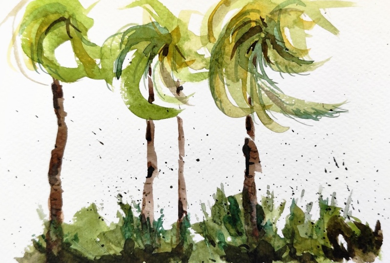
9. Palm Trees with Palmettos: All right, we're going
to do some palm trees and maybe even
some palm meadows. Give it that tropical look. Again, we can explore brushes
for something this size. I'll probably go with
a smaller medium. But I could do this
exercise with my sword. I could do it with
my pointed round. I could do it with my
small mop or quill. You get the point. I
could do it with this one as well and do it with
a combination of them. It doesn't really
matter a whole lot. What we're going to
do though is start just pointed round and then maybe I'll work some
other brushes into it. For color, I'll think
something an earthy green. I'll start with this
ochre, that's right here. Maybe a little bit of this Cerulean and a little
bit of the turquoise here. Cobalt turquoise. I need a little bit of it. I may as well mix
up quite a bit, get some water going here. I'll start midtone. Mid tone is a tone that's basically not too light
and not too dark. These trees have a little
bit of body to them, so they're not completely pale. I think starting
here will be fine, plus I'm going to get
a little bit of drop ball F test tells you that's
nice and soupy there. Let's go for it. We'll say these trees
are blowing in the wind. So we can do these strokes
that are doing this thing. We'll do a couple of them. Maybe I'll do one down in
here, different height. Have a little bit
of fun with it. Don't take it too serious. Maybe I'll put a little
more yellow into this one, technically, that's
called charging. A lot of times
you'll hear me say, putting some dots
in there and just dropping paint into the wet pigment and
letting it spread. That's basically what I'm doing. Now notice my stroke speed too. I'm not going real slow. I brush whip across the page. That gives you this
texturing look again, I'm not painting any of
this on a wet surface. This is a dry paper. For a slower speed, you're probably going to
get this result. The quicker you
start to move it, you're going to get the
texture of the paper. If you're using
compressed paper, I can go ahead and
continue using this brush. Down here in the corner, I've got some grays. I can throw a little
bit of Ultra there. Maybe a little bit of a lizard
and get some violet going. Maybe touch a little
red and yellow into it. Just maybe brown it
up just a little bit. That'll work. I don't
want it too dark. Again, that midtone like that start maybe a little bit
thicker towards the bottom. A little bit whiter trunk. And then as we get to the top, maybe it gets a
little bit thinner. I can even hint at
something in there. Again, notice the
sections I'm doing, these little
sections of a trunk. We got one in here, then maybe one more
coming down in here, I'll go behind that, some of these palm fronds
or whatever they're called, and that will give
that illusion of that's in front of the trunk or the stalk,
whatever you want to call it. All right. So
that's pretty good. We can let that dry for now. As it does, let's do some tropical complement
to it, some shrubbery. But maybe before we do though, I want to make sure I get a few darker notes
into the trunk here. What that does, it keeps
it from drying too flat. A lot of times, if
it's just like this, that will dry a little bit flat. Whenever I put these little
dots in there, that helps. Gives the illusion that it's more complex
than it really is. Again, that's just technically that's considered charging, but I'll just call it dots. Putting just touching, a wet wash with another color and
letting it do its thing. Now for the frons or like these palmettosI'b get
something like this. I'll take some of these greens
that are already there, mix a little bit more. I'll make these a little
bit darker on the ground. I can even take some
of these violets into it, but not too dark. Again, a mid tone, but maybe not quite as
green as all of this. I can do this stipling, basically touching the brush to the paper and
getting that look. Now, if you wanted
something a little bit thinner, if you wanted more, let's say a bladed look, you can take a smaller pointed
brush and do this thing. What I'm doing is I'm
using this point, say as my axis. And I'll flip my brush, I'll flip my hold,
so I'll go over top. Just touching it and
going around like that, that creates that fan
look that palmettos have. Let's just do that.
What I'll do is just get some color down. First, some blobs in here that
let's do a couple behind, get some darker ones
here like that. For now, I'll go a little
bit of blue into this. Maybe even a little
bit of my umber, a touch of yellow, darker. There's your finger
test there now. Again, taking that, I'll
get some of that paint off. You see that nice fine
point there picking an area and notice how
I'm working the edge. I can do one down in here. I'm forming that edge
as I touch into that. All that's bleeding
into each other there. I can clean my brush and
take some lighter values. Okay. So we don't want
everything to be the same. There may be some lighter
values in here and so on. I can get the same idea. I'm going in that same rotation, finding that point, and
then pushing up like that. Let's go with a little
bit of darker gray here. I can put a few now. It's wet into wet. Everything I do now is going to have that
soft edged look to it because it's all blending. Now I can take a little
bit of blue into this. We can put some shadows
coming across like that, give it that three
dimensional look. That's good. Now as I've been doing that, all of this dried. Now I can clean my
brush off and do the same idea with these fronts. I can maybe do a line and I notice how I'm just adding a smidge of detail doing
that stipling technique. You don't want them all
coming in the same direction, so maybe something like that, you can flip it if you
need a better angle. Not too much. We're just
trying to suggest details. We're not trying to paint it and spell out every
single palm frond for them. Maybe this one switches. Again, really fun way to paint, very creative and
suggestive technique. There you can go with. A lot you can toy with
and explore on your own. Now, I'll take some
yellows back in here, touch a little bit of
this turquoise into it. As I get to these fronts
or these palmettosybe, I can suggest some
points on top there, You see that strengthens
that idea of these blades. That's negative space painting. I can take one that's not
even painted and do that. We're going to let all that dry. When it does, we'll do a little bit more negative
space so I can get in here and negative space paint a
few little tips in there, so we'll just have it look like a little tip of the front. Just having fun with that. Go a little more violet, maybe a little more blue. Into this touch of this
ochre, we can splatter. Remember splattering? We
don't want that to recoil. Okay, we go down,
down, down, down. That gives that nice fresh look. It could be all types
of little details and different things in there. You can take some of that and suggests a really
loose palmetto. Doing that stiping again, know that it's
working wet into wet. So you're going to get a
little bit of that bleeding in there at this point. I'm going to take a hair
dryer to it just so I can throw a little bit of negative
space painting back there. All right, nice and dry. I'll take my small rigger here. I'll take some of these darks
that are on the palette. Tell me a touch, a red, touch, a sienna, a little more blue. I'll go much darker here. Look at how much
darker that is than some of those mid tones. Now I can suggest some branches and
different things that could be going on in here. This could be just a
larger shrub back there. I'll clean my brush really good, Remove most of that
moisture, very important. And then soften some
of these edges. What that does that
just gives it a little bit more of a blended, realistic look without having
to work too hard at it. Maybe a few more here
just to tie it in. Maybe we have some
structure in here too. Again, clean the brush, dry it off really good. Just fade that out a little bit, so doesn't look too
unnatural there. I can even touch a little bit of water into some of
these to soften it. I can touch towards the base. Maybe they're more in
shadow down in here. I can take and even do some positive shape branches
coming off from that. Again, a lot of fun you can have with this negative
space painting. Again, there's a crazy amount
of ways you can use that. I'll just take my flat here, a little bit of ocher,
a little bit of yellow, a little bit of turquoise. I'll just run a shot something there to make it feel like it's Anchor down,
it's some grass. Take a dryer to
it. There you go. Nice little wake and
work with palm trees. If you wanted to come in
here and just take it on another level, I probably would. I probably wouldn't
even take it this far. That's probably more detail than I would use
in my paintings. But again, I do this thing for the masses
and not really for myself. Maybe just a few little details
on the trunks like that. Again, I can clean my
brush, remove the excess, I can soften some of
those edges like that. Anyway, you get the point there. Basic palm trees try different
brushes, different colors. It's really the technique that you're thinking about
the most right now. Don't try to do anything
other than focus on that. If you get the technique down, the sky is the limit, but that's the stuff. It takes a little bit
of time experimenting. If you're painting
on a bigger scale, you can try this stippling with one of these
Motler brushes. I've got these smaller flats, these are for acrylic painting. Again, I could do it like
that too with these. Again, I'm not going to go over every single brush
I could possibly, but I just want to
plant the seed. What you do with it
from here is of course, totally up to you
anyway, palm trees.
10. Scratching in Trees Technique : All right, let's
get cooking here. I'm going to show you
a few more techniques we can explore with your trees. I'll just put in a little sky here just so it's a little
more of a complete sketch. A little bit of blue,
that's just on dry paper. I didn't pre wet it or anything, then a little bit of
warmth in there too. Just to mix it up,
clean my brush. And then you can just let
some water trickle in there. I'll pull some of those
yellows down in here is fine, even some of the blues. There you go. Just tone in the paper with a little bit of
a sky in mine there. I want that sky to be very weak. I'm going to put some
tree branches and whatnot extending up into it if
the value is too dark. If I went with like
a gradation and put some co ball blue or
darker blue up there, then I'll lose that
opportunity to put these tree masses up in. It'll be the same value. You have to think about
those things a little bit, actually, before it dries. Before I dry it, I'm going to take a little bit of this ochre, a little bit of this turquoise. Maybe a touch of this yellow. Just run a little grass there, maybe take a little bit of this blue touch of this crimson
touch of these yellows. And just do a
little gradation in the foreground that's
going to draw a lot weaker than you
think, which is good. I'll do a hair dryer and
then I'll be right back. Okay, a little bed down here. We still wet, but I'm not going to be
working in that area. So far, I've got this impression of a sky here, light and value. I didn't really work hard
for it and I didn't want to because I don't want
to overstate the sky. I don't want to put
darker values in it, like I mentioned before
because I'm going to use it for another reason. Again, these are the things you have to think about
in your painting. What's the painting
about? The co, the formation, the
color in the clouds. Do you want to put
these trees that have a nice foliage to them and some maybe tree
branches going up in the sky? You can't have it all, okay? You just simply can't do it. You pick what you want to say
and then you try to say it. I'm going to do some
distant bushes and trees. I'll just add a little bit
of blue to some of this. What's already on the palette, a little bit thicker
than what I used before. There's your finger test. A blue green is what
I'm after here. I can use this
scumbling technique. I can get in here and just use the side of my brush and
these random patterns. Okay, you saw, I
did that in like, what, 5 seconds maybe. I'll do a little bit of umber, touch of red, a
little bit of blue. I'll just touch some darker
values in this like that. Some random painting going
on. It's intentional. I know I know why I'm doing it and I know
that I'm doing it, but I'm not trying
to control it. So I'm not here going
to touch and let it go. I'll clean my brush off, dry it. This is getting really wet. If you use this towel technique like I do here in your
painting process, be sure when it gets really
wet like this to dry it off. While this is setting up, I want this to dry
about 80% When it does, I'm going to scratch
into it while I'm going to take a
moment and clean this. All right. Not too bad. I think I can go ahead
and work with this. What I'll do is I'll
take advantage of some of those darks
because what I'm about to do will show up better
the darker the value. This is an exacto knife, You can use your fingernail. I'm going to take
this and then just scratch right into
that wet paint. What that does is it reveals a trunk when something
like that is good. Maybe one more couple, maybe skinnier ones
in here like that. I've got a couple against
this darker tone. I got one here against
the lighter tone. Now what I'm going to do is, again, that's scratching
into wet paint. It doesn't work on dry. If you try to do it on dry, you'll get these flakes
scratchy looking things. You're not going to
get those smooth runs. Again, timing is important. If you do this
when it's too wet, it's just going to
back run, okay? What's going to happen
is you're going to put this color down, then you're going
to scratch into it. And it's just going to backfill just almost as fast
as you put it down. And you're not going to get
a smooth scratch like that. Now what I want to do is take some of these colors
that are on the palette. All of this stuff
is in the distance, it's in the middle
ground back there. We don't need anything that's
going to be dark in value. What I can do before this, I'll even combine a technique here that you're
already familiar with. I'll take this really weak, a grayish green. I'll scumble. I'll scumble a
little bit in here. I'll scumble in here. And maybe scumble a little
more in there like that. Maybe I'll do, this is
going to be for the future. I know that sounds weird, but you'll see what I
mean here in a second. Let's say I've got a
little bit darker value here and color and I'll put a little bit
of blue into that. Now I'll draw that
brush off, load it, and then I'll do a
little bit of that. I can splatter in there and
then make something of it. We've got that not much, right. What I can do now is
take a small liner here. Now I'll take some
of these values that I've already
used on the palette. Maybe touch a little
bit of gray into it. A little bit of neutral tint, again, very pale,
that may be to green. I'll push that more
towards a blue gray. Then I can just take this and extend that
down a little bit. Extend it down like that. What I'm doing is I'm pulling those trees below
that tree line there. Then what I can do is connect to that scratch and do some branches that
disappear into the foliage. Now, if I were doing
a winter scape, I may want this foliage to
dry a little bit. Okay? That would put the
tree branches in front of the leaves and that would
indicate that the branches, that the leaves are just dead. And it puts the tree
trunk in front of it and it gives it that
feeling of just dead leaves. Again, I can do the
same thing here. I can maybe even pull this one down a little bit further in here and then connect
a few branches. I'll go a little bit darker
and maybe a little bit brown. I can come down in here, even this is going to
be a little bit wet, so you see it disappearing
and that's fine. That doesn't need to
be too prominent. Now, I've got this other tree. I'm going to go a
little bit richer here, A little bit darker in color
because it's closer to us. I want this trunk to
be nice and dark. Maybe not that dark though. I'll take a little
bit of sienna, a little bit of ochre into that. That's probably more
like it in there. I even got those purple, maybe I'll take a little
bit of this lizard, a little bit of blue, and I'll pull into
that a little bit. Remember stroke speed.
A stroke speed, go fast, You get the
texture of the paper. Now, the paper has to be dry. Where this is wet, it's not going to work,
but where's drying? And it will if I go slow. Okay. You're not going to get
the texture of the paper. I want the texture of the paper. I'm low my brush. And then get a little bit of that texture of
the paper gone. Then I can get some branches coming off
of that a little bit, maybe putting one in
front of that foliage. And that really tells you, you already know what's
in front of all of this. But I like that
layering idea where the dark that branch is in front of that
distant tree there. We've got that going on again, I can even accentuate
that dark there. I can put a little
bit more there. Now, I'm going to take
some of these greens, mix them with blues here. All of this is dry. Now what I can do is do some
negative space painting. I can get in here, maybe create the illusion of
some tree branches and whatnot happening
back in here. Maybe towards the bottom. It's a little bit darker, so just a couple, just enough to hint at it to suggest some negative
space painting. Now I can clean my brush, dry it off where it's just
a little bit damp there. And just soften those
edges a little bit. Now we're combining
multiple techniques here, a lot of fun. And maybe we've
got a little tree kind of sticking up in there, just a couple of
branches there, right? Clean my brush, dry it, soften those top edges, maybe even diffuse the bottom. So you see how
that works, right? You see how a lot of
these little techniques can be combined. I can also do a little
shadow like this. I'll put a little
more green into that dark green if I can get it not
too dark though. So I can maybe just
indicate a little bush in there by just doing that negative space
painting, Soften the edge. Now you get that layered effect, you get the point there. Hopefully this again,
takes some doing. You have to get your
feet wet. Try it out. I'm going to go a
little bit bluer here. Value is first for me, I'm always thinking about value. Then once I get a value, right, I think about
temperature and I want the shadow to be dark and
I want it to be cool. Same idea. Watch how
fast that stroke is. You'll get a little
bit of that texture of the paper that can
scumble a little bit. These are in the distance
definition there. Then maybe we have another
top of a tree here. Watch those fast
strokes and you'll see that texture of the
paper come into play. All right, so again, building upon those
ideas, right? All the while backing
up a little bit, trying to practice the things we've worked on and
then showing you different ways on how you can use them in
different situations. Again, it takes a time, little bit of effort there, to just work out the techniques and you
have to learn them first. You have to physically get
in here and get involved, But then you have to apply it in various situations and
get comfortable with it. Then over time, what's
going to happen is these things will start
to trickle out in your art. They'll start to
make an appearance without you consciously
saying I want to, negative space painting,
I want to do this. They'll start to become
second nature in your work. That's, that's really cool. When it starts to do
it on its own almost. But you have to do
the work first. I'll just do a little
bit of splattering in there just to give the ground and everything a
little bit of texture, Okay? All right, well, I'll
just stop there. I could ramble all day, but you get the point.
11. Bonus Tree Technique: All right. I thought I'd do a little
bonus tree demo here for you. You guys have been so awesome. I wanted to spoil
you a little bit. So I'm just going to
focus on the trees primarily and then
I'll tie it into some sort of grass or something later on pre
wetting the paper there. All we're going to do is put
down some greens as a base. Okay, I'll get this
green shade gone, and then we can take
a little bit of yellow tie into that. I can take some orange tie in cleaning my brush. We can take some cools. I'll take some of these Ultras, teals, and maybe put
that towards the bottom. Some shadows. I'll just
finish it off with some ochs. Let that trickle around
there, just for giggles. Let's go ahead and add a
little bit of yellow here. I'll leave a little sparkle
there towards the back, the sparkle being
white of the paper. We'll go with a nice
rich golden green. I'll just do a little gradation leading up towards the field. Now I want that field
to be nice and dark. I can already tell it's not
going to be dark enough. Let's go with a lizard crimson,
some ultramarine blue. Even a touch of these browns just to knock it
back a little bit. It's saturated and intense, and we can do
something like that. All right, that's probably
going to get us in the ballpark of where we
need to be for this demo. As I've talked about before, this is going to dry
about 20% lighter. That's probably about
where it needs to be. But now speaking of drying, we're going to work with this in a state in the next
level or the next stage. I don't want this
to be 100% dry. I want it to be about 90% that way that I'll give
me some fuzzy edges and not really hard edges. What I will do is dry this off about 90% and I'll
be right back. All right, we are draw
to the touch here. As you know, negative
space painting is a technique that I have been sharing quite
a bit with you here. We'll take some darker hues, even maybe turn this
into a nice rich violet. I can get in here and do some
negative space painting. Do some big trunks there, maybe a small ones. So now we can make some
secondary branches. But again, keep it
fairly simple here. I'll put it just a
couple more over. And here that now I'll clean my brush off, get some fresh water, Tap it out then we'll just
soften these edges at the top. That's going to dissolve it. We can even soften some of the edges on
the side of the trees. If you get to me, hard
edges, you can do that. I can run a little bit of
water along the bottom to. Soften a few of those,
we can scratch. So if I wanted to scratch into that wet paint,
I can do that. Now, this is pretty
much dry over here. Okay, and what I want to do
is share a bonus technique. We soften a few of these
edges while I still can a bonus technique here, you can try, because all this stuff
you already know about, I'm going to take my rigger or my small point
around and wet it. Get most of the excess off. We want to have it pretty
wet, but not too much. Now, I'm going to
paint a tree using just water into this dry paint. Maybe I'll do one more in
here just for giggles. Maybe I'll try to lift
another one in here. What we have to do
is let that dry, dry, but let that wet pigment. Let me try again. We have to let that water loosen up
that dry pigment. I think if you give it
about 15 or 20 seconds, which is about where we are, I can take this and
just blot some of that excess water out. I'll take another one
here just because that one's fairly dirty. I think this one will work. What we want to do is rub
where we put those marks. Okay? And then you've got some trees, very light suggestion of trees. And then if you wanted to, you can strengthen that a little bit by coming in here and doing some of that negative space painting that we worked so diligently
on in this class. Just suggest them, they're
in the background. But another fun way
you can do that, you've got a negative
space and then you have, using water, fun stuff there. Things you can do. You can soften a few of
these edges in here that really create some interesting and a
lot more dynamic effect. Once you start really
harnessing all of these things. It's not like you have to put every single technique
in your paintings, but it's nice when you can start to know they're there,
these techniques, and then use them advantageously as you
paint and create your art. I'll just do a little bit of, maybe a little bit of
shadow color here. Maybe we got a few of these. Maybe that could
be, let's see this. Pick this one and
then maybe we've got one coming in off
the side like that. I can extend down a bit. We can extend this
one down a bit, touching that shadow, All right? I can even extend that one
down If you start to see how useful a lot of these things are once you start to learn them and play
with them a little bit, that's that again, I just
want to put that out there. I know we've talked a lot about different
techniques with trees and sometimes you can get so many different
ideas going that it's a little overwhelming, but I think you can
handle it again. Always encourage you to slow the process
down a little bit. Always remember that when
you get overwhelmed, then you have to back up. Take a break, take
a break, go back, Take your studies, and don't throw them in the
garbage bin too soon. Try to analyze it. Spend a little bit of thought into where you feel
it went wrong. Did you over wet it? Were
your color, poor choices? Did you go into the wet paint too soon
with too wet of a pigment, that sort of thing,
then go at it again. But when you're in that
zone of being frustrated, that's when you, I think, have to know it's time
to give it a break and come back with fresh
eyes, fresh attitude.
12. Master's Tree Examples: This one, we're going to
just focus on the trees. The main thing I
want to point out is just the lack of details. Everything that is depicted
in this scene here, let me get a, let me
get a more vivid color, more contrasting color here, I'll go with this yellow orange. But if we go around, let's say a prominent, we get a smaller brush. But if we go around some
of these edges here, for example, let us look
how subtle that is, is suggestive when painting, we indicate rather than state, you're just trying to give
the impression of trees. Look at this one here
where we came back with a darker note and
did a positive tree, a darker note for this one
in the background, again, even against the
light of the sky, it's a very quick and
easy outline of a tree. It's not focusing on every single needle and
leaf that's out there. That's something I wanted
to bring to your attention because I'm sure as soon
as you look at that, you know there are trees. We don't have to sit around
and guess about that. The next thing I
want to talk about, number one was simplicity. And you know few
details actually. That's a hell sorry about that, but it gets the point across. You can clearly see
what's going on. Okay. All good. Number two is the
negative space painting. This is where, this shouldn't
be new to you by now. When I say negative
space painting, and being able to start
light work to dark, that concept should start to re, register with you at this point. When we look at this,
we can probably guess that Homer started here, maybe even lighter,
maybe the sky, he did everything
in the sky wash, let it dry, and then
came back and then added the blue greens first. In this light value,
that may have been one, and then maybe two
was this value here. Then the third value here, we can see each
layer was put on, it was put on probably
as a big blob first. Probably this one layer right here was the same
as this back here. That goes all the
way down in here, maybe even down in here leaving a little bit of the
white of the paper there. And then coming back with two. And leaving this alone back here and just working with
what's in the foreground. While he was painting that two, maybe he came over here and hit a few little details on this
side just to give a balance. And then the three, these
darker notes were probably added when all of this and here these darker
notes were added. But that negative
space painting, starting with that blobby look, that blobby look, it
wasn't a complete blob. Probably towards the
top of that wash, there was a few
light trees painted. I'm sure they were thought out. Then as the second
layer was added, it was carving out a few
trees out of that blob. And then the third layer
was again carving out edges and things like that and painting maybe even some
positive shaped trees. But I like how this black right here on this tree
begins as a positive space. And then turns into a negative
space. That's really cool. When you can do that, it's doing it here too,
these dark notes. And then we get some
positive shapes for the edge of a bush or tree. Same thing here, this dark, not carving out the edge
of that bush or tree. And then it becomes
a positive note on the edge of that bush. Okay, good stuff. All right, so let's move on
to the next one. All right? This is a Sg. I wanted to focus
on a few things. First of all, we can look at the same idea of
negative space painting. All of these light values here, that's probably a terrible
color to use here. Let me use this purple. All of these light
values were added. We can even see that value a little bit here,
a little bit there. Again, that light value is
probably added in here. Maybe it was connected
over on this side, it was probably more
of this bluish color and then probably splash some yellow in the
foreground there. Once that dried, probably
with that first wash, it was a two layer thing, I think over here and
I'll just hash it out. It was more of a yellow
and then it went more to a yellow gray on the edge. Then those colors probably
just faded down into here. Just let them blend and bleed. But once that dried, then these darker notes of this grayish greenish
teal were added. But look how that
negative space painting, it was done with precision
down here a little bit. Then he connected, he came back and
connected these browns. With that, we did some negative space
painting for the trunks that I'm sure all of
this was thawed out. Hey, I've got some light
trunks against a dark mass. I can start with
this lighter mass, add a little yellow
over here, yellow gray. Let it dry, and
then come back with these darker notes
of the blue grays, blue teal, a grayish teal. And carve out the bottom
part on both sides. It wasn't completely dry. If you look really close, you can see shots of where things blended a little
bit because it was wet, probably slightly, and then coming back with the
siennas and ochres. And here, these browns and
positive space painting, these trees connecting into it. If I remove that layer, you can almost see where that was connected
right in there. I'll circle that again
with some black so we can see where that positive
space connection was done on that tree. Then probably for third, wash the brown colors, let me switch to a yellow,
that should stand out, we have these darker blues
and then some browns in here. Again, negative space painting to get that feeling of texture. Maybe grass or shrubbery connecting down in
here, we're good. This one over here on the right is just
positive space tree. Probably when this wash was
added and connected in here, he came back with
some darker notes. This lighter violet
was added and then did a splash of this yellow so they could blend
into each other. Probably when that was semi wet, he came in with
these darker grays. And just look how loose. He's not sitting
there staring at the details of all
of this stuff. On the edge of the
tree, the tree probably had growth on it, vines, whatever,
maybe some leaves. And they're just
dry brush strokes. They're dry brush strokes
against dry paper probably when this wash
was added over here. The initial wash was
added on this side. I'll hash that in. You know where I'm at. Maybe
all of this was added here. Then as I got maybe
halfway, two thirds dry, we came in with this
darker gray and just let that all and mingle
and bleed into each other. But all of this back here, the white of the paper
that was all dry, you can tell that because
these are very hard, crisp edges. But
look at this stroke. This is just a brush stroke that goes and then draw
branch, draw branch. I mean those are all
just draw branch, draw branch and then
dry very little paint, probably a little
bit thicker and just to indicate leaves, I just want to point that out, that's all being methodical
and thinking about how you want to approach your
subject before you do it. That's, you know, give you some idea on how to lace in these negative
space painting techniques. And looking for
opportunities where you have a light trunk against dark
masses and things like that. If you don't have it, you
can make these things up. This is very simple painting, but the way it's done and
the technique that was used, giving people negative
space painting. Positive space
painting, dry brush. Look at, even if I didn't
want to get into trees, but look at this
negative space painting around the dark switch
to a light blue. These darker notes
down in here that suggests some weeds or
grass or something here. Negative space painting loosely and then coming back
with these positive, we got them over
here to Flick Flick, when things are a
little bit drier to do some positive grap, you know, that's just knowing
those techniques exist, getting comfortable
with it, and then finding opportunities
to exploit it. But I did want to point out negative space painting and
then how these trees on the left hand side were not only negative space but also positive as they
got into the sky, something we covered
when we painted trees. Well, I wanted to
point out this to me, has a feeling of like most
of the leaves have fallen. You don't see a lot
of heavy leaves and anything that indicates that there's a lot of foliage. I say that because look at this blue line I'm
drawing around these leaves. You can even look at this
over here, Who knows? I mean, it could be summertime, it could be dead
trees or whatever. But I feel the artist
was suggesting that the leaves
were very sparse. Okay. And there's no energy spent or wasted trying to
paint individual leaves. They're just blobs when we
look at this blob right here, and they're probably very
wet, very weak paint. These are just short brush
strokes is all they are. Right, that was put on first. The reason I say that
is now we can see how this branch was put on
was added over top of it. All of this is very crisp and if it were
painted wet into wet, then all of this that touched this paint right
here would bleed. Did that. For all of this, the artist thought out, I don't want to
overstate these leaves, whether it's winter, spring, whatever the trees die in. I'm going to do this very
weak strokes here and let it dry and
then come back and do the branches that tells
you there wasn't much. Effort there or to conceal
the branches, to hide them, or let them blend into a mass of leaves because we can see
the hard edges on them. I wanted to point that out to you and just show
you how that works. Also, if we just follow, I'll do this in yellow. I told you not don't
do telephone poles. Look at these strokes, how that angle goes this
way and then up this way, and then back that way, and then off up this way, and then changes back that way. It almost has a subtle hint of going off in a
different angle, This one going off and look
at that lovely angle there. And then changes direction
and goes up this way, and then changes directions
again and goes that way. Okay. Nothing was painted
like a telephone pole. A lot of thought into the angles of the trees and
how he wanted to depict them. Another thing I'll
point out to you, this is a design thing. This one is wider, obviously. This is your main tree. He's telling you this is
the one that's in front. It's my main tree. And we've got that heart
landing there on the ground. And this trickles over. Then we have a shadow that goes behind it and
this tree is next. This tree is in the distance
because there's the bottom, a very light suggestion of
the bottom. And this is here. What I wanted to say is like these trees could
have been in one clump. But the feeling, but you
never want to do that. If you have three trees, you don't want to start three
trees on the same line. Okay? So I'm just going to do a lollipop tree here like that. All of these trees are started on the same line
and there's no depth. That doesn't give
you any indication of depth in that painting. What you do is you
try to design where one is bigger and closer to you. And then the next
one starts here, and then the third
one can start there, you get a 123. Okay? That's a good way to do it. Like how this branch is
coming down this way. Let me change color. They don't all have to go up. But look at that degree there, boom, boom, boom, boom. All right, This one
is a little bit less, this one almost a 90. This one is about a 30. Then this one, if we flip this upside down and
look at this angle, in this angle, it's
probably about a 30. It's just going in the
opposite direction. That's something I didn't
really point out to you in the tree section
and drawing branches. But yeah, that 20 or 30
doesn't always have to go up. Clearly we can get branches that come to just a
little observation. Spending time looking
at these things, admiring artists of
the past and ones you like would reveal
stuff like this. This is another one I'll
just show you real quick, of how this feels more
like a winter tree. And of course we know this because we have the white snow, but look how this was suggested around in a very light gray
even over here, right? And allowed to dry. And then these hard branches, hard edged branches were
drawn into those shapes. That tells you that
the branch structure is more dominant
and the trees are, the leaves on the trees are
just intended to be subtle, barely hanging on and in the background behind the
structure of the branch. I'll do it for trees. I recommend you do
some more research. So Edward Sego, Winslow, Homer, any of those artists
are great to look at. There's other ones out there. But just study that stuff and you'll see these
things that we've talked about in this course
start to reveal themselves. There's just really
good learning tools and we'll give you more ideas on how to
exploit the techniques.
13. Recap and Projects : Congratulations on
finishing the class. I know it was a
bit of a journey, but we did cover a lot of
techniques that I think will enhance your watercolor
landscape painting. If you did complete the
demos and hopefully you did, please post those
as a class project. I would love to
see what you did. And of course, if you
have any questions about what you learned or
would like some feedback, just leave that information in there and I will be
glad to respond to it. All right, thanks again and I'll see you in the next
one where we take on rocks and grass and we'll
continue to level up our watercolor landscapes
together. See the?
 ROBERT JOYNER, Make Art Fun