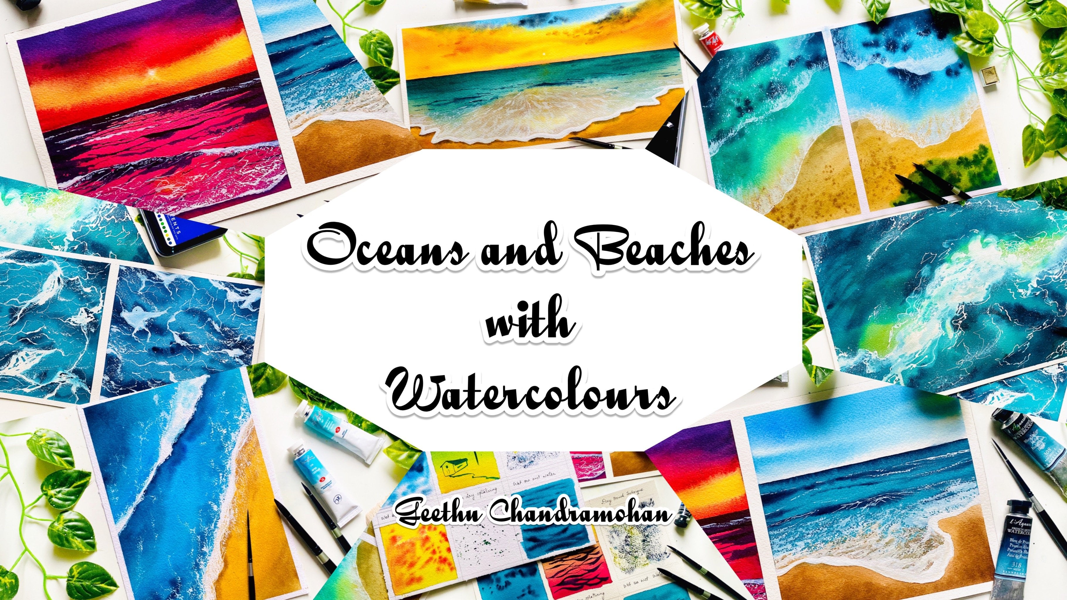
Transcripts
1. Welcome to the Class!: As an artist, you know
that color is one of the most powerful tools
you have in your arsenal. What better way to
express that than by creating beautiful
rainbow effects in your watercolor paintings. Welcome to this class on painting rainbow
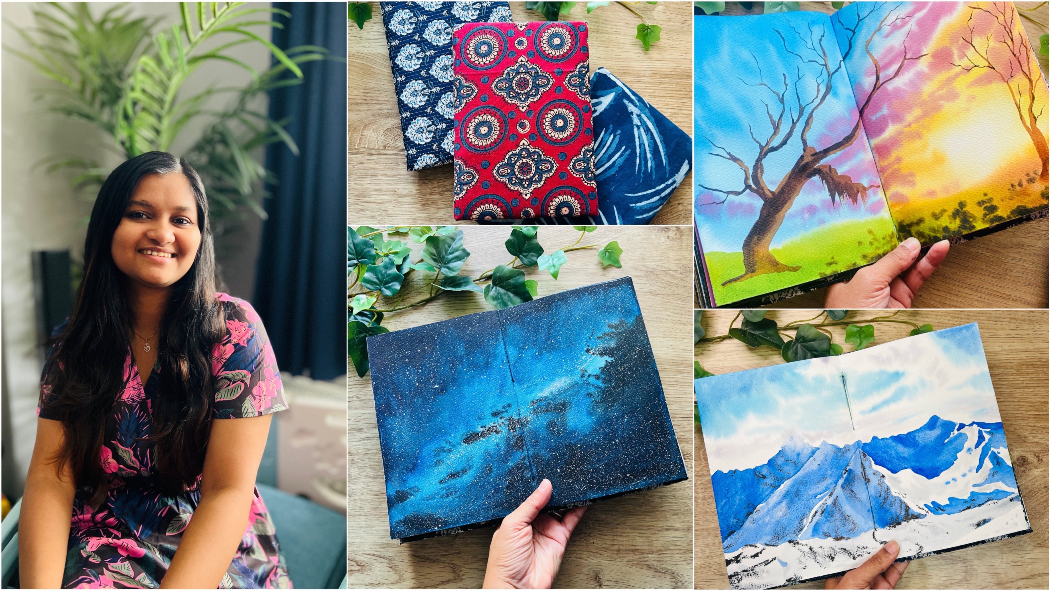
light effects with watercolors. Hello, everyone. I'm Gitu, a full-time
aerospace engineer with a creative odd business as a side hustle and an instructor. I am a silver brush educator and an ambassador for
Sitaram Stationers and White Nights watercolors. Even though my painting side started as a hobby
few years ago, I have become so immersed
in the creative process every day that it has become
an integral part of me. Every day it is about new experiments,
finding inspiration, new topics to try
my hands on with watercolor paints
and the process of it has never failed me. I have been teaching for
around three years now in Skillshare because teaching
is another passion of mine. That is, to share my
deep love for painting, knowledge about watercolors and helping you succeed one step at a time and making you believe that anything is
possible with practice. You can find me everywhere on social media as
ColorfulMystique, especially on Instagram and YouTube that I share a
lot of my process videos, photographs, my little wins, unboxing stories and insights
from my tiny little studio. In this class,
we'll be exploring the techniques and tricks of painting watercolor rainbows. The beautiful effects that the sunlight creates in the sky, which will take your
artwork to the next level. You learn how to blend
and layer colors, create stunning skies, and add a touch of magic
to your paintings. Whether you're an experienced
watercolor artist or just starting out this
class is designed to help you develop that love for unique techniques that will take your art to the next level. Whether you're just a
seasoned painter or just starting out this class
is perfect for you. Let's dive in and create some amazing watercolor
rainbow effects together. Enroll in the class now and
unleash your inner artist
2. Art Supplies You Will Need: Let us have a little bit
all the art supplies that you need for this class. First of all, we need paper. I am using this arches
watercolor paper. It is cold pressed, 300 GSM or 140 pounds,
100% cotton paper. The size that I'm using is
seven inch by 10 inches. I would recommend a minimum of 300 GSM paper for this class. Also, it would be better if it is 100% cotton paper as well. Next, we'll need
watercolor brushes. I'll be using large
flat brushes for applying water onto the whole of my paper for the
class projects. This one is a Size
20 from silver. It is a silver
atelier hockey brush, or the size 10, you can use whichever large
flat brush that you have, then we need a
medium-sized brush, a size 10, size 6, or size 8. For large detail strokes
on our painting. We also need a
smaller size brush, such as the size 4, or size 2, size 1 or a size 0, which has a pointed tip. The pointed tip of the brush
is very important because we need a smaller brush for the effects that
we want to create. We also need flat brushes, ideally synthetic
because that's how we can create the rainbow
effects in our big thing. But don't worry, you don't need the brushes in all
of these sizes, typically one size would
do not as large as this. I would recommend
smaller size for the class project if you have an angled brush that
would suffice as well, make sure that the
flat brush that you're using has flat bristles and not captain bristles
which would look like this. Because if it looks like this, then we cannot create
effects that we want. Ideally, it should be flat brush in which the
bristles can be laid flat. We also need watercolor paints. I'll be using watercolor paints mostly from the
branch mean K here, which I've curated into
my watercolor palette. This is my 36 well
watercolor palette, which I've been using
for a long time now. It consists of all the
colors that I mostly use. This palette and all the colors that is included in it will be in the resources section as a PDF document where
you can refer to. Naturally that means you need a palette where you
can mix the colors. You can use a plastic
or metal one, or even a ceramic palette, whichever one you have
at your disposal. I'll be using an
acrylic board like this one to stick my paper onto. You can use any
board that you have. I would advise again sticking it onto the
surface that you're working on because it is always best if you can move
your paper around. You also need two jars of water. One for freshwater for
applying to the whole of the paper or picking up
fresh bins and the other, which you can let it turn muddy by washing off your
bins from the brushes. You'll also need some
white gouache paint. I'm using designers gouache permanent white color
from Winsor and Newton. A masking tape if
you're going to be taping the paper
onto your board. Now that you know all the supplies that we
need for the class, let us move on to
the next lesson
3. The Theory of Rainbow: This lesson is probably boring, but it is important for us
to know the theory behind its formation in order to understand the colors
that goes into it. Also how and why we see
some colors more than the others in a rainbow so
that when you paint it, you don't make any mistakes.The first part of understanding the formation of a rainbow starts with the
understanding of the light. Visible light, that is the light that can be seen
through the naked eye, is made up of several different
wavelengths or colors that travels at different speeds when it passes through a medium. I don't want to take you to
back-to-school physics here but just starting with this so that you know where the
colors are coming from. It is because of
the properties of light and how it behaves
with the droplets of water in the atmosphere
that creates one of nature's most colorful
meteorological event, the rainbow. They are the results
of refraction and reflection of sunlight
within the water droplet. The most important
thing to note here is that it is an
optical illusion. It doesn't actually exist as the semicircular arc that
we see at that spot. However, the position of the
sun and the rain drops in relation to the
observer needs to be ideal for the
formation of a rainbow. The sun needs to be behind the viewer and the rain or fog, whichever is the source of water droplets must be
in front of the viewer. It is important, we understand this because there's
no way that you can paint the rainbow and the sun together in the
sky in an artwork. To explain this easily, imagine you see a rainbow
right in front of you, which means the
sun is behind you. You have your friend
standing further across near towards the
horizon facing you. For you, your friend is standing behind the
position of the rainbow. But the funny thing is,
your friend can't see the rainbow at all because they are
actually facing the sun. If they were turn to the
direction that you are facing, they would see a rainbow
too but that would be a completely different
rainbow than the one you are seeing provided, of course, there's rain
or fog there as well. Now let us understand
the geometry behind the positioning of the
colors in the rainbow. When the sunlight enters each
of the tiny water droplets, the light bends a little
because the light travels faster in
air than in water. Once inside the droplet, it bounces off back off the water droplet and goes
back the way it came, bending once more as it speeds up when it exits
the water droplet. The colors appear because
some of the wavelengths of the light gets bent
more than the others. Violet, which is the
shortest wavelength, gets bent the most, and red, which is the longest wavelength, gets bent the least. Thus when light exits
the water droplet, it is separated into all of its different
wavelengths or colors. You, the observer, the sun behind you, will see the slide
reflecting back from the droplets separated
into its different colors. While painting rainbows,
you will always need to remember that violet will always be at the bottom and red at the top for
a primary rainbow. You may have some times in a
double rainbow in the sky. This is because the
light is sometimes reflected once more within
the droplet, hence, the primary rainbow
is caused from one reflection inside
the water droplet, whereas the secondary
rainbow is caused by a second reflection
inside the water droplet. It exits the droplet at a different angle
than the primary. This is why it appears at the
top of the primary rainbow. The second rainbow will
always be faded than the primary one and the
colors will be inverted. That this violet at the
top and red at the bottom, because this was caused
by a second reflection, allowing the spectrum
to reverse itself. Now that you know why and
how the rainbow is formed, let us have a look at the
colors in the spectrum
4. Colours of Rainbow: Let us understand the
colors of the rainbow. The light splits into a
continuous spectrum of colors, and even though there is no specific number of colors that we can equate
to the spectrum, human eyes can distinctly see seven colors blended into
each other in a rainbow. These are violet, indigo, blue, green, yellow, orange, and red. The easiest way to remember this is to use the acronym VIBGYOR, using the first
letter of each color. Now, let us have a look at
how we can paint a rainbow
5. Watercolour Techniques: Now that you know the theory behind the formation
of the rainbow, let me show you how we can
put this onto the paper. You will need a flat
brush for this purpose, as already mentioned in
the materials required. But don't worry, you don't
need all of these sizes. This is just for illustration purposes to
show you how we can do this. I'll start with the bigger
one first because it gives more visibility as how
I'm applying the colors, and once you're more confident, we can move on to
the smaller one. But obviously, if you don't
have a larger one like this, then it's absolutely fine. You just need a very
smaller brush where you can transfer the paint
onto the small flat brush. I'll start with
this one obviously, and first we're going to
do the wet on dry one, after which we'll move on
to the wet on which one. You will need another pointed, round brush for transferring the pigment onto your
larger flat brush. I'm using this
size 4 brush here. It's got a really nice
pointed tip as you can see. This is size 4 from the
silver black velvet series, but if you have a
smaller size brush or if your brush is
not this pointed, then go ahead and pick up the smaller size brush you have. [inaudible] We've
already discussed that, so which means we need to be
putting those colors here. Let's start, I'll start
with the right side, which is basically reverse, so that is red. Pick up a nice red shade
and add it to the end. Can you see how I've done that? Transferring the red
pigment onto the brush, then go ahead, and
watch this one. I know, it's a lot of
wastage of pigment. Unfortunately, we don't
need all of that. But we do need quite a lot if we intend to
transfer it nicely. The next color I've
picked up is orange, and orange pigment
right next to it. Make sure you transfer nicely
to the end especially. Then next one is yellow. Here I'm picking up
my cadmium yellow. That's a nice amount
of yellow, isn't it? That's the warmer areas. Now we need to get
into the next part, that is the cooler sheets, which is obviously
starting with the green. I'm going to take my sap green, and load it up. The next color is blue, so I'm taking my tailor blue, and I'll transfer that. Then it's indigo, and finally, the last
color is violet. There I have violet
at the very end. Now we've got the
colors in our brush, and remember what I said, red has got to be at the
top for the rainbow, so arrange your brush in the direction such that
the red is at the top. Then you need to practice this a lot if you're going to
putting this onto the project. Believe me, even I do mistakes
because this is not easy. I'll share a short tip, so let's first start and try and put this onto the paper,
and see the magic first. We start with a beautiful
pigment that we've put. I'm going to start in
the left corner here. I know it's not a perfect arc, but this is the show. But can you see
where we started? Can you see the gorgeous colors? How we created that
beautiful blend? This is wet on dry, so that's why it
turned out dry because also I didn't put
a lot of pigment. If you have lower pigment, they would have
turned otherwise. What I've just done is I've
dipped this into my water, not entirely, just
the tip of it, that's what I did. I'm
going to try again. But can you see how
it's lightened up now? We've got a lighter rainbow, but there are various ways
that you can achieve that. Let me just go ahead and fill my paper with these
gorgeous colors. Can you see how we've
created that rainbow effect? What we did is to basically transfer the pigment onto
a larger size brush, but you can do this with a
smaller size brush as well. I've just washed off all
the color from my brush, so now I'm going to shift
to a smaller size brush. The thing about rainbow is
that when you look at it, yes you do see the seven colors. But then when
you're painting it, you actually don't need to put all of those colors together. You can skip some of the colors. For example, violet, which belongs to the
shorter wavelength, is not actually
entirely visible, you can now skip the
cooler versions. Especially if it's a day such that there is a lot of
warmth in the picture, then you can skip
those cooler colors, which we will be doing in
one of those class projects. Let's actually first
start again with the red. First, remember, I think I forgot to mention
this in the first instance, you need to wet your brush. Otherwise your brush is
going to be totally dry. Just dip your brush in water, and make it wet. But now it's too wet, but you only need it to be damp because otherwise the pigment is just going to flow everywhere. Dip your brush in water, and then make sure
to just wipe it off so that it's just damp, and that's what we need. Now we start the
transferring process. Here I've got my red. I'll go with my next shade, which is my orange. Make sure that when
you're adding, you have more of
the warmer colors. I've already explained those
are the dominant colors in a rainbow because it is the one with the
larger wavelength. Then obviously the
next is green. Towards the left
side, as you can see, it's a very lesser area, and it's going to be
almost congested, but that's what it is. Move to the left, then teeny-tiny bit of violet. You see, I skipped indigo because I think it's
absolutely fine, and I'm putting the violet
towards the edge of my brush. Where do I have the space? Oh I literally don't. Again, red at the top, and you just go. Do you know why it's
forming those dry strokes? Because our paper
is literally dry, and this is a synthetic brush. In order to create a rainbow
which is nice and flowing, you need to draw on the paper, or you need a brush that holds a lot of water and pigment. But it's still going to create
these dry fix eventually. In order to get that wet effect, let's see what we can do. We're going to try the
wet on wet one right now. Let me wash this off so that
we can reapply the pigment, and try the wet on wet version. Here's a flat brush that I have, and I'm just going to
quickly wet this region. Make sure to wet it evenly just because I'm not
using a tape here, and I'm not even using the
two side application method, and this is quite small area. I'm really sure that this
is going to dry up faster, which I don't want to, but it's going to dry up faster. This paper is archies, and even then it's
going to dry out. I'm just applying an even
tone of water to this side, just the bottom side so that we have the wetness on the paper, the moisture on the paper, which is going to create
that perfect rainbow effect. Whoops, then we come back. I think I'll show you
on the smaller brush itself because that's what we'll be using with
the class project. We don't need a larger one. Let's try and do this
effect on a smaller brush. Dipping my brush in water, getting rid of the excess water, wiping the brush on a cloth
so that it's just damp, and also you're
reshaping the brush. Just make sure that
you don't wipe it in such a way and it
becomes a captain brush. You need it to be flat. Wipe it on its flat surface so that it retains the flatness. Now, this is the point where
you need to work quickly, because you've already
applied water onto your paper and chances are it's
going to dry out faster. While you're doing this
process, it's going to dry out, but that's okay. We can apply the water again here because
it's a plain surface. Now, when you're doing
the class projects, you might have things on
your paper that's already wet and you'll have clouds
and sky in the background, which you cannot
afford to let dry, so you need to do
this process quickly. Practice as much as you want on different
sheets of paper, and also practice making the arc so that when you
approach the class projects, it becomes easy for you. I'm going to start,
starting with the red shade, orange. You can even skip some
of the warmer colors. If you just put yellow
right next to the orange, it's going to be absolutely fine because red and
yellow makes orange. Anyways, so who is
going to complain? Green, blue, and let's
finish off with violet. You might notice that I've
actually skipped the indigo. That's okay, because
it's such a faded color and even the violet I will just put into the
very edge there. Now we've got our colors. I can see my paper has started to work but because I have no masking fluid and no water
underneath, but that's okay. I'm just going to reapply once more and enhance the
moisture on my paper. Now we have our rainbow. If there is too much
water on the paper, it's going to spread. Yes, it has too much
water, but it's okay. I'm just going to show you
how it is on the wet paper. But can you see
how we've created that gorgeous rainbow without
having the dry effects? That happened because
our paper is wet. Let's add a bit more. I know that my rainbow has
already started to dry out. I think now I won't reapply
water onto my paper. This is another way that you
can practice because you can just apply water onto the paper, then reapply and do
it like I did know, then when you go for
the second round, don't apply the water. You understand the
best consistency that you need to get
for the rainbow. Can you see it's
spreading really a lot. We don't want that, do we? Here we go, blue and lastly, violet at the very tip. I've got my rainbow again
and I'm going to be using a red shade at the top. Here I go again. Can you see how gorgeous
it's turned out? This is not going to
spread as much as this because there's
less water now. While I was doing it, the
water has to dry out. This is something. Go ahead and practice this
as many times as you want. Understand the consistency
of the water on the paper. You only need a sheen of water. The technique that
I'm using basically is to apply water on
both sides of the paper. While I'm bending it, all my strokes reinforce
the moisture on the paper because even
if it starts to dry, when I paint on some area, that area gets wet
again and it stays wet, but then it's not that watery
or in a flowy consistency. You can see how it's
actually turned out. It's been two minutes
since I painted these. Can you see how soft this is? The first one is faded, of course, but look
at the second one. It was the right consistency of water on the paper as
well as the pigment. Can you see how it's
so soft and subtle? Which is exactly
how rainbows are. They're not going to be
so vibrant in the sky. Yes, it can be more vibrant. For that you just needed to use more vibrant paint. That's it. I mean, if you put in a lot
more pigment into your brush, then you're going
to get that effect. This is something that
you need to practice that has to get
the arc correctly, because that's very,
very important. Of course, if you're going to be creating the double rainbow, I've actually washed the brush, but the double rainbow
means that you need to have your arc in
concentric circles. That this one after the other and they should
follow the same. It should not be such that
one arc is in one direction. Let me just quickly show you. I know that this is
not the rainbow, but I just wanted
to quickly show you what we are discussing. It should not be such
that one arc is like that and the other
goes like that. It should never be. The rainbow arc should be
parallel to [inaudible]. This is almost okay, but as you can see, it goes
away towards this end here. Make sure you practice
more so that you can get the rainbow correctly. I know that painting
the rainbow is quite difficult process
and might be a bit scary, but just go ahead and practice those shapes so that you get
the wrist movement right. That is, your wrist feels confident enough to do
those brushstrokes. You don't have to literally fill all the colors of the rainbow onto the flat brush every time. Just go ahead and practice
as much as you can with any random color
onto a piece of paper, so that you get the confidence to do it
on the class projects. As you can see, I've done
a lot of practice myself. These are some of the sheets
on which I do the practice. Practice rainbow
styles in which you have the first and
the second rainbow. The basic thing that
you need to remember is to have the second rainbow, that is the additional rainbows following along the second, that is the gap between
that to be the same. You can see here how
I've kept on practicing. Then I did this exercise. This is actually
very nice because it will make sure that the gap that you keep between both
the rainbows are equal. I mean, you don't have
these many rainbows, but it's a good practice to
practice it in this way, because then you'll feel
confident enough and you'll also notice that
as you progress, your brush strokes
are getting better. You can see how many
times I've practiced. These are just a few. I have a bit more
other papers that I actually practice to make
sure that I get it right, but let me tell you this, even after 100
practice sessions, when you're actually going to do it onto the class project, that will make you nervous. It's a very, very scary process. For me is even more because
I was recording this, and I have to get it out right. It's scary, I know, but not to worry. Just consider it as a painting and enjoy
the process of it. That's what you need to do.
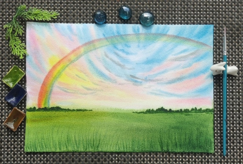
6. Class Project 1 Colours: Here's the first-class project
that we are going to do. We're going to make
this subtle rainbow on the top of the sky, even when there are
other colors in the sky. We've been practicing the
rainbow on like you know, plain sheet of paper
without colors underneath. The class project is mainly
to capture the rainbow, even when there are lots of
different tones in the sky. Because that's how
it is, isn't it? First of all, let's go ahead and have a look at the
colors that we have used in this one so that
you are familiar with all the colors that you
need for the class project. For the sky, we need nice and transparent,
warm yellow color. This is transparent
yellow, PGY150. Then I've used Quin Rose, quinacridone, violet
rose, or PV19. As you can see, I did not use the pink in this darker tone, but I used a very subtle and
lighter tone of the pink, which is basically
something like this. Now, do you recognize
the color in the painting in these areas? Then the next color
that I used for the sky is pale blue another one
of my favorite colors. Then I've mixed in a teeny tiny amount of
indigo into the sky as well. Lastly, I've mixed up a gray using the three
primary colors, which were basically
the transparent yellow, pale yellow, blue,
and alizarin crimson. Here's my alizarin crimson. Then for the foreground, I have used transparent yellow, which is already there. Then a bit of olive green, sap green and dark green. I know that many of
you may not have this dark green or the
sap green color, but you can easily make
that by mixing blue and yellow together and to
make a dark green like that, try and mix your
indigo with yellow, that should give you
a nice dark green. Let me just show that to you. It may not be the exact same as the dark green that I have, but it's still
going to be darker. Here I have my
indigo and here's a yellow. It's still dark. Yes, it's the same as this but maybe if you
add in more indigo, that's going to make it darker? Yes. Do you see that? Indigo and yellow
should give you a nice dark green and for the
background regions, I have used a bit of Payne's gray and a little
bit of darker brown. That's burnt umber
and Payne's gray. Now, for the colors
of the rainbow, I'll show that to you. I have used cadmium red. Then I used cadmium orange. It's absolutely fine. If you don't have the
cadmium pigments, you can go with the exact sheets that we've used here as well. That is the yellow, orange, red, blue, et cetera. Cadmium yellow and then a bit of green and lastly, pale blue. If you ask me why we haven't
gone with the tour scheme. That's because we did not go to capture the entire color
scheme of the rainbow. But all we wanted was
to have the warm tones first receding into the
cooler tones in the painting. As you can see clearly here, the warmer side of the
rainbow is clearly visible, and the cooler side, it's like barely
receding into the sky, which is what we
wanted to depict here. This is the reason why I have
skipped some colors from the rainbow scheme and just used this minimal
color palette for the sky. Now that you know the colors that we've used
in this painting, let's go ahead and paint this.
7. Class Project 1: Here I've got my paper and the acrylic board where I'm going to be sticking
my paper onto. I'll start with applying
water onto the paper. So since I'm using the
two-side application method, I am going to be
turning my paper to the other side so that I can apply water to the
backside at first. Here, I'm going to be
using my flat brush, and applying water to
the whole of the paper. Make sure that you do this
multiple times and ensure the backside is soaked well enough before you move
on to the front side, if you're using the same
method as well because it has a lot of effect on how your paper stays wet for a
longer duration of time. And if you're not using this
method and if you using a masking fluid to stick
your paper onto the board, then make sure that you apply
the water multiple times, at least a minimum
of five times, and then waiting
for the water to sink in and then reapplying, because you really
want your paper to stay wet for a longer
duration of time. I really would recommend using 100 percent cotton paper
because that's one paper that gives you noticeable results by using the wet-on-wet
method with watercolors. Now that I've applied
water to the backside, I am going to turn
my sheet towards the front side and stick
it onto the paper. Here you go. So now I'll
apply towards the front side, and while I'm doing this, I'll make sure that the
edges of the paper are stuck firmly onto the board
without any air gaps. How do I ensure that? I make sure to press my brush
as I apply the water so that any air gaps would come out and the water would
stick it onto the board. Can you see an air gap here? I'm going to get rid of that. Observe how I just press my
brush and move it along, and now can you see
that air gap is gone. This is how you can make
sure that your paper stays wet for a longer
duration of time. I've started to like
this method a lot now because I mostly work with
the wet-on-wet technique. I mean, that's my go-to method for painting
with watercolors, and this just gives
me more time, gives me more freedom to
paint with my wet-on-wet technique without worrying that my paper is going to
dry here and there. Here you go, I've
applied the water, but do you see this extra
water along the edges? This can pose a problem
to our painting. Let me explain how. There are two problems actually. One is, while painting, your brush is definitely going
to go towards the edges, and you might actually
pick this water up back from the outside, and your brush is
going to be loaded with extra water that you don't need and the paint is going to become
diluted on your brush. The second reason is, while you're painting and when you've got
pigment on the paper, these extra water can
flow back into the paper, create backgrounds, or what is known as blooms or the
cauliflower effect. Now, we don't want to
create that effect, so we should be getting rid of all this extra water.
How do we do that? I know that there
must be a lot of extra water because I
did use a lot of water, so what I'm basically going
to do is I'm just going to tilt my board to one side. So if there's any extra
water, that'll flow out. And can you see,
there really is. It's just coming out
in a lot of drops. So those are all the excess
water which I do not need, and because our paper
is really flat, it's going to flow out
from all of the edges. I mean, all the area and it's
just going to flow down. Now I'll use my
cloth to wipe along the edges of the sheet to prevent any water that
might create backgrounds, and now if you
observed your sheet has a sheen of water that's almost looking
like it's going to dry. You can go ahead and
reapply the water. This is like reinforcing
the water on the paper, but at this point, do not go outside of the
paper to any of the areas. Otherwise you'd have to repeat the process that you just did. Observe what I'm doing just
on the inside of the paper where you're solidifying
or in other words, reinforcing the
moisture on the paper. I think that should do. Now
I'm going to be starting with my size 7 brush and
painting the sky. The foreground area
in our picture is going to be our one by
third towards the bottom. Just keep that in mind, and it's very important that you choose the one by
third because that is the most aesthetically
pleasing look when it comes to figuring out the
composition in our painting. So it's more pleasing to
the eyes if you choose the composition to be around
one by third of the paper, either from the top
or from the bottom. Right now we're going
from the bottom so that is going to be where our
foreground is going to be, and the top portion is
going to be the sky. Let's start with the sky, so I'm going to start with a nice transparent, warm yellow. I'm going to start, so I said this is the point where the horizon
line is going to be. Always keep that in
mind because we do not have a pencil
sketch for this, so we're approaching
it directly. There, now just creating
some random strokes. Always observe the
brush strokes, the way you make it has a lot of difference to the way your
final painting turns up. The brush strokes show at
the end of a painting. That's why you need to be
wary of how you make it. Don't use these kinds
of strokes where you're touching the pointed
edge of the brush because it's just
going to spread out at that area and it never
shows the brush strokes. This is the reason
why I like to use different kinds of brush strokes and always use the entire
length of the brush. Otherwise, why do you have
like a whole large brush? Now, I'll move on
to the next color, which is going to
be a pink shade, but I am going to use
a very soft pink. Observe the very lighter
tone that I have taken here. Lighter as in, mixed it with a lot of water so
that it's very light, and this is what we're
going to add here. Observe that when you add
it along with the yellow, it's going to turn into
a slightly orange, peachy shade, and it's fine. You don't have to be worried
about the mix that it's going to be forming when you're
mixing it onto the paper. Here I start from the top, and all of those
edges of the yellow where you have painted it, make sure that you apply
the pink so that you create a nice separation between the yellow and where you're going to add
the blue in later. I guess that should do. Now, do you observe the
PT shade formed here by the combination of the
yellow and pink on the paper? Now we're going to mix color
like that so that would be a subtle pink and a little bit of yellow
and there you go, a thing a bit more
of the pink so that it's more like
a peachy shade. There, and we need it
to be diluted, there. Now we're going to use
this on the right side. You see, it's not
pink, it's not orange. It's like a peach shade, but in a very lighter tone, and that's what we apply
towards the right side. Observe the angle and the direction in which
I apply my strokes. Here I did it like the shade towards this side
and towards the right side. I do it like a cup shape
from the right side, and now it's time for the blue. Here I start with
my yellow blue, and make sure that it's very diluted when
you started first. Here, starting with my
diluted blue shade, there and here all the shapes are going to be
towards the middle. So it's like there's a lot of activity going around
there in the middle. So that's the point of
focus in our painting. We're bringing everything
towards the outside. Even though, yes, we are painting a rainbow
painting here. But the focus of attention
is not the rainbow, is not just a rainbow, it's something there in the sky, and that would be the focal
point in our painting. Here, painting up the
blue and going over, but now can you see how
we've created that gap between the yellow and the
blue by using the pink shade. So you can go over on top of the pink but not on the yellow. Stay away from the
yellow because you don't want to create
any greens in the sky. You can add your stroke
multiple times on the top just to make sure
that your paper stays wet. So one key method to
keep your paper wet, is to make sure that you'll
have your strokes on multiple times so that you're reinforcing the
moisture on the paper. You remember when we applied
water to the whole thing? But now you're doing that with a mixture of the
pigment and the water. Everywhere that you
apply your stroke, that area is wet, and it's going to
stay wet as long as you keep repeating
that process. Now let's go create
some darker clouds. For that, here I take
in my Taylor blue. I think I'll probably add in a teeny tiny amount of
indigo to it so that it does one shade darker
and then using this indigo and blue mixture, I'm going to create
the darker shades. So here, starting here and
some areas at the top. Observe how I make
these larger strokes. Or even if it's smaller, I make sure to use the
entire length of the brush. Do not press your
brush at one point and let it flow such that you're never able to predict the
direction of the brush stroke. Here I've created a lot of drama in the sky, but now I'd like to create
some gray clouds there. What we're going to do is
we're going to mix the gray, and let's do it by mixing
the primary colors. So here I've started
with yellow, and then I'll take in a
little bit of alizarin, and then I'll add blue to it. That demands more red, it's now a reddish gray, which means it needs more blue. Keep adjusting the
mixture to get that perfect shade of
gray that you want. I think that's good, and a
teeny tiny amount of yellow. Now that's turning
to a greenish shade, so maybe a bit more of
red should do the trick. Yes, there, I've got the
gray shade that I want, but now I want a very
lighter tone of it. Here I'm diluting the
same with a lot of water, and I'm going to be using that lighter tone
to put into my sky. Here we'll start
along the edge here. Make sure that you're
using a very lighter tone. But lighter tone also does
not mean that you add in a lot of water onto
your brush. Very careful. Here. I think we can add
a bit more clouds here, and have some more clouds
join along with the blue. Because we've used
the same blue, it's just going to
blend alone into a more darker bluish gray color. It won't ruin the
look that we have. Can you see how it's turned into a very subtle shade there. Let's add in some of the areas towards the
left side as well. Just teeny tiny amount. This is why I said, we are
using a very lighter tone and it's very important that we capture the
lighter tone here. Those clouds there are the
focus in our painting. Now that we've made the sky, it's time to make the rainbow. Here I'm just going to be
using this angular flat brush. You always have to plan how
you're going to do this. I'm going to be making
my rainbow like that, which means I would need my
red on this top edge here. The longer edge will be
where I have my red. If you're using a flat brush, it actually doesn't matter
because you can just turn the brush the other way when
you're doing your stroke. But here, since I said that I'm going to
be painting like that, which means that I need to have my red on the top surface, on the top longer edge. Here's my shorter brush, which I can use to transfer
the pigment and I'll start. Here I start with my red shade and that
goes over to the top. Then I think making
a bit of orange. It's not necessary but I feel
that it's good to have more of the warmer colors here because we've got a warmer
side on that region. Then I'll go pick up my
cadmium yellow and add that. Got that. Then we go for
a little amount of green. Green is going to
be very subtle. The cooler shades are going to be very subtle in this one. Make note of that. Then comes the blue, which as I said again, is going to be very less. It shouldn't be the
dominant one in your brush. The dominant ones should
be the warmer tones. Can you see how much
warmer tones there are? Now, it's time for the rainbow. The moment of truth,
this can go all bad. Or I don't know, if you want to use
a compass, you can. My compass keeps slipping on the table, so
it's very risky. Another thing that you can
do is maybe you can put a clothe or a large
sheet underneath so that you can use the
compass to pierce through that so that it stays in one place and doesn't
slip on the table. Since I'm recording,
I cannot do that. I'm going to go to straight
away with this and just believe that the luck
is going to favor me today. I'm going to be starting
right there. Let's see. What did I just do? Is it fine? Did I ruin it? I think not. Thank God. Oh, my God. That was really scary to do. Truthfully, I intended the
rainbow to come down here. I didn't do that
but I'm not that upset because I managed to
capture the rainbow correctly. But can you see how
it spreads a lot? Now is you have to do
a dry or damp brush. We're going to run along
the edge of the red. Just to make sure that we
flatten out the hairs, that's forming and get
trade-off the nonsense. Also spread out anything at the bottom that will be joined by the foreground,
so that's fine. Flatten it out. Actually really happy with
the way it's turned out. Oh, thank God. It turned out that way, which means now we
can go ahead and paint the foreground
and finish this. Let's go ahead and do it. Now moment of truth, the foreground needs to
have some yellow shades are warmer shades captured because of the warmer side that
we have here in the sky. Always remember that to complement your paintings
exactly as you've painted it. For example, if you've got some very Sun City
shades in the sky, that does not mean that
you can go ahead and paint a very vibrant foreground because you need to capture the tunes of the sunset
on to the foreground. I used to do this
mistake once before. A photographer actually texted me that she has a lot
of experience in taking photographs and that in her whole life has
never seen a situation where some things
from the sky are not reflected back
onto the ground. I went back to my painting, I looked at it and I looked at the reference and I could see
what she was talking about. I had a lot of red shades
in my sky and my ground was actually just like vibrant,
very natural green. I just sat there looking
at it and I understood my mistake and I really felt bad because how could I not
see it in the reference? These are things, maybe
it comes when you get a hit like the hat
or when somebody tells you about it. Let's start. Starting from the top. Here, I'm going to start
with my yellow itself, so we don't need to paint
it like vibrant yellow. We just need to make it warmer. I'm going to go here, take up my olive green and
mix it up with that yellow. See, it's a nice warmer shade now and that's what we use. Here, starting with
that warmer set of shade and that needs
to come up until here. Then we'll go over to the
right side with more greens. But then again, the greens
that we have on our palate. They are too vibrant you never see these kind
of greens in real. To make it natural, you mix it with a little amount of red so that it don't dump. That's too much.
But don't worry, if I had more green,
it's going to come back. There I've mixed in a little
bit of alizarin to my green. Now that's what I'll
use. Can you see? Up to the one by third mark,
isn't that what I said? Yes. Here's what I've captured. Let's get to it. You can see the bottom part
of my paper has dried even though we had applied
water on both the sides. That confirms what I've
been just telling you. That the more you apply
your stroke onto the paper, those areas are
going to stay wet. I've just applied my paint here. Now this region, can you see, they're all wet because you
just reinforced the water. That's how you
keep something wet for a longer duration of time. As you reach towards that yellow region,
you want to blend it. You can use a little bit more of your olive green as well. Here I've added more
of my olive green. Now, I'll go with my green, but never with the
original set of green. Mix it with teeny tiny
amount of red so that you capture a natural
color off the ground. Do you see how it's done hot? Now let's go ahead and
put in more darker tones. Here I'm going to take my
darker green right now. My darker green, but again, dropping a little amount of red so that it's not as vibrant. This right side is the bluish
areas which means it's the normal color which then means you can go ahead and
apply the darker tone itself. You have some blue tones
at the top there as well, which then again means you put in darker tones
towards the bottom. But this here is the region where you
need it to be lighter. Here became more dark tone
and adding at the top. Now with that, now
I need to add maybe some round or bushy effect
at the further end. I am going to do that with
my dark green itself but I'm going to turn that into a more
yellowish Walmart effect. I'll take in a
little bit of brown, mix that in, and maybe a
little bit of yellow as well. Yeah, I think that's good. Using this now, I'm
just going to add in some dawns to the background. Make sure that you cover the edge where the
rainbow is joining. Very important. Then, maybe you know, some towards this side as well. Creating some normal
random, bushy shapes. There you go. I love the way it's turned out. Now we'll go ahead and try adding into
foreground details. But before that, I'd like to
add in some shadow works. Here, I added little
bit Payne's gray. I'm just going to put in that subtle amount of Payne's gray to the bottom
there. Can you see? It's become slightly more shadowy towards the bottom and the top part is
slightly lighter. Always, remember shadow whenever you're painting it's
very important. Now, let's just go ahead
and paint the foreground. I mean, you could
essentially stop right here. But me being the perfectionist, I just don't want to stop. I thought that we'd
just go ahead and create some nice grass
textures. That's it. All you got to do is just
have these upward strokes. Here's my liner brush
and I'm going to use that to make those
grassy strokes. Here, just loaded
my brush with that. What I'm just going
to do is normal, just adding a lot
of grassy shapes. It's going to blend out because
our paper is still wet. But that's okay. Because it's still going
to look really nice with that blended calm look
of the foreground. Can you see? Darker colors towards the bottom so that the strokes that you're
adding can be seen. I think that's enough. I don't
want to ruin this anymore. I'm really happy with
the way this turned out. Are you happy as well? But can you see the
rainbow we've captured? More warmer tones and
the bottom parts, which are supposed to
be the cooler sheets, they should be very light. You remember I only applied
a very teeny tiny amount of green and a little
amount of blue, which was already
there in my sky, so it faded out. There you go. Here is
the final painting. I hope you like it. I really love the way the colors in the sky
are really subtle. Then the rainbow overpowering
many of the sheet and also the foreground where
we've managed to capture the different tones from
the sky onto the ground. But most importantly,
the rainbow, isn't it? Here, I hope that
you're happy with the building that
you've done yourself. Thank you for joining
me in this lesson.
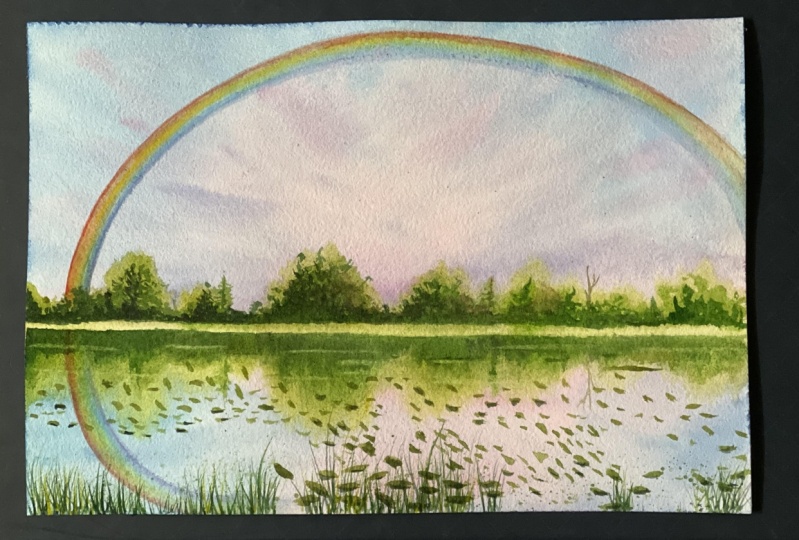
8. Class Project 2 Colours: Welcome to the second
class project, and here's what we
are going to paint. This here, it's the main
rainbow plus its reflection. I know that this looks scary and there's actually a
lot of other elements in the painting because the rainbow is just
a subtle part of it. We have the sky, we have the
reflection and the foliage, which is difficult, but it comes as a part of
the painting, isn't it? Let's have a look at the colors that we need
for this one first. The colors I have used, are bright blue or phthalo blue, violet, quinacridone violet
rose, which is PV19. Then for the foliages I
have used olive green, sap green, dark green, burnt umber, or transparent
brown, Payne's gray. Now for the rainbow, it's the usual
colors that I go to, which is cadmium red, cadmium orange, cadmium yellow. This sap green. But
I'll show you again, sap green, bright
blue, and violet. I've skipped the indigo
because I just feel that the cooler colors need not
be much in the rainbow. The violet and the
blue is, anyway, is going to mix and create that exact shade that
we want. Here you go. These are the colors that I
have used for this painting. If you are ready with
your watercolors, let's go ahead and paint this.
9. Class Project 2: Let us start. I'll be applying water again to both
sides of the paper. This is the front side, let me turn it
towards the backside now and I'll start applying
water to the backside. Like I've already said, if you wish to paint with your
paper taped on the edges, you can go ahead and do that. You don't have to paint in
the same method that I'm following which is to apply water on both sides
of the paper. It's your free will
but like I said, I prefer this method just
because it stays wet longer. I know that you may not
have an acrylic board like this one but you don't
need an acrylic board. I think for these class projects
because I'm painting on a considerably smaller
size that is it's not A4 it's a 10 by 7 inches, I think it might be
okay even if you're using a wooden
board or something, because it would stick
onto the board and I think that paper can stay wet long enough for you to
complete the class project. Don't worry about the acrylic
board, not necessary. I've applied water
to the backside so now I'm going to stick
it by turning it towards the front side and now we'll use water to fix
it firmly onto the board. You can see now the top
edge is absolutely fixed, let's go ahead and repeat
the process all round. If you see some air gaps, make sure you press
it down nicely so that you literally stick
it onto the board. Now that it's stuck
onto the board, I'm going to take my time to
apply water onto the paper. I'll be doing it
multiple times just so that I make sure that it doesn't dry out in between
my painting process. You might also know
that there are so many ways that you can
keep your paper wet longer, each of the strokes
that you apply, they also reinforce the
moisture on the paper. This is not the only
method but it's good to have a great beginning to
our painting, isn't it? I think we're good to
go. I'm just going to go around and wipe the edges, this extra water we do not need. I mean along the edges on
the outside of the paper. I'm just wiping that off
and once you've done that, your hand might have
accidentally touched the edge of the paper so you can go
ahead and apply once more. It's like reinforcing
the moisture but this time do not go
outside of the paper. You can see at the very edge, but not going outside
of the paper. Stay along the inside, so this also helps
just like I said now, if you've accidentally
touched the edge of the paper and the water
has dried out from there. I think that to do. Let's now get to the painting process. We're going to paint
the sky first, so we're going to use a
lot of colors for the sky and we'll start with
a nice blue tone. That's fine too yellow blue but I don't want it
to be this bluish. I want it to be depicting
some more colors in the sky not exactly
the blue part. What I'll do is I'll
dig in a little bit of my violet and I'm going
to mix it into that blue. It's like a violet blue color and that's what I'll start with. I'm going to start at the very edge of my
paper here at the top. Let's go over to
the top all the way there and coming down slowly, we don't need to leave
any gaps or anything. Picking up my blue paint a
bit of violet mixing that in. You can see I've got a
lot of water on my brush and I'm using considerably
wet stroke here. Let me take a bit
more violet now. We're taking some violet
shades now more violet and let's move on to the right side with
a more violet shade. Then I'll go with
some pink shade, so here I'm taking but you can see the colors that I'm using. It's very subtle, I'm not taking a very dark pigment here. The reason is I want everything
to be subtle in the sky. You know why? Because when
you're adding the rainbow, you can't have those dark colors in the sky where your
rainbow isn't even seen. This is why when we're
painting the rainbow, we have to make sure that the colors in the
sky are subtle. We're here, I'm using a nice pink shade and
you can always go ahead, add some nice strokes into
the sky and blend along. Can you see when I blend
it along with the blue, it creates a violet
shade itself? We do not want any
gap in the sky also. Let me take a bit more pink, make sure that it's
nice and watery and give it a bit more shade. More pinkish, towards the
right side and when I add it, it turns into this purple sheet, because we've
already added purple and blue to that area, and just remember it's the sky, so it doesn't have to be
exactly the same as mine. You're just trying
to capture a lot of colors in it, that's it, so here, coming down, let's come up to one by third. That's where the colors
are going to be. Then we pick up a
little bit more blue and maybe a
bit more violet, a bit more blue in the mixture. I want to depict
all those colors. Let it blend in
naturally as it would. That was one by
third of our paper, so what's going to
be at the bottom? You already know what's
ready what's the reflection, which means we've
got to go ahead and paint the same thing
at the bottom, so here I'm going to
take my pink shade and we're going to create that large blob that we created. Going towards the bottom and
filling with the same color. Here, taking the pink and adding the same
blob of color, and just fill it there at
the bottom because we'll add in these colors and
make it look otherwise. Done with the pink, now we've got to bring the other things towards the bottom, so here's my blue and mixing
with violent together. This side is supposed
to be bluish. There is bluish. Now as we come to
the pinkish area, it starts to turn into purple. I need to wash my brush because I can see
if we need more pink there. It's okay, you know
that even if you can't replicate the
exact same thing, the reason is because if it doesn't work
out at the bottom, go ahead and change the topside. It's that simple, isn't it? Then also the foliage that we add a is going to change
the look of the building, so it doesn't have
to be perfect. You just have to try and get
those same colors in there, and even if it's not
exactly the reflection, I think it's fine so blue
and a bit of violent it, for the right side. Think a bit more
violent, isn't it? You've got to have some
nice whitish shades here. Always remember the
rules of reflection, which is basically
if something's done this way as an
incline like this, it's reflection
would be like that, so you can see these
strokes I like that, which means my strokes here are going to be in this direction. It's as simple as that, so we've got my pink
sheets like that there, which means I'll take my pink and try and add
it this way here. I've gotten in a
nice background sky, so now we need to be
creating a foreground, which I need to do in
the wet-on-wet itself. This is why I applied
water to pull the side. But if you're using
the tape method, then you can wait for
this whole thing to dry. Now at this point, if
you've started to dry out, and then once it's
completely dried out, use a large flat brush, apply water to the whole
of the people again, that's how you can
paint the next stage. For me, the paper is still wet, so I'm going to go
ahead and paint. Just spotted a bit of white here. I'm just
going to get rid of it. Now to paint the foliage, I'm going to start with my
nice olive green shade. We already have those colors in the position where
we want the foliage. When this olive green
mixes with those colors, it's not going to be
perfectly olive green, but it's going to get those
stint of the sky intimate, and that's exactly what
we want, isn't it? The one by third position is where I want
my foliage to be. That would be, I think perfectly around the end where my blue is. It may not be the same for
you, but that's all right, but just go for the one by
third position in your paper. That's there for me, and what I am going to do
is I am going to first draw a straight line
and mark that horizon. Of course it wouldn't
be perfect that's okay. Who's going for perfection here. I've got my horizon line. Now I'm going to put
it in those colors and create a nice
foliage effects. First I'll just
create random ones, and then once
everything's dried out, I'll go ahead and add
more to the foliage here. I'm just using my
brush to create various strokes and start
with the olive green first and then add on more
colors on the top of it. More effect here, doing it first the right side, and you can see that at places sometimes using just the tip of my brush, and that's okay. You can just use the
tip of your brush, or you can use the whole brush, or you can use a smaller brush
to create these voltages. Now that you've done that before we paint in
the other colors, let's go [NOISE] ahead and
add in the reflection, so how do we add the reflection? We're going to do the same
thing towards the bottom. Whatever you've added to a stop, just go ahead and do the same
thing towards the bottom. Remember what I said. If indeed, you know, you
create another shape, go ahead and do the
same thing towards the top side, it's that simple. For the deflection, don't
try to make it exact shape. Sometimes these downward
strokes, they're actually good, so try and create downward
stroke like that. But following along
the position, like you've got to create an
arc there but then it's best achieved with that
downward stroke. Can you see that it's
only the downward stroke. But then we've created the
reflection of that one. Same with the next one. It's supposed to
be in that shape. Maybe you can do just
like I did know, you now, create an outline and then go ahead and fill it
with a downward strokes, but don't create the
perfect outline, so here. I've got my reflection in place. Now I need to add in
the darker colors. But before I do that, there's something else
that I need to do. That is I need to
create the point where it's the separation between the reflection
and the foreground, so here, that's my brush. Again, my flat brush, you
can use any brush in fact, and I'm just going
to lift off bit, so I've made this
into a damp brush now because I've taken off
all the excess water, and then you know that
line where we did the horizon we're going
to do that again, but this time we're
going to lift paint off. Can you already see how that
acts like a reflection, although there's no depth to it because we only have a
single color at this moment. But you can clearly
see that depth. You can clearly see how it's a separation between the
reflection and the foreground. We're going to
repeat this because we need to lift the paint. I'm going to stop
halfway through now. I think I'm perfectly
happy with that. Now I'm switching to one of my smallest size brushes and we're going to put
in more colors now. I'm going to take
my sap green now. Then we're going to add that. But don't put exactly need air. We need to give it some dullness because of
the colors in the sky. Why not let's just use the same colors that
we have in the sky. That's my pink and I'm going to mix it slightly into
my green there. That can you see the
saturated itself. Now this color is what
we'll try and add in on the top of the olive green and
try and get some depth. Now, remember, careful
about the place where you just lifted off and if accidentally paint spreads
into that region also, it's absolutely fine
because you can go ahead and lift again. That's the beauty
with watercolors. You can just keep
correcting your mistakes. Once you've got that in place, we're going to add
the reflection. Remember downward strokes. They're adding multiple
colors on the door. Letting you know, we can
add a different tree there. I'm just going to repeat that towards the bottom. I like that. Let's do the same throughout. I know this is supposed to
be just about the rainbow, but then you've got to create those beautiful backlog
for the rainbow. That's why we are going through this difficult
process [LAUGHTER]. I've touch there, I like
that with my brush soon. We need to be walking
fast and also, I think my sky might
dry out faster. We're going to put in our most important
part of the lesson, because we need it
to be on the wet and we can't afford
this guy to dry out. Here I've washed my brush
and I've flattened it. Now we're going to
load our brush with the beautiful colors of
the rainbow. Let's start. I want to start
with my red first. So red goes into the edge. Then the next color, orange. Then the next which is yellow I think I'll add a bit more red because
[LAUGHTER] red is gone from the tip like that. The orange also a bit
in-between. I like that. Then webbed you or it's supposed to be
green next, isn't it? So a bit of green. I'm taking my sap green. Blue I'll skip the indigo it's not necessary I'll just
blend in with the violet. I've got the colors of
the rainbow in my brush. It's supposed to be this way because I want
the red on the top. It's supposed to go
from here to here. Here comes the most
difficult part. I'm just going to do it,
oh my God, that's scary. Also I've just noticed that
my violet, it's not subtle. There's just a lot of violet. I tried at the end
and you can see, so I'm just going to get rid of that heavy-duty
violet from the edge. I'm just using my **** brush again and getting
off the pigment. Now I've got to go and use
the same edge aren't they? Oh my God, that was scary, so do you see what does happen there might be bred already
started to dry out, and that's why it's
done, not like that. Let's not waste any more
time and go ahead and do it. Now, the next thing is the difficult task of
adding the reflection. That's exactly why I
chose this project. We've got to go ahead
and make the reflection. Again red on this side, this is the reflections
has gotten nothing to do with a scattering
of light or anything. It's got nothing to do with how the water
droplets are scattered. It's got to do with the
reflection, how it's going to be. It's exactly the same as this. The red should be on
the bottom side now, as in this is my red and my brush there should
be in this side. The colors are gone so
I need to add it again. I just tried and
getting it's empty. So getting back to it again. That isn't a violet.
I've got the color now. That is my rainbow. Trust me guys, I'm scared. Did I even do it correctly? I don't think I did but anyways, it's not forming into a circle, but that's okay and so that
would have gone like that. Not bad. I admit I'm
not happy with it, but it's all about the
process, isn't it? That's what I
wanted to show you. For now, let's get back
to adding the foliages. You know why there's
a reason why I don't put my foreground in the
exact middle position, even if you want to get
the perfect reflection? That's because when it
comes to paintings, it looks more aesthetic and
good for its composition if the horizon line is the one by third point and not
at the halfway point. That's something that I've
learned along the way, so that's why I never do it
along the halfway point. I'm just picking up a
little bit blue here, and I'm going to try and put it in the middle
there because I can see that it lacks the blue part a bit and there's a lot
of violet in there. I am just going to put in more blue and blend along
in that region. That's much better, isn't it? Then also, there's my paint spreading here so I'm
just going to go ahead and soften the edges
here using my brush. You just need to create
this softened effect. Another thing is, no
matter how much you practice when you're actually putting your strokes
on the paper, you get nervous and scared and especially for me because
I am recording this, so I have this sense
of fear that it has to be perfect, isn't it? I guess it's okay. Just
enjoy the process, that's the best thing
you can do, I guess. Here again, because I had
gotten a bit of harsh edge, as my paper had
started to dry out, I'm just using my smaller
brush to soften out the edges. Don't use a lot of
water because then you'll create even harsh edge and you'll create
the cauliflower off the back or the
background effect, which we did not want. Just be a little
careful, that's it. We've got the rainbow in place, now we've got to go ahead and fill in the
rest of the foreground. The foreground looks so
bad right now, isn't it? Here's my dark green. I'll take a little
bit of my pink and add that and I'm going to
go ahead and keep adding. The edge of the rainbow, that also we need
to cover it up. It needs to look
as if the rainbow is coming from the
inside of the foliage. Just filling in all the
colors in the foliage. It's okay that your foreground towards the top has dried out, but I guess you need it to be
softer towards the bottom. Try and do the vertically
downward strokes, I can see that
it's dried out and I'll show you how
we can fix that. Let me just get towards
the end here on this side. You saw the edge there. I'm
just going to use my brush, a bit of water, not a lot. Do not take a lot of water as to create a lot of backgrounds. But again you see how I've added that right now and
soften that bit there. You can do the same along
all the others, for example, you see I am just adding
here and it's dried out. But then I've washed my brush, got rid of the excess paint, and now when I use my brush
along, I've softened it. Can you see that? I like the way this whole
thing has turned out. I'd like to add something now, so just like a small
branch or something. Here, if I were to add a branch, but I think I should do the
reflection first because the paper is almost dry, so I'll do the reflection first. There, I have done
the reflection. Now I'm free to go ahead
and do the real one. The real one is I've
got a tree like that and then I've got
a branch like that, we've added the reflection. No, we're not done yet. I am just going to pick
up a little bit of brown and mix it with my green to create an even darker
tone and I'm going to add that and you can also
add that towards the bottom. Here at the bottom, it
should be fine because I just added water
and softened it, didn't I? It should be fine. I'm going to repeat the process and go ahead
and create reflections. You can see the
harsh edge there, which I'm going to soften
immediately, can you see? I've got reflections to
create here, haven't I? Also the foliage reflection
there. Yes, here. Let me soften up the edges now. The edge where I said
I'll correct it, I'll just go ahead
with that brush again and try and lift off
the paint from that region. That line there, it doesn't
have to be perfect. That's another thing. Now, again, some darker tones. Here I've mixed my Payne's
gray with my green, so it's a bit more
darker because I really like to give depth for the objects
in my paintings. Again, it's very important
that you have depth. The more darker and lighter colors you
add in your painting, the much better
it's going to look. Also, the deflection
doesn't need to be as dark as the top part. Just going to go ahead and
soften those regions now. Another method for you to soften out these reflection areas would be to apply water to the
whole of the bottom region. Let me show you how we can
correct backgrounds as well. Can you see I've
got a harsh edge forming there because
I used extra water? I'm just going to
run my brush along the edge and move
the background. You'll reach a point
where the backgrounds are no longer there and
where it doesn't look bad. Don't worry about the edge
of the tip right now. Another way is to just literally use a lot of
water, but now can you see? That's where the background is. Just keep adding it to the point where you
don't see it anymore. See? That's gone. I've cleared that area as well. I don't want to clutter
this with a lot of stuff. What we're going to do right now is we are going to finish off with some things
in the water so that we just make this
aesthetically more beautiful. Let's just do that. Here's
what I'm going to be doing. I'm just going to take a
load of my olive green. Here is my olive green. I'll probably mix
in a little bit of sap green to that color. We're going to add in a lot of little things into the water. It's like leaves or something
scattered. Hear me out. When I finish with this, you'll understand what they are. Let's put in a lot. These are leaves in the water. I'm just going to use my hand and soften out the water because remember
we just applied water there. That region is wet. Also, like I said, this is one way that
you can get rid of that edge because it's not going to be visible when you
add these beautiful strokes. Literally, I'm just
using my smaller brush and adding in so many of
these random strokes. That's it. Then perspective. Those ones further
away are smaller, but the ones as it comes
towards the bottom, we'll start adding
bigger ones so that, again, by means of perspective, the viewer gets an
idea of the painting. Let's put in some
darker ones as well. Here I'm loading my brush
with my dark paint. I'm just adding onto the edge of my olive green ones just so that I give a little dimension to it. Also, I think that these
ones further away, it's better depicted when you
do it with a darker color. Go ahead and make in a lot
of those tiny strokes. Then there's another
thing that we can do, just going to use my flat brush, makes sure that it's just damp. I've washed off all the pigment and then
I'm just going to dry my brush and then we're
going to lift off some lines. Some places. Can you see? Just a line, that's literally
enough along that line. Now we'll do it along
another place. See that? Again, that's enough
for that area. Another one there. I think we're good to go. Now, what we'll do is
we'll finish off by adding some little amount of grass
towards that left side. For that here, I'm going to load with dark green and we're going
to add to that left side. Just making that left
side a bit denser. Using the tip of my brush, you can also use a liner
brush if you have. Using the tip of my brush here, some of them can
be literally long, start from the
outside of the paper. See that? Only when you add little details and
things like these, your paintings look
more attractive. I really like it now. Want to add a little darker one. I've just loaded up
my brush with Payne's gray and a mixture of green. I'll make this left
region nice and dense and add bit of olive green as well
for adding these. More than that, I feel a bit of cadmium yellow would
also be helpful because it might mix with that
green and form a nice different shade of green. Yes, see that it's turned
into a slightly lighter tone. That's my cadmium
yellow in the picture. But just using the
tip of my brush. I'm trying to add onto the top of my greens here
so that it mixes with the green and gives
me some nice strokes. Can you see that? Then you can go back with
the green itself. Now I really like how
this one is standout. I promise this is the last step. So I'm just taking some brown. Maybe I'll make it into sepia by mixing in a little
bit of Payne's gray. I'm just going to give
some branch effect to some of these because
it's the foreground. You don't need to add the
same in your reflection. The reflection can be
as subtle as you want. Here some branch effect there. I think I'll darken
out this branch a bit and maybe add some branch effect there. Also maybe now I'll
darken a bit of green and start
adding to the edge. These they don't need to go
into the reflection part. It's absolutely fine. Now, what I'll do is I'm
going to take in a bit of pink and I'm going to put
it there in my painting. You might think this is
weird, but trust me, it's not because you need to have some colors from
this sky being depicted. But can you see, I
just put in a mix of green and pink touch there? Just very subtle
want to I do the same to some of the areas here, see, I've added a
large blob of pink. Then I'll go ahead and soften it and blend it
along with my green. See that? I'm just going to add in a few more of this random
leafy structure. There you go. Now I'll
completely dry this up. Here you go. Here's the final painting. If you want, you can actually paint this in a larger sheet of paper and maybe try and replicate
the rainbow as a whole. But I wouldn't advise against
it because in photographs, it's really good to have those exact opposite
reflections. But I think with watercolors, it's good to have
these subtle elements in your painting
and not just create perfect things because
you want to attract the viewer's eyes to a
certain point in a paper. In here, for me, it's just this little corner
of reflection. That's it. Not even the sky, not
even this main rainbow. This little corner here. So that's that. Here you go. Here's the final painting
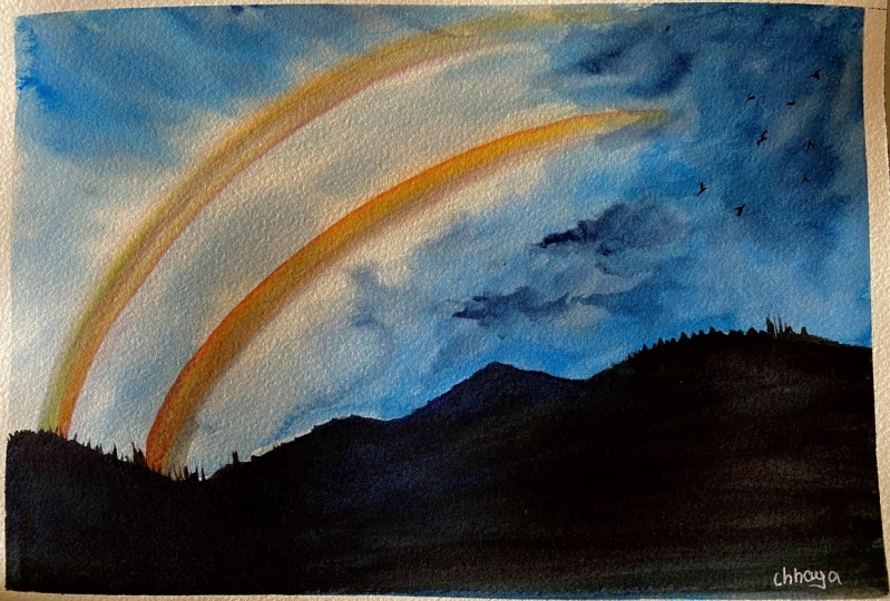
10. Class Project 3 Colours: Welcome to the
third last project, and this is what we
will be painting today. It's a dwell rainbow process. Let's have a look at the colors that I have used for this one. It's quite simple actually
because there aren't a lot of colors
except for the colors of the rainbow obviously. For the sky, I have
used bright blue, indigo, and Payne's gray. Then for the rainbow colors, it obviously the
same as what I had used for the previous
class project, which was cadmium
red, cadmium orange, cadmium yellow, sap green, bright blue, and violet. Here you go. This is the painting that we
are going to be doing. Just remember some facts
about the double rainbow. First of all, the first rainbow will have the warmer colors, which is obviously starting
with the red over the top. But when you have
the second rainbow, the colors are inverted, which means that
the warmer colors should be at the bottom, which is basically
where the red is right now. There you go.
11. Class Project 3: All right, let us start. I'm going to apply water
to the backside as usual. Here's my large brush and I'm going to apply
water to the backside. Now I'm going to turn
my paper towards the front and to get onto my board, and then apply water
to the front side. Now that I've applied water, I'll go ahead and wipe off the excess water
from the edges. Then I'm just going to
use my brush and add towards the inside again just to reinforce the
moisture on the paper. All right, so now this painting is going to be different
from the first. We're going to be in
the rainbow first, and there's a reason for that. You've already seen the painting and you know that the rest of the painting or the sky
part is quite dark. In that case, it's
going to be hard for us to put the
rainbow afterward, which is why we're going to
paint the rainbow at first. Let's get to the rainbow. Here is my brush. I've flattened it out and I've gotten rid
of the excess water. Very important that excess
water has been removed. Now we can start to
transfer the paint. My red at first, going with my cadmium orange, cadmium yellow, green, blue, and violet. When
you pick up the violet, make sure that it's subtle. You don't want a lot of it. Now where should the red be? Red should be at the
top, remember that. My rainbow is somewhere
from here to here. The main rainbow that is, okay. I'm going to add that onto
the paper here right now. Starting somewhere there. I can see that the green and
the colors have not come, but I've put the
position of the rainbow, so I'm quite happy
with that right now. Then I need to create a
second rainbow for this one. I'm going to start right there, and I think we just need to
maintain the same distance. That's what you
need to do. Now you only got very less colors in the brush so
it's okay because we need a lighter rainbow. But you know the case
with lighter rainbows, the second rainbow, the
colors are inverted. Now make sure that the
red is at the bottom. My red is now at the bottom, and I am just going
to follow along. I can see that it didn't
work out properly. But that's okay. I
am just going to go because we
painted it at first. I'm just going to go ahead
and adjust the position. I think that's okay. I know you can see
how it looks bad, but we are going
to correct that. we've got the colors
of the rainbow there. Let's go ahead and
perfect it a bit more. Here, remember subtle
colors always. I'm going to take my orange, and my orange right
next to the red. Then we go for the next color, which is my yellow. But again, remember
subtle colors, and the paper is wet, which aids in the spreading. Then the next color is green, which we already
have a bit here. Then blue, again to make sure
that it's nice and subtle.. Ending with violet. Gave at first your colors have spread out a lot. We can adjust it mainly because we're painting the
rainbow at first, isn't it? Here is my rainbow and
I need to adjust it. Then I've got the other
rainbow to adjust. Now I know the position
of the colors. I start with my red, but now the red
should again be very, very light because it's the
second rainbow, isn't it? Then the orange. I'm just going to go with
whatever is there on my paper and very subtle. Yellow, this is very weird. The mistake, isn't it?
The yellow goes on there. The thing with this
second rainbow is we don't need to complete
it because we're going to be adding
other stuff in there. Just make sure that the beginning
is correct. That's all. Then we got a bit
of the green now. You just need to make
sure that it's correct here along this line. Then what was the next color? Blue. Again, and finishing with the violet. That's a lot of color, so let me lighten the violet up. It's only up until
this point here. Whatever has happened here, we can ignore that. Now we'll go ahead and paint the rest of the painting.
Let's see how we do that. I can see that the paint on my paper has literally
started to dry out. I'm just applying water but I'm not touch any part
of the rainbow. We'll go very close
to the rainbow, but we won't touch the rainbow. All the areas that are
closer to the rainbow, we can do that with our other brush when
we start painting. I'll show you exactly how. We've got our paints,
we got our water ready, and the other areas
that is the areas closer to a rainbow are
not literally wet now. But we're going to start. Here I'm going to start
with my bright blue again, and we're going to put
that into the sky. Using darker colors so
here and going very close. Here again, we're not going to touch the rainbow at this point. I just want to show you.
Can you see it's dried out? This is why I hadn't
applied water to where the rainbow
actually is. This is why. Can you
see the edges are dry? See. But that's okay. I'm going to show you
how we can adjust that. Have your clothe ready, have your brush ready. I'm just taking off
that excess water. Now we're going to go
as close as possible to the rainbow and that region. Can you see? Yes, you could have
done this when you were working with
the large brush. But I just think
this is much easier. What's the top here? Don't worry, I know it's turning green because of that yellow, but we'll apply darker colors. There. Now, let me go very close to where the rainbow
is with my blue. There. I'm just going to include everything and the same thing, I'll do towards this region. It's going to connect
this rainbow. Also the region in between. I know that sometimes, my brushes going
over the rainbow, and re-wetting it,
it's absolutely fine. The colors have already
embedded into the paper. They're not going to
spread away too much. That's the advantage of painting that rainbow first
and then letting it dry. In fact, we could have
also done it that way, that it would be in the rainbow. When it's completely dried out, go ahead and re-applying water onto the paper
and then painting it. That's another method that
you could be in this thing. See. When you re-wet it again, the only thing that happens
is colors blend a bit more and the rainbow turns
out a bit more blended. If that's not positive, what is? Now that I've wet everything, I'm going to go ahead
and maintain nicely. Here taking my yellow-blue here creating some nice strokes, and here in the sky we
want some darker strokes. Don't worry, I'll create
darker colors there. This rainbow is like vanishing
in between the darker sky. The next thing I need is
a bit of Payne's gray, so here is Payne's gray. This region here is supposed
to be nice and white and we have some nice
Payne's gray regions here. I don't want it to follow
along the line of the rainbow. That's why I'm creating some
white gaps along this edge. Now let me make it
a bit more darker. In order to make it darker, I'll pick up indigo. What does my indigo? I'm going to start
and all that dark. Just adding indigo
at random places, especially towards
the right side. I think the edge here, we can make it nice and dark. Along with some of the edge here and maybe some areas here. This is the region, what I said. You get rid of that green color by adding indigo
on the top of it. Now, I want to go ahead and adjust in all parts
of my rainbow. Can you see it's got a
weird shape right there. I'm just going to apply my water and clear it up. Digging a bit. Blue because that's what's
missing from my rainbow. A bit of violet. Also a bit of violet
for the other one. Once you've got the
positioning of the rainbow, then it's easy to get
the things in there. Just reinforcing the
colors on my rainbow, right thing, orange
is literally missing. We do an orange as well. Not the way it has turned out. I just need to put the rainbow
probably along this side and remember that side rainbow, it should be subtle so don't worry about
the edge part here. You just need to
adjust the colors in between because the edge, we'll cover it up with
the mountains anyway. I like how it's turned out, so I'm going to paint
that mountain now. We're going to go
with Payne's gray. You can probably mix in a
little bit of indigo as well and here's what
we're going to do. Your paper might be
dry or wet or it might start to dry out. It's absolutely fine. The mountains are not the
focus so that's why I'm just going ahead and doing these random things and let's get the edge
of the rainbow. Going behind the mountain
and you here I come down. I want to take it one step up and I'm going
to go over like that. Fill it up with Payne's
gray, the foliage part. This part, actually, I wanted to make it
simple because you've already had lots of trouble
with adjusting the sky. The rainbow and the colors, if you went through the
same trouble as I did, so simplifying the foreground. This is just basic Payne's gray. As you can see, some
of my paint here is still wet so it's spread a bit so what
I'm going to do is, I want to completely dry this up and then add in little
bits of foliage. So it's completely dried
out now so I'll just go ahead and refine some of the edges to create
a nice foliage. Here, I'm just taking
my Payne's gray, nice dark Payne's gray and I'm just going to refine
the edge a bit. What I'm going to do is, I'm just creating these
upward strokes at the edges so that looks like
the edge of pine trees. Can you see that? Then you can fill it up and blend
it towards the bottom. When it dries up, it's
not going to be visible. Now that's done. I'm going to move on to the right side where
I want it to soften. But I won't create and
just like the binaries, but I'm just going to create little perforations
like this one, just so that it's not
a softer edge there. Now, let's go ahead and
just fill in the inside, maybe I should have shifted to the larger brush for doing this. This is taking a long time
with my smaller brush. Shall we put in two
little birds as well. So I just picked up [inaudible]
and just going to add it. Like few birds in the sky. So the bird shapes are
basically what I do is, I try to create little
v shapes like that. Can you see that? So just do it in different directions.
Can you see that? Just some bird flying off
in the sky. Here you go. So this is the
finished painting, I think out of the
three class projects, this one is my favorite. I did quiet spend lot of time
adjusting these rainbows, but I still love the
way this turned out. So here you go and I hope you
enjoyed painting the same.
 Geethu Chandramohan, Colourfulmystique - Top Teacher, Artist