Transcripts
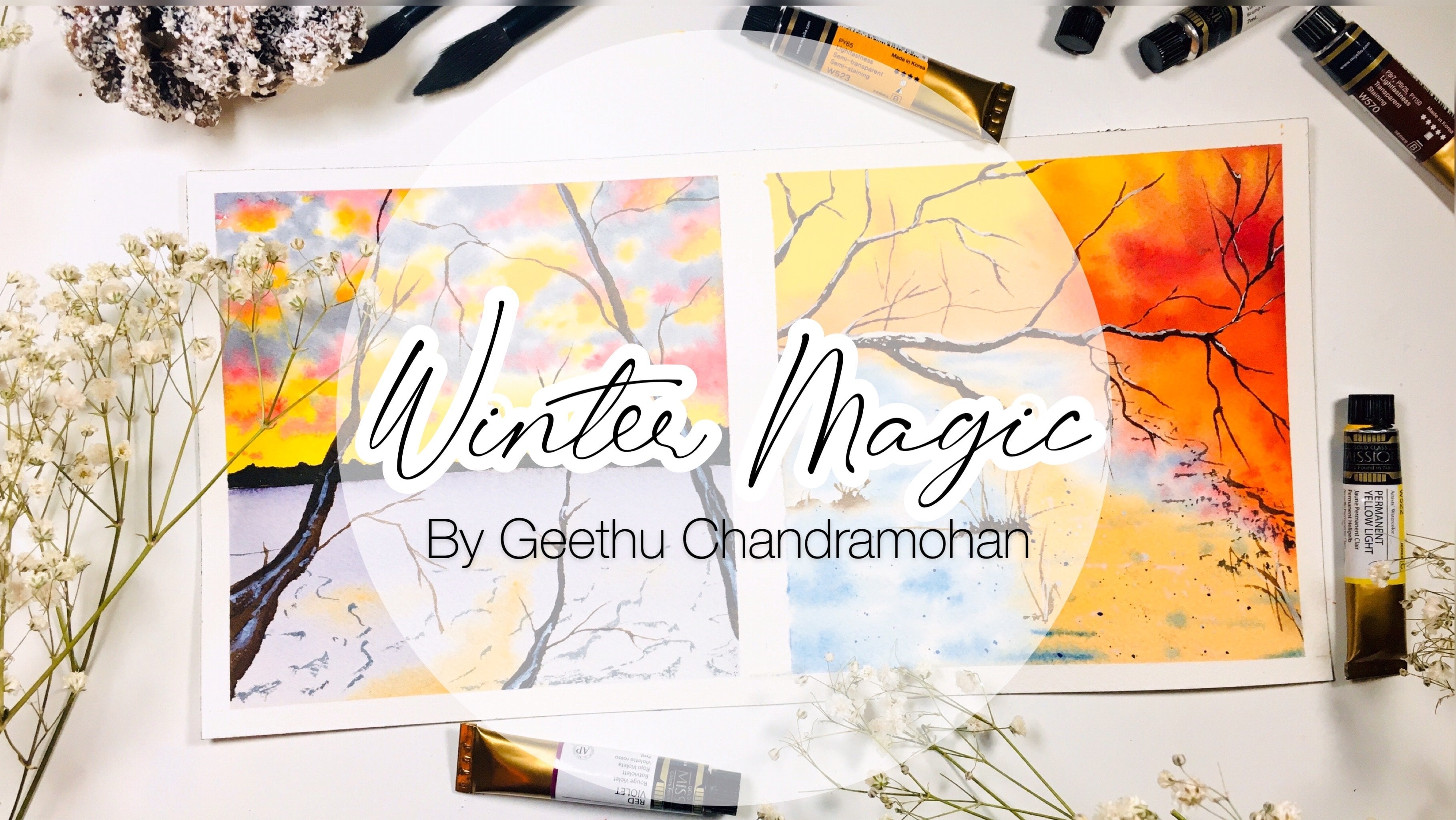
1. Welcome to the Class: Ocean and beaches are two of the magical places
on the planet. I could spend the whole day watching the waves at the beach. But there is one
thing that is more satisfying than that for me. That is painting
them and seeing how my hands can create these
magical places into a painting. Watercolor is one of
the delicate mediums of painting and requires a lot
of practice and patience. But with this beautifully
uncontrollable medium, you can create wonders. Hello friends, I'm Gitu
an aerospace engineer by profession and an artist and
instructor from the heart. One of my favorite
places to visit and attempt my travel sketching
hobby is by the beach, watching the waves
crashing onto the sand. Welcome to this class
on oceans and beaches. First, I will take you through all the watercolor techniques that are needed for painting oceans and beaches
and assure you the importance of different
watercolor papers. Then there are five class
exercises focusing on different ways to paint
both the ocean and the beach during different
times of the day, like sunset and moon, as well as using
different materials. I know that many of you may
not have masking fluid, which is why I have included a whole lesson on the alternative
to using masking fluid. We will learn to paint a vibrant painting of
the beach and the sky while the sun is setting and a gorgeous beach and
sky in the summer. The class projects
include putting into practice all the
techniques and methods from the exercises and
techniques lesson to paint three magnificent paintings that you would cherish forever. First of all, a gorgeous, vibrant sunset beach landscape
where you will get to implement all the techniques
learned in the exercises. This is followed by
the magic beach, which captures the beauty of
two different beaches into one and combines them into
a single magical beach. Lastly, the green ocean
covers a majestic ocean view, covering the Caribbean sea with its bold and vivid greens. These three, class
projects would level up your water coloring skills for painting different
beaches and oceans. It would leave you
confident enough to try out more paintings of oceans and beaches from reference images. Can't you tell by now
that I'm a beach person. This class is
designed for all of you out there who love
the cool ocean breeze, love the sound of
the beach waves and the enormity of the ocean. Join me in this class and
paint your hearts out.
2. Art Supplies You Will Need: Let us discuss all
the art supplies that we will need
for this class. These are the papers that
I'm going to be using. The first one is this
Arches 300 GSM 15 by 30 centimeters paper and it
is 100% percent cotton paper. As you can see it's really
long along the length wise and then another paper is the Saunders Waterford
cold press paper. This is also 100% cotton paper. It's almost exactly
same as artists. It's just that this
is the size I had for the A4 one which is why
I'm using this paper. Thirdly, Chitrapat paper. This is 440 GSM paper,
it's really thick. It is also 100% cotton paper
and it's rough surface. These are the papers
that I will be using, but don't worry
if you don't have the exact same papers
that I'm using. You can join me with whatever
paper that you have, but I will always recommend 100% cotton paper for this
class because there are lots of techniques where you need the paper to stay wet for a longer duration and
then the brushes. These are the brushes. The first one will be this Princeton hockey brush that I will be using for
large washes for the wet-on-wet technique then this size 12 brush from
silver black velvet, or you can use a flat brush
for the large washes. This one is one Jackson's. Then apart from the size 12 brush from the silver
black velvet series, for the bigger
strokes we can have a medium-size brush
like this size 8 eight a smaller size brush such as this size 4 brush and I will also be using
a rigger brush. This rigger brush
is a brush with this longer hairs as you can see and it's got a
really nice pointed tip. But don't worry if you
don't have a rigger brush, you can join me with the
smallest brush you have such as this brass tube brush then
we will need some palettes. I will be using various kinds of pallets such as this
that I'll make one; this one with ceramic wells
and also a plastic palette. I'm using these
different ones because I already have some shades
in it and I do not want to wash it off and base my things then we will
need two jars of water. One clear water for applying for the wet-on-wet technique and the other to wash
off your brushes. You can see how
one has done dark, so we cannot be using this water when we are
using wet-on-wet technique. Watercolor paints. I will be using
watercolor paints from various brands such as Sennelier, White Nights, etc. I be be discussing
the individual colors that we will be using for the various class projects in the respective lessons, so don't worry about whatever shades that we
are going to be using. I prefer Sennelier
and White Nights mostly then I also
have this palette; the Currents palette
from Art Philosophy. I will also be
using this palette, but as I said don't worry if
you don't have this palette because I will discuss the alternate shades
that we can use. Additionally, I have
put this shade. This is Sand Ridge shade from the Woodlands palette
of Art Philosophy. I've added it to this. Most of the shades from the White Nights I
have filled them into bands and I carry them as bands as it is easier for me to
take the paint from them. So these are full bands where I have filled
in the paints, so I will also be using
these full bands. Next, you will need
a ruler, eraser, a pencil masking tape to tape
the edges of your paper. Then these whitewash,
I will be using this color titanium white
from Winsor & Newton. You can also use
white gouache from other brands if you have or you can use your
white watercolors. As you can see I have both
of these from our design, so it doesn't matter
which one you're using then we will also
need masking fluid. This one is a masking
fluid applicator. I will explain in the
next lessons then you will need some old
brushes for using with the masking fluid and
then an old toothbrush. You can even use a
new one if you want, it doesn't really matter. Apart from these we
need tissues as well, but as I said don't worry if you don't have the exact colors. Without any further ado, let's jump in and move
on to the next lesson.
3. Watercolor Techniques Part I: The techniques that we will
learn today are wet-on-wet, wet-on-dry, dry brush technique, wet-on-wet splattering,
wet-on-dry splattering and painting watery boots
using the wet-on-wet method. This lesson on techniques is really important if
you are a beginner, because this will help
you to understand all the different watercolor
techniques and paint along with me in the class
exercises and projects. But if you are an intermediate artist and already know these techniques, then you can skip
these and go to the last exercises
directly if you want. But I would still suggest that you attempt these
techniques at least once before you move on so
that you are familiar and know what to expect from the class exercises
and the class project. I will be showing you most of these techniques on
two types of paper. One on Arches 300 GSM
cold press paper. You can see it's texture here. The other on chitrapat 440 GSM. See the thickness of this one, and it's also rough paper. This rough texture
will come in handy for certain techniques such as
the dry brush technique. You can see how both of these papers are
entirely different. But don't worry if you don't
have either of these papers. Join me in this lesson with whatever materials you
have and familiarize yourself with these watercolor
techniques thoroughly before we move on to
the class exercises. The first technique
that we will learn is the wet-on-wet technique. This one, as its name
suggests, wet-on-wet. The first word wet, refers to the brush and the second word
refers to the paper. It means applying wet paint on the brush to the wet paper. We need to wet the surface
of the paper first. I'm going to load
up my brush with water and applying on the
paper in this square. We have to make sure
that we apply the water evenly and not make
any pools of water. Apply the water on the
whole of the paper on this square or whichever
surface you're practicing on. You can see from
this angle here, the water consistency that
I'm applying onto the paper. Because I'm painting
this on a square, I'm just trying to cover the whole of this
[inaudible] with water. Now I'm going to load my brush with some paint
and going to dab the paper. You can see how the paint spreads because there
is water on the paper. Now I'm going to cover this
whole box with the paint. You can see that covering this large surface area
becomes easy with this method. Just load up your brush
and cover the surface that you have applied with the paint. In my case, it is
this box over here. The paint will look more even
and flat with this method. Now, my paper is still wet, so I can go ahead and apply a second sheet using
the wet-on-wet method. I'm going to apply a
darker shade on top of this one in some
random strokes. You can see how the
paint spreads on the top because
the paper is still wet and creates these nice
shapes in the form of clouds. One thing to make sure is that the water on your brush should be lesser than the
water on the paper. Now, again, I will
show you how we can achieve a perfect blend
using the wet-on-wet method. I'm applying water
in this square, which will help to make the surface wet for achieving
the wet-on-wet method. Then, taking some yellow paint, apply in the swift left and right movement
onto the paper. Next, taking some pink, I'll do the same left and
right motion with the brush. As you reach the yellow, just keep doing it so that they mix well and blend together, but stop around midway. Then load your brush
with yellow again and repeat the
same from the top. This will mix both
the colors evenly and create the perfect
blend that we want. It is these swift left and right movement that
creates the perfect blend. Now, let us have a look at the same techniques on the
rough chitrapat paper. Applying water to
make the paper wet. Apply the water evenly again
on the whole of the surface. Have a closer look at
this angle over here. Then, taking paint on my brush and dabbing
it on the paper. See how it has spread. On this paper, the paint spreads
more than on Arches. This is because, it is
perfect for this method and this paper is handmade while the other is
machine made paper. Now I'm taking a second color
and applying on the top. See how it is spreading. We can actually paint
clouds using this method. This technique is
perfect when we want to mix two colors on
the paper itself. But remember, all these have to be achieved while the
paper is still wet. Moving on to the next square. Applying water again to
show you the blending. In this one, I'm
going to show you a perfect blend of
yellow and green. Blending two colors evenly is one of the most
important techniques in watercolors and needs a lot of practice
to get it right. Keep practicing until you
get the perfect blend. I'm using the same
swift left and right movement to achieve
the perfect blend. First, I'm starting with yellow, this time at the bottom. I'm stopping around
midway to take the next color, which is green. Starting at the top, using the same swift left and right movements to join
the yellow in the middle. Practice this blending
method as much as you can because this is one of the very important
techniques in watercolors. The third technique is
the dry brush technique, and it is a very important
for this whole class. As its name suggest, it means the brush is dry
when we apply on the paper. We load the brush with paint, but we will dab it
on a tissue and dry off all the water
so that it is dry. Then, holding it at
an angle like this, make these brushstrokes
so that we get these texture on the paper. This is mainly because the paint doesn't
get a chance to go into the pores of the paper and only gets covered
on the top part. See how we have attained a very nice texture using
the dry brush method. Now, I'll show you with
a different color, yellow. On the top. Here, I have already made
on the Arches paper first. It is because I
actually forgot to click the record button
while doing this one, but I will show you once more. Dabbing on the tissue
to dry the brush. See how this paper also gives the nice dry brush
stroke on the paper. Remember that this technique is very important for our class, and I usually prefer chitrapat
paper for this method.
4. Watercolor Techniques Part II: Moving on to the
next technique which is wet on wet splattering. As the name suggests, again, we need to have a
wet paper so I'm applying water all
over my surface, which is the paper here. Wet splattering technique, it is always best to cover every other area where you don't want the water splatters, because the splatters where it falls is really
uncontrollable. I'm covering all around
the box with tissue, and then I'm going to use this size 4 brush and I
will load paint onto it. I will hold the brush like this, so holding it using these two fingers while your index finger will be
free to do the tapping. Tap on the brush and you can see the paint
splatter onto the paper. You can see how the
splatter has spread a little because the paper is wet, it is equivalent to touching the tip of the brush with paint, but this way using
the splatter is more random as the paint falls in a way in which we
have no control. Alternatively, you can also do the splattering method
like this by using two brushes and tapping the
brush loaded with paint on top of another so that the
paint falls onto the paper. This method that we
just learned is wet on wet splattering because
my paper surface is wet. Now, I will show the same on
the rough chitrapat paper. First, we have to apply
the water evenly. See this arches paper tests spread because I
kept it at an angle. On this one, I want to
show you how we can achieve this wet-on-wet
painted part. I will paint the
whole box yellow to show how this method
would come in handy. It needn't be just a wet paper, it can also have wet paint, that's what I mean. I have just applied paint
on the wet surface, so it is now still a wet
surface with wet paint. Covering the other areas
with the tissue so that only the box is exposed. Then I will load my
brush with paint, see red on the brush and then
doing the splatters again. Watch how the splatters
spread and also the tapping on the second
brush method here. Now, the next technique is
wet-on-dry splattering. This means that we will be doing the splatters on dry paper. Any dry surface can be
used for this method. I'll cover the other
areas with tissue again and do the splatters. You can see that the
splatters do not spread now. You can do it with another
color if you want. See how the splatters
are turning out. Now, we will do the same
on the chitrapat paper. See how the spatters we did earlier has spread
in this direction. This is because I kept the paper at an
angle while painting on the arches and the
paint spread downwards. But you can actually see
how this method can come in handy when you want to
achieve these textures. Now, after covering
the other areas to expose only the box, we will do the dry splatters. These platters are fairly
the same on both the papers, you can see how it
has turned out. Now, we will move
on to the next one, which is wet on dry method. You must have wondered when I applied paint on
this box earlier, but I wanted to
show you how to do the wet-on-dry method as a top layer on an
already existing paint. This has now completely dried
and the surface is dry. We can take dry paint
and apply on the top. Any stroke that we make will not spread because there is no
water to make it spread. We can also learn some
brush strokes here. Most brushes we see have a
pointed tip shaped like this. Let us use it to
its full potential. See the pointed tip on
both these brushes. We will start with the tip
pointed down like this, and then while you
make the stroke, you can see how the
shapes are formed. Press down the brush starting
from the pointed tip. Keep practicing
these strokes with the brushes and you will fully love how different shapes can be achieved with your
pointed round brushes. On the chitrapat paper, I'm going to show a simple
drawing with the brush. This is just to show you how the wet-on-dry brush technique has different uses and has no effect on how the
surface of the paper is. I'm just making a simple
house and a tree here. Next, we will learn wet on wet ripples for painting water. As its name suggest, because it's wet on wet, I'm applying the whole
box with water again. Then I'm going to paint the whole box with
the low turquoise. Now for painting the ripples, it's the same wet-on-wet method as we learned in the
previous lesson, taking darker shade
on the brush. First, I'm filling the box with lighter tone of
the low turquoise, and then taking a darker shade on the brush to
make these lines. To get the ripples effect, we will use the same
brush stroke that we learned in the
wet-on-dry section. That is, using the pointed
tip and pressing the brush. See here, the paint
spreads in this case, but creating a very
light ripple effect. See how I'm doing
the brush strokes. Now on the tetrapod paper, I'm going to cover
the same whole box with turquoise blue. It's almost the same shade
as the low turquoise. This is turquoise blue
from white knights. I'm just adding wet
paint to the whole of the box so that I
have wet on wet box, as in a wet surface. Then using my thinner brush, I'm starting with thin
lines at the top, and then making the brush
stroke as I move downwards. You can join these
strokes together to get the effect of
ripples in water. Observe how I'm doing using the pointed tip
and then pressing your brush downwards
to create the ripples. Keep practicing this
as much as you can. Next, I want to show you
how we can make thin lines with this brush called
rigor or liner brush. It has a really pointed
tip and long hairs. But don't worry if you
don't have this brush because you can use your
smallest size brush, typically size 1 or 0, like this brush
straw size 0 brush. See the smaller lines I'm going to make with
this brush now. Again, I'm using the pointed tip and because it's a
very thin liner brush, I get these smaller,
thinner lines. This smaller size can also be achieved with the brush
straw smaller size brush. Any smaller size brush would do, all you have to do is
use the pointed tip. For example, I
will show you with my size 4 silver-black
velvet brush. Even though it's size 4, I can make really
thin lines with it by using the pointed tip
pointing downwards. It really doesn't matter, you just need a very
smaller size brush. Lastly, we will learn a new splattering method
using a toothbrush. We need an old or
new toothbrush, whichever you have, to
get very small splatters. First, dip the brush in
water and then make sure to dab it off in a
tissue to almost dry it, then dip it into the paint
from the pan or two, so I've loaded it with paint and then holding the brush
using your thumb, move the bristles
and splatter it. You can see that tiny splatters can be formed with this method
5. Class Exercise 1 - Sunset Beach: Let us start with our
first class exercise. I'm drawing the
horizon line first, then I'm going to apply water
to the whole of the paper. This means that this is
going to be the wet on wet method so we need the
whole surface to be wet. Starting with the top, I'm going to apply water all over the
surface of the paper. Here, I'm going to be applying below the
horizon line as well. That horizon line will
be the line of our sea, towards the top of
it will be the sky, and towards the bottom, the sea. I'm going to start with Indian
yellow and slowly applying them over the wet surface
forming these lines. From the right to the left, and from the left
towards the right. Then we will repeat it
with Quinacridone Rose. Don't worry about
the name you can use a new rose that you want, just it should be a
pink or rose shade. Remember that this is
the sky, a sunset sky. It doesn't really matter
how the color spreads. I'm just randomly
mixing rose and yellow to my sky to give
it the sunset effect. Then using the quin rose, continue painting
the quin rose all the way downwards on the
whole surface of the paper. Wet on wet method
is the easiest to apply paint to a
large surface area. Make sure to apply the paint
while the paper is too wet. I have applied the whole of the bottom part
with the quin rose. You can apply darker
tone on top of each other as long
as the paper is wet. I'm going to darken
the yellows here so that they become
more prominent, and also the same with the
pink in the sky region. Then towards the
top of this sky, we will have to add more
colors of the sunset. Adding in more quin rose. Then towards the top, I'm applying violet paint, on the top part of
the sky to give it more vibrant and
dramatic sunsets colors. You just need to apply
it randomly on top of the pink to get the
contrasting effect. Just remember that the
whole thing is wet on wet and it doesn't
matter how it spreads. All you need to look at is just apply those strokes and don't
worry as to how it spreads. That is how we want
the sky to be. You can see how I'm just mixing all of these colors
together into the sky. Then here at the center, lift off some paint
with your brush so that we get the effect
of sun in the sky. To lift off paint, simply dry your brush
in a tissue first and swipe it on the paper then
dry it again and repeat. Try to form a circular shape
in the sky for the sun. Now, let us take
some violet and add towards the bottom area while
the paper is still wet. Remember, if your paper is not wet and has started to dry, do not work on it again. To add the violet, re-wet the paper after
it has fully dried using a very thin wash of water
and then add in the paint, that's how you can work on multiple layers in case
your paper has dried up. Right below the sun area, we will add some yellow paint to the beach to depict the
reflection of the sun. You can see, I've added some yellow on top of the quin rose, and the mix has turned into a golden orange shade,
but that's alright. Once your paper has fully dried, that is when your first
layer has fully dried, we will work on the
wet on dry layers. We will start with
the sea using violet, so I'm painting along
the horizon line. Towards the further
end of the sea, it will be entirely violet and while we approach
the beach area, we will start to see the waves. Make darker violet
to the further end, and then we will start
to make the strokes for the water as we're coming
towards the near end. Darker at the top and then smaller lines and strokes
as you move downwards. Now we will start to make
the strokes for the water. Do the brushstrokes just like I showed you in the
techniques lesson. These will be the water
ripples that I showed you. Observe how I'm making these
random strokes for the sea. It is entirely wet
on dry method. Paint from the left side and the right side and leave most of the gaps towards the center. This is because the brightest
parts of the painting are in the center due to
the light from the sun, and all the darker tones will be seen on the left
and the right side. You can see I'm starting
to add the wave motion, so make these lines just like
I'm doing in this angle. This is how a wave
will look like. It is probably a wave that's going to crash onto the sand. Then add more darker lines
to the top to increase the contrast between the further and the near end of the sea. You can see how I'm working on those thinner lines
of the ocean, it's just random small
lines and strokes. Towards the beach area, you will be adding
smaller lines. Once it has all dried up, again, we will start to add the highlights with
this white wash paint. This is titanium
white gouache paint from Winsor and Newton. Towards the further
end of the ocean we will add smaller lines to
give the waves effect, that is the waves
that are further away so they will
be smaller lines. See how I'm doing
very thin lines. I'm using my size four brush, which has got a really
nice pointed tip. When near to the beach, I'm increasing the
size of the strokes, make the brush strokes such
that it looks as though the waves are crashing
onto the water again. Observe here, I'm painting such that some part of the wave has crashed while the other is still going to splash
into the water, so thin lines, some at some places and then the
thicker lines at other places. This is what will make it look like the real waves in the sea. Now, we will paint
the beach area. We will mark the line of the beach water on the
sand with the whitewash. You can see, I'm just making some random line at
the bottom here to depict the beach water on
the sandy area of the beach. Then using my rigger brush, I will start to apply smaller lines and the
dry brush technique. Use the smallest brush
that you have and use the tip of the smallest brush to get the thinner
lines that you want. We will apply some thinner
lines and also use the dry brush technique to
get the effect of water form. This is why the techniques
lesson was very important. We will make the
entire beach water on the sand using this method. Once the waves have
crashed onto the beach, they will make form in the water so we're painting
that right now. Add in dry brush strokes in an upward direction to get the effect of the form
and the crushed waves. Observe my upward motion with my brush as I'm doing
the dry brush technique. Keep adding as much as foam
that you want on the water. The more white you add, the more foamy the water looks. That's as simple as how it is. Lastly, we need to add
shadows to the water, so take violet
again and apply to the bottom side of the border
area of the beach water. This will be the shadow
of the water on the sand. Once you have
finished this step, the sunset beach
painting is complete. Hope you all enjoyed
this exercise. I really love this
painting a lot. Obviously, sunset
is one phenomenon preferred by everyone
be it for painting, be it for observing, so I'm sure that you all must love the painting that
you have just created.
6. Class Exercise 2 - Summer Beach: Welcome to the summer
beach exercise. For this, we will again start
with the horizon line at around 1/3 position from
the top of the paper. Then we will draw the shape of the beach towards the bottom. This is all there is for the pencil sketch
of this exercise. Then first we will
start painting the sky. Apply water evenly on the top area above the horizon line for
the wet on wet method. Then, using bright blue, we paint the sky. To give the effect
of small clouds, we will leave some spaces white. As you can see, I've left tiny
gaps of white in between. To achieve this, you can also
use the lifting-off method. Towards the top area, I'm adding some ultramarine blue on top of the bright blue. You can see, I'm
trying to lift off some paint to create
the effect of clouds. Then while the sky dries, we can paint the
beach at the bottom. I'm going to be mixing burnt
umber and yellow ocher together for the sand area. We can quickly paint the beach area using
the wet-on-dry method. I'm using the wet-on-dry method but what we have to
remember is that we have to apply the
next stroke before the previous stroke dries up so that they blend
together effectively. That is how we can achieve wet-on-wet itself but using the wet-on-dry method that is by applying the next
stroke right before the previous stroke dries up so that they blend in perfectly. Make upward strokes
using your brush. And then we will add
a darker tone towards the bottom using burnt
umber like this. We will apply it using
upward strokes like this. Apply darker tone
towards the bottom. I'm using burnt umber here, burned umber, or
any darker brown. Now, to paint the
sea and the beach, remember that both the sky
and the sand region has to be dry otherwise the paint will
seep in from both the sides. Once it is completely dry, we can apply water for
the wet-on-wet method. Also, observe here how I'm
applying the water slightly above the borderline
of the beach and leaving a slight
gap at the border. Always make sure that
we applied water without any blobs of
water at a certain place, or that we do not skip areas
of the paper without water. Remember to leave that
tiny space at the bottom. Then we will start with
indigo at the top. Just like in the sunset
beach towards the top, we will have a darker tone and towards the bottom we
will have a lighter tone. Starting with indigo, we will apply right below the
horizon line with indigo and make it as dark as possible
because this is the further end of the ocean
and it will be really dark. Right below the indigo, we will paint with
turquoise blue. This means that the indigo and the turquoise
blue is going to blend seamlessly together
in the wet-on-wet method. Now, I'm applying turquoise blue all over the area where
I have applied the water You can see here that
because I'm painting in the same sheet that I did
the sunset painting on, I have covered the sunset
painting with the tissue so that I do not accidentally
spill paint or water on it. But if you're painting on a
different one, it's alright. Once you have applied turquoise paint all
over the wet surface, we even start to
add water ripples using a darker tone of indigo. Remember the wet-on-wet
water ripples we learned? We will be using the
same brush stroke to create these ripples. Using the pointed tip and then pressing your
brush downwards. Make these small water ripples using the darker tone indigo. They are totally random
and do not matter how you apply the water ripples. Just try to make them uneven and irregular totally
as per your wish. You can see how I'm
doing the water ripples. Next, of course, we will add the water form and highlights with
white gouache paint. But also note that white gouache paint can
also be used to correct any white areas like I'm doing here to rub off the indigo
that seeped into the sky. We will add the beach border
with this white gouache. Make sure to use
concentrated white paint. As I said, if you do
not have white gouache, you can use concentrated
white watercolors. Titanium white would be
the best choice for this, but you can also use
Chinese white if you want. In case you're
using watercolors, remember to load your brush
fully with white gouache, and you might need to give multiple layers to get
the brightest white. We will apply dry brush strokes
on the beach area to form the water foam or the water
ripples towards the end, towards the beach area. These will be
bubbles and the foam in the water as you
see on the beach. Haven't you seen when
the waves crash onto the sand and they come
towards the sand area, you have these white
spots in them, so that is what we're
painting right now. We will add thinner
lines towards the top using the pointed
tip of your brush. Towards the further
end of the ocean, these depict the smaller
and the far-off waves. We will add in the
dry brush technique. The dry brush technique is the most important part of
painting a beach scene, so we have to master that
before we can paint a beach. The brush has to be really dry to get the dry brush effect. I'm not diluting the
paint with water, hence there is no water
in the paint leading to a dry brush when I
pick up the paint. Keep adding the foam of the beach water to get
the perfect summer beach. You can see I'm doing some upward strokes and the
strokes from left to right. That is how it should be. Once that is done, I'm going to add some
burnt umber to the foam because there needs to be some beach area within the foam. That is some sandy
area within the foam. The whole of the white foam
will not be turquoise blue. That is why we need
some sand area as well. I'm adding it on top of the
gouache so that it will mix with the white and create
a nice blending effect. But we have to add
more foam on top of this later on to give
the effect of the beach. Which is why first
I added the white, but you could also
do this earlier on when you mix and paint
the turquoise blue, but then you need that
sheet where the gouache and the burnt umber has been mixed together which is why I'm
doing it in this way. Once you have added
in the burnt umber, now you can repeat the process of the
dry brush technique. This process will make it
look more like the sand area. Add as much as dry brush
technique as you can. That is as much dry brush
strokes as you can and this is totally dependent on how much you want the beach
waves to be white. I prefer it to have as much
foam as I can add onto it. Enjoy the music and
keep painting along with me here adding
the dry brush strokes. Once you have finished
with the foam, you can move on to painting the thinner waves on the beach. I'm using my rigger brush, so use the thinnest pointed
brush that you have. You can use the tip
of the smallest brush that you have and make these
small lines in the water. You can see I'm adding
it in the shape of small tiny waves towards the near side and towards
the furthest side, it would be thinner lines and very less foam than there is on the near
side of the beach. Once this is done, our painting is complete. Now let us remove the masking tape for
both the paintings. Remember to always peel
off the tape away from the paper to avoid it tearing
off the painted area. Here you go guys. The two paintings; the sunset one and the
summer beach together. I just love both of these.
7. Class Exercise 3 - Beach Top View: Welcome to the beach
painting exercise. For this exercise, I'm
using tetrapod paper. I have taped paper onto my
board on all the four sites. We will start with a
quick pencil sketch. Make two lines shape
like this at the top and also at the bottom
area like this. This is a very quick
pencil sketch. That's all that is. We will start to apply water
on the top area first. Make sure to keep
the area between the two pencil lines clear because we want that
area to be white. Apply the water carefully along the lines of the pencil
sketch on the top line. We will be leaving the
gap in the middle, white as it is because
that will form as the form the ocean or the waves. You can see I'm applying clear water evenly
across my surface. Then we will start painting
wet-on-wet with bright blue. As you can see, I'm
being very careful not to apply paint in the
area between the two lines. Apply bright blue
on the whole area. Then we will add some tiny
strokes of turquoise blue, to give it a mix
of green and blue. This would be at random places. If you don't have
turquoise blue, you can give it a mix of a
tiny tint of green and blue. Always remember to
paint in one direction. You can see I've applied the whole of the area
with bright blue. Now, we want to give it a darker shade and the effect
of depth into our ocean. I'm taking indigo and adding the darker contrast on
the sea to the top area, as well as adding some smaller
strokes at random places. Eventually, they
will mix but try to keep it as
random as possible. Next, we will apply water
again to the second area, leaving the two spaces between the pencil
sketch as white. Here, remember there are two areas that we need
to be careful about. One is the top area, and the other is the
second pencil sketch at the bottom area where we
have to keep it white. These two white areas will
be the waves in the beach. So it is now easier if it
is left white at first, than painting with
gouache later on. I am doing this exercise
because you will understand the different
methods that we can achieve, the waves in the
ocean or the foam. It can be either using
the masking fluid or by using the leaving blank method. That is the one that we're
using here right now. There's one thing I
want to tell you, masking fluid does not work
well with tetrapod paper, it would tear off. That's also another reason why I'm not using masking
fluid with this one, because this is tetrapod paper. Starting with
bright blue, again, we will apply the color
all over the wet surface. I'm using my larger brush, the Size 12 brush from silver black velvet to
cover the larger area. The whole of the
area with bright blue or any other blue
that you have and you can add in a tint of
turquoise blue here and there to give it a mix
of green if you want. Again here, I'm being careful to leave that space white as it is. Once I have applied all the
areas with bright blue, the next step would be
to add the darker tones. Here I'm adding the
darker tone with indigo. We will apply indigo just next to the wave area
for the shadows. If it is a wave, obviously underneath the wave, it will have shadows because it is splashing onto the water, that area is where we're
painting with indigo. We will also add the
darker indigo shade to other random places to depict the darker spots in
the ocean that we see. All of these has to be done
while the paper is still wet. This is why I speak about the importance of 100
percent cotton paper. 100 percent cotton
paper will make the paper remain wet for a
longer duration of time, giving us ambient time to paint with the
wet-on-wet technique. But don't worry if you don't have 100 percent cotton paper, you can still join me with the existing paper
that you have. Just remember to
work a bit faster. Now, we will paint
the beach area. This is also the
wet-on-wet method, so apply the water
whole area again, leaving white-space
for the wave. Once you have applied the water, we will be using yellow
ocher for the beach area. I'm painting the whole
area with yellow ocher. If you have a really basic set and you do not
have yellow ocher, you can also get yellow ocher by mixing a little bit
of brown with yellow. Now, we need to add depth
into the sand area. I'm taking burnt umber
or any brown and we will apply it towards the
bottom part of the sand, that is the yellow ocher area. We will also add it, towards the waves to give
it the sense of depth, that is the shadows. You can see how I'm
giving it a darker tone. Once we've finished
with this and all these layers has
completely dried, we can give the highlights and complete our painting
using our white gouache. I'm going to use the
white gouache paint to remove the pencil marks
here at the wave area. Then using the rigger
brush or thinner brush, make smaller and
thinner lines like these to give the effect
of form in water. The beach when
looked from the top, will have these lines. These are formed in the water, that is when the
waves are crashing the shape of form or bubbles. That's what we need to do. We will be using the dry brush
technique to depict this. Make smaller and thinner
strokes like this at an inclined
brushstroke like this, where the brush is moving upwards away from
the waves so that it seems like the form is coming away from
the crashing wave. You can observe the
dry brush technique at a closer angle here. See how my brush is sliding across the paper applying
the dry brush stroke. This is what we want to achieve. We are applying the dry
brush strokes away from the waves area and we want to apply it all over the
area where we left white, because otherwise it would have a hard edge and it
would look really odd. You can also add some random dry brush strokes
to other places as well, just like I'm doing right now. Always remember that
there shouldn't be any water in the brush
for this technique. You can go back to
the techniques lesson if you need to understand
this method better. But the key thing is to dry
the brush on your tissue after picking up paint and
swiping it onto the paper. Or you can use dry
paint completely and pick up the dry paint on your brush rather than dabbing your brush
onto the tissue. That's what I'm doing. I'm not using any water, but rather I'm dipping my brush into the dry paint
and picking it up so that I get both
dry paint and dry brush. We will do the same with
the wave on the top. I'm going to remove
the pencil marks and add dry brush strokes. Make sure the strokes are in such a way that they are always facing away
from the wave. We will repeat the dry brush
stroke for the whole of the wave area until you're satisfied with the
form in the water. This part requires
a lot of patience, as it is the most
time-consuming. But honestly, I enjoyed a
lot as these strokes are what makes the beach into a beach and what makes
the painting come alive. You can see it
already, can't you? When we're applying those
strokes and the dry brush. It is starting to
look like a beach and the form in the
beach. Isn't it? We will add some
dry brush strokes towards the beach area as well. That is towards the sand area because there would have been some form leftover on the sand even when the beach water
has gone back into the sea. Have you seen this
effect when you go into the beaches and the seawater has
resided back and yet you can see some
foam on the sand? That is what we're trying to do with the dry brush technique. Once you have finished with the dry brush technique
and all the form area, take a very light tone
of turquoise blue or any blue and apply
on top of the gouache, slightly mixing with
it so that it really appears as if the wave is
intertwined with the seawater. You see what I mean? If you
leave it as entirely white, it may not look realistic. So to get a realistic effect, we are adding a very
lighter tone of blue and mixing it
with the gouache. That was the last step. Now the painting is done and
after removing the tapes, see how it has stand out.
8. Class Exercise 4 - Ocean with Masking Fluid: We've been painting
two ocean scapes in this and the next exercise. I have taped down the paper and split it into two as
you can see here. One, we'll be using
masking fluid, and the other without
masking fluid. If you don't have masking fluid, you can follow the
next exercise. I will be using
this masking fluid from Winsor and Newton. I also have this masking
fluid applicator that I bought from Jacksons. This is just an applicator, so you can see it
has a pointed tip and the dispensing is easy, which enables you to apply the masking fluid
easily onto the paper. But today for this exercise, I will not be using this
masking fluid applicator, but rather I will be using this masking fluid and applying
it using these brushes. These are some of my old brushes which I don't use anymore. We can dip the brush into the masking fluid and
apply it onto the paper, just like we apply
paint using a brush. Remember, masking fluid
is a brush killer. That is, it will
destroy your brushes. Never use your main brushes
only unused old ones. As you can see, I've taken the masking fluid in
the cap of the bottle and then I'm using my small old brush to
apply on the paper. We will be making small
random lines with the brush in the shape of
the form in the ocean. It is totally random, so don't be bothered
how you should do it. It's just in some baby-random,
irregular manner. Some random shapes and
lines using the brush. Dip your brush into
the masking fluid and make very random, irregular lines
and small strokes. This is a very
time-consuming process, but don't worry about it. Take it slow. You can see
closely here at this angle. Once you've finished
applying the masking fluid, you have to wait for
the masking fluid to completely dry before
we can start painting. It has completely dried
and I will be using this Taylor turquoise shade from Sennelier for this ocean. First, we need to apply
water all over the surface, that is, the entire
area of the paper. This is why we applied
the masking fluid so that the areas that we need
white will remain white. That is, will be masked
off from the paint. Once you have applied the water, we will start applying
a lighter tone of the Taylor turquoise all over the wet surface using
the wet-on-wet method. Slowly. After that, we will
start to add darker shade. One thing we have to remember is that we always start from the lighter tone
and move towards the darker shade in
case we do any mistake. I'm adding a darker tone
of Taylor turquoise. Darker as it is
still a medium tone, but we will work on
it more and more and add to the
whole of our paper. Wet-on-wet technique is one of the most satisfying techniques. You can see how our paint
seamlessly blend in the paper. It is really satisfying
to work with the wet-on-wet technique and see
the magic of watercolors. I fill the whole area
with Taylor turquoise. Once you have applied the
shade all over the paper, you can start by applying
the darkest tone of the tailored turquoise
at random places. These will be the darker shadows in the ocean and will act as the darker spots that
we see when we're looking at ocean paintings
and ocean photographs. Applying these at random places will be the best way to do it. It is again, totally random. I'm just making it at any place that I want the
darker strokes to be. You can add this totally
as per your wish. You can add darker
and darker tones until you're satisfied. Keep adding darker and darker
tones on top of each other until you get the darkest
tone of the Taylor turquoise. As you can see for
this painting, I have used only a single color, which is the Taylor turquoise. But don't worry if you don't
have Taylor turquoise, you can also use a mix of green and blue
to get this color. If you are a beginner, it is a very good exercise for you because this completely teaches you the
wet-on-wet method and how you can work on multiple
layers on top of each other. While I'm doing
these darkest tones and adding on top
of the wet paper, the most important factor is
that my paper is still wet. Once you have finished it, and after waiting for the
layer to completely dry, we can remove the masking
fluid that we applied. I'm removing it by
rubbing it slowly. I love the process of
removing the masking fluid. Now, after you have removed all of the masking
fluid from the paper, we can add highlights using
the white gouache paint. As I said before, white paint is a key thing when painting the ocean because there is a lot of form in the water that we
need to depict. I'm using my rigger brush here. You can use your
smallest brush to make these thinner lines in an
irregular or random manner. Make these lines such
that they seem to be branching out of
the bigger areas. This part of the
painting is what takes the longest time and
needs our full attention. You can add these
thinner lines by using a mix of the dry brush technique and the wet-on-dry method. Dip your brush into the wet paint and
apply thinner lines. When the brush is
devoid of water, you can add the
dry brush strokes. This is how you can achieve the wet-on-dry and the dry
brush technique together. Keep painting along
with me and add the dry brush strokes to
the white foamy areas. You can also add splatters, lines, and any stroke you want. There is absolutely no rule. Just experiment with
you to yourself and add randomly at wherever
places you wish. Trust me, this is a
really small sheet, so looks odd with
these white areas. But when you start painting
this on a larger sheet, it will totally understand
the difference. I will be showing
you exactly what I mean in the class
projects section, where you have a very beautiful green ocean
waiting for you. But for now, just to learn the techniques we are
painting on a smaller paper. Don't worry about
how it turns out, just keep on painting and enjoy the process rather than being worried about how the
outcome would be. I've added thinner
lines everywhere, smaller, thinner lines, and
also the dry brush strokes. Lastly, you can add
some splatters. Like I said, if you know me, you know how much
I love splatters. Add in the final dry
brush strokes and your ocean scape with the masking fluid
would be complete. There you go friends, our painting is almost complete. This class exercise. I will not be removing the masking tapes
in this exercise, but rather in the
next one because I'm using one single paper to
show you the exercise. After the next one, we will remove the tape and you can see how
it has turned out.
9. Class Exercise 5 - Ocean Without Masking Fluid: This class exercise is the same as the ocean scape with
the masking fluid. But this one is for all
of you out there who don't have a masking fluid and yet wants to paint an ocean. We start by applying water
all over the surface of the paper because we will be starting with the
wet-on-wet technique. Make sure that we cover
all the edges and apply the water evenly on
the surface of the paper. Then we will start by using
the Prussian blue here. Start with the lighter
tone of Prussian blue and move on to applying
a slightly darker tone. Because this is the
wet-on-wet technique, the paint will blend smoothly in the paper and form
the base layer. Once you have covered the whole of the paper
with the lighter tone, we will move on to
the medium tone. It is always better to
start with lighter tones and move on to the medium
tones or the darkest tones. As you can see, I've picked
up the medium tone of Prussian blue and I'm
applying all over the paper. This one is fairly easy because we are covering the
whole of the paper with the same exact colors so
there is no blending or no big drama here
between the colors. It's just one single color all over the painting where you
have applied the water. Applying the water evenly is
what is most important here. Once you have applied
water evenly, we will start applying this single Prussian blue
color all over the water area. You can see how I'm
trying to achieve an even tone throughout my
paper using the Prussian blue. Once you have
covered the whole of the paper with the
Prussian blue, then slowly you can add the darkest tone of
the Prussian blue on top of it so you
can use indigo also. You can use a mix of indigo and the Prussian
blue on top of it. These will form
the darkest spots on the ocean as seen from above, and the shadow areas. Adding the contrast will
give it a feeling of depth and make it
become more real. You can see how I'm applying
the darkest tone at random places to get this
effect of depth in my painting. If your Prussian blue or indigo is not giving
the darkest shade, you want to get, you can mix a very little black with it to get
the darker shade. That is, mix a little
bit of black with the darkest shade of
the brush in blue or indigo to get the darker
shade that you want. Remember, I'm
applying it totally random and it's your choice as to how you want to apply it. Don't be worried in this
step that you have to apply the paint at exactly at those
places where I am doing it. Once you have
finished with this, we have to wait for this
whole thing to dry to add the highlights and the form
in the water remember that. While the paper is wet, add in as much darker tones
as you can at random places. Now, it has all dried
up and I'm going to use white gouache paint to add
the highlights and the foam. Using a small brush, I'm using my size 4 brush
from silver black velvet. I'm going to add thinner
lines like these, and small shapes, like in
an irregular random manner. These will be the water
foam in the ocean, the foam or the
bubbles in the water. Have you seen the
ocean pictures from the top when you can see it has a spray look
or a foamy look? That's what we're trying to
paint into our ocean now. They are simply irregular
strokes that will make the ocean come alive and look
like a foamy mass of water. For those of you who watched
the masking fluid lesson, this part is exactly
the same where we apply the masking fluid and masked the whole areas to
get the foamy effect. Here, it's the entire
opposite method where we are adding the foam and
the highlights at the end. This exercise is of utmost importance if you
do not have masking fluid. Because for the class project that we will be doing later on, there is the need
for masking fluid. Remember that if you
don't have masking fluid, you can still go through
with that class project because the areas
where we applied the masking fluid
will be the areas that you will be adding
in using your white wash. Go through this exercise and you will understand how we can add those white highlights and foam using your white paint. If you ask me, I
prefer both ways, and not any one method is actually not better
than the other. Because both the
process of applying the masking fluid and adding these highlights
are fairly similar. The masking fluid just makes it easier because you would be applying the masking
fluid and then peeling it off and you already
have a white area. Whereas with white gouache, you're applying the
same thing on top of an existing paint and
because of the pigment, you might have to add
in multiple layers. That's the only thing difference between these two methods. Like I said, sometimes you might need to add in
multiple layers of white on top of each other to get the color at the
consistency that you want. This is especially needed
when you don't have white wash paint and are
using white watercolors, gouache is more opaque and would stand out more
than watercolor paint. But even with gouache, I'm having to add
multiple layers to get the white that
I want it to be. This is because the Prussian
blue that we applied underneath is a
very darker shade and a highly pigmented color. Applying white on top of this
dark pink-bended color is really a harder task and we might need to apply
multiple layers. I'm adding some splatters now. You can see I've added in some splatters and
then I'm switching to my rigger brush here to get the thinner foamy
lines in the ocean. Add in those thinner lines at random places in a
totally random manner, and then you can also add dry
brush strokes if you want with this rigger brush or the smallest size
brush that you have, observe how I'm just
making thinner lines and try to join them with
the larger foamy area. All of these strokes is what gives life to our
ocean painting. You can already see how some of the foamy
areas look real. If you want, you can add more or you can stop at this stage. It totally depends on how much foam you want on the paper. I always have this tendency
to overwork on my paintings, especially with ocean paintings, I just keep adding more
and more white areas. Sometimes I don't even
realize the time and just go on painting and painting. See, this is what exactly
I was talking about. I'm just not getting enough
of those small branches. I'm just going on adding them, and even with the
dry brush strokes. I'm adding in more
dry brush strokes and adding in more foam. The dry brush stroke is really helpful because it helps to achieve more foamy effect than those wet on
dry brush strokes. Those shapes that we did, dry brush stroke is much better
than that because it will look as if it is
forming water sprays. In all those areas where I
applied the wet-on-dry method, I'm adding in some
dry brush stroke so that the foam comes
and looks real. Keep adding as much
highlight as you want. Once we are done, I'm going to remove the
masking tape around it. Here's the final look at both our ocean scapes,
dark view paintings. Honestly, I like the one on the right because it
is more realistic. The masking fluid
one would have been better on a larger
sheet of paper, and you can see exactly what I'm talking about in the
project section. Here you go. One using masking fluid and the other
without masking fluid
10. Class Project 1 - The Sunset Beach: This is going to be our
first-class project. I will be working on this 15 by 30 centimeters
paper from arches. It is 300 GSM,
100% cotton paper. If you don't have this paper, you can join me with
whatever paper you have. The painting is going to
be in the landscape mode. With whatever paper you have, you can join me for
this class project. I've taped down all four
edges of the paper. We will first start with the
pencil sketch using a ruler, make the horizon line at roughly about one
half of the paper, then with a pencil take
your time and draw these shapes to form
the beach area. We will first start
with the sky, so apply water all over the top area above
the horizon line. Just like we did
in the exercises, make sure to apply
the water evenly. I will start with
bright blue and start applying from the top using
the wet-on-wet method. Slowly, we will apply the
wet paint onto the paper, and we will blend it nicely into the water
using your brush. We need a perfect blend here, which is why we're
blending with our brush. Then we will start with Indian yellow and add it to the whole of
the rest of the sky. But remember to leave a slight gap between
the blue and yellow. Otherwise, these colors
will end up mixing together and form
green in the sky, so we don't want that. Then on the top of
this Indian yellow, we will add a darker
yellow on top of it, like Indian gold or
quinacridone gold to get the golden sky shade on
top of the Indian yellow. You can see I'm applying
from the left side and the right side and
towards the center, I'm making smaller lines. Then next we will take
Indian red and apply it on top of these yellow to get
the red shade in the sky. You need to work on this
while the paper is still wet. Make sure you work faster
when applying the colors. I'm adding in the red
shade from the left and the right side and
towards the horizon line, so just above the horizon line. You can see I'm adding just some random strokes
using the Indian red. Because my paper is still wet, it is blending it nicely on top of the Indian yellow
and the Indian gold. After this, we will add
some darker clouds. For those I'm using Payne's
gray and add them in the gap between the blue and
yellow that we left behind. Apply them randomly such that they form clouds in the sky. You can see I'm
just dabbing onto my paper in smaller strokes. Then towards the bottom
of the Payne's gray, I'm adding burnt umber and
also a mix of Indian gold, so that the Payne's gray and yellow will
have an even mix. If we do not add
this burnt umber, the Payne's gray will look
odd along with the yellow. I'm mixing them together so that my Indian yellow and Payne's
gray blend together. We will also add some tiny
clouds with our Indian gold. You can also add
them using Indian red or the burnt umber. We just need to have some
darker clouds in the sky. That's what we did. After completing the sky, we can paint the sea. I'm going to apply water again for the wet on wet technique. Make sure you apply
the water all over the sea area
and the beach area. We have to apply
the water evenly. Then here to get a darker
green shade of the sea, I'm going to mix Turkish
blue and burnt umber. You can also directly use
Viridian green for this. See the shade that I made. But I'm just mixing the same instead of using
Viridian green. I will tell you why in a moment. We will start applying
the same towards the further and of the sea
along the horizon line. We have to be very careful that we do not spill over
to the sky region. Apply darker tones
towards the further end, and we will make
it lighter as we approach the beach area. Observe I'm adding
darker tones towards the further end and coming lighter as I come
towards the beach. Make it as dark as possible
in the further end. You can add multiple golds
over the paint if you want. Then towards the
middle we will add burnt umber because
this is where the transition
between the sea and the beach is going to
happen in this painting. The burnt umber will
need to blend in smoothly with the turquoise
blue and burnt umber mix. This is the main reason
why I made Viridian green by mixing turquoise
blue and burnt umber. Because when I'm
adding burnt umber, it will blend in
perfectly as the mix already has burnt umber
as an underlying color. We need to add some
yellow paint onto the area below the burnt umber because we will add a
sun later on in the sky. I need the reflection of
the sun on the beach area, which is why I added some
yellow onto that area. Then the rest of the beach area, we will paint with burnt umber and blending smoothly
with the green. Since I feel that I need to darken a bit more near
the horizon line, I'm adding a darker tone
on top of the green again. Then using the same green, we will add in some
random water ripples. They will be more
towards the near side. As you go further away, it will be smaller. Remember the water ripples that we learned in the
techniques lesson. Make small, tiny strokes
here at random places. Towards the further end, it will be very lighter
tone and also very thin. Use a smaller size brush for
this purpose and remember, your paper has to be
absolutely wet for this. Then I'm adding more of Indian yellow for the
reflection of the sun, which we will paint later on in the center like
I'm doing here, and blend them smoothly with the burnt umber because we
do not want it standing out. Next, we will paint the beach sand area while waiting for the sea
region to dry completely. I'm using Indian gold
to paint the beach. Paint the whole area completely with Indian
gold or quinacridone gold, or even you can use yellow ocher if you do not have
either of these colors. Observe the slight
white gap that I'm leaving between the
beach, water, and sand. Now, we will need to add in darker tones and shadows to give the sand the
feeling of depth. I'm adding in burnt umber on top of the Indian gold
in the bottom area. Then we also need to give the beach water a
sense of depth, which is achieved
by adding shadows. We will add burnt
umber or sepia to the areas below the whitespace
that we left behind. But remember, these are shadows, so it can only be
in one direction. I'm going to paint all
areas which are horizontal as the sunlight is coming from the further
horizontal plane. It will seawater part that
lie in the horizontal plane, we will add in the darker
brown or burnt umber. Now finally, it is the time for the white highlights and
the beach and the foam. This is what will make a beach painting
look like a beach. I'm going to use
my white gouache again to add in the highlights. This is Titanium white
gouache, remember that. But if you don't
have white gouache, like I said, you can
use your watercolors. You just need to have a
very concentrated amount of paint on your brush to achieve the consistency like gouache. The area surrounding the beach, that is the separation between
the sand and the water, this is foam in the water, so we are going to add
that with white gouache. I'm just painting along
the lines of the border of the water right now and
adding white gouache paint. You can see that I'm having
to add multiple codes over on top of each other so that I get the desired
white that I want. You might also want to add in multiple layers to get
it to be really white. Keep adding those
white highlights and making the border of
the water come alive. As I said before, this is really time-consuming, but this is what actually makes
your painting come alive. That is the final
white highlights. White paint is really necessary when you're
painting beach or the oceans because there
is foam in the water, or you can call
it water bubbles. Those has to be painted
and we would need white. That is what I'm doing. Then, using a
smaller size brush, we will add in some
lines into the water. These can be totally random. Just use the tip of the brush and the different brush
strokes that we learned, we will add in lines
into the beach area. This will be the
foam in the water. This painting is what we see the beach from a very low angle. It is by the horizon line is
above the half of the paper. Since we are seeing it
at a very low angle, it will be one point perspective
where even the foam in the water will be trying to converge into a
point in the center. This is the reason
why we have to paint the white
foam in this angle. From the left, all of
those strokes will be at an angle
towards the right, and on the right side, all of them will be towards
an angle in the left side as if converging at a point
in the center of the paper. This is what we call as
one-point perspective. Adding as much white foam
as you can into the water using random brush strokes in the direction such that
it converges at a point, and you can already see how the beach painting
is coming alive. Adding as much as you can, add in the dry brush
technique strokes. Remember, for the
dry brush technique, you have to take paint on your brush and dry
it completely. But if your brush
is already dry, you just need to dip your brush into the paint and pick it up and swipe onto the paper to get the
dry brush technique, which is what I'm
doing right now. My brush is dry, I'm not filling it with water, or I'm not dipping
it into water. Keep adding the dry brush
technique to add in as much foam as you
can into the seawater. I'm speeding up the video
slightly over here. This is because the
process of applying the foam into the water
is fairly repetitive, and we have already
learned it in the various exercises and also previously in this
class project itself. Just keep applying this
random foam into the water. I have increased the speed
of this video to times four. But in case you want to slow it down and watch the
whole process again, you can use the
settings option in Skillshare at the bottom
where you can click on it and set the
speed to 0.5 so you can reduce it down by times two. But this process is
really repetitive, which is why I have
sped up the video. All you have to do is bring out the foam in the water by
using the white paint, by using your dry
brush technique, and applying these strokes. Remember, all of these
drops has to be such that they converge to
a point in the center, that is one point perspective. Now, here we will
add in the sun, just like I said. Using your white paint
or white gouache, add in a tiny dot in the sky. Then now we need
more reflection of the sun in the viridian
green or the green mix. I have mixed a bit of yellow with the
white gouache paint. You can use a mix of a few white and yellow and just apply these small strokes into the viridian green such that
they form a reflection, and we will just
blend it on top of the viridian green so that
they do not look odd. Now, onto the last
age of our painting, we will add some
darker highlights with the same
viridian green mix. This is [inaudible] is blue
and burnt umber mix again, and I'm adding some
smaller lines to depict the darker lines
on the beach area. I'm using my thinner brush. Our painting is
finally complete, and we can remove the tape
and see how it turned out
11. Class Project 2 - The Magic Beach Part I: Welcome to the second
class project. In this class project, we will be using this
Currents palette from Art Philosophical. This palette is perfect for painting the
ocean and the beach. Look at these swatches here. I made them into the
shape of the waves, and these are the colors have been built
within the palette. But don't worry if you
don't have this palette because we can always use the other greens and
blues that we have. I will be telling you the alternate colors
that we can use, so don't worry, if you
don't have this palette. The other colors that
we're going to be needing is this Indian yellow from Sennelier and this
Sand Ridge color from the Woodlands palette, again from Art Philosophical. Don't worry if you
don't have it. This is the Woodlands palette and the Sand Ridge
belongs to this one. Then the additional
colors that we will require are: sap green, any dark green and olive green. I have filled the sap green
and the green and the olive green into
these full pans here, so I will be using them instead of it being
from the tubes because I've already filled
it in, then burnt umber. That's all the colors
that we're going to use. Next, let us start with
our pencil sketch. First of all, we will
sketch the beach area. This is going to be a really fun class project
where I have combined two different oceans in one painting so that we can have some fun
painting with it. Just draw the shape of the
beach randomly as you wish, and just add some lines at the bottom of the right
one to add green foliage. We will add some green
bushes in the beach, and also mark another line
towards the top area. This is where the form will be. We will be painting with
the wet-on-wet method, so you can use a
larger size brush to wet the paper in
case you have it. I'm using this
Princeton hockey brush. It is mainly because when
you use a larger brush, you can have it apply
water over a larger area. When you use a smaller brush, obviously it will
take a longer time. This is the main reason why I switched larger brush for applying water in larger areas, so the area of the water
is very large here, which is why I'm applying using the
Princeton hockey brush. But don't worry if
you don't have it, you can use the larger
size brush to apply water. Apply water evenly
all over the area. Then I'm using the
color called seaside, so this one would be any
lighter tone of blue. You can use bright blue or turquoise blue
blue Mijello Mission. Use a very light
blue for the ocean, and we will be painting
the one on the right side, and it can go over
to the left side. As I said, this is going to be a really fun class project where I'm blending into
different ocean, which is why I have separated
it out in the center. But it's going to be
still forming blend. The first color was
seaside or bright blue, then the next color
would be Caribbean Sea, and on top of that, we will add the color
called Turkish sea, that would be a darker tone of viridian green or a mix of viridian green and
Hooker's green. You can also add some algae
or olive green here to the mix so that we get a wide variety of
colors into our ocean. This color is now Hooker's green and then adding more of
the Caribbean Sea color, so that would be viridian green, and blend it along with the seaside or the
bright blue color. I love the names in the Art Philosophical
Currents palette. It's just really so
much interesting. They call seaside, blue whale, Caribbean sea,
Turkish sea, algae. It's really amazing palette, and it's a must-have if you want to continue
painting oceans. But don't worry if
you don't have it. Like I said, you can have
all these colors and use alternate once instead
of these exact same palette. For example, as I said, the Turkish sea color is the mix of viridian green
and Hooker's green, Caribbean sea is viridian green, algae is olive green. There are always
alternate colors if you don't have the
exact same color, so don't worry about it. Right Right, I'm blending
in both the greens and the blues together using
the wet-on-wet technique, and I'm adding darker tones into the green
part of the ocean. You can add more dark
green on top of it, and here I'm going to be using the blue whale color or the deep sea color,
whichever you want. That would be
equivalent to indigo, as you can see how the
shade has done that, so it is a very darker blue, so you can use indigo for this. Apply the darker tones, the darker shades in
the ocean on top. I'm just applying them
randomly onto the wet paper. Add some small spots
here and there as well, and now we want to
blend it on top of the green using the same indigo
or the blue whale color, you can add on top
of the green to give the darker shadows to
the green areas as well, and it will blend and mix together with the
green to form an even darker green that is the
property of the indigo pigment. Keep adding the
darker tones to give the darkest depths of the ocean. I prefer some areas
to be very dark, so I keep adding more
darker paint onto the top so that I get the
darkest tone possible. Because the paper is wet, there is a tendency for it to blend out and it
becomes lighter. You might want to add darker tones on to the
top as much as you can. But remember, so long
as the paper is wet, when it is dry, we should not add
more darker tones because that would create
darker edges in the paper. Also, most importantly, note that while I was painting
the blue and the green, I had left a tiny space, whitespace at the bottom
part of the ocean. This is because I wanted
to blend in the sand area, and this is where I'm using the color called
a Sand Ridge from the Woodlands palette to paint and blend in the
sand and the beach. That is the sand and
the sea together. But as I said, don't worry if
you don't have this color, you can always go for a mix of yellow ocher and burnt
umber to get this color, so blend in the Sand
Ridge or the mix of yellow ocher and burnt
umber to the sea, greens and blues, and then you can
paint the rest of the beach area that is a
sand area with yellow ocher. In case you're using yellow
ocher and burnt umber, the beach area would
be first a mix of it, and then towards
the bottom area, you can use yellow ocher. Blend them together nicely. You can also use wet-on-wet
method for this. I'm just going with
the wet-on-dry method, but I'm making sure that I blend it together with
my previous stroke. All this is possible
because this is 100 percent cotton paper. This is the Tetra Pak
paper that I showed you in the techniques lesson. The Tetra Pak paper stays
wet for a longer duration of time and you can work
on it more and more, which is why I prefer
this paper a lot while painting oceans and for
blending techniques. As you can see, I'm
blending on top of my previous strokes
with yellow ocher here. The part at the bottom is where we will add some green foliage, so until that green
foliage area, we will apply the
yellow ocher paint. Then, once we're
done with it now, we will blend in the sap green along
with the yellow ocher. Painting for painting
the foliage, it is better if you have multiple versions of
green mixed together, which makes it looks like having a depth and some foliage effect. Which is why I'm blending it
together with the sap green, olive green, and the dark green. Mix all of them together. See, for example,
if we had painted the whole thing with
just one color, we would not get
that foliage effect. This is why I'm using
different colors. The three colors that
I'm going to be using, are olive green, sap green, and green, the green
shade is a darker one. First I used the sap green and the olive green
mixed together, so you can already see
how we are getting a slight texture because
there is a mix of two colors, and then on the top, I'm applying the
darker green to get an even more depth in the
foliage or in the bush area. There I'm applying
random strokes into the bush area at the bottom to get the nice bushy effect
and make it look like real. In case you want it to
make it more darker, you can use indigo
on top of the green, which will make the green turn into an even darker green, or if you don't have it, you can also use a black on top of the green that would
make it more darker. Then I'm switching
to my smaller brush, and I'm going to do some
wet-on-wet splatters. Remember we learned the
wet-on-wet splatters in the techniques lesson, so the sand area is still wet, and I'm going to do some
splatters with burnt umber. Because it is
wet-on-wet splatters, it will spread and create these nice texture
on the beach area. I'm covering the rest of the area with the
hues so that they do not spread to my seawater, and I've added in
this splatters. You can add as much
splatters as you want and they would
just blend in together and form the nice wet-on-wet
splatters that we learned. Now, we will add the final
form in the next lesson.
12. Class Project 2 - The Magic Beach Part II: We will have to wait for
the whole painting to dry before we move on to
adding the white form. I will be using
these two brushes. This is size 4 brush, and this is the
rigger brush that I was talking about in
the exercise lessons. First, using the rigger brush and the titanium white gouache, I will be drawing the
lines of the beach. Remember, if you don't have
the titanium white gouache, you can use a darker tone of the white watercolors that
you have, so don't worry. Now, this will be the
border line of our beach. Remember to make it onto
the sand area because the beach water would have formed and flowed on
to the beach area. This is why we have to include the beach sand area as well. Once we have done the
outline of the beach area, we can move on to adding the further details and adding
the form into the water. Even with my gouache paint, I'm having to add
multiple layers to get the desired white. Then we will add more
waves in the water. This will be the second
wave in our beach view. This will be further
in towards the sea. This is the line that
we drew in the center. It might have gone off
with the paint on the DOM, so you don't have to worry about the pencil sketch
that we have made. You can just randomly draw the second line using
your white paint. Then we will start to add the highlights using
the white paint. We will be using the
dry brush technique. Remember, dry brush technique is where your brush is really dry and you're
having paint on it. When you apply onto the paper, you will get paint
at random places, as in as paint
spots, tiny spots. This is because your brush is dry and also your paper is dry. The paint will not get into
the pores of the paper and will form as tiny dots. This is what dry
brush technique is. Now, I'm switching to my size
4 brush and I'm going to repeat the dry
brush technique to paint the whole of
the beach area. Keep applying the dry
brush stroke technique onto the whole area of the beach so that we get the effect of the beach
water on the sand, that is the form or
the waves that are formed as they
approach the sand. As I said before, this process is the most
time-consuming one, but it is also the
most satisfactory. I really love the
dry brush technique. It is one of my
favorite techniques. Remember that we have to apply the dry brush stroke
towards the top area, that is facing upwards, so make the brush stroke upwards so that they
are towards the ocean. That is what we
have to take care. They always will be facing
towards the sea area, so if it is at an angle, we will have it at an angle just like we did
in the exercise. In this class project, the ocean is towards the top and the sand is at the bottom, which is why we did
it facing upwards. Now, we will paint the
form in the middle. That is the wave
breaking in the middle. For that, again, l'm applying the white paint on the
area where I marked. Here you can apply
concentrated paint using the wet on dry method. Then from that area, you will again do the dry brush technique
to give it the effect of the waves breaking
as they form. I have increased the speed
of the video slightly over here because
as you can see, the process is exactly similar
to what we have learned in the techniques lesson
and also in the exercises. The only thing to remember is that all of these
dry brush strokes, we have to be doing it
in the upward direction. Keep adding as much as dry
brush strokes as you can, and your beach will turn out
to be beautiful as it can. In both sides of the ocean that is on the
green part and the blue part, we need to be adding
the dry brush strokes. The speed of the video
here is times four, so in case you want to
paint along with me and want to slow down
the speed of the video, you can do so from the
options in Skillshare. At the bottom you can
see the settings icon, and if you click on that, you will see that you can
set the speed to 0.51 or even you can increase
the speed if you want to see this faster. Just keep adding the
dry brush strokes. As you can see, I'm painting
on the left side as well, where I have added
in the wave and we will also apply the
dry brush strokes at totally random places. Only towards the wave we need the dry brush stroke to have
some more bright white, which is why we will use a
bit more multiple layers. As you can see, I'm adding multiple layers of dry brush
strokes to the beach area. This is because
we want that area to have more form than
the rest of the areas, which is why I keep applying
more and more white, because the white that I apply seems to get dull as it dries, so add in as much
layers as you want. Now, I have switched to my
rigger brush and I'm going to add some tiny
lines into my ocean. This will again be the form, but in the form of lines. For this, if you don't
have the rigger brush, you can use the smallest
size brush you have, and using the tip you can
make the thinner lines. I'm also adding some
dry brush strokes with my rigger brush as well. You can also add in
splatters if you want. Anything that you
want to add in, you can add in using the white. Now you can see our painting is complete and we go into
the most satisfying part, which is removing
the masking tape. See how beautiful
it has turned out. I just love this because even though it's
a continuous painting, we have two different
colors of ocean here. As I said, I felt that it
lacks a bit of splatters, and if you know me, I love splatters, so I'm just adding them here. See this guys, I just
love it so much. The texture on the sand, the green bushes, and
the multicolored ocean.
13. Class Project 3 - The Green Ocean: Welcome to the next
class project. For this class project, I will be using this paper
from Saunders Waterford. It is exactly same
as Arches paper and just to be 100
GSM cold pressed. The paints I will be using the Currents palette from
Art Philosophy again. I have already shown this
in the exercise lesson. The brushes that we will use are the silver black velvet
size 12,4 and 8, along with the masking fluid, which I have filled into the
masking fluid applicator, just like I showed in the
masking fluid lesson. For the ocean here, I will be applying
the masking fluid in random shapes like this. But I want a larger foam in
the center of the painting. Which is why first I'm creating the border and then
I'm going to fill it up with masking fluid randomly such that there
are slight gaps in between. The speed of the
video is times two. Because this was a
really large painting and the masking fluid
process is fairly the repetitive one
and it's exactly same as we learned in the
exercise lesson. We will apply the masking
fluid in the center, just like I'm doing. In this one, the
foam is going to be in the center of the ocean. So we will just apply and fill
the board that we created. We will also apply
the masking fluid at other places randomly in, foamy shape that the ocean has. These are just totally random and it depends
on how you want. You can see how I'm doing. There is no specific shape, no rules as to how
this is to be done. Just do it randomly as you wish and add some
strokes here and there. Just like I explained, if you don't have the
masking fluid applicator, you can always do this using the old brush that you have by taking masking fluid and
dipping in and doing it. Once you have finished, we need to apply water all
over the surface of the paper. But remember that we have to make sure that the
masking fluid is completely dry before we
can proceed onto this step. Also, don't worry if you
don't have the exact colors, as in if you don't have the Art Philosophical
currents palette. Because I will mention all the alternate
colors that we can use. Here, we're using
viridian green. In the Art
Philosophical palette, this color is known
as the Caribbean sea, so we will add in the color. You can also use viridian green. If you don't have
viridian green, you can get this color by mixing turquoise blue and burnt umber. Just like in the last class
project, remember that? Apply the whole of
the bottom area with this viridian green or
Caribbean Sea color. This is a wet- on-wet technique, so we want it to be
blending it nicely. Remember to add darker
tones at some places. Next, I'm adding in the
color called as algae here. This is exactly going to be
like some algae in the sea. This color is olive green in case you don't
have the palette. You can use olive green, and on top of that, I'm adding the color known
as Turkish sea again. This Turkish sea color
is dark green color. You can add this color. The process is really simple. We just want to cover the
whole of the ocean with different types of greens so that is what we're
trying to do here. We will be taking the Caribbean sea or the
viridian green color again and applying the whole
of the top region with it. The only difference
was that we added an extra color algae or
olive green in between, so that we had an effect
of green into the ocean. I'm working on this whole thing while the paper is still wet. It is very important that we use a 300 GSM cold press paper and also that it is
100% cotton paper. Hundred percent cotton
paper is what actually makes the paper stay wet
for a longer duration. Once you have finished with the first of the viridian green, we will start to add
the darker tones. I'm taking a darker tone, which is deep sea or blue whale from the Art
Philosophical currents pallete. But you can use indigo or a darker shade of
green for this purpose. Indigo would be ideal so add
in the darker tone of indigo on to the top of the
green color that we added so that
we add highlights. Mostly it will be right
below the foam area that we want to give the darker tones and
towards the bottom. All of these darker tones
would be at random places. These are just the shadows and the darker
spots in the ocean. As you can see, I'm
adding it right next to the foam and at random
places towards the bottom. We need to get it as
dark as possible, so if you want you can give multiple on top of each other. Just like I'm applying here, I'm adding more and
more darker tone on top of the first
tone that I applied. This is because
the paper is still wet and there's a chance
that the pain that you applied will spread out
and loss its darker tone, which is why we have to
add more on the top. As you can see, I've also darkened up the olive
green or algae a bit. Then we will move on to working with the rest of the
parts of the ocean. I'm applying the Caribbean
Sea color again, that is the viridian green. You can also add mix of other greens in between so that you get a
realistic effect. For example, I have added the color called sea
green here in between, the sea green from the
currents palette for that. You can use sap green or
hookers green instead. Then obviously, just like
we did at the bottom part, towards the top part, we will add the darker tones
using the darker colors. That is indigo. I'm adding in the
darker tone on the top. The reason why I applied another coat of the
Caribbean Sea color onto the top area was because it was drying out and I
wanted it to stay wet. What you can do is you
apply it another coat of the original color so that
the paper will stay wet again and then you work on
the further darker tones, like I'm working
here with indigo. You can also add
shapes in the foam of lines or small cloudy
shapes into the sea. This is entirely the ocean and it doesn't matter
what shapes you put in. Right here, I'm adding in some shapes in the
foam of long lines, and because my paper is wet, it just spreads out and gives it more texture to the ocean area. You can see how I'm adding the darker tones
again and again. You can already see how
the blend or the mixture of all these colors
has turned out turning our ocean
into a perfect one. I'm adding more of algae
and indigo to the top area, so add more of olive green
at places wherever you want. You can also add it more in
other areas if you prefer. You don't have to paint it
exactly the same way as I did. You can have your own
innovations and try to explore how you can make
your ocean more beautifully. Now, my first ocean layer
has completely dried, so I'm removing
the masking fluid. This process is
my favorite part, as I said before, to remove the masking fluid. You can either use an eraser, but I have found that using
an eraser would also remove off some of the paint
from the top layer, which is why I prefer
to use my hand. In areas where there are
thick masking fluid, you can just pull it off with
your fingers and the others just rub off using your hand and you can just remove
the masking fluid. You can see how I'm
removing the masking fluid. The center has a thicker
consistency of the fluid, so I'm just pulling it off. Believe me, the process
is really satisfying, I just really love
pulling off the tape. You can see how once the
tape has been pulled out, we're getting a more
better ocean view. Now, we do not want it to
be left so bright white, which is why we
are going to start applying a bit of water into the foam areas and
try to blend in some lighter tones so that we get a realistic
view of the ocean. I'm just applying
water onto that area and I'm going to apply a
very lighter tone to it. As you can see, I've added a very light tint of the
viridian green onto it. This will remove the
brightness of the white and make it look
as if it is real. As I said, don't worry if you don't have
the masking fluid, you can do this
entire process in the reverse manner like
we learned in the lesson, the exercise without
the masking fluid. In that, you would be
painting the whole thing and then you will add in the foam using your
white paint or gouache. When you're doing that process, then you can skip this step
where you're trying to make the brightness of the white to decrease by adding in another extra layer
of a lighter tone. You can see, I'm
just blending in all the white areas
so that they do not look odd and stand out in the painting because we
want it to look like foam. Now, we will add some splatters. I'm going to be using
white gouache and the brush method to
do the splatters. Remember, I told
you that they make very small splatters so it is ideal for ocean
painting like this one. Dip your brush into
the gouache paint or the white watercolors and gently do the splatters
at places near the foam. Your hands will get dirty but that's the best thing
about painting, isn't it? Getting your hands dirty, working with the magic. You can see I'm adding
more and more splatters. Also with this
splattering method, the splatters are so tiny that
there's a chance that they will get seeped into the paper and they will become lighter. You might need to add more
and more splatters to make it prominent and be
visible on the paper. This is the reason I'm adding
more and more splatters. Add these splatters
with the brush in every place that you think
it needs more splatters. This was the last step, and now we can remove the
tape to reveal our painting. See how it has turned out. I love this one so much and it is one of my
favorite oceans.
14. Thank You For Watching: Thank you so much for
joining my classes. If you attempt any
of my paintings, you can upload them to the project section
here in Skillshare, or you can tag me in social media profiles
when you upload them. You can find me in Instagram
as colorfulmystique. Once again, thank you so much to everyone who has
joined me here today.
 Geethu Chandramohan, Colourfulmystique - Top Teacher, Artist