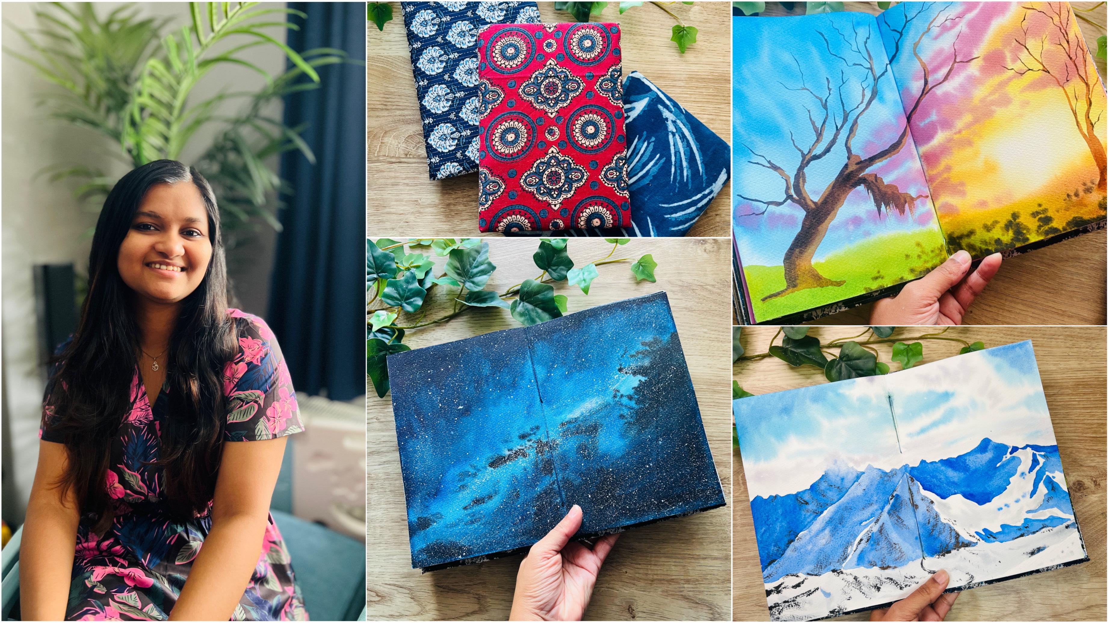
Transcripts
1. Welcome to the Class!: As an artist, I believe
that sketchbook is the place where creativity
takes its first steps. It's like a canvas for
your ideas to come to life with the stroke of
your brush or a pencil. That is why I have put together a very beginner friendly
sketchbook practice class for you today. Hello, everyone. I'm to a self taught
watercolor artist, a still brush educator
ambassador to white knight watercolors
stationers in India, and a Scalia teacher. I have been teaching online
for more than three years now and have also conducted
various in person workshops. I go by the name colorful mystic in almost all social
media channels, especially Instagram,
where I share my process, videos and snippets from
my studio practice. I pretty much learned
everything I know in a colas through
trial and error over the past 4.5 years and Sketchbooks have played
a very crucial role in my creative journey. So today I have come up with this class
which can teach you to be bold and expressive
in your sketchbooks. I welcome you all to
this Klich class, which is a 20 day
consecutive painting session that will take your artistic
journey to new heights. This cliche class is
designed to help you explore the mesmerizing world
of water colas and learn how to paint edge to
edge in your sketchbook. Like a true artist, I've often marveled at how
artists confidently create edge to edge masterpieces with other media such
as acrylics and guash. In their sketchbooks,
I've questioned whether this delicate and
fluid nature of watercolors can achieve
the same effect, especially with the most
common style of painting, which is wet on
wet, heavy washes. Out of curiosity,
I did a series of experiments and finally found out a way to do so
with watercolors, and that too, with a
lot of wetonwetwhes. You can say that after
a lot of experiments, I've unlocked the method and today I'm really excited
to share it with you, whether beginner or
experienced artists. This class is tailored for everyone who shares a
passion for water colors, the beauty of landscapes, and the joys of painting. In a sketchbook, over
the next 20 days, you can join me in discovering
the secrets of creating stunning landscapes that come to life in your
sketchbook pages. Each day you can
follow along with me as we dive into a
landscape painting. From cosmic galaxies to awe inspiring mountain ranges
will cover it all. I'll guide you step by step. Sharing techniques, tips and tricks that will make
your paintings stand out. You learn the art of layering, blending and painting on all edges without your paint pleading onto the other pages. By the end of this
20 day journey, you'll have a sketchbook filled
with stunning landscapes and a new found confidence in your watercolor
painting abilities. I'll start with all the materials
you need to get started and give you plenty of tips
during the painting process. So grab your sketch
books, your watercolors, and your enthusiasm,
and let's dive into this incredible artistic
adventure together. So if you're ready,
let's get started.
2. Class Overview: Hey, thank you so much
for joining this class. I know you're also excited, but I wanted to just give you a brief overview about the
structure of this class. First of all, I'll
briefly go into the importance of sketchbooks and a regular
sketchbook practice. After which, I'll go
into detail about all of the art supplies
that I have used in the 20 projects
of this class. Since this class is all about
painting in Sketchbooks, I have included an
additional lesson about the kind of sketchbooks that you can use for water colors, as well as how you can use
them in a variety of ways. There is also a
techniques lesson which will give you some tips to make sure that your
paint does not bleed to the other pages
of the sketchbook. Those are points that
I gathered after several experimentation
and I'm sure we'll definitely
help you after that. You can jump straight
into the class projects, but if you're someone
who would like to get their palette of colors
ready before you start, then I have added a
separate lesson before each class project
that describes the specific colors that have
been used for that project. I would also highly
recommend that you watch the painting video
once before you start so that you know
what's coming next. And it would also help
you to incorporate changes that suit your
style in your painting. And that's not all. This class
isn't just about painting, it's about building
a community of artists. Share your progress. Connect with fellow students
and watch your skills flourish by uploading
your projects into the project
section here in skis. I can't wait to see
all of your projects. Now let's get to
the next lesson.
3. Importance of Sketchbooks: Some people believe that
a sketchbook should be messy and not be painted with
straight edges or borders. But I believe that a sketchbook is a reflection of
an artist's style. And a place where
the artist gets to unwind their experiments without worrying about the
final outcome. A paper puts a lot
of pressure on you to paint something
really beautiful. Whereas a sketchbook is something that you
keep for yourself, and hence you feel like you
can paint anything you want. I don't want this
lesson to be boring, so I'll quickly go through the advantages of
keeping a sketchbook. They are compact
and lightweight, making them easy to carry
with you wherever you go. This means you can capture
inspiration on the spot, whether you're traveling
at a cafe or in nature. They provide a safe space
for experimentation. You can try out new
techniques, colors, and styles without the pressure of creating a
finished masterpiece. This freedom fosters creativity
and artistic growth. Sketchbooks encourage
taking risks and overcoming the fear
of making mistakes. Since the stakes are lower, you're more likely to try new things and push
your boundaries. As an artist,
filling a sketchbook requires dedication
and discipline. It encourages you to set aside a time for
regular practice, helping you to focus and eventually creating
a painting routine. Honestly speaking, I can think of 100 different
reasons why you should keep a sketchbook and maintain a regular
sketchbook practice. But I'm not going to be
listing them all here, but know that I am this individual who carries
a sketchbook wherever I go. I even have a sketchbook
by my bedside table, you know, in case some inspiration strikes
at an odd time, be it day or night, I know I don't need to
convince you anymore, but let's get to know about the best type of sketchbooks
that are suitable for wells.
4. Overview of Sketchbooks for Watercolor: The market offers a wide
array of sketchbooks, and selecting the right one for painting can indeed be
a bit overwhelming. Since our focus in this
class is on watercolors, let's dive into the specifics of sketchbooks best
suited for this medium. Watercolor, being a wet
media that relies on water for painting demands paper that can withstand the moisture. As a result, most
watercolor sketch books are constructed with a minimum
weight of 270 GSM or above. These sketchbooks are
typically composed of cellulose blend of sillilos
and cotton fibers. And they're perfectly
suitable for our purposes. This is because sketchbooks often encourage a
more relaxed style, with wet on dry strokes being more common than heavy washes. That being said, I still
do recommend for opting sketchbooks that contain at least some proportion
of cotton content. This inclusion provides you
with a bit more flexibility when it comes to
exploring wet on wet techniques in your
watercolor paintings. Keep an eye out for
sketchbooks with this advantageous feature
as you make your selection. The sketchbook that I
have used here is from vibrant parcels and
is actually 300 GSM, 100% cotton paper sketch book
in the five portrait size. This one is a bit smaller, but this one is the five size sketchbook
that I have used. This is a fairly new one. The one with the paintings
on is this one where I have made all of the paintings for the class to make things
convenient for you. I'll provide links to
all of the materials that I have used in the
description of this class. The reason I've opted for this specific sketchbook is that my personal painting
style leans towards utilizing generous amounts of
water and creating a lush, heavy washes on the paper. This class is centered around
this particular approach, but I want to emphasize that
you are encouraged to adapt any aspect of the painting and the process to suit your
unique creative style. Feel free to explore and make the final artwork
distinctively your own. Another approach for getting
a sketchbook to paint along in this class is
to create your own one. You'll find plenty of online
tutorials that provide step by step guidance on
creating your custom sketchbook. This option offers
several advantages as it allows you to select the paper that suits
your preferences, as well as tailor
the sketchbooks to your exact
specifications regarding the size and the
number of pages. This is a sketchbook that I made a while ago and you can see I've used the stitching method and I've made this sketchbook. You can choose this
method if you want, which will give you
the freedom to choose the number of pages as well
as the size that you want. Like I said, it will also let you choose the type
of paper you want. For example, if you're someone
who's so comfortable in painting with Archi paper or
Sandra Spot of foot paper, You can use that
paper and cut it into the size that you want
and make the sketchbook. For the purpose of this class. As I said, I'll be using
an A five portrait size, not the landscape one,
the portrait size. But you're free to change
anything the way you want it. And also, while it may
seem somewhat time consuming process to
create a sketchbook, the creation process can
be profoundly rewarding. And also, it adds a personal touch to
your artistic journey. So when I made this sketchbook, I had these sticky covers in different colors
and different designs. And I chose this one
for this sketchbook. And I also made an artwork, although this one is quash. But you can see this
sketchbook is completely made out of a rough
decled edges paper, which I believe Pana Global
sent me once before. But you can do that as well for painting the
projects in this class. And with regards to paints that are suitable for
painting in Sketchbooks, I believe both the paints in watercolor pans and watercolor
tubes are most suitable. That is because when you're
painting in Sketchbooks, it does not demand a lot
of pigment to be there on the paper because
you're not going to be laying out heavy, heavy dose of, you're not going to be
laying out heavy dose of pigment on your paper unless
you really mean, I mean, there are some projects
where I've done so, but you could keep on
layering with your paints. That is the most important part, I guess pans and both
watercolor paints would work on such
a sketch book. Also, keep in mind that a very lesser GSM sketchbook is not useful for heavy washers. And that is why I would
recommend something that is above 270 or 250 GSM. The one that I have
used, as I've said before, is 300 GSM. And lastly, one good thing about painting in sketch
books is that you only need smaller brushes because you don't need a
very large brush, which needs to cover a very large surface area of the paper. The paper size is
literally small, and especially if you're
painting just on one side, then you can go around
painting the whole of the painting with just a medium size brush
such as this one. So this is a size
six from silver. And you can go around painting the whole of the painting
with just this brush. When painting in Sketchbooks, I have seen artists use some way to keep the paper steady
because as you see, you can see the paper
is going up and down. Especially if you're doing even a little amount of water to paint the
wet on wet method, then your paper
is going to start bending because it would
start to expand on one side. While the other side
is not expanded, it starts to fold. In order to prevent that, there are several ways you can use paper clip to clip the edges of your paper so that it stays straight and does
not start folding. In our case, we'll
be using tapes. I'll be showing you the
method how we can use a masking tape to
take down our paper. And also if you
use a paper clip, note that it's
going to take away that much of the
surface area you see. This much of the surface
area you cannot be painting with because
it's covered by the clip. Obviously, once you paint
around the other areas, you can move the clip and
then paint on that region. But I think it's just not that convenient for
us to paint that way. Just look out for
different options as to how you can paint
on your sketch books. I'm just sharing a few, and in this class we'll be using
the masking tape method. Now that you know the type
of sketchbook that you need, let's go ahead and look at the other art supplies that you would need for this class.
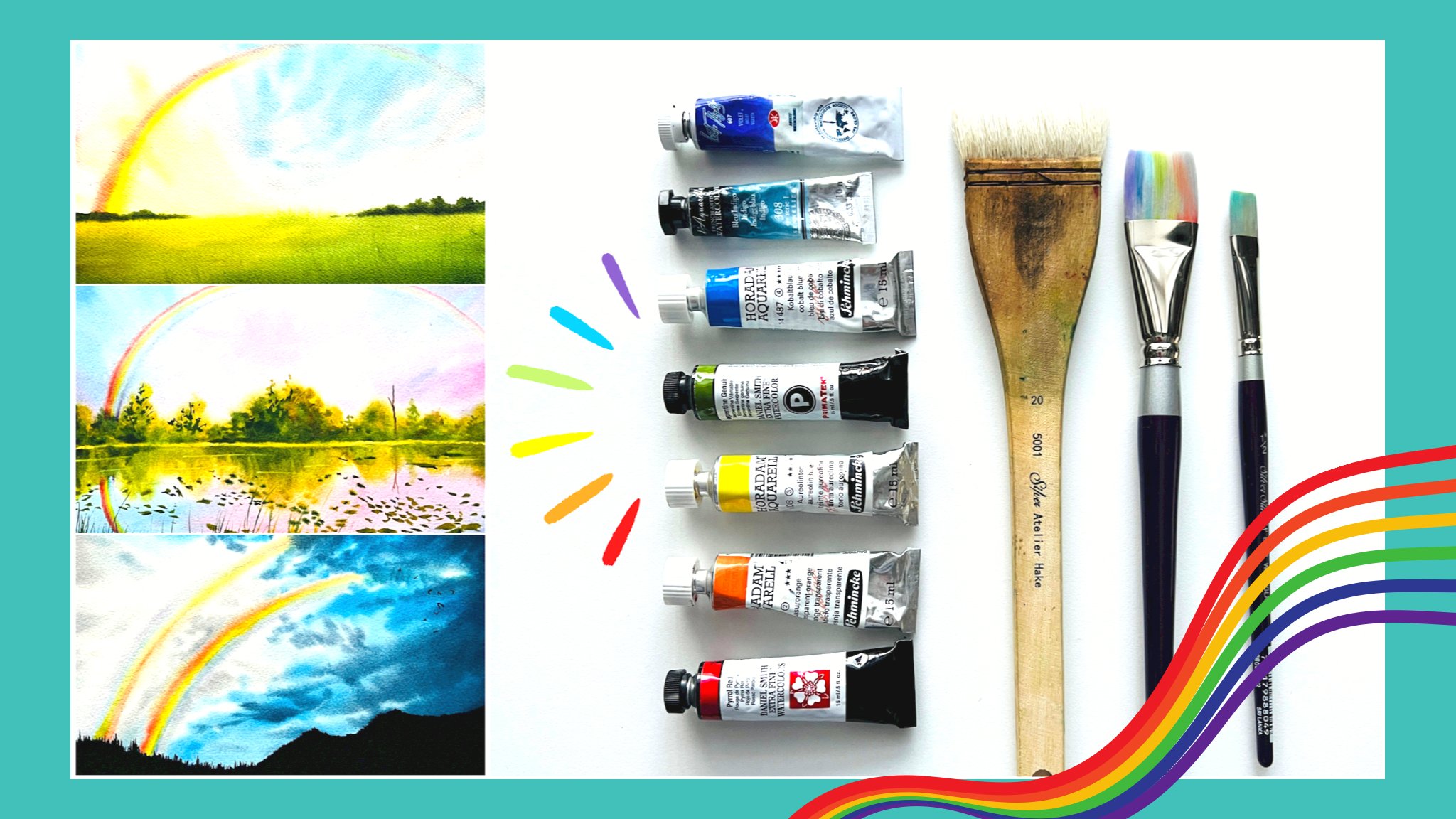
5. Art Supplies: Now let us go through all the
art supplies that we need. First of all,
obviously sketchbook, which we've already discussed in the previous lesson five, portrait tied sketchbook
is what I'm using, 300, 100% cotton paper
from vibrant parcels. Next, we need
watercolor paints of I'm using my curated
palette of water colors, which I mostly use in
all of my classes. That being said, you also need a palette in which you
can mix your colors. This is my custom made
palette of 36 colors. You don't need all
of these colors. You can go with a
simple palette as well. You just need some
of the basic colors. And I will be discussing
all of the colors used in each of the projects right before the class starts. Now for brushes,
these are some of the brushes that I have
used in this class. Mainly the silver tailor blend quill brushes and
the silver velvet brushes. And also a smaller size brush. This is the golden
natural series. But you necessarily
don't need all of the same brushes
that I'm using. What I would highly
recommend is to have a size 12 or a large more brush to cover the
entire surface area with water when we're doing
the large wet on wet washes. And then a medium
size brush such as a small brush or a size six
or a size eight round brush. Then an extremely
smaller brush such as a size 21 or zero
for the details. It would also be highly beneficial to have a liner
brush such as this one, but you could always
get away by using a smaller size brush
such as the size zero. For that purpose,
two jars of water, one for picking up fresh water, for applying onto your paper, as well as to pick
up fresh paint. And the other, which will turn muddy while washing
your brushes. Keep two jars of water. It's better to have it that way. A pencil as an eraser to make any rough sketches as is
necessary in your paintings. I use a mechanical
pencil like this one, but you can always
go with the normal one, white quash paint. The one that I use
is the designer quash permanent white color
from Windsor and Newton. You also need masking tape. Even though we're
painting edge to edge, you need the masking
tape to prevent your paint from bleeding to
the other sides of the paper. I'm using two kinds
of masking tape here. One is from the
brand called Empty. It is a really amazing washi
tape because it completely prevents the flow
of watercolor paint underneath and prevents
from bleeding on any side. And also it does
not tear the paper. The brand is MT, and that's the one that I'm
using for all the edges. This one is what I'm using to
create a double sided tape. I just create a double
sided tape like that to stick my paper firmly onto the other paper
underneath so that my paper does not bend with
the huge number of washes. I'll be showing you this
in the technique section. Don't worry about it. This one, it doesn't
particularly have a brand because it's
one I use from Amazon. I don't know, it says
I can leave links to this from the Amazon Uk where
I buy in case you need, you can go ahead
and check it out. But I believe that
even a frog tape or some painter's masking tape or any kind of washi tape will
work for that purpose. You could even use
the empty washi tape. The reason I don't use
it is because it's a bit expensive and
also it's very small. I prefer to have this 1 " one
to create a double stape. Lastly, a cloth or tissue to take off excess water and
paint from your brush. Now that you know all the materials that
you need for the class, let's go ahead to
the next lesson.
6. Techniques and Tips: It took me a while to
find the best solution to prevent any bleeding to the
back side of the paper. And as you can see, the pain did sweep
to the other side. For the first few
tries from my trials, I have learned some
very interesting tips on how to prevent the bleeding. The first thing I tried was to keep another paper underneath, so that would prevent it from
going to the page behind. But I quickly realized
that it was definitely a bad idea because of the fluid nature
of the water killers. As you can see while
I was painting. And this here is a surface change between the top paper and
the bottomst paper. If you observe here,
it's like a step change. And while I was painting, all of the water was going
onto this paper here. And then because of the nature of the water in the
watercolor paints, it was going underneath and it was staining my
paper on the sides. It actually happened in some
of these edges here as well. If you can see you've
got a lot of beating. So that's what happened. And I quickly realized that
this was a very bad idea. Keeping anything
underneath to prevent it from going was definitely
not going to work. The next thing I tried was
to use a masking tape. Not on this but on here. But what I did mistake
with the masking tape was again to have some
edges sticking out. While I was sticking
the masking tape, I did not take care of
us to have it straight on this side of the paper. And that caused
it to bleed again because it was again
acting as a surface. If I were to show you
what actually happened. So here's a masking tape. I was sticking it onto the
other side, along the edges. And I accidentally had a little bit of edge
sticking out like that. And that caused it to
bleed because again, it's a surface
change and the water would go onto that masking tape, it would cause the
glue to come out and eventually this part of the paper used
to get stained. That was definitely a nou. I realized that I had to make sure that the edges were clean, but at the same time
have masking tape. I learned that the
best way was to stick the masking
tape onto the paper, but making sure that it stays inside and completely
along the edges. Also, there are
some ways that you can take care by yourself
to prevent the bleeding. For example, if you're
painting with your brush, if you go carelessly
towards the other side, then it was going to bleed. As I reached toward the corners, I made sure to paint by holding my brush parallel to the
surface of the paper, and touching it
towards the outside, such that I lift my brush off
as I reach towards the end. Rather than if I were to paint
like this towards the end, what would happen is
that it would have a lot of water and paint
along this side. And then that water and paint would go over to the paper edge, eventually leading it to
go over to the other side. And also through the
masking tape as well. Even if you've got masking
tape stuck on the other side, it would go through the
inside of the masking tape if you let your paint flow
to the edge of the paper. In order to prevent that, the best method was
to make sure that I paint it towards the
outside like that. Making sure that I lift off
as I reach towards the edges. And that really, really worked, and some of you may be thinking that using this method to tape the other edge of the paper is actually a wastage
of the masking tape. But trust me, it's not.
Because if you would be painting using masking tape
by covering your paper, you would roughly be
using the same amount of masking tape in order to get that perfect
edge to edge method. We're actually
taping the edges of the other side rather than
the side we're painting on. Obviously, when you're painting on both sides of the paper, you do use a bit of extra tape. But I think it's worth it. Having said that,
you do not have to paint along with me in this class for the
edge to edge method. If you're not confident with it. If you want, you can cope with the normal taping method and get your sketch books in
any way that you want. You're completely free
to experiment and paint alongside with me in this
class in that manner, please don't feel
pressurized that you need to do exactly as I do with
the edge to edge method, although that is one technique that I'm introducing
in this class. Now I'll also go through
some tips to make sure that your paint doesn't
lead to the other edges. I've already
mentioned some tips, but I will also share some more. So if you're a person who uses a hair dryer to dry your watercolor paintings
in between layers. And if there is a lot of
wet wash on your paper, just make sure that the
edges of your paper are dry. So what you can do is you
can use just a cloth to make sure that you absorb the excess water from
the edges like this, and then use the
hair dryer on it. Because what hair dryer
can actually do is it can push the water
over the edge, it can let it go through
the masking tape. And then Once water reaches
the masking tape, it's going to lose its glue
or the gum holding it. And then it would start
peeling off and then your paint is going to bleed
over to the other side. Remember to stick your
masking tape firmly. I've already mentioned in
the art supply section the masking tape
that I've used here. I've used the empty washi tape, which is really nice.
And here's a tip. If your washi tape is really sticky and it's trying
to tear off the paper, mostly it's the paper
that's the culpritif. It's tearing the paper. But then there is
some method that you can reduce the gum
on the masking tape. To reduce it from
tearing the paper, what it can do is
take a masking tape, stick it onto a surface. Or even better, if you can
stick it onto a cloth. But just make sure
that it's lint free. Otherwise you would
end up with a lot of lint on the tape. Stick it onto the
table multiple times, and lift it off like that. That ensures that the glue
on the tape is reduced. Now, this won't definitely
tear your paper. The next thing is to
make sure that you do not use a lot of water
towards the edges. Also, when I'm applying
water all around my paper, I make sure to not
touch the edges. I only touch the edges with
my paint while I'm painting. And because there's water
all the way till here, I apply water like roughly
in a square format, right up to the edge, but
without going to the edge. Then while I'm painting, I use my paint to
use and spread along the edge that ensures that there is less water
along the edge. And also, like I said, paint towards the edge in
an outward manner. You can paint along
the inward manner, but just make sure that
you're brushed doesn't go and touch the edge of the
paper. The edge here. Okay. Next, if you've got a sketchbook like
the one that I have, which is handmade, and I believe most
sketchbooks do as well. You have a page where
it is not a center page and then comes center
page like this one. Some of my paintings are
painted on the center page, which focuses on having the entire stretch
of the landscape. I feel it's beautiful to
have it on the center page, but it's completely
fine if you're going to be painting on this
because as I said, it's just a sketchbook practice
and not to be pressurized about it while painting
on the sketchbook. Another thing that
you have to make sure is that you do not
apply a lot of water towards these tiny
little holes in the center. That is because these
holes actually lead to all of the other
edges of the paper. And through that hole your
water can come onto this. And if there's already
a painting here, imagine just water
flowing onto it. It could ruin this edge here and then create
a lot of gaps. This is why you have to make sure that when you're
painting on such a paper, apply water all around it to not apply water in that whole area, but just use paint
to apply there. When you're using paint. If
it's in a creamy consistency, it's never going to bleed
onto the other pages. These are things that you
can prevent from happening. I'm also using this
masking tape to tape down my paper so that it does not expand as I apply water onto it. The two things that I do
for painting on a surface, let's say I was going to
paint on this surface. What I do is I stick
ape all around the edge with this smaller one and then
also onto the other side. If I'm painting a
whole landscape, then I'm using this tape to
create a double sided tape. What I would normally do is
I take a piece like that, then I fold it such that
it sticks to itself, and that creates a
double sided tape. And using this
double sided tape, I tape it down so that this paper prevents my
paper from folding. This is contrary to the method
where I said you can keep your paper down using a paper
clip instead of using this. I use this method because then I would get the entire surface
of the paper to paint on. Just using few double
sided tape like this one. I've stuck it on both sides. Again, you can
decrease the glue of your tape by making sure you stick it on
some other surface. That decreases the glue. That's also one reason why I'm using this because it's got a very less glue and it
wouldn't ruin my painting. Even if you've got a
painting on the other side, it's absolutely fine to
stick your paper onto that. Because once you've
finished painting, if you take it out slowly, your painting is not
going to be ruined. But make sure that the
painting on the other side is completely dry before
you put anything on it. This is why this is
a daily challenge. If you're painting
one day apart, then it's going to
be absolutely fine. It's just water
colors. It's going to dry out before you
can even think. These are all the tips and tricks that I can
think of right now. And you will learn more as we progress
through the lessons.
7. Day 1 - Simple Mountain: Colors: Welcome to day one and this is the painting that
we're going to be doing. I've tried to keep it as
simple as possible so that you get used to the technique that we're introducing
here today, which is to paint the edge
to edge in a sketch book. Which is not very usual, but I know that many
people have done so before in a very
successful manner. So it's not something that
nobody's ever done before. But I'm just showing
you this technique. Okay. Reference image
of this painting is already uploaded in
the resources section. You can download
that and use that as a reference along with the painting process
if you wish. Also, you can go with
the edge to edge method, or the taping method, where you actually
tape the borders of this particular sheet
and go ahead and paint. Or you can even use the normal sketch book method where you just don't
have any tape and you just paint freely and have
all these abstract edges. Okay? Because this is the
first page of the sketchbook, it is quite tricky to
paint this one because this paper here is
a very thin paper. I'll be showing you
how you can tape this side of the paper to paint along the
edge to edge method. Also, I'd like to bring to your notice that I've
left the first page of the sketchbook here
because I'd like to do something else
on the first page. That may be like some kind of landscape
painting where I can actually incorporate some
details about me about like this
sketchbook belongs to me, how they can contact me if this sketchbook
is actually lost, and maybe give a heading as to landscapes or
something like that. That's why I've left this
first page of the sketchbook. But if you look at
the end of the class, you'll find how the sketchbook
has been completed. Let's have a look
at the colors that we've actually used
for this painting. The colors that I have used, a bright blue, bright
blue, or to blue. I keep saying bright
blue because it's the shade of the white
knight tube that I had. And I'm no longer using it, but it still comes
out of my head. This is Hello Blue
from Schminkan. This is Indian three
blue or Prussian blue. You can use either
of them if you're wondering that there's only
a single blue on this paper. And how come I'm showing
you different blues? Because this shade here
is actually a mixture of these two lo green. I created this shade using a mixture of these three shades. And very little amount of
Hello blue, It's this shade. Now if you look at it,
it's almost like tal blue. But it does have
a good amounts of Prussian blue and a little
bit of telo blue in it. Okay, that was for this
bluish part of the sky. Then I've got a bit
of paints gray. I've used a very
lighter and medium tone of paint gray here
for the sky part, for creating the
shadows of the clouds. Then for the mountain, I have used my
transparent brown. This transparent brown is transparent and that's
why I really love it. It's unlike many of the other
browns that I have seen, which is semi transparent
or semi opaque. This transparent brown
and transparent orange, the transparent orange
is from Shmenka. Transparent brown
is from Senelire. These are the colors
that I have used. Additionally, obviously I have used a bit of white
quash as well. I'm not watching it
because it's white. That's one, another shade
that I have used, that's it. Basically three colors mix in
this one then paints gray, transparent brown, and
transparent orange. If you're ready, let's
go ahead and paint this beautiful sky and
mountain painting.
8. Day 1 - Simple Mountain Project: All right, so let us start with the very first page
of our sketch book. The first page of
the sketchbook is going to be quite
tricky because we don't actually have a surface on the left side to put
the masking tape on. We should be extra careful
when painting this one. But I think that's positive
in a way because you learn to be extra careful
and extra cautious. File painting, all of the paintings that follow
will be very easy for you because you've already
learned the way to control the paint and prevent it from bleeding
towards the other side. Obviously, if you're
not using the edge to edge method and just
using the masking tape, then it's really easy for you. And then you can
just go ahead and start straight away for me. I'm going to start and I'm going to start putting the
tape onto this side. This is empty washi tape, which I've already mentioned
in the art supply section. You've got to be extra careful
when applying the tape. And make sure that it's along the edges really nicely
and covers the borders. Okay. Right along the edge. Also make sure that it's
not sticking outside. Okay. That's very important that you don't have even
a little tiny bit, uh, sticking outside
because that could be dangerous in a way that if
that is sticking outside, it'll be a surface for the
pain to flow, pain to flow, and then it'll use that surface and flow underneath. Okay. Which is why you've got to be
extra careful and stick it. Usually I just use my hands
to tear off the masking tape. But today we're going
to use scissors because I have to be
extra careful, right? And make sure that there's
no edges sticking out there. So that's one side done. Then the next side again
being extra careful. And the last side, don't forget to press along the edge and make sure that
there are no air gaps. Because even if there's
a teeny tiny air gap and the water starts to flow in, that air gap can expant
and go into a bigger one. Your paint is obviously going to bleed into that whole area. Which is why I'm being extra careful and running
my hands along just to make sure that I've
prevented Now there you go. I've taped the three edges.
We don't need this side. Of course, as you can see, this is a side that
we're painting on. But when we start to
apply water and paint, this paper is going to start to bend because we're not
stretching it in any way. This tape here was not
for stretching purposes, but was to prevent the
bleeding of the paint. We need to somehow keep the paper firmly such
that it doesn't start to bend. Because once you start applying
water here, this surface, that is this side of the paper, will start to stretch and this side doesn't
have enough water. What happens is the
paper is going to bend this way because it
needs more area to stretch. That's why your paper
starts to bend. We need to prevent that bending. What I'm going to do is I'm
going to put a little bit of double sided tape here
and stick it to this. I'm going to take
that risk because it's actually very thin paper and there is high chance
that it would tear off if I stick it very firmly, because this is just like a
smooth and very thin paper. I'm going to use this
tape now because I think this is more safe. The empty washi tape that I
have is very sticky and firm, which I don't want to
use for this surface. By the way, I've also tried this edge edge method with
this tape and it works. Let's see how I make
the double sided tape. I use just a normal tape
and then I stick it onto itself and turn it once more, that creates a
double sided tape. Now I can tear it off, I think I'll put it
onto this edge here. Another one on this
edge, that should work, but this is still very sticky. I need to reduce
the gum of it and the best method is to have it stick onto your
cloth a few times. That would decrease
the gum on it. Okay. And there. Then one more. I think one more should do. Okay. Now, I'm going
to stick this. Don't press it too much, we
just need it to stay flat, okay? Okay. There you go. Now, if I turn, you can see that this thin paper is stuck
onto it using that tape. I hope it comes
out, but even so, I'm not so stressed
about it because this is just a sketchbook and no
one's really going to say it. Of course, you all
are going to say it, but I'm okay with it. You see that's the confidence that you need to build in
with your sketchbooks. All right, then shall we start? I'm going to be starting by
applying water to my paper. Obviously, I'll start
applying from the center. As I reach towards the end, I'll be very careful again, the center is
absolutely fine as I reach towards the edge,
being extra careful. Okay, like I said, this might even bleed a little, but if you know the
ways to prevent it, then you're going to
be absolutely fine. Okay. The ways to take it
off after it's bled, then also it's perfectly fine. Here again, I'm just
going to bend my aboard. This is why Sketchbooks are
best because you're not sticking your paper
onto something here. I'm just going to
use gravity so that any water that I apply
along the edge would only flow down and wouldn't
flow towards the top. Along the edge. Again, careful. I all the way down. Even here, even though you're like getting all the
way towards the bottom, the gravity is going
to make it flow down towards the top underneath. Okay, careful. All right. I've given a nice one coat, so I'm just taking a
little bit more water and making sure I cover the inside
part nicely there. It shouldn't have
any flowing water. And the best way to
make sure that it doesn't have any
flowing water is to have your sketchbook turn
in a direction like this. If at all it has
any extra water, then it'll all flow down towards the bottom because of gravity. And then you can use
your brush to run over like that and absorb
extra bits of water. You see, I've got
a nice even there. Now we'll start painting. I'm going to start with
my size ten quill brush. You can use a medium size
brush for this purpose. And we are going to start with a nice slightly turquisy color. I would say here, I'm going to start
with my bright blue. Okay, I'm going to mix in
a little bit of Taco blue. This is like Prussian blue. Or you can use indenreen blue. Okay. Mixing that with my bright blue and a tiny,
tiny amount of green. That would be my Hello green. Okay, that'll give us a nice turquisy shade and that's what we're
going to start with here. We're going to start
at the very edge, but see how I'm being extra
careful along that edge. Then use that and start to add different
shapes into the sky. I'm using the whole
length of my brush. And hold your brush at an angle almost like parallel to
the surface of the paper, so that it becomes
easy for you to paint. Don't paint like that,
pointing to the top, because that's really difficult. Okay, then maybe a
little bit more green. A bit more blue, a
bit more dry, blue. Okay, okay, here again, moving towards the top. As you can see we're
leaving a lot of gaps. Okay. If you find that your paper has
to start to dry out, you can go ahead and
apply water again. I felt that it
started to dry out. This is because we're not
using any stretching method and we just applied the water. Okay. That's why hold your paper
at an angle like that. That really helps. Okay. Go over some of the areas that you've
already painted here. Take it that. Okay. Up to the edge. And then I'm going
to wash my brush. Okay. I've cleared my brush of all the paint and then you can start to
soften some of the edge. See how accidentally
I touched there, But I immediately washed
it off by using my hand. Okay. Here. Just lending along. You can do the same here. That's just because
I don't want it to be like perfectly white. Okay. It's good to have
some amount of pleading. Next color that we'll
take is paints gray. But let me just quickly see if my paper has
started to try out. Yes, quite. I'll apply
a bit more water. You can see how the papers
already started to bend. If you start to get any blooms because of the water
that you've added, you can go ahead and
start to blend it. See how I'm blending it and getting rid of that
bloom that had actually formed on my
paper blooms form, because there is uneven
water on your papers. When I applied that extra bit of water there and paint there, this area had lesser water. That's why it started to bloom. But as soon as you start
to blend it inside, then it goes away when we just applied water to the base there. Now I'll go with a bit of paint. These are little things
that you need to understand in your head as
to why are blooms forming? Blooms are forming because
of the uneven water surface. What can you do to
make that go away? Just make that unevenness
become even. That's it. That's what I try to do here
and try to blend it along. Now I've taken a
bit of paint gray and I'm going to add
that onto my paper. Okay? Leave some white caps. Okay. Again, careful as I move
towards the edge here. Okay? Remember, use the entire
surface of your brush. Okay? Very, very careful. It's much better if
you can use like the entire surface of your brush because it becomes
easy for you to paint, actually, towards the bottom. I believe we just
give it a nice wash. I don't mind because it's going to be the
mountain at the bottom. I don't mind how it turns out. Then I'm going to give it
a slightly darker tone for some of the clouds have taken a medium tone
of pin screen. Now again, I'm going to
go over to the top now. I'll place the
sketchbook back down. I'm not going to, I
keep it at an angle. Okay. Just washing my brush and I'm picking a
little bit of the blue. And I'm just going to go over
to the edge here because I noticed that there
is a white gap there and I want to fill that. These are little things
that I am having OCD about. You don't have to
have it. If you see that slight white gap and you're okay with it, it's
absolutely fine. It's just my tiny little OCD. Okay. So I had to dry my
brush because I know that that area
is like really dry. And if I'm going
to cover that up, I can't put any
more water there. So that's why I made sure that I dry my brush before I apply. Means there. Okay. So that was the trick behind that area. Okay. All right. So I think we're good to go now. All we have to do is
like to wait for this to dry out so that we can add that mountain
in the background. Okay. All right. Now, so
as you can see, I've tried it up, it's
not that cold anymore. The best way to check if
your paper has dried out is to use the pack of
your hand and touch it. Obviously, if you can see
that it's got like water when you look under the
light, don't touch it. That's going to ruin your
painting, of course. But this way it's
easy for you to check if your paper is
dry or not. All right. I've switched to my size brush because I prefer
to have a bit more pointed and also the wheel
brushes hold a lot of water. At this point, I
don't want it to hold a lot of water because
we're moving into the foreground and that's basically mostly
wet on dry strokes. Okay, wet on dry combined
with wet or white strokes, we'll start with a
nice brown color. That's a really
nice brown color. Then I'm going to
take in a little bit of orange and mix
it with that brown. That creates a nice color,
like burned sienna. In fact, if you have burned
sienna, you can use it. I prefer this color more than the burn Sienna.
I don't know why. I just love this shade here. That's orange mixed
with dark brown. Okay, then now we're going
to create the mountain. I guess I want the
mountain to start here. Okay, On the edge. Then we'll have the peak
going towards the top. As you can see in the reference. I don't strictly
follow the reference, but obviously I try
to mimic the shapes. I have the reference right
here in front of me. I try to mimic the shapes, but then I make
changes on my own too. Because if you see
the reference, you'll see that the mountain is actually almost
like halfway point. I skip that part because I
like to move things around and make it aesthetic
to my liking. But obviously, if
you want to go and paint exactly as
in the reference, you're welcome to do so. Okay. Because like I said, this is your sketchbook,
your sketchbook practice. Okay. I need more paint. I should have mixed
in the beginning. That's okay. There, More
orange. Okay, there you go. I'm just adding once more
over the top because I want that area to be wet when I
finish along the edge. Okay. There, then another peak like that, then it
goes like that. Then let me create the edge. Okay? Okay. This is like my
sketchbook practice. So I'm just trying to
keep it as simple as possible for me and
for you as well. Okay, So this shouldn't
take very long, right? Okay, there you go. If you see we've covered up the bottom. So now we'll start to add in darker shades. Now I
go with the brown. This is why I like this
technique as well, because we're using
the same mixture of paint and which is pairing the colors by adding more brown or orange in order to make it, when you make it
lighter with orange, it actually gives
that glowy orange, golden color look, which
I absolutely love. That's the dark brown. And I'm going to give it that
peak as in the reference. Okay. There. Okay. All right. And then adding it in the
form of lines or valleys. Okay? So this is why I
said it's going to be like a combined wet on wet,
wet on dry method. Okay? This valley and then we've got darker edge
towards the right side. But like I said, you don't need to go exactly as in
the reference here. I'm just tweaking it
to make this like a different foreground mountain. Just think with
your right brain, that is your artistic brain. And think of the ways
in which you can change the reference
images to suit your style. Okay, that's what I've
done and I think I'm going to take that a bit
towards the left side. I'm using a bit of paint
gray here to make it darker. I'm being very careful as I reach towards the edge,
You can see that. Okay. Yeah, I think
that's good to go. What I'll do is I'll take
a little bit more orange, mix it into that mixture, and create that previous color. And then I'm going to use
it again on my mountain to blend those regions
because I feel like the brown is a bit
sticking over the top. And I don't want that in
order to get rid of that. I applied that orange
again. Now I like it. I'm taking a bit of paint, clay and I'm going to
give it a darker edge. This area a darker edge. And maybe, you know, like some of the areas a darker edge. Okay. Okay. That's it, I promise we're done. I love the way it turned out, but if you look at the
reference picture, you can see that there's a road, there's some plants and for
grounds in the picture. I just avoided all of
that. I don't want it. Okay. You are welcome to paint exactly as in
the reference picture, so don't worry about
those things. Okay. I think we're almost done just making sure this edge of
mine is like a bit perfect. I'm a perfectionist when
it comes to, you know, the paintings that
I do not realism, but I like perfection of my strokes. That's
what I would say. Okay. Okay. So we're good to go. I hope it's not led
to the other side. We'll see in Ohio. So I'm going to quickly
try this up and then we'll remove the tape and everything and see how
our painting is done. Okay? All right. There you go. So it's
completely dried out. But before I remove the tape, and just because I have tiny, tiny bit of perfectionist, I'm going to add something. Okay? I'm just going to use my white paint. There's
my white paint. And I'm going to add
some dry strokes like you see in the
reference picture. Okay, it's been bugging
me in the head that it's got some white strokes
and I'm not adding it there. It's going to be a dry stroke, so you can see the consistency of the
paint that I am picking up. It's really dry. Okay, and we're going
to be adding this. You don't want it in
all of the places? Okay, That's blue, white. You can see the kind
of, oh, I like it. I love the way I've
added the dry strokes. Okay. See, just gives you a painting and extra bit
of goodness, isn't it? So, okay, I think that's it. You don't want too much of it. Okay. I mean, that's
my perception of course now that's try so I
don't need to bother about it. I am going to see. Let's reveal out, carefully. Take out the tape. I've taken the page out. This is tricky and
hard to take out, but we'll see, oh my
God, look at that. Nothing split out A. So let me take that
off carefully. This is what I said,
it's very tricky. So it's having some
paper come off, but if I take it carefully,
it should be fine. It's still not perfect. It's got some uneven edge now. But at least I didn't
tell it this is fine. All right. So now we'll go
ahead and remove the tape. Of course, this
actually eliminates the satisfaction
of the tape feel, right, because it's
when you remove the tape that you have
that perfect painting. Maybe that's one
disadvantage of this method. But look at the
edge to edge guys. I really love the way it's turned out.
Don't you? Think so? Isn't this gorgeous? I hope you enjoyed
painting this one. In whichever method that
you have chosen to paint. Like whether it was with the
tape or without the tape. With the edge to edge method. But thank you for joining me today and I hope to see
you in the next painting.
9. Day 2 - Tuscan Landscape: Colours: Hello everyone. Welcome to day, too. And this is the painting that we are going to be doing today. I tried to match
the colors a bit, that's why I've picked
up this painting. But obviously it's
not necessary. And if you have some other reference image that
you're going to use, you can use that as well. But this particular
reference image is uploaded in the resources
section as usual, you can have a look at that. Now let us have a look at all the colors that I have
used for this painting. So for this painting, I have mainly used
bright blue for the sky, that's bright blue
or thalo blue. That's lo blue from Schmike. I still remember it is bright
blue from white nights, which is by always
say bright blue. I should remember.
Not say that right. Okay. And then the next color that I have used for the clouds in the sky is a lighter
tone of paints gray. But I have picked some other
color with the paints gray. I added a bit of Alizarin crimson and my
tloblue to the paints gray to create more versatile
and medium tone of gray. Okay, I have used a
bit of raw sienna for the lightest parts of
the sky where it's got some yellow glow in the
further off horizon region. Then at the base, I have used a bit of Hello Green mixed with indigo to create
the further mountains. That's because you want to
put in cooler shades for the things that are
further away and warmer tones for the things
that are in the folk grounds, these mountains, they are in the background and further away. In order to depict that,
you can use two methods to show the atmospheric
effect here. What I have used is I've used a cooler shade which is basically the Hello Green
and the Indico mixture, as well as a blurred edge to
get that atmospheric effect. Now you can clearly see that it's way off in the background. Then for the foreground, I have used olive green, which is again a warmer tone, and depicting warmer
tones in the foreground. Then a bit of transparent brown for adding some brownish tones at random. Then for the tree
region, for the tree, I have used sap
green. Dark green. Okay, Sap green and dark green mixed with a bit of paint gray. For the stem, I have used
my transparent brown. That transparent
brown is a bit light. Let me put in a darker tone on the top and see
transparent brown. These are the colors
that I have used, basically ten colors
in this painting. Nothing fancy here, just from
my usual palette of colors. And I've managed to
get a clean edge here, although my OCD is like
bugging me that I've got a cap of white region here. But I don't want to
paint over this now. But even then, I'm really happy the way
this has turned out. Come join me and we'll
paint this along now.
10. Day 2 - Tuscan Landscape Project: All right, for the
second painting, let's go ahead and tape it
down again at the back side. Of course here I'm
going to use my tape, stick it along the very edge. Take your time to do this. I'm going to sweed
up this process because you don't need to see me sitting and taping
down very carefully. Right. You just go
ahead and tape yours. Just one more thing.
Remember to press along the middle and follow along the
direction of the paper. Because if you just go flat
and then if you try to bend, try to open up the other page. It won't happen. You
need to be extra careful and just let
it sit in that gap. That is the gap
along the middle. Okay? Give it enough surface and leeway for us to turn
the page. Very important. Now you go ahead and tape yours. All right. We're ready to go. So I've taped along the back side and also
stuck my paper together. So let's go ahead and paint. Okay, So I'm going to
be starting by applying water onto my paper careful as you reach
towards the edges, towards the left or the right. Okay. And the top. And
the bottom as well. So here, applying enough
water on my paper. Now I'm going to get
help of crappy tea. Look at your paper under light and you'll be able
to see a sheet of water. And you'll be able to see
if you've covered all of the areas and whether
you're missing any places. Okay. So that's the best
way to look at your paper. All right. All right. There you go. I've applied the
water nicely and even I'm going to start
with my helo blue color. I remember to say to blue today. Okay, here a nice
amount of theloblue. I'm going to hold my paper
here like that at an angle, just again to use gravity. Going to start at the very top, from the very edge and let my paint flow as I make
the shapes of the clouds. Okay, I'll leave a
slide. Get there. Okay. There you
can see I'm using a very lighter tone and also careful to paint along
the edges at carefully. Then again, I'm leaving a lot of gap. Okay? Leave a lot of white spaces and go ahead and
make the shapes. Okay, See I am going and adding as I come towards the bottom,
I'm trying to make it. Go slightly slanted. Okay. All right. Let me pick up
a little bit more darker. Bright blue for the top region. Okay. Where it needs
to be slightly darker. Okay. All right. Now I'll use paint scray
to my paint scray. I'm going to add in a little bit of Alizarin and a
bit of the blue. Okay, that's more paints gray, but a teeny tiny amount of
Alizarin and a bit of blue. That's almost like
mixing up a gray. But I'm not using the
yellow here to mix up the gray and neither
using ultramarine blue. I don't like to use
ultramarine blue in the sky these days because
it creates a lot of granulation and it just
appears like a granulated sky. Which I don't like anymore. Okay, here using that color. The good thing about
mixing is that sometimes the Alizarin and
that blue that we mixed up will start to separate
and will show us different colors in the sky which makes it look beautiful. I'm not strictly
following the reference, as you can see just adding
some amount of clouds, but not strictly
following the reference. I think my paper started
to dry out at the bottom, so I'm just going to go and
give it another coat of water towards the bottom
with my larger brush. Using the same brush, obviously, you'll have to wash
up the paint in your brush and then do it. Since I'm using a
different brush, it helped edge again, then the gray adding just using the entire length
of my brush at times, sometimes I'm using the point. Do you understand how
easy it is for us to get the different shades? Okay, there some smaller, smaller clouds as I come
towards this region. Okay, here as well,
some smaller clouds. Okay, I've washed my paint. Now what I'm going to do
is I'm going to pick up a little bit more paints. Gray. Okay. Bit more
dark as you can see and I'm going to
apply it over the top. Okay. At certain areas, not all the areas,
Just certain areas. I think you can skip
the middle because that's going to be covered
with a tree anyways. Okay. I think we're good to go now. I see some yellow
shades in the sky. I think I'll try to add that, but obviously we
need to be careful. So I'm just going to be using
a lighter tone of Rasiena. It's best to use Rasiena
because it doesn't mix that much with
blue to create greens. Even if it does, it's
going to be subtle green. So don't go for like
very vibrant colors such as Indian yellow or transparent yellow because
it could be very risky. And runo painting here, it's a very lighter
tone of the Rasiena. You can start to put that in
the sky and you can see it does not blend to create greens. Okay, this is the reason
why I'm using Rasiena. Teeny tiny amounts of raw
sienna into the sky region. It gives a very subtle
tone of yellow, which is exactly what we want right now that you've done that, let's go ahead and try to paint
the background mountains. For painting the
background mountains, I'm going to be picking
up a little bit of my Hello Green. It's very light, so I need
to make my Hello Green. I'm going to mix it up
a little bit of indigo. Okay, there. It makes my palo
green nice and dark. And you can see the consistency of the paint that
I'm using here. It's not too wet like
this one was because we need to be like not
spreading a lot. Okay. And also I'll have the angle
on my paper which will ensure that my paint flows down and not goes towards
the top. Okay. So this nice consistency of the paint and I'm going to
be probably taking it there. Okay. You can still see
it tries to flow up. Okay, I think I
need more indico. Okay, I am not adding towards the bottom because that's where our
foregrounds will go. I've reduced the length of the
foreground as you can see. Now I'll start adding my
shades towards the bottom. So I'm going to be
using olive green. I'm going to fill up the bottom. Okay. All right. So taking my olive
green and adding, and also I am observing that
it's at a slight angle, so we'll take up that angle. You can see when I'm
painting at the bottom, I don't do upward strokes, but rather I try to do as much downward
strokes as possible. Unless you're painting
some grass and you need to do the upward strokes. Okay, Be very careful
along the edge. Whoops. Okay. All right, fixed up the olive green. Now I'll put in some
other smaller shades. So I'm going to take in a
little bit of my brown, nice amount of brown, and start putting some
random shades. As you can see, the
base of the tree is actually surrounding,
uh, brown sheets. So that's what we'll add. Okay, then maybe some edges there and you can
have random spots. Maybe give a nice edge King King, I think that's good to go. And foreground looks in a
way that I'm happy with. So now let's wait for
this to completely dry out and then we can go ahead and paint that foreground tree. Okay? All right, there you go. It's completely dried out. So now we'll go ahead and paint that foreground tree because it's on the wet on dry method. We don't have to hold the paper written angle at this point. Okay. I'm using my size
brush and we'll start. Okay. So you need to roughly have the shape of the tree in your mind so that
you get it correctly. If you are in doubt, you can also actually
go ahead and put in a slide pencil sketch
on the top right now, but remember you can't use
an eraser at this point. It wouldn't be good
for the paper. Just roughly mark
along how you want your tree to be and make it smaller so
that when you paint, you can go slightly outside and get rid of those pencil marks. Okay. Roughly mark along where
you want your tree to be. This is the point
where I marked, marked my dark brown shade. Think I'll have my tree
somewhere around there. My tree can go slightly up. Remember to paint
very lightly. Okay. Remember to make the sketch
very lightly, up until here. Okay, that's one tree. Then we have two more trees. These are not going
in a line or thing, so you can have it at
different heights. Okay, that's another tree. If you want, you can go
ahead and directly attempt this without a pencil sketch
as well, it doesn't matter. Then another one there. Okay. I've just roughly
marked the positions. You don't need it to be perfect. Okay, So let's start. So I'm going to start with a nice amount of my
sap green shade, okay? And I'm going to start
at the very top, so this is where my
tree is going to be. So here I am just adding strokes like that as
you can see over the top. And make sure that it's from the outside towards the inside. Do you see that? Okay. From the outside
towards the inside. And go over the pencil
marks that you've done because we obviously want to get rid of
those pencil marks. Also, you don't need to have all of the
edges sticking out, cover some of them, and
only have like one or two sticking out at random. Okay, see how I'm doing that? Let's cover up the inside. Okay, Remember to go over it again. If you notice that it's
starting to dry out, it's best to not let it dry, but it's okay if it rise up. Try and see if you can
prevent it from drying. Okay. All of those colors
underneath doesn't matter, which is why I said
don't focus on a lot of details in the
sky towards the mill because I knew that
anyway is going to be covering it up with this tree. Okay. As in the reference. Okay, there you go.
I've added the tree, now we'll immediately
pick up a darker color. So in my case, this
is dark green. The pigments number is G, eight and we're going
to be using that. Okay. In order to
make it even darker, you can mix in a little bit of paints gray to your dark green. That'll make it even darker. And that's what
you can use here. I'm going to add it at random. Okay? Don't keep it strictly towards the left side
or the right side. Okay. Try and put in a
random strokes to your tree. Okay. Here in this case the light is from behind or the other side. This area is mostly dark, but we don't want it
to be completely dark. You can go ahead and fix it just to show how the
tree has got nice depth. That's what we're
trying to picture here. Okay, then as you come towards the bottom, we need to show depth. Let's add darker shades
here at the bottom. Okay, You can go back and
pick up some more sap green. And start to mix up any
areas you feel like you know it's disengaged and area that you feel
needs more darkness. You can add that as well. Okay. There. I'm happy with that tree. Now we'll add the trunk of it, obviously that's going to be
with my transparent brown. Okay. Do it while the
tree is still wet so that the stem part, the leaves part doesn't feel disconnected or
disengaged. Okay. Now, towards the bottom, if you can blend it into the
base, that would be great. All right, see that's the tree. Let's go ahead and
make the next one. Okay, so here
taking my sap green again and going to start all right there. Now going with the dark
green paints gray. Going to add darker
details at random places. But I think you can make
this tree even more darker because it's
like in the backside. I'm trying to make it
a bit more darker. Nice amount of pain
scray for the a, washing that off and taking
my brown paint for the trunk, softening out and
blending that pace. We've just got one more
tree to go and let's start. I think this one is a
bit of a different tree. You can actually have some
strokes towards the outside. Okay, Like that. If you find this difficult, then you can go ahead and
replicate what we've done. I see some difference
in the tree. In this tree, in the
reference image, which is why I'm trying
to do that as well. Okay, taking my darker
green and paints gray, then for the trunk, I see more brown part of this
tree towards the middle. So I've just had it in line. Then soften out the base and basically that's it. We're good to go, it's finished. Unless if you want to add
some random details like I'm feeling to do, which is to basically put some olive green shades into
my tree on the left side. I don't know why. I just
feel that I need to show some light at some places. You can
totally skip this. This is just me being
me with my OCD. Okay. I just gave it some
light on that left side. Do you see that? That's it. Okay. We're done, I
promise. There you go. Let me dry this up so that
we can remove the tape and see the damage. All right. It's completely dry now, so let me go ahead and
remove Yeah, it's safe. I actually save these up for my next paintings because
it's not much damaged. And it has only
reduced the gum of it, which is actually
perfect, isn't it? So I usually save it up just telling you a tip in case you
want to save it up as well. Now, let me remove the tape. Like I said, again, no
satisfaction for the tape peeling. Unfortunately, there you go, edge to edge without any bleeds. Isn't that perfect? Thank you all for
joining me today. I hope you enjoyed
painting this one and yours have turned out as
beautiful as mine has. I can't wait for you to
show you the next painting. Join me on the next day project.
11. Day 3 - The Night Mountain: Colours: Hello, hello,
welcome today three. This here is the painting
that we're going to do today. This reference image
is attached to the resources section
here in Khare. As usual, you can
go ahead and have a look at it and use that along with the painting
process if you want. Let us have a look
at the colors that we are going to be using
for this painting. I've started with
a mix of paints, gray and indigo at the top. I've mixed both of these colors together for the top part. Because if I just
use paints gray, then it's going to get
lighter as it dries up. But if you give it a
dwell pigment color with the indigo or
some dark color, then it gets dark as possible. So that is the reason why
I mixed it with indigo. Then for the bottom part
in this mixture here, I've used Lo turquoise
or Acco green. The one I've used is called Acco Green from
Windsor and Newton. You can also use the Hello
turquoise from Seneli. You can also use
this one, which is thalo turquoise from siniliar. You can say it's transparent
and also really amazing. But one thing you can
note here is that it's a mixture of PB 15 and G seven, which means that it's basically a mixture of Theo
Blue and Tlogreen. If you don't have that,
all you need to do is mix up Helo blue and Tlogreen in order to
make it slightly darker. Mix in a little bit
of dico or paints gray and you're going to get the exact same color, trust me, because even this pigment
number says that B 15 is Tloblue and D seven is
Tlogreen or emerald green. Okay, that's the color then as I moved
towards the bottom, I've used my transparent
orange from Schminka. Then a bit of
transparent yellow, then I've used my
transparent brown from Seneliar here along the mountain in order to create
the sun's rays. I've used a bit of
Quinacrodone gold. That's quinacdone
gold again from Minka along the mountains. I have used transparent, then paints gray for the
four ground mountain. Then for these lighter
lines on the top of it, I've used lavender. I know that many of you
may not have lavender. What you can actually do is you just need the violet color. And using that violet and a mixture of white,
you can use lavender. Okay. That's the
easiest way to create lavender color because obviously lavender is a mixture
of violet and white. So those are the colors that I have used
in this painting? Yes, of course. I have also used my designer squash permanent white color for
the stars in the sky. Okay, so if you're ready, let's go ahead and
paint this one.
12. Day 3 - The Night Mountain Project: All right, let us begin. Now, today's painting is
going to be more trick here because you have actually
colors on the other edge. And sometimes you might
be worried that when you tape it down and when
you pull off the tape, it's going to take out
part of your painting. Well, that's absolutely
true. It can happen. And this is why you need to
experiment with your tape. Make sure that you
stick it maybe on some other paper or
something which has painted. And make sure to leave it on, or to press it for a while, and then remove it and see if
your tape actually damages. And there are ways in which you can prevent it from happening. I'm going to take
my paper now, okay? Yes. It's dangerous, but I want this sketch
book to turn out the way that I had
envisioned in my mind to be at the end with all
the edges painted. Because I've never seen
a sketch book like that. I just want to create
that keep too, if you are willing
to take a risk. All right. So let's go ahead, I'm going to start
taping as always. I'm going to speed this up. Remember to press along this middle part here and give you tape the
leeway to push in. Okay. You've got to be extremely careful
with these ones, which is why I'm re using the ones that I used
the previous day. So it's got lesser gum on it. And also I'll try
and keep it towards the tape part here rather
than towards the middle. Okay. I won't press it too much. Okay. It's very risky. But it's a risk I'm
willing to take. If you're ready,
let's start here. I'm using my larger
brush as usual and applying water careful. I'm not going towards
the edges at first. I try to paint along
all the areas, The middle at first, and then I'll carefully
put water along the edge. Okay. That's the best way to do. I think here I've covered
almost all of the areas now. I'll lift my paper
and start to apply. Okay. There along the edge. Very careful along the edge. Okay. Making sure that
gravity aids in the water to flow down rather than
going into the other side. Okay. Again, careful
along the edges. Okay. Now I'm going to look
at my paper under water, and I see that some areas
has very less water, so I'll just reapply. Okay. Especially in
the middle area. That's where we want
to cover nicely. And this edge. All right. I think I've
applied the water enough. Now, let's go ahead
and start painting. I think this painting is
going to be fairly simple. Let's start, Okay, First of all, towards the top region, I am going to start with
a nice amount of indigo. I'm okay with this
Tuquis color shade because we're going to be
mixing Tuquis at the bottom. Okay, I'll just mix it up with the indigo and I'll
stuff in paints as well. Because I want it to
be dark as possible. If I just use paints gray, it doesn't have the pigment strength enough
to be that dark. It gets lighter. So this is
the reason I'm mixing it up with a little bit
of indigo. Okay. There. And that's what
I need at the top. Oh my God, that's so vibrant. Okay. But careful, keep
your paper at an angle. Observe here the angle
that I've caught. Going very carefully
and avoiding the edges. Avoiding, as in carefully
along the edges. Not avoiding what am I saying? This paints gray and indigo is the colors that I've
seen spreading, guys, it's dangerous and see, I've already got some
along the edge here. I just took off a bit. And then we'll carefully
add to the edge. Looking there, you want it to be
dark as possible. Add the dark death. Okay, Then let it go. Have some lines like that. Careful along the edge
to fill up this edge being very careful. Okay. Now we'll go with
the nice aqui shade. This is Aco green from
Windsor and Newton. Or you can use the turquoise from seller,
whichever you want. Okay. I'm using the acreen. Okay. And that we're going to
blend it into a sky. Okay. Can you see that very carefully on the edge? Okay. You can actually mix this
color if you don't have either the acho green or
the Seneliarelo turquoise. Okay, I've already discussed
that in the color section. So you can have a look if you haven't watched
that already, to how to mix that color. Hey, there, taking more of the Echo Green. Okay. Now moving on to lighter colors thing
will take some orange. Okay? Yes, it's going to
make up some greens in the sky but that's okay. Okay. Orange shade. It will mostly be
brownish because of the nature of the orange and
the turcos green mixture. I see that my bottom part
has really dried off, which is why I'm
starting to get strokes. If I apply water should be fine. Okay. Just making sure that these edges are proper. Because I actually saw
that it was having a hard edge at some places. So I'm just making sure that it doesn't have any hard edge. Okay. Just filling it up. Okay. Going back to
the orange. Okay. Then as I approach
towards the bottom, now I can freely
mix in my yellow. You can see that? Okay. Mixing in my yellow. Okay. Let's get rid
of any harsh edges. So I'm just going to go ahead and paint the whole thing with my yellow paint. Okay. So taking a bit of brown
along with the orange, I'll add in some clouds
or darker sheets, just like in the
reference picture, but towards the left side. Do you see that? It's
there in the reference. Right. I think I've dropped a
bit of water at some point, so I'm just going to end that. Okay, I think it's done out well once we've added
the stars and everything. Okay, now going
with more orange, let's start to add in the view. Beautiful orange clouds. Okay, I think that
should be enough. We can add the sun with a
white paint or not at all. Now all we have to
do is to wait for this to dry out. All right. Now it's almost a dry
it out and we can go ahead and start painting that
mountain in the background. Okay. For that I'm going to be using my transparent brown. I go just beautiful brown shade. All right? Okay, and we'll
start at the back side, starting at the back side, then let's take it up like that. Then it goes towards
that right side, then we leave a cap towards
the right side, not a cap. We leave it as it is for now. Because on the right side, I want to bring in the glue. In order to bring in the glue, I'm going to take
my golden sheet, which is Indian gold. Okay, and I fill
my golden shade. Can you see my
Indian Gold shade? I will add that towards
the right side. Okay. Let me fill that up. We'll fill it with brown shade. But that was just the gap
that I needed to fill. Okay. And you don't need the glue
up to all that places. Here you go. Filling
it up with brown. Let's take it up towards the left side as well. Okay? Okay. I think that's enough. That was the first
layer of the mountains. Now, there is something that
you can do if you want to bring out that glow
a little bit more. Which would be to use different, smaller brush and
do some lifting. The ideal scenario would be to use a flat brush,
something like this one. If you look at this flat brush, this is the silver silk
88 flat shader brush. So it's a flat brush, I've tipped it in water,
now I'm going to dry it up. Because you need a damp
brush. Not a dry brush. Okay. Then using
that damp brush, what you can do is you can
take off some lines like that. See that creates perfectly
you wash off the brush, wipe it off again to remove that excess water and to
retain that dampness. Okay. The only thing is you've got to follow that in all
the directions. See taking that off then now I'm bringing it towards
the center there. That is why he painted the underneath region
as yellow because you want to bring that
clove right there. Okay. I think I'll stop after adding one more
towards the left side. Remember all of these
need to converge towards the center
or diverge from that center point
towards that outside. Okay? Okay, I think that's
enough. I love the glue. We just need to add in
the sun in the center. We'll do that white later on. But now I need to wait for this to dry out so that we can add one more mountain
in the front, just like it is there in the
reference speech. All right. It's dried up now. Now we'll go back to adding some darker mountain on the top. I'm going to be using
my pain screen. Okay? Then starting
with the pain screen, going to create the shape
of the mountain. Okay? You can mimic the shape as you see in the reference image. I don't normally use
a pencil sketch. I try to do it directly
with my brush itself. As you can see,
as we reach here, there's a peak
that actually goes above and then comes
back down like that. That peak is in front of the other one. Okay. It's good that we have an
undertone of a yellow brown because then this
paint clay now will be really dark and good. Okay, to make sure that it stays away from
the sunlight region, okay? I'm going to keep it at that. Okay? Something like that. We're just simplifying
the reference image. You don't need to
paint exactly as it is and fill it up with all the
little nuances and details. You can skip whatever you want. Like I see some tree
in the foreground, but I'm not going
to be doing it. I'm just going to skip that and just finish it off
with this mountain. We've added as detail as
possible with the sun's rays. I think that's wholly
enough at this point. All right. Now the only thing that I'd like to do to bring in some randomness to this mountain is to add in some
lighter shades. But you've painted it with
a taker gray already. So how are you going to bring
in some lighter shades? Well, I have a
solution for that. Obviously, you can use
quash white colors, but let's not do that. Let's use lavender. Lavender is really opaque. I mean, if you have lavender, if you don't have
lavender, go ahead and mix it up with a white. Okay. And then I'm going
to mix that lavender with a little bit of brown that
gives me like a brownish tone. And I'm going to put
that on my mountain. Okay. Here towards
that right side. Then where else I can
see some crevices and details like that
going to when it dries up. Trust me, it's going
to be really subtle. Okay. It won't be this big. Okay. It'll be very
subtle when it dries up. You're free to go
ahead and use it. Okay? There. I'm going to go back with a bit of paints gray and make
sure that I lend it nicely and here lending that. Okay. I think we're good to go now. Let's quickly dry this up or let's not
wait for it to dry. We can actually go ahead
and paint the stars. To paint the stars,
you are going to need scrap piece of paper so that
you can mask out this hard. Okay, then here's my white, uh, I'm going to use
it to paint the stars. You can use the two
brush tapping method, or you can use the
single brush method. I've shown this in
many of my classes, but I'll show it to you again. The single brush method, or just the one finger
method is basically, I'm holding my brush. Okay. These three fingers, I use that to hold my
brush along with my thumb. Then this one is for tapping. As I tap, it'll drop the white marks into
the sky. Can you see that? Okay. Then the other method is the two brush
method where you use a second rush to tap
onto the first one so that it drops a lot of
white marks into the sky. Can you see that
both are random, but the hand method is
a bit more controlled. Okay? Because you can actually
control where it falls, whereas in this one you
can't control that much. Try to keep most of
it towards the to where the blue where the
indico and the paint gray is. Okay. I think that's
enough darker spots here. I'll get rid of it. But yeah, that's it. Now, let's not wash
off the white yet. What we can do is we go ahead, make sure that you follow
along the divergence. Okay, This is where the
rays are all converging, which means the sun is
going to be right here. Just draw a teeny
tiny circle there. Okay. Depict the gorgeous sun. That's it. Okay. All right. Now, I think I'll
go ahead and try this up. All right. It has dried up. Do you see how subtle
those lavender tones are, even though we added
it in a great manner. But I love the way
this has turned out, and this is what I
was talking about. Even if you add in a Taka
shade, it gets lighter. That's the thing
about watercolors. Now, let us look at the damage to be careful as
I'm feeling off these tapes. But if you do it slowly,
it should be fine. Yes, it was fine. Oh my God, I feel this is wet. Is it wet now? What's the scary part
again? This side is clear. If you look at it, there was some water that
actually bled off. And see how, but luckily
it didn't ruin any part. But I'm okay with these happy
accidents that happened, so long as you're okay, see a little bit of bleeding. And I'll show you exactly
how you can get rid of that. Okay? As I said, paints gray
is the most dangerous of it. Darker colors, obviously, it has a very
big tendency to bleed out. And of course it
did at that corner. But I'll show you how
you can get rid of it. It is the same as
the lifting process. You need a fat brush or some kind of brush that's
got like hard bristles. If it's a synthetic brush, the best that you can use. Okay. Make sure it's damp, then just run it over. Okay. So you can see
as soon as I run it over, that part has gone. Obviously also it helped that this particular region
where it bled was white. See, it's almost gone as
clean as it could be. The tape didn't damage any
part of my sketch book. And I have another
edge to edge painting, which I'm really happy with. Okay. If I look here,
this edge is fine. And this edge here, see the black edge there? That's the one that
I've got to be more careful next time and not apply towards the top
surface of the paper, but still it was much better. And like I said, you don't
have to take all these risks. It's just what you want. This is just something that
I'm showing you. The most important part is to build that sketchbook
habit and get into the habit of painting in sketchbooks and going on and on, spending a little time every day to paint into
the sketchbook. That's it. I hope you
enjoyed this one. Your painting is as
beautiful as mine. Thank you for joining me today and I'll see you on
the next painting.
13. Day 4 - Glowing Pine Trees: Colours: Hello, hello, hello.
Welcome to day four. And this here is the
painting that we're going to be doing
today as usual, the reference image is attached in the resources
section here in score. You can refer that and
paint along with me, so we have a glow here right underneath the trees
which we need to capture. You'll see how we've changed the color of the sky from
what we painted the day before when we mixed up in
Deco and paints gray together. Today, the mixture is
quite different because of the colors that we need
to use towards the bottom. Let's go ahead and
have a look at the colors that we need
for this painting. I've started with a bit of transparent brown
paints gray mixture. That's basically transparent
brown and paints gray. Mixing them together will get
a darker color like this. Then towards the bottom, I've gone with a
transparent brown again, then blended into orange
yellow at the bottom here. Okay, then for the trees, again, I've used a mixture of transparent
brown and paints gray. Then at places to give it
a different, nice glue, I've used quinacridone gold, then cadmium orange
here at random places. It's okay if you don't
have cadmium orange, you can actually
use a gas color. But I believe that it's a very good color to
have in your palette. Okay. And cadmium
yellow as well. Those are both
opaque colors which will let you paint
over darker colors. That is the reason why I
have them in my palette and it's absolutely
essential for me. Then I have also used a
bit of white gash paint. Okay, for the stars and
here at the bottom. And for mixing it with the
Kinacrodone gold as well. Those are the colors that I
have used in this painting. So let's go ahead and paint
this gorgeous night sky, pine trees, forest painting.
14. Day 4 - Glowing Pine Trees Project: All right, so the paper
is taped and ready. Let's go ahead and apply water, starting from the
center as usual. Now holding my paper
sketchbook at an angle, just looking underneath a light and seeing the areas
that I've missed. All right. Done
applying the water. So now what we're going to do is we're going to start
with paints gray itself. But unlike yesterday's painting, we're not going to be
mixing it with indigo, but rather we're going
to be mixing it with transparent an you learn to adjust your colors
accordingly how you need it. Now I need my paints
gray to be blending with a lot of yellow shades in
order to achieve that. The best under color that goes along with paints gray
is my transparent brown. This is the reason why I'll be using transparent brown
to give the undertone, can you see how dark it is? But it's also got that
subtle brown shade. Okay. Not enough. Need more just using
brown at this point. And then remember to give your sketchbook the
desired angles in different directions to prevent the flow of paint in
undesired directions. Okay, I've got to be very careful along this edge. Okay, Now I'll take paint
screen adding to the top. I think I'm going to
switch brushes because this brush is like literally
holding a load of water. It's pushing my pigment away, rather than applying the paint, it's taking more
pigment from the paper. And yeah, this is much better. See that rush is great
for large porches. Soap, soap, so got paint
on my Ape underneath. Okay, keeping the color. Then as I move brown, move down. I need brown. That's
what I meant. Okay? You can see how
I'm blending with my brown going down. So we'll keep
adding more browns. Okay, Towards the top, you can keep adding your paints. Gray, taking more brown and blending towards the bottom. Okay. Now, as I'm reaching downward, what I'm going to be
doing is I'm going to be adding orange here. Mixing my brown with orange
as I move downwards. Okay, And this right side is going to be
completely orange. So let me fill that up. I think this might need another extra layer to get it to the desired
color that we want. Then towards the left side, we're going to be adding yellow. Okay, that's my transparent yellow towards the
left side. All right. All right, let me hold my paper in the other direction
and try to fill up some more pans. Grey towards the edge is okay. I guess a bit more brown
to too much orange, I feel so I'm adding
a bit more brown. And blending it
with orange choking and yellow at the bottom. All right. So we've achieved
that glowy color. Now before this dries up, we need to add some
background trees for that. I am switching to
my size two brush, which is the smaller size brush. Okay? And we're going to be taking dark brown and
the paints gray mixture. Same color that we used
Okay, for the trees. Okay. There. Then
you can start by just adding some tree
trunks like that. Okay? It's going
to be in random, but make sure that they are like slanting and slightly
pointing towards the middle. Okay, I guess that's
it. Okay. The rest of it will add it
in the foreground. So this is just that goes in
the background, the trunks. Now let's add in a bit
of leaves to these ones. Okay. It is the same mixture that, so making some random
fine tree shapes doesn't need to be perfect. Now, if you observe your paper, you'll notice that all of the extra water
that we applied, it's come down so you can go ahead and absorb that
with your brush. Do you see that extra
water at the bottom? I absorbed all of
that dry my brush. If there's any more, I can
go ahead and absorb it. Okay. I'm sure this one has definitely blared
out on the other page. Let's see. Now we're
going to go ahead and dry this up. All right. It's completely dried up. Now, we'll start
adding the pine trees. Okay. For the trees on the left, we're going to be using some lighter colors
because that's where the glow is,
somebody's little log. Okay, Here you can see
the reference picture. And see what I mean, I'm going to be using
a nice plane shade and going to start
with my first tree. Let me see my first tree. The height is going to
be somewhere there. The center trunk,
although not visible, it's always best to
add in a center trunk, which will give you
the perspective on how to draw the tree. Now that you have
the center trunk, you can see that all you
have to do is follow along that center trunk and create
the tree right there. I follow along and make some marks to the
left like that. Take it all the way to the bottom because that
tree is covered up. Okay. Then at the right side, we need to be
adding more colors. I'm just adding the
shadows at this point. Okay. Then as I come
towards the bottom, it's a bit darker
because it's denser. It's not because there's
no lights reaching there, but it's too dense for the light to actually
reach there. Okay. So that's why then bit
of inks gray there. I'm just trying to mimic
the reference picture. The thing with this
exercise is you'll also learn how it's like an extension
of my other class where it learned to paint
from reference images. You'll learn how you can incorporate and change the
things in a reference image. And you'll see how
I approach it. At the same time keeping my
focal points and all of that. For example, this mountain
here is my focal point. You can clearly see that from the way it's painted
in the foreground. Okay, added color
up to that point. Now we'll go ahead and add
some golden shades in. Okay, it's going to be tricky. Let me try this with the
Quinacrodone gold at first and see if it
comes over the top. Not really. When it dries up, it's not going to be visible. The one step solution
that I think would be to pick up a little bit of white and mix it
with the queen gold. It gets lighter, but make sure you add in more of
the queen gold. This just makes it
slightly opaque. Okay, Okay, I think maybe you can mix in a little bit of the
transparent orange as well. Gives it the orange color. Yeah. Okay. And the thing is with this, you can even add some
to the left side. Okay. Then go ahead
and create the shapes. Okay, Some towards
the left side. Okay, there. Don't worry, it's not done yet. We'll add in the shadows
and it'll make more sense. Okay, we have
another tree there. I'll just go ahead and paint the part of the tree
that needs to be lit. And then we'll add
in the shadows. Like for example, if I
paint the hole of the tree. Okay, I've painted the
whole of that tree. I know it looks really weird, but there are ways to bring it forward which is basically
to paint the tree behind it. The painting the tree behind it, that one got it stem
starting from there. See just creating the
shape of the pine tree. This tree now has glowing areas as it come
towards the bottom. We'll go ahead and add in our next tree which
is at the top and then starts to get lighter. So we'll go with the brown. Think can mix in a
little bit of orange to my brown so that it'll get
slightly lighter. See that? And then we'll start to go
with our glowing orange. Glow orange towards the bottom. Then we can go with some yellow. At this point, we can start
using cadmium yellow. Okay, for depicting
that nice area here. See how that region is
like, literally glowing. Okay, Okay, now we need to
bring in the background, taking my pain screen and
brown mixture will go there. Then this base
goes on like that. Then we have part of
another tree here. Okay, now for that glue region, yes, we need to add glue. But the glue can be added
with a white paint. We'll add that later on. I'm just painting
the undertone there. Also these areas, remember this tree here meets
the brown undertone. Okay? The depth. And then a bit of yellow. So you can also use admi orange instead to get
that glowy region. See how that region is
like literally glowing. Isn't that gorgeous? Okay, now let's go back to
add our rest of the trees. We have a few more
trees to add, isn't it? The next tree is
going to be there. Let that background
tree be there. That was supposed to
be in the background. You'll actually see parts of it. Okay? You only need
to see parts of it. That's also the advantage Okay, of adding that in
the background. Okay. Now, as I approach
towards the bottom, I definitely need to
add in darker shades, lighter sheets, the
orange, orange shades. We'll add that with
cadmium orange later on. Let's just fill up the tree because this is a sketchbook painting. I am focused on making my
strokes start perfect. Okay. I mean, we just should be painting freely in our
sketch book. Right. Can pick up paint
screy as I approach the bottom to show the
denseness of my tree. Okay, that's the of my tree. Okay. I think that's it
with the ground now. We'll move ahead with pain spray towards the right side. Okay. Another tree which
is even taller. I'm not going and following the exact shape of the
trees as in the reference, I'm just adding pine trees. I know that it needs to be
pine trees and that's it. That's all I'm trying to focus here and trying to
bring into my picture. I know that pine trees can be
really hard for beginners. Basically, you draw a line
and then using a small brush, try to make these strokes as you do it and as you
come towards the bottom, make sure to increase and make it like a
conical shape. Okay? Okay, and we're good to go. Okay, I want this to be a bit more I'm adding when
you make it longer, which means you need to
modify your cone shape that. Lots of trees. Now, basically, we'll
add in the stems first, and then just add the
trees for a few of them. Okay? I mean, that's how I see it in the
picture. There's more stems. The the, the stem, or you call it the
trunk, isn't it? And there's a longer one there and another bigger one like that. Okay. Done with the trunks. Let's go ahead and add in
to make it slightly longer. I know it's not
longer than that one, but I kind of wanted
to be slightly longer. Okay. Just added a lot
of branches. All right. Um, some of these trees need okay, that's it, towards
that right side now, need to bring in that glow
in some of the areas, so I'm just taking cadmium
orange and bring that. Okay. The right side also,
the reason why we mix the other color is now this area has a dwelt
only if you look at it. Okay? So that's
why we want that. Don't let it be a single color. Always have total changes in your painting and that
it'll be more beautiful. Okay, okay, here goes a bit here. Then we said we'll add some to the left
side of the stream, finishing off with some
nice brown mixture. Okay, so now we can finish
off with the stars. Loading my brush with
the white paint. Yes, so let me now use
the tapping method. Okay. Call a lot of stars. All right. There you go. I just realized there is one
teeny tiny thing missing. There's always
something, isn't it? I say it's finished and then I end up doing something else. There's the trunk of that tree. I just need to add in a bit. That's the part where it's lit. Okay. So that's why we need to add the trunk of that
tree and maybe drop in some extra white shade which will give it
more glowy appearance. Okay. There, I promise. It's done. It's done. There you go. Let's
completely dry this up so that we can see the damage from all the browns and
the pain screen. All right. It's dry now. Let me see the damage. Nothing, see that. I'm so happy this has
turned out much better. And without any damage, we can remove the tape. This is the heart. See? I suppose there isn't
any damage seeing, I think you just got to be careful and once
you get the hang of it and you'll see that your sketchbook
looks really amazing. I know obviously
if you had a tape, then you'll have
better borders here. But then even then it's
so beautiful you can actually get rid
of that bad part. There's an easy method. I'll show you that as
well in case you're reno you don't like the
way that area looks. You can just brown paint. Just use the color
that's there at the edge of the two paintings. In this case, it's brown because that's what we painted
along the edge, isn't it? Just use that. Okay, Fill it up. Do a dry stroke rather
than a wet stroke. When I was painting
with the wet on wet, I didn't go towards that side. So that's why there is
a lot of gap there. Okay. But when you're doing
it in the wet on dry method, it'll be absolutely fine just take it over to the very edge and then you'll have a really
edge to edge painting. Consider this also as my OC that I'm seeing that
white and I'm like, oh no, it has to
be covered. Okay. If you in something, go ahead and put in a Pointry or something. Okay. Covered that edge.
But I see that some part here is missing.
You can do that later. I'll when you come in before the next
painting, I'll do it. Okay. There you go. With the edges all
clean at the back. And here's our
finished painting. I hope you enjoyed
painting this. Thank you for joining me today and see you tomorrow for the next one where we're going to be painting something
really beautiful.
15. Day 5 - Sunset Blooms: Colours: Hey everyone,
welcome to day five. This here is the painting
that we're going to do today. Yes. We're going to be painting on both sides of
the sketchbook that is on a whole page that is
both left and the right side, and create this cope here. The reference image of
this is obviously attached in the resources section here in S. You can refer to that. There are a lot of things
that I should warn you about this painting
though. Let's go ahead. First of all, obviously
you have to take down both the sides because you're painting on both
sides of the paper. You need to protect your
previous days painting. And you also need to protect
the other side to not bleed and create colors on this. Because you have to paint
on the next day, right? That is one thing. Secondly, I've chosen a page which actually has this
thread in the middle. I don't know if you
can see clearly there, which has this thread in
the middle. This thread. It's a page that is like
wholesome like that. If you look at the next page, for example, this
is actually, uh, the middle part of it goes into the middle area and it can seep into other pages
towards the back side. Okay. We don't want
to cause that, which is why I've
chosen a page like that while you're in the
painting process and you see that your page is
not this and maybe like two pages down the line, you have that
line in the middle. Then you can go ahead
and use that page. Leave those two pages blank. Come back later for a different
days project on that one. Then next, the colors
super fast while you're painting because of you're
not applying a lot of water and we're not even
stretching the paper. It usually, very quickly, it
actually dried up for me. Keep another brush
in hand, ready, ready to apply reapply
water or reapply paint. Wherever you think that
it's starting to get dried. Do not let your paper dry out. That's very important if you
want to paint these clouds, I know it's a very
tricky process. And if you are a
beginner, you might be really overwhelmed
to try this out, especially for such
a large format, and especially because you're got a lot of wet
techniques for the clouds. But trust me, you can do it if you learn to try to control. And this is, again, another
part of this class, isn't it? It's about sketchbook painting. Do not be worried, if you actually ruin it, it's absolutely fine because
it's your sketchbook and it's that simple guys. The last thing I want to tell you is about this
reference image. This reference image
is a landscape format, which is what I have
chosen for this one. If you remember, all the others
were in portrait format, and that's why we painted
in the portrait scale. This one is a landscape format, but what if you don't
want to paint in the whole two pages and
create a landscape format? What if you just
want to paint on one side of the sketch bookino? You can absolutely do that. And that'll be easier for you if you're a beginner as well, because then you'd have
lesser surface area to work or lesser surface area where
it starts to get dry fast. But if you are using the
both sides of the paper, then high chances are there that when you're
working on this side, the other side might
start to get try. But I urge you to give it a try and I would
really recommend it as part of the
process because it's really important
that you learn it. But even then, if you're not happy and you don't
want to do that, you can go ahead and paint
this in a portrait mode. Let me explain how
you would transform a landscape mode image into portrait mode.
It's very simple. All you have to do
is like think of that as a vertical one. All of these would be
squished in together. You'd have lesser of the space. If you look at
these clouds here, it's this much of thickness for the clouds
on the right side. Split your painting, your
reference into half. If you split it into this half, you can see that
this half is a lot. You don't need that much of
the clouds on the right side. Bring it to the left side, this is the portrait
side, right? If you bring it
to the left side, we'll have this much of these heavier clouds and then you'll have smaller
clouds at the left side. It's like squished in together. Then the mountain, obviously
the long trailing edge, you can see that you don't
need it to be that long. You can make it shorter. It would be something smaller and even then is obviously
easy to squish it in. Right. Regarding the tree as
well as you can see, I've only taken a little
part of the tree and not a whole tree in my painting because there's actually a road and
everything there. I've skipped that
part of the painting. If you want to paint that, then all you have to do is make the tree slightly thinner. If you make it this thicker, then it's already going to
take a of your paper, right? Make it slightly thinner. Paint it on the left
side itself but such that it covers around this much. And the rest of it
would be the sky, the mountain, and
the foreground. That's how you would paint this. Okay, I'm just telling
you in case you need to translate this
into a portrait mode, you can always try that. But first of all, like I said, I urge you to try this. If it doesn't work, you can go ahead and try the portrait mode in
a different paper, and it would be a smaller surface area
for you to work on. Now let us go ahead
and have a look at the colors that we have
used for this painting. First of all, I
started with a mix of bright blue and Alizarin, which created this base
violet color there. Then to the sky, I have blended in quin ac done violet
rose, queen violet rose, which is PV 19 shade a bit of orange and transparent yellow. Those are the shades that
blend into the background sky. Maybe you can add in a bit
of Alizarin crimson as well, but that's what went
into the background. Then. For the clouds, I have added in violet. For the clouds, I have added in violet and a mixture
of Alizarin crimson. Those two mixed together along
with some orange has given the beautiful shade
of the cloudy sky. Then in the foreground, I have used a mixture of brown and olive green,
which you can see here. The color is basically
olive green and a bit of brown which created somewhat
mixture like this one. Okay, that's the mixture is created and I've used
it in the foreground. You can apply olive green at first and then use the
transparent brown. Then once you've done
that for the flowers, I have used catinum red, which is basically opaque, so it gives you that
opacity on top of these darker shades
for the mountain. There, I've used a mix of violet and paints gray
for the tree as well. It's a violet and paints gray. And the same for these birds
as well on the foreground. Also, I've just used it in a darker tone of this
mixture that we made. Basically, these
are all the colors that I have used
for this painting. If you're ready
with your colors, let's go ahead and paint
this gorgeous painting.
16. Day 5 - Sunset Blooms Project: All right, let us start. As you can see, I've already taped down the edges of this one because it's a lengthier
painting where we're trying to go and use both edges, both sides of the sketch book I've had to do on
this side as well. And I agree at this point, yes, it's a lot of
tape that we're using, but I believe that if the
end result is beautiful, then there's nothing
to worry about. Let's go ahead and start with
our painting process, Okay? So here I'm going to be applying water onto the
whole of my paper. And as you can see
for this painting, I've chosen a landscape
reference image. And I've already
explained how you can convert this image into a portrait in case you only
want to paint on one side of the paper of the
sketchbook, I mean. Okay. All right. At lying towards the
center regions at first. All right. Now, I'll
go towards the edges. I think the right side
is okay, as in it. We don't have to be worried that it will ruin our
previous paintings. But the left side, you've got two paintings. And it's really
dangerous, isn't it? Okay. Now, I think I'll slightly bend it this
side so that, you know, it has more water there needed to be nice and wet. Not running water though. Okay. I think we're good to go. Let's start. Okay. So
what I'm going to be doing at this point is to
mix up a nice purple shade. For that, I pick up my bright
blue and a bit of Alizarin. Okay? And you can
see as I mix it up, it turns into a
nice purple shade. Okay? And this is what
we're going to use. I'm going to start from the top, and you can see I'm using
a very watery mixture. Careful as you
reach the top top. Okay. And towards the middle. Careful to not have a
lot of water towards the middle because you
can see that line form. Just move it around, That's it. Okay. There is a good thing about mixing is that
each time you mix, your colors will be different. You can see sometimes it's more bluish and sometimes
it's more reddish. But that's the beauty when
you mix up your colors. Okay, I really love mixing
up my colors in that manner. I've put darker tones towards the right side
because you can see there's more darker tones in
the reference picture. Okay. Also because I'm
tilting my paper, I can see a lot of water
accumulation there, which I've absorbed
with my brush. You can also go ahead and
absorb with a cloth if it's too much extra there. Put in a lot of violet tunes. Then as we start approaching
towards the middle, I think we should go pinkish. Here I'm picking up my
Quinacridone Gold shade. I've got Quinacrodonerose shade. I start to add it to my sky. Okay. Adding the quin
rose shade, you can see. Add it in blend
along into the top. That's my quin rose shade. Okay. Slowly, slightly blended. Same on this side as well. Okay. All right. I think you can give
a bit more color because it's like
turning really lighter. And it's turning lighter
because you're actually holding it up and so all of the paint
is kind of flowing down, but that's okay. Okay. I see this paper has some
kind of damage here. I think I did something while I was taping
or maybe it was the rush. I don't know, that
shows up damage. Nothing to do for that. Now, the next color
I am going to be taking is a bit of orange. We'll start to mix that up
into our beautiful pink shade. Okay, we start with orange. Just like you can see
in the reference image, it's called that nice orange, subtle Pch shade in the sky. Okay, I guess you can start
somewhere along the middle. Okay? Then we can go with nice yellow shades
towards the left side here. Okay? As you can see, basically put it down flat, then we're going to
add more orange. Okay, more orange. Make sure to absorb extra water from that
string area always. Okay. That's one area that has a disadvantage when you're
painting in this manner, then picking up my pink shade, I'm adding it here
so that we get like a peach shade when you
mix up your orange. Okay. But when you do it in
a slightly lesser amount, you start to get
this each shade. You see that it's a
beautiful each shade, we can use that. Okay? You only need to apply
color up until that point. Now, let's quickly
go ahead and add in our clouds on the top. I'm switching to
a synthetic brush because I know that my paper
is like starting to dry out. So I need to work quickly
and add in lots of clouds. Okay, here I'm going
to start with my let, okay, and we're going
to be starting right at the top again. It's violet. Make sure
that you are very careful. I think you can mix
in a little bit of paints, gray,
that's too much. Add more violet. Okay
there adding more violet, I think I'll hold at an
angle again so that I can control how the paint flows. If you look at the
reference picture, you have the clouds up until
here, around the middle. And then you keep going and
you start adding, okay? Okay, Then as you
reach that point, we'll start to add
in some red shades. Okay, So that it becomes
more like a purple tone. There's mixed in some Alison. Okay, we'll start
adding that add here. Obviously, this painting
demands that we work more quickly because
as you can see, otherwise it starts
to dry out already. My paper is like drying out, but I know how to work around it and make things work out. Just be careful. Ah, there I see my papers
started to dry out. What I'm going to
do is I'm going to switch back to my other brush. And pick up that color. You can't see where
I'm mixing it, but I pick up that color and mix it up with my Alizarin
to create that shade again. And I'm just going
to go over the top. This is one way you can reinforce the wetness on your paper because the
bottom side is still wet. Okay, just go ahead and
add some more strokes, then add in your clouds. See how that's worked out. Okay, some purple clouds here. Violet at the top can literally add violet
clouds at the top. Purple and red dish
towards the bottom. This is the reason why I'm using a synthetic brush because
it holds less water. It wouldn't introduce more water into my brush in order to, for it to create
blooms on my people. We really don't want
any blooms, right? Oh my God, you can see
it started to try out. I'm going to have to shift
to my other brush again and put in some pink shades
where we're painting. Okay, Go back and
reapply the tones. So long as you hold your
paper at an angle like that, then your paint is only
going to float down and it won't create the blooms. Okay? That's why hold your
paper at an angle like that. Make sure that you are
able to blend colors. Okay? I'm just telling you
the tips and tricks. I know if this
doesn't work for you, you're scared to attempt this, then go ahead and ain't it on a single page,
it's absolutely fine. But remember this fact about sketchbook always,
it's your sketchbook. And you don't have to be
worried about what's turning out in a sketchbook
because that's the main purpose of a
sketchbook practice, isn't it? Okay. That being is a a bit what I'll do is I'll
mix in some orange. I'll add that as well. Okay, So we can have some
orange shades in between. Orange glow, if you can
see some nice orange glow, if it's allovable, you can add some orange glow
over there as well. Then here we've got
some orange glow. Okay, I can see why I love the two side
application method. The water stays wet
for a long time. This is like scary when your water actually
starts to dry out. Now that's done, I'm going
to pick up a bit more red, just a red clouds there. Maybe it's not there in
the reference picture, but I feel like I want
to add some red clouds, maybe a bit of
violet clouds there. I see some harsh edges
forming along here. What I'll do is I'll blend that. I'm not worried about
the base but I'm worried about the harsh just
that forms along this side. Okay, Then need a bit of orange
to create some nice lens. All right? Okay. Honestly speaking,
this did not turn, turn out to be the perfect
way that I had imagined. But I'm still cool
and happy with it. Okay. Maybe a bit more pitchy
orange shade to the bottom. Okay. Don't worry about the harsh line forming
here. That's okay. Because they'll be masked
out by the foreground. We only need to worry
about the sky right now. Okay. I really want to add
some violet clouds over here. Okay. That'll be masked
out by the trees. So are not bothered. I know this harsh
edge, I'm not worried. Although if you are, you can just use your brush and soften it towards
the bottom like that. Okay. So that now
there's no harsh edge. Okay. It's just softened
towards the bottom. Now, let's go ahead and dry this up so that we can add
in the foreground. Okay? All right, so now
that's completely dried up, let's go ahead and add in the foreground for
adding the foreground. If you look at the
reference image, I think it's a warm tone, but it's a dare. I feel like if I mix up
olive green and dark brown, I should be able to
get that mixture. Okay, here's my olive green
and dark brown mixture. And let's see, up
until that orange, that's where we want it. Okay, there, I'm going
to be drawing a line. Okay? From where it starts
up until there, then goes over to
the right side, the whole straight line. Okay? So that undertone of
red is absolutely fine. It's just going to
help us because it's like reflecting
the colors in the sky. Okay. Which you do need to do. Okay? Okay. Don't let
your colors dry out, use a very wet tone. I think what I'll do is I'll first paint with my olive green. Easier than mixing up, unless you can mix up your color pre, mix your colors in
advance before you start. That's a good way to do, but I also like this method where I paint with my olive green. Okay. There. Can you see the undertone
of the sky there? Because we let the colors flow. Okay. Taking that olive green, adding it. All right. All right. I filled
that part up. Now, I'm going to go
with my brown paint and I'm going to apply
that on the top of it. Okay. And fill up my olive
green with the brown blend? Yeah, picking up brown. Okay. I guess we can
add a bit more brown towards the base. Okay. Then digging up the brown and creating like a patch of cross. All right. I think
we're good to go. We've added it nicely. Now one thing we can do before this dries up to add
in some flowers, would be to add in
some splatters. Obviously, for doing
this platters, we need to make sure that
it doesn't go towards the sky region here. I'm going to use my
scrap paper and I'm going to hide the
part of the sky. Then I'm going to pick
up my cadmium red. Okay, cadmium red, it's
opaque and opaque color. And we have a lot of
red flowers, isn't it? So that's where
I'm going to draw. Okay, I see that there are a lot of flowers
on this left region. Then I'm using a smaller brush, by the way, for the splatters. Okay, I've got the
good splatters, but now I want some bigger ones that I'm going to be
painting that with my brush. Taking my brush, going to
drop paint like that C. Okay? At random spaces. Okay. That's the thing about
when you drop paint because it's always bigger and that's what we
want, isn't it? Okay, let's add in some
more details like the stem. So for that we're going to use a darker brown
green mixture here. I've taken my brown, now we're going to
make it greenish here. I take my green,
I'll mix that in. You can also use a
sap green instead. Here's my sap green. I mix that, we get a
brown green mixture. Okay. Using that, you can actually create these
upward or downward strokes. I'm using downward
strokes because I don't want it to go
towards the other side. When I do this, my paint can
touch the edge here and ruin my painting on the other
side and the paper as well. That's why I'm using
these strokes. Although always, um,
upward strokes are better. But remember the center strokes, you can typically add in lot of strokes to cover and add
depth to your field. Okay, What you can do is you can start at the edge and
then go towards the top. When you start at the
edge, just be careful that your brush doesn't
have a lot of pigment. You put that all in, going to
make it darker, this side, making these upward strokes. Okay, I think that's enough. So now we're going
to wait for this to dry so that we can
add in that mountain. So ground flowers and that tree. Okay? All right,
here my paper is. Now, I'm going to add in
that ground mountain. That ground mountain here. If you look at the
reference image, it looks as though it's black. If you then look carefully, you will see a violet
undertone in it. Okay? These are things that
you can understand. If you look at the sky, it's
a whole lot of violet tones. Then that mountain is supposed to reflect
those tones in the sky. Right here I am, mixing
my paints gray along with my violet to create that shade of the
mountain that we want. Okay. Then where does
the mountain go? The mountain actually
starts there. Okay? Goes like that. Not much. Slight bend and then goes up. Okay, then comes back, actually comes back down
towards the middle. Then goes up again. Goes straight lines. Okay, straight lines. And then you have lots of
small stuff on the right side. What we'll do is we'll
just make the right side flat first and then we'll add
in things to the top of it. Okay. There. Let's fill
in the mountainous bill. O, kay. Building the flat area. All right. Fill that
up, I guess, you know, you can go ahead and take and add something towards
the left as well, although I can't see it
because of that tree. I'd like to have that
continuation for the mountain. And then just creating
some random shapes. Now we've got to create
those random shapes on the right side, remember. Okay. Some my random shapes. Okay. Just random shapes. Then I see a tower like
structure on one of them. Then on this hilly region here, it's not that perfect, it's got some random
details there. Okay. Yeah, I think that mountain is good to go now. All we have to do is to add
in the tree on the left side. So let's go ahead and
do it. I'm going to do it with the same color here. I know it's probably in a
darker shade or something. But let's give it
a subtle because we already have a lot
of these mixture left. Okay. That's going to be where
is the tree starting from? The tree is you can actually
see the trunk of the tree. The tree starts there, goes up like that. Got to make the trunk
thicker at the base. Then let's actually blend in part of the tree
towards the bottom. Okay, here I'm taking that
clean mixture that we had and we're going to add in
some ground grass shapes. Okay? Blend a base and add
in some grassy structure. Okay? When this dries up, it'll be fine. Absolutely fine. All right. You can also
soften some areas. Right now, back to
this brush there. The tree is basically nothing. You've got to just go ahead
and add random shapes. Okay? Leave some gaps in between so that you can see
the sky through it. Basically, let me just trace out the exterior so that I
know what I'm looking at. The tree basically goes
like that up until there. Then it has like something there. Something goes like that. Okay. And goes all the way up until there. That's the thing that
I need to fill in. Okay? But the thing is
if you look carefully, you can actually see the
trunk of the tree going in. Okay? It doesn't
need to be perfect. Just go ahead and add in
a line which will also give you a direction as to how
you have to add the trees. Okay? Maybe there's a trunk like a line like that,
another like that. Okay? Don't have these
lines in the final one, but it gives you a picture
as to how you can add it. Okay? Then use a smaller brush
and smaller strokes. Okay? It's best. I can see it coming
into picture. Okay? As you can see on the left side, there's barely parts of the sky that can be seen
through which is why I'm adding a lot of
color to that region. Okay. It's mostly towards
the right that you can actually see a lot
of gaps in the sky. Okay. Might gaps in the
tree to reveal the sky. Okay. Almost done. Then I see that
there's like a one, a dish and punch sticking out. Then let's have some smaller
one towards the end. Okay. Yes. Okay. Almost done. I think that's good.
Also, if you can pick up just paints
gray and add at random places that will look like darker depths in the tree. Okay. The shadows in the tree, can you already see
that in my picture? The nice shadows. Okay. I think my painting is completely lighter than the image. Right,
But that's okay. I love the way it's turned out. Now, last thing left to do is to add in the foreground flowers. Now if you take the cadmium red, go ahead and add in lots of teeny tiny
cadmium red flowers. Okay, you'll instantly see the difference between the ones that are in the foreground and in the background because
the background blur and not in focus and also slightly
lighter in color because you painted it
with a baton white method. In this method, you'll
see you will have a lot more clarity
in the flowers Okay. And details that goes in. Okay. I think that's enough. We're done with the
painting, But you know what, I feel inclined to add something more because I have a lot of paint left and I'm
just going to do it. Okay? Going to add
in a few birds. It's just fun, isn't it? Maybe some birds there. Okay? It's easy to add birds. Let me just show you, I'll show you on a scrap
piece of paper, you're supposed to do V shapes, use a pointed brush which
has a pointed tip like that, and go like that. Okay, that was quite big. But if you do this and do
that in various directions, upside down, towards the top, towards the left, towards
the right, see that? Just keep doing that. And then you'll be able to
add in a lot more words. Okay, Make sure you make them smaller as you
come towards the horizon. Okay, I think that's
it. That's enough. Don't want to add anymore
and ruin your time now. All we've got to do is to wait for this to completely
dry out so that we can remove the tape from the other side and
see the damage. Of course. All right.
I've dried it up. This is the most scary part. Oh my god. Oh my God. Oh, there are gaps. So let me see if I've
ruined anything. Nope, it's okay. Oh my God. Thank God that was really, really close, isn't it? Because I used a lot of water for the sky and
I was worried that, you know, like I might
ruin it. All right. Done. Don't you love the way the sketchbook
is turning out to be? There you go. I hope you loved today's painting and thank you for joining me today.
17. Day 6 - Lavender Peaks: Colours: Welcome to day six. This here is the painting
that we're going to do today. I decided to give
you guys some Levy and let you relax a bit
after yesterday's painting, which was so tough, isn't it? I mean, I know it can be
really tricky and tough. I wanted to make you guys
feel relaxed into this class. Again, back to being
the relaxed mode, I chose this simple painting, which is really, really simple. But don't take it lightly
because you've got a lot of dry brush
strokes to do. I think this lesson is
a very good way for you to practice your dry brush
strokes and perfect it. Because even if it doesn't
come out to be perfect and you start to get these wet strokes, like the one I started
with here to show you how we can start
with the wet on wet stroke and move
on to the dry stroke. It's absolutely fine, but I'm sure that once you paint
the whole painting, because of the large number of dry brush strokes involved, you'll learn quite quickly. Let me remind you that
one important thing that dry brush strokes require. It needs to have some tooth or some texture to
the paper so that the paint can stick onto the theory behind
dry brush strokes, it's basically that when you apply the dry brush
brush and the paint both tune get to go in between the troughs of the paper when there is water in your brush. Then it goes into the
little crevices or little troughs of the paper and it covers the entire
surface area. But because your
brush is so dry, it literally the
paint cannot flow. There's no flow involved. It just touches the surface
of the paper that is bumpy. That's why you need a texture. Imagine it's got a
texture like this. It's only touching
the top surface and not going into the
troughs of the paper. That's how these dry
brush strokes are formed. It's staying on the
topmost regions and not going into the
troughs of the paper. You get a nice dry
brush stroke like that. Okay, you can use this lesson as a way to practice
that. It's very simple. The reference image is again uploaded in the resources
section here in skin Share. You can refer to that and
we can paint together. Now let's go ahead
and have a look at the colors that I have
used for this painting. For the sky, I have just
used a single shade and started with a
basic lavender shade. Then on the mountains, we have used paints gray and
a bit of transparent brown. Then for the trees here, I've used a mixture of dark
green and my paints gray. This whole painting is basically just four
colors involved. Okay. All right,
if you're ready, let's go ahead and
paint this one.
18. Day 6 - Lavender Peaks Project: All right, so I've tapd down both the side since we're going over the
whole of the page, but even then it's going to
be an easy painting. Okay? So here is the mountain. Okay? Just sketch out roughly the shape of the
mountain as you want it. Okay? Here, it comes down there, and then it vanishes
towards the trees. This is basically what
we're going to paint, okay? It's going to be really simple, so don't worry about it. Okay? I promise this
won't take a long time. We're going to start
by applying water. We'll apply water to the
sky region at first, avoiding the mountain
region just a long the sky. Okay? Because there isn't
a lot to paint. This is going to
be really quick. Careful around the middle. Don't let too much
water be there. This here is actually the undercolor that's flowed out of another painting that we did. We don't want it to flow out. Apply water along the
edge of the mountain. Actually, it's better that
if you can do this process without using the pencil sketch. Because, because
this mountain is so white and we're going to leave
a large chunk of it white, it actually shows up
this pencil line. I'm going to do my
best to mask out any pencil lines there is, but it still is better if
there was no pencil line. I was just telling
you one thing you can experiment with this painting
is to create the sky, that is, apply
water into the sky by following the line of
the mountain in your head. Can you just imagine that? Okay. That's something
that you can try. I'm not doing it because obviously this is a class
and I've got to take care of everyone who is like a beginner, advanced equally. Right? So just looking at the areas which needs the color and hence applying
water in that region. Okay? Whenever I'm
applying water, I try to shift the gravity
action towards that side. So for example, I'm
applying this side, that's why I'm pushing
my water there. So that it helps and
aids in the flow as well as prevents it from
going underneath because obviously water cannot go flow underneath and
then go upwards. Right. Okay. We're done. Now for the clouds, it's the easiest part. Okay. Trust me, because
it's just a single color. It's basically lavender that
I'm going to be using today. Okay. The lavender color,
just going to apply. It can apply it nice and evenly. You don't do much. You can just leave a
lot of white gaps. Okay, careful as
you reach towards the edge but leave a
lot of white gaps. Let your paint flow towards this side as well. You can see careful
along the edge. That's the glue
that was sticking. So that's why it's
created such an edge. I'm okay with that. Okay. I picked up violet instead. Back to the lavender. One thing you should
know about lavender though is that this
lavender that I'm using is from Rem brand
and it's granulating. I actually don't like
granulating colors for my sky, but today it's okay. Right. Okay. So now
you see how it's Flowing out like that. I love when it does that, basically I'm not
going to put a, but some of it towards the
mountain would actually be better to create a separation between
the whiteness of the mountain and the
whiteness of the sky. Okay? Very, very subtle tone. If you can add when you don't paint something on
that region of the mountain, then it'll be more prominent. Okay? Okay. All right. I'm happy with the way
the sky has turned out. Okay. That's as
simple as it can get. All right. Now, shall we go ahead and
paint that mountain? For painting the mountain, what we're going to do is we're going to completely white, but you need to add
shadows at random places. Okay? And some details. So what I'm going to
do is now I'm going to apply water at random places. I'm going to look at my
reference image and I see that there is a little
bit of tark edges here. Then there's a rock
that goes like that, a bit of tark image. Even another thing that
you can do is, well, actually let's not
make it difficult for you because if I apply water at random places, you're
not going to see it. What I'll do is I'll apply water to the whole
of my mountain. I'm applying water to the
whole of my mountain, but I'm not touching
the edge area. Okay. Very, very
careful about that. Don't touch the edge because
if you touch the edge, then you lavender of water
is going to flow inwards. Okay. Let's not do that. Let's avoid the edge. See, this is as
close as I can go. Not touch the edge.
Okay. And apply water then once
you've applied water, make sure that the water is like really just
a sheet of water. Okay? Not too much. Then
we'll go with our paints. Gray. Okay. And just
add some random too. Okay, That was
really flowing out. Okay? Just need
some subtle shades. Maybe another
subtle shade there. Now you can follow along the reference and add
these different shades. Okay, Here I'm actually
using this mixture here. It's got traces of
brown, but I don't mind. Okay, then again, here, like a, maybe some
lines along the edge. Okay, some of these lines are turning out to be in
a wet on dry stroke. I don't mind. Okay. You can see some
dry strokes as well with the wet on wet method. Again, this in itself is
already a picture resident. Don't you think I
chose this image? Because literally
no one would choose this because it's just
too simple to paint, I feel, isn't it? Now, all we have to do is to
wait for this to dry out so that we can paint the details on the mountain and the trees. Okay. All right, here you go. It's completely dried up. So now let's go ahead and paint. I'm going to be
using my size brush and we need to be damp. First of all, I'll start
with my brown shade here. I'm taking my nice brown shade. Can you see Pick it up then once I've taken
my brown shade, I'm going to dry my brush and make it devoid
of all the water. Okay. Then picking up a
nice amount, we'll start. Okay. It's still going to be somewhat watery,
but that's okay. But it'll start to
get dry as you paint. That's why I started with
this one right here, because I can see in
the image that it's a one that has got a
bit of thickness. Okay. Each time, just try
it up, then start. I know it's not drown
in the picture, but we'll add black on the top. First, go with
these brown tones. If you make your brush dam
enough like in a dry format, then you should be able
to get these dry brush. Can you see how dry
my strokes are? Okay, that's what we're
going to be using for the entirety of this mountain
and all the details. Okay, here we got an
extra rock there, have some details,
I'll blend into that. Then have some
rocky shape there, other rocky shape there. Then this actually goes
over to that side, then coming over here
have some shapes like. That which extends all the
way towards the outside. That then we have more random shapes here, put in a lot of landom shapes. I think this painting is a good, good exercise for
practicing the dry brush. Okay, next is pains Gray. Can you see how dry that
pigment is here on my palette? That's what we're
going to use here. On top of that brown, we're going to apply the
paints gray in a dry format. Okay? In areas where it
needs to be lighter. Just softly. Okay? Brush your
brush very softly. That's how you need to do it.
Where it needs to be dark, become more pigment, and go over it in a
nice dark manner. Okay? All right. Y keep adding those drivers straws in some places, you can make
it some places lighter. Okay? So there's no
strict rule and I'm not even like blindly following the reference if
you ask me. Okay? I'm just making my
own mountain here. Some areas can be darker, so just cope with the flow. Okay. All right. Covered most of it. Now, I'm going to add in the smaller ones
at random places. Okay. Like I see
there's some here here. So I'm not going to
pick up any more paint, but rather just going to fill it up with whatever I
have on my brush. Okay. And see how I am
added some nice ones right now I'll pick up some paint because I
want to create like a nice edge one there. Yeah. Okay. I think that's good. Now that we're done with that, let's go ahead and add the
pine trees and finish off. It's quite easy to add in
the pine tree just taking my dark green here
and mixing with the paints gray that's
already here on my palette. I know it's got a
tint of violet in it, but I'm not bothered because it's just going to still make the pine my paint, which Exactly what I want. Okay. That's it. All right. Darker paint. And where do we start? We have pine trees
from right here, another small one there, a very large one there, lots of smaller ones. A tall one there, then
another small one there, another bigger one there, and we finish off with
another bigger one there. Okay. So let's get going. It looks black at this point, but when it dries up it
will be more greenish. Okay. It's like in the picture, I don't see a gap
in the pine trees, so I'm just adding a bit more. Okay. This one which is kind of empty at the top and then starts to have more
leaves towards the bottom. Okay. I just added a
lot of zigzag lines, to be honest, let
me just cover up all of that base region. Okay? Now I'll go with my binaries. All right. Another one there. Pine trees are just
basically, you know, normal random zigzag shapes
in different directions. Y, Okay. We're done. So that was quicker. So let me dry up the pine trees and then we can remove the tape
from the other side. All right? It's tried. I know I'm pretty sure that this painting is completely safe because we actually did not do a lot towards the other side. Right. But you still got to be careful when
you're peeling off because you have to do it
such that it doesn't take off your paper. If you tear the paper, then that's very dangerous, isn't it? You can see I'm still doing
it very carefully and slowly, such that it doesn't
tear my paper. Okay. Remember to tear it off at an angle always again, that way you won't
tear your paper. This is a different tape that I used which is why it
came off so easily. The other one was empty tape. I don't even remember the brand but it's a very clumsy one. I used that because I
thought page is fine. I can clean it up
even if it bled. That's why. But this
was my painting. You can't allow it to bleed. Right. There you go guys. This is the simplest I've
ever painted, I feel. But here you go. Thank you for joining me today. I hope you really enjoyed it.
19. Day 7 - Blue Celestial: Colours: Welcome to day seven. And this is the painting that
we're going to do today. Isn't it gorgeous? Just look at the
number of stars. I think I had a lot of fun painting these stars
and look at my hand. So I just painted this and I'm now telling you the colors. So my hand, my watch, oh my God, Everything is just filled with a lot of white paint
to clean it to. But this is the gott painting that we're
going to be doing today. I know that this looks a bit
large and hard to paint, but I thought that I would have to paint as in layers.
I didn't have to. It worked out quite well. The new technique or the best thing that I
found out to prevent your paint paint
from going over to the other edge is to not
apply water to the edges. When you apply
water to the edges, that areas literally
wet and then it's got water flow towards
the other side. What you can do right now when you're trying
to paint this, apply your water but
leave the very edge. Go with your brush
up to the extreme, leave like maybe 2 millimeters
gap and then apply water. But when you're painting, take your brush to the edge that does not have a
lot of water in it. It's probably not enough
for it to flow outside. Also, I've been very
careful to tilt my paper in the necessary
directions to avoid the avoid the paint to
spill onto the other side. Okay, let's have a look at the colors that I've
used for this one. It's pretty simple,
not a lot of colors. The first color that I
have used is bright blue, then a bit of indico, then a bit of paints gray, a bit of transparent
brown, and a tiny, tiny amount of my
Quinacridone violet rose, although it's not even
visible right now because I've applied my
white paint over it. But it's actually
here. Can you see a subtle pink shade maybe? Or maybe it looks
like a violet shade. But that's the five colors that I have used
in this painting. And of course, white quash for the stars, which
is really important. Are you ready to
paint this with me? Let's go ahead and
paint this one.
20. Day 7 - Blue Celestial Project: All right, Let us start. I've taped on both the edges, this time with a very
nice tape because the painting that we're
going to do involves a lot of washes and dark paint. I've got to be extra
careful As usual, I am going to apply my water, but for this, I'm honestly going to just
use a larger brush. It's easier for me to cover
a larger surface area. Okay. You can also
use the brush that you've been using
for a large brush. Okay. This just makes
it easier for me, which is why I use it. Basically just using the larger
brush and applying water. I won't go towards the edges. Okay. I'll strictly keep away from the very
edge of the paper. Yeah. So once you've
applied the water, we can start with
our painting C. So I'm going to be
starting with Indigo and I'm going to be going
and adding that towards the top and in a zig zag
manner up until that region. Okay, there, adding my intigo, we need a paint. A lot means a lot of paint. Okay? You need to get this as
dark as possible, isn't it? That's why I think it's best to paint this in multiple layers. Okay. So that you can
make it really dense. Now, I'm going to go
towards the edges, but I'm going to be very careful and I've tilt my P
so that my paint only goes out and
I mean goes down. What did I say out? No paint only goes down and
not towards the other side. Okay. So if I'm careful. Very careful. Okay guys, then again here at the top were more dark. This is the trickiest part
of this painting to get it and not to ruin
the other side, especially on the other side. It's a very lighter
tone that we have. Okay. The lavender painting for me King. Then I think I'll put in some paints gray at the top
to make it even darker. Yes, I can see it getting
darker and darker towards the top to see
exactly how we want it. Okay. Slowly and slowly back to indigo. We need to mix it
along with the paints, gray that you've just applied. Okay. Now, once you've done that, we can go ahead and start
applying the next color, which is going to
be bright blue. Okay, picking up a nice
amount of bright blue, I'm going to add it
such that it blends into that indegotiate that
we've applied in the sky. Okay. Before we do that, I've noticed that my paper
has started to dry out. This region has almost no water. I'll just go ahead and refresh the water
on my paper here. Okay. Touch the top region and don't let the water
flow towards the top, but if you hold your paper
at an angle like that, you'll be able to keep going. Okay. Like I'm doing right now. See how you're able to
blend the colors nicely. Careful along the edge again. Okay. As we come towards the bottom, keep applying. Okay. Now we'll pick up more bright blue and start adding. Okay? Then you can have some white
gaps at random places. Okay? So I'll have a large chunk of white there and some
large chunk of white there. Then the rest of it, I'm going to cover it
up again. Okay. Be careful of where you
hold your paper as well. I've been holding
here and slightly got my color color on my hand took color from
the paper as well. So we need to avoid that. Okay. Oh, no. This part of the paper
also has some mark. I don't know where these
marks are coming from. Am I doing something
wrong with the brush? I think it's just a bad
sizing of the paper. I got this book like
literally around a year ago, and it's been sitting
in my cupboard. That is not good for papers. You should not leave
your paper like that. It loses its sizing. You should actually
store it in cool, dry place and maybe in a
plastic sleeve or something. I didn't do any of that, that's why it's
probably damaged. It's going to take
that single page going to apply my color tone like that towards the outside, but not towards the edge. Very careful of
that. I'm literally enjoying painting
this edge to edge, mainly because I love the way
that thing is forming up. It's just so gorgeous, isn't Okay, now that we're done, let's get back to adding Indico. Okay. Um, I guess I want to
add a bit more at the top. Okay, blue. We'll see if we actually want
to add in another layer. Sometimes it gets done in another layer.
One layer itself. We'll see after it's dried up, whether you need another
layer or not. Okay? Then you can see adding more of the indica. Okay? Okay. Okay. Okay.
Okay. Okay. Accident. I know I've taken a pop to the
side. Need to clear that up. Okay, See that huge line
there on the paper? Okay, back to more blue mixture so that we can blend in the blue to that
indigo that we added. I know that this blending
process is like really tough, but the key technique is
to look at your paper. Look at where it's lacking color or where
it's starting to dry out. Work on all the areas
again and again. Do not let your paper
dry out at any point. Okay? That's the key thing. But if you've finished
working at some point, at some place and it starts to dry out there,
then it's fine. Like for example, this
absolute top region, we've finished working on it. It's actually okay if it starts to dry out a bit
here and there. Okay. But even then, I try my best to not let it dry out. See that? Okay. I keep adding my paint and just keep going so that
I don't let it dry out. At any point. Now, we've got
to go back with black paint. Okay. Like we did at the top
and make this region darker. Oops, I've drawn a line actually there because the paper
surface was uneven. A bit dark shape there. Then you can start adding, you know, random darker shapes. Then I'm going to go
with a bit of brown. Okay. And start adding some shapes like I
see in the reference. Mixing a bit of
paints gray as well. Okay. Then blend that along with the blue,
taking paints gray. A random detailing you can see. Now let's go with
the random dealing. Okay, Needn't be perfect. I am just putting
random strokes. Okay, done with
that. Now I need to add in a subtle pink shade. If you can see around somewhere along there next to
that white region, can you see a pinkish
reddish shade? Maybe we can add that. Okay. Squat light. But yes, when we add pink, it's going to turn
into a violet shade. But maybe that's
okay. It's good to have some violet
shades in as well. Okay. I don't like this right
side how it's turned out, so let me try and correct that. It's basically some random
shapes like that clustered together and it goes blended into the
bottom like that. Okay, now let's create that part of the galaxy where it looks stunning in the middle. For that, I am going
to use my white paint. Okay, pick up nice quantity of the white paint.
Let's drop it in. Okay, you're dropping it in. Wet paint, it's going
to be slightly flow, but at the same time
show up through, plus me, it's going
to be gorgeous here. Some lighter shades here. That extra light
shade that I added. Let's blend it in. Okay, We only need it
to be slightly lighter, so we can pick up the blue and the shades in the
background and blend it in. Okay, this one blue. We only need it for this region here, which is bluish. Okay, I think we're good, but let's add in some
wet on wet splatters. It looks good in galaxies, not a lot, just a few
at random places. Okay, These will be
like blended inwards. I know I've added, but if this whole thing needs
another layer of color, then we might have to
add those stars again. I'm now going to dry this
up and let's see the damage underneath and whether we
need to do this again or not. I give another layer or not. Okay. All right. It's completely dried up. I've basically
checked the damage. It looks okay. I don't see any blades in, but we'll see after
it has dried up. But in first look,
it looks okay. I don't want to remove this
and then put back again. Now that we're done with this, let's go ahead and add
in a lot of stars. And this painting is
basically done, okay? Going to load up my brush
with nice amount of white, going to add in a lot of stars. Okay, I think the two
brush tapping method is really useful here. I'm just saving my ipad and my other things
that are here, so I've just kept
the paper there. Also note the direction in
which you hold that rush. You're going to get your
splatters in that direction. So for example, if I hold
it like that and I slatter, you're going to get a
lot of flatters such that it forms a line.
Do you see that? Okay. And then towards the other places, you can actually move
your brush around. Oh my God, That's
a lot, isn't it? I want a lot more in
that middle region, which is why I'm doing
this. Look at my hand. Okay. I like it. Let me just quickly
clean this up. All right. There you go. I love the way it
has turned out. I'm not showing you
the tape removing process because it's pointless. Okay. And I'm pretty
sure that nothing has led to that side. It's safe. The other side is safe as well. So, here you go. That's the painting for today. I hope you enjoyed it and
thank you for joining me.
21. Day 8 - Distant Lightning: Colours: All right, so let
us have a look at the colors that we need
for day eight painting. This is the painting
that we're going to do today and as usual, reference image is attached in the resources section
for you to have a look at and start painting. I've made some
changes which I've also explained as we go along. But mainly it's the
fact that I've changed the horizon line so that we
can capture more of the sky. Because in my perspective, I've chosen the
focal point to be those lightning rather
than the foreground. And also I've changed that
pathway to suit my liking. I've made it as simple as
possible because my aim for this entire sketchbook series is to just paint
simple and enjoy. And to create a sketchbook
which has no borders or edges. Okay, so it's like creating a limitless kind of sketchbook. Now that you've
seen the painting, let's go ahead and quickly have a look at the colors that
I have used for this. Okay, I've started with
a mix of Indentrin blue. Don't worry about the names. Okay. Indanreene blue is exactly the same
as Prussian Blue. Almost exactly same
as Prussian Blue. You can go away and do
with Prussian blue itself. Okay, then I've used indigo
for the darker parts. Then to get a slight
turquoise shade, I've used a bit of
my thalo green. You can use either thalo green, emerald or Viridian for
that purpose. Okay. Then at the bottom
we have pinscreen. Then a little bit of the
transparent brown that I have, which is from sennelier,
transparent brown. Then in the foreground
we started with yellow, yellow Ger is absolutely
good shape because it doesn't actually mix with blue
to create vibrant cleans. You can go away with just using wet on wet
for the whole method. You'll see how in the project, just go ahead and wash
the project at first, a bit so that you
understand the process. Then I've used a teeny
tiny amount of Burn CNA, but you can see it's a very
subtle, subtle amount. I think that's pretty much it, all the colors that I have used. Obviously, there is
additionally white guash also that I have used
for the lightning. That's it. Now, if you're
ready with your colors, let's go ahead and paint
this beautiful painting.
22. Day 8 - Distant Lightning Project: All right. Let's start
a brand new page again. As usual, I'll start to tape the other side from all the paintings that
we've done till now. I think this one is
my absolute favorite. Just going to use my tape again, this is the empty
was tape. I know. I keep just reminding that in case anybody forgot
what the brand name is. Okay. All right. Here I've applied the tape
at the backside and also inserted a double sided tape in between so that my
page remains flat. Now, I'm going to start, okay. Basically you can see
from the reference that it's got a lot of grass area. But what I'm going to do is I'm going to shorten the grass area and make the sky visibly more. One by three is going
to be the grass area, whereas the sky is going to be the rest of the
two by three area. Okay, I'm going to start with applying the water like usual, I'll not apply towards the end. So you can see where
my brush is going. It's not going towards the
end of the paper but just right where the water is. Okay. Don't go
towards the edges. Your paint brush can go towards the edge and you can be
careful at that point of time, it's okay that you're not
having water over there. I'm sure that it's
possible to adjust. And also this painting
is very small, so then we can
really make it up. Okay. Here, again, not
going towards the edge. Adjust applying water. Again, also this edge. Make sure you don't because this is actually not a center parton. So you can see that the
water might actually go in between the edge here.
Careful about that. All right. All right. So now I
think I'm happy with the amount of water that
have applied onto the paper. Let's go ahead and paint it. I'm switching to my smaller
double zero blend brush. It doesn't mean
it's a double zero, this is probably like a six. When it comes to
the round brushes, just use medium size
brush basically. Okay, Going to start
with a darker color. I'm observing in
the reference image that it's got like a
turquoise shade in between. Maybe we can slightly use that. What I am going to use
is this Indreen Blue. Don't be worried at the name. Okay, it's almost
like Prussian Blue. If you look at the color shade, can you see it's almost exactly similar to
the Prussian Blue. You can go ahead and use that. Okay. In order to make
it slightly darker now, I'm going to mix it up with
a slight amount of indigo. Okay. That makes it
slightly darker. Let's quickly start. Okay. You can see I'm starting
with a very edge now. I'm going to be very careful
as I reach towards the edge. I do want to paint the
edge. I'll be careful. There is no water there. It's going to take a while for your paint brush to reach there carefully because
there's no water, which can make it
spread to that region. As you can see, the
other regions are spreading where the
water is. Okay. Where there is no water, Let it spread where there is no water. Just go ahead and
paint it. Okay. And you can see how I'm carefully adding
my tone to the paper. Okay. Towards the top. You just want it to be
not spreading around, but you do want the edge
right on this side. Okay. Now that you've
applied along the edge, you can go ahead and pick up more paint and give
nice depth to the sky. But remember to leave
some white area. Okay, Or of the blue. I'm giving my paper
slight angle. Now. Whichever direction I'm
applying towards the edge, I give it an angle. Because if I give
an angle like that, my paint is going to flow inside and not towards the outside. So that is the reason why
I give this angle there. Then I've got to keep
going to apply, isn't it? Since we decided that it's going to be all the way
towards the bottom, this here is going to
be my lightest part. Okay. The rest of the areas
I have to go and paint. You can see I'm mixing more
and more blue as needed. And then taking
towards the edge here. Now I'll lift my paper in that
direction. Just get along. We don't want too
much white spaces, we just want a subtle and a
smaller one to be honest. Okay. Going up to
the very edge as you can see. All right. I think up till here is the point where we said
we'll apply, right? And below that is going to be the horizon line where the
grass, Ali is going to be. Okay. All right. So up around there and now if you want
to darken some areas, like at the top, I would
like to darken it. I'm just adding a
bit more paint. Careful though, towards the
edge to wet paint to spread, especially to your
gorgeous galaxy painting on the other side, right? Just take caution. That's it. Okay, let's go ahead and
add some darker clouds. Observe, now I'm
picking up paint directly and you can see
the creamy consistency. Because now you have to reduce the amount of water that
you're mixing with the paint. Only then you get the perfect
wet on wet technique wise, your brush is not going to be doing the wet
on wet technique. Okay. Don't bother any pain that is spreading downward. We can fix it. Also, I did mention that we can add
a slight deurqusy shade. I'm not sure if it's possible
at this moment because our paints have already
started drying at this point. But what I think is
you can just take in a little amount of green. Okay? And blend it along there. Okay? That it gets a
slightly greenish touch. When I say green, I mean a Viridian or emerald green or even Hello green
for that matter. Okay. And then just blend it
along in some of the areas. Okay. Now, let me
wash my brush. Okay. Clear it up. And then
I'm just going to spread it around slightly. Okay. That will give that
slightly greenish hues. At the same time just having a slight faint line. That's it. Okay. And go ahead and add any kind of clouds. Okay. You can see how I
am moving with my brush. Okay. Just making random shapes, make it smaller as
you come towards the bottom there. Okay. I think I'm happy with the way everything is turned
out right now. Now, I'm just going to look at my paper and see if it
needs any modification. So I see that there is a very lighter tone
here at the edge. I'm just going to cover that up. And then there's a lighter
tone here towards this edge. Those edges are actually getting lighter because
we did not apply water and it was a wet on
dry stroke, but that's okay. And nothing that you can't fix with some touch ups
like these. Okay. All right. Now that that's done, let's go ahead and
paint that bottom part. For that bottom part, initially you can see that it's got an undertone of a
lighter color at first. Let's paint that
undertone first. And I'm going to go with
yellow ochre for that purpose. Yes, it's going to mix with that blue slightly to form
some greenish shades, but it should be all right. Okay. Here taking
up my yellow occur going up to the edge, but being extremely
careful, like I said, it's okay that your grass area is going to be slightly
greenish at that point. Okay. It's absolutely fine. Don't stress, it's the most
important part you can see. I'm just picking up more
and more yellow occur. You couldn't have used any
other yellow for this purpose because other yellows would
make very vibrant greens. Yellow occur is subtle
in that manner, and that is the
reason why I have used yellow occur. Okay. All the other
yellows. If you were to lighten it up,
it would really, really form darker
greens which we can't afford or which we
do not want on our paper. This is the reason why
I've gone for this. Okay? Okay, careful again at the bottom. Take your strokes
outward like I'm doing. Okay. Then more yellow occur. Another good thing or
positive thing about yellow occur is that
it's slightly opaque. Okay? So if you're
using a brand of water color that has nice, opaque yellow occur, then that is going to
be positive as well, for you to apply the
foreground region. Okay, there I've filled my foreground with
the yellow ochre. For me in this painting, the most important part is
capturing that lightning. I really don't bother about getting the shapes of
the clouds exactly as it is or other things that you see in the painting.
Just remember that. Okay, Now the sky
region is slightly wet, so we'll go ahead and
paint that foreground. And I'm going to
change that road slightly so that it looks a bit more attractive and nice here. I'm going to go with my
dark brown shade at first. Okay. That's what I'm
going to be using. I'll mark the
position of the road. That little dirt track. My dirt track is going to
be something like that. Okay? At an angle I do not like the way it's so
perfectly straight. And then here it comes. Okay? This is how my dirt
track is going to be. Then obviously, the
remaining areas, you can go ahead and
add your darker colors. Okay? And try to mimic the
shape of the grass, but it needn't be
perfect at this point. Okay, We're just trying to
get the darker hues in at this moment and do leave some lighter yellow
worker regions in between. Okay, same for this side. Let's just go ahead and apply. Don't leave a straight
line for the dirt track. Try and do the grassy shapes. The grassy shapes has
to go towards the top. Okay. And remember to leave gaps. Okay? Okay. I know
it looks weird. We haven't done with it yet. This was like the base part. Okay. Now what we'll
do is let's go ahead and add those
background elements. For that, I am going to
take my paint scray. Okay, and we'll add it along the edge paint scray going
into the edge region. That's how we'll mark the
horizon as you can see. First of all, let's
say, let's draw a line and mark up that horizon. Okay? Once you've done that, then you can start
adding small shapes. Okay, do make that horizon. And you can see that
I'm making the shapes such that I hide out any
part of that yellow, greenish shade that's formed. Okay, so you can see
here was the most area, and remember you don't have to make exactly as in the picture. So I know that in the
picture on the right side is where you have
these large bushes. But if your yellow ocher is actually spread
in the middle, then why not go and paint
large bush over there. So this is how you can
modify that painting. Okay, I mean modify the reference image and make your painting
uniquely yours. Just don't follow everything
exactly as in the reference. You don't have to, that's the
most important point. Okay. Now we've got to give darker shades into this
land area. Okay? Just pick up more of that, paints gray and start
making random shapes. Okay? Especially here towards the bottom where it's going
to have nice depth. Okay? Those regions that we painted
is actually still wet. The region that's not wet is the road which
is going to dry. So what I'm going to be
doing is just going to try, and in some color variation, I'm picking up a little amount
of brown, Not too much. Okay, we'll try. And it's a dirt track. It's not a perfect
road, isn't it? We'll try and make some
random lines on it, see that, so that it's
just not a perfect road. Then I'll take my pins
gray again and I'm going to go straight again
and make my grassy shapes. Okay, You can use a
smaller brush if you want, but I just just prefer this. It doesn't really matter so
long as you're capturing the details that
you want to see. It's a night scene, so you really have to
capture the ness and the. Okay, so dark towards this edge. All right? Okay, see how that turned out? So I know that you
don't need to focus a lot because that is not our focal point in our painting. The focal point is our
sky region there. Okay. So just let that bottom. Okay, Let me just carefully
check the damage underneath. Okay. I think it looks okay. Now I want to capture
a bit more light into that center region where it's actually going to
be that lighting part. Here I pick up my
yellow occur again, we're doing it on
the top because now this is like capturing
that light region. Okay, Just pick up
a nice amount of the yellow occur and start
adding to that center. This is why I said yellow
occur is a bit like opaque, but not too much. I think that should do and now all we got to do is like to wait
for this to try out. Okay? All right. So it's tried out completely and now I'm going to
add the lightning. So for that I'm going to be
using this white quash paint. Okay? And I'm going to be using this liner
brush that I have. Okay, so this is
the silver black Belmt script liner
brush size one. Okay, that's what I have here and that's what I'm
going to be using. If you don't have a liner
brush, that's absolutely fine. You can use just a smaller
size brush you have like possibly size 21 or
even zero as you can see. Okay. Any of those would do, you just don't need
a liner brush? Don't vary. You don't have that. Okay, now I'm just stuffing my brush with that beautiful,
gorgeous white paint. Can you see how thick that is? I'm just loving it. Now, we're going to do
the lightning, basically. It's nothing, you've
got to start from right above the area that you've marked out for the
lightest part. Okay, there, see, put a drop. Whoops. See that's also the problem of taking very thick paint
because you end up having a very thick line
and the whole point of making it lighter
actually goes away. Thinner actually goes away. Okay. Not to worry. Okay. Then here, now all
you've got to do is do as if your hand shaking, so that you get these
random lines. Okay? Move your brush in
different directions. And also as you come
towards the bottom, try and make them th
very tricky, isn't it? To make it even thinner
that you've already have. Then let's see, from there, going to join that one. Okay? And we're going to add
another one. Let's see. You can also have
like small branches coming out of the ones
that you've already made. Okay, Like there. I have too much paint still, so I've got to make it thinner. What this is actually
very thick, I feel. Let me try with that
size zero brush. Maybe a size triple zero would work or like 200. I don't know. I actually do have a very thin, lighter brush from
the ultra mini, but I don't want to
be using brushes and then disappoint you because
you don't have that rush. I'm just trying to
limit myself to the brushes that possibly
many of you might have. Okay. All right. Now, this one got
to done my paper. Yeah, I think this
is much better, you know, like for
my hands as well. Oh my God, what Tiny, tiny ones. Wow, That was really
tricky you guys. So you can see just add
several branches like that. In fact, let's add
one somewhere there. Crossing over like that. Don't start like absolute
thing somewhere there. Just try and lighten
it up as you go up, you can have even lighter ones, you see lightning in the sky. All right. Now the tire
painstaking is complete. Let's have a look
at the backside. So what is the damage? Okay. It's looking good. Also, remember to peel off your tape at an angle
so that you don't tear your paper and don't pull off too much like that stick
close to the paper. Oh, wow. Look at this. Our painting is intact, so is this side, all right. Oops. You know what? The mistake I did
was? I just noticed some white paint here. And
I was like, what is this? This lightning that
we had done is not dry and I pressed it. Okay. Thank God it's white
and not these other colors. Okay. That's also another
risk that can happen. So be careful. All right. So we've completed another day. I hope you like it and
enjoyed it. There you go. Thank you for joining me today.
23. Day 9 - Lone Tree: Colours: Hello, hello, Welcome today. Nine. This here is the painting that we're
going to do today. It's quite simple, and I actually wanted it to
keep it really simple. I've chosen this picture
and also because it's almost like the night sky
that we did the previous day. Now let's have a look at the colors that we're going
to be using for this one. I have started the
whole background with a paints gray color. Paints gray for the
entire background. Then in the foreground, we have some reddish and yellow shades. So for that red, I mixed up Alice Arn and yellow together. Okay? And I've gotten a
mixture of a nice red, somewhat like this, using
these two mixtures. Okay, That color is a mixture. Then for the background, I've used also a little bit
of my transparent brown, a bit of Quinacridone gold. Don't worry if you don't
have Quinacridone golds, because you can easily
mix it up by mixing a bit of orange and yellow together. It's still by, so maybe a bit more yellow. And
you can mix it up. You can make a
Quinacridone gold in color by mixing your orange
and yellow together. That's very easy to mix. Don't worry if you
don't have that. The color I have used
is Quinacrodone Gold, which is from Schminka. That's basically all the
colors that I have used, so it's very less pain screen. Alizarin, Crimson,
transparent yellow. And lastly, I've also used a
bit of transparent orange, which I've mixed with
the transparent brown to create the trunk of the
tree. Here, right here. Okay, that's all the colors that I have used.
It's very simple. Pinscreen, Alizarin,
transparent yellow, transparent orange,
transparent brown, and quinacarone gold. That's it. Okay, so
if you're ready, let's go ahead and
paint this one.
24. Day 9 - Lone Tree Project: All right, let us start. Okay. So here's the
blank canvas again, and this time today, I'm just going to
take a huge risk. I'm not going to put
tape at the back, and I'm just going to try and prevent it from spreading
to the other side. Let's see if it succeeds or not. But even if it doesn't, I'm okay with it because this is a blank canvas on
this side and you can easily wash it away with
some water and tissue. And then when you
put your colors on the top, it's
going to be fine. This is why I am letting it be. But if it was a painting
on the back side, I wouldn't take this risk because I don't want that
painting to get ruined. Okay? So starting straight away, I am going to start by
applying water onto my paper. Okay? But before that, I just need to secure my sheet so that it
doesn't stop bending. That's it. Okay.
Now, it won't stop bending because you've
stuck it to the other side. All right. I'm just going to go start and apply water again. I'll be careful not to go
towards the edges there. Staying away from the edges. Okay. I'm lifting my
paper and adding, going over to the edge. Apply the water nicely
over the middle areas, but towards the edges as you go decrease the
amount of water that you have such that
it doesn't have any large drops which can
pull over to the edge. That's what you need to do. Okay. Now that I've
applied water, I'm just going to go carefully
because I'm taking risks. In this painting, what
I'm going to be doing is I am going to take my brush
over to the edge, okay? But not with a pool of water. Just my damp brush and moving the water
that's already there. And letting it move on. See? Just letting it move
on to the edge. I've taken it to the edge, yes. But such that I push my brush outward and not letting any of the water pull
along the edges. You can look at your paper
underneath the light and you'll be able to see where there is water
and where there isn't. Whenever I pick up extra water, I make sure to apply it
towards the center. Okay, See? Just being careful and
applying it towards the center will switch to my medium size
brush. This is my size ten. You can go for a I
eight or a size ten. Okay, So what I mean to say
is this is my brush size ten. You just need a
medium sized rush, like a round size
eight or a size ten. Starting with paints
gray for this one. Okay? Nice amount of paints
gray towards the top. In this class, I actually
have chosen pictures that, such that they match together so that there is a
little bit of cohesiveness to the paintings
that you're doing on each page because it was a
night sky or on the left side. I chose this image here
for the right side. Okay. Taking towards the
edge and applying, you can see the angle that
I've hold, held my paper with, you can see how
it's like spreading the water is like pulling
down the pigment. Okay. But you've got
to be really careful. Especially for my case, I don't have a tape underneath. But if you're really worried, then you can go ahead
and put a tape. I am just experimenting myself
and teaching you to be, not worried about the end
results and to be free, just your mind from
the limiting beliefs that these paintings
are tough or that, you know, like you, everything needs to be perfect,
things like that. Take it out of your mind. Okay? If it spread, it
spreads. That's it. Just don't bother, honestly
speaking and honestly telling you it spreads what's the
worst thing that can happen? Right. It's okay there. That's my paints gray. Now. I wanted it darker
towards the top. That's why I'm picking
up more colors and applying
carefully to the top. Okay, see clearly, see. That's what I'm doing, adding darker shades
to the top here. Once you've done that, as you reach towards the bottom, you can start
decreasing your color. I've actually washed my brush
off and what I'm going to do is I'm just going to pull out the pigment from
the top here. Okay. I'm just going to paint
the edge carefully. See as I'm pulling
the pigment downward, what we're going to do
is we're going to pull the pigment all the
way to the bottom. Okay. Don't worry about
the foreground now. I mean, at least that's
how I'm going to paint it. If you need to make a distinct separation between
the ground, you can do, but if you observe the painting
the reference carefully, you'll see that there
is a clear separation, but which you can do it later on with the wet on wet method. The wet on dry method, whichever you prefer. Okay. Because it's a lighter
tone that we are applying, the red shade that we're going to apply will
also not be affected. Okay. All right. I've actually touched my
brush slightly over there. I hope it doesn't just taking a bit more pigment
because I see that it's like forming these streaks. And that's because it does the paper doesn't have enough water. But I guess you can't do
anything at this point. All I can do is just to keep tilting the paper so
that my paint spreads. Okay. Now let's go and start
applying the red shade. The red shade here is transparent and you need to
have that transparent look. What I'm going to do is
I'm going to mix it. Transparent red,
Cadmium red, pyro red. These are all opaque reds. You do not want that. You
want a transparent red. Alizarin crimson is
really transparent quad. These are all transparent. But when it's a rose shade or
like a shade like Alizarin, it's got a little bit
of coolness to it. So it's a cool red,
which means it's more like a purple
or a rose in fact. Okay, so you need to make it more reddish.
So what do you do? You add a warm color to it. And a warm yellow, such as transparent yellow. Okay. Again, make it
nice and red here. I've mixed my Alizarin with my yellow and it's created this gorgeous shade of red here. Okay. And that's
what I'll apply. Let me see, my tree branch, I mean, not the branch, the trunk part is
going to start there. So that's where I'll
apply. Alizarin. Oh my god. Let it spread. Okay. It's fine. I'm honestly fine with the way that it's
going to spread in the grass. Okay. See that's the red region. Now you need to capture
the glow on that tree. Let's say the tree
branch goes like that and then it's going to
have the branches there. This is the area where I
want the glow to be here. I'll put those reds mixing up the Alizarin nicely. We're doing it in
the wettle met. You just actually want it
to be having a slight glue. That's it right here and taking it up, there's not a glow
in all the places. It's only in some place. Okay, so observe the
reference picture at this point and decide where
you want the glue to be. I guess that's okay. Now that you've done that,
let's go ahead and start adding a bit of depth
to the foreground here. I'm taking paints gray again and I'm going to go along the edge. Maybe your paper has
started to dry out, but then once you
start applying water, the paint, it should
start to come back. Okay, here, just giving it
a little bit more color. As you reach towards the red, you can start to
blend it up a little. And this is the
point where you can actually the horizon line. Now you mark the horizon line, you can go ahead and add
your paint below it. Okay. And keep your brush, your paper at an angle
itself so that it helps with the blending to heart. Okay. Where your
paint is going to spread. Let me see. I've marked up the horizon, I've made the pin. You
see my paper here? It's got a little bit of glue sticking out, but
I guess that's okay. Now my paper is too wet. I've got to wait for it
to dry out a little bit. Before I had any details, I've switched to my
round size for brush. Okay. What I'm going to
do is I'm going to add a teeny tiny amount
of yellow as well, to that foreground.
Okay? Can you see? I can actually see a
little bit of light there, which is why I'm
adding that yellow. Okay. And maybe a bit of yellow shades to the
bottom there as well. That should do, as far as the rest of
theory is concerned. I think I'm okay taking a
bit of paints gray to make the tree branch
here in the center which is actually black. Can you see that? Okay, the rest of it be add in detail with
the wet on dry technique. Okay, now what we've got to do is to add in the footprints. But let me see the
consistency of the paint. But see, it's still a lot flowy. I think I've got to wait
a bit before I can add in footsteps and the
marks on the snow. Okay. But having said that, I just noticed in the
picture that the snow has a bit more darker color
towards left side. I'm just using my
smaller brush and trying to create that
darkness towards this side. And also the bottom, I guess
should be a bit more darker. When you observe the
reference picture, clearly you'll see
all of these teeny tiny details and things where you think that
you can improve. Okay. As I was waiting, I'm looking at the picture in front of me and I can see there is a lot of things
that I can improve. Like the one here where I'm adding a bit more
depth, You can see that. Okay. And I'm kind
of adding from the left side towards the
right side like that. I kind of like that. These kind of marks are not
there in the reference, But it's looking
good on the paper, isn't it? Okay. All right. Now, I've got to wait a bit before I can add
in darker marks. And also in order to
add the darker marks, the easiest thing
to do is to pick up paint and make sure
it's really dry. And because this is like
dry paint on my brush, it's easier to make
those strokes. When you do dry on wet, it doesn't spread a lot
because your pain doesn't have enough water to spread in the water that's
on your paper. Okay, Let's just
add random marks on the paper marks and it like
going towards the tree. Then we have another
set of marks. Okay, That's again
who was walking in the snow. Okay. One thing to note is that
low part is still snow, the glow, and the
darkest regions on that region needs to be
with that specific color. I'll just show you. Let
me put some more marks. Okay. Then somebody's
walked in circles. Then we'll go with the
same color scheme. Okay? But need to be dry here. I'm mixing it up again, that red shade,
but it's dry then. That dry shade is what
you'll put there. Okay. See, that's how it makes sense. Don't put the black ones on it. Okay? Any random shapes. Go ahead and add
it with the red. It needs to be red. Okay. Now that we're done
with the background layer, that layer number one, actually, we don't need to
wait for it to dry out. One reason being you can go ahead and paint the
background trees. Your paper has probably
started to dry out nicely. Even if it's a little bit wet, it's actually good
because you'll be able to capture a little bit of mixed wet on wet and
wet on dry trees. Okay? So I'm just
going to mark and paint the pine
trees behind. Okay. There's my horizon line. What I'm doing is marking out the vertical lines where
I want my pine tree to be. Also, remember you've got to skip the areas of the tree where you
want to add the glue. Okay, here my tree branch is going to be
somewhat like that. You can see it's a bit
wet in these regions where the edges are quite dry. Okay. I have marked
the branches. I do that because it makes
it easy for me. All right. Now, I'm just adding
the pine tree. I know that adding pine trees may be difficult
for many of you. Okay? It's very easy. You've got to start
from the top, small, teeny tiny bit, and then you expand as you go
towards the bottom. See you really expand
and try and paper it towards the top and it gets fatter as it goes towards the bottom. That's
how you do it. Okay. Because your
paper is almost, you can go ahead and mark
your horizon once more. It won't spread as much. And go ahead and paint
the bottom part nicely. Okay? Because it's like literally
covered up in the pine trees. Right. It's only towards the top that you need
to be worried about. See, honestly speaking, I just do it completely random. There is strictly no rule
as to how I paint this. I'm having so much
fun that I'm out of words in here. When you're doing, try and
create some gap, okay? But don't make it like a
perfect line or ending. Try and make some shapes just to show that you're seeing the pine tree through
the tree. Okay? The parts of the pine
tree which you're seeing through the tree there. Okay. That's how
you've got to make it. Now again, I will add
parts of my pine trees. I've created a gap there
because we actually want to add in the trunk of the tree and also some
lighter shades. Right. So that's the reason ending the ends. I've lift the paper so that I can paint towards the outside. Okay, there it goes. And I'm really happy with
the way it's turned out. Okay, Now along
that center region, I want it to be slightly lighter and reflect
that glow underneath. Okay, I'm going to
start with a brown. Blend it into that black. Okay, see it's a bit of
my transparent brown. I'm blending it
into black region. Then what I'm going to
do is I'm going to take my Indian gold or
Quinacdone gold sheet. Don't worry if you don't
have Quinacdone gold. I've told you
exactly how you can mix that up in the
color section. So here now painting that middle part with that
glowing quinan shade. Okay, When we add the
tree trunk there, it'll make more sense. Okay, So just let
it be like that. I guess I'll put in a bit more darker tones
by taking up my brown, taking it there, and letting
it blend. Okay, there. That's the golden touch. Now that's the first layer done. Now all you have
to do is like to wait for this whole
thing to dry out. Okay? All right. My paper is now completely dry. Now, I'll start with the
tree trunk and the branches. Okay, Here I'm going to
take my transparent brown. I'm going to mix it
up with a little bit of orange so that it
gets slightly lighter. I really love this mixture, the transparent brown
and the orange one. It gives such a bright, glowing orange brown color, which is really nice
where we start. We start right here, right? That's the point, and
that's where our tree is, ending there. That's where we've added
the trunk area as well. Okay, there goes the
trunk towards the top. Now I've got to add in depth. I'm taking my brown now. I'll add it towards
the left side, that the right side is glowing. I know you can't see it, but if I show it too
closely, you probably can. But before that now let
me fix up the bottom. We just need to create
a slight shape at the bottom such that it doesn't look as though it's
like protruding out. Now it looks much better. Right. Okay. Then
taking up that brown, we'll start going
up and creating, but as it reaches up, it needs to go darker. Here, I've mixed
it, paints gray. Okay. There, mixed
it with paints gray. It just goes smaller and smaller towards the top such that you actually don't
see it anymore. Then go ahead and fix
in other branches. Okay, Those other branches can
be mix of brown and black. Here I'm mixing it
with my brown and my paints gray and that's
what we're going to be using. Okay, Here is a branch, then another branch, always, all of those branches need to
go and vanish into the top. Okay? Now, all you got to do is like add in several
of these branches, okay? All to the areas where we
have added the glowy bits. Okay, In the reference image, the tree literally has
a lot of branches, you don't need to
capture that many, it's really tough to
capture that many branches. Just do as much as you
can. Okay, That's it. In creating branches like this, I am honestly, really lazy. I tend to stop after
a little while. This is exactly
like the lightning that we did have a little bit of shaky hands so that your branches start to go
in different directions. Okay. That's another reason why
I club this painting here. It's like a hand exercise
practice, isn't it? Okay. Can you clearly
see how that tree is glowing on this bottom side? It's really looking
amazing, isn't it? Then you can pick
up a little bit of white if you want to
create a bit more glue. Okay, here at the base, I've just added a
little bit of white. I feel it's looking really
nice with the glue. Maybe, you know, some of the
branches can be glowing, especially the one
areas where we've added that yellow bits. And also in the reference image, when I'm looking closely,
I do see a white branch. Now that that's done, I feel I want to add in a bit
more of that glowing red. Okay. I've switched to
my larger size brush. Again, I'm going to pick up
the same color that we mixed. Okay. The yellow
and red mixture. Okay. But need a lot of water and make sure to have
a cloth or a tissue ready. All right, then this region is where I see that it's
got some nice glowing red. I've just put in a little
drops of color like that. The same thing we can do here. This is the best thing about
this transparent color, Even if you paint over your black or the paint
clay that we've applied it, honestly speaking, it's
not going to affect that is it is a
transparent color. It's as simple as that. Okay. Going to need
a watery mixture or a milky consistency and apply. Okay. Not in all the areas. Just randomly, this gives
it like a dwell tone because of the underlying
reddish shade that we gave plus the tone that
you're adding right now. Okay. Okay. Now I said cloth
because you don't want it to be that vibrant. Try and absorb bits
and blobs. Okay. This much red is enough. You don't want it
to be too much. I know that water colors go
lighter once it's dried out. Even then, I felt that
the amount of red that we added earlier was
a bit too bright. Okay. You can actually reduce
it up with the clothes now. I like the way it's turned out. Now I feel that the red at
the bottom has reduced a bit. I'm adding a bit more
of that same red shade. Okay, If you look here, I've added that red shade. You see it's a hard edge, but you can easily soften
it up with your brush. I just to run my water
along the bottom. See, I've blended it up. Got to do the same
towards the top there. I've gotten rid of the
harsh edge and it's also a bit more
brighter. All right. We're basically done
with the painting. There you go. I
hope you like it. I really love these two
pages, how it stand out. Let's see if there's any
damage on the other side. Oh my God, that's so clean. I've just only got
some bit of blue here. I'm surprised I
didn't use any blue, Maybe this is from the other
page. This one over here. Okay. It's clear here,
the final painting. Thank you for joining me today and I'll see you again tomorrow.
25. Day 10 - Fiery Northern Light: Colours: Welcome to day ten. This here is the painting
that we're going to be doing today.
I hope you like it. It's an entire page
of Northern Lights. I know that it looks difficult
and you may be worried, but please, we can't
get this done. And I'll share all the tips
and tricks to get this done. Now let's have a look at the colors that I have
used for this painting. First of all, I have
used transparent yellow. Then a bit of hello
Green for the sky. Then the darker parts
of the sky is a mixture of indigo paint screen. Obviously the foreground
is paint screen, that's pretty much it. With four colors, you can
make this entire painting. Let me tell you once more
transparent yellow lo green ridion or emerald, indigo and paint screen. Obviously you need
white gash as well. This foreground is also
done with a bit of white. That's pretty much. I hope you enjoy
painting this one. Let us go ahead and have a look at how we
can paint this one. That's basically all the colors. Now I just want to bring to you, notice that this
page, again for me, is center page, which I've chosen because I want it
to be like spread out. If I were to choose a
page like this one, then it's got these
gaps in between. There's nothing wrong
in that. I'm just telling you that that's what
I've chosen for this page. I've planned my
sketchbook accordingly. My sketchbook actually
has one page like that. Then there's one
page that's called the center. It
goes on like that. All my paintings have
planned it accordingly. If I want it to be like
a one single flat lay, then I tried to go
with a single page. But there are paintings in which you're painting
the whole thing, but it's not a center page. But this is just
I'm telling you, there's strictly no relevance. This is your
sketchbook exercise, your sketchbook painting. Go do whatever you want, okay? There's no rule to this. And if you're ready, let's go ahead and paint
this gorgeous painting.
26. Day 10 - Fiery Northern Light Project: All right, let's start. I've actually taped both the
sides and this painting, as you've already seen, is
going to be the whole sheet. Let's get to it.
But before that, I just have to tape
my paper to this side and that side so that it doesn't start bending
and flowing out. Let me just do that.
Okay. Here, it's all taped and ready, and as you can see,
it's a center page. Okay. I'm going to start by applying water
onto my whole paper. This is a very
critical painting. It's the Northern lights. You've seen it, but obviously, again, it's just like the
Galaxy painting that we did. You've got to be careful. Don't go towards the edges
as you apply the water, Look under the light and see where the water
is on your paper. Let it nice and flowy only
towards the middle regions. Okay, very careful
about these things. I have put more water, but towards the center,
as you can see. Okay. I guess I'll also limit
most of the chunk of water towards the right side
because that side is empty, as opposed to the
left side where we have our paintings at the back. Okay, so here it's just
water at the center, but in a very even manner. Once you're satisfied with the
water that you have added, let's go ahead and start. Okay, I'm basically starting
with a nice yellow color. Okay, here's my yellow shade here on the right
side of my palette. That's where I'm mixing it. Okay, starting with
a nice yellow shade. And then we'll start creating
the shapes in the sky. Okay, I'm going
something like that. And then bending and
turning it like that. Something over here
like that, more shapes. Okay? Then here at the right
side, something like that. Okay. Just creating
random shapes and doing that. Okay. Once you're done with that, we can go ahead and pick up the next color basically
which is to green. I'm picking up Hello Green. Okay. And you can see that. Okay, I'll mix it here so
that you can actually see. Let's quickly mix
up the colors then, taking that Hello Green. I'm going to go closer to my yellow that I've
applied. Can you see that? And just take it.
Built your paper. Very important because that's
how your paint is going to spread and create those
beautiful aurora lights. Okay? Let those yellow and let
it spread at random. Don't worry too much
about it, okay? Just create these lights. I know that it looks very, very scary and you
might be like, oh my God, how am I
going to do this? But trust me, you can. Okay. Really do, trust me, you can. What I'm noticing
here is because we've got the tilt in
our paper. I've got Water, which I'm going
to absorb with my brush. Okay. Just need your brush. And run it across, dry it in a cloth or something. The extra bits of water
will go away. Okay? Now, before this
thing dries out, you've got to paint
the sky region. Okay, here I'm
picking up my indigo. I'm adding it now. Again, add it, following
along the lines. Okay, very important in this side, come in between. Use the entire length of
your brush to kind of push pigment and flow
it in words. Okay? See that? Can do the same. Okay? See how it's flowing in words? I know that it's not
very good right now. We've got to blend it up. Okay? But until we blend it,
don't stress. Okay? The funny thing
about Aurora is that it's never going to be the shape that you
initially added. It's just going to
be a whole bunch of different color tones
and you'll be like, this is not the lights that
I made initially, so funny. Okay, I'm going to take a little bit of paint
scray as well to add to the top because I
need it to be really dark and having a nice depth, especially here at the top. Okay, Right now what I'm doing is just
laying down the colors. Once I'm done with
laying down the colors, I'll go around to
mixing them. Okay. I guess this middle portion, I want to have like a bit
more towards the bottom. There's one more area that we haven't laid down
the colors yet, so I'm going to go back with
my yellow apply to the base. Okay. All right. Now that I've applied
all those colors, I'm going to go back with the same colors that
we used earlier. That would be my
yellow at first. Okay? And see, I'm just going
to run it along the edge. Okay. Back to my
yellow, yellow again. Wash your brush if necessary. If you've touched the indigo and your yellow is turned green or something,
touch it again. We actually created
some shape here. Now, back to the thalo green. Take it up. You can pick up
different greens if you want. Okay, let it go to the blues. Okay, keep mixing it up. You will eventually observe
that you're able to blend it up so long as
your paper is still wet, you can do anything with it. Okay? So you can see the areas that you see has
started to dry out. Look at your paper. Look, look. And that's the most important
thing in this painting. You've got to observe that. Where is the color
starting to bleed? Okay, I've noticed that this region here has
started to dry out, which means I need
to work on that immediately before it
starts to dry out. Okay, so here I'm
loading my brush with the Hello Green and I
go ahead and apply it. Okay, I might lose the
yellow in the process. I might mix up different
colors in the process. But the most important
thing for you to do is to make sure
that it's blended up. Okay. Now I see other areas where the indigo
is not mixed up together. Now I'll take up my indigo. And I've noticed here, go together, see here, the indigo is not mixed up. So let it just tail along. Really look at your paper. That's what you need
at this point, okay? It's like a glowing fire
of some kind, isn't it? But you can solve it. All you need is nice amounts of water to blend and mix
these things, okay? Which if you apply
onto your paper, you can have the
paint flow nicely. If you observe that parts of your painting has
started to dry out, let it go on. Then you'll see these
nice hairs forming. Okay, I just want to try out and see if I add in a
bit of lighter tone here. Does that work? Not much. The yellow we're using
is like transparent, so it's not going to work much. But you can go ahead
and wet those regions. Wet the edges of the strokes
that you're doing so that it has enough space to bleed out. These bleeds are what
creates the blend. Do you see that?
The blend here in the sky is because
of those bleeds? The bleeds are
happening because of the angle that you've
given for your paper. Okay. If your brush
is really dry, this technique is
not going to work. You actually need your brush to be wet with a little
bit of pigment. That's why I keep
picking up my pigment. But then I'm dropping
water drops here. I think that'll go with yellow shade here
towards the bottom. Although it's going to make
up greens at this point, but still gives that nice
flow in our painting. Okay. Any depth that you want, we'll just go ahead
and keep adding the dark indico,
the paints gray. Okay. The more you
add towards the top, the more depth you will
have in your painting. And observe the watery
mixture that I'm adding. Important, like I said, wash your brush each
time when you're trying to paint yellow shades. Okay. Very important. Because otherwise it's just never going to be
yellow, isn't it? Okay. So I really love
the way it turned out and can you see how it's
like bled downwards? Let me just make sure that the top and all the
edges are safe. I think the bottom might
have got some water accumulated just absorbing
extra water that I see. But I love those bleeds. And those bleeds are what is very important in
our painting. Okay. All right. If you're done, it's best to actually let
this naturally dry. And also if you can let it
dry by like keeping a tape or something underneath so that it always has that flowy angle. Okay. But I think once it's got all these hair like
structure, it's fine. You can let it dry now. All we've got to do is to wait for this to
completely dry out. Oh my God. I just love
what's happening here. I guess the only thing
now left to do is to wait. All right, guys. Here you go. After it
has completely dried. Can you see that? Just look at those blends. I know that I should
not be boasting, of course, because
I'm the teacher. But sometimes you just have to marvel at some things that
you create, isn't it? I'm just human. I just love the way it turned out
and I can see there's a lot of bleeds in here
and there because of the center part
of the book and I hope nothing's damaged
on the other side. Although I can't see
anything right now. We'll see at the end. But I just love the way it turned out. Now all that's left to do is for us to add in that foreground, which is really simple. I'm not going to make it
clean, very complicated. Just going to go
directly with my paint. Spray paint. Scray is the color that
I mostly use for black. Okay, I guess it's going to be a very little
of the foreground. I don't want to take it too much because I love the way the sky turned out because most of our colors are
towards the bottom, I am sticking it up
towards the very bottom. Okay, like that is going
to be my mountain. Then we have like some rocky structure
towards the foreground. Again, I'll paint that with
some downward strokes, leaving a gap there. Because I see that
gap in the picture. Then it starts to go, I'm not painting
that human there. Okay. Whoever took
that photograph must be standing there. And that's why he
took that photograph. But I'm not painting that these
images are from unsplash. So, you know it's
safe to use them. Just add any kind of
foreground. Okay? You don't need to add exactly
as in the picture as well. You can go with anything
else that you like. Maybe you can add
mountain there. Okay? Now, as I start
making a random shapes done with that background part, now the only thing I am
going to do to make this foreground a little
bit better is to add in some highlights. Okay? But because it's black, how do you add the highlights? Let me just show that to you. Okay. The highlights are
mainly because these rocks, they are not simply just black. They've got surfaces
because the way they're sitting and the
light is hitting on them, some areas are bound to
have the highlights. The highlight in this
case is going to be somewhat like
this aurora color, but it's still going to be black because it's a night sky. Okay. The way we're going to do is I'm going to take up a
little bit of my white paint. Okay? I'm going to mix it up with the halo green color
that we used for the sky. Okay, see it becomes like
a cobalt turquoise color. If you have that cobalt
turquoise, you can use al. I believe that it's best to mix the same color that we used. It's not going to be visible
this much when it dries up. What we're going to do
is we're just going to add some random shapes. Okay? See that? Random shapes such that it looks as though
the rocky shapes. Okay. And we'll add that into
our mountain region. Okay. Just some areas you can see. I'm not even washing my brush, I guess because I know
that when it dries out, it's going to be,
like, really subtle. Then what you can do is you
can pick up more paints gray, and try and add some darker shades in some
areas in between. And if you think that
you've added it too much, then it's also the point
where you can add more. Okay. Trust me, that's
going to dry very lightly. Okay. Now, let me quickly
dry this up and then we can see what's the damage and how this painting
is turned out. Now, the only thing left to
do is to add in the stars, which is really
important, isn't it? So let's add the stars. Going to be using my
white paint as usual. Okay, loading up my brush. The smaller brush that you use, you get the smaller number
of the smaller stars o this is not like the galaxy. You do not need a lot. That's
why I'm just using this. Stopping method. Look at my hands. Oh, here it is. Now, let me dry this up so that you'll see
how lighter it is. All right, here,
Everything is now dried up and you can
see how it turned out. Let's have a look at the damage. My goodness, it's
the scariest part. Some damage over here. The Hello Blue has spread out. I know how to fix that. Just be ready with my clothes. Of course. Let me
take out the tape. I really want you to know that
it's completely al right. There are so many
ways that you can fix things if they don't
turn up as you expected. Let me carefully peel that off. Oh, wow. The plow green was just on the tape
and not on the paper. This side here is
damaged because that's actually the glue that
was sticking this paper. The glue just absorb any color. But other than
that, the painting is absolutely safe.
Can you see that? Okay. Okay. Wow. Look at that, you
guys, It's safe. Nothing's gone
wrong on this side. Obviously, all the other
sides are safe as well. Now, we've got to go
over to this side. But like I said, even if you damage this side,
it should be okay. You can still clean
it up with water. I sometimes feel that at least one of you
might be thinking that this is a whole wastage of tape because
you're not using it. But honestly speaking, I just think that this
is maybe like one, a teeny tiny bit extra than
you would have used if you were taping the edges of the paper. Don't
you? Think so. I mean, yes. You
would have taped one set over the whole
I've just used twice. That isn't it?
That's either safe, all the areas are safe. And see how this has
turned very lightly. So that's why I said don't
keep it like purely black, try and give it some shades. That's always very,
very important. Okay, I hope you
liked this painting, and thank you for
joining me today.
27. Day 11 - Dusk-Dawn Harmony: Colours: Hello. Hello. Welcome to Day 11. And this here is the painting that we're
going to do today. So as you can see, it's kind of where we're taking our sketchbook
exercise to the next level and trying to blend two different
reference images. Both of these are attached in the resources section along with the combination I have made by simply cutting together
and pasting it together. Just to show you an example
of how I intend to do it. Even if you look
at that picture, you're going to say it's
like completely random. Not at all like that, but it's something that I
wanted to show you how you can mix up two different
images and create a stunning, absolutely beautiful
landscape of your own. Okay? Something that goes in your
sketchbook, here it is. Basically on the
right side is like a very warm color tone
using one of the images. On the left side is
the cooler color tone where we've got all the blues
and the violet tones here. Okay, this tree right here is the focal
point in our image. Which is why from
the right side, that is the other image. I've made the tree smaller. Even though that's also
bigger, it's your choice. If you want this tree
to be or focal point, then maybe try and reduce
the size of this one. If you want this tree
to be a focal point, then this is how
you can paint that. So that's what I have done to bring the viewers attention
to where you want. I know that obviously
cooler tones are not something that you
always put as a focus, but in here, that's exactly
what I wanted to do. There are some cool
techniques in this one. Like for example, to
get these drippings from the tree and lighter tones, light taker tones
and such things. Let's first have a look at the colors we have
used in this painting. Don't worry, this is not
as tough as you look. The sky is actually pretty simple and the
entire thing is just basic and most of it is just on dry. It should
be easy for you. Okay. The colors that I have
used for this painting are, starting with the
sky on the left, I have used my Hello blue
or the bright blue. Okay. Then for the sky
on the right side, I've used my transparent yellow. Then I've used some quin gold. I've explained in
a previous project how to mix the quin
acrodone gold. You just basically
mix orange and yellow together and you'll get the
quin acrodone gold color. Then for the cloud region, I have mixed up Alizarin
crimson and my violet together. Okay, so violet is not in this consistency have mixed a very lighter
tone of violet and my Alice are in together which
creates a nice warm tone. So I've mixed violet and rose. So violet is already a color that is kind of like the
mixture of blue and red. And when I'm mixing
more red into it, it makes it a warm
violet, right? So it's like a purple color, and that's what I've used here. And as I move towards the left, since we've already got the
blue in the background, it turns into a cooler shade. Okay. So that's basically that. Then for the tree trunk, I've mixed in orange and my
transparent brown together. Okay. Before that
there's the foreground. For the foreground, I
have used my sap green. A bit of transparent yellow, which we've already
marked there. Then the dark green, I know that many of you may
not have this darker green. So what you can do is you
can mix your green with either pink spray or
indigo to make it darker. What I've noticed that
is another method to create this darker
green is to mix your transparent
yellow with indigo. That would make it
darker green at the same time warmer because
you've got yellow in it. Okay. Then on the
right side here, I've used olive green again. Don't worry if you don't have olive green because you can mix your sap green and
your burnt umber or your brown together and
you'll get olive green. That's exactly what
I've done here. I've mixed olive
green with brown. Which means that if
you're mixing up your sap green with your
brown to make olive green, then mix more brown
in that mixture. That's what happens. Okay, if you see this mixture here,
let me just show that to you. This is actually just a
mixture of green and brown. And see I've added more brown, so that's why we get a
darker brown like that. Okay. Sap green,
dark green, brown. And then on the right side, I've also added a
teeny tiny amount of burn sienna here
in the background. Let me see. That's pretty much all the colors
that I have added. Yes, that's it.
That's all the colors that I have used
in this painting. So let me just quickly recap. Hello. Blue, transparent yellow, quinacridone, gold, Alizarin, crimson violet,
transparent orange, transparent brown, sap green, dark green, olive
green, and burnsena. Okay, so those are the colors that I have used
in this painting. If you're ready, let's go
ahead and paint this one.
28. Day 11 - Dusk-Dawn Harmony Project: All right, let us start here. I've taped both the edges. Again, as you've seen, we're going to be making a
whole page painting today. But we're getting into
the complex bits of the sketchbook process
that is combining two different images and putting it into one in
this painting over here. Okay, so let's just see how
we're going to do that. It is tricky, trust me. Okay, let me just
stick my paper. I'm reusing the ones that I've
used before that way it's less sticky and less dangerous that it's
going to tear my paper. So I just save these up
from the previous painting. I just put it on my table
so that I can reuse it. The paper is all fixed and
ready. Let's just start. Okay, It's quite
easy, don't worry. So what I'm going to
be doing is as usual, lying water onto the
whole of my paper. I'll apply to the whole
of the left side first. Okay. So here taking the water and applying to the whole
of the left side, careful not to go
over to the edges, that is these three edges. The right side is fine. Okay. All right. I think the background
should be pretty easy, the sky part. Okay. All right. Now, I'll
slowly go to the edges and try to add very
little water as possible. It's going to be very bad if we smudge our Northern
Lights painting. Should I say very bad? No, no, no, no. Sorry. Sorry. I mean, it's going to be a disaster, but that's the worst that
can happen, isn't it? Okay. So let's just on it. I'm just trying to
encourage you guys. Don't mind whatever I'm saying. Okay, here you go. The left side is
done now, basically, I'm just going to go over to the right side as
well, not the whole. Okay. Just a bit. I didn't apply both together
because your water, could you go in between? So you've got to be very
careful of that part. I think it looks good
now along the edges carefully don't let water
accumulate in these edges. Okay. Because especially if
it's a part like that. Okay. Applied water. Let me just carefully
do it again on this side and make sure it's
intact in all of the places. All right. Now that
I've applied the water, let's just go ahead and paint. I'm starting with halo blue and that's what I'm going to
be applying for, the sky. Okay, on this left side here, I start with the helo blue. Let me carefully go
over to the edge. Hello, blue is a
staining pigment, so you've got to be careful. Okay, so here taking over to the right side. Let me take up more of
the blue Now then, sir. That's what I'll
apply at the top. Okay. As I always say,
aerial perspective, if you want to put it into play, which means that the top
region has to have more color. Okay, And decrease
the color tone as you come towards the bottom. Always remember
that golden rule. Okay, now I come
towards the bottom. Now this is the part
where we extend. Our sketchbook. Tricky thing. I'm just going to take my blue and paint a bit over
to the right side. See that? Okay, this region here needs to be entirely blue. Let's just keep at it, try and get that angle
towards the right side. I'm stopping somewhere
around there. I know that it might seep a little towards the
bottom as I'm painting, but that's okay there a little bit of blue
to the other side. If you want, you can add
more blue to the top. But again, careful
along the edges. Very careful. Okay. Don't let water seep in even if the blue goes
to the other side. We can still manage because it's a darker side on the other
painting, it should be okay. But if water goes, then your painting
is going to be ruined and it's going to create
blooms on the other side. Which we really do not want. Right? Okay. I love the way I've got
those bleeds in the blue. I somehow like these bleeds when near painting
the sky, you know. Let me just clear
this bit here now. For the right side,
I'm going to use the right side of that
image that we have, okay? Basically, let's see. I'm going to start with
a nice yellow shade, which is going to be
for the sun region, that's somewhere around there. Okay? Just leaving a large
white chunk for the sun. Then I see that there are
lots of golden sheets. I'll take in a bit of
my Quinacridone gold. Okay. And we'll add that. I think I should shift to a
smaller quill size brush. I'm just taking my size
zero quill brush now. It's basically the
medium size brush. Okay, that's what you need. The Quinacridone gold. Okay, this quin gold, you can start applying
the words, the horizon. One thing you need to note is you need to make the
horizon line same. Okay? That's where
we stopped the blue. Let's stop that
there as well, okay? Painting the edge and
carefully blocking the areas. So how do we blend
these two together? Those are completely
different colors, right? I guess the easiest way to do that is to
use a purple color. Purple is two purple. So what I'm going to do is I'm going to take off my purple. Okay, I'm going to make
it slightly pinkish. It's best to mix a bit of Alizarin and a bit
of purple together. I guess that's a good shade. If we add that to our sky, it would create that gorgeous, subtle or orange, brown shade
that we have in the sky. As well as give us the good, beautiful purple mixture
for the bluish regions. Don't you think so?
Let's just do that, okay, Alizarin, and
a bit of purple. And that's what we're
going to be using. Use that to create
just cloudy shapes. And now guess what? You can use the same
color tone and start adding some cloudy shapes onto the left side because we actually want to
blend it together. Right. Okay. That's what we're going to be doing here, Ali. A bit of violet. Both of them together
and start to make these smaller cloud blends. Okay? Make the clouds
smaller as you go towards the left side
and have your people to it because that's aiding in the spreading of the pains and creating those beautiful tones. Okay. As a bit of the violet, it's more towards
the reddish side. When you add the violet,
just make sure okay, that it's more towards
the reddish side. Okay, just filling
in these regions. I think I'll add in a bit over
here because it's lacking. If you look at the picture also, you can see there's
a lot of clouds. Adjacent surrounding
to the lightest area. Okay, so that's what we're
trying to do here, Alizarin. And a bit of violet gives
that beautiful color. Because the color that
we're going to be adding is a bit darker. Should be. All right. There's that blend.
I kind of like it. I like the way that
it's blend together. So I guess we're good to go now. Just absorbing the
extra bit of water from the bottom and I'm wiping
it off on my tissue, that's why you don't see it. It's actually here at the
right side of my table. No. Shall we go and paint
that foreground? Okay, for that foreground, I'm going to go with a bit of sap green. Here's my sap green. I'm going to mix it up here on the right
side of my palette. But what I'll do is I'll
mix in a little bit of my Indian yellow or
transparent yellow so that it's nice in light, it's going to be like
the Windows XP paper. Actually, that foreground
is almost like the Windows XP wallpaper,
don't you? Think so. Then you just go ahead and
stuff it up with that color. See that? Just fill it up. Then as you approach the bottom, I guess you can take more D, the sap green itself, and just add the sap green. You can see how the bottom
has actually started to dry out because we didn't apply
any paint over there. Darker green towards the bottom. Now let's see how we can blend
it towards the right side, taking the same
greenish mixture. I'm going to go over
to the right side. Then as I reach towards
the right side, I start with olive green. Here's how we do it. Olive green, nice amount of olive green towards
the right side. Then as I reach towards
the right side, again, I'm going to go with a
more brownish color. I pick up my burnt
sienna this time. Okay, And then blend it along with the olive
green burn sienna. If you look at the picture, you can see that it's brownish stones towards
the right side. Now that's where you take clear, burnt sienna, you paint with it. Okay, so set that up then a
bit more olive green as we try to match up, blended that along. Then a bit of sap green as we try to blend
these regions together. You can see how the green
blends into the right side. Do you see that? How we've
mixed up two images, but obviously there's
those trees left. Wait, let's finish that. I know that we've got
some little spreads here, but I actually don't mind. I like it when my
foreground is soft. I know that. It's not
like that in the picture. But having said that, you're free to go ahead and do it the way you please and
the way you like it, okay? If you're not a person who
doesn't like your backgrounds to be having these softer edges, go ahead and make wet on dry strokes once
your paper is dry. Okay? I didn't wait for
it to dry and I did it completely with the
wet on wet method and before it dried up. So I get this kind of like mixed wet on wet and
wet on dry technique, which I really love. So
that's why I'm doing that. Okay, now before that
foreground dries up, let's put in some
details over there. Okay? So for that what I am doing is I'm taking
up my olive green, there was a bit of
halo green there. I don't mind taking
my olive green, mixing it up with a little
bit of brown so that it's more like a brownish,
earthy green. Okay, need a bit
more olive green there. I guess that's good. Now, we'll start adding
the foreground here. Okay, if you look
at the picture, you've got more of those, these marks and some
random grassy shapes towards this side
of the reference. I'm actually looking
at the reference of the mixed image that I made. I don't know what's on the left side of that
original painting. It actually helps not knowing, because then I'm free to
make these random changes. Okay, here I am just randomly adding these
sing things to the left. Which gives me the
creative freedom to experiment and
just go about it. You see that? Now I'll
take a bit of sap, maybe a bit of green. I'll mix it to the same
mixture, dark green. Now I need to make it more dark, my transparent brown
mixing into that. Now the time to add depth. Okay? Using the same mixture
but in a darker version. Adding depth at random places. Darker colors. Okay. I guess that's it. Okay.
That's it for the four round. I'm not going to
do too much stuff although maybe if you want some random detailing on the ground just so
that it's not like completely paint
brownish over that side. Okay. Yeah, I think
that should do. Um, I don't want to
add anything anymore. Now. What we do
is we'll wait for this thing to completely
dry out. Okay. All right. Everything
is now completely dry. We can go ahead and paint the tree and the
rest of the things. Okay. So I'm going
to be starting with a nice amount of my brown, but I'm going to mix it up with a little bit of
transparent orange. You know by now how
I like to lighten up my brown using that color. It's these two colors
that I mix frequently together so that I lighten
up my brown a bit. Okay, then let's see, I'm going to start the
tree somewhere there. Then the tree goes up like that, then has a bend like that. I'm just trying to mimic
the shape as I see it. Okay, Then this side with
the branches and everything. As it bends, then it's got a
branch that goes like that. Then another branch alongside
it that goes like that. This is going to go towards
this side like that. Now, we'll take it up
with a smaller brush. This is just to get in
the colors initially. Then comes the main
branch, isn't it? That main branch is going
to go over like that. Here's the trick.
It's going to go over to the next page. Okay? And then it's going to turn
just like in the image, and we'll be in the rest later
and orange mixed together. This branch here on
the right side has another branch comes
off like that, then it's got some drippings. Okay, let me show you how
I did those drippings. Okay? If you look at my paper, I'm holding my brush
like that at an angle, and then I pull it
down like that. Then what happens is it
creates these dry strokes. Try it out on a different piece of paper first
before you get it. Perfect your technique first, and then do it on the paper. Okay, it's all right if you don't get it and it's
completely fine. See, I didn't get that
point. It looks weird. So I'm just going to
extend it a bit more. I guess there shouldn't be a
lot of water on your brush, so that's one method
to take it up. Okay. So now I'm going
to make it darker. I've taken more of
my brown and I'm going to add over the top. Okay. So these ones, I want it to be dark, I guess. Okay. See? Just stuffed
in some darker. Oh, I love the way
that we stand out. Now it's time to put
in darker shades here. I take my brown and we're
going to go over this side. Okay, That's where
I see the darker shades taking over
the darker colors. Remember there,
they're all good. If you add these subtle color
changes and everything, there's a branch that
actually goes like that. But we'll paint that
with a different color, I guess because it's lighter. Then again, even these branches, they have a depth
element to them. For example, let's paint all right here on
this branch here. I love the way we've captured
the color on those areas. But now I'm going to
shift to a smaller size truss that
it's easy for me to add in thousands of branches. Okay, Don't worry, I'm not
going to add thousands. Okay? I'm going to finish
this as quickly as possible because I also want to finish it as quickly
as possible. Which branch? This, this is the branch that goes
over to this side. This branch has another
one that comes out of it and goes to the top, and then branches
out at the top. And this one comes here
and branches at the top. Over there, you can add as many branch as
you want for your tree. Our tree branch here, I guess that's okay.
Then I guess I do see a branch structure kind of going like that
towards the right side. So I'll take that up. Okay. Then again, another
one on the right. All right. Oh, I love that. Now for the tree that's
there on the right side, we're going to do
something similar, but I'm going to make it pad, smaller than it already is. Okay. The reason for that is this tree is our focal point. Try to make the other
elements smaller. A tree here, I've mixed my
orange and brown together. Going to start my
tree there. Okay. I've washed my brush because
I want to soften out the bottom and blend
a tree bottom. See what I've done there. Just
softened it with my brush. Okay. Then taking my tree, I think that's the height
of my tree at Max. Okay. Coming over to this side, we had the main branch. This branch go a
little bit higher. Now we go over to
the darker colors. I guess the top regions
should be darker. You can capture some parts of the area in depth,
but not a lot. This is the lighter area, Remember that maybe a bit
towards the bottom as well, but remember to
blend that region. Then taking Brown, let's add in as many
branches as we can, but teeny tiny ones. I'm using the pointed tip of my smaller size brush
for this purpose. So this is the trickiest part. I know it's going
to be like, oh, how long is this going to take? And you've literally got
a lot to add, it's okay. Just take your time
and enjoy the process. Okay, I guess that's it. Now, let me get
onto our main tree, which we're not done
yet because we've got lots of branches to add. Don't you think
it's time for us to add the leaves for that tree? Also, if you look
at this painting, I really love the
way it turned out. I'm just going to
take a photograph of this in case I ruined this up. All right, if you're, let's go ahead and
paint this tree. We're going to be starting
with a nice sap green color. Okay, so here's my sap green and adding a lot of
water to the mixture. Then let's mix in a little
bit of lighter color. Or another way that
you can do is you can just paint with yellow
directly on your tree, but I think that
would be too light. This is why I'm mixing it with a little bit of sap green. Okay. What we're going to be doing, we're going to be adding
teeny tiny branches. Some areas use the entire
length of your brush. Some areas just use the tip of your brush how
you can get those strokes. Okay? Now, pay
careful attention to how the shape of the
tree is in the picture. As you go towards the edges, see how you can create these
varying kind of strokes. Okay? Leave some gaps. See these tiny, tiny strokes, Stroke marks that
I'm adding the same. This is a sketchbook exercise. So feel free to do any kind of tree shape
in fact that you want. You don't have to do
exactly as in the picture. So feel free to experiment
and do anything. Now towards this side, I love the fact that towards
this side it's going to reflect that olive
greenish colors. Because of the underlying
warm tones that we have added another positive thing. Okay, when we're adding this tree in the end
that comes out of it, the tones are going
to be warmer on this side because of the already warmer colors
that we've added there. Can you see because of the blue that we've
added this side, the color also turns out
to be cooler on that side. Isn't that perfect? This is the most
time consuming part where you're going to be
painting the tree, I suppose. Okay. But there's one thing
I'd like you to do, that. Once you've added those colors, pick up a little bit
more of the green, or a darker green
for that matter, and start to feed in a little
depth at random places. The more well color
that you can give this, the much better is going
to look okay if you look. I'm just adding darker
swallow strokes at random and you can already see how that area looks more lively because of the darker colors
that we've added. Right. I'm adding it before
it dries out. I'd like some of
it to spread out, some of it to be dry. It's like semi dry state. And it also spreads
out which is positive. Okay. That's why I didn't
wait for the whole tree to be done to make these
smaller strokes and adding the shadows as you come towards the right side. Keep it minimal. You
don't want it to go towards the right
side and be too warm. Okay, careful there. Let's get back to adding more. Ticking yellow as I approach this side. Okay. I see that there's a branch that literally we need to add some branch shapes in
there, but we'll do that. But the tree really
extends outward like that. Okay. Smaller ones
towards the end, really teeny tiny ones. This painting can be so therapeutic if you
let it as if you forget about all the things that you've left to do
and just go ahead and keep adding these
little strokes. You can actually do that. Okay. Not done with the
left side, so going back, just going with smaller strokes. But before that, let me
just pick up my dark green again and go with the darker
shades at random places, careful as I go towards the right side because
we don't want too many. I promise this
will be over soon. Finishing off with
darker colors. The good thing about this
dark green is that you can paint over some of
the branches now, which will make it look as though the tree foliage
is covering the branch. See that otherwise the sap green is too light and the brown
overpowers in front. But when you add it this way, your dark green is dominant and it takes
away that branch. Okay, I think this is it. I'm not going to add too much. I know that there's a lot more
density within the branch, but let's not add too much because it's going
to take a long time. But like I said, if
you do have the time, just sit and enjoy while you make all the
branches and everything. I am just adding a few more branches just
because it looks so fun. Now, when you're
adding branches, make sure that you add
them in between the trees, the tree foliage
that you've added. Okay, you can add as many
foliage as you want. This is like literally
possible to sit and paint for such a long time, but let's not take
too much time. Let's wrap it up. I am going to wrap it up. Okay. I just noticed that this edge here doesn't
seem to have any branch, so let me just add few and
the same with this one. So you can see how I'm just adding some lines here and there just
so to connect them. That's it. That's
pretty much it. I hope you like it.
Let's see the damage. The tree is still wet, so
don't close your paper yet. I'm just very eager
to see how much of my Northern lights
of damaged to see that it's got some bleats, but it's still safe. And I've noticed that
mostly on this side is where it bleeds and
I have a reason for it. It's not actually
bleeding outwards. It's just that your paper is wet when you're applying
water on this side. The water is being
absorbed by the paper and it eventually reaches
the fibers of this side. Then the pigment on this side, the paint on this
side, starts to loosen up and that gets
stuck onto the tape. It's not actually my water bleeding because if you
look, it's fairly clear. But what happened
was the moisture from this side has got
into the other side. The same here. So and I know that the site is
going to be okay, so it's absolutely fine. So here you go, guys, and thank you for
joining me today.
29. Day 12 - Cobalt Peaks: Colours: Hey guys, welcome to Day 12. This here is the painting that we're going
to be doing today. Isn't that gorgeous? Such a mountain range. What we're going to be doing is we're going to be capturing these mountains as they form in layers in
front of each other. Don't worry, this painting
doesn't have too many layers. I guess there's just
two or possibly three. But you can go and paint this in a single setting because you're painting
in a sketch book, your paper just totally
dries up completely. I love this tiny tiny area here where the mountain is like, you know, um, gone in
between the clouds. Let's have a look
at the colors that we have used in this painting, Starting with halo blue, which I've used for the sky, then I have also used a teeny tiny bit of ultramarine
blue in the sky. That's ultramarine blue
for the clouds in the sky. I have used paints gray, but you could just be fine with using only paints
gray for the clouds. But because it's my painting, I tend to mix a little bit of
blue and red to my paints. Gray eventually
gets gray itself. But I like when it
has that little, teeny tiny undertone of red in that it's
not even visible. But when you look at it closely, I think you can actually
see it, in my case, a teeny tiny bit of Alizarin
and a teeny tiny bit of ultramarine is what
I added to my paints. Gray. Okay. Then the next blue that I have used for the
mountains is cobalt blue. I know you need different
blues for this, but you actually can get
away without so many blues. I'll explain how you can
create different blues. Okay, let's say that
you have only one blue, which is maybe halo blue. Okay? If you only
have halo blue, the way to slightly change the color tone of it
would be to add a tiny, tiny amount of violet
or purple to it. That would change it to almost a color like
the ultimate blue. It makes it cooler, obviously. Again, if you're a
person who's actually mixing red and blue to get
violet, then what do you do? Simple mix that blue. It's a bit of red and you
almost get the dark color. Again, it's not
exactly the same. Yes, but you still
get different blues. Just try mixing different ratios of red and blue together and you'll get different
kinds of blues. Okay, so this is
blue that I made. Then lastly, one more
color that I have used for the painting
is Transper brown. For some of these trier strokes
and basically that's it. You could actually do away
with just two types of blues, a gray and a brown. For this painting, this Alizarin and this extra other
blue is just me. Completely ignore that. Now that you know the colors that I
have used in this painting, let's go ahead and
paint this one.
30. Day 12 - Cobalt Peaks Project: All right, let's
start. We're going to quickly make
the pencil sketch. You may notice in the
reference image that the mountain starts almost
exactly like in the middle. But let's not take it
exactly in the middle. But if this is the middle, I think I'll just like a teeny half an inch or like
1 centimeter above. Okay. Then let's trace
out some of the peaks. There goes a peak like that, the rest is covered
up in misty area. And then this mountain
as it comes here, we have another peak right
in front of it. Okay. It peaks, lots of peak, another peak here. That's it. Then this one is like the mountain in the front
goes all the way down there. Then we have another mountain. It's almost like in the
middle of the pages in it. That mountain is there
and there's a peak. This mountain, we're
going to have to mark the border between
white and the darker areas. Okay, there starts the shadowy
bits of that mountain, then we can take up the
shadow somewhat like that. Then there's a bit
of white area here. It's best if you can like
mark out the areas of white. Okay. Which makes it
easy for us to paint. Like for example,
there's a white here. Then once that is done, then we have the foe ground just completely random
as you can see. There goes. Then if you
notice there is an extra, another bit of foreground. But let's catch that very lightly because that's going
to be completely white. So you just need to know
the position of it. I'm pretty sure, I don't know if you can see this in the camera, but I can see it
on my screen here. There, it's very light. This is basically,
if you notice, I've stuck the
pages but I haven't put a tape on this
side because I thought that we don't have a big
part where it's wet on wet. We just have some parts
of the sky to do. That's why I'm in love
with winter mountains, which is why I'm
doing the second one. But also I wanted to show
you how we can capture the shadows in multiple ways, especially when there are so many layers of
shadow in our painting. Shall we start? We'll start by applying water to
the sky region. We're going to be
painting the sky. Just the sky right now. Go ahead and separate out the sky from the
mountain in between. And follow along the lines here along the top
of the mountain. Just apply water. It's fine, but not going to be applying
a lot of blues there. So it should be all right. As you can see now I'm
tilting my paper to the other side because it makes me easier when I'm
applying the water. The water is not going to accumulate at the
top of the mountain. And also, I haven't taken my stroke towards the
top regions at all. It's not going to
flow there yet. I'm still safe on that manner. Now I'll start to tilt it
downward because I'm taking my brush towards the top
and applying the water. You don't need a lot of water,
you just need a little. Because you're
basically going to do just a sky with lots of
clouds that not even lots, most of the clouds are just
going to be white anyway. Let me look at the paper. Yeah, that's basically it. Now, let's go ahead
and add in the sky. Okay, For the sky, I'm going to be bright
blue. Using my bright blue. So let me take it
up to the edge, we'll take it up. Then around here, as
it reaches the center, I observe that it starts to
break up and form the clouds. So I'll take that
downward like that. It goes up until around here. We have a little chunk of
cloud here on the right side. Not cloud, that is the
sky. I'm so sorry. Basically, that ends the
cloudy part over there. Then we've just got
some more to add here. You can add some
background lines like you seeking maybe a bit here, let it go on like
some random mixtures. Now, in order to
make perspective, we need to add some more colors. Okay, here I'm taking ultramarine
blue and I'm going to paint that over my bright
blue just at the top regions. Okay, that would essentially bring depth to your painting. Just towards the top there, also the side because that's
also part of the sky. Isn't it done now? You can see there is
a slight well color in the sky right now. Quickly, we've got to
add in the shadows. For adding the shadows,
you can either mix up a gray or you can use
your paints gray. Okay, here is my paints gray. What I usually love
to do with my paints gray is I take up
my paints gray, then I mix in a little bit of Alizarin and a little
bit of ultramarine. It eventually gets back to the almost the
same kind of gray, but I like this gray
when mixed paints gray. Okay, now we're
going to put that U. We have to be careful not
to make any harsh edges. I saw that my paint had started to dry around
these regions here, I'm wetting the paper without
touching the blue regions. And also, I think I'll
keep my paper down because if the wetness that I just applied
flows to the blue, then it's going to form
blues, which I don't want. All I want is to just put in some random cloudy shapes
along these regions as well. There's some harsh edges here. Let me go ahead and soften those harsh edges
wherever I've made. I think that's pretty much
it we do with the sky. That was really, really
simple right now. All we've got to do is to wait
for this thing to dry out. Let me just check
and make sure that this edge is safe. Yes, it is. Okay. Now what we do is we
wait for it to dry out. All right. My mountains
now completely dry. So now we're going to paint all of these
mountains and layers. Okay? When I say layer, I mean these mountains are like stacked up in the front
of each other, right? Remember this part where
anything that's like way in the background or at the back is supposed
to be more cooler. You would paint that with a cool color and you can come lighter as
you come towards the top. If you actually observe
the reference as well, you'll see that the
most foreground part, which is here is really white. And then this one is
more whiter than that. As you go backward, is where the shades get
darker and darker and darker. Right? That's what
we're going to be doing. Let's paint that. I think it's now completely dry. I'm going to be starting
with ultramarine blue. Ultramarine blue. You can either use ultramarine blue or in fact, you can actually use
cobalt blue as well. Okay, it's your choice. I think I'm going to use a mixture of ultramarine blue and cobalt blue
for the background. I'm going to be mixing it
on this right side here. I hope you can see it. Okay, Then a mixture of ultramarine blue and
a bit of coal blue. Okay. That is what I'm
going to be taking and then I'm going to paint
into that mountain. Okay. Let me make
that mixture nice and watery so that it's
enough for me to paint. That mountain is like
completely under the shadow. You can go ahead and
paint the whole thing. Can you see Just paint
the whole thing. It's absolutely fine. Okay. With regards
to water colors, I believe that it's
always good to. I love vibrant things. What I usually do is
to make everything one shade darker than what it is in the
reference picture. If the reference picture
is like a dull painting, I try to make it more vibrant.
I know that this is the Exact blue that's
there in the picture, but I like it this way. Okay. Observe here. As I approached this side, I have stopped a bit
because going up, you need to make it misty. Towards the top here, I washed off the
paint in my brush. Okay, I'm going to soften
it now towards the top. Okay, See that I have softened
my paint towards the top. We need to blend it
towards the sky. Okay? You just don't see
the roof of that mountain. Okay? It's blended into
the clouds over there. Okay? Such a misty look to it. See that now that we've
painted that mountain, the next mountain is supposed to be like one tad shade lighter, but we actually need to wait for this area to dry up so that we can paint
the next mountain. But while that happens, maybe we can add in like the teeny tiny details
on this mountain. For example, here at the bottom, it's supposed to be more darker. This is like giving
multiple shades of depths. Okay, leave some lighter areas
then if you observe it's got the extra lines. Okay, here, see that it's not wet or dry. If your painting is actually starting to dry up immediately, just go over it
and soften it up. Okay. But then you should be able to see how it starts to blend up. Okay. I'm just going to blend it
and then reapply the paint. I think that's easier for me. So where is it darker here? It is darker a bit, then this side is a bit darker. There's a darker edge there. Yeah, I think that works. Okay. Now, wait for this to dry out. If you have a hair dryer or a
heat gun, you can use that. Okay. Okay. It's nice and ry because we're
painting in the sketchbook, it usually just takes around
two to 3 minutes to dry out mainly because we're
having a plied a lot of water. It was a wet on Ry stroke
and also we're not using any two side application
method or lots of water basically
just dries up faster. Back to the mountain
in the foreground. Again, more cobalt blue and ultramarine blue
into that mixture. Here I go again, need a
lot of water as I go, but observe closely how
it's a lighter blue. Then leave some areas white. If you observe in your picture, then you'll see that as well. Okay, taking it up, I've got a little
white area here. I've marked that. Then I've got a white area along the edge of that mountain. Then the rest of it, I need to paint the
rest of the areas. I'm just going on with my paint. In fact, even if you
take more paint, it's never going to be
as dark as the one that you've already applied there. Let me quickly go over
to the other side. Remember, this
mountain needs to be even darker than the one that we have on that
right side there. Now I'm taking ultramarine blue and the same mixture but in a little bit more medium
tone and trying to mark some of the darker
regions in the mountain. If you observe the
picture closely, you'll see that there are like color variations within
that shadowy regions. That's exactly what
we're capturing here. Okay. And the same if you
go towards the right side, coming over to the right side. Now in fact, one method that you
can do is to just paint the whole thing in
cobalt blue at first. And then when you're adding
in in the shadowy bits, these are darker colored bits. Then you can add in more
of ultramarine blue, just telling you different ways that you can paint this. Okay. I got to stuff that in marked the border of where the white region
is supposed to be. Then let me pick up
ultramarine blue and give depth to some of
the areas as I see it. I see that ultramarine blue is needed somewhere around here. Then a little bit on this
side of the mountain. Then a bit here, you take it up like this and of course a bit more
on this valley dip here. I mean, that's not necessarily need to
be ultimately blue, it's just a blue shade. Okay, to that right side. I mean, some things
I've actually forgotten to paint with my sketch it out. But as I look at the picture, I have the picture right
in front of me here. As I look at it, I'm
able to visualize. I know that this part of the class may be tough
where you have to manage watching a
video as well as have the reference
image in front of you. I know it's tough. I'm so sorry about that. There we've painted
a lot of that Now, I guess there is some areas here then. Here at the bottom. Oh, I didn't sketch that out. Let me quickly sketch that
out with my brush itself. Okay. There, something like
that. And then goes there. One thing that you need to
understand is you don't need to mark it out exactly
as in the raping picture. Okay. There's clear
no need for that. Okay, that's the
background mark. Now we have one more
layer to paint. I'm pretty sure that while we reach towards the right side, all of this has dried out. I'm just going to go straight
and paint with that. Okay. But I need a bit
more watery mixture here. I've made a milky
consistency of the paint. I'm going to dive
straight, but I'm going to leave some white space along that edge here as I go start adding more paint. So that's where the edge
stops, isn't it? Okay. Now, for the shadowy
bits taking, oops, what color did I pick? I think there was some
other color there, ultramarine onto
that, mountain bits. If you want, you can add
more vibrant colors. I'm just adding a little bit of vibrant touch to
that area. There. There you go. I love the
way it's turned out. Okay. If you think we're done, we're not done yet.
Of course not. Right now that that parts done. Let's go ahead and paint
some of the foreground. Okay, this is where I said that we need to get that
clear separation of the white between the ultimate foreground
and the foreground. Maybe we can actually
call this middle ground. You can't really call
it middle ground because this left side, it becomes a foreground. That's the reason why I'm not
calling it middle ground. But you've got some area here on the right side which is like
ultimate ultimate white, and you need it white. Okay, so for this reason here, I've applied water,
but as you can see, you're not taking it towards the extreme edge even if you do do it after your
blue has dried up. Okay. Then a bit of paints
gray and apply it all along. Okay. The tiny bit
would do and see guys. It's just blended. See. Okay. I've got a
little bit of bleed there. I know. I know how to
take care of that. Okay. And I'll show you. Okay. Take it up to the right
side and like in a line, how the fog moves. Okay. The ultimate fora moves. Now it's time for even
darker, darker shadows. Pick up your paint
Scra and just start, you know, like adding
it in random places. Okay, I see here, then I see there's like
a T or something there. There's a, there's
some bits there. There's a really dark bit there. I think I need more
paint for that. That was a bit too
much, but that's okay. Then some darker
bits over there, some taco bits here and
there. We've added it. Now we need to add some shadow bits to the foreground as
well, where you see. But make sure your
brush is absolutely clear and don't go towards the edge where
you applied the paints. Gray. We need this
region to be white. White, White. Okay. Then picking up a little bit of paints gray, just going to drop
in some random bits. Make sure that you
don't drop it too much as it starts to spread around. Okay, You need that
area to be white. Okay, now you can clearly
see what's happened. Now let me tell you about these lighter white
regions that you've added. You cannot just keep
it purely white because there are some
shadowy bits there too, although it's less of a shadow. Okay. It's actually
how the snow is moving around and structured.
We need to be into that. Here what I'm doing is I'm applying a
little bit of water. Careful not to like smudge
the blue in any of the areas. My blue is like almost dried up. Now I'm confident
enough to do this. And like some edges as
well, es gray again. Sure it's not a darker color. And go ahead and make some de, tiny bits of details
and darker tones. Okay. See that. How beautiful it looks when you've got that little
perforations here and there. Also, because you've
just applied water, now is the time
where we can add in some blue areas which
we didn't add earlier. Here, if I take my blue and make sure that it's in
a dry consistency, dry on wet is a technique that we're going to be
using now because there's water and we don't
want it to be spreading to the whole part there. A bit of blue, I guess it
goes like that, isn't it? I do see a lot of
blue, extra shadows. Oh, I love that. I
love the way that turned out a bit there. I've already made that chunk
and it's like wet on dry. Now, pl there, I guess this region here is actually a bit
of blue that I see. There's also a blue bit, the words this right side. Okay, that's it, right? I guess. A bit blue for the edge. I think that's basically it. And I'm really happy with the way this
has turned out now. Now all we got to do is to finish off with the
dry brush technique. You don't even have to wait
for it to dry out completely, mainly because this
is already dry. You can go ahead and
start painting on that side without
any worry. Okay? The background, we're
going to be using paint, gray and brown mixture. We need the paint to be dry. Observe the consistency here. It's like a really,
really dry paint. But even then, for safety, what I usually do is I have a scrap piece of paper
or a book or something. I make sure to take up the
paint and start rubbing along. Once it reaches to the point where the water in
my brushes dry, I know that it's very much safe to use it on my paper here. This is very much safe
to use on my paper. I'll just go ahead and start
making those strokes now. Try to follow along. As you see, I see that some
of them goes like that, some of them goes like that. There is this bend in the strokes as it goes on
this side of the mountain. I think this mountain
here actually has a peak there that's a bit
dark egos like that. Then there's some
darker bits there. Then again, our next mountains, some darker bits there, lots of darker bits here at the bottom, nice
and spreading. You can see how I'm basically
using my dry brush. It's like literally dry, and I'm running it across. As soon as you add this, you can clearly see how that mountain is
looking gorgeous, isn't it? Now, the next mountain
has a bit more of it, and then we're going
to be using more of our brown and black here. I've mixed it a little bit more. You can clearly see
in the foreground, not for this mountain here, that it's got more of it, right? So you're going to use
more of your paint. But the thing with this mountain is I can see that
it's got a lot of brown strokes as
it reaches around somewhere here I see it
looks more brownish. I'm going to take pure
brown at this point. Okay, here's pure brown. It's dry on my brush. That's what I'll apply.
Okay, here, taking it down. Remember I said that I know
how to fix the part where my paint blood put in
some of these strokes. Here. Again, actually follows along that line over there in this direction we have then we have a lot
along this as well. Following along the
valley of that mountain. See added them nicely. You can't see many rocky areas actually in the white region. We won't add I think just a few random ones here and I guess a random ones there. Now in the shadowy
bits that are more, I wonder why is that, why is it got more rocky
bits in the shadow? It's very surprising, basically done with
the background. Now let's move on to the
foreground and we're practically done
for the foreground. You need nice itself, no mixture, straight black. It goes like that over there. Some black bits over to the top, then have like a line
of those rocky bits, lots of rocky bits there. Then another extra
talk a bit there. Then it goes and follows some line like that and
extra bits over there. I'm just looking
at the reference picture and trying to mimic. But like I always say, you don't need to do exactly
the same as the reference. Feel free to change anything
as you please here. When I'm adding the black, there is a clear
distinction between the brown ones at the back and the black ones in the front. It looks as though this one is in the front and the
other is at the back. Okay. I see some lines
there, some poles. And there is a road. I guess that's a road, isn't it? I'm not going to
make it too perfect. I'll just see just marked and it's
also in the center which takes away its
attention, which is good. We don't want the focus of
the viewer to be there. There are poles in random places that there's nothing
on this side, we leave it as it is. Our painting is
basically, that's it. I love the weight standout. I know I say this for
all of the paintings, I may not have done exactly as in the reference picture,
but I really love it. I hope you guys enjoyed
painting this one with me. Thank you for joining me today. I'm not going to look at
the damage or anything. Pretty sure, it's fine. See
you all in the next painting.
31. Day 13 - Twilight Falls: Colours: Welcome to day 13. This here is the painting
that we're going to do today. Also before that, I would like to tell you that I've changed the reference image slightly as in there was a large
rock in the front. So I just moved it out. But if you guys
want to paint that, you can absolutely
go ahead and do it. Okay, let's have a look at
the colors for this painting. I have basically started
with transparent yellow, then a bit of quinacdone
gold for the sky. But remember you don't
have to use that. You can also use just
orange and yellow mixture, which is what I did eventually. Then transparent orange. Then for the sky, I think first I tried to orange and quin rose together to create a peachy color
and it didn't work out. I eventually went with
the orange itself. But you can try
out this mixture, but I guess they both make a red dish shade,
which I don't want. I shifted back to the orange. Then for the darker
cloudy region, I have basically mixed in my Alizarin and my
violet together. We've used this mixture
before in the tree painting, if you remember, we
used a mixture of Alizarin and violet to
create that gorgeous shade. Right then now for
the foreground, I have used a mixture of transparent brown and
my orange together, which I called the
golden brown mix. I really love those
golden me that. It's really pretty
if you try to make that with burn and you don't
get that much pigmentation. Whereas the burnt
umber or the orange mixed together has a lot of pigment and it
really gets that. Then at the foreground here, I've used paints gray. I think that's basically it, all the colors then this is
white, quash, obviously. Okay, here are the
colors that I have used. You can actually
skip the Queen Rose, so it's transparent yellow,
transparent orange. Alizarin crimson, you can skip
the golden color as well. Then Alizarin violet, transparent
brown, and paints gray. So those are the colors that I have used in this painting. If you're ready
with your colors, let's go ahead and
paint this one.
32. Day 13 - Twilight Falls Project: All right, let us start. We're back to one page again. And I've taped down our
mountain painting carefully. Now I'm just going to take
this paper together as usual. I'm going to start by
applying water to my paper. Careful about the edges. Being careful about the edges. I guess I don't need to paint towards the
hole of the bottom because I'm going to
focus on the sky at first and then paint
the bottom part. Okay, Not making any pencil sketch because I think
it's very easy without the sketch itself
just focusing on applying water to the top
region at the moment. Careful along the edges. Careful along the middle line. Okay. There, I'm happy
how I've applied the water then switching
to my medium size, more brush, going to start
with transparent yellow. Okay? It's a nice and
transparent yellow. And that's what I'm going
to be applying here. The top part of that waterfall region is
going to be somewhere here. That's where we start with
and apply the yellow. Okay, Then I'll take in a bit of quin gold because I
think it looks better if there is more gold and shades
there up until that point. All right. I added the nice shades, then even when I
look at the sky, I can see more each shades, I'm going to try and
create a G shade that's basically my orange
and my pink together. There's already some pink here, and I'm going to just
mix my orange there. And then here's my rose. That's too much going to take in more orange. Okay. It's not red, it's like a G shade taken that
I'm just going to apply Sterling into a red shade because there's yellow
there, basically. Maybe I'll just take my orange. Actually, that's much
better, isn't it? Here? Taking my orange and adding nicely
onto the top here, then where I see some orange
in the edge along here. Then when we add
the darker clouds in front of it will.
Makes sense. Okay. Maybe drop some here. I want it to be vibrant. That's when putting
in more colors. You know me by now. Then now we'll start to paint
the sky region for that. What I'm trying to create
is a nice beautiful color. Let me show you what that
color is going to be. Now, for that darker part, what I'm going to
do is I'm going to take in a little
bit of Alizarin, a bit of violet. Okay, that's too much. But now I've created
a purple shade there. A nice purple shade. But if you add in a teeny tiny amount of
yellow to that mixture, it turns into a nice
purple brown shade. See that? That is
what we're going to add into the cloudy bits. Okay, we've painted
with this shade before. Remember where we made there at the large tree and another tree branch
towards the right side. That day we actually
made this paint, remember it's the same. You can use that to create
a mixture like that. Let's see, Alizarin, any tiny amount of
violet and a tiny, tiny amount of yellow, and that will give you
the vibrant red shade. Make sure when
you're mixing it up, you have a lot of mixture. Otherwise, it won't mix
nicely here taking it up, and remember at this point here, there's already a yellow. You can add in a
bit more violet to your painting so that the
color becomes correct. Okay, here at this point, I see, I know that in the picture it's more like a brownish tone. But why should we paint
exactly as in the picture, like then going again? Adding, then I think
some more here at this bottom to create that nice separation of
colors, Alizarin and Violet. I mean, the yellow is
already there on the side, which is why I'm not
adding the yellow. It makes sense, right? And then you can take a darker
part of that mixture to try and give depth
at the top as usual. Just in some areas put
in that darker shade. Okay. And maybe some areas here as well. All right. I love the way it's turned out, but what I'm going
to do is I feel like this is not a flattened look. Because those clouds
that we added just now, it seems as though
it's in the front. We can bring it to the
background by just adding the same colors
that we added earlier. If you pick up a
little bit more orange and blend it there, see it's too much orange. Okay, Now the orange is in the front as
well. What do we do? Bring back the yellow, taking up that yellow, paint it in that region there. Now it looks more
cohesive and together, without having it look like
a large clouds on the top, I'm just taking a little
bit more orange because I observed that this lacks
a bit orange there. Okay, now look at that. I love the way it turned out. Now all you've got to
do is like to wait for this to dry out and then we
can paint the foreground. Okay? All right, so it's
now completely dry, we can go ahead and start
painting the foreground. Okay, for painting
that foreground, I'm going to mix in that
brown color that you see. It's brown, but you can see some lighter orange hues
in there, can't you? We're going to be taking
my favorite mixture, brown and orange together. More orange at this point, and see that golden,
golden look. Okay? And that's what
we're going to start with. Starting around somewhere
there and then trying to create like the shape of
the mountain mountain. It's like a cliff, isn't it? Just create the shape of
the cliff as you deem fit. Don't bother about
the waterfall. Now, we'll paint it with white. You don't need to add, leave space for it, mainly because there are some
rocks seeing through. I was looking at the
picture very carefully, trying to analyze whether I want to leave
some space or not, and then I realized that that waterfall is
like very slim. It's got a white
seeing through it, which is why we
really don't need. Okay. So taking that
golden orange shade up till the edge around here, then it goes like that. Once it reaches this point, we can start adding
some darker details onto this orange itself so that it looks more
blended together. I wouldn't say perfectly
blended, but somewhat blended. I've picked up a dry amount of my brown and see I'm just
adding it on the top. Then I see that there
is like a darker area of brown here then the edge, there's a darker
area around here. There's a area somewhere there. See that. All of those things where there
is lines and stuff, you can actually
do it with using the tip of your pencil
with your brush. Then you can also use a
bit of paints gray and see just adding some random details, I guess I'll just put in lines. I think there's some more
details and lines there. There's the edge, there's, I think those are enough. Now, we can go to add
in darker shades. Then let's wash, brush off and start with the
paints gray color. I like to mix in a little bit of some darker color
with my paints gray, which is why I always
mix it with brown. Because paints gray, it indeed has a lighter
tone. It gets lighter. We don't want that, which is the reason why
I'm doing this, taking up my dark mixture. We wanted to blend
into that top region. Let me just put all that
color on my brush right now. That's everything. Then what I'm going to now do, try and blend it up a little. Taking my brown paint, just going to add at the top, blend some of the areas you can possibly take
in a little bit of orange and lend the ends. Okay, I like the
way it turned out. Then we'll go with the brown and black mixture and try and paint the
rest of the region. The rest of the region.
Let's assume that this is the border line
where the black region is. Okay, let's just
put black there. I'm just taking paints gray. You can see how dense it is. I'm not even like
dipping my brush in water because that would just light another paints gray,
which we do not want. Just taking pure
pigment and adding it. It's going to make it
a lot harder for us to make white strokes on this. We definitely need some
good white quash paint. Well, that's the
challenge, isn't it? Now comes the transparent
brown again here, picking up the brown. Okay, here, observe, we're going to have
the color come back, but then we're going to,
starting it with brown as we go. Okay, so here I'm not going
to do that rock in the front, so that's why I'm
extending it downwards. Okay. Then comes our beautiful golden mixture, which we're going
to blend into that what we've already done here. Orange, brown is already there. Now let's create like a straight line where our
waterfall is going to be. Let's cross blend this region more brown. Create these rocky
shapes with your brown. Just taking my brown
and adding several dots and shapes like that across so that it
looks like the rocks. And more details
to the right side, you can see how
it dried lighter. We probably need to
add in a bit more of pinscray over the top in order to make it
even more black. That's why I said like paint. Scrayk tries lighter. You can blend in
some of the paint scray and create the
shapes of rocks. Okay. Now it looks much
better, doesn't it? It's got the cave underneath and slowly
lights coming out. Well, that's what
exactly it is, isn't it? For capturing the water back. Paints gray at this time. Water mixture, that
dense mixture. And also, note,
I'm going to leave some white area here
where the water is. Okay. This region here up until this region is
going to be white. The rest of it. Now I'm going
to paint with paint scrap. Okay. See that that area has a lot of water and
that we need to capture. Okay, just using my brush, capturing the white area
and the water area. Okay, now we need to add
the waves in the water. I'm switching to my smaller
size brush at this point. Okay. Such a size four, taking up dry or creamy
consistency of my pain screen. And we start here. I guess there's more
darkness here as well. Towards then as I go inwards, I start adding the wave
structure in the water. So long as your paint is dry and you're using the
wet on wet technique, you should be able to
get your dry strokes in. It would blend correctly. You don't have to look at
other things right now. Just try and make the
shapes try such that all of your strokes are away
from the water falls. You've got to work quickly
for the wet on wet to work. Okay, See, added a lot of those. What are strokes? I think all we got to do is
to now wait for it to try so that we can add in
the waterfall itself. That was simple,
isn't it? All right. It's, here's the part where
it actually gets difficult. You've got to take your white
quash and you need it in a nice and literally creamy
consistency for it to work. My white quash that I took
has already dried up, so I just need to basically
activate it really nicely. It needs to be in a
creamy consistency, not in a milky consistency. And I'm using my mop size brush. If your paint has dried out, the best solution is to
actually use wet paint. If you squeeze out more of your white quash or from
wherever you're using it, that would actually work better. Okay? I think that works and I'm going to squeeze
of excess water. We start your brush needs to
be at an angle like that, like literally
parallel to the paper. Okay? You're going to
pull down like that, such that starts to
touch the paper. Okay, let's try the
straight stroke first. Here. We've got those. Once see the region where I touched and I can
see that my brush still has a lot of water. I'm thinking of
the excess water. Ah, see that. What?
We're going to do this. We're going to do this. Oh my God. I love that. That was tough. It didn't go all the way down. We've got to do this all the way up until
that point. Okay. I'm going to leave
a slide gap and repeat as I reach
towards the bottom. I'm actually, you
know, like really lightening up my
stroke because you don't want it to appear as though it's starting
from somewhere in between. Okay, then here, there is
a change in the direction. What's the right here?
I need the paint to be a little bit more dry. I think I'll do the
right side of one first. That's somewhere around here. It falls Again, I literally need my
brush to be dry. What I'm going to be
doing is going to absorb all the extra
bits of water. It's going to be literal paint. Just paint. Okay. There. Pick more paint and still a lot of
water better, isn't it? Yes. Now, here it starts
and it goes like that. Wow, I like that. Then we have sister falls here. I like to call it sister falls. It's like sisters
of the main ones, which actually does go all
the way to the bottom. But it's like we have
sister falls at the top. And this is what I said, we need lighter ones over there. Lighter ones towards
this left side. Okay. And it's edges to these. Wow, I forget. I shouldn't be appreciating
then just dropping in some random bits of white
because I think there are some lighter details
there, so does here. But since that's too white, I am going to lighten it up. Basically what I do is I've just washed my brush and then
I'm just going to run over the color there it gets over the top and
it gets lightened up. Alternatively, you
can pick up more of your same color that you
mixed up and add it. Now it's perfect. It's
called that lighter tone. I should have done this
before washing my brush. Such a lot of paint wasted. Okay. Anyways,
before you finish, you can't basically leave your white region
like that, okay? What you've got to do is try and create some watery strokes. I know it's not there
in the picture, but then if you look
at the picture, it looks a bit more cohesive and much better than what
it is right now, isn't it? Okay. I guess you can add some brush strokes
to depict form here. Okay, now I think it's
perfect. We're done. I love the way it's turned out. All right, so basically
we're done and that's it. Here you go. I hope you
enjoyed painting this one. And thank you for
joining me today.
33. Day 14 - Snowy Pine Peaks: Colours: Welcome to day 14. And this is the painting that we're going
to be doing today. You can see it's got these
background mountains which is not blurred like
in my usual style. This is a sketch book
of mine and I'm just going with so many variations
in this sketchbook, I think that it's really
good to experiment yourself. This painting is based on the reference image that you have attached in the
resource section. Also, remember, I have
attached two different things. One would be the exact
image that I have used and the other reference of the
page, how I've split it. The reason why it is is because I've used a paper app in my, I've had to design the page. When I keep that
image onto the paper, it crops the edges. I only paint what I see on
that page of the reference, not using the
reference in entirety. You can use either of them, Either the entire page where I've shown how the
image is cropped or you can use the
entire reference and try to congest that into
the space that you have. It's totally up to
you. You don't have to follow the exact same
thing that I've done here. Now, if you're ready, let's
go ahead and have a look at the colors that I have used
for this painting here. I've started with a bit of pain gray and a bit of
indentrine blue. Indentrine blue is almost
like Prussian blue. So don't stress
out, you can just use Prussian blue
for that purpose. What I've done is for the sky part here, which
is where I started, I mixed up indigo and my
indreine blue together. You can mix up your indigo
and any kind of blue. In fact just needed
to be cooler blue. All right. Mix that with your indigo and you should
be able to get that sky. Then for the mountain, I've used Painsray.
This pain cray here. We're going to be needing
it in different values. This is a very lighter tone. This, if you look, is
almost like a black color. You see that that's a
very darker tone of pinscray framed myself
from using any black. And in the whole
of this painting, I only use pin spray. This shadow here is a mixture
of pins, gray and indigos. You can see a slightly
bluish tone there. Then these trees are paint, scra, very dense
amount of paints gray. Then now if you look
on the trees there, you can see some
lighter tones there. Those lighter tones are
with my olive green. The reason why I've used olive green here is
because it's opaque. The pigment that I have is
olive green from white nights. That is a very opaque pigment. Makes it easy to be painted over on the top of
your paint gray. I know that many of
you may not be using the same olive green
or you might be mixing it up so there
is a solution for that. Try and mix your green. Okay, here's your green and
mix it up with yellow occur. Yellow occur is
one pigment that I know is like a good,
the opaque color. If you mix it up
with yellow occur, it should have the amount
of transparency that we expect in this painting because it doesn't need to
be extremely bright. Those light highlights of
green should be really subtle. If you mix up your green
with your sap green, you should be able to get a
color almost to olive green. I think I just need a bit
more green in that mixture. And we got to go see it's almost entirely the
same as the olive green. You can do that in case if you don't have an olive
green that's opaque. Okay, I'm just showing you
your options. That's it. Lastly, I've just added
white quash onto it. Basically all you need
is the white quash. Okay? Any brand is absolutely
fine, just white quash. Okay, That's it
for this painting. If you're ready, let's go ahead and paint this
beautiful landscape.
34. Day 14 - Snowy Pine Peaks Project: All right, let's start. So I haven't put the tape around all the edges of the next page. I'm just going to try without it because I am more confident. Now the only thing I'm going
to do is put a tape so that my paper would stick down and not bend after
applying the water. Also, I'm not putting the tape
because it's a blank page and there's no painting
of mine that can get ruined. It's okay. If it was a painting, then I wouldn't probably
take such a risk. All right. That's my page stuck down. Now I'll get to the
painting process. First of all, what
I am going to be doing is I'm going to be
sketching out the mountain, just roughly, All right? One thing I am going to try and do is match the shape here, although in my reference, the mountain starts
at the bottom. I'm going to try
and change that and make it slightly match
where my other level is, just for the sake
of my sketchbook. Okay, here, there
goes the mountain. It goes something like
that. Then have a peak there, another peak there. That's how it goes. And
it also matches up with the composition of having my element at one
by third position, rather than like
exactly the half as it is in the reference. Then do we have any other
relevant things to mark? Maybe I'll mark the definitive
shadows on the mountain. You give me a bit more clarity when I'm painting.
Okay, that's it. I think the pine trees are probably ahead them
when I'm painting. I'm going to be trying out
different color schemes. Not exactly the one that is
there in the image itself. Okay, so let's get started. Here's my large brush, which I'm going to be
using to apply water. Since I'm going to be
painting in sections, I'm going to be applying
water here to my sky area. All right? Only to my sky area. That should be easy since
it's a very small area. And we can easily do lots
of strokes there isn't it being careful as I
reach towards the edges, also the edge of the mountain, trying to mimic the
shape that I created with my pencil carefully. You can sometimes use brush, or maybe even a small brush
would have sufficed for this. I didn't need a large
brush to apply the water for this one because it's
a very small surface area. At least covered that part. Let me observe in light, which will give me more
clarity as to where is the water that
I have applied. When you look at
the paper in light, you can see the water
sheen on your paper. I am happy. If you're happy with yours, we can start with
our first sky part. Okay, I'm switching to
my medium size brush. Let's get started. I think I am going to go with
a nice indigo shade. Okay. But I think the indigo is too dark and I'd like to make it a
little bit more bluish. What I would do is I'm picking up a little
bit of my blue in. It's okay if you don't have it because I've already
told you before, it's almost like a
Prussian blue color. Okay. Mixing that into
my indigo will give me a more bluish
indigo color. Okay? I like that. It's more denser
than the indigo, which is why I like it. Okay. See, it's got
that bluish tint in it. I'll do the same and
just popping up water. Now, when I'm painting, can you see where the edge is there? It's not spreading because I
haven't applied water there. But I can take my brush there. It'll not spread too
because it doesn't have much water on it to spread
towards the outside, which is why I paint
my water there. Okay. You can take paint brush there, but don't take your water there. Take your water
towards the bottom and let only your paint
on your brush go there. That would help with
not spreading out. Okay. And also give you the
edge to edge method there. I've got to be extra
careful, haven't I? Because I haven't applied a neat tape onto the other side. I'm just being extra cautious while applying
my paint and colors. Okay, here I've got
my bluish color tone. Now I'm just going on a, you can see I've got my
paper at an angle here which will help with the
blending as in my paint would. Flow down. I'll pick
up a little bit more indico and try to add towards the top maybe some
around here as well. Now I see a little bit of
bluish stone on my painting. On my reference, I'm
going to accentuate that. I've taken off my gorgeous,
bright blue color. And I'm going to
be putting that, adding that onto the mountain. On the mountain right
above the mountain. That's what I meant.
Let's first apply that. My top today has buttons here on the side and
they're actually hitting my palette and
making so much noise. I don't know if I can
cancel them out while I'm editing and if you're
hearing it, I'm so sorry. That's what it is. All right. Okay. A bit on the right side and we're
done with that blue. Now, let me just
apply more colors. Make sure I take the edges, blend it up nicely. You can see how
the waters created a different texture just because the water
consistency was uneven. But as soon as I blend it, that should solve my problem. Here, I'm taking a
little bit more blue and I'll try and blend it
into the dark blue there. Let's add some more here
onto the left side as well. I think only the brightest
part is here in the middle. Okay. All right. I think that should do. Okay. It's not that soft asi imagined. Probably. I think I didn't
apply a lot of water. That could be possibly
the reason. All right. Not going to be
fussing about it. I still like the way
it has turned out. Do you know what I did
for this sketchbook page? Can you see it's literally contrasting color on this page. I'm just showing you
different ideas in which you can incorporate
into your sketchbook. It doesn't always have
to be so cohesive and perfect as this one. Or it doesn't even have
to color match like we did on another day where
we did both nice skies. I'm not turning this
side because it might stick and the
blue might come here. But you know what it is, right? Like remember this one.
That's what I'm trying to do. Now, let's wait for
this to completely dry because I've got to paint
the edges of the mountains. Since we didn't apply a lot
of water and a lot of paint, it was fairly easy
for it to dry out. Okay, I'm just going to go
ahead and start painting, So I'm going to be starting
with my paints. Gray here. I already have a lot of
it here on my palette. So I'm just going to reuse
that easier, isn't it? Okay there taking
up my nice gray. And I'm going to start
just going to try and make that shadowy shapes
on the mountain, actually. But I think what I'll do is I'll mix in a slight amount
of indigo to it. I just need a slight
amount of cooler tone. That's it. Okay, that's
perfect, I guess. Okay. How was it? I did mark it out here, but I guess I was too far off. I don't know what I
was thinking also. All right. I can
do with my brush. Oh, that's a different shadow, not the top one. Okay. Coming to the top edge here, there is a slight
gap that goes on. Just creating random shapes. Like I've told you
before, you don't have to follow the exact shape
as in the mountain. Okay, That's very, very
important to understand. Try and be free. Take your freedom and change
the image as you please. I'm showing you a class, so I try to keep it to the reference because
otherwise it would be difficult for someone
who's following along and can't understand the perspective that I'm trying to point out. Which is why I tried to paint it from the
reference itself. But you don't have
to, that's my point. Okay. I'll show you
what we're going to do. Let me just quickly
cover this area up. Okay. I've applied a nice amount of water and paint
over that region. Then what I am
basically going to do is we're going to
soften down that edge, towards the bottom until
you see Filer edge. Okay. Taking it then have
it this side as well. Now, I think towards
the right side, we got to have a bit more. Let's do that even on this
side because I can see the pine trees are seen
through the dark edge. Okay. We'll take it
down a bit more, I guess, before we soften it. I think this far should be enough careful along the edges making it towards the outside. Don't have any edges that are because that
would create edge. You can see these
are really strong. But I painted it. As long as I am able to go and soften those regions out
quickly, I should be fine. Okay. See quickly softened it. Now, I'm just going to tilt
my paper so that there is no paint hanging which
creates harsh edges. Okay. Then see just keep
going down until I soften it entirely towards the bottom. Okay. It also helps us in getting that lighter color
tone on your paper. In between the pine
trees. All right? Now, the thing that you
can do is make sure that you don't have
like a transition. I'm just taking my
paint a little bit more and adding it like that on the top so that it doesn't have that clear transition line. I've got to bring it all the way towards the
bottom, haven't I? Okay, let's make that
gray tone all the way towards the bottom
and cover it up. All right. Now I'll
bring my paint as well. All the way from the top. It's okay if you have
like these bloody edges and some even paint strokes. Can you see on my paper
here we're going to be covering that pig pine tree anyway, so it should be fine. We're not done yet
because we have some peak here that actually needs to have the shadow All right. Added that we're not done
with the mountain and we've got lots of other details to
add which we'll do later on. But now I think
this is good to go. What we'll do is let's go ahead
then quickly dry this up. Okay, There's a dried up. Now, I'll go ahead and do those. Pine trees, pine
trees basically, you just need the color. All right. Let's just start. The smaller pine trees are going to be towards
here at the bottom. Just going to make lots of lines and tops of the
pine trees. Okay? You can also modify the image, don't think that you have to
paint it in the exact way. Okay? If you don't want to add
pine trees there and you just want to add some pine
trees towards the right side, that's also absolutely fine. Just go with the flow. Okay. You can see here what
I'm doing on the left side, what I'm just going to do is
I'm just going to fill up this middle part
inside with paint. I'll just ensure that
there is no white. At all in my sketchbook. Okay. Then coming to the
bottom with my pine trees. It's here. It just goes down, but we'll have to add in snow then it'll make
more sense here. We've got the bottom part, the trunks of the pine trees. It's like in a path comes there, We have this tree over here. Then we have more trees
ending there. Okay. You can see it's just
minute details and I try to taper down towards the bottom as I make
these pine trees. All right? Okay.
Let's get going. Oh, okay. Then I got to add in the shadows for that
paints gray again. And the shadows of
all these pine trees are like towards this site, on towards the road again, there that, that I'll take
in a lighter amount of the gray to mark in how the tree trunks are
going towards the top. Okay. Now we've got
the shadow there, Now we'll make the larger tree. Okay, My first large tree is up to here and it comes
down all the way. Okay. Then I'll probably have like in the reference,
another tree there. Then another tree again, which is quite large, an empty kind of tree there. Okay. Another tree over here, and finally the trunk
of the next tree. We can't see it. Okay, Let me just get going. As I'm painting and I'm
looking at my picture, I can see defect, different colors on it. And I'll show you how we can incorporate those
different colors. Okay? It's not just if you look at the reference
picture closely, You do see some
different color tones in there and we are going to
implement those color tones. Okay, I'll just show
you how we can do that. First of all, let's
just finish off with a pine tree and
adding the details. The details but all
of these tree shapes key coming down. This is why. Don't worry if you're like
shadow bit is looking weird looking because we're anyway is going to be covering
it at the bottom sea. You only have a little bit of that shadow area
to be worried of. All right, let's get
to the next one. Just loading up my brush
with more and more paint. This one is, again, I also don't always
go with the shape, as in the reference
for my pine trees. I go with this random flow
that I have with my brush. It just goes on to
create random shapes. Another one, again, starting with a very thin
edge towards the top. Then increasing the strokes
as I go towards the bottom. These pine trees like it leaves could have fallen off and they could be empty at
some places as well. Just like this, it's a
bit emptiness there. That's absolutely fine. It's winter, it's dried up. So you see now the
problems that we had along the mountain side is
not going to be that visible because we've covered
it up with pine trees. So that's why I said
we don't have to worry about it too much. Okay. All right. That's done. Now, the next one
was the one that was like empty right there. It's a bit empty. I remember to use dense pigment. Okay? In this stage, especially when I'm using paint. If you're using black, then
it should be all right. But if you know me by now, I try to refrain myself
from using black pigment. I don't know why, but I've
heard this saying that artists don't use black because nothing in reality
is actually black. Always got some undertone
in different colors in it. Or even if it's an
object that's black, then it's going to reflect some other colors
that's surrounding it. Like if you keep a red ball
next to a black object, that black object is going
to have a red shadow, but red reflection of that
ball right next to it. It's not actually black because it's got those
reddish tones on it. Okay. If it makes
sense what I'm saying, which is why nothing in
reality is just black, you always use some other color. That's why I keep
myself to using paint screen rather
than other colors. All right. Filled up that bottom. Now let me just
paint the bits of the tree that's seeing
so there's the bit. But to make sure
that the color is more denser than what's
there on the mountain. So make sure you pick up a very darker tone of paint
screen for this purpose. Okay? All right. Now we've reached
the point where it's just covered and doesn't have
anything showing through. Now is the part where I
told you that I'm going to show you how we can implement
some color tones here. I have my olive green. The olive green I have
is from white nights, and it's opaque, not
entirely opaque. But trust me here, if your
olive green is not opaque, then try and mix
an opaque color. The best way to do it is, I've already discussed
this in the color section. I'll tell you again,
the best way to do it would be to mix your
green with yellow ochre. Yellow ochre is like a
earthy yellow, right? So it's going to make
it olive greenish. Another method to
do this is to use an opaque brown color and mix
that into your green color. This yellow occur is from white nights and that is
really opaque, I know that. Okay. Not to the extent that
it would in my painting, but just just so ever slightly that it would start
popping up in the front. Okay. Here, just going to
use it and add some tones. Can you see how it's
popped up in the front? Okay, I'm going to use that
exact same thing to add. Over the top here, you'll see how my
color pops out. See, it doesn't
have to be a lot. And that is enough. Okay. I'll just go on do that. We've got to add in
the snow as well. Consider this as the little additional part
that we have to do. All right, then here
last one I guess because the ones I see on the right side are
like really dark. It's mostly towards
the left side. Because remember we made
the shadows like that, which means that the
light is from this side, which is why these ones on
the left side are really lit. Okay. You can just add few tiny bits of light here and there
and then stop it. Okay? You don't have to go that far. I guess I love the way the
light pops up on these ones. Can you see now how
it's looking so nice. Now, we're going to start
with our white paint, where we're going to paint the snow. Here's my white paint. I'm just going to load it
up nicely in my brush, make sure that it's dense
because if it's not, your snow is going
to turn too light. Okay? You don't have
to add too much, especially on these trees here. You just need tiny,
tiny bits, okay? Because they're
smaller trees, anyway, they will get
lighter, eventually. Don't bother too much. All right. Now for the ones, again, always here
while you're doing. And add it towards the bottom, like trying to follow the shape. Drops are like settling
towards the bottom. See that angle towards the bottom because where
there's snow on those branches, it makes its top downwards. Okay, see how I'm adding those snow bits? Okay, paint. We'll do the same
towards the top. It can be extremely
small because it's a very small surface area. As you come towards the bottom, start making them larger, bigger bits towards the bottom, because that is the
foreground that you see. Oh my God, I love the
way this is turning out bigger, bigger chunks. If you look at the picture also, you can see that those ones
at the bottom are bigger, especially for this tree. If you look, oh my God, I see some bigger chunks, see something of that sort. I'll show you once
more how we do that. Shape observe on this side. Okay, I use the entire length of my brush and place
a stroke like that. Then use the tip of your brush to create some variations
like that that looks as though it's resting on
the branch or the leave of pine tree and stooping down. See that? Okay. That's
how you can do that. That's what I'm doing here now. We've got to do on this side, like I said, follow the shape, then just add some
downward strokes. Okay, see that would
give it a nice shape. I think that's good. I love
the way it's turned out. It will turn lighter eventually so we don't have
to worry too much about it. Now, the only thing
left for us to do is to add in a bit more detail onto the mountain area
because it looks empty now, if you
know what I mean. So let's do some dry strokes. Okay. Dry strokes basically
try a pick up dry pigment. Yeah. Starting to get dry, and we can add those dry details
onto our mountain. These details need to go into the area there is
shadow as well. Just fill it up on the mountain. Can you see? Make sure that the paint taking up
is nice and dense. Okay. At the same time, it's in a creamy consistency
of heavy pigment. If you take pigment, then it'll reflect and
show that darkness. Okay. In the dry strokes
that you're applying, can you see that darker,
darker edge there? Just do the same and try and add these
various details in. See what I did to those
mountain regions. Now I like it, we're
basically done. There you go. I love the way it's
turned out and obviously paper on the
other side is safe. There you go. I hope you
enjoyed painting this one. Thank you for joining me today.
35. Day 15 - Underwater Jellies: Colours: Welcome to day 15. This is the painting that we're going to do today. Can you see? It's a lot of jellyfish
underwater and it's very simple. Only the background is what you have to take care
about, nothing else. Those jellyfish are very simple. You're just using white paint. If you want, you can go ahead and look at references other jellyfish and have that as
well in your painting here. I haven't gone through so much. My only aim was to paint that
background, which I did. And that's it. If you're ready, let's go ahead and have a
look at the colors that I've used for this
painting here. The first color that
I've started with is of course my lo
blue, my favorite. Then I went on to mix in a little bit of my
indent thre in blue, which is basically almost
similar to Russian blue. Then I've also mixed in a little bit of indigo
into that mixture. That's it. Those three colors are what I have
used for painting. The background in the foreground are those jellyfish
which I've painted using various tones
of my white paint. If you're ready, let's go
ahead and paint this one.
36. Day 15 - Underwater Jellies Project: All right, let us start. Okay. So this is a
brand new empty page, and for me you can see
it's the center page. All of the paintings I
have designed that way. And you want to see the big
risk I'm going to take today. Look at this tape. What I'm going to be
doing is just taping it down so that it's
secured in position, but no tape to prevent
the edges from bleeding. That's a very big step, wouldn't you say that here? I've got my usual tape. I'm just going to use that
to keep the paper in place. That's it. Okay. There you go. Now, for this painting, since it's like in
a continuous pace, you can actually split it up and paint on one side and then the other if you're afraid that your paper is
going to dry out. Okay. For me, in my case, I'm just going to
go at it together. Since I've not used any tape, I'm just going to be extremely careful not going
towards the edges. See, I've skipped
the whole edge. Not going towards
the edges. Okay. I'll only take my
paint brush there, not my water brush there,
if you know what I mean. Okay. The background is the hardest
part in this painting. The rest of it should
be like really easy. The jelly facer mean, it's not a lot of work
here in this painting. You just have to this paper, you have to make sure
that you don't have too much water there
because that water can seep in and go towards
the other pages and ruin it. One thing again, to
be careful. Okay? Okay. I know that I've finished applying water
on all of the areas, but now I just want
to reinforce it because our background
is kind of like a bit dense and it needs
a lot of attention. It needs a lot of water. So I'm just not going to risk it and risk my paper drying out. I'm just heading a lot of water. Okay. But without going
towards the edges All right. I think I'll also keep going on with my larger
brush because it's a larger, larger area to cover up. And I start with my most
favorite, halo, blue. Okay. It's an entirely
blue painting. And remember your strokes, they have to be from the
top towards the bottom. Okay. With a slight
angle along the edges. Just pick up your
paint and go and add. Okay. Those strokes
again, like I said, careful along the middle part. Also, I think the best way would be to start from
the bottom and go towards the top so that you don't have
denser color there. I should have said that
before applying the stroke. Isn't it towards the top, from the bottom would
give that denser, denser color at the bottom and less dense towards the top. Okay. Now I've got
to make sure that I cover my edges without
taking too much water. Towards the edge. Okay. So I'm being extra careful and
avoiding the edges, especially for my paper here. If you see it's
not even and it's got a separation between
the underlying page. Okay? You can clearly see it. That's why I kept my
finger in between and did that so that my brush would really never
touch that point. Okay. There are several ways
that you can avoid spills and dangerous things
from happening here. Again, picking my
pigment upwards. If you notice, I am not
picking up any fresh pigment. I am only using whatever's there on the paper and
pulling it upwards. Okay. Now, on the contrary, when you're going to
use at the bottom, pick up more pigment
because you want more denser at the bottom
part of your paper. Okay. Again, being careful
on this side here. Once you've put the pigment in, then it's easy to let it flow. Because you've got water and
pigment on all the areas, it becomes easier for us
to apply the paint again, which is why you've got
to keep working Okay, and make sure that all
of the areas are wet. If there is some area
that you don't work, then that is going
to dry sooner, which we don't want to allow. Okay. Here, taking
my blue again, Now that we've put
paint on all the areas, it's going to be easy. All you have to do is
just make sure that your strokes towards the bottom, if you can do these kind
of strokes and such that you leave some
gaps towards the top, then it's going to reflect
that light effect. Okay, we'll make it and
towards the bottom, go ahead and use as much
pigment as you want. Doesn't matter adding those upward strokes of dense figument. Okay, keep working. Don't let any part of your painting out then. I think, yes, we can
add some lines here, like in the reference. Okay, we've only done
one blue till now. We've got to add
some more blues. Okay, Like the Prussian Blue, indent three in blue in my case. Going over to the next blue, which is indent three
blue to make it tense. And starting from the
bottom. Towards the top. Okay. And along the edge here, towards the top like that, there is a dark spot there, which I see in my reference, some nice lines, a lot of
lines along this side. I think I'll just
paint a bit more there because I see that it
was starting to dry out. I just went ahead and
applied a little bit more. I've got to be
extremely careful. Now, if you want to make it
even denser in some areas, pick up indigo like I just did, and use that for
the upward stroke. Then if you feel that the
blending on your paper is gone, wash off the pigment of the pick up one of some
of those blue again. Go over the top. See my bright blue blending
along in that background. All right. I love the
way it's turned out. I know that on the reference, the dark blue kind of
goes over to the top. But I think I won't do it
all the way to the top, but you do it and stop it
somewhere there instead, Not all the way towards the top. You can go ahead and do it
exactly like in the reference. Absolutely fine. In fact, it would be making your painting so Goachus
as well, isn't it? Because that reference is
indeed, really beautiful. Okay, I think we're good
to go with the background. I don't want to do
anything anymore, so let's wait for this to try. All right. It's completely dry
and my this side is almost say I say almost because I can see some
bleeds here in the center. Let me quickly clean that up. This is what I said.
So you paint and water can see through
this edge here. But I'm just going to
quickly show you how you can save up. I've observed that. I've cleaned that up. That's it. All
right, there you go. It's completely dried up. Now, it's very simple. We just have to go ahead
and make those jellyfish. Those jellyfish, again,
you don't have to do it exactly as
in the reference. Okay, And we need white paint. So it's pretty simple. All this, while we've been using the white paint in a
very dense format, today we're going to
be doing the opposite. You're going to be
using your white paint with a lot of water, so it's going to be a
watery white paint. All right? So that it
becomes transparent. Have you used your guash
in a transparent manner? I'm pretty sure you have.
Okay. Let's do that here. The first jellyfish. Okay. Also, make
sure that your brush doesn't have a lot of water because you see I
had a lot of water, but I took it off
and then I'm trying and adding the shapes, okay. With a very lighter tone. You can see how light that is. Then we have a sheet
that goes like that. Then let me get rid of
extra water and then I'll squeeze in the details. It's basically, I've
added a large white blob, then try ten, spread it out, then I've made some
lines from it, then I've added some
blobs onto it again. But in order to
refine the shape, what we do is now we pick up tense pigment and we
add it to some areas. Like I add it to the end, then I added to this edge, it gets a bit denser and
starts to see through. That is how you can make those. Don't worry about creating the exact number and exact same. You can stop whenever you want. I guess because
this is inverted, I am going to make a
straight one here. Even though it's not
straight in the reference, I'm just going to
make it straight. Okay, It's like a
cup shape like that. Then it's got a closure
painting that cup shape. This white is going
to get extremely lighter also because
the blue pig win that we've added is strong, starting in the center, joining there again large
blobby structure here. Again, another blobby
structure that goes there to this jellyfish. I'm just going to make it
a bit interesting now. Let it dry out and
then I'll show. So some more, maybe this
one I'll have it inverted. Okay? So that's the thing. That's the cup shape of my
jellyfish filling it up. Okay? This shouldn't have
been in the same line, should have been
slightly different. What I'll do is I'll try
and make it smaller. You know, like the blobs a bit smaller and maybe like the blobs in a
different direction. You should not have objects
in your painting that are like in a cross, in a line. It doesn't look good. Ideally. Okay. Don't worry, we're not done
with any detailing yet, Okay? Okay. I can see that this is
like turned up very light. So I'm just going to
go ahead and paint a little bit more on
it because I think I use too much water and
it turned up too light. Okay. If you look
at some of those, you can actually see how it's
turning very, very light. I think that's all the number of jelly fishes that I
am going to have. I'm not going to add too much. Now what we'll do is we'll start to add in the teeny
tiny bit of details. Now when we're adding the
details, we need dense, dense pigment to make
sure now you load a very dense amount of
pigment onto your paper. Okay, first thing,
this jellyfish, then a lot of dots
on the jellyfish. Again, these are
all dense pigment. If it's not dense, then you wouldn't
be able to make those dots appear on the top. And also make sure that
the underlying pipes that you just applied is dry. Make some of those dots
towards the edge. Okay. Such that it gives it
like a three defect. Can you see the three
defect along the edge here? Not all of them are
like perfectly inside. These are on the surface and
it's protruding outward. When you add some of those dots, not on the outside but
are touching the edge, then it makes it look as though it's protruding outside. Can you see how that looks? Pick up Europa and give
denser edges to some areas. Okay, I think the next thing that we can do it
with a liner brush. So let's go ahead and
put details first on all of the jellyfish here. I think that one
I'll go last because I just added some paint
onto it, isn't it? I made this slightly different. Now, the last bit of detail that we're going to do is we're going to add that with a line of brush so that we get those thin, thin, thin, thin lines. All right, here's
my line of brush. Let me pick up nice and
dense, dense pigment. I'm not a watery pigment. You need it to be dense. Okay. Now that's dense, remember the jelly fish. So what I'm going to
do is just basically Add in the teeny tiny
lines that come of it. Okay? All of them
needs to have it. Also, I know that it's not pretty which visible
in the reference, but if you look at
that center one, it actually has those lines. Okay? It's just not
that clearly visible. But we'll make it visible. The best thing that you
can do is just have those lines in
different directions. Okay? From the center and let it pop from the
center towards the outside. This is where I
said, make sure that your brush, it is light. Okay. And make sure
that it's very thin. And like I said
before, if you want, you can go ahead and use
a very small one as well. A very small size brush. Okay. I think because
of those smaller ones, I'm going to use a very
small brush instead like the size zero.
It's very small. For me, see it's really small. Not all of them
needs to have it. Okay. And you can just keep it to one or
two for some of them. I think these two are
in this, in this. So I'm just going to
give it more and more. I think we are good to go. I love the way it
has turned out. It's very subtle, it's just transparent jelly
fishes in there. And that's it. There you go. We're done with the painting. I hope you enjoyed it and thank
you for joining me today.
37. Day 16 - Mountain Stream Bliss: Colours: Welcome to day 16, and this is the painting that
we're going to do today. Okay? First of all, don't panic, this is not as
tough as it looks. Okay? So even while
during the process, you might feel lost and you might feel that
this is not working, But don't worry, you can do it. All you need is to
construct the shapes. Make sure you put in the shadows and
different elements in the right place
and then you stroke. Stone matters If you
look at my mountains. It's got a lot of strokes, a lot of brush marks
being visible. And that's intentional as it was just letting go of your control to get
that perfect edges. Perfect blends. There
is no perfect blend, perfect edge in this painting. The only thing that
I've made sure has softer and smoother
edges is for the sky here. Nowhere else in this
hole of the painting. Okay. Don't even think that
you won't be able to do it. You can just follow along. Don't worry about
the brush shapes if you make any mistakes. If you make any mistake
with the water, for example, you can
add white to it. If you make a mistake
with green tone, you can just adjust the
black tones adjacent to it. Many things that
you can correct, remember, it doesn't have to be exactly the same as
in the reference. Okay, the reference is attached and you can
clearly see that. Now all we've got to do is have a look at the colors that I've used for
this painting. The colors I have used is
basically started with the sky used pinscre in
that paints gray mixture. I basically added
a little bit of lavender so that you get
that subtle tone of violet. Then for the bag
round mountain there, I have mixed my sap green
along with my brown. My brown is contaminated
with my sap green. Okay, let me get that
nice and correct there. Yep, that's my brown. This is the color
that I obtained by mixing my sap green
and my brown together, which is over here
in my palette. Because I wanted
the mountains as a backside to be
in a cooler tone. Cooler things recede and
warm things come forward. In order to give
that appearance. What I did was mixed
up my Hello blue, maybe my Hello blue as well, because it's got that
residue of the brown and the green, my Hello blue. Then along the
foreground I've used the same color and I've also
used a bit of olive green. Okay, the olive green. Then all along the foreground, I've used paints gray. And I guess that's pretty much all the
colors that I have used. I haven't even used any
other color. There you go. That's 12,345.6 colors. You could actually even
skip this. Olive green. If you're going to be
mixing this two together, just mix it in different ratios and even mix in yellow occur. It would give a
nice earthy tone, just like the olive green looks like discussed in
the last lesson. Once more paints gray, lavender, sap green, transparent brown, halo blue, olive green. And if you want to mix
up your olive green, then yellow occur
with sap green. Okay? That's basically all the colors that
have used in this. If you're happy to go and
approach this and try this out, let's go ahead and
paint this one.
38. Day 16 - Mountain Stream Bliss Project: All right, let us start. So first of all, I'm just going to trace out the mountain, even though this is
not a middle page, I chose a picture that it's
not too critical to have you like a split in the middle which were
these mountains. I don't know. I'm just in
love with painting mountains, which is why I'm doing it. Then it comes down here has some liberty protrusions
and there it goes. Then I'll just probably
add in a bit more of the shadow regions. Like this region has got to
be a bit dark if I come, it's dark lobby bits here, there it's a bit dark. But then where that
stream starts up, if you can see the
dark bits there, here, it's absolutely
dark again. And we've got a
valley split here. This is probably going to
be difficult, isn't it? We've got a lot of valley shift. Here's a valley, here's where the stream comes and flows
into the mainstream. There's the mainstream. The mainstream goes like that. Then turn again, okay. And that until is only we can see comes to mainstream here, we start seeing more of it. Okay. That's what we see. Then got lots bits
and blobs there. We've got the land area
here that we need to cover. Lots of rocky structure here. Okay. Would you say
that this is difficult? I don't know, but I'm
excited to try this. I haven't practiced this or anything before and I
want to show you how that's freeing
when you're trying to do some things
like that Here. What was this mark? Oh, that was the cliff. Okay, here. Now the stream comes
and joins there. All of this is just land
which vanishes here. And then we have another part of the
stream that's coming. Okay? Doesn't bend. I don't know why I added
that bend. Okay. It just that's it. Then leave it. All right. Is that a very tough sketch? Please tell me it,
isn't it simplified? Draw a large mountain, another mountain in the front, a little stream in the front, and maybe another stream there. Don't ever stretch yourself. Make it as easy as possible
for your capabilities. That's what I can say. If you have taken
my reference class, you know exactly what I mean. Since we're done and I've
taped my paper inside here, no other tapes now because
I'm pretty confident to just go like approach this directly without having
the tape underneath. It's only the initial
stages when you're being very careful that you need to have the tape on your edges. But now at this point of time, I'm saving a lot of tape. It's my case If you're still afraid and if you think
that you're not ready yet, go ahead and take the edges. Okay. Very important
to know what is your level of risk
taking capability. Okay. I'm starting with applying water to the
sky region, of course. Okay? Taking my sky
again along the edges, then adding it along the
shape of the mountain. I look at the paper in
different angles to make sure that I see the areas that have started to dry out. This edge where I applied the water along the edge of the mountain
started to dry out. I'm going over it again. I don't want my sky
to reflect strokes. I want it to be softer. I'll make sure that I
apply smooth enough water. Okay, here you go. I'm happy. I'm going to start
with paint scray. Of course, we're not going to retrain ourselves to using just paint scray. I'll
show you in a moment. First of all, let's
just go ahead and fill up the bit and blobs
with our nice paint scray. You can see it's a medium tone, it's not a very light tone, and it's not a darker
tone that I'm using here. And I'm using whatever
that was there on my palette from the previous
paintings that I did. Now comes the part where I
said that I'm not going to be refraining it from
to only paint gray. The color I am going to be
using is a bit of lavender. Look at your reference
at this point. I know that I
always say that you don't have to paint
exact colors. But if you look in that,
you'll see that it's got a touch of violet in
those misty areas. How can you achieve that? Lavender is your answer. Just put some bits and blobs
of lavender into that sky wherever you think
you should have that subtle violet tones. I've cleared my brush. Just spreading pigment Now, at this point,
those subtle parts. Now I'll take a
little bit more of my pain screen and start to add depth in the
regions that I want. Like here in then
some clouds there. I think maybe a bit
along those edges. If you think you've
done too much, it's easier to take it off, see, just spread it
around, That's it. I'm basically done with the sky, but I love the subtle amount of lavender popping in my
sky at random places. Okay. All right. So if you're done with that, we could go ahead and, you know what, let's
not waste time, let's go ahead and paint
This Bottom part right here would happen
while we paint this. The sky would dry and then
we can go ahead and paint the mountains isn't
that beautiful. Okay. In order to paint
that bottom part, you can clearly observe it's
in a, paints gray color. But let's try and make it like in a
matching way to the sky. Because it's water, it's actually reflecting
the color of the sky. That's pretty easy to
do. What you have to do is the color that
we use for the sky was paint screen lavender. Mix them up together. Put that on the paper. See, let's start
from the very edge. Follow in any random shape like you've done
the reference then. Now what you can do
is as you paint, that's why I'm doing this
wet on dry as you paint, you might get these lighter, white, white strokes in between. Can you see that? How I've got
some random white strokes. My point is, let it be, don't try to cover
them up, okay? Sometimes try and create those
deliberate white points. Like if you use the
side of your brush and just see sometimes you
get those white strokes. I'm trying deliberately
not to cover up and intentionally take away all
of those white strokes. See, I've white gaps
here and there. And I've got some variation in my water area that was mainly because I use the
wet on dry method. Okay, now let's try and paint that little
water area as well. We can always add more
white if we want. I know that as a
watercolor artist, you should probably be
leaving white space rather than using entire white paint. It's okay. Okay, here. Here in this edge, I'm just going to use lighter. Let's make it join
towards our painting. But as it, I'm just going to make sure
that it blends nicely. Blend here without having too
much water added onto it. Okay, I guess here there is an extra bit of white
which we do have to add. We'll do that later on
when it comes to it. Okay. I guess at this point our
sky might be dry here. If it's not dry, it's
absolutely fine. Which will give us a
little bit of that blurry, misty edge to the mountains. Okay, I'm using
this mixture here, which I will show
you what it is. It's a mixture of my sap
green and my brown paint. Okay, Sap, green and
brown mixed together. That's what we're going
to be using today. More of sap green, I guess. I want it to be on the
greenish side. Can you see? It's more on the greenish side. All right. Now, there
is one thing that I want to discuss
in the painting. It looks as though it's like
in a whole one single color. But it's best if you can apply
some cooler tones towards the background as in the further off
mountains and then get warmer towards the front. You see my blue over
here on my palette. I am going to mix that. That was basically
ind and green blue, but I guess you can
use a little bit of bright blue and
try and mix that. We start with that. Okay. I'm going for my wet on
dry here, a bit more blue. See it's not entirely dry. Some areas are like blending. I guess it's okay
because like I said, it would show the misty
edge of the mountain. Okay. Not all of the
areas would be spreading. Only some area, absolutely fine now to get the
perfect misty edge. Okay, take another brush. Make sure it's damp. Wet. Okay. And go over the edge like that. See, now that's a very
misty edge we have there. Okay. Keep painting such that you do not lock
your brush strokes Okay. There. Don't lock
your brush strokes such that it starts to
form a darker edge. I keep going back and
reinforcing my stroke, making sure that it's it's
not dry at that point. And coming back over here, it's under there, I guess, these river marks
along the further end. I think we can probably
add that with white paint. It's much easier when
you're trying to follow in this method. Okay. Covered up to the edge. That's my low blue. A bit of the sap
green and the brown. And going over it again, I see that this valley
here, it's a cooler. Remember we added a separation for the valley there. Okay. Paint up until that point there painting up
until that point. Let me go over these
areas once more because typically you
don't want it to let dry. Okay? Don't let those regions
dry and it's good to have. You don't want softer, perfect softer edges in
all of those regions, which is why we're using
this wet on dry method. Okay? It's always good
to mix the colors again because then each time you mix the color mix in your paper
is going to be different. Okay? And it also gives a variety variation
your mountain. That is also why we're
using this method. Okay. Now that we've painted
up until that point, I'm going to add darker details. The darker details, what
I'll do is paints gray. Taking dense amount
of paints gray, I'm going to stuff it in
to the top of my mountain. Obviously, I lost all the
pencil marks that I had, but I guess I'm okay with it. And there was here along where the river area
is going to be, okay. It's like a valley and there's random bits and blobs
in a blob here, which is what separates
this part of the mountain. We'll see that I
leave a lot of gaps. While I'm doing like, you see some green bits there right now. Let's get to the bottom
part again, quickly, sap green and my brown mixture. At this point, I
think what we can take in a bit of olive green as well, which would
make it lighter. And make sure that
you try and blend it. Okay. You don't want
to create harsh edge, blend it with what you
already have on the paper. See, because there's nothing
here on your painting. It's going to be, even
if you blended it here, it's not going to
turn lighter. Okay. Now, coming off
towards the edges of the river stream there is that mountain
hill that we marked. In fact, even if
you get rid of it, what I'm going to do is I'm
going to distinctly paint it. But I know that I can see
my pencil sketch there. Okay. We can add dark
paint when it's time. It's always good to paint with the wet on dry
because like I said, it would retain those marks and that's what gives variety. Okay, I'm taking
olive green and I can see dark bit here, lighter bit here comes
the valley down there. Don't paint perfect. Look at what I'm doing, just randomly touching along the edge here so that when it's reaching
the water area also, you're not making a perfect, We don't want that, We
don't want perfect edges. Okay. We have to be extremely careful to not
actually get perfect edges. That's our main aim here. Okay, then I guess
this mountain also can be in the next color, you see how it instantly pushes this forward and
the other goes backward. Even though in the
reference it's not, it's absolutely fine. We are trying to
create a variation and variety in our painting. Don't try to mimic
the reference. Okay, that's not the point. And I deliberately
leave dark marks. I deliberately use all
the paint in my brush, even though there is
some cooler greens in there. It's fine. Okay, that's the point. Because we're not using
any denser paint, and because this is wet, dry, it's absolutely fine. But now let me just go
back to that region and start giving
a bit more color so that I can give
the dark color. Okay. Now going back with my
brush and taking pens, Gray will fit that in to create different
mountain valleys. There's a large,
bushy structure here. Some shape that goes that way. Again, coming down
to the edge again. Don't make the edge perfect. Let's have a loose hangings. Okay, If you look in
the picture itself, you can see that
it's not perfect. Don't have any olive green
hanging at the bottom. Cover that up with
the paints green. Then it comes and extends to a larger section here and
goes and joins there. I like to have that undertone
of the olive green, which is why I didn't add
paints gray at first. We have that undertone
of olive green. When we're doing this,
you can make some dandom, rocky shapes, Okay.
In the water. Now this side is dark again, but if you look at that side, that side has a lot of olive green that's
seen through. Okay. We'll just create lots of gaps. Okay. I guess I want to reinforce my olive
green a bit more here. I pick my olive green, I just add it on the top. You can add it now again to
that cliff. Do you see that? Along the edge so
that it blends that. We've got to add a lot of
cliff regions here and I like it to be wet when I'm
adding those cliff regions. This is the reason
why I'm going with a nice olive green shade again. Okay. We've got to
make some nice regions and loss the Okay. Added the paint again. Okay. I think I'll switch to my smaller size rush
for this purpose. I think size six
would be perfect. Then taking my size six
back to the paint gray, making it wherever needed. This bottom bit
needs to be nice. And then here along this side, what my color does is
it has to go like that, following along the path, but having some lighter
tones at random places here. It follows along the path, goes over like that, then goes like that. Okay? Then lighter tone
here, again, darker tone. Just look at your reference. Okay. Remember it's okay that black places or the black areas doesn't match as it is in the picture because like I said, it doesn't have to match. Okay. And I'm not always
matching it up either. I try and create variety. That's the aim in our painting. Okay, I like that part. Then, applied a
lot of paint here because we wanted to create
details, right edges. There's a cliff region
here, another cliff here, then a lot of cliff parts
there, you can see that. And another extended
detailing over there. Okay. Yeah, that
looks nice, isn't it? Then this mountain over here need to have
downward stroke. But in a lighter tone, I cleared my pain. I'm just going to push
it downward like that. That gets it darker
tone. See that? I think what we can do
is we can do the same for some of the
areas over the top. Wet that. Okay, then put
some bits and blobs. We could do the same over
here because it's not like in a perfect manner just wet that region and then start
adding bits and blobs. These bits and blobs
would spread and make that mountain in
not uniform manner. Non uniformity is what
we desire, right? We have a lot more of those
black areas to add here. I guess what I'll
do is apply water. You can also pick
up the same color that you applied before, add it over the top, going back with the black. Then here comes the valley shape and lots of bits and lobs here. That creates like there are
two valley shapes there. I just blend anything basically. It doesn't have to be uniform. Okay, that's what we need to understand from
such paintings. You think about going in a very uniform and perfect manner, but you really, okay, It's just lots of
stupid detailing. Actually, lots of bits and lobs. The extreme detailing
is not needed. There goes the river path. Now we've got to
paint this left side again to that left side. I'll start with my olive green
careful as it's the edge. All right, then over the top, going with pain screen, not leaving any edge with the olive green.
That's the key. See, we've got a
nice edge there now. All we've got to do is make sure to add in
some nice shadows, some rocky bits in the water. So there's Don on Fox here along the water,
there's some large blobs. It's best if you can achieve some dry rocky
shapes there see some rocky shapes and more rocks in some
random places. Guys, we're almost done
with this printing. Trust me just taking details and adding
it at random places. Okay. Even here, try and
add some extra rocks. All right. All
right. Almost done. Just want to add some
edge and rocky bits to the water region
because I feel like it's too perfect in
the water sense. I love the way it's turned out, but now I think that
we need to add in some darker blobs for that we actually need this
to be a bit dry. Okay. Like these
rocks that we added, just wait like 1
minute for it to completely dry out and
then you're fine there. I've waited like for a minute and it's completely dry now. I'll just do is just going to apply water into
that water region. Okay? Just apply just one of water such
that the black paint, all the rocks that you
added don't spread. Very important at this
point that they don't spread there just
one at of water. And it doesn't even matter that you don't have water
in all of the places. But what I need to
do here is just to give like a slight
tonal variation in some of the places here. Taking that, then
taking a little bit of lavender mixing in, Because that's the same
mixture that we use, isn't it? It's not too dense. Okay.
Just in some places, try and have that
tonal variation, but remember to do
it in one direction. Remember also that we left some white gaps when
we painted this. Try and retain them as well. Like see here, there are some
light light bits and lobs. Okay, I think we are. Good to go now. This one, this lavender
bits dries off. We can just add some
white highlights and we're done. All
right, there you go. It's almost dried up now, so we'll go ahead and add up those little highlights
at random places. Picking up a damp brush, then picking up dry paint. Okay, Very important that it's kind of dry the paint that we're adding and just go ahead
and put random white lines. Okay? So the easiest
way to do that would be to use the
entirety of your brush. Load it up with pigment, the entire, make sure it's dry. Start adding your white strokes in the direction
of the flow here. The water is flowing that way, then it's going to have more
on this side as obvious because there is a lot
of rocks there which creates more foam
as the water flows. Then there's obviously a lot here because there
are lots of rocks. Remember to do it
in the direction of the flow. Very important. Don't do it towards the bottom. Needs to go from there, towards the right side. I think that's good
for that point. Now we'll go ahead and add in that stream in the middle that there we only
see bits and blobs. Okay, here it comes down,
then it comes down again. We see another block there. Another block there.
It's gone. Okay. Then I guess there is another
blob there in between. Then that blog comes out here. There is a stream that
splits off a bit there, see how it goes off. And I guess as we add it, we can add a little bit there. We're the only thing I
notice now is that I think I need to add bit
more shadows on this side. I've picked up my paints
gray and just going to add some random bits here
on the horizontal line. Can you see that it has shadow, especially for that rock there? Now, it's got a two
dimension look. Oh, but I just noticed our olive green to this
side is like too perfect. Maybe I'll just
apply some water. Okay. On the top of it. See on the top of it apply some water blending along with
the black in random, picking up a bit of my paint. Scray's two dense. I don't want it to dense, just going to um, random but because the paints
gray shouldn't be perfect. Yeah, that's much
better when it has that color variation,
Don't you? Think so? Okay, there. Yeah,
that's much better. All right. We're
done, I promise. Now we're not going to modify
anything. There you go. So I know this was quite
tough and difficult, but I wanted to really push your limits
with the wet on dry method because this was completely almost so much of
the wet ray method. At the same time, trying to make your brush strokes seem
natural, isn't it? I know that this is tough, but give it a try. The only concepts here is cooler tones towards
the background. I tend a little bit of
halo blue to the backside, lighter tones, so I've got more olive greens and
warmer tones here. Color of the sky in
the water reflections. Then all of this is
the black tones are just mixing in at various
ratios. That's it. It doesn't even have any order or perfect way in which
you should do it. Okay? There is no
role in painting. That is one important thing
that you need to understand. If you're happy, there you go. Thank you for joining me today.
39. Day 17 - Beyond Earth: Colours: Hey, welcome to day 17. This here is the painting
that we're going to do today. It's just completely random. I picked up a galaxy image and I picked up the
image of an Earth. And then I just blended
it together and put some things happening
with the Earth guys. Oh my God, There you go. Let's have a look at the colors that have used for
this painting. Okay? Additionally, you
might need a circle maker, or a compass, or any kind of object that lets you
make a circle dip. And one thing to
note is that I've chosen to have my Earth
around in this corner. But if you'd rather have it
in the center of your image, which I would say is not
good for composation. But you can go ahead
and try if you want to place your Earth
towards the right side, towards the bottom anywhere. If you want to make
your Earth smaller. If make your Earth bigger, all according to your choice. Okay, just go ahead and do
whatever you like. That's it. So let's have a
look at the colors that I have used
for this painting. It's basically,
I've started with a nice sap green color and
I've used a dark green color. And then further along
in the background to get these depths of darkness, I have used paints, gray, those three colors
for the background. Then for the foreground, where the Earth is, I started
with a blue undertone. That's my yellow blue. Then over it I've put
my Indian green blue, which is Prussian blue. In your case, if you don't
have the Indian Treene blue, then for the land area
I've basically use my Burn CNA and my yellow ochre mixed together
to gate that land area. Then I've also mixed
in a little bit of sap green and my
transparent brown together. Okay, honestly all of my pins
are contaminated brown with my sap green to get a slightly more
brownish stone and then white quash for the stars and the white
areas on the earth. Let me recap because
there's lots of bad colors in here which
I didn't intend to put. Sap green, dark green
paints, gray, yellow, blue, ind and green, blue, and cena, yellow, ochre,
and transparent brown. Those are the colors that I
have used in this painting. Look at my hands. In my watch, I've got wash my hands now. If you're ready. Let's go ahead and
paint this one.
40. Day 17 - Beyond Earth Project: All right, let's
start in this one. I want to have a bigger circle
over here for the Earth. Of course, I'm going to
be using my circle maker, but you can go ahead and use any compass or any
object like this one. I tried with this one first. It's just a coaster, but I guess this is too small, which is why I'm
going with this. Try and find an object that
suits your sketchbook and suits your dimension for the Earth that you
want to add to. I guess mine and my Earth is not going to be
in the center or anywhere. It's going to be somewhere
around here, along the edge. Okay. That's where I am
going to sketch it and that is the only sketch
involved in this painting. Okay, there you go. I think I made a round mistake as I was coming along here at the bottom. Let me just try and rectify it. That's it. That's my Earth shape and that is the only
sketch that I have. Okay. Now, for the
painting part, basically we're going to
apply water brush has blue. If you see the blue undertone, I need to clear it up. But I guess it's
okay because we're anyways going to be painting
with a darker color. Take your paintings
but careful again along the edge of the thread. This is why you should clean
your brush after thalo blue, because Tyloblue is like a very staining pigment
and it's very dangerous. But in this painting, it's okay. That's saving the
edge carefully. I haven't used any
tape for the last few. I have not been using a
tape because I became fairly confident
after all this time. If you're confident you can, otherwise you know
exactly what to do, you know exactly how
to put the tape. Okay. I've shown you that
a couple of times now. Along the edge of my Earth, carefully along the circle. When you're tilting your
paper and you see that there's water accumulating
along the edge. Make sure to get rid of it because you don't want
the water to flow down all along the edge
and ruin your paintings. Okay, Or your paper underneath. I see a lot of water
accumulating there, which is a danger. Let me just quickly
make sure that see, it's already seeped in. Which is why you've got to be extremely careful of
the way you paint Okay. The water that you
put along the edges. So let me just clean up
the edges in the middle. I know that it's very risky. I'll just take my paint there and not a lot of
water, I guess. Okay. That's the easiest and
safest thing to do. I'm just being extremely careful as I go along the
edge of my circle. Okay, I think I'm good now. The rest of it I'll
add with my starting. With sap green. Okay. Then beautiful sap green. Any green would suffice. Don't worry that, oh my god, I don't have sap green
or anything like that. Okay, This sap green that I'm
using is from white nights. It's a bit on the denser side. As you can see, it's a vibrant
green that I have here. Going to carefully take
it along to the edge. Yeah, that's it. You
can see as I painted, it spread which made it
look a bit beautiful. Isn't it tilt my paper? Always try to keep your paper in different directions
as you deem fit. Okay. That was it. Then I'll go over to
the next dark shade, which for my case is
going to be dark green. This dark green is
again from white. Nice. But you can
create your dark green by mixing paint gray
with sac green. Or you can mix it
with indigo as well. But mixing it with indigo
would make it slightly cooler, which is why I refrain
from using that. They're going over. You can see how my
paint is like watery at this point because I'm just
trying to get the colors in, but keeping it away from
the edges is my aim. So you can see, I've got
my paper at an angle here. Always keep an eye at every part of your paper and see
what's happening here. Dark edge, hash edge towards this side,
It's going to be only the dark green as you can see from the reference I've created using
two photographs. Use your brush to
absorb extra pigment from areas that don't
need that extra pigment. Okay, careful when you're painting along the
edge of the earth. Once you've put down
one layer of color, then we have to keep
adding a lot more. Let me remind you of
what I say always. If you find at some point that
your paper has dried out, I guess it's best to let it dry out completely and
then paint rather than trying to paint over and create a lot of harsh
edges I guess. Okay. Done with the rounded areas, but now we've still got
a lot smoke color to do. We're still in a very
lighter stage here, paint gray over
the top, I guess. I see that this region here in the center which we started
with has started to. I'm just blending a bit
more of my green there, making sure that the whole
thing just blends out, pick up extra water
from other areas. I think for this painting, maybe I will show you if we
can apply an extra layer, maybe this painting
might need it. This edge here is supposed
to be really dark. The green is just the undertone. Need sap green at this
point because you can see it's like drying out. But I know how to adjust my
paint and lend it along. I'm just doing that, just that I'll probably drop in
water along the center, see how it's created a blue. But then as soon as
I spread it around, it should be fine some darker spots. That's what I do with
my darker green, dark spots here in the center. You can create an even
lighter tone if you pick up a little bit of yellow and try to
stop it in there, okay, see some yellow tone. That's basically made
it a bit lighter. But now let's finish off
adding the dark regions. Okay, It's absolutely essential that we keep it as possible towards the
edges, keep applying. You can tilt your paper in different angles to make
sure that your paint blends like here I'm taking my paint gray
and I'm just going to go over this region once
more so it'll be more dense. Now, I'm going to try
something new here. Here's my black
paint and I'm just going to put it onto the paper. Okay. If you see I
put a large blob. Okay. I'm very sure. I haven't seen anybody
do this with put colors. I take that large blob
and I spread it around. Oh my God. Now, isn't it? Now, that's given me a color. I need to blend it up with
a little bit of green. Each time you do it,
make sure that you know, your brush is devoid
of excess water. Okay? Excess water can completely
ruin your painting then picking up more paints. Gray or the edges pigment. The reason I do
this multiple times is I know that it is still okay. But then when it dries out, you will see it
one shade lighter, which we don't want, right. I want it to be as
dense as possible, so that is why I'm adding more and more color and
making it really dense. Hey, see it's now denser
along that region. Oh, I see a separation
between the pains over there. So I'll just get rid of
it and blend that in. Okay, Yeah, I think that's cool. Then if you look
here, my sap green, this edge has dried and
forming a harsh edge. Okay, that's really good. Now all we'll do is like
wait for this to dry out, then we can add some stars, and then we can add in
the Earth, basically. All right, it's now
completely dry paper, we'll start to paint
the Earth. Okay. I'm just basically going
to start with applying a little bit of
water all around. It's good when you
apply the water because you'll be able
to paint it softly. Okay. I guess that should do. And then I am going to start
with my halo blue first. Okay. I know it's like a blue in the reference,
but that doesn't matter. Here's my Hello blue. I take it to the
right very edge. Okay, Right now we're not going to focus on the white paints, we'll be adding that later on. So I guess there is Africa. Then let's just trace out
the different shapes that we see in the Middle
East and there, careful as we paint the edge. I can already see the shape here has gone a
little bit wonky. I probably might
have to adjust that. You could use a masking
fluid if you're not that confident in order to paint
along the edge like this. Okay, You could have used
a masking fluid earlier on and prevented your Earth
from getting any colors. Now for the Earth, what we're going to do
is a mixture of color. So I've picked up a
burns, a little bit of yellow stuff that on maybe a little bit
of greenish brown. So here's my green, mixing
it a little bit with brown and that's what we'll
put along the edge there. Don't worry about
the perfect edge or shapes that you're creating. Okay, don't worry at
all because we'll cover entire mass of it
with a lot of white paint. It doesn't have to be perfect. Okay, that's Madagascar. Then we've got the Middle
East lying there like that. We've got the Middle
East over there. I know the middle East is not at all supposed to be green. Here along the Africa
is the Sahara desert. It's supposed to
be more yellowish, I would say is the
Middle East region. Then I'll take in
a little bit more blue and put blue
along the top edge. We need more color. All right. Then I'll go with
my indenten blue. Okay, I'm going to add. Over the top of my blue, I always like to give
this undertone of pride blue whenever I'm using my Prussian blue or my
Indian threme blue. Okay. I don't know. This undertone is always
great, that's why I use it. Also, it gives a different
appearance to the ocean. Don't worry that you're
going to ruin your Earth, because when we add
in the white tones, it'll all make
sense and there'll not be much to worry about. Okay, the only thing I would say that
you need to worry about is actually
getting the shape right. Because if it's not round, then it's as though like created some different shape, isn't it? I'm getting some
harsh edge there, so I'm just going
to soften that up. Some nice watery pits here, some water, like a current here. Some watery bits there. Okay. I guess that's enough. We're going to be covering
it up with a lot of white. All right. I think I
just need to adjust the shape a bit here
because I see it's got. All right. Now what we'll do is we'll wait for this
to completely dry. Okay? All right. It's completely dried and now we're going to add
in a lot of whites. Okay? So make sure
that your brush is like a semi dry brush. You don't need it
to be really wet. Okay? Because there's a lot of dry brush strokes involved. The first thing is I'll
start from the top. Okay? Get rid of any
random, uneven shapes. Wherever you made mistakes or wherever your shape
doesn't make any sense, just go ahead, cover
it, white paint. That's why this is
the easy and fun bit, because you are covering
up the entire mass. Okay, I guess towards the bottom we need to have
more of the white paint, because it's
Antarctica down there. Observe the shapes
on your reference. I see there are some darling current
activities going over there. Try and mimic all of that. Towards the end of Africa, there's activities first, let's draw in the larger shapes. After which we'll switch to the lighter strokes
and the dry brush ones. Okay, I see that there's a huge load of
activity going there. Then a lot of now I'll get on to adding Antarctica and
the bottom bits. Okay. If you look at the
reference picture closely, even along that Antarctica bit, you can see the
bluish underdone. This is why we're not
using paper white because it's really
not paper white. There's a lot of
cloud forms there. Yes. But then it's got that bluish undertone
even on the reference. Okay. Which is why we
first painted it with blue and then going with these
darker tones of white. Okay, then go ahead, start with those strokes. They won't have too
many clouds over to the desert region, okay, because it's a dessert. Because the Indian Ocean
is always dense, cloudy. Okay, try and create those
various shapes that you see towards the bottom. You might
actually need more coats. Okay, not just one, possibly. Okay, Covering the entirety
of that bottom heart with a lot of smaller clouds. Again, you could use a
smaller brush for this, but I didn't mind with
whatever I'm using. Okay. Now you see that when
you've covered up a lot of it and then
it's fine, isn't it? All there's left to
do is add the stars. This is possibly a scene
where our Earth has gone, wandering off into
a different galaxy. Don't freak out if you're
one of those signs guys, but this is just, you know, like a painting. That's it. Okay, here comes the
dangerous part. Oh my god. Oh, no, wrong rush 'cause that's wet and it's
dropping water, love mode, denser stars
towards the right side. Okay, let me close my palette. All right, Look
at my hand again. So I'm really happy with the
way this has turned out. And if you're happy as
well, you can start. And here you go.
Here's the painting. I hope you enjoyed it, and thank you for
joining me today.
41. Day 18 - Green Meets Snow: Colours: Hello, hello, hello.
Welcome to day 18. This here is the painting that we're going
to be doing today. Second you see it's a blend of two different
pictures as it is clearly evident because you're never going to find a
scene like this in real. It's totally random. It's totally absurd, isn't it? But I just combine
two different images, and you'll find both of these images attached to
the resources section, along with the blended page, so that you can clearly see
how I've structured it. Okay, let's have a look at the colors that I have
used for this painting. So I've started with
the left side for the sky and I used lavender. So lavender is a
very common color that I have used
in this painting. And if you guys don't have lavender and if you're
thinking of mixing it up, what easy mix to do is
with violet and white, because lavender pigment
is exactly that. Okay, then I've used
a bit of Queen Rose, but I haven't used it
in this consistency. It's a very, very lighter tone for the whole of the
background, if you look at it. Okay. Right side of the sky, I have yellow, then
I have orange. Okay. Then for the clouds
here, it's just lavender. And for this clouds here, it's a mixture of
Alizarin and lavender. So it's Alizarin, crimson
and lavender mixture. The mix I created is
this one, and it's this, basically lavender and Alizarin mixed together gives this color. Okay. Then as we come
down to the bottom, I've used different
kinds of green. So that's a sap green at
first, my darker green. So if you want to stark green, you can just mix sap green with pains gray and you'll
get that darker green. I tend to mix it a
lot which is why it's there in my palin's a
convenience color for me. I have transparent
brown of course, needless to say paints gray. Then I also have a bit of Bunsen for some areas
here on the rock. Then the right side I have is amounts of greens
which is again, my sap green, my dark green, my paints gray, a bit of transparent brown and of course the
famous olive green. Okay, so those are the colors that are
heaviest in this painting? I guess there's nothing else. Yeah, that's pretty much
all the colors that are heaviest. So I'll
say it once more. Lavender, queen,
acrodone, violet, rose, transparent yellow,
transparent orange, Alizarin, crimson, sap green, dark green, transparent brown paints gray
Manzana and olive green. Okay, so if you're
happy and ready, let's go ahead and paint
this beautiful painting.
42. Day 18 - Green Meets Snow Project: All right guys, let's start. This is the first
time actually that I've seen bleed over here. That's from the green of this painting and it didn't
actually bleed on the edges. But what it bleed
was through this gap between the thread
so the water could easily flow through those holes. And that's how it happened. That's a real big warning, which is why I also tried
to keep the water away, but I guess it didn't work
out and it bleed a little. That's definitely going
to stay in my sky. My sky for this painting is
not at all in this color. I guess it's okay. I'm
completely fine with it. It's acceptance
basically because there's nothing I can
really do about it. Let's get started. We'll
start with our pencil sketch. If you look at the
reference again, combined two different
reference images. Okay, I'll start with a mountain here along the one
by third position. I've got a cliff here, right? A cliff that goes like that. Then the mountain again comes and we have
a cliff like that. Then it protrudes a bit, something like that
then and joins there. Let me mark out the cliffs now. Okay, Cliffs there is the
cliff of that mountain. Okay? Some dark editor,
some dark arches. Then we've got the
mountain road over there vanishes somewhere there. We've got another
cliffy edge over here. Don't worry about
adding it like in a too detailed manner.
This is where it starts. You see that little
lake over there? That's where I thought
put in this combination. Okay, It doesn't make any sense. So we've got a lake over here. How about we start
adding another leak? Okay, this picture is not going
to completely make sense, but then it's going to be
like a blend of two images. It's unlike the other
images that we've done. Where was the other
one that we did, which we blended two
things together. Merged two things together. It was the tree image, right? This made sense because
it was just a tree. This is not going to make
sense, but it's a blend. Okay, That's what
I'm trying to show here. Here comes the lake. As you reach here at the
edge of the mountain, this transitions
into a rock, okay? Then it goes like that
and go over there, we'll make this a water body. Again, here is rocky edges. Rocky edges, There's a
large rock over here, some smaller rocks,
the water part there, and so many lighter areas
that we need to capture. That's it. Now, where does
this mountain part end? Okay. Let's see. We said that this was
going to be like a lake. Okay. How about we've taken a little bit of green
over to that side. We make the mountain. Okay, Come over there again. This is all part
of the water area. If you'd like to have a look, there is a closer look of the sketch that we're
going to be doing. I'm going to be starting with
the sky here, obviously. Let me just quickly
water the sky region. I'm going to seriously stay away from the edge because I'm really worried that
it'll ruin up. Once you've done that,
let's get to painting. Okay, so first what we're
going to do is we're going to try and give the sky and everything
a background color. Okay, let's do that first. Towards the left side here. The background color that
I will add is lavender. Okay, so here. It's a very subtle and light
color, You can see that. Okay. I applied it to water
and then I'm just lightening the whole thing up over
here to the lavender. All right. It's just so that our
paper is not white. That's it. Although white is
also absolutely fine. If that's what you prefer,
then over to the bottom, a little amount of pink. Okay. That's what goes
there in the water. It's a very subtle
amount of pink. So make sure that you use
it in a very light manner. Now, in order to make
this a bit more cohesive, what we do is we'll apply the continuing on
from this side. Okay. A bit of a bit of the lavender. The lavender, but make
it very subtle. Okay. Then on the right side, it goes on to be yellow. Yellow is the undertone
over on the right side. I don't know. Even
in the other image, the warmer side to be on
the right side, isn't it? Maybe because I'm right handed, because I feel like
the dominant side, it's warm and towards the
less dominant side is cool. Maybe if you're left handed, you might want to shift the image completely
over to the other side. What do you think? Lots of yellow even in the gaps. Make sure you now go over to where the gap between your mountainous
and start applying. Okay. You can see how
cohesive and blended it is. I love the sky, even if
it's just a soft blend. But now we're going
to add in cloud. Now we go with lavender. As you can see on the left
side, it's lavender denser. Okay. At lavender clouds towards the top and coming over to
the right side like that, what I'm going to do
is since I've got a lot of blend and
wrong colors there, I just put in lavender and
I took rid of my color that tad spread more in the sky. I think the clouds turn lighter as I go towards the bottom. But I've got some denser clouds over here, let me make them. They're dense lighter at the bottom and
almost like a line. Now on the right side, I think what we need is
a mixture of lavender, possibly a bit of Alizarin. If you mix your lavender and Alizarin together and
try that over the top, See, oh my God, That color is just gorgeous. Like when you mix in
lavender with your sky, it turns it into
a gorgeous color. Trust me, I see that my sky
has started to dry off a bit. I'm just applying water or you can just reapply
your yellow paint. Okay. Here, I'll just
apply my yellow pink. That's the undertone, isn't it? Applying my yellow paint
because my sky has dried out. It's good when you
have a separation of the sky like this, isn't it? There was a subtle pink. I just put a drop of pink and then I'll
spread it around. Okay. That way it'll be more spread. Now, I'll get to my
Alizarin mixture. Okay. And see that's my
lavender and Alizarin, that's what we'll
paint using Okay. In the sky and create
different shapes. I see some orange stones
in there as well. I guess I will add
them later on. We love the dell color. My brush is giving me
because I pick up lavender. I just like touch this. So then my brush has a lot of lavender and
that's giving those, look at this one over here. Oh, it's so gorgeous. Some over to the side.
Oops, oops, oops. That side is dry. I just wet that little region. But now I need to add orange. Here I am picking
up orange and I see orange in the background
in some of the areas. I'll just add it over the top of the colors that
we have already. It blends together. Oh, look how that gorgeous
orange is getting in between the land and all
Add in mixture and blending. I love the way it turned out. That's enough for the orange. Just taking that mixture
a bit more because I'd like to make the clouds
over here a bit dense. Okay, That should do, this part is dry and
this part is wet. I think what I will do is we'll
start from the left side. Okay. Before that,
here along the sky, there's an edge gap. Okay. I feel that maybe taking a little bit of
that reddish color towards the left. Okay. The transition was too
strong over there. Now for the parts on the left, I see that there is a
lot of white areas, but they're not entirely white. They need to be in
a lighter tone. What I'll take is lavender. I'll take a pretty
much lighter tone of lavender and put
that over the rocks. Okay. It's got
lavender because it's reflecting off the
colors from the sky. It's white, but then it's
reflecting off the colors. Okay, over here at the top. I don't need to
entirely fill it up because we'll have
taker tones top. Then we have the water area which is again going to reflect. For that, we'll repeat the same process that we
did for the water area. Basically was to use
a lighter tone of lavender here, that's the water. Using a lighter
tone of lavender, we'll add in the water area. That's one thing I
forgot towards the top, it should be slightly pinkish. Okay. Drop some pink, then I'll spread it around
and make it pinkish. It's the water, but it's
the reflection of this. It should be slightly pinkish
in that region there. I think that makes more sense. Then comes back the
lavender again, careful of how you do it. Okay. Lots of nuances here
that you need to take care of. Let's pay the left side first, and then we'll move
on to the right side. That's a separate region. You could actually
separate it up. You've added the
base of lavender. Now you need to
give in the clouds just like it is
there in the sky. And that would be toward
the bottom, further off. Okay. Just go ahead and mimic
the shape of the clouds. Okay. The needn't be a lot, I guess that's those
are the clouds. Okay. It's only there
towards the bottom. Now, this is what I said
about the right side. The right side is a blender. The pink is already done. Now if you go further, the middle portion of
the sky, it's yellow. You need to capture
that yellow over there. Okay, Taking that yellow, that's what is
there in the water. Just a lot of things
to keep in mind. Isn't it see some yellow mixing over to this side just
like we have over here? It's like right under the clouds is where we have the
longest yellow mixing in. That would be that
this part is yellow. I think there is a very
subtle orange over here. We need the same color we used, which is lavender and
hellingether to rather. Clouds, these clouds. Then we have some
clouds over here. We have the clouds trend
positioning there. We have some clouds there. That's the clouds. But they need to be subtle. So I'm just going
to blend it up. Needn't be as strong
as it is in the sky. Okay, They need to
be sub. All right. Now once we've done that, let's go ahead and paint the
rocks over on this side. For the rocks on that
side here at the top, if you look greenish tree, I'll take my green over there. I think it needs to be darker. So I'm just mixing it up with a little bit
of paints gray. This is completely wet on dry. So just go ahead and do it. Okay. And take it over to
the top of the rock that's there and give some structure
to the grassy shape. It's not grass, I don't
know what that is, but some detailing is I don't
even know what that is. I guess here we said it's
going to be continuation. We'll deal with that later. I guess there's some amount of grassy shapes there
at the end then. Now, if we continue
over to the left, there's the rocky bits starting. The rocky bits start there. Okay, there's lots more rock
for me to add over there. I'm not doing exactly
like the reference. Don't stress out that you need to mimic exactly as
in the reference. Okay, here I'm taking a bit of burnt sienna and I'm just
covering up a part of it here. Then I'll take some dark brown
and add to the base of it, which will give it like
a slightly darker tone. Then I'll place some rocks
in the water area here. When we make the entire thing, then this is going to make
pure sense right now. It's going to look
like a bunch of what. We've got more rocky areas here. I think we've got to add
some tree over there. But then as we come down to
the bottom part of this rock, then there is some more
detailing over there. As I'm saying, don't focus too much on exactly
as in the reference. You just need to
capture some kind of rocky and land shapes
there. Basically, that's it. Okay, You get these slight gaps. You can in fact totally do that. Now I'm taking a bit of paints gray and I'm
going to add it. I'll be careful to leave that white gaps that
I just talked about. I see that this rock has I just spread the paint over that
rock because I could see that there is a lot
of brown shades there. Then let's take this
up and this land area, it could be in a
more brown shade. Bottom part of this
rock needs to be dark. This part here, we can add more than
what there is the rock, it's not entirely
light as it is now. We've got to add in a lot
of dry brush strokes, in small detailing.
We'll get to that. But I think what I'm
going to do is I can see that at the back
of the land area, there's like a little
watery structure, but I'm going to avoid
that watery structure. Instead I'm just going to fill
it up with foliage itself. Okay. See, I've put some
foliage over there. That's how I want it to be. Then we said that the mountain was going to
continue over, wasn't it? We'll take up the dark green. The mountain is going to. And there it goes. This is a complete blend. Okay? You can clearly
see that we've got the little bit of the
lake area to cover there. We'll do that, but let's
just put the color in first. Okay. Here, over on
this side as well. Remember, don't make
it a single color. It's just like the other
mountain painting we did. I'm picking up a little
bit of paints. Gray. Adding it at random places just so that it's not,
like, perfectly uniform. Coming over to the right side. Now, over to where the lake is, now what we do on the right side is we started with
a darker green, but we're going to transition it into a lighter,
olive green shade. Here I pick up my olive
green and I'm going to immediately come across and my paint over and make it transition into
that olive green shade. Okay. Here, when you pull it off and mix it up
with a dark green, you're going to get a color
like sap green over there. And it's absolutely fine. Okay. But here you go. Now, I've at least blended it. Okay. And we have the
olive green over there. Okay. Wash brush if it gets
contaminated with the darker, darker green and each
time you do that, you get into the fresher,
olive green version. Okay? You can put dark
greens at some places. Like for example here I
feel that it's closer to the edge of the lake region and it shouldn't be like that. It needs to be in a horizontal
manner, like a cliff. Then you can keep going and
the shape of the mountain. But when you observe,
obviously the mountain, you'll see that
there is a lot of cliff regions that you
need to capture as well. We'll do that first. Let's just paint
the whole thing. Observe also that I've gotten rid of the background
mountains in this case. Okay. I didn't want that
to disturb our painting. I'm just going to fill it
up with the color at first. Okay. This is supposed
to be the road. I guess I'll make the
road in a darker color. So I'm just go over and paint
the whole thing right now. That's easier for us
as well, isn't it? So if at all, you
want to go ahead and add in darker details
while the paper is too wet. A good point to stop
is where the road is because it's a
split in our painting. It's a point where there is a
harsh edge in our painting. I've painted up until
that point and I see that my other areas
are starting to dry out. I'll quickly go over taking my talk clean
and just going to give a subtle talk detailingskayn maybe a bit of a detail
with paint scrays. Well, here, closer to the river. I guess there is more here
at the bottom of the cliff. Yes, I'd have to add
darker tones for that, which I will do later on. But I guess the detailing
is also important now. I think I'll get back to that now, adding darker details, I guess this region
here at the bottom is kind of dark greenish
and with a lot of feud. This is actually the foreground in this part of the painting. You can see how I've
applied it at the bottom. Maybe here, I need to add some brownish
strokes over here. This is just like the
mountain we painted again. I'm doing it again so that, that whole process
becomes easier for you as you go forward and
try something on your own. Okay, the road comes here like that and there are
some brownish strokes. I think it's best to mix that round with a little
bit of paints gray. Then that's where
the cliff is in it. So I'll add the cliff with pink, gray and brown mixture together. Okay, so here is the second part, right? It's not uniform. So just need to make sure that I've added some chunky bits, then I blend it. See, I guess I could add a bit more
towards the right side because that's how it
is next to the road. Blend and smoothen the edges. Now, once we're done that, I think we can go ahead and
start painting the left side. No, but maybe let's add
more details like here. I feel we could add, okay, let's paint
that water region. That water region is
going to be with a very, very subtle amount
of pink basically. Okay? That really doesn't
make any sense, right? Because for the aesthetics
of it, it's good. But then I don't think it makes sense coming together.
Like that was good. Okay, I'll just cover it up. I thought it was going to be
good and I left it there, but Okay, here's the brown. And taking the brown again, I guess I'm going to add
some stroke over here. Some here, coming down. Oh wow, I love the
way it turned out. I think I'm not even going to soften that because I love the hardage look to that
region over there. I guess there, some of it here as well to add some
closer to the road. This one I will
probably soften a bit then I'm just going to take a little bit of my
thalo blue and give some color variation
in my mountain at some places that
is a cooler blue. Adding that cooler
blue will make it appear like a dip
in the mountain. Okay. It's like a really big dip in the mountain over
there, blending that. Now that's a really
dip in the mountain. See, it's a very good
color variation to add. Okay, I just added some lines, but I
need to blend it. I'm pretty happy and
satisfied with that. Then I'll take some
play over and try and make the bottom
part of that mountain. We literally almost done, we're done with the cliff.
We did all of that. And now the only thing
left is to add in the dry brush and some detailing
over to the left side. Okay, let's add the
dry brush For that, I'm picking up brown paint, making sure my
brush is also dry. Then picking up more dry paint, then I'll try and see
lots of dry brush. I think it's also best to mix
it up with a bit of paint. Gray. It's like a sepia color. Oh wow. See how the
dry brush strokes are creating the rocky texture. Now only thing left
to do is to add in some details and foliage towards tech devices and
in between areas. Okay. First we'll do
that with a mix of dark green and the
paints gray. Okay. All right. Taking that, I'll add lots of stuff over there. Now, the only thing that you
need to look at over here is that when you're
adding some foliage, you need to add the
reflection of it because it's a water area. Reflection means
doing the same thing that you did towards the top. See, oh, wow. That instantly makes it
look like the water. Okay, so let's add some. I guess we just lay in a lot
more of these tiny details. Then I think next
I will switch to my Sat Green and try and create like a land
structure that I see there. You see the crevices in between the rocks
make them darker. That gives the
appearance of like lots of shadow areas in between. You can give separation
to these rocks. See how they separated, like shadow under the bottom
of the I'm over there. This bottom part of the rock here looks like a
solid color to me. I'm going to give it
a bit more shadow. What I'm going to
do is I'm going to pick up my lavender and then I'm going to mix in a
little bit of my paints gray. Then I need a lighter
tone of that mixture. If I apply that lighter
to soften it up. Yeah, see, that's much
better, isn't it? When it has that
color variation. Let's do the same for
all of the rocks. Honestly speaking,
if you look at it, I'm just having free
flow with my brushes. You don't need to make
anything perfect. Sometimes it's even fine if you don't soften out the edges. Okay, Look at what's happened
on my paper that way. This thing is really simple. Okay. Here I'm adding the green foliage to
some areas of the white, so that we definitely see that
there is a green foliage. Otherwise that green is not
at all going to be visible. Okay, there are other
places where you can add. Like I said, this doesn't
really make sense at all because it's like a
completely different painting that we've blended together. Finishing off, it's more
black details. Okay. Like some touch details. I think that gives
a better texture. Like when I'm doing
this I'm just doing my stabbing motion there. Maybe let's put
in a little rock. We're done. That
was long, isn't it? Okay, here you go. I hope you enjoyed
painting this one with me and thank you for
joining me today.
43. Day 19 - The Lava Flow: Colours: Hello, hello, hello,
hello, welcome today, 19. And this is the painting that
we're going to do today. Do you like it? All right. This is actually
very easy because it's just a lot of black
tones here and there. Let's have a look at the colors that we need for this painting. Basically, for the sky region, the color that I have used
is paints gray as usual. Here, we're going to need
paints gray in different tones. That is a lighter tone and
this is a darker, darker tone. Then for the mountain area, I've mixed it with
a little amount of my transparent brown. You can also use
burnt umber instead, or you can mix it up with sepia. But I like to mix my brown and black together to get
the color that I want. Then for the fire area, I've basically used my
transparent yellow. My transparent orange
a bit of Alizarin. Okay, Alizarin, when
painted over the orange, gives a nice red color
like that. See that? Then I've also used
my favorite mixture of the golden brown color, which is transparent orange and transparent brown together. It's already there
in the colors. Then for these lighter areas, I have basically ed
lavender. All right. I think that's
basically the colors. There's one more color. Yes, cadmium orange. I used cadmium orange
because it's opaque and lets me paint over the top of
paints gray like that. Okay, after I finished painting the whole
of the mountain, I used my cadmium orange to draw these small bits and
blobs here and there. That's basically it paints gray, transparent brown,
transparent orange, transparent yellow,
Alexander, crimson lavender, and cadmium orange,
cadmium orange, because it is opaque. But if you don't
have cadmium orange, which is as opaque as this one, you can actually use a guash
paint if you do have that. All right, so if you're
ready with your colors, let's go ahead and
paint this one.
44. Day 19 - The Lava Flow Project: All right, let us start. I'm going to quickly sketch
the mountain over here. Okay, I'll probably have it from not a
halfway point even. It's not halfway point
in the picture as well. Taking my mountain upwards then coming over here
towards the center then. Okay, I will show you where we can modify these images to
get the better composition. Okay, here that goes as
the background that we have another one here that is again in the
background, right? Then this is where
the fiery bits are. Yes, that's a bit in the center. I think if you look, there's an extra bit of fiery bit over there
as well at the top, and we have some extra
fiery bits over there. Then for the composition bit, it's good if you can
change it a little bit. Instead of having a
smaller bend over here, I've made it into a larger bend. Okay, obviously it comes
all the way down again. It comes down thinner, then it gets thicker. The parts of it are
blob, horizontal. Blob is what we need to capture. This one is horizontal as well. Can go all the way outward. There's a large blob
of black area there, then a, then lots of
larger blobs in the, those larger lobs inside. We won't actually sketch it out. All right. We'll just do
that with our, itself. For the best of
the conversation, I've slightly shifted this towards the right side because
if you look at that image, it was right in the center. And that's not really good
when you're trying to make a composition and a painting, because if it's like
exactly in the middle, it wouldn't make it attractive. Okay, that's all there
is to this sketch. Now, let's go ahead
and paint this. Okay, this should be pretty
interesting and easy here. I've just taped the inside. I mean, not the inside, just put there and that's it. Nowadays, I don't put the tape, you know that I'm just going to apply water to the
top of the mountains. In fact, I think we can
fairly go ahead and apply water to the back mountain as well because let's
make that bloody. Because that's like in the
further background. Okay. We can make that and have a
bloody edge for that one. The picking up, adding more following along
the shape of the mountain. It's also absolutely fine if you don't follow the
shape of the mountain because this mountain is
black or brown in color. You're good to go so
long as you like. You've fairly applied water
in some rough manner. Okay, then we're going
to start with a bit of paints because it's
background over there here. I've just picked up a very
lighter tone of paint, Scra, and I'm going to be
adding this to the sky. Okay, nice and strong. I think I'll apply
to the whole and then I might apply a bit more to create the
effect of clouds. This is a center page. I want to clearly
steer away from the center and not ruin
any part of my painting. I guess I'm not
bothered about me going towards the outside hoops. Where did that slight
yellow color came from? I think it's from my palette. Okay. All right. Now, picked up darker version
of my colors. Oops, Oops. Oops, too much. But okay, I think I'll just spread it out. And that should solve my
problem because it'll, anyways, be lighter Once
it's dry, you know, I see a very subtle orange
towards the left side. So I'm just going to take up this little orange
from my palette. And put it there
along the left side. Okay. It's subtle. Make sure that you
make that subtle. Okay. There. I guess
that's enough for the sky. One thing is let that sky dry
out while let's drying out. How about we paint this
region over here? Okay. That will make it
easier as well. Let's go ahead and paint
that region for that, I'm going to be switching
to my size ten more brush. Okay, We'll start with yellow. Yellow, because I want to
capture the lighter areas here where there is
the fiery color. Okay. That's the only place where there is yellow, I guess. Yeah. I mean, if there
is anywhere else, we'll capture it while we
reach there. That's yellow. Then surrounding those region, we have orange here. It's in wet on dry. Just going and following
along the edges. Okay. Carefully as I approach that. Red. Okay, This is a
continuous picture, but I'm pretty sure
I don't want to, being wet on wet here. It's easier this way. Isn't it getting in orange? I guess you could
stuff a little amount of yellow at some place here, then just continue along
with the orange, I guess. Okay, let's keep going now. This is going to take a while, all of the areas just
fill it up with orange. That's what we're going
to be doing. Okay. The orange that I'm using
here is transparent brown. I mean, I've mentioned it in the colors before,
so I just thought, I'll say it once more just
to be on the saper side. Don't worry about the sketch that you've made right now for the dark that we need
to be adding there. We can add that later on,
so don't worry about it. Try and keep to the surface, especially when there is a
paper variation like that. So just lift off as you
reach towards the end so that that paper variation doesn't paint on the other side. Okay. On the paper underneath. And stay away from that. All right. So I've added, now the next thing what
we're going to do is I'm going to shift
to my smallest eyes. I will probably shift to
a size two or four brush. This one is size
two that I have. Then I am going to add
Alizarin over the top. That is going to make some
of the areas really bright. Alizarin is a cooler
red, but that's okay. Once you add it on
top of this orange, then it's going to make sense. Okay. Not in all of the areas, just in some of the areas. Just go ahead and make these
random lines see lines. And maybe try and mimic the shape of those
little pieces. Okay. And I guess there's a
lot of edge ones here, a lot of smaller ones there. I don't mind that.
You know, many of it is like drying up. It's absolutely fine guys. Okay. So don't panic
that your paper has dried or it's fine. All right now that
we're done with a red. That we're done with the red, we'll go back to adding
the lava things. Okay. That's basically,
you've guessed it, with pain spray over the top, but make sure you pick up a nice amount of
dense pain spray. But if you observe there are some lighter colors on the lava, but we will add that later on with white but
a different color. We'll see here I pick
up and then just follow along maybe in some places create create random
edges towards the center. Keep it tight just
along this region. But you can also
create some gap. Right now we're just focusing
on the darkness of it. The black, We'll make it lighter in a different method later on. Okay, so don't worry about that. Now we start getting to
the chunkier pieces, so some large pieces there. Then we have the large
piece that we sketched out. I might not be following the exact sketch,
but that's okay. Okay. Don't worry about the
exact shapes for now. Okay. Or the highlights. Just keep adding as many of these smaller bits and lobs
right now in to the lava. Okay. It's basically
wet on dry, wet on wet, Doesn't matter if your
lava is still wet, then you get some
met on dry strokes. If it's still dry,
if it's dried, you get some met
on dry. That's it. Okay. Nothing fancy or big. Like we said, lots of
chunky pieces over there, then some bigger
pieces over there. So make sure that you
don't cover up all of the Elisa that you've had. Okay, So let it be there. That's a pretty good
coverage, I would say. But now you've got to capture some darker areas
on the lava itself. What we'll do is darker
as in a bit more golden. Here I've got my brown. I have my beautiful, usual mixture of
brown and orange, so makes it a bit more golden. And then try, these strokes are pretty dry, it's
absolutely fine. It's just like now
you've got a surface to cling onto as in how
varying it should be. Okay, because you only
have the gaps to fill in. You could paint this
wet on wet as well, and it would look more
beautiful than this. But when it's this sketchbook, I don't think that's
possible because your paper is not going to
stay wet for that longer. It's little bit compromises
that you have to make for the sake of the sketch. B. B, okay. I guess that looks good. Um, I think we need a bit more
yellow in certain places. We've already painted something and our transparent yellow
is not going to work. I'm going to use a bit
of cadmium yellow. It's absolutely fine. Um, but I think I picked
up the wrong brush, so I'm just going to go with it. Just some lighter tones at random places don't touch the
black areas, I guess. Okay. It will be like in a
flowing manner, if at all. There is okay, like
it'll be flowing and some lines see
that. It looks so good. When we've just added
the yellow along with the contrasting dark parts, it's looking really nice. I like the way it's turned out. Okay, I think that's enough
for the lighter regions. While we did this sky has dried, now we need all of these
black spots to dry. In order to add
in lighter spots, what we'll do is we'll go
ahead and paint the mountain. I am basically going to
take my paint scrape, but I'll mix in a little
bit of brown to it. So that color variation, again, didn't I say that I was
going to paint that softly? Actually, let's do
that. Here's my I'm just going to apply
water over there. Okay. And soften out the
edge as I applied the water. Then here I'll take
my brown paint. I'll go apply that, the mixture paint that we just did. All right. That's soft. If at all, you find
some harsh edge, make sure you take a damp brush and then all
you have to do is run your brush
along the edge there. It's an absolute soft
edge over there. Okay, then let's create
some misty effect here. All you need to do is make
sure to blend these edges. Can you see a plead
out white areas drop in deliberate blooms. Let the color be non
uniform on that mountain. Okay. See, taking that paint again now I'll paint
the other mountain. I want to capture the mist. I'll leave a gap there then
taking along this side. Okay. In order to
capture the mist, just let it spread. Oops, that's a little
bit of water. See you. Just let it red and create
those fiery effect. Okay. Yeah, I think
that's good enough. Now, we can't paint on that side because it's full of paint. What we'll do is we'll go ahead and paint on
the right side. I have my brush here which
I've been holding onto. The one I've mixed
there is my dark color. But like I said, oh, I forgot to add the fiery bit over there.
Okay, we'll add it. I've got the mountain over
here on the right side. Just following along
my pencil sketch. In fact, outside of
my pencil sketch, so that we'll make sure that my pencil sketch is not visible, it's hard to capture those orange bits without
taking too much time. I'll just ignore that and I'll probably add in those
orange bits later on. That's the easiest method to do. Okay, here, keep
creating the mixture. And this is why I like to
keep creating the mixture. And I'm a at the beginning
because when I mix in between, sometimes the brush be more and sometimes the black
content would be more. And that gives a
variation in my mountain. Okay, that's what I'm
going to be doing. I just realized that
I forgot something. I'm going to do that. Just going to take
up my orange and I'm going to fill this
large blob here, which was supposed to be orange. The thing when you mix up paint and paint this
way is, like I said, you'll have different color each time when you pick up
from your palette. Okay, it'll be like a mix
of brown and paint screen. But also make sure that
the color you're using is and don't let your
brush marks strew. Instead of the brush marks. What's important is you capture like a variation
in the mountain. Again, not the brush rooks. Okay, so that right
side is done, I think. Now this left side
is dried, see, so you can do bits of your
painting here and there and combine different things so that you're not
wasting your time. All right, Now taking
over to this side, okay, Make sure that
it's not a uniform and not in a toothy
bit like that as well. Try and getting non
uniform strokes closer to where the larva is filling up the entire mountain. That's basically
what we're doing. Any darker details? We'll add
it up later on. All right. On some of the edges
you can let it go in words like that, so it'll look as though it's the edges of
the lava flowing. Okay. All right. Almost done. So not just going to fill up any brush strokes and you know, funky marks that remain. My God, that was a lot, isn't it Just going to fill
up that remaining piece of yellow in the painting here? Digging up yellow, then orange
to go around its edges. If you notice, there is
some black there as well. But I guess we could wait
while that dries out. I think we can add in the details over here for
adding those lighter marks. It's nothing other
than lavender. So have a look at it and now you'll see that
hey, it's lavender. Just use a medium size
brush and try and put in lots of these
lavender marks. Okay? When it dries out,
it'll be even, it can have all of
these darker spots, but let it be like what you
see in a lighter manner. Also, if you feel that your
lavender is like really dark, go ahead. Use a cloth. Absorb most of the
paint and that will also give it a nice
look and appearance. Okay, here, loading my
brush with lavender. So as we start coming down now, have a look at where are the spots that you
need to add lavender. I see that for this
large blob over here, it's pretty much over the top. Then somewhere here. Just a little bit
over the bottom. Over here. Okay. Oops. I touch the
edge over here, I think that's pretty much it. And you can see this side of the mountain
that has dried up. Let's give it another extra
coat of pure colory goodness. Also, just realized,
you could use lavender to add bits of lighter detail, but as you can see, I'm using a very subtle
and lighter tone of lavender there. Okay. Just placing some
lighter tone of lavender. See that? Okay. Even to the edge here, there
are lots of places. I see that there is the
lighter tone of lavender. Make sure it's nice and
watery when you add, so that it turns up lighter. All right then. Okay. There's lots more over here with smaller,
tiny, tiny dots. This is what I said
about the bending the pages actually come
loose now. I can't touch. It's wet and I'll get
color over my hands. I've been re using
the tape and I guess that tape is useless. Now, I've got to use a better
tape for my next painting. It's started to lose
its sticky path, then this mountain has kind of like shapes that go that way. Okay. So if we've captured
a lot of detail now, I guess it's time to add now. Dark, more black. Also remember I said
I'd painted later on, I think the time has
come to add that bit. Now there's a
separation in the fire. Do you see that? Okay. This fire, this mountain has to have that fiery separation like that. Then if we add several, then that would mean it's
like a fire as well. Just look at your painting
and see where are the places that you
can add more details, more work if you
need to do anything. Okay. So just adding a random black details. Okay? Because there
are some areas that definitely have
extremely black details. Okay? So that's what we're
trying to capture here. When it dries out, he'll
make much more sense now, it looks a little
bit more dry now. We'll wait for this to
completely dry out, and we'll finish off
with a cadmium orange. Okay, that's it. All right
here, it's completely dry. So what I'm going to do
is I'm going to pick up a little bit of my
cadmium orange. Okay, We'll give a nice
boost to some of the places. So just like adding out with the black fiery bits
here, fairy bits here. Let's see the fire
rising from here. Then there is a fiery
bit over there. But that was supposed to
be on a black mountain. I think we skipped
that black mountain. Let's get that in there so that we can
definitely add that orange. Okay, here's the Black Mountain. But we need to soften it
if we need to make sure that it's in the misty category. All right. I've made the
background mountain. What I'll do is I'll just
ensure that I soften out the area underneath
like we did before. Okay. That will capture a lot of light and misty
effect over there. See, that's misty effect and our mountain is
definitely in the front, but now we have to wait for it to dry while that dries out. I'll put my cadmure
in shellswhere See how that already
looks. Very interesting. If we can maybe get it even
adding the cadmium orange at random places inside that lava is going
to make it look interesting because this orange is actually
completely different. Okay, I know this is over there and this is like elsewhere
on the painting. But I like that line of orange that's I'm
just going to add it up. See, I like that over
there at the end. I think that's enough. And that part has now dried up. And pick up my orange,
get me orange. And go over there and add. You can see the fiery
bit over there. And add yellow adjacent to the cadmium orange
that it looks like fire. It's like the lava flowing
over to the other side. Because lava is not actually
just flowing on one side, it's flowing out
of the mountain. It's like following everywhere. Okay, I'm just going to pick up my black
again because I feel some of these lavender
strokes are really dominant. Maybe I'll just apply a bit
of my paints gray over it, and that should make
it less dominant. Yeah, I think that's good. Now. Anyway, having
said all of that, this painting is now complete. Okay. I hope you enjoyed
painting this way. Me, thank you for
joining me today.
45. Day 20 - Aqua Serenity: Colours: Welcome to day 20. And this here is the painting that we're going to do today. So I wanted this painting to be really simple and, you know, somewhat easy for
you because we don't want you to ruin your
painting on the last day. Right? Plus it's water. So it's not that easy
for everyone to paint. Although some of you may
be really proficient with painting water after
my aqua class, if you've taken it still. I wanted it to be simple. And it's quite tricky
because with water, you have to paint
it horizontally on a sketchbook without
damaging the edges. And that's not easy. Okay, so now let's have a look at the colors that I
have used for this painting. I'm using some paper today
because I can't really find the sketchbook that
I was actually marking the colors down. I'll find it soon. The
first color that I have used is my lo blue for the sky. Then as I approached the water, I mixed my lo blue with
my Indian green blue. Okay. Indent, thin blue
is like a t bluish color. You can use Prussian blue instead if you don't
have either of these. And using a single blue, you can also use
ultramarine blue. But the only thing with
ultramarine blue is that it granulates and it doesn't
have that vibrancy. But I guess that would
still work if you're like someone with not a lot
of paints then in the water. I have also used indigo for
some of the taro strokes. The three main blues that I
have used is bright blue, Indonrine blue, which you can substitute with Prussian
blue or indico. Then for the foliage, I have used my Indian yellow
or transparent yellow. A bit of sap green,
then dark green. Okay, I really need to fill
up these palettes here. Dark green, then a bit
of paints gray as well, to get some of the darker
details in the foliage. Okay. Basically
these other colors that I have used
in this painting, let me go it once more. It's bright blue,
in green, blue, then indigo, transparent yellow, green, dark green,
and paints gray. All right, this painting,
the reference image, is like in a landscape and I've changed it into
the portrait format. It's quite tricky
to paint water, especially when you
have to keep your paper wet for really long,
forgetting these waves. That's why I didn't want to
trouble you too much and I've like ingested it
into a smaller sheet, onto the portrait mode here. Okay, So you have the reference image attached
in the resources section. You can refer to
that. Now let's get to painting this
gorgeous landscape.
46. Day 20 - Aqua Serenity Project: All right, let's start. So I'm just going
to quickly apply water onto the left side here. I've taped and kept
the paper secure. Now all I need to do is to
apply water on to my paper. As I've already mentioned. I'm going to be painting
this only on the left side, even though it's kind of
like a landscape image. I'm converting it
into a portrait mode. And the reason why I do it is mainly because there's
a lot of water involved. And I don't want to stress you out by painting a lot
of water strokes, especially in this
method of the sketchbook where your paper can
dry out so quickly, Let's just keep going. I've applied the water all towards the edges and carefully avoiding
the other areas. You can see this is like pled here from some other painting. I'm not even sure which one, but that's okay.
Let's just get going. I'm going to start with my
Taloblue for the sky, okay, And going to apply toward the sky region in a
completely random manner. So you can see haven't applied water towards the top region, but I'll take my brush there which will
eventually prevent it from bleeding onto the
other areas like we've done in so many
paintings before. Here, just taking my lo
blue and applying it in a completely random manner to create the effect of clouds. Okay, Up towards the edges. Okay, I need the top
portion to be a bit more darker, more vibrant. Here I'm picking up a nice, vibrant amount of
my thalo blue and adding Once I've applied
it with my brush, then it's easier to actually go over the top of it because there's already water and you can just easily move
your pigment around. Now, I won't pick
up more pigment. Okay. I'm just going to use
whatever's there in my brush because I want the color
to red use as I go down. Okay. No more dark details. I can even take
pigment from some of the upper areas and
start pulling it down. Okay. And you can see
just taking it downward. As soon as I reach around one by third towards the bottom, that's where I'll make a stop. Okay. I'm just going to add a bit more towards
the right side. I think that's
enough. All right. Okay. So now all we've
got to do is like wait for this to
completely dry out so that we can add in the foreground
details. All right. All right, there you
go. It's dried up. Can you see how the
clouds have turned up the sky and the clouds which
are in the white color? I always love the randomness
of the water color. Wet on wet clouds, you basically what
we're going to now do is to paint the water area for painting that water area. We've got to figure out one
by third of the papers, that's one by three, That's
two by third from the bottom. One by third, that's
somewhere around there. Now, that area is where we're going to be
applying our water. Okay. Make sure it's
in a straight line. Let me see that.
Slightly slanted, so I've got to make
sure it's straight. Okay. I believe that's straight. No, it's still not straight. It's planted. What am I doing? Yeah, I guess that's okay. Then we'll apply more water. Okay. So now that when
you apply the water, it's okay that your
paint is going above onto some of the blue areas
that you just painted. It's absolutely fine. Okay. Now we're going to be using somewhat
similar blue itself. What I will be doing is alpha, my bright blue or
my yellow blue. Okay, and I'm going to mix
it here in my palette. There was some other blue there. I think it was ultramarine
blue. I don't mind. Okay, then picking a little
bit of my indtreene blue, you can use Prussian
blue instead. We've already discussed
this in the color section. You can pick up
your indreene blue, or Prussian blue,
or some dark blue. You can even mix an ultramarine blue if you don't have that. If you still don't
have that many blues, you can mix up a slight amount of violet or a dark
reddish color. Your blue will turn
into a cooler tone. Okay, That is what you're going to be painting
in that water there. Okay? Pick up the nice
color and start here. I'm just going to
use that border edge then I'm going to
paint the water. There, all the way until there. Make sure these strokes, until now we were painting or bottom down strokes
for these bottom areas, mainly because we wanted to
prevent the bleeds, right? This is the trickiest part
of this painting where you actually have to paint
it in a horizontal manner. Okay, Here comes
horizontal manner, even towards this side, mixing both those
colors together, taking it up until the bottom. I always have to go and paint
in the horizontal manner. Okay? Make sure your strokes are horizontal
towards the edges. So I'm just going to
hold my paper like that. So hold your paper and your sketchbook in any
way that suits you. Okay? For me, I think this
is much better. So I'm just like, you
see I'm holding down a page and not even
the whole sketchbook. Okay. I think that makes
it easier for me here. I'm doing those
horizontal strokes there. Once you lay down the paint, then I guess it's quite easy for us to keep applying, isn't it? Make sure you go over multiple times so that you're able to lay
down your paint, and also to make sure that
your paper stays wet. Because if you don't go
over it multiple times, then your paper is going
to start to dry up, which we don't want before
this thing dries up. I'm just going to
quickly shift to my smaller size brush
at this point. Okay. Somewhat my size ten brush, going to quickly pick up that. And then I'm going to pick
up more of my indent, three blue Prussian blue. If you're using that mix up the same color tone
and going to give depth, picking that up and then
adding to the bottom regions. Okay, towards the bottom. We want it to be darker here, taking that up and adding then once you've added it, like in a straight line all
the way towards the bottom, When you go towards
the top side, start to decrease the
length of your strokes. So you can observe here I'm holding the whole
length of my brush and then starting to add
these little lines. They form like the
water ripples. Okay, See that I touched my hand there and see my hands got paint
from the edge. That's okay. Remember as
you go towards the top, you need to reduce the size of your strokes so that
we master perspective. Anything towards the bottom extreme bottom
needs to be darker. I think we'll give more colors. But right now let's
just go upwards before it starts to dry. I'm going towards the top now and you can see it's re lines, okay, that I'm adding
with the tip of my brush. As I go towards the extreme top, it's even more reduced. I know that in the
reference picture there is a lot of white strokes, but I'm not going to
be implementing that. Okay. It's just a slight change that I've made to the reference. If you want to paint
those white strokes, you're totally free to
do so. You can do that. Okay, now I'm picking up
a little bit of indigo. You can see I'm picking
up dense paint. I'm actually not even
mixing it in my palette. This dense paint, I will
take, I'm going to add that. Okay, dense paint towards the bottom because that
needs to be even darker. Okay. I think that's
more than enough. I love the way it's turned out and you can see
the water strokes. I really love painting. Vibrant stuff, you know. Okay. That said, now all we've got to do is to go
ahead and paint that foliage or that
background things, but I guess we better wait for this to dry out
so that we can do that. Okay, I just spotted something. So let me just clear that up. I'm going to take
up my indigo and add to that bottom region there. Okay, That's it. Yeah. So now all we've got to do is
to wait for this to dry, So I'm going to quickly dry this up. All right. There you go. Okay, it's completely dried up. Now, time for the foliage. So very simple, just going
to start with the sap green. Or you know what? Not sap green. I want to put in some
lighter tones in there. So what I'm going to
do is I'm going to start with my Indian yellow. Okay, like in that right
center region over there. Just add in a bit
of Indian yellow. Then I'll go to my sap
green and mix it up. S okay, so that area will
have a somewhat lighter tone, which is why I picked up the Indian yellow
at first. Okay. And going towards the very edge. If you notice the
picture, you'll see that, that the foliage increases in height towards
the right side. I'm just doing the
same thing even though it's a portrait landscape image. And I'm changing it to portrait. We just implement that here. Okay. Now all we've got to do, we have to be careful as you paint closer to
that water region. Okay? Like that. And
then coming very close, make sure that you paint doesn't go into
the water region. Okay. For me it did go a little bit. Okay. Then going to pick
up my darker green, I'm just going to make random
spots onto my foliage here. Can you see that? Especially at the bottom is usually where you need to
capture all the death. Okay. So it'll be denser towards the bottom,
that's what we capture, like that, towards the edges. Slowly we capture the depth. As we come towards the
yellow region as well, you can capture the depth, but you can still see
that glow over there. Okay, all right, that's the aim then going to pick up
a little bit of paint because I still want to capture a bit more depth in
just some areas. Going to pick up and put that dark green
paints gray color. Okay. What I meant to say was that when I apply paints gray on top
of the dark green, it becomes like a
darker green color. Can you see how it's
like showing off the beautiful depth
in our painting? Now, you may think that
the painting is complete, but I still think that
you need to add in like a bit of shadow to
where that foliage is. Just because we've
painted it so close, that means it definitely
needs to have some shadow. I will add that
shadow right now. Here's my brush. I'm taking indigo at this point. Now, field is for
adding the shadow. We're going to go
towards the bottom edge, okay, of our foliage. Going to make these
horizontal lines. Remember, not
vertical this time, it's going to be
horizontal line. Okay? Now add those
horizontal lines. Then what you will do is make
some more horizontal lines. Okay? Such that it's like
the reflection. All right, More of those reflection strokes make it more towards the
right side and the left side, and lesser towards the middle because the middle has
got lesser height. But this is a peak, so you can add a little
bit for the peak there. Observe the height of the
foliage that you've added. And then see as soon
as we added that our painting has been elevated because you've got a reflection
in there. All right? Was pretty simple, right? I mean, the painting
is over And honestly, with all the drying
up and everything, my time here shows 18 minutes. And that was real
quick, isn't it? I wanted this to be short, and sweet and simple because painting water is
not easy, trust me. That's why I try to keep
it as simple as possible. And it's the last day as well. I want you all to be able to enjoy the painting,
enjoy the process. I hope you enjoyed
painting this one. Thank you for joining
me. There you go.
 Geethu Chandramohan, Colourfulmystique - Top Teacher, Artist