Transcripts
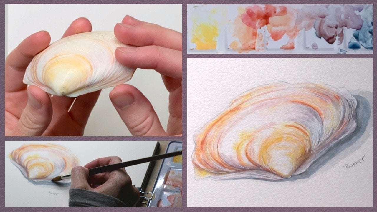
1. Watercolor: Introduction to Layering: Hello. My name is Molly Barker, and today we are
going to be learning about the watercolor
technique of glazing. In this class, we will be
starting with a blank page, and by the end, we will have a beautifully finished
watercolor painting. This will be broken
down into steps. First, we'll find a
flower as a subject. We'll then lay down our initial sketch, finalize our drawing, apply a full page wash, lay down our initial
wash onto our drawing, and then add the details
through glazing. I have been a lifetime
artist and have found that the more techniques
that you have available to you in your
personal repertoire, the better you can
represent the world in your art in the
way that you desire. Think of everything
that you've learned as an individual tool in
your personal toolbox. You can use these
tools individually, or you can use them in
conjunction with one another. And oftentimes the outcome
is much more grand or alluring when using
different techniques together than if you
used it in isolation. Also consider that
your toolbox is different than any
other artist out there. And the more tools you have, the more individual
your art will become. That being said, let's
get right into it. In the next lesson,
we will cover the required materials and the project for this
class. I'll see you there.
2. Materials and Project: Welcome back. Let's
briefly cover all of the materials that we're going to be using
for this class. Let's start with one of
the most important aspects of a painting the substrate. My favorite paper to use is this watercolor
paper from arches. Hot Press, 140 pound, 100% cotton in block form. This paper is smooth and
absorbs water beautifully well, and it being in a block allows you to paint
all the way to the very edge without having
to use any masking tape. As for the pencils and
brushes we will need, my favorite pencil for the
initial sketch is this 0.5 millimeter pentel
P two oh five. It's light and
allows you to sketch quickly without having to
worry about a fine point. The pencil we'll use for
the final drawing is the Febrecastel matte pencil
in an incredibly soft 14 B. This allows for
dark lines without the worry of marring
or gouging the paper, and the mate quality is
beautiful underneath watercolor as there is no
shine or glint visible. The brushes that I'm
going to use are the Windsor and Newton
Series seven sable brushes, both round in the size seven for larger washes and the
size three for details. These are wonderful brushes
and last a very long time. But again, they're
rather expensive, so you can use any
brush that's similar. As for paints, I'm using the Windsor and Newton
professional watercolor paints. You can use whatever paints you have as the professional
paints are a bit pricey, and their student
quality paints, the Cotman Series, will work just fine for
this class as well. You don't need every color and variation of that color,
but you will need a few. Also, you'll need a
piece of scrap paper to test your paints on and a paper towel to
dry your brushes. And finally, you
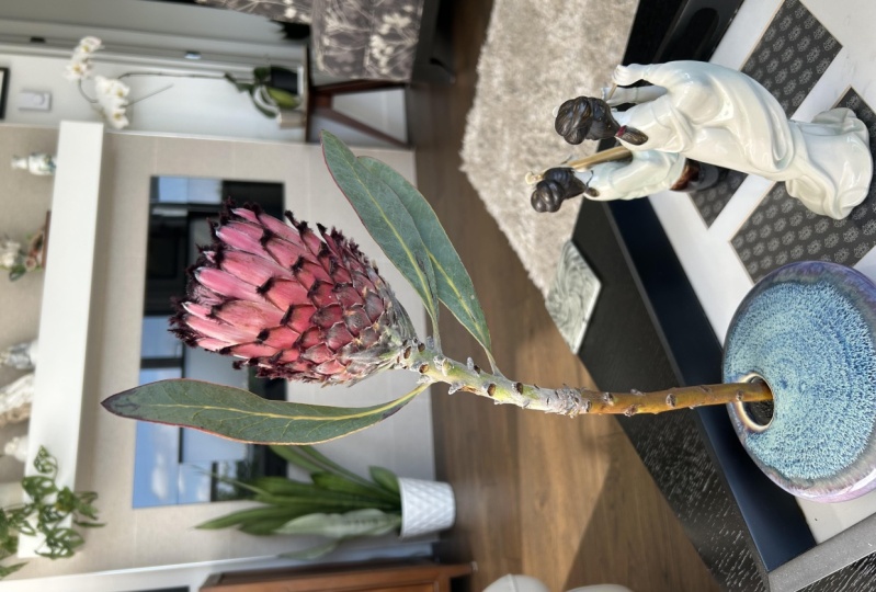
will need a subject. I can't quite stress how important it is to
have a subject, in this case, a flower
in front of you, as opposed to a
picture of a subject, as it really changes how you will translate that flower from third or fourth
dimensional reality onto this two dimensional plane. As for the project
for this class, I would like to see
both a picture of your subject and the final
product of your painting. I would also love to see
the interim pictures from each lesson or a picture of the final drawing
prior to adding paint. You can upload those to the class project
section of this class, and I would be more
than happy to give you individual
tips and pointers. Alright, let's get
right into it. Our first lesson will be the initial sketch.
I'll see you there.
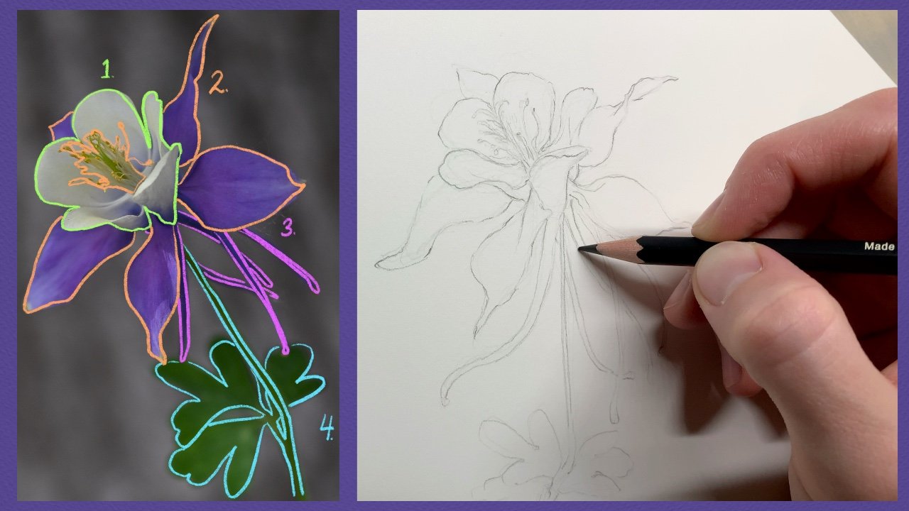
3. Initial Sketch: Welcome back. The first
thing that we need to do in this lesson is take a moment and look at
your chosen flower, turn it in your hands and find the angle that we like the
most and want to sketch. After tilting it and looking at it from
different perspectives, let's get right into the sketch. From here, we're
going to be using our mechanical pencil to lay
down a very faint sketch. At this stage of the painting, we're going to be
keeping our lines super faint so that you can easily plan out our drawing and won't have
to do any erasing later. These lines will stay on the
paper, and in my opinion, it actually adds to the texture and beauty of the
final painting. If you'd prefer,
you can also take a needed eraser to the
final sketch prior to painting and erase some of
the lines that were laid down that weren't used
in the final lines. One tip that I find
most helpful in this stage is to hold your
pencil at an extreme angle, as you can see me doing here. This makes it pretty
difficult to press too hard and will help to prevent you from accidentally
gouging the paper. In the next layer
of this drawing, we'll be going over it
again with a softer pencil, which will leave darker lines, and we'll be holding
her pencil at a more of an upright position. Another thing that you
should consider trying, while I'm sitting
here laying down this sketch and later
painting this rose, I'm keeping my upper body
and head fairly still. By holding your
perspective steady, it helps you to actually see what it is that
you're drawing. If you're constantly
moving around in your seat or moving
the vase of flowers, you can really easily
start drawing something in one perspective and accidentally finish it in another one. Keep in mind that you are taking a three dimensional object and drawing it in a
two dimensional plane. So by looking at it in only this one position with
very little variation, it can help you to more
easily translate what you're seeing onto the paper
and with fewer mistakes. The fourth dimension
that you have to consider while painting
things which are alive, like flowers is time. Learn to sketch and draw quickly if you
want to be able to capture the beauty of a flower in a sliver
of its lifetime. I once was sketching
a bed of snapdragons, and the flowers were
popping open and blooming before my eyes as
I tried to sketch them. This wild rose will only
last about a day in a vase. But within those hours, it will change drastically, wilting and dropping petals. Though this might seem a
little sad to think about, it is actually really beautiful. I've sat with a single
flower drawing and painting it several times
from the exact same position, and simply because of the
short lifespan of flowers, was able to capture completely different
looking compositions. I really like being
able to see how flowers shift and
change so quickly. This fleeting nature really
adds to their beauty. One of my absolute
favorite artists is Pierre Joseph Redoute. He spent most of his
career painting flowers, though they are all
stunning flowers, the parts that I
enjoy most about his paintings is that in them, he actually showed
what was before him, even with their faults,
crumpled petals and brown spots included. So the way the flowers change
is really stunning to me. Now that we have this
initial sketch finished, let's move on to the
next lesson where we will finalize our drawing.
I'll see you there.
4. Final Sketch: In this lesson, we're
going to be drawing over our initial sketch
with our soft pencil. One thing that I would
really recommend is investing in these
wonderful matte pencils from Fabert Castel. The lines just look so good
underneath watercolor, dark and without adding
any glinting shine. Anyway, I'm using a 14
B here, so very soft. Because of the softness,
I can easily make the lines fairly dark without having to
add much pressure, which again, will
protect the paper from accidental gouging
and therefore, prevent watercolor paint from
pooling in the next stage. At this point, we already studied our
flowers and laid down our initial sketch
that mapped out the flowers so we know the essential
placement of everything. This stage is simply choosing the final lines and
committing to them. As you draw these lines, think about varying the
pressure of your pencil and, therefore, the
darkness of the lines. Lines of varying widths
and lightnesses or darkness will draw the eye and create visual movement
in the final painting. It also helps prevent your final drawing from looking like a page out of
a coloring book. The lines are there to add interest and detail to
the final painting, not detract from the
painting itself. One of the most
important things about this step is to lay down
these lines with confidence. It is abundantly clear when the final drawing is laid down
with a lack of confidence. Even if it isn't exactly
as you wanted it to be, just continue to the
best of your ability. You don't want your final
lines to look sketchy. Be bold and lay down
the lines without fear. I actually love this
stage in a painting. I have sketchbooks filled with drawings of my final
lines but not painted. The more often you
draw and sketch, the easier this will become. I think also that the more
you draw in this way with a sketched out map of your idea all the way to the final lines
like you see here, the more you'll be able
to easily lay down your plans for paintings without a physical
subject in front of you. I think that having a
basic understanding of drawing and practicing
really helps to improve the anxiety
that is sometimes present when you're first laying down the lines
for a painting. I used to feel all of the
time that I just couldn't get the idea out of my head and onto paper in the way that
I imagined or wanted. Practicing in this
way makes it not only possible but also
really enjoyable. Alright, now that we have the final drawing laid down for our painting, let's move on. In the next lesson,
we're going to lay down our background with a soft
wash. I'll see you there.
5. Background Wash: Welcome back. In this lesson, we're going to lay down our
first layer of watercolor. I've often heard
this layer referred to as the breaking of the ice, as the first brushstrokes on a painting are often
a bit nerve racking. So with this layer, you're going to be covering
the whole page with the same watered down wash to add a cohesion to
the whole painting. I'm going to be using a mixture
of yellows for my wash. The main one is Naples yellow, which is a really
beautiful sort of creamy yellow, one
of my favorites. I'm going to mix
in a little bit of raw sienna and burt
sienna and add that to my first wash. And
I'll also make a separate wash that is
much more raw sienna, which I'll use a little later. It's important to
have the washes all made up and ready to go, because at this stage, you want to be able to lay down the wash onto the entire
page without it drying, which will give a smoother look without accidental
layers of glazing. So the first thing that
I'm going to do is sprit the whole page with water so that the entire
surface is wet, but not so wet that
the water is pooling. I like to use the spray bottle, but you can also just use a large brush that's
saturated with clean water. After that, we're going to
work with a little speed, not going crazy, but quickly enough that the water on
the page isn't drying. Take a large brush. I have a
size seven round brush here, but you can use something bigger or a different shape
if you prefer. And dipping it in our first wash that is
mostly naples yellow, evenly apply it to
the whole page. So long as the page is wet, you can go back
and add a bit more or smooth it out with your
brush if you need to. When you've laid down that first wash to your satisfaction, let's move to the darker
wash with the raw sienna. We're going to use this to make some beautiful color
blooms on the page. I'm going to really load up my brush with this
wash, and then, so long as there
is more water on my brush than there
is on the page, wherever you touch the
page with your brush, a soft bloom will appear. I'm going to lay
these blooms down mostly in two opposing corners, and then some in the third and only a few in
the final corner, just to allow for some visual
interest in the background. Now, we're going to lay down the darker wash and for the
most part, let them be. One of the tricks with
watercolor is knowing when to let it do its own thing and when to attempt to constrain it. Right now, we're just going
to let it do its own thing. One thing that will happen
since you're adding this additional water to
the already saturated page, you will likely
have some pooling toward the edges of the page. In order to prevent unwanted
water blooms from happening, dry off your brush and just lightly touch it to the page where you can see
the water pooling. So long as your brush
is drier than the page, the water will be
absorbed by it. Run your now wet brush along a paper towel and repeat until most of the
pooling is gone. And the final thing to do
while the page is still wet is we're going to
take a small twist of dry paper towel and
use that to gently lift off some of the water and pigment from a few key
places in our drawing. This allows some places
to stand out while still being somewhat grounded
by the background color. I'm going to pull off
some of the pigment from the blossoms and also from
a few leaves and stem. Don't agonize over this step. We're not removing
every bit of color or staying perfectly within
the lines of our drawing. We're just adding a few
initial highlights. And the final step
is to sit back and wait until the entire
page is completely dry. If you start to paint
the next layers prior to the page
being completely dry, your lines will often bleed, and you won't be able
to have those sharp, crisp lines that we want. Some people like to use a hair dryer to speed
up this drying process, but occasionally, that can cause your pigment to drift
in an unnatural way. I prefer to just step
away for a while and come back when I know it's completely dry and ready for
my next layers. In our next lesson,
we're going to add our first wash to the
leaves. I'll see you there.
6. First Leaf Layer: Welcome back. In this lesson, we're going to be
adding our first wash to the leaves of our wild rose. Our first order
of business is to choose the color that we
want our leaves to be. I'm going to use this olive
green as the main color of my leaves while
adding a small amount of naples yellow to
soften it a bit. After I have that mixed, you can see how much
pigment is in my mixture. It's quite dry and very
saturated with color. However, the first
wash that I want to use needs to be
quite a lot more wet. So take a big brush
full of the paint, move it to another
mixing segment on your palette and
add some clean water. I love having an eyedropper
nearby with clean water so that you can quickly add a few drops
whenever it's needed. Mix it up and test it out on your scratch paper prior to
putting it on your painting, just to be sure that
it's the right amount of saturation prior to painting and add more water or more pigment depending
on your preference. Another thing to keep in mind, because we lay down a blanket
wash over the entire page, your colors will have an
underlying slightly yellow tint, so they will appear a bit different than what you'll
see on a white page. The slight variation in
your color bothers you, it might be useful to
add the same wash to your scratch paper so that
when you test out your colors, they will appear the
same as what you will find when they lay down
on the actual painting. Okay, now that we have our initial wash, we're
going to get started. Don't worry about the original more saturated
green that we have. We're going to use that
in the next lesson. I'm going to be using my
size three round brush here. Let's go ahead and
start on our leaves. With watercolor, one
of the things that you must pay attention
to more than almost anything else is the wetness or
dryness of the page. We're starting here with
a completely dry page, so we're going to
be able to create some really crisp
and beautiful lines. As we paint on each
leaf, however, we need to try to paint the entire leaf prior to any
one section becoming dry. As you'll see in
our later lessons, if you paint a wash over
another wash, it will darken. And when this is
done accidentally, it can create some
really unpleasant looking lines and blotches. Like to think of this as
holding two translucent sheets of plastic in front of the light right next to each other. They're the same color, but
as you begin to overlap them, the section that is overlapping
will appear much darker. In watercolor, this
is called glazing, and we're going to use it
to our advantage later. But at this stage, we want our base color to be smooth
and free of splotchy lines. So when you paint each leaf, start from one end and paint all the way to
the other without going back and adding more water or pigment
later as it dries. A good tip on your brush will be really helpful with
this kind of painting. So one thing that
I like to do is, as you dip your brush
for more paint, while pulling the brush
backward along your palette, continually rotate until you lift the brush from the palette. This will allow all of
the hairs on your brush to come together and create
a really nice point. Go ahead and paint each of the leaves and stems
that are green, including the rose hips. But leave this main stem blank. We'll go in later with a
deeper brown for that portion. Okay, once you're finished
with this layer of wash, again, stand up,
stretch your legs, and let it all dry completely. In the next lesson,
we'll move on to the stem and add our initial
wash. I'll see you there.
7. Stem Wash: Alright. This is a short lesson, but let's mix up a
nice brown color for the stem of our rose. I'm starting with a
little bit of Indian red, and then let's add a
bit of Vandyke brown. This will make a nice warm
brown to match our rose. If it's a bit too
saturated with pigment, add a few drops of water. Now, our goal is to prevent accidental
overlapping of color, which has dried and thus glazing and creating
accidental lines or splotches. We're going to add the color to the main portion of the stem, and don't forget about
the thorns, as well. If you really examine the rose
itself, you can see that, though they are mostly green, there are also a few hints of reddish brown on the small stems that hold the
leaves together. So we're going to add some small hints to those stems as well. I always feel that it's
attention to these tiny, barely there details that can really make a painting
in its final stages. So try to pay attention to these small things in
your own paintings, and you'll really be able to see the difference
at the end. In our next lesson,
we're going to be adding our first wash to our blossoms.
So I'll see you there.
8. First Petal Layer: This is going to be another
rather short lesson, as we are just laying down
our initial washes right now, but more detail will
be coming soon. I have here a very water
down wash of permanent rose, such a fitting color name. And I'm going to color all of
the petals in this blossom. We are going to be working on depth and shadow
and detail later. So just trust the
process here and also don't forget about the small visible petals on that tiny bud. As we lay down these washes, keep in mind that the colors that we are putting
in place right now should be the
absolute lightest color. These are going to be the
highlight colors that show through at the very
end of our painting. I feel like watercolor is
the opposite of working with oils or acrylics or
even gouache sometimes. With those types of paints, you start with a
middle shade and then add the low lights and the
highlights in afterward. But with watercolor, the first shade you add is the
highlight working backward with more and more
heavily pigmented paints until you add the darkest
shadows, absolutely last. Okay, with those
blossoms colored, let's move on to
our next lesson, where we are going to be
adding our first details. I'll see you there. Oh
9. Glasing Layer - Leaves: In this lesson, we're
going to be using glazing to add the
details to the leaves. This is a bit time consuming, but let me tell you,
the final outcome makes it all really worthwhile. The first thing
that we're going to do is reconstitute our green, which we used for
the initial wash of the leaves simply by
adding a bit more water. A really good thing about having the same scratch pad when
you're working with glazing is that you can check how the
colors will look on top of the prior wash before having to put it on
the painting itself. Alright, once you're satisfied with the color that
you're going to be using, let's get into the
painting itself. Take a moment to study
the leaves of the rose. You'll notice that there are many little veins that run
through the entire leaf. But specifically, there is a main vein that runs
down the center, and then the veins that branch
out pretty regularly from the center vein that move
out to the edge of the leaf. We are going to be using
the technique of glazing to emulate the darker
portion of the leaf, which is in between
these tiny veins. And the lighter green
that remains will be the veins on the leaf
that you can easily see. The difficulty in this is that you're trying to make
the veins almost as thin as possible without two wet segments
accidentally touching. If you do end up unintentionally connecting two
segments, don't panic. You can either leave
it as painting with watercolor is often about
giving up some control, or just take a piece of dry paper towel and
dab the wet segments, picking up some of the pigment. Wait until it's dry
and just try again. The technique of rolling your paint brush as you
pull it back and out of the paint is really
useful when you're working on such small
and fine detail. If you'd like, you can
also size down your brush, but something to keep in mind, by sizing down your brush, it has less capacity
to hold paint, so you may end up having
to dip more frequently. I find that the best
practice is to use the largest brush that you can for the size of detail that
you're attempting to paint. That way, you can hold
the maximum amount of paint and dip the fewest amount of times during the process. As is always the case
with watercolor, you have to be
mindful of the water drying so that you can avoid
unintended glazing lines. As you're painting, be mindful about the
directionality of the leaves and where the
center vein actually falls. There are only a couple of
leaves that are truly full facing and thus have the center vein down
the middle of the leaf. All the rest will have the vein arching closer to one
side or the other. Although these kinds of details are often rather time consuming, they are also some of my most favorite
portions of a painting. It's really easy to turn
on some calming music or listen to an audio book and just get lost in tiny details. For a simple example of how long these kinds
of details take, the glazing on these few leaves took about 35 minutes
in real time. And though that might
seem like it is too long, I would like to ask, is your goal to paint
for speed or detail? I'm going to show you
how long it takes to paint this one tiny
leaf in real time, just so that you can
see how the technique looks and how slow I'm
actually moving my brush. It will be about a minute, so I'll put on some music for you. There are many other
techniques that one can use that result in less detail but are equally beautiful
in their own way. But along the same line, it's good to know many
different techniques, some for detail and
some for speed, as each can be used effectively in different circumstances. Okay, now that we're
done with the veins, let's go back and
add a third layer to the leaves to create some
more depth through shadow. The light source is
above my flower, so keep in mind where the
shadows are going to be. Also, think about how the leaves themselves have a
nice curve to them. So by adding some shadow to
the edges of the leaves, but leaving the rest
the lighter color, it will give it a
soft rounded look. As you add these shadows, don't worry that the third
layer of glazing will remove all of your hard
work of the previous step. The shadow green going over the top of the already
glazed area will add a third layer and the veins will only
get a second layer. So the veins will
still be visible. And just look for a minute at the difference that those
few shadow details made. It really makes the leaves pop. Okay, let's move on
to the next lesson where we will be adding our glazing details to the blossoms. I'll see you there.
10. Glasing Layer - Petals: In this lesson, we're going
to be using glazing to add the details and shadows to the petals of our blossoms. The first thing that we
need to do is, again, reconstitute our
rose colored paint and do a quick test on our scratch paper to
make sure we have it at the correct level of
saturation that we want. If you look at my poor subject, you can see that I finish this painting over
a two day period, and sadly, it has lost
a little bit of life. If you want to use a live
subject for your paintings, it's best to start and finish the painting
all in the same day. Otherwise, you may
have to end up using mostly your
memory to complete it. Now, with the blossom, we're going to do it a little bit differently than the leaves. These blossoms won't
be extremely exacting. Instead, think about
movement and fluidity. One of the things that I really love about flowers and roses specifically is
the stark contrast between the thorny stems, stiff leaves, and the
soft fluid velvet of the petals and blossoms. So that is what we are
essentially trying to capture. I want to have this
wonderful contrast between the stem
leaves and blossoms. It should flow between this
feeling of rigidity and structure and the stem and the whimsical softness
of the blossoms. So we're going to be picking out the soft details on the petals, first of all. Look
at your subject. I hope it's more
lively than mine, and see where the
slight ridges on the petals are and the way
the petals curve toward you. Pick those out with
the first layer of glazing and also add your first layer of
shadow underneath the petals toward the
center of the blossom. As you work, always
be mindful of your light source and place
the shadows accordingly, always on the opposite
side of the light. Also look at the difference in colors between the
blossoms and the bud. The bud, overall, has
a much deeper color than the already unfurled
petals on the blossom. Another thing to
think about is that petals are also
somewhat translucent, so the shadows won't
be extremely stark. Some light will continue
to shine through. So as we're working through
these details and shadows, be sure to leave segments
of petal that only have the first wash
on it as a highlight. Also, though we are adding many different
layers of glazing, we still need to be
really mindful to allow each layer to dry prior to
starting on the next layer. One way to be sure that
each layer has time to dry is to bounce around from
one blossom to another, sort of like honey bees and only come back when
the layer has dried. Each additional layer of glazing will be
darker than the last. So each new layer should cover a smaller and smaller
area of the painting. And as we get closer to the final stage of
glazing on these blossoms, let's also add a few small
line details around each of the petals to help delineate between when one petal
ends and another begins. We can just add some of this dried paint to our
already damp brush to saturate the brush
with pigment and allow us to paint with
it almost like a pen. Okay, that all looks really
good now. So let's move on. Let's go ahead and
add a little bit of depth to the stem here before we move on
to the next lesson. We can reconstitute this
reddish brown that we used before and add a little glazing to show some of the shadow. Before we finish with the brown, let's also add a little
of this color to some of the smaller stems that are
visible between the leaves. Sometimes adding
just a few hints of color is better than
coloring the entire stem, as it will create small
hints of interest that also make your eye want
to move around a painting. Alright. With that all done, let's move on to our next
lesson. I'll see you there.
11. Blossom Center: In this lesson, we're
going to be adding that little pop of color to
the center of the blossoms. One thing about watercolor is that it is very translucent, so it makes adding a
lighter color on top of a darker color
nearly impossible. Tiny bright highlights
that you choose to add at the end of a painting
are very difficult. So we're going to mix up a paint that is really
saturated with pigment. I'm going to be using
my naples yellow, and since it isn't quite leaving the impression
that I was aiming for, I'm going to add a
bit of my white, which is the most opaque
watercolor that I own. I sometimes cheat a little and use a bit
of gouache on top of my watercolor if I want to make some small changes at the
very end of the painting, but let's not cheat today. So let's add this somewhat
opaque color to the middle of the blossom and also let's add a bit of it to the stem
near these thorns, as wild roses tend to have slight areas of white
on their stems. Alright. That looks good to me. Let's go ahead and sign it. I think I'll sign it
in this green that I've been using. All done. I like it. Alright, let's go to the next lesson
where we will remove the page from the block.
I'll see you there.
12. Separating Paper from the Block: Welcome to the final lesson. One quick note that
I want to make about removing a sheet from
a watercolor block. Always use a sharp knife
to cut through the edging. If the knife you're
using is dull, it can cause the paper
to bend or tear, which you certainly don't want. Thank you so much for
spending your time with me, learning about glazing
in watercolor. I have several other classes using different
watercolor techniques. So if you enjoyed this class, please check out
some of my others. I really look forward to
seeing your class project, so please remember to post it to the class project section. If you have a moment, I would very much appreciate a review, and please share this class with anyone that you
feel might enjoy it. Thank you again, and I hope to see you in another
of my classes.
 Molly Barker, Lifetime Artist - Creative Entrepreneur