Transcripts
1. Introduction: Hello, my name is Molly Barker. And today I'm going
to be teaching you the fundamental strokes and
techniques of watercolor. We will then apply
those fundamentals to a beautiful painting
of a seashell. Watercolor is one of the most
rewarding mediums to use. The supplies are
relatively inexpensive and with a basic understanding
of a few fundamentals, you can transform a sketch into a vibrant and beautiful
finished piece of art. In this class, we will be covering all those
fundamental techniques and strokes that you
will need to go from a blank page to a
finished painting. We will start with the
basics of observation. How to sketch with the
intention of using watercolor. Initial washes, color mixing, adding shadows and
layers to create depth. And then finally using fine details to pick
out areas of interest. I so look forward to going on this watercolor
journey with you. In the next lesson, I'll be covering the
necessary supplies as well as the specific
materials that I prefer to use. And we'll go into
more detail about the class project.
I'll see you there.
2. Project and Materials: Hello and welcome to
the first lesson. Let's start by going
over the class project. It's pretty straightforward. First, we need to find our subject in this class
that is going to be a shell. I have a few different
shell photographs in the class resources section, including the shell that I
am going to be painting. But I would highly
encourage you to pick a shell that you have. Mostly because it's
really nice to paint a subject that
means something to you. But also because it's
really beneficial to have your subject in front
of you sitting in all of its
three-dimensional glory. Next, We'll sketch the shell as a preparation for painting. And then we will be learning a few different techniques for watercolor that we will then
apply to our paintings. By the end, you
will have gone from a photograph or a real
shell to a sketch, to a beautiful
finished painting. Let's cover what
materials you'll need before jumping
right into our project. Hello again. In this lesson, we're
going to be covering the materials that you
need for this class. So the paper that I'm
going to be using is this large Moleskine
watercolor pad. And the tooth of this paper
is just slightly rigid. The pages aren't super thick
like some Watercolor books. But I really like this paper, so this is what we're
going to be using. You can also use hot
press, watercolor paper. The texture is more satin,
more smooth grained. And so it has a slightly
different look to it. Arches is a really nice brand. They also make cold
pressed paper. And so the texture of
this is going to be slightly more, more bumpy. You'll be able to feel
kind of a grain to it. This is a nice paper to use. And you can also get
watercolor sheets, just big giant sheets
of watercolor paper, and tear it down to the
size that you want. Actually really like to
do this because you get these really beautiful
edges to the paper. And it just looks really
nice when it's all finished. But for this class,
we're going to be using the Moleskine notebook. And then after the
notebook we're going to need watercolor paints. I have the Winsor and
Newton Professional paints. These are very nice. They have really
nice vibrant color. I really liked these paints. I also have the Winsor and
Newton Cotman series paints, which are the student brand. And they're substantially
less expensive. And I would highly
recommend these if you don't have any watercolor
paints right now, they're really nice quality. And I would say, though the Professional
paints are, are better, they're really
only slightly better. And I like these cut
the Cotman paints. I'm going to be using a few different sizes of round brush. I have here the
Kolinsky series seven, size three, and size seven. And at the end we're also
going to be using a size zero for some very fine work. I'll also be using this eyedropper to add clean water to my
paints periodically. And it works great since you can just fill
it with clean water at the beginning and not have
to worry about it again. We will also be
using a pencil of your choice for the
initial sketch. And if you want, you
can use an eraser if there are some errant lines
that you went to get rid of, I would recommend
a kneaded eraser. And I also like to
use these Clips to hold my sketchbook
open while painting. You'll also need a
big glass of water. The bigger the better.
If you'd like. You can also use
masking tape to be certain that you have
a nice sharp edge. I found that just
regular general purpose masking tape tends to work
better than artist tape. Artist's tape is a thicker
which sometimes allows for paint to bleed underneath where the tape is overlapped
on a corner. Will also use some Gelly
Roll pens at the end. And finally, you'll need a paper towel to dry your
brushes as you go along. And that's it.
Let's get painting
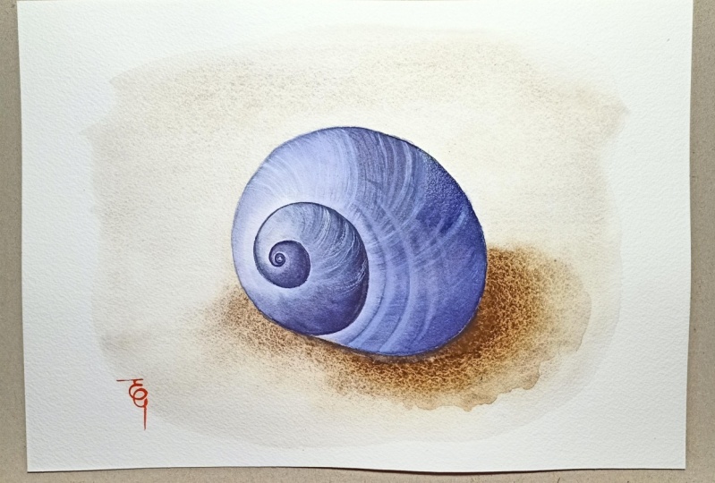
3. Examine and Sketch: Hello, Welcome to
our first lesson. The very first thing that
we're going to be doing is examining our subject before
we begin our painting. What are some of the most
important aspects of it? To me, I think that these beautiful
rusty colored riches are pretty unique
aspect of the shell. And also the fact that the
back edge has been broken. So these are two of the aspects that I
will want to focus on. Also take note of the
different colors for my shell. I see rusty colored ridges, creamy yellow and soft white. There's also a slight
blue and violet color. I think that I'll amplify
those colors in the painting. Alright, now that we have
all of that information in our minds and our shell or
photograph in front of us. Let's begin our sketch. The first part that I'm
going to be focusing on is the outline. Think about the space that the shell is
currently sitting in. What are the identifying edges? I want to be sure
that I get this down before moving on to
any other details. Also, I want you to take note of how I'm
holding my pencil. By holding it at
this extreme angle, it's easy to keep the
lines very light on the page without accidentally
gouging the paper. If you leave deep
lines in the paper from your pencil prior to
painting with watercolor. Oftentimes the water and
pigment will pool in those deep ridges and will make the painting
look a little off. So we want to remember to
keep our sketches Light. Think of them as simple
notes to yourself about key aspects that you'll need to remember
while painting. So as I continue with a
sketch of this shell, I've completed what
the outline looks like and am now moving on
to the inner details. This part is where
you'll be making note of the things that are
important to your Painting. Think along the lines of where are there different
segments of Color? Where will the shadows lie? And for me, where are the most prominently colored
images on the shell? These tiny notes later on, while you're painting is
incredibly useful as you can easily make a quick
correction here with your pencil. However, later on
while you're painting, if you make a major mistake, it's much more difficult to fix. You can see as I continually
go back and adjust my lines slightly to correct
the angles and dimensions. It's so much easier here. This tiny bit of extra work at the beginning is just
so incredibly useful. Also be thinking about the colors that you
want from your shell. With my shell, I can see several colors that
I want to amplify. I see the creamy yellow, that wonderful
rusty orange color on some of the
ridges, a soft white. But I also see some
faint blue and violet. One way to be sure that you
paint the correct colors in the correct spaces is to literally block off areas
with very faint lines. One thing to keep in
mind while sketching, all of the pencil lines that are painted over will
become permanent. So if there are some straight
lines that you don't like, definitely use a
kneaded eraser and very lightly dab them away prior
to putting any paint down. I normally all of my sketches because
I liked the way that the finished painting looks with this sketchy lines
beneath it. Okay. I think that I have
just about all of the information that I need
to have in this sketch. So in our next lesson, we will be laying down our very first Wash by utilizing
a wet on wet technique. This is the first layer, so it will cover the
largest amount of space, but will also be the
most faint color. I'll see you in the next lesson.
4. Base Wash: Hello again. We're going to be laying down our initial wash in this lesson, we're going to be using a
technique called wet on wet, which refers to having
both a webpage and wet paint or lots of water
with very little pigment. Let's do a quick demonstration of how this is going to look. First with the page
with good clean water, you are going to wet everywhere that you want the paint to go. Next, you need to pick
up some wet paint. So think very thin and watery
with just hints of color. The beauty of this technique
is that as you add different colors in different
areas, if you're painting, it will bloom and spread and sometimes mixed to
create beautiful, natural and sometimes
unexpected outcomes. So long as your paintbrush
has more water on it, then it's on the page. It will flow from your
brush to your page. However, something that is very useful to remember if you ever find that you've dropped in too much paint or the
water is pooling. All you need to do is dry your brush and it will absorb
the excess water and paint. Making corrections
fairly simple. You can see me
picking it up here. Okay, Now that you can see
how this technique will look, let's move on to our painting. The first thing that
you need to do is completely fill your
brush with water. You'll be using this to
wet the entire portion of the page that you want
the pigment to spread too. So don't be shy. I'm using a size
seven brush here. But if you're painting
is very large, you may want to use
a larger brush. One thing to take note
of at this stage, I want this Wash to add a base color to the
entirety of my shell. So I'm going to be
wetting the entire thing. If there are sections of your
shell that are completely white or has a very shiny
highlighted section. If you leave that area dry, the pigment will
stay away from it. As you add this water
before adding any pigment, go back and be sure that all areas are still
wet depending on the type of paper that you're using or if you're
inside or outside, or even if you were in a
more humid or dry area, your paper will dry
at different rates. Now that our shells
are completely wet, we're going to start
adding our Wash. I have this really wonderful creamy yellow color
that I really like. So I'm going to pick up some
of that with my big brush, making sure that there's
plenty of water with it. And I'm just going
to drop it in. This is where you're
sketch comes in handy. We already know where the different colors are
going to essentially be. So this is the Fun part. You can also see the difference between dropping a color in with a little dab and running
the brush along the page, which will leave a
lighter trail of color. Also notice how the colors spreads over the entire
section of the page. Isn't bleeding onto the
dry sections of the page. That is exactly what we want. When we finished with
the initial Wash, we're going to let it dry
completely before moving on. The edge of the shell
that was wet will have a really distinct
line where the paint dried without spreading
beyond the water. Alright, I think that's
enough yellow for my initial wash. Let's move
on to the blue-violet color. Now I want to add this to a couple of different
areas on this painting because it's going to be not only the blue tint
that is on my shell, but will also be the base
layer for the shadowed areas. My light source is coming
mainly from the top left. So I'm going to
see the shadows on the curved underside
of the shell. It's important to be
thinking about giving the painting depth even
at this very early stage. Also take note on how pretty the interaction is between
this blue and yellow color. Try not to overlay, blend
the colors together. Simply let them interact. If you blend the
colors forcefully, then you tend to end up with a really muddy colored paint. Not very attractive. So we've added our
blue Shadow Color. Let's move on to those
rusty colored ridges that I liked so much. I've got a terracotta
red that I think will look pretty nice for the
backdrop of the ridges. So let's start dropping that in. We're going to be placing
it where we sketched out the lines so it will
spread beyond those lines. But don't worry, this
is what we want. Keep the curvature
of the shell in mind as you drop this color in. One good thing to
keep in mind while painting with watercolor
as you begin, things look messy and sometimes not very good. But it's okay. As you lay down more
and more layers the paintings renders and
becomes beautiful over time. So don't become
discouraged if you think that these first
layers look bad, I promise it will get better. Okay, I liked that
terracotta red, but I think that I need
to deepen the color a little and maybe add
some yellow to it. I've added a little bit of raw sienna and that
changes it just enough. Let's drop some of this over the lighter red color and also along some of these yellow areas and watch them bloomed together. Wow, that is looking
really nice. You can see here at the
bottom of the shell, the page is beginning to warp
a little due to the paper. Don't worry, it happens and it's causing some
of the water to pool their you can really see what I mean about the
color becoming muddy. The yellow and blue
are mixing into an odd green and this
rusty color isn't helping. Let's take care of that. The first thing that we need
to do is rinse our brush in clean water and then dry
it off on a paper towel. Now that are paint brushes
dry the excess water on the page or went to flow
to the bristles of the brush, allowing us to pick up those
little pools of paint. I want to get this
bit here by the tip. But if there's anywhere
else that you feel has too much water
or too much pigment. Run your clean dry brush along that area and it will pick up a good portion of the pigment. Okay, Take a good look
at your painting so far. And if there's anything
else that you want to add before walking away
and letting it dry? Now is the time to do that. I think that I wanted
to add a tiny bit more yellow here, and that's it. In the next lesson,
we're going to be adding the first Details In the
key aspects of our Shell. We're going to be using
a wet on dry technique and a Dry-on-dry Technique.
I'll see you there.
5. Pick Out Key Details: Hello again. The first thing that I wanted to cover
in this lesson is a few different ways to use a round brush to attain
different types of strokes. By pressing on the
palette and wiggling my brush back and forth to
splay out the bristles. I can flatten my brush out
and create a fan like brush, which can be used to
create the appearance of several soft lines
running in parallel. Next, instead of
wiggling back and forth, I'm going to roll the brush in one direction as I
pull it backwards. As I twist, you can
see that some of the water that was in the brush
begins to be pressed out, leaving a dryer brush, which will allow for a finer
point at a finer line. Both of these techniques work best when used with
a dryer paint, less water, more pigment. You can see that by pressing a bit harder with the
fine point on the page, you can create a thicker line. As I turn my brush
tip, it's sharper. And if I press hardly at all, you can see how
find the line is. Moving on to the fan. Watch as I move the brush
very lightly across the page, you can see the soft stroke left behind by rotating the
brush as you paint, you can also go from Several
soft lines to a single line, which will come in handy
with this shell painting as it will allow us to give
the appearance of depth. Will be using this
technique mostly to show how the ridges wrap around the edges of the shell will really make the
shell appear to pop. Before putting any
Details strokes on your shell painting. I encourage you to
take a page and test out these techniques until you feel
comfortable with them. Plus they're a lot of PFK-1. Be sure to check that the initial wash on
your painting is completely dry before moving
on to adding details. If the paper is still wet, your Details will bleed onto the paper and they
won't look very sharp. The first Details that I'm
going to be adding will be the largest stripes of those rust colored ridges
with the fine tip. I'm going to mix up
some terracotta, red and raw sienna
to get this nice, rusty orange color
on my palette. Notice that I'm
using less water and more pigment as I begin
adding these details. At the beginning of a painting, you're going to start
with the lightest colors, leaving some of the white of the page as the
brightest highlights. In each additional step, you will be using less
water and more pigment, creating a darker layer each time you add an additional
layer of details. Okay. So as you can see, I'm following those initial
sketch notes to myself. I'm going to be placing these
details over the areas on the shell where I
can see the most vibrant, rusty colored ridges. Later, I'll be adding finer
and darker lines with a fan brush technique to detail the little shadows that you
can see behind the ridges. Also, notice how I'm curving around the edges of
the shell and varying the width of the line
depending on what I can actually see on the shell
sitting in front of me. One thing that I want you
to notice as you begin painting these Details
on my brush right now, I still have that wonderful
rusty colored pigment. However, as I travel over the different colors which
I used in my initial wash, you can see how it almost
appears that the color on my brushes changing sort of like holding two
different pieces of stained glass in front of a Light and then Layering
them one on top of the other. This is one of my most
favorite parts of watercolor. As this effect allows for some really beautiful and sometimes quite spontaneous
details to come about. Good thing to remember
with watercolor is that sometimes not
trying to control all of the different
effects allows for some really
wonderful Details. Alright, now that we've added our rusty orange colored ridges where we know they
belong on our shell. I'm going to go back
and grab some of this nice creamy yellow. Notice how much thicker
this paint is compared to the initial Wash. Again, I'm using more pigment
and less water at this stage to allow for a
lot more vibrant of a color. We're going to be using the
fine tip of our round brush again to just add in a little
more color here and there. I'm adding these yellow
ridges mostly over the areas on the shell that I placed the yellow
wash initially. Whole time that I'm
painting these details. I'm keeping the shape of
the shell in my mind and I'm curving my brush strokes around the sides appropriately. If you look at the shell, you can see that there
are no crossing or overlapping ridges because
of how the animal grows. So I certainly don't want to
make that mistake while I'm painting as it would be pretty distracting when our
painting is finished. The next Details that
we're going to be painting will be with
the fan Technique. So let's go ahead and
flatten out our brush. Okay, Let's take a minute to see how this technique
looks close up. See how I'm allowing my
paintbrush to stay flat in one direction as I move over the curvature
of the shell. That's allowing the
flare of the bristles to fan out and create
all those soft lines. And then as I move the brush
and a different angle, the lines will merge
together into a single line, making the angle of the shell appear to look more extreme. This is exactly what we want. Also notice that the paint
that I'm using is the same as the creamy
yellow we just used. By adding these lines
over the top of the larger fine
lines that we make, it will appear as though
the paint is thicker or has more pigment
with less water, every layer that you add onto a previous layer
will appear darker. So at this stage, we know how to do
this fan Technique. So let's apply it to the ridges
on the rest of the shell. I'm going to be using
more of this wonderful creamy yellow to highlight
some more of those ridges. Also remember that
the initial wash that we laid down of the blue on either side of the shell is meant to
be parts of the shadow. So we're also going
to be adding some of those yellow ridges to
the edges in the shadow. Let's also add some
to the tops of the widest parts of the
shell for some interests. And we're also going
to be adding some of those soft brush strokes
in the rusty orange color. You can see that by adding
these little brush strokes really adds a lot of interest
without much effort. Okay, in our next lesson, we're going to be adding details which are
quite a bit darker, including some of
the shadows that are present on the shell
to create the look of depth and the feeling of
dimension. I'll see you there.
6. Darker Wash and Shadow Color: Hello. In this lesson, we're going
to be adding a darker Wash, more details of
the little ridges. And also a nice deep
blue violet Shadow Color to the underside
edges of the shell. As I mentioned in
the last lesson, since watercolor is transparent, adding layers on top of
each other will still allow the previous colors
and details to come through. Depending on how many different
colors that you're using. You may need to be more cautious as to many different
colors layered over the top of each other can
have a tendency to look muddy rather than vibrant. So as we work on this stage, let's keep that idea in mind. When we add a new layer, try to keep it in
the same family as the colors beneath it. That being said, you can see that I've been adding
larger areas of wash around some of the Ridge Details that I
painted in the previous lesson. We're going to continue
adding the yellow and some more vibrant
reddish color to our rest, orange areas, as well as a
few new areas of Ridges. I'm pretty happy with those
details at this stage. So let's spend a little time mixing up a good Shadow Color. As you can see, this
first shadow color that I mixed just didn't feel
quite right to me. It is a bit too much
of a murky brown. And I think that it just
didn't look right with all of the more wholesome
looking pastel colors. So I went back to the
palette and try it again. And that is one of the
best parts about painting. If you find that you just don't like a color, no big deal. Go back and try again. This next color that I mixed
was much more appropriate, a bit brighter with more vibrant
reds, blues and violets. Let's fan out our brush and
add some shadow details. As I mentioned before, this fanout Technique with
a round brush tends to work much better when you have
less water on your brush. So be careful about
how much you pick up. If you end up having too much a quick dab
on a paper towel, will quickly dry it out. Then just array the bristles again on a try section
of your palate. Again, the light
source from my shell was from the top and
slightly to the left. There were cast shadows, mainly on the bottom right edge. And the shadows from
the Ridges were more pronounced on the
right-hand side, giving the shell a
slightly bluish hue. We're going to go in there. And not only add the cast
shadow on the shell, but also add in those
little Ridge shadows. I really love how this cool shadow color looks next to all of these
warm pastel colors. Since the shell is rounded, there was also a bit of a cast shadow on
the left-hand side. So let's not forget
to add a bit of shadow over on
that side as well. It's important to not go
too overboard with all of these colors and
to allow some of the initial Wash to
continue to shine through. I always say that as
you begin a painting, you should start out painting the largest areas with
the lightest washes. Then as you progress
with your painting, each successive
layer should become both darker and smaller. So the closer that we get towards the end of the painting, the finer the detail
should become with the most pigment and
the least Water. At this point, we have
some pretty dark paint. That is to say lots of
pigment and not much water. We're going to be taking
this and going around, adding to the areas that are
to clean or don't adequately represent either how
the shell looks in real life or how we want
to portray the shell. We're going to be adding
some more of the creamy yellow to areas that need
to be darkened slightly. And also some more of our rusty orange color to areas that need
a bit more detail. Then I'm going to also pull
up some Payne's gray to add a slight bit more of a cool blue to a couple
of small sections. You can see as I paint this on, it really does add more
interests since there's so much warmth in these warm yellow and
warm orange colors. By adding this blue, it just makes it pop. Lastly, let's look
over the shell one more time before we
let it thoroughly dry. Before our next lesson, I'm going to be adding a bit more of the rust colored riches. And I also want to add a little more Shadow Color to the bottom edges
of the shell. You can see if you look at the right-hand
side of the shell, there is a darker shadowy area, more to the top side, followed by an area
that's lighter. And then the darker
underside strip of lighter color is
actually from light reflecting off of the
desk from my window, which is to the right, not the light source from
the upper left-hand side. I thought that it was
so pretty to have that small area
of lighter color. So I wanted to be
sure to add it in. The next lesson, we're
going to be painting the shadow cast by the
shell onto the desktop, which really gives it dimension. We're also going to be adding our last Details and watercolor. I'll see you in the next lesson.
7. Shadow on Table and Shell: Hello. In this lesson, we're
adding our cast shadow, followed by a few
more tiny details on the shell with our
smallest size zero brush. We're going to start out by
mixing a nice wash out of our Payne's gray and a
tiny bit of lamp black. A good tip. A little black
goes a really long way. Another tip. Really take note of
where the edge of your shell is before
putting any shadow down. As we want the shadow to be an extreme
differentiator between your shell, the desktop. The light source that I have
isn't a single point bulb, but a strip of several light's coming from the upper
left-hand side. The shadow that is cast is
going to be slightly varied. There'll be a very dark area directly beneath the
edges of the shell, followed by a slightly
lighter shadow and then a somewhat faded out
fuzzy shadow near the edges. Especially since I have a bit of light coming in through a
window on the right-hand side, which will soften the
edges of any hard shadows. You can see as I lay down this final Wash of
shadow that I'm leaving the edges somewhat broken to imply that there is a light coming in from
this side as well. I think this slightly
broken shadow actually looks really nice with the added fact that
the back part of my old shell is a bit
shipped and broken as well. As I mentioned before, watercolor is very transparent, which is one of its charms. One thing that I really
like to do, however, is at the very end
of a painting, add some very fine details
with a White Gel Pen, which we'll do in
our next lesson. What I'm going to
do right now is grab some of this
titanium white paint. And I'm going to use it
to not cover Details, but softens sections of the
painting in anticipation of using that Gel Pen later to pick out some
highlights on my shell. When using white in watercolor, I find that the least amount of water you can use, the better. The white details are a bit difficult to pick Out on camera. But I assure you that
in-person you can really see the subtle
softening that it adds. I'm not going to get too carried away with adding
these white sections. And I certainly don't
want to muddle any of the very vibrant sections of
details that I've painted. Like I said, I'm just softening a very few areas that I
anticipate using my gel pen on. Okay, now that I've softened some areas and added the
shadow onto the desktop, I'm going to really look at the shell and think about
what else it needs. I think that overall it's
starting to look really good. But having the contrast
of the dark shadow on the desktop makes me want to darken up the shadow
on the shell a little. So let's get a little more of this blue-violet
Shadow Color and we'll add a final layer to the most extreme
edges of the shell. By doing this, I think that it really adds a lot of depth. If you feel like you're painting is a little too flat looking, I would really
encourage you to add another darker layer as
having a greater contrast between the areas of
light and the areas of shadow will give your subject
a lot more dimension. Again, I'm only adding
a little bit of this darker layer to the absolute darkest
part of my shell. And you can see that I've sort
of feathered the edges of the shadow to allow for the appearance of the uneven
surface of the shell, which is the shadows
behind the little ridges. Now that we're done
with a shadow, I think that adding
the thinnest lines of this rust color will help to make these portions standout most amongst all of
the other colors. I'm going to mix up a
bit more of this color, but this time I'm going to make the red aspects a
bit more prominent. These are going to be among the last details that we're going to paint
onto this shell. So take a little time, look at your own painting and really think
about if there is a portion or aspect of your painting that
feels deficient. Is there a section
that seems to empty? Maybe not enough
contrast or color? Now is the time to remedy that. That being said,
it's also really important to not
overwork a painting. So be honest with yourself, does your painting
feel finished? Having areas with
minimal details can be beautiful as well. So try not to fill every square inch with as
much detail as possible. Instead, allow some
of the white of the page or some of the
initial Wash to shine through. Okay, we're going to
switch up our brushes. Let's get our
thinness liner brush. I have a size zero here, and we're going to dip it
into our darkest color yet, I have some Payne's gray on my palette and we're going to be using that with the least amount of water that we
can get away with. This is the last thing that
we're going to be painting. And after this, we're
going to move on to our white gel pen to add a few different
kinds of details. What I'm going to do with
this little liner brush is pick out the finest details. We're going to be twisting the bristles as we
pull it through the paint to create
the finest point and thinnest line that we can. As I sit here looking at my
nearly complete painting, I've decided that I need to have a bit more of a delineate or between the edge of the shell and the white of the page. Especially since my shell is broken in places
on the back edge. So I'm using this
super thin liner to showcase the
edge of the shell. Now I'm not taking
this and adding a dark line all around my shell. I'm going to be varying the thickness of a
line and picking out key areas of the edge and expressing the fact that
this area is broken. I specifically picked
the shell because I really like how this broken
edge gave it character. So I'm highlighting
it just like I highlighted those little
rusty colored ridges. I'm also going to
take a minute with this extremely fine brush to add a few thinner lines in this
super dark Payne's gray. I really like how this
turned out as it adds quite a bit of interest
in this shadow area. If you want, you can
take this liner and add some additional colors with
this super thin line as well. But I thought that now
is a good time to stop. In the next lesson,
we're going to be using our White Gel Pens
to break apart some of the larger blocks
of color and add some luminous highlights.
I'll see you there.
8. Add Reflected Light and Ridge Details White Pen: Hello. In this lesson, we're
going to be taking out our White Gel Pens
and we'll be adding some really interesting
details with them. This is one of my favorite ways to add interest to a painting. There are several different
ways that you can utilize White and
watercolor painting. The most traditional ways
to use masking fluid at the beginning of your
painting to block off certain spaces from paint. When the masking fluid dries, it feels somewhat rubbery. You paint as if it's not there. And then at the end
of the painting, when you peel it off, the
white of the page is visible. Using masking fluid
is really wonderful. And if you'd like more
instruction about it, I have a class that I use it in where I paint
milkweed seed pods. However, using masking fluid requires a lot of
forethought and planning. And sometimes you just need
to have to be able to add some white to areas that you wouldn't
have thought before. This is where the
Gel Pen comes in. What I'm going to
be using it for. Firstly, to pick out specific highlight
areas that I want to have a really
beautiful, clean white. And also I'm going to be
using them to break up sections of color that I
wanted to have more detail in. I have three different
sizes of Pen, 0,508.10. I'm currently using size 05, which is the smallest size. And you can see how fine of a line I'm able to make with it. I'm also curving around
the shape of the shell. So it's still creating that feeling of
depth and dimension. At this point, I'm going to
move on to my size 08 PIM. You can see how much
thicker the line is that it leaves behind. With this pen. I'm going to be focusing
more on larger sections of white where you'll need
a much more visible line. You can really see how having these sharp white
highlights adds a tremendous amount
of visual interest. One thing that I
wanted to mention, both with watercolor and
now with these Gel Pens, I'm not starting on one
side of the shell and creating a ring that
travels all the way across the top of it to the
other side by breaking up the line with areas of highlight and varying the
thickness of the line, you're able to make it look
a lot more interesting, even though if you closely examine the
shell in real life, the ridges are
consistent all the way around from one
side to the other. Also note that the highlight
that I'm placing on the right-hand side are reflected
lights from the window. Alright, we're
going to move on to the largest size of
Gel pen, size ten. And you can see that
this line is very thick and leaves quite
a mark on the page. We're going to be a
little more cautious about where we lay
these lines down. Use this pen mostly for larger areas that you
want to be much brighter or on very light areas that will need a larger line
to be noticeable. After we're done with this pin, we're actually going
to go back and smooth out these lines a little with
some of the smaller Pens. Another thing to note
with these Gel Pens, occasionally some of
the white gel paint will dry on the
tips of the pins, which can cause it to be
either completely clogged or sometimes just for it to leave a weird or clumpy looking line. So periodically take
your pen and roll it around on a paper towel and
it should clean it off, allowing it to flow
properly again
9. Signature and Critique: Hello. So we've reached the final
step in our painting. Some people like to sign their names with the
same color every time they sign a
painting, like Bob Ross. But I prefer to sign in a color that has been
used in the painting, making each signature a little more unique and
special to each one. So this is our
finished painting. I think one of the
easiest ways to learn from each one of
your paintings is to take just a minute
or two at the end and really contemplate the
aspects that you like. And almost more importantly, the aspects that
you don't like that you can improve upon next time. My favorite parts
of this painting are the highlighted areas of white Reflected Light here on the right-hand side and also this section on
the top-left that demonstrates all the
different layers from almost white page to the extreme details
of all of the riches. However, the part that
I feel that I can improve upon next
time as the shadow. I think that instead of
doing the shadow in stages, allowing each section to try first may not have
been the best choice. Next time I make a shadow
with multiple light sources. I think that I'll use a wet
on wet technique so that they blend a bit better and it
isn't such a sharp line, but we'll freed
gradually to soft edges. Thank you so much
for joining me. I really hope that you learned a lot and we'll utilize some of these techniques of watercolor in your own painting practice. I would love to see
your shell painting and would very much
appreciate a review. I have several other
watercolor classes teaching about different aspects
of the painting process. So please feel free
to check those out and my other classes. Thank you again for
spending time with me and I hope to see you
in my other classes.
 Molly Barker, Lifetime Artist - Creative Entrepreneur