Transcripts
1. Modern Watercolor Introduction: Hi, my name is Molly Barker, and today we are going to be learning about modern
watercolor techniques. Watercolor is one of my
absolute favorite mediums. There are many different
techniques that can be used to create and
highlight various looks. From wet on wet blooms
to using salt or using granulating pigments to emphasize the texture of the
paper you're working with. In this class, we are
going to be focusing on a more modern looking
smooth technique, which will highlight
this beauty of layering and generate a
vibrant and lively colour. The final painting
will have a fresh, clean, and simplistic book. We will use this idea
of modern watercolor to create a painting of a
group of potted plants. We will have gone from a
blank page to a sketch, to a final illustration using watercolor in a fresh
and trendy way. I look forward to exploring these watercolor
techniques with you. I'll see you in my next lesson.
2. Class Project: During this class, you will learn several techniques about how to organize a sketch
with ink to showcase depth. You'll learn about mixing watercolor paints
to show vibrancy. How to quickly add dimension
through layering using more saturated shades and using other medium to
add finishing touches. The project will be to
take these concepts and create your own illustration
of potted plants. Will break it down
into three main steps. Sketching out your design, painting it with the watercolor
techniques seen in class, and photographing your
final illustration and uploading it to
the project gallery. This class is intended for the beginner with no prior
knowledge of watercolor. All the way up to
someone who has been using watercolor in
finished illustrations. But may want a
fresh perspective. You don't need any prior drawing
or sketching experience. You can just pick up
tips along the way. I would recommend that you also look through the
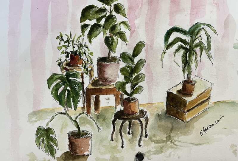
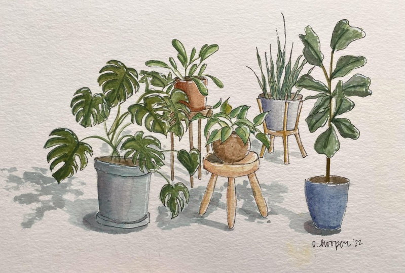
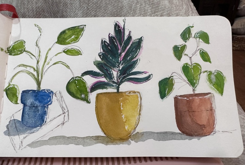
project gallery and see how fellow students decided to paint
their illustrations. I'll see you in the next lesson.
3. Materials: Hello again. In this lesson we're just
going to briefly cover the materials that we'll
need for this class. I'm going to be using this
Arches hot pressed paper. It has a very fine grain to it. It's very smooth, very sudden. And it allows the watercolor to really smoothly coat the page. So this is what I'm
going to use for this modern technique
of watercolor. So this is the paper
will be using, and then we'll also
need some paints. I have the Winsor and
Newton professional paints. You can use any paints. These are the ones that I have. I like them the most. We'll also be using a micron
0.005 archival ink pen. At the end, we'll be using
a Jelly Roll pen for fun. And then we'll also
need some brushes. I have the Kolinsky
series seven brush, and we'll be using this size
seven and the round brush. And then we'll also be using
a size three round brush. And any brush that's that's around this
size would work well. So these are the things
that we're going to need for the painting. We'll also need some water, makes sure that you
get a big chunk of it. And that's all that you'll need. Let's go ahead and get started.
4. Ink Sketch: Hello. In this lesson,
we're going to be using our waterproof ink. This is a Pigma
Micron pen in black, are very small size
and we're going to be using it directly onto
the watercolor paper. So this isn't a pencil, this isn't something that
you can erase later. But it is really mostly a guide as to what we're
going to be painting later. So you can think of this as sort of a layout of where
you would like to paint. This isn't going to
be the only place where paint is going to
be placed upon the page. So the first thing that
we're doing here is we're figuring out what plant
we want closest to us. Since this is a waterproof ink, this isn't something that
you can erase later. And so you want to identify
what is closest and draw that first so that you
don't have lines which are intersecting things
behind or in front of them. So I've decided to put this
nice tall leafy plant first. And what we wanna do is have the illustration be somewhat
balanced, somewhat cohesive. And so what I've decided
to do is have somewhat of a triangle of plants
coming up to the top. So we're just going to draw in what we think
plants will look like. If you'd like to go and actually research what the plants
really look like, please be my guest. But for this illustration, I wanted to just sort of have
a leafy jungles of plants. And so I've made up
several of these. Some are actual plants and
some are just for fun. So you can see I have this, this small side table with these two plants closest
to the, to the foreground. And then I'm going
to have a little bit taller of a stand to the right. And then behind it will
be the tallest stand. And we'll draw that in a moment. But you can see as
I'm drawing here, It's not it's not super detailed and it's not
incredibly precise. So there's no need to be really concerned because you're going
to have paint over this. Though. You will still be
able to see the ink, which actually
looks really nice. It's not going to
be overwhelming. It's not going to be the main
focus of the illustration. So definitely be aware of where you're drawing things and where you want the
illustration actually sit. But don't be overly concerned. I feel like with these
kinds of illustrations, what you want to do is
have the feeling of, of the plants or
the furniture and not necessarily have this incredibly
detailed illustration. I think that modern
wet watercolor paper. I think that modern
watercolor painting is more about feeling and just the idea
of something as opposed to this overwhelmingly
detailed image. So as you can see, we're almost done here. We're just going
to be illustrating the the plant that's
gonna be in the back. I felt like this wasn't quite cohesive enough.
Cohesive enough. So I wanted to bring it
all back to the middle. And so you can see, I've got a few little pots
on this stand in the back. And then I think that we
should have one big plant in the background coming up to
the top and making a peak. And so you can see, this is why I
illustrated this last is because now I'm able to draw the legs of this little
table around the leaves. And it's not super imperative. It's okay if you make a mistake. It really isn't very noticeable once you get
the paint on there. The line art isn't going
to be very noticeable. The paint is what's going
to jump from the page. And so this, again, this is just a guide for how
you want the paint to lay and what sort of leaf
shapes you want for each plant. So as you can see here, I've got some much larger sort of jangly style of
leaves here in the back. And I thought that was really
good at sort of set off the different styles and types of plants that
you can have in a pot. And if you're anything like me, this is actually what
your house looks like. You have a whole jungle
of plants at home. And so we have just a
few of these leaves. And we're gonna go back
when we do the painting and we're going to be putting
in additional leaves. These won't be the only ones. This is just sort of a feeling for what the shape will be like. So at this stage, we're just going to be finishing up filling
out the plants. We're going to put in the
little leaves and sort of sit back and make sure that this is how the
illustration should look. See if there's anything else
that you'd like to add in. And then you're going to
be starting our painting. I'll see you in the next lesson.
5. Base Color - Leaves: Hello again. So as
you can see here, the paper is taped down. You want to do that
to reduce any kind of warping when
the page gets wet. And I've got my brush here. And we're going to start by just sort of getting
a nice sap green, a green that you like, a nice green color. And we're going to use that
to paint one of the plants. Again, for the most part, these plants are imaginary so you don't have to
be really concerned. Oh, is this completely
accurate to how the plant is? Don't worry about that. Just sort of pick a
color and go with it. So we're going to just sort
of fill these leaves and, and get a nice rich,
vibrant color going. You don't want to have too, too light or too
washed out looking. So make sure that it
is a nice dry paint. You don't want to have
a super wet wash color. So as you can see, I've
filled in all the, all the leaves that I drew and it just looks a
little bit imbalanced. So I'm adding a few more leaves without any of the line work. And we're gonna be doing this with most of the
other plants as well. Just adding a leaf here
or there just to make sure that it looks filled
out sort of like a bushier, how a healthy plant would look. I went ahead and I
went over and I added a few lines just to
connect all of the leaves. And what we're
going to do is just mix a different kind of
green for each plant. So grab some yellow,
grab some blue, get a different
kind of green that you have this some more emerald green and I've mixed it with ocher and I think that
looks really nice. So we're gonna go
ahead and use that for one of the other plants. And do that with each
one of these plants. Don't, don't use the
same color twice. At least add one additional
color to the green before, before going on to
painting additional plant. Just to give it interests, you don't want to
have one solid mass of the exact same green color. You want to have interesting
variation within the green. As you can see, we're just adding the leaves that
we think look nice. So you can see I've added a ton of leaves
to this little plant, just to have more of a
little bush here going on as opposed to just the few
leaves that it was before. And let's go ahead and
we'll mix a new color. This is a Payne's
gray, love that color. And so just go ahead and get
the colors that you want. You want a dark, dark
green, that's great. You want to use a lighter green gets more yellow, it's fine. We're just mixing up a bunch of different kinds of colors. And we'll have these on
the palette for the, basically the rest of the
time that we're painting. The same thing here. It's just a slightly
different color, a different shade of green. And we're going to fill
in each of the leaves, try to make the
paint consistent. Try not to let it pull. Don't have a huge mass of water on your brush
as you're painting. Instead, try to have a thicker dryer paint as opposed to a paint that has a
lot of water in it. So you want a lot of pigment and just a little bit of water, just enough to get
it on the page. But you want that nice,
vibrant watercolor. You don't want to have, you don't want it to be washed out. And that looks pretty good. Let's go ahead and we'll
add a few more leaves in here. Yeah, I like that. Alright, so let's go ahead
and mix another color. So as you can see, I grabbed that sap green again. And this time let's
add some white. I feel like white really changes the way that watercolor
paints on the page, the way it looks and the way it feels as well as
you're putting it on. So let's go ahead
and have that here. That's a really nice contrast, that sort of light green with that vibrant spring
green to the left. That looks really nice. So we're just filling in. I feel like at this
point it's kind of like a kid's coloring book. You've already
done the line work and now you get to do is color it in and it's the
funniest part, I think. So. We're adding in all of the, all of the little
stems and things. And you can see I've added
a few additional leaves. Then I think that looks nice. So let's go ahead
and mix a new color. Let's get some red in there. Get a nice brownish color. And we'll paint this, this fiddle leaf fig plant
on the right-hand side. And you'll be able to see just how the little bit of
red really changes, how the green looks and how it's completely different than the
other greens on the page. And I think that's wonderful. You want to have a lot of
variation in these colors. You don't want it to
be boring or the same. So we're gonna go ahead
and fill that in. And you can see, I'm not too careful. It's not really a big deal if you go outside of the lines, actually sometimes
that looks better. So we're going to go ahead
and just fill this in. And then we'll mix a new color for our last plant
there in the back. And as I'm looking at this, I think that the plant in the back just
needs to be bigger. It needs to be bushier.
It needs to be something that's
in the background but a little bit
more more alive. It seems like it's got
just a few leaves left, like it's only hanging
on by a thread. So let's add some
more leaves and make it look a little bit
more vibrant as well. So I've got this
good sort of jungle green going on here and
we're just going to fill in, just like the other
plants so far, we're just going to fill the
leaves in and try and have a nice consistent smooth paint on the page kind of painting. You can see I'm
outlining the shape first and then filling
it in as you go along. If you do have some extra
wet puddles, that's fine. We're gonna be adding shade
and highlights to this later. So it's not a big deal, so don't be too concerned if there are pools
of paint on your page. So we're almost done here. And I really liked the
shape of this leaf. So I think let's keep
that shape going. And let's think where should
we add some of these? Let's add some over here. I think here we'll add this
one and then we'll add, let's see, one on the other
side and then one up top. And that would probably
be enough just to sort of round out this bush, make it look more
alive, more full. I think that looks pretty good. Then you can also
change the shape of the leaves that make
it look like it's turned to the side or If the back of the leaf is to you as opposed
to the front of the leaf. And you can see, I went
ahead and added some stems, but some of the leaves,
they're just floating. I think that looks really cool. So we're going to leave
that and that's it. So I will see you
in the next lesson.
6. Base Color - Stands: Alright, so we finished
painting the plants. And now we're gonna go
back and we're going to paint the stance which
they're sitting on. Just like with the greens. You want to have different
variations of greens. What I wanna do with this
stance is have one color, one main color that I'm
going to start with. And then we'll have slight
variations on that same color. So we'll just add a little bit of difference for each stand. So as you can see,
I got a little bit of yellow ocher and
a little white. And it makes a nice
pine colored wood. And so we're gonna go ahead
and paint this stand with this nice creamy yellow color. And we're going to take this exact same paint and
we're going to add just a little bit to it for each of the
additional stands. And as you can see, I'm not
being super super exacting. I'm going outside of
the lines a little bit, leaving a little bit unpainted. That's totally fine. That's kind of what you want. Do you want it to have just
a little bit of a wild look? I went ahead and I added
just a little bit of red. I think that looks really nice. It's a nice peachy color. So let's go ahead
and we use that for the back stand here. We're just gonna
go ahead and paint it and avoid the leaves. You don't want to have
this color on top of the leaves since the
standards in the background. So go ahead and paint
around that and then paint the legs of the stand. And that'll be good. And the next thing
that we're going to be doing is the pots. And then after that we'll
be painting shadow. So you want to
keep this color as consistent as possible because we're going to be adding shadow, which is going to make
it look quite different. So if you can keep
this consistent, you can add a lot of depth
and dimension just by adding some small shadows
here and there later on. And so as you can
see, I'm not, again, I'm not being super exacting with this
kind of watercolor. You want to have a, just a loose feeling. You don't want to have
to be super constrained about how it will actually
look on the page. You just want to be able
to flow with paint. So I went ahead and I added a little bit of Payne's gray
and a little bit of purple. And I think that
looks nice, like maybe the stand isn't worried. Maybe it's actually like a
footstool that's made out of like velvet or
something cool like that. So it's a nice purply color. And these are all
about the same hue. So it's not, it's not too
crazy of a difference. And so we're gonna go
ahead and fill in all of this and just keep in mind that you're gonna
be adding shadow later. So don't be too
concerned about the, the angle or anything like that. So we're almost done here. And the next thing, like I said, we're going
to be painting the pots. And I will see you
in the next lesson.
7. Base Color - Pots: Hello again. In this lesson we're
going to be painting the base color of the pots. And I really liked
terracotta pots. And so I'm trying to
mix here a color that's sort of like a nice
terracotta color. I've added some nice vibrant
red and some yellow ocher. And we're trying to get
the right color going on. And some orange also, and it looks a little
bit to wash out here. So one of the things that
you can do if you think that it looks like not quite
the color that you want, the whole area that
it's going to be. And if you can get back to
it while it's still wet, it'll really easily mask the color that you
laid down originally. I went ahead and add
a little bit more orange, little bit more red, just to make it a
little bit more vibrant because terracotta is a
nice rich orange color. I'm adding a little bit more, a little brown, a little
bit of yellow ocher. And we're going to
have this nice thick, rich color like that. And we'll go ahead and paint
these other pots this color. You can change the color of the pots if you
want some people like different colored
ceramic pots and things. But I just loved this
orange terracotta color. I'm going to use this for most of the pots and
I'll add a little bit of Payne's gray to cool it off for a couple of the parts just to
make them different. I added a little bit
of Van **** brown. And we're going to use this
new slightly darker mixture. We're going to use that for the big pot in the background. And to have slightly different
variations in color, just the same with the stands
and with the leaves to have this same base color and then to have slight
variations upon that. Really makes it
look really pretty. It has a nice color
theme going on. And what I'm doing here
is avoiding all of the little leaves that
are here and trying to keep it as consistent
as possible. You don't want to have
too many brush lines, brushstrokes in there. And so I'm trying to work quickly before
things start to dry. So I'm avoiding the
pots and the leaves and just sort of getting all
of that whitespace in there. And we're almost done there. And the next thing
we're going to do is color the small pots. And I think I'll change the color quite a bit
for those little pots, just that they really stand
out away from that big pot in the background since it's basically touching those pots. So let's go ahead and
grab a different color. We get some Payne's
gray mix that in. You can see right away
it just cools off a lot. So we're going to add that
and I like that color. Let's make the
other one a little bit cooler even than that. And when we're done with this, we're gonna go ahead and
start adding shadows. So I will see you in the next lesson where we'll add our first layer of shadow.
8. First Shadow Layer: Hello again. In this lesson we're
going to be adding shadow to all of these pots and stands. So I've got this nice
terracotta color. I went ahead and
added a little bit more of that nice Payne's gray. It looks a little
bit dark to me. So we're gonna go
ahead and just have straight up Payne's gray
over here with some water. And we're going to
use that for awhile. So as you can see, it looks really dark, but once you get it on the page, It's not as bad. I'm going to add a
little bit more water just to sort of wash it out. This is going to
be the first layer of shadow and we'll have
another layer later on. So we've got a nice
cool thin color here. And as you can see, we're going to have our light
source off to the right. And we're going to
be adding shadow to the left hand
side of everything. So just think about
how shadow works. Just add vague shadows of where
you think they should be. We're just going to sort
of brush along the side of the pots here and don't
be too concerned, it doesn't have to look perfect. We're gonna do another
layer as well. So it's going to look a bit different, is
going to be very nice. So fill in the top portions of the pots to make it look
like soil and we'll have a darker layer
later to make it look even more so that way we're going to add these and
let's go ahead and shadow all of the pots first. And then we'll add
some shadow to the rest of the stand
and all of that. So the different shapes
of Potts just sort of put in shadow how
you think it should be. And it's not too, it doesn't have to be
super, super precise. Just like if everything
with this painting, what you really want to
do is have the feelings. A nice idea of where
the shadow should be. People who will sort of assume that that's where
the shadow should be as opposed to being upset
that it's in the wrong spot. So what you'll find is
that it looks quite nice just being this vague idea of where
shadows should be, it makes it look more
three-dimensional as opposed to very
flat upon the page. That looks really
nice with the pots. Let's go ahead and we'll add in some shadow to the stands. And as you can see, I'm not using the
terracotta anymore. I'm using just Payne's gray
and water and it's very thin. This is going to be the
first layer of shadows, so it's going to
be a larger wash. So it's gonna be much,
much larger space than the next layer, which will be much darker. So let's go ahead and
add in those shadows of where the pots are as
well so that you can see that it's sitting
there on top of the stand as opposed
to floating in midair. So that one looks nice. Let's go ahead and we'll
move on to the next one. Let's see. I think let's go ahead and
add in the shadows first. And then this one's really
easy since it's a box, we're just going
to shade one side and then put a little
bit of detail in. So as you can see,
I'm just going around the base to the left of
where the parts are. And we're going to shade
this whole area over here. And it looks nice. That really gives it a
little bit of a pop, a little bit of a more
three-dimensional. So let's add some designs
there that looks nice. And let's go to this back table. And you can see
just like the pots, I'm just shading to the left. And you can see how imprecise it is in
the background here. But you can tell that it also
makes it look much nicer. It makes it look very
three-dimensional. Alright, I'm really liking
how this looks so far. So let's go ahead and move
on to the next lesson.
9. Plant Shadow: Hello again. Alright, so in this lesson, we're going to be adding some
dark shadow to the plants. And I really like this part
because it's a lot of fun. You can either take
out the same color of green and just put
another layer on top. And because of the way
that watercolor works, that layer, even though it's the same paint,
will look darker. Or you can add a different kind of green
like I'm doing here. I thought this fiddle
leaf just looked a little bit too brown, like it wasn't quite
alive anymore. So I'm adding more of
a vibrant green to this plant and see
that it makes it look much prettier,
much more alive. And I'm just adding a shadow where essentially
where the vein of the plant would be and also a shadow against
the light source. So just on the left-hand
side of the leaves. I think that looks really nice. So let's go ahead and move on. And what we're gonna do
is take a little bit of Payne's gray, mix that up. And we'll use that to shade some of the other
plants that we have. I like this dark
green is really nice. So let's go ahead and do this big plant in
the background. Again, we're just going to
be painting to the left of the leaves and
sometimes on the veins. And also you can see the way
that the leaves are turned. If you imagine the
shape of a leaf, you have this heart shape with
the two sides folding out. So you can put two shadows
there if you want. One on the left side,
that's very dark, and then one on the
right side that's much smaller because that's
how the light would be. So, as you can see by
adding a little bit of shadow here to this leaf
that's in the background. It actually pushes
it back more and pushes the leaf that's in
the foreground forward. So that's also what you want. You want to have
some more depth. You want it to look
like an actual plant as opposed to just a flat drawing. We're gonna go ahead and do this to each one of our leaves and just sort of pick out
some nice dark areas. You don't have to go
crazy and you don't have to be perfectly exact thing. But just to add this little extra detail really brings the
painting to life. So I think this makes it
look very modern as well. Just having, instead of
really meticulous detail brought out just the
secondary wash of shadow. I just think it
looks really nice, something that you would
see in modern painting. So I went ahead and I use that same whitish green that I used for
this plant before. And I just added a little bit of extra sap green and a little
bit more emerald green, just to give it more of
a brighter shadow color. As you can see. I'm just brushing it on just
a little bit here and there. And it really, it really
makes the plant pop. Alright, I think that
one looks pretty good. So let's add some
veins to the middle of the plant leaf and then
we'll go on to the next one. Oh yeah, let's go ahead and
do this vine here as well. I forgot that part. So again, going back and
doing these small details, it really brings the
painting to life. And so when you do this, don't be overly
concerned. Again. I'm just going to say
it again and again. Don't be meticulous with
this kind of painting. It's really much more loose
than you think it should be. We're going to go ahead
and adjust this Payne's gray to this darker sap green. And we'll go ahead and use that for these pretty leaves
to the left here. And again, we're just
shading, shading the leaves. And the opposite side of where
the light source would be. Just assume what's direction
the leaf is going to be and paint it in that way. And it just looks really nice. It looks really nice
when it's all done. So we're gonna go
ahead and do this. And we'll also be adding some shadow to the small
leaves in the background. Don't go too crazy
with the leaves in the small plants
because you don't want to you don't want it to be too chaotic back
there since they're so small. But we're going to be doing
this with the shadow. And then later on we're
going to be using a white Jelly Roll pen to bring out some highlights on a shiny leaves of the plants. And wow, let me tell you
that is the funnest part of watercolor is adding those
fun highlights at the end. You can get the same effect
by adding a masking fluid. But sometimes when you're doing a looser painting like this, just using that
Jelly Roll pen to pick out highlights at the
end is just so much fun. And so let's go ahead and finish these and
then we'll move on to a slightly darker shadow on the pots and on the stands. I'll see you in the next lesson.
10. Second Shadow Layer: Hello again. In this
lesson we're going to be adding a second
layer of shadow. So we're going to get
rid of this green and we're going to add
straight Payne's gray. And we're going to add a
little bit of red just to make a nice deep purple shadow color. With watercolor,
what you're going to have our large shapes initially, you're going to paint all of the stand or all of the leaves. And then in the next lesson, in the next layer, you're going to be doing
a smaller section. So each layer that you do, the area that you're going to cover is smaller and smaller and smaller until you get
to the very fine details. As you can see, this is
a darker shadow colors, so we're not going
to be covering the whole of the initial shadow. We're actually just going
to be doing small areas. Just add a little bit more
depth to the painting. So you can see I'm just doing a touch here and
there of the shadow. It's not it's not something that we're going
to cover up the initial, the initial layer of shadow. It's just a little hint
of something darker. And you'll get that when you
look at things in real life, they're very, very dark areas and then they're
slightly darker areas. So what we're doing here is just picking out that
natural shadow color, something that makes it look
more three-dimensional. So right now I still think
it looks a bit flat. So we're just going to add these little kind of the
opposite of highlights, these little low lights here, these shade areas
that are quite dark. And so as you can see, that's really bringing the, bringing the depth out. You can see the layering of it. You can see how it's more
three-dimensional now. Alright, the next lesson, we're going to be adding highlights with the
Gelly Roll pen. So I'll see you there.
11. White Details: Hello again. In this lesson we're
going to be picking out some highlights with this
wonderful Jelly Roll pen. I have a few different sizes, so let's use the 05, the smaller size for
these tiny leaves. So what we're going to do
is just like the shadow, we're going to be taking
the opposite side, the side that would
be in the light. And we're going to add just
a touch here and there. A little white highlights. Just like on a leaf, it
would be slightly shiny. We're going to be adding the highlights there
with this pen. And well, let me tell you it is so fun to use this
Jelly Roll pen. One of my favorite tools
for watercolor is this pen. So we're gonna go ahead and do that for each one
of these leaves. Just a little tiny
highlight here and there. And it really brings out some
life out of the painting. So I'm gonna go ahead
and I'm going to swap over to a larger pen. And we're going to be doing the other leaves and we'll
also be adding some highlights to the edges of pots and the size of the stands and everything just to make it pop. And you can see how just adding this little tiny
bit of highlight really adds character
to the plants. So we're gonna do
this with each one. What you wanna do is add
sort of touches of this. You want to have maybe a
dashed line or a few dots. You don't want to completely outline the leaves
or anything like that. You just want to have
just a few hints of this, of this highlight. So don't, don't
go crazy and have full-on lines all around
every single leaf as you're, as you're using this pin, you just want to
have a hint here and there of a highlight. And so we're gonna
go ahead and do that with most of these leaves. And as you can see, I'm just touching
it to the page, dabbing it on as
if it were paint. And it really, it really
brings the painting to life. I feel like this is one of the, one of the best tools that
you can use with watercolor. That isn't actually
in watercolor. And so we're gonna go ahead and do that with each
one of these leaves. And you can see how you
could add depth by, by highlighting not only
this, the right-hand side, but we'll also add a little bit of touch to other areas
of the leaf that would, that would be highlighted because of where
the light sources, it really, it really adds
some texture as well. Leaves have a nice, a nice finished to them. And the waxy surface sometimes just brings up these
really pretty highlights. So we're gonna go
ahead and do this with the rest of the leaves. And as you can see, it's just really
brought it to life. Love this pen. Okay, so let's go
ahead and move on to the stands and the pots. And we're gonna do again just the opposite of
where the shadow is. Just where the highlights
where the sun would touch it. Just sort of dots and
dashes, nothing super large. And you can see here
I'm just going to add just a little tiny bit of a
highlight here to this pot. And then just like that, the potluck so much prettier. We're gonna do that
with each one of these. Don't go too crazy. You don't want to be really coloring in large
sections with this. You really want it to
be used very sparingly. Just like with watercolor. You want the larger
shapes be coloured first and then these small highlights are going to be added last. And they're going to be the smallest thing
that you paint. Alright, that looks really good. I'm really liking
this painting now. Wow, that looks great. Okay, I will see you in
the next lesson where we do the best thing
for the painting. We will sign it and we
will remove the tape, which is just so satisfying. So I'll see you there.
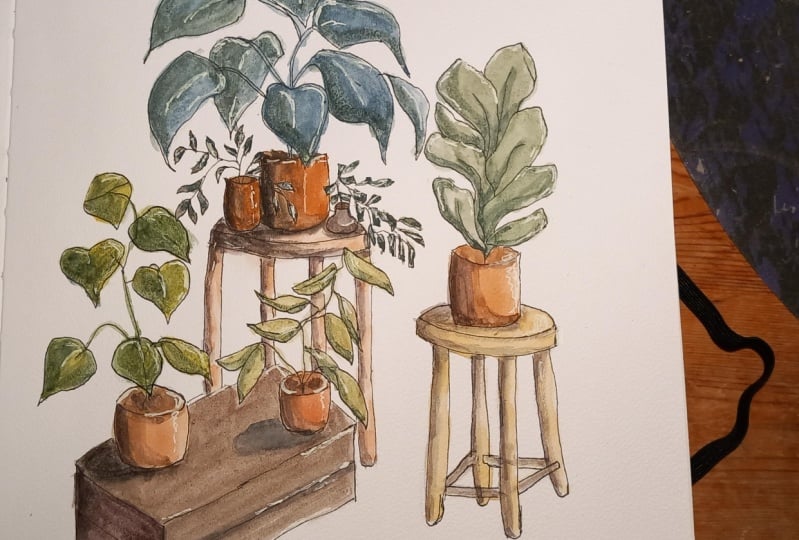
12. Final Thoughts: Hello again. Alright, so
this is our final painting. I hope that you love your painting as
much as I love mine. I feel like it turned
out really well. I think that the dark
shadows look really nice and the highlights add some
texture. It's missing before. So this is the final part. You get to sign your painting
and remove the tape, and you have your illustration
of potted plants. Let's go ahead and
just sit back and enjoy this moment of
peeling off the tape, which is my favorite
part of any painting.
 Molly Barker, Lifetime Artist - Creative Entrepreneur