Transcripts
1. Introduction: Hi, my name is Eva lab and I'm a fine artist based on the central coast of California. I create lots of landscape and seascape paintings here and my bright little studio. And in this video today I'm gonna be teaching you that is all about the basics to create a watercolor painting. In this video, we will be creating a fun, playful watercolor illustration of a building. But I will be teaching you guys all of my tips and techniques and everything you need to know to go forth and create more watercolor paintings of anything that you might want to, including landscapes, urban scenes, and animals, people. These tips can be applied to any kind of watercolor painting.
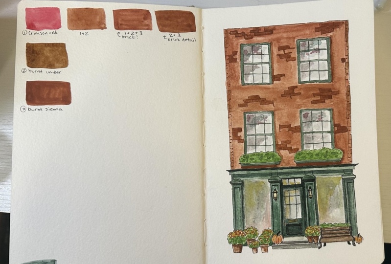
2. Materials: Brushes and Paints: So the first thing we're gonna talk about is all the materials and supplies that you might need to create watercolor paintings and complete this class. The first thing that I wanna talk to you guys about is brushes, and this is one of the most important things. I recommend getting brushes that are specifically made for watercolor use because they will hold water the best and do the best job. I see a lot of packs and craft stores that say they can be used for watercolor and acrylic and oil paints. And I really don't recommend that you get a brush pack like that because when it's not made for watercolor, it won't hold as much water in the bristles. These are designed to hold a lot of water so that it's easy to get smooth gradients and get lots of paint from your mixing pan onto your paper. So that being said, they don't have to be really expensive. These ones are brand I really like called Princeton Art brush and code. I have a couple of them. And you can find these at most craft stores, I believe. And they do a really good job of holding plenty of water. And for brushes, I recommend you get at least three brushes for your watercolor painting. I recommend getting a seven or an eight size brush because that's a really good medium-size brush. You can use it for most things. Because when you get it wet, it comes to a nice point so you can use it for detail work, but it still holds plenty of water so you can get a nice smooth gradient with it as well. Secondly, I'd recommend getting a really tiny brush like a 0 or a two slash 0. And this is just for little details on any illustrations you wanna do. There's just sometimes need just wanna really fine at brush. And then thirdly, I'd recommend getting a larger brush, maybe like a 20 or 15 or just a mop brushes with they're called This one is called a belief, a cat tongue shaped brush, but it doesn't have to be shaped like this. You can get any larger flat browser mob brush. And that's just for creating really big gradients and covering large areas on your paper smoothly. Otherwise, you can get other different sized brushes, of course, but these are the sizes that I recommend. A seven or an eight, which is a good medium branch, are really small, fine detail brush. And then like a 20 or 25 or 15 somewhere in there as a big round mop brush. The next thing to talk about is paint's. Of course, I use these paints that are by Holbein as the brand and they companies really tiny tubes. You can see this is more of average size watercolor too, but I really like that these come in these really small tubes because you can test them out without spending too much money. And you can also get a lot of different colors. So I will say, I really enjoy using tube watercolor paints like this as opposed to pan watercolors, which I think are kind of what people imagine. Oftentimes when you're talking about watercolors, they come in little cakes and you activate them with water and then you can use them. But if you've never tried to border colors, I would really recommend trying them because you can get a lot more control over your color. They still work similarly to pan watercolors in some ways like this is dried to watercolour and I can reactivate it and use it so it still has the benefit of lasting a long time and you will reuse it and not wasting paint. But you can also use it in its what form and get it really saturated color really easily and you don't have to be struggling to activate enough paint to get it pretty gradient on your paper. So again, this brand is Holbein watercolors. I recommend them. I think they're really nice. They're not too expensive or too cheap. But whatever you use, I think using tube watercolors, you have a little bit more flexibility. If you do want to get a cheaper paint, you can still get more rich, saturated colors. And then this is Daniel Smith, which is another brand that a lot of people really like. I think it's great, I don't think is necessarily better than the Holbein ones. So you don't have to spend all the money on getting me as I've just get smaller ones. And that's about it for paint, I will list all of the brands that I recommend and the colors that I used in this video for you guys in the project section of this video. And another thing I want to say, I do like about the Holbein watercolors is that they have a lot of interesting colors like Mars violet and Davies Gray. And I feel like those colors are kind of unique to the brand. So that's one reason that I do like this brand as well.
3. Materials: Paper and Other: Next up, when you're painting with watercolors, of course, you will need a pallet of some sort, whether you're working with dried cake watercolors, or if you're working with two binoculars, you'll need something to mix your colors on. I really recommend just using a white ceramic plate. They're really easy to get really affordable. And I've been using this for years. You can clean it off completely and it'll look brand new again. I wouldn't recommend eating off of it after you use it for paints, of course, but I do recommend that just because it's easy, simple, and works really well and it's not really expensive. I wouldn't go and buy like a $20 palate when he would just get like a $3 plate. And then you'll also need water. Of course, for watercolors, I recommend either having a tank like this with two sections of water or just two cups or two jars of water. The reason for that is when you're painting, you will be mixing your color painting on your page. And then you will be cleaning or brush so they can get a fresh new color. And this side or this cup would get really dirty with paint water really quickly. And then when you want to add one or two your pants, you don't want to add the water that's already green or brown. You want to add clean water, so you have a clean water cup and then a washing water cup. So another thing that you will be needing is special watercolor paper. You will find this at any craft store. Its aren't really special, but you will want it to be at least 300 GSM, which refers to the thickness of the paper and consequently how well the paper can hold water without warping. So you want to get one that's at least 300 GSM. I also really recommend getting one that's a 100% cotton. You don't have to if you're just starting out and you don't have the money to do it, but it does really show an improvement and of how the patient lays on the paper. So I definitely recommend trying it if you ever can. And I love this brand is, is the Canson heritage brand is probably my favorite watercolor paper ever. But I also really like this fluid 100 paper, which is a bit cheaper and I appreciate that. And it's still 300 GSM and still a 100% cotton. So if you're looking for ones a little bit more affordable, I really recommend this brand. And then one other thing to note when you're shopping for watercolor paper is there are two different types of texture. There's cold pressed, as you can see here. And there's hot press, which you can see here. And the difference between the two is that hot press is completely smooth. Similar to Bristol or mixed media paper. Really even smoother than makes media paper. So it's a very smooth paper versus the cold pressed has that traditional water color texture that a lot of people imagine and are used to. I really prefer cold press paper because I love how the water colors sits on it. It creates this pretty texture, brings out these gradients. I really loved that. But some people do like using the smoother hot press paper if they're using a lot of inking pens, because the inking pens will go on really smoothly on the smooth paper, whereas they can seem a little bit scratchy, textured paper. I like that look, I still use pens on this kind of paper and I really enjoy it, but it's up to you and you can play around and try different options as you go. So one more thing is, I'm going to be using a pencil to draw. I really recommend using some kind of art pencil, unlike the heaviness of f, that's my personal favorite. But of course again, you can use whatever you want. You could use a mechanical pencil. It's really up to you as to what you like. That's not too important, but I did want to share this one as it's one of my favorite brands. And then we'll also be using micron and sigma Micron pens to airlines after we sketch. And I really love these pens because they're super affordable. They're completely waterproof. So when you use the pan and then put water on top of it, as long as you let it dry for a couple of minutes, it will not bleed and spread, which is really great. And you can find them almost anywhere. And they also come in a variety of sizes and colors. So I have a blue one here, navy blue and black. And you can see that the nibs, or just a little bit different as when smallest ones bigger and they have a whole variety of sizes. So you can have a lot of fun experimenting with line width or things like that. So lastly, a couple of miscellaneous tools that you might need are some painters tape and maybe a spray bottle. I particularly recommend a spray bottle if you are using paint that has dried and a pan as opposed to two watercolors because this can help you to activate them all and let them sit so you can get more of a saturated color. And of course, with any watercolor painting, it's helpful to have a tape because we will be taping down the edges of our paper to avoid any curling and folding. And later on, again, I will list out all of my recommendations for your projects and for paints and supplies in the description section of this video. So you can go through if you're looking to get new things and see what I recommend and what I use.
4. Studio Set Up: Alright, so first things first I want to show you guys how I set up my workspace. If you are working on a block like this, you can just leave it on the watercolor block because it is glued down on all of the sides. But I will show you guys today how a tape down my work and how I get stuff off of this without ripping X, i can be a little bit challenging. So I'll use a palette knife. You can use a butter knife for anything that's stream will thin. And there's a little section right here that's not glue. So we will go ahead and we learn palette knife in there. And you just wanna go really slowly with this. And you also wanna make sure you're keeping pressure. With your fingers you go because it's really easy to rip. The paper is kind of annoying when it's all glued down like those for that. That's also one of the reasons I like to take it off and tape it down so that I haven't completed a beautiful piece of work and then I rip it trying to get it off. So you just go really slowly and make sure you keep your hand and there. And I kinda dealing a sine motion as well. So I find that helps. And honestly sometimes I still rip it, so don't get frustrated with yourself if that does happen, it just happens to everyone. Sometimes. You can see a kind of a lot of glues stuck to the edges here. So sometimes I just go ahead and use my fingernails and peel it off as best I can. Doesn't matter too much because with the final artwork, if you're going to frame it or anything like that, it will cover it up. But if it's annoying, definitely go ahead and peel it off. Some of it will come off with our tape as well. So again, you don't have to worry too much about it. Alright, so once you have your paper off your book and you clean up the edges as much as you want to. Go ahead and take. And I just eyeball this but I taped down about maybe like a fourth of an inch of the paper. All sides. For this type of illustration, it doesn't have to be perfectly precise because we're not covering the whole sheet of paper. But if you were doing a full sheet of paper, you might want it to be more even on all the sides so that you don't have different amounts of weight on each side. Alright, perfect. Now that you have your art taped down, you are ready to start sketching. I'm gonna be using this Mitsubishi pencil in f, which is the hardness, it's kind of a medium hardness, not too soft, not too hard. And another thing I wanted to tell you guys is if you're going to be moving your art before you're finished with it, then you might want to instead tape it down to a piece of wood, a hardcover book, something like that, that you can then move with you, obviously. So it's not stuck to the table. If you're working at your dining table and you need to eat dinner before you finish. So that's the thing I like to do. It IS MDS board. You can get that at any hardware storage really cheap and then you can just reuse it over and over and over again. So usually I'll keep my palette here and I'll put my water up there. And then our brushes. And I will also have a couple of things. A paper towel. I can block the water off as I go if I need to. And I also like to have a sheet of water color paper. This can just be scrapped. Something you painted, you don't like anything. So that I can test the colors that I'm using before going straight onto my paper if I want to. So I really recommend having something like that. If you're having a hard time with colors, you can just test it really quick and make sure it's the color that you want it to be. So I did want to take this opportunity to show you how to clean off your watercolor plate. I t's a plague since really easy. You just take a wet paper towel and wipe down the middle. And then you have all this room to remix your colors. For today, I'm gonna be taking it all so I can show you guys how I set it up as well.
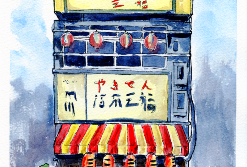
5. Sketch: Ruler Layout: So as we begin our sketch, we're looking at a reference photo, which I do have linked down in the student projects section for you if you guys want to see the original reference. And for this I'm going to be using a ruler for our initial sketch because I like to get nice, clean, sharp lines. And for my first sketch, it's nothing too detailed. I kind of just get the shape of everything and where everything goes in. I also like to have a ruler is I can then measure chunks and comparison to the reference photos. So I can say, oh, like it's in thirds. So 1 third is the first story in the next 32nd story and the bottom thirds, the first story. And that can help me to get nice proportions for a piece of artwork. So the first thing I'm gonna do is measure out a little bit from the top, get about an inch at the top, and then draw straight line all the way down to about an inch from the bottom. You don't have to be this precise. It's just so that I know I have room to do a little bit of detailing on the top and then a little bit of room on the bottom of the foreground. And then over here I'm gonna do the same thing. And I'm not measuring all of this and mostly just using it as a straight edge. We will connect designs and I do make sure that the bottom line is level with the bottom of the white paper. Just so that it doesn't look too cricket. It doesn't have to be like this precise is just something I had to do for the first box. So that then when I'm sketching over, everything's pretty much straight up and down. And so once we've got the base of our building here in this rectangle, I'm gonna go ahead and divide it up. So when I divide it into approximately 30, I cut the bottom half a little bit bigger because there's more detail down there. And then from there, we can start adding in all the details on the building. So we can see there's some lines here of detail and building. And they've got a big sign up on top. But first I'm going to add in, you can see the bottom of the building a little bit. This is just kind of a lesson in perspective, I suppose. And going in there. And this is the bottom of the top story. So now you can see that the top stories coming out over the middle story. We'll add in our sign on the bottom here. And you can totally complete those however you feel like you want to. It doesn't have to be this precise or evil. This is how I like to do it just because it makes it a little bit easier for me to get later. But if you want it to be a little bit more artistically rendered or leave out some details. You can do whatever you want to do. And not all of these are perfect straight lines. In terms of, you know, there are a little wacky. It's a drawing. It's not doesn't need to be perfect. And I'm drawing in this pipe right here. And it's really fine. It too. I really recommend looking at the reference photo, which again is in the student projects section. Stephen kind of interpret things in your own way. That's really fun to do. And then you can add more details or less details wherever you feel like you would like them to be. So this is all in Japanese is a little shop that I saw while I was in Tokyo. So I'm going to just write in the lettering as best I can. I don't speak Japanese or write it, but I am just drawing the shapes. But you could actually put something in English here whenever you want. You want this to be a noodle shop. It could be a noodle shop. It's up to you. That's the fun part of doing a creative illustration. I think the most important part of doing something like this is that it has lots of fun details. And it's really fun to think about who lives here and what are they doing, and what kinda shop is it and what would be in it. And that's a really creative part of storytelling. That is really fun. It's also if you speak Japanese, Maybe you can tell me what it says on the photo.
6. Sketch: Details Top Stories: And then we'll go ahead and draw these boxes. Something I really love about Japanese buildings in particular is just all the details and kind of industrial feel that it has air conditioners, electrical units. These are things I think a lot of people think are ugly, but I think they're really cool and they add a lot of detail and a lot of like a lifting feeling, which is something I really love to include in my artwork. And then we can see the tops of these windows back here. And then I come back in with my ruler. And as you're sketching in these lines, I'm just framing the door. Just take a good look at the reference photo or what I'm doing here so that you can see kind of how I do it, but it doesn't have to be perfect. And then I'm going to start working on the sign on the top. And if you're a pencil doesn't have any racer, I recommend getting one. I like this sticker researchers, you can just push it all the way out and back in and the scholarship. And then I'm just adding the framer on the sign. This will be important later once we start water coloring the sign, we're gonna try to make it look like it's going a bit more just so he did actually take Japanese for a year in college, but I haven't really used it, so I don't really remember it. So if you guys are taking a language, just remember that you really have to use it. Because of that it's a little bit funny because I recognize some of these symbols. I don't remember necessarily what they mean, but I feel like I have and the ability to write them out a little bit. Probably terribly those notes. And then you just keep adding details like I see these pipes coming down from the roof and I want to add in. We've got a little furnace of some kind on the ceiling will chimney kind of thing. And so then I will go into the bottom half of this sketch where we've got our shape, which is one of the cutest things I love about Japanese buildings. And lots of any buildings, I guess French cafes anywhere. I think these are so fun.
7. Sketch: Details Bottom Story: And when you're sketching, you wanna get lots of little details then, but really simply they don't have to be finished. You just quickly lining them. Because when we go in and add even more detail. So I'm going to not add any of the lines here until we go in with paint leader. Do add these little curlies and the end. And then there's even a small little pipe underneath. And I'm going to add in That's something that, you know, you obviously, as I've been saying, you can add as many or as little details is you want to. But I love adding and just extra lines, extra things. I think that makes it look really cool. O R this paper that we brought down, if you remember, we did this pipe and landing right there and then we'll start drying the doors Next. Looks like there's three doors on this building. Probably one of them leads to the upstairs, I guess. And the other set is for some kind of restaurant. So we've got a set of double doors here and a single door here. I'm just lining that in simply. Nothing too complicated. And then the fun part is after lining all this, n is going in with little signs and lanterns, all that kind of stuff. They've got a little middle bar here. And once you have that base laden and let me add in these little railings across the top and the bottom. Then we can go in and you see a big lantern here. And I'm just drawing over my own lines and then I'll clean it up later with an eraser or if you want, you can just think over it and No, but it's a little bit easier to clean it up and erase here so you don't accidentally ink over the wrong area with ink. So we've got our Lantern here, it's hanging out a little hook. You kind of just imagine what these things are resting on if you can't see it. Because again, we are simplifying this building. And then I'm adding a little poll here that's going to have these cute little Linda is kind of look like pinned up shopping bags or a friend's. And I'll take phi research. We're getting a little bit confusing. And it just erase out things we don't know the answers lines in there that we don't need. And then since we drew in the doors before the four answers lines going all through the fives times erasing the background there. And then we'll just add in.
8. Sketch: Final Touches: Her cymbals really loosely. If you can't read this, I don't blame you at all. You could draw a picture there. You could add English words whenever you want to do are kinda just try to make it look like. There's even a little science here in the window that will have a little writing on it. Another menu or some kind of sign a door, and it has writing in it. And the trick is also when I do the writing on really small, I'm not really trying to copy the image at all. I'm just doing little marks that looked like they could be writing. And then lastly, we're going to go ahead and add in. Similarly, it turns out that up here and I just draw little circles or ovals as best I can and about the same size. And then these ones kinda look like beach balls to just give a little different colors. And add a little hat, H one and the bottom. And you can maybe connect them all with a string. And then there's some lanterns down here as well that we'll add in. And these ones are a little bit more oblong like a cylinder. So I'll just draw a few of those and they do airline you if you're struggling at all with the sketching. Just practice, takes a lot of time and have fun with it. Think about details. Do what you like to do. These. And you can also skip forward to the watercolor section if you just want to learn more about watercolor and technique. Looks like we've got some kinda hose going across the top here. And I'd really like to include all these details. I think it gives us so much character. And then once you've got this space light and you can look what's around the building or there. Maybe I'll add in some milk crates because I think this would probably be a restaurant of some kind. There's often a lot of planets around these buildings. Maybe we'll do a planter over here. And I just do really loose plants when I'm doing watercolor like this. Just so squigglies like little bush. Another one, it's like a little tree. Doesn't have to be too detailed or anything like that. We're just adding little bits of character to this building.
9. Inking Part 1: So as you're happy with your pencil sketch, it's time to go in with the ink. I like to use black or dark blue microns for this project and we use dark blue. But Bach, I think is easier to find, so, and I love using blackouts, kinda my preferred one, but this is what I'm going to use today because my black ones a little short on inks trying out a bit. And this is the size of the lake. I did say all this and the material section by like 0.05. that seems to be my favorite fur lining watercolor illustrations around this size. But again, it's really fun to play with different sizes and all that. So my tips for when you're going in for the lining is work kind of the opposite way of your hands that you're not smearing it as you go. So I'll start in this corner because I'm right into and I just start tracing over the lines we already put in. Something I really like to do that I think adds a lot of care today your line work is instead of getting one continuous line all the way across, I'll break it up. Have a little bit of short lines and dots so that it's not all just one continuous line. I think that gives it a lot of character. And you wanna make sure that you're just paying attention. Don't go over things that weren't supposed to. Although of course, if you do App as the best of us and you can totally work around it. So I had to start from the top down and just do it feels good to you. So do things lines as long or as short as you want them to be. An inking can be like the most relaxing thing. It's my favorite part really because once he got a pencil lines down, you can be pretty confident that you are just firing. It's the most flake coloring in, in a coloring book. If you ask me because you've already done the work and you just get to zone out and traces and try to enjoy it. Don't get too stressed. That's why like these micron patterns, I feel like they're pretty easy to work with, consistent. So you can make all the choices that you want to make. And I'm not gonna line in the top part of the sign because we're actually going to use watercolour paint to do that. I will do the black lettering on the sign so adapted as you see fit, if you wrote something and you think it would all be in black, you can definitely use your pen for that. But if it looks if you're doing this illustration or if you want it to be in red or something like that, then just leave it blank for now and we'll fill it in with the watercolor. We'll go ahead and fill that in with ink. Just because it's a little bit easier to use your pen to fill in any parts you think would be all block because it's waterproof. As opposed to when you go in with watercolor. And then if you accidentally smudge it, it'll smudge into your other colors and bleed. And then as we move down, I will do the lanterns first. My strategy with this is to do the objects that are coming at you in space first. So these would be in front of the things behind it. So I'll do all of those just to make sure I don't accidentally put lines through the lantern where I shouldn't connect them all with their string.
10. Inking Part 2: And then we start moving down. And I can see I've done a pipe here, so that's in front of the wall. So I'm doing that before I do the law. And thinking about it this way just helps you to avoid mistakes. Although like I said, it's not the end of the world. If you use your kinda put a line through it, you just make it work creatively. And then we'll do the frame of the door. That's the furthest most thing on this level. And then we'll basically just moving down the page and just remember them very airline wait a bit. You can use different pens to achieve this Or like I am and just break up the line sometimes in a strategic way. And now I'm gonna draw this hose going over our shame because it's in front of it. And then get into our shade. And I'm actually just going to draw the outline of the shape so that the rest of it will be done with our watercolors later on. So then I'll go in really intense. And all of these techniques for inking and sketching applied to really any illustration, whether it's a building or a landscape, where a person, the more that you practice your inking, the better you will get. And same with sketching. So I really recommend looking at some photos are going out in real life and playing around and trying to draw some buildings if you're interested in that.
11. Inking Part 3: And it's really up to you to decide how much detail you want to add in with your inking pen versus where you want to leave for when you're using color. So for example, on these lanterns, I drew in the edges of it to show where the colors will change. But on these lanterns, I'm just gonna go on watercolor and do that naturally. And don't worry too much of your lines are perfectly straight or anything, but what they don't need to be, it adds a little bit of fun and when Z to the building of creativity. So I'm gonna go ahead and see this is what I mean. I probably should have done these flags before starting the door, so I'm gonna do that now. And I'll just go over them because they are in front of the door. And it's really easy to get lost when you're inking, but it's not a big deal. And just do it now. And we'll just make us poor little bit thicker and that you can't tell. And now we can resume our work on it. And then, like I said, when I do these signs, I just kind of do some squiggles. This writing in this illustration was going downwards. That's how Japanese is. So I'm doing that. But if you wanted to go sideways, you can do that too. And just kind of do some squiggles and some dots. Pick up your pen with it quickly. And move on to these plants are just trying to get the gist of an area. Doesn't need to be perfect. And then we'll finish up any last bits. But you haven't entirely skipped over. You can definitely spend some time with it at this point, adding in any details that you want to add in or just looking at it and trying to decide what you like or what it means. I think a good chunk of time spent creating is just looking at your work and thinking about it. And thinking about what you can add or change or things like that. So definitely don't be afraid to take some time to just absorb it, look at it, think about it. At any point through the artistic process really. Sometimes you just need to sit with something for a little bit to figure out what you need to do next.
12. Watercolor: First Layer: So once you are finished with your inking and you feel like you've got the right amount of detail for you. You can go ahead and start setting up your palate. So colors that I really recommend our Payne's gray question, blue and green, that's a color we love. And then asides that, I would recommend getting some brands, some greens surrounds orange, some yellows, you don't really need oranges. I like to have a cadmium yellow, which is a little bit medium, which is a little bit warmer. And then I also use lemon yellow that brighter. As I feel like having that variety is really nice. But you can use whatever you have or the typical colors that communist set when you buy a set of watercolors that will work just fine. And again, I'll list all of the colors that I especially love for this kind of illustration in the description of this video. So if you're curious about a specific color, I'm using contract there. A whole lot of paint on your palette. You can just do these little stole a little bit because it is really saturated. And then the nice thing is that once you're done, if you just let it dry, you are totally reuse. And then once you have your pilot ready, I like to start with our median brush and I'll just go in and start laying in some gradients. Since this building's yellow. I'm gonna go ahead and start with that. And what I like to do is take the yellow, this is a cadmium yellow light. And I'm actually going to mix it with a tiny bit. Mars via live a little bit of a purple color. You can use any purple that you have will work for that and it just draws it down a little bit. So it's not quite as saturated, whereas vibrant. And it gives a kind of an older Look to the building. And then what I like to do is I go ahead and start laying it in. And you want to, this is the big reason I was saying you wanna watercolour brush because see how beautifully it holds the water and covers the space without having to read it every tiny little bit. And what I like to do is kind of cover some of the area and they try to do it all at once so that it's got really smooth, pretty gradient. And then I'll come back in after I got water all over the area. You can also just dip it in water and add it and it'll get a little bit later. And as you go. And that's kinda how you form a gradient. So if you do run out of your mixed color, just make sure that you get the whole area you're going to be working in at first, which for me is this top area of yellow wet. And then you can go in and dip into your more saturated yellow. And a little bit of the purple make a little bit darker version and just kinda start adding it in some places. And it will spread out really beautifully. Give it like a lot of texture and kind of, I think it ages the building and it really beautiful way. But these techniques will work with any if you're doing skin tones and you want to have a faint blush, anything like that. So you just can add it once the paper is wet, when you add darker colors on top, those spread out really beautifully, which is one of the things I really love about water color. And that's why I say that you should just let water kind of be what it is and don't overwork it too much, just kind of work while it's wet and then let it be. So I've added a little bit there, and that's all for the first layer there. And then I'm going to go in and start working on the signs. For this sign, I'm going to use a little bit of a lighter, brighter yellow. And this is the lemon yellow that I'm using to mix up. But you could just use the cadmium yellow and not add any of the purple. I'd be fine too, because he wanted to be a little bit brighter because this is a sign that is lit up, if you can imagine that. So I'm just doing a really light washer that to start using the same technique where I will come back in with some darker colors to kind of let it make a really pretty gradient.
13. Watercolor: Gradient: And it's good because if you put CFS a little too bright for me, so I'm just rinsing off my brush and I'm gonna go ahead and spread it out. So it's really easy to work with this kind of paint. You don't have to be too careful, which I really like. And I'm imagining that there is a light coming from the middle of the piece. So I'm going to keep these darker colors around the edges because wherever the light would be coming out will be very close to white. And then we're going to just repeat that with the sign below it. Because it's also yellow, similar color. And don't be afraid to clean off your brush if you need to, if you feel like your colors are getting it all muddy. And it's always a safe bet is to clean your brush in your water tank really well. One of the things I really like about a water color like this is that when you're using ink to doable lines, you can just really let the water filler do its own thing. You're basically just filling in each section with colors. They are mixing up. And it's not quite as regimented as if he had no line work. So I think that it's really fun to combine inking and watercolors. You can really just let the water color play and B itself, as silly as that sounds. So the next thing I'm gonna do is this area between this front yellow and this sign. And I really like to mix up a combination of Payne's gray and Prussian blue. And because for something that is important to know when you're creating paintings is that warm colors come forward. So this yellow comes forward, which means that it's closer to you as the viewer and then cool colors recede. So when I do a cool shadow underneath the building, it looks like it's going backwards into space. So I really like to use Blues for that. Even though in the reference photo just looks like maybe a darker color of yellow or gray. I like to be a little bit imaginative and nice bright colors. So I use this blue to create the illusion of shadows. I'm just filling in all around these blends right up to this pipe for now because I do have to work in sections. And then now that we have that nice bright color, I'm gonna go back into her Payne's gray and are pushing blue mix up a little bit of a darker color and add that to just part where the building is like. So we can see as it dips, inherence is underneath. And then this part is more of the wall behind it. And just doing about half of that with a darker color kind of all blend together. You don't have to make it really precise, but I'm just doing that intentionally. And then I'll go back into little bit of the brighter blue and water it down a bit. And we'll do this wall as well and Apollo gray color. And if you're new at watercolor, I would also recommend just spending some time on a scrap piece of paper and playing around with your paint, playing around with gradients and getting used to how your brushes hold water. Because everybody's tools are a little bit different, so they'll react a little bit differently.
14. Watercolor: Color Blocking: And then we're actually going to use that same blue gray color and move around the page a little bit and do this part. Leith shape because that will also be and share. And so the biggest tip I can say is make sure that you do have a watercolor brush because it can be really hard when you're working with either a brush. It's not meant for watercolor or brush that's too small because you'll find yourself only being able to fill in one small area and it won't be wet and it won't stay wet long enough to do the techniques I'm telling you about where you can go back in and add a gradient. So, and like I said, that doesn't have to be a really expensive brush necessarily. Just make sure you get one. That's me for watercolor and don't work too small for your painting. And then I'm imagining that the shade stops about here. What do the whole wall and shadow because it's just a little bit of the shape. And now I'm gonna go ahead and start working on the part of the shade. And we're gonna actually add pretty red stripes into it. So I'm gonna go ahead and we'll start with this brush, but be ready to move to a smaller one if you need to. So I'm just going to start with this red, orangey color and just traveling in these small stripes. And what I'm gonna do here is you want to pay attention to the fact that we've drawn this. So it's curving out and then it goes down. Then this part of the strength will be completely vertical. And then something that can be helpful when you're trying to do these stripes as they will change direction as you're working, is to do the middle one. And note that the middle one is going to be almost straight down the hallway. And then also do this one and the edge. And then you can work your way back from each of those paying attention to the direction of the stripes. Let me use don't have to be too perfect and you can go ahead and just work on a top PR and then come back into finish the bottom. And I'm also not worrying about this too. We painted right now because I'm gonna go ahead and cover it with a darker color when it's time to do that. And so I'm just going in and out again, these vertical stripes on a lower straight part of the shade now. And then we'll start looking in from the other side.
15. Watercolor: Reflections and Shadows: And one of the fun things about watercolors, you'll end up with some different saturation. So some of these are much more brighter red where some of them are a little bit more faded. May actually think that adds to the character of the shop and the idea that maybe it's a little bit son faded in some spots. So everything lake water color. For that flexibility, it gives some kind of organic feel. So we're going to let that dry and then we'll come back to it because you wanna make sure that you're letting each layer dry before you start working on top of it, or else you'll end up with a really muddy maps. So the next thing I'm going to work on here is we're going to go back to the top of our building. And I'm gonna mix up some dark yellow gray. I actually have a color called yellow gray and I'm gonna be using that. We can do a similar thing we were doing before, where you darken the yellow of something purple. And then I'm just adding these kind of little drifts to the building. As I think it adds a lot of texture and character. And I really like that look kind of an old building. Maybe it taught some water or similar asked. So that's why I go ahead and add that in around then also darkening and around this part of the sign, imagining that there would be a shadow on this side. You don't want to add too many, but just a little bit and you can add different amounts of water to fade it out. And then if you feel like any of it's getting too dark, just take a piece of clean paper towel and dab it away. And it's a really fun thing about watercolor is it's very workable while it's wet. And then I'll do the same envelope then more just to the very edges of the sign here, open a dark myths. And the reason we didn't do is that first is that now that it's a little bit drier, we can get more clean cut lines and it doesn't blind altogether. So that's just working with the different properties of water, where some things you want to work while it's wet and soon as you want to wait till it's dry. So now I'm going to start working on these lanterns here. We're adding some red. I'm doing this loosely. It doesn't have to be too precise. There's adding in some red and then we'll go in and add some yellow as well. And I'm going to add a little bit of blue as well, which is already gone, a little bit of blue shadow, but just kind of adding that in their kinda like beach fall colors. And then we will go ahead and create a nice dark colour to go inside these windows because we're imagining that it's dark inside. You can't see too. If you want, you can imagine that there would be some reflections in this class, so it won't be perfectly smooth black. But that's only if you want to take the time to do that. It will work. Just fine with black ones as well. I'm leaving a little bit of space here, imagining that it's reflecting some of these lanterns. And I'll add in a little bit of the colors and you'll see that in a minute. But that's why I'm leaving kinda like circular shapes, weight for now. Then I'll come in and add some color.
16. Watercolor: Shadows: And then to create those reflections will just dip back into that ever read. And just do a little swipe of it will also dip back into our yellow because this is just a very kinetic blurry reflection. It doesn't have to be all that precise. And then we're going to take this Payne's gray, a little bit of a darker Payne's gray. And it'll be a bit lighter than what we did for the windows. And we'll go ahead and go around this sign and fill in that frame of this glowing sign. Will do the same for the one on top. And I'm actually going to paint this little guy up here that same kind of light grey color. The color I really like to use is called Debbie's grain. It gives us kind of desaturated and nice gray. And let me use my retaliatory can damp out just a part of it just to give it a little more dementia. And then we'll go back into our Payne's gray and Prussian blue mixture here. And I'll create a shadow around these two dark and more water in there. Can we show these boxes here? So it'll be a little bit darker and there. And then we'll also go in and add a little bit more of a clean line for this roof and go over that as well. Next up, we will work on the doors down here, which are going to be a nice brown color, which I will create by mixing some burnt umber and some Payne's gray and a little bit of Mars violet over here. And then we'll just go ahead and start filling in all the parts that are wood. If you're getting confused because of all the lines we've created down here, you can always refer back to your reference photo, which you should be doing anyway as you colors just to make sure that you're doing the right things in the right spot. Also just to get an idea for the pilot you wanna use. So I'm just filling in these parts and then we'll do the part behind it or dark black color.
17. Watercolor: Wood: And we'll go and fill in that middle bar. And I'm just paying attention to the things that I want to be brown versus where I'll come back in. They don't want to paint over anything I shouldn't. Although with watercolor, it's super easy to fix your mistakes like I shown, you can just dab it up with a wet paper towel. So if you do want to clean it up a little better, you feel like he painted something that you want to change. It's not that hard to do it, so that's really cool. And then I'm going to move around and work on our lanterns while we wait for that section to dry. So not on a going with the dark right away because it could really easily mix and just trying to avoid muddy maths and our lanterns are going to be orange. So I've mixed some red and some orange and I'm just covering the whole thing to start with a nice orangey color. Then I'll go in with a more saturated red. And this is again where I like to work with tubes. It's easier to get a really nice saturated red. And I'm just going to frame the edges with that. And this kinda gives that same effect that we are going for the sign that it's glowing or that it's lit from within and UPN still wet, so kind of ones and pretty it gives it that nice gradient texture. I love about watercolor. Then I've been saying I love about watercolor. This whole video. I'll do the same thing for this large one. It's also going to be an orangey color. And we can now go around and work on our plants, all of it. I like to use a mixture of greens, sap green's definitely my favorite. Like if you had to pick one green divine, That's the one I would recommend. But it's also really nice to have a good variety of greens. And I'm going to add different amounts of water. It doesn't all look exactly the same. And then we'll add some of this bright green in as well. Same thing over here, just to quick brushstrokes and we'll have to look too perfect. You're just getting the idea of it. I don't adapt. Its little saturated for me. I'm just dabbing it. Here we go. And then this part of the wall is going to actually be yellow, like the top. So we're going to mix up another version of our desaturated yellow. No point out there. And then now this is dry, it should be dragged. And so we're gonna go ahead and fill in the other part that's not red with yellow. And you want to not try not to go over the red part too much because it will bleed if you go directly over it and then they'll all kind of blend together that it should be dry enough at this point that you can get pretty clean separation. I love this trick with the paper towel. I'm just going to dab that in some areas to give it a little bit more variation. And so now we can come back in here and our dark shadows in-between the door frame. And then after that, we'll break out a really small brush and go in with some last minute details.
18. Watercolor: Details: And so you can take your time with this and go slow as you want to do to make it nice and detailed and clean. Or you can go little bit faster and just enjoy the artistic flow of watercolor. It's really up to you what your final piece tool. And then just gonna keep filling all this in. And then I'm just going to take some red row quick color in this crate. And a little bit of our violet color or the pot behind it. This part over here. And now we're going to take a really fine brush. And we're going to go ahead and start adding in some of the texts that I wanted to be red up here. I'm going to add some details here and there. And we'll go ahead and mix up this dark color and add darkness to a bottle caps and each band for my lanterns. And I'm going to use a really pretty bright blue color, these flags in. And we're kind of at the point now where you could call it finish or you could go around and add extra details in different places. So I come in, I have a little bit of a shadow right here, this pi. I'm going to add some over here. I think I'm gonna go in with some of her dark red and mix it with a little bit of a violet. And then just go in and add a little bit more details to our stripes. I'm going to outline each red stripe with a little bit of a darker red. And I think just adding little details like this really just gives the piece extra dimension, extra care.
19. Watercolor: Finishing Touches: And say my biggest advice for creating watercolor paintings, especially of buildings, is and lots of little details in some spots than in other spots. Just let the watercolor shine. And DOE working. So up here we didn't do much. And are here we're adding a lot more detail and it creates a nice contrast and really brings the piece to lie. And now's when I'd recommend just, well covariate piece. Add some shadows if you want to add extra character if you wanted to. But other than that, we are pretty much done with this watercolor painting. If you guys have any questions for me, please feel free to leave them in the discussion tab and I will help you out as best I can. And if you guys liked this tutorial, please give it a review. I would love to hear from you guys and post your watercolor illustration, whether you follow along with me or create something using the tips and tricks that you learned here in the student project section. So I can celebrate you. And I'm really excited to see what you guys all create.
 Yvette Lab, Fine artist in Portland OR