Transcripts
1. Introduction: Are your watercolors
looking flat? Do you struggle with
giving life to your work? There's one simple solution
to that, observation. Hi, my name is Saumya Lakhotia. I'm a watercolor
artist from India. I love to explore
the versatility of watercolors across
various subjects, from landscapes to
flowers, to animals. The key to my style and approach to watercolors is observation. This is what allows me to tackle so many
different subjects. By carefully observing
our reference image, we can translate
light and shadows of a subject to create dimension
and form in our paintings. Just through observation and working with different
tones and values, your painting can go
from this to this. In this class, you'll learn how to paint with
depth and form. We'll start with a series of fun exercises to practice
the fundamental. We'll then choose
our reference image and break it into very
easy and doable steps. Throughout the class, we'll cover how to
identify the light tones, the mid tones, and the dark
tones of our reference, we'll create some
beautiful blends, learn on how to add form and depth using different
tones and values, and finally, we'll
add dry textures and details for a greater sense
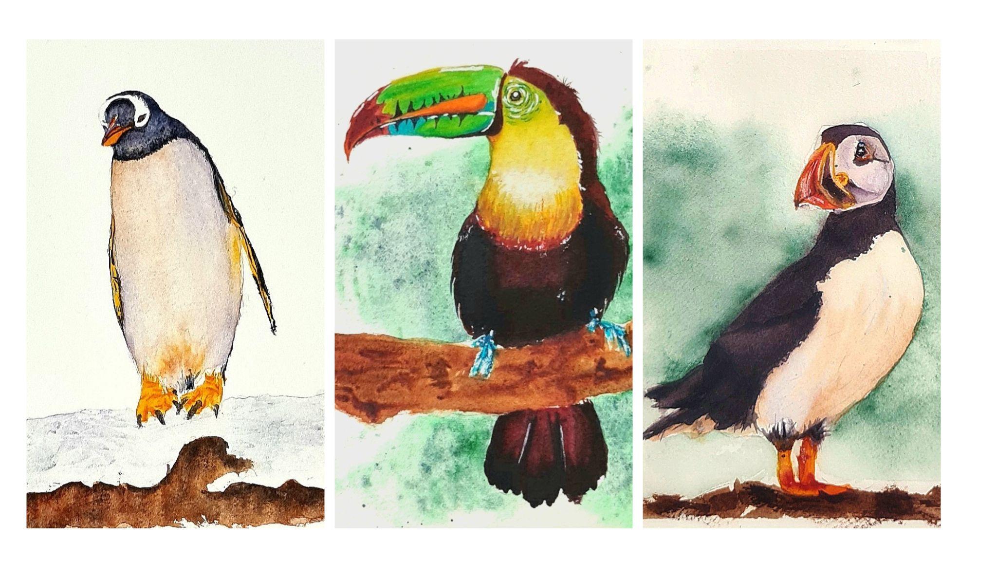
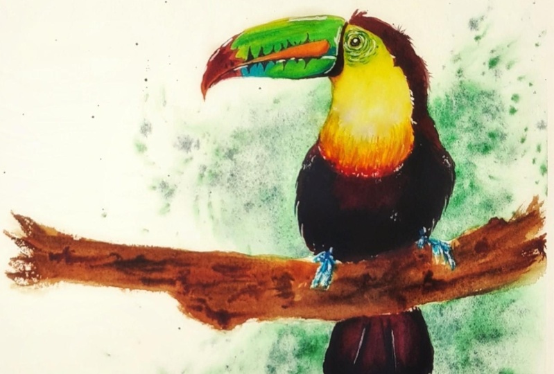
of realism in our paintings. For the class project, I've selected some references; a toucan, a penguin,
and a puffin. Though you can select any
reference image of your choice. I have selected these
birds specifically to demonstrate how to paint a black animal,
especially the toucan. It has vibrant colors in
addition to its black body, plus, it has some nice
and curvy shapes. This class is perfect
for beginners or anybody stuck always
painting the same subjects. These are foundational
techniques which can be used to give
form to anything, from rocks to trees, from balloons to
Christmas bells, from flowers to insects, and the list just goes on. I hope this class
motivates you to explore and experiment more with this very versatile medium. Are you excited? I know I am. Quickly grab your brushes, and let's get started.
2. Your Class Project: The project for today's
class is a Chagall. You can make such an
amazing subject to show how to define form and create
depth in our paintings. It offers us an opportunity
to work with lighter colors, like yellow, to learn how to resolve to white
and lighter colors. At the same time, we get an opportunity
to work with black, which in itself is a very challenging color and can also result in
flat paintings. It's a great place to
start for beginners, as we will be going to all the techniques
in great detail, and also make some fun
little mini paintings while practicing
the fundamentals. Once you're comfortable
with the techniques, we'll break down
painting the Chagall, into some very easy
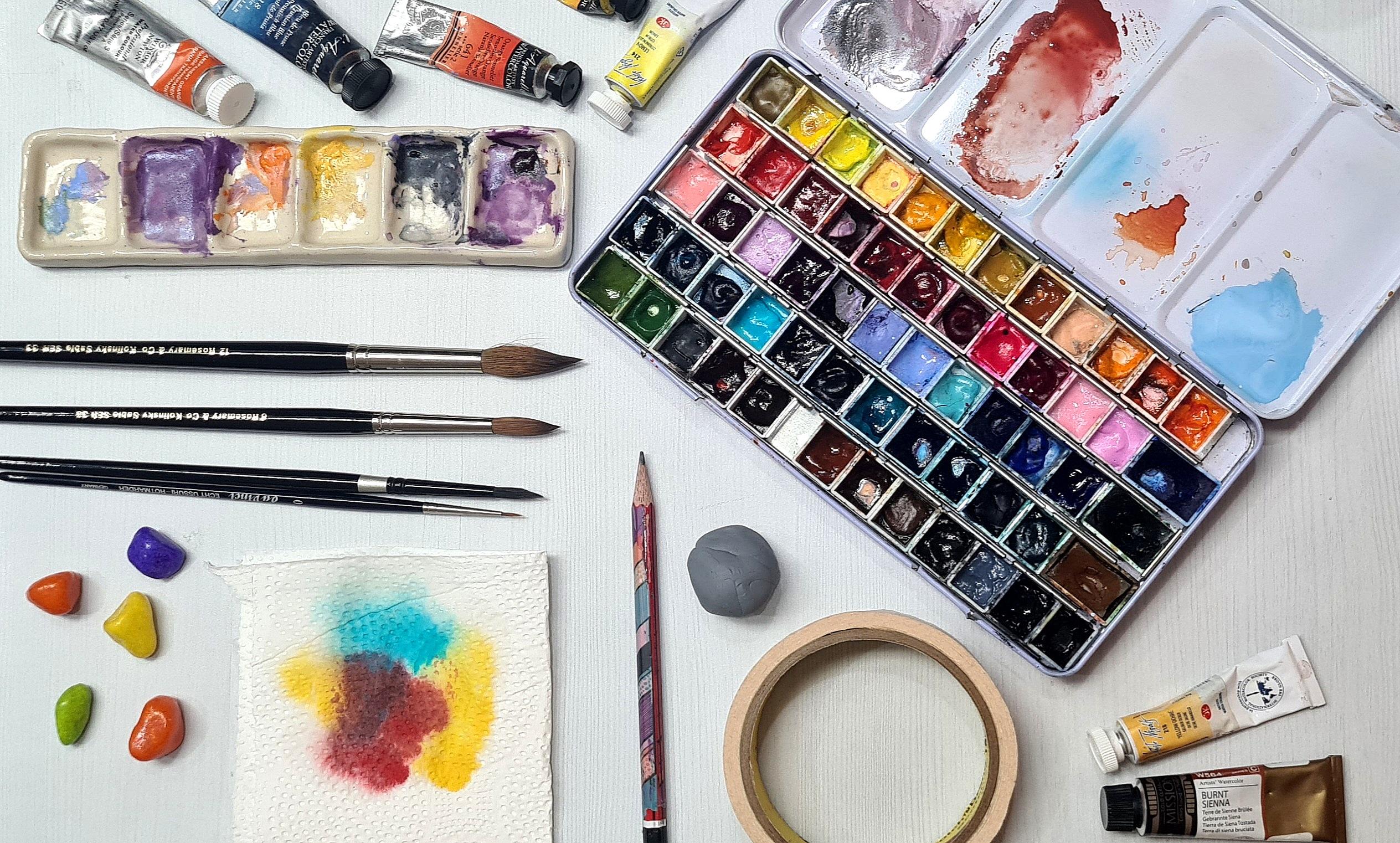
and doable steps. Let's first go over the materials which will
be required in this class. Starting with the paper, I'll be using 100% cotton
watercolor paper of 300 GSM. You can use any brand of watercolor paper that
you already own, will require a few
pieces of scrap paper, a sheet for the final project, and two-halves of a shift
for our practice projects. We'll require a hard board
to mount our papers on. Coming to the brushes now, these are the brushes
which I'll be using, a large brush to wet
the watercolor paper. You can use any large
brush that you have, these three round brushes
of size 4, 8 and 10. We'll be using these brushes to paint that you can and
our practice projects. A liner brush for finer details, and a flat synthetic brush
to lift some colors off. Coming on to the colors now, I'll be using this palette of professional grade
watercolor paints. It can be of any form, tube, or pan. I have squeezed out my tube
paints into these half pans. Let me walk you through the
colors I have on my palette, they're in the same order
as they are in the palette. lemon yellow, Indian
yellow, Indian gold, yellow och-re, orange, permanent alizarin crimson, cobalt turquoise,
yellowish green, burnt sienna, burnt umber, ruby, diopside genuine
or any cool green, compose blue or any light blue, peacock blue or any dark blue, indigo, purple, Payne's gray, neutral tint, and lunar blue. I have uploaded the
details of the shades and the respective brand
names for your convenience. You'll also need whitewash. I'll be using bleed proof white, paper towels, a pencil, and a kneaded eraser, a ceramic palette, or any palette or any plate
for mixing your colors. A spray bottle filled with water to activate the
watercolor paints, a masking tape,
two jars of water, and a hair or heat gun to speed
up the process of drying. Though this is optional, you're painting can
always air dry. So these are the
materials which we would require in our class
and practice projects. My suggestion to you would be to have patience and lots of fun. Don't be afraid of
making mistakes. In fact, make lots of them. That's how we known, just go with the
flow of watercolors, and paint along with me in our practice lessons to get comfortable with
the techniques. Remember to post your
practice projects and the progress shots of your final project in
the project gallery. I'll be very happy
to provide feedback. You can find a detailed
list of materials and also the reference images and pencil drawings
for you to use. So I'll see you next in our first practice
session. See you.
3. Practice: Wet on Wet & Wet on Dry: Before we start
painting that you can, let's first practice some
important techniques. I thought it'd be fun to create some mini paintings
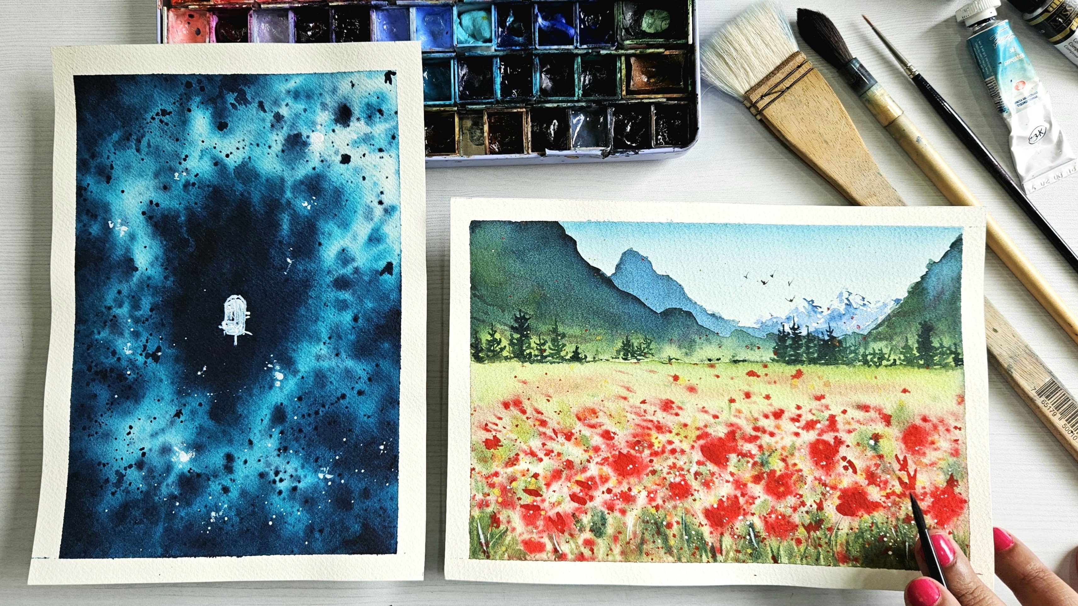
in our practice. For the first practice session, we would be creating
a night sky. With this exercise, we'll practice the
wet on wet technique, the wet on dry technique, and the splattering technique. Let's begin painting. Attach your watercolor paper to a clipboard or any hardened, smooth surface using
a masking tape. Gently press the masking tape to ensure that there
are no air gaps. Once you've attached it, wet the paper with clean
water using a large brush. The paper should be wet evenly, ensure that you haven't missed any spot and that there are
no patterns on the paper. If you see that there
are some paddles just in the paper and the excess
water will flow down. You can simply wipe
off this excess using a paper towel or just soak
it up with a dry brush. Wipe off the water on the masking tape
with a paper towel. This way, the water on it doesn't flow back
into the painting. Once the paper is evenly wet, we'll take some compass blue or any light blue to paint the
lower part of the paper. Spread the paint in
horizontal strokes. Next, pick some peacock blue or any dark blue to paint
just above the light blue. Then finally taking some indigo, paint the top part of the sky. Taking peacock blue again and split the candor in
horizontal strokes again, and take it up to the indigo
to blend the two colors out. Repeating the same process
with compass blue, to blend compass blue and
peacock blue together. Repeat this process 3-4 times. That is, lay the
colors on top of each other and blend them together. Diluting that they
are dark enough. Nodes tend to light
when they dry. We need to repeat
this multiple times. Wipe the edges of the masking tape with
a clean paper towel. This way, the paint or water on it doesn't flow back
into the painting. Once you're done painting, lift the board and
move it around. The water on the paper, guides the pigments
to flow into other, thus creating some
seamless blend. Through this exercise, we saw the wet-on-wet
technique in action. It's when we paint with a
wet brush on wet paper. Next, we'll practice how to control wet paint on wet paper. For this, we have to control the moisture on our paper
as well as on our brush. To control the
moisture on the paper, allow it to soak the
water for a few seconds. The paper would
then be semi-dry. To control the
moisture on the brush, simply dab off the
excess water on the paper towel and demonstrate this by
painting the clouds. Ensuring that the
paper is semi-dry. We'll start painting
the clouds in the lighter areas, like so. Squiggle your brush to
paint cloud-like shapes. Since we control the moisture, we are able to control
the flow of the paint. This way, we practiced how to control wet
paint on wet paper. We let the paper dry completely before moving
on to the next step. I'm using my blow dryer
to speed up the process. Once the paper is
completely dry. We'll splatter stars. I'll take some bleed-proof
white on my small brush. You can use white gouache. Using your finger as it is. Flick your brush to
create splatters. Don't worry. I dropped a
big blob of paint here. Then just flick off the
excess and splatter the paint remaining on my
brush to create the stars. We'll paint the moon
out of that large dot. I'll add some shades of blue in the moon to show the craters. Let's now add some
mountains and trees. Before we do so, let's practice painting the
pine trees on a scrap paper. Taking indigo on my small brush, start by drawing the line
with the tip of your brush. Now hold the brush
closer to the top, flatten it a bit
and start dabbing. We just want an
impression of the trees. We don't have to go into too many details.
Adding the ground. Repeat the process by
practicing a few more trees. Make so small and large trees. Once done, let's get
back to the painting. Prepare a mix of indigo
and neutral black. We'll use this mix
to paint a mountain. Switch to a smaller
brush and start painting the trees with
the same mix of colors. Here we're using a wet brush
to paint on dry paper. Thus, practicing the
wet-on-dry technique. Being the mix of large
and small trees. God makes so small
and large trees help create an
illusion of depth. Adding some nuclear black to the mix will splatter this mix on the mountain
to create some texture. I'm adding some depth to the trees using the
neutral black mix. Just adding a few
dots and lines. Let the paper dry completely. You can leave it for air dry or dry it with a hair
dryer or heat gun. My painting is dry now. Let's peel off the masking tape. Some things to keep in mind to avoid ripping the paper
is to make sure that the paper is completely
dry before pealing the tape and always paint the tape at an angle
and not straight. If you think that the tape has a strong adhesive before you use it on your
watercolor paper. You can stick it
on a hot surface to take out the excess glue, and then use it to attach on watercolor paper to any surface. There you have it. A
night sky painting. I hope you are now comfortable
with these techniques, you can practice some more
by creating night skies with your favorite color combinations or even paint a
simple landscape, the blue sky, and green fields. Once you're comfortable
with these techniques, I'll see you in the
next practice session, where they practice
how to paint with dimension. See you there.
4. Practice: Light & Shadow for Depth: Adding light and shadow by
using different colors and the saturation helps us give the subject depth and dimension. We'll first do a simple
study of a sphere. The proper use of values helps us express shapes
in three-dimension. Let's imagine that the
source of light is here. This part where the
light is hitting directly would be the lightest and it's
called the highlight. The parts surrounding
it would be a little darker but
still in the light. We'll use a middle value
of colors to paint it. As the sphere is round, light does not fall on
this side of the sphere. This part here would be in the complete shadow hence we'll use a darker range of
value to paint it. On the shadow side of the sphere we also
get reflected light. This is where the
light is bouncing off the surface on which
the object sits. Finally this part here is
called the core shadow. This is a shadow
which the sphere cast on the surface
that it sits on. I hope you're now familiar with the concept
of light and shadows. Now let's paint a lemon branch together to demonstrate
this further. I have provided the
pencil sketch for the same in the resources section. Let's do a study of light and shadows on our lemon painting. Let's imagine that the
source of light is here. This is where the
light would hit directly and hence
it's our highlight. This part here is in the light, we'll use our middle
tonal values to paint it. The bottom part, and this part here, is in the shadow, we'll use our darker
tones to paint it. We'll use middle tones to
paint this reflected light. Let's begin painting. We'll start by wetting the
lemon with clean water. We'll then prepare a very
diluted mix of lemon yellow. Note some water and
very little paint. Leaving the highlight as white, we'll start painting the
other lighted potion with this diluted
mix of lemon yellow. I'm increasing the saturation
of the lemon yellow and now painting it in curvy strokes to indicate
the roundness of the lemon. Next I'll take some
clean water on my brush and blend the
area around the highlight, repeating the same curvy
strokes to get some definition. Let's now prepare a mix of Indian yellow and lemon yellow. Using this mix, we paint the area in the shadow. Remember to preserve
the lighter areas. Don't paint the shadow on
the left side of the lemon, that is where the
reflected light is. Taking lemon yellow and
blending everything out. Next blend the highlight
with clean water. Next, taking a thick mix of Indian yellow we intensify
the area in the shadow. Let's now prepare a mix of
Indian gold and Indian yellow. With this mix, we'll further add
intensity to the shadows. Let's now add greenish-yellow to the Indian yellow
and Indian golden mix, and add that color
at the bottom. We'll prepare a mix of green and Indian gold to
get a nice warm green. We'll use this green to paint
the branch of the lemon. Now coming to the leaf
on the top left side, it is curved on the bottom to the opposite side of light, so that area would be
in the complete shadow. Let's prepare a mix
of lemon yellow, green and add a little bit
of Indian yellow to it. Using this mix, we'll paint the
light and the leaf. Now let's prepare
a mix of green, Indian gold, Indian yellow, and make our blue to paint the area in the
shadow of the leaf. While the area is still wet, we'll paint the shadow on
the left side of the leaf. Then with the lighter mix we'll blend the colors together. Coming to the curved
part at the bottom, start painting this area with a lighter mix towards
the inner part. Add the darker mix
towards the outside. The better even darker
mix with green, peacock blue, burnt
sienna, and Indian yellow. Use this mix to paint the
outer edge of the curved leaf. Blend it with a
lighter mix towards the middle texture deepening the shadow at the bottom with another layer
of the dark color. I'm preparing the
light green mix again with lemon yellow, green and Indian yellow. We'll use this mix to paint
the leaf on the right. Start painting it with this lighter mix of green
with your large brush. Next, painting the shadow side with a darker mix of green and blending it together
with a lighter mix. Finally coming to the leaf at
the back of the left side, it will have darker colors
as it is in the shadow. Let's prepare our mixes first. For the darker
color, mix indigo, green, Indian gold,
and burnt sienna. For the lighter
color, mix green, burnt sienna, and lemon yellow. Using the lighter mix, start painting the leaf. Paint the shadows
with the darker mix. Using the lighter mix
we'll paint the tip of the leaves and add another layer of the same colors to increase the vibrancy. Let's paint the veins
of the leaf now. Take a flat synthetic brush
and dip it in clean water. Dab off the excess
water and lift the color off by painting the
vein with this flat brush. Clean your brush and
repeat the process. Hold your brush upright. It's like you're painting
with clean water. Take your medium down brush and wet the
area of the branch. Taking the dark green mix, we'll add shadows
to the left side. Let's leave it the
other two leaves. I want a softer look of the veins so we'll
paint them wet on wet. Adding some color
back to the leaf. Taking in my medium brush, I'll take some saturated
mix of dark green, that is, green, burnt sienna, indigo, and peacock blue. With this mix, paint the veins using the
tip of the brush like so. Using the flat synthetic brush, we lift some color to
create some highlights on the veins adding more shadows to the branch. We have now finished
painting the lemon branch. There you have it. A cute
little lemon branch. I hope you're now comfortable
with all the techniques. Let's finally start painting our class project that you can. We'll start by looking at our reference image and then
preparing our pencil sketch. See you in the next lesson.
5. Reference & Preparing the Sketch: In this lesson, we'll
prepare our pencil sketch and also see the reference
image for our class project. This is the reference
image that I have selected by the photographer Zdenek Machacek from the copyright-free
website called Unsplash. You too can use this site to
connect your own references. I have provided the
reference image and the pencil sketch in
the resources section, you can use my sketch
as a reference when you're drawing
your toucan or you can cut it and use it as a stencil or you can
even print it and use a light box that transfer the image on the
watercolor paper. I have mine ready here and adjust some lines and
add some details. Before we start painting, I'll start by adding some
shapes for the feathers. Improve the curve of the beak. Add lines showing the different
characteristics of the beak. Line joining the face and the
beak equals to the toucan, adding triangles along the beak. Some lines around the eye. Defining the belly
of the toucan, remember to keep your pencil
sketch as light as possible. You don't want any
lines peeking through. I have mine dark, shadowed as I wanted it to
be clearer on the camera. You'll keep yours light, adding lines to the tail. Improving the shape
of the clause. I think I'm ready, let's take the excess graphite off using the kneaded eraser. Start rolling the eraser
all over your sketch. Just dab the result on the areas which didn't have some
excess graphite, like so. Once you're ready, that is finally begin painting a toucan.
6. Painting the Background: We'll start by painting
the background first. To paint the background, we'll use some coolant
diluted mixes of colors. The techniques which we will be using are the
wet-on-wet technique, the wet-on-wet splatters, and softening the edges. Let's start by fixing our watercolor paper on the
board using a masking tape. We'll paint the background
in parts: Top left, bottom left, top right,
and bottom right. Starting with the
top left corner, wet the area around the
bird very carefully, making sure you don't get
any water on the bird. Don't worry, if you accidentally get any water
or paint on your board, I'll teach you how to correct that at the end of this lesson. Once the paper is wet, drop in the diopside green
already done, or cool green. Spread it around. Be very careful not to
add color to the bird. Adding some more saturated green over the already wet area. Add some Luna blue to the green. The paints will spread on their own since the paper is wet. Let's soften the edges with
a clean and damp brush, adding some more lunar blue. We can add some character
to the background by splattering some clean
water over the painted areas. I'm using my small
brush to do this. The clean water separates the pigments and adds character. Then splatter the same things, that is the blue and green, but with a little more
saturation like so. Splattering some
clean water again. Using the clean paper towel, dab off the paint, splattered on the bird. Now repeat the same process
on the other three sides. I'm speeding up the process now. Now, let's clean up the
bird by lifting off the color from the body using
this flat synthetic brush. Dip this brush in clean water and brush over the parts
you want to lift off. Clean water, take
off the excess, and again, just rub it. Don't be very harsh, we don't want the paper to tear. It's like you're painting
with clean water. Now, dab off the moisture
using the paper towel. It's done now. Wasn't
it a lot of fun to just splash the colors and let the water do
our blending for us? You can use this method to create fun backgrounds
for your paintings. You only play with
different colors and see how they add together. Let the background dry completely before moving
on to the next step. I'll see you in the
next lesson where we start painting the head
and chest of the toucan.
7. Giving Form: Head & Chest: Now that our paper
is completely dry, let's start painting our tucan. We'll start by painting
its head and chest. In this lesson,
we'll be walking on controlling wet
paint on wet paper, and also defining
form in a board. We will understand how
to create roundness by observing lights and shadows and using the
range of candles. Let's begin painting. Looking at reference image, we can see that this
area here is curved. This is the part at which the
knight would hit directly, and hence is our highlight. This lower part of the chest is in the shadow, hence
would be dark. Coming into the area
around the eye, it is in the light, so we'll use our middle value
of colors to paint it. Next, coming to the
area below the beak, this part is covered
by the beak, and hence would
be in the shadow. We'll use a darker
shade to paint it. Now that we've studied
our reference image, so let's start painting. We'll be working
wet-on-wet for this step. Taking my big brush, we'll wet the head and chest
area with clean water. Now, let's prepare a diluted
mix of lemon yellow. Very little paint
and lots of water. Take the diluted mix and
start painting this area, leaving the middle part, that is the protruding
part of the chest white. Dabbing off the excess paint on my brush and gently lift off some color to
create the highlight. Then taking a more
saturated mix of lemon yellow that is
equal paint and water. We will start painting the head. Be careful not to drag the
color to the middle part. We want that part to be light. We will also add curvy strokes from the
bottom of the chest. Next, while the
area is still wet, let's take Indian yellow. Add curved lines starting from the lower part of
the chest like so. Curved lines and repeat
the roundness of the body. Again, make sure that the color doesn't go
to the light part. Adding more depth with Indian
yellow in the same manner. Also adding a little wet of Indian yellow to
the top of the head. We want a middle
tone of value here. Taking a small brush, add Indian gold to the lowest part in the shadow
in the same curvy manner. Be careful not to cover the
whole Indian yellow with it. Having these different
shades of yellow, let's create depth and define
the form of the chest. Going to the area below the
beak and wet this area again, add Indian yellow
just below the beak. Let's now add some Indian gold to further intensify the shadow. I want to increase the vibrancy
on the top of the head, so I'm adding another layer
of lemon yellow to it. We'll now paint the
green around the eye. Prepare a mix of
Indian yellow and yellowish green to
make a light green. Taking this mix, let's take the excess moisture off by dabbing it
on a paper towel. Using the paint
remaining on our brush, we'll start painting
some curvy lines around the eye using just
the tip of the brush. Repeat this process again
using my liner brush. Since the moisture on
my brush is controlled, we are able to
control the movement of the wet paint on wet paper. I'm also adding some
lines with lemon yellow. Using a clean brush, I'll gently lift
some color between the green labels to make
them more prominent. Taking lemon yellow, I'm adding some
color right below the eye since I think I've
lost some color here. We have finished painting the initial layer of
the head and chest. We'll add some details
in the final stage. Let the paper dry completely before moving on
to the next step. Post your progress in the
project gallery so we can all see your board
starting to take form. I'll see you in the
next session when we continue adding
dimension to the beak.
8. Adding Dimension: Beak: The most recognizable trait of a toucan is it's
exceptionally large beak. Their long beaks are
usually brightly colored and much longer and thicker than
their action heads. In this lesson, we'll have fun painting with
different colors and defining the most
prominent trait and widen part of the
toucan, its beak. Let's get started. We paint the beak in parts. We'll first paint the
right part of the beak, which is green in the
reference picture. Prepare a diluted
mix of lemon yellow. Using this mix, start
painting this area. Prepare a mix of yellow, green, and lemon yellow. Add this mix to the yellow on the paper in a wiping
motion like so. Don't cover the entire
yellow area with the green. Let some parts peek through. Preparing a more saturated mix of lemon yellow and
yellowish green, repeat the same wiping
motion with this mix. Let's now use a smaller brush to control the flow of paint. Add some saturated lemon yellow to brighten
the yellow areas. Add a more saturated
mix of yellow and green in the same wiping motion. Next, taking only green, we'll add intensity to define the areas in the shadow like so. Be careful not to paint over the entire area of
green and yellow. Coming to the left
side of the beak, that is the red part in
the reference picture. Start painting the tip
of the beak with orange. It's light and bright, as the light is hitting
the beak [inaudible]. As we move to the left, paint this part with a
mix of orange and ruby. Blend these colors
out nicely like so. Paint the bottom left part
with the same ruby orange mix. The bottom part would be
darker as it is in the shadow. Let this part dry for a bit. As it dries, the green area is
also now almost dry. Let us intensify
the green shadows. Since the paper is semi dry and my brush also has more
pigment than water, we're able to
control the flow of the paint and preserve
the lighter areas. Also add lemon yellow to the lighter areas
to make it dry. Coming back to the
tip of the beak, mix alizarin crimson and neutral tint to get a
dark maroonish color. We'll use this color to
paint the inner darker area. Now, moving on to
the middle part, that is the orange part. Prepare a mix of Indian
yellow, and orange. Start painting the entire
orange area with this mix. While the area is still wet, add orange to the bottom part. The beak is curved
so the bottom part would lie in the shadow
and hence would be darker. Nicely blending out
these two colors. Next, taking cobalt turquoise, paint the middle part
of the bottom beak. Dragging this paint in a
thin line to connect it. Making a creamier mix, I'll add vibrancy to this area. Also paint a small
circle like shape, right next to the orange part. Let us now prepare
a mix of orange, crimson, and purple. We will get a dull and
muted purple shade. We will use this color to paint the line joining the face
and the beak of the toucan. Let's add some neutral black to the mix
to make it darker. We'll use this mix to paint the lower part and to
the part that is curved. Again, use the lighter mix
to blend the colors out. Adding more neutral
black to the purple mix, we'll use this color to
paint the joint of the beak. My paper is dry here. Using the same color mix, add small triangles and lines along the
mouth of the bird. Switch to a liner brush
to make the triangles. Keep switching
between the light and the dark mixes to add interest. That's it. We're done
painting the beak. You see, only by varying the strengths and use
of different colors, we're able to show the
lights and shadows and hence creating
dimension in our beak. Finish off your beak
and when you're ready, I'll see you in the next lesson, where we'll start
painting the body of the toucan. See you there.
9. Different Hues of Black: Body: In this lesson, we'll
figure out how to show form working only with
black or so it seems. Painting the object with only one black color and make it look
very flat and stack. Black in itself it's very
harsh and unnatural. We can create depth and dimension by using
different dark colors, like purple, magenta, and blue to show the light reflecting
on the black object. Using these different colors make their transitions
very harmonious. By varying the tones to
show light and shadows, we could paint a
board which looks very interesting and realistic. Let's begin painting. Prepare a night makes us
orange, crimson and purple. We'll get the same
thus keep purple. Using this mix lets start
painting the top of the head. Paint the entire area of the
head and the right wing. I change to my
smaller brush now, add neutral tint to the mix
and drop this paint here and there on some parts of the head and put a band where
the head and the wing meet. We will also add the mix, to the inner part of the wings, as it is in the shadow. Squeaking out some lines with your brush to show that font
feathers along the body. One out, some paint in sharp downward strokes to show
the feathers of the wing. Again add some random dots of new clean black to
enhance the shadow. In the left wing in
the same manner. Also add some blue to add
some more color to the wing. We paint the inner
part with newton tint. I'm into the chest I'm
taking Ruby that painting, the red line with the
table shell brush. Add small vertical strokes
to show the feathers. This line would be the thickest in the
middle and tapers as it goes outwards. This is because as the
body is calves the part in the middle would
be the nearest to us so we can see it
in great detail. As the body curves outwards the same line
tapers and finally, is not visible to us. These little details
help show us depth. Now, taking a deeper mix, add color to this
line here and there, doing so adds interest and form. Let's start painting the
belly with the crimson mixed. Repairing or more, less
keen mix of purple will use this mix to paint the part of the belly which is protruding
out and isn't the night. It will be nighter when compared to the outer
part of the belly, which is in the shadow. Let's paint the outer part
now with neutral black. This part is dark as
it is in the shadow. I'm adding another new of the
same purple mix to deepen the colors as watercolors
and enlighten on drying. On so deepening the shadow, with black and curvy
strokes like so. Curvy strokes and we depict
the roundness of the body. I'm softening the hard edges of the belly with the purple mix. Finally, moving to the team, start painting it with crimson. As you go lower start
painting with neutral black. Switch the position
of your brush so that the bristles are facing
the bottom of the paper. Holding the brush flat, almost touching the
paper move it in an up-and-down manner
to paint the edges of the pain to later
made a natural look. Next will add the purple mix to the tail in vertical strokes, here and there to
deepen the color. Remember, not to cover the
entire crimson with it. I'm adding some more
purple mix on the tail. Next, we'll use
nutrient black to add some vertical lines like so. The shorter shadows of
the feathers of the tail. I'm adding more Ruby to
intensify the red line. We're almost done
painting the toucan now step back and
see your painting. Can you clearly see the form and dimension in your painting, Isn't it so amazing, how playing with
different hues of candles creates such step. Let the paper dry completely. In the next lesson, we will paint the
eyes and claws.
10. Dry Details & Textures: Eye & Claws: In this lesson, we'll add dry details to the eyes
and the area around it. We will also learn to create some beautiful textures to paint the claws of
the [inaudible]. We'll now paint the claws using
the dry on dry technique. The paper is dry and
so is our brush. We can first practice
it on a practice paper. We'll start by wetting our small brush and take
some cobalt turquoise. Take off the excess moisture on the paper towel so
the brush is dry, paint quick strokes like so. Notice that the dry
brush and the texture of the cold press paper create
some beautiful textures. Let's paint a claw shape
using similar strokes. Very quick strokes like so. Let's add shadows to this now. For that, pick peacock
blue or [inaudible]. Dab off the excess and paint over the cobalt turquoise
to create the shadows. Creating shadows on the
claw in a similar way. Practice this a few more times. When you're confident, move on to the painting project and paint the claws there. Taking cobalt
turquoise on my brush, let's start painting the claws in the same shot at
quick downward strokes. My brush is dry. Paint the other claw too. To add shadows where
the fingers meet, we'll use peacock blue
with a dry brush. This way we get a
cotton mix of white, light blue, and dark blue. Don't worry if you don't
have any white spots. We can paint them later
with white gouache. With this, we have finished
painting the claws. I've accidentally spilled
some water on my painting, let me dab that off
with my paper towel. No, I lose the part
with the paint on it. Let me try and dab that off. It's not really coming
off so don't worry. I'll take care of it when
I add the final details. Let's start painting the eyes. Using a creamy mix
of lemon yellow, add some lines around the eye. Now, prepare a mix of yellowish
green and lemon yellow. Take this mix and take of
the excess on a paper towel. With the paint remaining on
the brush, paint golf lines. On the light green
area around the eye, vary the length of the line. Some short, some long. Add a few random dots too. Repeat this process with only yellowish green to
add more depth. Now let's paint the eye. Let me zoom in so
you can see better. Take a very diluted mix of neutral black and paint the eye. Next, taking a more saturated
mix of neutral black, drop the paint in the
center of the eye. Using my liner brush, I'll take some neutral black and add a black
outline to the eye. The edges of the eye are dark
as they are in the shadow. Add little dashes to the circle to show the
four around the eye. Here you go, our bird
is now complete. Let's move to the next lesson, to paint the branch of the tree and add
some final details.
11. Tree Bark & Final Details: We are now very close to
finishing up painting. In this lesson, we'll paint the branch of the tree that
the Tucan is sitting on. Then, we'll finish
our painting by adding some final
details and highlights. Let's begin painting. Using my large brush, I prepared a diluted
mix of yellow ocher. Start painting the branch of the tree with this
diluted color. Then you reach the end, do quick horizontal strokes
to get a ragged end. Adding a saturated mix of yellow ocher in
horizontal strokes. Remember to keep
the edges ragged. Add burnt sienna in horizontal
strokes here and there. Nothing specific. We aren't going to add
too many details to the branch as I want
the Tucan to stand out, just add horizontal lines. Remember to leave some gaps for the yellow ocher
to peek through. Repeating the process, using a saturated mix of burnt sienna, remember to preserve
the lighter colors. My paper is almost dry and there is more pigment
on my brush than water. Since the washer is controlled, we're able to control
the flow of the color. Repeat the same process with burnt umber and remember to
preserve the lighter areas. Using burnt sienna, just quicken out your brush and drag some horizontal lines. We're doing so to show
the texture of the wood. There you go. We finished
painting the branch. I noticed that I've left
some white spot so I'll just quickly paint that
with burnt sienna. Let's now add some highlights
using bleed-proof white. You can use white gouache. We'll first add the
highlight to the eye, adding this little white dot instantly brings
the animal to life. On top of the beak. On the left part of the
beak, along the face. The joint of the beak. To avoid this dark highlight use your finger to
smudge the white paint. Add small circular
lines around the eye. Some dots on the body and wings. Some highlights on the clause. Lines on the tail. Again, smudge them with your finger to avoid
this dark highlight. A few dots on the red
line on the belly. Next, I'll add some
white paint on the protruding part of the chest to enhance
the highlight. Now with a clean brush, I'll just go over the edges
like so to soften them. Now try to rectify the mistake that I made on
the lower part of the chest. I'll first paint some lines
with lemon yellow as it is an opaque color and should be able to cover
the blue under it. I'll add bleed-proof
white to the yellow to increase the opacity. But it isn't still
seem to be working so using a synthetic flat brush
and lift the color off. Deep it in clean water, take off the excess
on a paper towel and gently lift the color
in a single stroke. Clean the color on your brush, and repeat the process
till you're satisfied. Since we took the colors off, using a small brush, we'll add back the colors used to paint the lower
part of the chest, in the shadow falls
to a lemon yellow, then Indian yellow, and finally Indian gold. Again, add the white
to the part in the highlight and blend out the edges with
a clean brush. Using the bleed proof white, I'll exaggerate the
highlights on the beak. Next, using neutral black, I'll intensify the
shadows on the tail. We finished painting
our project, let's peel off the tape now. Remember to peel the
tape off on a slant. The tape comes off
easily like this, and we avoid tearing the paper. There, you have it,
your finished project.
12. Conclusion: Congratulations. We've finished painting
this beautiful Blackboard. I hope you enjoyed painting
this with me and are now confident in all the techniques which we used in practice. To summarize, we learned how to observe
a reference image, define the areas in
the light and shadow. We learned how to
create depth and form by marrying the hues
and saturation of colors. We also learned how to create some beautiful dry textures. Now that you're confident
in these techniques, I strongly urge you to practice them when painting
similar black objects. It can be anything; flowers, birds, animals, and so on. You can use copyright
free websites like Pixabay and Unsplash to
select your reference images. For your convenience,
I've provided two other reference images
and their pencil sketch. Please do use whatever
you've learned in this class while creating
your own paintings. If you have any
doubts or questions, you can ask them on the
discussion page of this class. Please upload your
practice projects and your final project here. It would help me to look
at it and give feedback. You can then use the
sweep back in creating your own paintings and upload them here
for further advice. I would really appreciate it if you could leave a
review for this class. I would love to hear what
you thought about it. Feel free to reach out to me at Saumya.creates on Instagram. I'm really looking forward
to see what you've created, so excited. I hope you enjoyed this class. Happy painting.
 Saumya Lakhotia, Watercolor Artist