Transcripts
1. Intro: Class, you will
learn how to paint in beautiful thorough
using water. You can do this class no
matter your watercolor skills, It's always good to
learn different ways of painting and trying
out new things. You will learn about composition dimension
and some tips and tricks along the way. At the end of the class, you will be able to
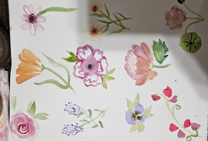
paint these flowers. You can use them to
make gift cards, some frames for your room or
just as gifts for friends. I will also be talking about where to gathering
inspiration from. What materials will
we need and also the different materials
that you can find out there and the ones that
are better suited for you. I hope you really like it. So let's get started.
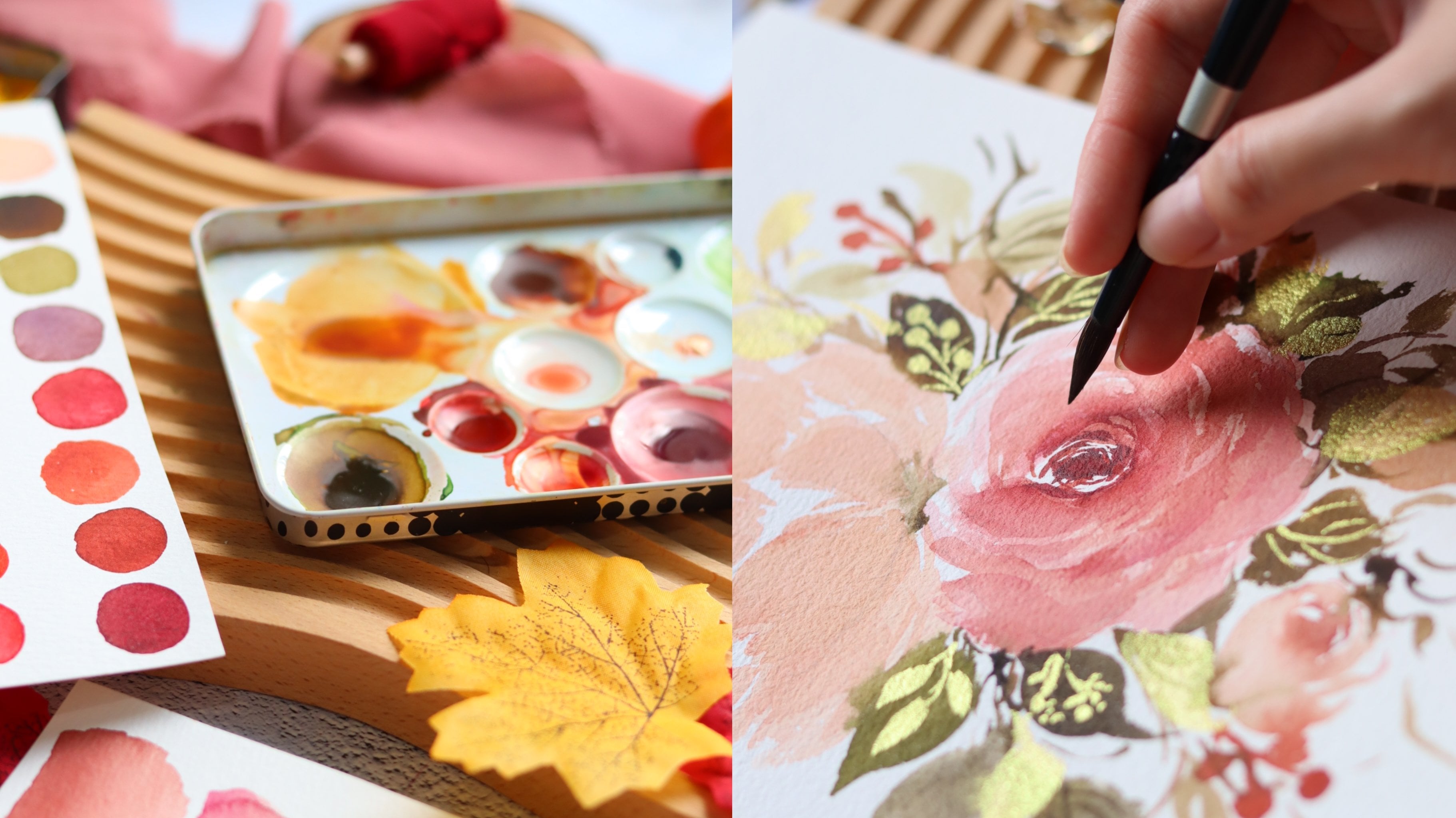
2. Materials and Advice: For this class, you will
need some watercolor paints. They can be sullied
or in liquid form. Watercolor paper,
preferably 300 grams. Then some brushes. Color palette or something
to mix your color. Paper to sketch. Color pencils for details. Paper towels and water. Let's talk a bit
about materials. I'll first talk about
watercolor paint. In watercolor paints you
have three different types. The hard ones that are called basileus in Spanish that I don't remember the
name in English. But they come like this. This one's life from Winsor and Newton have
also three types. Well two types, I think, professional and also like
student types of watercolor. These ones are
professionals and they really lasts a really long time. I had these four maybe to use. Now, I paint quite a lot and I haven't
finished them at all. Like some colors
I have to refill, but most of them are pretty. They still have a
lot of watercolor. The last really long, the
colors are really pigmented. I've heard while I've also
used the Codman ones, but I've never bought
them like the heart form. But they're pretty similar
to the professional ones. So like if you don't
want to embrace that much or just try it
out for yourself. But yeah, it's not like
that much of a difference. But the hard ones are really nice because you can travel
with them, their light. You can also use the packaging Like for mixing
your watercolors. And they're like super
practical for traveling. Because sometimes
I've traveled with liquid ones and can be amazed. And also like if
you're traveling only would lie lied luggage, you cannot bring
that much liquid. So this one is really
good for traveling and also for your daily painting. There's also like the
ones that come in tubes. This ones are really
practical and I like them a lot because you can just squeeze them
and start painting and you can put these
like everywhere. You don't have to. I don't know. Like they're just
like so practical. They last a really long time. I think I've never actually finished like a tube of these. Like maybe the bad
parts sometimes is that the paint gets stuck and sometimes it's really
hard to open them. But that's kind of in, and I've tried three,
well, two brands. One is this one, it's a French brand. But most of it I started, I say Winsor and Newton. As I said Lady, how the
professional ones and God-Man, that is like for students, but they're pretty
basically the same. I've never noticed a difference. The French one, that I
didn't see the name. I think it just go like crap. I don't like this
brand that much like the cool thing
is made with honey. But you need so much paint, lies not as vibrant
as the other ones. These are these ones. Some other really
cool watercolors are these ones that
are liquid ones. So you just open them Like you just use them like these
to drop your paint. And they also last forever. They're like super,
super pigmented, light, really strong colors. Really Byron, like I love them. And I've heard so much also for scanning your watercolors. These ones are great because they maintain their vibrancy. Like I've used a lot
of like two ones or these ones like specially
the colors like pink. It's super hard to maintain like the Byron see when you scan. These ones are a bit easier, but also likely depends
with the color. Way are like they're
super practical. The colors are amazing. They're super easy to
use to mix because you really can decide either
quantity that you aren't like. It's a bit easier to clean. I just love them. And with three colors
that you can do. So many mixes, their supervisor
and I really like them. Then moving on to the brushes. For brushes, I basically
use these three ones. These three brushes. So I use like a kind of
small one, this number four. This is number six, I think. Yeah. This is number ten. So like having three
different sizes, like make it makes it way easier to do details and do like bigger stuff when
you just don't want to paint forever
using a small brush. And also you can get a tiny one. I have also like super
small ones for details. These ones are actually like
synthetic, synthetic hair. So it's not like for
real animal hair. They are cheaper, but they
actually feel like super soft. Seed was like animal hair. Super. Now you cannot tell
the difference. I wouldn't especially invest that much money on your
watercolor brushes. These ones were like, not like they were a good price and they
work really well. They've lost forever
if you tune them well. These are my sizes
that I normally use. Also for mixing colors. I normally use a plate. This is a ceramic plate
that I use for mixing. You can use anything you want, kind of like only if
its not like absorbent. So you can use plastic or
whatever you have in hand. Like some people also
use while ceramic plate, but also like pieces of marmot. But you can use what? I really find it super easy
to use ceramic plates you can buy in the supermarket
or where or wherever. And also you can buy just like a normal plate doesn't
have to be ceramic. But if you're gonna
use a mixing palette, I would suggest
getting a white one because that way you can
really see the color of your, of your paints without them being like dirty
with other colors. This way you see the pure color
also are good thing about ceramic plates is
that it's super easy to wash you basically, when you have them as you've
just put water and you do a bit like this and
it goes super fast. I also like having a huge
one because heaps like way easier to do on this and
you have more space for him. Then talking about papers. Paper is well, I
think I've heard also a lot of people say that lay the paper is
the most important, important part in your
watercolor practice and also in the end result. Well, let's first talk about what kind of paper do
you need for watercolor? For watercolor, you will be
needing around 300 grams or more like 300 is like the most normal and he's like the
best one for watercolor. Because if your
paper is to seem, it's going to be wobbly. It's not going to
maintain its form. It's going to wobble and
it's gonna look bad. And also like them
more content of codon, like the best qualities, and also the more pricey. So there's a lot of
options on the shops. You can really get
whatever you think, like suits your budget. Maybe you can also start
mixing some brands are some different papers. You'll see which one
do you like the best? Because also there's
hot pressed, a paper and cold pressed or hot pressed is when
there's no texture. Super soft like no
texture at all. And this one is my well, the one that I like the most. Because scanning is super easy. It's way easier to clean
your art from the computer. And also, I don't know, I
really like how it looks, but that's like that depends. Totally new and European. Cold press, I don't love
this one is co-create, but this one has a
bit of that texture. But you can find papers with
different amount of texture. Some are like super bumpy
somewhere more like soft. But yeah, like if you want a completely self check
for the hot press one.
3. Flowers part 1: First of all, we're
going to start with the roles. For the rows. I'm going to use the red color due on your pigment to
be really strong because the flowers like
in the middle there, Normally they'd color is darker and the outsides are bit softer. First you want to do like a
pigtail, something like this. Like half circles around it. Then you want to use
the belly of your brush to make the stroke
a bit thicker. It goes on the side. Like this. You can use more water
to get lighter color. You want to go
around the middle, around this circle to
create the petals. Around the center. Sorry. To create a beautiful flower. You can add more petals like
tiny ones on the sides. If you want.
Something like this. Maybe it'd be thicker. You can go back to get
more pigment and put it in the first well in
the center of the flower. I get more of that effect. Like to give you a
bit of dimension. We're going to
paint some petals, sorry, is helping leaves. I'm going to get
some green paint. I'm going to put a bit of
red to make it a bit darker. You want to start
with the tip of your brush like this and then press down as you
go and then lift up gently, you create half of the leaf. And then you want to do the
same but a bit less strong, putting less pressure
on the brush. To finish like this one is more pointy than
this one. It's fine. But if you want to
make it the same, you can just go back
and use the tip of your brush to make it as
point G as the other one. To however we of contrast, I'm going to put yellow
and paint another leaf. The type here. Always, always when
you're painting, it's important to keep
in mind composition. Instead of painting
only two leaves, it's nice to both third one because that keeps the eye going around and also its composition. Always having a
third impair numbers is better than having pairs. Like it's more interesting
for the height. Let's our rows. And now we're gonna
go with our tulip, which I'm going to paint pink. Well, no, I think I'm gonna
painted orange this time. I think I'm going to use pink, yellow color. That turns out yellow. It's more like coral color. Tulips. They are like really
not that open, like a really close flower and they don't have that
as many petals. First, I'm going to start by using the tip of the brush and creating pressure to create
something like this. Then I want to make it a
bit more round like this. Then I'm going to
leave some space here. So it looks like the
petals are divided. So I'm gonna do the same
blood go a bit higher. Like this, go back. I'm gonna go to the other side and create a video of the same. I create a curve
like to know where I'm going and then I'm
gonna do the same. Putting the belly of
my brush going up. This team is gonna go here. So that's why I'm focusing all of the petals like
going the same direction. I'm going to do another
kind of a drop up here. Also, if you want to make
it a bit more interesting, you can get more paint. While it's still wet. You want to go and put a bit more pigment
wherever you want on your flower to create
a bit more contrast. And we're interested, more
interests on the flower. Now we're going to do
the stem of the flower. Tulips have really thin stems, but really thick ones. I'm going to use a light
green for this one. Also. They have a tiny like I like
to do kind of like a hard. Then drag my brush in our straight line
with a slight curve. You can go a bit thicker. Maybe I'm gonna
go a bit thicker. Go up. Then I'm going to create
the leaves for them. I'm also going to grab
some yellow, some green. I'm going to start with the tip of the
brush, then the valley. I put some pressure
and then finishing up lifting the brush
only with a tip. Like this. This one. I'm gonna do it a bit
more straight like this. You have the tulip. Then I'm going to do a
flower that is called head, whereas in Spanish, and
I think it's the name, the same name in English, but I'm not sure about
the pronunciation, but I will put a picture here. You can see what
I'm talking about. This flower is
super simple to do and it's a lot of
fun. I read legging. First, you're gonna grab your pigment like any
color that you like. And you're gonna get
a lot of paint on your brush like
really saturated. Let her paint and not that
much water to create that. Then you're going
to create, well, you're gonna make a circle
with a lot of paint like this. Then you're gonna rinse your brush with a
really wet brush. You're going to make
petals like these. Dragging the paint that
you put on the paper. Making petals like this. And once you feel that
your brush is getting dry, you can go and get more water. Like this flower has
a lot of petals. So really don't be afraid
to really feel this up. Also, you can see that in some areas there's
not damaged pigment. You can go and put some more
paint like in the middle. The color of goods dragged. I'm going to put more here
because it dries really fast. You just want to pull in. This flower is really different. And it gives a really beautiful and
natural effect of watercolor. For this, I'm gonna wait to dry because right
now it's really wet. But also you can go with
more pigment and add more color when wherever you feel like you
need to read more. Or if you'd like it like
this, you can just leave in. Next, I'm going to paint
a lavender flowers. These flowers are really
simple and really fun. And I love the colors, lights. I really like lavender. Lavender color light
violet, like super pretty. For these, I'm mixing
blue and pink. You can play with the tones
that you can, you can do. The colors that
you like the most, you can do a darker blue, pink, get like the friend. Die more interesting colors. For the lavender I
like to make around two or three different
tones of violet. Gives more like the mission and a bit more interest
in the flower. Something like this. Maybe some same color but with more water
so it's lighter. This one I think is too blue for the lavender. Going to use some yellow
and green for the stems. Here I'm going to make
like a tiny composition. I'm going to paint
three lavender. The lavender has a
really thin stem, so you want to just use
the tip of your brush. In this case, I'm using
the number four brush. You create a line. And also I'm gonna create another lavender going this way. I'm just going to
make two this time. Also lavender is have
like really tiny petals. And for these you just want
to use the tip of your brush. You want to go up and down like making like a curve
and then going back. Or you can just press and put
some pressure and then lift up to create other
types of leaves. And also it's nice if you mix different kinds of greens that it looks more
interesting that way, like having different
tones of green. Right now I'm making
a darker green. When you're painting the flower. You really want to follow
the direction of this team. This team is going this way. You're going to keep going following the curve
for the flower. Same with this slide. This has a slightly
curved to the right, so I'm going to paint the
lavender going this direction. This is super easy to paint. You just want to kind of
like put your brush down, press a little bit, maybe get more pigment. You just want to
press your brush. If you're following
along with this class, It's nice to have a
reference picture. You know how the final
flowers should look alike. And then I'm going with the same color but with
more water to create some lighter areas on the flower to give more dimension
and some more interest. I'm just basically
putting drops of water. Think this looks pretty good. Now I'm going to go
with the other one. I think I need a darker color. I'm gonna get more pink and
blue to create more purple. Make sure when you're
painting your flowers so dry. If not, I wouldn't
be like making them. It's always it's always
a good idea to use a hairdryer to make
these dry faster because the watercolor
dries really fast, but it depends on your climate. It's really cold and humid is going to
probably take some time. But if you live in
a hot area and it's going to dry super-fast. You will learn these
with time and you will adjust your painting
according to these. You just wanted to
put some drops. Lavender. Also something that
I like to do to give my flowers more details. But without watercolor is
just grabbing a color pencil. Doing some like some
lines on the leaves. So it has more detail. Kind of like this. That's the lavender. Now I'm going to do an anemone. It's Japanese flower. I think. They're super beautiful and
they come in a lot of colors. But the most important
thing about anemone is that the lay, the most characteristic
thing is that the center is really dark and it has a lot of tiny
hairs coming out. We're gonna focus a lot
on that because that's what makes them look
like an anemone. I'm going to mix some
pink with some red, really dark pink color. For this also, you want a lot of saturation
on your brush. You want to create five or
five or four petals then, depending on the size, you're gonna do them, It's
a bit like this flower. Like I was going for
an anemone here. Yeah, it's super
easy to make like the most important thing
is like the center. With these flower, you
can really have fun. Like it's more about being super loose and
changing the colors. Let's do it. Also. It's nice to have to know where the center of your
flower is going to be. For example, I know the
center will be here. So I'm going to use that
as a reference point. All of my petals going
the same direction. So I'm just going to use
the tip of my brush and create this shape of
the petal like this. You can turn also
your page around. You're more
comfortable painting. The video stopped. I don't know why. You couldn't see how I made this flower, but right now this
flower is dry, so I'm going to show you how the middle of this
flower is brown. I'm going to get some brown. We're going to put
a bit of black, also a bit of pink to make it more of a soft color
like not that dark. I'm going to do like tiny
dots inside like this. We want to make a circle
but not, not perfect. Also be on the sides. These legs, good. Now I'm going to go
with a smaller brush. I'm going to get some
pink while it's more like wine color, like stronger. I'm going to do tiny, tiny petals going
around the center. Like this. These petals, sorry,
these flower also has a really straight stem
and really thick. I'm going to use this brush. Just imagine like
we're from the center. Like where will this thing be? Imagine. You can give it a bit of a curve to make it look a
bit more organic. But if not, you can
just keep it straight. I'm going to show you
this flower later, but I'm going to finish it. But basically what
I did is was, well, it was grabbing some pink
color, some pink watercolor. And with the tip of the brush, I was going on the sides, making, making the
sides of the petals. So I did five petals
going around. I put a lot of pigment on them. Then I put some
watercolor, sorry, some water on my brush without
any watercolor in here. I grab the color of this petal. On the color of this petal. I'd make a gradient. Then without any watercolor,
just with water. I went the center and I created some volume to fill the petals. And touching all of the
sides of the petals. The color of the watercolor created wealth light
pigmented this area. Now we're going to
create the center of the anemone. Like this. This part is what will
make it look like, really like an anemone. First, we want also smaller brush because we're
going to use it for details. We're going to use it for
details of the center. And I'm going to grab like a wine color and some
brown make a darker color. Because I don't want
it to be really black goes he will be
like really strong. I'm just trying to make like a dark color that
lose still be pink. Then I'm going to create
a circle in the middle. Just like this. You can put more
pigment if you want. Then using the tip
of your brush, you're going to
create some hairs. You want to go from
outside to inside. The hair looks like
figure and then a bit thinner in the
inside, just like this. Also, you can turn your paper so you are more comfortable. Then. You just wanted
to do the dots. You're going to go
on top of it here. Okay? So I think it's
looking really cute. Now I'm going to create
some petals following the, the third while the
rule of thirds that I told you like of composition, always putting three
petals instead of tool, because it looks a
bit more interesting. For this, I'm gonna
do a petal like just, we've just one stroke. I'm going to put the
tip of my brush, then putting a lot
of pressure and then lifting it and just
leaving the tip. I'm gonna get more color. So putting the tip, pressing down and lifting it. If you don't have that
much color as you want, you can just start your watercolor and get
more pigment on there. Or animals, I'm going
to get more pigment of my my brush like this. Then changing beat of the color. This one's going down. Three in this side and two, so it makes five still
an impair number. So I looked better than
just having four petals. Now, one of my
favorite flowers and I think one of the ones
that look the cutest, like a dry flower or a
call in mortal, immortal. That is like an
Australian flower. That when he drives it keeps like looking
really, really beautiful. For this, I'm going to use some yellow and some pink to make a really light like salmon color. For this, I'm also going to
make a bit of a composition. So I'm going to
paint two flowers. I'm going to get some yellow and some green
to make a dark, sorry, a light green, like a lemon green. I'm going to create two
light stems using the tip of the brush and one
smaller than the other. Then I'm going to create some petals is really
similar to this. Just a bit thinner. Sorry, just a bit longer. And with a pointy tip, you're just going to
put some pressure and lift it like this. Then I'm going to get, well, I'm going to rinse my
brush and get some of that really light color. I'm going to put a dot like to know where my
center is gonna be. And from there I'm
just going to pull my brush out like this. Create like hair, kind
of light here you effect because these flowers
have a ton of petals. This flower has a ton of
petals and they're tiny. So we want to
create that effect. You're just going to keep doing it until you have full flower, like a full circle. You're gonna do the same
with the small one. I'm following the
direction here. I'm going to let it dry
and then I will continue.
4. Flowers part 2: Now that it's dry, I'm going to go with
a small brush and make the darker version of the
color we just made before. So it'll beat of
a Salomon think. We're gonna do the same as
we did for the big flower, like for the outside
of the flower. Just like in a smaller version. We're going to go like this. The same for this one. So while this dries, I'm going to show you
how to make a pencil. And pansies are really
beautiful flowers and they're really
simple to make. They have, well, they have
more than three petals, but like simplifying
it to three petals, look really, really good. And you can tell right away what kind of
flower you're seeing. For this flower, I'm going to go with a light violet color. I'm going to put
some water here. These violet for this, for these flower, I'm going
to make three petals. It's also good to know where is the middle
of your flower. I'm just going to do
it with a pencil. Put the center of the
flower. From there. I'm going to guide
myself where the petals coming out like this. So you just want to
create one petal, then another one, but leaving
a space here in the middle. Leaving a space. And then another big petal, this is the biggest one of them. Coming here. On top of them. You can make them
touch each other. Now, you have this
U, it's pretty wet. You want it to dry at tiny bit. Before adding some more color. Like these, flowers have different tones of the
same color on them. So you want to mix a
darker violet and just touch the closest part of
the center of the flower. And this will create
a gradient effect. Now, you're going to
go for some ocher. Yellow goes. This color is more thick, like more like a gouache color. It's really nice. It has
really nice coverage. You're going to want to stay bleed like
made tiny dots with a really small brush
in the middle to cover that pencil
mark. Just like this. If your paint has done
all crazy like this, you can just go with a
wet brush with no paint. You can guide your paint to have more like a
normal gradient, like not that much texture. You can go again with your darker paint and
maybe put some more paint. Give more dimension. I'm going to create some leaves. This case, I'm going
to do this live. But with some space in-between. You want to start with
the top of the brush, press and let go. You can put more paint. Then same. Just like this. I'm going to do another
one with less pigment, so it looks lighter. Details here to
make it look cute. Maybe one leaf that
is completely full. Then another one
is a bit lighter. Looks really nice. You can still go on putting more violet if
you want new middle. Maybe retouching. So all the lines. I think it looks
really cute. Let's see if this has dried. So make sure if you're
painting has dried, you can just kind of look on this side and if
it looks glossy, it means that it hasn't dried. But if also another test, of course it's touching it, but maybe with a UK
ruin your painting. It's better just to see
if it's glossy or not. Now we're going to finish
this flower and for that, I'm going to get some
of my pink watercolor. I want this to be
really, really thick, really pigment in,
because I'm going to do that in the middle
of the flower. Then other one. Also you can do some
tiny dots around. Make it look cuter. You can go with
the color pencils, some lines on the leaves. So it looks a bit more detailed. You can also do this
with watercolor, but I like how it looks with a colored pencil and
it's a bit easier to do. You have more like it's
easier to control. The line. Looks really good. This is dry. I'm going to put another layer. Violet, like a darker violet. Just to make just to give
it more, more detail. So I'm just going to go
with the top of the brush and some wiggling
around like this. That's it for this flower. Now I'm going to paint
a peony or pony. I don't know how
to pronounce it. But this flower is
super beautiful. It's like a lot of people that
use their favorite flower. Also, it's kind of intimidating flower to paint because
it has a lot of petals. But I'm going to
simplify it a lot. So you see that
it's not that hard. You just want to keep in mind that these flower
has a lot of petals. And also that is like a
really fluffy flower. So first I'm gonna make
like an orange color. I'm going to start with
the middle of the peony. I'm going to paint
it right here. I'm going to create a
similar texture like a similar effect or a similar
flower like the tulip. I'm going to start with a tip. These channels doing
hard with another hard. Just filling it didn't
just like this. And then I'm going
to go and grab, but only my pink got
mixed a bit with yellow, but it's not as orange
as the other one. I'm going to put more
pink because what I want is I want
the colors to mix in the flower to give you
more volume or interest. I'm grabbing. My pink. My stem will be here. So I want this to go a bit more down side petal. Like this. This is kind of like the
center of the flower. Now what I'm gonna do is
go with a pink again. I want to create legs. Like if there were some
petals like behind this. So it's like, kind
of like tiny curves. Play has moons. Then with the lighter
pink, more water. Going to go like this. Creating this. I'm gonna do the
same on the side. Putting more paint here. This looks more red than pink because you've
got a bit of yellow. But now I'm gonna
go with only pink. Hopefully. Gonna do some, some petals like on the
bottom of the peony. Kinda like this. Like a hard, the same. The penny is like a
really fluffy flower. So this gives that effect. Put more of the pink here. Now what I'm gonna do
is just use the top of the brush and create
just lines like coming from this center to create the effects of a lot
of time in petals like this. And after I'm going to come on, put some yellow to create
the middle of the flower. Gonna get some green. This stem, the top of the stem. I'm gonna do it like a tiny stem because I don't
have that much space. Just create leaves. Pianists have more
texture in their leaves. You can just do it like this. On this side, I'm
going to paint kept Poussin flower or North Station. These flowers are in
a lot of gardeners, well gardens because they
attract the bees and they're beautiful to look
at and also you can eat them so they're
really pretty. They had really
interesting leaves. So I'm going to add them also,
these, these compositions. So first they have really
thin strands like this. I'm going to make another
one fill with some seeds. And another one for the flower. This one's how lye
really circular leaves. I'm going to just
paint a circle. I'm going to use thicker brush for the seeds. They have seeds that loop. These different segments. Like two sides, looks
a little bit like, like a coffee bean. Now for the flower. I really like this color. So I'm just going to put more water to make
our light effect. These flowers have,
I think five petals. They're just,
they're like really fluffy and start
like really theme. Then they get bigger.
That's what you want to do. Like just start seen and get a bigger
exterior on the petals. And also the problem with
this paper right now is that if you have
greasy fingers like me, sometimes when you
touch your paper it stops being so observant. So right now I don't
know if you can tell what I've touched these paper probably quite a lot right now. Like the watercolor
is not really going so easily into the paper, which is kind of annoying, but there's nothing you can do. Maybe just wash your hands more often or have
something to remove. The greasy means severe
hints. Something like this. Five petals that all
connect in the center. It's really important
to keep in mind that all the petals always have to go in
the same direction. So in the center. Because if you put, even if you change the
angle like a tiny bit, you can really tell. These will make your
flower look on real. Something that helps
that I've done in this flower is just
putting like a point in the center of the flower so you can focus all the petals there. Then I'm going to get a lighter, sorry, a darker color. And I'm gonna do a bit like the same that I did
here in dependency. And I'm going to touch here. That's it. Then for this. Well, still pretty
wet so I ruined it. I'm going to put
some more paint. I'm going to let this dry and then I will continue with it. Right now I'm gonna
show you how to make sweet pea flower. They're really,
really beautiful, delicate, they smell amazing. It's one of my favorite flowers. Also. They're kind of challenging at first,
like to paint, but once you understand how they're made,
It's pretty simple. They grow like really
inorganic shapes. I'm going to draw a bit
of a curve like this. That happens when you don't
wait for your paint to dry. But whatever. We also in here, I'm having the same problem as in the
side that I didn't like that. The paper is a bit greasy
so the color is not going so easily like
inside of the paper. These flowers also
have a lot of tiny, I don't know how they're cold, but lie the things that
grabbing onto the wall or into other things so they can
keep going up tendrils. I think their coal tendrils. I'm going to draw here just
using the tip tendril here. For this, I think I'm going
to use a similar color, like a really light pink. For these flowers. You want to use two colors. One darker for the top petal and one litre for the bottom, or just changing around. But just like making sure than one is lighter
than the other. You want to create like a heart, but like an upside
down hard, like this. I'm going to do the
same here. Maybe here. You can do it like this. Also a hard, or you
can add another hard. I really like painting a heart. Lay that really
simplifies the flower. Now I'm going to go darker, while this is more like an
orange instead of a pink. I'm going to go on the
top and do the same. You want to create
it in an angle. Gives the flower was
opening the IVs. Here. I'm going to wait for these to
dry while we form. I'm going to do like the
beginning of the flower, just a tiny, tiny line where
the flower is starting. So what I've done here, Let's see if this is dry. Well, it's not dry, so I'm going to
wait a bit longer. But before I do that, I'm going to go back into this flower and put
more pigment here. Just in the center. I'm just going to
wait so it dries. Now they're dry and I'm
going to finish them. I'm gonna get a darker green. May the details of this flower, of these leaves, sorry, so I'm going to draw center. And then with not that
much paint on my brush, I'm going to do some
lines coming out of the center like this. Smaller ones like this. You can do the same
for the seed part to outline it or give
it more precision. For these flowers,
for this width b. I'm just going to give
more color to the side. To put another layer on top. Kind of like this. You can do the same just to give it more
direction of the petal. I'm gonna do the same
with these flower. Putting some strokes,
light hairs coming out. That's it.
5. Where to find inspiration: It's always a great
idea to go around your neighborhood or your park and just gather some flowers. Yesterday I went for a
walk and I got these ones. Painting from a real reference. Like something that you have in front is a bit easier because you can see all the details
of the flower. I held. The light is hitting
the flower, the petals. You can see how it formed. So it's always a good idea. Also, you can Gaul and maybe buy some flowers
and Flour Shop. Also I'm really into gardening, so I have a letter like
seeds with like song, pictures of flowers in them. And also of course,
you can go into the internet and find
some reference pictures. Like everything is great. And if you were first starting, it's a great idea to really have a reference picture or a reference object
in front of you. You can see the details and once you're comfortable painting
them for a long time, then you can maybe move on
and try different colors and maybe different shapes
to simplify them. So I really encourage you to
go outside to your garden, to a local park and paint flowers that are there
like physical flowers because there's
something special and something easier
about painting a flower that eats 3D that you can really touch
and see the details. You can move around so you can see how
the light is hitting, how shapes are for me. So try this out to
see if you like it or to see if you find it easier. Well, yeah, always painting from a reference is a great idea.
6. Thanks!: Hi everyone. Thanks for watching this class. I hope you learned a
lot and you enjoyed it. Don't forget to
upload the flowers to the project section so everybody can see
what you've done. And also, I'm really
interested to see if you change the
color or the composition. And I just wanted to see
how your work looks. Don't forget that part. And also I wanted to
show you this card, cards that I made using one of the flowers that I
showed you, the anemone. I just wanted to show
you the possibilities. These flowers, or you can make everything you
want with them. You can make some designs
like or you can paint them four frames in your house or just as
gifts for friends. So Joe's be creative
and have fun with it. I wanted to remind
you that I also have two other classes on Skillshare if you want
to check them out. So just go to my profile
and see what I have there. Don't forget to follow
me on Instagram. You see my creative
process and just my thing, and also share a bit of
my garden and cooking. So I hope to see you there. Thanks for watching.
 Andrea Escalante, Artist + Entrepreneur + Educator