Transcripts
1. Introduction: Hi, guys. I'm Iga
Freelance illustrator. I have been painting
for 15 years, so I have a bit of
experience in this field, and I'm obsessed with crockery, magical things, and cute stuff. And during my classes, I constantly share knowledge
that I have about the brokere and how to create beautiful watercolor
illustrations digitally. So welcome back to
my class today. Let's dive into
watercolor art paint altogether beautiful
flower illustrations, and in the end of my class, you will learn more about
procrete and composition. This part takes an important
role in today's class. Because before we
start painting, we're going to define
the purpose of our art, before we jump into
digital process, we tiny practices with
traditional watercolor medio, where we will experiment
with different styles. So finally, you will understand
which styles you more, and you can keep practicing and keep painting in this style. And like I said, finally, let's start adding color shades and highlights to our art. I will show you how to
create flowers from the simple sheades and how to
add more and more details. So we will make our
painting process a little bit advanced. As a bonus, I will share with you my own custom brush set, paper, color palette, font, my own pictures that I created. This class is great intermediate
and advanced levels. As can be useful for beginners if you have
basic understanding of procreate features and if you watched my previous
procreate classes for those who is interested in digital watercolor art
and flower illustrations. One thing that I
want to mention is your opinion and your feedback
is very important to me. So feel free to tell me
what you think about my class in discussion
or review section. I will be glad to reply to you. My idea, art fellows, I can't wait to
start this class, and definitely I can't
wait to see what you upload to project section.
So let's not wait. Grab your iPad
with Apple pencil, and let's paint together.
2. About Class Project: Your class project will be next. So you can follow my steps and create lovely floral
illustration, the same that I chose or use your own
sketches that you made and then paint using the tips and brushes
that I gave you today. I will use Procreate
for this class with iPad and Apple pencil. So if you have it
also must draw in pads or just regular
paper and pens, please join class,
and good luck. In today's class, I will
paint floral postcard. We will start with
simple drawings and then move to more and
more complex shapes. Our main focus will be flowers, and in the end of the class, we will create lovely
floral postcard that you can print and share
with someone you like. Once again, you can choose completely different topic
and draw something new. Try experiment, and enjoy
painting process to get.
3. About Composition: So we move to the very
important part of the class where we are going to talk about the composition, about its rules and principles, and I will show
you the way that I follow when I'm creating
some of the artworks. And I hope this way also
can be useful for you. So before we start
painting process, we need to answer yourself. We're going to have two
questions in our head. First is what you're going to
draw and with what purpose? Those questions are
crucial because like there should be a meaning behind every of the artwork, and all artists want to
deliver some specific message. So without those two questions, it might be easy to forget
about the initial idea. That's pretty often
happens to me. I'm trying to remind
myself every time, what was the initial purpose, the meaning of my
art that I created. Composition in art is arrangement of the various
elements on a canvas, and particularly how art
elements like shape, form, color, value, and space, how harmoniously they
are placed on a paper. And how you arrange and
position, all those elements. That's how it will affect the perception of people
who will look at your art. And if there is no connection
between the elements, so the picture can look a
little bit chaotic or dull, and we need and we
want to avoid it. So wisely arranged elements can really help us to
change the mood of the art like dramatically and accordingly to our
needs because like I said, we always remember
about the purpose. So what composition techniques
we can use in our art? First of all, this is balancing of negative and positive space. So positive space
those are the objects that are in main focus,
and at the same time, negative space serves to
support and exaggerate, acinuate the objects
of the focus. At the same time, negative space serves to highlight
the object of focus. It's like I and Yan. In order to create
such composition, you need to try to keep approximately equal amount of negative and positive space
in your art composition. It should be 50, 50%
for two of them. The second rule is
perspective rule. I like to use it a lot, but and especially if you like math. So we have like one
point perspective, two point perspective,
multiple points perspective. And it can really help to
deliver the feeling of depth. And this perspective rule can be achieved by using
lines and points. We can play some of
the points on paper, and then by using some
mathematical, not formula, but the rules geometrical rules, we can build our
objects like wisely, but of course, we need to
remember about the proportion. And when we place the object
next to the main point, so it will be pretty small, and the closer we're
going to place the object to the
end of a paper, the bigger the object will be. Another rule is circle. Show the harmonious motion, and it's very well balanced way of arrangement
elements on a canvas. So I just place a round
object in a center, or you can place two
or more elements in a circular position, and that will help you to draw people's attention very well. Next rule is scale. The term scale refers
to the size of an object in relation to the other objects
in your artwork. Usually, we use the
correct proportions, but if you want to create some fantasy artwork or
deliver some specific idea, you can alter the
shapes and make the elements of your
art disproportional. That really can help you to bring pretty dramatic results. Next rule is triangle. It helps us to create very well balanced and
strong composition by letting people
follow the line and see the unity of
elements on a canvas. Also, if you want to add
more dynamic to art, create more triangles, so people's eyes will move from
one scene to another one. It can be a little bit
challenged at the beginning, but try maybe this principle will really work well for you. So the next rule
is golden ratio. It's Phi Banach sequence. And it's a mathematical
formula that artists use in their art in order to create very well
balanced composition. You need to divide the
paper into rectangles in some specific sequence and in
some specific proportions. Eventually, you
will be able to see the spiral that for me,
it looks like snail. Artists can use those spirals in their work to create a
sense of movement and flow. It's very beautiful, but yeah, it takes probably a little bit of practice in order
to use this rule. So next one is my favorite. This is rule of thirds. This rule is based on ideas
that our brains tend to get excited over things that are not in the
center of an image. So we need to divide
the paper into nine parts and at
intersections of those lines, we need to place our objects. That will create the most interesting and eye
catching feeling. And the last one, you can
create your own rule, but, of course, don't
forget about the harmony. Hey. Let's briefly talk about
the elements of artwork. So we actually going to
call them building blocks. Yeah, I think it's easier. So first of all, we have lines and dots, so
we can just, like, draw a couple of dots, then connect them with the line, and that can help us
to create a shape. So after shape also
we have color. So we can fill our objects, our shapes with some
specific color or colors. It's also very important
element of the artwork. Next, we have texture. So we can define
how smooth or rough our texture can be and that really can make a big
difference in perception. The next is value.
Here, we will define how light or dark
our color can be. Next is space. Using space in the right way is super tricky and super
important at the same time. Space is filled with
negative and positive space. Try to keep it in balance. Use negative and positive
space wisely. Next is depth. This is a distance between the
objects on a flat surface. We can use perspective. And if we speak about depth, usually it's foreground,
middle ground, and background. And this is it for the
elements of the artworks. It's just like basic
understanding that really can help us to ease painting process and
know a little bit better about art and what we are
doing during my classes. So let's jump into next
part of the class.
4. Watercolor Practice: It's time to practice. Let's polish our art skills before we jump into
painting process. We'll go through some
ways of painting flowers, and in the end, he will find a way that works
perfectly for you. Lovely skill share community. I think it's time to practice. And as I promised today, we're going to use real
watercolor medium, this one. And I decided to use
any watercolor set. I have 18 colors here. And I'm going to use them
today for our practices. Again, you can use
any brushes you want, any paints you want and
you have any paper. You don't have to
buy special paper or special paints
for these practices. Definitely, no need to do it. And my suggestion also
takes some kind of tissue. You can use toilet
paper is what I do. Here, you can mop
the brush in order to remove the excessive
water or some paints. You might see already
made tiny sketch over there that will help us to
ease our painted process. So about the reference
pictures, as I said, you're going to
find them in I'm on the freebies and then
download them to Files app, and then you can just look at the picture that I showed to you or you can use any
other flowers you like, and then try to
redraw it on a paper. We just need to
practice and learn in this part of a class
what style we like most. And then it can
help us to define our painting technique
when we're going to draw our flowers on iPad. So as a brushes, I use
brushes with natural fur. Is squirrel, and I
have Paul Rubens four. I have Brilliant as zero, and the last one is Chinese
brush for calligraphy. So I'm going to use them today. So I decided to use loose watercolor style for
this flower, for the iris. And then here in this part, I will use more
dry brush strokes. So it will be a wet on dry painting technique
or even dry on dry. And here I will use wet on wet and dry on wet
painting technique, and here lose watercolor style. Let's just fill our
flowers with some water. I will not add too much water
here because like I said, this part I want to
keep pretty dry. I will not touchiris for now. That's our final practice. And for this flower, as you see in reference,
it's more yellowish. I added some of the color. Some of the petals
area with a color, but I didn't blend it entirely. Add more color. So you can control the
intensity of color by defining how much pigment you want to add to your brush. So less pigment you have more transparent and less
bright your painting can. I don't add water. I just keep adding pigment. And because this is kind of dry and dry
painting technique, almost dry and dry, the
pigment will be brighter. You see, I still have
some white caps. I think it looks very lovely. Perfect. Now in the middle, I'm going
to use some brown shade. For this practice, we
don't really need to know precisely the
name of the colors. We just need to learn
how to practice. And here in the
middle, because I applied tiny bit of
water at the beginning, I like this blending effect. So colour bleeds into, from the heart to the petals. Now remove the excessive
water, remove it. And you can go a little bit more orange color,
more orange shade. Just try to experiment. Ish color. So your aim is to show the blending
of different colors, and at the same time, remember, we can switch to another
brush to a smaller one. Brilliant race. I'm gonna use this brush. A little bit water. Tiny bit. Okay, use the style that I showed you previously just
show like tiny lines. Like that. You can have
some gaps. It's okay. Just like layer the color. Remember that you need to layer the pigment and we have the darkest part
around the heart. So the edges I tend to
keep more transparent. So by layering, you
exaggerate the color, make it brighter
and more saturated. And when you don't
add a lot of water, the color looks has, like, very obvious strokes. If you want, you can
blend some areas. Just a little bit, like that. Now what I'm gonna do, I will go second time where
the heart of flow. Oh It's pretty dark, but not black, of course. So you can take a little bit of dark shades to show the
blending effect color. You see color grading
is very nice. And now, do the same grab some brown color
mix with yellow or orange and also show
around the edges. So tinish around the edges. Remember, I will not
add too much water. And later you will blend
some of the edge lines. Now, grab previous brush
and blend a little bit. Also, the brush is almost dry, maybe a little bit wet. Like. Now time for our final part. I will mix brown color
and orange and yellow. And you see we make a
little bit some kind of dirty brown color. And we need to show
the lions in a set. Depending on the free
time that you have, you can keep layering additional colors,
additional color variations. But remember, don't blend too much and don't
add too much shades. Otherwise, it will
look like a mess. In what color contrast
is very important. You can show us at edges. S at petals. Len. And I think we've done this
part with this practice. This flower looks very lovely. So here, the painting
techniques that we applied was dry on dry or dry on
wet painting technique. So try to add more dry pigment, and you will see
that by layering, the color become more
and more colorful. Okay, now let's go to the second technique where
we're going to apply a lot of water and
very gentle blend. Okay, second floral. This one will be more
like pish try to add water but within
the frame of a petal, try not to go beyond the petal. So we don't need to have loose watercolor
effect in this flower. So add water, but
within the petal size. Okay. Now, we need to
have purple shade, and our first layer
will be purple. Because we added a lot of water, so you will have very
lovely and gentle blending. Technique. You can
have some white caps. It's totally norm. Mixed together purple
and blue shade. But keep in mind that we have some kind of gradient
in this flower. So the part that is closer to the heart will have less
pigment, so it will be whiter. That's why I try to remove
some of the pigment here. And lastly likes it. In a center, we're gonna have some kind of
greenish shade. Like it. Thank. So the plant green
color into the blue one. Look, you see, it's
very gentle blending, like I told you. Now we need to wait a tiny
bit keep adding more lines. More layers. Same colors. Balance between blue
and purple color. You might have different
types of blue. Here I like it blue colour. Things very gentle. Try to add more
blue shades here. So by layering, you also add very beautiful
additional blooms. So now I want to add
more bluish shade. Because you see we
have the purple veins, so I don't want to have
too much purple shades. Even though like on a picture, we actually have a lot
of purple variations. But it's okay. We just some time
ding those details. Look, I really like wet on wet painting
technique because it gives you very beautiful
and gentle results. Okay. Waiting, waiting, waiting. And if you want to add
some unexpected results, you can add some water, and it will have very
beautiful blooms. Now, let's wait until it dries.
5. Watercolor Practice: Loose Watercolor: And while we are waiting
for this flower, I think we can combine
this class together, and we can start painting
our last flower, this iris. And like I said, it's loose watercolor
painting technique, so I'm going to apply
a lot of water here. Alexis. So the colors
will blend one another, and it will create very
unexpected and beautiful result. I hope so, at least I hope so. Have some green color. Then, what about the background? Let's see what color
we might have. Maybe a bluish shade. Maybe it's a little bit
too bright, but it's okay. Maybe we also gonna have some of the brown color here. Why not? So try to blend colors and add a lot of
splatter salt water. Now, yellow color,
Iris is yellow. Of course, we're gonna
mix it a lot with orange. But to show the
basic understanding, we're going to need
those colors too. So bit of color gives
you a lot of freedom. You can experiment, use
different types of colors. Because we have this
flower, I decided to add a little bit
of purple shade. So actually, our background
looks very colorful. First, like, when you draw, try to stick to around three
colors, three main colors. So not to make your picture
too disproportional. But again, this
is just practice. So you can be creative. Okay, I think I like
this background, the way how it
blends one another. So I'm gonna keep it that way. Now we need to wait until
everything dries, too. Okay, I think it's
a little bit dry. So we can keep adding
and look at the blooms. That's so cool. Okay, let's keep going. We have the same brush, and I'm going to keep
adding tiny details, but now I have a lot
of purple shade. So look at the
reference picture, and you see we have
so many veins. This part is still wet, so it would be
really difficult to draw those tiny
parts of the flour. So let's not draw.
Then let's wait. And I want to add. Okay, let's add purple bloom. Really many veins. I just try to show them, but also most likely we're gonna have many, many, many blooms. My suggestion. If you
have very thick lines, just try to blend them. Here we have some purple shade. A in this area. So that probably will
be our final touch before the thin line. So be careful. Don't
leave pretty sharp lines. Now we can have tiny bit of
blue blooms. Separate some. And because the
paper is still wet, so let it do the job. Alexis. I think here you can
have a tiny bit of splatters to see the
unexpected results. Now let's come back until
it completely dries. And let's finish
second layering. D. Now here, I'm going to mix
blue and brown color together. Because this part is
already almost dry, so it's super easy
to show the lines. Doesn't blend, so
it would be easier. To blend it. Thanks. Okay, here we still
have some wet parts. So we're gonna just blend them. Now mix yellow and
orange color together. And still some part is still
a little bit greenish. And marched. Why not march. I'm already into
procreate process. Painting process. Yellow color. So greenish shade a little bit. This part is still wet. So you need to be careful. Here we have super
vibrant color. Likes it. We can go beyond the lines and
show some of the colors. I really like to play with color gradient
and with volume. So in some parts, we're going
to have very dark spots, but sometimes we will
have very soft light. Second layering of background
color to make it a little bit stand out,
make it brighter. So by using some contrasting
colors like for example, background can be darker than our iris that really
can help us to show the beauty and help viewer
to look at our flower, like, so it will be in the
center of the attention. It's also one of the
compositional tricks. So remember, you can always
use some darker shade at the background and paint your main object
a little bit lighter, so it can help us to
reach very beautiful and like desiring feeling when we look at the
art that we create. Not we, just like people who
will look at your artwork. They will look at your
flower like immediately. Next. And look the way how
it blends also very natural. Again, we need to wait
until it all dries. Okay, I think when we've
done this drying art. Now, I think we can add little
by little tiny details. And let's do add those
tiny details here. Just look at the
flower that you have. Try to add those tiny
details little by little. Add those small veins. Also, you can still add some
tiny details in this area. Just emphasize where we have I added a little
bit of purple shade because I think it
might look very good. And we underlined and show
where the petals are. Now you can plant a little bit. Then we can add tiny bit of orange color, and be careful with plenty. That's a tiny bit of cream
colored see. Just tiny. Do you have some green colour? Tiny bit of yellow.
Then some brown, you shade. You edit it. Now let's grab pretty thin
brush, the smallest one. And we will go with
very purple color. Remember, we needed
to show more water. We needed to show
or so a flower. Well, grab purple
and blue color. And try to show those veins. A little bit green color
green color in this area. Like that. We can call this piece finished.
And the last one. Same, we'll mix brown and
green colour together. You need to show carefully
lying What was the step. Like, very, very carefully. And then grab a little bit water tiny bit and blend the
edge from another side. L Then mix brown and
orange color together. Me brown and same show
the edge from this part. So, of course, lose body
color is all about blending, like diffusion of one
color in another. But we also can grab
tiny brush and emphasize the most important lines like underline where we have what? I can keep adding and
keep adding details. Keep painting. Here we will show the petals. And again, try to add more
color to the background, and that will help us to exaggerate and show our
beautiful flower better. And I think we can call
three flowers finished. Guys, I hope you learn something new about
painting techniques, and you discovered the one
that you like most wall. And now we will try to
implement this knowledge that we just got into our
digital painting process. So let's do it.
6. Practice in Procreate: Dry-on-dry: So we were waiting
for a long time for this moment, and
now we are here. We are ready to jump
into painting process. Use the brushes that
I provided Emmons PriebisO native procretals
or your own brushes. Don't forget to paint on a layer that is under
the texture paper. And let's not wait, and I will show you
everything right now. Okay. In this part of the class, I will show you how
to paint a flower, the same flower in three different styles that
we were practicing earlier. So I decided to use this flower. It's round pretty as
our practice flour, and then I will go to the sketching layer and move to multiply blending layer mode. That really can help us to blend the pencil strokes
into the paper naturally. And then I will lower the opacity of the
sketching layer because, like I said, what's the
most important is to see the pigment and control it. So let's go to Bull
dark watercolor edges, and I'm going to
use this brush as our main brush for this
painting technique. And here, let me show you. My favorite style is the
second one when we use wet and wet painting
technique and when we diffuse colors naturally. But like I said, let's try all three
styles that we tried earlier with traditional medium and define for us
what we like more. So the first painting technique that I'm going to
apply is dry and dry or wet on dry
painting technique. So let's do it. Let's
make this flower. Buish so first thing
that I need to do is to fill every petal
with some specific color. Here. So if you turn it off, we will have less
watercolor texture. If we turn it on, you will
have more water color texture. I like it, so I'm going to
give the stains layer here. Painting and maybe a little bit. Oh, green color. Then I will use my
blending brush and blend the color
naturally like this. And we also have stem. As a stem, I'm going
to use and as a brush, put basic watercolor brush. I want to have more
textured line in this part. Let's do the same what we did with traditional
painting method. We need to layer little by
little, additional layers. Let's move to the new
layer, shades layer, and let's switch blending
layer mode to multiply. And here, you might use different types of
brushes running inker grab a little
bit darker shade and increase the color. Don't worry, we're
going to lower the intensity of color
a little bit later. But we just need to show
the dry brush strokes. And also you might show some of the dry brush strokes that are coming from
the center like here. When we go to the
edges of the petal, they will be the lightest. And in the middle, the
color will be the darkest. So we are trying to imitate
the same painting technique. Now let's play with
blending layer mode. Also have the shade from
the petal on a step. You can go and experiment with blending layer molds.
I like darken color. So I'm going to
stick with darkened color and lovers opacity till 50, 60%. Then my suggestion,
you can go to curs and try to
experiment with color. Lover's opacity
even more till 45%. Then grab blending
tool and blend in some spots not everywhere because we need to imitate
the watercolor feeling, so we need to show
some water drops. Same brush, and I want to
grab slightly darker color. Now we can look at again.
It's a style and flower that we are going to show
to imitate right now. And here we still have some of our lappings and in some areas, the brush strokes are softer. So let's do the same.
Okay, very well. Now let's darken area. So I will duplicate
shades layer one more time and go to multiply again. And this time, what about
going to Bubesiqaycolor brush? Grab dark blue color. See it's super dark, but
we're going to blend it. So we just need to schematically
show where we have the darkest areas and then
blending tool and blend it. This brush is amazing
for showing some blooms. And don't worry if you think
it's too dark, it's okay. Like I said, we will
adjust the opacity. Move the past until
60 80% like that, and then merge it together. And guys, now what
we need to do, we will need to add tiny edge lines to the
petals and the stem. And for that, the best
solution is to use Alpha log. So in this case, we need to duplicate our main color layer, then go to the lower layer. Then go to hue saturation
and brightness in adjustments and move the
brightness to maximum 100%. So as you see, the lower
layer now is white. Now we need to duplicate it
again and merge together this white layer and
then merge it together with our original
color. Why we did it? Because now we need to use
Alpha log press Alpha log, and if the layer is semi
transparent or transparent, and it was transparent because watercolor brushes
are semi transparent. So when we apply Alpha log, in this case, maybe some of the brush strokes will
not be too visible. That's why we decided to remove the transparency from the
layer and then use Alpha lock. B natural stains, let's
use this brush again. Lower the intensity
and go to the edges. We're going to use
this technique about edges with another style too. And then I want to add a
little bit brighter color. Let's go to B basic
watercolor brush and add additionally some
bright elements, brown color. Brown so the next step is
we gonna merge together, shade and paint here layer. Then then turn off Alpha lock. Our next step is, let's just make it a
little bit lighter. Go to adjustments, press curves, and increase the brightness and you can play
with a contrast. Now it looks very nice. And in end still, you can add tiny bit Burn
in curcan shading layer, tiny bit of shades. Let's go with proper shade. Now bluish color and move a little bit to the
proper one, I think. So thanks to the new color, we will add some color
variations, too. Very nice. And then lower the
opacity like this. And if you want, don't
forget about blending brush, Blend the sharpest lines. We can turn up the sketch, and you see we
have very natural, very beautiful
watercolor flower. Now let's jump to wet and
wet painting technique.
7. Practice in Procreate: Wet-on-wet: Okay, I think we're ready for the second painting
technique where we can apply wet on wet
painting technique. Let's use Blue dark
watercolor edges. Creas the size a little bit. Going to use this color. Little bit of green
shade and lblant them. You can just go beyond the
lines a little bit, like that. Then go again. Okay, so
that's our first step. Now we need to remove
the transparency, same what we did with
our previous flour and then go to lower layer. Adjustments hue
saturation brightness, move brightness to maximum. Duplicate, merge together
our white layer, and then merge together with
the original Wonderful. I will show you another
painting technique. We have Alpha lock
when we draw on a layer with our painting. Another option, we can create
one more layer above and then tap it and press clip and mask. Now we
can do the same. We will not go beyond the lines of our original painted flower, but on the other hand, all the changes that we will
make will be on a new layer. And that means that if
we don't like something, we can just turn off the
layer or just even delete it. Now multiply
blending layer mode. And here, I'm going to
use both diffuser brush. I will go with a little
bit darker shade. And you see, I can add some
lovely watercolor texture. And probably I want to
add some bright shade. So it's like it goes
beyond the lines. Like that. Now, darker, what about try and be natural stains brush blender and add some of the
stains at the edges? Also in areas where
we have two petals, one to each other, we're going
to have the darkest part. So here we're going
to have shade. And if you think this
a little bit too dark, you always can go to curves
and lighten the shade. You also can play the
color variations. I like this one. Multiply still. If you want, you can create
one more layer in between, also set it as a multiply, and it's also
automatically clipping mask mode, Rename, shades too. What about adding green color with two dark water color edges? Also blended. Okay, now let's go to Blue salt. Grab this bluish shade. Maybe you can move a little
bit to darker color. You see you're trying to add stains and also helps you to create very
realistic feeling. And if you think there are
too much of the splitters, just blend them or erasks. So let's go to paint here
layer and paint the stem. And if you like everything, just merge everything together. This is all flower. And also, I might
add a little bit of watercolor texture here, shades, Duplicate, clipping
mask, multiply, go to very dark blue color. And let's go to
Bonatural stains brush. And when you just touch gently, you might have those
natural watercolor lines. So this is a second way of
painting that is softer. And here you're
gonna apply a lot of soft blending techniques that really can make a difference. So try experiment and see what you like more
for your style. And now let's go to
the next and the last one style which is loose
watercolor. Let's do it.
8. Practice in Procreate: Loose Watercolor: Okay, we still have a flower. We have pin here option, and I think we will
go with probably shade and go with full natural
stains brush and blender. I increase the size. And here we need to add
some background color. Remember what we did with our
real watercolor practices. Go to curves and make
it lighter or brighter. Think This is pretty lovely. Okay, so this is our background. Let's just write background. Go to paint here layer, and here we're going to
grab basic a color brush. Same blue colour.
And in this style, we're going to blend a lot. Okay, wonderful. Now, remember when I told
you that we actually gonna show as a contrast. Let's come back to
the background layer or even create one
layer underneath. You go to the
background and switch blending layer mode multiply, and here I will also
write background. So same what we did with our
traditional painting style, we need, it's too bright. We need to show the contrast. So in areas where our background
is touching the flower, we're going to have
some darkest lines. Now grab blending
tool and blend it. Now the second step, let's merge background
layers together. Now let's go to the chase layer. Move to multiply. Here we're going
to apply Bonatro stained brush and
blender, like a lot. So you also can go
beyond the lines. This is the main feature
of the watercolor style. And then we're going
to grab purple shade and purple shade will
blend into a flower. Same this orange color. Now, let's blend together
all of the lines. So you have shades
and paint here layer. If you want to exaggerate
the shading layer, you can duplicate the layer
and it would become darker. Then lower up passage
of one of the layers. And if you like it,
merge together. Or, you can go to curves and play with curves
and intensity. Let's go to our main color layer called Cra blending tool. This it make it less
visible and blend the colors one and another so that it would be
really hard to see the edges. You might grab
Runny Inker brush, go to shades layer again. Move blending layer
mode to multiply, grab dark green color. It's too dark and show the shade and then blend
one of the edge like that. Then we'll go with blue color, and we need to show line
where we have the petal. So by controlling the
size of the brush, you also can control
the blending effect. Like that. And if you want, you can go to the eraser
and as an eraser, use boot diffuser brush. Go to our basic color,
control the size. Dump splatters. So that's loose
watercolor style. Very chandel and soft blending
techniques where you don't actually underline the edges
don't define the lines. So I hope you enjoyed those
tiny practices of painting flowers digitally and using real traditional watercolor
painting techniques. And now I think we are ready to jump to our final project.
9. Final Project: Painting Flowers: We still have a tiny
sketch that we can use. So if you don't want, you can choose any other
flowers you like. And then I will go
to paint here layer, and I decided to paint a couple of flowers
that we're going to use for the creation of the postcard for the
floral composition. And I decided to choose the second painting style wet
and wet painting technique. And also, I will show
you tricky way how to paint hydranta in
a very fast way. So wait a little bit. And let's see I love the flower, but I think I want to change
the color. Okay, great. And now what I want to
do is I want to select the petals because I'm going to change the color of the petals. So I will do. Mm hmm. So I select it, and then I will go to Hugh
situation and brightness, and I will play with the color. I want to make it more pinkish
and slightly brighter. Make it. Here I will
use blending technique, and I will blend this part. Okay. So we have our first flower that
we're going to use. Let's just place it in. Then let's go to
paint here layer, turn off this flower, and I think we can paint
those lovely roses. And I will crabb dark
watercolor edges brush. Make. In here, we're going to have green color. Max. So about this flower,
like I told you, I will show you some tricky ways how to add color variations. Selection tool free hand, and we need to select the
middle of the flower. Then let's go to adjustments, press hue saturation
and brightness and increase the brightness
and lower the saturation. So it show that this part of the flower will be
slightly brighter. Then another thing what you can do in order to show shades, let's grab free hand again, select the areas where
we have our flower. Maybe let's go to the bottom
of the button of the flower. And then when we select it, we will go to the feather and increase the amount
of feather till 20%. Then again, go to adjustments, press, hue saturation,
and brightness. And here we will
lower the saturation and lower the brightness. You see, you can experiment
and make it slightly darker. So you can play with a hue, so I made it a little bit
purpish, just tiny bit. And this part, I think it's
a little bit artificial. So let's make it more natural, so blend some of the sharp. Axis. And then lower the sketch, the opacity of the sketch. The next thing that
we need to do, we will go and add
tiny bit of details. Let's go to the B and inker, go to the shades
layer, multiply. Then I want to show tiny bit
of shade lent the edge line. So it will look
more realistic Ls. And same we're going
to do it is fine. Then we'll go with the magenta color and also show some tiny
color variations. I think in this area, we're also going to have some
of the sheets. Same we can do with stem. I feel like everything
just merge together, and then go to curves let's make our art
tiny bit brighter. Like said. You also
can add some blooms, B natural stains
brush and blender. I think it looks very good. Tiny suggestion, you can go
to the boost of diffuser as an eraser to show some
watercolor filling. Okay, done with this
part of the flowers. Now we'll go to the leaves. Those leaves are from hydrangia. So we will go to the
bright green colour, boater coolor edges. And then we just need to
simply draw those leaves. Great. Now B natural stains
brush and blender. Let's go to the
shading layer here, multiply. Slightly darker shade. Then we will go to Burn incur. Make it a little bit
more transparent. I like linear burn. I
like this color here, so I'm going to
keep it this way. Now I want to remove
the transparency with our main color, and then I will duplicate it. Go to lower layer. Go to a chatment, press
hue saturation and brightness and increase
the brightness to 100%. Then duplicate it again, and merge it together. So now we can use clip
and mask or Alpha lock. I created one mo layer above, and I will press clip and mask. Then change blending
layer mode to multiply. Now I want to go to
Bov diffuser brush, and then I will grab some greenish
shade, maybe too green. And natural stains
brush and blender. And if you want, you can
add some Bu salt splatters. Ex. And no suggestion, you
can have the same brush, but use it as an
eraser. Long tap. Now we have Balt as an
eraser, and for that, we need to come back to
the pain here layer and just tap a tiny bit and then
merge everything together. Thank you. Same with shades layer. I'll create one layer
above for the shades, for the hydranza petals. I'm going to keep them this way. But maybe I want to make
them a little bit brighter. For that, I will go to the
selection tool free hand, and I will select our leaves. Because when I want to
make some color changes, I don't want those changes
to affect our rows. So I just selected those leaves, and then I will go to hue
saturation and brightness, and I will increase the
brightness, tiny bid. Maybe 53%, make it
slightly saturated L Okay, I'm going to keep it this way. Then I want to go and finish painting those petals that we're gonna use as a
base for the high drench. So let's create one
more paint here layer. Mm hmm. This is the
base for our postcard. And now for the hydranger
you're going to use this lovely blue
color, maybe bluish. Same Blue dark watercolor edges, but you always can use Bu
basic watercolor brush if you want to reach more
watercolor effects. I just like dark edges here. Again, you might use sketch. Or you might just create your own Laurel This is the first one. Now we need to create one more layer for
the second petals. This I just need to
remove that transparency. And again, how to do it. Duplicate a petal,
go to lower layer, adjustment hue saturation
and brightness, and then increase brightness. Duplicate our white color layer, merge together, and merge
together with our first petal. Then let's go to another petal, duplicate it, go to lower one. Then adjustments,
hue duration and brightness and increase
the brightness to maxim. Duplicate the layer
with white color again, merge together, and then merge
together with blue layer. Next. We've done with removing
transparency part. Now we need to press Alpha
log on two of the layers. Now when we do some changes, it won't affect anything that is going beyond the petal line. So let's start painting. I want to use let me
think Blue soft diffuser, grab, slightly brighter color. Some of the colaborations here. Let's come back
to another layer. Then Bonatual stains
brush and blender. Control the size. If you think it's a
little bit not natural, again, try to blend
some of the parts. And then my suggestion, I just want to go to the edges and add some
sharp edge lines. So in this case, let's go
be natural strains, brush, and blender, and let's go to
the very dark blue colour. So I can lower the
sketching layer. Just go to the edges and
show tiny bit of darkness. Let's go to another petal. So we need to separate
petals one from another, because when I don't
use the sketch, I want it to be
clear what is what. And now let's turn
off our sketch layer. I still want to add some lines pan ink brush, maybe
slightly lighter. Like that. Okay,
now my suggestion, let's just go and play
with the composition. And let's arrange our
elements in a different way. So we will practice our
compositional class. And then you will decide for yourself which
composition style, which composition
rule you like most. And you can keep
practicing and keep creating lovely
artworks. Let's do it.
10. Final Project: Creating Hydrangea: Okay, now it's time
for our final flour, which is hydranchaT one. And I'm going to show you
how to create hydrancha which is actually very difficult
flour to draw it first, and how to create this
flower in very fast way, how to draw it group them. So here I will just
write flowers, and I will turn it off. So now we have leaves
hydrant hydranta layers, and now that's where
we can start playing. But my suggestion, I also want to duplicate it a
couple of times, and I want to keep
the original layers because I will need to
duplicate them in the future. Now, let's just place our lovely petals
in a different way. And again, we also going
to lower the space. So this shape of hydrangia is kind of like triangle
or half circle. So that's what we're
going to try to imitate. So my aim because we
remove the transparency, so mostly we won't
have overlappins. But of course, in some
areas, we still do. And let's just try to play and lay the objects in
different positions. You can flip, rotate,
whatever you like. Minimize the size. You see, it creates very
realistic feeling when we place our flowers
next to each other. So now, my suggestion
let's merge together all of the
hydrangea layers. Last layers. And some of the petals so
we can just simply erase. I think great. Marge together. This is
our lovely hydranga. Of course, if you want,
you can keep showing some of the tiny
details like that. Call to multiply bluish shade, B three HB pencil, I think would be better. H. I think this hydranga
looks very beautiful. Now let's paint stem. Let's use Run inker brush. And then go and grab
dark watercolor edges. And then grab very, very gently and then brush, like said, and now
finally leaves. So the first leaf, I
think will be here. And if you want to make some
changes in leaf position, you can just go to adjustment to liquefy and then
select push option. Then just push it. But be careful because we're going to have two
leaves on the same layer. Try not to affect
the second leaf. And then I drench itself
will be in front. So that's hand drencher
that we have and that we're going to use
for our composition. So let's move to the next class where we're going to
create finally postcard.
11. Final Project: Experimenting with Composition Rules: Finally, we move
to the last class, I will arrange the elements on a canvas in a
different way so we can experiment with a composition
and with actually flowers, how to create beautiful
color bouquet. And here we have the
flowers that we created. Let me show you one by
one, what do we have? This is a tiny flowers
that I created as a base. You see, I used
hydrancha petals, and then hydranza itself. Then we have rose. This one, and ly flower here. So my suggestion we placed all
of the flowers in a group. My suggestion to duplicate it in case if you
make some changes, so we already have the
original set of layers. And again, because we're going to use the flowers for
different compositions, of course, we will copy, paste, delete, cut off
some of the parts. That's important. Okay, let's experiment with
the composition rules. And the first one
will be circle. So as you remember,
from my class, when we use some
geometrical shapes like triangle circle that
really can help us to shape the elements
on a canvas in the most beautiful way that will be pleasant for
people to look at. So circle is also one of the ways how to
arrange the elements. And I think in this case, we can the first option that
you have is we can just use our hydrana and place it
somewhere in the center. It can be even
higher, bigger lexis. But it will stay in the
center of composition. And then if you want, you can remove the
circle reference because we already see that
the position of flower is right in a circle, and the shape of a flower actually creates
a circular shape. So it already looks
very beautiful. And also, you might add if you
want to create a postcard, then you decided to use
this combinational rule, you can add some quote or
headline or whatever you want. And again, I added font that I created that you can
use for the class. You can just use some of the stem brushes like
what I did here, and then I will add text. Action add add text. And see where you
want to place it. For example, here, this
is one of the ways how you create beautiful
floral composition. And when you place
the headline here, I think it will be a
little bit too much, and this part will be
a little bit empty. So try to keep the proportion and try to keep the balance. I think now it looks
very bit okay. So what are you
going to do next? For example, here, just
go to the flowers, duplicate, move it here.
So this is a circle. The first composition
that we created. Okay, so let's turn
off the circle. Now we have triangle. This is triangle reference. And I actually decided to
use the triangular shape, but I need to place it
upside down because it will be really hard to arrange the elements
at the bottom, and then what you're going
to have is at the beginning. Like, it's also possible. But I think for the bouquet, I think it would be a great idea to use exactly this shape. We are on triangle layer, and then I want to just arrange the elements into the
most beautiful way. So of course hydranza will be in the center. Somewhere here. And then, apart from hydranga, we have so many other flowers. But I think those flowers
will be smaller comparing. And I will place it underneath. So our aim here is
to arrange all of the elements, place it on a top. We need to arrange all of
the elements on a canvas, but also keep in mind that we
have this triangular shape. And I want to create the
feeling that the leaf of the hydranga is
behind the flower. Running incur. And I
want to show stem again. Will. Definitely not this color. Maxis. Yes. Now, let's keep adding flowers.
What about Rose? And here we're going
to place zz flower under the flower
over there like ad. We can make it really small. Place it sabre here
and one more rows. I want to play Sabri. And then we can turn off
the triangle reference. And that's the
petals that we have. Now what else you can do? We can finish the
stems, some of them. Like this. This is
a bouquet that we received in and that
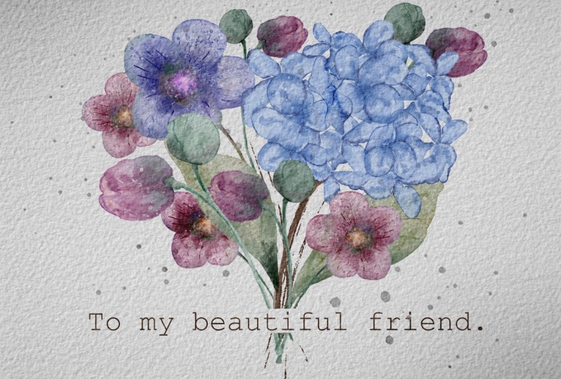
has triangular shape. And my suggestion,
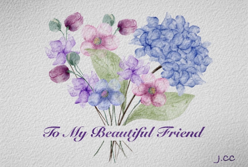
we can add tiny W? Oh, just like a headline. To my beautiful friend. We can write it here. And
my suggestion in this case, if you want to keep
the text visible, let me show you what you can do. And then deletes part that
interferes with the text. Like um. So this is one more postcard, one more composition tricks that you can use when you
create lovely composition. And now let's jump to our
final project part where we're going to use negative
and positive space and create also
beautiful composition. Now we are on negative
and positive space layer, and then we have our flowers. Now, my suggestion,
what we can do is, what if we rotate
the paper this way. And now I was thinking maybe we can arrange the
elements on a canvas, like in a mirror way. So if we need to show clearly
positive or negative space, I decided to place our florals
at the edges of a paper, and then the middle
part will be empty. And I think it can help us
to really create and show this balance between the
negative and positive space, like empty space and
filled with the flowers. So let's do it. Let's duplicate our hydranga because we're going
to need four pieces, two hydrangs from the bottom, and two hydrangs
from another side. But in this case, let me show you the tricky way what we can do,
how to save time. So in this case, start let's delete two of
the hydrangea layers. And then let's just create the composition
for the lower part. What about a small flower? They're gonna use rose, like, a lot of times. And I duplicated a couple
of times 'cause I'm gonna lace it in
different positions. So let's keep
arranging our elements on a paper in the
most beautiful way. And I was thinking about
let's merge it together, merge together the
flowers that we like. And we know for sure
we're going to keep it. Now, I was thinking
maybe I want to place some of the
petals somewhere here. I like the way how we
put everything together. And for me, pretty much,
this is coat already. If you want, we
still have one of laurel that we
didn't use this one. But I don't think we have enough space for
this flower too. And now let me show
you the tricky way, the one that I told you about. So we have our layer. This one, we merged all
of the flowers together. Now we need to have the exact picture
exact combination on the top. So how to do that. Simply by swiping left, we have the duplicate
option. Let's tap it. And then we have
duplicated option, go to the arrow button, and then we need to
press Flip Vertical. And then move it to the sides. But you see the
problem is that we don't really have a
lot of space here, and our aim is to actually show the balance of positive
and negative space. So in this case, the one
thing that we can do is go to the free form and move it
a little bit to the sides, just like tiny bit. Let's do the same here. Duplicate, keep one
layer untouched. And now finally we have
tiny bit of space. Also, if you want, you
can flip horizontal. And in this case, now the
flowers won't be too identical. And then we have to
my beautiful friend. And place it the
way how you like. I think this is
very good balance between negative
and positive space. You see, we have some of the
elements from the sides, but at the same time, the
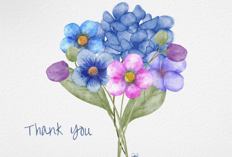
middle is empty. So, cool. That was our final
project where we created amazingly
beautiful postcard. Also, one more tricks that
I can show you 1 second. So merge together two
layers, those ones. And if you want to create
some kind of frame, you always can do it. So how to do that, it will
go to the selection tool, press rectangle and very
carefully just select the area around the edges
and then press inward. And then three fingers
down and press cut. Now we actually have
polroid postcard. Oh lovely postcard is ready.
12. Bonus: Rule of Thirds: Okay. And as a bonus, I prepared with something
and I want to show you how to create the rule
of third composition. So let's finish that one, and that will be the
end for our class. So like I told you, we have
our last bonus composition, which is rule of thirds
that I like too much. I told you earlier. So rule of thirds is when we need
to divide our paper into nine pieces and at intersections of the
lines at the dots here, you have the most pleasant
position for our object. I decided to minimize, lower the size tiny bit. And you see, I place it right at intersections
of the lines. So I move that a little
bit to the right side. That's the most important
when we don't place our object in a center
of the paper like that. And then I have to my
beautiful friends squad, and I will just place it here. So as you see, we took
four points of the grid. So as you see, we
have two points here. So this is our main object. It moved a little bit
to the right side. At this point, we
placed our lovely cord and the last point
almost next to that, we have our tiny rows. So let's turn off the grid. And let's look at our
beautiful composition. This is and for
our today's class, I hope you learned a lot
about the composition, about the creation of
watercolor flowers digitally, and you have so many ideas how to create beautiful postcards. And let's teach
us in next class. Am this is the end
of today's class. I hope you enjoyed our
painting process a lot and you learn something new about the procret composition,
especially composition. I spent a lot of time
for preparation, and you now you know where
to find some inspiration, how to use layers,
clipping mask, and how to add texture and color variations
to your painting. And most importantly,
you learn how to create lovely floral
illustrations digitally using digital
watercolor brushes. Guys, I will be happy to
see all your artworks as usual in projects and
resources section of course, I would really appreciate
your feedback about my class, and you also can leave suggestions about
our future topics. So let's see each
other in your class. And next time we will paint watercolor shuts in procreate Zu
 Inga Yoon, Digital illustrator and teacher