Transcripts
1. Introduction: Hello, I'm, I'm an artist and
illustrator from Argentina. I've been living in Berlin
for seven years now. And I created the
Berlin art club, where I teach
mainly watercolors, which is my latest passion. I started fashion designer
at university and when Osiris and then many
other kinds of art. But children, book illustration was my thing when I found it, made me very happy. And in 2020, I published my first book also
during pandemic, which wasn't easy, but
it was a nice challenge. But since then, to be honest, I've dedicated most
of my time to teach. I teach in schools, kids in different places in
Berlin, in our galleries. And I also teach adults
in different places, and of course, in
Berlin art club. Since the pandemic, we've
also then lots of classes online and now I'm doing
my first class here, nervous, but I
hope you enjoy it. We are going to cover the whole
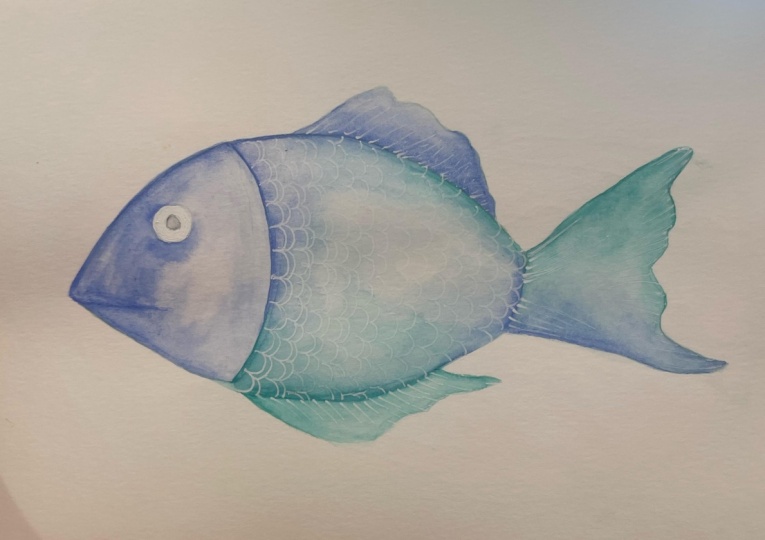
process of making a fish. I'm going to show
you what some of my favorite illustrations
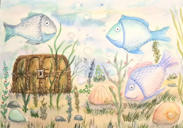
I've dedicated a lot of time in creating a
scene of flying fish. So I hope you like them and you'll get
inspire and you get to do many other fish
with me in this class. Since I'm a very big fan
of fish illustration, I'm gonna show you how
to paint your own. But don't worry,
we'll go step-by-step through all the effects you
can achieve with watercolors, transparency wet on wet, color mixing, and also details that we're
going to use later on, the final fish, like the
scales, lining and cetera. But I've got it through that so you don't need to have
any previous experience. We're going to experimental
art practice a lot. And then at the
end, put all that together in our final project. There's also gonna be a
bonus for anyone interested. But that's a surprise. I hope you'll join. I hope you have fun and
see you soon to start creating my Instagram account
is you can go to that, or you can follow
the Berlin art club. I leave all the links for you
and hope to see you soon.
2. Material: Hello. So before we start, let's have a look
at our material. I'm going to show
you what I have in my studio or what
I use regularly. This is my watercolor paper, a very pretty, it
comes all glued in. I recommend taking some papers
off because we want to do a lot of practice or
you can let them dry. They are and then take them off. I have this little thing here that is actually
for cooking, like a plastic spatula
such as bachelor. I just recommend it. Do it. Do we need these carefully? Otherwise, you can
use a business card or anything that
is kind of hard. Not just like ripping them
off with your hands because you can scratch or
damage the paper. This has a very nice
texture, is a concern. Block, is cold, press. They are, that means that you're gonna get
sort of this texture. You are going to see
the texture if you do transparencies,
which is very nice. This is a size,
it's a little bit smaller than an A4 and it's 300 g. I recommend
something like these. 300 g is at least 300 g is
what I always recommend, is a very good thickness. Brushes. I use this da Vinci. I have a collection of the
ones that are for Hobbes, for, really for watercolors
that you are all synthetic. There, I just recommend
having different numbers. I mean, different sizes have some smaller ones and some
bigger ones, at least 1.1. So you can do bigger
things and the tails. What does watercolors? Obviously, these EEG is a Winsor and Newton box that
I bought a long time ago, but it actually has a
mix of patterns that I buy apart and I trust may hear the collection of colors
that I liked the most. Greens and blues,
as you can see, I have them quite empty
because I use them a lot. I love these colors and you will use this
space to mix them. I show you another
little set that I have. These are just some empty boxes that I got and I make here, I put some extra colors or some, I make my palettes. The colors that I want to
use for a specific project. I put in, put them there to sort of limit the
colors are used. These are Winsor
and Newton as well. But there are lots
of good brands. You can also use shrink, reward time Petersburg,
I use loads. There are lots of good
professional brands. Benzyl, it's important. You see this is an
HB is important. There is a hard pencil. So we don't get a
lot of graphite on the paper and then it gets messy when we want to
erase it, erase it. Eraser. Just soft, nothing
too complicated here. Just a soft eraser is nice. What else? My acrylic, we're going to use acrylic at the very
end for details. Any ran that you have
is fine for this. It's not so important, is only for lethal lions. Anyways, I'm going to give
you at least the material. I recommend glass
for the water so it doesn't fall when
we put the rash, when we clean it fast
on the side and we make these pressures
sometimes if it's plastic, it's going to fall. You can see that I use
a lot of blue on there. One last couple of
things, kitchen paper. I use it a lot, sorry to clean my brush. So I'll put it very close to your water and have it always very handy so
you can repeat these. Don't leave the
brush on the water. And as I said, I'm
gonna leave you a list so you don't have
to eat so fast. These little rush. I don't know what
it's meant for, but I use it to clean
the extra eraser and you don't use your hands not
to make anything dirty. As I said, in the
resources area, you're going to find a
list of these materials, get ready, and let's paint.
3. Gradients: Hello, We're going to start, and for these effect, we're going to put
a lot of water in one of our watercolor pens. You can see I'm
using this green. You can use whatever you like. And once you have a medium
brush, nothing too vague, nothing too small, full
of color and water. We're going to do this lines
up and down, up and down. We clean the brush and we come from far on this direction. I'm going to show you
this a couple of times. Don't freak out. I
just have to show you fast because otherwise it dries. So it's very important here, the Italian mean as well. I'm getting a new color and you can use any color that you like. We make these lines. I'm cleaning the brush and I
will come only with water. From far there was a little
bit too little water. That's gonna be the question, how much water is enough? The idea that you just shake this first color a little bit, let me show you
that it disappears. You see how pretty this
gradient effect is. It goes from very dark or very intense to nothing to white. Let's try again terracotta color and a little bit
of water from far. Of course, the question here is, how much water is enough? Timing and the amount of
water in watercolors is, are the two more
important things that we need to master and that you
can only do it by repeating. So don't get frustrated. We are just going
to keep doing this with as many colors as you like. Always remember to start with
a good amount of water and then you fade it with just a little bit of
water on the brush. Very clean from far. Like this. Keep going and we're going to add something new at the end. Once you've finished
your gradient effects, like before, we are going to start doing some little shapes. Let's say this time
in this kind of D letter, this curved line. And we're gonna do
the same process. We're going to start with
the color, very salt, but we're gonna go little by little from
the bottom to the top From far on ways with water, exactly the same process, but this time going under
the direction of shadows. This is something that
we're going to use a lot for shadows and volume. So a thick line, very soft in color
and water from far to shake it to make it
disappear a little bit. We keep trying with
different colors, always a thick line. I need a bit of
water up and down, up and down these
little movements on almost pressing a
little bit of rash, leave quite some space between them so you have space to work. Make them feel good. You can always clean the
brush and bring clear water. Again from far, this is something we
are going to use a lot. So it's better to practice. Make as many as you can
with all your colors. Try different colors. Start always with these
kind of thick line. That's better so you have
more color to work with. Don't do it too small and always remember this approach from far. These are the
important things here, the amount of water on
also to be quite fast, don't forget about that. We're going to start with
lines in the other direction. We've been doing vertical. Now we're gonna do
some horizontal. The concept is the same. We always get here from
far with the water. So it doesn't
matter if it's from right to left or from
the bottom to the top. But always we approach it from far to get this beautiful
gradient effect or bleeding effect
to make the color continue following the water. So I'm zooming in
here so you see it start with a
thick line of color, very soak in water. And you see the movement of the rash is always these tick, tick, tick, tick and very
famous for my noises. Tick, tick, tick, tick from far. And that's up to us. How much we want to
control it. Like that. I see it. Okay. But you
could even repeat these. Don't get obsessed though
there is a limit with watercolors we can't reattach
and retouch and reattach. We just have to learn to let it be if I'm going to
do the last one. Same trick. You can repeat
this as much as you can. Again, with all your colors, make as many papers
as you like with this horizontal or
vertical lines. And you can always repeat
this from the bottom to the top to correct it. Have fun.
4. Blending colors: Hello. So we are going
to start mixing colors. This is my watercolor said, You've seen it before. I'm adding a lot of water on
top of some of my colors. E.g. on top of these blue, always make sure
it's very, very wet. I'm grabbing more
and more water drops and drops and I'm also
adding some to my green. You can use any
color that you like. Just make sure that it's
very full and the brush is, as you can see, very
soak in that color. And this is what we're going
to start doing up and down, up and down with our color, just like we did for
the gradient effects. And we're going to grab a second color instead
of just water. And repeat what we did
before this time with color. From far till the middle, we mix them fast in the
middle and that's it. Don't try to retard or to
force the colors to blend in. If you're using a
good amount of water, that should be enough. So one sacrum kinda from
far and here in the middle, fast, up and down, up and down. Again with a different color. Remember to get
the brush Berries, salt in their color, second color from far fast, like this, we are going
to keep repeating these. Try as many color
combinations as you like, leaves his chest till
you get the hang of how much water is
really needed here. So let's keep going and
make as many as you can. Once you've made enough
to color combinations, we are going to do
the same thing, but with three colors. This is very important. Try not to think much
about the colors, but we're focusing on the
technique. It's not easy. Sometimes One Kyler will eat up completely.
The first one. Sometimes it's too dry and
they don't really mix. So we have to start
fixing these things. Don't forget to show me. I'm very happy to
check the progress, the work in progress
you are doing. We just keep going like this. The second kind of fast. Don't forget. If you see that the colors
are flowing too much, too much out of control, tried to press the brush against the paper a little bit more. These went on the
autumn palette. You can try think
of warm colors, cool colors, but really
don't get too picky. This is just to do it fast and to see how colors blend in. That's the whole
challenge for now. Try these three color
combos as much as you can. It's important to practice,
practice, practice. You can also do whole paper tests with three color combinations
as you like. And keep going. We are going to do
one less thing, our blending colors at the end. And I'm just very curious
to see your work. We are almost done. Oh boy, you that our
color blending exercise, this last bit of paper
that I have left, I'm going to use it to make
a very long drain of colors. Always remember
that the new color comes from far, and that's iid. Use all the combinations
you like and chest. Keep going, keep
adding and adding. A new color. Like this. Could be more intense,
could be lighter, more water down or more
thick as you like. And this is gonna be our last exercise
of blending colors. I hope you had fun. Show me, please,
how it looks like. And again, it's just repetition. Sometimes it's gonna do this, sometimes it gets more. I'm blooms, bigger blooms, and sometimes it's not going
to blend in so easily. So keep trying. And it's all about the amount of water and about the timing. The more you repeat it, the more you are gonna get it. Have fun.
5. Easy Shapes: Hello, We are going to start sketching this time
because we painted enough. Now it's time to sketch
and go into shapes. I'm showing you my benzyl, you've seen it before anyways, it's a harp and z, that means it's not a tool via three-way has to say a huge be. So it doesn't make
the paper too dirty. I'm sketching mega soft. You see I divided my paper in four spaces just like freehand. Don't worry. I'm making for shapes. Very irregular, doesn't matter. It looks like eyes. If you want the ER, or like ovals, or like leaves. If you want to
compare to something. Very easy, doesn't matter much. And we are going
to start painting. A medium brush again, nothing tool,
tools, small place, and you have to
put a lot of water on top of one of your
colors and get the rash. So can this color, this is kind of our
gradient effect. Water from far and
we shake this, this time you can be
a little bit more careless, if you will. Just makes everything. The idea is to keep some
white in the middle, but we also need to
have quite some color. The other part of the line I'm going to make
with another color, choose any combinations
that you like. I'm going to cover it till
it meets the first color. Of course, both have to have
a good amount of water. So they meet and they
play, they mix nicely. You don't have to
see where one starts and the other one finishes. They just have to
blend in very nicely. That is always the challenge. Next one. Same thing with
different colors. You can even paint a little bit inside of it. Don't be shy. As I said, it doesn't need to be only one line this time where little bit more like Fast
and Furious. Second color. This time I'm using a very similar from far
on that direction. And I can always correct
it a little bit the shape, and play with these colors. You see, I'm, I still
managed to leave some white. In some part. We're going to work with these
feelings of transparency. That's why we want some white. Of course we're practice
practicing inside of shapes. Then you can repeat the
same concept in your fish. I was showing you there
that I managed to keep some white color somewhere. Does it need to be
always half and half? You could do even more, if you like, of the fish. Always water from far
and now I'm just mixing it carefully around the sides. So it still looks pretty
under shape is respected. Then a second color. Go in a little bit
over the first one. That is it. You can even shake it a little bit in the
middle to make them play or go over one
color with the other. Cool, pretty, this is
actually called wet on wet. That's also something I
teach and I use a lot. But in this particular
class, I lifted out. I'm sure it's gonna come
up in my next class, eats less lethal fish. Going to add one color lookup, 3D, paint, buying paint. We can add the second color, almost on top of the first one. Again, with a little bit
of water, we shake good. So everything gets
very nice together. Very nicely mixed. Of course, you can add a little bit more
color if you like. And we are almost done. Practice these as
much as you like. At least these four
shapes would be nice. And we are also going
to use them later. So don't lose them. This is very important. Hope you like it, hope you get the
colors to blend in very nicely and see you soon.
6. Lines and Details: So we are going to
start with lines and details that then we're
going to use for our fish. A good thing would be
to already start with scales because we are
going to need them. I'm going to start with a
row like this, not too big, not too small with
a hard pencil. You know this. And what
I'm doing is from the top, the middle of the
top of these curves, I bring the next
one up and down. This is just a basic, the basic logic behind the
structure of the scales. So they don't get too
big or too small. This helps you control
them a little bit. This is the basic concept and you can already start
trying with your brush. Of course, it's not gonna
be as easy probably. But let's see what happens. Use a good amount of water. Don't press too much the brush, I'm using a medium brush. You could use a thinner
brush or even a liner. If you have a medium brush that you really
like, then like me, what you can do is to
press less so I'm only using the tip of the rash
to get this thin line. You can already start
mixing colors if you like. As you can see, I'm using
a good amount of water. That's why the
colors are flowing this pink inside the purple. And you can continue
to decide if you want. Again, not too big,
not too small. So it's not too
complicated or too easy. Again, one row, you could
mix colors in rows as well. When you do the next one, we do with blue, on the next one with
green and so on. Just practice these
as much as you can with all the colors
that you want. Let's keep going. So this is our first experiment, four lines and details, and we read it over white, over the white paper. We are going to try. Now another way that you are very pretty scales just to
get a little bit the idea, the logic behind this
K is the repetition. And now I'm talking
my rushing color because we're going to
repeat our gradient effects. And this is gonna be the
base for wide scale set. We're going to do something
that is not too light. It's fine if you leave some empty space like
I did. Like color. Second color from far, like always mix
them up and down. And that seed can be two colors. Can be something a little bit darker or I mean stronger
with more pigment. I just mix them in the middle. I'm adding a little
bit of water. That's what I
meant. If you want, you can try it some
transparency already. Instead of color from
our color from far, I did color from far
and water from far. At some point.
This is up to you. You can try. Let me show
you a little bit bigger. I mean, closer. One color, any color
combination you want to try. Second color from far, maybe one other color. This is up to you to colors, three colors, whatever tests
have fun here mixing them. The only thing is
that you have to have the amount of water so it doesn't dry and they
mix nicely in the middle. This one is gonna
give me a green in the middle because I use blue
and yellow when it dries. And we are almost
done with our basis. These has to dry. Don't forget whatever details
you want to do on top. This has to be
completely dry first. So once these is completely dry, don't forget to wait, please. We are going to use our acrylic. I'm adding some drops, one or two drops on the leaves
just to use very little. And as you can see, I'm testing that
the rash is solved, but not like dripping color, that would be too much. It's a very thin
brush this time. Like leave some out if it's two charge and we're gonna
repeat this structure here. So as you can see, sometimes you're going
to run out of color. This is chest practice. If it's too little, go and get some more. The idea is there is wet enough so it flows
and you don't have to get more and get more
every single scale. But also if it's totally query, it's going to be see-through.
We don't want that. We want it a little bit
thicker, otherwise, we won't see it at all, especially in the
parcel see-through. So these is the idea. We're gonna keep repeating this. Just show you one more. Wait, one more
thing you can try. That E is doing it dabble. Maybe if you do them
a little bit bigger, this is something I
used for my fish. A lot, is just go in
with double lines, which is going to keep
repeating these crab fun. Check the amount of water
and just keep going. The more you though, the
more you're gonna get how much water and how
much color you need. We are almost done here. We have a very nice catalog of single line and double line
with watercolor over white, with white over watercolor
practices as much as you can. So then you feel much
more confident when you do it in our fish and joy.
7. Final Project: Fish Sketching: Hello and welcome to
our last project. We are going to start
with sketching, so then we can paint
are pretty phage. And to begin with, I'm starting with
this curved line, trying to get these
inner horizontal line. More or less the two
ends in as if they were placed on the same straight
line. On the bottom. I'm going to do the curve line opposite as if it was a mirror. This is any leaf shape, any shape that you like. It could be. I mean, it has to be oval obviously, but it can be
thinner or thicker. You could even look for
examples if you like, just has to be something simple. And if it's chubby better, because we have more space to play inside of the feet with
the tail scales and stuff. I'm just going to
add these two films, one on the top and
one on the bottom. We always start with
the easiest shapes. Don't get it too complicated. This is going to
start mutating soon. I'm going to add things
here and they are, or make things better. Let's say big, I
just like it there. And these kind of the mouth
can be like a straight line, then a little curve up. So it looks a
little bit happier. Could also be a very grumpy
fish chest as you like. And we, from here, I'm going to start correcting. So we can start erasing things that we are not too sure of. E.g. when I tried to make the overall shape a
little bit better. Let's see this line we
don't need anymore. Definitely, we want to
make something softer there. Let's see what else. I have the habit of making all these like
very hairy lines, like line next to
line next to line. So at some point, once I've placed the things
where they need to be, I just erase and clean it up
with one really nice line. So it's not so their tea, especially before
starting painting, always make sure it's
very, very light. So we don't make, mix the
graph it with the watercolor. I'm giving some
curves to this fin. I'm going to make
the connection with a tail a little bit more subtle. Let's make some
little curves here. I like this shaky lines, not so straight and
not so perfect curvy. Let's connect this also
here on the bottom. Let's see if I can get
some curves here too. Again, you can check
for other shapes, only two fans, That's
enough and the tail. So we all have something
similar to work with. I think that's almost done. I'll let you have your time. Make these in peace, arrange and rearrange
as much as you want. Always with a hard pencil. Don't press too much on. I think almost done. Remember to erase it nicely and see you in the next video
to start painting so much, looking forward to it. Have fun.
8. Final Project: Fish painting: So we're going to
start painting. We're gonna do this
exactly the same way we did our shapes before. That's why we did them. We're going to start
with the brush, soak in color with water. Always put a lot of water
on top of your color. We start e.g. on this line on the top
and I bring water from far these we've
already practice. I'm sure by now, you must be a node. Are you must have a lot of
confidence, or I hope so. Again, color following
the outside line. This time, we can play a little bit more inside the shape. And at some point you can
bring a so-called color. Of course you can try this doing our blending color technique in some other paper before starting chest to
see your colors, which colors you would
like to use together. I'm showing you there the
meanwhile I talk so much. This is gonna get dry, salt. What are those to bring
water fast and mix it. And then I can continue in
this little part in peace. I show you that
again in new ways. Worry. We can cover e.g. the tub. I go fast
in the middle. I'm very careful
around the edges. Tried to have the rush
always inside the shape that helps water from far. But this time we can
make this almost like round touches to bring
the color inside. We wanted see-through, but
not completely see-through. Here, I just have a lot more
color around the edges. Again. Choose where to put your colors. In this case, I'm
going to continue with my green beads of
water on carefully. When I keep adding. So I can go over what
I've already have. They are still wet and
they want to flow nicely. And careful around the tea
leaves or little parts. Liter corners of the tail. There is where we have
to be full press lethal. Correct or not? The shape. We are almost done
with our first layer. This has to be fast, is our wet on wet. So it has to flow nicely. Now we will have to let it dry. And we're gonna start
with the details. Once these 0s drive, our first layer is done. We are going to start
with the details because we're going to keep
putting layers on top. But first, we need
to do the scales. Bring your acrylic,
your white acrylic. And we're gonna do the
same process as we did before when we
practice the scales. So, you know, these
are a little bit of water on top of our leaves. We mix it with a
very thin brush. We're going to get just a
little bit as what's enough. My wishful when it on the
wrong screen. I'm so sorry. Let's see if you can see it now. While they are, you'll see that I have it in a whole brush. And we're going to start
from these division of the head with the body
on this direction, go in towards the tail. You can decide if you want to do only one line, just like before. You practice this before. So you can do only a single line for each scale or double
lines like these. Of course, if you choose
to do them double, this is going to take
quite some time. Just be patient. Breathe in, breathe
out and continue. As you can see. Sometimes we're not
gonna see them too, too obvious, let's say, because we also
use transparency, but it's fine because then we're going to add layers on top. Just keep going
like this for now. That's good enough. And then we're going
to add more color in case they are to
invade in the civil. So I'm gonna let you go, continue with this almost like a therapeutical insert size. Continue and have fun, and I'll see you
for the next layer. Good. Once all your white details
are done, let them dry. Really give these a lot of time. And we're gonna
start with shadows. For this, we're gonna
use our gradient effect. Remember, we practiced this
already with your rash, soak in water with color, I like to call it, has to be a watercolor that
is very soft in water. We add the line and
from far we failed it. We're gonna use our
gradient effect for shadows and for volume as well. This is very nice to divide e.g. some parts, the head, e.g. to the body. The same we're going
to do to the fin. So I color it can be or I recommended to use
the same color as you have on the background, or at least the same two
colors in different parts. But so it doesn't
look so different. It looks all together. Look how pretty. It
already looks so much better with only a couple
of shadows here and there. So again, from the tail or
from the body to the tail. And we come from far
with very little water. These are just details. You don't need a huge amount
of water on the brush. And we're going to keep
going taken or else need, needs to be a little
bit more visible, where it would be good to have an extra layer or a shadow, e.g. down here in the next fin. Very nice. Also, good to use a very
good amount of color. So then we can fade it and we still see it doesn't
disappear completely. So last couple of details
with a thin brush, we can already do e.g. the mouth and the eye. For these, again, even if
it's something very small, I'm bringing in
quite some water on the color and then I'm failing
it with very little water. Remember, it's always more convenient to have
a lot of water on the color and less water
when you add it from far. So you could also do
this just as a line. This is my personal taste. I like adding
shadows everywhere, but the mouth could easily
be just a line. For the eye. I'm just going to
do the bottom part. A little bit of color and very little water
chest tube, fail it. So it looks like a
little shadow is gonna look like popping
up a little bit. So that is our first layer
or second layer actually. And now what we're gonna
do is to keep adding, but this time for volume, this is what I meant. We are going to try to
make it more I know, three-dimensional, more like
a real object or animal. And for that we're going
to go around the shape with the same technique
with our gradient effect. Careful don't paint
inside the eye. We have plans for that later. But again with the same colors. I wouldn't use color
that is too different. I would try to stay
to a limited palette. I'm going to repeat
this two colors. I'm going to ring color on
the sides and a little bit of water always from
far on that direction. So it fades nicely, but you'll see it's
already not so flat. Not so I mentioned, even if it is actually here, careful around the mouth, it doesn't need to be the
whole line everywhere. You can decide to bring
it like Juilliard, chest under the
mouth. The same here. I'm living a very thin line, not to confuse it to match
where with the fin begins. Of course you can
do these lines with two colors just as you like, and a little bit of
water and you fail it. You can also see that the
scales are starting to appear. That's very nice. It gets these transparency look
that we like so much. Once we have all
the outside line or what do we consider
more like a volume effect? We could repeat
this foreshadows. Just check what you feel actually maybe
you already used a very or a slightly darker color and you feel that it's
already dark enough. I always use these colors, very watered-down trusting keys. Chest. I prefer repeating the effect and not
having a too dark, and then I can fix that. So I prefer checking
again and going over. The weird thing about
watercolors is that we can always do layer on top of layer on top of layer as many times as we like or
as the paper allows. These little part is
just checking where we think there is something
missing. So e.g. here, it could be
a little bit more. There could be a little
bit more of color on the outside line or from the
outside line to the center. What else? Really take your time here. Look around you again. Check if you feel
it's necessary. You don't need to. If you already have a good
amount of water of color. Just checking if this is dry, I can add an extra layer. Otherwise, we'll have to wait. Of course, you can
use a hair blower in-between layers if you
don't want to wait too much, just dry it as you
would draw your hair. Is they are now I feel it
makes a little bit more sense. Was a little bead wash down. Let's see. What's her down? Maybe
a little bit on top, on the top tool and
we are almost only missing the eye of color. Always check if you want to use, if you want to paint something smaller or a smaller surface, use a smaller brush. I like it. I'm still not
convinced about the tail. So we're going to add
just a little bit more. Don't get too obsessed. Careful. I think this is almost done. I quite like it like this. Let's try. Here. I see a lion. Careful. If you want to
retouch something that is not as easy as it looks
like I kind of disappeared. You to line that I will see you in our beloved acrylic
for the last details, I'm going to paint the circle of the eye completely white. Again, this is just my taste. You could do that with black or with blue and leave
it like that. I prefer doing it with white. And then I'm going
to add a little bit of darker color inside. Last little touches. You could decide if you
leave it like this. It will be already
quite adorable. Or if you want to paint
the inside of the black, I hope you enjoy it. And I'll see you soon
for the bonus. Have fun.
9. Bonus: Fish Family: Hello. So to continue
with our bonus project, we are going to use these easy shapes that
we've already painted. And of course it
should be very dry. And we want to transform them
into a happy fish family. You can use any ideas that you have to
make your own fish, always starting
with these shapes. Obviously, nothing
too complicated, but as you can see, we can add the fence, we can add details. We're gonna keep
working on top of them. Just to repurpose a little bit. I work practice from before. As you can see, doesn't need
to be anything spectacular. We just need the basics. We need the mouth can be happy
fish can be very mad fish. We need a couple
of films external, outside the body that's
important for now. So we can work on
this pails later, any kind of detail
that you can think of. So I lead to draw this and
we painted in a minute. So once you've
drawn on your fish, we are going to start painting and we're going to
start with this Gill, with the fins and the tails. The fin is again our, again our gradient effect. You notice a little bit
of color and faith it. And the rest, of course, needs first layer of color
because we have it completely wide is something we added
just with a thin brush. Get old amount of water
with color on your brush. Like always, even if it's small. But just be a little bit
more careful, right? The corners are gonna
be more complicated. That's why I'm doing this. Like little touches
lead to lines, and then I can always
carry the color that is here with either a little
bit of water from far. This is what I'm doing or
just adding more color. This is up to you. It's our first layer. You can be as playful as you
like or just leave it flat. And then we're details on top. Of course, just as
in our final project in our fish that we
just did together, we added at the end or the
lions and scales and stuff. That's what I want to work here. Chest, keep going. Choose the colors that you like. I'm using more or less the same Congress that I
have on the backround. Remember, start with
the good faith it, and then carefully the
Kyler on the fence, The tales told by little. And actually do this at your own pace and ICU for
the details in a minute. So our fish are almost done. You can see me painted
at the speed of light. You can see that sometimes I
even played with two colors, and this is up to you. And we have to start with
the details, shadows, our gradient effect again, you know that details. You also know that
for the scales e.g. lots of little lines, we will have to do
smaller brush again. And I wouldn't do
this little line under the mouth as I showed you before as a little shadow, very subtle nod line. You could also just do a
thick line if you like, but that's going to look
a lot more cartoonish. I'm a big fan of these shadows and gradient
effects everywhere. It's a little bit
harder, but it looks much prettier for the eyes. We again, have a
couple of options. I'm just going to do
like we did before, a little bit of
shadow around it. And I'm going to paint with the same color
inside a little bit, the part that should be black, let's say you can also
let it do it black. And about the order of days. You can always obviously
organize these as you like. You could do all the i's
together of all the phage or all the scales and then
the eyes. This is up to you. I'm going to start
already with the scales. Of course, our previous layer
has to be completely dry. Don't forget to wait, please. I can't say that enough. Sorry. Already. You
know this already. We've practiced this with a very thin brush because they
are quite small this time. We can draw the different
techniques you've already seen. We the line, one
line with color, with the lions with
different colors. And we also did them
with white acrylic. You can choose now and make your own combinations or your own versions for
each of these fish. Now, I'm doing the single lines with the colors that I already have on the
background, e.g. very carefully. This is the part that is
very much like meditation. Line after line after
line. Very nice. When you have enough water
and they flow when the colored touches
the previous line that flows inside of it. I'm running out of colors more that it was already
sick. I think it's fine. Otherwise, we can take
it to the previous one. So it gets a little bit
mixed on more water down. Still, correct? In a little bit. So next thing would
be the lines. We're going to add an
extra layer of shadows. So don't worry about that. Now, let's just do details. I, scales and lions. Remember you can use these shaky lines to make it look a little bit more
interesting. I don't know. Chest not so straight,
perfect line. So we're almost done here. I'm going to show you
how I do the rest. And again, take your time. This is up to you. I just
show you some examples. So very important ones. Our fish are done. Look how happy the family. We don't have to forget. They have a very dry careful
you'll notice by now. We could already
erase everything that we don't need anymore
in this case is everything because
neither lines anymore. So erase it very carefully
with a soft eraser. And we just need to
do our last choose. For the last details, we are going to do the shadows, everything that goes
to the outside, let's say the external
shadows that divide the fields or the tail
with the body of the fish. And for these, I recommend using the same color just a
little bit more intense. You will get the proportion in the proportion a little bit more of color and less water. So it's not so
super see-through, but it still has to
be quite see-through. Otherwise, you'll get one
of these marks that look very artificial lake
marker line, right? And we're going to repeat our gradient effect
always, always, always. This is another important line. So I'm also going to retouch it a little bit with a little
bit of extra shadow. As I said before, I prefer starting very, very light and then adding on
top than starting to dark. I'm just over careful
most of the times. For the eyes, as I said before, you can do like a
little mini shadow inside or chest pain
them completely. The round part inside
of the eye painted. And that's it. So again, line that divides here. Very little water. Careful though this
little touches don't retouch or presto magic because you're gonna erase
your previous lines, are mixed them up. Again on the tail little circle. That's what I meant.
It could be just completely round and that's it. And we're gonna just keep going. You can do the shadows with
one color or with two colors, you know that as well. So I let you finish
your details. We are almost done. I'm very excited. I would really want to see your fish family of recycled fish that
were just all vowels. You will go far. We've got to know your animals,
stay, you're alive. Remember that watercolors
are all about patients. Don't get frustrated
the more you do, the more you're
gonna get defects. That's my last tip. By the way, I see you for one last video to pour
all that we saw together. It's important for me to
have an overview or also to show you what you've learned now and what you can
keep practicing. I think we've gotten again
very far here from chest, some color samples to a
real thing, a real fish. Really enjoy painting fishes. I'm very happy to
share these with you. Again, don't forget to show me. I hope you've enjoyed
all the videos. See you for the
last one on please, please show me. Have fun.
10. Final thoughts: Hello and welcome to our
last video together. This is just to
put a little bit, all in one video,
everything you've done. Remember our gradient effects. This is very important. I just want you
to have a look at everything you've learned
and to keep practicing. Probably if you're here, you've seen many other videos. This is something very
particular that I'm a fan of and that I teach
very particularly. Maybe you haven't seen this trick of bringing
the water from far. But for me it's very,
very important, so you don't carry
that with you. So practice these as
often as you can. As you know now, we apply this into shadows. We do this for volume. So it's very, very important
with practice these, you can make many more papers. Just as important
are our color mixes. Sometimes we want
them to make rooms, these crazy color
stains, let's say. We've also cover shapes. Of course, you can practice
these first layers of two colors together in any
other shapes that you like. These you've learned
and you can apply it in any of your future projects. We've also done little details with acrylic, white acrylic. I think it's always
great idea to mix these techniques
with watercolors because it's a
little bit thicker. As you know, it makes, it's going to make
the paper waterproof. So if you want to add
shadows or any darker color, the white, we'll
just stay there. So this is also a
good trick to apply. Another things you can
play with white details on top of any other
thing that you make. And of course, now
you know how to apply these fish for scales, for tiny little scales. I hope you enjoy this part. I know it's a lot of work. You can always go back to the previous videos
and take again, the more you watch,
the more you're going to find little tricks. This is like with
any kind of art. The more you observe
someone doing it, and the more you
are gonna get it. And of course, practice
makes perfect. So the more you practice, the better you're gonna get it, and the more confident you
are gonna get with it. I hope you've enjoyed our
little fish trip together. I hope you have a whole family, happy family of fish,
please show me. Don't forget. I would love to see them and ask me any questions you like. I'm very happy to help you. Also follow me here
on the top you have my name with a little
Follow button. Because I'm very sure that I'm going to keep posting
classes here and I love to see you again in my courses and
hope you have fun. Thank you very much
for joining me.
 Lujan Cordaro, Illustrator and Art teacher