Transcripts
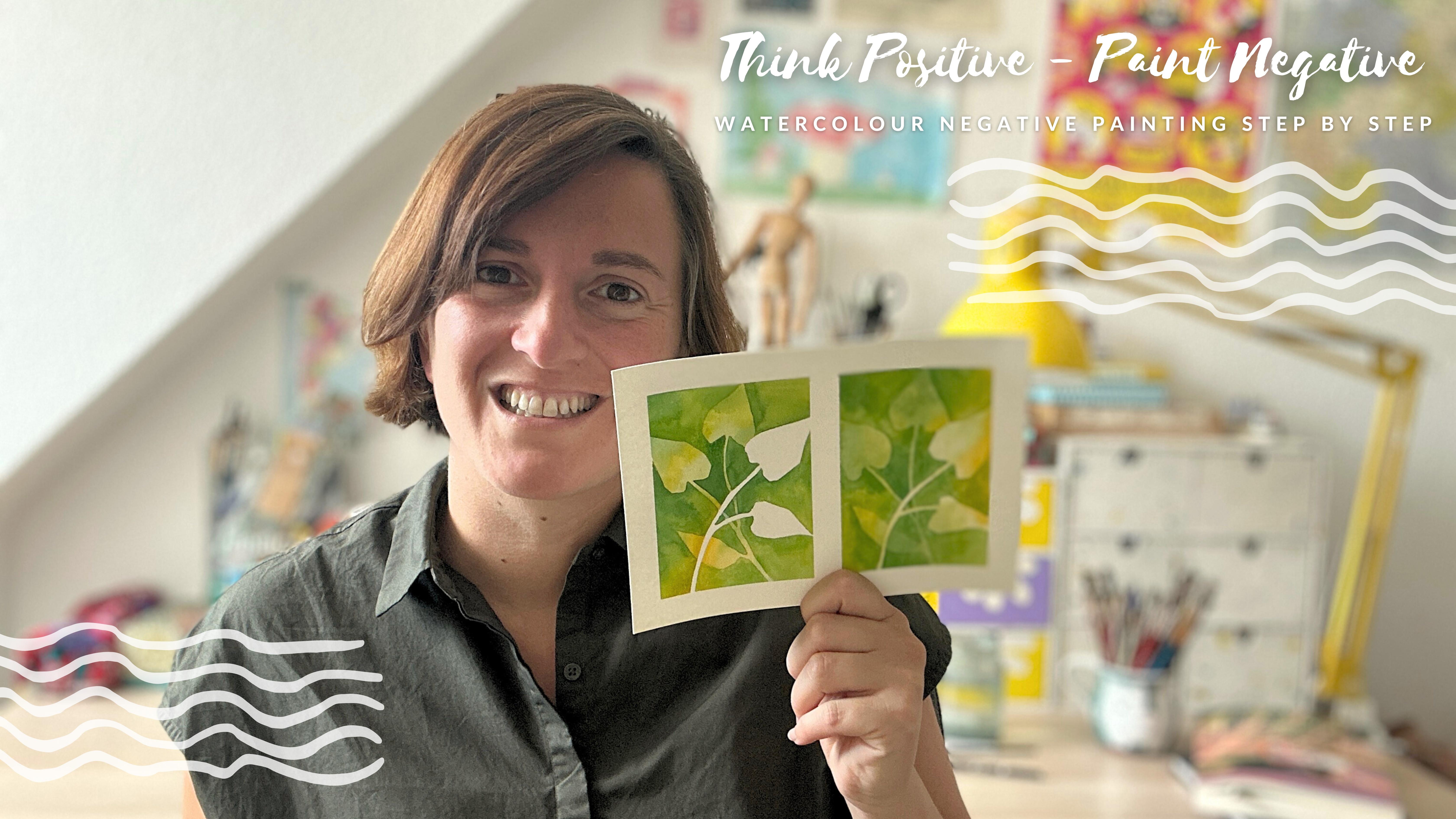
1. Think Positive - Paint Negative / Introduction: Hi, everyone. I'm Lou. I'm an artist, an illustrator, originally from Buenos Aires, living in Berlin for
the past ten years, and I'm very passionate
about watercolors. This time we're going to do
a lot of negative painting. If you're not
familiar with that, it means that we
work with a lot of layers and things overlap and you have to decide which
goes in the foreground, which goes in the
background and add a lot of magic of watercolors
for that to happen. It's a lot of fun, and
I decided to show you that based on
different tree leaves. And I hope you enjoy it. Shortly about me, I've been teaching here in Berlin
for around eight years. I created the Berlin
art club where I teach mostly adults
but also kids, and I teach around Berlin everywhere in
different schools, kindergartens, I
teach at museums, at a gallery, in lots of
places and mostly watercolors. That's what I love the most. Um, so if you have seen my other videos or if you haven't
seen my other videos, I recommend you to watch
them and if you have um, you know how we work, it's very slowly step by
step, so no worries. You'll get awesome results. This course, I
would say, though, that needs a little bit of
previous experience because we don't go so slow as
with my fish or birds. If you're a total beginner, I recommend watching
those first. Um, and before we start, I just wanted you
to see my work, to check it in my Instagram. It's Lujan Cordao and to
check my other classes in the Berlin Art club that you can find us at berlin.art.com. I think that's all, and
let's start painting soon.
2. Watercolour Material : Hello. Hello and welcome to
a little introduction to watercolor materials or what
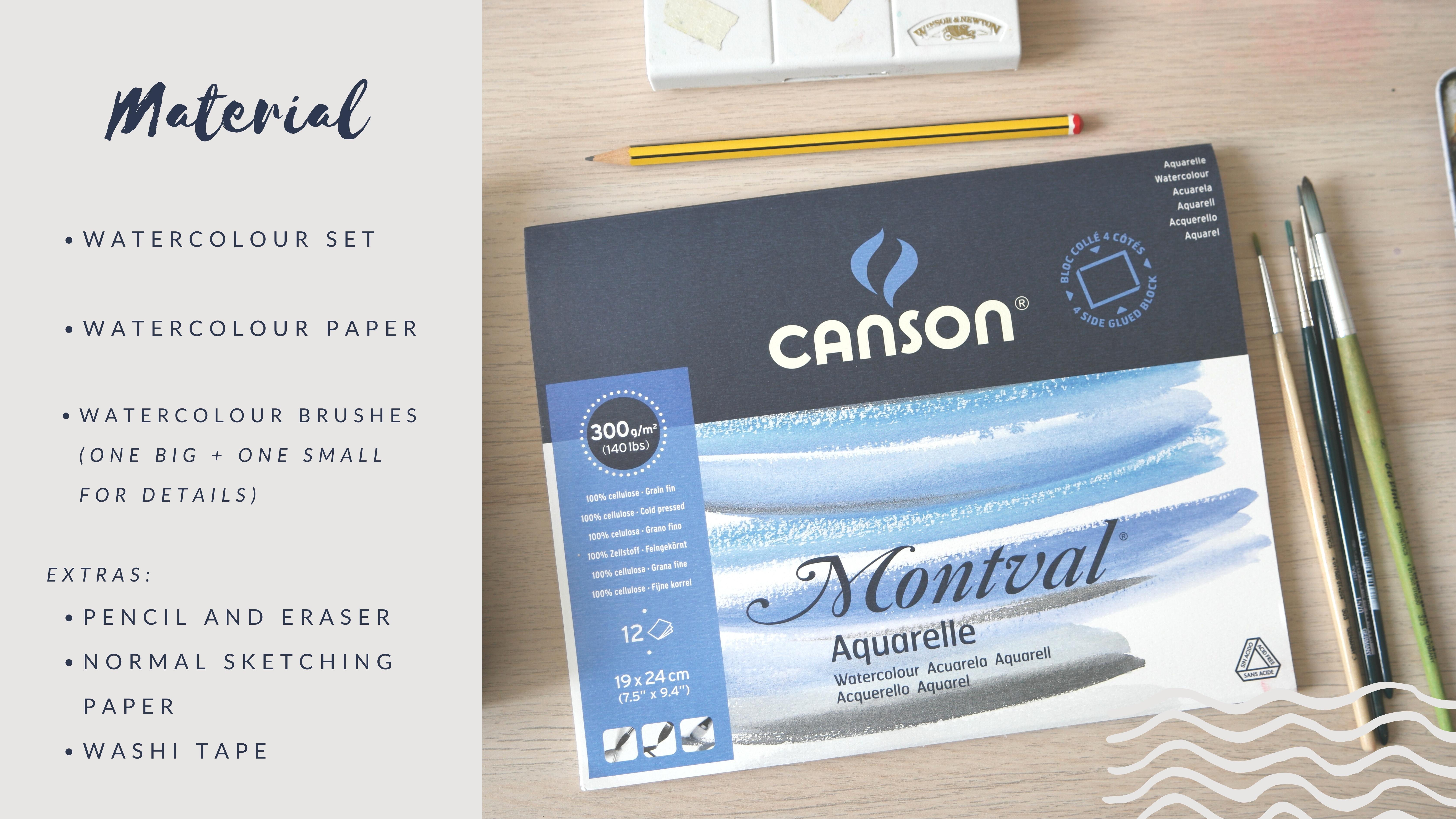
you need for this workshop. Basically, watercolor paper, anything that is around 300
grams is going to be fine. This is from a brand called aquapath but I
normally use Canson. You can find all these
in the resources. I made a PDF with lots
of recommendations. Just check for something
that has a texture that's good size wise, I cut this in half. This was in a four and I cut them to
have something smaller. For this workshops
better for you to work small so
things don't dry, it doesn't get so hectic. You're going to need paper,
brushes and watercolors. Obviously, these are
da Vinci brushes. I really like them and I
normally don't recommend numbers because every brand uses a different number
scale, let's say. This is a six is a four, could be that these are fine. That makes sense. This one
is a little bit bigger. But something like 4-6 and something smaller
would be great. At least two round brushes. It's just synthetic
hair and brushes. Check that they say
for water colors, that would be amazing. Obviously, you're going to
need something for the water. I prefer glass that is not going to fall we
see kitchen paper. You're going to need a
pencil and an eraser, that's just any pencil
that you have at home. Um, nothing too important there. This time we're going to
use washy tape for making a little frame around the paper. So, any color, it's the same, doesn't matter much, we're
going to throw it away. And for the colors, this was originally Windsor
and Newton wear a color set. I've already shown
it in other videos. It's a mess. I just
like it like that. I just keep cleaning
this every now and then, but I replace this so often that normally it's
in a state of chaos. I really like finishing the color before
throwing it away. Lots of the colors you see
that are pretty worn out, but I keep using them. Watercolors last a long time, maybe years because we
use a lot of water. So mostly you just get water on this and you get a lot of color
over and over again. So I would never throw them
if they look like this. Anyways, I have RMS and as I was saying they were originally
Windsor and Newton, but I have some Smink. I have St. Petersburg is
another good brand that I like. I have God, so many
different ones. But basically,
Windsor and Newton is a good brand for beginners, they have a beginner
collection, let's say, and a professional one, any of those Sminkes
an awesome brand, it's going to be a
lot more texture. Probably this is Shriminke. It's a lot more pigmented, this one probably too. Yeah, I think with those
two, you should be fine. It depends where you are, I mean, actually,
what you can find, but also check that PDF because there I made
some other suggestions. So I think that's it. Let me know if you
have questions, you can always contact me. So yeah, feel free to do that. And yeah, make sure you
have lots of oranges, reddish, green because
we're going to paint. Um, leaves, and I'm going
on an autumn direction. This one here is just
green and yellows, but I also use some
oranges, reds, so get ready for that if
you are going to buy some. Okay, I think that's all and seeing you soon.
Just start pinging.
3. Technique: Gradient Effect: Hello, hello. So we're
going to start with our first video and
our first technique. I'm using a small paper. All this that I'm
doing is gonna be in half an A four,
DNA four paper. So it's quite small, and I'm
going to divide it in two, so it's going to be
even smaller because it's practical to turn
around the paper and also, we're going to do
background some big things, and it's just easier, so nothing really dries to
work a little bit smaller. As you can see, I'm using
washi tape to put all around. Gear one that doesn't have a lot of glue that is quite plasticky, even a bad one that
you wouldn't use for wrapping presents
because it's too bad. That's perfect.
Because otherwise, it's going to rip off the paper. And I'm dividing it into
more or less similar spaces, and we're going to
start to paint. First, we're going to
make two backgrounds. Use two colors that you like. For the whole course, I chose greens and
yellows and oranges to go in the direction
of trees and autumn. So I'm going to
stick to that, but it can be any color
that you like. And as you can see, I'm
using these little spaces in my watercolor set to mix these two colors
with a lot of water. We just want to make sure
that we have a lot of water, so things mix ups,
I made a stain. So colors mix nicely. Big brush, and here
just start painting. We're going to cover
the whole thing. There's not a lot
of tricks here, get a little bit the feeling
of how much water you need. If you use too little water, the two colors are not
going to mix together. So it's better to have too much, and then you just wait
for it to dry than too little and nothing
is really drying. For the first one, I'm
only going to use green, very, very light, by the way. And the second one, I'm
going to use this orange, yellowish, turn into an ochre, something because my pan was 30. Always clean your watercolor
set when you put new colors. So this doesn't happen,
but at this point, I don't really care
could be any color. Just very uneven with quite
some water, and that's it. Go over the edges,
go over the tape. So you're sure you have
the whole square done, and we're going to
wait till it dries. And I'm going to
do some magic now, and well it's right. And now that it's
right, we're going to start with our gradient effect. I'm going to use this green. I'm going to mix with
the previous green. It's just two different greens
and I'm mixing together. And with a medium brush, I'm going to make
this thick line, and I'm grabbing chest water, and I'm going to go
from the bottom up. It's as if you would
like to erase this line. So there if you still
see these little spots, you can repeat it
chest with water. So you really can't tell
where this line ends. The idea is that it goes
from very dark on the top to nothing to completely
see through nothing. The same I'm going to
make here on the white. So again, gradient effect, there I see the
line very clearly, so I'm cleaning the brush, and I'm going to clean
that line. And that's it. You see that it
really disappears and you just see color fading. That's the idea. Every time
you make one of these lines, you have to wait till
they dry completely. So now this is dry. You can also use a hair
blower if you're not patient. And again, thick
line, water from far. Always water from far.
That's an important thing. We're going to use this effect
in all the next videos. That's why I wanted to
practice with something abstract without drawing,
without the leaves, just to make any shape and any kind of line and work with this
effect to disappear it. So water from far and repeat. So I can still see it. So I clean the brush and I
get a little bit more water. So let it dry and next line. So I'm going to let
you practice this. Please show me. I'm
going to repeat this. I'm going to go a
little bit faster. So it's not so much time for
you because you know this. What I'm changing
here is that you can really make a thick line. You don't need to think
of one thin line. This could also be surface, could be like a big
block of color, and then you fade it. That's another possibility. I'm going to do the
same in the next paper. And I let you practice that. Yeah, I just put it faster for you so you can sit and
repeat it at home, and then don't
forget to show me, especially if you
have any problems. Looks easy, but it's not, so a lot of patience and
a lot of repetition. You can make as many as you
like with many, many colors. Lo So, we're almost done here. I hope this worked. The result is gonna
be very pretty. I'm gonna remove the tape and a. You get these little mountains. You can also turn it
around how pretty or waves or whatever you like. It's just to practice
this effect. So practice a lot. Show me, make it with different backgrounds
with different colors, and hope you have fun.
4. The Logic Behind Negative Painting: Hello, hello. So we
are going to start with our process of
understanding negative painting. For that, I'm using just a regular sheet
of paper, any kind. This is just for sketching
and your pencil. Obviously, if you want to have an eraser close by,
maybe it's a good idea. I'm going to make
some little examples of what we're going to see. Later, we're going to work
with leaves, as you know. And my idea is that you see this and maybe understand
a little bit the logic of negative painting. The thing we need for
negative painting are objects that overlap, basically, because
if nothing overlaps, you can't really show
or use the technique to show what's behind and
what's in the foreground. So in this case, I'm making two sets of leaves and
each has two leaves. And I'm going to put this closer so you see
it better. Yeah. Let's imagine this is our first project and
we need to paint it. I'm going to make this darker because once we have it drawn, we have to define
what's closer to us. So this one would be on top. This would be number one, and this would be number two. What we also need for negative painting,
this is our paper. We need or, like, it would be optimal if
things reach the edges. You see there, I cut the
little bit of number one. The more we do, the more you're
going to understand this. But let's imagine now
we have three leaves. This is going to be kind
of our last project. So you can see a little
bit of everything now. Let's imagine this kind of
maple leaf, I think it is. So we need another one
that is behind it. They are, and we're
going to make one more. In this case, you would have two options of what
you can do with color. You could paint the
leave number one empty. This is number one, and convert the other two in the
second layer two, or leave one as two
and the other one as three because you could
even give more layers, and it would be like, one is very close to us, two is close to us,
and three is far. That's the idea. Number
one is always the closest. So the logic of this, it's all about layers. One more. All these little examples of drawings of compositions
you can use later. Let's make a slightly. I'm taking for a
reference of leaves. You can just Google. It's going to take a minute leaf catalog or
leaves illustrations, and you're going to get the
name of each tree and stuff. I'm going to make this
one that I think is very pretty it's a little
bit more complicated. That's also something
that I wanted to say. Maybe don't go to something so complicated because then
when you have to paint it, it's going to be
obviously harder if it has many of these little
curves around it. If you've already done this, go for something
complicated like this. You could even make
three of these ones. It's just that then we have
to rush and the color dries, so it gets oil a
little bit tricky. So this would be our one and the other one
could be our two. This is also just to
show you that behind doesn't mean like under. Behind could be really on the back like the previous ones. And we have two options. These two I make in, so you know what is
going to happen later. One option is to
leave number one empty to leave it completely white with
the color of the paper, and with the same same
composition with just two leaves. I'm not making a masterpiece. It's just so you
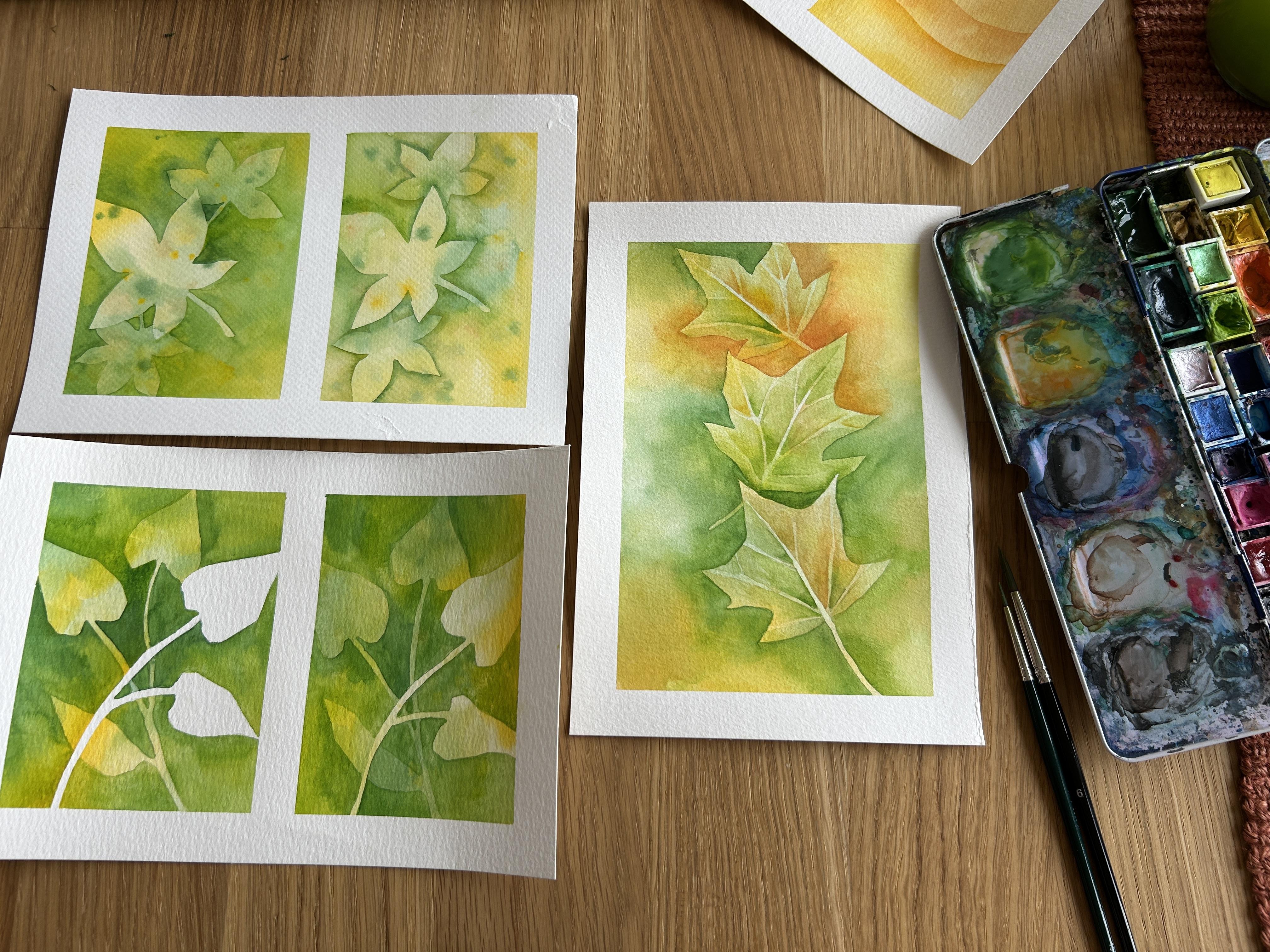
know how it works. One and two. The other option would be to color everything, the whole paper, make it a
background, and then go. Let's go on the other direction. Makes more sense. Leaving one empty and covering number two. Is this too abstract? Oh, my God, I'm dying
to see your comments. This way, you will have color on the
first on the first leaf. Anyways, just have this little sheet sheet sheet close by. It's all about the layers, and we are going to start soon and we'll go through this again.
5. Negative Painting 1: Leaving White: Hello, hello. So we're going to start with our
first experiments. As you can see, I
already painted, put the washi tape
and painted one of these squares rectangles with an easy background with
two colors like we did for the gradient effects, and I left one empty. And I'm going to use also
something that you already saw. There is this example of the two leaves together
that we sketched before, and I'm going to repeat it
twice on these two steps. I just did the background
before not to use so much time. And now we do the
drawing together. I'm just going to
repeat this twice. And as I said before, you can choose any
plants that you like, any leaves that
you like for this, but nothing too complicated. This already will be
complicated enough. Let's call it like that.
Let's see if I like it. Always shrinking how
much I show you, to be honest because also this I could have just shown
you the drawing done, but I always think it helps
that you see me and you see my mistakes and you see
how to fix things I like. I like not to edit so
much, to be honest. But well, the washi tape you
obviously can put yourself, and I will do it in
some other video. So you see or in case there is something that I'm
forgetting to explain. And as you can see, I'm
trying to imitate this twice. I could have also copied
it, like trace it, so it's twice perfect, but I really don't care
that is exactly the same. And we're going to
see the two effects that I showed you before when we saw a little bit
behind the scenes, the logic of negative painting. This one, I'm going to leave with the leaves in
front of us white, and the other one I'm going to do with the leaves
already with color, already with the
background on them. Extra complicated. I
decided to add a new leaf here in between just
because the composition seem a little bit
empty on the top. Sorry. And same thing here. Again, you don't need to first. Maybe if it's your
first attempt, you can make it much
easier and make one long stem and one leaf. This is up to you.
As you can see, you can always erase on
top of the background. Just be gentle. And that is it. Think we are ready to paint. Once you're done,
what you're going to need is a medium brush and soak it in a lot
of water with color. I use these empty spaces, as I showed you before. And I'm going to just mix and play with these two
colors as I go. There is not like
a specific order or what I use more or where. I'm just going to mix them. I'm kind of doing this is not then put speed up
or fast forward. This is my normal speed because you have to be
fast so nothing dries. I'm obviously leaving
the first set of leaves or the first plant
empty, completely white. I'm going to go full around it, and I'm playing with two
different greens and a yellow that I'm going to
mix directly on the paper. So when you go around the
plants, go very slowly. And when you are
farther from the lions, farther from the tree
corners, you can go faster. So here, again, very slowly. And I can carry this color from here to there everywhere just because
it's still wet. So make sure you use a good
amount of water for this. Always move the paper around. You don't need to be
stuck to the table. It's better if you can move it. So it's more coffee for your
hand. This is the easy part. Look, I just have to go
over all the other plants. I'm ignoring what's
happening in the background. And I'm just painting,
painting, painting. At the brush, you're
going to hear me say this if I didn't say it before. I use this medium
brush just because I like that the tip
is very pointy, very sharp, and because
it's quite big, it holds a lot of water. Of course, for a
background, this big, you can use a bigger
brush and cover more, but maybe it would
be trickier around the edges and the small little
corners of the drawing. So I'm in between,
not too small, not too big, and I think is
the best option for this. So Keep going, keep going. And we achieve something like the background
that we already had. But this time, leaving
the leaves empty. I kind of like the shape. It's quite a little bit
shape less, but I like it. I made some interesting
straight lines that weren't on the drawing, as I also said before, I think, I just erase
the lines later. So the drawing for me is a
suggestion that it's wrong, but I normally change
the drawing as I go. Exactly the same thing. But now over the background. Carefully. Same colors. You don't need to maybe
you think you have to go darker because you
make this pop up, but just because the
colors are overlaying, they are going to be darker, so you don't need to worry much. There, I even use a little bit of water
directly on the paper. So careful around the drawing. And I'm not comparing
with the first one. Don't worry about that. They can be a little
bit different. It's just so you learn these two options with one same thing, but it doesn't mean
it has to be exact. And we continue look how pretty that is
starting to appear. You can see if you're
using yellow like me, maybe don't put it
exactly where there was yellow because maybe
it's too saturated, I would play a little
bit with using yellow, but also using green
where there was yellow. There. So it's not only yellow. Normally, it doesn't sum up
yellow plus yellow so nicely. So I mix it with a
little bit of green. And this is working so smoothly because I have a
very good amount of water and I can do this. I can go over things and
they are going to mix. The paper is also quite good. That is very important here, not the best, I have to
say, but it's quite good. This aqua pad paper I decided to make some stains here and there just because. Also because it
still was still wet. Otherwise, don't touch it, just let it be and we follow. We continue in the next layer. So we're almost done. Let it dry a lot, a lot, and then we continue. So once they are completely dry, we're going to do the same to the plants on the back to
the leaves on the back. That means we're going
to paint around them. And this time, we're
going to respect those, and we're also going to
respect the white one. So the white one obviously
has to stay white. Did I say the white, the
white one has to stay white. And now, the one that was in the background is also
going to stay lighter. We are basically just making
the background darker. Again, can be the same colors in a different position
in a different place. Light green and darker
green, and I'm playing. This is also up to you
how much depth you want. If you want it to
look like, very far, very dramatic, the background
can be much darker. Otherwise, you can just
use a lighter color. Normally, when we do negative painting,
we work with many, many layers, mesmin so
you see the details. There. So normally, we
try to go quite light because you can always add more accents and more
depth in a new layer. But if you do the
first layer very dark, you can't undo that. So it's better to be safe
than sorry, I guess. So pay attention because
it gets confusing. Sometimes you forget which
layer or which lines you're respecting I'm going to
make this one with you, and I'm going to let you
look at the second one, which is going to be
exactly the same. By the way, for this exercise, we are just covering everything. Later on, I'm going to show
you another way of doing negative painting with the
gradients that we used before. But the technique of painting is as if you're making a
background over and over again, just respecting shapes,
just leaving shapes empty. So Look how pretty how
they start to emerge. They appear the
leaves that weren't are like magic. They are pretty. Careful. Remember to always add more color.
Don't go too far. What I mean is be careful here with the shapes go around them. Carefully. And then
don't go too far. Like, I go around this, maybe that's enough and you see already come with more
color and more color. Don't just, like,
keep going with your strokes because the more
you go, the farther you go, the drier the brush gets, and you're going to
start seeing some lines, the strokes, the dry strokes of the brush, and
that's not nice. We don't want that
in watercolors. So last little bit, careful around the white. These lines are quite thin. That's why I say
it's not so easy. But patience, you can also
choose what you do first. Maybe start with the
corners that are easier and then go
around the lines. That's more of a challenge. I try when I do these tiny bits, not to press the rush. So I touch the little
corners, you see, with the tip of the
brush very, very gently. And then I can go with
the side of the brush or paint by pressing more. Oh, there is a
little layer there. Sometimes you can just ignore it or carry it out with your brush. When it dries, you can
remove them anyways. So little darker part
here it is again. To it left. Ah. Hmm. This is a ticking bump
because things are drying while I try to get
this little hair out. W I just ignore it, and when it dries, I
will just blow it. So little corner,
and we are done. So this is how we are. We're going to do
exactly the same. With the second one, I'm going to show you that a
little bit faster. S, we are the here. You see the two options. Now when they are very, very dry like this, look so pretty. The only thing would be to very carefully erase the pencil. Here you have your
two options with and without leaving white or with
or without a background. Hope you enjoyed it. Show me how it went and let me know
if you have questions.
6. Negative Painting 2: With or Without Gradient Effect: Hello. So for our last project together, this is what
we're going to do. I'm going to prepare two colors, and we're going to make
two little paintings with two slightly
different techniques. But first, let's prepare
the backgrounds. I chose these two colors. You can choose any
colors that you like. I'm going to continue with
this palette of greens, yellows and orange colors. And you know this. By now, I'm just mixing
them kind of fast so they don't get dry
and the colors mix and, like, flow one into each other. I'm going to make some random
stains here and there. Right now, we're not
going to think too much or plan too
much in advance. Just stain the
paper a little bit, just so it's a
little bit more fun. Quite light, I would recommend. So because later, you know, we're going to add
layer after layer, and if it's too dark, it's going to get too saturated. So try to use a lot of water, try to use light colors and only a couple of
touches here and there. And meanwhile, I make the
colors for the next one. Wait, I'm going to
make some little dots. Um, I wanted to tell you about these techniques
that we're going to use. We're obviously going to
do negative painting, but it's going to be
in two different ways. One is going to be covering the whole surface
around the leaves, and the other one is
going to be just making a shadow over the background
with a gradient effect. Right now, I know
it sounds abstract, but you're going to see it soon, so, you know, oh,
second, little square. I love the size. Also, if you want, you
can make them apart. Remember to hold your brush. Other was a little bit dry. I should have put
more water there. I'm going to go over
it. If you it's too dry just add a little bit of
water on the paper directly. Making it in any direction. This is not important. It's just to have a
pretty stainy background. So a couple of dots. And we're almost done.
This is as you like. You can also add
some lighter colors. I'm going with the yellow
now, and almost done. We're obviously going
to let this dry. And when it's completely dry, I see you again and we draw together a little composition. Three leaves together.
It's gonna be. So let's let it dry
and see you soon. So now it's completely dried and I'm going
to start drawing. Remember to get an H B,
pencil, something hard, not too graphite, not
a two B or a four B, that you will never be able
to erase something soft. And I already sketched
this in a normal paper. Now I'm checking how it went. You can sketch first a couple of leaves and then decide
which ones you want to do. I went for this mot or less
chestnut leaf shape if you just Google
shape of of leaves, you're going to get so
many different ones. This was, like, a little bit
simplified version of it. And I on purpose did it, so it reaches one of the sides. So it's kind of
exceeding the left side, and I'm going to make two
smaller ones around that one, so then we can send
those to the back, like first one ID that's going
to be in the total front, and I'm going to make two
more that tar behind it. That's the logic here. I recommend making three leaves that are the same
from the same tree. I'm thinking what's
more convenient here. But I don't want you to go crazy with trying
different shapes. Take your time here. You can also erase if you like. That's also possible. So check which position is better or what
you like the most. I made it again, quite simple, one, two, three, that's it. And I'm going to try to copy it. So you have the two versions
of the same composition, the two different
techniques you can use while still using
negative painting. So more or less the same, I'm going to make
one in the center. Exceeding the left side. These ones have like two, like, smaller pointy
shapes, let's say, on the bottom, and
then two bigger ones and one big head, let's say. Again, just check for chestnut. Leaf or maple is also very, very easy to draw. And the last one. So
we're almost there. Draw as soft as you can also. So then you can
erase this easier. And we're going
to start painting before just check if
your lines are too hard, you can erase them softly with
an eraser, normal eraser. And that's it. So once it's done, we're going to start
with the colors. Again, prepare the colors. I'm going to use these two
colors that I used before. I'm going to prepare them
in these empty spaces, and I'm going to start
with the first one. What we're going to do with
the first one is just leave the big leaf in the center empty and paint around
it, all around it. Start with a medium
brush or a bigger brush. I prefer a medium
one because I can go on the pointy corners better, and it still covers a lot. And every now and then,
I just switch colors. This is completely
spontaneous. It's not planned. Sometimes I'm going
to use the yellow, sometimes I'm going to
use the green. That's it. You see that already
the first well, the little leaf on
the top already disappear because this one is
becoming much more present. We're going to rescue the
one that disappeared later. So of course, you have
to be kind of fast. That's the tricky thing also because it dries and the
colors won't really mix. If it dries, but
carefully around the shapes and then just
fast over the rest. This, I would say is the
easiest way is just, like, covering
everything around it. And on the other side, we're going to do
the version with gradient effect that is
a little bit trickier. So thick line around the sides, like outside the leaf and
then color color color. There. I really don't care so much about
the pencil lines, I have to say, because
I can erase that later. Just use it as a guy
kind of cheating. Also, add mordot if you like. Why not? While still wet. If it's not wet, leave it. But here it's still wet, I can go a little bit around the shape and add
something else fast. So let's leave this one to dry. And meanwhile it dries, we can start with
the second version. This is going to be the
gradient effect one. I'm going to use the
same brush, that's okay. Always prepare the
colors in advance so you don't get them
directly from the pan. I mix it already with a
little bit of yellow. What we're going to do here
is start the same way, go a little bit
around the shape, but come just with
water from far. Gradient effect. We've
tried this before. So water from far, I'm going around because I
thought it was too light. Color around the line
and water from far. You just want to shake this
line, so it disappears. There it is quite
well. Actually, check very carefully the shape there. I think that's better.
And line thick line. Don't go with a thin line. It's gonna be harder to
erase and go around it. And again, I'm going to
check that the edges, the tiny, tiny corners
are more or less fine. You can even paint more. Doesn't need to be only a line. Here, I just added more,
and then the water from. So sometimes I let go
over it once more, if I see it still wet, just to make it a little
bit more dramatic. And as you can see,
the leaf starts appearing and it's like
a shadow around it. It's just we're not doing
much on the other leaves. We are just making this shadow. I got a lot of focus.
Now, I move it there. Um, you don't need to think about the
other leaves at all. We're just adding around
this one for now. So let's leave some time for these to dry for
both of them, actually. And maybe when the
first one dries, I'm going to already
erase the pencil. You can see the
difference already. One is completely
flat all around, and the second one has this, like, gradient
color disappearing. Please, like, let it really
dry. This wasn't a minute. This was many minutes or use
a hair blower and dry it, and then you can erase
the color, the pencil. I mean, let's check here. Also, check how it works. Don't be too hard. Like do little
touches and check. Sometimes, depending
on the paper, maybe it takes too much
color, the eraser. You have to be
careful and obviously don't erase the lines around it, the lines of the other leaves. So we're going to continue
with the leaves around this, make sure you have enough color. And maybe switch to a
smaller brush if you like, just because the
corners are smaller. I'm a little bit lazy. I do everything with this brush because I
know how to control it, but yeah, the little
corners are gonna be. Even smaller now. The thing now is that
we have to go around the first leaf and
around the second one. So I'm doing this very carefully because it's
easy to get confused. Even for me that I've
done it for very long. I love this effect, and I'm checking where
it's better to begin. Careful because
it's very easy to change the shape that I like
I just did, for example. So I'm going to go
over it and just make it darker and better. But there, we repeat
what we did before, plus around the new leaf,
around the small one. I decided to go from here down. You can do this in the
order that you like. Just be careful and
remember for this one, we're just blocking
all the background. Careful, for example, with this little stick
with the Stem, is it? Or am I making it
up? It is a stem. Stem is for plants. Well, the little
part of the branch, there is this little stick. And again, you have to be
fast so this doesn't dry. This union there is, good. It was still wet.
That's the magic of using a good amount of water. Nothing. I mean,
you don't see lions where things match. Here. You see, now the two new
ones are starting to appear. Looks easy. It's not. Be patient. If it doesn't work, you
can always start over. You can even do this without
doing the background till you get it right and then
make one with the background. Be patient, be forgiven
with yourself. Be very careful around the
shapes and then color doing these soft touches and
then second color or the same color all around it
before this rice Oop there. And go over the tape. Remember that's also nice. And we almost have
it just missing the little part on the bottom. Oh, this little corner
here, I was missing. So careful don't retouch
if things are already dry. I kind of did something funny with the drawing
there. It's fun. I'm gonna leave it
like that, but you see it has four corners. I don't know what I
did. I probably went over one that I didn't
see in the drawing. Well, this always happens.
It's just practice. Don't worry. It's not the end of the world if you change the
shape or forget something. This is just to
learn the technique, and then you can use
it for 1 million other paintings or projects that you design and
think more carefully. But this is just the way
to learn the technique. So careful and then just
cover, cover, cover. And in the middle, I'm
just missing a little bit. And we're almost done
with the first one. I have to tell you that
wasn't so bad, was it? Hope everyone is
still breathing. Don't panic. It's all good. And voila. So gonna let it dry, and we continue with the other. I switched to a
smaller brush here. Maybe it's a good option because we're going to
do gradient effect, and you know the
corners are small. Let me show you closer. So you also see the pencil. This when it dries, you're also you're always
going to see stains. Don't worry. It's like that. The water makes
marks, it's all good. We're not aiming
for any perfect. Oh, a drop speaking
of not perfect. They are water from far. Any perfect look just has
to be messy and stainy. That's the wood part of it. So don't stress about that. Color, that was
very little water. So grab more water. If that happens there I'm happy because that's
not gonna dry. I can even make it a little
bit thicker if I want. Don't go too far. You see, I do two lines and
water from far. I'm not going to draw all around the leaf because that's not going to work.
It's going to dry. So one line and water from
far, press, press, press. I'm extending this bit of
color that there was there. Line, water from far and
the little corner here. Line and very little water
because this space is tiny. Here, I'm just going to color that little corner,
water from far. And I think that's it. Am I missing something.
I think it looks fine. Let's continue with
the one on top. And we're almost done. Then it's up to you if you
want to add details to this. But remember, a
little bit of line, a little bit of water. Don't scratch too hard the
paper because you're going to get all the color that
is on the first layer. You're going to get it
all mixed with this, so we try to be as
soft as possible. I'm remembering all
the tips as I go. I'm going to make
a summary for you. So water from far
water from far, even on top of the
tape, if you want. Line a little bit of
water and line here. If it's thick, it's better. It's going to be easier
to make it fade. You see, I'm not using
a huge amount of water just enough
so this line moves. That's it. We are
almost done here. I'm taking here and I
see a couple of things that I could kind of fix. It's not completely necessary, but it's bothering me
that this corner is quite light, super light. So I'm going to add a
little bit more color here and do another gradient. You can do this as many
times as possible. The thing is that it's quite risky because every
time we go over it, we have the risk of
changing the line, changing the original drawing. So I wouldn't do it much. But I want to have this one a little bit closer to us, also. So I'm going to add this here. If you feel like
retouching something, just wait till it's
completely dry. I think I'm going to
leave it like this. It's a good example enough
for a first introduction, I guess, to the two
effects, hope you like it. I'm going to let them dry. And now that they
are completely, completely dry, don't forget
to let them really long. I'm gonna peel this. If it's
not coming off, be careful. You can use a hair blower because it kind of
melts the glue, and then you can take it off easier and easier and you
don't rip off the paper. Anyways, the trick
is to have it to almost push against the paper. Ah, this little thing
is killing me here. Come on. By does
I want to leave. Da da da. So be careful, and that's what I
mean, like, very much against the paper. Like, I don't know how to say. Don't pull on your
direction there. I think I took a little bit.
I know, it's still fine. So it's gonna it's
very rewarding. I'm doing it slowly, but it's
so nice when you see it. Tan. So I think you
said last project. Is our almost last project. We're going to make
one more painting like your final class. But this is to show
you these two effects. Ah, they are it peeled. So I always like that. I should have done it with
the hair blower. Careful, it also depends a lot on the washy tapes
that you're using. Use a bad one, one that
has very bad glue, so it's easier to peel off. And the d, d done. Little last bit. And, oh, it gives me so much
more mental peace now that I see without
this red frame. Oh, look at the white happiness. Almost done, and I show you. So, hope you enjoyed it, hope it wasn't too stressful, and I see you soon for our
last bit of the course you.
7. Negative Painting: Final project : Hello, hello and welcome to our last project or your
final project, actually. As you can see, I already painted the background.
You know how to do this. Change the colors if by now you are completely bored of
the yellow and green. And you can always make this sketch first
in a normal paper, like I show you
at the beginning, just to be sure that you like
it and that you uh, yeah, are happy with the
drawing before going to your paper
with the background. I chose for these maple tree leaves, making my own version. I didn't want to make
them as pointy as they are just because it's going
to take a lot longer. And for this, I'm going
to add for this video, we're going to see
something new that you can do besides the obvious negative
painting around the leaves. I'm going to show
you a new trick, something you can
add for the veins. So I'm going to show you a
little bit faster how I drew this just because you're going
to have your own version. Again, I would recommend sticking to three leaves
that I would say, do it as I'm doing it, but it could be any
leaves that you like or even even three
different leaves. The veins, this
is the new thing. I would like you to add a couple of lines inside the leaves. Not too many but
these little veins, at least the central one and some smaller ones
going from here, from the center to the tip
of each part of the leaf. So check again, originals. We're not going to work
on the design now. When you have this, we are
going to start actually there. I'm preparing the color, and we're going to
start with the veins. This is something that
we didn't do before. But this is an excellent way to practice negative painting because you can already
leave the veins, especially the central one. Leave it much later. So we're going to
paint around it, obviously, just to leave
that part lighter. I'm also adding some
dots here and there. That is also kind of a
new thing that now that you practice so much,
maybe you can try. Very, very gentle
with a lot of water as usual and very,
very see through. So color in the middle. And I don't care if I go
over the leaf or if this is just staying in the center because then I'm going to
cover all around the leaf. So we don't really care. Just water from far
make this disappear. Maybe I see too
much the line here. I'm going to erase that
just in case, you know, we erase just with
water from far, just not to see
where the line ends. Going to add some
touches here and there. You can also play with
different colors, even in the same
line, if you like. There was a lot of
color. But I like it. It's also fun. Doesn't need to be
so super subtle. And last one lying around it, lying around the
line on the outside, and second color if you like. And I'm going to
use this oh so dry a little bit more water here and make this color
fade and disappear. So we're almost done
with this little part. Of course, you have
to let it dry. Don't forget, little dots, if you like, only where you see that the color is still wet. And now I'm going to let it dry. So once this is, look how lighter it looks. It's crazy. Went
very, very light, but I have to say I kind
of prefer it that way. You could even repeat
it if you like, but I'm going to
leave it that way. And I'm going to start by painting the other
lines, the tiny, tiny lines, the veins that we drew before with a
much smaller brush. And you're going to get
this feeling of depth. Really looks deeper,
looks like texture as you could touch these veins. So small brush, color around
these little V letters, let's say, kind of
retouch it too much, Ban a little bit more later. And around these lines,
little color line. You can choose how much
color you want for this. Be very careful. And the other side as well. So a little bit of color from line to line
and water from far. Line and color. Remember, don't go too
far with the color. You can even do like
I did and actually color between these spaces
and then fade it from far. So I'm going to get a
little bit more color. This is getting very,
very light there. I like it a little bit more. And you're going to repeat this endlessly as many
times as you like. And for now, it's just this gradient effect all
around the lines. You don't need to worry
about the logic of what's behind and what's
in front for now. It's just making these
tiny lines come to life. So tiny places are going to be a little bit
harder, but still doable. So I really like very
see through things. Again, you can add more
color if you like, but I like seeing the
color disappearing. Love that. So one
is almost done. And I'm going to continue with the next one. You can choose. Maybe you make one leaf that is a little bit more orange orange, one that is more
green as you like. Right now in Berlin is the
perfect time for that. Autumn is starting,
and I'm going to go now showing you a little bit faster because you
know how this goes. So color color, color, water from far some parts you can even just
make very light and leave them like that. Maybe you don't
even need so much water if it's very light. So now I'm confused about what I did with leaf. Yeah,
it was bigger. So I'm going to cover
that. Doesn't matter. Again, it doesn't
matter so much where the leaf ends because then we're going to
paint all around. Then we're going to make
the background darker. So that's a good
thing that now you shouldn't care much
about the shape, doesn't matter if you
go over the line. So line, water from
four, almost done. I add a little bit
of yellow here, and the next one. Last one. Again, the more of these
lines that you add, the more complicated
it's going to be. But it's also good exercise. It's just like teaches you to respect the
shape a lot, a lot. A little bit of green that I haven't used in this one so far. Look how magic, how
the lines appear. Of course, you could have made the center and these
lines together, but it's a little bit
more complicated. That's why I did them
individually, each line. This is the one that
I didn't like at the beginning. It was too light. Just going to add some
touches here and there, and this part is
almost most Done. I missed this tiny one here. I'm going to add it now. Have a look, check that
everything is fine, and then we're going to start our negative painting
around all of the leaves. So Do. Let's let it dry
and magic. It's d. So again, maybe medium brush. You can prepare your
colors already, put a lot of water so
then you don't have to be running and nothing dries, and you don't need to. To worry that the
colors don't mix. So I'm mixing yellow
with this green, and now you have to decide which leaf is going to
be on top of which. What I did here is to use the orer like as
if they were falling. So this one is going to
be on top of the rest. And what I suggest for
this one, as you like, you can also do the one where we paint all
the background, but for this one, I am
using the gradient effect. So I paint the line or I even paint more than the
line like this. And then I'm just
going to bring water to make that color
or line disappear. So a little bit more color pretty going to let it
expand a little bit. Because I see that
it's still wet, I'm going to make
this line here. You can always
move your paper as I'm doing so you see
if it's wet or not. Going to bring more color here. And but as you like, you can make it all gradient
with a color background. And I'm going to go
over the stem because that's the idea to make this
one on top of that one. And here I just do
a gradient effect. Normally, when we
do this technique, well, it depends
on your project, but normally we play with both. We don't do only, like, a background plug
in everything or only this shadow,
this fading effect. We normally play with both, a little bit here,
a little bit there. Or depending on the
logic of the paper, we do have some intention
intentionality. Oh, if you see this line, always erase it if you see
where the color is ending, and look how pretty we almost
have one leaf here, then. What's going to happen
and it's happening to me? I like this, like,
little broken corner. Is that probably you get
lost with the drawing. It's not symmetric
anymore. I don't care. It's just to practice
this technique. And we're almost
done with this first one careful around the edges. And I'm gonna let it dry, and I'm going to show
you the next little bit, a little bit faster
because now you know this. Let's see. I can even cover a little bit more
here. Oh, I like it. It's starting to appear nice. If this is still wet, you can correct or add
a little bit of color. If it's dry, just let it
be, you don't need to. And once this is, same process to the next one. I'm going to show you this
faster because you know it, but it's good that we go
over it with some tips and how to solve mistakes. So here I don't have to forget about the stem has
to appear again, so I'm going to go over it. Shape carefully. Water from far always. I made this kind of brownish with the green and the
yellow that I had. I also quite like it. When I use a lot of orange, really block the other leaf. So it looks like the third
leaf is really behind. It's really one falling
on top of the others. I mean, one on top
of each other or one on top of the one over it. You know what I mean?
My English, God. But the good thing is
that you can see it. So careful when you
go around the shape, color, color, color, and I
try not to touch much what I already did for the first
one because that's done. I'm going to make
this little space that should be
empty between them, just like this, little bit
uneven. I think it's fine. Maybe here darker just because I see that it doesn't
look like so deep. Maybe that's better,
and that's it. Let it dry, and we're going
to make the next one. I'm just traumatized by
the little shape here. Maybe it's better. Careful. I'm doing this, but it's
still kind of wettish. You shouldn't. Wait
till it's dry. So now that the first two, look how much you see them
before it was nothing. Now they're starting to appear. Of course, later,
you can choose if you want to retouch the veins, if you want to add
something, be very careful, but you can we always
use 1 million layers. So that's always
very much allowed. I try not to retouch or to retouch as little as
possible out of principle. Because some mistakes are
nice with watercolor, so we shouldn't worry so much. It's all good. Orange. You can always clean things
with your finger as I did. Just pushed a little
bit of color out of the leaf with my finger and then corrected it with
the brush, obviously. Oh, I like this transition
from orange to green here and little last
bit here on the bottom, too, the leaf
appeared very happy with that little that
last a little bit. So done. Let's give it some time to dry. And what you can do is erase the shape and then check if
you need to add more details. Careful with the eraser, as I always say, just
do little touches. This has to be very, very dry. Otherwise, you're going
to remove the watercolor. Oh, I just did, I think, I'm going to
retouch it in a minute. The thing, I mean, it's always nicer to erase
and then have another look right to see if you need
to retouch something depending on your paper
and on your colors. Actually, sometimes you remove
too much with the eraser, but, of course, we don't
want the pencil lines. So once this is done, let's do some small
last retouches and we're going to
be ready very soon. This is really up to you. You can add more color around
them as much as you like. Right now, I'm just
fixing this part got to white with the eraser. I can always happen. And I'm going to add some more color to
some of the veins. A super speed for
the last touches. I don't want to bore
you with this last bit because all of you
are going to need more retouches here or more retouches there
or no retouch at all. So this is just my
example and, like, my little problems to fix or where I think should
have more color. This is what I mentioned, maybe between the veins, and maybe these little corners so they pop up a
little bit more. But every one of you
is going to have a different experience here
also based on your drawing. So very little. Corners. This one I
feel especially lost. Maybe I was too shy
with the color. Normally, that's the
case. I'm over careful. But this is up to you. If you see it and it's very saturated, also, just let it be. Since it's good to learn
where to leave it also. And we are almost done. Oh, my God. Hope
you've enjoyed this. Hope to see all your projects for each class or
for each video. You must have a project and
you must have questions. So post, share it. Find me. You know where to find
me in the description. You have all my contact details. So last project, let's
remove the tape, and W hope you enjoyed
it and see you soon. Oh
8. Final thoughts: Oh so here I am again. I hope you enjoyed this process. I hope it wasn't
too frustrating. I know what countries are
not easy to deal with. But when you get the things
to work, it's quite magical. So I hope you enjoyed it. If you did, please comment. If you did that person
comment, leave me a comment. I'll be happy to help you if something didn't work
or if you have questions. Also, it would be
awesome if you can leave a review so other people
know which level you think this workshop is for or any other things you feel like sharing that
would be awesome. Also, follow me and tag me
if you've done your homework in the Berliner club or at Lujan Cordao my
name and my last name. I would love to connect
with you and to see any follow up
work you do at home. Yeah, hopefully soon I'll
be making more videos. Follow me, and let's
share a lot more. Who knows? Who
knows what's next? Thank you. Keep painting. Bye.
 Lujan Cordaro, Illustrator and Art teacher