Transcripts
1. Welcome to Watercolor Polaroids: Are you ready to
make a big impact with the smallest details. Welcome to Watercolor
Polaroids Sera Sunsets, where we're going to
capture beauty in a petite format in just 1 hour. So Polaroid style art is not just about working
on a smaller canvas. It's about honing your focus,
sharpening your skills, and thinking creatively
within a compact space. So this polaroid
style art is not going to be just about
working on a small canvas. It's actually about
honing your focus and thinking creatively
within a compact space. And together, we'll explore the joy of creating
these adorable frames. You'll master the
art of creating impactful compositions
on a tiny scale. We're going to also explore
color combinations to evoke that exact feeling
that you want to portray. And you'll also practice some essential
watercolor technique, like washes and layers
and even fine details. And all of that is going to help so much with the depth
in your artwork. I'm Peggy Dean. I am an
artist and educator, and I love facilitating
knowledge. And while I do teach in depth
on all these techniques, I also really appreciate
a bite size class like this one that's gonna give you a fun project to walk
away As you learn. So I want you to picture capturing the
warmth of a sunset, the freshness of a beach breeze, all in this nostalgic
polaroid like format. So this class is perfect for anybody who wants to refine
watercolor skills, of course, anyone who loves
a good challenge, or simply just wants to capture the essence of summer
in a unique format. By the end of the
class, you will have a collection of charming, summer inspired
watercolor pieces. And I'm warning you
this is addicting. You might have a. Are you ready to create
your own tiny masterpieces? I will see you inside.
2. Supplies: We have a few
supplies to go over. I know you have a list of these, but I want to just walk
through it real quick so that you are fully aware of
what you're going to need. The first thing that
you're going to need is watercolor paper, and that just means
that you want it to be 140 pound
paper or 300 GSM. Going to have the ability to withstand the water
that we're going to put on it without it warping or hopefully
without it warping. And the next thing you'll
need is a pencil and a ruler. We're going to place the polaroid shapes
down first with pencil. Also an eraser. I
don't have that out, but you'll need an eraser. And from there, you're going to need some washing
tape or any kind of tape that is not going
to damage your paper. So when you take it off, because this is going to seal, create a frame around the
water color that we create. Now, we'll need a flat brush
or just a large round brush. Either one would be fine, especially since
we're working small, and then you'll need a
very small round brush. Ideally, something that's
like a two or under. This is a two. This is a 12, just so you are aware. But I think that 14, ten, just a large round
brush will be good. From there, you're going to need something to I'll go into paint, but you're going to
need something to cut your paper at the end if that is a exacto
knife and a paper. Matt, a cut mat. That's fine. If it's a paper cutter, that's fine if it's
scissors, that's fine. Just something to
cut your paper. You'll need a jar of water. You'll need a towel
or a paper towel. You'll also need your paint. And the paint colors that
you're going to want, we're going to go over
three different projects. So I want you to grab two
sunset colors of your choice. We're going to go over
that in the next lesson as we explore different options. You're also going to
want a very dark hue. Black is totally fine. If you want to get a little
more creative with that, then you can do a dark
dark burgundy or a navy, something along those lines. You'll also need a light color, like a Big, a light neutral. Big or tan, that's going
to be for some sand, and then you'll want
some warm blue, so like a turquoise. From there, you're going
to want opaque white. So if that's acrylic, great. If it's squash, great. If it's a gel pin, great. It really doesn't
matter as long as you have something
that is light, ideally white, that
will show up on top of paint on top of
something, layering. Grab your supplies.
And meet me back here, and we are going to explore
some color combos so you can be really set on the
color choices for your sky.
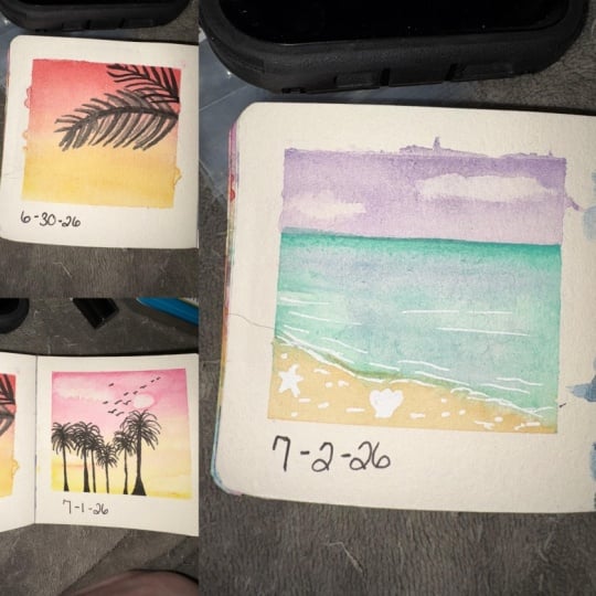
3. Set Up Your Polaroid Frames: So it is up to you the size
that you want to go with. I'm not going to go
traditional sizes just because it can be tricky
because it's like 3.1 ". So I'm going to go a solid
three inch in my square, and then we will leave
room outside of that. So what we want to do is determine three
areas on our paper. We can cut ahead of time, or we can just map it out for now. A really quick way to do this would be to
use washi tape and then just put the
space in between. So let's go with that. It's going to make
things a lot easier. So the first thing
we want to do, is make sure that we
have space at the top. And typically, if you
do this according to, you know, a real polar rom, you're going to have
less space at the top. You can use the
guide that I added. It's totally optional. It just
has a few different sizes. But I'm going to go about here. I just I like a little
bit of a thicker border. So you can eyeball
that or you can use washi tape or excuse me. Can eyeball it, or you can draw a little line and then apply
your washi tape there, or you can even put your ruler just inside the lines
where you want it to go. I actually have an easier
time eyeballing it. So I'm going to
take my washi tape, and I'm going to
just line it up. At least I have an easier time, Pauling it when it is a
right next to the edge. Not so much when it's not
right next to the edge. So let's just see, I'm going
to look alongside here. Okay, that looks
about even to me. So what you want to do, I don't want to press super hard because I don't
want to tear my paper. Luckily, this particular
washi tape isn't so bad. I would recommend doing a test first to see if it's
gonna tear your paper. So apply some tape, wait like 10 minutes for
it to like bond, right? And then lift it and
see if it will tear. I know this one will not. So good to go. Alright, so from here is
when we start to measure. The first thing I'll do
is measure in the center. It doesn't have to be perfectly centered on the page because
we're going to cut it. But I'm going to want
to do about 3 ". So I'm just going to go
approximately in the center, and I'm going to create two lines that I can use as reference to
draw lines down the center. So looks like right here, and then the three
about right here. It's not perfect, but
it doesn't have to be. Now, I want to draw
those lines at, you know, toward the
bottom a little bit. Again, totally doesn't
have to be perfect. And then we're going
to measure from there So if you have
a right angle ruler, that's really going to
be your friend here. So it's three by three. And if you're
working, by the way, if you're working
in centimeters, if that's easier for
you, it's approximately like 6.5 or excuse me, 7.5. It's actually 7.67
0.62 to be exact, but if you are working
in centimeters, that's just a quick reference. Okay, so it looks
like about here. So a line along the bottom here, as straight as I can get it. That seems to be okay
for me. All right. Now, I'm going to use the
washi tape as my guide again, and I'm just going to place it. So the edge lines up here, and that's going
to make sure that the inside is still 3 ". So for example, the edge is going to be just
outside these lines. Make sure they line up here. Okay. And then that
is leaving 3 ". And then from there, I'm
going to have the other edge, the outer edge here
line up right here. So that gives me still
the 3 " on the inside. So I make sure that's
nice and sealed. You want to make sure it's nice and sealed because
we're going to be painting with wet on wet, and we don't want it
to bleed underneath. We want that crisp white line
when we're done. All right. So now I'm going to measure from here to here
and here to here and make sure I have 3 "
inside there as well. So, bring this in. I'm going to line up
the three right here, and then I have my 1 " here. And I'll just do. I know. I know. I am not
the most accurate, but I just don't have the
patience for perfection. I just don't. Okay. Got it. Now, I'll do the same thing where I line up the washi tape, the edges to the
space that I need. So the edge on the
right is going to line up on the
left side of this, and I want it to be as
straight as I can get it. So see you can see
along the edge there. I see that my washi tape
is relatively straight. Okay, see this part here. I I went a little further than I had this
washi tape stretch, so I want to make
sure that that is sealed right down here because
I don't want you get it. I've said it, but I'm going
to say it again and again. You want to make sure
these are sealed. And then this part right here. Add this in. Again, if you
have that 90 degree ruler, that's going to be your
friend right here. Okay. And the next part is, We are looking at we're going to end up cutting the
outside of this later, we'll measure that all up as well to make sure
it's nice and clean. Just to note, so you're
aware the inside here, we're going to end up cutting. Since these are the squares, when we take that tape up, we're going to cut right
in the center of it. So we have that nice clean edge, and then we can go along the top and make sure that that's
clean and where we want it. I noticed. I put way
too much of a gap here. So what I told you about
having the edge of the washi tape be
leaving the space, it should have been opposite. It should have been the bottom
aligned with that part. But it doesn't matter
because I can cut it. It's better to leave
more room than less. And then the bottom
of your page, you want to make sure that
you have enough room, which we clearly do on this one, but you want enough room, so when you cut it, you have that cute little polaroid area. I'm going to wait
again till the end because I can cut it and make sure everything's
nice and clean then. Right now, I'm just focusing on those squares that I'm making. Okay. I'm going to go ahead
and put this last piece down along that
edge that I drew. And make sure it's
nice and sealed. Okay. When you are ready, you've prepped your
paper with washi tape. Met me in our next lesson. We're going to be exploring those colors that we'll be
combining within these.
4. Paint Sunset Skies With Wet-on-Wet Blending: Alright, it is time to begin
painting our sky plural. And if you haven't yet, I would like to encourage you to I was seeing what
colors I wanted to use. Change out your paint water if it's super murky because you're going to want these
colors to really show up. So you can use a
wash brush for this. You can also use a
larger round brush. I'm going to use a wash
after I apply it or during. It's hard my paint
wells are pretty small, but I want to do it that way because it's
going to be nice and even. But I also want to use it to actually create a sheen
on each of these, and I'm going to do
them separately. We're going to work on the
three polaroids together. But as far as application, I'm going to do it
get this wet first, put the sky in, put
the sky in that way, I have more control
over that blend. When we do the watercolor wash, we're going to want
this to be a sheen. We're going to want it to be not super mopp just enough to where we can see an even sheen when we move it
against the light. I'm going to come into my water. I'm not going to dunk it on the side and get a
ton of water in here. I just want enough to where
it's going to fill this spot. I'll go ahead and drag that brush on the side
to get excess water off, and then I'll use the other side and just make sure I
have enough water. And just drag it over the
full area edge to edge. Make sure that I
have enough here, and then I want it
to be nice and even. So what I do is I make sure, so I definitely
don't have enough. I'm not sure if you
see the sheen on mine, but it's not even, so I want it to be
covering the entire space. And if you do too much water, you can always take some off, so I'm going to do that
so you can kind of see how to approach that. So now I have this sheen. It is the whole way. It's nice and even. If you
need to take some away, just dab your brush and go
over the entire area again, it'll sop up any of that excess, and then you have
this nice even sheen. Okay. So from here, I can apply some color. And since, yeah,
since this is small, I'll go ahead and
use my round brush, but this first one, I'm going to actually make it pretty vibrant. So I'll go in and grab some red. And then I'm just going
to wait real quick. I'm a little. So I dried
up a little too much here. And I really want to make
sure this is fully even. Okay. So I'm going to dab
paint this line here with red. Okay? I'm going to drag
that all the way until I get to the center and notice how I got lighter
toward the center. If you need to, if you have
any part that's pooling, you can also go over it
with your flat brush. You can also apply it
with your flat brush, but The other part is, if you push to one side, you might have a pooling a line of color
that's like too much, so just pull it toward
the center more, and then it should self heal toward the center
when it's still wet. Then I'm going to grab a
little more of that red, and I'm going to come
up at the top again at the very top and then
go about halfway down. That's going to
bleed. That's going to create a natural bleed, but with the vibrancy
toward the top. I want to make sure
this is still wet. I don't know why my
paper is drying so fast today. But it is. Okay, so now I'm going to drag, I'm going to drag that
color or excuse me, grab the water toward
the bottom again, make sure it's a
nice even sheen, and then I'm going to do yellow. Really bold, I know. Drag
it along the bottom here. And it looks pretty pigmented
as I'm about halfway, so I want to get some
of this off my brush so that I'm just pulling
a lighter color up. So instead of going
right into the pigment, I'm going to go right above it and see it's still
pretty pigmented, so I'll really rinse my brush off and then go way
above it and see how that kind of pulls the
yellow up and into that color. And then they can
start to blend. I'll use this brush again to make sure that's
nice and even and it's okay if it looks like
it's getting a little lighter because it'll recenter. And then it's really
hard to do this part because we have so much
impatience, but it's like, let the watercolor do its
thing because chances are it will begin to
blend on its own. If it doesn't, just
wait a second, because then you
will be able to, again, give it the
encouraging nudge. This one, for some reason, it doesn't look like it
is blending super well, but we'll see in a second. I'm going to grab
some more yellow and just dab at the bottom here so that I have
that rich pigment. And I think, sometimes
is this fast. I'm watching it's still not
doing that blend that I want. So I can go in with
some water and just kind of with
the top of my brush. I'm just creating these
lines in the center, and that's kind of merging
it together a little more. And this could be that I have
more water than pigment, and so I can go in and add
some at the top again. Dab some of that color off and then bring it
down a little more. And I don't want it
to pool, remember, so I'm going to actually
pick some of that up and then pull it down just
by going over it again, and then I'll pick
some of that yellow up and put it into the red. See, it's just like a
dance that we do to see how we can let
these interact. Okay. See, now it's
starting to blend. I really like it again, when it starts to
blend organically and starts to make those marks. But what I do want to do is make sure that this
isn't super pooled. So I'm picking up
that flat brush again and just picking up some of the water by doing just a quick swipe
along the top. And then I can add more pigment to it if it starts
to get too light, but I want to wait until it's a little drier and that way, it won't bleed as far down. And when it doesn't
bleed as far down, that means that the pigments
not being as dispersed, so it'll be concentrated
more toward the top. So I'll do that in a second, but we can move on to
the second polaroid now. And this one, I want to do a yellow top and
pink on the bottom. I think that'll be kind of fun. And this time, let's make it so that it's not in the
absolute center, but it is more like
a third of the way. So first thing
we're going to do. My water is a little bit dirty, but since I'm using
these warm colors still, it's not going to matter. So I can This will be covered
up by the pain I use. But if you're using
something different, I would rinse out your water. I'll probably do that
before the next one. Okay, so I'm making that sheen, it's easier to see because I
have some pigment in there. This is really wet, so I'll
go ahead and dab some of that water off and just go
over the whole thing again. See how that lifted some of it. And I've got still quite a bit. So I'll pick some of
that up one more time. And now I have a
nice even sheen. So now I can drop some color in, and what did I say?
Yellow at the top? I think I'll go orange, so it's just my orange
is still pretty yellow. That way, it's a little bit of a different hue for funzies. And then I'll pull
some of that down. As I go. And every stroke has a little bit of a
different or excuse me, every stroke has
less and less paint because the first
place that we put it is the primary area. So if we have enough to drag
the whole way down, awesome. Notice it got a little
bit sparse in the middle, and that's probably
because it's my paper is starting to be angry with me because we put so
much water on it, even though it is
water color paper. So I'll just go in, set that first part down here and just do that process
one more time, and then just kind of push
that color toward the middle. I do like how that looks though, because it kind of
creates some clouds, which we're actually
going to do right here, but I just want to give you the problem solving in case you want to make sure that
that's nice and smooth. Okay. So when that color is in, I'm going to do
the bottom color, which was going to be pink, and mine is a very hot pink. I could mix it with white, but I actually love the hot
pink, I think it's very fun. So make sure that
that's nice and saturated at the
bottom, even more. And then bring that up. It's pretty wet. So
when it's this wet, it's going to kind of pool more. So I'll take this and pick it up and then just go
back in with pigment, but not extra water. I'll go up and drag
it up to about here. And then we'll see how
that starts to blend. What I do, I think
it won't blend as much because I'm getting
a little bit drier. So I'll go ahead
and take my brush. I just rinse it, and
then drag on the side, and then go in the middle. And then I'll do that with this brush just to
pick up any excess. And then I'll come in and do those quick kind of jiggle it along to
get that nice fade. Okay. Now we can go back here. Now that this is almost. Well, not almost, but it
is a little drier and I can just add that
pigment at the top only, and it'll bleed down and give me that nice saturation
that I'm after. Can definitely do more of
a blend toward the center. I like it when it's a
little bit lighter. I feel like there's some
misty qualities to it, so I think it's really pretty. So I'm happy with this one. And then on the next one, we are actually going to do
something a little bit different where we are
going to put some washi at either the lower half or
the higher or excuse me, lower third or higher third. Now, this is going to
divide the amount of sky versus water. These
two are just Sky. This one's going to
be sky versus water. And so we will. Let's place that because
I did a lower part here, I'm going to go higher and
make the water higher. Now, I would recommend actually just putting
it in the very center, because if you
remember, the edge of the washi tape is
actually the measurement. So if we go too high,
we might leave to low or too small of a sliver, because right here, this is
actually the measurement versus this because we're
going here versus here. So we're going to
paint the sky first, remove this when it's dry and then continue
with the below. So that's how that's going
to work. Real quick. Since this is about dry,
not quite all the way, we're going to this
is totally optional, but I want to put
a few clouds in. So you can take a paper towel
and just kind of wadded up. It can be large, if
you want big clouds, it can be real small
if you want them to be more like little lines here. But we're going
to press it down. And it looks like mine
is a little bit too dry, but it'll still give the
same effect that I'm after. So if it's too dry, something you can do
is what you know, reactivate it, like
we talked about. And then it will
actually pick up more. See how that's leaving
more white space now. So tricks to all of it. I'll get this a little more activated and just
put that in there. So see, these are subtle. But it's enough to kind of
give a little bit of depth. And again, this is
not the ground. This is still part of the sky. So I can go into the pink. And if it's a little too much, if you dab around it, it's going to make it so
it fades a little better. I don't want this
to be as intense. Okay. And I'm going to just do a small one right
at the top here. So reactivate this. See how even just
the brush pick some of it up, so that's nice. Okay. So just that smaller
little strip in there. This sounds a little
bit too much for me. So if I reactivate the pink, I can push it back up. I have cat hair. And then take this brush and
go along the bottom. There. That's softer. I
like that better. Cat hair. Oh, it's gonna drive me nuts. Okay, I'm just going
to leave it for now. And if it creates
that little line, we can thank for Annie. That's going to be so cute. Alright. So over here, I think that I want to. We know that the ocean well, you can do any color
water you want, but I'm going to do
a turquoise color. So in contrast, I think
that I want to do the sky, like a purply color, purple maybe with some
pink or some red. I I like the warm
colors the most, so if that's not obvious,
let's go purple. And I'll grab this
wisteria color. Okay. And I'll do a whoops. When you want to. Make sure
that we create our sheen. This is to mope. I'm going to
get some of that water off, and then go again
over that area. Make sure that the
sheen looks good. It's still pretty wet. So just that slate, there we go. I'll put this purple in. And it's not quite
enough. There we go. And that's going to start
to bleed into the bottom. And if you want to make
this more like swirled, these don't have to
be straight lines. You can kind of break
that up and let it bleed. You don't have to
have another color. Actually, I think I'm
going to leave this as is. When I did that sheen, it's going to make sure that the rest of the purple
does drag throughout. I'm not going to go over it again with the wash
brush because I want to keep the quality of
having that be separate. But because that's going to pull the color into those areas, we're still going to
have a nice outline. I'm going to just pick
some of this color up, so it's not so moppy. Okay, it kind of looks like
it's got some clouds in it, but overall, we're
going to let that dry. So from here, we want
everything to dry completely. So this is when it's
a great time for a coffee break or a lunch
or go pet your dog. Take your dog outside, but leave it alone. Now's the time to leave it alone and let it dry completely
and then meet me back.
5. Paint a Palm Tree Skyline: All right. So if you
haven't already, pause real quick and get some fresh water
in your water jar. And your paper should be
completely dry at this point. I'm going to add some
fine line details. I actually went ahead and
grabbed my 3/0 round. So as long as you have
a small round brush, you could use a
number two, also. These brushes, if
you have the pigeon letters brushes,
even the really, really large brushes have
a very, very fine tip. So I did them that way
on purpose because I wanted to make sure they would also work for brush lettering. So that they have that
really quick snapback and that fine hairline stroke. So you should be good to go
if you have those or just, you know, light light
pressure on a round brush, and you should be good. Okay, so what we're
going to do is grab a very dark color. So black is great because
we're doing silhouettes. If you want to do something that has a little hue to
it, you totally could. We're going to do palm leaves. So one of the things that I
like to do is go analogous. So I could grab a really like
a dark red, crimson, like, almost like garnet kind
of or like a burgundy, something like that
would be really pretty. Or if I want that depth, I can go with a black
or dark dark brown, but I could also mix the two. So I could go real
dark on some of these leaves and not
so much on others. But overall, it's going to
be pretty straightforward and pretty easy because these strokes are going
to be really thin. So go ahead and load up
your brush with paint. We're not going to
do a ton of water, so I just dip in here, slide off the side, and then
go in and roll my brush. I'll show you how I just roll the brush on the side like this to load that up, and then I have it coated. It's not too much
paint or water. It's just enough less
is more to begin with, and then you can
always add, of course. The first thing that I want to do is and you can
do this anywhere. I just kind of concentrate
on like a third. Think about it composition wise. You could go up toward
the top and then come in in this general area or have the palm
coming in this way. I think I'm going
to have it reach up and then actually
cut off in the corner. So it's kind of cropped. So I'm just going to I
need a little more paint. This is just black
that I'm using. I'm just going to
bring it in like this. So see how it's
pretty imperfect. That's what we want because it's going to look more
organic that way. So this does not
need to be pretty. And then I'm going
to do another one, just coming in and reaching,
probably to right here. Now, I'm pulling from the
inside to the outside. I cannot for the life of
me pull the other way. I would say it would be easier
to pull from the left side because we're going
to apply pressure in the beginning and then
lift up to taper out. I'm going to have to do
it the opposite way, so I'm going a little
bit lighter and then pressing to get that
fuller pressure as it gets toward
the outer area, because I want the part that's inside the frame like
the end of the palm. I want that to be thinner. It's not that big of a deal, especially when you have
something so small, it's not going to
be very obvious, but either way, something
to note, and keep in mind. When this is down,
we can go in now and create some leaves on
the bottom of these. Again, not the way I
would normally do this, let me turn the paper
to show you how I would do this if I was going
from the other direction. So essentially, I'm
going to go real light. And then press down
and then light again. So see how that just kind of
creates the silhouette of a leaf and makes it look like
it has some movement to it. As far as the way they bend, it really like, the
more imperfect it is, the more organic
it's going to look. Now, when we have less paint
on the brush and more water, you're going to have
more transparent lines. They're going to
come out lighter. And that is going to
add some depth to this. And I would recommend going with both more transparent
and more opaque. So we're going to add
some more paint here. You can have these bleed if you want them to where you have it run into another leaf. Just know that if
it's super wet, then it's going
to probably bleed all the way into those ones
that you wanted to keep More just lighter.
Just know that. Essentially, all we're
doing is light pressure, heavier pressure and
then light pressure. If you're using a
really large brush, you would have to just barely more pressure because
for the most part, you just want it to be slightly
thicker in the center. Some of these, I would say, you could keep them thin
throughout and then maybe a little
thicker at the tip, and that just shows movement,
which is pretty fun. So we can do that.
I'm going to go ahead and carry this
down to this one here. I think what I want
to do though is have some longer leaves. Just a few, I'll
have a maybe one coming right here. Okay. I just like it to look
more organic and a little sloppier because I
think that that makes it look a little more lively. The tip of this one, I want
those to be pretty small. So it's like just doing
these quick marks. See how they're small
at the very tip, and then they get a little
longer as they get further in, and then I'm going to have
them be ale more prominent. Like this. They get thicker
and they get a little longer. Now, we can start to have
them reach quite a bit. I think I wanted to taper, but I want it to be pretty fast. This one I'll have
reach down like this, and then I'll have one come even longer and then I'll
fill in the in between. But this way, I have a good
base to fill the rest in. Okay, add more pigment. So I have light pressure, a little heavier, and
then light again. And then I'll have some overlap. So this one can come
in and overlap. And then I I think it's
fun to also have it bend a little bit at the end because
it just looks more like, you know, a palm leaf
wood because they're not necessarily the most dainty. And then I'll have a little bit thicker coming in right here, and I'll make that a
little bit longer because we want these ones to be
to reach a little further. And then toward the
beginning here, I'll have them get a
little bit shorter, not quite as short as the top, but a little more so that it looks like
it's tapering back in. And then continue doing this until I'm happy with
how that's looking, but I'll have these reach and
then drop down some more, and the choppier they are, the more they look like,
you know, older trees. They've been around
for a minute. Okay. Let's see. I'll be a few
real thin ones, right here. Have that come down
and then I'll have more of a bold one just
right in the center here because I noticed that this
is looking There we go. That looks a little
better because I don't want them to be
perfectly spaced out. Then at the top here, they're
going to be curving down, so we want it to look like we do see that
the leaves are there, but mostly they're going
to be drooping in. I'm going to make some larger
ones here because I don't want it to look
like it's tapering at the center and then going in. I want it to be There
we go. That's better. So that's going to be
the isolated palm, and this looks really pretty
when we take the tape off and then we can see
the polarize style. It's just like this
more artsy kind of more of an artsy vibe. Let's move to this one. And this one's going to be
kind of similar, but we're going to
do it more from, like at a distance.
6. Paint the Ocean: Okay, this is going
to be a lot of fun. This is kind of its
own little projects. So think of it kind of like a bonus because it's
going to go over some different types
of techniques that are really going to
surprise and delight. So what we're going to do here is we have to
remove this washi tape, and I want to do this together
as much as it's like, Okay, I know how to remove
washi tape, just a minute. Because what we're
going to want to do is take it flat against. So see how I'm not
lifting upward. I'm actually pulling
parallel to the paper, and I'm doing it slowly, and that is going to be the
least damaging to your paper. When you have that
up, you're going to have a nice clean line. It is satisfying
every single time. I'll never get sick of it. Now we're going
to start on sand. You're going to want a
beige color or a tan color, and it's going to
be pretty light. You can I'll take my
larger round brush. Really any sides you want to do. Actually, I'll take the wa. I'm going to do the same
thing that we did with this and just fade it upward. So I'm going to make
sure that my brush has plenty of water on it. Grab my beige color. I'm going to be
using Buff Titanium. It's my favorite watercolor
color by Daniel Smith. I love love this color. Now, I'm not going
to wet this first. I'm just going to
paint wet on dry. Then I'll go back in with
pigment just at the bottom, like we would normally do, and then it'll
fade up like that. I'm going to go ahead and use that turquoise that I sampled. I like that it's
a little duller. I think that's going
to be a cool effect. So this is mostly dry, so I'll go ahead and start this, and it's going to be the most pigmented at this horizon line. Just like we're
treating it as if it is the top of the sky. That's where you put
the most pigment. Right now, I'm not really
worried about the pigment so much as I am getting as close to that line
without going over it because I don't want to
mess up the horizon. I'll grab a little
more of the paint without water
because I have a lot of water on this already. Then I'm just going to drag that down the same way that
I drag the sand up. This is going to anytime that
I grab pigment by the way, I'm going to restart at
the top because I want that to be the saturated. Appear, and then
I'll pull it down. Pull it down, pull it down. And this is going to
overlap over the sand, but we're going to do
it with this wavy line. And it doesn't matter
what direction it goes, create kind of a
wavy transition. And then I'll take
my wash brush. I want to make sure that the red is all the
way off of it. I don't think that it is. Yeah. Had to get that off. Okay. So I'll make sure this is dry, and I'm just going to drag
it along the bottom there, and that's just going
to give me that smooth, almost like it picks
up a little paint, but it makes it nice and smooth. And then I'll go in and add a little more pigment
to the very top. Okay. And we're going to wait
a minute because we want the water to be just semi
wet for the next part. So right now, just push in as much pigment as
you're going to want in there because this
is going to be primarily the main color. And what I like to do is kind of go in rather than
just at the top. I know that I just said that, but also bring a
little bit of it throughout And that just adds a little bit of
depth to the water. We're going a lot more
of that, but for now, that's a great way to
get started on it. And then we want that
to dry like halfway. And then what we're
going to do is pull some of the
color from the sky. So I'm going to grab
my purple again. Make sure my brush is
clean. Grab my purple. And I'm going to I'm going to find a spot
that's not super wet. From here, we're going to
just add a little bit of it to the top part of the water. And that's kind of like where the ocean is reflecting the sky. And it'll blend in
there really nicely, and it also adds
some of the depth. That's bringing your
sunset down into it. If you used two colors, you can dab that
through out there too. As it bleeds, you can definitely go in and take
the excess water off and you can drag it more in the
area you want it to go. I kind of like to, I
really like to focus at the horizon line and
then let the rest of it just get lighter because
we're about to put in some kind of reverse
depth at the top here. Okay, now, when this connection right here is all the way dry, we're going to get into our either white
paint or the gel pin. Either one works. We're
just going to paint or or draw over the line where it's connected
fully, the whole thing. I'm just going to grab
my smallest round brush or actually, I'll
grab the number two. You can grab just a small one. We'll do or draw this on. I'm not even taking this
out and putting it on a palette and I'm just dabbing so I have some white paint. I'm going to paint
along the edge here. The whole way and the same
waviness that I painted in. You're just doing it
along that border. This might not show up as much for you if you
went a little bit lighter, but that's okay because you're going to see how it
all comes together. So if you are using
acrylic like I am, you might have some
streakiness in here. So when we are finished
going through, I'm just going to dab
some of the paint off my brush and smooth out the texture because I don't want the texture since I'm not
doing a full texture deal. If I was using acrylic
only, different story. But this is what I'm doing. Okay. Now, when that's in place, I'm going to do the I'm
going to use the same white, and I'm going to do very
thin imperfect lines just above that white line and all of them are going
to be not perfectly, nothing's perfect, but they're
going to be horizontal. Even though they're
wavy and imperfect, they're still going
to be straight up horizontal because you
don't want them at an angle because this
water is coming into us. I'm just going to
do real thin lines. I'm actually going to grab my smaller brush so that I
can really make the thin. Yeah. Then I'll have some
that are just really small, almost like you're just
setting your brush down, and I want them more
concentrated further down the page and then they'll get a little sparser and
a little thinner. Maybe, I guess they're the same, but not so ns. Okay. Now, from here, that's pretty subtle still because my area right
here is very light. If you were doing a
real moody water scene, it would be a little
bit different, but it would pop more, but we are going to make it pop because we have one
more part to this. So now, just underneath the lines that we just
created in white, we're going to take
a darker color. And create an even
thinner line on the bottom side of
all of those lines. So that can be like
the blue again, just like a darker pigment. It could be gray, it could even be ware down
black. It could be the beige. I'm going to just go with the ocean color and just do
more pigment in those areas. So I want to make sure I
have more paint than I do water on my brush because I don't want
it to bleed at all. I just want to define it. On the sand, I'm going
to do more of a bige but on the water, just
underneath these. Now this is really thin. I'm also going to
vary the opacity. I'm skipping around so that
some of this is darker, and then I'm going
to rinse once, dab my brush and come in again. That's a little too light, but I want this to come up. There we go, where it's
not as dark everywhere. That way, it just
adds to the depth. Just underneath all of
the lines that we just made and see how that
just makes it pop more. You can do that. I think
I want some out here too, and then I'll have just a lot more concentrated right here. I'm drawing these lines in
and I'll add white to it. To just above it. So just above the order
doesn't matter too much, as long as you have
the white above the darker line. All right. Now, I'll add the darker line below the white line
where the sand meets. I'll do that with my
small round brush, and I'm just going to grab the same color,
the buff titanium. If I need something darker,
I can always go back in. But for now, let's see
what this will do for us. I think I want to also add some more depth to the
sand closest to us. I'll do that too, even
though it's not still wet, but that way, I have
some more depth. I love some good depth. And then along see how
that line just makes the rest of it feel like it's
like the smooth coming in. I'm going to get the brush wet. And just along the bottom part, I'm going to drag some
of that color in. Not all of it, but
just some of it. And it's going to kind
of look like wet sand. I think I'll leave
it to that actually. I thought I was going to
put the depth closer in, but I think I like it more toward the water because it
just looks wet that way. Since I did that, I think I
will add a little more depth. So I'm just going to grab
a little darker color. This is what is this? This is French Ochre. But I mean, it's so slight
that you're not really even going to be able
to determine the color. It's just a little
extra. There we go. Now I'm going to
take that same color and I'm just going to make tiny tiny little dots, and that's just acting
like sand granules. I don't want to make
too many of them. I don't want to space
them out perfectly. Just enough for texture. And if you think you
did too much like me, you can always go over
it and paint it out. I'd rather have it be Yeah, I like that a lot better. Okay, one thing I'm noticing is that this big white
space here is kind of detracting from
the closer effect. So I'm going to take
my larger brush. If this happens to
you, you can just go in and reactivate that blue. And the edges will soften, and then pick up some of that
water that you just added and then just put in a
little more pigment. The reason we're
picking up the water is because we don't want
this to be a hot spot. I'm blending that out and then bringing some pigment
in. And that helps. You're still going
to have white space, but it's not going to be
like mine won't be as bold. It won't be as intense. Then you can always go
back and do a light sheen on top of the sunset
color that you made. And it just softens it. The more depth that you add
toward the back like this, see how I went over it
one more time and just added that deeper Hue. It will make it so that the
part that's toward us is a lot more eye catching. All right. Now, I
think it would be fun to put some
depth in the sky. If you have it
where it's already dry and you want to
add depth later, you can always go in
and just wet that part. This is what you don't
want to do where you run it into the wet paint. I'm going to pick
that up carefully. It's not going to pick
up the purple because I didn't go into the purple enough to where it
would reactivate it, like I didn't move it
around, so we're good there. I'm going to want to wait for the water to fully dry if I'm going to
go that close to it. I'll re establish
that horizon line, has that depth again. And then I can always
go in the sky and just not pull the
water down as far. And then I can just lay
some pigment at the top. If you want to bring
a deeper color in, you absolutely can. If I wanted to
bring in a red hue or even just a darker purple. This is actually going to
make it really vibrant. What color did I just grab? This is Bordeaux, and
it's really rich. This is one of the
richest pigments that I've worked with, I think, ever. What I'm doing is
making a vignette. Vignette. I don't even know if I Vet Vignette. Don't know. But since I made
that whole area wet, and then I dabbed it along the top while it was
still as wet as it was. That's why it bleeds in so much. If you want it to be more
subtle or not bleed in as much, then you could do this where you lay the water down
and just wait longer, and then then apply it. So I'm just going to dab this one time because I don't want it to be as
intense, I don't think. We'll come back in.
Since I dabbed it, it picked up a lot
of that water, so I can go ahead and
do that part now. So see how it's not as intense. If you want to drag it more, you can always get
your brush wet, and just the very
tip of your brush, you're just like kissing the
paint and it pulls it down. I'm going to lift some of that from the edges
just a little bit. I'm just clearing my brush off, getting it nice and dry, not all the way dry,
but for the most part. Then it's going to
pick up some pigment, so it's not as bold. Just along the areas I want
to have a little lighter. See how that's just
creating a fade. It's actually easier to
do it this way, I think, than to pull it down
with water because I think it gives you so much
more control when you're working with paint
that's drying. This is another way to
go about doing that. I'll go ahead and drop
some of this L's see. I have a slight sheen
still in the water. I'm going to drop a little
bit of that. In here. We'll see how that blends. I think I might want
to dry the brush, tap that so that it
has more of a blend. And there we go. Then I can take that
prussian blue just along the horizon
to deepen it just a little bit more because we
want it nice and at that line. It is a different hue, but I like going darker with the same color family
versus adding black to it. It's just personal preference. But you can, of course, add
mixed color and add anything. Okay. There we go. Now is the exciting part. Now is when we get to remove the washi tape and reveal the
pieces that we've created. I will say an important thing. Et this fully dry. And when I say fully dry, I mean, it's got to
be, like, so dry, even if it feels
dry to the touch, you just want to make
sure that you are indeed ready to take that off. Now, because they're small, it's not going to be
as crucial as if you were creating a big piece and the paper was taped
down to something. Ideally, that's going
to prevent you from having any issues with
warping on other pieces. It's not like I know I said it's really,
really important. In this case, it's not
so crazy important. But I would say just please do yourself a
favor and wait till it's dry. Then we'll finalize the poloids by cutting them into shape. They're going to be so
cute, I can't even wait.
7. 500 More Polaroids!: Now, over the past hour, you have mastered the art
of capturing beautiful, impactful scenes
in a petite format from designing balanced
compositions to choosing the perfect color
combinations and perfecting those essential
watercolor techniques. Remember that the skills
you've gained here are not just creating this small
scale art project. This is going to help your
overall painting approach. So embrace these
new techniques and perspectives in all of
your future projects. Thank you for joining me on
this creative adventure. I hope that you are so proud of the tiny yet impactful works
of art that you've created. Keep painting, keep
experimenting, and most importantly, keep
enjoying the process. And I can't wait to see
you in my next class?
 Peggy Dean, Top Teacher | The Pigeon Letters