Transcripts
1. Introduction: Hello, everyone, and welcome
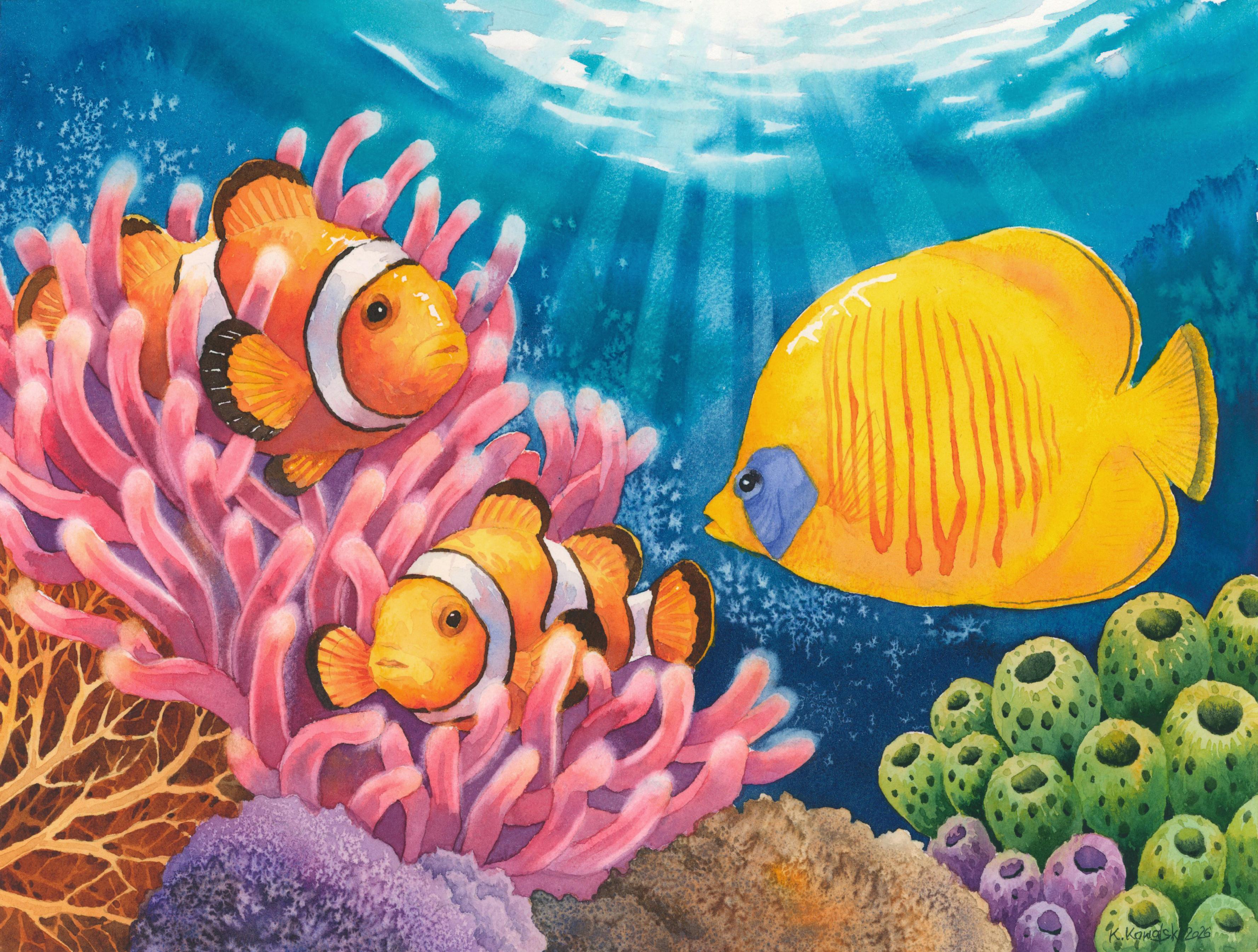
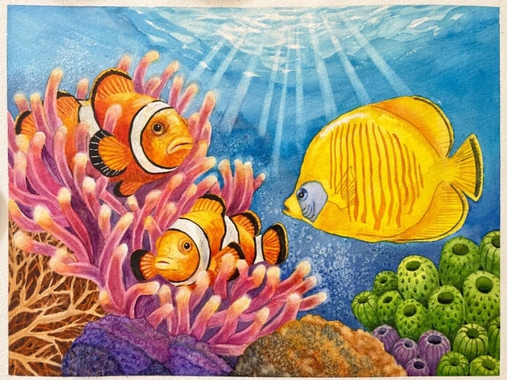
to this watercolor tutorial. In this class, we'll be painting a colorful underwater
scene featuring a pair of clownfish and a butterfly fish surrounded
by vibrant corals. It's a bright, playful illustration inspired by
the beauty of coral reefs, and throughout the project, we'll combine a variety of watercolor techniques
to create the depth, texture, and the glowing
underwater atmosphere. Although the final painting
may look detailed, I will guide you through the
entire process step by step. We'll begin by planning
the composition and applying the
first light washes and then gradually build
the painting layer by layer until all the
elements come together. Along the way, we'll
practice a number of useful watercolor techniques, including wet on dry
painting, lifting, creating textures with salt,
and negative painting. We'll also focus on one of
the most important aspects of watercolor using tunnel values to create depth
and define forms. As you'll see throughout
this tutorial, values are often much more important than the
exact colors we choose. Rather than trying to create a highly realistic
underwater scene, we will use our reference
photos as inspiration and simplify many of the shapes to create a more stylized
illustrative painting. This approach allows us to
focus on strong composition, harmonious colors,
and the joy of painting instead of getting
lost in tiny details. This tutorial is suitable for watercolor painters who already have some basic experience
with this medium. If you're comfortable with transparent
watercolor layers and would like to expand your skills while learning a
few new techniques, I think you'll really
enjoy this project. So gather your paints,
prepare your brushes, and let's dive into the colorful underwater
world together. I hope you'll enjoy the process, discover a few new
ideas along the way, and create a painting you'll be proud of. Let's get started.
2. Project and Resources: I've prepared a selection
of helpful resources for your project available in the projects and
resources section. You'll find a PDF file with the supply list I used
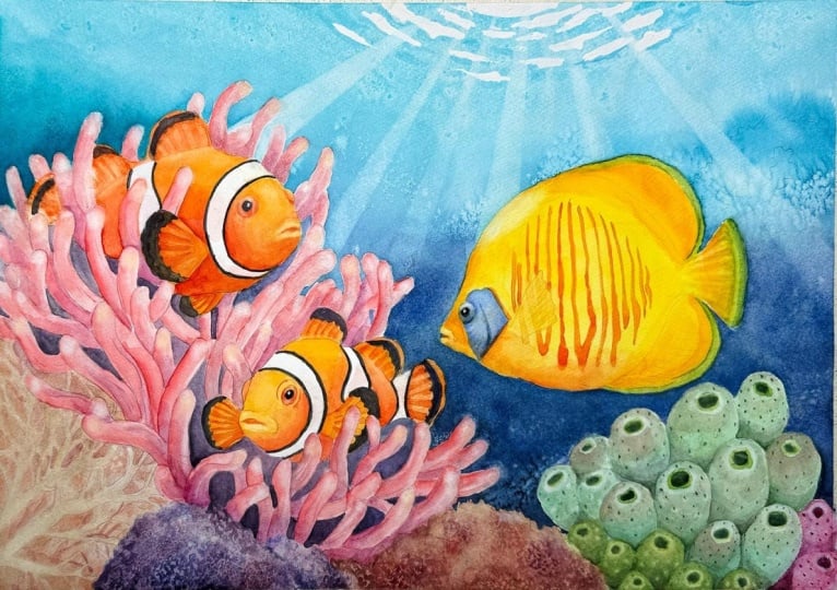
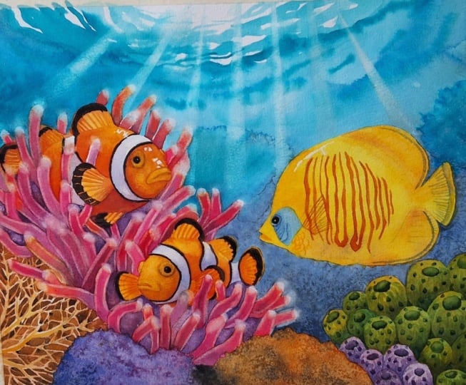
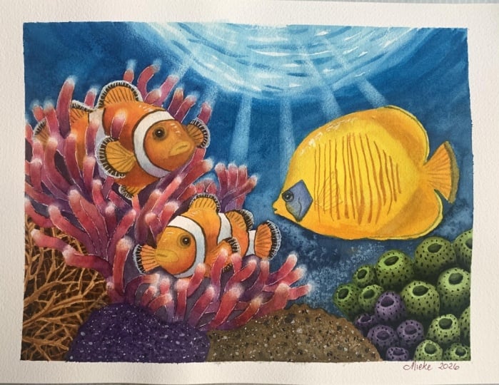
for this painting, along with reference photos and an image of my finished
artwork for guidance. Line drawings in
various sizes are also provided so you can print and transfer them onto your watercolor paper in the size that best
fits your needs. Additionally, there are
working progress photos to help you follow the process
and focus on specific areas. Feel free to explore
these materials and use them to create your own unique and beautiful painting. Please share your final painting in the projects and
resources section. I also encourage you to
take the time to view each other's work in the
student project gallery. It's always inspiring to
see what others create and the support of your
fellow students can be incredibly comforting. Don't forget to like and
comment on each other's work. Lastly, I highly
recommend watching each lesson before
you begin painting. This will give you a clear
understanding of what to expect at each
stage of the tutorial. If you find this class helpful, I would greatly appreciate it if you could leave
an honest review. Your feedback will help me
improve my content and assist other students in deciding whether to join the class.
Thank you in advance.
3. Painting Plan: Before we start painting, let me tell you a
few words about this project and how we're
going to approach it. We won't be following a
single reference photo. Instead, I've been collecting
reference photos for a while and created my own
composition based on them. I used the Procreate
app to sketch a few thumbnail compositions
and explore different ideas. Once I found a composition
that I thought worked well, I continued developing it while referring to
the reference photos, but without copying
their shapes exactly. I was happy with
the final drawing. I created a clean
line drawing that we can use to transfer onto
our watercolor paper. I printed it out
and transferred it to my paper using a light pad. This painting has many
different elements, but as always, we'll break everything down into
manageable parts. You'll see that it's completely achievable if you simply follow
the process step by step. Let me show you the order in which we'll build
up the painting. First, we'll apply masking fluid to the edges of the
main elements and paint the water which forms the background and
sits furthest away. Technically, water is everywhere in the scene, but you
know what I mean? It's more in the background. After applying the main wash to the water and
allowing it to dry, we'll create the sun rays and
remove the masking fluid. Next, we'll apply the base
colors to the clown fish. Then we'll add the darker
details and complete the fish. After that, we'll
begin working on the pinkish purple coral to create a cozy environment
for our fish. We'll first apply
the initial layer, then paint the negative spaces between the coral branches, and finally add the
glowing effect. Next, we'll move on to the
blue cheek butterfly fish, dividing the painting
process into two parts. Once the yellow
fish is finished, we'll only have the
corals remaining. We'll begin by applying the
basic colors to all of them. Then we'll focus on the
two corals in the middle, followed by the one in
the bottom left corner. Finally, we'll paint the green tubular coral
in the bottom right, breaking the process down
into a few simple steps. By the end, we'll have a vibrant underwater
scene full of life, beautiful colors, and
striking contrasts. I hope you're feeling
inspired now, so gather your art
supplies, and let's begin.
4. Applying the Masking Fluid: Before we start painting, I would like to
spend a few minutes preparing the paper
with masking fluid. This is one of those steps
that isn't the most exciting, but it makes a huge
difference later on. It allows us to
paint freely around the main elements
without worrying about accidentally
painting over them. As you can see, I've
already transferred my line drawing onto
the watercolor paper. I used staples to attach
the paper to a gator board, and I applied white tape along all four sides to create a nice clean border around
the finished painting. As always, I will be using Windsor Newton masking
fluid with a yellow tint. Before using it, I gently roll the barrel to distribute
the pigment evenly inside. We'll also need a piece of soap. I keep mine in a little
round container like this. You'll notice that I never
work directly from the bottle. Instead, I pour a small amount
into a separate container. In my case, it's simply the cap from an old masking
fluid bottle. By pouring out only what I need, the rest stays fresh
for much longer. We'll also need
some clean water. I keep a separate
small glass container just for masking fluid, along with an inexpensive
synthetic brush dedicated to this purpose. Once I've poured out
enough masking fluid for today's painting, I close the battle right away. It's a simple habit, but it helps extend the life of the masking
fluid considerably. Now, before my
brush ever touches the masking fluid,
I prepare it first. This is a very
important step if you are using a brush to
apply masking fluid. The masking fluid can
permanently damage the bristles if it
dries inside them. I always coat the bristles
with a little soap first. I dip the brush in water, then gently rub it on the soap. The soap creates a protective
layer that prevents the masking fluid from
sticking to the bristles, making the brush much
easier to clean afterward. Now that everything is ready, I can start applying
the masking fluid. I decided to apply masking
fluid in two main areas along the edges of the fish and the corals where
they meet the water. By masking these edges, it becomes much easier
to paint the background. We won't have to carefully paint around all
of these shapes, which means we can use larger brushes and create
much smoother washes. In the class materials, you will find an
illustration showing exactly where I applied
the masking fluid. Once you've finished
applying it, rinse your brush thoroughly, clean it with soap, and
dry it with a paper towel. You'll see that the bristles are still in perfect condition. They are not stuck together, and the brush can be used again and again
for this purpose. Without the soap, the bristles would already be stiff
and glued together, so don't skip this step. Now leave everything
to dry completely, and once the masking fluid is
dry, we'll begin painting.
5. Painting the Water: The masking fluid is
now completely dry, so we can begin painting. Our first step is painting
the water which forms the background and represents the furthest plane
in the composition. Instead of painting
a simple blue wash, I wanted to create
the beautiful effect of sun rays shining through the water from above and illuminating the
gentle ripples below. I think the easiest way to achieve this effect
is to paint the water first and then create the sun rays using the
lifting technique. Notice that this lighter area of the water doesn't form a
straight horizontal band. Instead, it has more of
an elliptical shape, and we will want to
capture that as we paint. In the line drawing, I roughly indicated the shape
of the slider area, but we don't need to
follow it exactly. It's simply there to gently guide the direction
of our brush strokes. To paint the water, I'll
be using a size 12 brush. I'm also planning to
use salt to create some interesting
texture and I have it in the small container. It's just regular table
salt with very fine grains. The size of the salt crystals will affect the final result. So depending on the
type of salt you use, the effect may look
slightly different. This is simply the salt I
happen to have at home. For painting the water, I'll be also using
eqoline number 522, which is a beautiful
turquoise blue. You don't need eqoline
for this painting though. You have any
turquoise watercolor, it will work just as well. I simply wanted to
try Ecoline for the first time and I thought this would be the
perfect opportunity. First, I'll prepare
a generous petal of a Windsor blue green shade. This will be one of the blues we'll use to paint the water. Then on the other
side of the palette, I'll squeeze out
a little eqoline. The bottle has a
built in dropper, so it's very easy to dispense
it onto the palette. Maybe the camera doesn't fully capture how beautiful
this color is, but it's a gorgeous torquise. I treat it just like
regular watercolor paint, except that it's already
diluted and ready to use. One nice thing about
ecoline is that we can mix it on the palette
like any other paint, but we can also apply directly to the
paper if we want to. So we now have the
beautiful shades of blue, but we also need a
deeper darker tone. I will prepare a mixture of ultramarine blue and pains gray. If we used Pain's
gray on its own, the color wouldn't have quite enough depth as it
tends to dry a little flat. Mixing it with ultramarine blue creates a much
richer, deeper blue. We'll be working with
three main colors, the turquoise Ecoline, Windsor blue green shade, and our darkest blue made by mixing ultramarine
blue with paints gray. We'll use these three
colors in that order. First, I'll pick up
a light value of the turquoise blue and
begin painting the water, starting with the
lightest areas. I'm using a fairly diluted
mixture at first and then I'll gradually make
the color darker as I work my way downward. I'm loosely following
the pencil lines, but they are mainly there
to guide the direction of my brush strokes rather
than define the exact shapes. The shapes themselves
are simply irregular, gently curved brush strokes with white gaps
left between them. We want to preserve
those white gaps because they will suggest the brightest
highlights on the water. Since we want these
shapes to have crisp, well defined edges, I'm painting using the
wet on dry technique. If I painted wet on wet, the paint would spread
across the damp surface, creating soft edges and
blurry shapes instead. Another reason we are using
the wet on dry technique is that it helps the colors retain their intensity
after drying. If we painted wet on wet, the pigment would be further diluted by the
water on the paper, resulting in lighter, less saturated colors once
everything has dried. As I move downward, I gradually transition to
Windsor blue green shade. You'll notice the difference
between the slightly cooler, more bluish windsor blue, and the greener turquoise
of the Ecoline. I think these two colors work exceptionally
well together. Because we've masked the
edges of the main subjects, we can now paint with bold, confident brush strokes while maintaining a nice even wash. Try not to get caught
up in the details. At this stage, our goal
is simply to cover the rest of the background with different shades of blues. So if you have a larger brush, this is a great time to use it. Now I'm painting
with Windsor blue, but around the middle of the
yellow fish on the right, I will gradually transition
to the deeper blue mixture. While the paint is
still slightly damp, I will place three drops of
ecoline in different areas. The surface is already
beginning to dry. So when I add the weather paint, it will push the drying pigment
aside and create blooms. This is an effect I'm
creating intentionally. These blooms can suggest distant corals or other underwater forms
in the background. I'll also sprinkle a little
salt onto the drying paint. As the paint dries, the
salt crystals will create irregular lighter textures that add extra interest
to the background. Of course, this step is
completely optional. Now, let everything
dry completely. Once this blue layer is dry, we'll create the sun rays.
6. Creating the Sunrays: Now that the turquoise water
layer is completely dry, we can finally see the
effect we've created. It's always difficult
to predict exactly how these techniques will look
once everything has dried, especially when using salt. I think this turned
out really well. The salt texture is visible
without being overwhelming. It simply adds a subtle layer of interest to the background. Blooms also create soft
fan like shapes that could suggest distant corals
growing in the background. Before we create the sun rays, I would like to take a moment to soften a few of the edges. For this, I will use
my scrubber brush. It's a flat, fairly stiff
brush for acrylic painting, a Windsor Newton
galeria size four. Softening these edges
won't be easy because the turquoise ecoline appears
to be a staining color, just like Windsor
blue green shade. Staining colors have both
advantages and disadvantages. One major advantage is
that when you paint additional layers over
them to build depth, they stay in place instead of lifting and mixing
into the new layer. In other words, staining colors are quite resistant
to reactivation. Downside is that if you make a mistake or as in this case, want to soften an edge, they are much more
difficult to lift. I will scrab just a
few selected edges with the stiff
bristles of the brush. The main purpose of softening these edges is to create
a more convincing glow. By softening the
transition between the dark blue and the
untouched white paper, where our brightest
highlights are, we create a beautiful effect of light radiating
through the water. Now it's time to
create the sun rays. For this, we'll need
some masking tape. I'm using two narrow strips of washy tape and that's
all we'll need. I place the strips where I
want a sun ray to appear so that the edges of the tape
define the edges of the ray. Then using either a
regular round brush or preferably a stiffer
scrubber brush, I'll gently lift some of the paint to
create the highlight. Since these blues
are staining colors, a stiffer brush makes the
lifting process a bit easier. After positioning the tape, I first apply a
little clean water to the exposed area and let it
sit for a second or two. Then I scrap the surface. This gives the water a moment
to loosen the pigment, making it a little easier to lift even the
staining colors. Next I move the tape
to another location where I want to create a sun
ray and repeat the process. I try to lift more pigment near the top of each ray and gradually
less toward the bottom, since the light becomes weaker as it travels deeper
into the water. Once the sun rays are finished, the background is complete, and we can remove the masking fluid and begin
painting the main subjects. You can remove the
masking fluid with your fingers or if you have one, you can use a rubber
masking pickup tool. I really like this little tool and it's what I always use. If the masking fluid
is still fairly fresh and was applied in a
reasonably thick layer, which should be, it should
peel off in larger pieces. Now let's move on to
painting the clownfish.
7. Clownfish - First Layer: Now when the water is finished, we can begin painting
the clown fish. For this, we'll need a few
shades of yellow and orange. Our main yellow will be
Windsor yellow deep. It's a warm yellow that will provide a great
base for the fish. We'll also need a color yellow, so I will be using
Windsor yellow. We'll also need an orange. You can use a ready made orange. In my case, I'll be using
transparent orange. If you don't have an orange, simply mix your warm yellow with a warm red such as
quinacradon red. Apart from these colors, I will also mix
quinacridone magenta with ultramarine blue
to create a purple. Purple is complementary
to yellow, so we will use it
to neutralize the yellow slightly and
create subtle shadows. I'll be using a size eight
brush for this part. First, I'll pick up Windsor yellow deep and apply
it to the tail. Then I'll introduce some orange to create a greater
sense of depth. These are black
markings on the fish, and you can either
leave those areas unpainted or cover them
with yellow and orange. Since they will eventually
be painted black, either approach will work. On the main body of the fish, I also begin with
Windsor yellow deep, then transition to
orange and finally dropping a little purple
in the darkest areas. The general idea is that the upper part of the body
is catching more light, so it will remain more
yellow while the lower part is in the shadow and therefore
becomes slightly darker. Along the top of the body, just before the white stripe, I'm intentionally leaving
a few tiny white gaps. These will become highlights that help suggest the smooth, slightly glossy
surface of the fish. I'll continue working downward
with yellow and orange, adding touches of purple wherever the shadows
are deepest. On the head, I will begin with Windsor yellow,
the cooler yellow, and then transition
into the other colors, again, leaving a small
gap for a highlight. Because Windsor
yellow is cooler, it shifts this area toward a cleaner yellow
rather than orange. It also helps suggest that this part of the fish is
receiving more sunlight. I'm also leaving the
iris unpainted for now. I'll repeat exactly the same
process on the second fish. Everything is essentially the same, just mirred horizontally. Once again, the head and upper part of the body are
lighter because they are catching more light and
the yellow gradually transitions into orange
toward the lower areas. You'll notice that
I accidentally forgot to paint the
fin on the left side. Realize this later
and quickly add it. So don't worry if you
happen to do the same. Also, be careful not to paint
over the white stripes. I was working a little
too quickly and accidentally covered part
of one stripe with yellow. I simply lifted the
paint and continued. Once you've finished
this first layer, let it dry completely
before we add more color to the
white stripes. Sure.
8. Clownfish – Deepening Colors and Painting the White Stripes: Now that the first layer
is completely dry, we can apply a second
layer to deepen the colors and add a few details such as the simple
lines on the fins or even a suggestion of
scales if you would like. I'll be using the same
yellows and orange as before, but this time, I'll also introduce a little
quinacrodon red. I'll begin by painting some fine lines on
the tail and fins. Then working from left to right, I will gradually deepen the
colors by adding more yellow, orange, or touches of red. I'm not trying to be
overly precise here. Instead, I want to keep my brush strokes
relaxed and natural. I'm not worried about
perfectly straight lines or perfectly smooth washes. In fact, I actually want
some visible brush strokes and layered color because they enhance the
watercolor look. I want the painting to clearly show the character
of the medium. In the deepest shadow areas, I use a mixture of
quinacrodon magenta and ultramarine blue to create a rich
brownish purple tone that works beautifully
for the shadows. The body of the fish between
the two white stripes, I apply quinacredon red first. Then I pick up Windsor yellow deep and blended into the red, creating a smooth transition
from the red through the warm yellow and into the
colors from the first layer. Again, I'm not aiming for a
perfectly smooth gradient. I use loose irregular
brush strokes to add texture and gently suggest
the fish's scales. It's perfectly fine if the surface isn't
completely smooth. As I work on the
front of the fish, I use quinacridon red, orange, and touches of purple to
darken the lower part of the body and create shadows
near the white stripe. With a slightly darker orange, I also define the
fish's small mouth and the separation between
the upper and lower lips. And of course, I don't forget to paint the fine lines on the fin. I will repeat exactly
the same process on the second fish
just mirrored. Do Now, before moving on
to the next part, I would also like to add some
color to the white stripes. Although we perceive
these stripes as white, they are not
actually pure white. They contain subtle
reflected colors. For this, I'll use a very diluted mixture of ultramarine blue and
a little purple. I will apply more purple along the bottom
edge of each stripe, ultramarine blue
through the middle and leave the upper
edge mostly white. This creates a gentle shadow and gives the stripes
much more dimension. No. I will repeat the same
process on the second fish, white along the top, ultramarine blue in the middle, and purple along the bottom. Now, leave everything
to dry completely. Once it's dry, we'll finish the clown fish by painting
the black markings. Uh
9. Clownfish – Final Details: In this part, we'll bring
everything together by adding the dark
elements to the clownfish. This includes the black
markings and the eyes. For my black, I will mix transparent orange
with ultramarine blue. These are two colors we've
already used in the painting, which helps maintain color
harmony throughout the piece. For these details, I will switch to a smaller
size four brush. Now carefully working
from left to right, I will paint all of the dark elements using
the wet on dry technique. This includes the black
edges of the fins, the black borders on both sides
of the white stripes and, of course, the eyes. I'm being a little more careful here because this is
such a dark mixture, so any mistakes will be
much more noticeable. On this fin, instead of painting one continuous
black stripe, I will break it into
smaller sections, leaving tiny white
gaps between them. This just helps suggest
the structure of the fin. Those lighter gaps catch
the light and make the individual fin rays
appear more dimensional. When painting the eye, I will leave a tiny
white highlight. I think it adds a nice sparkle. Of course, you can also
paint the eye completely black and add the
highlight afterward using, for example, white guash. I'll repeat exactly the same
process on the second fish. At this point, I noticed that the eye looks
a little flat. There's a subtle colored
ring around the eye, which I also included
in the drawing, so I'd like to paint that now. I'll use a little
purple applying it in the two small
areas around the eye. Then with Windsor yellow deep, I will blend those darker areas into the surrounding color to
create a smooth transition. The second eye isn't
fully visible, but because it
protrudes slightly, we can still see a
small part of it. I'll add a touch of orange there to suggest
a subtle shadow. This is also where I
realized that I forgot to paint the second visible
fin on the lower fish. I will paint that off camera. After adding all
the black markings, you may notice that
the white stripes still aren't quite dark enough. Don't hesitate to
add a little more ultramarine blue and purple
to deepen the shadows. Even with these extra layers, the stripes will
still read as white. And with that, our two
little friends are finished. Now it's time to create
a cozy home for them. In the next part, we'll begin painting the
pinkish purple coral. We
10. Pink Coral – First Layer: In this part, we're going to begin painting the pink coral. We'll divide the process into several stages because it's
quite a complex subject. That doesn't mean it's
difficult to paint. It simply requires
a bit of patience, as we'll be repeating the same
process many, many times. I've cleaned my palette
and changed the water so that all of the colors
stay clean and vibrant. First, let's prepare a
purple mix by mixing quinacrodon magenta
with ultramarine blue. We'll also need a pinkish red, so quinacrodon red
will work perfectly. Finally, we'll need
a warm yellow, and we'll be using
Windsor yellow deep. For this part, I'll be
using a size eight brush. It's large enough to
work efficiently, but not too small that I will be tempted to focus on
unnecessary details. Choose any coral
branch and begin by applying quinacrodon
red in the middle. Then pick up some yellow and apply it to
the upper section, leaving the tip white. If you accidentally cover the tip with yellow,
don't worry. It won't be a problem. Finally, pick up the purple and apply it to the
bottom of the branch. We're working wet and dry here. The goal is to
create a transition from yellow through
red to purple. Now, we simply repeat the
process on every branch. As you can see, it's
very straightforward, but it does take a little time. I'm careful not to paint neighboring branches
while they are touching each other so the colors don't flow from one branch
into the next. Instead, intentional instead, I intentionally leave
some branches unpainted and come
back to them later. It's the same approach
we often use when painting flowers with
many overlapping petals. I've painted all the branches I can safely reach at this stage, I will dry everything
with a hair dryer and then return to paint the
branches I left unpainted. The order in which you apply the colors isn't
especially important. If you prefer, you can start
with the yellow and then gradually transition
downward into the red and then the purple. I like to begin with
quinacrodon red because I want it to
remain the dominant color. Then when I add the
yellow and purple, they naturally blend
into the still wet red. Here's what the coral looks
like after the first stage. Now I'll dry everything
and off camera, I will apply the same colors to all of the
remaining branches. And this is how it looks once the first layer has been
applied to the entire coral. As you can see, I
haven't painted the negative spaces between
the individual branches yet. Before moving on, I think
it's a good idea to fill those white areas
with darker colors. I'll be using the
same mixture of quinacredon magenta
and ultramarine blue. But this time, I'll
use a stronger mixture with more pigment to
create a darker value. I'll also add a touch of orange to slightly
mute the purple. Apart from that, I will keep quin acrodon red and winsor
yellow deep on my palette. For this step, you may also want to switch to
a smaller brush. I'll be using Size four, which makes it easier to reach into all those narrow spaces. Again, there is nothing
complicated here. We simply need to fill all the negative spaces with
the darker shades of purple. I also like to drop in a little quinacrodon red or
winsor yellow deep here and there to maintain
color harmony with the coral branches and introduce a bit more
color variation. So the purple doesn't
look too flat. If you're feeling a
little more adventurous, you could even paint a
few negative shapes in these darker areas to suggest additional coral branches
in the background. I think I will leave mine as
it is because we'll be using the negative painting
technique later when we paint the coral in
the bottom left corner. Now, let everything
dry completely, and this might be a
good time to take a short break if you'd
like when you're ready, we'll continue
painting the coral.
11. Finishing the Pink Coral: Now that we've applied the
main colors to the coral, it's time to build its
form by adding shadows, texture, and finer details. We'll deepen the shadows
first and then use the lifting technique to create a beautiful glowing effect. I'll begin by mixing
a darker purple using quinacrodon
magenta and ultramarine blue with just a touch of transparent orange to slightly mute the vibrancy
of the mixture. I'll use this color for the deepest shadows at
the base of each branch. I don't want to
overcomplicate this stage. My goal is simply to
deepen the red in the middle of each branch
and darken the lower part. I begin with quinacredon red, running my brush through
the center of the branch, and then I drop in the
darker purple near the base. After that, I quickly rinse the brush and
soften the transition. If a few hard edges remain, I don't worry about them. The goal is simply to darken the lower part of each branch. This creates more
depth and makes it easier to distinguish
one branch from another, where they overlap or
sit close together. The branches receiving
the darker shadows will naturally
appear farther back. Repeat this process
on every branch. Once you've finished, dry
everything completely, and then we'll move on to
the lifting technique. For this step, I'll be
using my scrubber brush, which is Windsor Newton's
galeria brush size four. However, it's already
quite old and well worn, so it no longer has
a sharp flat edge. That means when I
try to lift paint along the edge of a branch to
create a glowing highlight, it removes a little more
paint that I would like, leaving a highlight that is
slightly wider than intended. In other words, this brush no longer gives me the
precision I'm looking for. Fortunately, I also have another flat brush that I
bought a few years ago. This one is the rosemary and co evergreen short flat size two. It's also a flat brush, but because it hasn't
seen much use, the edge is still
crisp and sharp. So today, I will use
this brush to lift paint along the edges
of the coral branches. Of course, you don't
need the same brush. If you have any brush that will do the work,
it will be just fine. It allows me to create much more precise highlights while also softening
the transitions. I'm not following any particular
reference photo here. Instead, I looked at
many reference images of similar corals and I noticed that most of them have
lighter glowing edges. That's the effect I'm
trying to recreate. I will repeat this process on every branch or at
least on most of them. After finishing the edges, I will add one more
effect by creating a soft glow around the tips
of the coral branches. This is purely an
artistic choice. I think it creates
a beautiful effect, making the tips look as though
they are gently glowing. Of course, this step is
completely optional. You don't have to do it. I simply enjoy the look
it adds to the painting. This, I will switch back to my Windsor Newton
Galeria scrubber brush. Here, the worn bristles
actually work in my favor. They allow me to
lift the paint using small circular motions over
a slightly larger area, which is exactly what I want. I don't need to be
particularly precise. I'm gently scrubbing around each tip and slightly into it to lift the paint and reveal lighter values that
suggest a soft glow. Some areas are a
little more difficult, especially where the coral
meets the blue background. The blue pigment sometimes gets lifted into the
tip of the branch, but that's perfectly fine. After all, we're painting an underwater scene and the
water surrounds everything. While I was painting, I
actually had another idea. It might have looked
interesting to add a few soft wavy blue shapes
over parts of the coral. Suggest transparent
water in front of it, but it's a little too
late for that now. So perhaps I'll save that
idea for another painting. I think these glowing highlights make the coral look
much more interesting. Now it's a good time
to take a break, and you may also want to change the water in
your water container. In the next part,
we'll begin painting the first layer of the yellow butterfly
fish on the right.
12. Butterflyfish – First Layer: In this short and easy part, we'll apply the first layer to the blue cheek
butterfly fish. I'll begin by cleaning the
left side of my palate so I have a fresh mixing
area for the yellow paints. I've also changed the water
so the yellows won't be contaminated by pigments
from the previous stages. We'll be using two main colors. So first, I'll prepare a generous puddle
of Windsor yellow, followed by another puddle
of Windsor Yellow deep. I'll begin with Windsor yellow, applying it from the
top of the fish. I will intentionally leave an irregular white shape
unpainted to create a highlight. I think this will look really nice and help suggest a smooth, slightly glossy
surface of the fish. Then I'll continue filling
in the rest of the body, carefully painting around
the blue cheek and the eye. We want to preserve
that area because if we covered it
with yellow now, it would turn green once
we add the blue later. I'm applying the paint using
the wet on dry technique. Once the entire fish is covered, I will pick up
Windsor yellow again and go over the first
layer a second time. This helps deepen
the color because the initial wash isn't
completely even, and I can see a
few lighter areas. I'm applying the second
layer immediately without even waiting for
the first one to dry. Yellow is actually a
very forgiving color, and despite what
many people think, it's surprisingly
easy to work with. While this second
layer is still wet, I will pick up Windsor yellow deep and apply it in
the shadow areas. These include the fins, the lower part of the body, the front of the fish, and part of the tail. This warmer yellow
introduces more variation while also helping us define
the form of the fish. I'll also drop in a little
purple to deepen the shadows. Since purple and yellow
are complimentary colors, they will naturally mix
into a muted brown, which is exactly what we want. I think I'll also add a touch of transparent orange to create an even richer warmer shadow. These yellows and oranges work beautifully with the
colors in the background. The fish creates
a strong contrast against the cool blue water, while its worm palette also harmonizes with the clownfish
and the pink coral. Together, they create a very vibrant, playful color palette. Once I'm happy with
the first layer, I will leave everything
to dry completely. When it's dry, we'll add the details and finish
painting the fish.
13. Finishing the Butterflyfish: The first yellow layer on the butterfly fish is
now completely dry, so we can begin adding the
details and finish the fish. For this part, I'll switch to
a smaller size four brush. Let's begin by preparing some transparent orange along with a little
Windsor yellow dip. We'll use these colors, mainly the orange to paint the vertical stripes along
the side of the fish. I can still see the pencil lines which serves as my guide, so there's nothing
particularly difficult here. I simply follow the sketch
as I paint each stripe. Some of the stripes
connect near the bottom, so I'll try to
capture that as well. I'm also not worried about achieving perfectly
smooth orange stripes. If some areas are
a little darker or lighter than others,
that's completely fine. It adds to the watercolor
character of the painting. Once all the orange
stripes are finished, we'll move on to the
fins and the tail. Now let's prepare some
ultramarine blue. We'll use it to
paint the details on the fins and tail and, of course, the fish's
distinctive blue cheek. First, pick up a light mixture
of ultramarine blue and paint a thin line close
to the edge of each fin. For this step, I've switched to a different brush size
zero liner brush. It's very similar to a rigor brush with
long, fine bristles. It makes painting these
narrow lines much easier than using a regular
size four round brush. When the blue is applied
over the yellow, it naturally creates
green tones, and that's perfectly fine here. That's what we would expect when transparent watercolor
layers overlap. In fact, if we wanted to create an even more realistic
underwater effect, we could glaze a little more
blue layer over the fish, but this isn't meant to be
a hyperrealistic painting, so I'm happy to keep the colors a little cleaner
and more vibrant. Next move on to the tail, paint a long blue
line along the edge, and then use brush
strokes that radiate outward from the center of
the tail toward the edge, creating lots of fine lines that suggest the
structure of the tail. You can also add a
few extra blue lines across the tail to
reinforce that texture. Finally, using a
very diluted orange, paint a few fine lines
on the small side fin. This fin is mostly transparent, so we don't want to
paint it solidly. Instead, we're simply
suggesting its presence with a few delicate lines that
represent the fin rays. Now let's move on to
painting the blue check. I'll be using
ultramarine blue here, but I will also drop in
a little coupled blue, which is lighter in
value and has a cleaner, more neutral blue hue. First, apply the
initial layer to the entire blue check,
including the eye. As you paint it, I
remember to leave a tiny white dot unpainted
to create a highlight. Once you've applied
this first layer, let everything dry completely. Now let's mix a
thicker mixture of ultramarine blue with
transparent orange. We'll use this to paint the dark eye carefully
preserving the white highlight. If you accidentally
cover it, don't worry. You can always add it back later with a tiny
touch of white guash. Finally, I will use a darker blue to add
the finishing shadows. First, I'll paint
a subtle shadow around the eye to give it
a little more dimension. Thank then I'll add the fish's gills. These small blue details are the final finishing touches
and once they are in place, we can consider this beautiful
butterfly fish complete. Congratulations.
Now it's time to paint the final section
of our underwater scene. The corals at the bottom, we'll divide that process into several smaller parts to make
it much easier to follow. If you'd like take a short break and I'll see you
in the next part.
14. Corals – First Layer: The last elements
we'll paint are the corals at the bottom
of the composition. They will be
especially interesting because we'll be using
several different techniques. In this first step, our goal is simply to
establish the main colors. Once we have that
solid foundation, we'll build the form, values, and details in
the following steps. We'll begin with the coral
in the bottom left corner. I thought it would look nice
in warm yellowish browns, so I will mix burnt sienna
with Windsor yellow deep. I'm aiming for a pale, yellowish brown on the
branches that catch the most light and darker browns
in the shadowed areas. In the center of the coral, I will use a lighter mixture, while around the edges, especially where it meets
the neighboring corals, I will use a slightly
darker value to suggest the shadows. At this stage, we're
simply working wet on dry and applying
these base colors. Later we'll use
negative painting to build the intricate
coral structure. We can use the same yellowish
brown for the coral located between the purple
coral and the green coral. This one will also be brown, but I would like it to be
a little less saturated. So I will add some
ultramarine blue to mute the mixture slightly. I will especially add more
ultramarine blue toward the lower left side to create a deeper shadow and begin
suggesting the overall form. Upper part of the coral
receives more light, so I will keep it
lighter in value. You'll notice that I've skipped
the purple coral for now. That's simply because I
don't want the colors from neighboring corals
to blend into each other. Now that I've applied the
browns to these two shapes, I can dry them before moving
on to the remaining ones. For the purple coral, I will once again use a mixture of ultramarine blue and
quinacrodon magenta. This time, however, my mixture contains more ultramarine blue, shifting the color toward
the cooler violet. This violet is
intentionally different from the pinkish purple
of the main coral, making it easy to
distinguish the two. As before, I will use a lighter value on
the upper part of the coral and gradually deepen the color
toward the bottom, especially on the left side where I want to
suggest more shadow. I also thought it would
look nice to paint the four tubular corals on
the right in the same violet. I think they will create
a beautiful contrast with the larger green coral beside them since my plan is for the main coral on the
right side to be green. For the green coral,
I've decided to use a drop of ecoline
to mix my greens. I will combine it with Windsor yellow and Windsor
yellow deep in different proportions
to create a variety of green shades and
then I will cover the entire coral
with those mixtures. I chose the turquoise Ecoline
because it helps connect the coral with the colors we've already used
in the background. Whenever possible, it's
always a good idea to reuse colors that already appeared
elsewhere in the painting. Even when they are mixed
with other pigments, they help create a
stronger sense of color harmony across
the entire composition. It's perfectly fine if some of the green blends into the neighboring
purple at this stage. So don't worry if that happens. Once all of the corals have been covered with
their base color, let everything dry thoroughly. If you're using a hair dryer, remember to wait a few
minutes before continuing. The paper can become surprisingly
warm and painting on hot paper is quite difficult because the paint dries much more
quickly than usual. Wait until the paper
has cooled back to room temperature and then
we'll continue. H.
15. Corals Created with Salt: E now that all of the
layers are completely dry, we can begin building the forms and textures
of the corals. Let's start with the two
corals that are very easy to texture using
ordinary table salt. First, I'll make sure I have
enough of my purple mixture by preparing some more
quinacrodon magenta and ultramarine blue. At this stage, our goal
is to deepen the color. You may be wondering
why we always begin with a lighter base layer and then apply a
second darker layer instead of painting everything
dark from the start. Technically, you could do that. However, if you want to
achieve rich deep colors, it's much better to
build them up in layers. The first layer reduces the brightness of the
white paper underneath. So when the second
layer is applied, the color appears deeper
and more saturated because less of the paper is showing through the
transparent watercolor. I'm applying another
layer of violet, shifting the hue
slightly by adding a little more quinacredon
magenta through the middle. I'm still keeping the upper part lighter and the
lower part darker. I think I will even drop in
a much darker mixture of ultramarine blue and
paints gray to make sure the final value
is dark enough. Since we'll be using salt, which naturally lightens
parts of the surface, I intentionally start a little darker than I ultimately
want the coral to be. While the paint is still damp, I will sprinkle some table
salt over the surface. My salt has very fine grains, so I'm expecting lots of tiny delicate light
spots to appear, creating a subtle texture. As the salt dissolves in
the moisture on the paper, it pulls pigment away from
the surrounding area. This leaves a lighter spot in the center with a slightly
darker edge around it, creating the
characteristic texture that salt produces
in watercolor. We will repeat exactly
the same process on the next coral,
the brown one. First, I will apply
a fresh layer of Windsor yellow deep
and burnt sienna, adding plenty of
ultramarine blue toward the lower left corner. I want this area to
become very dark. Then while the surface
is still damp, I will sprinkle on the salt. Once you've added the
salt, don't touch it. Just let it do its work. You can already see the texture beginning to appear
on the purple coral. Now, thanks to the
magic of editing, we are a few hours later and everything is
completely dry. I should also mention
that it's best to let the salt dry naturally. Don't use a hair
dryer to speed up this process as it won't
produce the same effect. Now that everything is dry, we can see the beautiful
texture the salt has created. This is an effect
that would be very difficult if not impossible to achieve with a brush alone. I think it looks really good, and it works especially well
for this type of coral. This point, you can optionally
add a few more shadows. This step is entirely up to you. So if you're already
happy with your result, you can leave it as it is. I'm going to use the same
brown and purple mixtures to deepen a few of the
shadows here and there, just to emphasize the form and add a little more dimension. And with that, these two
corals are finished. Now we'll move on to the coral
in the bottom left corner, which uses a really
interesting technique.
16. Coral Created with Negative Painting: In this part, we'll paint the coral in the
bottom left corner. I think this one is especially interesting because
we'll be using the negative painting technique to create its
intricate structure. For this stage, we'll use
a slightly darker value, but not the darkest
one just yet. I'll be mixing burnt sienna with transparent orange to create
a medium value brown. The first layer that we
applied earlier will now become the color of the
lightest coral branches. Our job in this
step is to reveal those branches by painting the negative spaces around them. It's actually a very
straightforward process. We've already down
the main shapes, so now we simply need to paint
the spaces between them. Use a fairly diluted mixture. You don't want the paint to
be too thick as that can easily lead to an
overworked appearance. A nice watery consistency will allow the paint
to flow more naturally while still creating
enough contrast with the first layer to make
the branches stand out. Fill in all the
background shapes. Don't hesitate to
drop in a little of another color from time to
time to create more variation. I will occasionally
add a touch of ultramarine blue to shift the brown toward a
more muted tone. Once you've finished this layer, let everything dry completely. At this point, we've created
our first layer of depth. We now have the light
foreground branches and the darker
spaces between them. In the second step, we'll create another layer of
branches in the background. For this stage, I will use a darker brown made from burnt sienna and
ultramarine blue. This time, I'll be painting the negative spaces around branches that exist
only in the background. Of course, we can't actually
see those branches. We have to imagine
where they might be and then paint the
spaces around them. If you'd like, you
can also sketch a few background branches
with a pencil first. That can make the
step feel a little easier and give you more confidence before
you start painting. The spaces we are
painting are quite small, and the branches themselves
are fairly simple. They are mostly
straight lines with an occasional branch
splitting off. So relying on my imagination. Whenever I imagine
there is a branch, I simply avoid painting it and instead paint the
negative shape around it. This creates another
layer of depth. Notice how each
previous layer now becomes the color of the
newly revealed branches. The more layers we add, the deeper the coral appears, creating the illusion of
many overlapping branches. Even at this stage, I think the coral already
looks really well. The structure is clearly
defined and we can see all those intricate branches receding into the background. If you're happy with this
result, you could stop here. However, if you would like to push the effect even further, you can mix a very,
very dark brown, almost black, as I'm
doing here and paint a few tiny negative shapes
deep between the branches. These suggests an even
greater sense of depth. One of the wonderful things about negative
painting is that you can keep adding layers
for as long as you like. To finish this coral, I will also add a little more brown to the lightest branches because now they still look slightly flat and
a bit too pale. I will simply run a
slightly darker tone through the middle
of each branch to give them a bit more
dimension and color. And with that, this
coral is finished. Now, let it dry completely, and then we'll move on to the final part where we'll
paint the green coral.
17. Green Coral: Welcome to the final
part of this tutorial. I bet you can't wait to
finish this painting. Don't worry. We're almost there. In this part, we'll finish
the green coral and with it, complete the entire painting. We'll divide the process into a few simple stages
because as always, we can't achieve this
effect with just one layer. Fortunately, each step is very straightforward.
Let's begin. First, we'll need
two shades of green, one lighter and warmer
and the other one darker. This time, I didn't want to
reach for the Ecoline again. So I mixed my own greens using Windsor blue together with Windsor yellow and
Windsor yellow deep. Of course, you can use
any green you like. Green gold would work
beautifully here, or you could simply mix Windsor blue with a transparent
yellow, for example. If you have sub green, you could also use sub green. The exact shade isn't nearly as important as the tonal value
that define the forms. After all, color is just color. Corals come in countless
shades in nature, so there is no need
to worry about matching a perfect
specific green. For the darker green, again, use whatever
mixture you prefer. The easiest approach
would simply be to take your lighter green and mix
it with a little pains gray, or even more than a little. I created my dark green by
mixing all yellows and blues, so I mixed Windsor yellow, Windsor yellow deep, ultramarine
blue, and windsor blue. That said, adding paints gray would work perfectly well too, and in fact, I think I will
even add a little later. The general idea here is to
begin with the lighter green, applying it around
the opening of each tube to suggest
its rounded shape. Then I will drop in
the darker green into the lower part
to create the shadow. After adding the darker green, I will rinse my brush and gently soften the
transition upward. I'm not trying to create
a perfectly smooth blend. I actually want to preserve
a little texture and leave some visible brush
strokes because they add character
to the watercolor. I simply don't want
the transition between this layer and the previous
one to feel too abrupt. Repeat this process
on every coral tube, making sure to skip any neighboring tubes while
the paint is still wet. This prevents the colors from flowing into each
other and helps preserve the smooth
transition from light to dark on each
individual tube. Start by painting the tubes that aren't touching each other. Then dry everything and come back to paint the
remaining ones. The darker green
shadows are important because they create the illusion of three dimensional form. They help show that some
tubes sit behind others, adding depth and
dimension to the coral. Once again, remember that
tonal values are much more important than the
exact colors you choose. Don't worry about matching
the colors perfectly. In this painting,
we're relying more on artistic interpretation than on copying a reference
photo exactly. The reference serves mainly as inspiration and helps us understand the
overall structure. Repeat the same process
on the purple tubes. But this time, use a darker purple mixture
instead of green. This is the second layer, and we are gradually building the form of these
tubular corals. We'll add the final layer using an even darker
mixture to define the deepest shadows and clearly separate each
individual tube. Once you've finished
this second layer, let everything dry completely. For the final layer, add paints gray to your
dark green mixture. Use this very dark
green to paint the deepest shadows on each tube and in
spaces between them. Apply the paint mainly
near the bottom and in the corners where
the tubes overlap. We're still working wet on dry. After applying the dark paint, use a clean damp brush to soften the shadows
where needed. Some of the small
triangular negative spaces between the tubes should remain crisp and
dark because they clearly define the separation
between each form. However, the shadows on the
tubes themselves can be softened slightly to create a smoother, more
rounded appearance. After everything
is completely dry, there are also two very
simple steps left. First of all, using the
same two shades of green we'll paint the openings
of the coral tubes. This is very
straightforward because we've already marked
them with pencils. Begin by applying the lighter
green to each oval opening. Then while the
paint is still wet, drop the darker green into
the lower part of each one. This creates the
illusion of depth and suggests the hollow
interior of the tube. Repeat this process
for every opening. The final step is to add
the spots on each tube. This is completely optional. So if you don't like them, feel free to leave them out. Alternatively, instead of spots, you could find lines radiating downward
from each opening. I think that would also
look really interesting. I'm painting the spots
with a darker green varying both the size
and their placement. The spots near the top
are slightly smaller. As I paint them,
I'm also thinking about the rounded
form of each tube. I imagine that I'm painting
on a curved surface, although the spots
are placed randomly, they still follow the natural
curvature of the coral. Once the spots are in place, I will pick up an
even darker green and paint a small shadow along
the lower edge of each one. This suggests a thin rim
around each opening, making the spots look like tiny holes rather than
simply dark dots. And with that, the
painting is complete. Now, take a moment to look at your painting as a whole and ask yourself whether there is anything you would
still like to improve. Do the values feel clear? Is there an area that could benefit from a little
more contrast? Does anything need to
be slightly darker? For me, the only final
adjustment is lifting a little more paint from
the tips of the pink coral. I couldn't do that earlier
because the brown coral in the bottom left
hadn't been painted yet. And now we can call
the painting finished. The last step is
to sign your work. I always use a small
brush and choose a color that's already
present in the background, usually a slightly
darker version of it. If the background is very dark, I'll add a little white
quash into my paint. Once you've signed
your painting, remove the masking tape and take a moment to celebrate
what you've accomplished. I think this painting
turned out beautifully. I especially like the
vibrant turquoise, and I have a feeling
we'll be using it again in another
project in the future. This painting gave us the
opportunity to explore several techniques that
we don't use very often, including negative painting,
creating texture with salt, and lifting paint
to create sun rays. Though it's more of a colorful storybook
illustration than a realistic
underwater scene, I think it was a lot
of fun to paint, and the final result is full
of life and vibrant color. I hope you enjoyed the
painting process and congratulations on
finishing your painting. Now, let's take a moment to summarize what we've
learned in this tutorial.
18. Summary: Congratulations on completing this colorful
underwater painting. I hope you enjoyed the
process and had fun exploring all the
different techniques that came together
in this project. Although this
painting has a more illustrative than
realistic style, it allowed us to practice many important
watercolor concepts while creating a vibrant
and lively scene. Let's quickly recap the
most important things we explored in this tutorial. Throughout the painting, we
worked from light to dark gradually building depth with transparent watercolor layers. By carefully controlling
our tunnel values, we created the illusion of
three dimensional forms, separated overlapping
elements, and guided the viewer's eye
through the composition. We've seen throughout
this class, tonal values are often even more important than the
exact colors we choose. This project gave
us the opportunity to practice several
watercolor techniques, including the wet and dry, lifting, painting with salt,
and negative painting. Each technique created
a different effect from soft underwater transitions
and glowing sun rays to organic coral textures and
intricate branching forms. Instead of trying to recreate a realistic underwater scene, we used the reference photos
mainly as inspiration. We simplified shapes,
adjusted colors, and relied on artistic
interpretation to create an illustration
with strong forms, vibrant colors, and a
playful atmosphere. Hopefully, this showed that understanding light values and form is often more valuable than copying every
detail from a reference. The final stages, we strengthened the painting by
adding the darkest shadows, defining the forms of
the corals and fish, and including small details that brought
everything together. These finishing touches enhanced the sense of depth and help each element stand out while maintaining harmony across
the entire composition. Thank you so much for
painting along with me. I hope this tutorial helped you feel more confident using
transparent layers, creating depth with
tunnel values, experimenting with negative
painting technique, lifting and salt texture, and approaching watercolor in more creative and
expressive way. Take these ideas into
your future paintings, experiment with your own colors, compositions and subjects, and most importantly,
enjoy the process. Thank you again for joining
me in this tutorial, and as always happy
painting. Bye.
 Krzysztof Kowalski, Watercolor artist